Enhancing IoT data visualization: Introducing new time series charts

On this page
Since launching, our time series charts have grown a lot but have become harder to configure due to many new features. We decided to make them easier to use and added advanced data zoom capabilities by switching to Apache ECharts, a popular and powerful charting tool. Below, we’ll walk through the new widget setup and spotlight the latest enhancements.
Time series chart family
Our new chart family includes four types. The main one, the time series chart, lets you show lines, bars, and points all at once. The others are line, bar, and point charts. We’ll focus on the basic configuration of the time series chart below. The other charts’ configurations and features are very similar.
Time window and data source
The time window and data source configurations are similar to other time series widgets. Please note that you may display data from multiple entities using entity aliases.
Y axes
New charts differ from the old ones by offering direct control over the Y-axes setup, influencing how these axes are shown visually. Each chart comes with a default Y axis that is fixed and cannot be removed. Initially, any new series or threshold you add will appear on this default axis. However, you have the option to create additional axes and specify these for your new series or thresholds during their configuration.
Configurable options for each axis include:
- Option to toggle the axis visibility. Even if hidden, it affects the chart if min or max values are set.
- An optional label for the axis.
- Choice of axis placement: left or right side of the chart.
- Minimum and maximum values to set the chart’s visual range. Leaving these empty enables automatic adjustment based on data values.
- Units for the values are displayed next to the axis.
- The number of decimal places for value precision.
- Selection between line or bar for the axis representation.
- Additional settings to adjust the appearance of axis ticks and lines.
Series
The series table lets you set up which time series data keys to show. You can display each series as either a line or bars, and it needs to be linked to a specific Y-axis. When displaying data from several entities together, you can use entity aliases as the data source. To differentiate between data series from various entities, we recommend including ${entityName} or ${entityLabel} in the series label. These placeholders will automatically be replaced with the specific names or labels of the entities, making it easier to tell the series apart.
Configurable options for each series include:
- A label for the series. Supports
${entityName}or${entityLabel}template parameters. - The display style: choose between a line or a bar.
- The color for the line, bar, or points.
- Units that are displayed next to the value in tooltips.
- The number of decimal places for value precision.
- Additional settings for managing the series’ appearance in the legend and other visual aspects.
Thresholds
Threshold settings have been incorporated into the basic widget configurations, maintaining their full functionality while simplifying the process. There are three ways to set thresholds:
- Using a constant value for simplicity.
- Referencing an attribute from the entity specified in the data source.
- Referencing an attribute from a different entity, such as an asset, customer, or tenant, offers flexibility in threshold configuration.
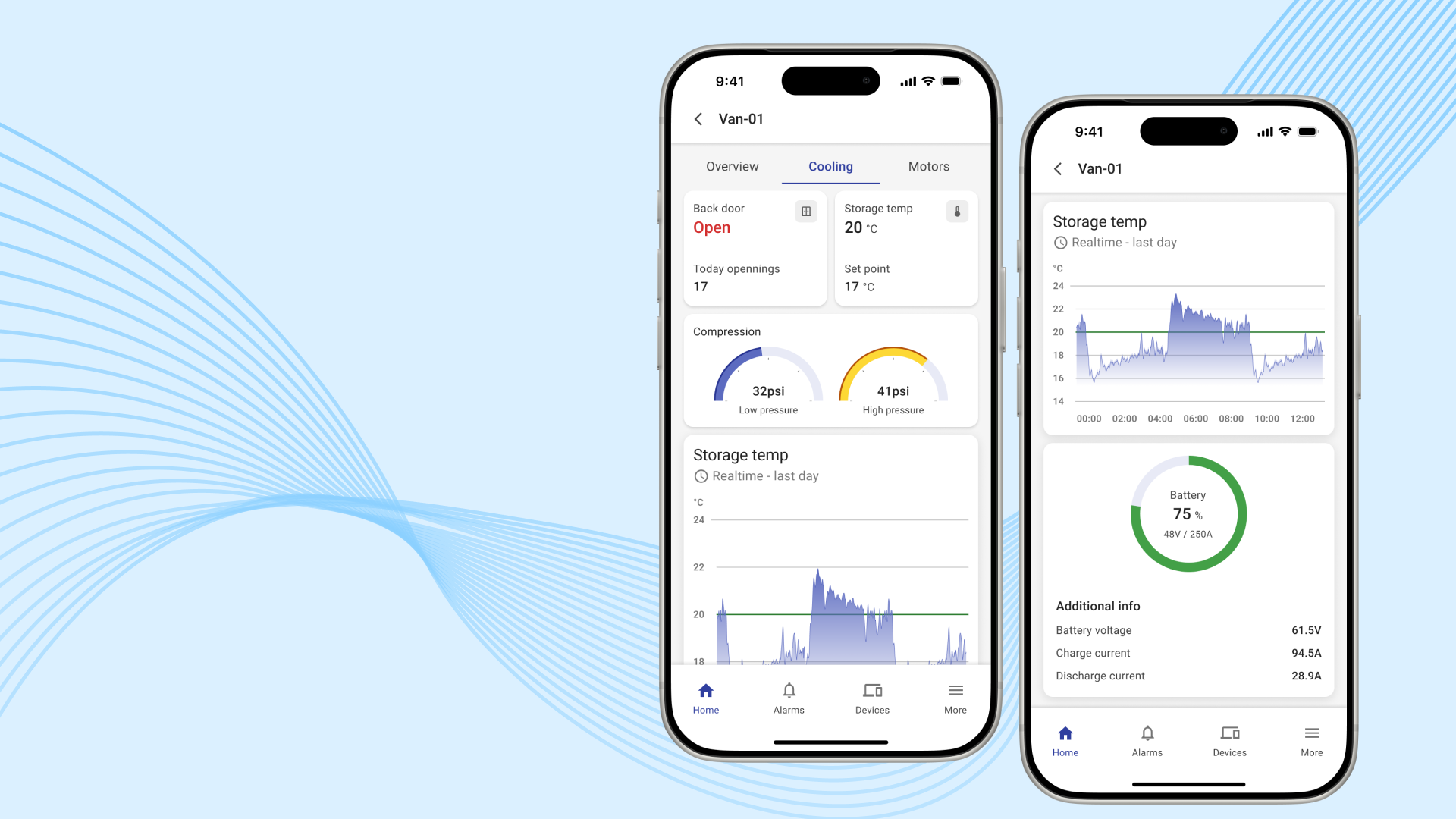
Find examples of these configuration options in the screenshot provided below.
Data zoom
A valuable new enhancement is the introduction of data zoom functionality. This feature enables you to zoom into specific data points or ranges directly within your browser, efficiently and without the need for additional data requests from the server.
Tooltip improvement
The tooltip configuration has been updated to offer more flexibility in formatting data and showing the data’s time interval. By default, the tooltip will show both the start and end times of the data aggregation period. You now have the option to customize the font and colors for both the actual values and the date labels, as well as the tooltip’s background, to suit your preferences.
Other echart-based widgets
We have added a few more widgets with slightly different configurations.
Bar chart with labels
The widget is crafted to compare aggregated data across various entities or multiple data keys. To differentiate between data from different entities, incorporate ${entityName} or ${entityLabel} into the series label.
Range chart
The range chart is specifically created to display a single time series value from one entity, such as a device or asset. A distinctive feature of this chart is the “Range Colors” option. This allows you to assign specific colors to different value ranges shown in the chart, enabling a visual representation that matches the value’s magnitude with color.
Summary
As we wrap up our exploration of the newly introduced suite of chart widgets, it’s clear that these enhancements are set to revolutionize the way we visualize time series data within the ThingsBoard platform. From simplifying widget configurations to introducing advanced data zoom capabilities, our goal has been to make data analysis and presentation both more powerful and user-friendly.
We hope you find these new data visualization capabilities both enriching and beneficial to your analysis and presentation tasks. As always, we welcome your feedback and suggestions through feature requests on GitHub or comments below. Your input is invaluable as we strive to meet your evolving needs and further enhance the ThingsBoard experience.