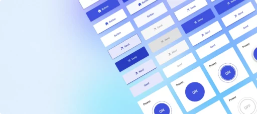
Welcome to the latest update from the ThingsBoard team! Our ongoing mission to improve the platform’s functionality and user experience brings us to the introduction of four innovative IoT widgets: the “Action button,” “Command button,” “Toggle button,” and “Power button.” Designed with a focus on usability, these new buttons are tailored for the most common IoT use cases, offering users enhanced control and flexibility in managing their IoT devices and dashboards. Let’s dive into their capabilities.
Action button widget
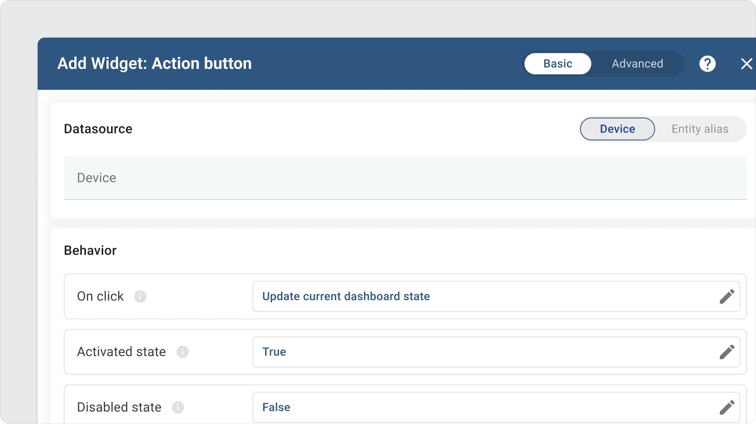
This button facilitates single-click navigation to other dashboards, states, or custom actions. You may choose one of the common widget actions to be triggered when the user clicks the button. You may also choose whether the button is in default, activated, or disabled state.

More importantly, the button may dynamically change its state based on the value of the attribute or time series subscription. You may find an example of the button that changes its state when the user attribute is updated below:
The behavior configuration is available in the basic widget settings:
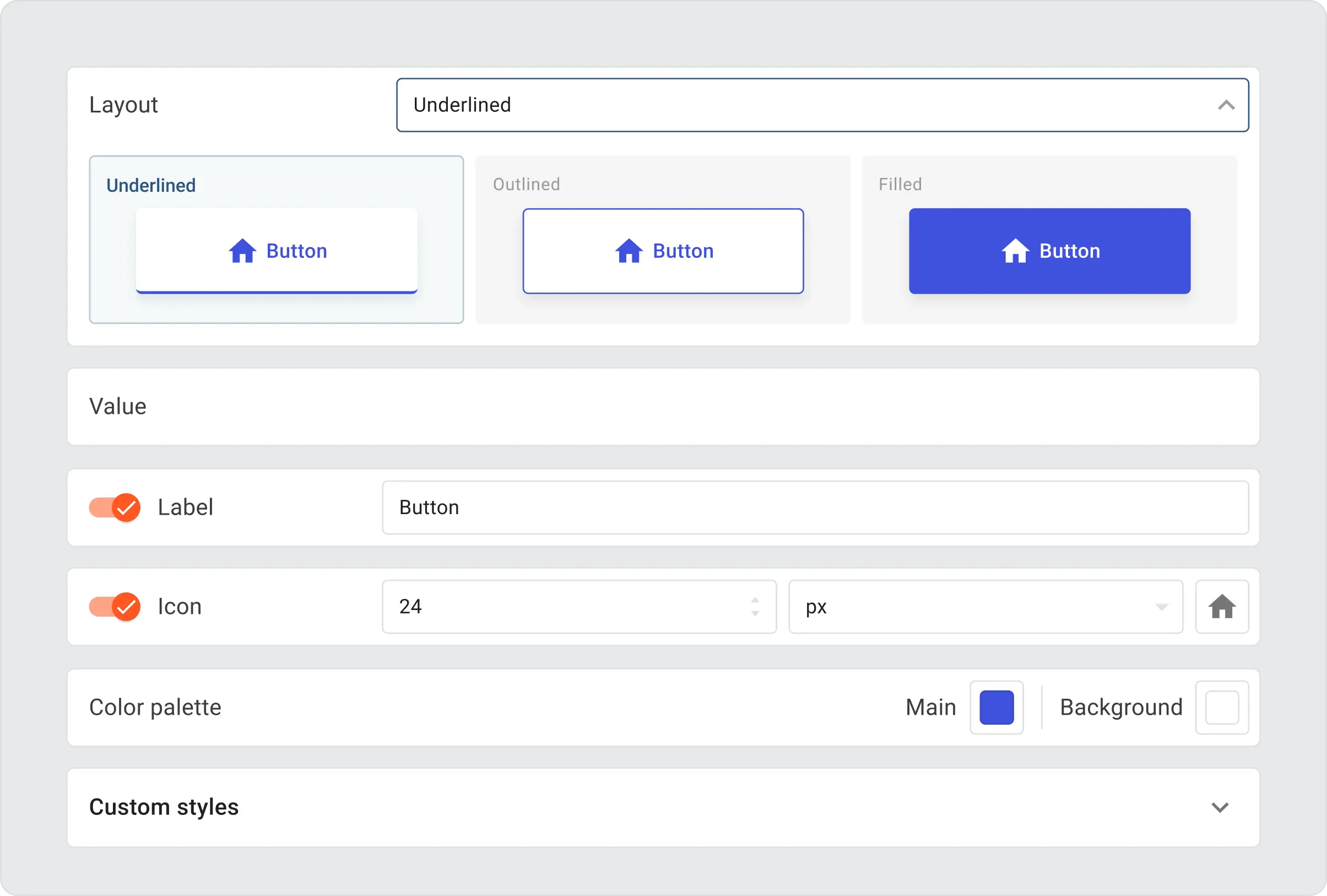
The button appearance is highly customizable. You may choose one of four available layouts, configure icons, and label appearance. The colors of the buttons are configured via main and background color palettes. By default, the button uses a palette configured in the white-labeling settings.
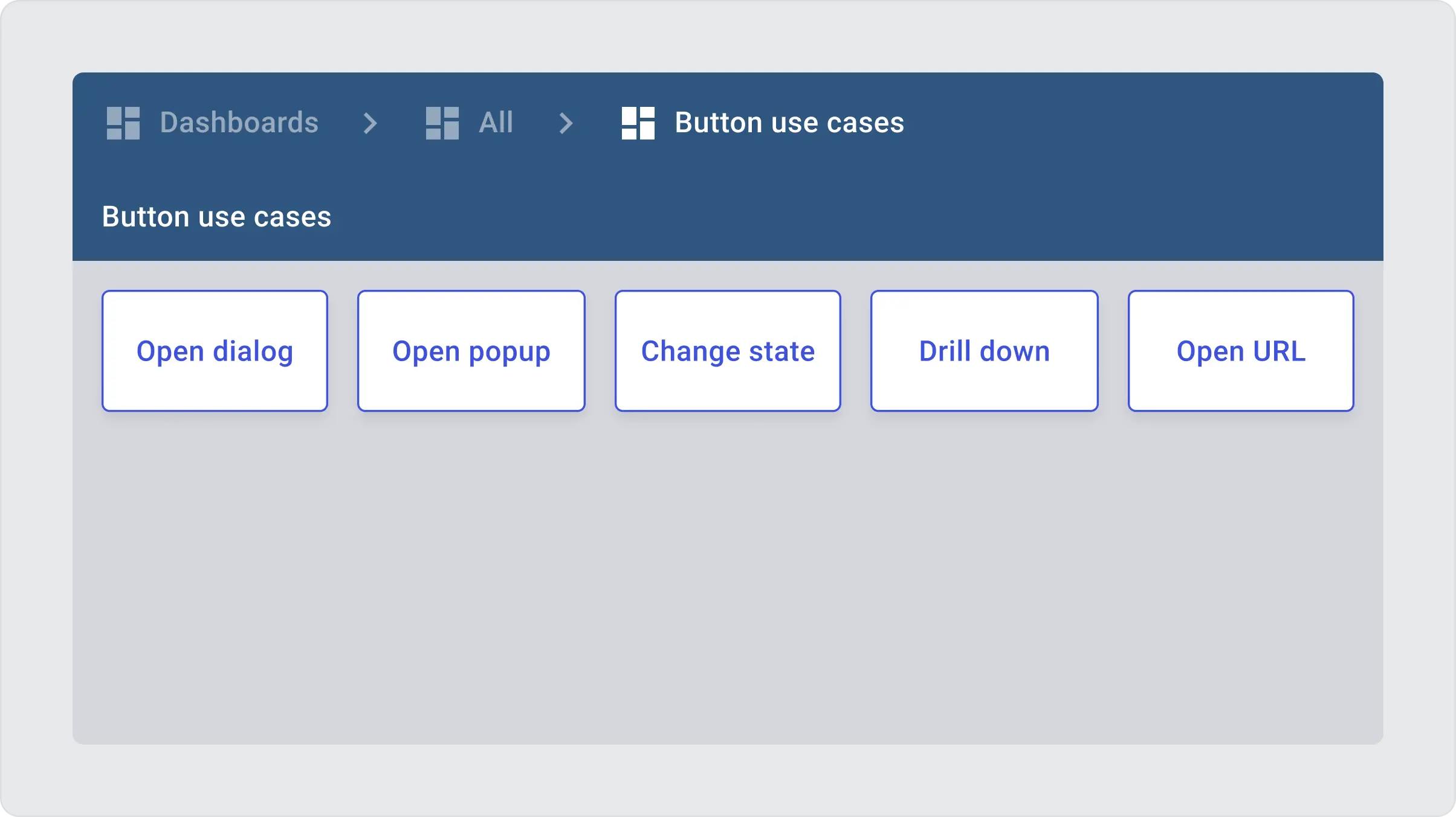
Although the button supports all common widget actions, we will highlight only the most popular in this article. To demonstrate them, we have prepared the dashboard that you may import to your platform instance.
You may find the sample dashboard JSON below:
The dashboard has two states: “default” and “other”. The default state contains 5 showcase buttons. The “other” state contains a line chart widget with random data. Let’s review each button below:
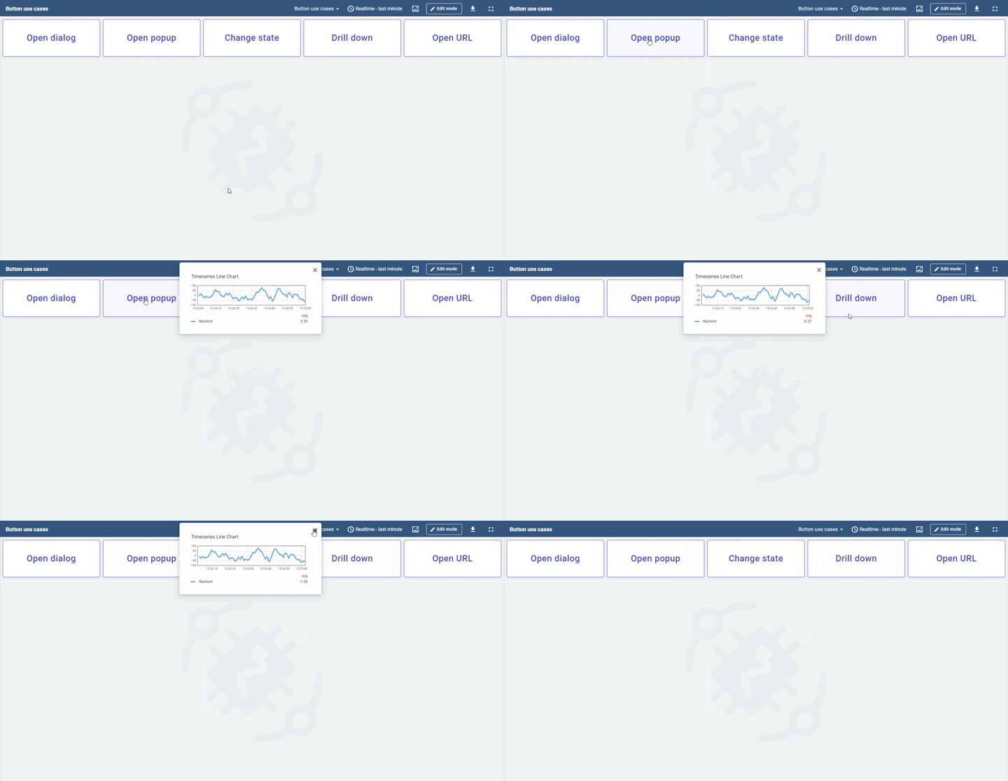
• Open dialog button uses “Navigate to new dashboard state” with the “Open in separate dialog” display option. So, the user will see the line chart opened in a modal window.
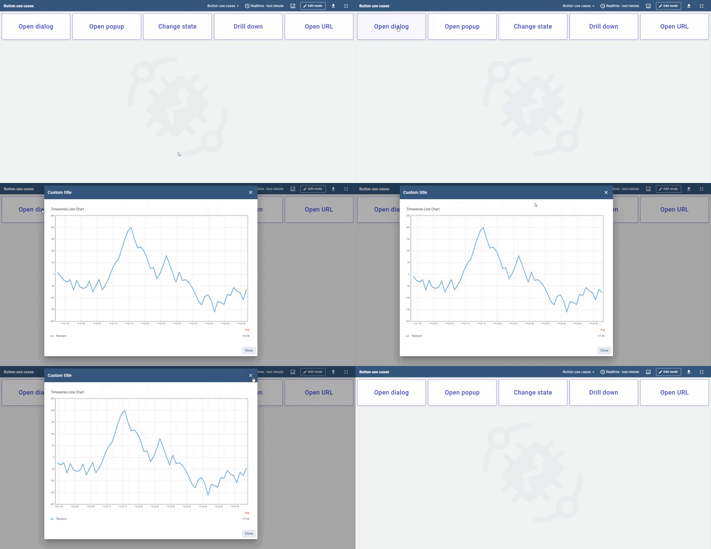
• Open popup button is similar, but the “Open in popover” display option is used. You may also explore various options for the “Preferred popover placement” option.
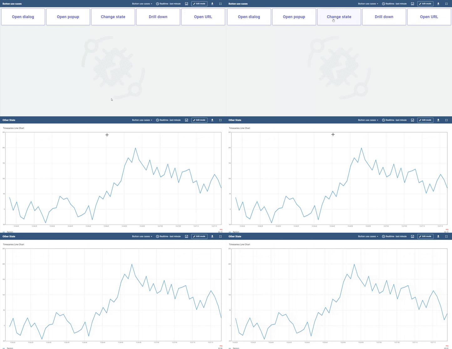
• Change state button simply update the current dashboard state to the new one.
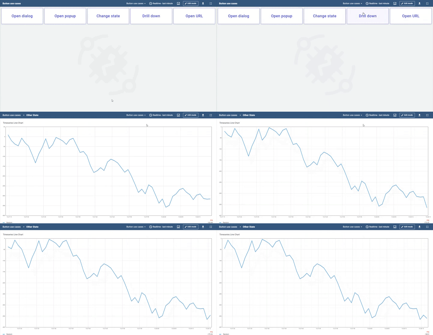
• Drill down button is similar, but instead of changing the dashboard state, it leaves the old one in the stack.
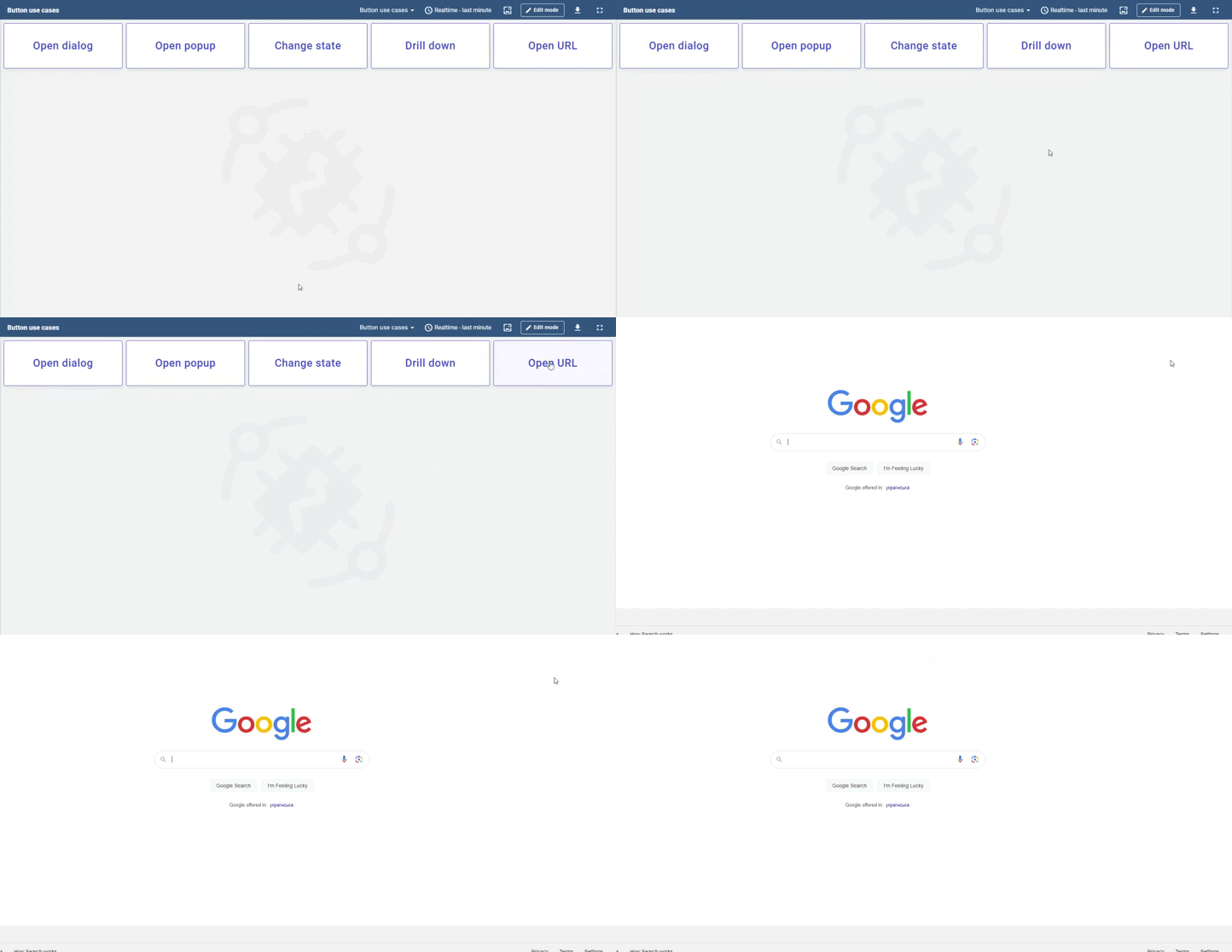
• Open URL provides the ability to open external or relative URLs in the same or separate browser tab.
Command button widget
The Command button widget is designed to perform three key actions: sending commands to devices, updating attributes, or appending time series data.
You can specify a single device to carry out your chosen action, such as receiving a command. For those familiar with the platform, there’s an option to use entity aliases for targeting. This means you’re not limited to devices; you can target assets, users, or other entities capable of supporting attribute updates or time series data additions.
Behavior settings enable the definition of the on-click action and condition when the button is disabled. More importantly, the button may dynamically become enabled or disabled based on attribute or time series subscription.
Execute RPC action allows you to send the command to the device. You may configure the command (method) name and parameters of the command. The parameter value may be configured as a constant or result of function execution. You may send the command without parameters by choosing the “None” option.
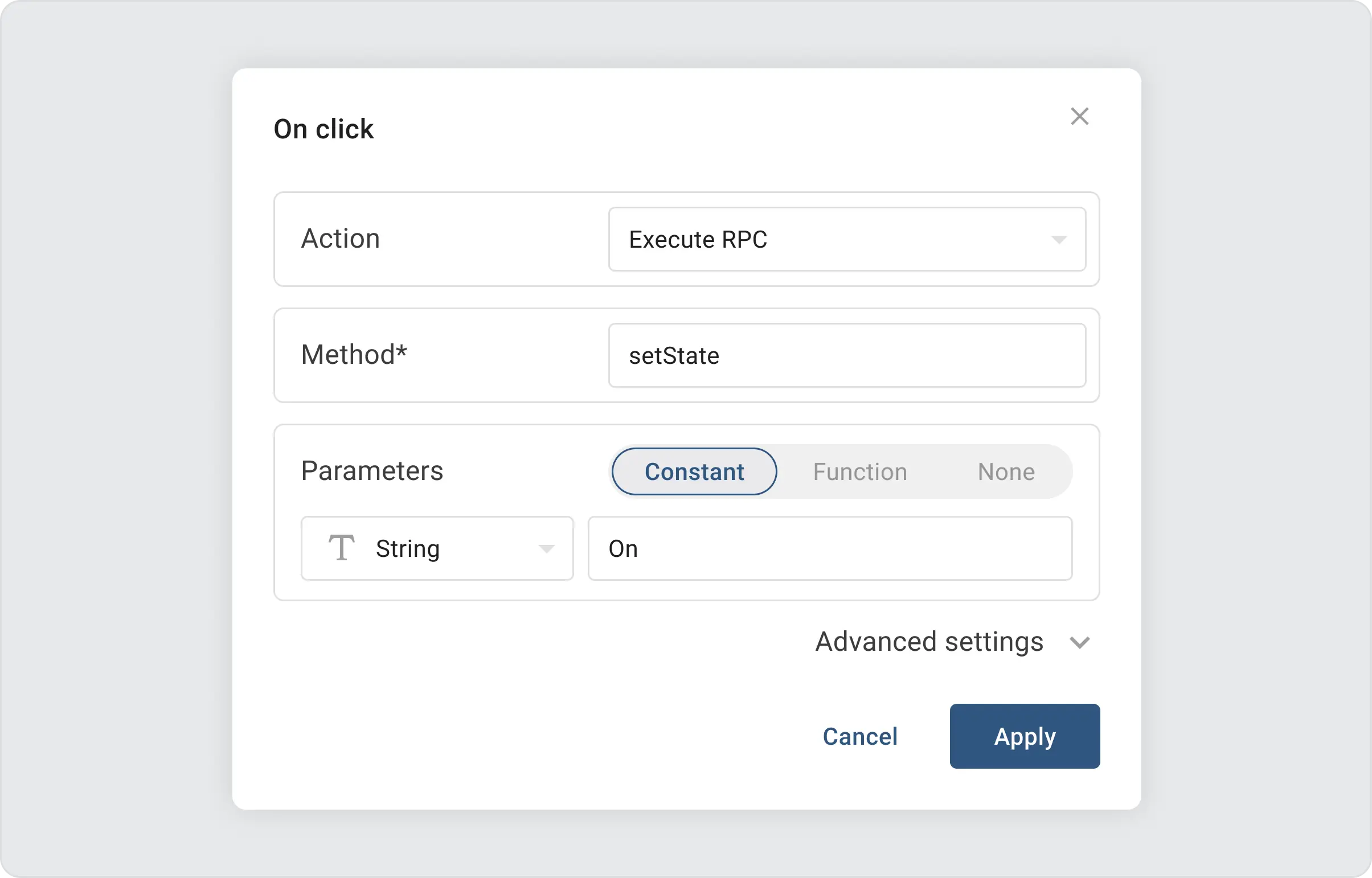
By default, we use an un-persisted command with 5 seconds timeout. You may change the command parameters in the advanced settings of the action.
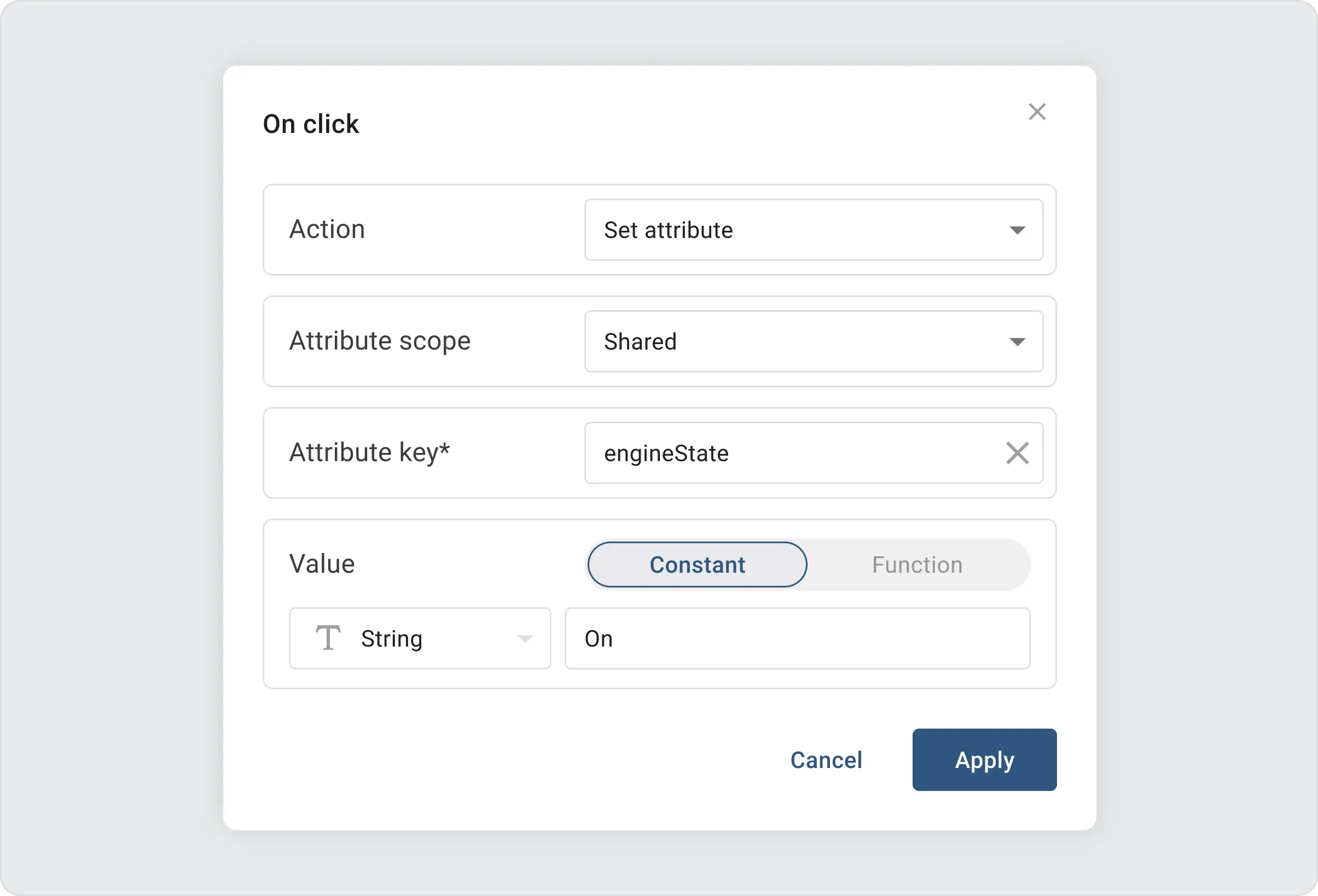
Set attribute action allows you to set or update the value of the particular entity attribute. The action configuration form allows you to configure the scope, key, and value of the attribute. The attribute value may be configured as a constant or result of function execution. Please note that only devices support “shared” attribute scope. You must choose the “server” scope for all other entities.
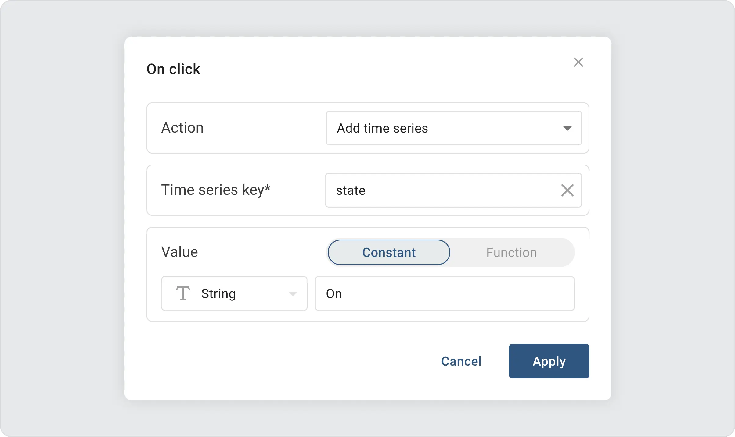
Add time series action allows you to add the new time series value for the particular entity. The action configuration form allows you to configure the time series data key and value. The value may be configured as a constant or result of function execution.
You may dynamically disable the button based on certain values of the attribute or time series key. For example, the dashboard attached below contains two buttons that switch the state of the user’s attribute “state”. When the user presses button A, it becomes disabled, and vice versa.
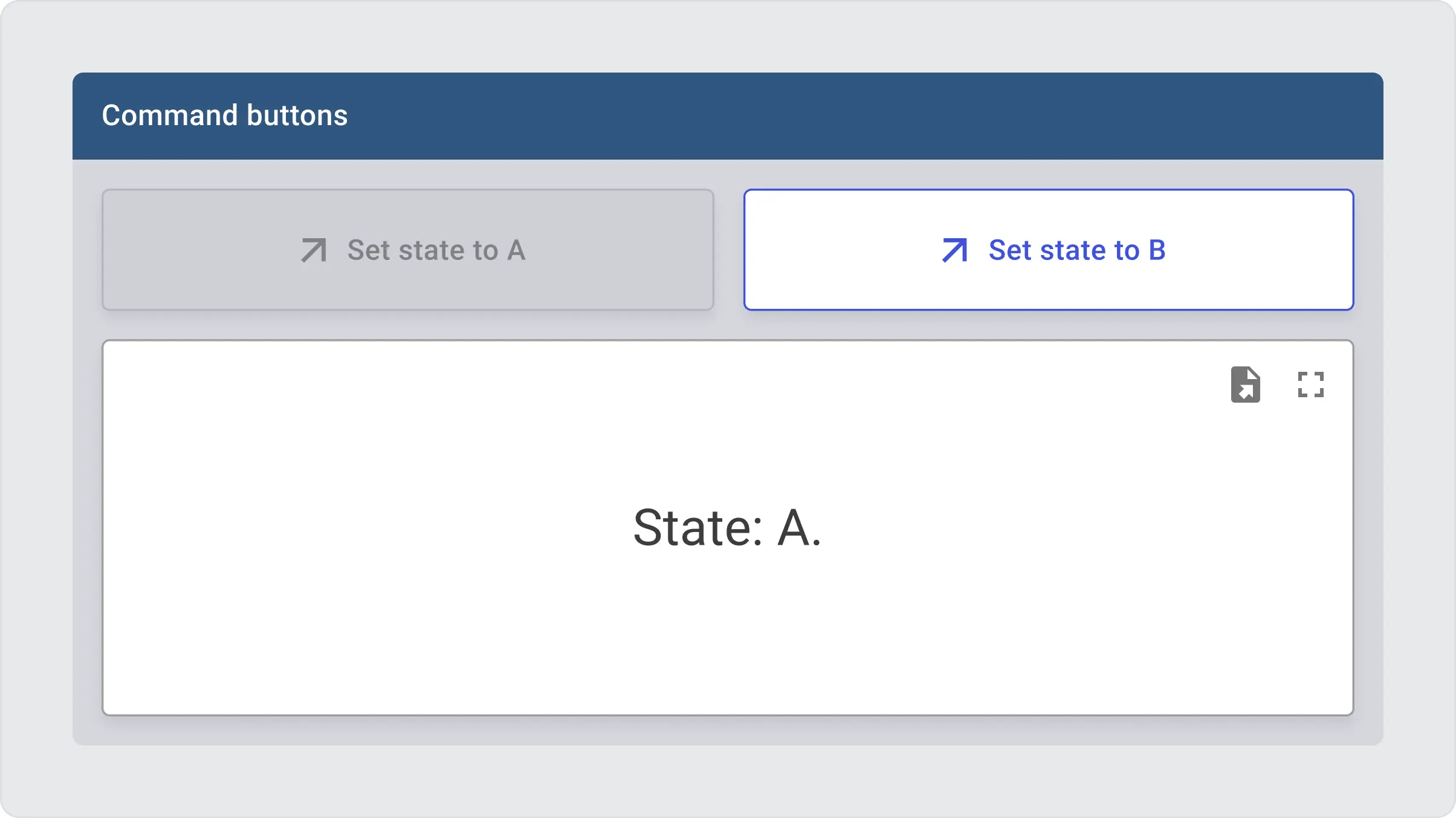
You may find the sample dashboard JSON below:
Alternatively, you may disable the button that sends the command to the device, if the device is offline. For this purpose, you may just use the value of the “active” attribute or time series key.
The appearance settings for the Command button are identical to those of the Action button. The primary applications of the Command button are straightforward, focusing on managing devices and assets. This involves either issuing commands or updating attributes to control their operation.
Toggle button widget
The Toggle button widget shares many similarities with the Command button widget, but with a crucial distinction: it features two distinct states, “checked” and “unchecked”. This design allows it to perform two specific actions, “Check” and “Uncheck”, depending on its state. Users have the flexibility to fully customize the appearance of the button for both states, enhancing its visual and functional integration into their dashboards.

The default behavior will change the state of the device using the “setState” command:
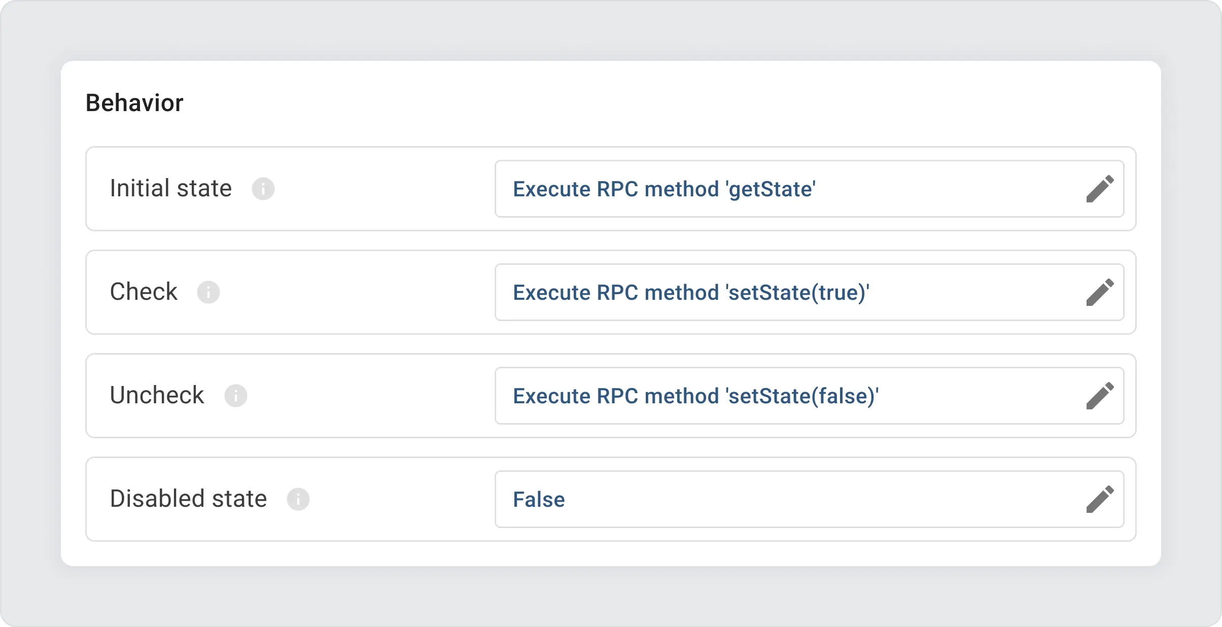
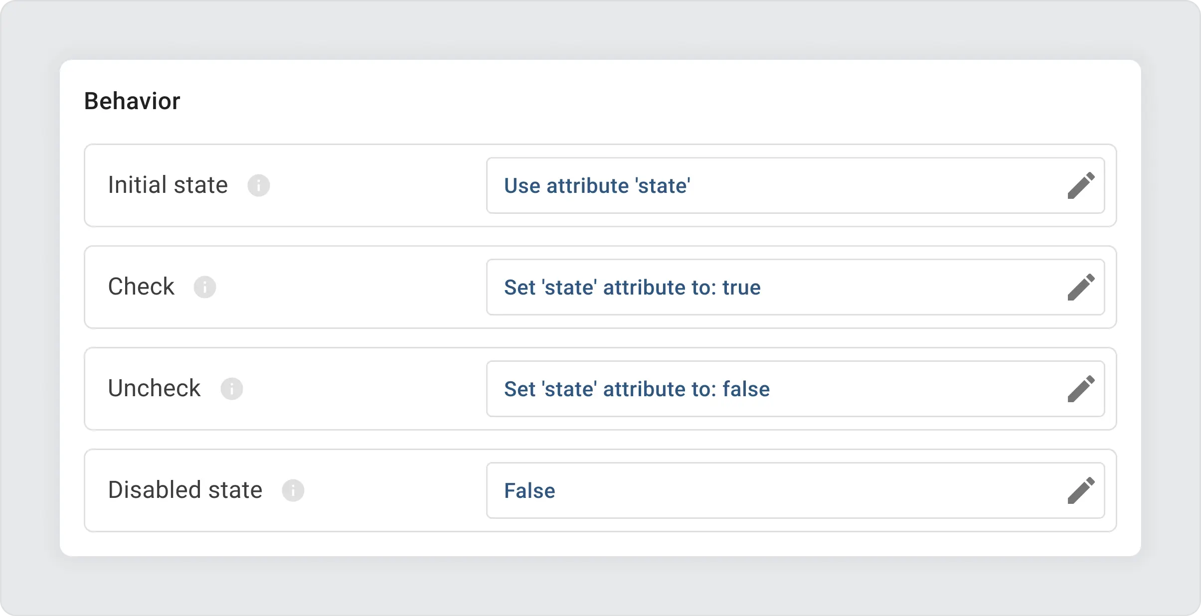
You may easily change this button to operate with the “state” attribute instead of sending commands to devices:
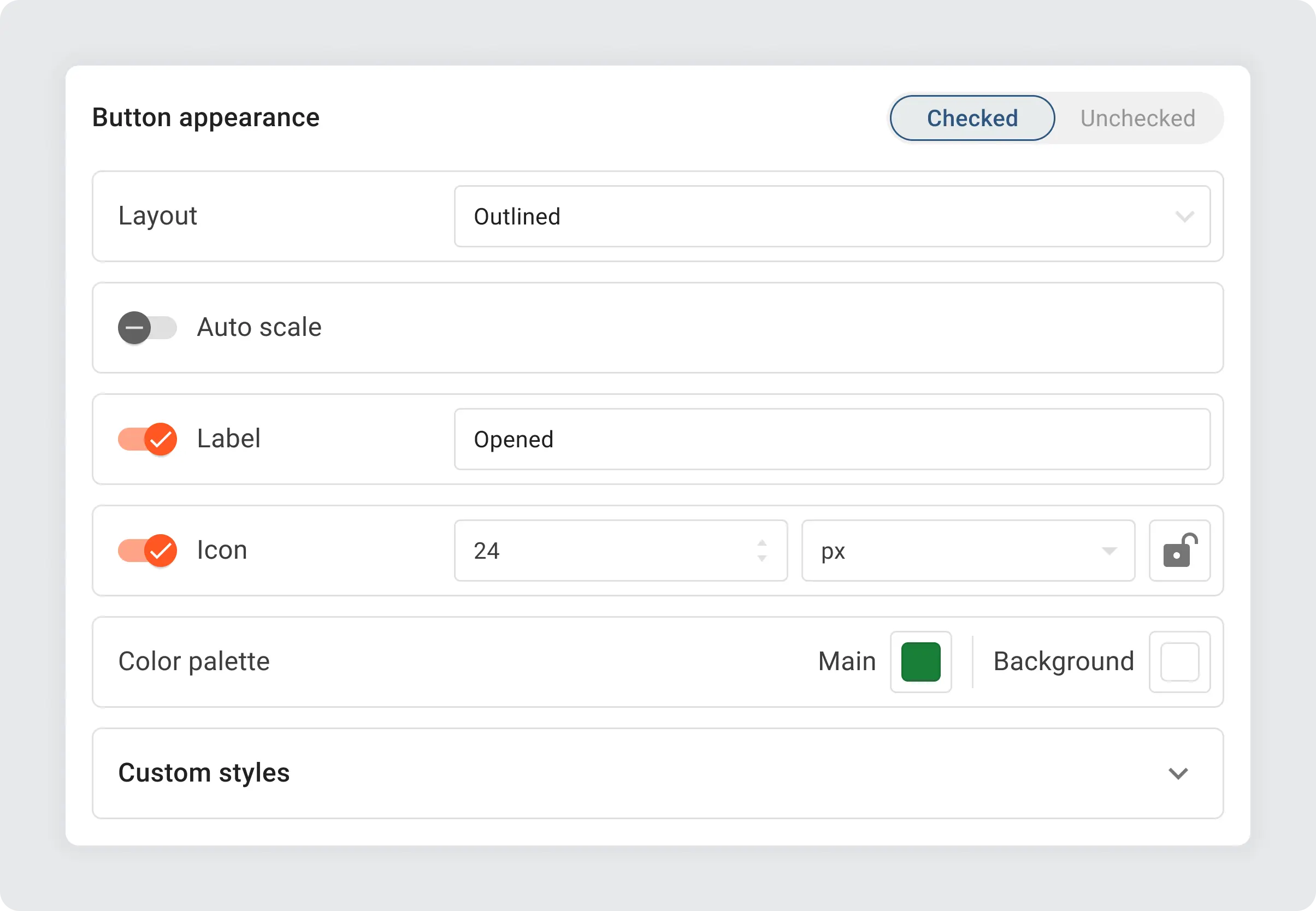
The Toggle button shares appearance settings with the Command button but allows separate configurations for its “Checked” and “Unchecked” states:
Adjusting the border radius, background colors, and other appearance settings can significantly alter the button’s style:

Power button widget
The Power button widget, similar to the Toggle button, differs in appearance and has three states: ‘On’, ‘Off’ and disabled, with six customizable layouts:
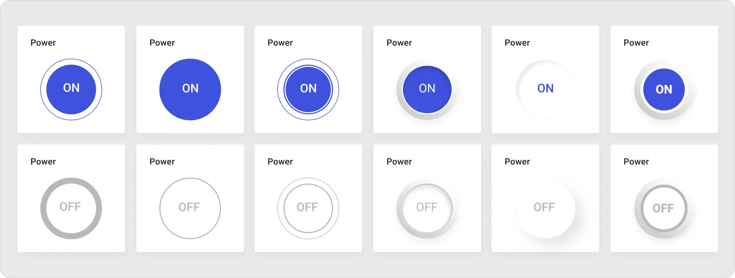
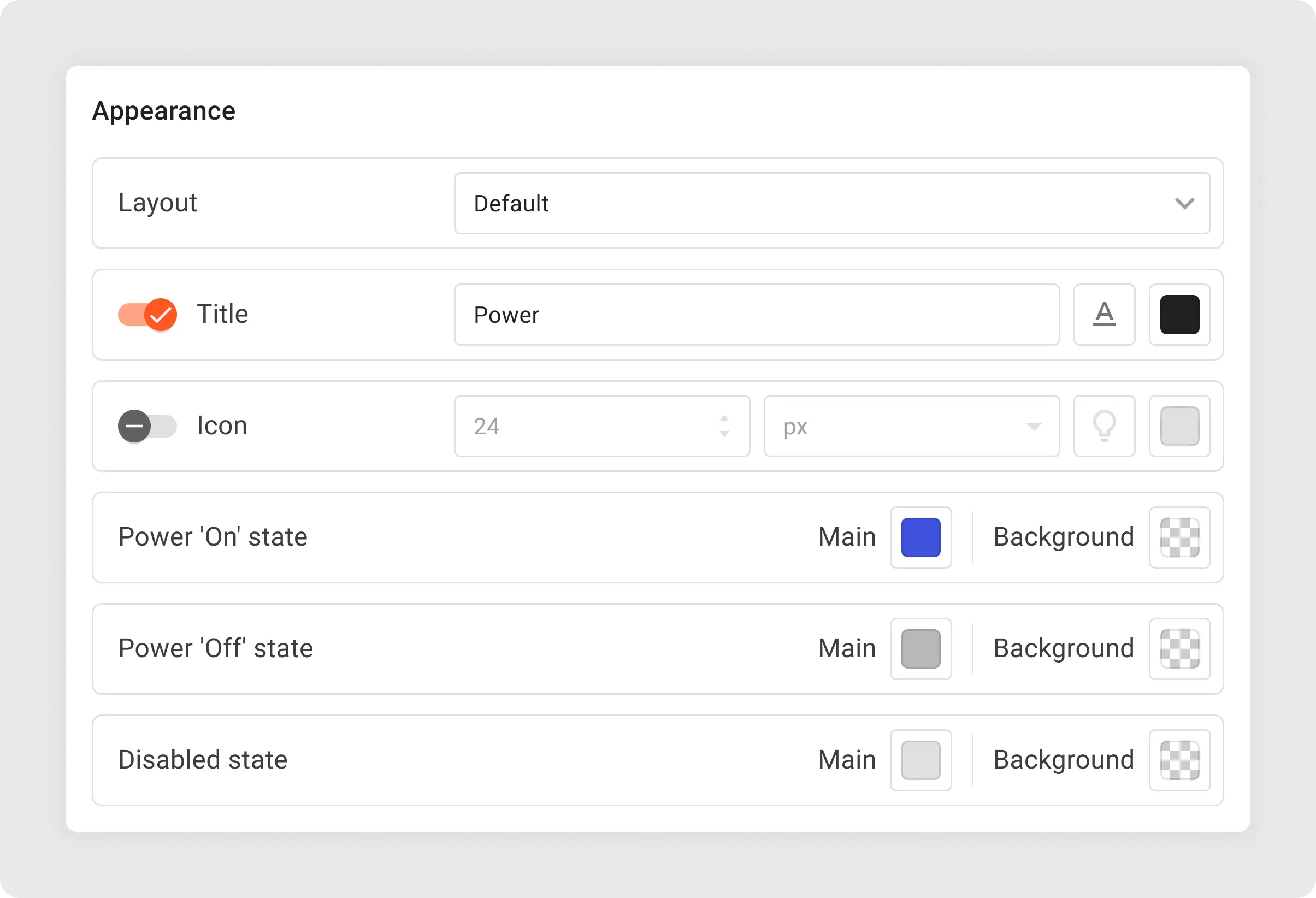
The appearance settings are simplified compared to the Command button. Basically, you are able to configure main and background colors for every state.
The Power button widget enables remote control of devices across sectors: turning smart home appliances on/off, managing industrial equipment, controlling servers, adjusting energy sources, operating irrigation systems, managing healthcare devices, retail displays, and public lighting, showcasing its versatility in simplifying power management in IoT applications.
Summary
In our overview of the newest widgets for the ThingsBoard IoT Platform—Action button, Command button, Toggle button, and Power button—we’ve highlighted how these tools enhance IoT dashboard interaction and device management. Each widget offers specific functionalities to improve the user experience, from executing commands to providing clear status indicators.
We encourage you to explore these widgets’ capabilities within your projects. If you have ideas for improvements or additional features, we welcome you to submit feature requests on GitHub. For any other feedback, please leave your comments below. Your feedback is essential for us to keep improving and growing the platform.
