White-labeling
White labeling lets you tailor your ThingsBoard instance to match your brand — set your company name, upload your logo, choose color palettes, and customize the UI — all without writing code or restarting the service. You can also configure a custom menu and custom translations.

Playing this video loads it from YouTube (Google), which sets cookies on its own domain. See our Cookie Policy.
Video: https://www.youtube.com/watch?v=jSXuHj3lbG0
Inheritance Model
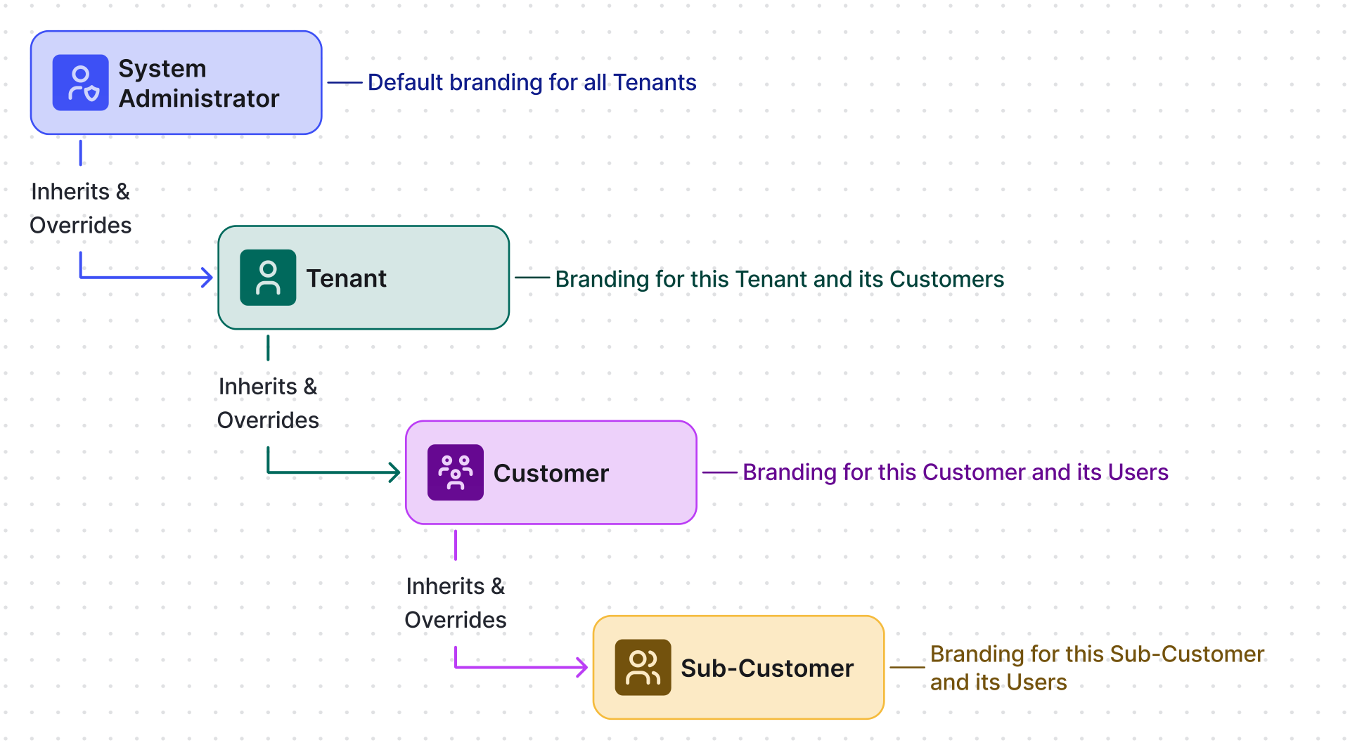
Section titled “Inheritance Model”White labeling settings follow a three-level inheritance chain. Each level inherits from the one above and can override settings within its scope.
General settings
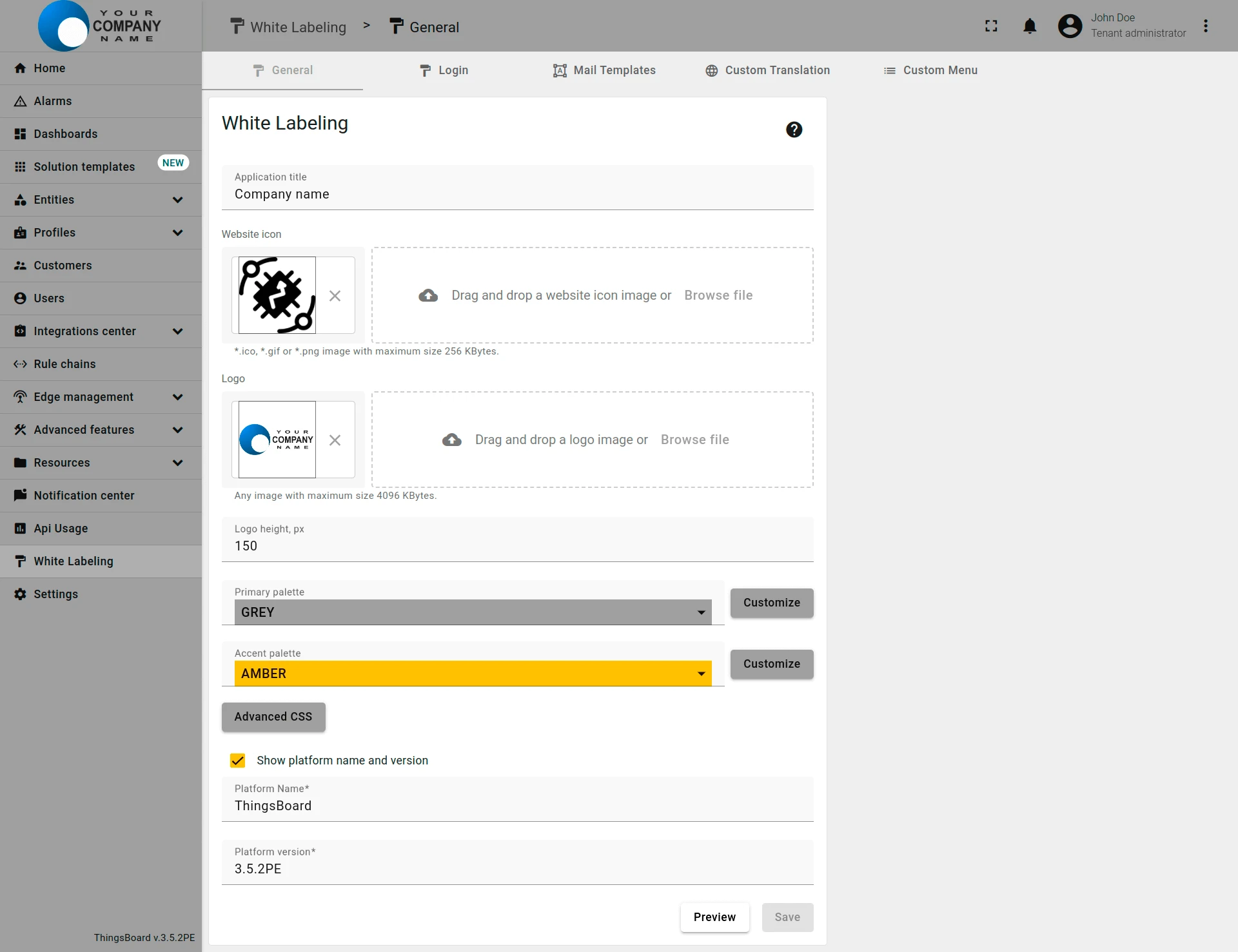
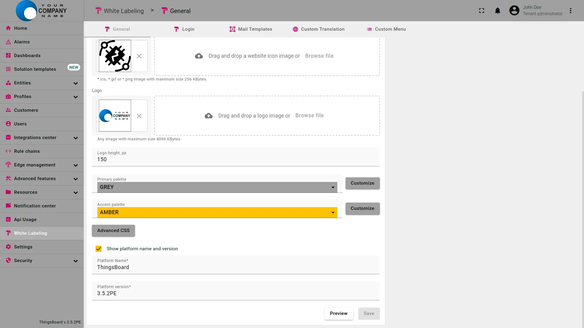
Section titled “General settings”Navigate to the White labeling ⇾ General to configure your company or product logo and color scheme.
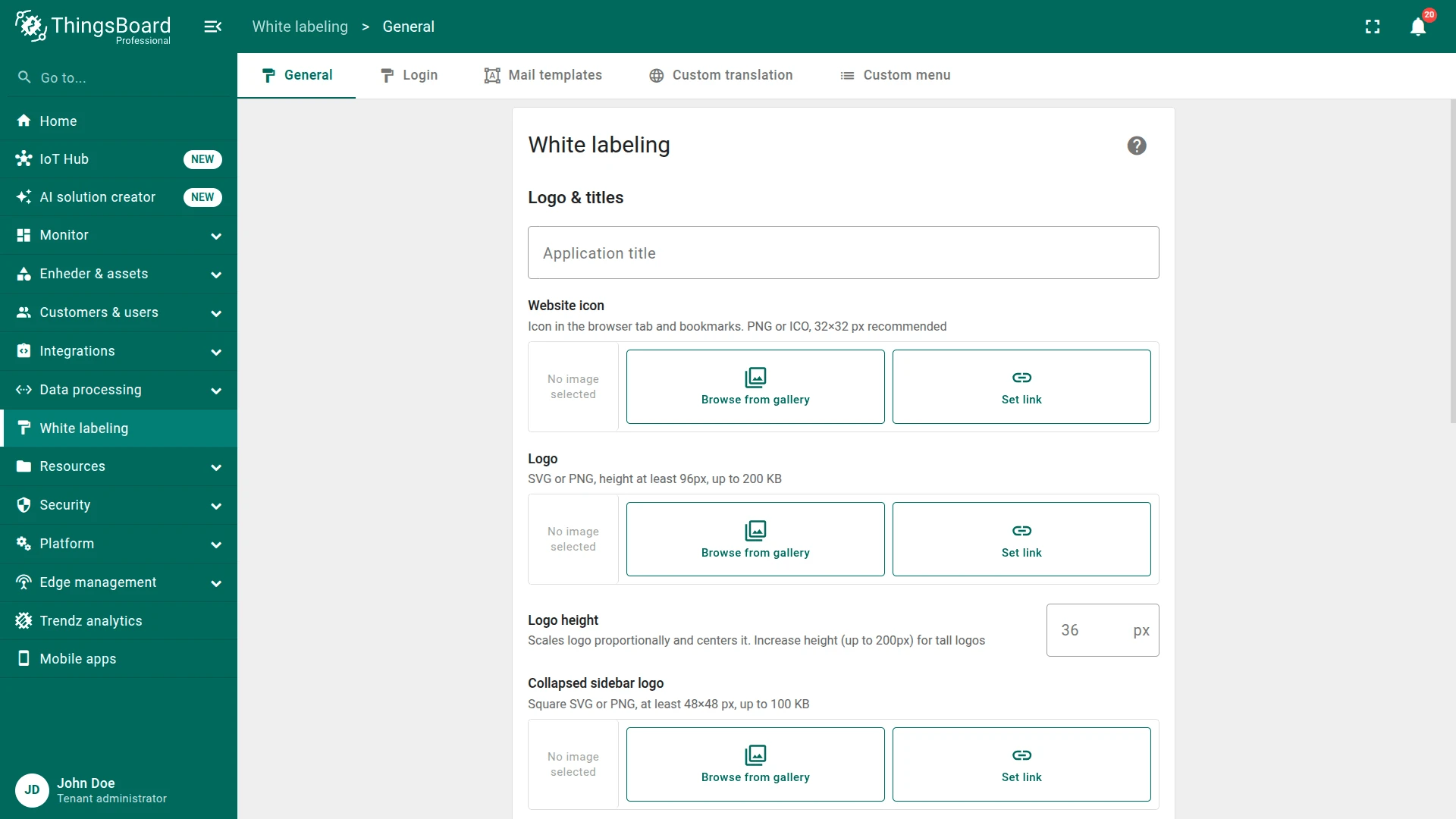
The General tab provides the following settings:
| Setting | Description |
|---|---|
| Application title | Custom page title displayed in the browser tab |
| Favicon | Website icon shown in the browser tab and bookmarks |
| Logo | Image displayed in the upper-left corner of the UI |
| Logo height | Resize the logo to fit your design |
| Primary palette | Background and font colors — pick a predefined option or customize |
| Accent palette | Color for interactive elements like toggles and buttons |
| Advanced CSS | Custom CSS to style any UI element (see below) |
| Override Trendz analytics Add-on name | Rename the analytics add-on from “Trendz” to “Advanced analytics” across the platform |
| Show platform name and version | Display the platform name and version in the lower-left corner |
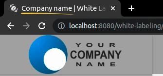
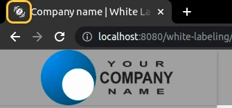


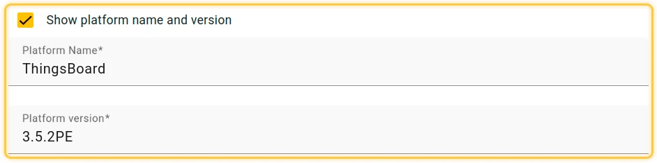
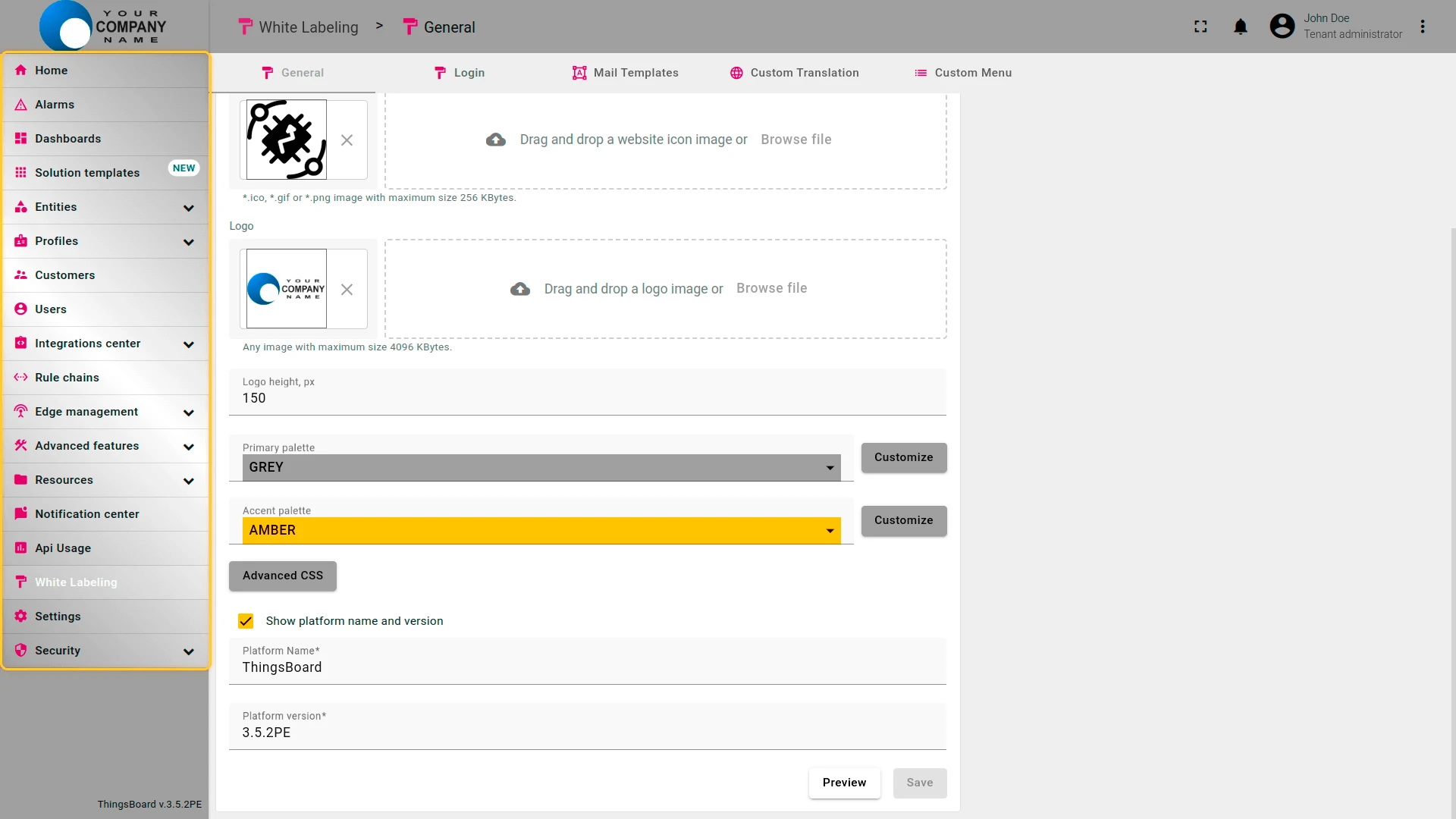
The final look of the customized user interface:
Advanced CSS
Section titled “Advanced CSS”Using CSS, you can style any element of the ThingsBoard UI — background, icons, fonts, scrollbars, sidebar, and more.
- Navigate to the White labeling page and open the General tab.
- Scroll down to the Advanced CSS field and enter your custom CSS rules.
- Click Save to apply your changes.
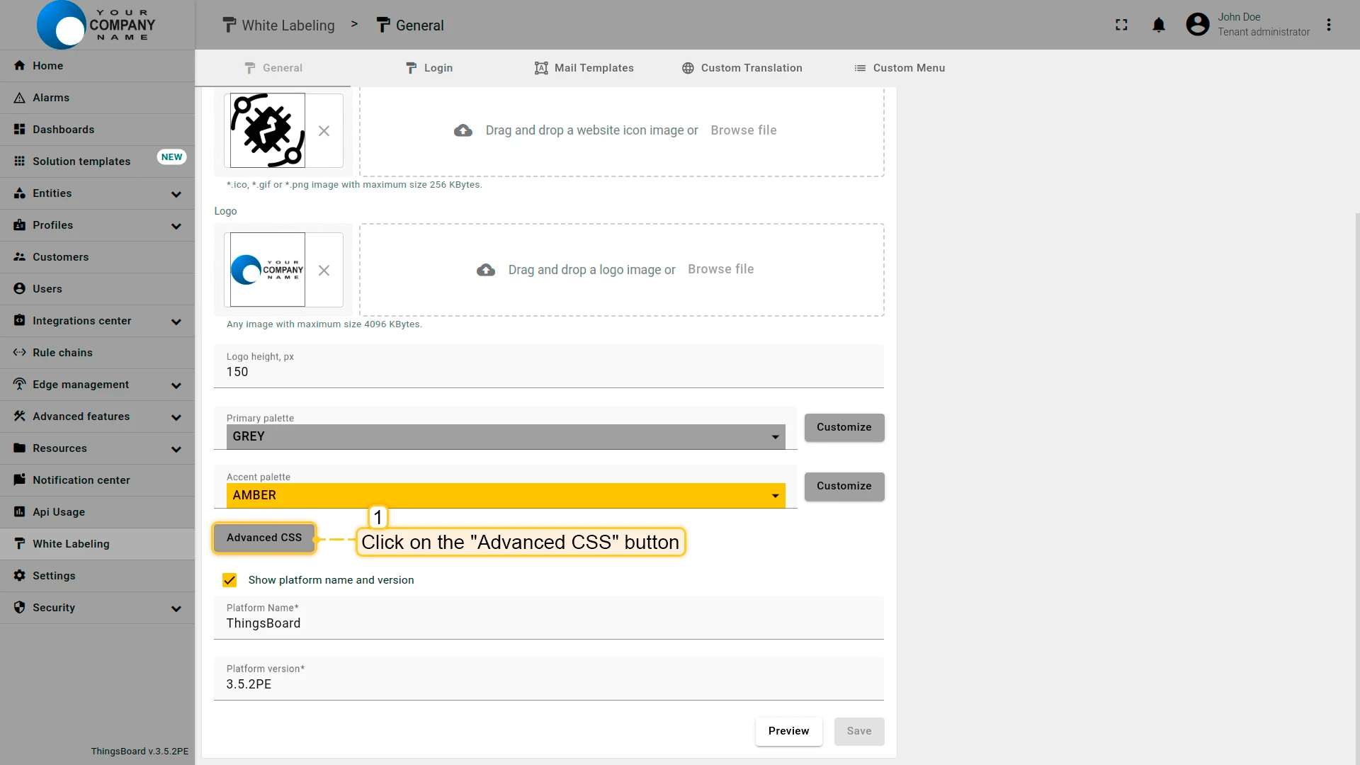
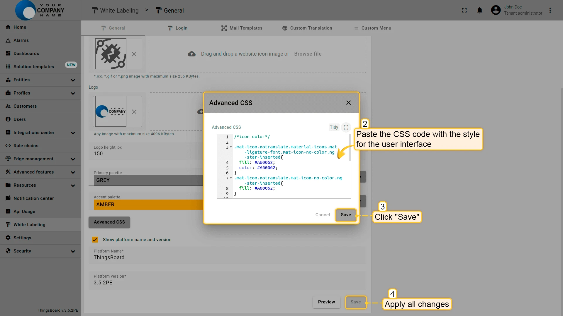
Example — customize icon and scrollbar colors:
/*icon color*/.mat-icon.notranslate.material-icons.mat-ligature-font.mat-icon-no-color.ng-star-inserted{    fill: #a60062;    color: #a60062;}.mat-icon.notranslate.mat-icon-no-color.ng-star-inserted{    fill: #a60062;}
/*scroll color*/mat-toolbar::-webkit-scrollbar-thumb,div::-webkit-scrollbar-thumb,ng-component::-webkit-scrollbar-thumb {    background-color: #c526a5 !important;    background-image: linear-gradient(#e72c83, #a742c6);    border-radius: 200px/300px !important;    border: 0.1rem linear-gradient(#e72c83, #a742c6);}
.mat-mdc-button.mat-mdc-button-base.tb-active{    color: #ffffff;}
Example — add a gradient to the sidebar menu:
/*menu gradient*/.tb-side-menu { background: linear-gradient(44deg, #9d9d9d, #ffffff, #9f9f9f);}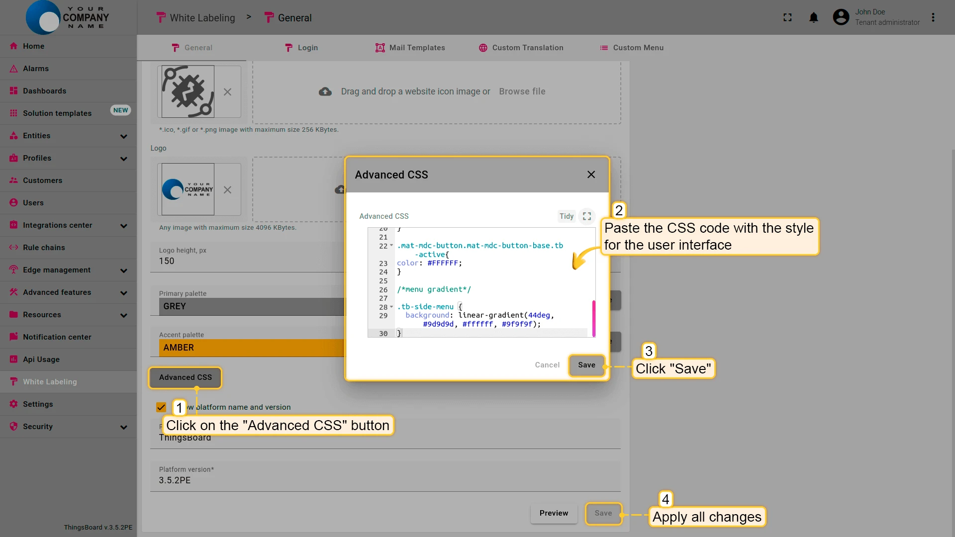
Was this helpful?