Dark Mode for a Dashboard

On this page
In recent years, dark mode has evolved from being a just trend to an essential feature for apps, websites, and operating systems. With its sleek, modern aesthetic and ability to reduce eye strain, dark mode offers users both style and comfort, especially in low-light environments.
In this article, we’ll explore the dark mode implementation in ThingsBoard using one of our Use Case Solution. Understanding key concepts, you can follow along to enhance the user experience yourself.
Explore the demo
Currently, the TB platform does not offer a built-in dark mode by default (though this may change in the future!). However, you can enhance the look of your dashboard by customizing it with a dark mode theme.
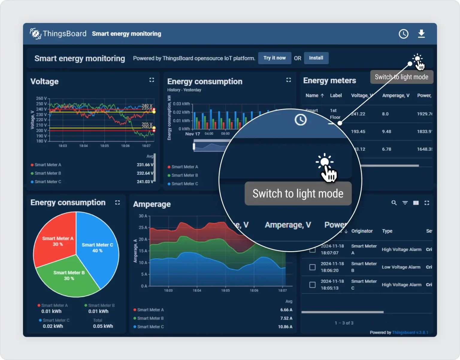
To see an example in action, check out our “Smart Energy” use case on the website. Simply click the “Try Demo” button to explore the dashboard. In the top-right corner, the “sun” icon can be found, which allows to toggle between light and dark modes effortlessly.
Custom action: The switch button for dark mode
One key element in the dashboard’s dark mode implementation is the switch button that toggles between light and dark modes. To enable a dynamic dark mode feature in the dashboard, the switch toggle the .dark class on the dashboard element using a custom action on any Card widget.
The switch works through a simple line of code in a custom action that toggles a CSS class:
$('.tb-dashboard-page').toggleClass('dark');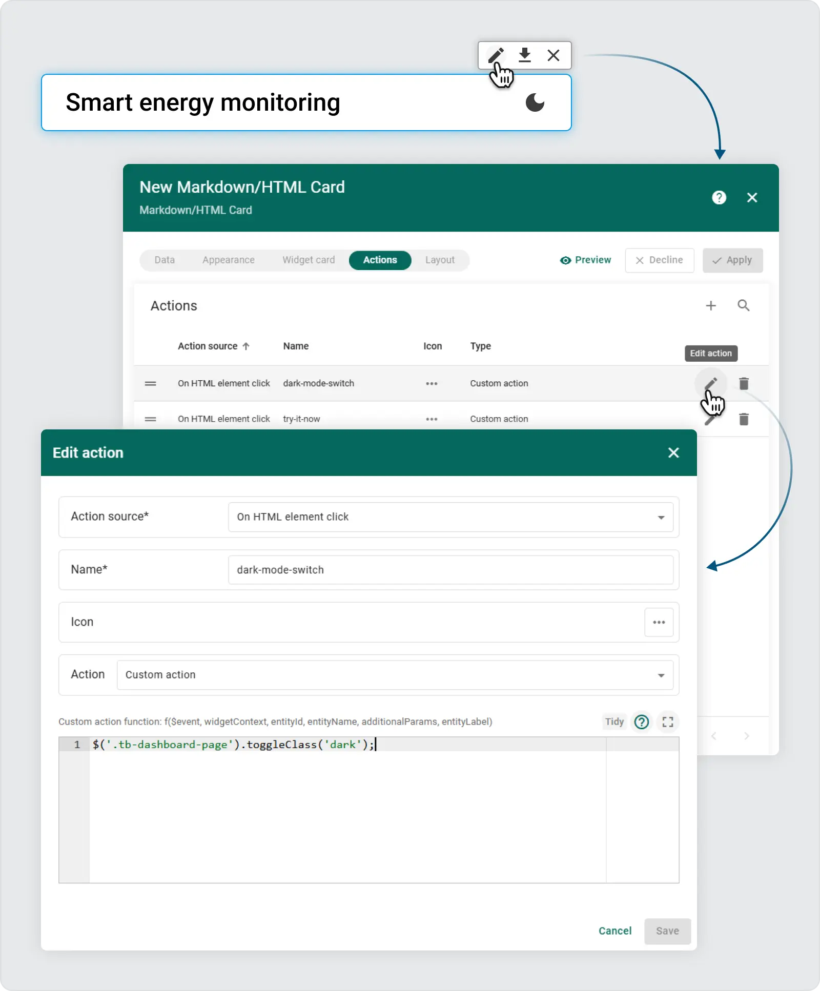
Once this class is added, the dashboard automatically applies the predefined CSS rules you’ve configured for dark mode. This approach gives the flexibility to write advanced CSS rules that only apply when the .dark class is present.
Using advanced CSS in dashboard settings
To fully customize the appearance of the dashboard in dark mode, there is no need to define styles for individual widgets, all configurations can be centrally managed through the Dashboard Advanced Settings section. This makes the process more efficient and easier to maintain. Additionally, browser developer tools allow to inspect component classes, helping to identify which elements should be styled for the dark mode inversion.
Steps:
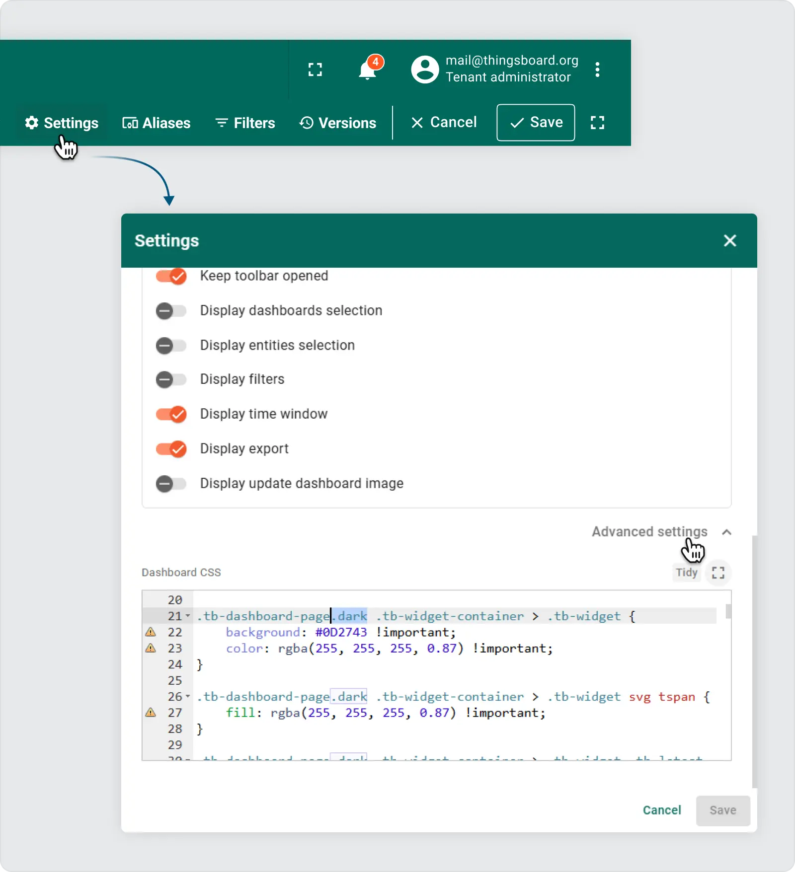
- Open Advanced Settings: Expand the panel with Advanced settings to access the CSS editor.
- Apply Dark Mode Styles: In this section, custom styles are written for when the dashboard has the
.darkclass applied. Example:
.tb-widget-container > .tb-widget {    border-radius: 8px;}
gridster-item:not(.tb-noselect) > .tb-widget-container > .tb-widget {    cursor: default !important;}
.tb-widget-container > .tb-widget .tb-table-widget .mat-mdc-row {    cursor: pointer;}
.tb-widget-container > .tb-widget .tb-legend-keys {    cursor: pointer;}
.tb-dashboard-page.dark tb-dashboard > div {    background-color: #0A1F36 !important; /* rgb(238, 238, 238)*/}
.tb-dashboard-page.dark .tb-widget-container > .tb-widget {    background: #0D2743 !important;    color: rgba(255, 255, 255, 0.87) !important;}
.tb-dashboard-page.dark .tb-widget-container > .tb-widget svg tspan {    fill: rgba(255, 255, 255, 0.87) !important;}
.tb-dashboard-page.dark .tb-widget-container > .tb-widget .tb-latest-chart-legend-item-label div {    color: rgba(255, 255, 255, 0.38) !important;}
.tb-dashboard-page.dark .tb-widget-container > .tb-widget .tb-latest-chart-legend-item-value {    color: rgba(255, 255, 255, 0.87) !important;}
.tb-dashboard-page.dark .tb-widget-container > .tb-widget .tb-latest-chart-shape svg text {    fill: rgba(255, 255, 255, 0.87) !important;}
.tb-dashboard-page.dark .tb-widget-container > .tb-widget .tb-time-series-chart-legend-type-label {    color: rgba(255, 255, 255, 0.57) !important;}
.tb-dashboard-page.dark .tb-widget-container > .tb-widget .tb-time-series-chart-legend-item-label div {    color: rgba(255, 255, 255, 0.57) !important;}
.tb-dashboard-page.dark .tb-widget-container > .tb-widget .tb-time-series-chart-legend-value {    color: rgba(255, 255, 255, 0.87) !important;}
.tb-dashboard-page.dark .tb-widget-container > .tb-widget .flot-text {    color: rgba(255, 255, 255, 0.87) !important;}
.tb-dashboard-page.dark .tb-widget-container > .tb-widget .flot-text > div > div {    color: rgba(255, 255, 255, 0.87) !important;}
.tb-dashboard-page.dark .tb-widget-container > .tb-widget .tb-table-widget .mat-mdc-table .mat-mdc-header-row {    background-color: #0D2743 !important;}
.tb-dashboard-page.dark .tb-widget-container > .tb-widget .tb-table-widget .mat-mdc-table .mat-mdc-header-cell.mat-mdc-table-sticky {    background-color: #0D2743 !important;}
.tb-dashboard-page.dark .tb-widget-container > .tb-widget .tb-table-widget .mat-mdc-table .mat-mdc-row .mat-mdc-cell.mat-mdc-table-sticky {    background-color: #0D2743 !important;}
.tb-dashboard-page.dark .tb-widget-container > .tb-widget .tb-table-widget .mat-mdc-table .mat-mdc-header-cell {    color: rgba(255, 255, 255, 0.87) !important;    border-bottom-color: rgba(255, 255, 255, 0.2) !important;}
.tb-dashboard-page.dark .tb-widget-container > .tb-widget .tb-table-widget .mat-mdc-table .mat-mdc-cell {    color: rgba(255, 255, 255, 0.87) !important;    border-bottom-color: rgba(255, 255, 255, 0.2) !important;}
.tb-dashboard-page.dark .tb-widget-container > .tb-widget .tb-table-widget .mat-mdc-table .mat-mdc-header-cell .mat-sort-header-arrow {    color: rgba(255, 255, 255, 0.57) !important;}
.tb-dashboard-page.dark .tb-widget-container > .tb-widget .tb-table-widget .mat-divider {    border-top-color: rgba(255, 255, 255, 0.2) !important;}
.tb-dashboard-page.dark .tb-widget-container > .tb-widget .tb-table-widget .mat-mdc-input-element::placeholder {    color: rgba(255, 255, 255, 0.57) !important;}
.tb-dashboard-page.dark .tb-widget-container > .tb-widget .tb-table-widget .mat-mdc-input-element::-moz-placeholder {    color: rgba(255, 255, 255, 0.57) !important;}
.tb-dashboard-page.dark .tb-widget-container > .tb-widget .tb-table-widget .mat-mdc-input-element::-webkit-input-placeholder {    color: rgba(255, 255, 255, 0.57) !important;}
.tb-dashboard-page.dark .tb-widget-container > .tb-widget .tb-table-widget .mat-mdc-input-element:-ms-input-placeholder {    color: rgba(255, 255, 255, 0.57) !important;}
.tb-dashboard-page.dark .tb-widget-container > .tb-widget .tb-table-widget .mat-mdc-table .mat-mdc-cell .mdc-checkbox__background,.tb-dashboard-page.dark .tb-widget-container > .tb-widget .tb-table-widget .mat-mdc-table .mat-mdc-header-cell .mdc-checkbox__background {    border-color : rgba(255, 255, 255, 0.57) !important;}
.tb-dashboard-page.dark .tb-widget-container > .tb-widget .tb-table-widget .mat-mdc-table .mat-mdc-cell button.mat-mdc-icon-button mat-icon {    color : rgba(255, 255, 255, 0.57) !important;}
.tb-dashboard-page.dark .tb-widget-container > .tb-widget .tb-table-widget mat-toolbar.mat-mdc-table-toolbar:not([color="primary"]) button.mat-mdc-icon-button mat-icon {    color : rgba(255, 255, 255, 0.57) !important;}
.tb-dashboard-page.dark .tb-widget-container > .tb-widget .tb-table-widget .mat-mdc-table .mat-mdc-cell button.mat-mdc-icon-button[disabled][disabled] mat-icon {    color : rgba(255, 255, 255, 0.2) !important;}
.tb-dashboard-page.dark .tb-widget-container > .tb-widget .tb-table-widget .mat-mdc-paginator {    color: rgba(255, 255, 255, 0.57) !important;}
.tb-dashboard-page.dark .tb-widget-container > .tb-widget .tb-table-widget .mat-mdc-paginator button.mat-mdc-icon-button {    color : rgba(255, 255, 255, 0.57) !important;}
.tb-dashboard-page.dark .tb-widget-container > .tb-widget .tb-table-widget .mat-mdc-paginator button.mat-mdc-icon-button[disabled][disabled] {    color : rgba(255, 255, 255, 0.2) !important;}
.tb-dashboard-page.dark .tb-widget-container > .tb-widget .tb-table-widget .mat-mdc-paginator .mat-mdc-select-value {    color : rgba(255, 255, 255, 0.57) !important;}
.tb-dashboard-page.dark .tb-widget-container > .tb-widget .mat-mdc-select-arrow {    color : rgba(255, 255, 255, 0.57);}
.tb-dashboard-page.dark .tb-widget-container > .tb-widget .mdc-text-field--filled:not(.mdc-text-field--disabled) .mdc-line-ripple:before {    border-bottom-color: rgba(255, 255, 255, 0.4);}
.tb-dashboard-page.dark .tb-widget-container > .tb-widget .mdc-text-field--outlined:not(.mdc-text-field--disabled) .mdc-notched-outline__leading,.tb-dashboard-page.dark .tb-widget-container > .tb-widget .mdc-text-field--outlined:not(.mdc-text-field--disabled) .mdc-notched-outline__notch,.tb-dashboard-page.dark .tb-widget-container > .tb-widget .mdc-text-field--outlined:not(.mdc-text-field--disabled) .mdc-notched-outline__trailing {    border-color: rgba(255, 255, 255, 0.4);}
.tb-dashboard-page.dark .tb-markdown-view div,.tb-dashboard-page.dark .tb-markdown-view div.param,.tb-dashboard-page.dark .tb-markdown-view .header .title,.tb-dashboard-page.dark .tb-markdown-view p {    color : rgba(255, 255, 255, 0.87);}
.tb-dashboard-page.dark .tb-markdown-view div.param-title,.tb-dashboard-page.dark .tb-markdown-view .header .subtitle {    color : rgba(255, 255, 255, 0.6);}
.tb-dashboard-page.dark .tb-powered-by-footer {    color : rgba(255, 255, 255, 0.87) !important;}
After the .dark class is applied to the .tb-dashboard-page , the widgets’ background becomes dark, and the text is lightened, providing better contrast for dark mode.
Customizing dark mode to fit your brand
The power of this method is in its flexibility. You can customize the color scheme to fit your brand’s identity. In the CSS panel, modify colors and backgrounds to create a cohesive dark theme that aligns with your brand guidelines.
Try it on your instance:
- Download JSON: Download the JSON file from the Demo dashboard.
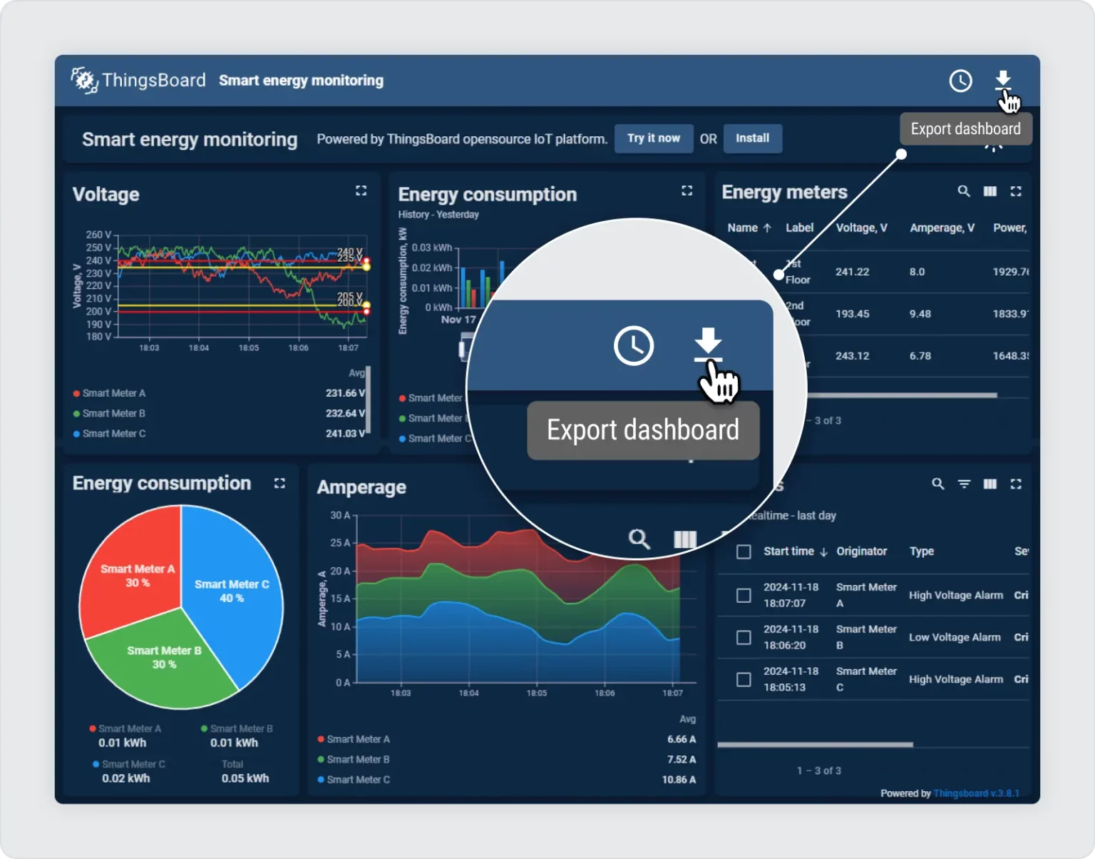
- Import the Dashboard: Import this JSON file as a dashboard into your ThingsBoard instance.
- Edit Mode: Enter Edit mode to customize and inspect settings.
- Check Custom Action for Switch Button: Observe the toggle functionality to enable dark mode.
- Dashboard Settings -> Advanced CSS: Here, you can view the CSS settings to enhance the dark mode experience.
Improving user experience with dark mode
Implementing dark mode is not just a design trend but also a way to improve user comfort and accessibility. By following this feature, you’ve not only added dark mode to your dashboard but also provided your users with a more flexible and comfortable interface. Be sure to experiment with the CSS settings to find the perfect look for your dark theme!