- Before We Begin
- Adding entities and establishing relationships between them
- Adding dashboard
- OpenStreet Map widget
- Adding Buildings list widget
- Customize the appearance of the dashboard
- Final view of the dashboard for this lesson
- Next step
Imagine you have several buildings, each containing multiple office spaces equipped with devices that monitor water and electricity usage, CO2 levels, temperature, and humidity. This lesson is the first in a series of step-by-step tutorials to help you create a multifunctional dashboard for visualizing and monitoring data from your premises-integrated devices.
By completing this series, you will be able to:
- Display your buildings on a map widget;
- Show a list of office spaces with detailed information about each one of them;
- Show a list of devices in a selected office and visualize their layout on the room plan;
- Develop dedicated panels for each device, showcasing both real-time and historical data;
- Share your dashboard with clients.
For simplicity, we'll concentrate on a single office in Building A, equipped with smart devices to monitor everything from energy consumption to environmental conditions.
Let's begin with the basics: add new entities, establish relationships between them, and display our buildings in the OpenStreet Map and Entities table widgets. After completing the first guide, you will have a dashboard that looks like this:

Before We Begin
To start building, you’ll just need a ThingsBoard Cloud account. You can create an account in seconds—no credit card required, and it’s free forever.
Adding entities and establishing relationships between them
Before we add and configure the dashboard, we need to add some entities, specifically assets and devices. Assets will represent our buildings and offices, while devices will represent our sensors.
Adding assets
Assets are abstract IoT entities that may be related to other assets and devices.
For this tutorial, we will create two assets to represent buildings: Building A and Building B, and two more assets to represent office spaces: Office A and Office B. Let's get started.
- Login to your ThingsBoard instance as Tenant Administrator;
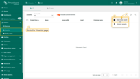
- Go to the “Assets” page of the “Entities” section on the sidebar. By default, you'll be redirected to the “All” device group. We'll begin by adding new assets to this group;
- Click the “plus” icon located in the top-right corner of the table. Select “Add new asset” from the drop-down menu to start adding your first asset;
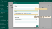
- In the asset name field, type “Building A”. Type “building” in the “Asset profile” section and click on “Create a new one!” to establish a new profile for this asset;
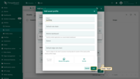
- Click the “Add” button to confirm the asset profile creation;
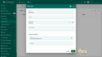
- Now click “Add” to finalize adding the asset.
Congratulations! You have added your first asset.
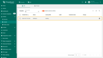
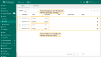
Similarly, add the asset “Building B”. Also, add the assets “Office A” and “Office B” with the asset type “office”.
Adding devices
Devices are basic IoT objects that collect data from their environment and transmit it to the ThingsBoard platform, as well as respond to Remote Procedure Call (RPC) commands.
You can add devices manually, just like assets. However, ThingsBoard has the capability for bulk provisioning of devices (and assets) using CSV files. This is very useful when you need to add multiple entities at once.
For this tutorial, we need to add four devices: Indoor Air Quality Sensor, Energy Meter, Water Flow Meter, and IAQ Sensor. Later, we will simulate sending telemetry from these devices to ThingsBoard using emulators. So, let's start:
- Create a CSV file or download a pre-made one, where each row corresponds to the creation of a single device with specified parameters:
| Name | Type | Label |
|---|---|---|
| SD-001 | air-sensor | Indoor Air Quality Sensor |
| EM-002 | energy-sensor | Energy Meter |
| WM-003 | water-sensor | Water Flow Meter |
| AM-307 | air-sensor | IAQ Sensor |
Your CSV file should look like this:
1
2
3
4
5
name,type,label
SD-001,air-sensor,Indoor Air Quality Sensor
EM-002,energy-sensor,Energy Meter
WM-003,water-sensor,Water Flow Meter
AM-307,air-sensor,IAQ Sensor
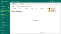
- Navigate to the “Devices” page of the “Entities” section on the sidebar. By default, you’ll be redirected to the “All” device group;
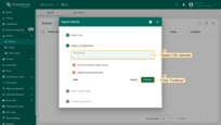
- Click the “plus” icon located in the top-right corner of the table. Select “Import device” from the drop-down menu;
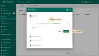
- Drag the CSV file into the import window and click “Continue”;
- Select CSV delimiter and click “Continue”;
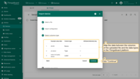
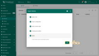
- Map the data between the columns of the uploaded file and the data types in the ThingsBoard platform. Click “Continue” and then click “OK”.
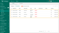
Four new devices should be successfully created: “SD-001” (Indoor Air Quality Sensor), “EM-002” (Energy Meter), “WM-003” (Water Flow Meter), and “AM-307” (IAQ Sensor).
Adding relations between entities
Relations are directed connections between one entity and one or more others. To ensure that our Office A and Office B are linked only to Building A, we will set up relations between them. Follow these steps:
- Return to the “Assets” page and click on the “Building A” to open the details window. Navigate to the “Relations” tab, ensure the direction is “From”, and click the “plus” icon to add new relation;
- Select the type “Assets”, then specify “Office A” and “Office B” in the list of entities. Click “Add”.
Now your Office A and Office B are linked only to Building A.
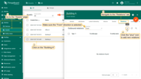
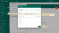
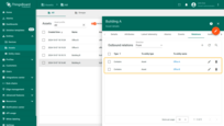
Now let's establish relations between the devices “SD-001” (Indoor Air Quality Sensor), “EM-002” (Energy Meter), “WM-003” (Water Flow Meter) and Office A:
- Click on “Office A” and navigate to the “Relations” tab. Ensure the direction is “From” and click the “plus” icon;
- Select the type “Device” and specify “SD-001”, “EM-002”, and “WM-003” in the list of entities. Click “Add”.
Now the specified devices are “related” to “Office A” asset.
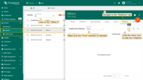
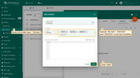

Similarly, establish relation between the “AM-307” (IAQ Sensor) device and “Office B” asset.
Adding dashboard
The dashboard is more than just a space for displaying your data in a convenient format. Creating a structured and visually appealing dashboard is essential for efficiently monitoring and managing your assets and devices efficiently.
Add a dashboard to start visualizing assets and devices on it. For this dashboard, we will create a separate group:
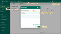
- Go to the “Dashboards” page and navigate to the “Groups” tab. Click the “plus” icon to create a new dashboard group. Name it “Buildings” and click “Add”;
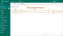
- Open the created dashboard group;
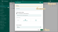
- Click the “plus” icon in the upper-right corner of the screen to add new dashboard;
- Enter the title for the dashboard - “Buildings” and click “Add”;
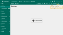
- Save the dashboard by clicking the “Save” button in the upper-right corner of the screen.
Your first dashboard has been successfully added. It will open automatically after adding. Save the dashboard by clicking the “Save” button in the upper right corner of the page.
OpenStreet Map widget
Now we move on to the most interesting part — adding your first widget – OpenStreet Map, which will display our two assets on the map: Building A and Building B. To display the buildings on the map, we need to set their coordinates - latitude and longitude as the attributes.
Additionally, we will configure the widget to display general information about the building, including its address, email, phone number, and image when the building marker is clicked. This information will also be added as attributes.
So, let's start with the preparatory work - adding building images and attributes.
Upload building images
Building images need to be uploaded to the Image gallery, which serves as a centralized repository for storing and managing images. They will be used in the tooltip of the map widget. You can use the Building A and Building B images from this guide or upload your own images.
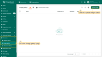
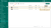
- Go to the "Image gallery" page in the "Resources" section. To upload a new image, click the "Upload image" button in the top-right corner of the screen;
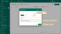
- Select an image for Building A or simply drag it to the "Upload image" window and click "Upload" button;
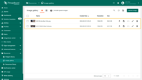
- The image for Building A has been uploaded. Similarly, upload the image for Building B.
Now you need to obtain and save the links to these images for further use it in the buildings' attributes:
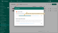
- After uploading, click the "Embed image" icon next to each building's image;
- Note down the unique links provided for these images. These will be used later in the buildings' attributes.
Adding the necessary attributes
Now let's move on to adding the necessary attributes:
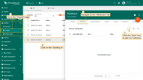
- Go to the "Assets" page and click on the "Building A" to open its details window. Navigate to the "Attributes" tab and click the "plus" icon to add new attribute;
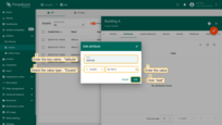
- We'll start with the coordinates for Building A: enter "latitude" as the key name, select "Double" as the value type, and input the latitude coordinates. Click "Add";
- Click the "plus" icon again to add another attribute. Enter "longitude" as the key name, select the "Double" as the value type, and input the building's longitude coordinates. Click "Add";

Coordinates of the buildings used in this example:
| Building | latitude | longitude |
|---|---|---|
| Building A | 40.75912 | -73.97600 |
| Building B | 40.75901 | -73.96997 |
Similarly, add the following attributes: “address”, “email”, “phone”, “contactPerson” and “buildingImage” with values from the table below. Use the value type “String” for these attributes.
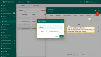
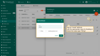


Buildings’ information used in this example:
| Building | Address | Phone | Contact person | Building image | |
|---|---|---|---|---|---|
| Building A | 645 5th Ave, New York | [email protected] | +121 244 55 66 | Thomas Johnson | Use the link to the Building A image |
| Building B | 641 Lexington Ave, New York | [email protected] | +121 555 66 77 | Jack Williams | Use the link to the Building B image |
Finally, your attributes list for Building A should look like this:
The attributes list for Building B should look like this:
Adding OpenStreet Map widget
All preparatory settings are done, and now we can add OpenStreet Map widget:
- Open the “Buildings” dashboard that you have created;
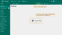
- Click the “Add widget” button at the top of the screen or click the large “Add new widget” icon in the center of the screen (if this is your first widget on this dashboard);
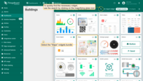
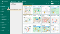
- Find the “OpenStreet Map” widget in the “Maps” widgets bundle and click on it;
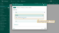
- Now we need to add an alias to define the entities from which the data will be extracted. In the “Alias” field, enter a name for it - “Buildings”, and click “Create a new one”;
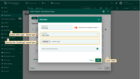
- Enter the name of the alias and select a filter type - “Asset type”. Then specify the “building” asset type and click the “Add” button in the lower right corner. This alias will display all assets of the “building” type in the widget;
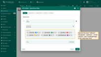
- Now, add the following attributes as data keys: “latitude”, “longitude”, “address”, “email”, “phone”, and “buildingImage”.
The “Appearance” tab:
- Navigate to the “Appearance” tab. Change OpenStreet map provider to “CartoDB.Positron”;
-
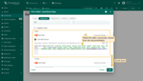
Scroll to the “Label” section. The label is located above the marker and can display specific information about the entity, such as its name, type, telemetry data, etc.
Add the label to the appropriate field by taking it from the documentation. This will display the building's name and customize the appearance of the tooltip;
The label used in the example:
1
<div style="position: relative; white-space: nowrap; text-align: center; font-size: 12px; top: -5px;"><span style="border-radius: 10px; background-color: #fff; padding-left: 12px; padding-right: 12px; padding-top: 4px; padding-bottom: 4px;">${entityName}</span></div>
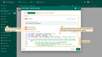
- A little further down, find the “Tooltip” section. Here we will configure the data that will be displayed in the tooltip when clicking on the building marker.
- Turn on the “Use tooltip function” option;
- Use the function provided in the documentation to display the selected building’s image and its contact details.
The tooltip function used in the example:
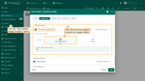
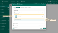
- In the “Marker image” section, turn off the “Use marker image function” option, and add a custom marker image. Click “Browse from gallery” and upload new image marker. Use provided custom marker image or upload your own marker image. Set the marker image size to 60 pixels;
The “Widget card” tab:
- Navigate to the “Widget card” tab. Turn off the “Display widget title” option;
- Set padding value to 0;
- Open “Advanced widget style” section. Copy the CSS from the documentation and paste it into the “Widget CSS” section. This CSS defines the styling for the tooltip;
1
2
3
4
5
6
7
8
9
10
11
12
13
.leaflet-popup-content {
  width: auto !important;
  margin: 8px;
}
a.leaflet-popup-close-button {
  font-size: 20px;
  color: black;
  backdrop-filter: blur(5px);
  background: rgba(255, 255, 255, 0.35);
  border-radius: 2px;
  top: 17px;
  right: 17px;
}
- Turn off the “Enable data export” option;
- Click “Add” to confirm adding the widget.
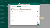
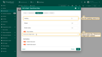
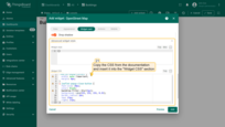
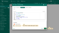
Congratulations, we have added your first widget, that displays our two buildings. Move the widget to the top-right corner of the dashboard and resize it by grabbing any corner and dragging it. After adjusting the placement and size of the widget, click the “Save” button in the top-right corner to save the dashboard.
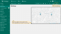
Now click on any building image to display a tooltip with information about it.
Adding Buildings list widget
We have already created a widget that displays our two buildings on a map. Now let's create another widget - Entities table, which will display our buildings in a list.
- Switch to dashboard editing mode by clicking the "Edit mode" button on the toolbar on the right;
- Click the "Add widget" button at the top of the screen;
- Find the "Tables" widget bundle and click on it;
- Select the "Entities table" widget;
- In the "Datasources" section, switch to the "Entity alias" option and specify the previously created alias "Buildings" as the data source. Furthermore, add the "address" key in the "Columns" section;
- Change the card title to "Buildings list", uncheck all buttons of the "Show card buttons" section, and click "Add";
- Resize the "Entities table" widget to your liking. Afterwards, save the dashboard.
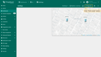
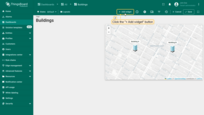
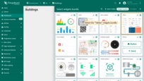
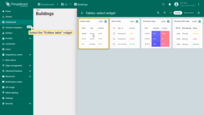
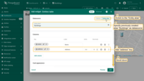
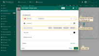
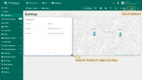
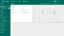
Our dashboard now features two widgets. The first widget displays the location of our buildings on a map, and the second lists the buildings and their addresses.
Customize the appearance of the dashboard
Let's make our dashboard more appealing by customizing its appearance. We will set a custom background for the “Buildings” state and apply custom CSS styles to the widgets.
Setting a custom background image
Transform the look of your dashboard by adding a custom background image for the “Buildings” state. This visual enhancement not only makes the interface more engaging but also aligns it with your branding or aesthetic preferences. You can use the image from this tutorial or your own.
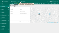
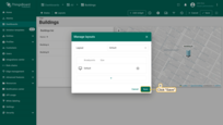
- To customize the layout of the dashboard, enter it edit mode and click the "Manage layouts" button located in the upper-left corner of the dashboard toolbar;
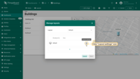
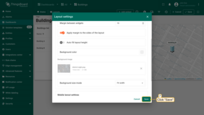
- A window for layout management will appear. Here, locate and click on the "gear" icon, labeled "Layout settings". This action opens the layout settings window;
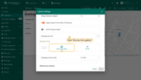
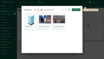
- Scroll to the "Background image" section within the settings. Click "Browse from gallery" to open the image selection interface;
- If your desired image is not already uploaded, click the "Upload image" button found in the top-right corner of the Image gallery window;
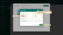
- You can either drag and drop an image into the designated field or select an image to upload from a folder on your computer. Once selected, an image preview will display, allowing you to ensure it's the correct choice before proceeding. Confirm the upload by clicking the "Upload" button. Your new image will now be a part of the Image gallery;
- Save your new layout settings to apply the background image to the "Buildings" state of your dashboard;
- Confirm all changes by clicking the "Save" button located in the lower-right corner of the settings window;
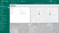
- Ensure that the background of your dashboard has been updated.
Customizing Widgets Appearance with CSS
We will also make changes to the appearance of all future widgets on the dashboard using CSS. We will round their corners and add a side shadow.
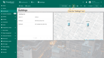
- Click the “Settings” button on the dashboard toolbar;
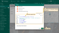
- Scroll down to the “Advanced settings” section. This area allows you to modify in-depth settings that affect the entire dashboard;
- In the “Dashboard CSS” section, input the following CSS code to style all widgets:
1
2
3
4
5
6
7
8
9
10
11
12
13
.tb-widget-container > .tb-widget {
    border-radius: 8px;
    box-shadow: 0px 4px 10px rgba(23, 33, 90, 0.5);
}
.tb-dashboard-page .tb-widget-container > .tb-widget .leaflet-popup a.tb-custom-action {
    font-family: 'Roboto';
    font-weight: 500;
    font-size: 14px;
    line-height: 20px;
    letter-spacing: 0.25px;
    border-bottom: none;
    color: #00695C;
}
This CSS snippet applies styles to elements with the .tb-widget class that are direct children of the .tb-widget-container.
It specifies border-radius: 8px, which gives the element soft rounded corners, and box-shadow: 0px 4px 10px rgba(23, 33, 90, 0.5), which creates a semi-transparent shadow with a subtle blur, offset by 4 pixels downward, adding visual depth, and specifies opacity: 0.9 to make the element slightly transparent, allowing for some background visibility while maintaining the content's visibility.
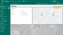
- After entering the CSS code, click the “Save” button to apply the changes;
- Save the dashboard by clicking the “Save” button in the upper-right corner of the page.
As you can see, the widget corners are now rounded, and the background is slightly transparent.
Final view of the dashboard for this lesson
As a result your dashboard should look like this:
Next step
Congratulations on completing the first chapter of our guide! You've successfully crafted a dashboard that not only lists your buildings but also vividly displays their locations on a map widget. This achievement lays a solid foundation for more advanced functionalities that we will explore in the next chapters.
In the second part of our guide, we will continue developing our dashboard. When you are ready to proceed, simply click the button below.
Lesson 2. Dashboard states, widget actions, and analogue and digital gauges


