- Simulation of the devices’ telemetry data
- Displaying devices telemetry in Office sensors list widget
- Time window
- Adding state for each device & navigation between states
- Configuring air_sensor state
- Configuring energy_sensor state
- Configuring water_sensor state
- Final view of the dashboard for this lesson
- Next step
This lesson is the third installment in our series on setting up a dashboard to visualize and monitor data from devices integrated into your premises. In the first two parts, we explored assets and devices, added a dashboard, created states for buildings and offices, and implemented navigation between them. Before we proceed, we strongly recommend reviewing the previous lessons if you have not done so already.
Lesson 2: Dashboard states, widget actions, and Image Map widget
In this part, we will add separate states for each device, simulate telemetry data for the devices, and display them on card widgets.


Simulation of the devices’ telemetry data
Since we are using virtual devices, they do not send telemetry data to the ThingsBoard. However, we can simulate the transmission of such data in real time. To do this, we will use Rule Engine.
We will add a new Rule Chain with four generator nodes that will periodically generate simple messages with random telemetry readings, unique to each of our devices. Then, we will save this telemetry in the database using the save time series node. Let's get started.
First, create the new rule chain:
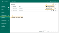
- Go to the “Rule chains” page and click “plus” icon, then select the “Create new rule chain” from drop-down menu;
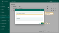
- Name it “Device Telemetry Emulators”, and click “Add”;
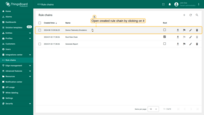
- Open created rule chain by clicking on it.
Now, let's add the necessary nodes:
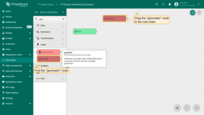
- Find the generator node and drag it to the rule chain. With its help, we will generate telemetry values for further visualization on the dashboard. Name it “Indoor air quality data emulator”, and set the number of messages to send to 100 and the sending period to 600;
- Specify the device “SD-001” (Indoor Air Quality Sensor) as originator;
- Copy the following script from the documentation:
1
2
3
4
5
6
7
var temperature = toFixed(Math.random()*10 + 18, 2);
var humidity = toFixed(Math.random()*15 + 40, 2);
var co2 = toFixed(Math.random()*70 + 440, 2);
var msg = { temperature: temperature, humidity: humidity, co2: co2 };
var metadata = { data: 40 };
var msgType = "POST_TELEMETRY_REQUEST";
return { msg: msg, metadata: metadata, msgType: msgType };
- Paste the copied script into the generator function section to simulate temperature, humidity, and CO2 telemetry data;
- Click “Add”.
We added a “generator” node that will send telemetry to ThingsBoard on behalf of the “Indoor Air Quality Sensor” device every 10 minutes (600 seconds). There will be 100 such messages.
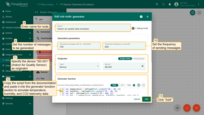
Similarly, add data emulator for “Energy Meter” device:
- Name it “Power consumption data emulator”;
- Set the number of messages to send to 100 and the sending period to 600;
- Specify the device “EM-002” (Energy Meter) as originator;
- Use the following script to simulate power consumption telemetry data:
1
2
3
4
5
var powerConsumption = toFixed(Math.random() * 2.2, 2);
var msg = { powerConsumption: powerConsumption};
var metadata = { data: 40 };
var msgType = "POST_TELEMETRY_REQUEST";
return { msg: msg, metadata: metadata, msgType: msgType };
- Click “Add.
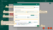
Add data emulator for “Water Flow Meter” device.
- Name it “Water consumption data emulator”;
- Set the number of messages to send to 100 and the sending period to 600;
- Specify the device “WM-003” (Water Flow Meter) as originator;
- Use the following script to simulate water consumption telemetry data, and battery voltage data:
1
2
3
4
5
6
var waterConsumption = toFixed(Math.random()*1.3, 2);
var batteryLevel = toFixed(Math.random()*1 + 45, 2);
var msg = { waterConsumption: waterConsumption, batteryLevel: batteryLevel };
var metadata = { data: 40 };
var msgType = "POST_TELEMETRY_REQUEST";
return { msg: msg, metadata: metadata, msgType: msgType };
- Click “Add.
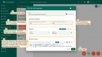
Finally, add data emulator for “IAQ Sensor” device. Name it “IAQ data emulator”. Set the number of messages to send to 100 and the sending period to 600.
- Name it “Water consumption data emulator”;
- Set the number of messages to send to 100 and the sending period to 600;
- Specify the device “AM-307” (IAQ Sensor) as originator;
- Use the following script to simulate water consumption, and battery voltage telemetry data:
1
2
3
4
5
6
7
var temperature = toFixed(Math.random()*10 + 18, 2);
var humidity = toFixed(Math.random()*15 + 40, 2);
var co2 = toFixed(Math.random()*70 + 440, 2);
var msg = { temperature: temperature, humidity: humidity, co2: co2 };
var metadata = { data: 40 };
var msgType = "POST_TELEMETRY_REQUEST";
return { msg: msg, metadata: metadata, msgType: msgType };
- Click “Add.

Four generator nodes have been added. Now, we need to route incoming messages from these nodes to the “save time series” node to save time-series data in the database.
- Find the “save time series” node and drag it to the rule chain;
- Name it “save time series”, and click “Add”.
We have added all the necessary nodes.
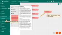
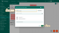
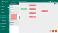
Now, we need to connect the generator nodes to the “save time series” node for message routing:
- Tap on the right grey circle of "generator" node and drag this circle to the left side of "save timeseries" node. Select the "Success" link and click "Add";
- Repeat this for each generator node. Afterwards, save rule chain.
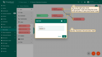
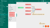
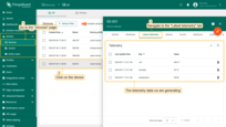
After waiting for the period specified in the generator nodes, you will be able to see the telemetry on the “Latest telemetry” tab of your devices.
Displaying devices telemetry in Office sensors list widget
Now that we are receiving telemetry data from the devices, we can display it on the “Office sensors list” widget.
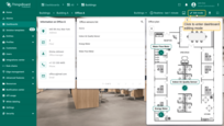
- Go to the dashboard and enter edit mode by clicking the "Edit mode" button on the toolbar;
- Click on the "pencil" icon of the "Office sensors list" widget to enter its editing mode;
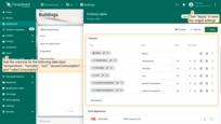
- Add the columns for the following data keys: "temperature", "humidity", "co2", "powerConsumption", and "waterConsumption". Then, apply the changes to the widget;
- Now the table displays the devices' telemetry.
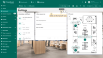
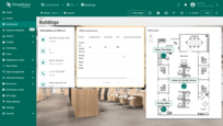
Devices can send multiple telemetry values. For example, an Indoor Air Quality Sensor sends values of temperature, humidity, and CO2 level. By default, each telemetry value (key) is represented as a separate column in the table widget. However, this layout might not be the most convenient for viewing. Let's combine the telemetry values for a device that transmits multiple readings into a single column for a cleaner appearance and hide unnecessary columns.
- Re-enter the edit mode of the "Office sensors list" widget by clicking the pencil icon;
- Add another column: name it "telemetryValue", and click the "Time series" icon to add a new key;
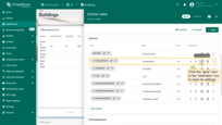
- Rename the labels for the keys "Name" and "telemetryValue" to "Device name" and "Telemetry value," respectively. Next, click the "gear" icon next to the "telemetryValue" row to open its settings;
- Turn on the "Use cell content function" option. Insert the function from the documentation into the corresponding field. This function will combine several telemetry columns into one for a single device. Then click "Save";
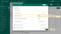
- Now we need to hide the unnecessary columns such as "temperature", "humidity", "co2", "powerConsumption", and "waterConsumption". Click the "gear" icon next to the "temperature" to open its settings;
- Select "Hidden" in the "Default column visibility" menu. Click "Save" to apply the changes for this column;
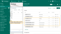
- Repeat the steps described above for the columns "humidity", "co2", "powerConsumption", and "waterConsumption". Ensure that only the columns "Device name" and "Telemetry value" remain visible;
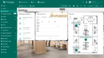
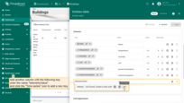
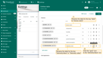
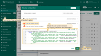
Cell content function used in this example:
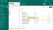
For the “power Consumption” and “water Consumption” keys, we will sum all data point values over the selected time interval. We will specify the time interval later in the dashboard time window settings.
- Click the “pencil” icon of the “powerConsumption” key;
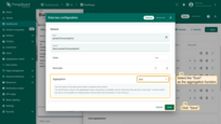
- Select the “Sum” as the aggregation function, and click “Save”;
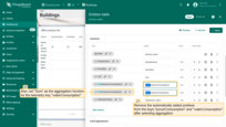
- Also, set “Sum” as the aggregation function for the telemetry key “waterConsumption”. Remove the automatically added prefixes from the keys label “powerConsumption” and “waterConsumption” after selecting aggregation;
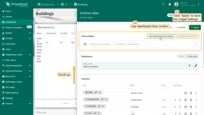
- Scroll up to locate the time window settings. Use the dashboard's time window and apply the changes to the widget;
- Save changes to the dashboard.
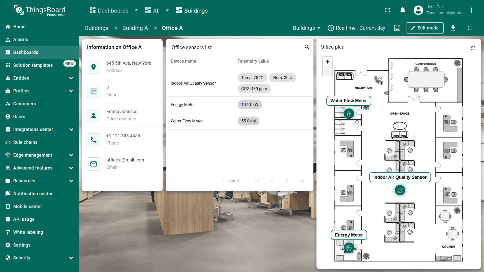
Now, in the “Office sensors list” widget, the telemetry for the Indoor Air Quality Sensor is displayed in a single column.
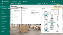
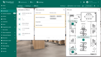
However, telemetry for the other two devices is not displayed because the aggregation applied to the keys “powerConsumption” and “waterConsumption” is available only for fixed time intervals, like “current day” or “current month”, etc., and is not available for sliding window intervals like “last 30 minutes,” “last 24 hours,” or “last 1 minute,” which our dashboard currently uses. Therefore, let's proceed to configure the time window.
Time window
To correctly display data on widgets that use the dashboard time window, you need to adjust the time interval and aggregation parameters. Data sent by devices will be grouped by hour and displayed for the current day, week, or month, depending on your choice.
Let’s proceed with the setup:
- Enter dashboard editing mode;
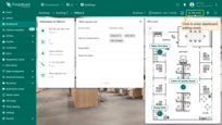
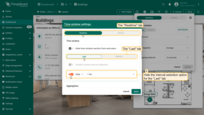
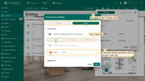
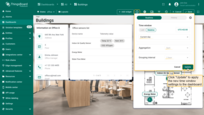
- Click the "Edit time window" icon on the toolbar and then click the "gear" icon to open the time window settings;
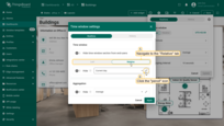
- A new settings window will open. Start with the "Realtime" tab. Hide interval selection parameter for the "Last" tab;
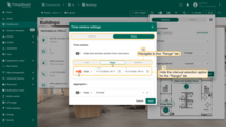
- On the "Relative" tab, click the "pencil" icon in the interval settings row;
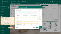
- Uncheck all intervals except for "Current day," "Current week" (Sun-Sat), and "Current week" (Mon-Sun). Set their grouping interval and default grouping interval to 1 hour;
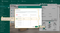
- Also check the "Current month" interval. Set grouping interval and default grouping interval to 2 hour. Click "Apply";
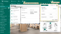
Now, configure the “History” tab:
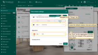
- Navigate to the “History” tab, and hide the “Last” and “Range” interval options from users;
- For the “Relative” tab, leave the default settings;
- Set “Sum” as the aggregation function and ensure users cannot modify this parameter by hiding it;
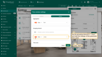
- Configure the grouping interval to “1 hour” and restrict users from changing it.
- Click “Apply” to save the time window adjustments;
- Select “Update” to apply the updated time window settings to the dashboard;
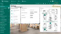
- Save the dashboard to confirm the changes.
As you can see, the “Office sensors list” widget now displays data on the office's energy and water consumption for the selected time period, which in our case is the current day.
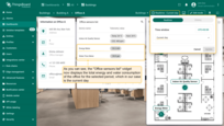
This configuration ensures that all widgets using the dashboard's time window will display the aggregated telemetry values for the current day (or another selected interval) grouped by the hour.
Adding state for each device & navigation between states
Now we need to add separate states for each of our devices and set up transitions from the “Office sensors list” and “Office plan” widgets to these states.
- Enter dashboard editing mode;
- Click on the "Manage dashboard states" menu option, then click the "plus" icon to add new dashboard state;
- Name it "Indoor Air Quality Sensor", and enter state ID - air_sensor. Click "Add".
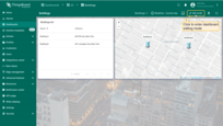
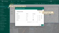
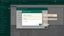
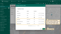
Similarly, add “Energy Meter” state with the energy_sensor state Id and “Water Flow Meter” state with the water_sensor state Id.
Customize Office sensors list widget
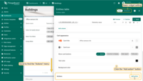
Now let's customize the “Office sensors list” widget by adding an action so that when you click on a device row, we transition to its state.
- Go to the “office” state and enter editing mode of the “Office sensors list” widget;
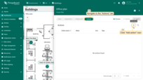
- Scroll to the “Actions” menu section and click the “Add action” button;
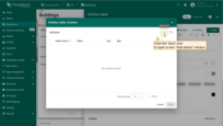
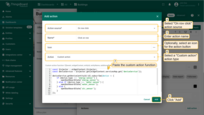
- The “Actions” window will open. Click the “plus” icon in the top-right corner of the screen. Complete the following steps in the “Add action” dialog:
- Select “On row click” action source;
- Enter action name;
- Choose the “Custom action” action type;
- After choosing an action type, the “Custom action function” section appears. Paste the function by copying it from the documentation. This function performs a transition to the dashboard state depending on the type (device profile) of the selected device.
Custom action function used in this example:
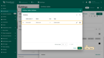
- Afterwards, click “Add”;
- In the “Actions” window, you can review the configured action, including its source, icon, and type. Click “Save”;
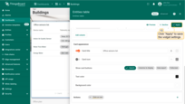
- Click “Apply” to save the widget settings;
- Save the dashboard by clicking “Save” in the upper-right corner of the dashboard page.
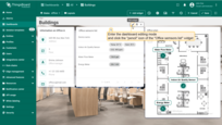

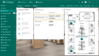
Check how it works. Click on the row of any device to transition to its state.

Customize Office plan widget
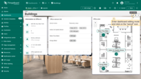
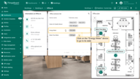
Enhance the functionality of the “Office plan” widget by adding a tooltip that display telemetry data for the sensors and adding the ability to drill down to the details of each device. Follow these steps to customize the widget:
- While in the “office” state, enter the dashboard edit mode;
- Click the “pencil” icon of the “Office sensors list” widget to modify its settings;
- Add the following data keys to the existing ones: “temperature”, “humidity”, “co2”, “powerConsumption”, “waterConsumption,” and “batteryLevel”. These keys represent the telemetry data that will be shown in the tooltip when clicking on the device;
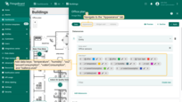
- Navigate to the “Appearance” tab. Scroll to the “Tooltip” section and turn on the “Use tooltip function” option. Now, copy the tooltip function from the documentation and paste it into the “Tooltip function” field;
The tooltip function used in the example:
- Adjust the tooltip's Y offset relative to the marker to -0.77 for optimal positioning;
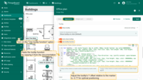
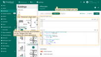
- Go to the “Widget card” tab. Access “Advanced widget style” and paste the provided CSS into the “Widget CSS” field to enhance the widget visual appearance:
The CSS used in this example:
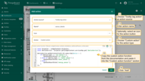
- Navigate to the “Actions” tab and click “plus” to add new action. Complete the following steps in the “Add action” dialog:
- Select “Tooltip tag action” as the action source;
- Enter “sensor_details” as action name;
- Choose “Custom action” for the action type;
- Paste the custom action function by copying it from the documentation.
The custom action function used in this example:
- Then, click “Add”;
- Click “Apply” to save the modifications;
- Save your dashboard configuration by selecting “Save” in the upper-right corner of the dashboard.
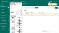
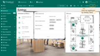
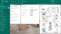
Click any marker on the “Office plan” widget to open a tooltip. Each device's tooltip includes a line button to access the details of the selected device. Click on this line.
Configuring air_sensor state
To effectively monitor and analyze indoor air quality, we'll add three widgets to display current readings of temperature, humidity, and CO2 levels, alongside two widgets for tracking historical data on air quality in the office. This will allow us to not only monitor the current state of air quality but also to analyze the trends in their changes over time.
Temperature, humidity, and CO2 level cards widgets
In ThingsBoard, there is a bundle of pre-configured widgets for displaying telemetry of the indoor environment, including temperature, humidity, and CO2 levels, etc. In this lesson, we will use this widgets bundle.
First, add a widget to display the current temperature in the office.
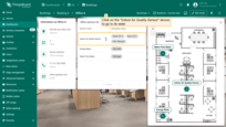
- Click on the "Indoor Air Quality Sensor" device row in the "Office sensors list" widget to transition to its state;
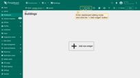
- Enter dashboard editing mode and click either the "+ Add widget" button at the top or the large "Add new widget" icon in the center of the screen;
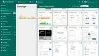
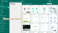
- Find the "Indoor Environment" widgets bundle and click on it;
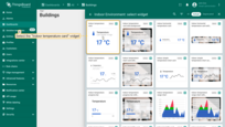
- Choose the "Indoor temperature card" widget;
- Specify "Selected entity" alias as the data source. The "temperature" key, from which the temperature value will be "extracted", has already been added;
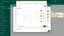
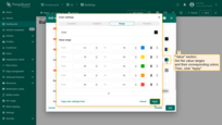
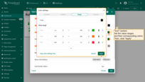
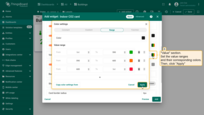
- Scroll down to the "Icon" section. Customize icon color change based on temperature value using predefined ranges. This helps to estimate the temperature value faster. Set the value ranges and their corresponding colors. Then, click "Apply";
- Set the value ranges and their corresponding colors for the "Value" section. Apply changes;
- Clear the "Card border radius" value, and click "Add";
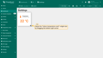
- We've added a widget that displays the current temperature. Adjust the widget size to your liking.



Now, add a widget to display the humidity.
- Click the "Add widget" button at the top of the screen;
- Navigate to the "Indoor Environment" widgets bundle and select the "Indoor humidity card" widget;
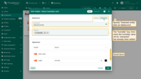
- Specify "Selected entity" alias as the data source. The "humidity" key, from which the humidity value will be "extracted", has already been added;
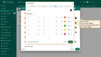
- Scroll down to the "Icon" section. Set the value ranges and their corresponding colors. Then, click "Apply";
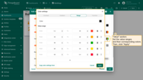
- Set the value ranges and their corresponding colors for the "Value" section. Apply changes;
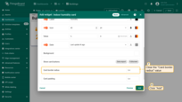
- Clear the "Card border radius" value. Click "Add";
- The widget displaying the current humidity has been added. Place it to the right of the "Temperature" card widget and adjust its size.
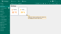
Add another card widget to display the CO2 level.
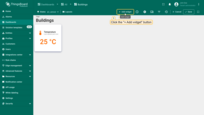
- Click the "+ Add widget" button at the top of the screen;
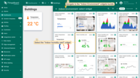
- Select the "Indoor CO2 card" widget. This widget is located in the "Indoor Environment" widgets bundle;
- Specify "Selected entity" alias as the data source. The "CO2" key has already been added, from which the CO2 value in the air will be "extracted";
- Scroll down to the "Icon" section. Set the value ranges and their corresponding colors. Then, click "Apply";
- Set the value ranges and their corresponding colors for the "Value" section. Apply changes;
- Clear the "Card border radius" value. Click "Add";
- The widget displaying the current CO2 level has been added. Place it to the right of the "Humidity" widget. Adjust the widget size to match the dashboard aesthetics, and save the dashboard.
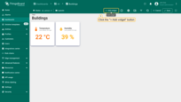
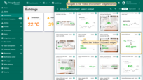
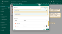

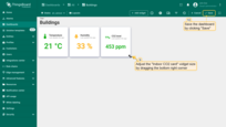
Now you can see the current temperature, humidity, and CO2 values.
Temperature and humidity history chart
Now, we will add a chart widget to display historical data on temperature and humidity in the office. This widget will use its own time window settings. The configuration we set will allow us to view the hourly average values of temperature and humidity for the current day. This way, we can monitor their changes over time.
- Enter the edit mode of your dashboard and click the "+ Add widget" button;
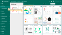
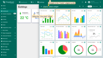
- Find the "Charts" widgets bundle and click on it;
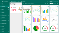
- Choose the "Line chart" widget;
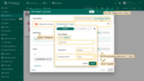
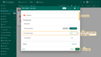
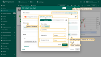
- Use the widget's time window and make some changes to its settings. Select "Relative" and set "Current day" as the time interval. Leave the aggregation function as "Average" and set the grouping interval to 1 hour. Then, click "Update;
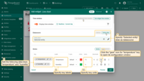
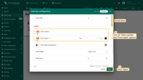
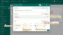
- Specify "Selected entity" alias as the data source. Add data keys "temperature" and "humidity" and specify their labels and units. Then, click the "gear" icon for "temperature" key to open its configuration window;
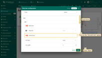
- Turn on "Show points" and "Point label" options. Click "Save". Repeat this for the "humidity" data key;
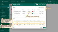
- By default, the chart includes a single scale on the Y-axis. Label it "Temperature" and set the units to °C. Add another scale for "Humidity", place it on the right, and set the units to %. Now, apply the "axis1" scale to the "humidity" key;
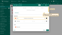
- Change the chart title to "Temperature and Humidity history";
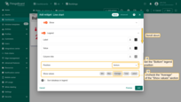
- Set the "Bottom" legend position and uncheck "Average" of the "Show values" section;
- Clear the "Card border radius" value to streamline the widget's appearance. Click "Add";
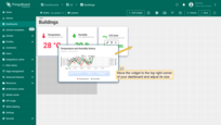
- Move the widget to the top-right corner of your dashboard and adjust its size;
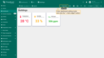
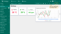
- The "Temperature and Humidity history" widget has been added. Save your dashboard to implement the changes.
CO2 level chart
Add another line chart widget to display air quality data. This widget will also use its own time window settings, showing hourly data for the selected time period.
- Enter the dashboard editing mode, and click the "+ Add widget" button;
- Select the "Line chart" widget of the "Charts" widgets bundle;
- Use the widget's time window. In the time window settings, select "Relative" and set "Current day" as the time interval. Leave the aggregation function as "Average" and set the grouping interval to 1 hour. Then, click "Update;
- Now, specify "Selected entity" alias as the datasource. Add "co2" as the data key, and set its label and units. Then, click the "gear" icon to configure the "co2" data key settings;
- Turn on the "Smooth line" option to make the chart line appear smoother. Click "Save";
- Enter a name for the Y-axis, such as "CO2 level", and specify "ppm" as the units;
- Change the chart title to "Air Quality";
- Set the "Bottom" legend position. Check "Min", "Max" and "Average" options in the "Show values" section to display these statistics on the chart;
- Clear the "Card border radius" value. Click "Add";
- Place this widget below the "Temperature and Humidity history" widget in the right-bottom corner of the dashboard and adjust its size. Save the dashboard to apply the changes.
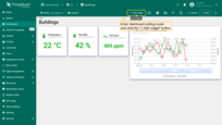
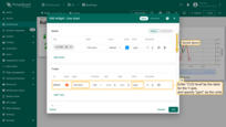
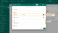
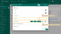
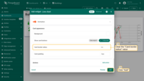
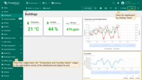
Monitor the current air quality status and analyze its changes over time in a separate dashboard state.

Configuring energy_sensor state
Let's move on to configuring the energy_sensor state. We will add two widgets: one to display the total energy consumption for the current day and another to display historical data on hourly energy consumption.
Current power consumption
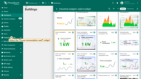
To display total power consumption, use the “Power consumption card” widget from the “Industrial widgets” bundle:
- Click the "Energy Meter" device row in the "Office sensors list" widget to navigate to its state;
- Enter dashboard editing mode, and click the "+ Add widget" button;
- In the widget library, locate and click on the "Industrial widgets" bundle;
- Select the "Power consumption card" widget;
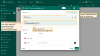
- Specify the "Selected entity" alias as the datasource. The "powerConsumption" key is already specified as the data key. Open the "powerConsumption" data key configuration by clicking the "pencil" icon;
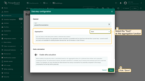
- Select the "Sum" as the aggregation function to sum all data point values within the selected time period. Click "Save";
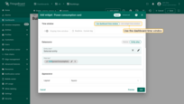
- Use the dashboard time window;
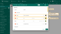
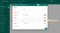
- Change the widget label to "Power consumption". Open the icon color settings;
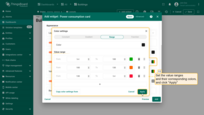
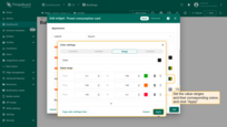
- Set the value ranges and their corresponding colors as shown in the screenshot. Then, click "Apply";
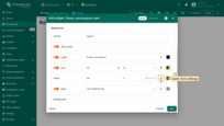
- Open the font settings;
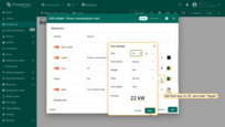
- Set the font size to 35 pixels, and click "Apply";
- Open the value color settings;
- Set the value ranges and their corresponding colors as shown in the screenshot. Then, click "Apply";
- Clear the "Card border radius" value, and click "Add";
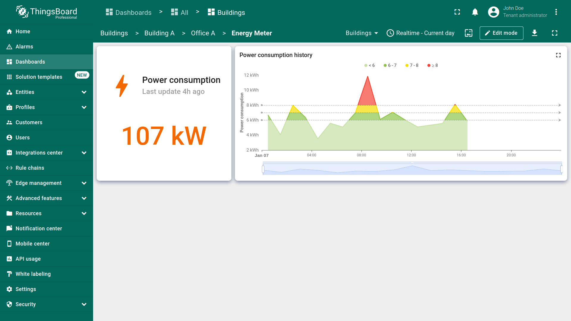
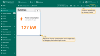
- The widget has been added to display the total power consumption for the time period specified in the dashboard's time window. Adjust widget size to your preference. Then, save the dashboard to apply the changes.

Power consumption chart
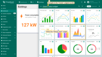
To display historical data on power consumption, we will add the “Range chart” widget. The unique feature of this widget is that changes in data values on the graph are visualized using configurable color ranges.
- Enter dashboard editing mode, and click the "+ Add widget" button at the top of the screen;
- Select the "Range chart" widget of the "Charts" widgets bundle;
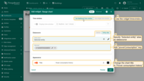
- Use the dashboard time window. Specify "Selected entity" alias as the datasource, and the "powerConsumption" key as the data key. Change the chart title to "Power consumption history";
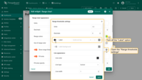
- Change the units to kW. Then, open the range colors settings;
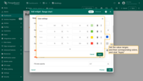
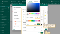
- The line color on the chart is colored according to the range in which the value falls. This will help you to quickly orient yourself with the data by visually highlighting changes in color according to variations in values. Set the value ranges and their corresponding colors. Click "Apply";
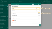
- Go to the "Range thresholds settings", and turn off the "Label" option;
- Open the "Line color" settings, and set the opacity to 40%. Apply changes;
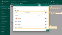
- Expand the Y-axis settings. Enter the "Power consumption" as the axis label, and turn off the "Show split lines" option;
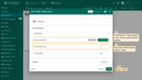
- Uncheck the "Data export" box in the "Show card buttons" section, and remove the value for the "Card border radius". Click "Add" to complete adding the range chart widget;
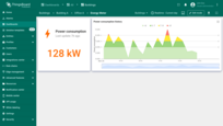
- The "Power consumption history" widget has been added. Place it to the right of the "Power consumption" widget and resize it to your liking. Save the dashboard to apply the changes.
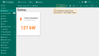
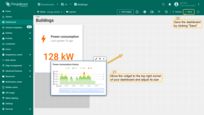
Now you can monitor the total energy consumption for the current day and track historical data on hourly energy consumption.
Configuring water_sensor state
Finally, we will configure the state for the “Water Flow Meter” device. This will include a card widget to display the total water consumption for the current day, a chart widget to show historical data on hourly water consumption, and a battery level widget for the device.
Current water consumption
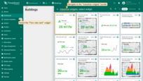
If you need to display specific data but cannot find a suitable widget in the available bundles, you can customize any widget to fit your needs. Let’s take the “Flow rate card” widget from the “Industrial widgets” bundle as an example and configure it to display water consumption.
- Click on the "Water Flow Meter" device in the "Office sensors list" to go to its state;
- Enter the dashboard editing mode, and click the "+ Add widget" button;
- Navigate to the "Industrial widgets" bundle and select any widget, for example "Flow rate card";
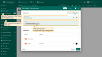
- Specify "Selected entity" alias as the data source. Add the "waterConsumption" key as data key, and click "pencil" icon to open its data key configuration;
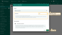
- Select the "Sum" as the aggregation function. Click "Save";
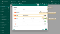
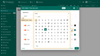
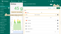
- Use the dashboard time window. Change the widget label to "Water consumption". Let's change the widget icon to better correspond to the type of data displayed. Open the "Icons" window;
- Choose a new icon;
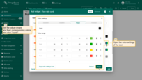
- Open the color settings of the icon. Set the value ranges and their corresponding colors. Then, click "Apply";
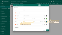
- Set gallon as the units. Open the color settings of the "Value" option;
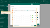
- Set the value ranges and their corresponding colors as shown in the screenshot. Then, click "Apply";
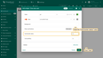
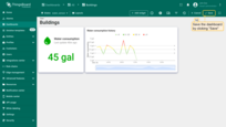
- Clear the "Card border radius" value. Click "Add";
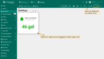
- The widget has been added to display the total water consumption for the time period specified in the dashboard's time window. Resize widget to your liking, and save the dashboard.
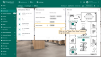
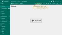
Water consumption chart
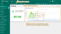
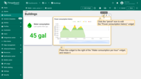
Now we need to add a widget to visualize historical data on water consumption. Previously, we added a similar widget for tracking power consumption. Let's copy the “Power consumption history” widget, paste it into the water_sensor state, and change the data source to display water consumption.
- Go to the "Energy Meter" state, and enter the dashboard editing mode. Right-click on the "Power consumption history" widget and select "Copy" from the dropdown menu that appears;
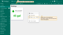
- Navigate to the "Water Flow Meter" state. Right-click on the dashboard and select "Paste" to insert the copied widget on the dashboard;
- Place this widget to the right of the "Water consumption" widget, and resize it. Now, enter the "Power consumption history" widget settings by clicking the "pencil" icon;
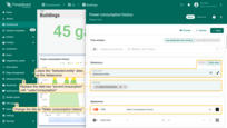
- Leave the "Selected entity" alias as the datasource. Replace the data key "powerConsumption" with "waterConsumption". Change the title to "Water consumption history";
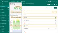
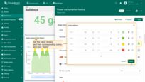
- Change units to gal (gallon). Turn off the "Fill area" option. Now, go to the range colors settings;
- Set the value ranges and their corresponding colors as shown in the screenshot. Then, click "Apply";
- Expand the Y-axis settings. Change axis label to "Water consumption". Click "Apply" to save changes;
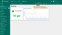
- The "Water consumption history" widget has been added. Save the dashboard.
Battery level widget
And lastly in this lesson, we will add the “Battery charge” widget. It will display the battery charge level of the “Water Flow Meter” device.
- While in dashboard editing mode click the "+ Add widget" button;
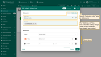
- Select the "Battery level" widget of the "Status indicators" widgets bundle;
- Specify the "Selected entity" alias as the datasource. The "batteryLevel" key is already specified as the data key;
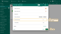
- Clear the "Card border radius" value. Click "Add";
- Place this widget to the right of the "Water consumption history" widget, and resize it. Finally, save the dashboard.
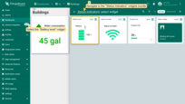
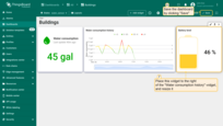
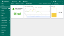
The state for the “Water Flow Meter” device has been configured. Monitor water consumption for the current day, track historical data on hourly water consumption, and control the battery charge level of the “Water Flow Meter” device.
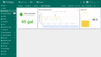
Final view of the dashboard for this lesson
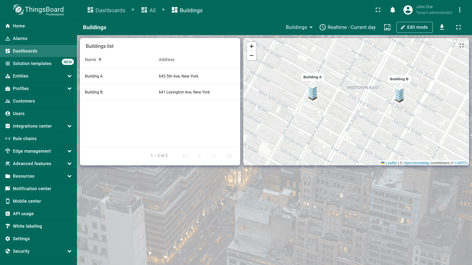
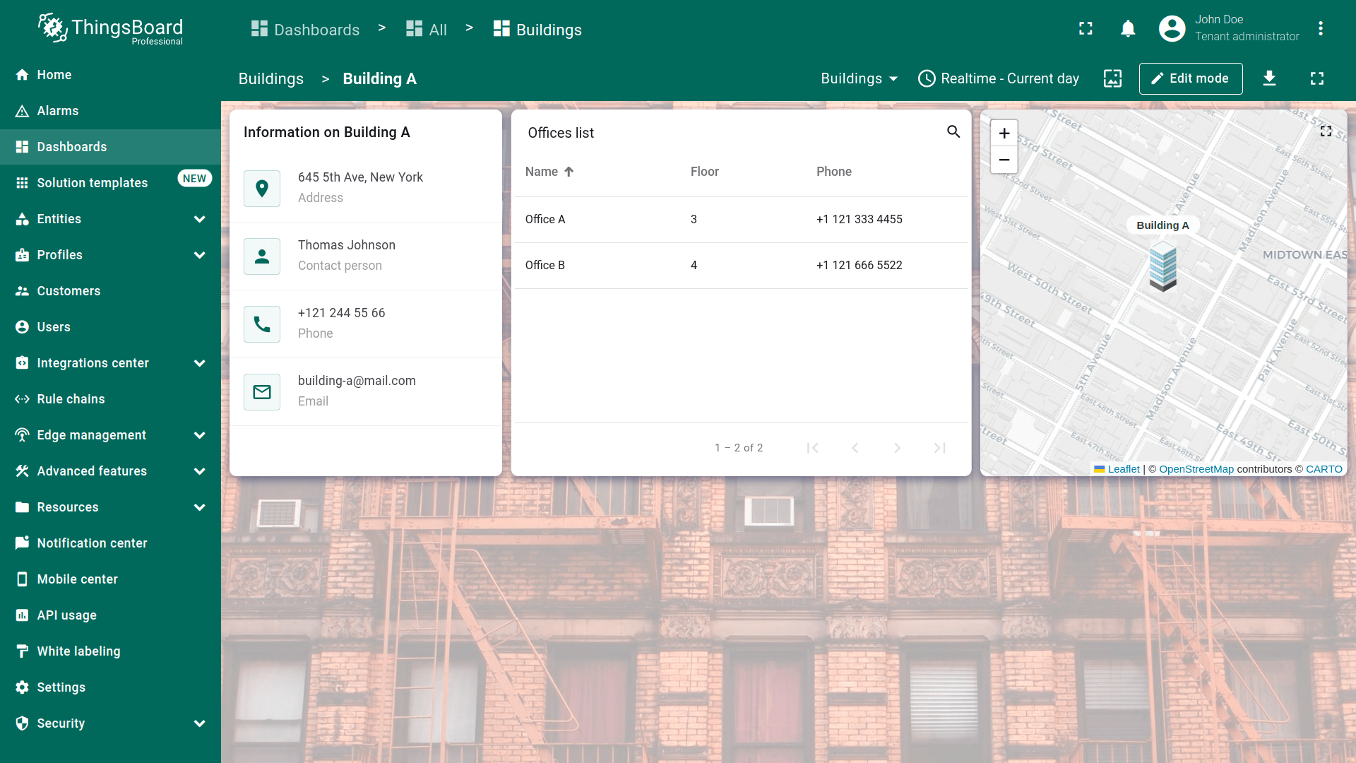
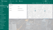
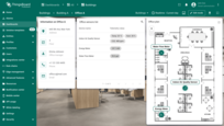
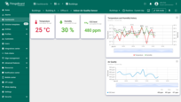
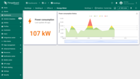
Finally, your dashboard should look like this:

Next step
In the next lesson, you will learn how to configure notification rules, add the “Alarms table” widget, and manage alarm notifications. If you're ready to proceed, click the button below.
