Track Overall Equipment Effectiveness (OEE) on an Industrial Plant
Overall Equipment Effectiveness (OEE) is the industry standard metric for measuring manufacturing productivity. It combines three components — Availability, Performance, and Quality — into a single score that exposes where efficiency losses are occurring and which assembly lines need attention. This guide shows how to compute and visualize all three OEE components in real time using IoT sensor data and Trendz Analytics.
Task definition: Track OEE score for the whole plant and for each assembly line in real time and on a daily basis.
Implementation plan
Section titled “Implementation plan”- Compute Availability by tracking the duration and reasons of downtime events.
- Identify the top 5 downtime reasons per assembly line for root-cause analysis.
- Compute Performance by comparing actual production speed to the planned rate.
- Compute Quality based on the number of rejected parts.
Prerequisites
Section titled “Prerequisites”The domain model in ThingsBoard:
Manufacturing plant— registered as an asset.Assembly line— registered as a device with a relation to the manufacturing plant asset.- An on-site gateway collects data via Modbus and forwards it to ThingsBoard.
Telemetry keys reported by each assembly line:
| Key | Description |
|---|---|
powerUsageWh | Energy consumed in Wh |
producedParts | Parts produced (incremental counter, reported every 60 s) |
rejectedParts | Parts rejected during quality check |
status | Assembly line status: running, stopped, maintenance, etc. |
reason | Reason for the current downtime event |
Implementation
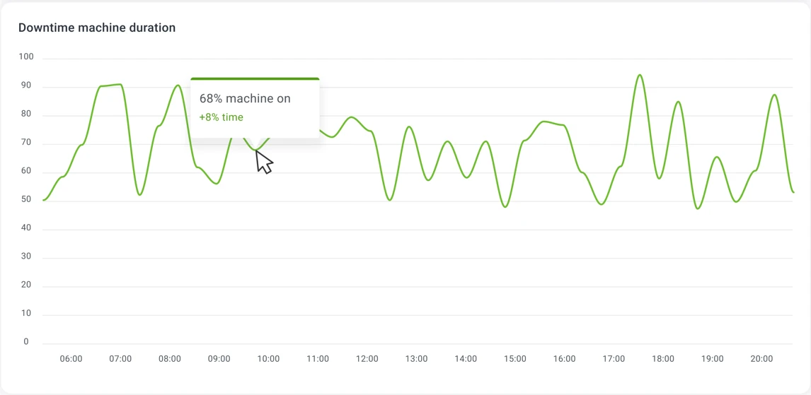
Section titled “Implementation”Step 1: Availability — track downtime duration
Section titled “Step 1: Availability — track downtime duration”Trendz state fields calculate how much time a device spent in a given state based on a boolean condition. Use this to measure what percentage of time each assembly line was operational.
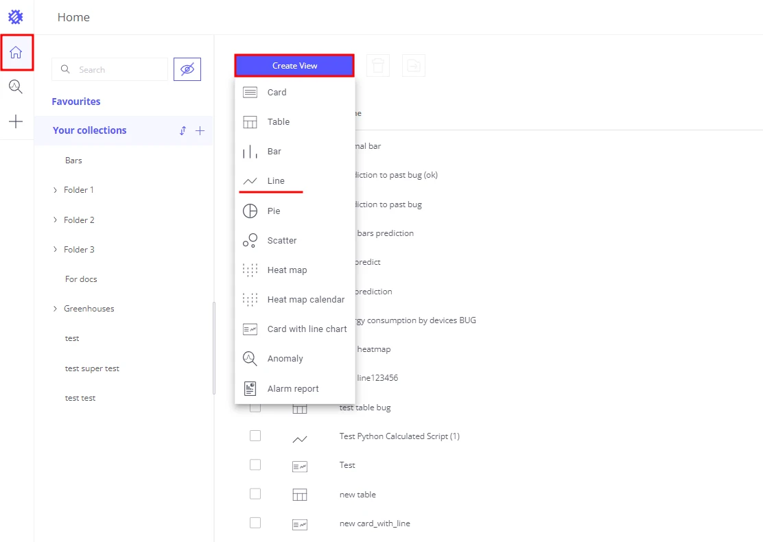
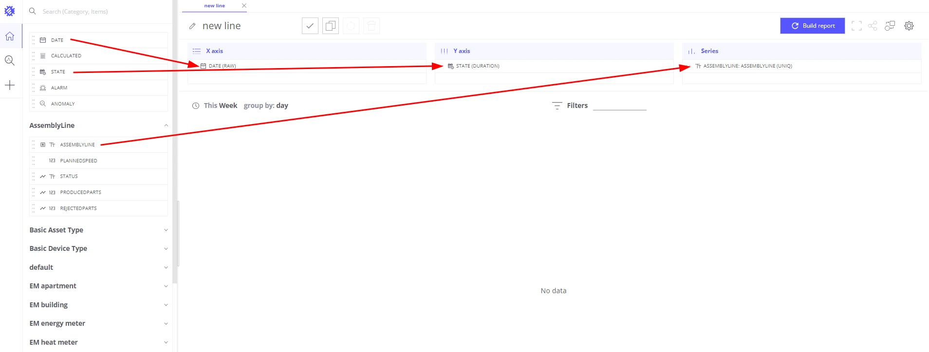
- Create a Line chart in Trendz.
- Add a Date field to the X-axis section.
- Add
assemblyLineto the Series section — this draws a separate line per assembly line. - Add a State field to the Y-axis section:
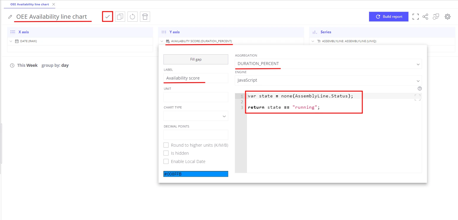
- Aggregation: Duration percent
- Label:
Availability score - Formula:
var state = none(assemblyLine.status);return state == "running";
- Save the view as OEE Availability line chart.
The result is a real-time chart showing OEE Availability percentage per assembly line. You can add a threshold line to immediately highlight when Availability falls below a target.
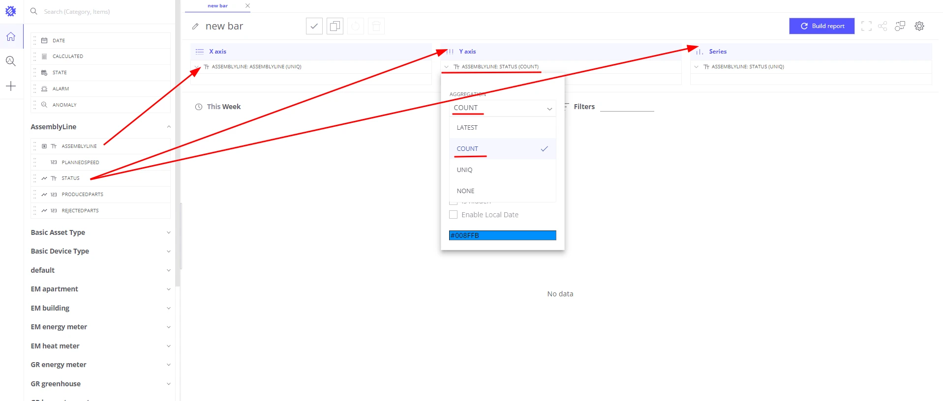
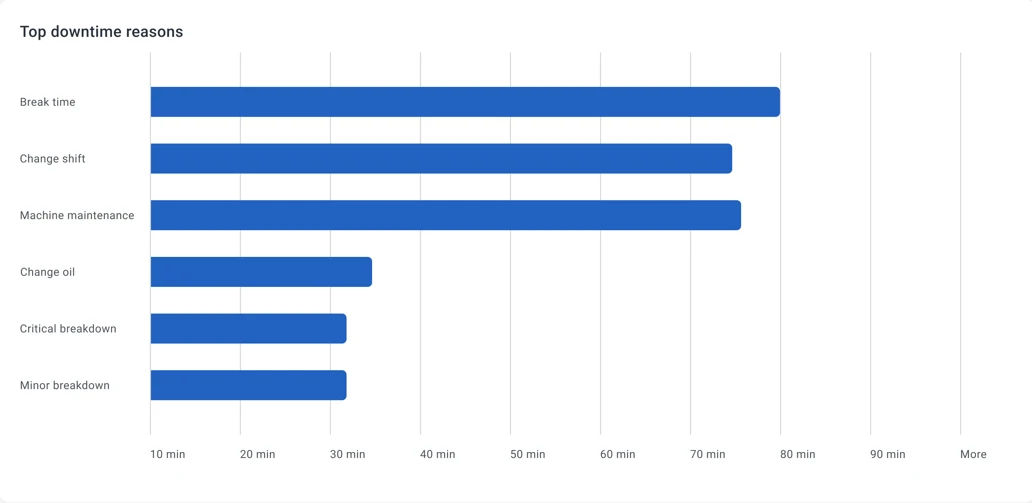
Step 2: Availability — top 5 downtime reasons
Section titled “Step 2: Availability — top 5 downtime reasons”Knowing that a line was down 15% of the time is useful; knowing the top reasons is actionable.
- Create a Bar chart in Trendz.
- Add
assemblyLineto the X-axis section. - Add
assemblyLine.statusto the Series section with aggregationUNIQ— groups bars by status value. - Add
assemblyLine.statusto the Values section with aggregationCOUNT. - Add
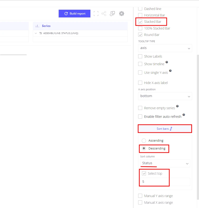
assemblyLine.statusto the Filters section and select only statuses that represent downtime. - Open view settings:
- Sorting: Descending by
assemblyLine.status - Limit:
5 - Enable Stacked bar
- Sorting: Descending by
- Save the view as Availability: Top 5 downtime reasons.
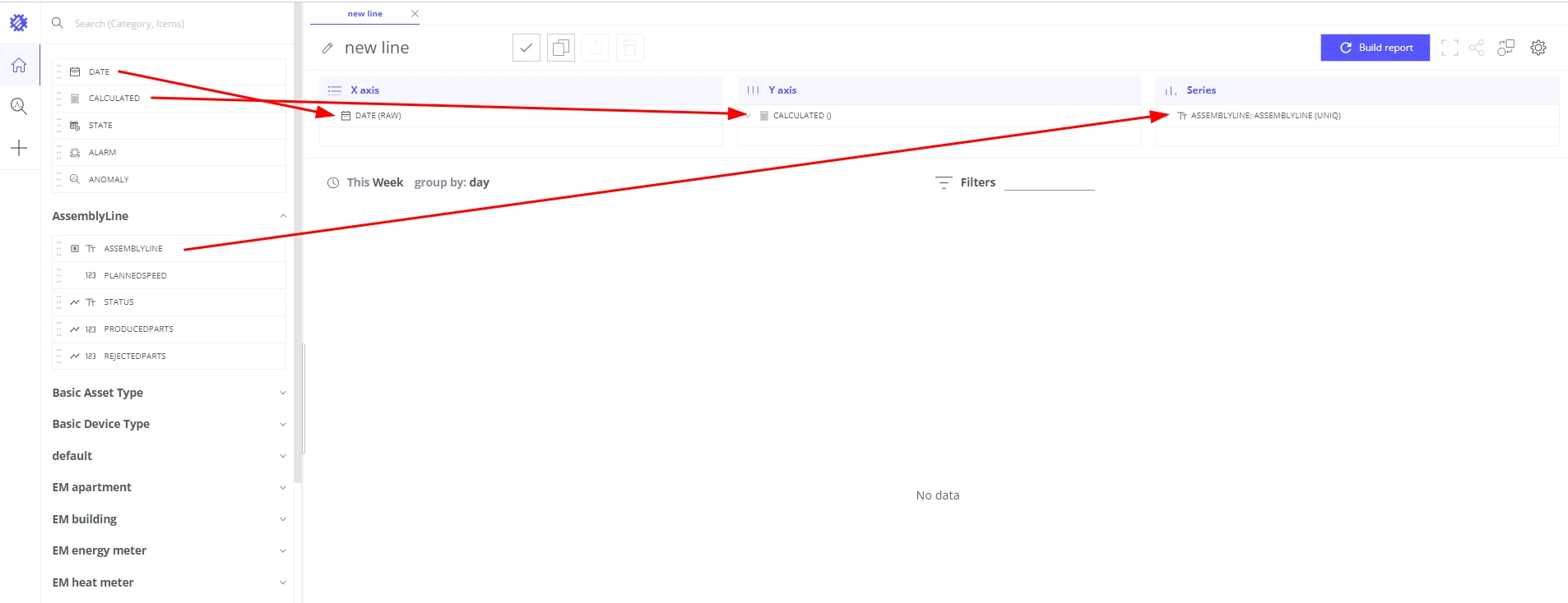
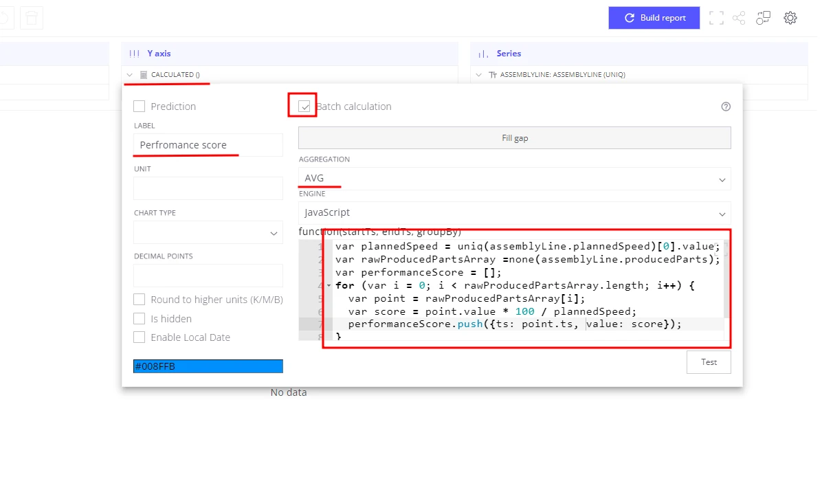
Step 3: Performance — actual vs. planned production speed
Section titled “Step 3: Performance — actual vs. planned production speed”Performance score is the ratio of actual production speed to the planned speed. Use a batch calculated field so the formula has access to raw per-point telemetry values.
- Create a Line chart in Trendz.
- Add a Date field to the X-axis section.
- Add
assemblyLineto the Series section. - Add a Calculated field to the Y-axis section:
- Label:
Performance score - Enable Batch calculation — provides raw telemetry points to the formula
- Aggregation:
AVG - Formula:
var plannedSpeed = uniq(assemblyLine.plannedSpeed)[0].value;var rawProducedPartsArray = none(assemblyLine.producedParts);var performanceScore = [];for (var i = 0; i < rawProducedPartsArray.length; i++) {var point = rawProducedPartsArray[i];var score = point.value * 100 / plannedSpeed;performanceScore.push({ts: point.ts, value: score});}return performanceScore;
- Label:
- Save the view as OEE Performance score line chart.
With batch calculation, Trendz computes a performance score for every raw sensor reading, then applies AVG to aggregate them per time interval (hour, day, week, or month — user-selectable).
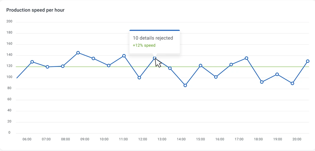
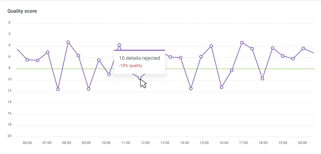
Step 4: Quality — rejected parts ratio
Section titled “Step 4: Quality — rejected parts ratio”Quality score measures the percentage of parts that passed quality checks.
- Create a Line chart in Trendz.
- Add a Date field to the X-axis section.
- Add
assemblyLineto the Series section. - Add a Calculated field to the Y-axis section:
- Label:
Quality score - Formula:
var producedParts = sum(assemblyLine.producedParts);var rejectedParts = sum(assemblyLine.rejectedParts);var qualityScore = 100 - rejectedParts * 100 / producedParts;return qualityScore;
- Label:
- Save the view as OEE Quality score line chart.
Summary
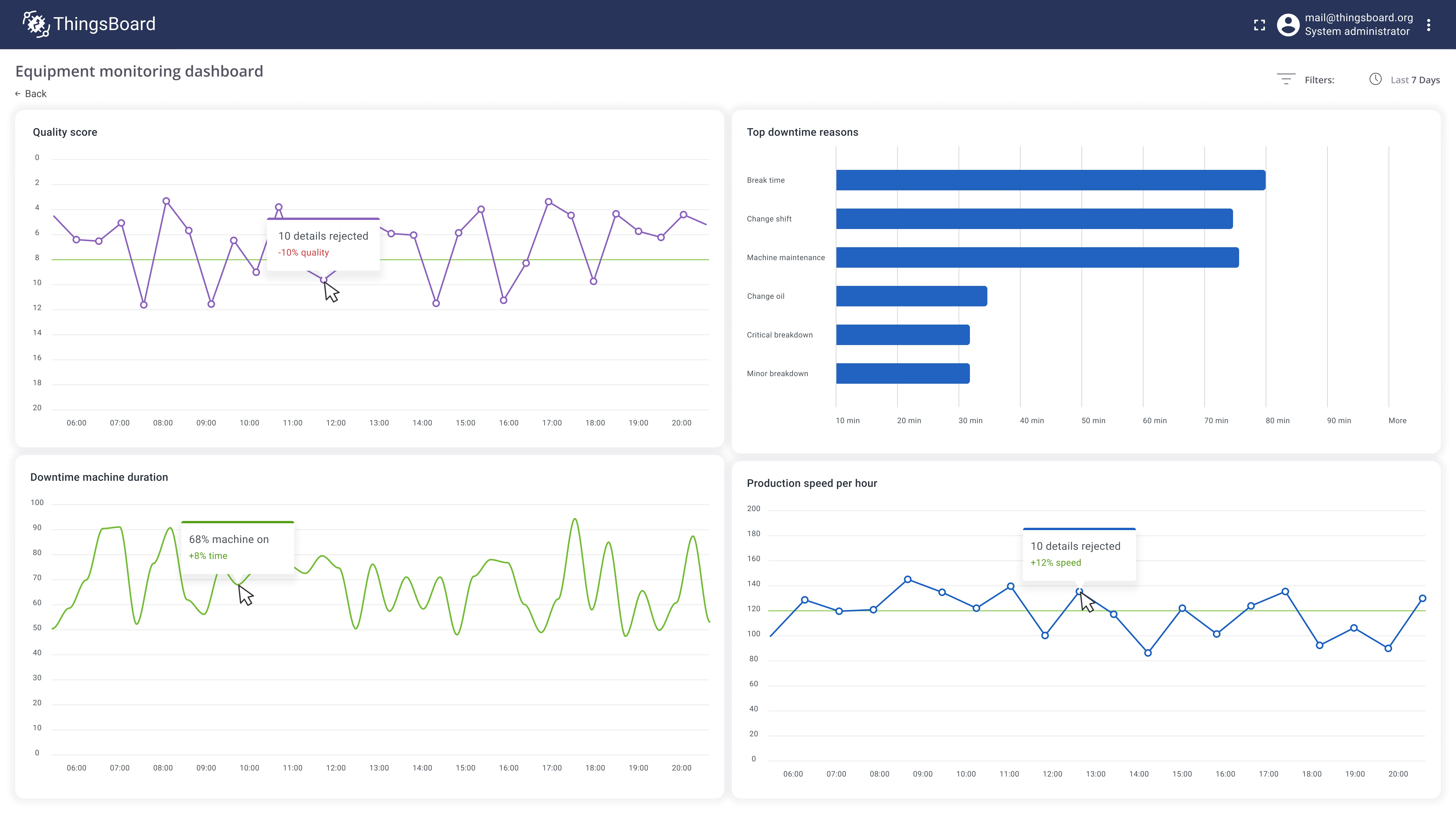
Section titled “Summary”With four Trendz views — Availability line chart, top-5 downtime bar chart, Performance line chart, and Quality line chart — you have complete OEE visibility for every assembly line in real time. Each chart can be added to a shared ThingsBoard dashboard so plant managers can identify the root cause of efficiency losses, target the specific lines or shifts that need improvement, and measure the impact of interventions over time.
Was this helpful?