- Chart types in ThingsBoard reports
- Adding a Chart to a Report
- Configuring a Chart
- Example: Embedding a Line Chart
- Next steps
- Your feedback
| Available since TB Version 4.2.1 |
Only Professional Edition supports Reporting feature.
Use ThingsBoard Cloud or install your own platform instance.
Charts are powerful visualization tools that make analytics more accessible, intuitive, and actionable. Instead of manually analyzing raw numbers, charts help you see patterns and insights at a glance.
Common use cases:
- Visualizing time series – track changes in metrics over time and highlight emerging trends.
- Comparing categories or entities – quickly compare data from multiple devices or key performance indicators across groups.
- Spotting anomalies and irregular patterns – easily identify sudden deviations or abnormal events.
- Aggregating data – display averages, minimums, or maximums across time intervals in a clear and structured way.
- Showing proportions and distribution – use pie or doughnut charts to illustrate how categories contribute to the whole.
- Management presentations – communicate key insights visually to stakeholders without digging into raw numbers.
Using charts makes analytics more visual and helps you make informed decisions faster.
Chart types in ThingsBoard reports
ThingsBoard supports a variety of chart components, each designed for specific purposes. Below is a list of available charts with explanations and practical examples.
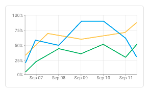
• Time series chart.
A universal chart for visualizing values over time. Ideal for monitoring trends and detecting anomalies. Can combine line and bar views.
Example: displaying sensor temperature throughout the day together with the number of messages in each interval.
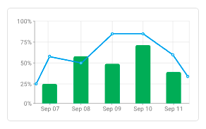
• Line chart.
A classic line graph for comparing multiple metrics over time. Great for showing progression or correlation.
Example: comparing average room temperatures across different areas.
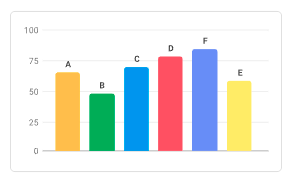
• Bar chart.
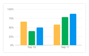
Vertical bars for comparing categories or groups. Perfect for ranking and showing aggregated values.
Example: monthly energy consumption of devices for the month.
• Point chart.
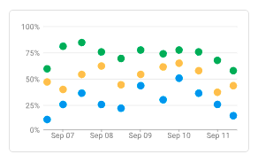
Shows individual values as dots. Useful for scatter plots or event distribution over time.
Example: displaying motion sensor trigger events.
• State chart.
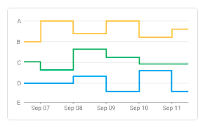
Illustrates changes in system or device states over time (e.g., ONLINE/OFFLINE).
Example: pump activity (ON/OFF) during a week.
• Bar chart with labels.
Bar chart with numeric labels inside or above bars. Highlights exact values.
Example: daily water usage per apartment, with liters displayed directly on bars.
• Range chart.
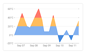
Displays minimum and maximum values over time as shaded ranges.
Example: hourly min/max temperature.
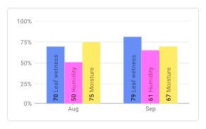
• Bars.
Compact representation of metrics as progress bars. Useful for completion levels.
Example: battery charge or memory usage.
• Pie.
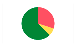
Circular chart for showing parts of a whole.
Example: share of electricity consumption by department.
• Doughnut.
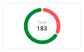
Similar to a pie chart, but with a hollow center where a key metric (e.g., average, sum, KPI) can be displayed.
Example: % of used capacity plus absolute value in the center.
• Horizontal doughnut.
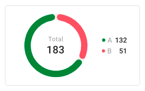
A horizontal variation of the doughnut chart, displayed as side-by-side rings. Useful for compact metric comparison.
Example: percentage of completed vs. pending tasks in a project.
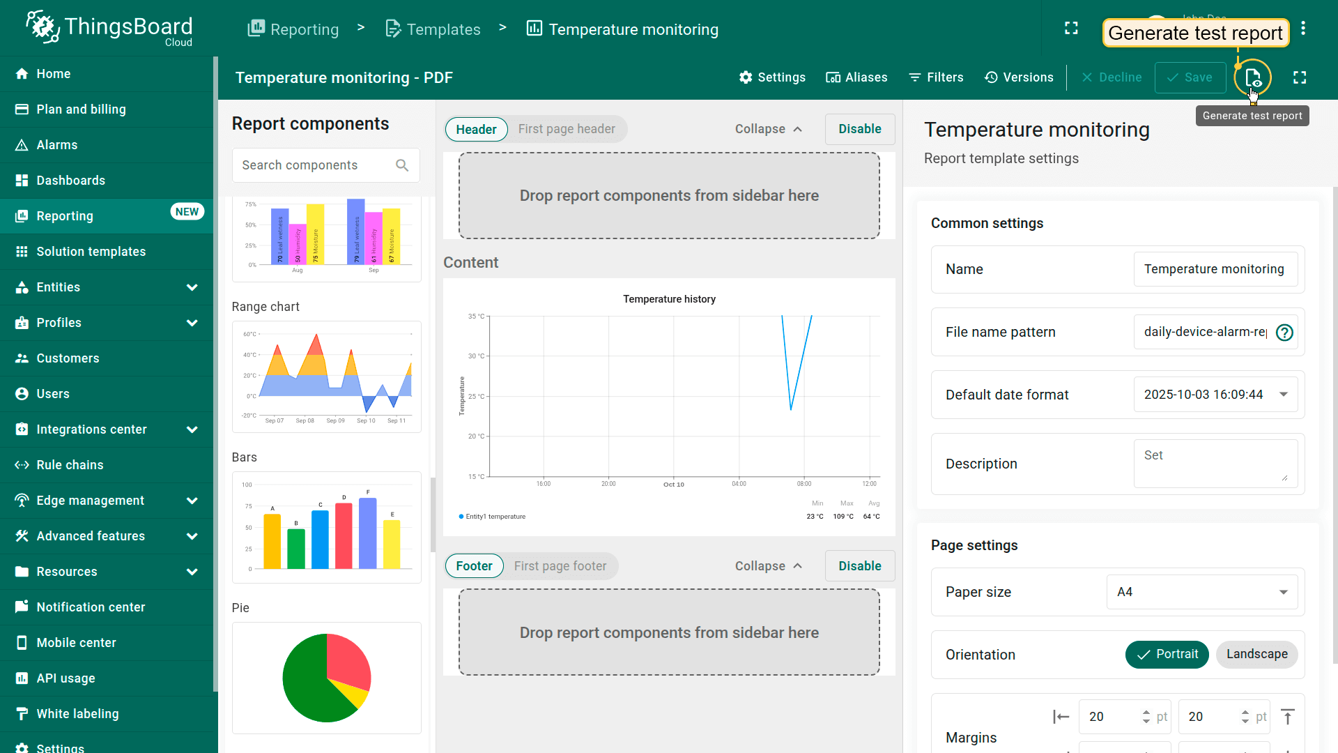
Adding a Chart to a Report
- Navigate to the Templates tab on the Reporting page.
- Open an existing report (or subreport) template or create a new one.
- In the Components library, go to Charts, select the chart type, and drag it into the content area of your report.
Configuring a Chart
Define the data the chart should display, the time interval for that data, X and Y axis configurations, thresholds, legend, appearance settings, and other options.
Time window
- Define the time intervals for displaying telemetry data on the chart. Learn more about configuring the time window here.
Data configuration
- Datasource:
- Define the chart's data source:
- Device — telemetry from a specific device.
- Entity alias — an abstract reference to one or more entities. It is often used when a chart needs to work with multiple entities.
- If needed, configure filters.
- Define the chart's data source:
- Series:
Specify which telemetry keys to visualize (e.g., temperature).
For each data key (depending on the selected chart), you can configure units, labels, colors, line or bar styles, and more.
Layout settings
Adjust the appearance of the component by setting height, width, alignment, padding, margins, background, and border styles.
Other settings
Depending on the chart type, you may configure additional options that improve clarity and usability:
- Y axes – configure axis labels, units, position, and value ranges to control how vertical data is displayed.
- Thresholds – add reference lines based on constant values, keys, or entities to highlight safe, warning, or critical limits.
- X axis – define horizontal axis properties including label, position, ticks, and vertical line.
- Legend – manage the placement, formatting, and content of the chart legend to clarify series meanings.
- For configuring other options and more details, see the Widgets documentation.
Saving and Testing
- Once the chart is configured, click Save.
- To verify that your template is set up correctly and the data displays as expected, click Generate test report (next to the Save button). The system will generate a sample report using the available test data from the selected device or entity alias.
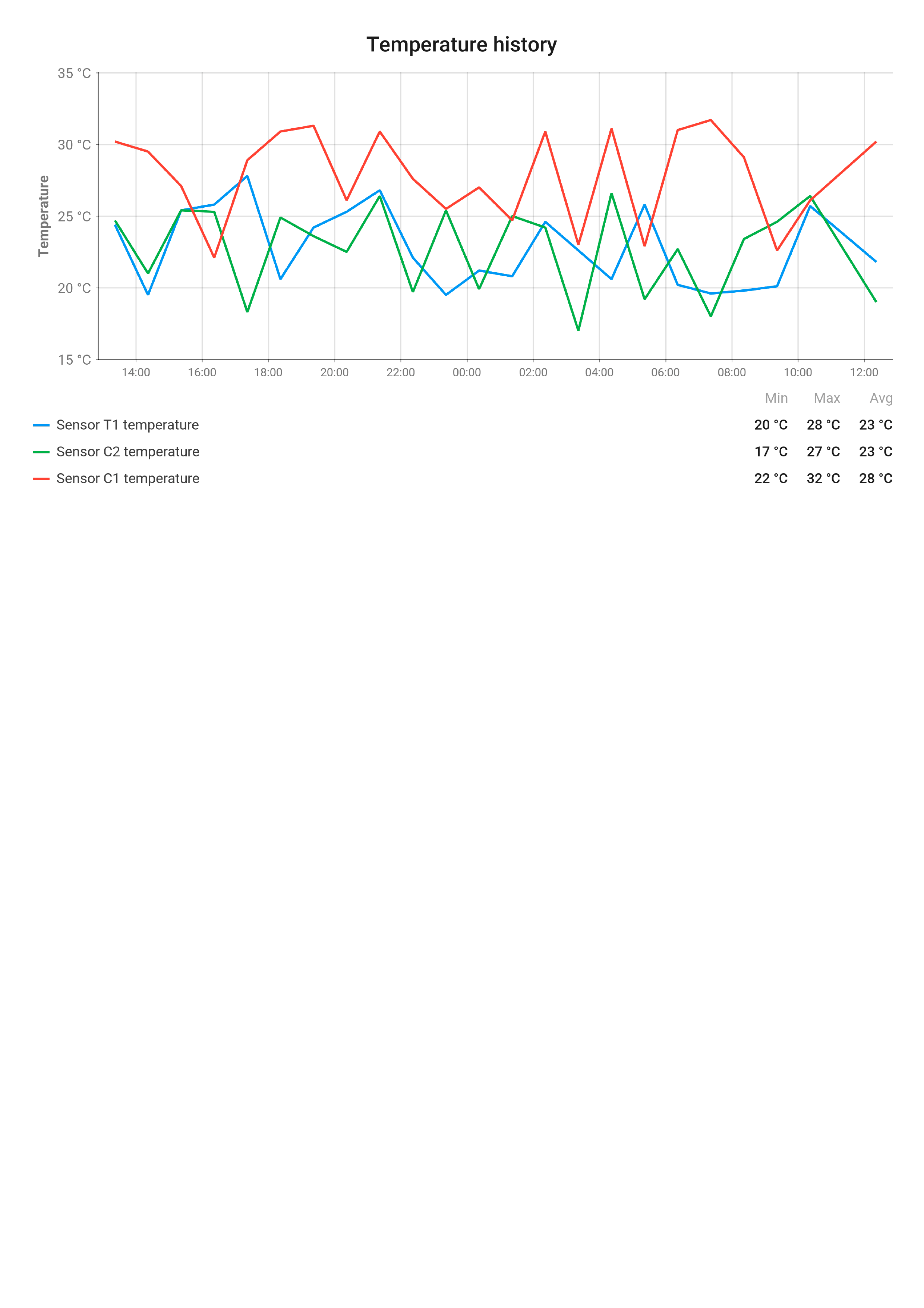
Example: Embedding a Line Chart
Goal: Display and compare temperature readings from three devices over the past 24 hours.
Step 1. Preparation
- Prepare three devices that will send temperature values to ThingsBoard as telemetry. Data from my devices is sent once per hour.
If needed, simulate telemetry in real time using the Rule Engine.
See the guide here.
Step 2. Adding the chart
- Go to the Templates tab on the Reporting page.
- Select an existing report template or create a new one.
- Drag the Line chart component into the content area of your report.
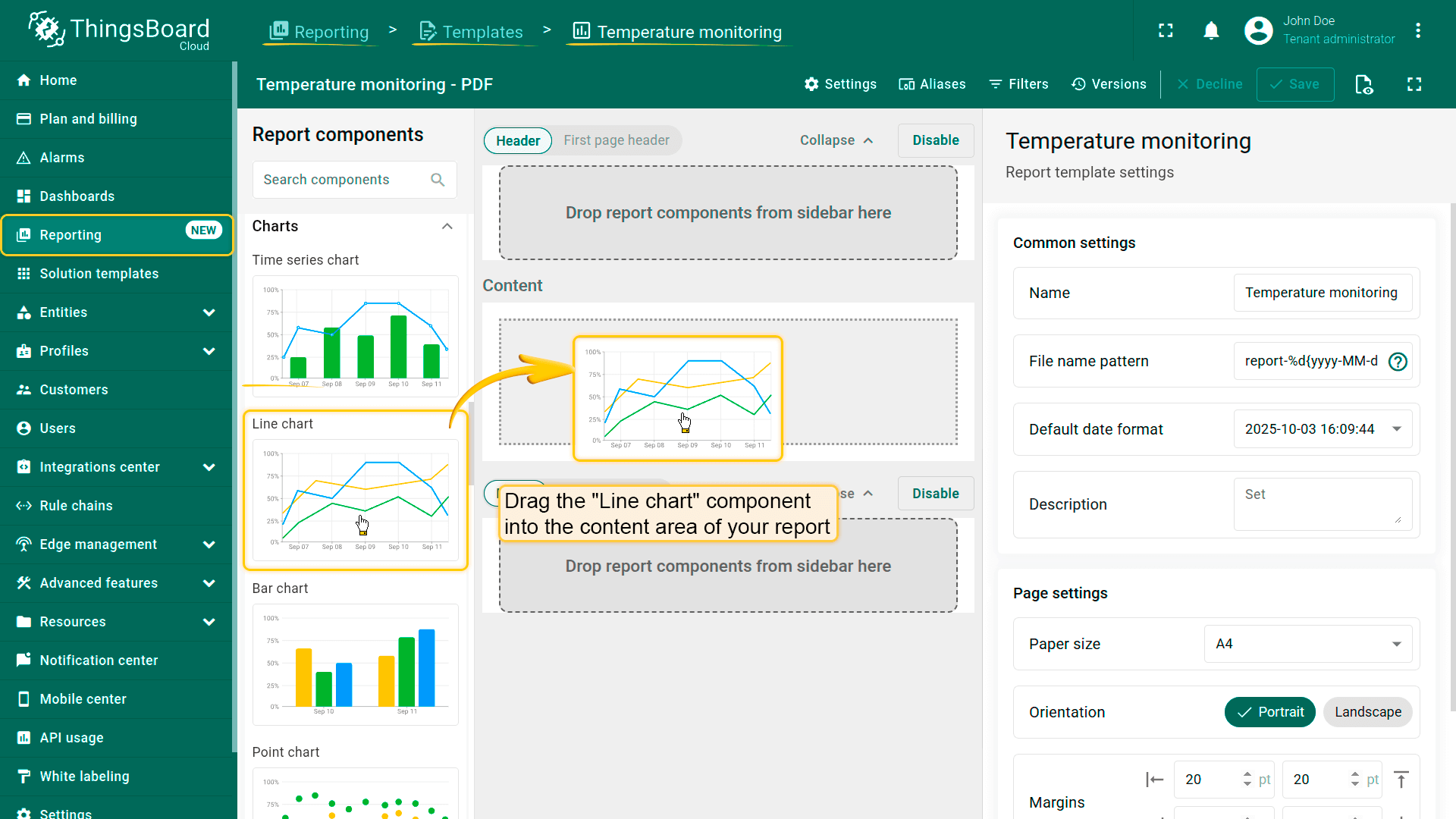
- Drag the Line chart component into the content area of your report.
Step 3. Configuring the chart
- Time window: last 24 hours, aggregated by 1 hour.
- Title:
1
Temperature history
- Datasource: create a new Entity alias that includes the three devices.
- Alias name: My devices
- Filter type: Entity list
- Type: Device
- Entity list: specify three devices for comparing temperature values.
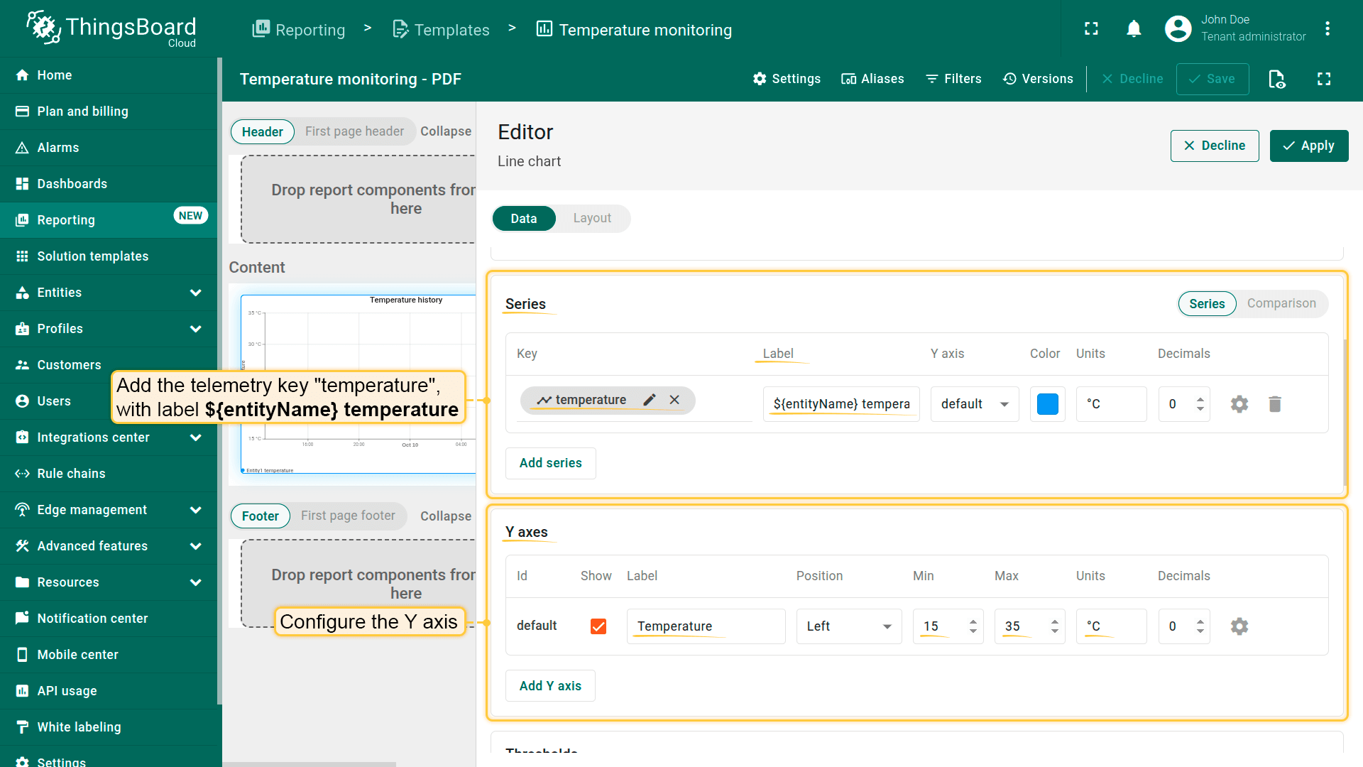
- Series: add the telemetry key temperature, with label
1
${entityName} temperature - Y axis:
- Label: Temperature
- Min: 15
- Max: 35
- Units: °C
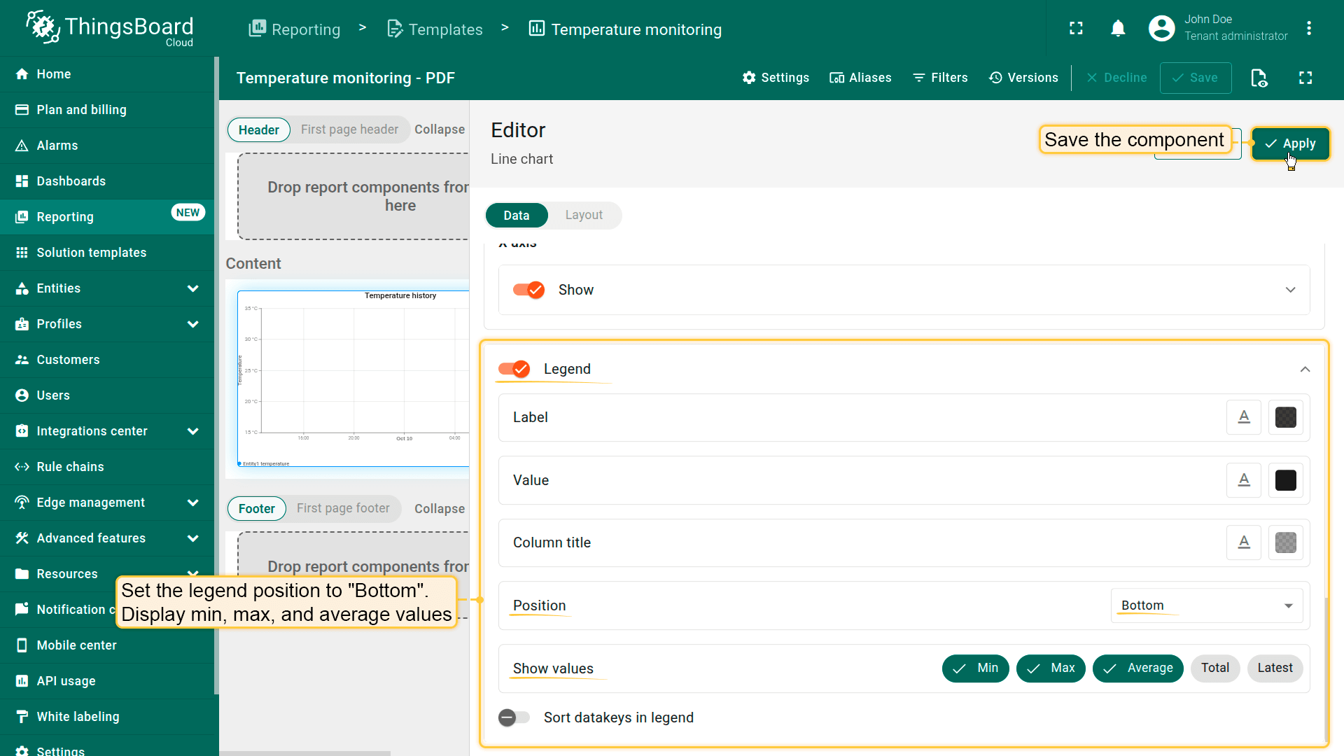
- Legend::
- Position at the bottom,
- Display Min, Max, and Average values.
- Save the component.
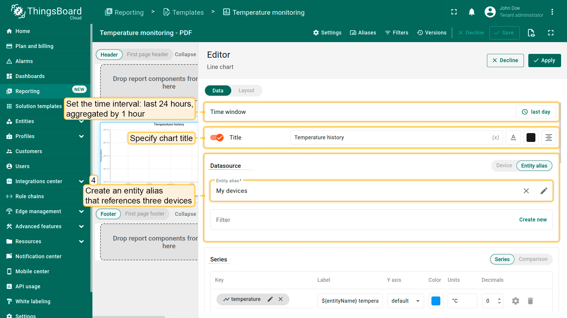
- Set the time interval: last 24 hours, aggregated by 1 hour.
- Specify chart title.
- In the "Datasource" section, create an entity alias that references three devices.
- Configure Y axis.
- Display Min, Max, and Average values.
- Save the component.
Step 4. Save the report template
- Update the file naming pattern to make reports easy to identify:
1
temperature-monitoring-report-%d{yyyy-MM-dd_HH:mm:ss} - Save the template.
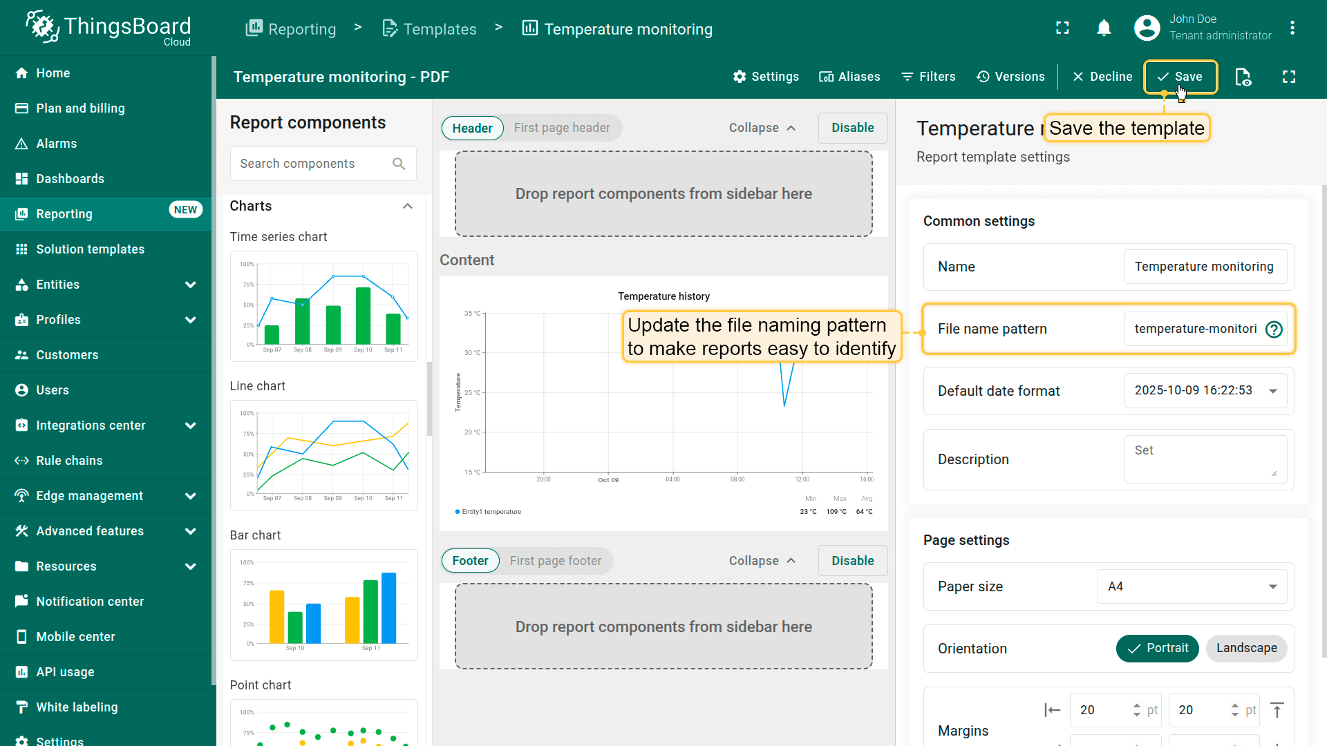
- Save the template.
Step 5. Testing
- Click Generate test report to verify the configuration.
✅ Result
The generated report will include a line chart showing temperature trends from all three devices, allowing you to compare them over time.
Next steps
-
Connect your device - Learn how to connect devices based on your connectivity technology or solution.
-
Data visualization - These guides contain instructions on how to configure complex ThingsBoard dashboards.
-
Data processing & actions - Learn how to use ThingsBoard Rule Engine.
-
IoT Data analytics - Learn how to use rule engine to perform basic analytics tasks.
-
Advanced features - Learn about advanced ThingsBoard features.
Your feedback
Don't hesitate to star ThingsBoard on github to help us spread the word. If you have any questions about this sample, please contact us.