SCADA Dashboards
SCADA dashboards provide a specialized layout for building interactive supervisory control interfaces. Available since ThingsBoard 3.8.0, the SCADA layout places widgets on a fixed column grid — symbols hold their exact positions regardless of viewport size, making it ideal for process diagrams, factory floor plans, and energy system schematics.
Video Tutorial
Section titled “Video Tutorial”Watch this video to learn how to set up a SCADA system in ThingsBoard to monitor and control an industrial water tank system.

Playing this video loads it from YouTube (Google), which sets cookies on its own domain. See our Cookie Policy.
Video: https://www.youtube.com/watch?v=kBMcsg7YEcQ
SCADA Dashboard Layout
Section titled “SCADA Dashboard Layout”Unlike the default layout, where widgets reflow and resize with the viewport, the SCADA layout fixes widget positions on a column grid:
- Widget positions and sizes are fixed — they do not adjust when the viewport changes.
- The canvas scrolls horizontally when the viewport is narrower than the configured minimum width.
- A configurable margin defines the space (in pixels) between the dashboard edge and the canvas.
Create SCADA Dashboard
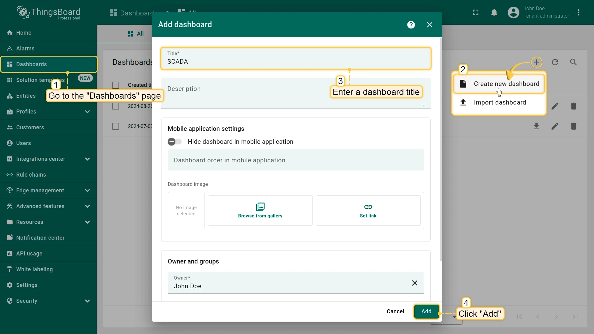
Section titled “Create SCADA Dashboard”- From the sidebar, navigate to Monitor ⇾ Dashboards.
- Click the + Add dashboard ⇾ Create new dashboard in the top right corner.
- Enter a dashboard title (all other settings are optional).
- If needed: In Owner and groups, change the dashboard owner or add it to a group.
- Click Add — the dashboard opens automatically in edit mode.
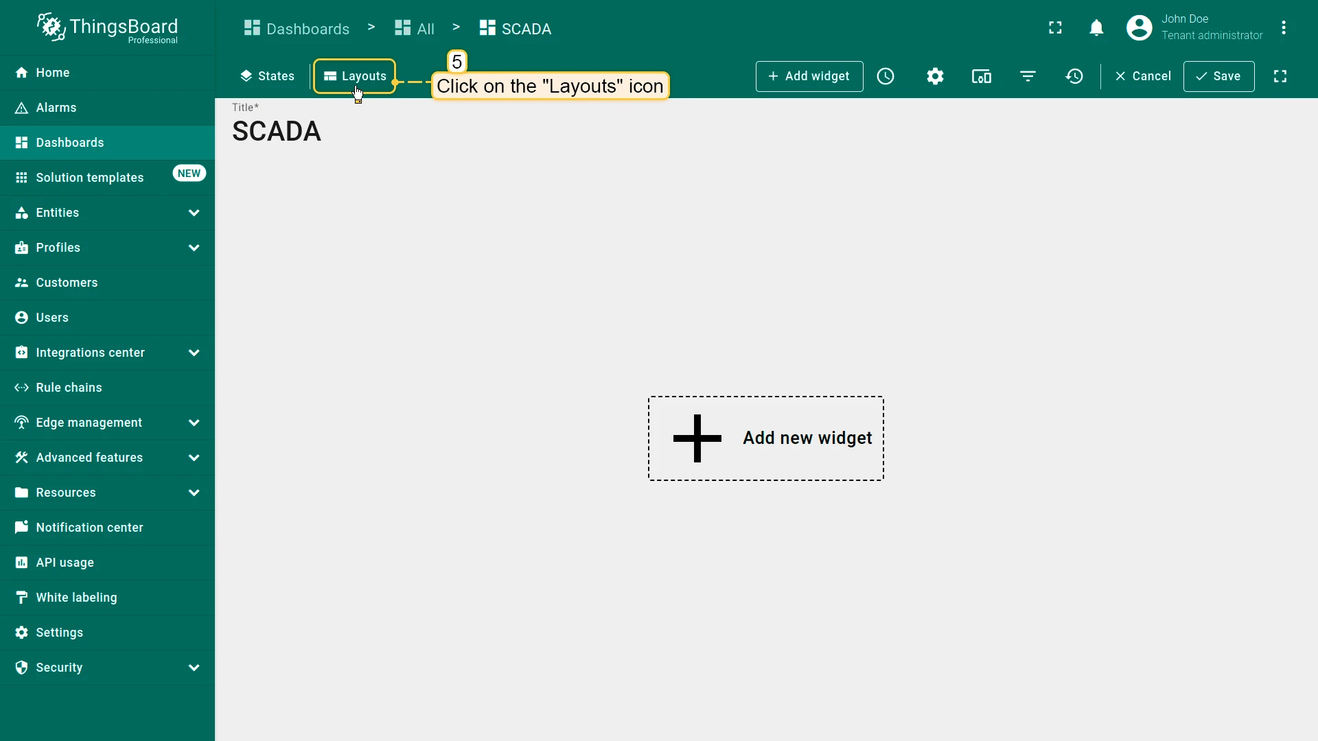
- Click Layouts in the toolbar.
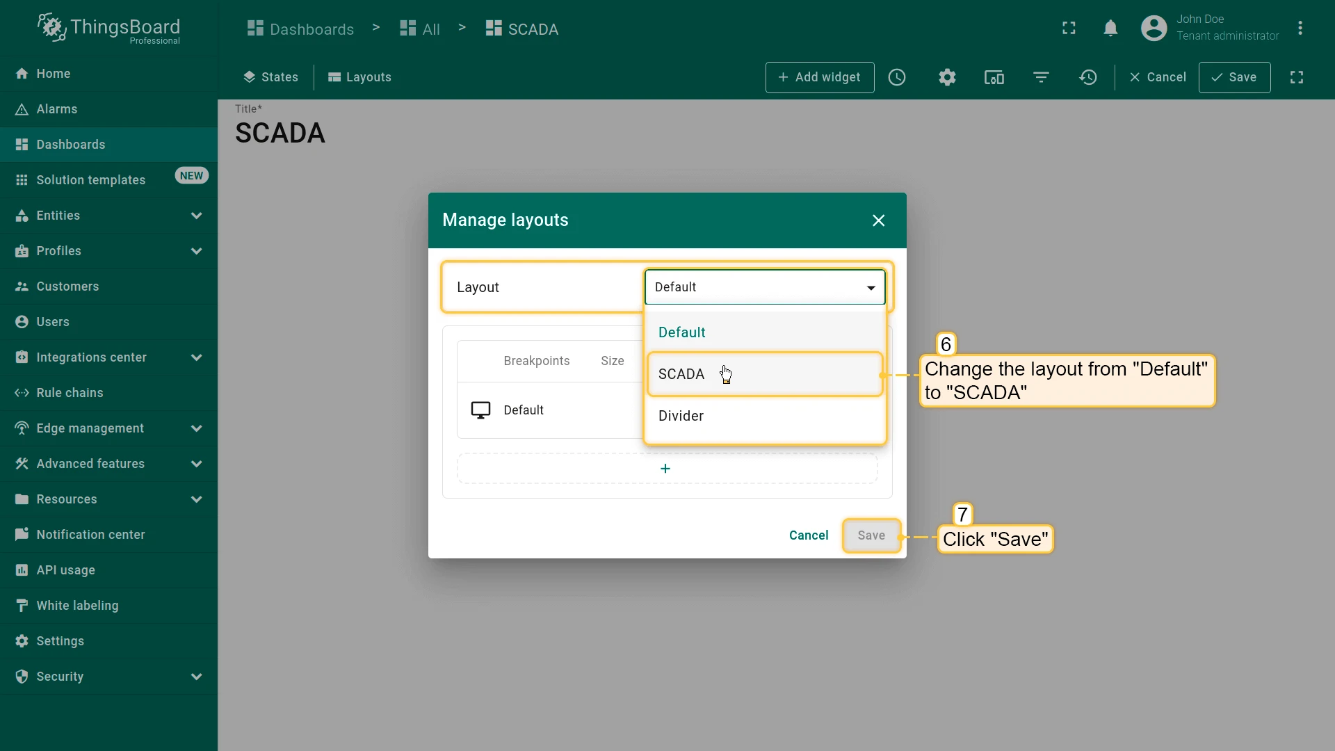
- In the Manage layouts dialog, change the layout type to SCADA and click Save.
Layout Settings
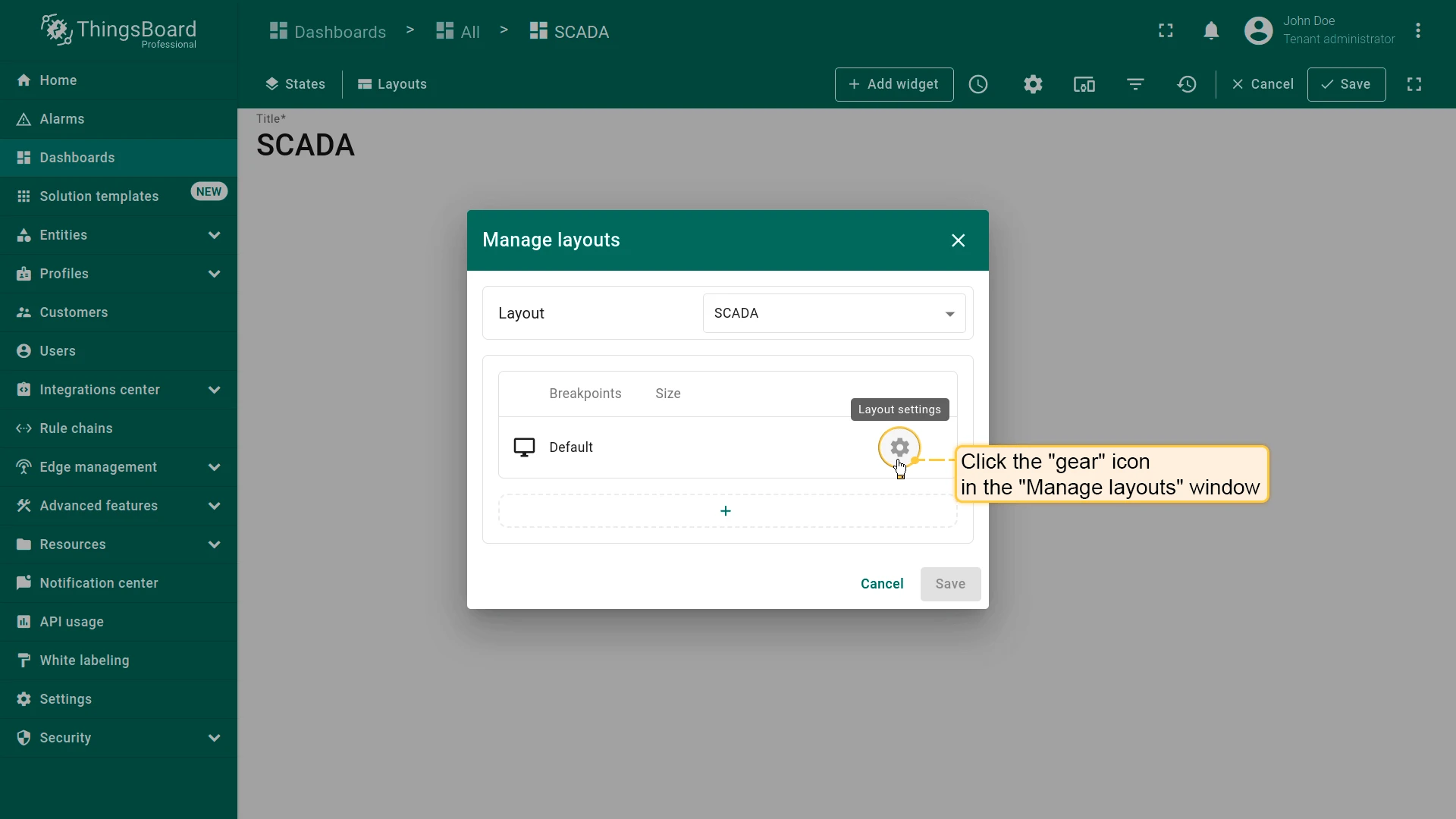
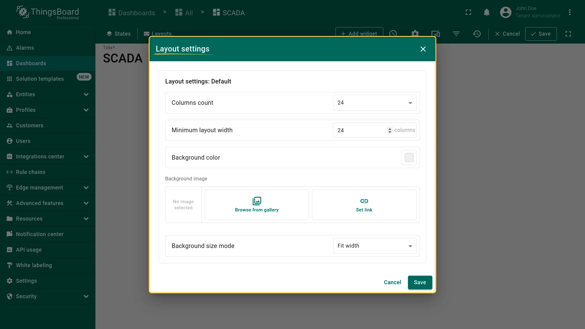
Section titled “Layout Settings”To access layout settings, click Layouts in the edit mode toolbar, then click the gear icon next to the layout row in the Manage layouts dialog.
Columns Count
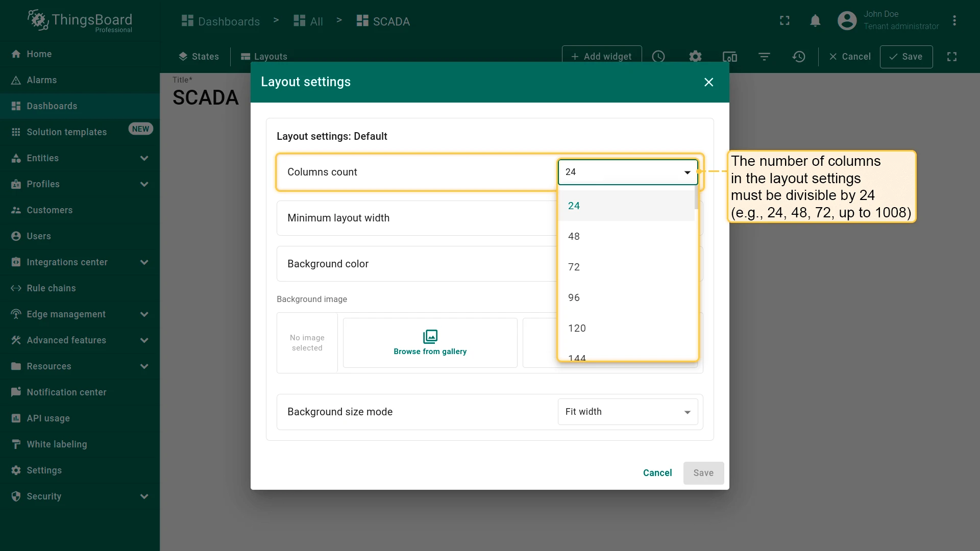
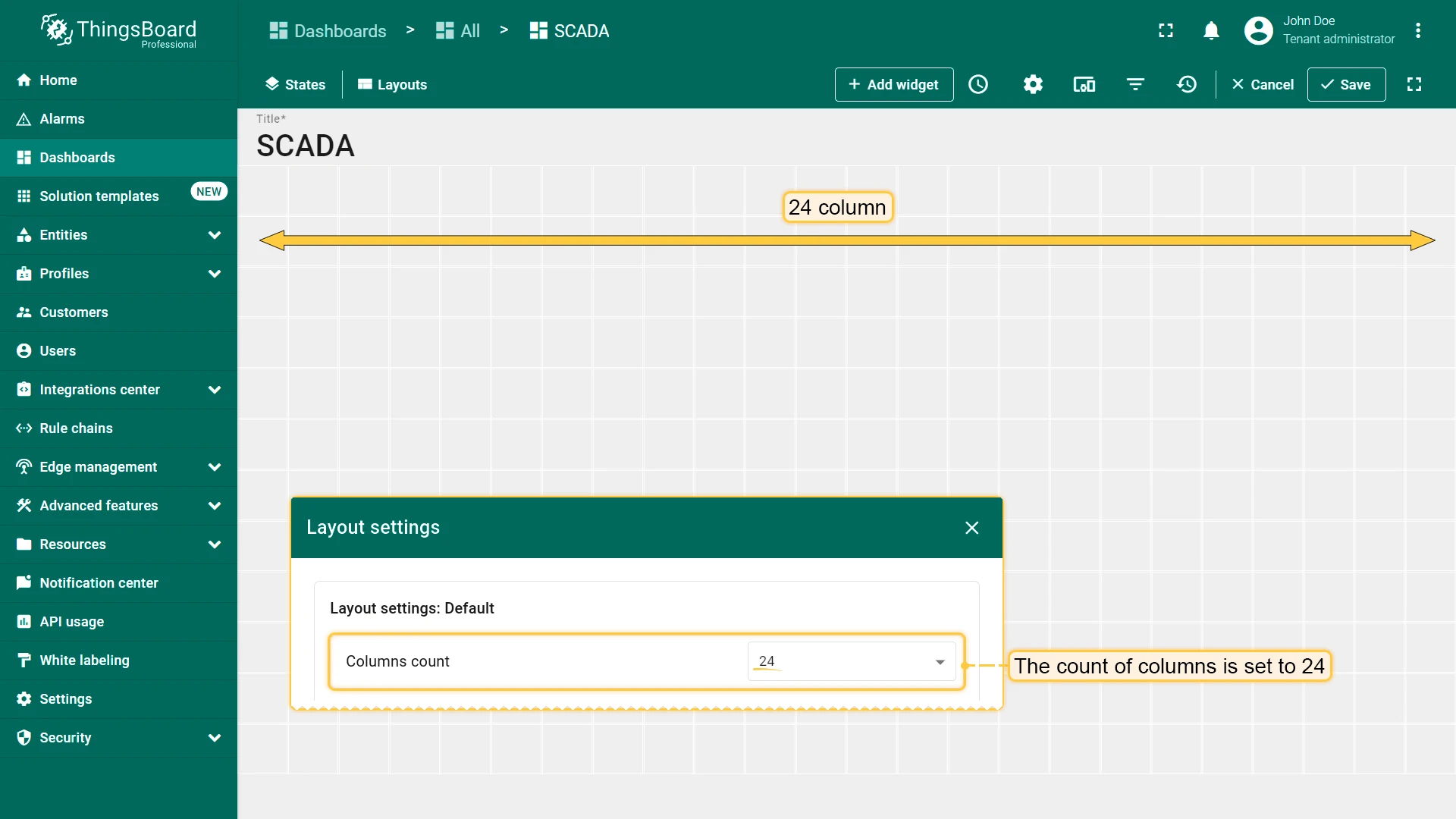
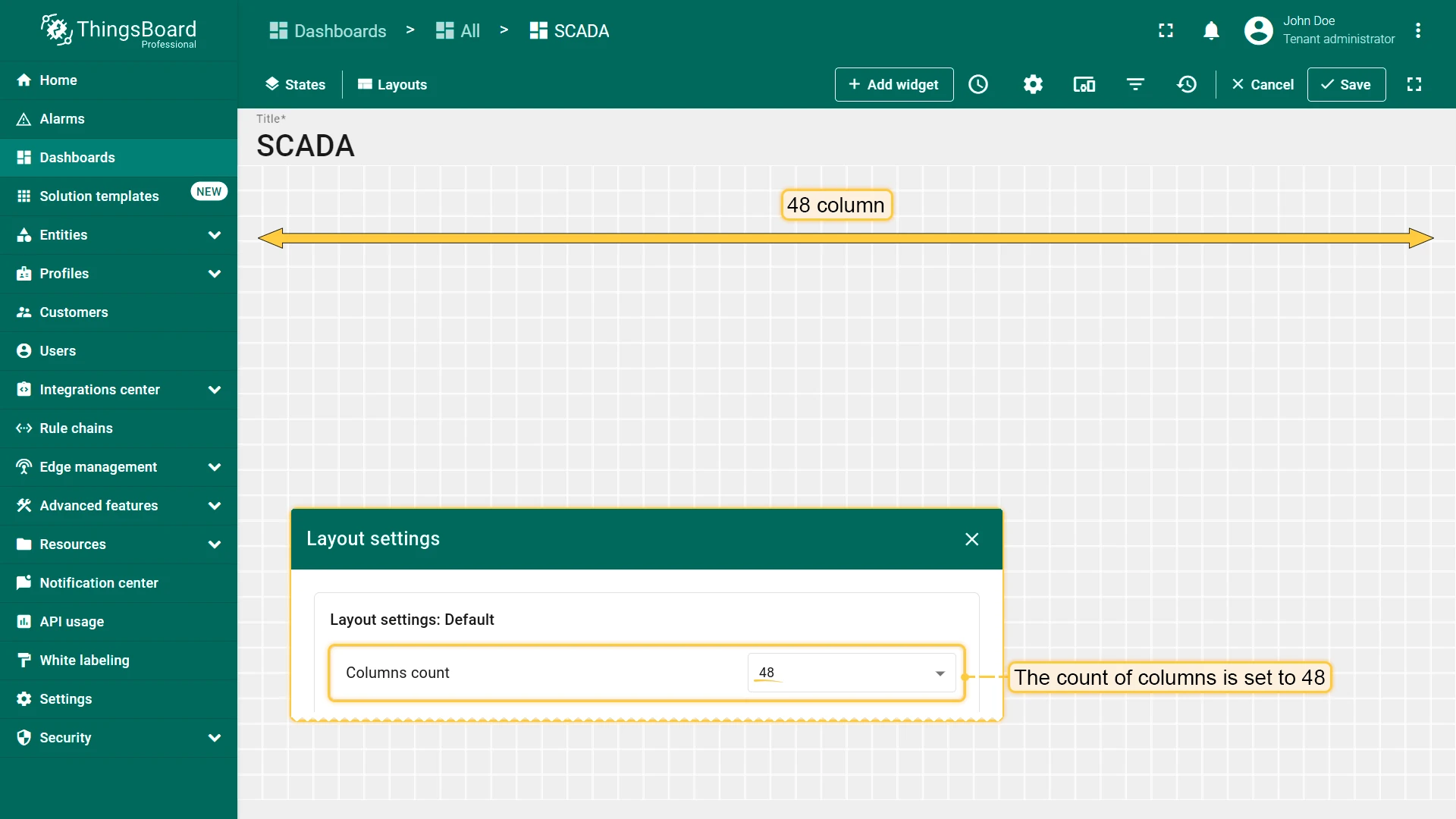
Section titled “Columns Count”Set the column count for the SCADA grid. Values must be multiples of 24 (24 to 1008). Higher values give finer placement granularity.
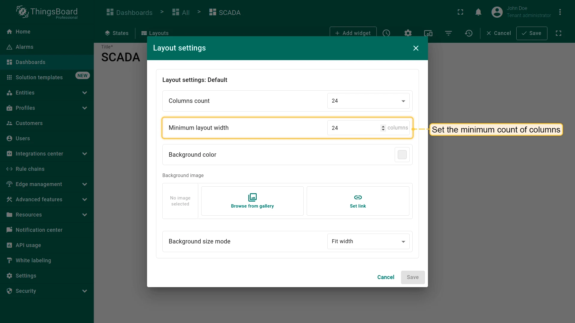
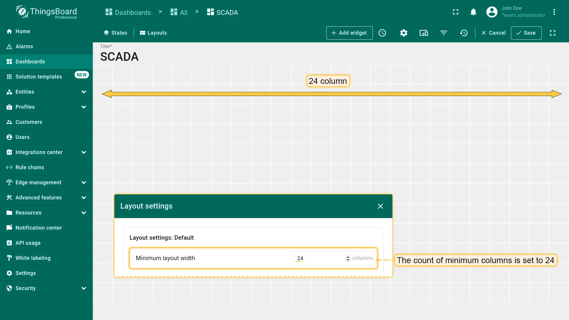
Minimum Layout Width
Section titled “Minimum Layout Width”Set the minimum canvas width in columns. If the viewport is narrower, a horizontal scrollbar appears.
Background Color
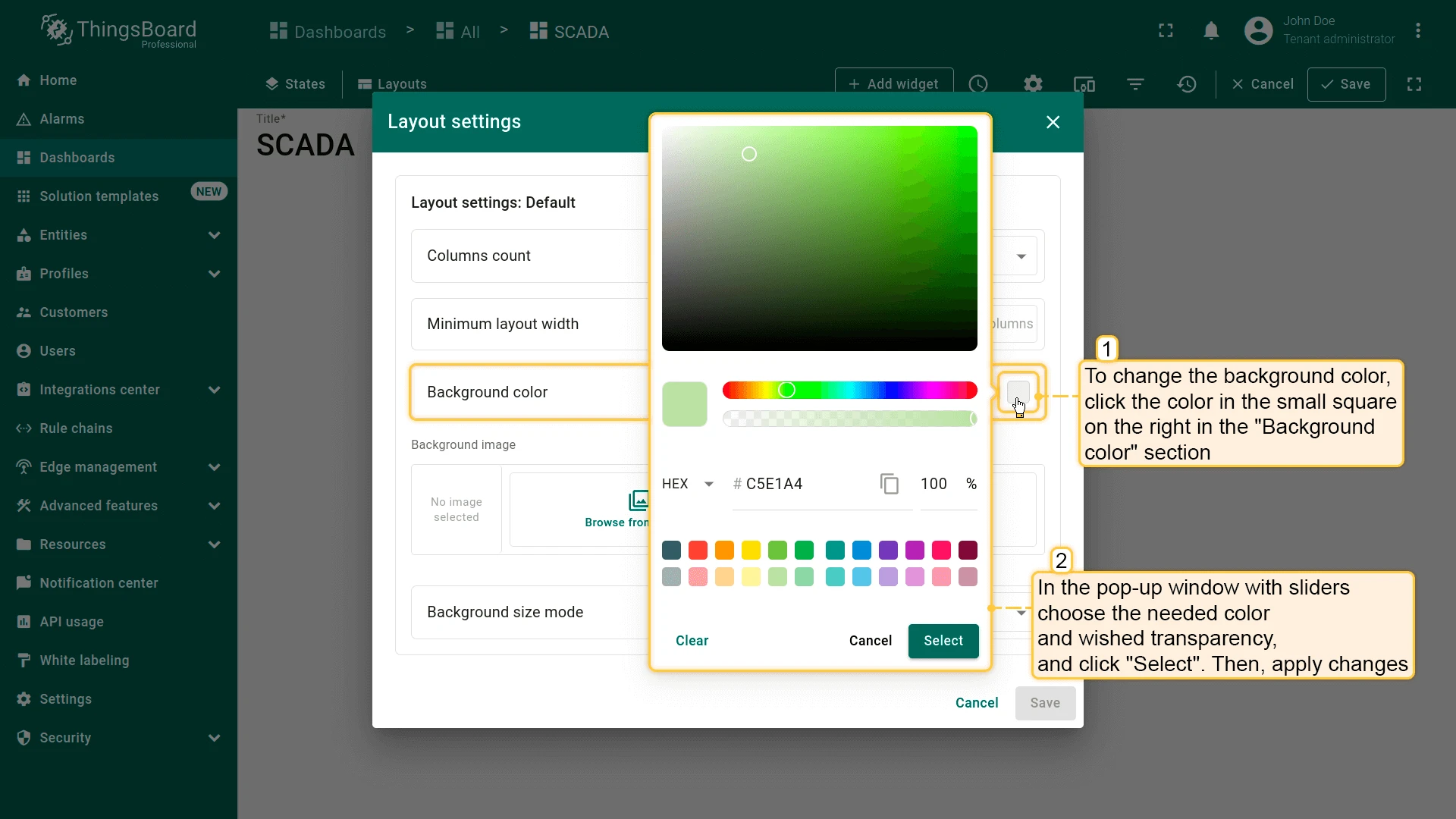
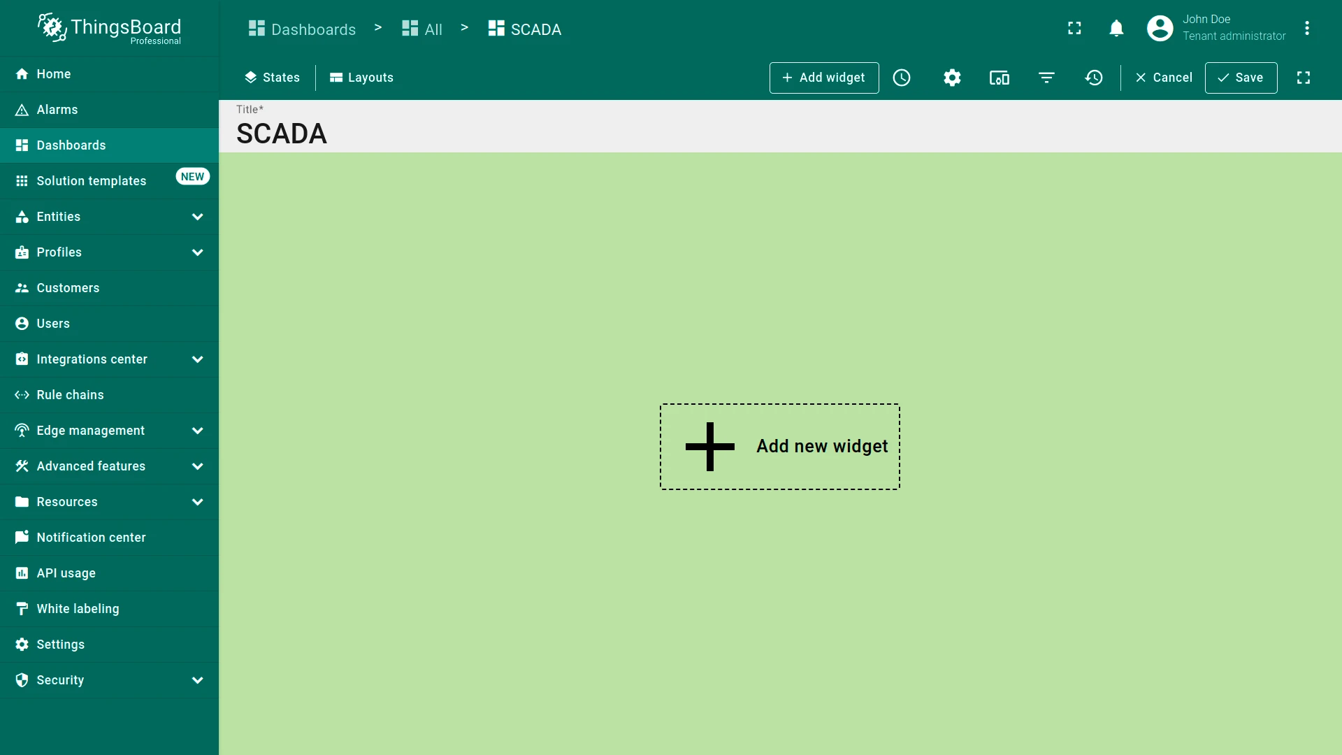
Section titled “Background Color”Set a custom background color for the SCADA canvas.
Background Image
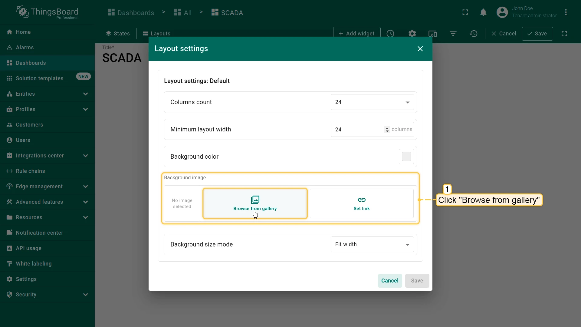
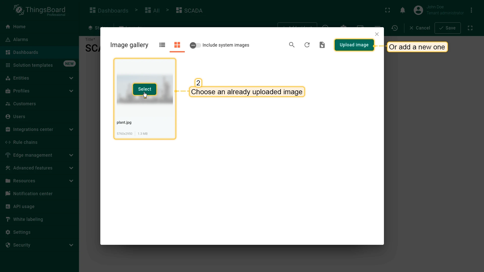
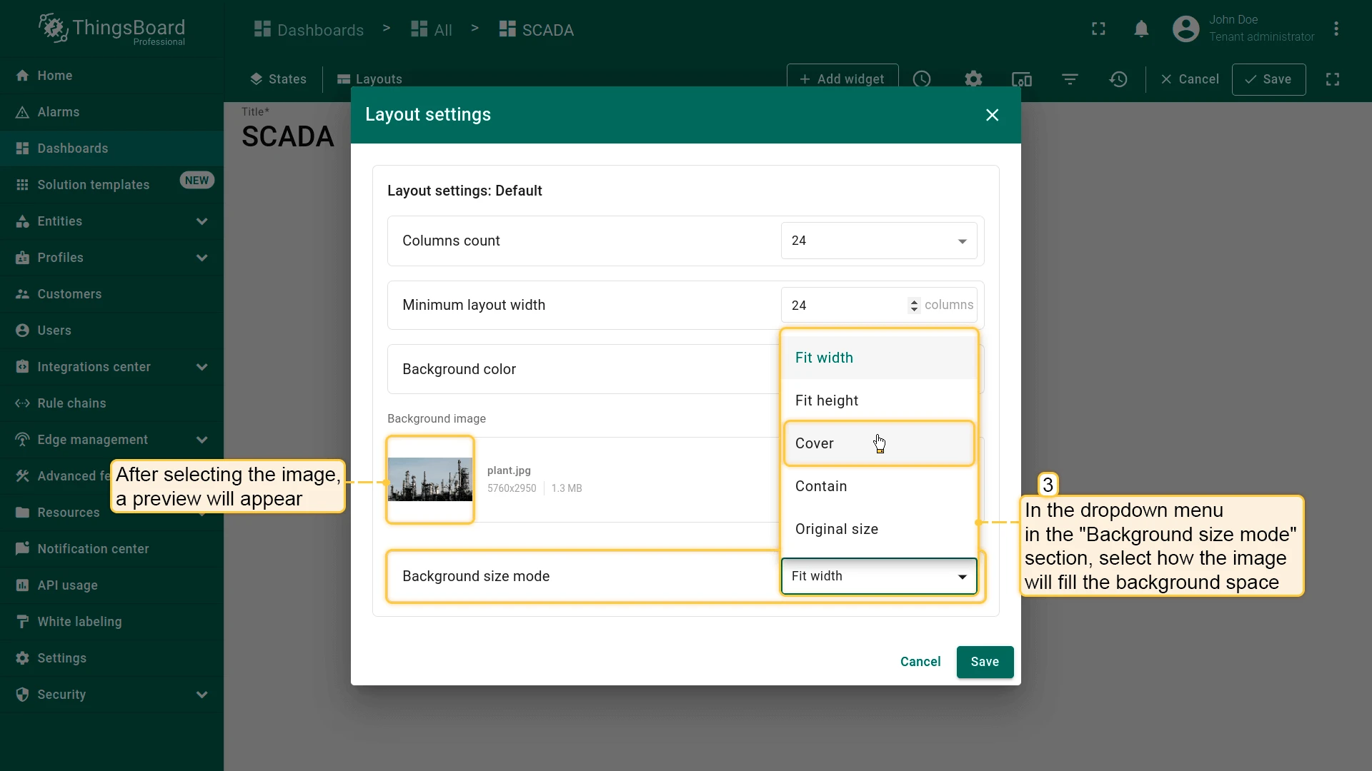
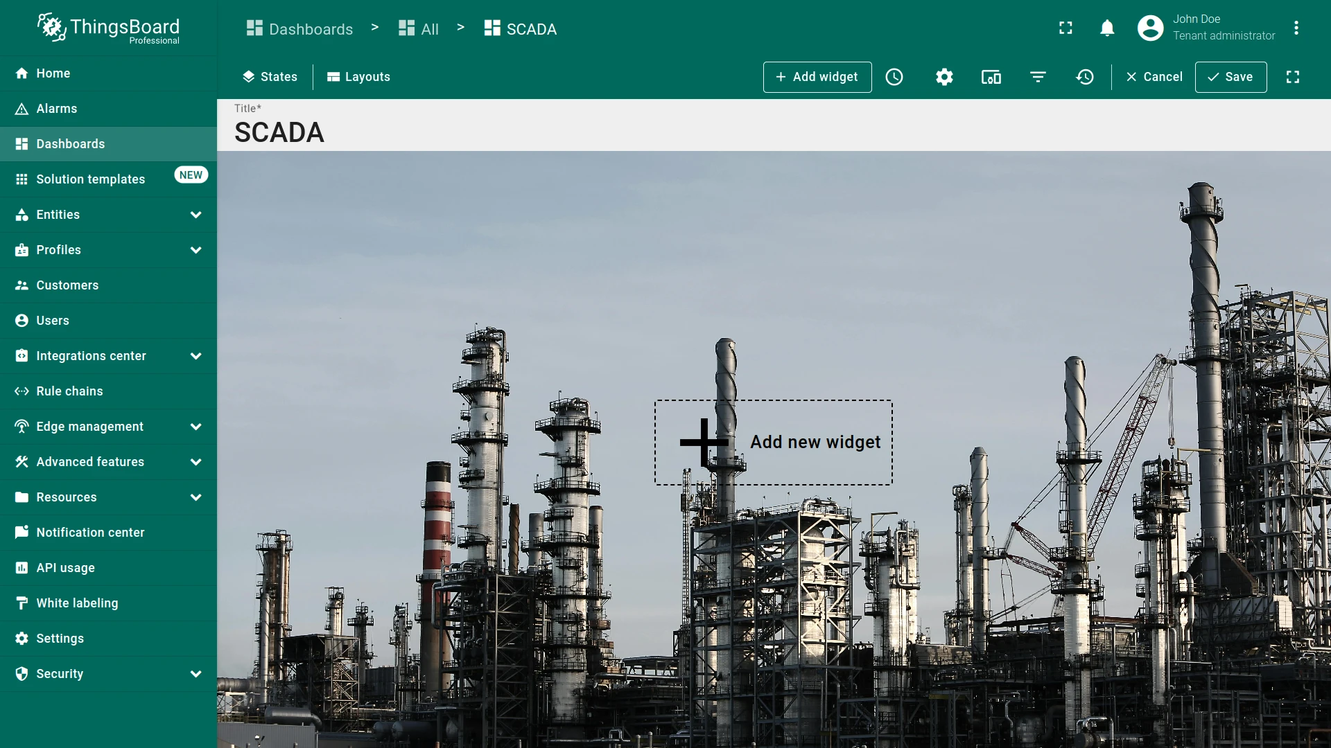
Section titled “Background Image”Upload a background image and choose a Background size mode — Fit width, Fit height, Cover, Contain, or Original size. The image typically represents the process diagram on which SCADA symbols are overlaid.
Multi-state Dashboards
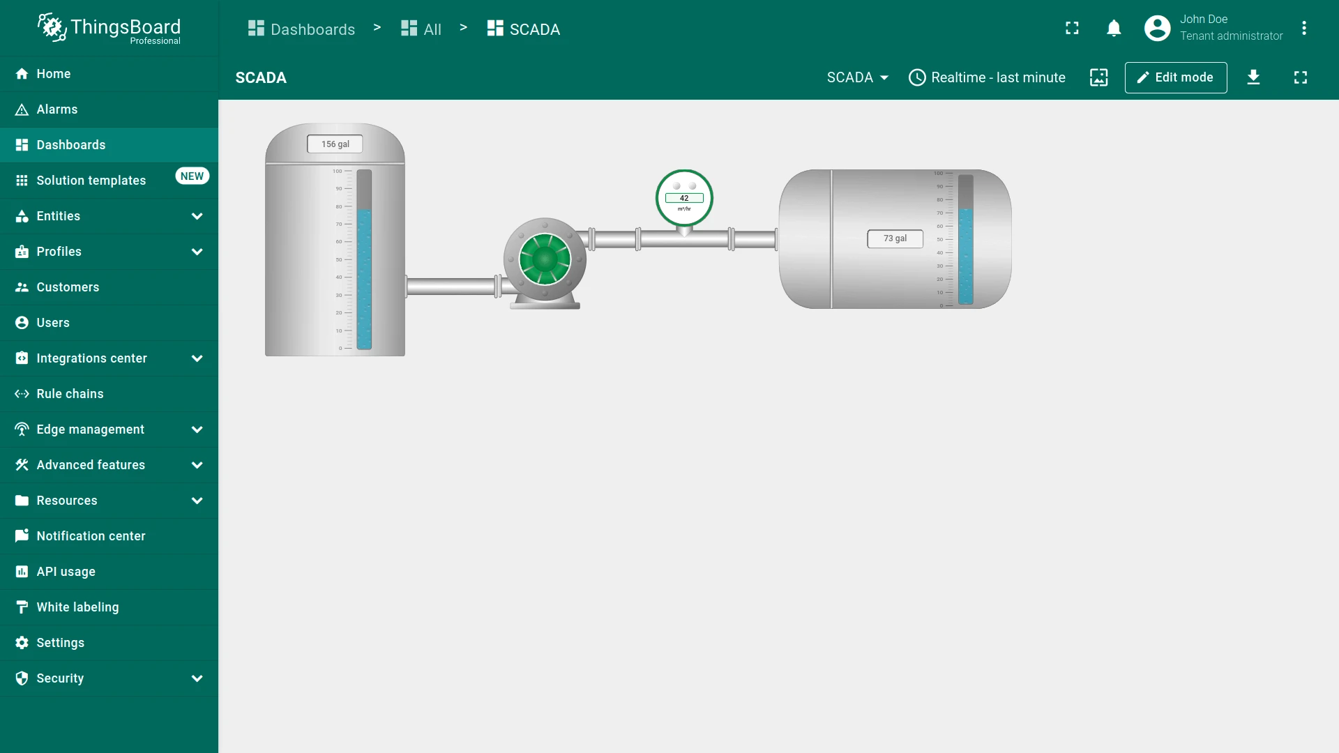
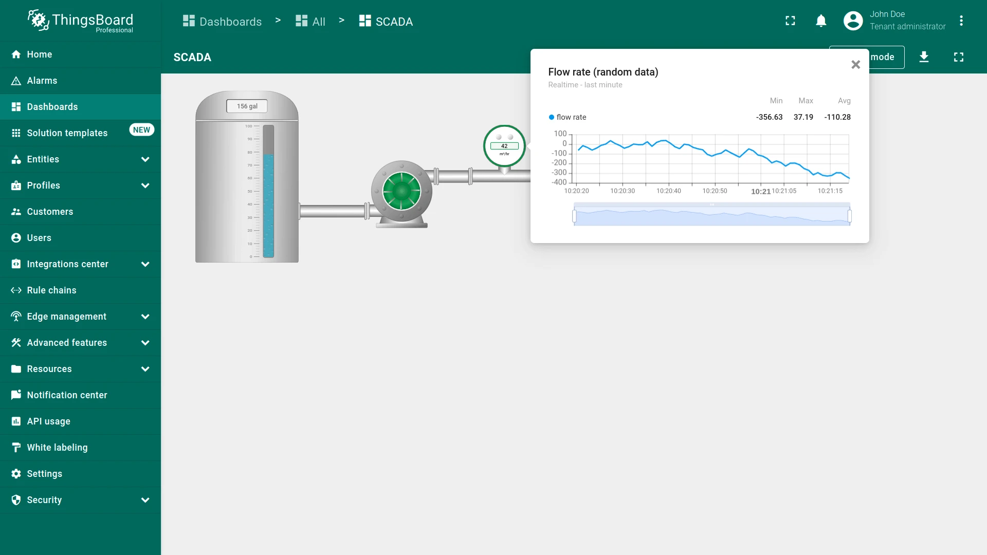
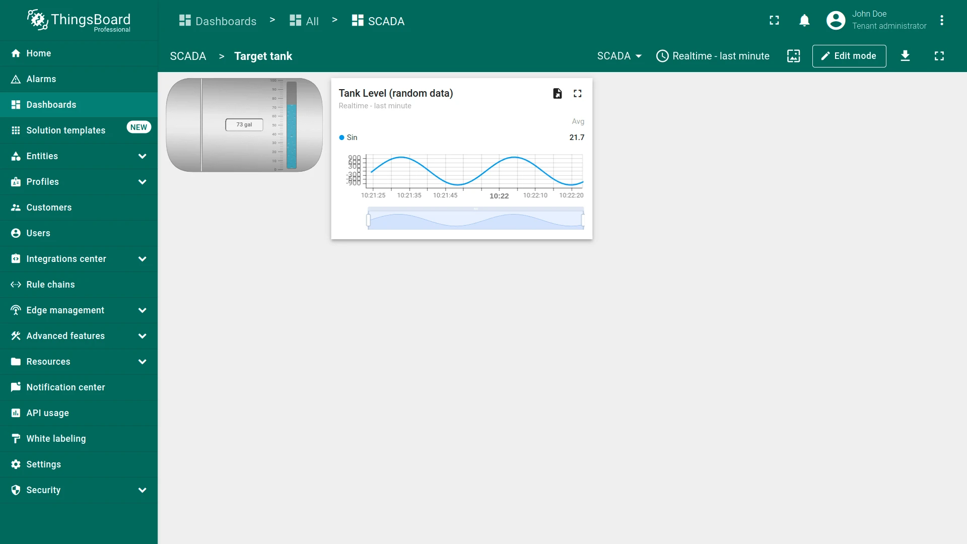
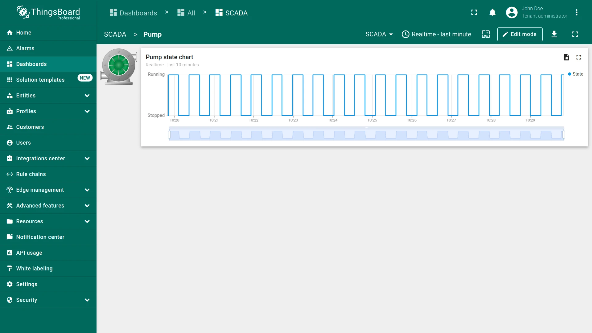
Section titled “Multi-state Dashboards”A dashboard can combine regular dashboard states with SCADA states, enabling navigation from a SCADA overview to a detail view — or from a symbol to a popup widget.
You can download and import a sample multi-state SCADA dashboard to explore this feature.
SCADA Symbol
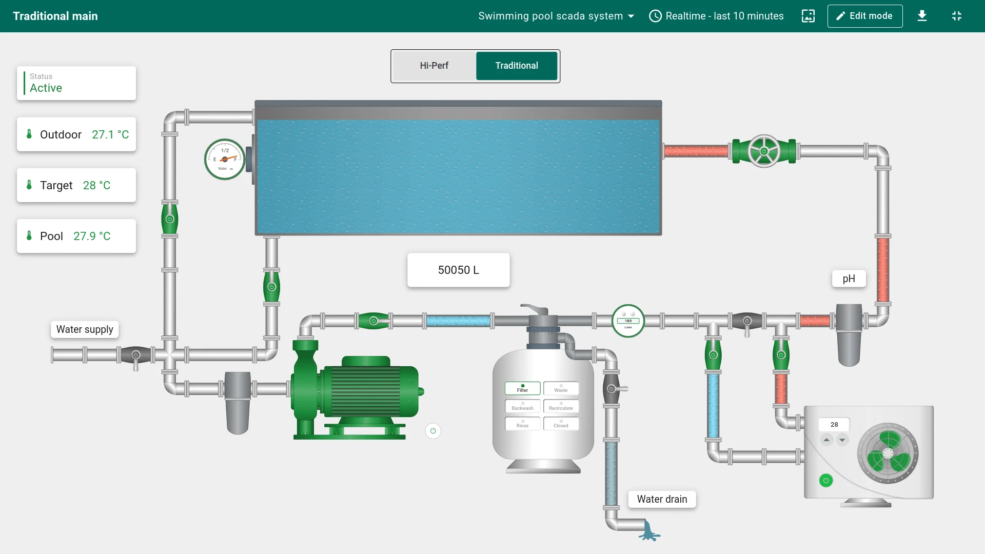
Section titled “SCADA Symbol”A SCADA symbol is an SVG element that represents a piece of equipment — a valve, pump, tank, or any process component. Symbols include built-in behavior tags that connect them to device data.
ThingsBoard provides 100+ SCADA symbols out of the box, with plans to expand to 500+. You can also create custom SCADA symbols.
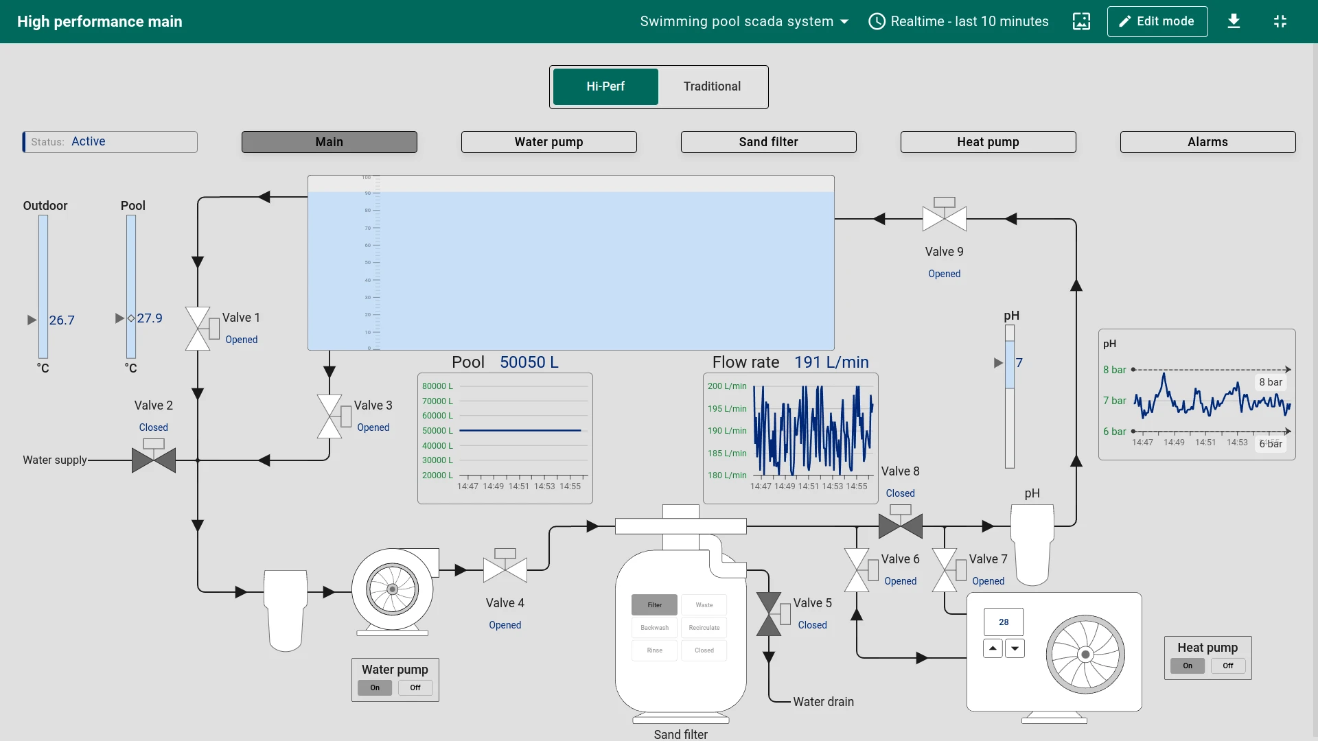
Starting with ThingsBoard 3.9, high-performance SCADA symbols are available — streamlined graphical elements designed for large-scale dashboards:
- Simplified design — clean, standardized visuals that reduce rendering overhead.
- Color coding — state is communicated through color changes.
- Dynamic changes — visual state updates reflect live process data in real time.
- Standardization — uniform appearance across all diagrams.
- Compatibility — designed for use across different devices and screen sizes.
SCADA Symbol Widget
Section titled “SCADA Symbol Widget”The SCADA symbol widget renders an SVG-based symbol on the dashboard and connects it to a target entity for live data.
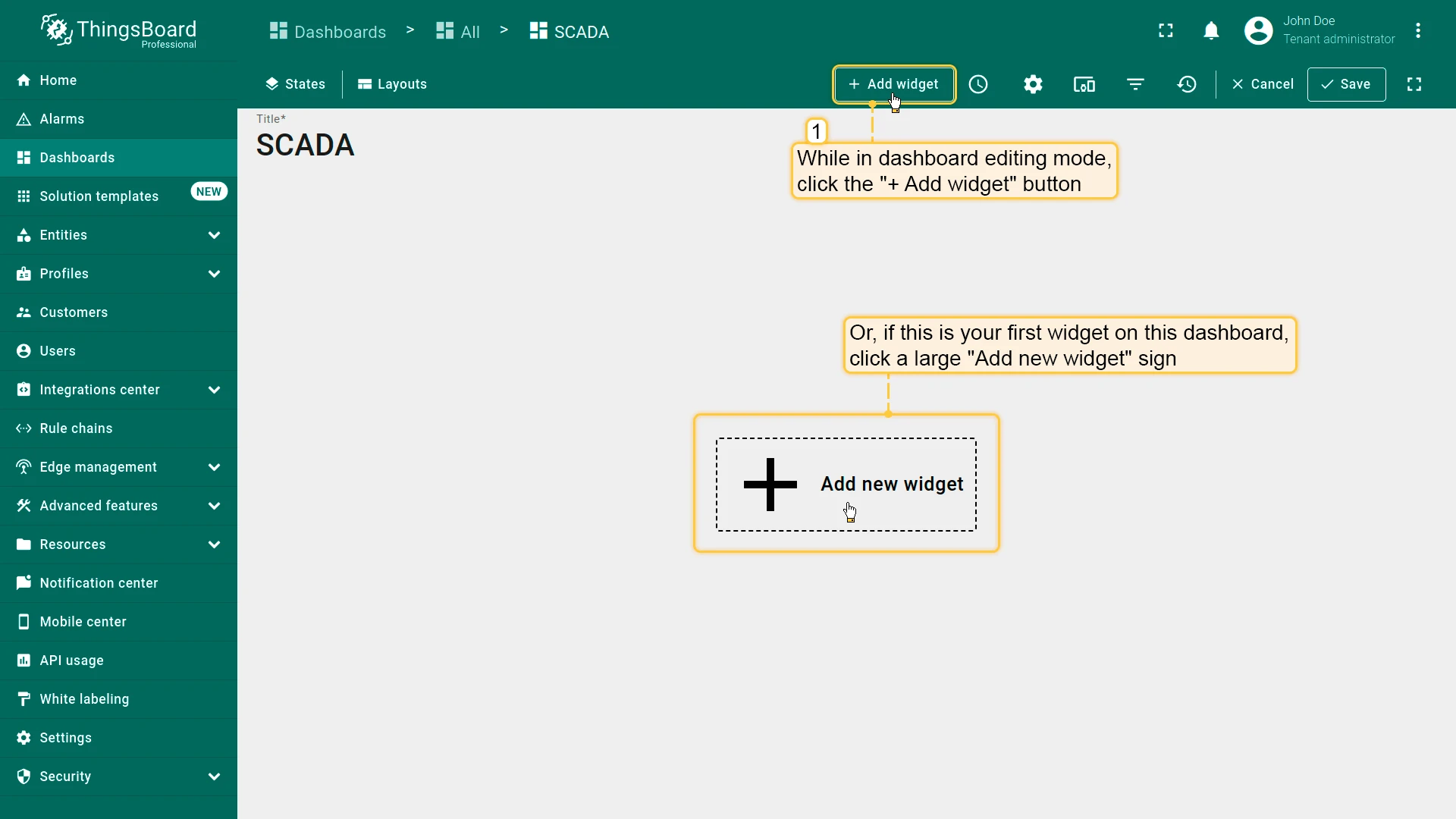
- In dashboard edit mode, click + Add widget in the toolbar.
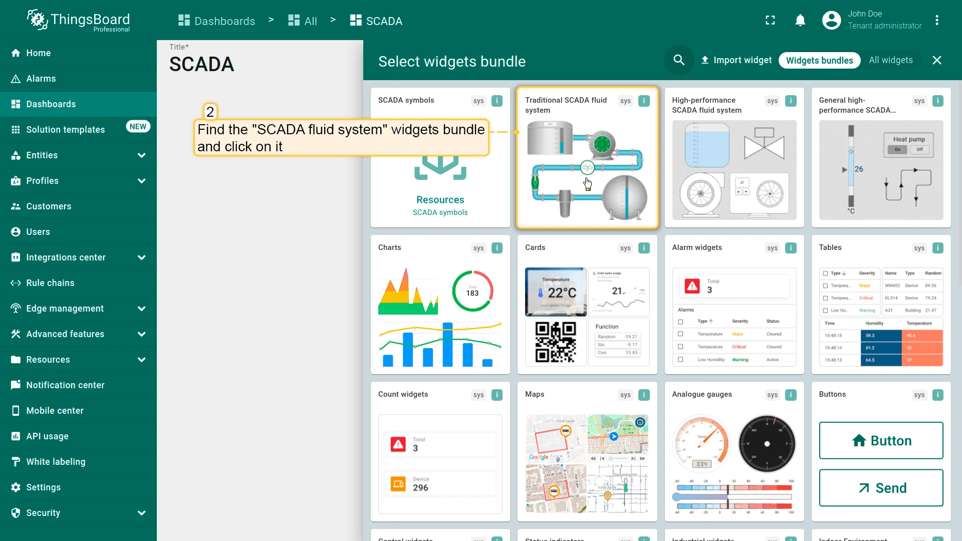
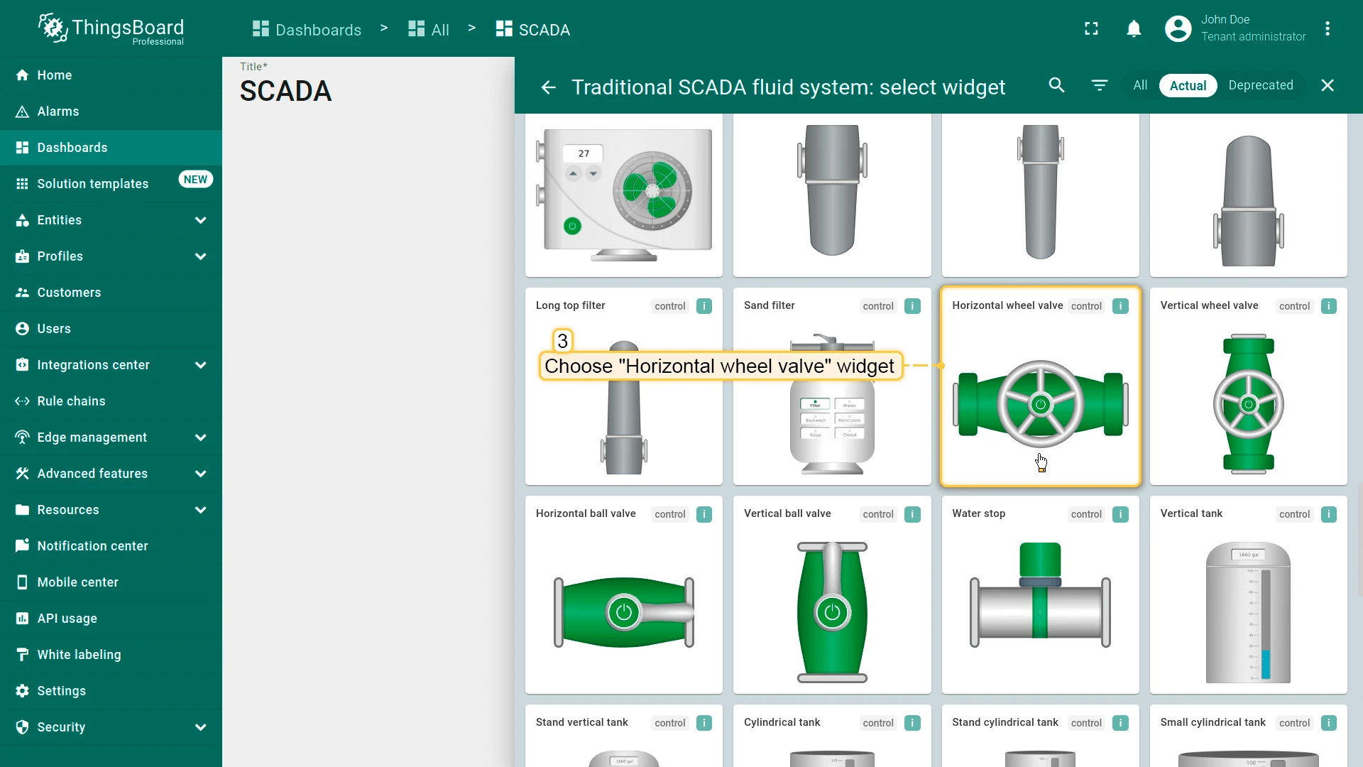
- In the widget library, find and open a SCADA symbols bundle (e.g., Traditional SCADA fluid system).
- Choose a symbol (e.g., Horizontal wheel valve).
- Configure:
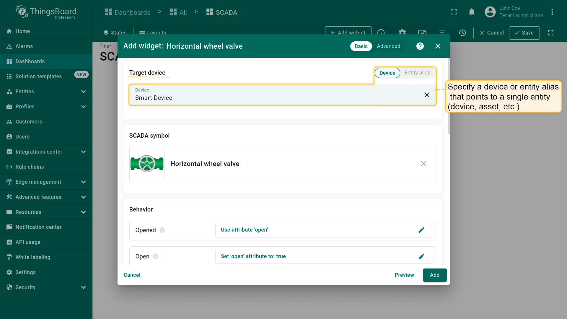
- The target device — the device or entity the symbol will visualize.
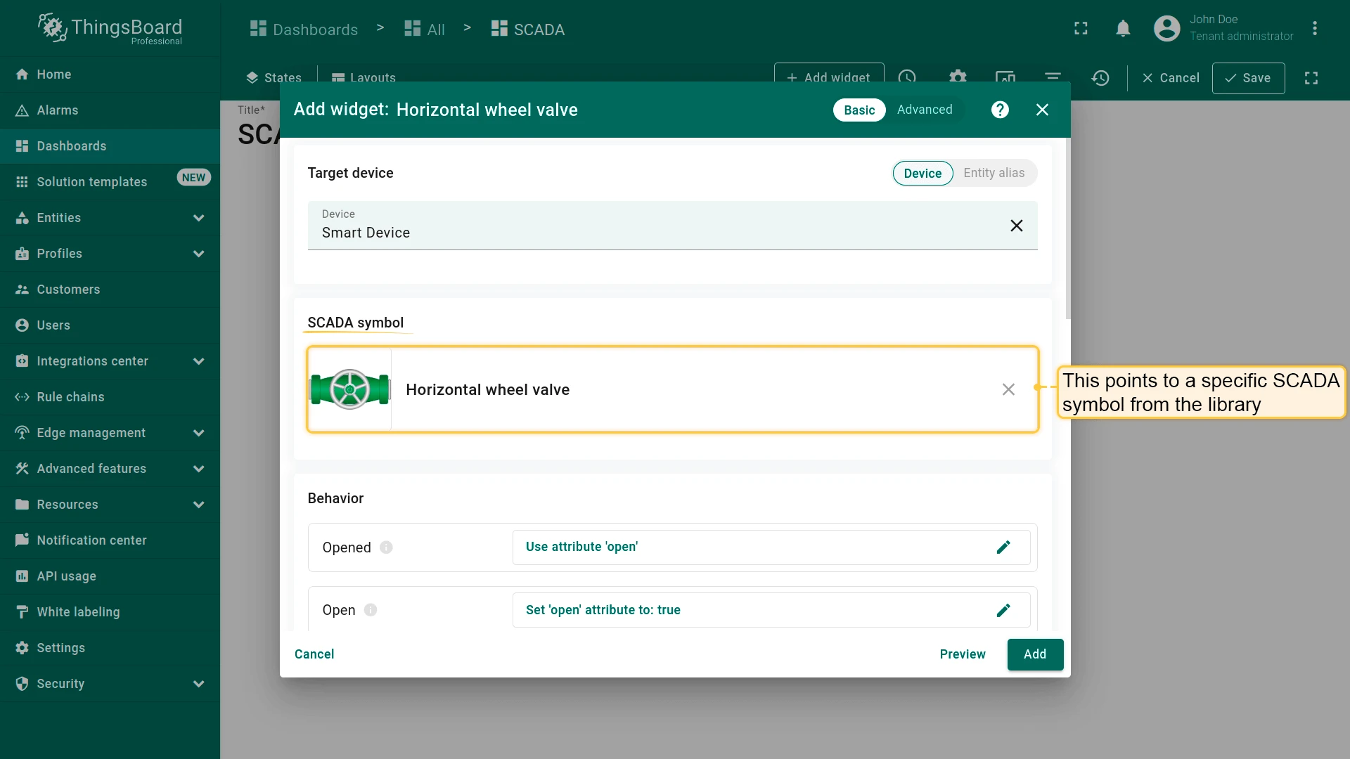
- SCADA symbol — the SVG symbol from the library to render.
- Behavior — how the symbol reads and writes data.
- Appearance — symbol-specific visual properties such as state colors and rotation.
- Card appearance — background, border radius, padding, and visible card buttons.
- Click Add.
Target Entity
Section titled “Target Entity”Select the entity the SCADA symbol will visualize — either a specific device or an entity alias resolving to a single entity.
SCADA Symbol
Section titled “SCADA Symbol”Select the SVG symbol from the library to render in this widget. The selected symbol determines which behavior parameters are available.
Behavior
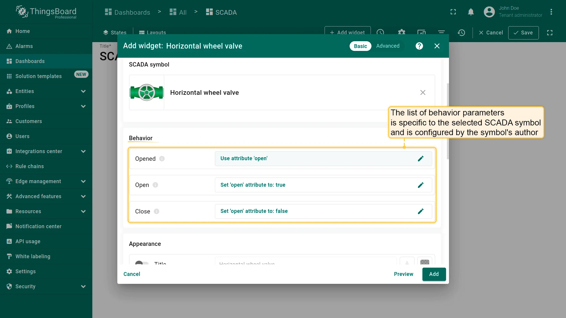
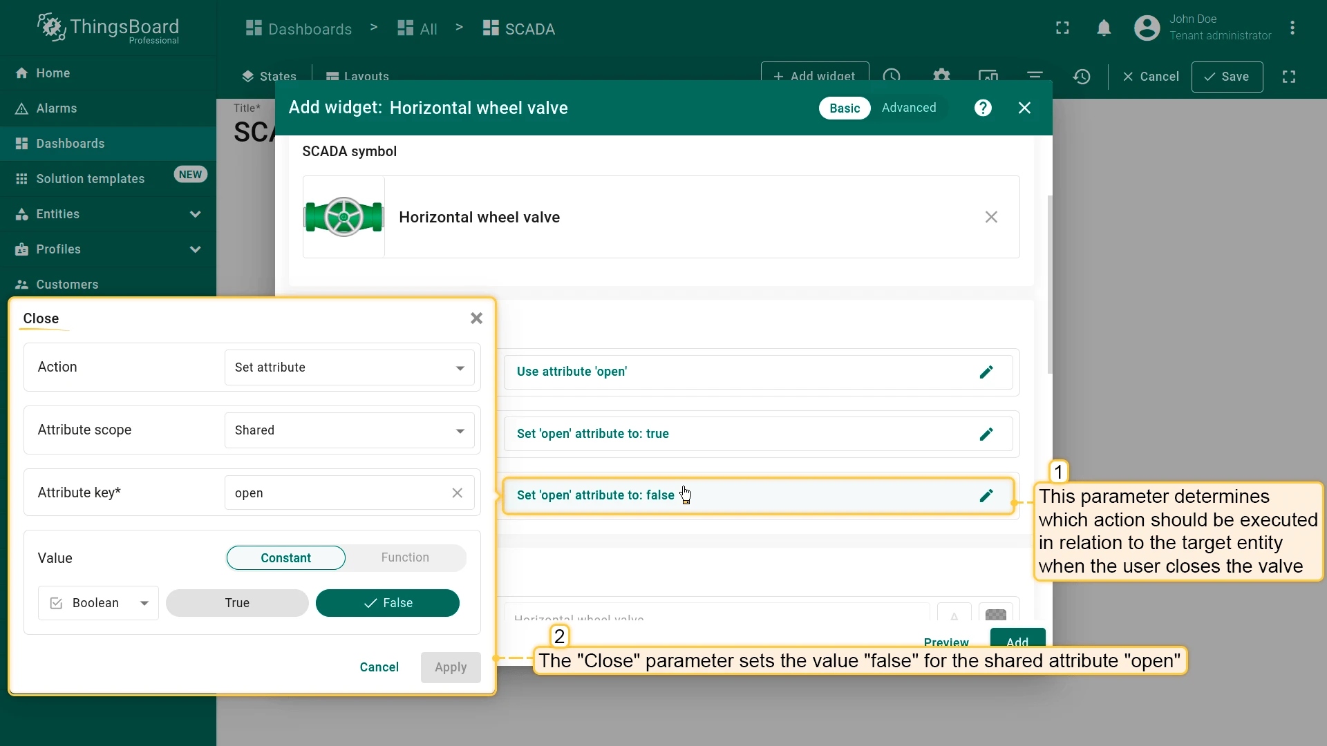
Section titled “Behavior”Behavior settings define how the symbol reads and writes data. Each behavior parameter has an action type that determines the data source or target. The set of parameters is specific to the selected symbol and defined by its author.
Action types for retrieving a value:
| Action type | Description |
|---|---|
| Do nothing | Uses a constant value defined in the widget |
| Execute RPC | Sends an RPC request to the device and uses the response |
| Get attribute | Subscribes to an entity attribute |
| Get time series | Subscribes to the latest time-series value |
| Get alarm status | Subscribes to the entity’s alarm status |
| Get dashboard state | Uses the name of the current dashboard state |
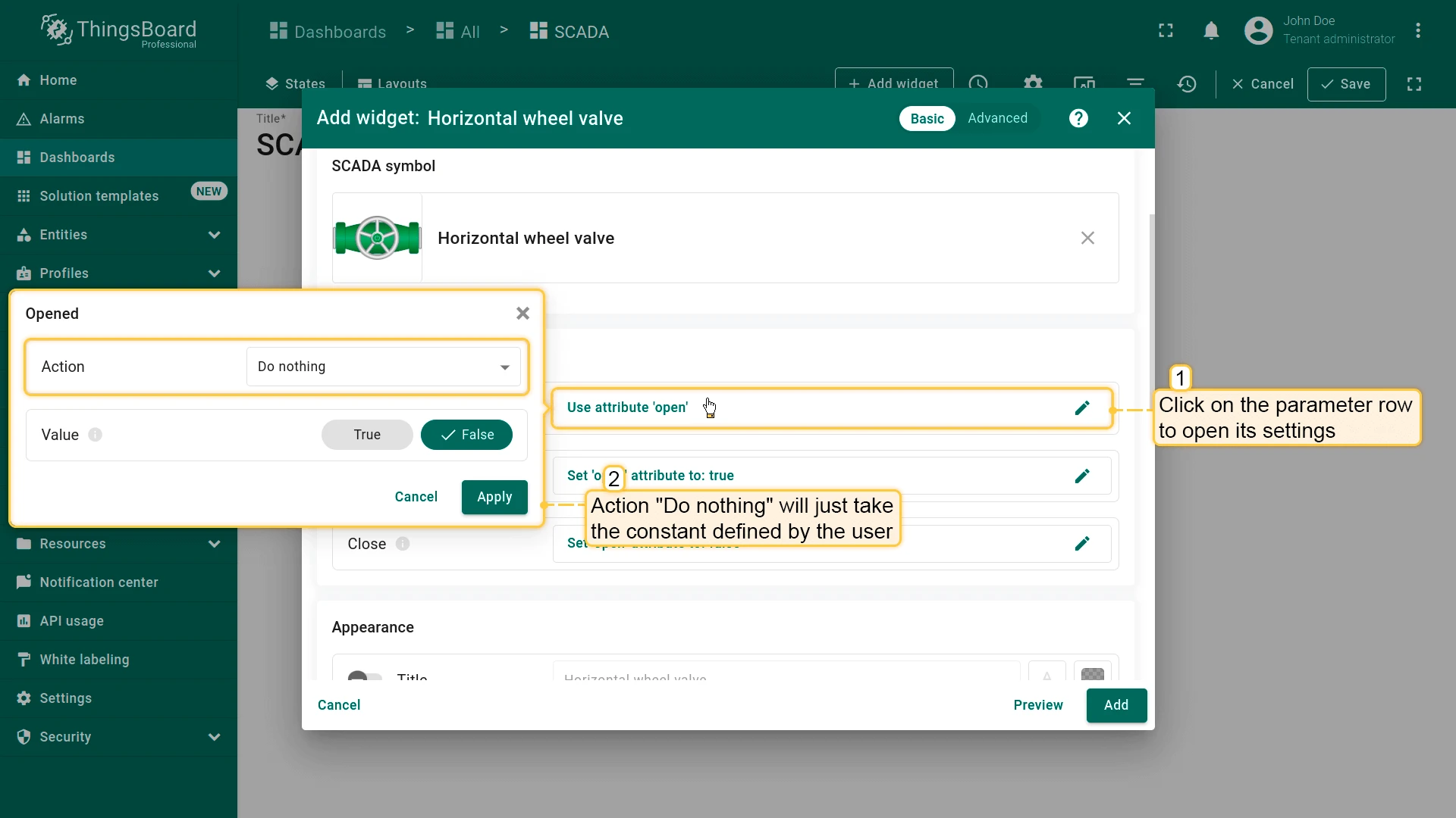
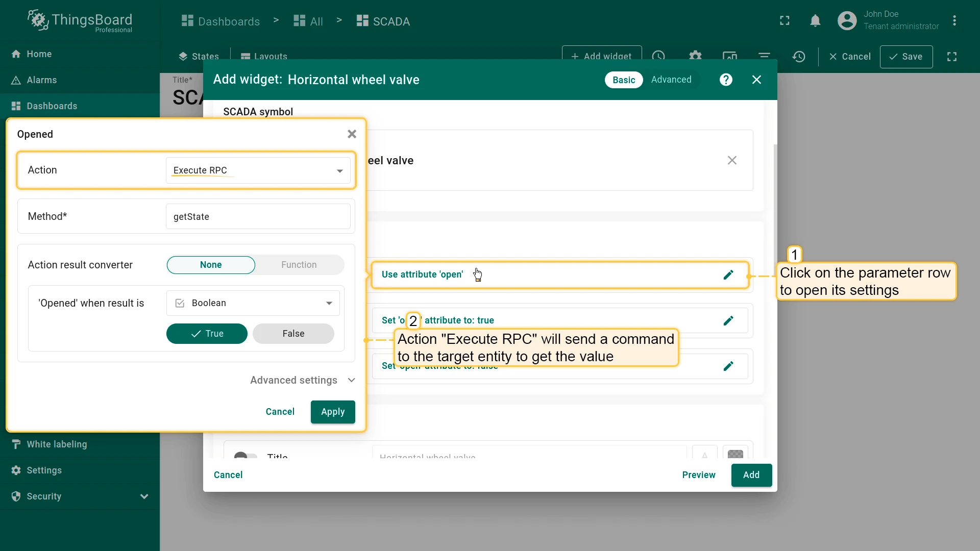
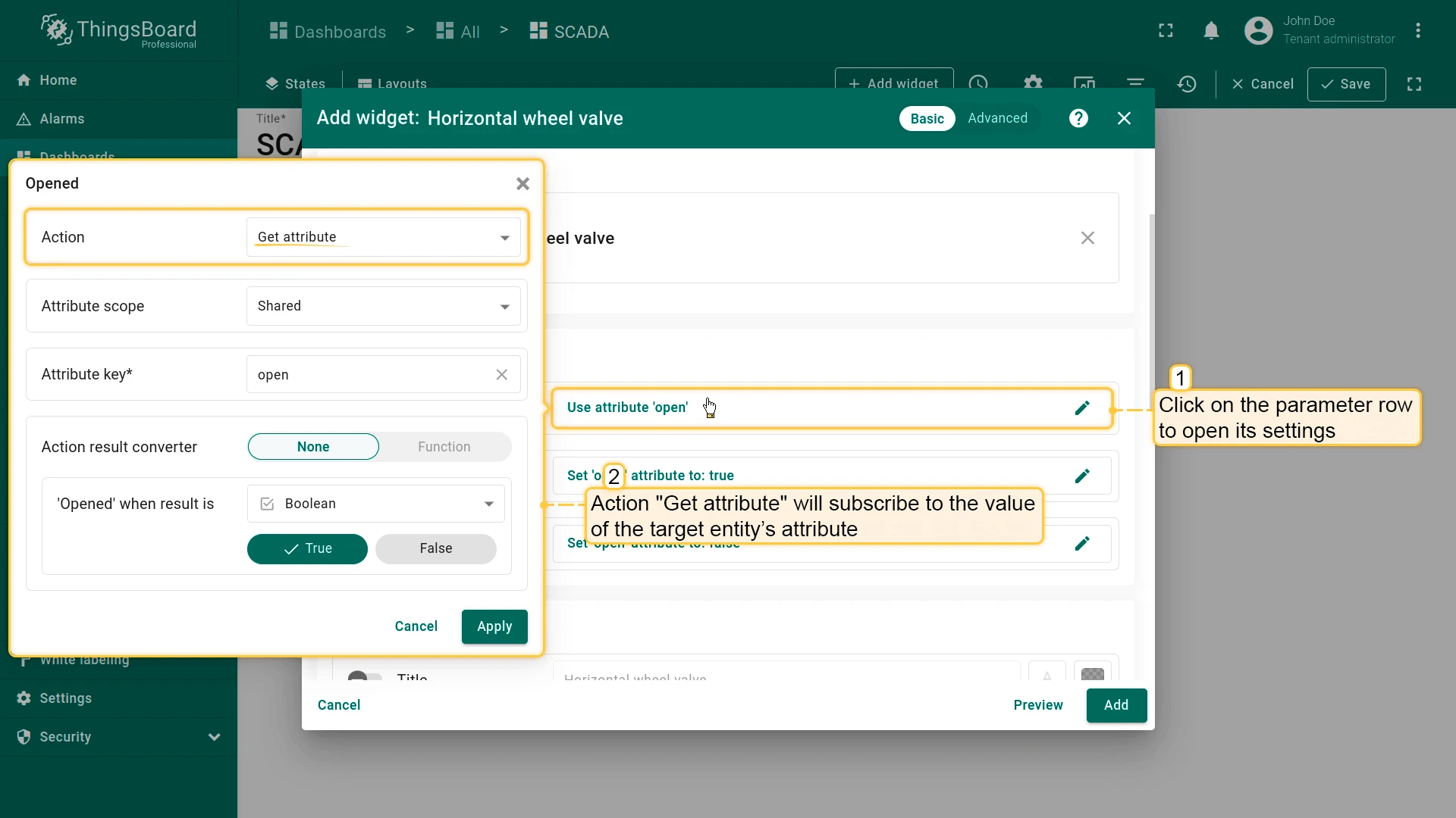
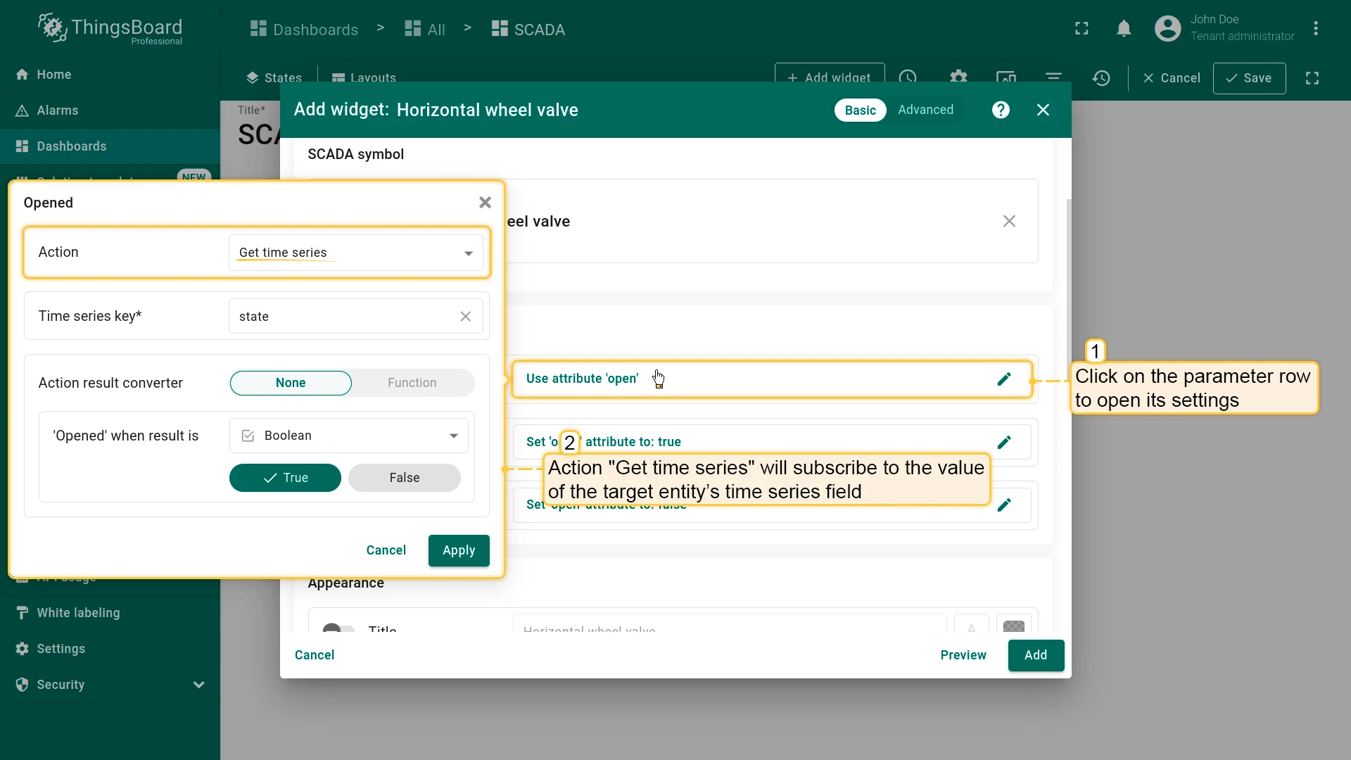
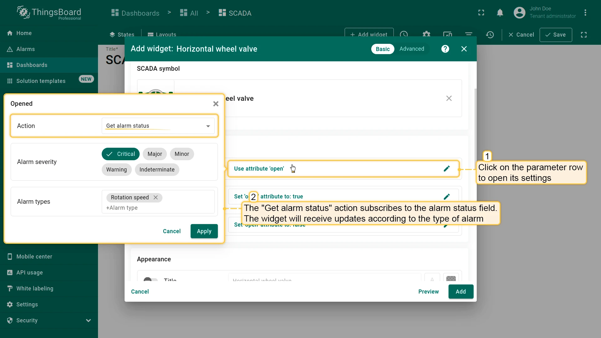
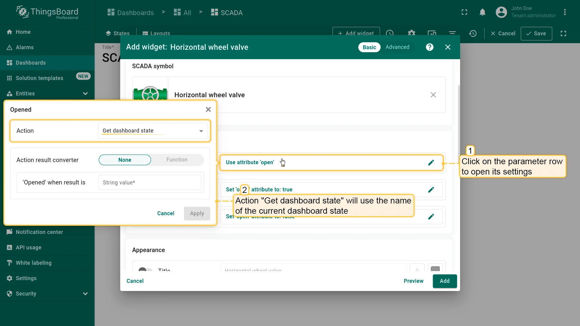
Action types for writing to the target entity:
| Action type | Description |
|---|---|
| Execute RPC | Sends an RPC command to the target device |
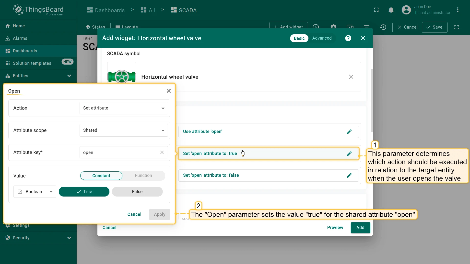
| Set attribute | Writes a value to an attribute on the target entity |
| Add time series | Pushes a new time-series data point to the target entity |
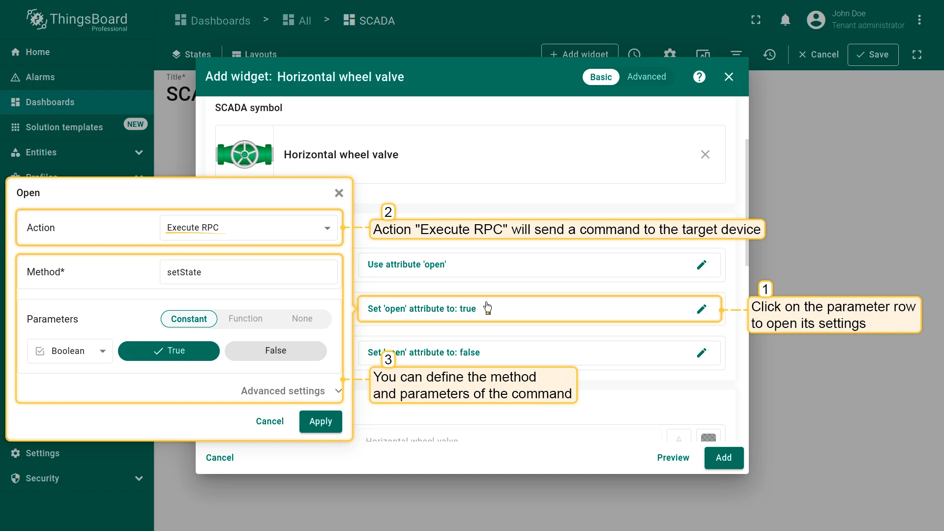
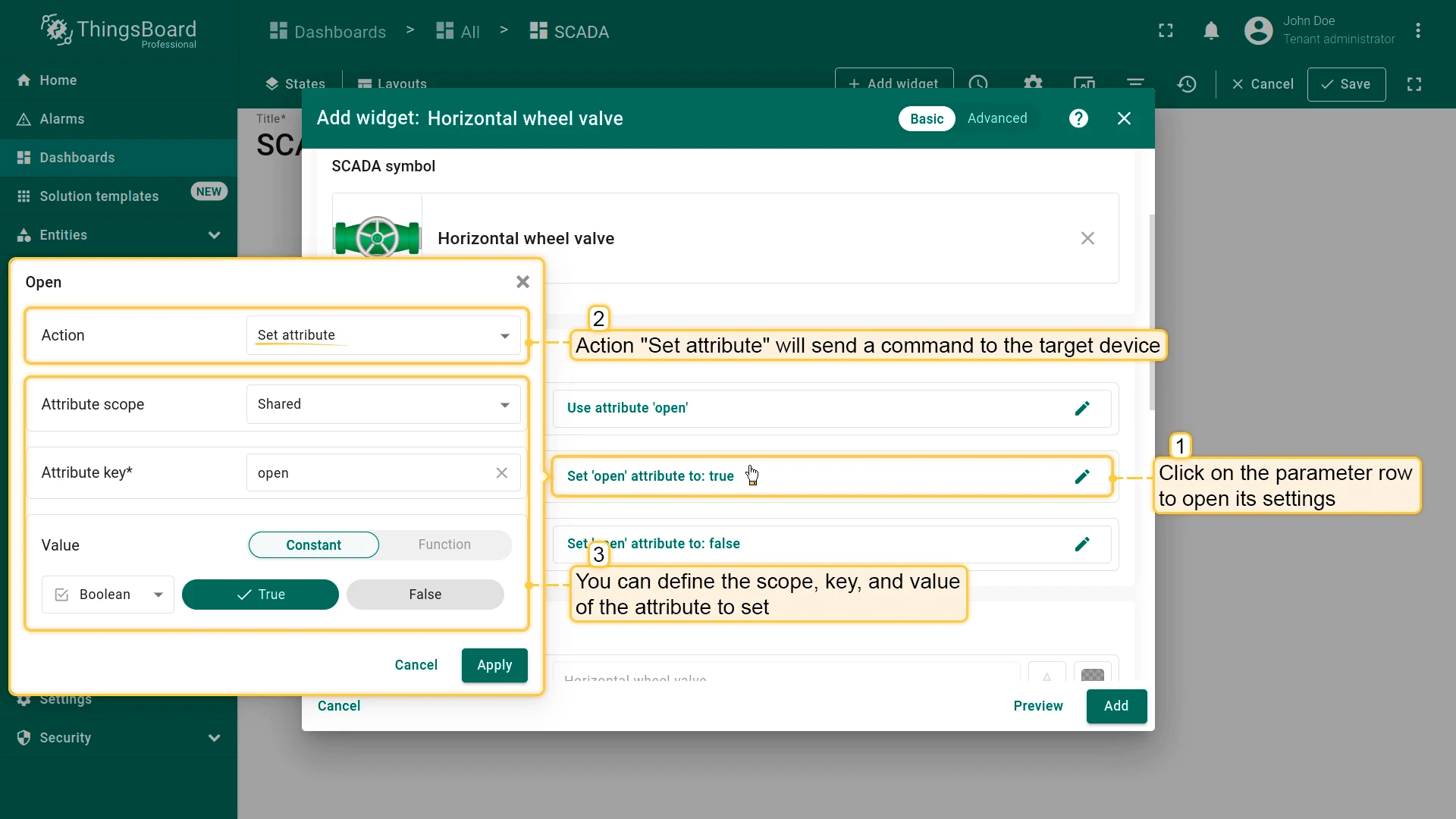
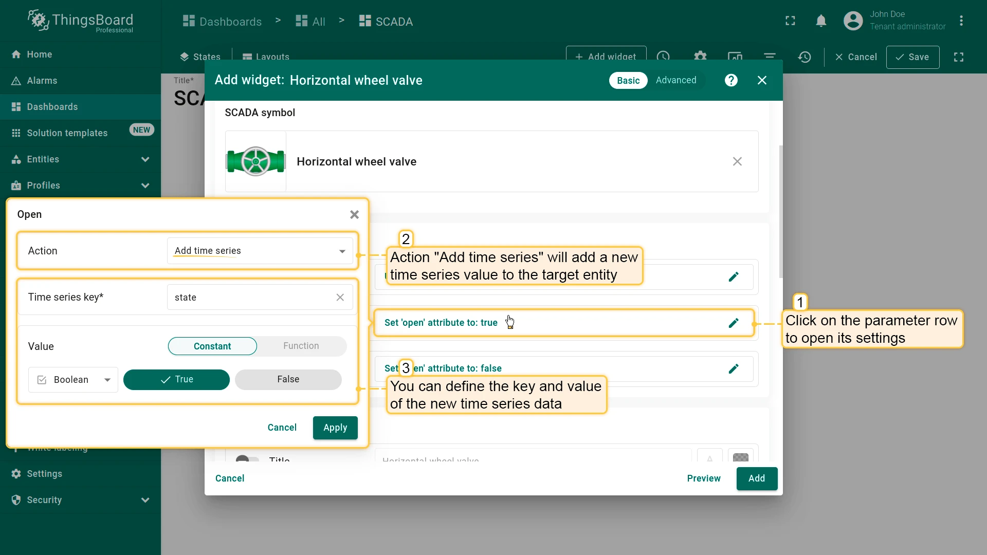
Widget action (On click) — defines what happens when a user clicks the SCADA symbol. See widget actions for details.
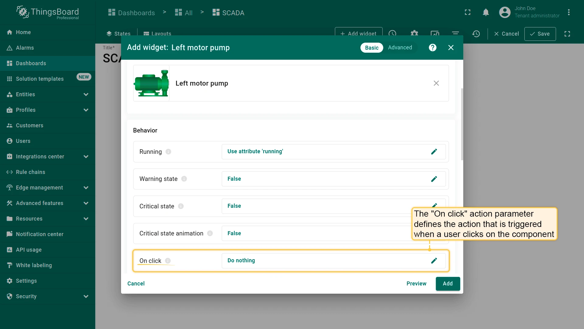
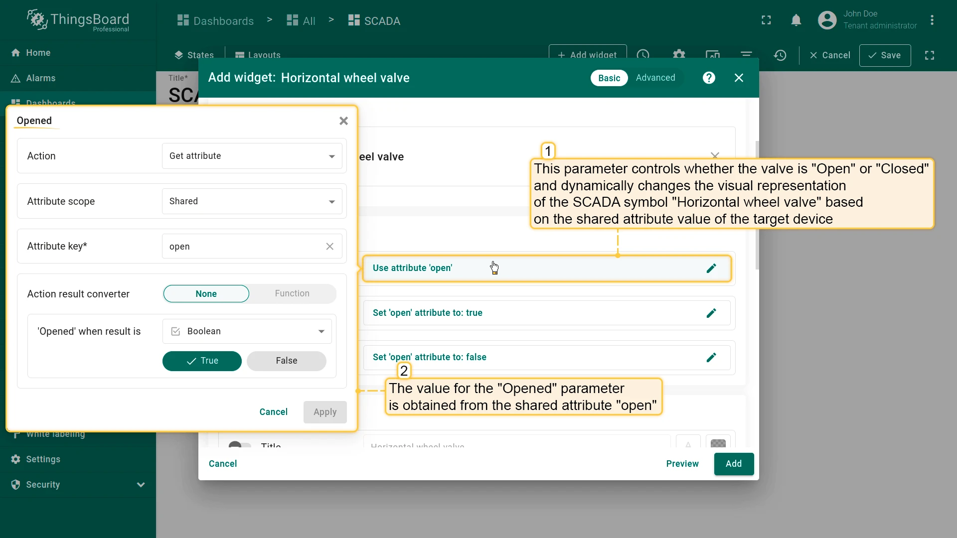
Example: Horizontal wheel valve — all three behavior parameters use the shared attribute open on the target device: Opened reads it to render the valve state; Open writes true when the user opens the valve; Close writes false when the user closes it.
Appearance
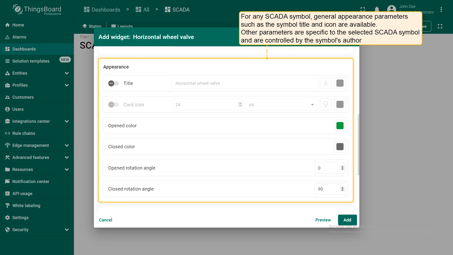
Section titled “Appearance”Appearance settings include generic parameters (title, card icon) and symbol-specific visual properties defined by the symbol’s author — such as state colors and rotation angles.
Card Appearance
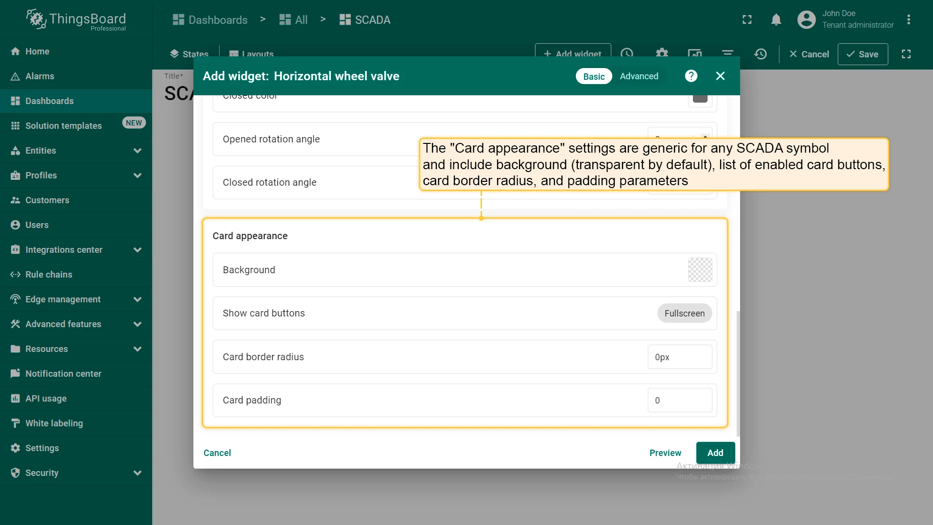
Section titled “Card Appearance”Card appearance settings are common to all SCADA symbol widgets: card background (transparent by default), visible card buttons, border radius, and padding.
What You Can Do with SCADA
Section titled “What You Can Do with SCADA”| Capability | Description | Guide |
|---|---|---|
| Configure the layout | Set column count, minimum width, background color, and background image for the SCADA canvas | Layouts |
| Create custom SCADA symbols | Design your own SVG-based symbols with built-in behavior tags for use in SCADA dashboards | Custom SCADA symbols |
| Add SCADA symbol widgets | Place SVG-based equipment symbols on the canvas and connect them to live device data via behavior parameters | Add SCADA symbol widget |
| Build multi-state SCADA dashboards | Combine SCADA states with regular dashboard states to navigate from an overview to detail views or popup widgets | Dashboard states |
| Trigger widget actions on click | Configure what happens when a user clicks a SCADA symbol — navigate to a state, open a popup, or send an RPC command | Widget actions |
Was this helpful?