Layouts
A layout controls how widgets are arranged on the dashboard grid. Each dashboard state can have its own layout type, settings, and breakpoints — allowing you to tailor the presentation for different IoT use cases and screen sizes.
To access layout settings:
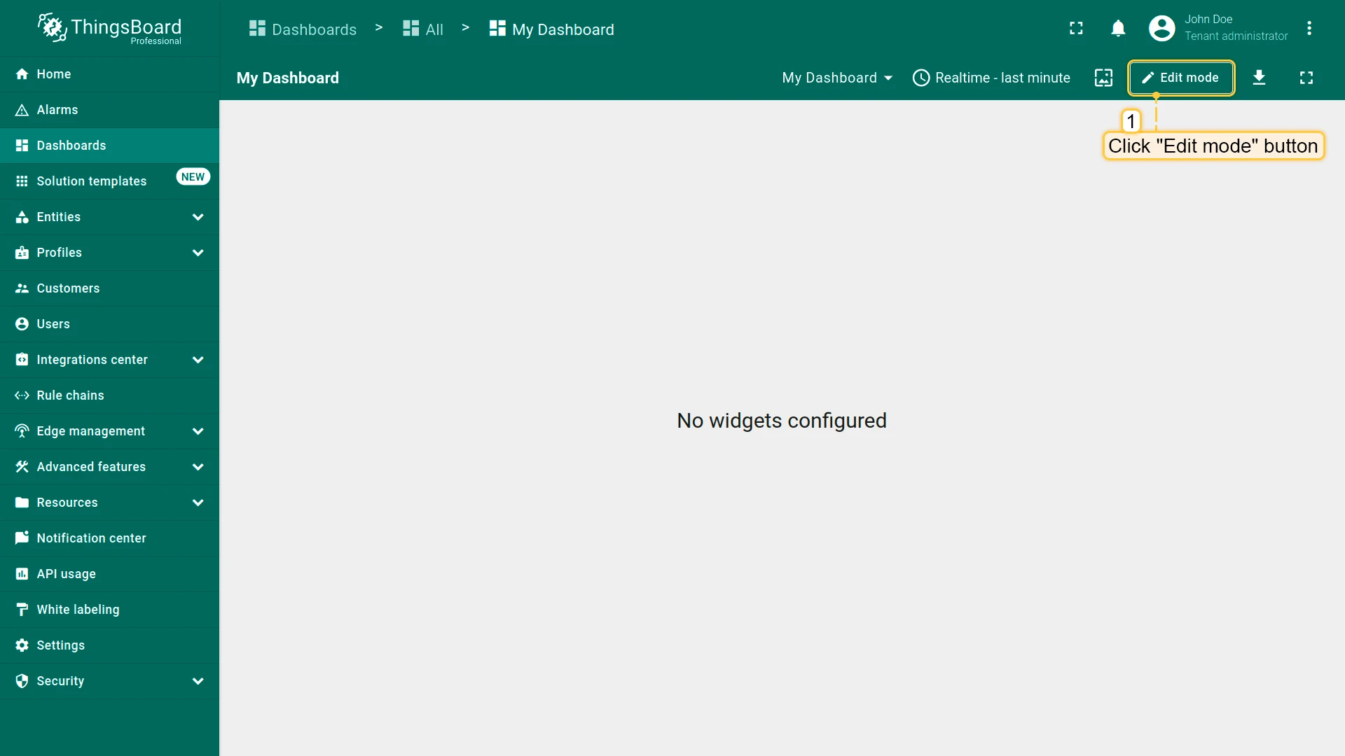
- Enter dashboard edit mode by clicking the Edit mode button in the upper right corner.
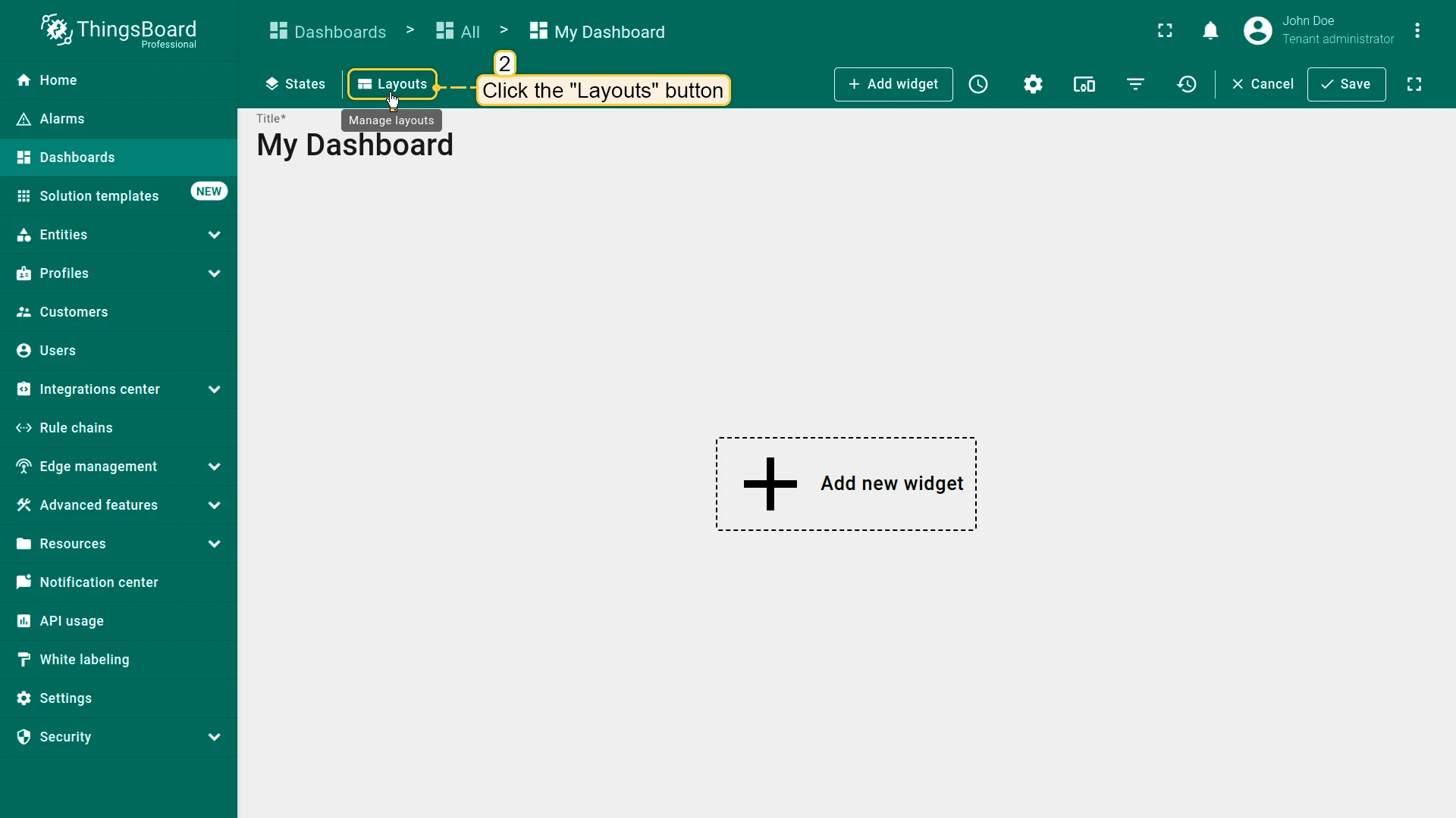
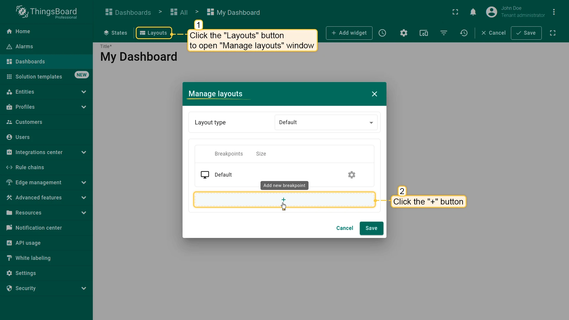
- Click the Layouts button in the upper left corner to open the layout management window.
Layout Types
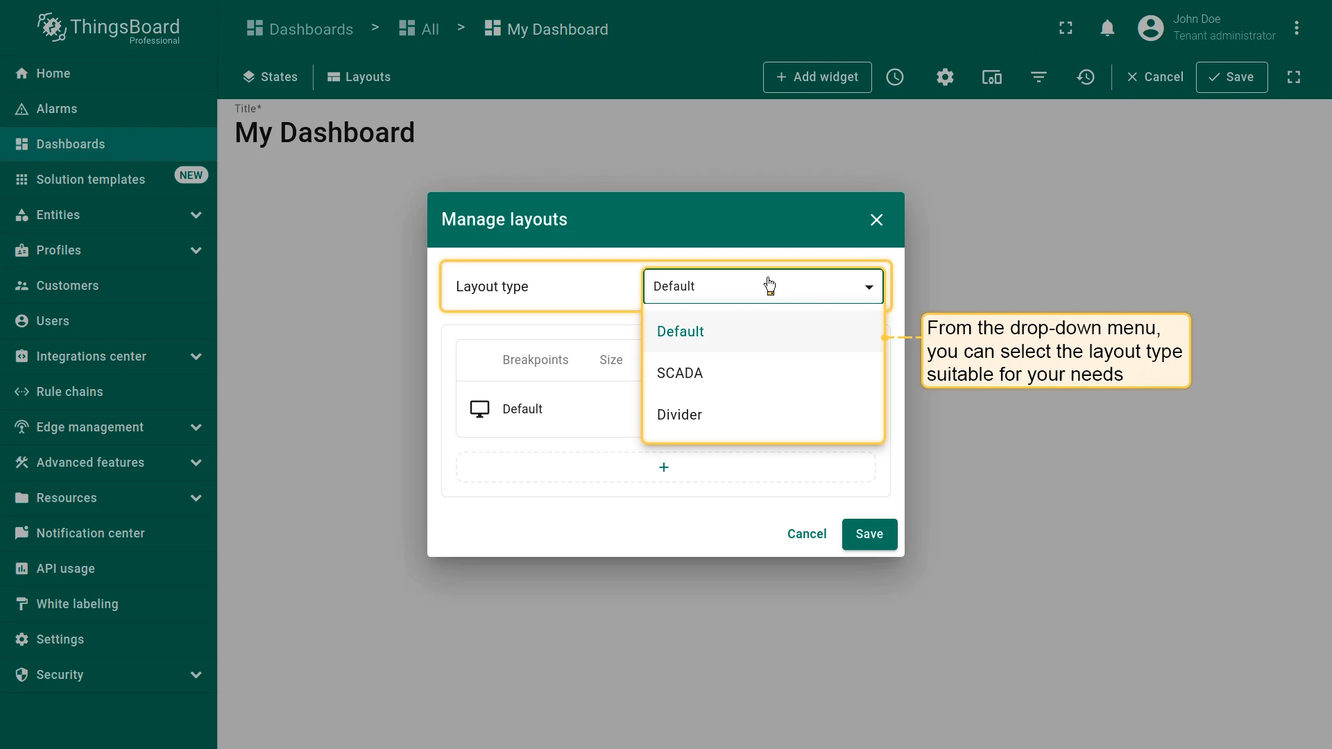
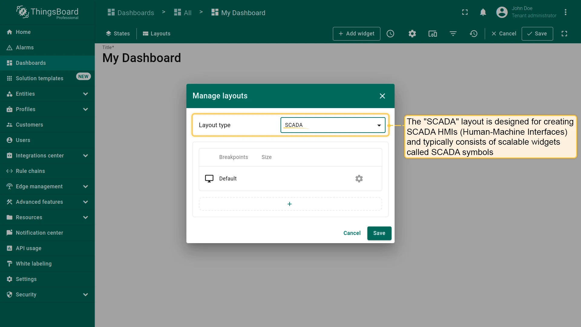
Section titled “Layout Types”Each dashboard state has exactly one layout type. The platform supports three: Default, SCADA, and Divider.
Default Layout
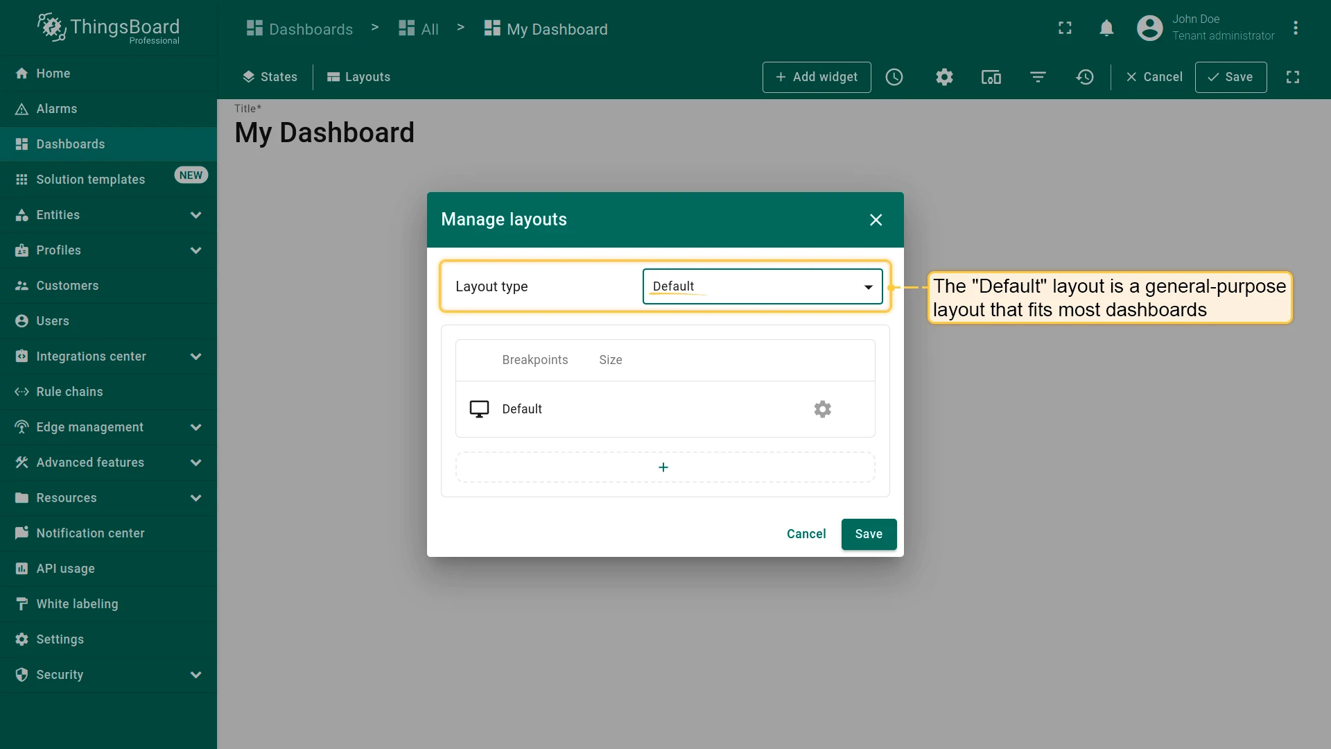
Section titled “Default Layout”A general-purpose layout that fits most dashboards. Supports screen breakpoints for responsive design.
Designed for SCADA HMIs (Human-Machine Interfaces). HMIs are typically built from scalable widgets called SCADA symbols, which can also be combined with standard ThingsBoard widgets on the same canvas. Breakpoints are supported.
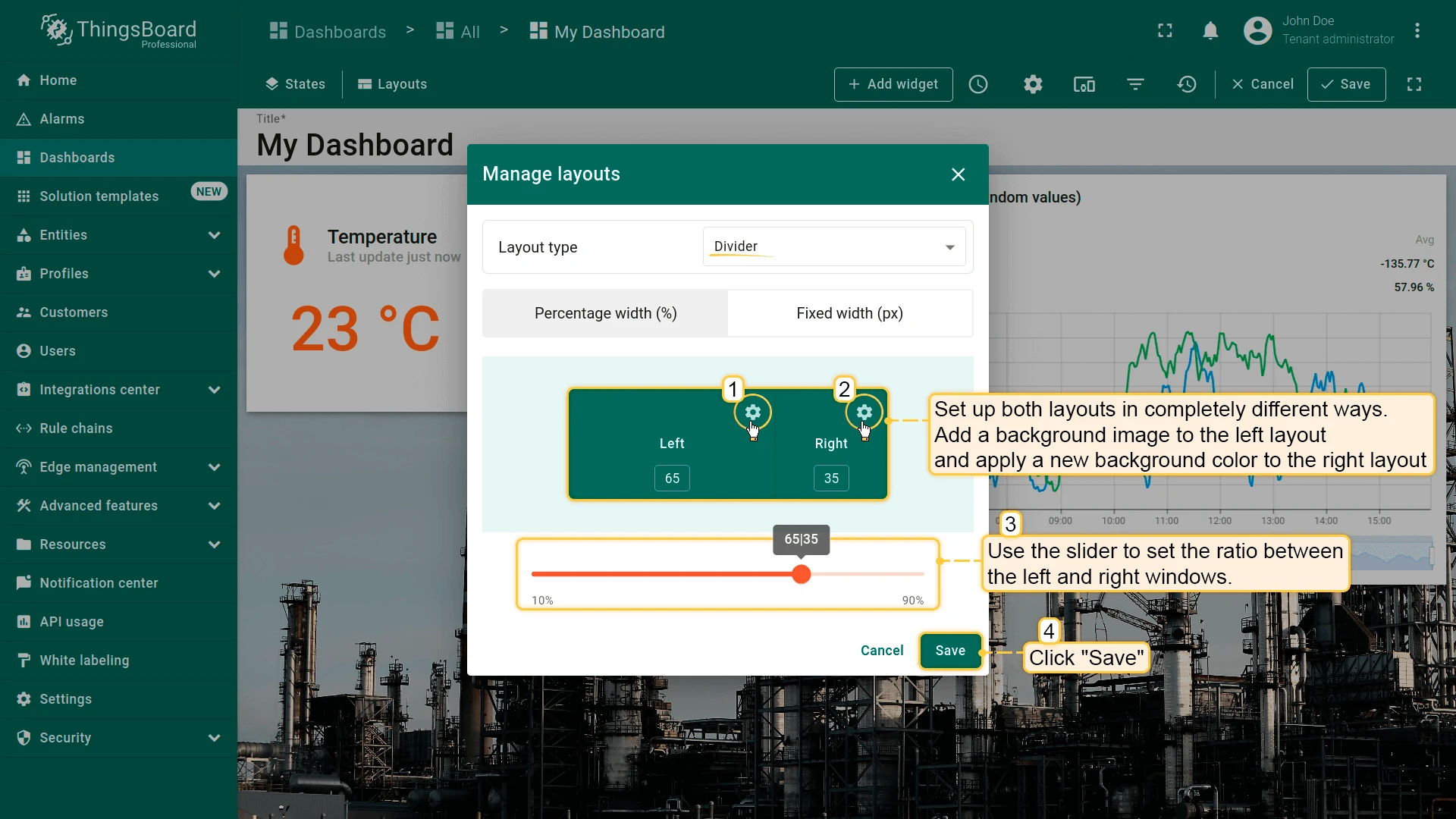
Divider
Section titled “Divider”The legacy Divider layout splits the dashboard into left and right sub-layouts. Each sub-layout width can be set as a percentage of screen width or a fixed pixel value. Most settings available in the Default layout apply to sub-layouts, except breakpoints.
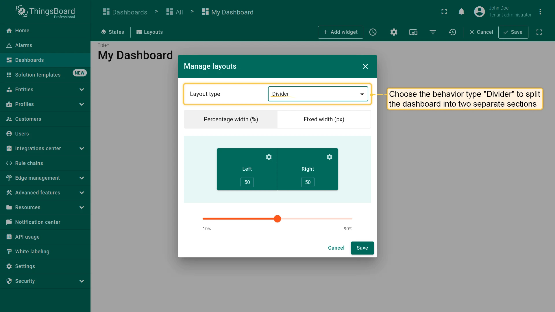
Each sub-layout can be configured independently with its own background, widgets, and size.
Breakpoints
Section titled “Breakpoints”Breakpoints let you configure separate widget arrangements and settings for different screen widths.
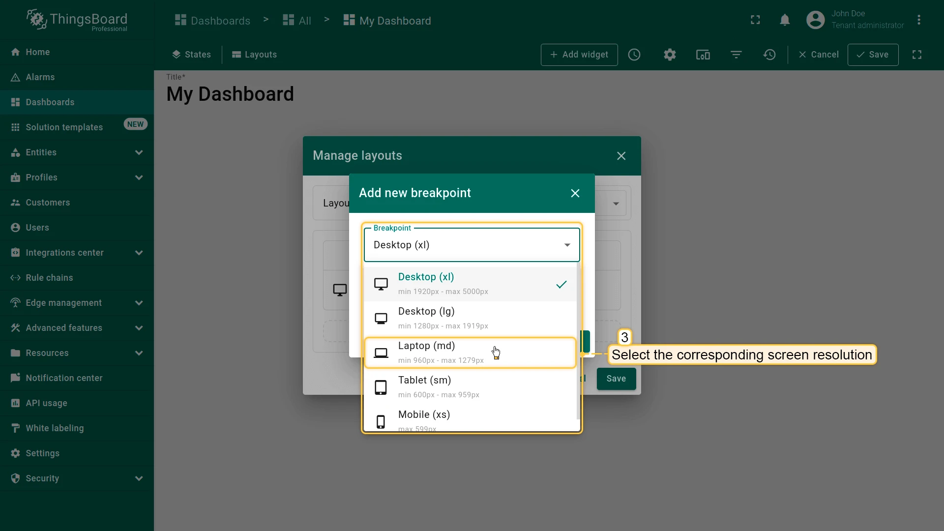
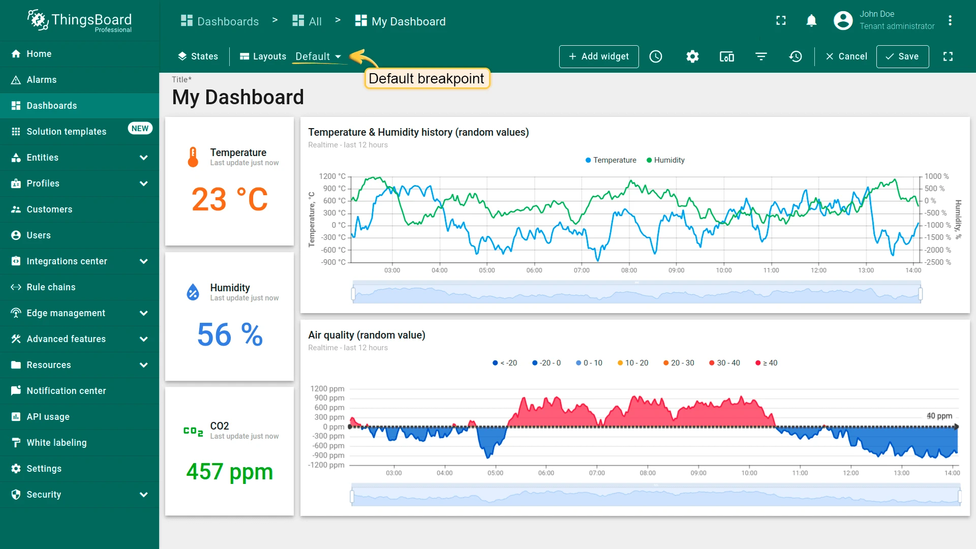
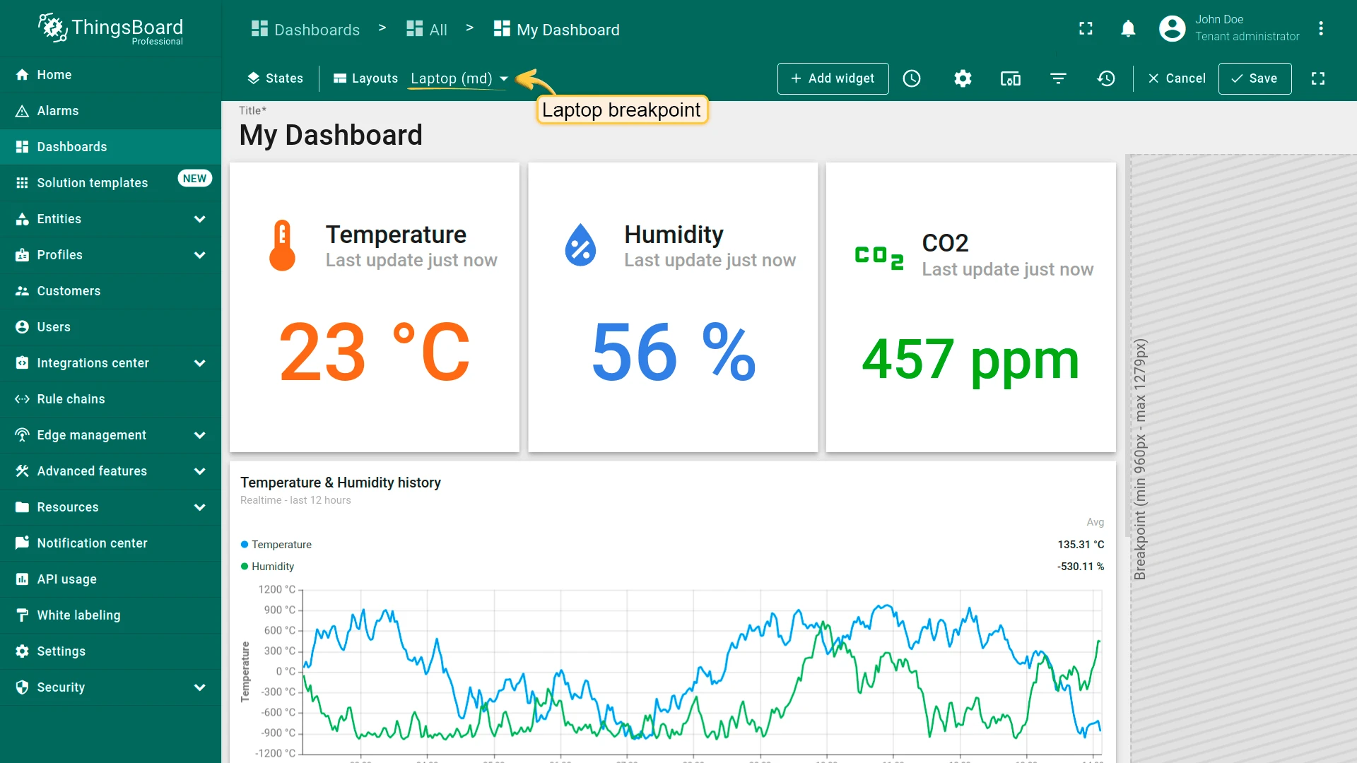
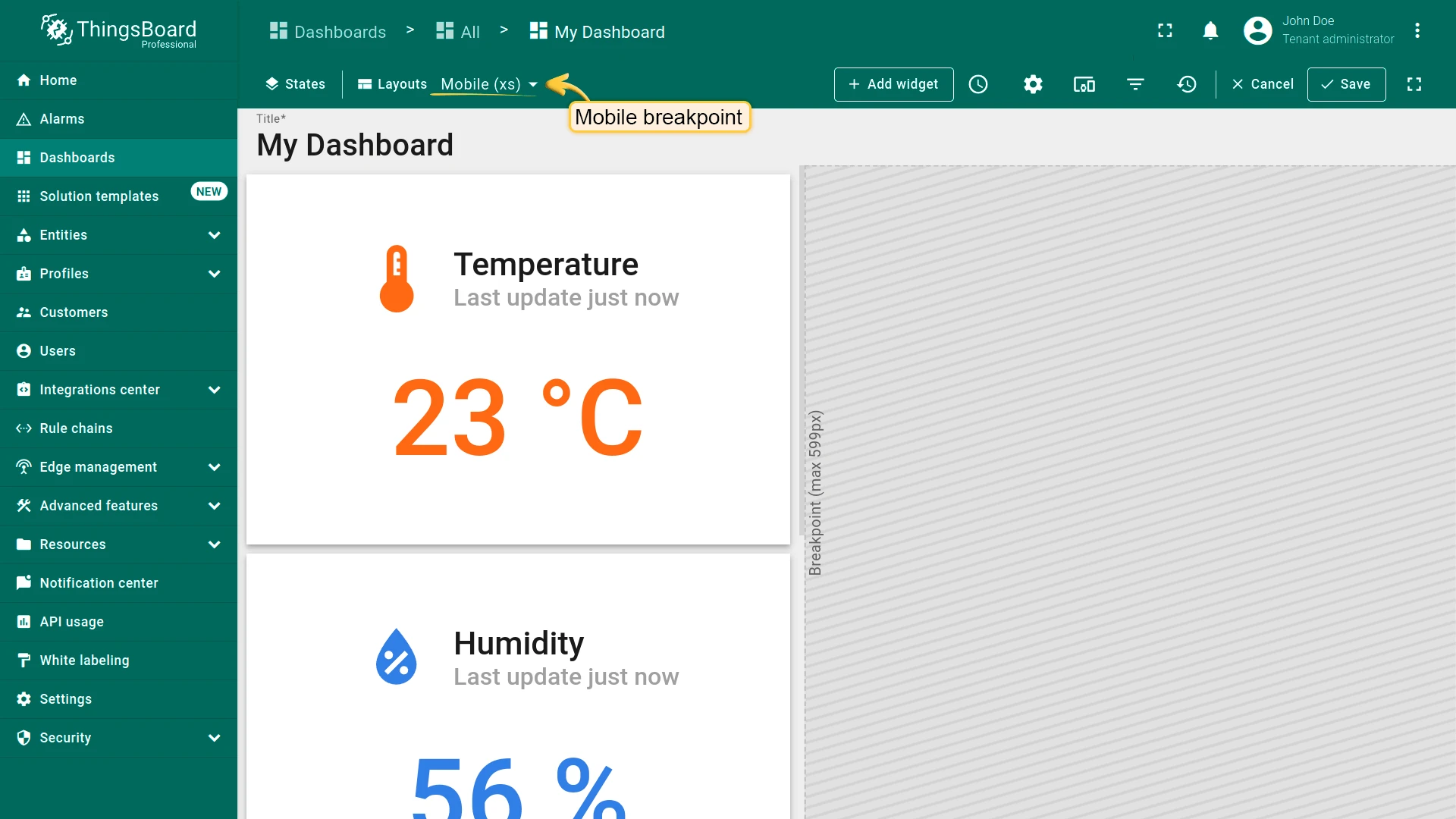
Each dashboard state has a Default breakpoint — used when no other breakpoint matches the current screen resolution. The following breakpoints are available:
| Breakpoint | Min width | Max width |
|---|---|---|
| Desktop (xl) | 1920 px | 5000 px |
| Desktop (lg) | 1280 px | 1919 px |
| Laptop (md) | 960 px | 1279 px |
| Tablet (sm) | 600 px | 959 px |
| Mobile (xs) | — | 599 px |
Adding a Breakpoint
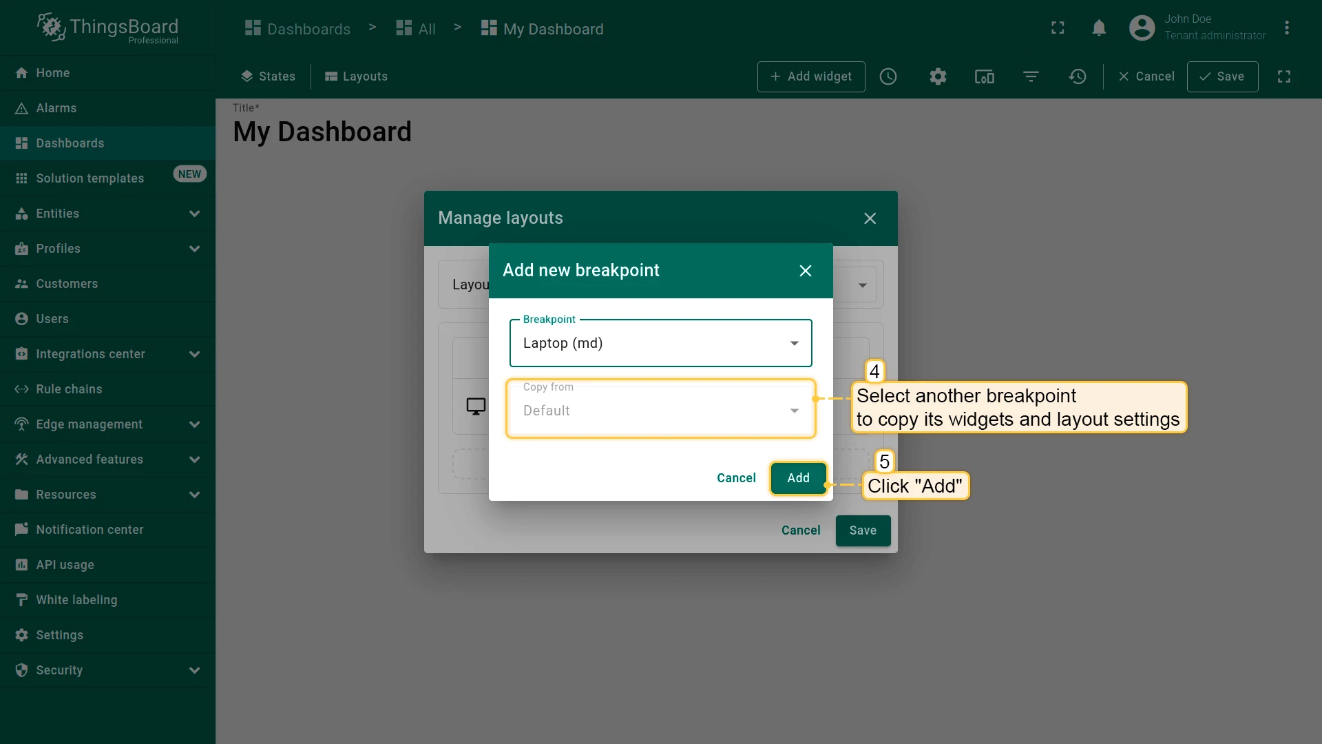
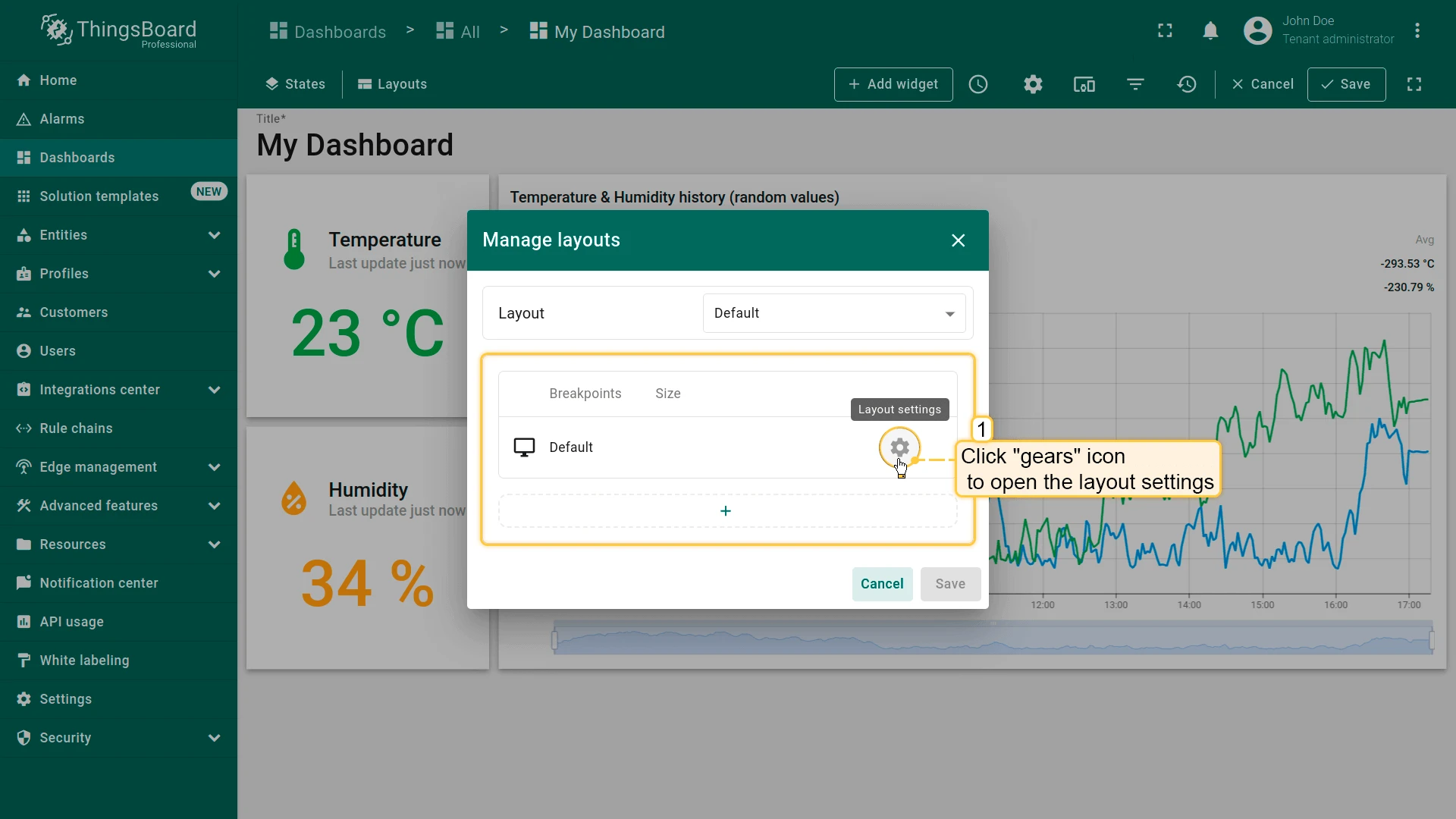
Section titled “Adding a Breakpoint”- Open the Manage layouts window and click the + (Add new breakpoint) button in the breakpoints table.
- Select the breakpoint (screen resolution) from the dropdown list.
- Optionally, copy widgets and layout settings from another breakpoint.
- Click Add.
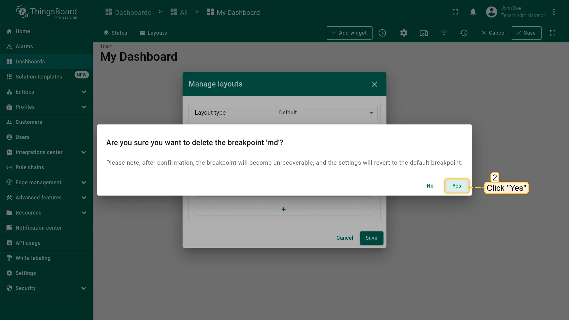
Click the gear icon to open the layout settings for that breakpoint.
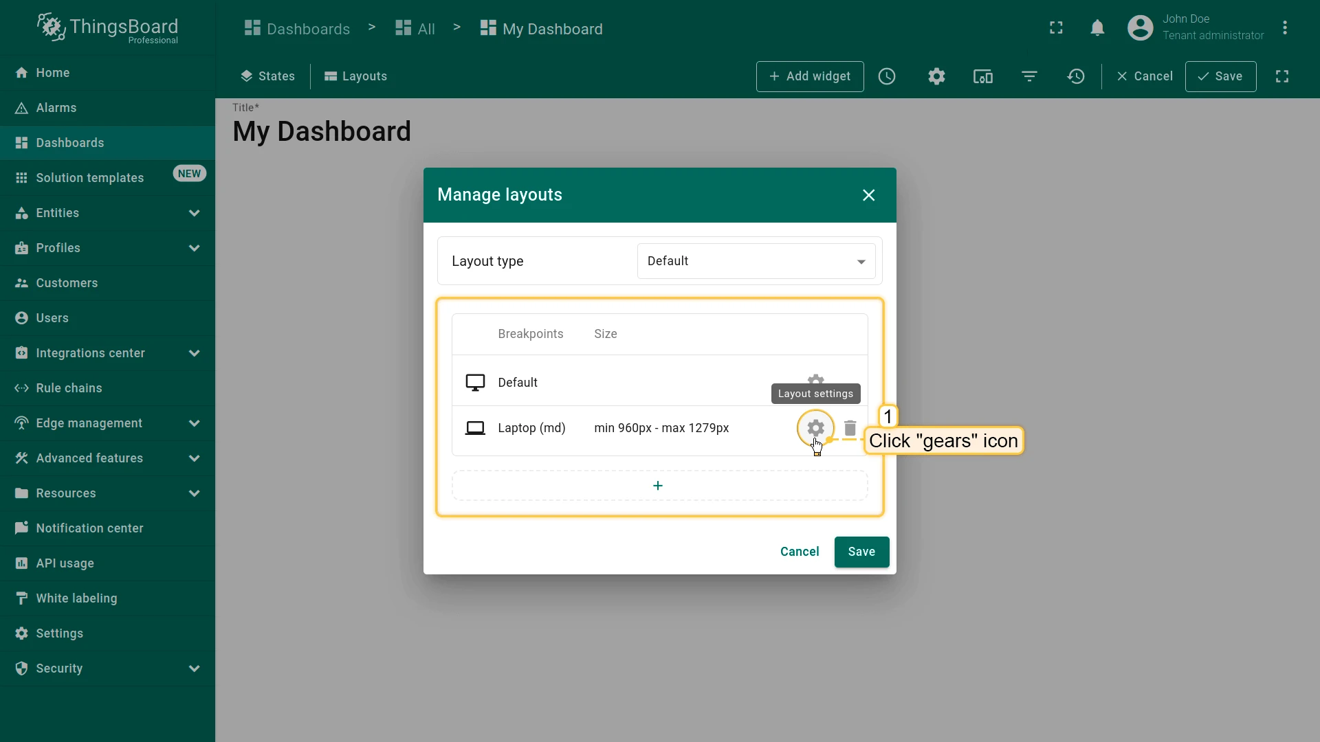
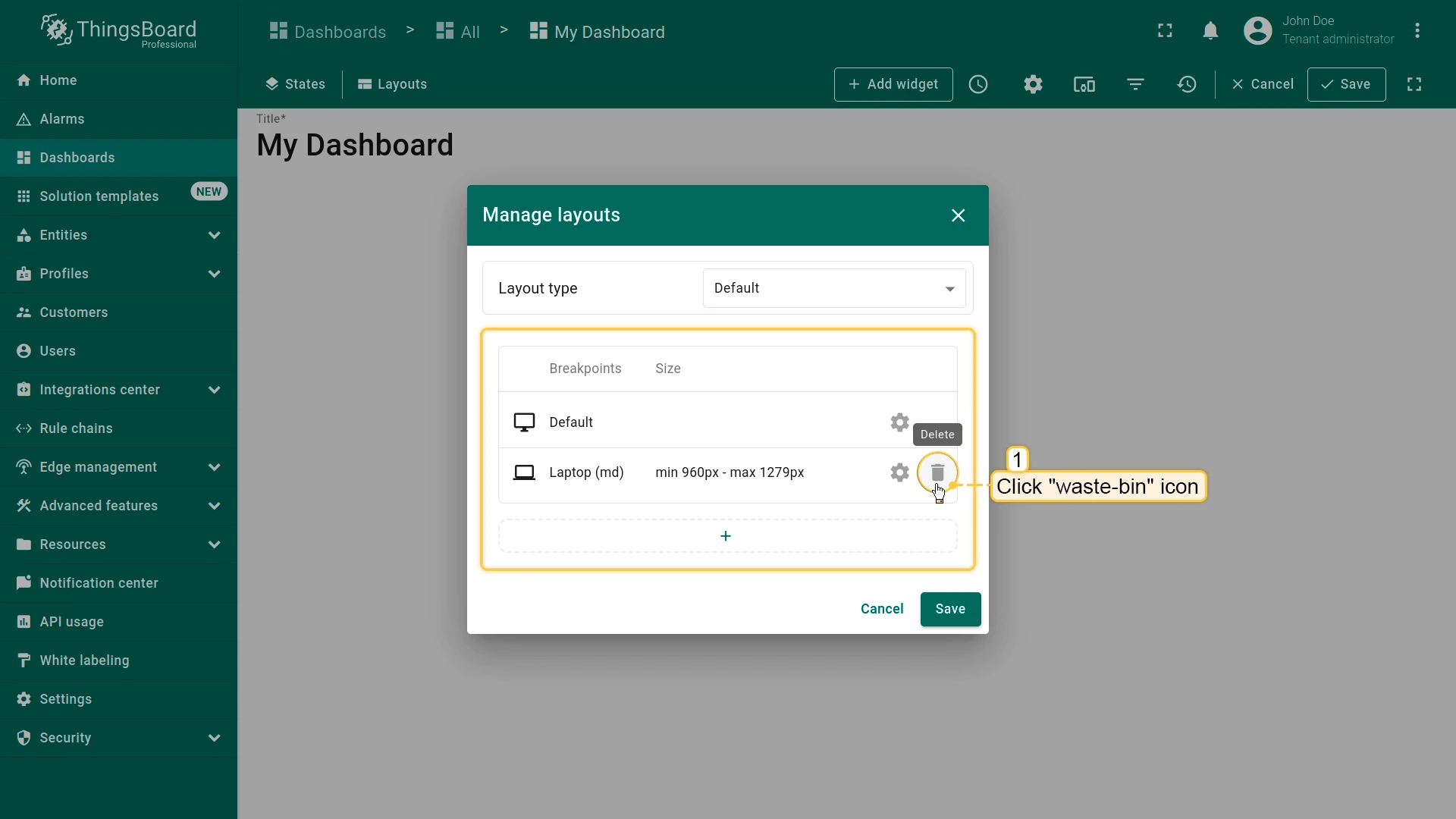
Click the trash icon to delete a breakpoint.
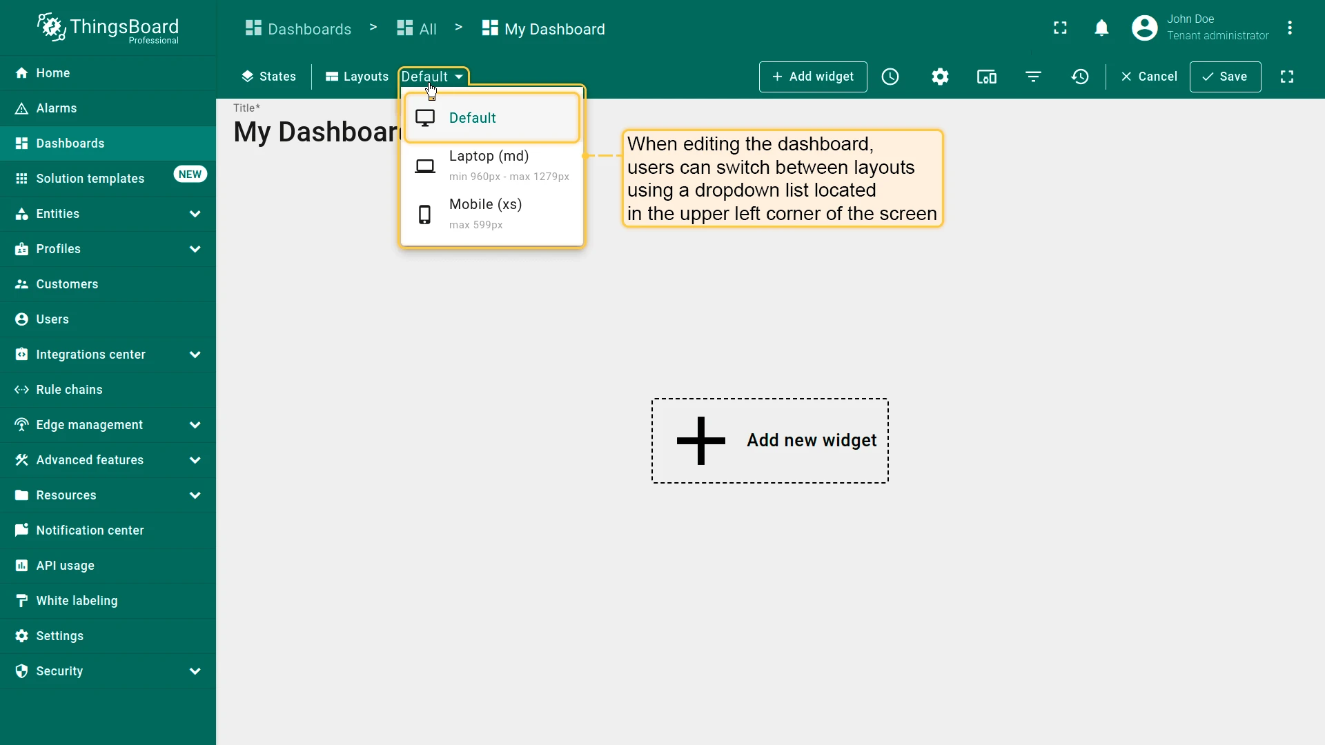
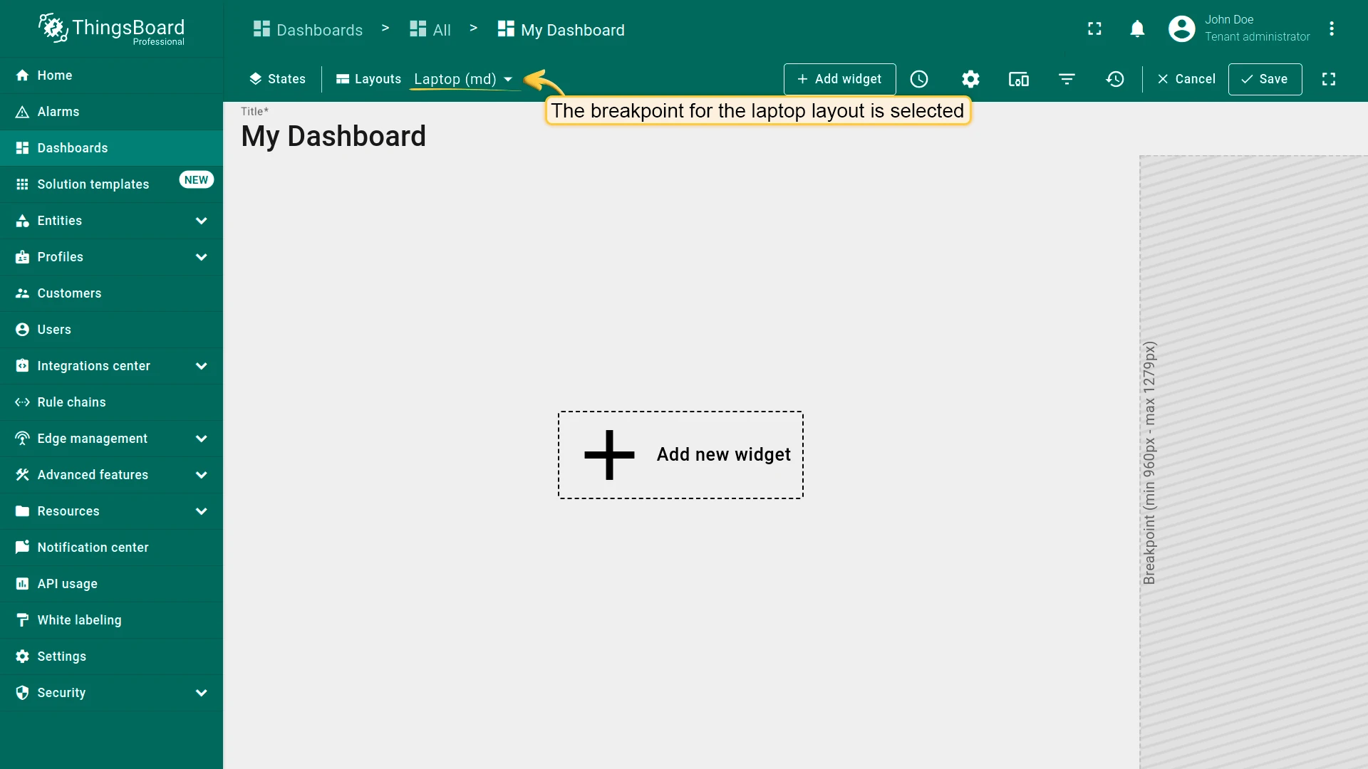
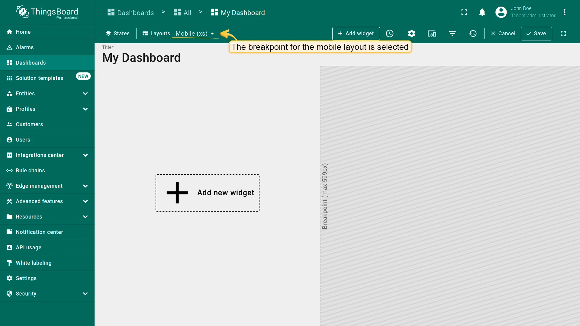
Switching Between Breakpoints
Section titled “Switching Between Breakpoints”When a user opens the dashboard, the appropriate breakpoint is applied automatically based on screen resolution.
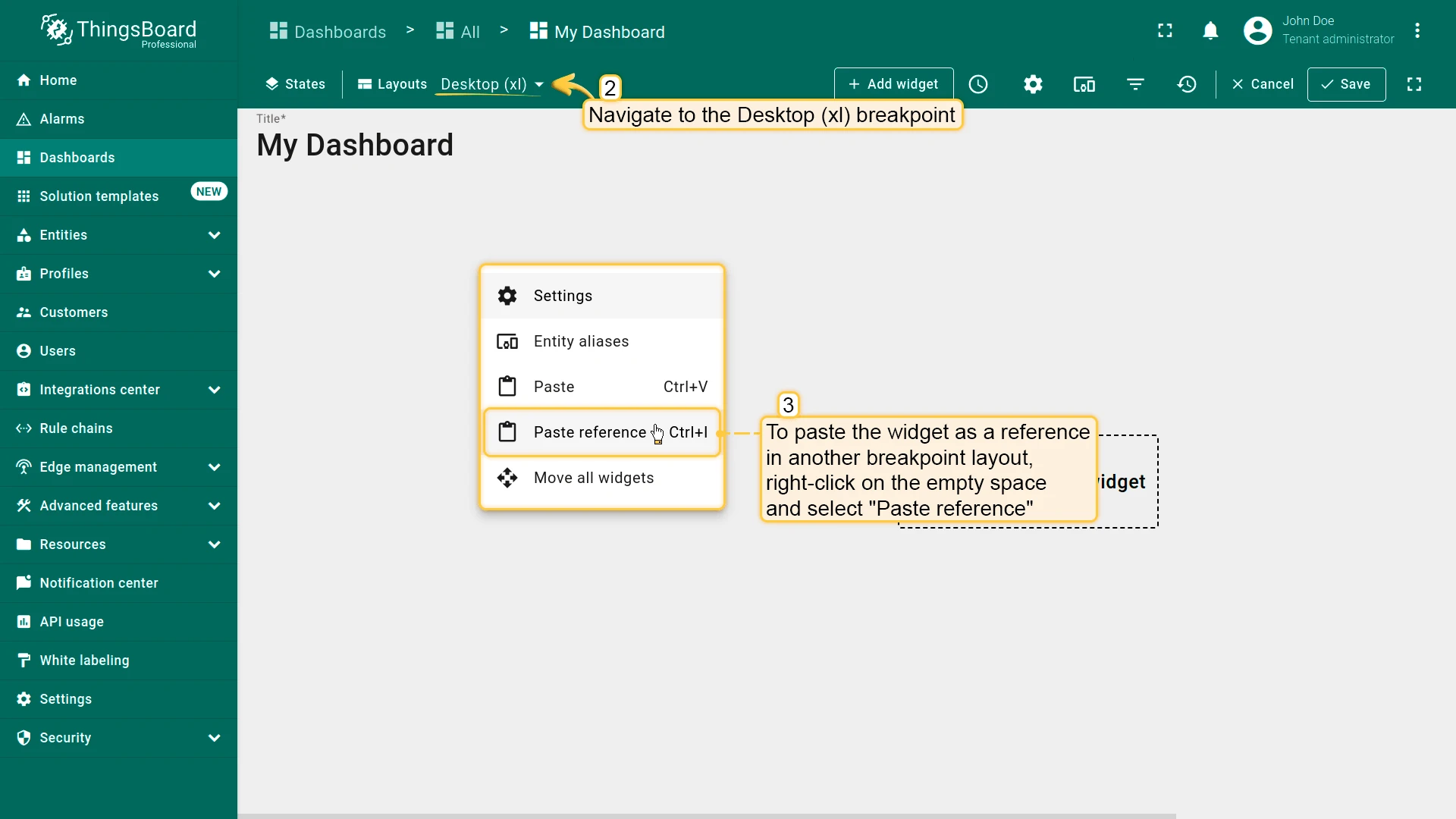
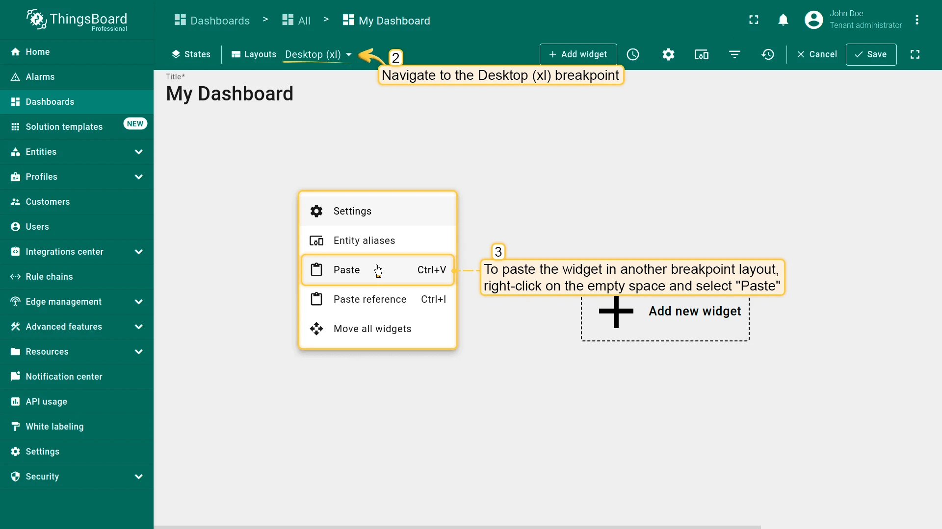
While editing, switch between breakpoints using the dropdown in the top-left corner.
Breakpoints Demo Dashboard
Section titled “Breakpoints Demo Dashboard”You can import this demo dashboard to explore how breakpoints work. Download the demo dashboard and import it into your environment.
Widget References vs Widget Copies
Section titled “Widget References vs Widget Copies”Widget References
Section titled “Widget References”When a breakpoint is created, all widgets from the source layout are copied by reference. Configuration changes are synchronized across breakpoints; position and size remain independent per breakpoint.
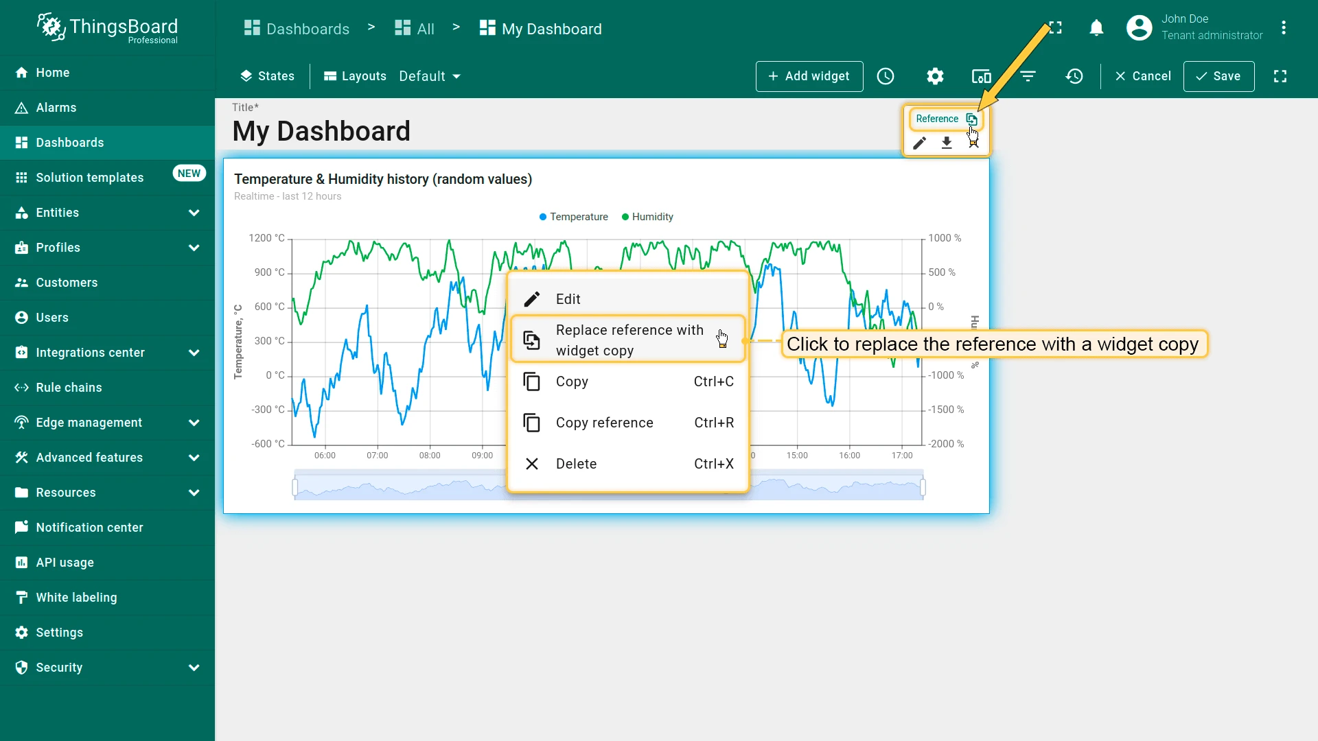
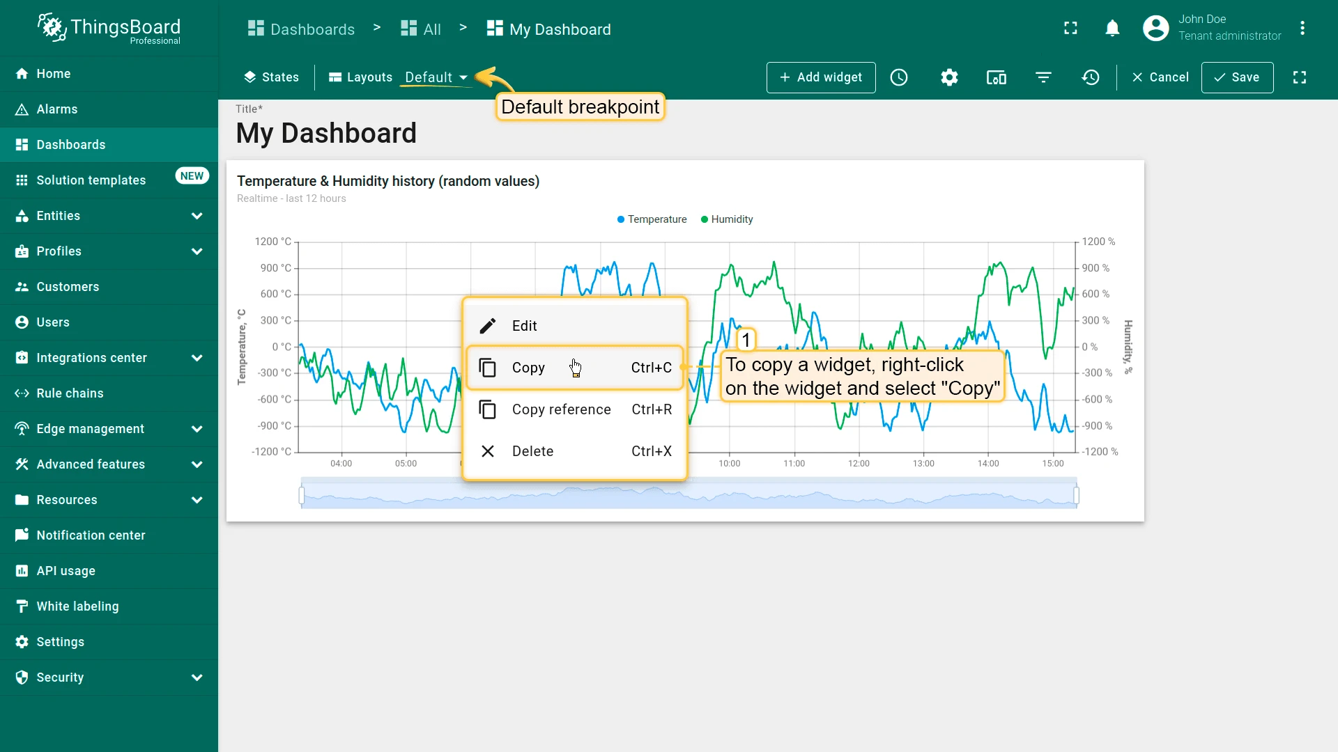
- Right-click on the widget and select Copy reference (Ctrl+R).
- In another breakpoint layout, right-click on empty space and select Paste reference (Ctrl+I).
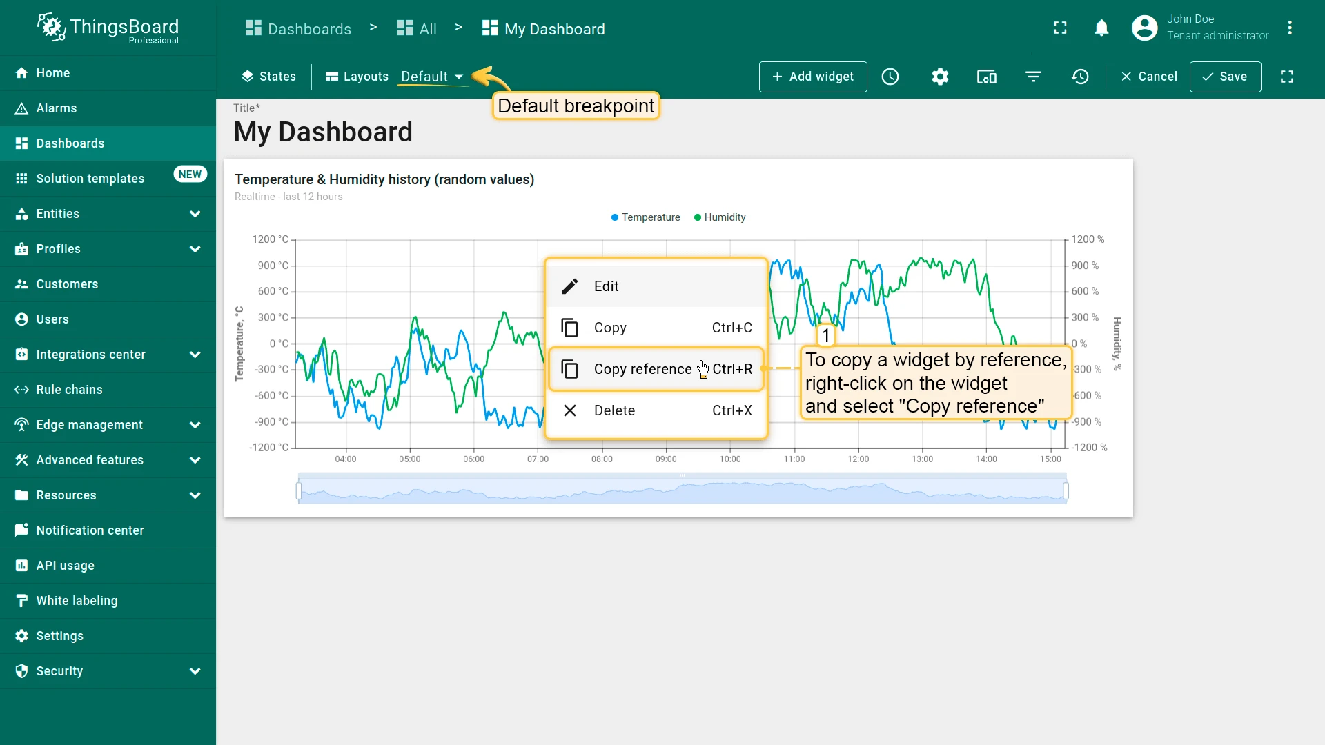
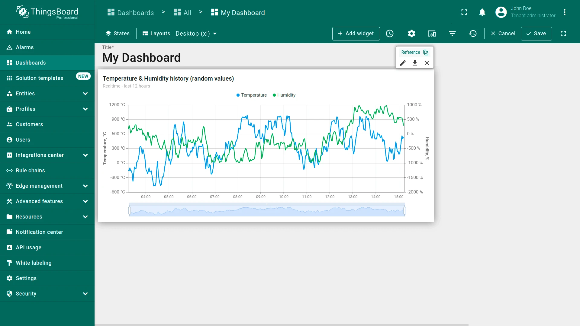
In edit mode, identify a referenced widget by the Reference button in its edit panel.
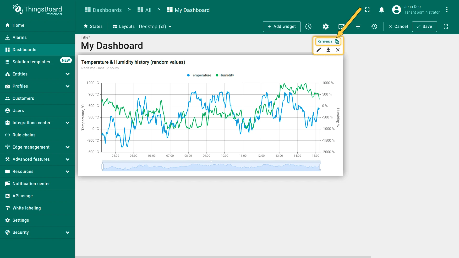
To replace a reference with an independent copy, click the Reference button or right-click the widget and select Replace reference with widget copy.
Widget Copies
Section titled “Widget Copies”A widget copy is fully independent — changes to it do not affect the original.
- Right-click on the widget and select Copy (Ctrl+C).
- In another breakpoint layout, right-click on empty space and select Paste (Ctrl+V).
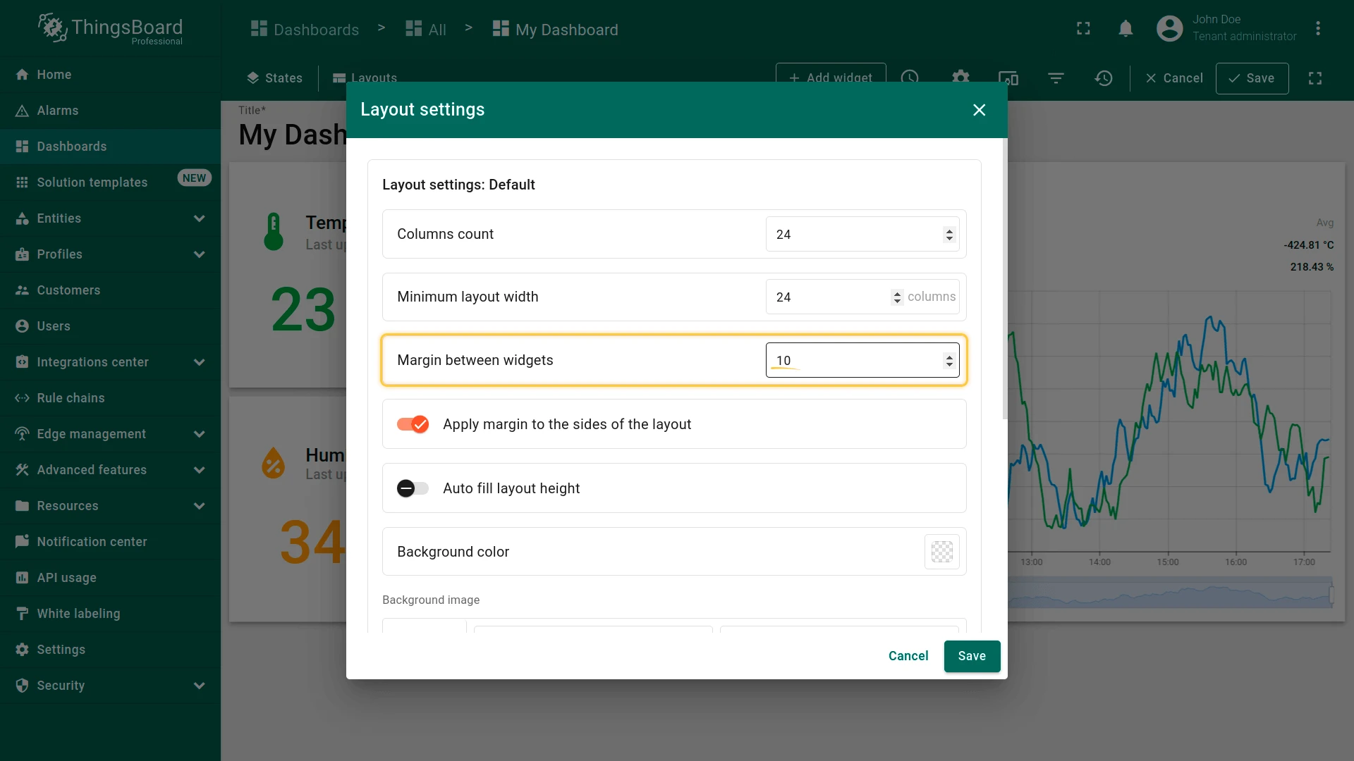
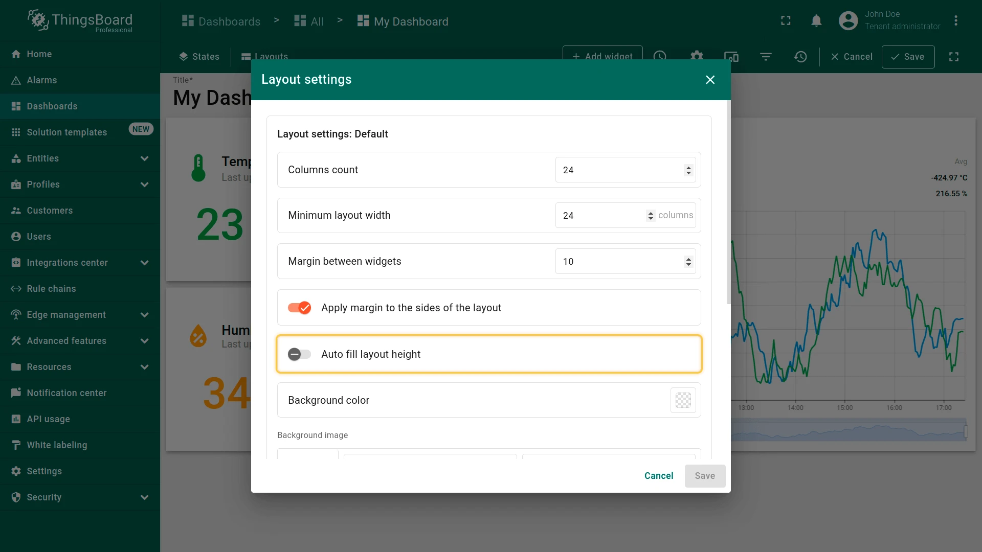
Layout Settings
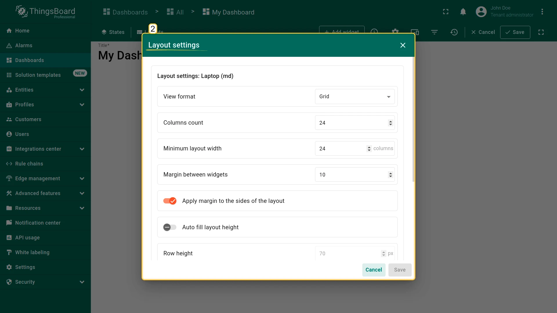
Section titled “Layout Settings”Click the gear icon next to a breakpoint to open the layout settings.
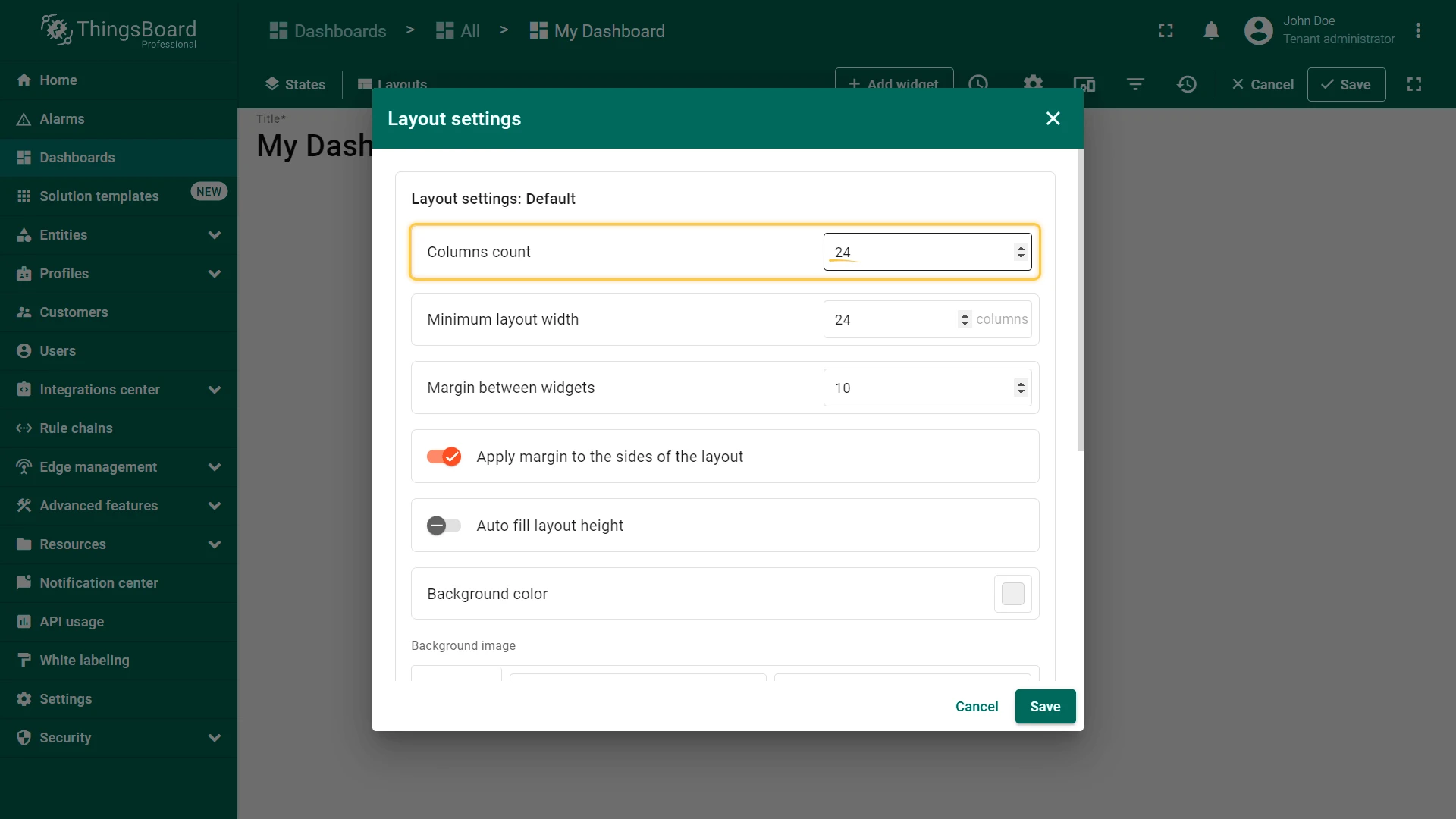
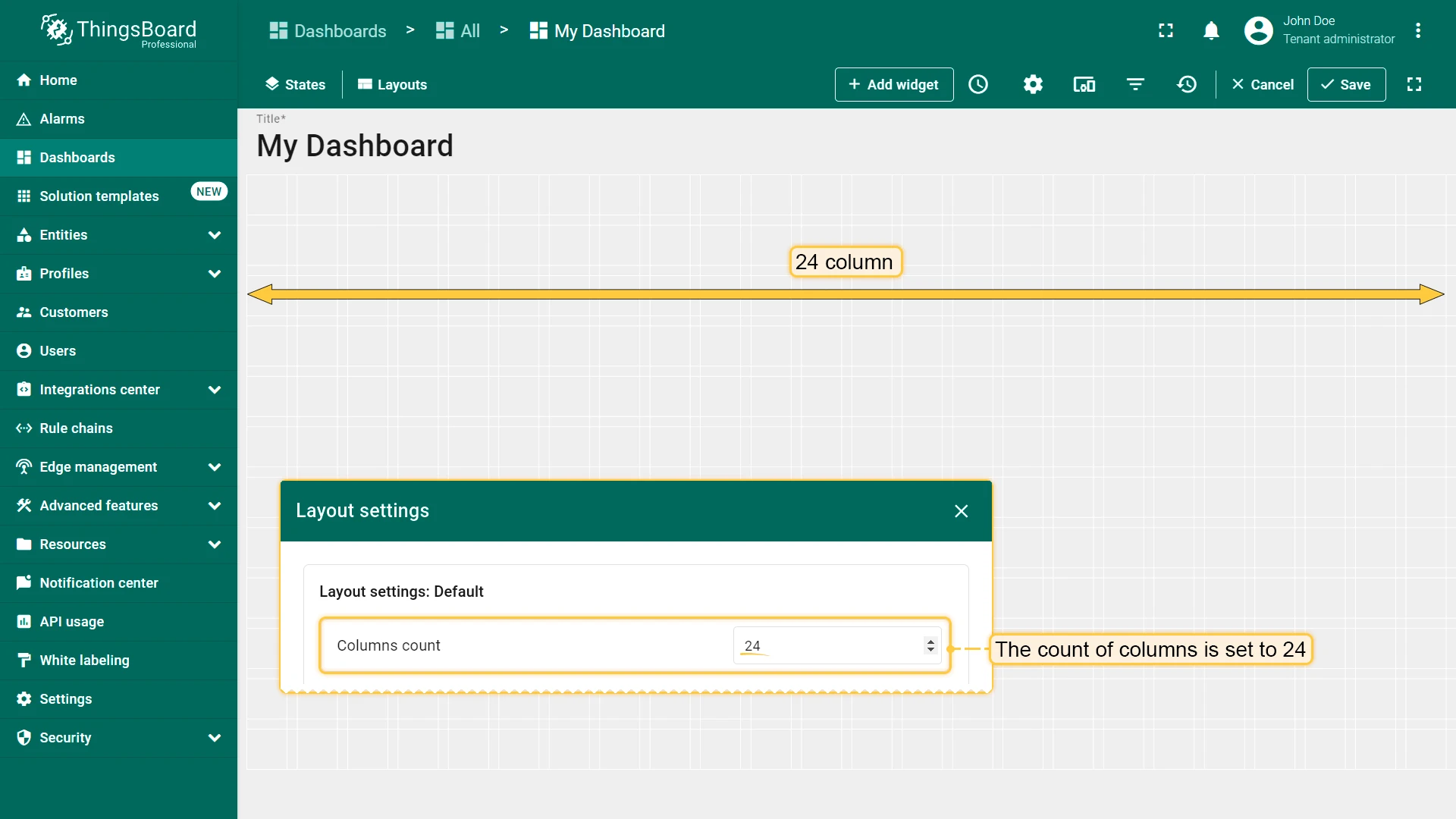
Columns Count
Section titled “Columns Count”Defines how many columns the grid is divided into, controlling horizontal widget placement. Default: 24 columns (range: 10–1000).
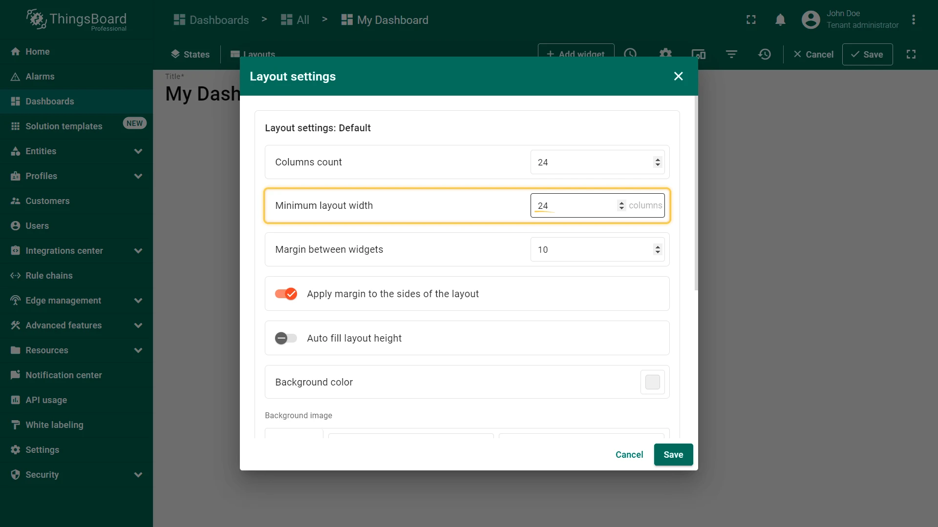
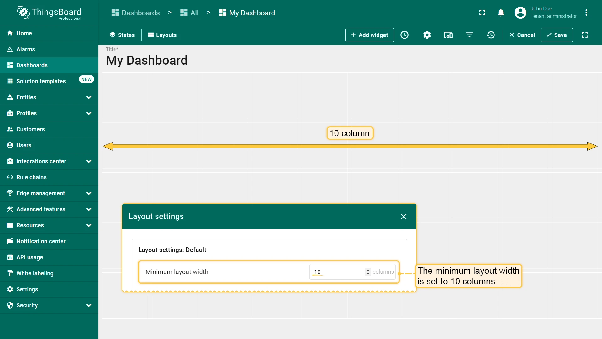
Minimum Layout Width
Section titled “Minimum Layout Width”Sets the minimum number of columns before horizontal scrolling activates. Recommended: equal to or greater than the column count.
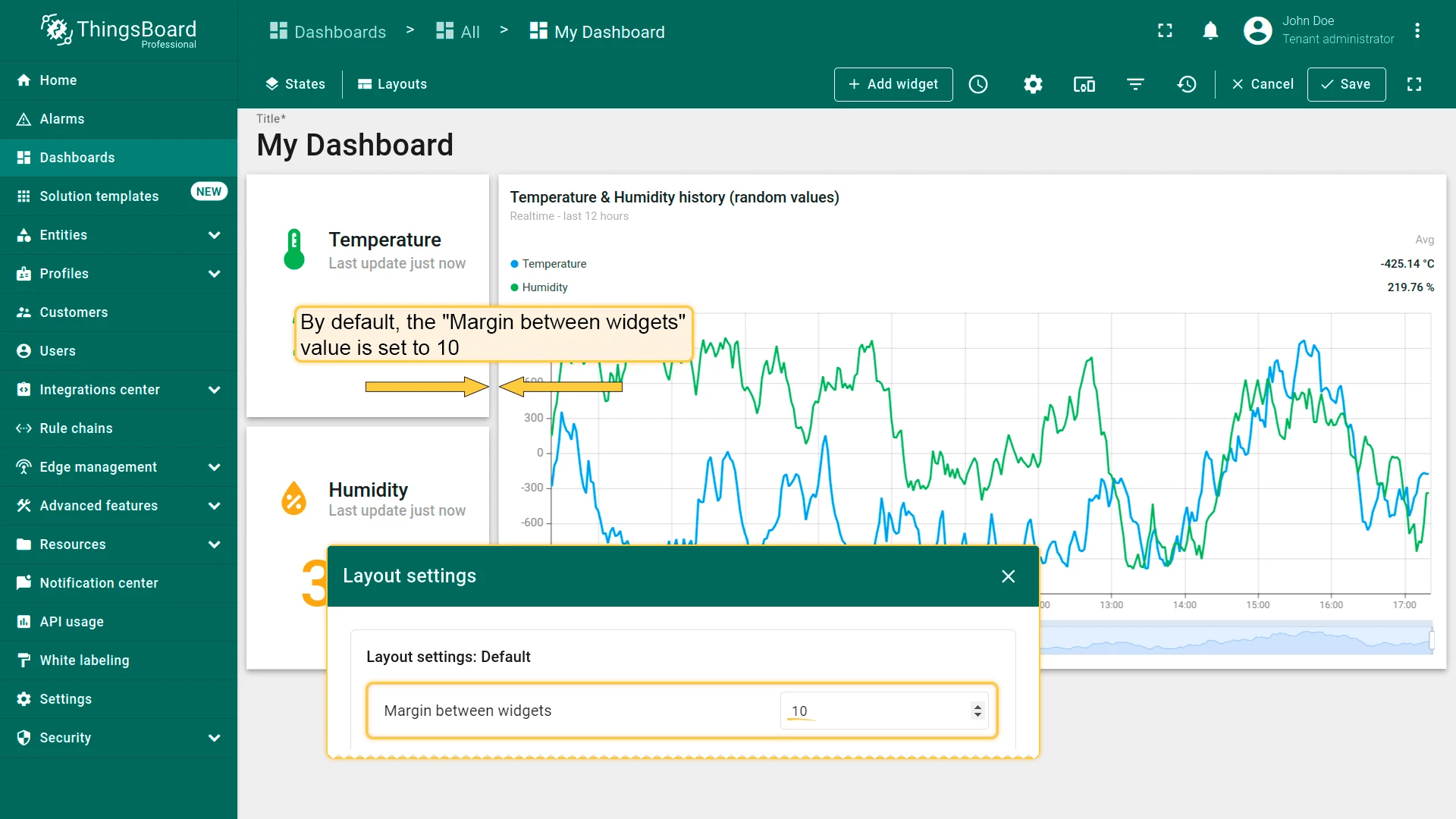
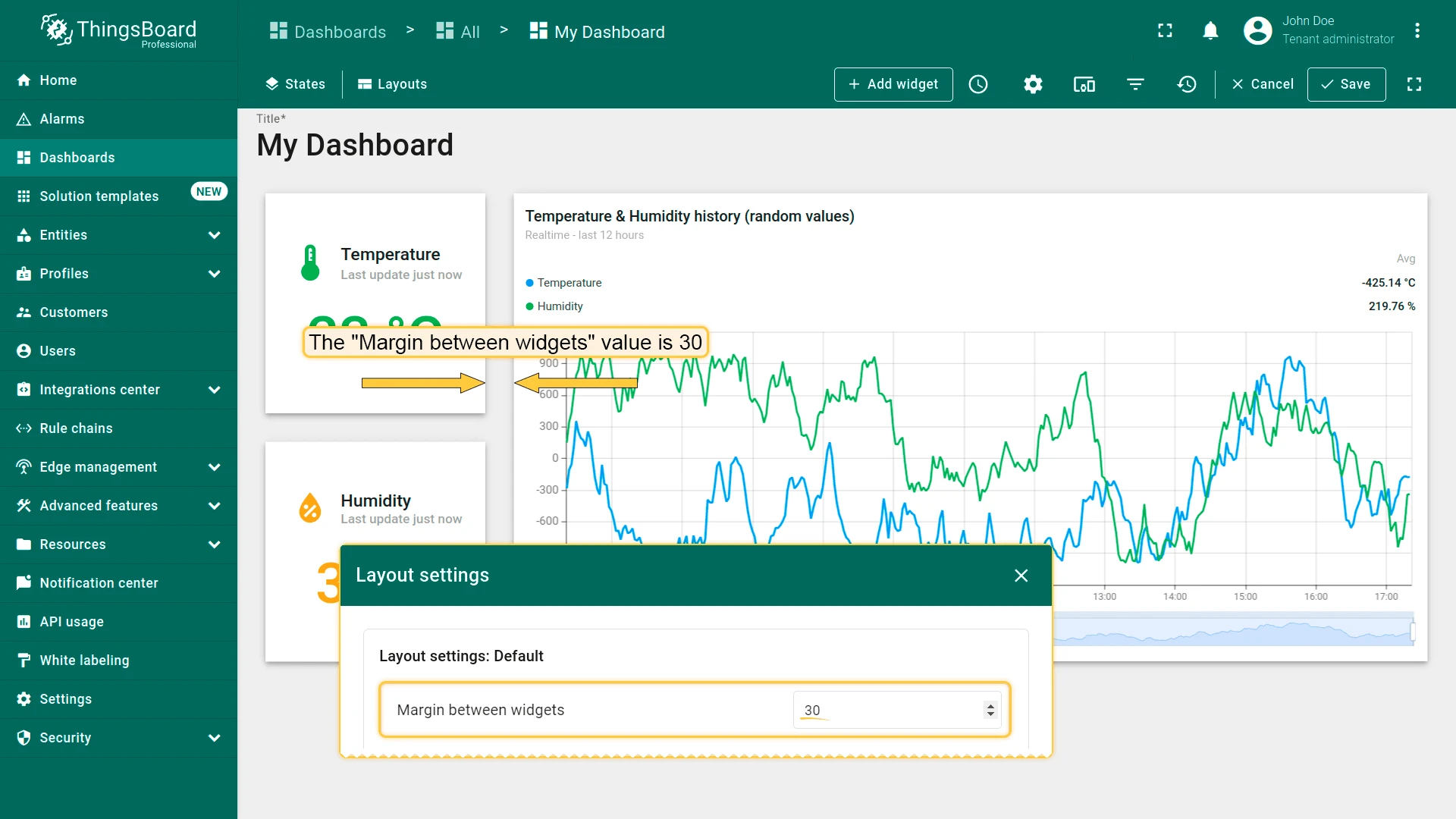
Margin Between Widgets
Section titled “Margin Between Widgets”Controls spacing between widgets. Default: 10 (range: 0–50).
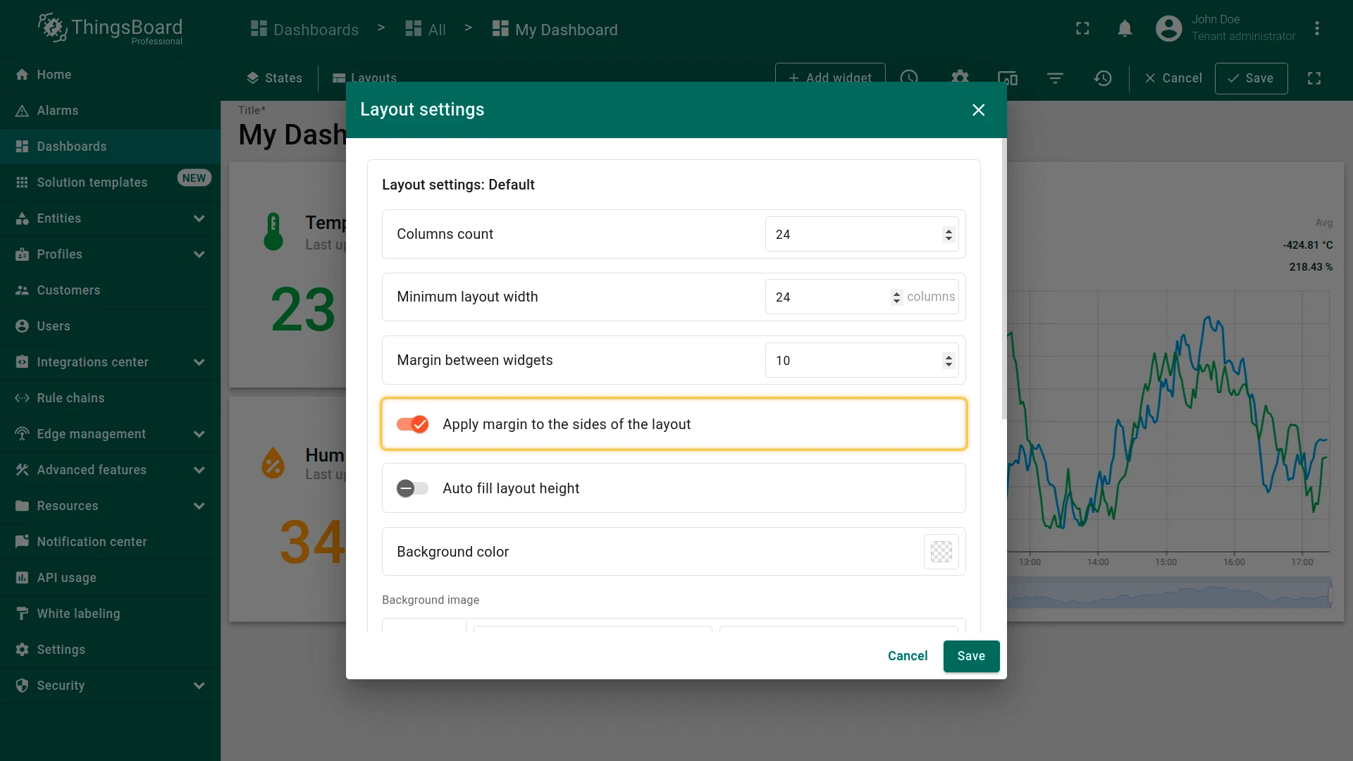
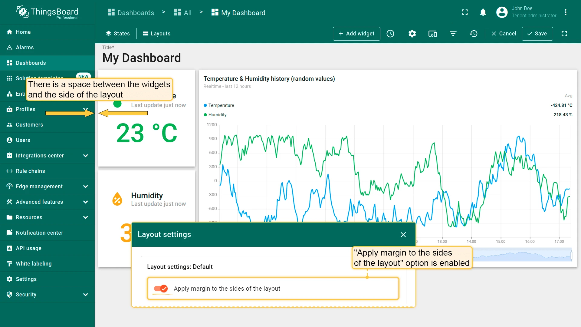
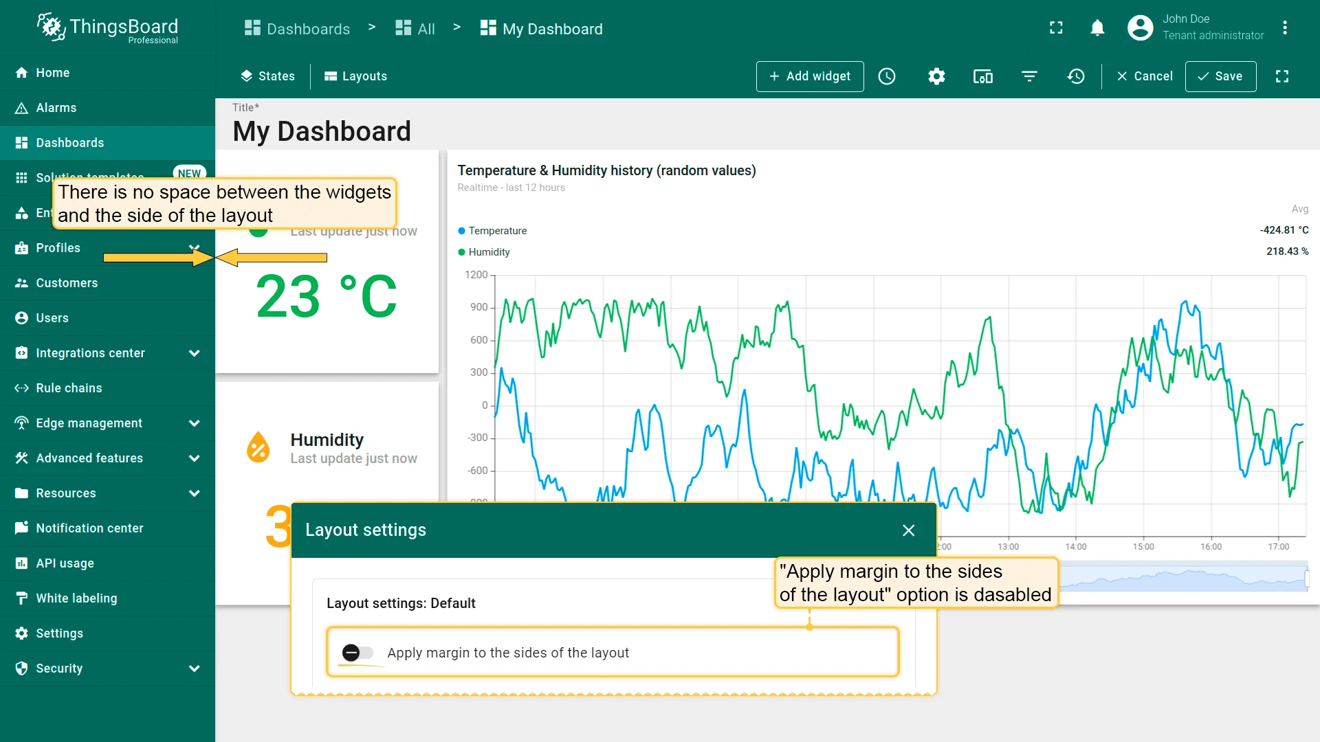
Apply Margin to the Sides of the Layout
Section titled “Apply Margin to the Sides of the Layout”Controls whether the widget margin is also applied to the edges of the layout.
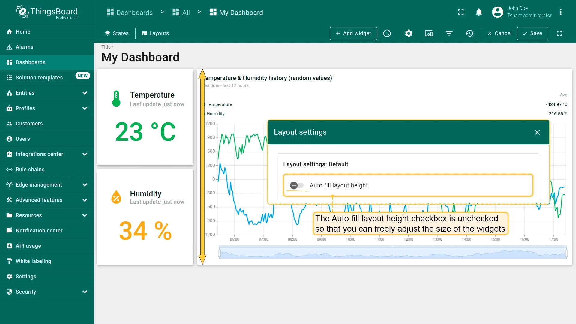
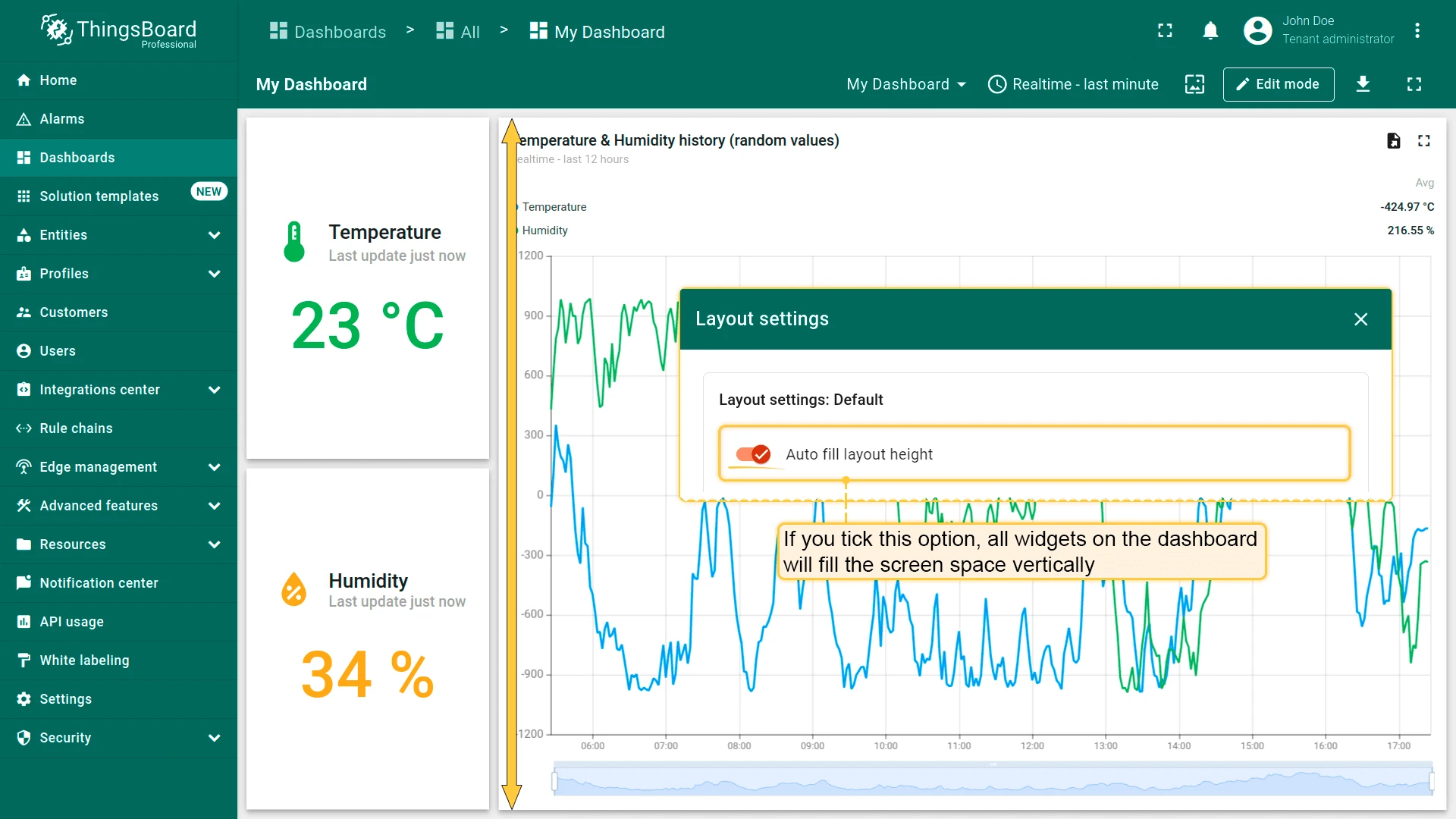
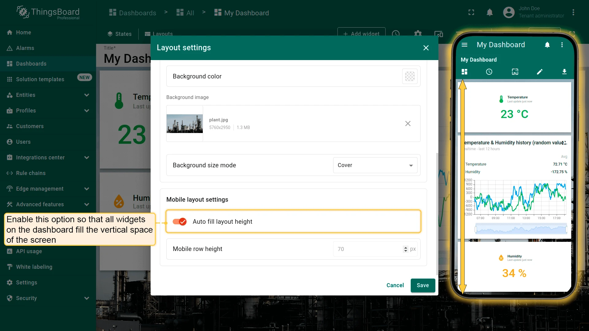
Auto Fill Layout Height
Section titled “Auto Fill Layout Height”When enabled, widgets are stretched to fill the full screen height. When disabled (default), widget heights are set independently.
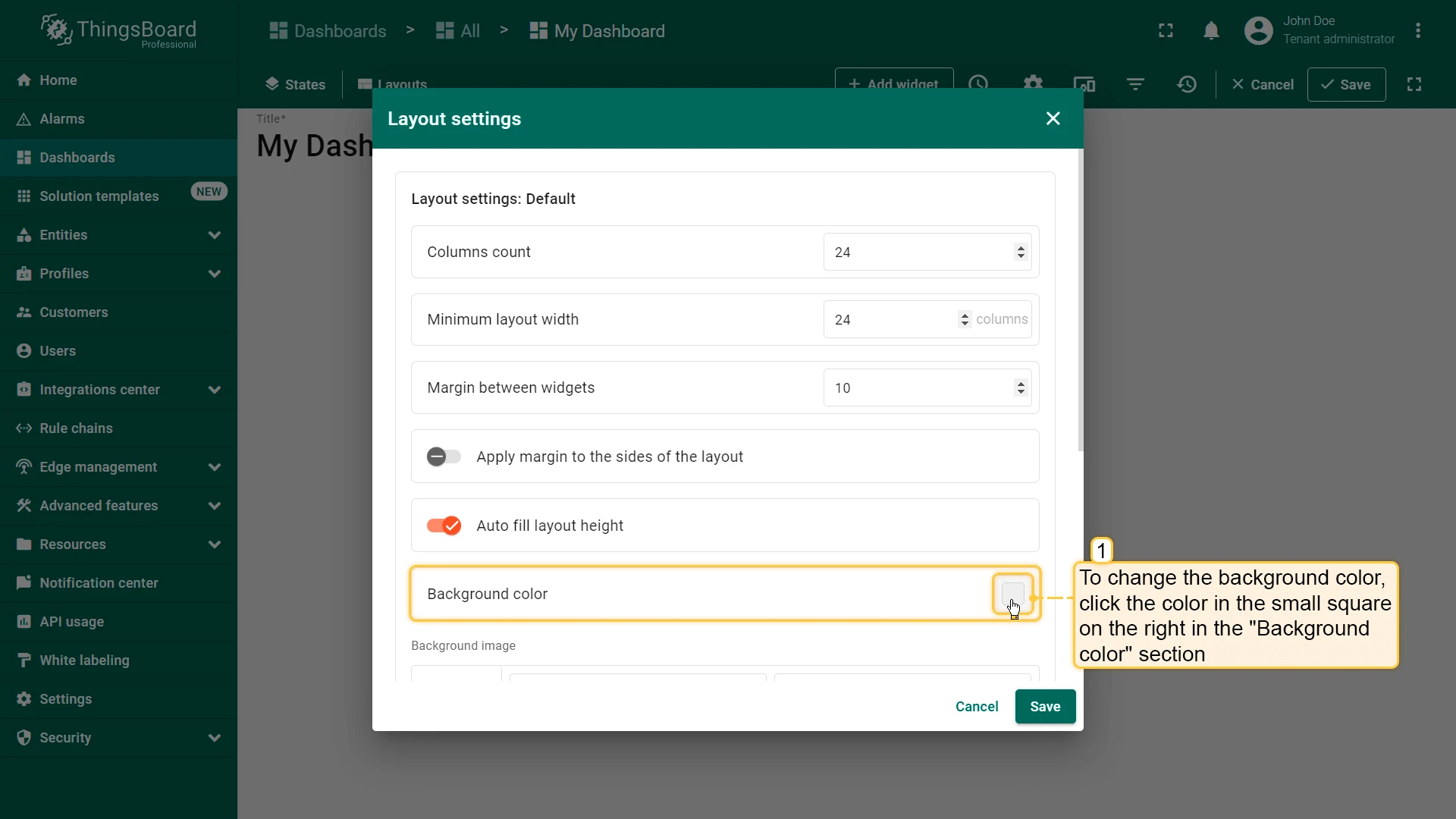
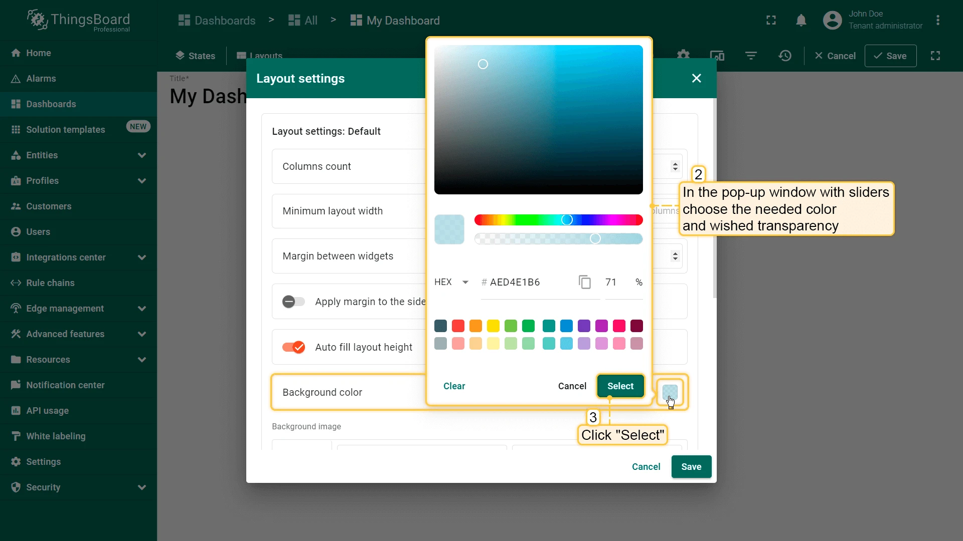
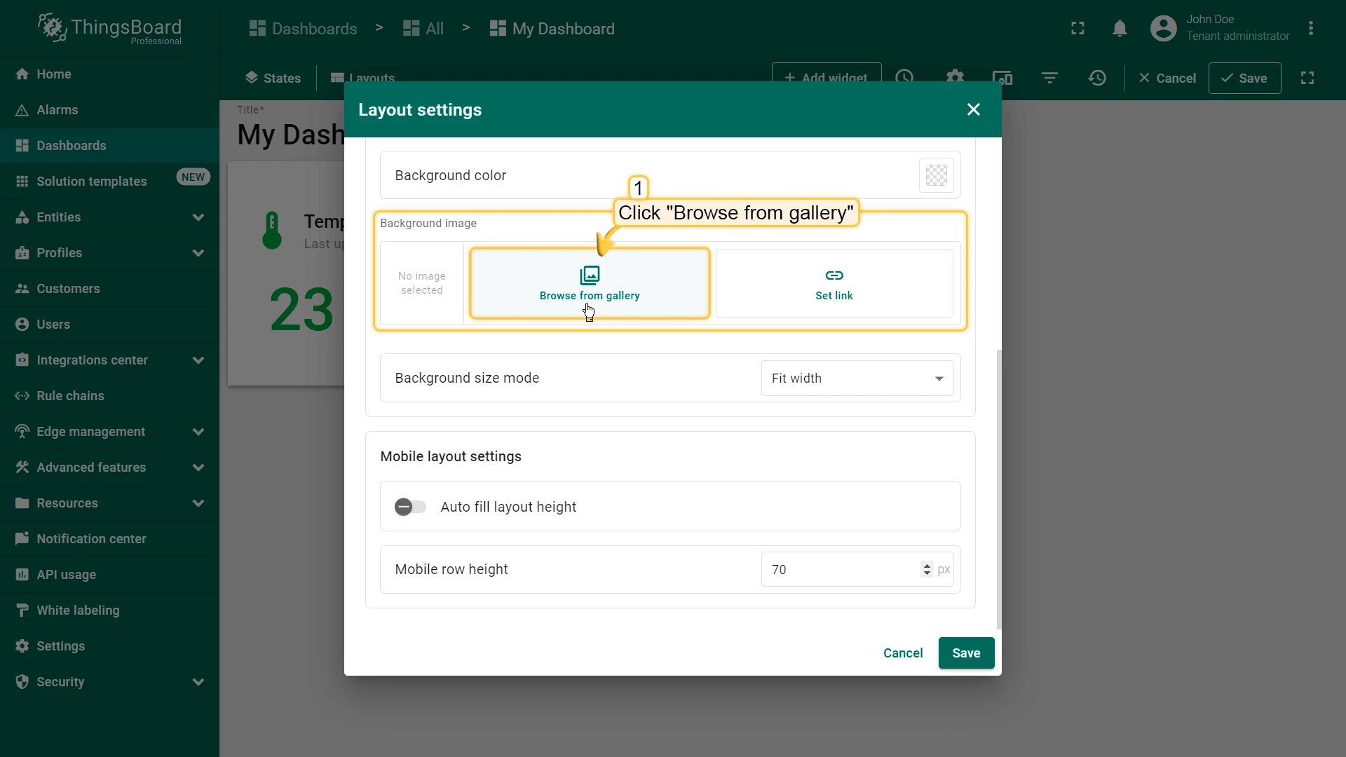
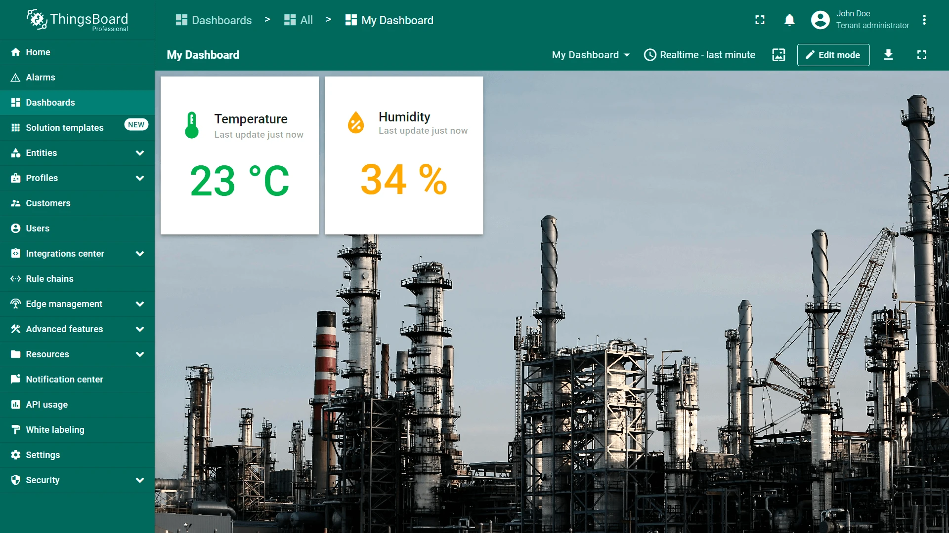
Background Color
Section titled “Background Color”Customize the dashboard background color. Click the color swatch to open the color picker, select the desired color and transparency, then click Select.
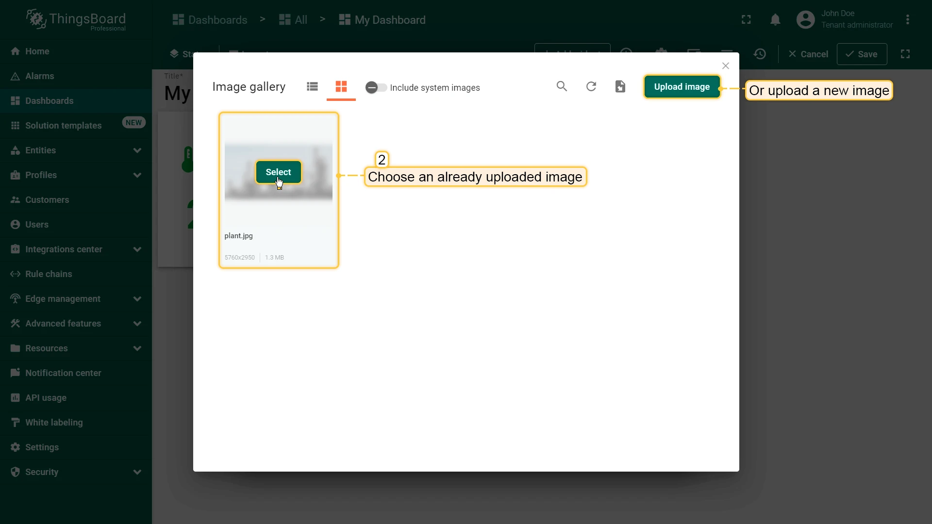
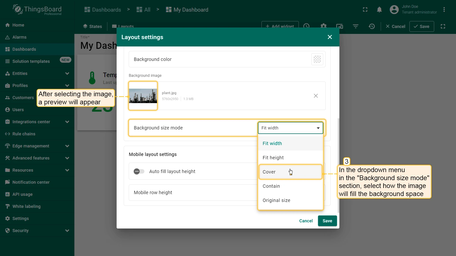
Background Image
Section titled “Background Image”Set an image as the dashboard background. Choose from the Image gallery or provide a direct link. Use the Background size mode dropdown to control how the image fills the space (e.g., Cover, Contain).
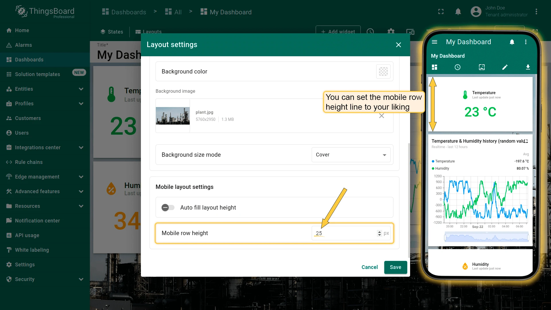
Mobile Layout Settings
Section titled “Mobile Layout Settings”These settings apply when the dashboard is viewed on a mobile device.
Auto fill layout height — when enabled, widgets are stretched to fill the mobile screen height.
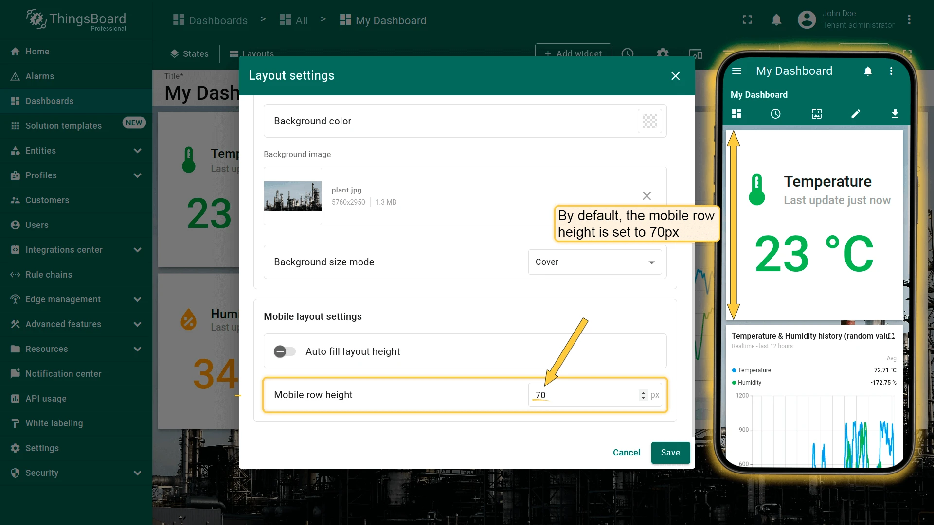
Mobile row height — height of each widget row on mobile. Default: 70 px (range: 5–200 px).
Was this helpful?