Overview
Entity Table widget displays the latest values with list of entities that matches selected alias and filter with ability of additional full text search and pagination options. Highly customizable using widget styles, data source keys, and widget actions.
Setting up Entities Table widget
To get started with the Entities table widget, you first need to create a dashboard and add a widget to it.
Creating a dashboard
So let’s create a dashboard that will visualize our telemetry.
You can use an existing one or create a new dashboard for a new use case.
In our example, we’ve created a new dashboard called “Entity Table” for the purposes of our tutorial.
Adding a widget to the dashboard
The next step is to visualize telemetry. To add the Entity table widget to your dashboard, you should:
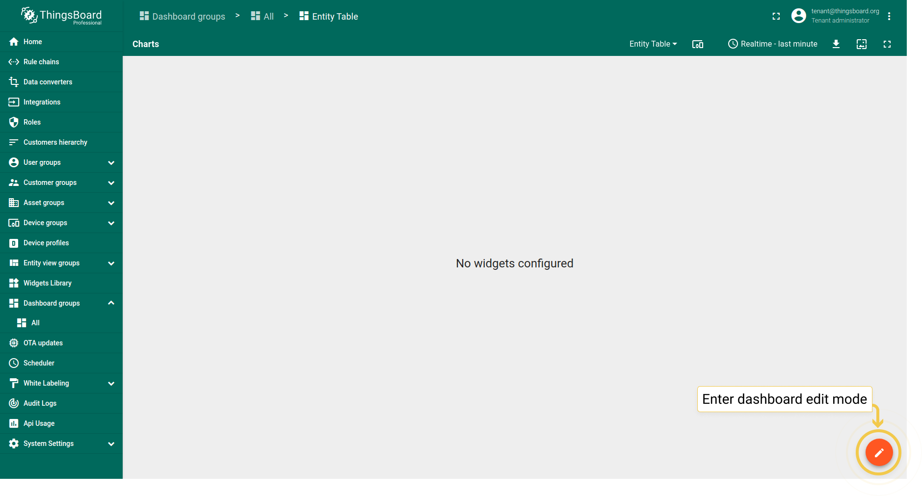
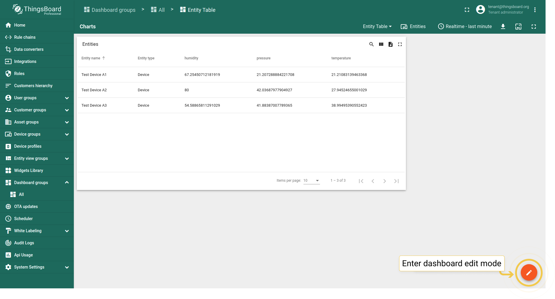
- Enter dashboard edit mode by clicking the pencil icon in the lower right corner of the screen.
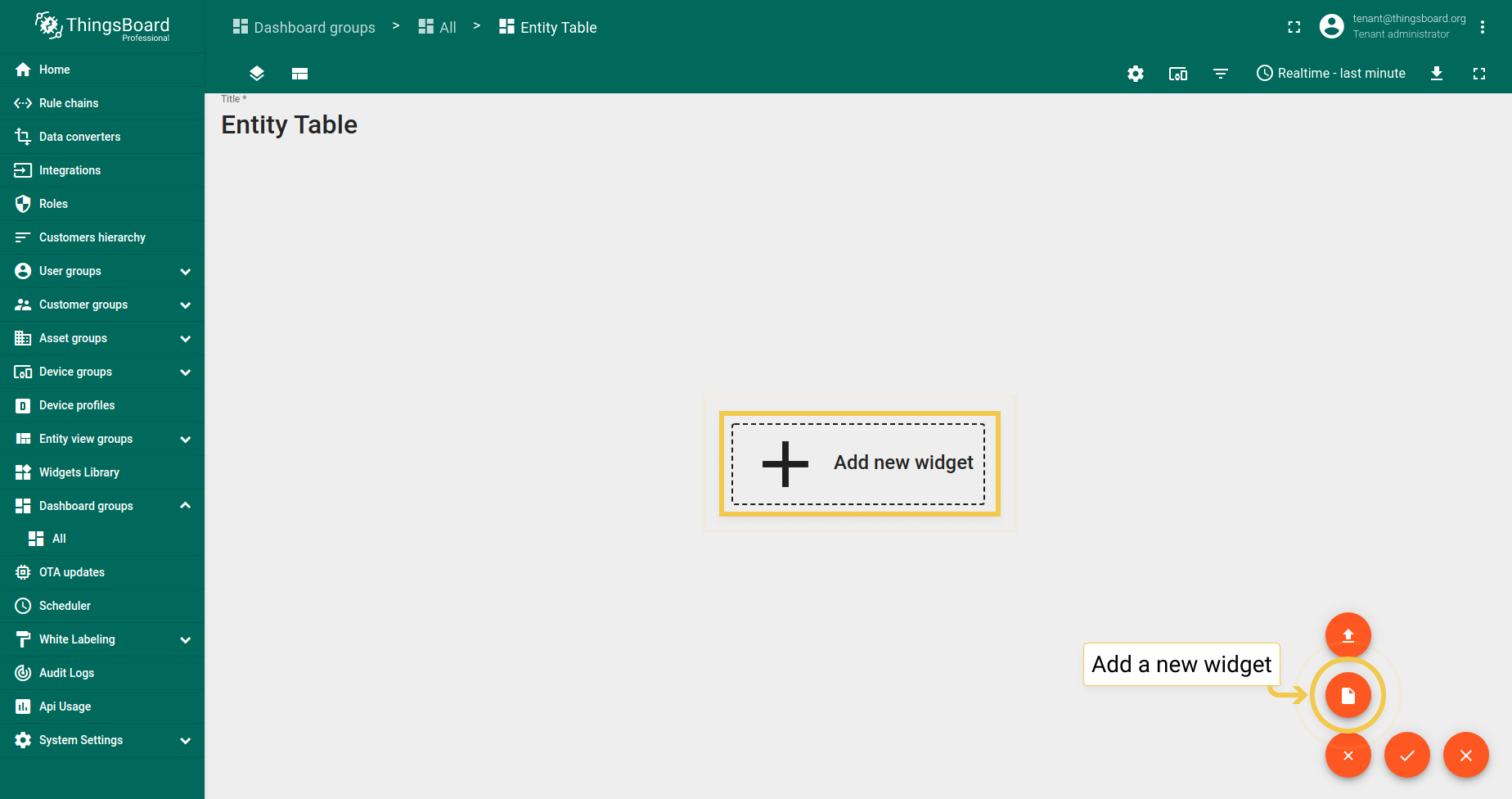
- Click the big sign in the middle of the screen or the plus icon ("Add new widget") in the lower right corner of the screen. From the drop-up menu, select Create new widget.
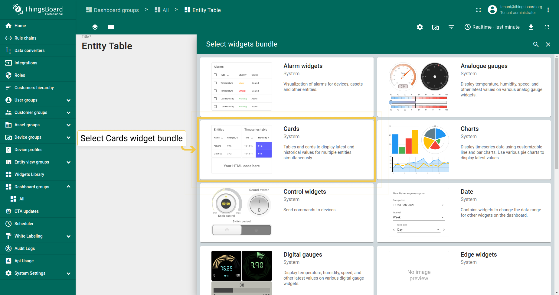
- In the widgets bundle selection dialog window, choose Cards.
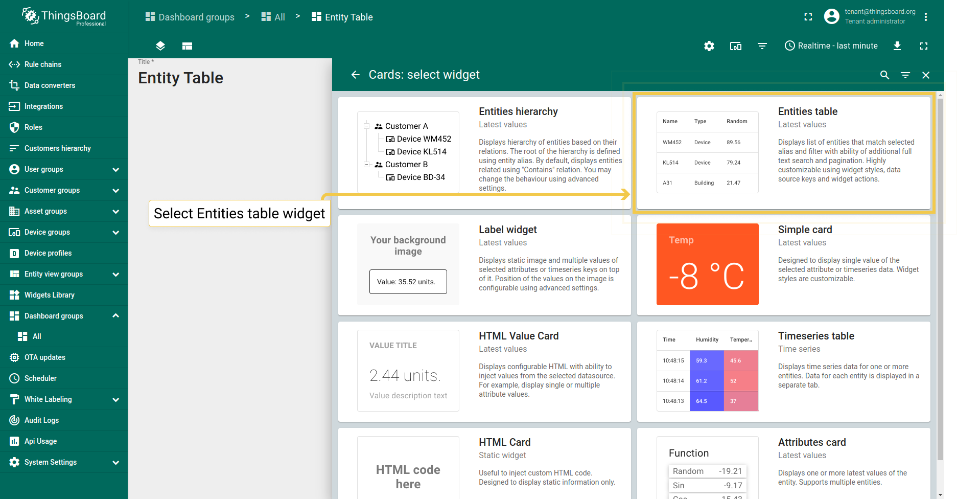
- From the Cards bundle, select the Entities table widget.
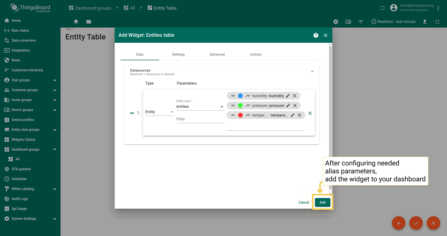
- Click Add to attach a datasource to your widget to specify entity from which we will receive telemetry data.
- If you have added an alias before, select it from the drop-down menu. If not, click "Create a new one!".
- You can learn how to add an alias and aliases types by following the link below the screenshots section. After configuring the alias settings, click Add.
- Add telemetry from the drop-down menu to be displayed on the widget.
- When you are done configuring datasource, click Add.
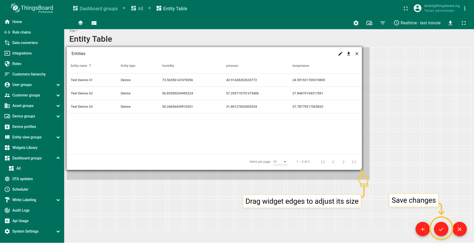
- Drag the edges of the widget to adjust its size and save all applied changes by clicking the checkmark in the lower right corner of the screen.
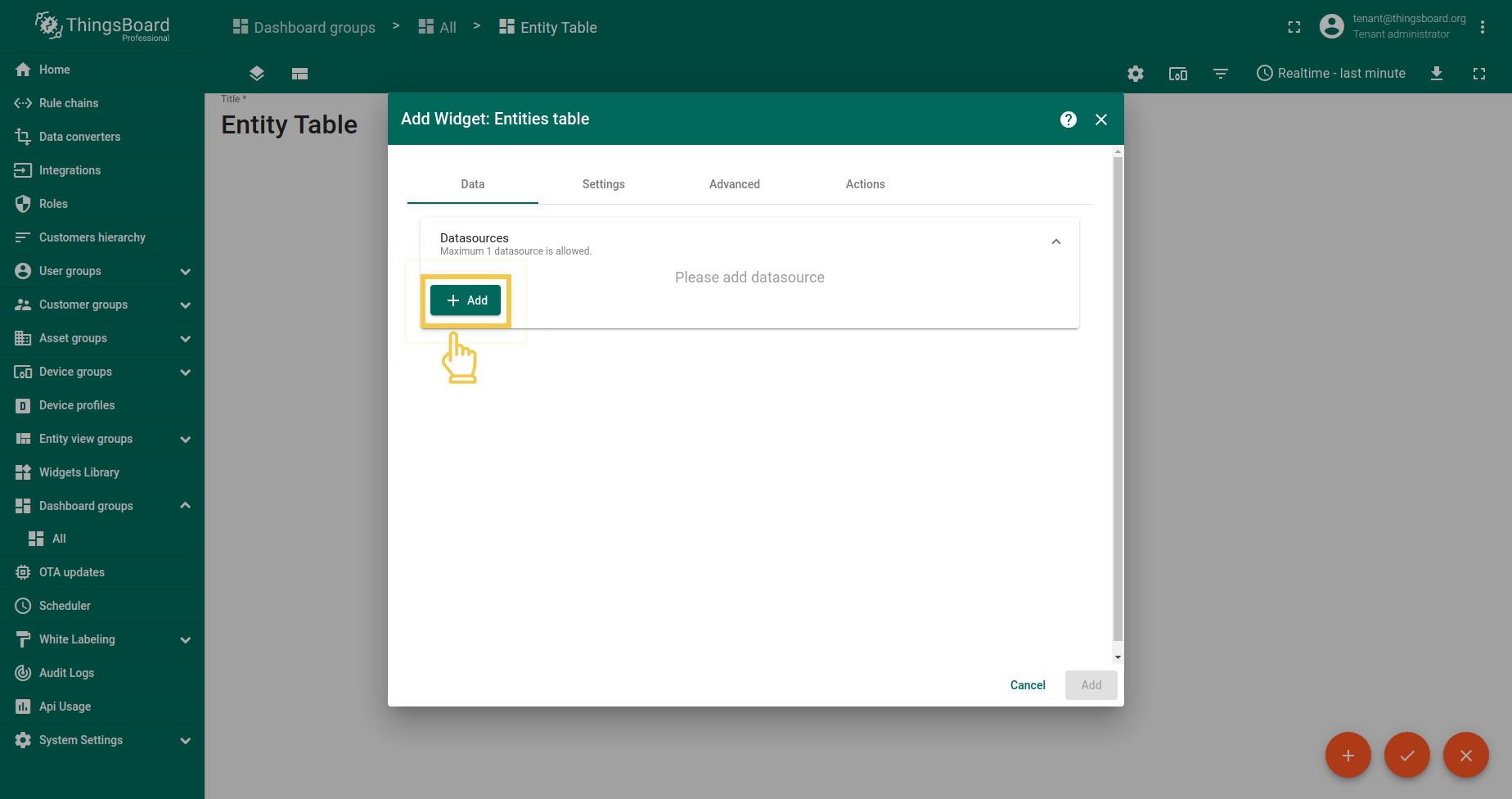
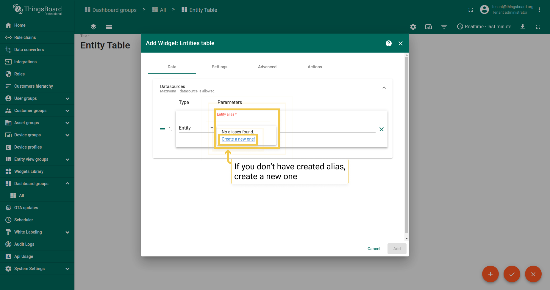
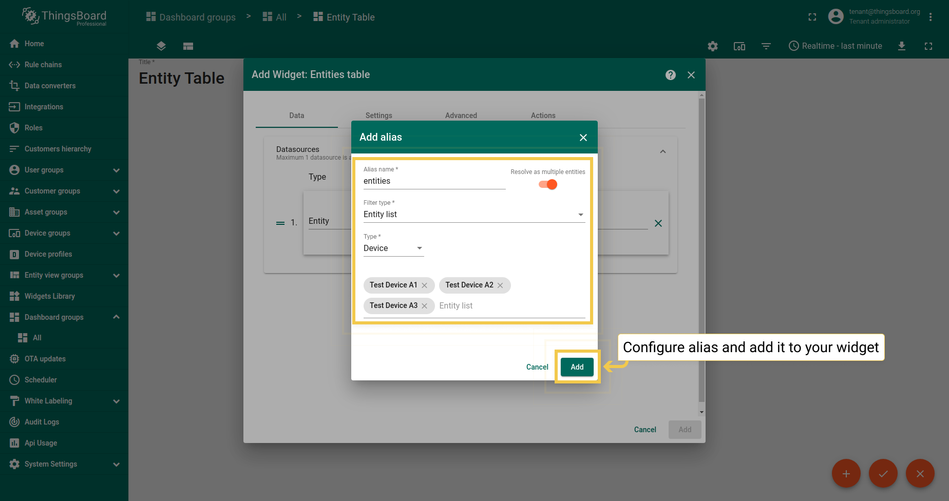
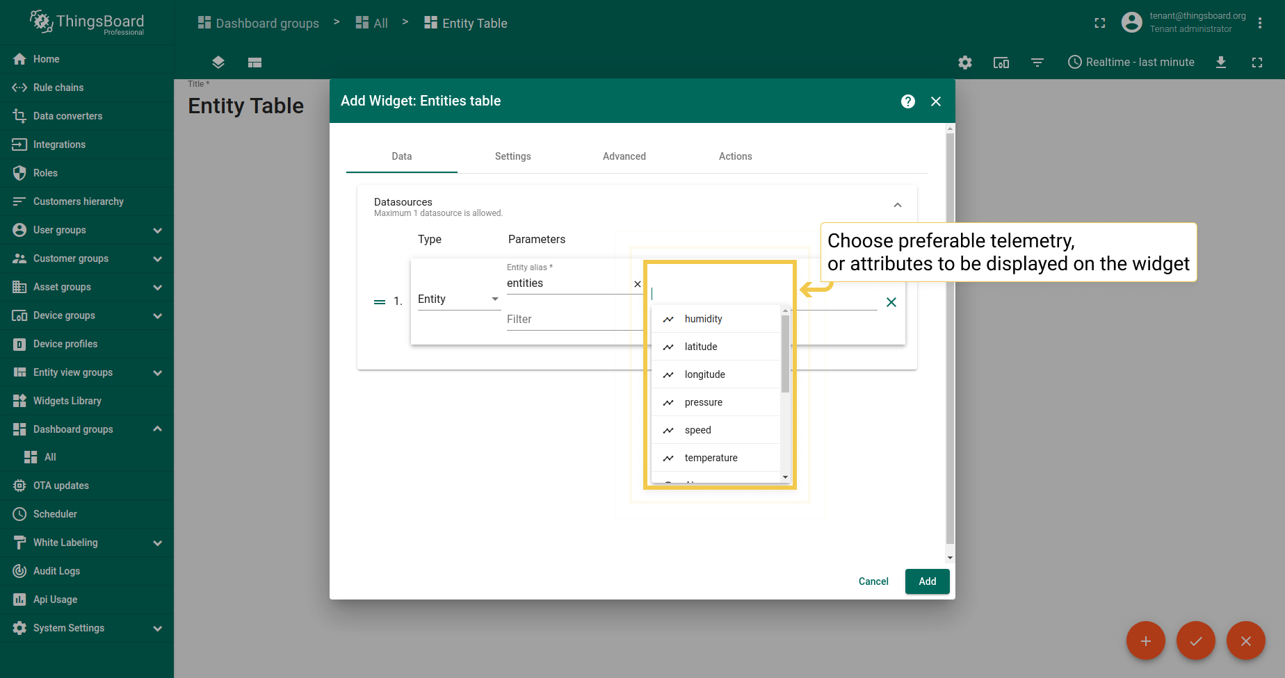
Learn how to add alias to your widget.
Settings
To start customizing your widget, you should go to widget edit mode by clicking the pencil icon in the upper right corner of the widget while in the dashboard edit mode.
1. Title style
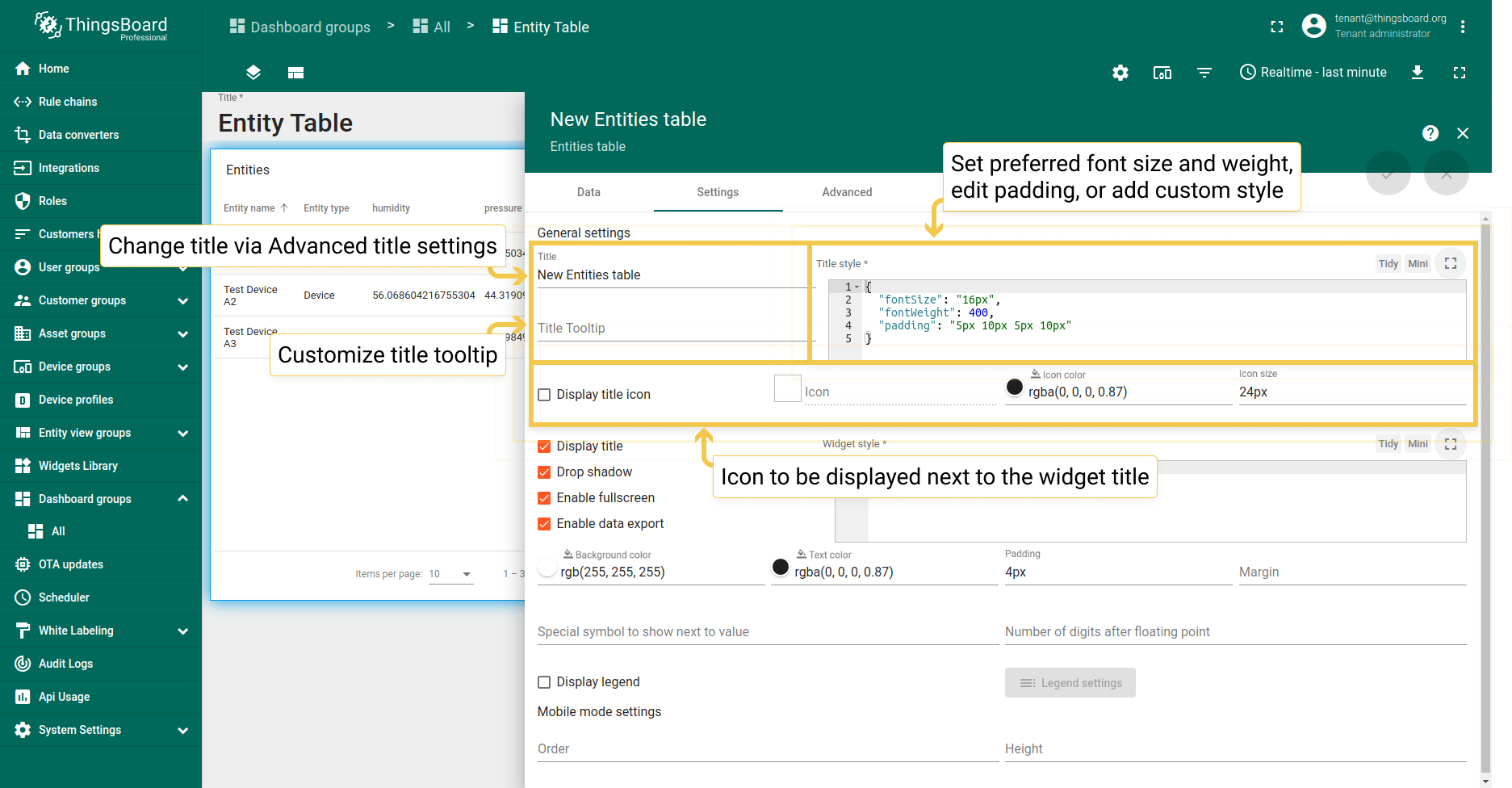
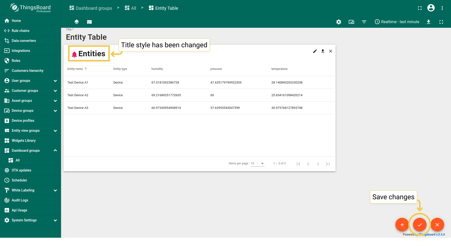
You can change widget title tooltip, and title style. Title itself you should change via Advanced title settings. Also, you are able to add an icon to the title and adjust its color, opacity, and size. See configuration and the corresponding result below.
- You are able to change Title setting, its tooltip and customize title style. In addition, you can add an icon and adjust its settings.
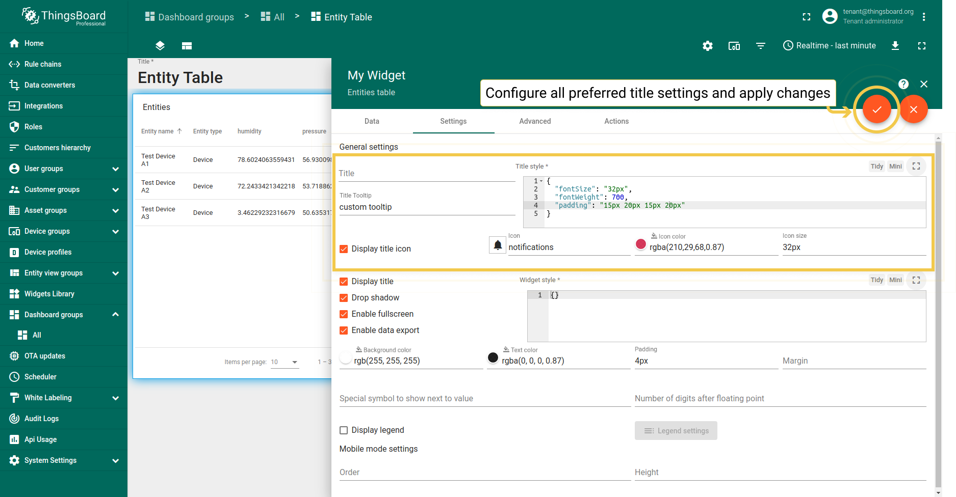
- After setting up all preferred configurations, apply the changes by clicking the checkmark in the upper right corner of the screen.
- As you can see, the title style has been changed, and the custom has been added icon next to it. To save all applied changes, click the checkmark in the lower right corner of the screen.
The checkboxes are responsible for displaying/hiding the widget title, widget shadow, and enabling/disabling fullscreen mode.
2. Widget style
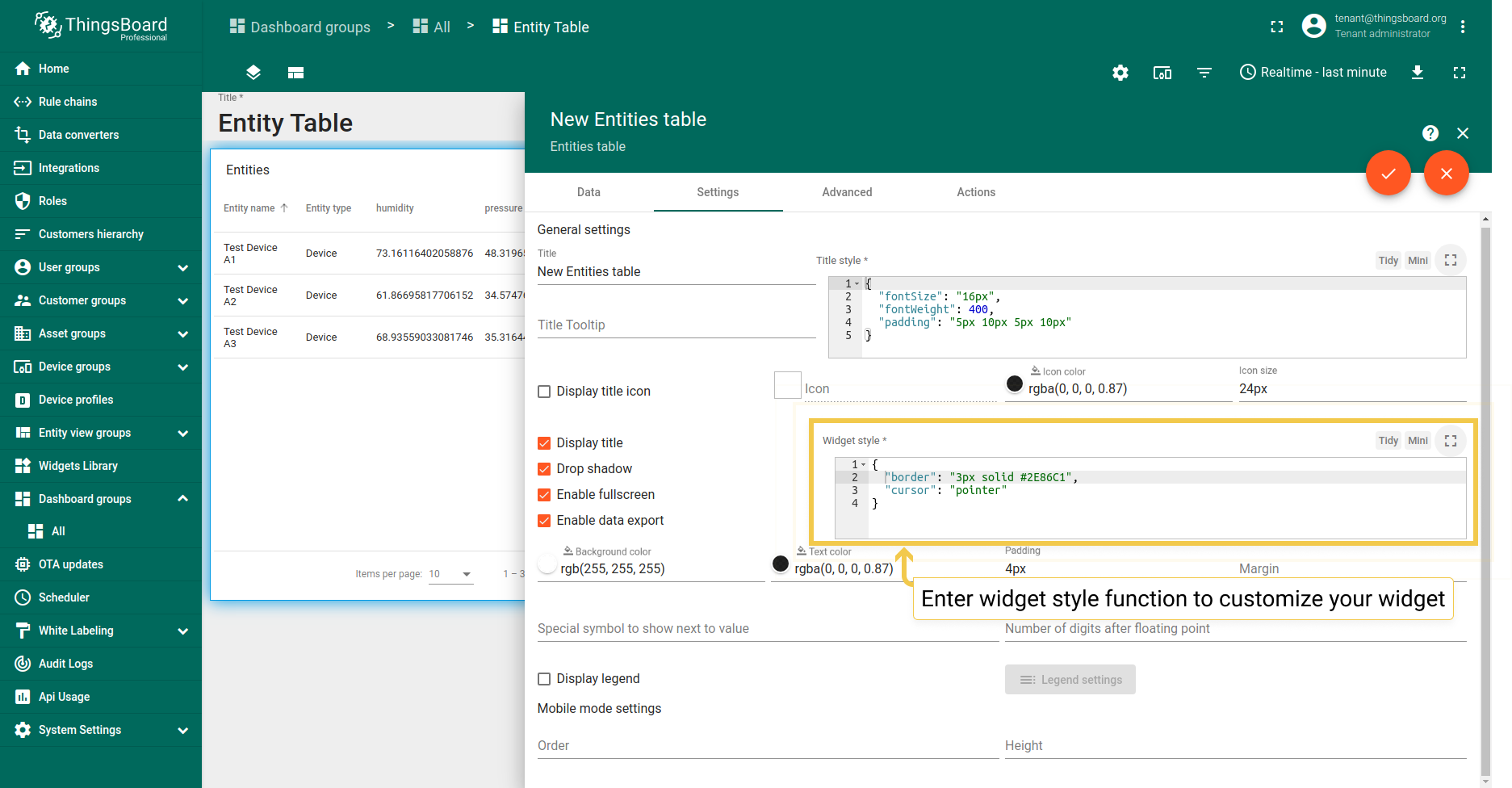
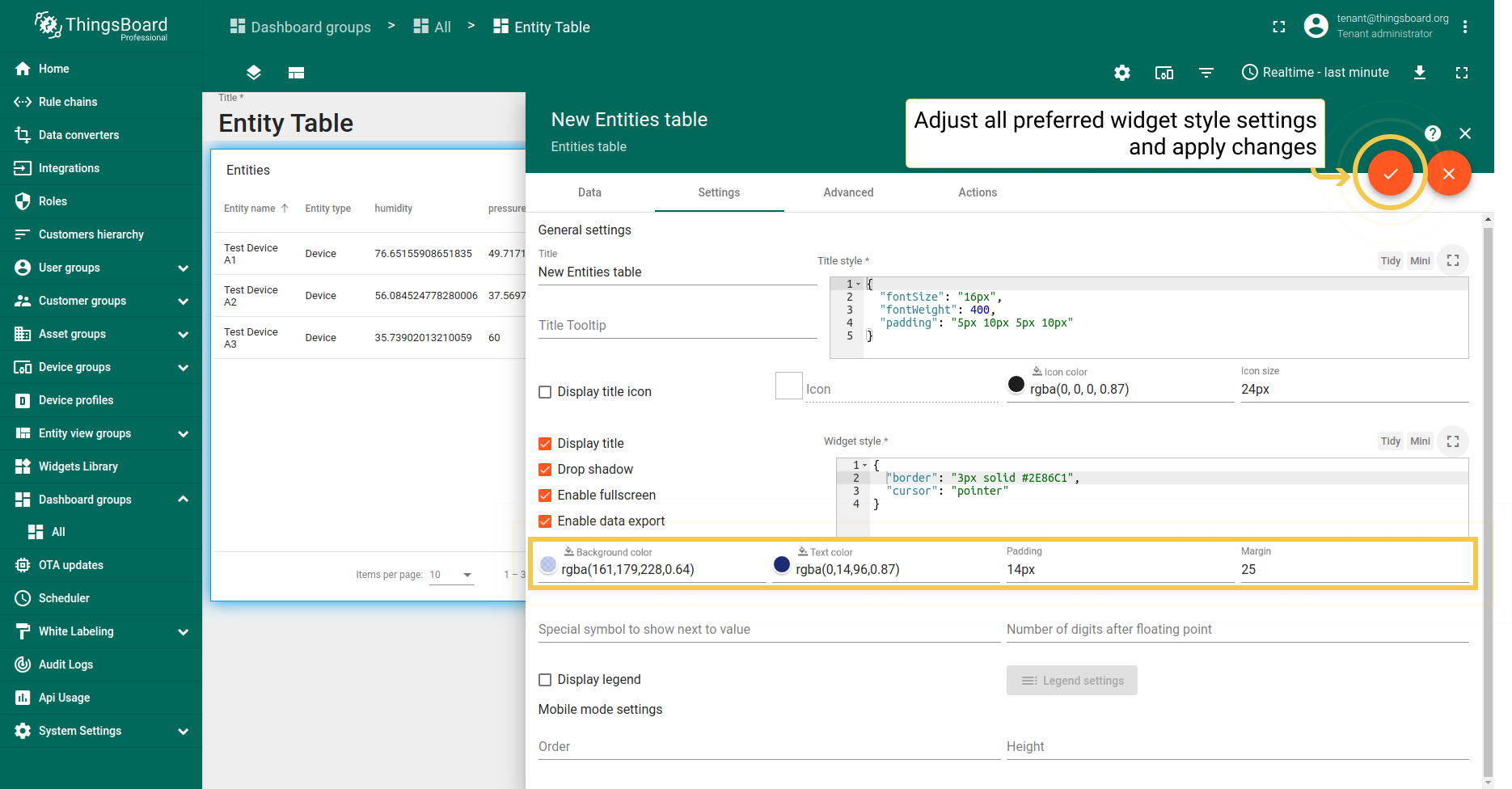
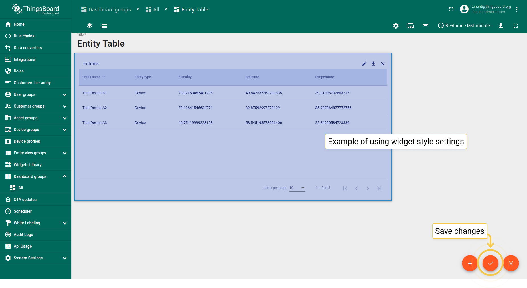
You can customize personal style for the widget using CSS properties. This style will be applied to the main div element of the widget. You can also change the background color, text color, padding, and margin. See the configuration and the corresponding result below.
Please note that the style and background color are just an example and are definitely not part of our guidelines.
1
2
3
4
{
  "border": "3px solid #2E86C1",
  "cursor": "pointer"
}
- In the widget style field, enter the function to customize the appearance of the widget.
- You can manually adjust the background and text colors by clicking the corresponding circles and moving sliders to select the color you want. Enter the preferred value in the padding and margin lines. After configuring the desired options, click the checkmark in the upper right corner of the screen.
- As you can see, the appearance of the widget has changed. To save all applied changes, click the checkmark in the lower right corner of the screen.
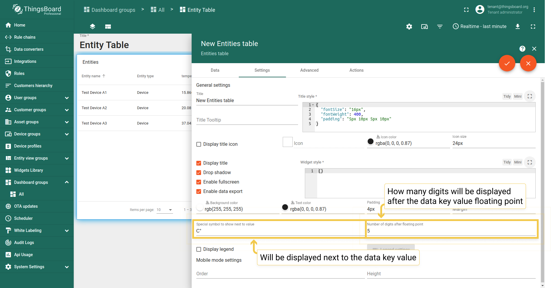
3. Special symbol and number of digits after floating point
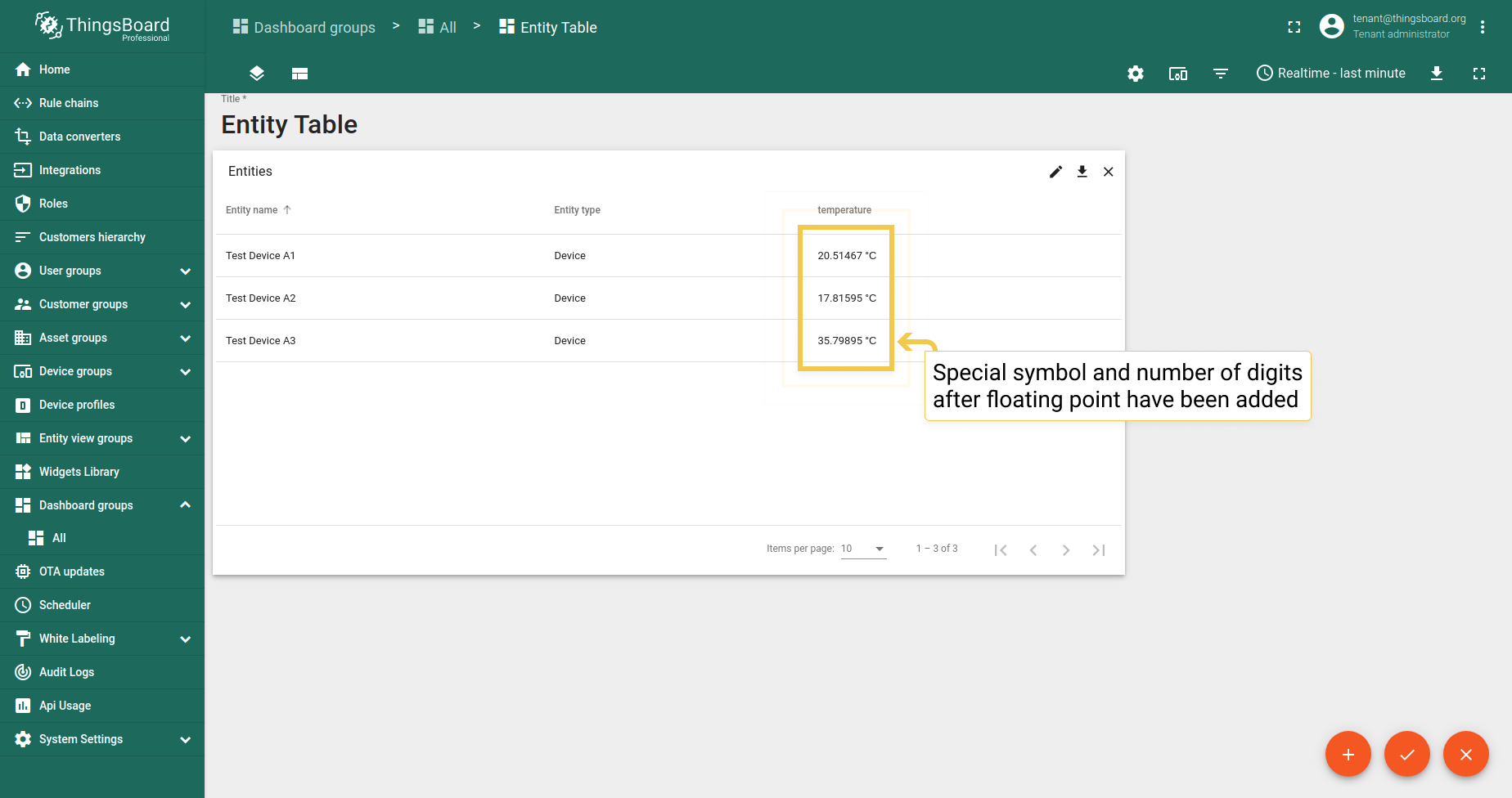
You can add a special symbol that will be displayed next to the entity values of your widget. Also, you can customize the number of digits to be displayed after the floating point number of your value. See the configuration and the corresponding result below.
- Enter the desired symbol to be shown next to the value. Enter the number of the digits to be displayed after the floating point number. Apply the changes by clicking the checkmark in the upper right corner of the screen.
- As you can see, the special symbol has been added, and the number of digits has been changed.
4. Legend settings
Legend settings make sense configure only in time series widgets where this option is enabled by default. You can read more about Legend settings here.
Advanced settings
Advanced settings of the Entities Table widget allows adjusting the title of the widget, changing visibility of objects on widget, customizing the columns, setting up the pagination, sorting the data and changing style of widget rows.
To enter the advanced mode and start adjusting the settings above, you should:
- Click the pencil icon ("Enter edit mode") in the lower right corner of the screen.
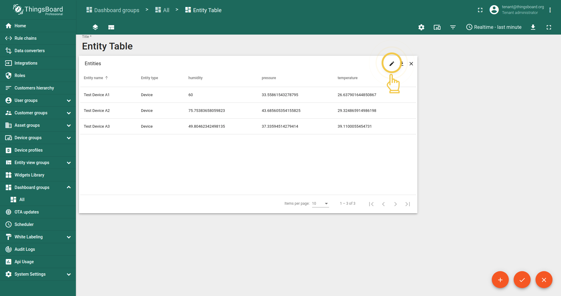
- Click the pencil icon (“Edit widget”) in the upper right corner of the Entity Table widget itself.
- Move to the Advanced cell.
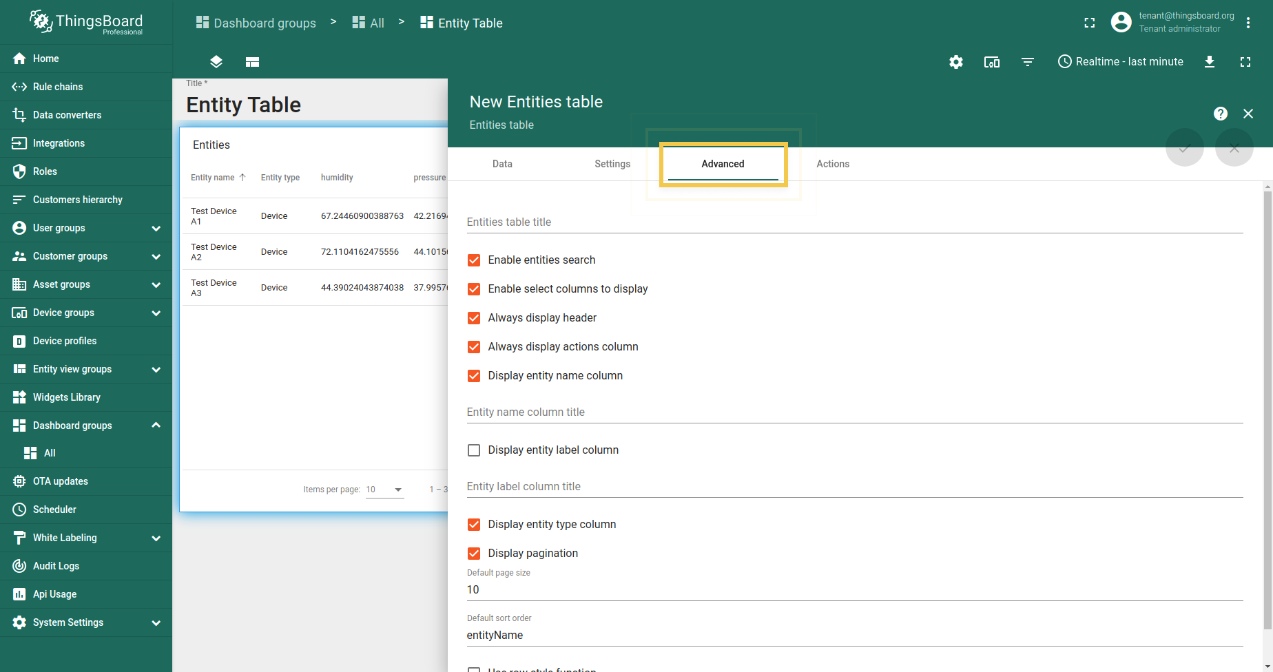
1. Entities table title
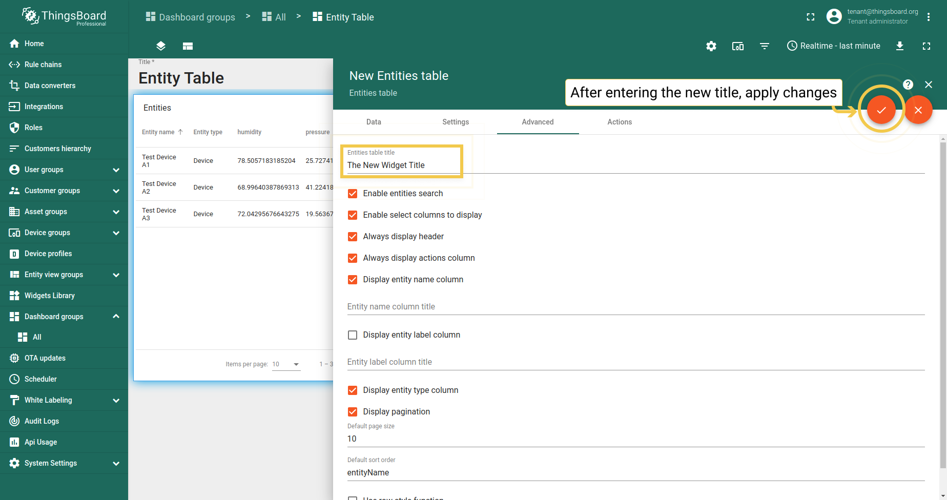
ThingsBoard has no name restrictions, either in symbols or in a number of characters. Nevertheless, in case the title is too long, it will not display completely in the Entity Table widget, but will be terminated with three dots. However, after applying the changes and opening the widget in full-screen mode, you will be able to see the full name of the widget. For example, let’s use something simple for the title like “The New Widget Title”:
- Enter the desired title in the title bar. Click the orange checkmark in the upper right corner.
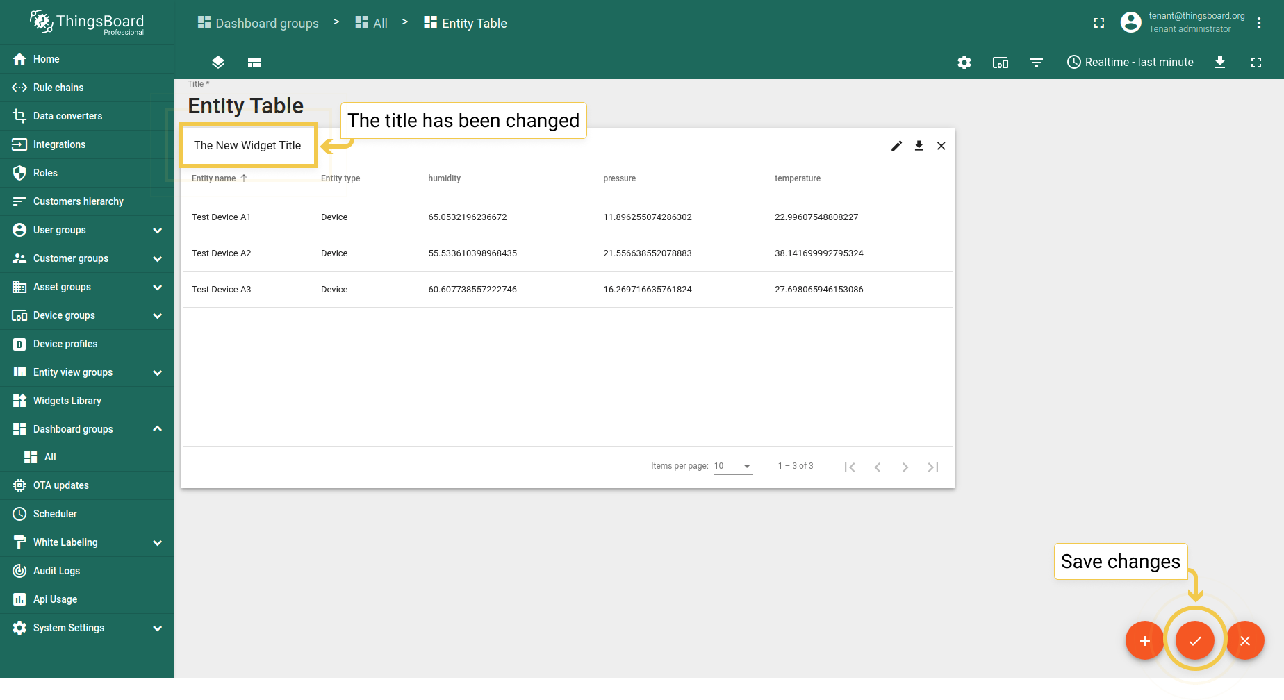
- The title of the widget has been changed.
2. Checkbox settings
- Enable entities search
If the checkbox is checked, the magnifying glass in the upper right corner of the widget allows you to search for widget entities.
- Enable select columns to display
If the checkbox is checked, the black bars in the upper right corner of the widget allow you to choose which columns you prefer to hide and which to display.
- Always display header
If the checkbox is checked, the widget header is always visible when we scroll through the list of entities. If the box is not checked, the widget header remains at the top.
- Always display actions column
If the checkbox is checked, the row action cell is always visible when we scroll through the widget’s telemetry. When unchecked, the row action cell remains at the end of the row.
- Display entity name column
If the checkbox is checked, the entity name column is visible. If it’s unchecked, it will be hidden.
3. The columns settings
3.1. Entity column title
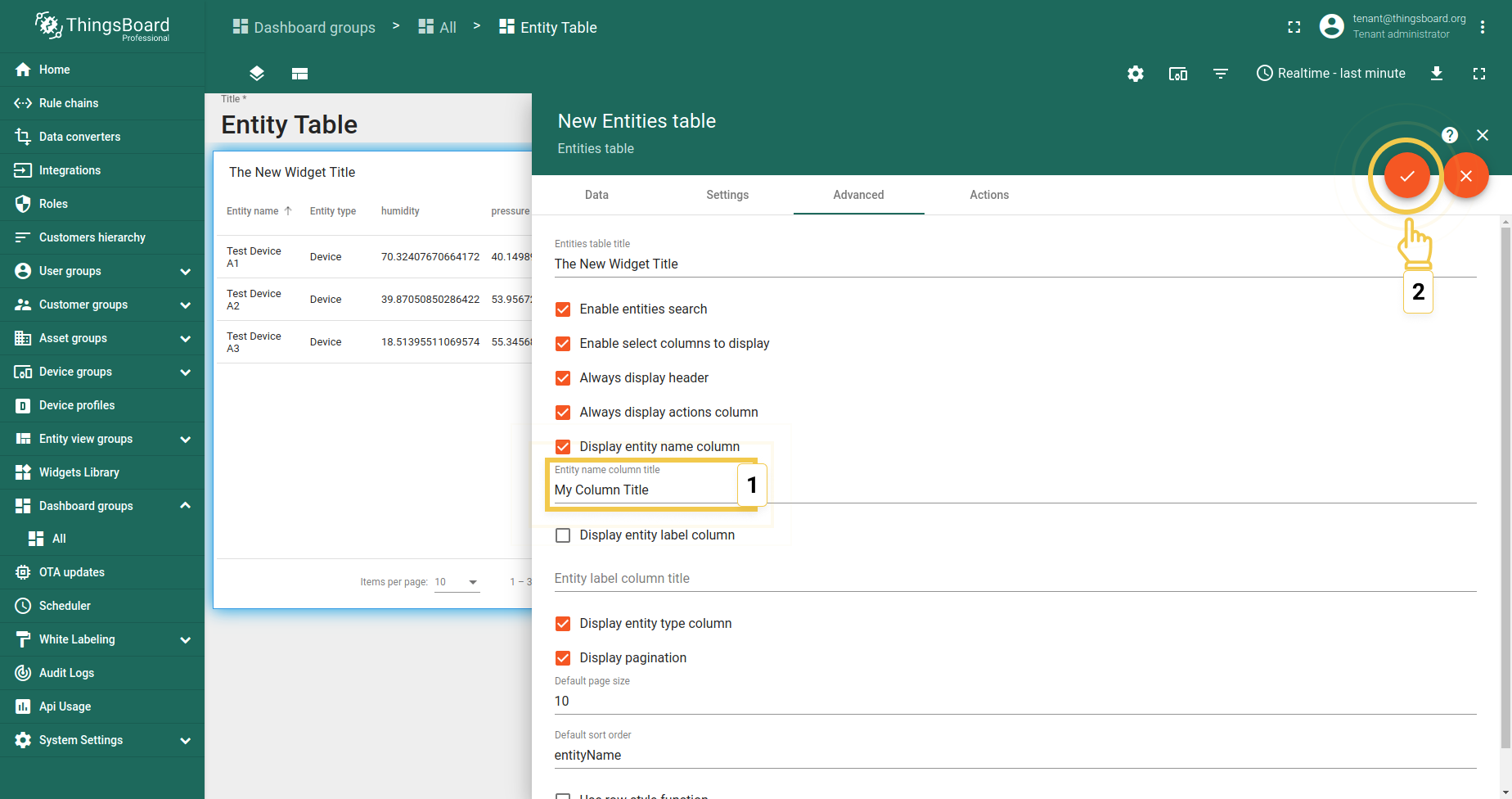
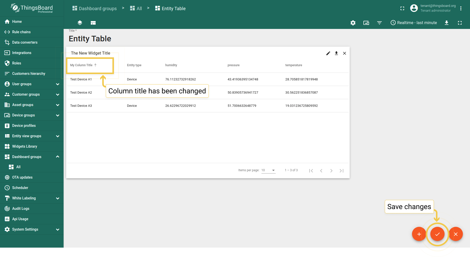
To change the title of the column, you should:
- Enter the new title in the corresponding line.
- Click the orange checkmark in the upper right corner to apply changes. An entity column title has been changed.
3.2. Displaying an entity label column
If the checkbox “Display entity label column” is checked, you can add the label column and name it. After clicking on the orange checkmark in the upper right corner, the label column with the custom name will appear in the widget.
3.3. Displaying an entity type column
The checkbox “Displaying entity type column” is responsible for showing the type of the entity on the widget (e.g. “device”). By default, an entity type column is shown, but you can hide it by unchecking the box.
4. The Pagination
By default, the widget shows how many items per page can be visible and how many pages there are in general. Displaying this information is optional. It changes by checking/unchecking the checkbox called “Display pagination”. If the checkbox is disabled, the information about items per page and number of pages won’t be displayed. To apply the changes, click the orange checkmark in the upper right corner.
Please, note: to understand the next settings, we need to enable the “Display pagination” checkbox to see the number of items per a page.
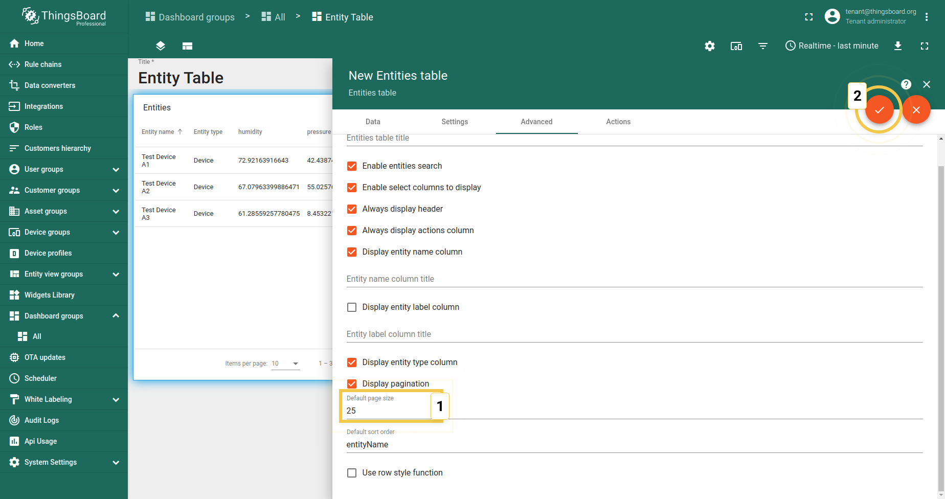
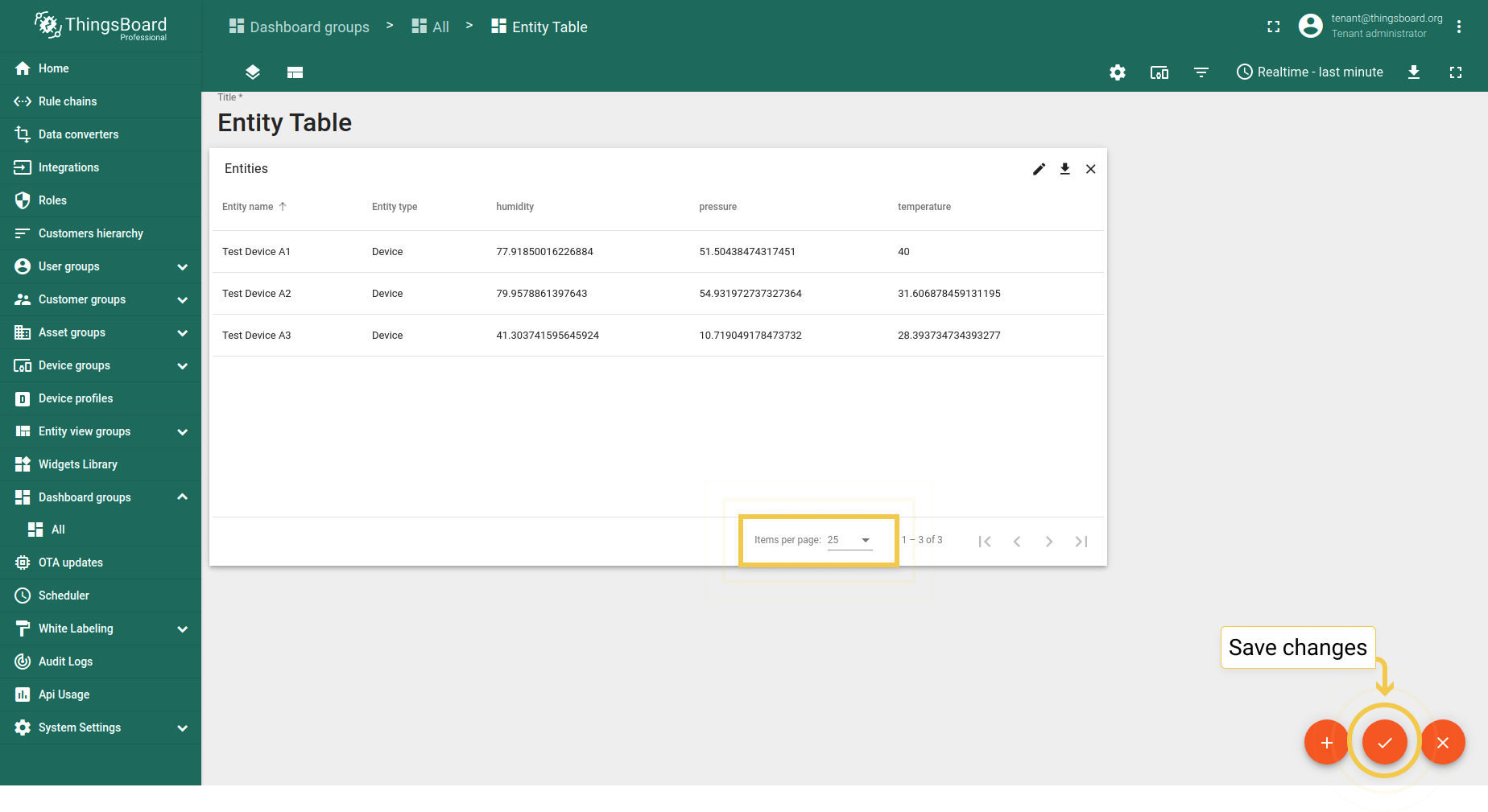
By default, the page size is set to 10 items per page. If you need to change this number, you should:
5. Sorting data in the table widget
By default, the data in the Table widget is sorted in ascending order. If the values in the column are not numeric (for example name and type), then the sorting will be done according to the alphabetical ordering rules.
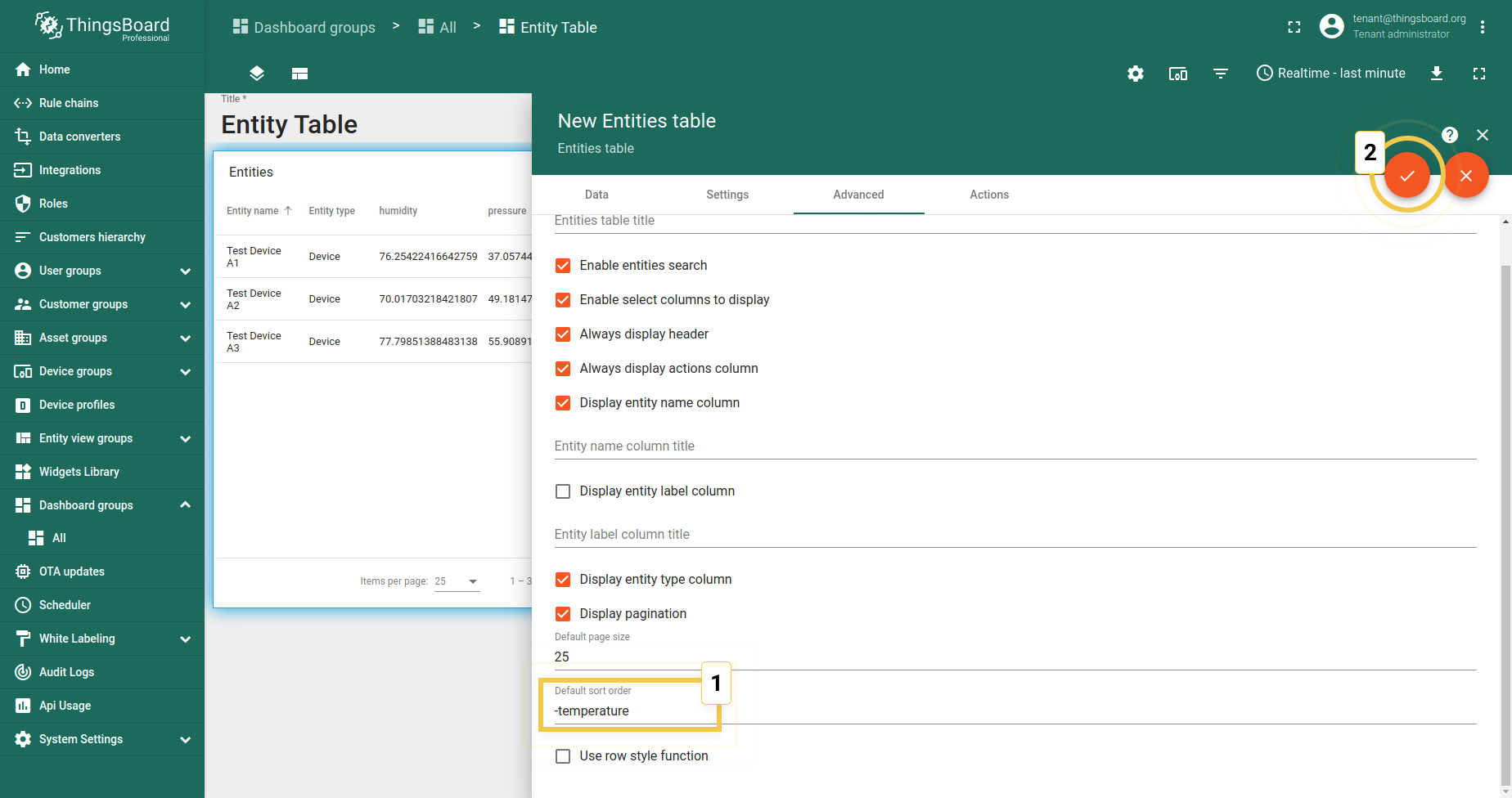
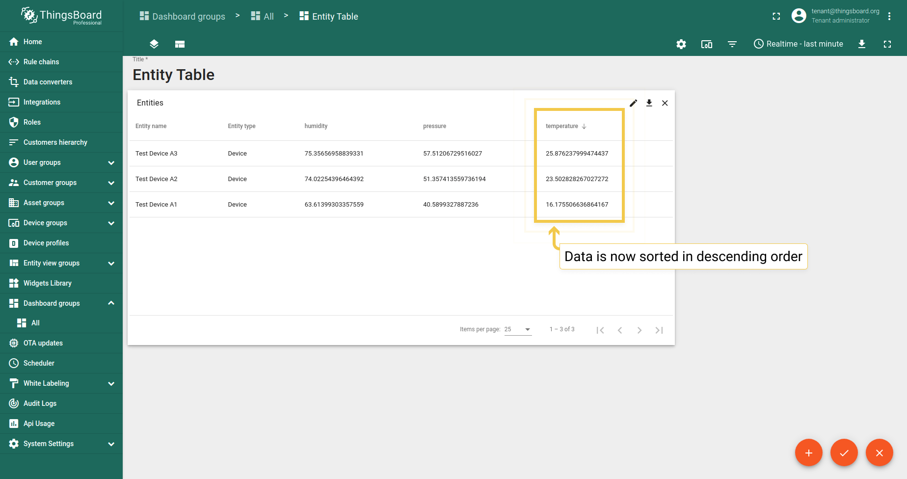
If you’d like to sort the data, for instance, by the telemetry data key type (temperature, humidity, etc.), you can do this by inputting the name of your value in the default sort order row. In the example, the temperature is used. If you need to make the sort order descending, you should:
- As was mentioned, the default sort order is ascending.
- Type the “-” (minus) symbol in front of the data key name in the Default sort order line. Click the orange checkmark in the upper right corner to apply the changes
- Now, the telemetry data is sorted in the descending order we needed.

6. Row style function
Since version 3.2.2, the opportunity to change style of widget rows depending on their conditions appeared. Let’s see how it works on the simple example:
assume, we need to observe which device is active and which is not. To make our mission easier, we should use the Row style function.
An example of it and the corresponding results:
1
2
3
4
5
6
7
result = {background:"white"};
if (entity.active == "false") {
   result.background = '#FF0000';
} else {
   result.background = '#00FF00';
}
return result;
Saving changes
For the changes to be applied and saved, you have to click the orange checkmark in the lower right corner of the dashboard.
Then you can be sure that the changes to the table widget are applied and saved correctly.


