- Overview
- How to create a Chart widget
- Chart widget types
- Chart widget settings
Overview
This guide will study Chart widgets: their functionality, features, basic and advanced settings of the widgets, and widgets’ data keys.
Chart widgets allow you to display time series data with customizable line charts and bar charts. Moreover, you can use various pie charts to display the latest values.
How to create a Chart widget
To add any chart widgets to your dashboards, you should:
- Enter edit mode by clicking the pencil icon in the lower right corner of the screen.
- To add a widget, either click the sign "Add new widget" in the center of the screen or open the drop up menu by clicking the plus icon and selecting "Create new widget".
- From the widgets bundle, select Charts.
- Select the preferred widget from the Chart bundle.
- In the "Add Widget" dialog, click the Add button to add a Data source.
- Add Entity alias and Entity time series, then click "Add".
- While still in edit mode, drag the widget corners to adjust its size. After that, click the orange checkmark to save all applied changes.
- Now you have the Chart widget on your dashboard.
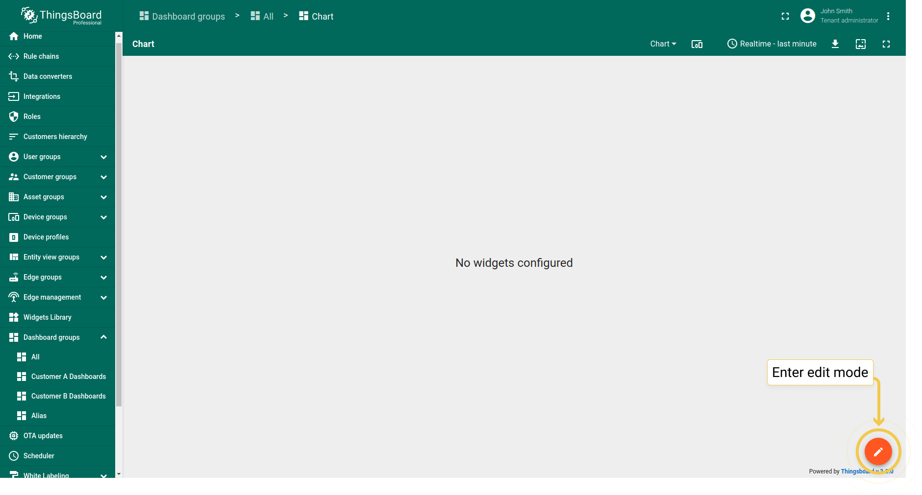
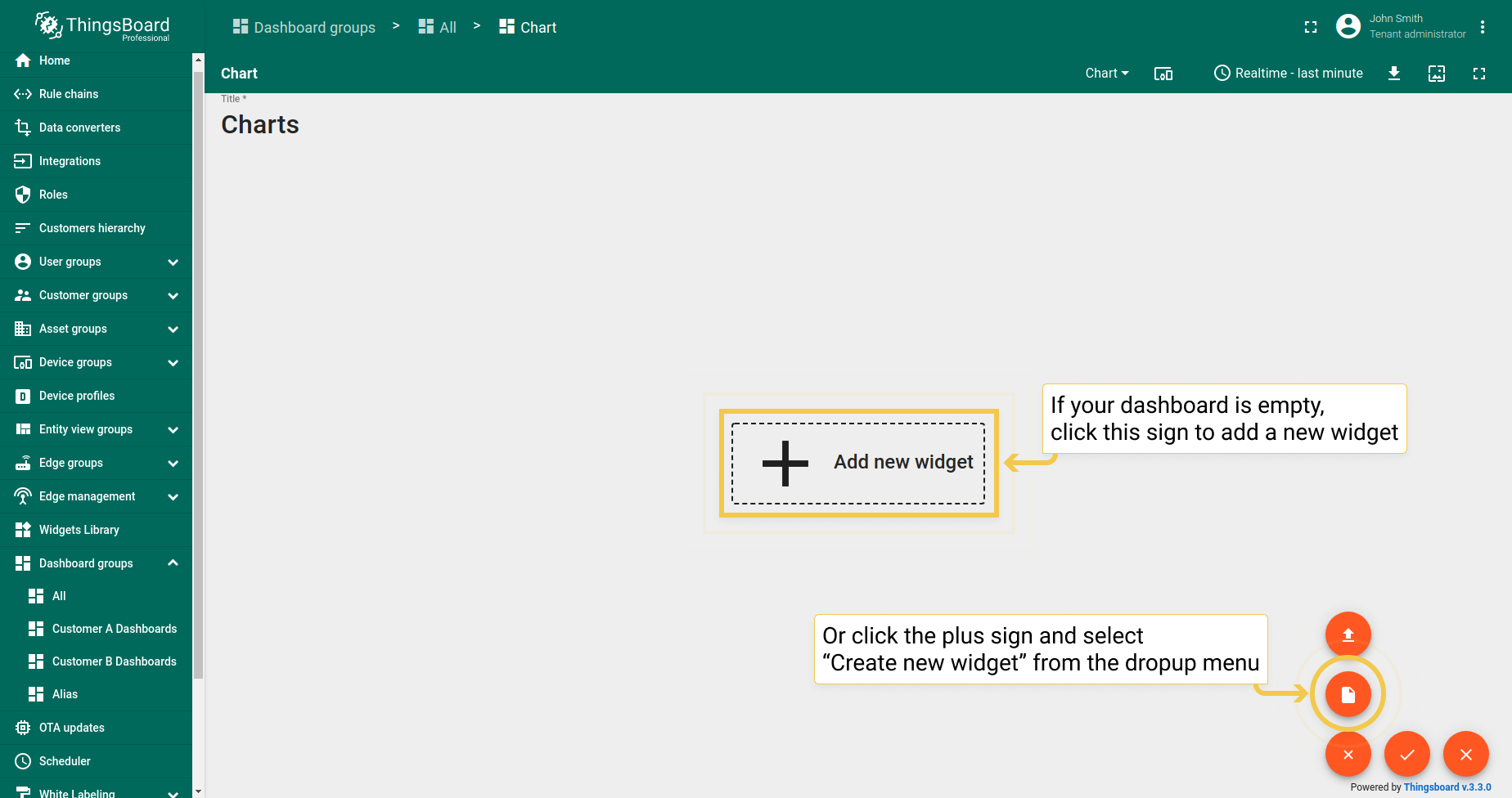
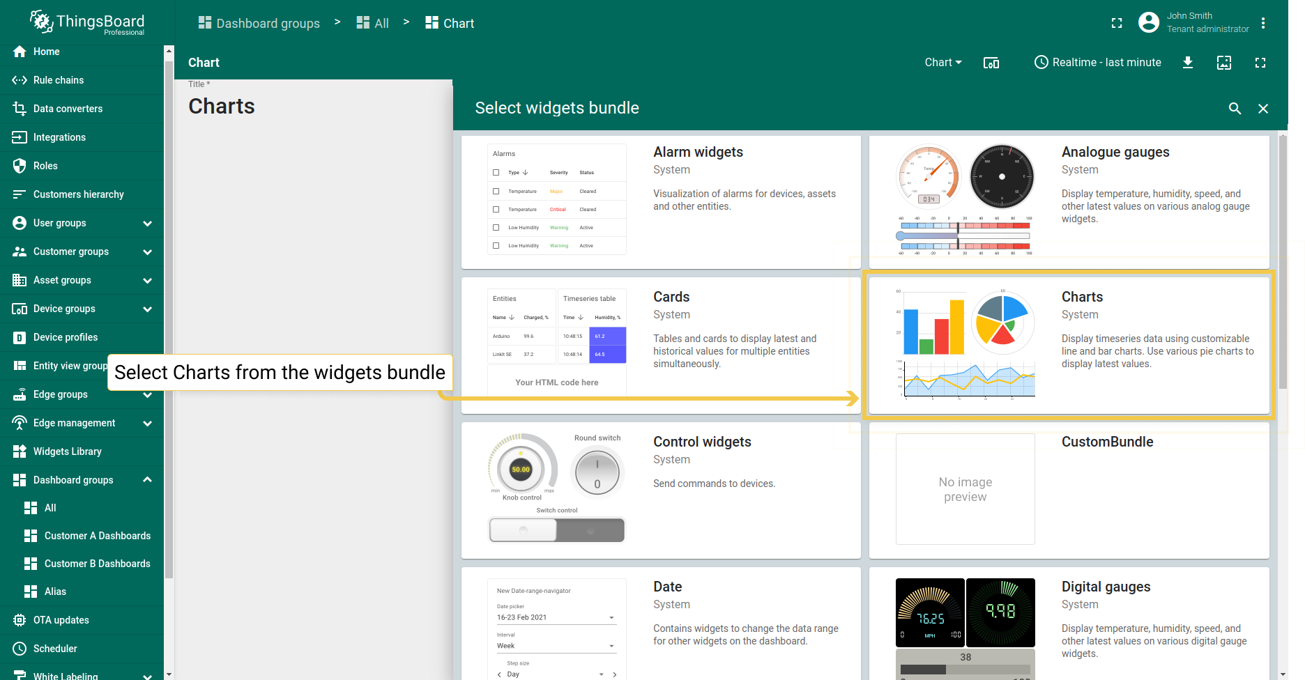
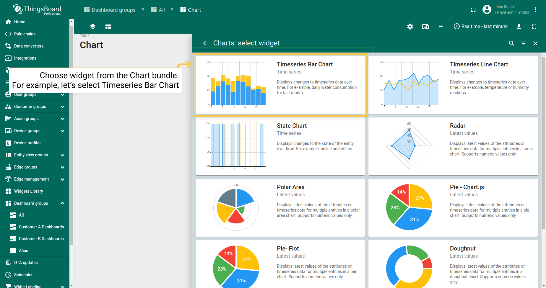
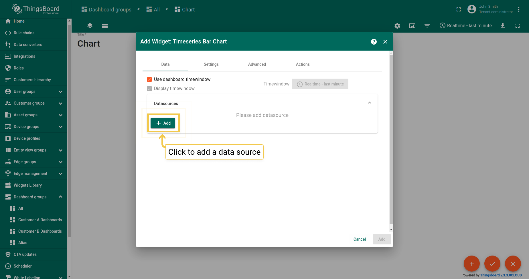
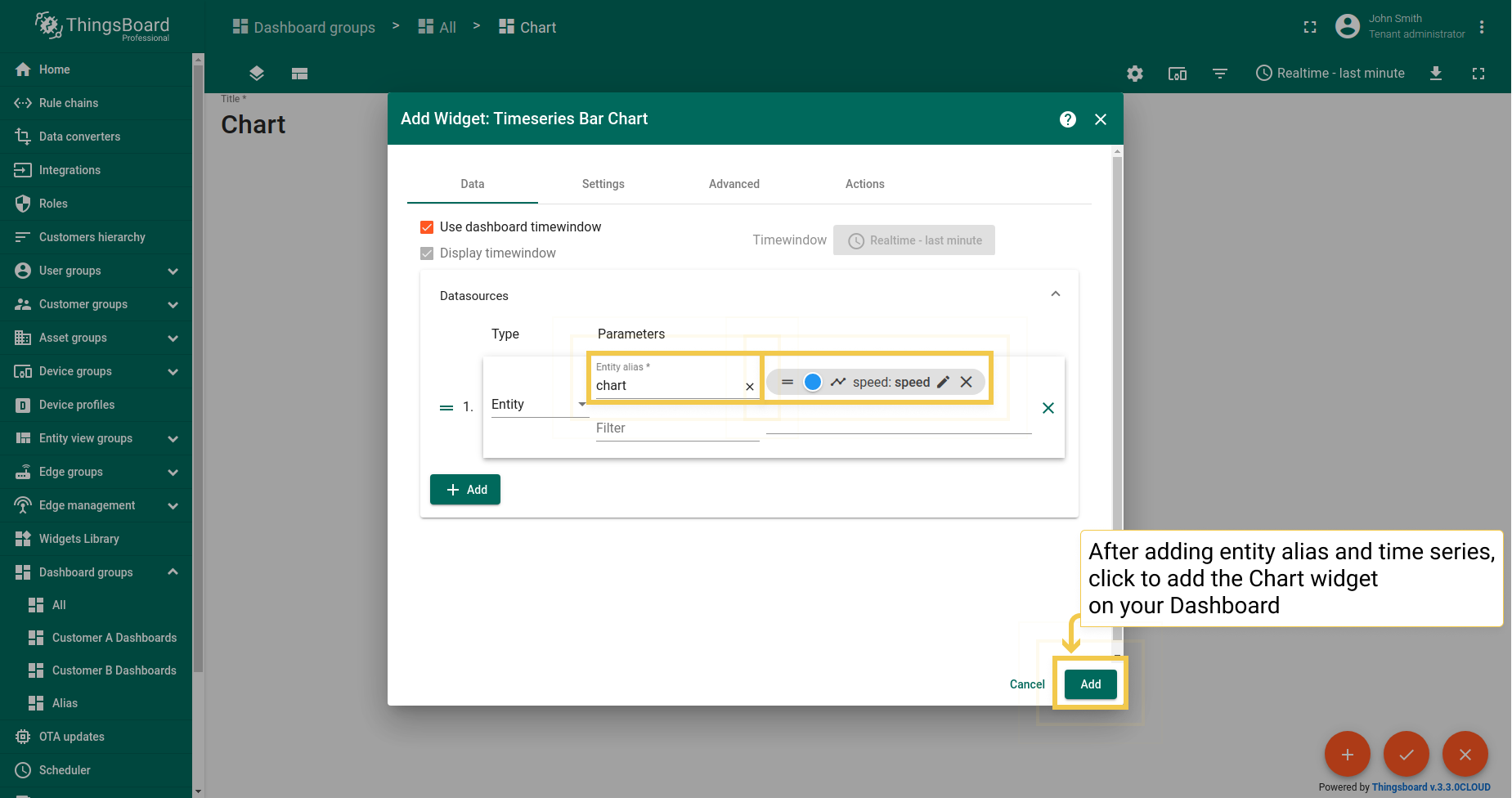
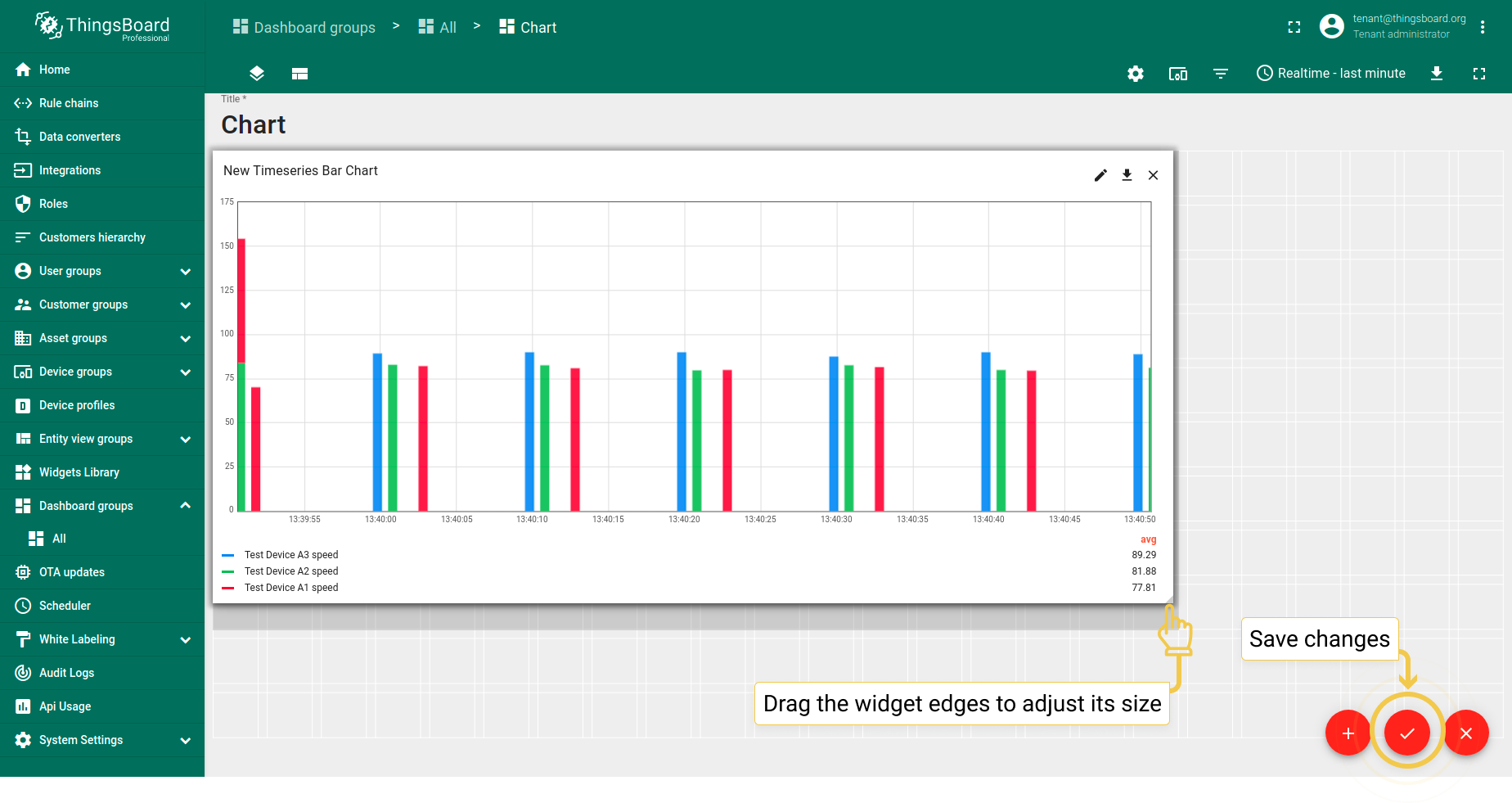
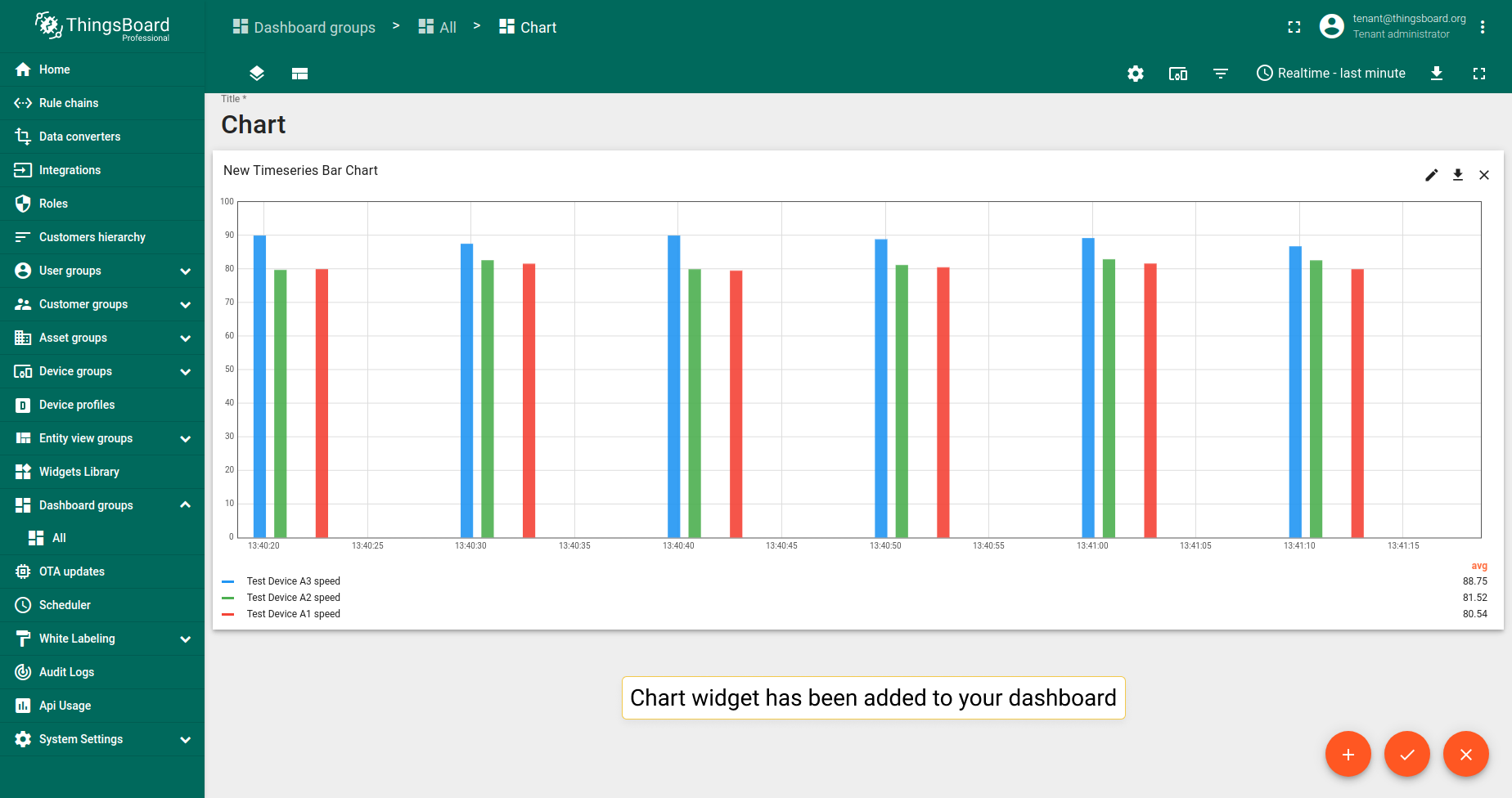
Chart widget types
Chart widgets are divided into Time series and Latest value widgets. Time series widgets are useful for visualizing changes in time series data over time. Latest values widgets are used when you need to see the latest attribute values or time series data for multiple entities.
Time series widgets
Time series widgets visualize changes in time series data over time. Read here how to set up the time window.
Bar Chart
Bar Chart widget displays changes to time series data over time. The example shows the temperature readings.
Line Chart
Line Chart widget displays changes to time series data over time. The example shows temperature and humidity readings.
State Chart
State Chart widget displays changes to the state of the entity over time. For example, if a device on and off, its states and conditions.
Last values widgets
Latest values widgets render the latest values of attributes or time series data for multiple entities. Latest values widgets mostly support numeric values.
Radar
Radar widget displays the latest attribute or time series data values for multiple entities in a radar chart. Supports numeric values only.
In the example, the widget displays the latest pressure time series data for three devices.
Polar Area
Polar Area widget displays the latest attribute or time series data values for multiple entities in a polar area chart. Supports numeric values only.
In the example, the widget displays the latest pressure time series data for three devices.
Pie - Chart.js
Pie - Chart.js widget displays the latest attribute or time series data values for multiple entities in a pie chart. Supports numeric values only.
In the example, the widget displays the latest temperature time series data values for three devices.
Pie - Flot
Pie - Flot widget displays the latest attribute or time series data values for multiple entities in a pie chart. Supports numeric values only.
In the example, the widget displays the latest pressure time series data values for three devices.
Doughnut
Doughnut widget displays the latest attribute or time series data values for multiple entities in a donut chart. Supports numeric values only.
In the example, the widget displays the latest humidity time series data values for three devices.
Bars
Bars widget displays the latest values of the attributes or time series data for multiple entities as separate bars. The only latest values chart widget that allows using not only numeric values.
In the example, widget is displaying the latest pressure time series data values for three devices.
Chart widget settings
Basic widget settings
Basic widget settings are responsible for the appearance and style of the widget: from the title style and legend configuration to the settings for mobile devices. All of ThingsBoard widgets have the same basic settings, you can learn how to customize them here.
Advanced widgets settings
Advanced widget settings vary for different widget types. Advanced settings are responsible for configuring the unique features of the specific widget.
To enter the widget Edit mode and start configuring its Advanced settings, first enter the dashboard edit mode. Then, you should:
- Click the pencil icon in the right corner of the widget to enter the widget edit mode.
- Click the third tab "Advanced".


Time series Bar Chart
1. Common Settings
1.1. Stacking
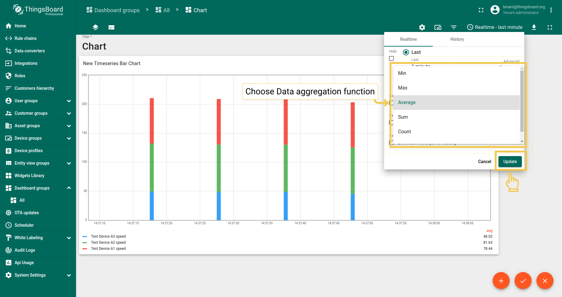
Use this function if the data aggregation function is not set to None. If the Stacking box checked, the bar will be split according to the values of the entities used. If this box isn’t checked, the widget will show you the sum of the used entity values. To see the values of all entities, you need to hover your mouse over the bar.
- In the upper right corner of the screen, click on the Time window configuration and choose any preferred Data aggregation function other than None. Click "Update" to apply changes.
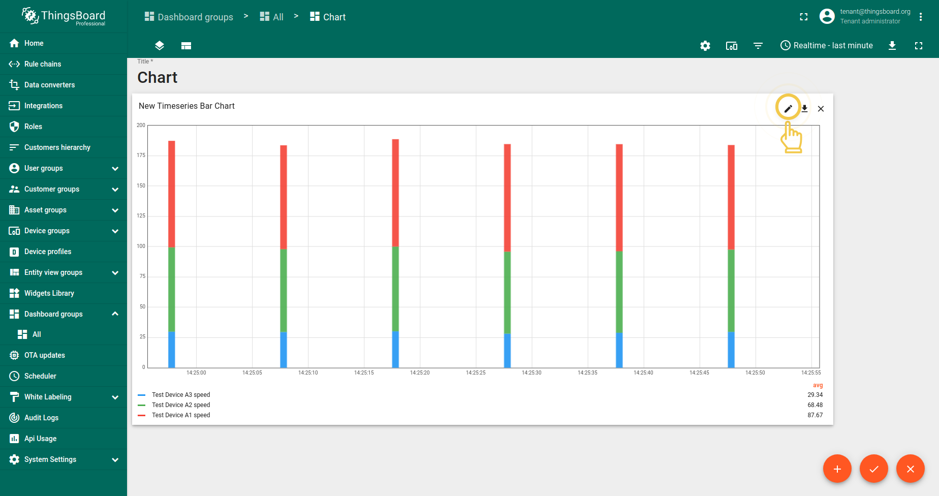
- Go to widgets Edit mode by clicking the pencil icon in the upper right corner of the screen.
- In the Advanced tab, disable the Stacking box and apply changes by clicking the orange checkmark in the upper right corner of the window.
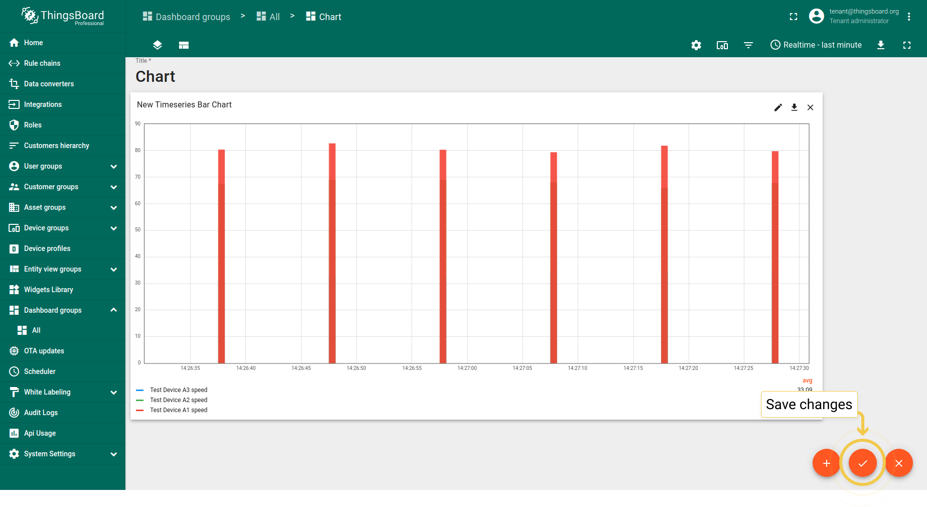
- After changes have been applied, click the orange checkmark in the lower corner of the screen to save them.
- Hover the mouse over a bar to see values of all entities.

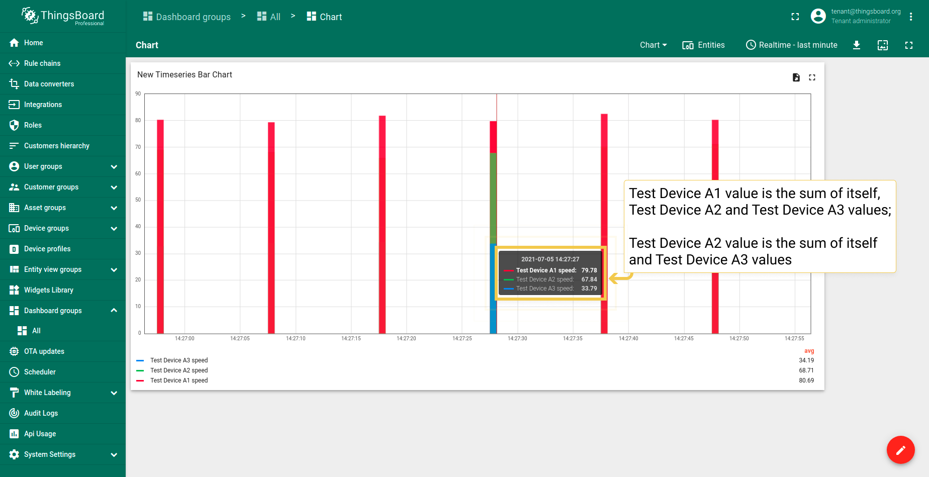
If your data is not aggregated, you can adjust the Default bar width for non-aggregated data (milliseconds) by changing the number. This action makes the bars of the chart wider.
Bar alignment is responsible for the placement of the bars on the Chart widget relative to the time point.
Default line width for all thresholds, Shadow size, Font color and size work for Time series Line Chart and State Chart widgets.
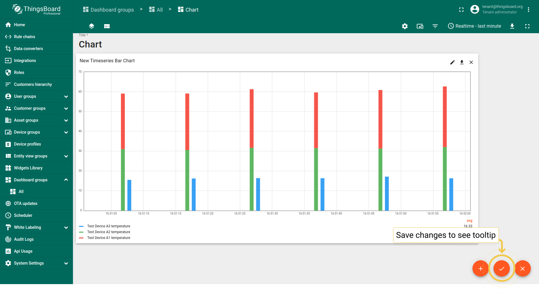
Tooltip value format function, f(value) is used when you want to manually customize the tooltip. You can customize the values that will be displayed in the tooltip via Settings or Advanced Data key configuration. Tooltip configuration via Settings is basic and applied to all entities at the same time. When configured in the Advanced Data key configuration, it is applied only to the specific time series data, and the basic tooltip function will be overwritten by this configuration.
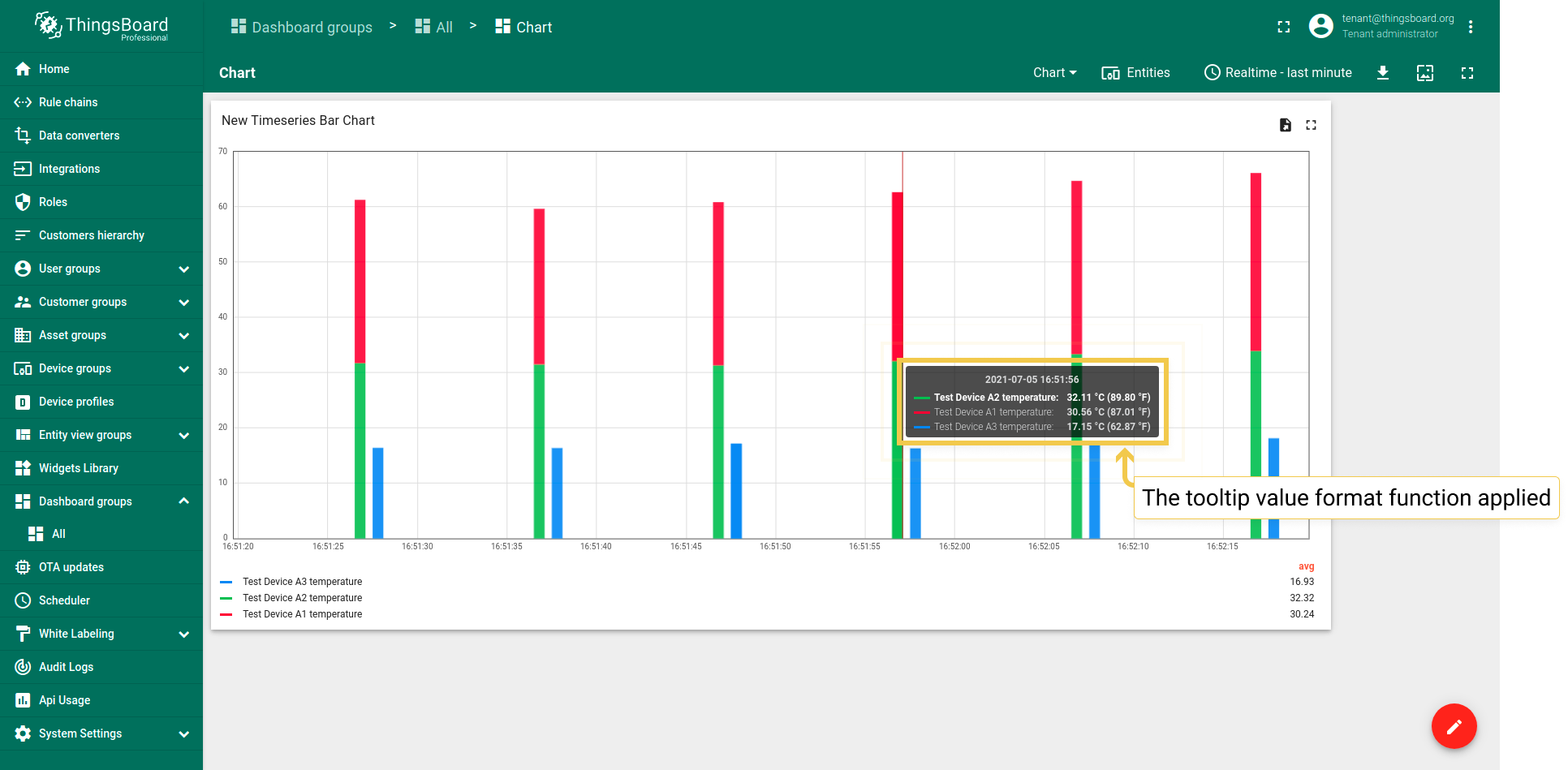
But, if you need something really special for your widget, the Tooltip value format function is for you. Suppose you have temperature readings, and you’d like to see Celsius and Fahrenheit values on your widget, which will be displayed with two floating points.
- Input your custom Tooltip value format function and apply changes by clicking orange checkmark in the upper right corner of the window.
- To see tooltip, you need to save applied changes by clicking the orange checkmark in the lower corner of the screen.
- Hover the mouse over the widget to see tooltip with applied Tooltip value format function.

1.2. Grid settings
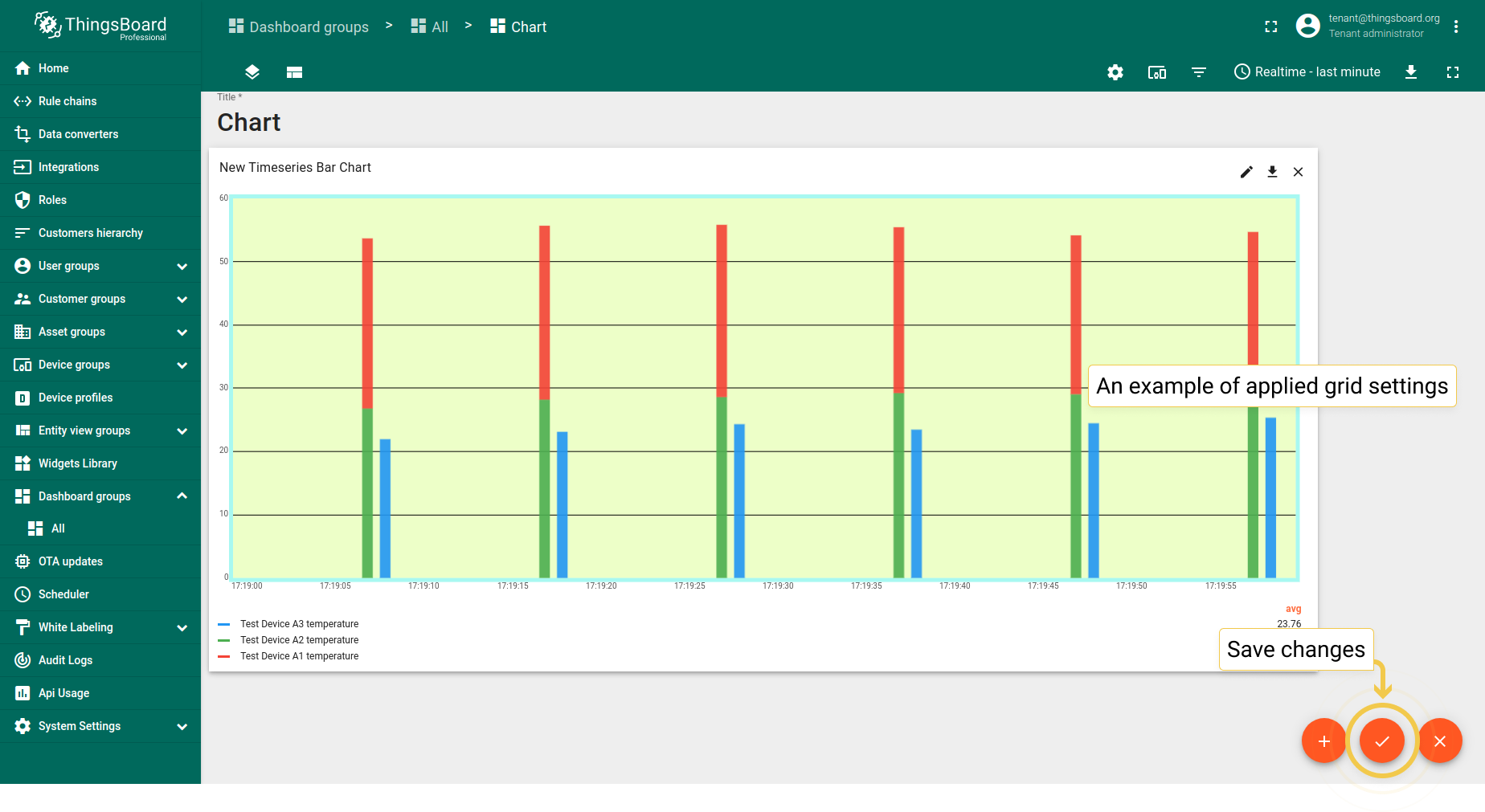
You can change the appearance of the Chart grid: customize the color of the background, the grid frame and its ticks; change the width of the lines and turn off their visibility.
- In Advanced tab, go to the Grid settings and click on the icon of Primary color circle. In the opened dialog box, move sliders to adjust color and transparency. Click "Select" when you finished, to apply changes.
- Configure preferred Grid settings and apply changes by clicking orange checkmark in the upper right corner of the window.
- This set of applied colors is just an example. To save applied changes, click the orange checkmark in the lower corner of the screen.


1.3. Axis settings
- Configure preferred axis settings and click the orange checkmark in the upper right corner of the window to apply changes.
- As you see, titles have been added, colors of axis have been changed and values have been adjusted according to the applied changes. To save these changes, click the orange checkmark in the lower corner of the screen.


1.4. Ticks formatter function, f(value)
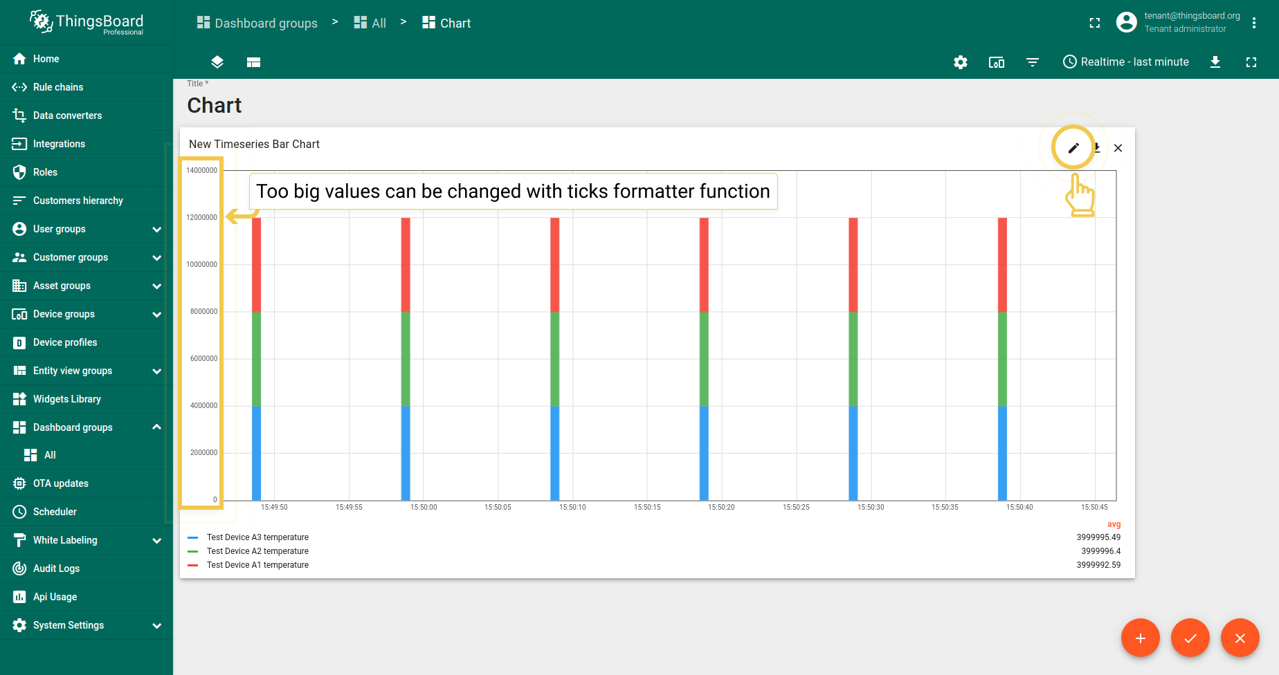
Let’s say we have telemetry which takes values of very large numbers, especially when there is a special symbol near values. However, we need to build a small graph (since we don’t have a lot of free space on the dashboard). Therefore, using the ticks-formatter function, we can convert the ticks values to a more compact form.
- Enter widget edit mode by clicking the pencil icon in the right corner of the widget.
- In the Advanced tab, in the Ticks formatter function field, enter the custom function and apply changes by clicking the checkmark in the upper right corner of the window.
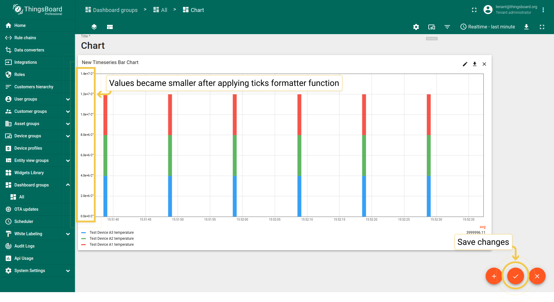
- Function has been applied and values became more compact. Save changes by clicking the checkmark in the lower right corner of the screen.
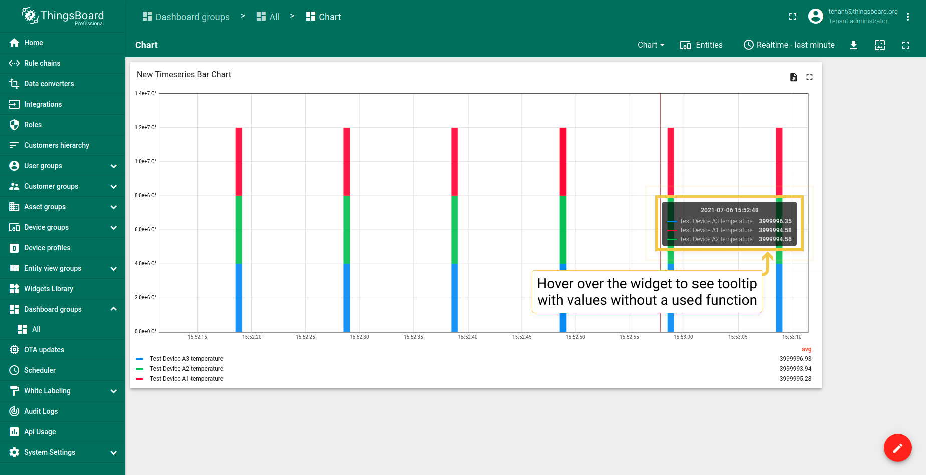
- By hovering the mouse over a widget you can see the tooltip with not reduced values.

2. Comparison Settings
Comparison settings allow you to compare the difference in values over a specific period of time. Works only in the History time window.
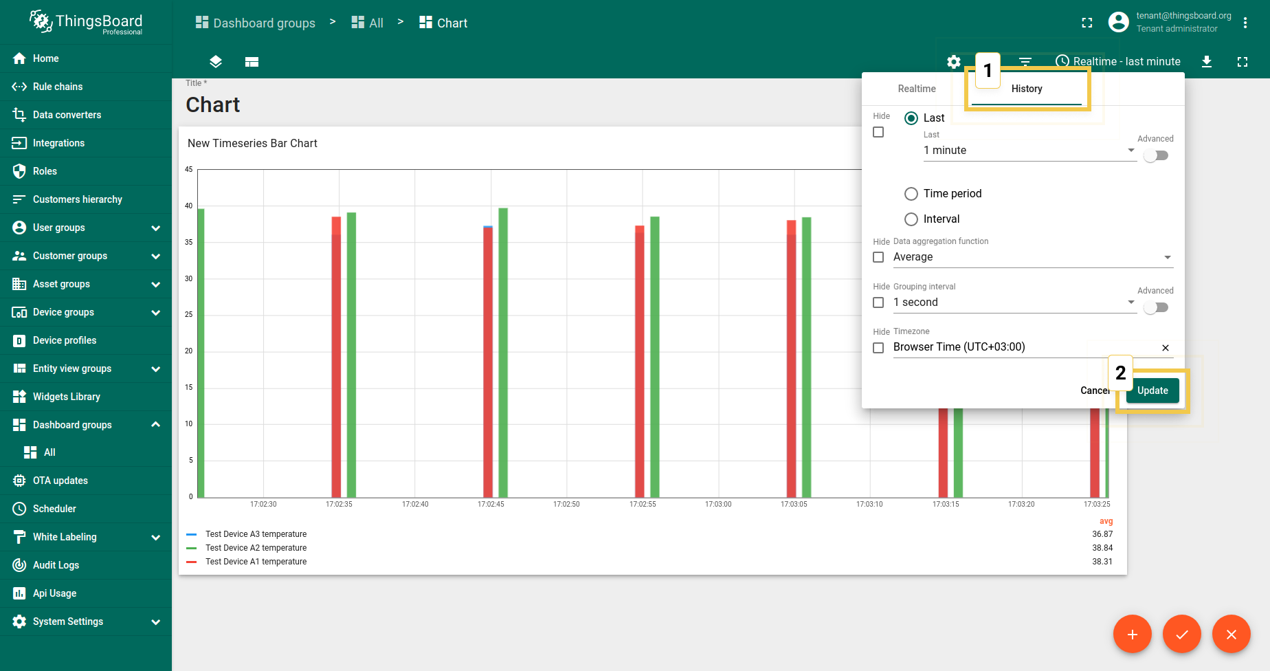
- Since comparison settings work only in History time window mode, click on the clock icon in the upper right corner and select the History time window there. Click "Update" to apply.
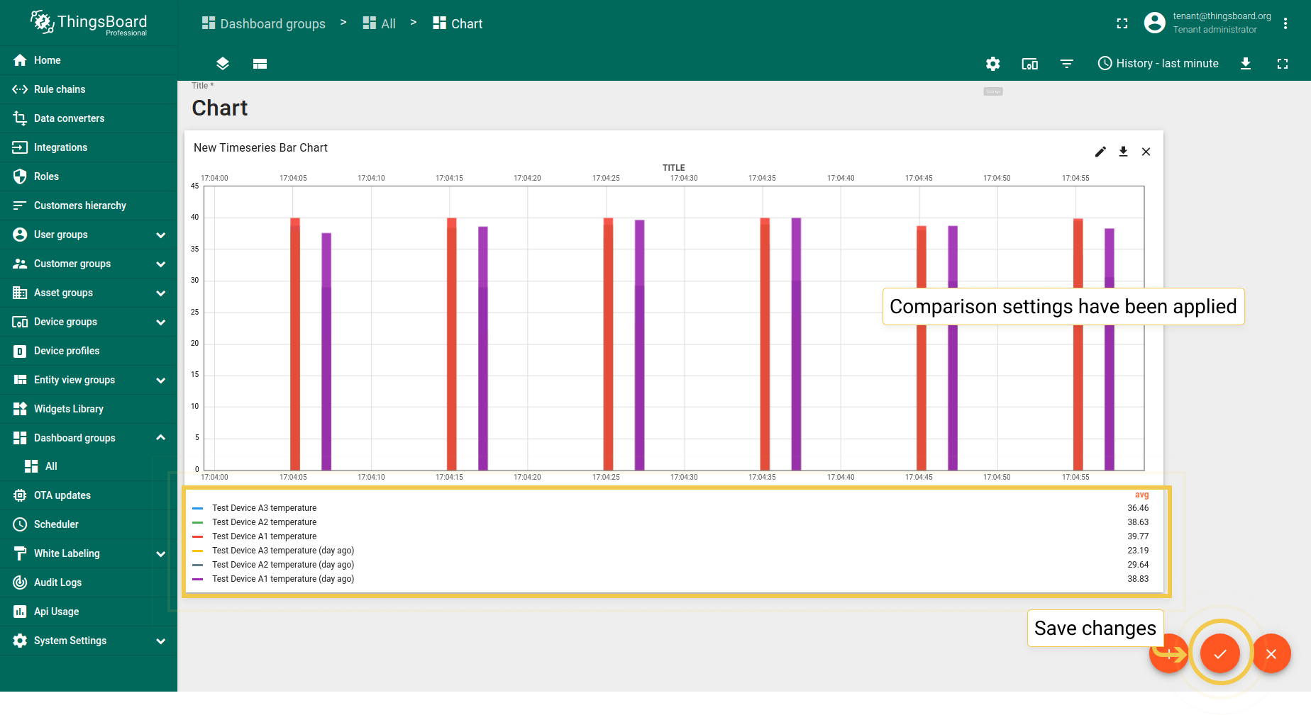
- In Advanced tab, enable comparison and from the drop-down menu select time to show historical data with which to compare. In the "Second X axis" section, select axis position, where the compared axis will be located on the widget. If you would like title for the second axis, enable "Show labels" and enter the Axis title. When you are done with Comparison Settings configuration, click the orange checkmark in the upper right corner of the window to apply changes.
- You can see in the widget legend that Comparison Settings have been applied. Save changes by clicking the orange checkmark in the lower right corner of the screen.
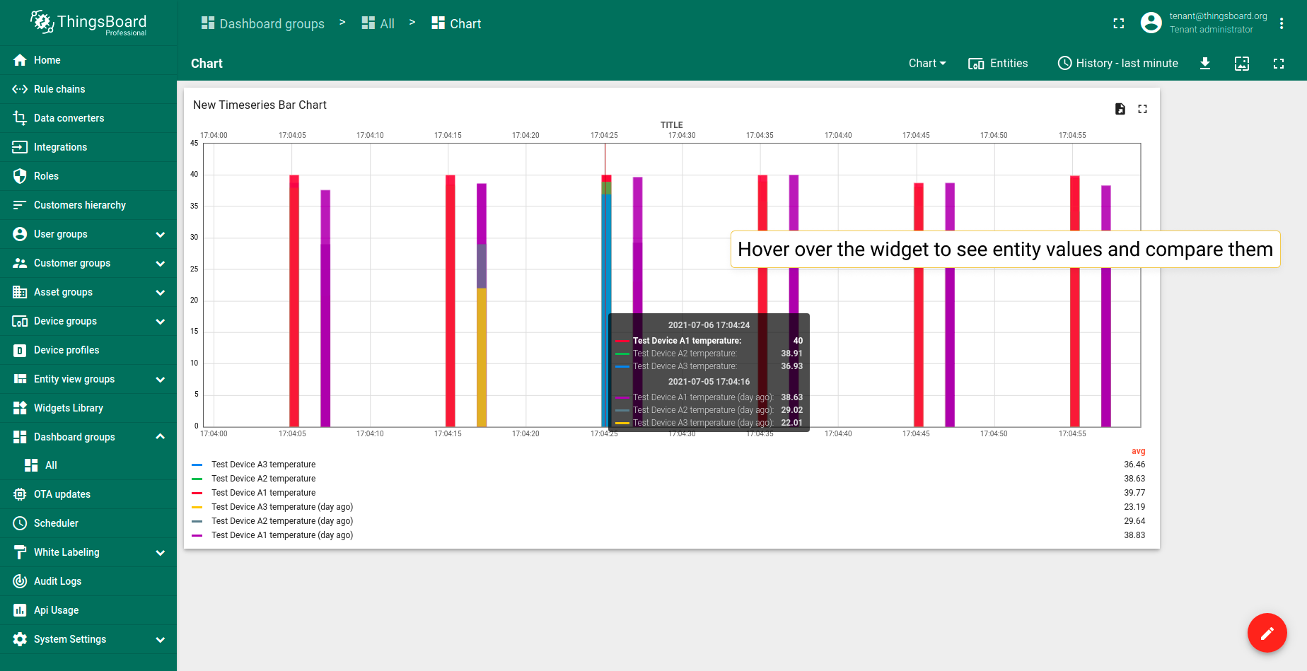
- You can see the tooltip with the comparison data when you hover the mouse over the widget.

3. Custom Legend Settings
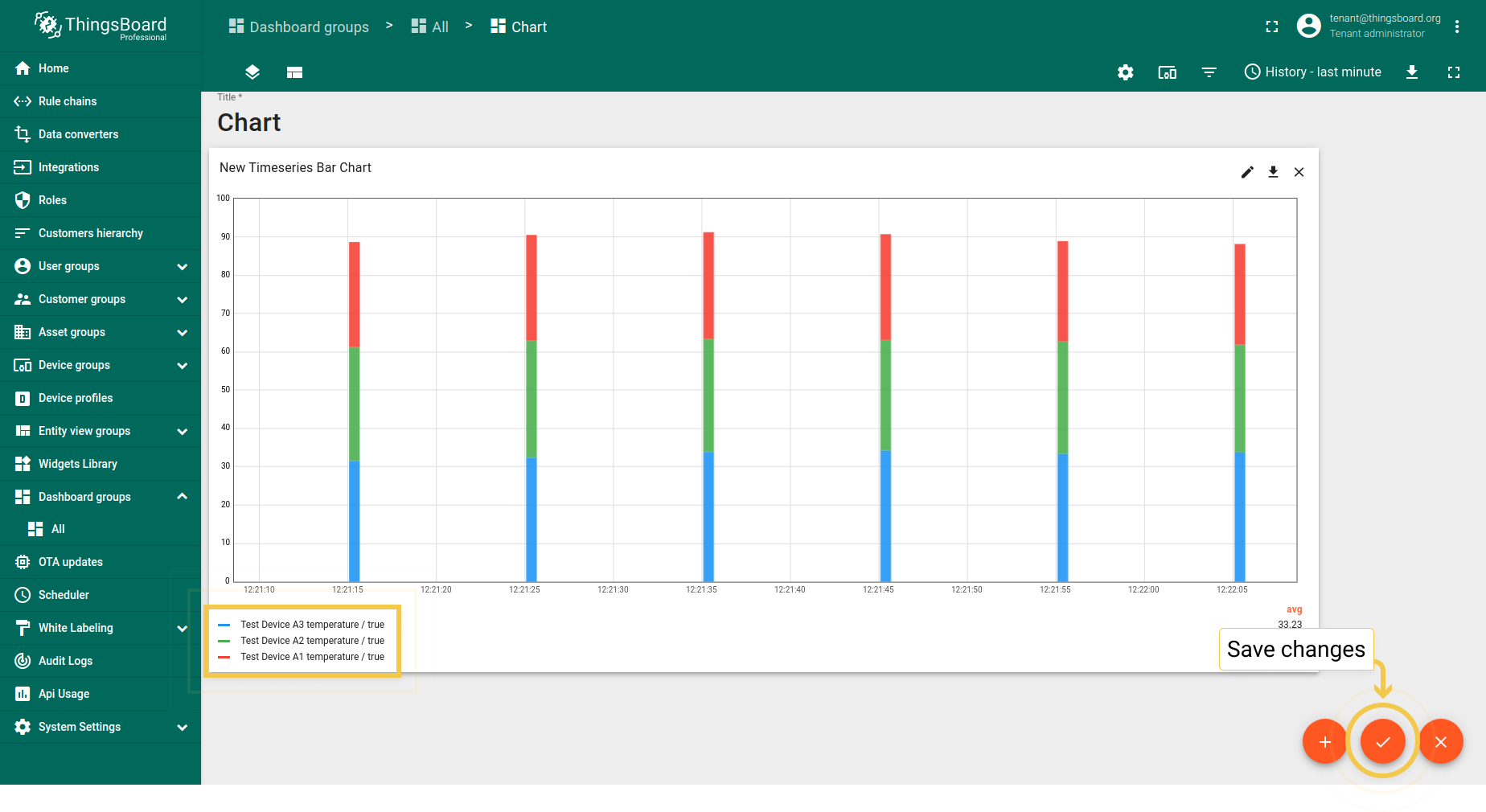
Custom Legend Settings are for cases when you need to display data that cannot be displayed in the chart such as attributes or display specific time series only in the Chart legend. For the example let’s use active/inactive attributes that can not be displayed on a Chart, only in a Table widget.
- In the Advanced tab, enable custom legend to use attribute or time series values in key labels. Click the "+ New" button. From the appeared drop-down menu, select key type. The Key name is entered in the line below. Apply all configured settings by click the orange checkmark in the upper right corner of the window.
- Go to Data tab and click the pencil icon on the data key to enter Data key configuration.
- In the label line, enter the patter ${} with the data key name inside the brackets. Click "Save" to apply new label name.
- Click the orange checkmark in the upper right corner of the screen to apply data key changes.
- As you can see on the widget, custom legend settings have been applied. To save changes, click the orange checkmark in the lower right corner of the screen.


Time series Line Chart
Advanced settings for the Time series Line Chart widget are the same as for Time series Bar Chart. You can learn about these settings above.
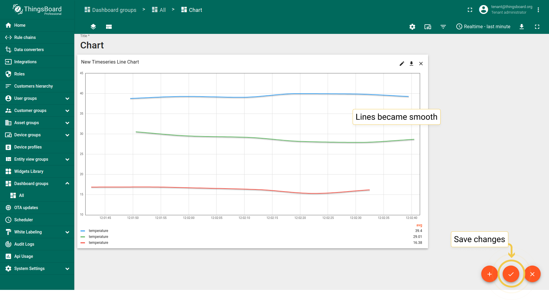
1. Display smooth (curved) lines
- In the Advanced tab, enable "Display smooth (curved) lines" and click the orange checkmark in the upper right corner of the window to apply changes.
- As you can see on the widget, lines became smooth. Click the orange checkmark in the lower right corner of the screen to save changes.

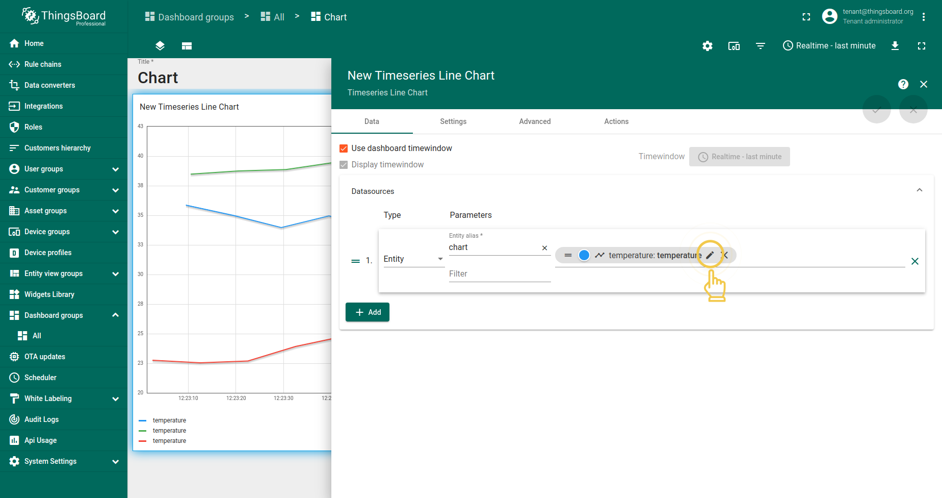
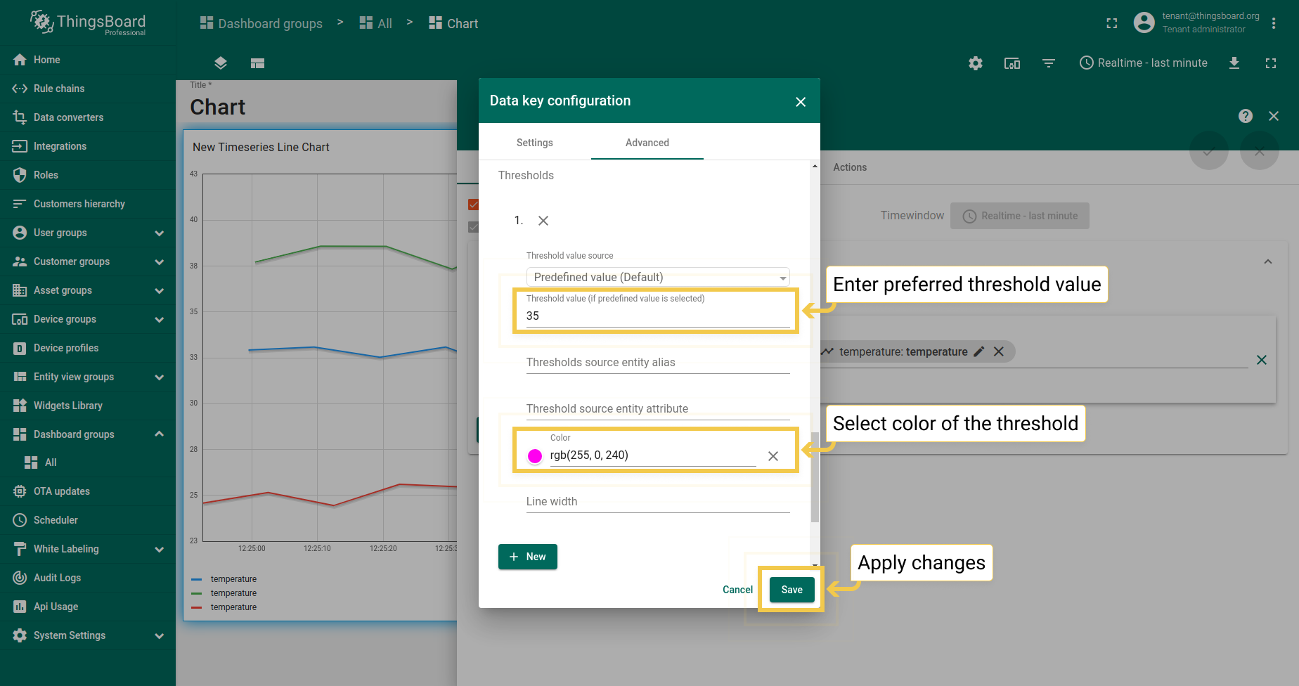
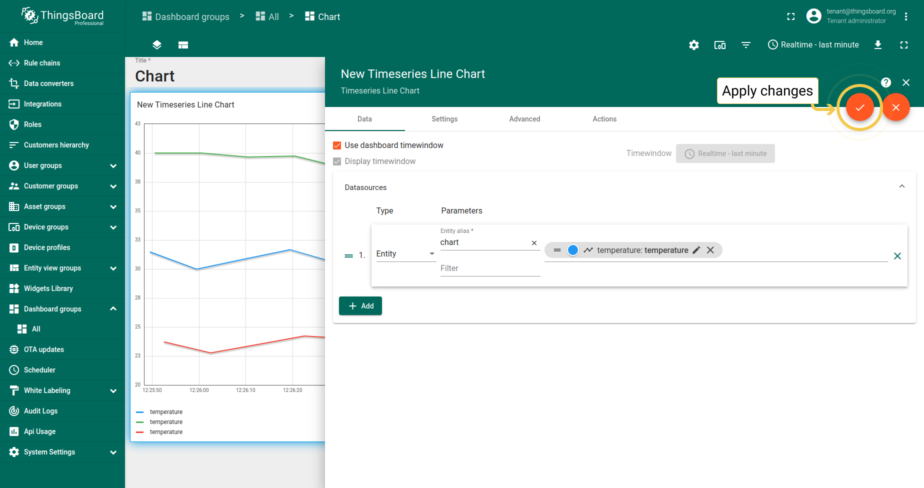
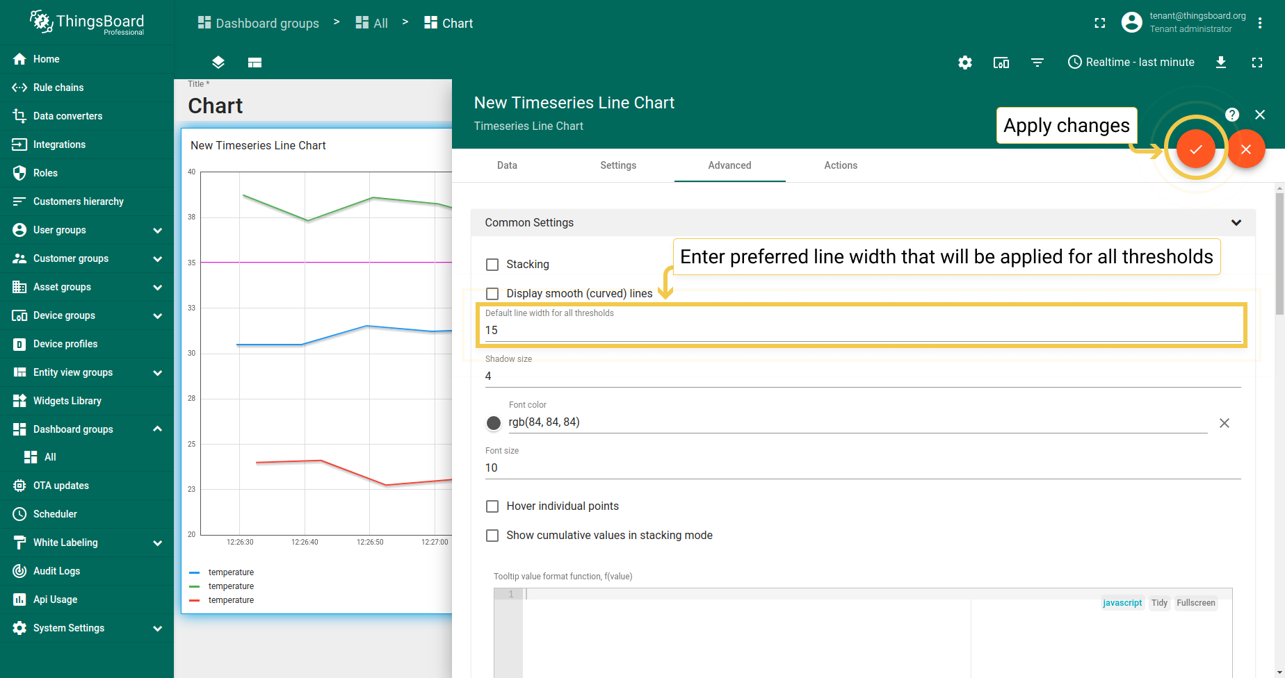
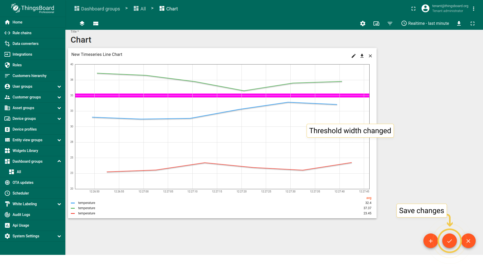
2. Default line width for all thresholds
- In the Data tab, click the pencil icon on the data key to enter Data key configuration.
- In the Advanced tab of the opened dialog, enter preferred threshold value, pick the color of the threshold and click "Save".
- To apply changes click the orange checkmark in the upper right corner of the window..
- In the Advanced tab, enter line width for all thresholds and apply changes by clicking the orange checkmark in the upper right corner of the window.
- Thresholds width has been changed. Save all applied changes by clicking the orange checkmark in the lower right corner of the screen.
State Chart
1. Common Settings
1.1. Stacking
Stacking mode works in widgets where you need to see entity values.
1.2. Display smooth (curved) lines works only in Line Charts.
1.3. Hover individual points
When the box Hover individual points is checked, you won’t see value points on the lines.
1.4. Cumulative values in stacking mode
While stacking mode is on, you can check the box “Cumulative values” to enable your chart to display sum of all entity values.
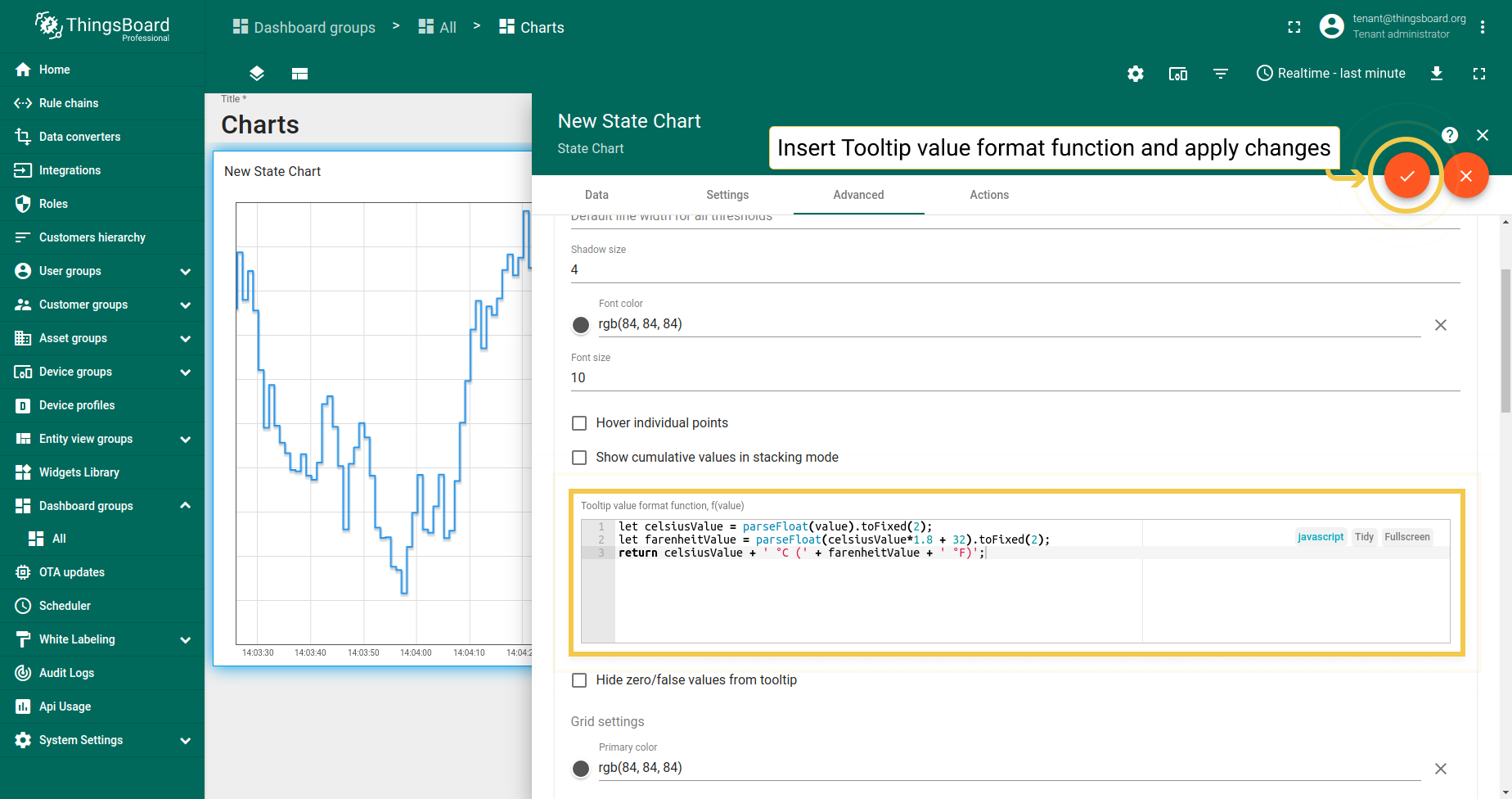
1.5. Tooltip value format function, f(value) is used when you want to manually customize the tooltip. You can customize the values that will be displayed in the tooltip via Settings or Advanced Data key configuration. Tooltip configuration via Settings is basic and applied to all entities at the same time. When configured in the Advanced Data key configuration, it is applied only to the specific time series data, and the basic tooltip function will be overwritten by this configuration.
In State Chart, you can configure entity states to be shown on a tooltip depending on entity values.
1
2
3
let celsiusValue = parseFloat(value).toFixed(2);
let farenheitValue = parseFloat(celsiusValue*1.8 + 32).toFixed(2);
return celsiusValue + ' °C (' + farenheitValue + ' °F)';
- In the Tooltip value format function field, enter your function (our example you can find under screenshots section). Apply changes by clicking the orange checkmark in the upper right corner of the window.
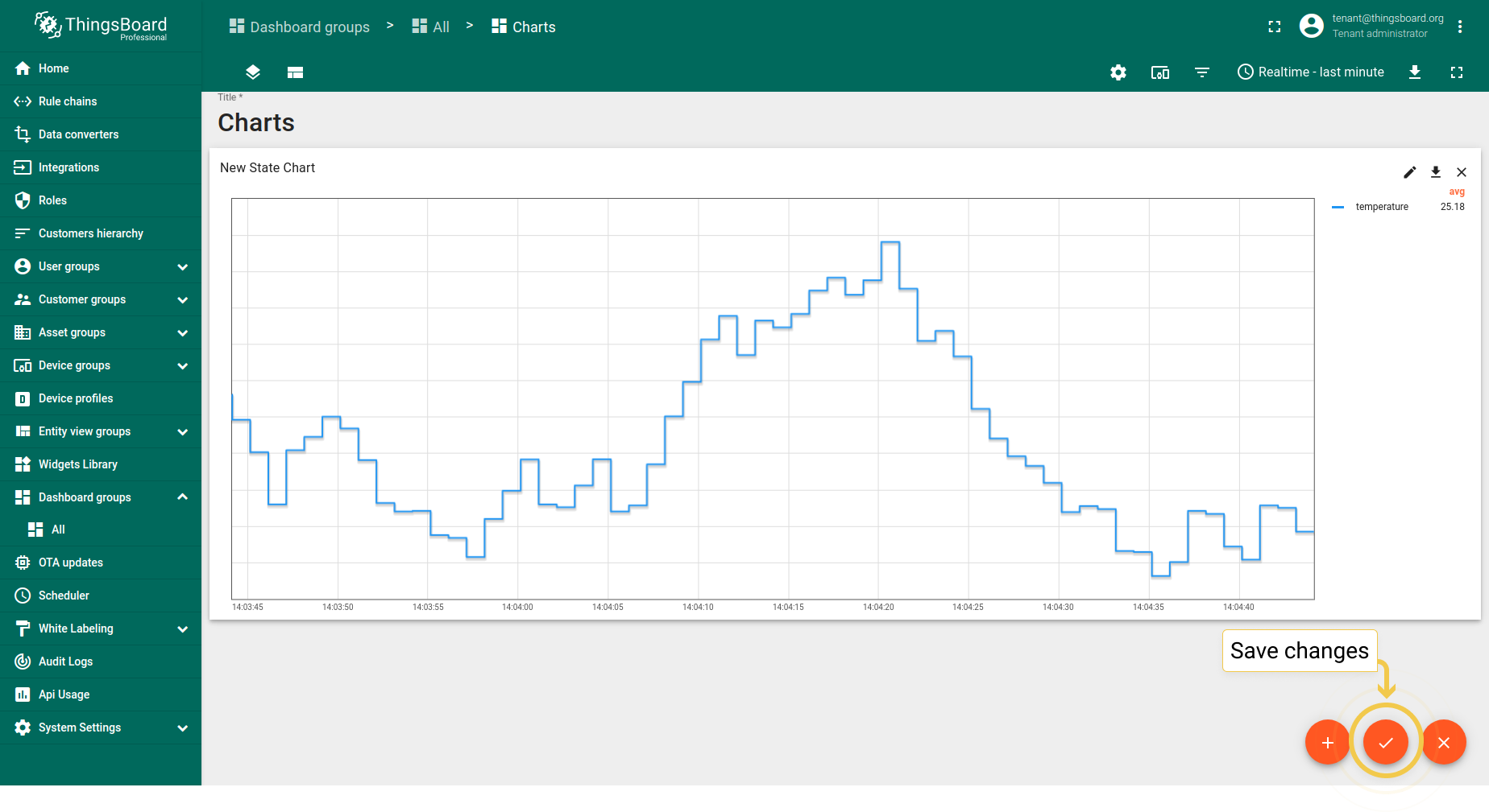
- You need to save changes to see tooltip. Do it by clicking the orange checkmark in the lower right corner of the screen.
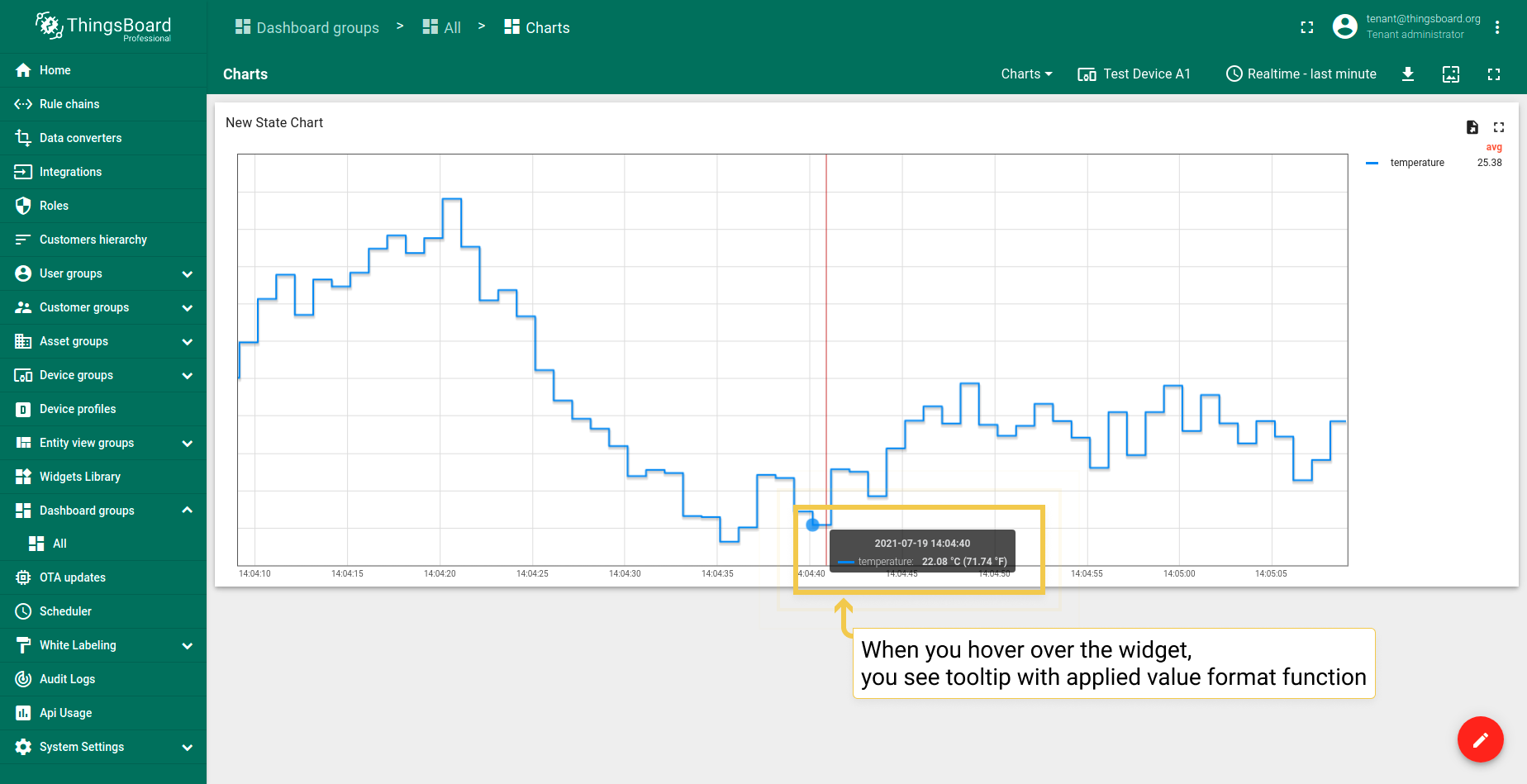
- Hover with your mouse over the widget to see tooltip with applied value format function.
1.6. Grid settings
Grid settings are the same as in Time series Bar Chart.
1.7. Axis settings
Axis settings are the same as in Time series Bar Chart.
1.8. Ticks formatter function
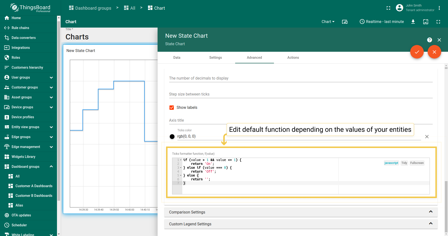
- In the Advanced tab, you can edit the default function according to your entity values.
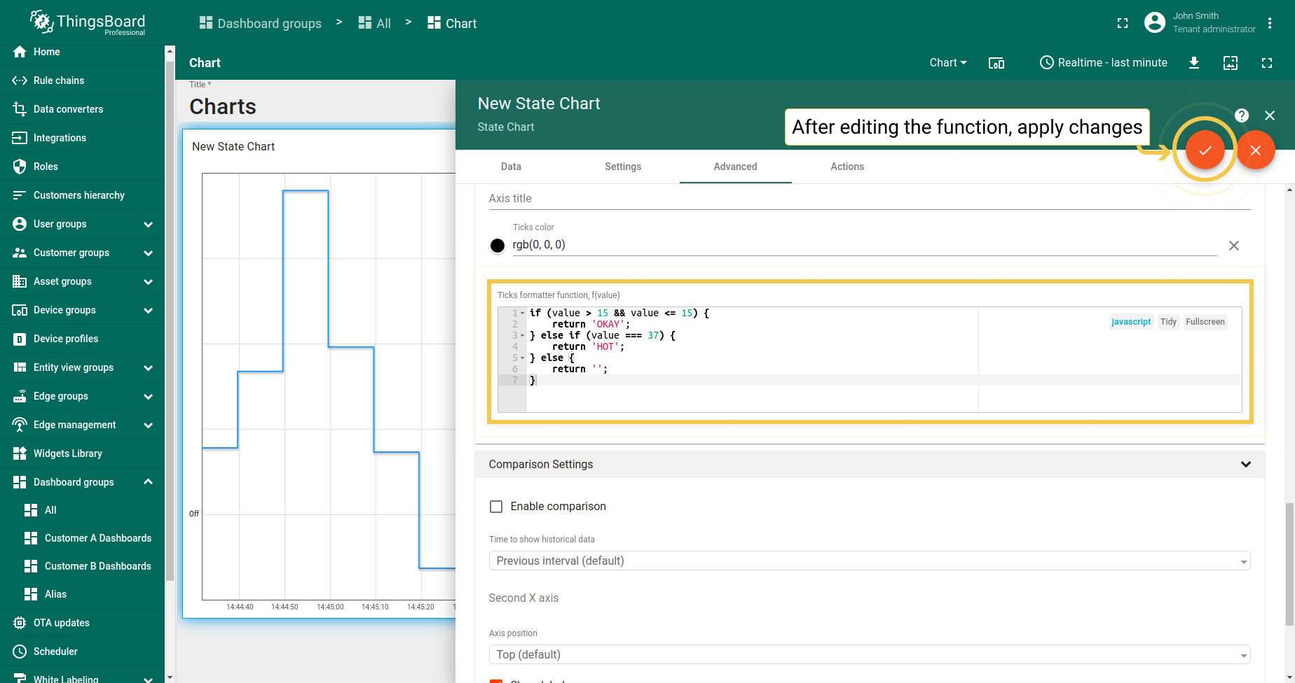
- After you edited values and text to be returned, apply changes by clicking the orange checkmark in the upper right corner of the window.
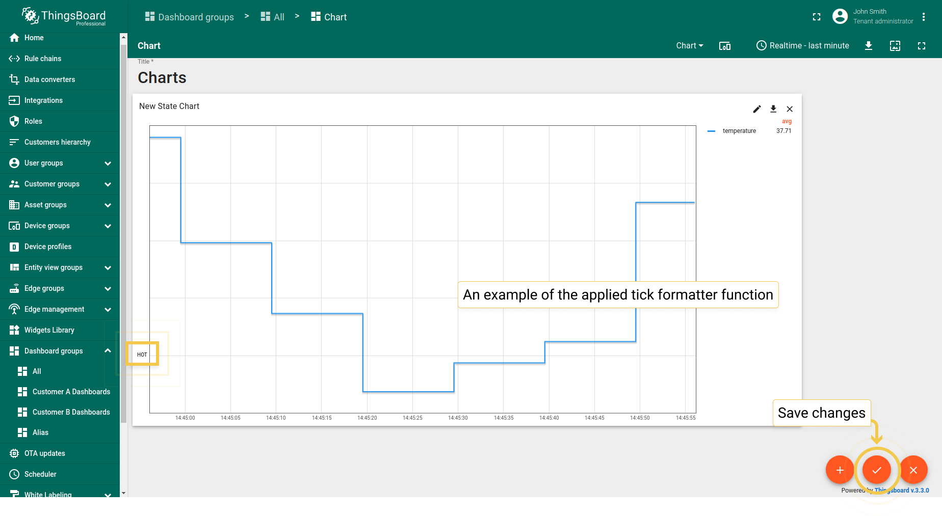
- Ticks formatter function has been applied. To save it, click the orange checkmark in the lower right corner of the page.
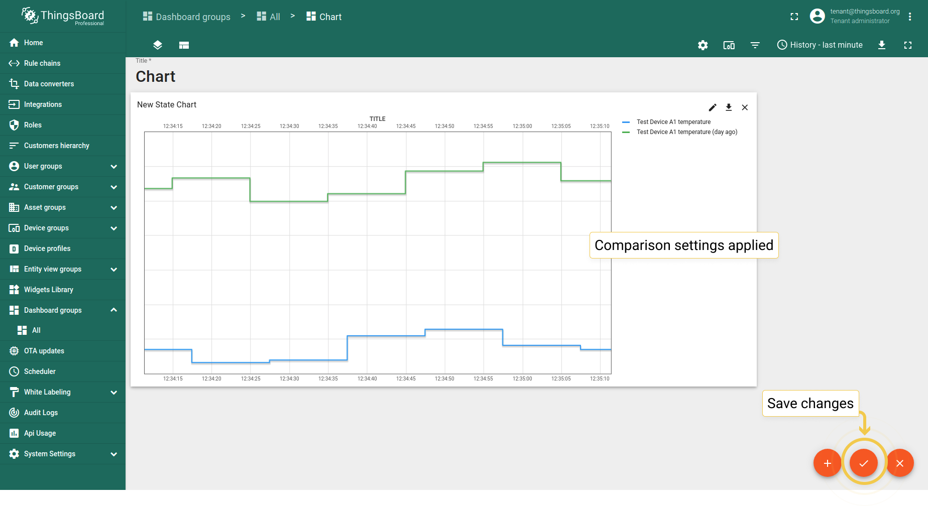
2. Comparison Settings
- In Advanced tab, enable comparison and from the drop-down menu select time to show historical data with which to compare. In the "Second X axis" section, select axis position, where the compared axis will be located on the widget. If you would like title for the second axis, enable "Show labels" and enter the Axis title. When you are done with Comparison Settings configuration, click the orange checkmark in the upper right corner of the window to apply changes.
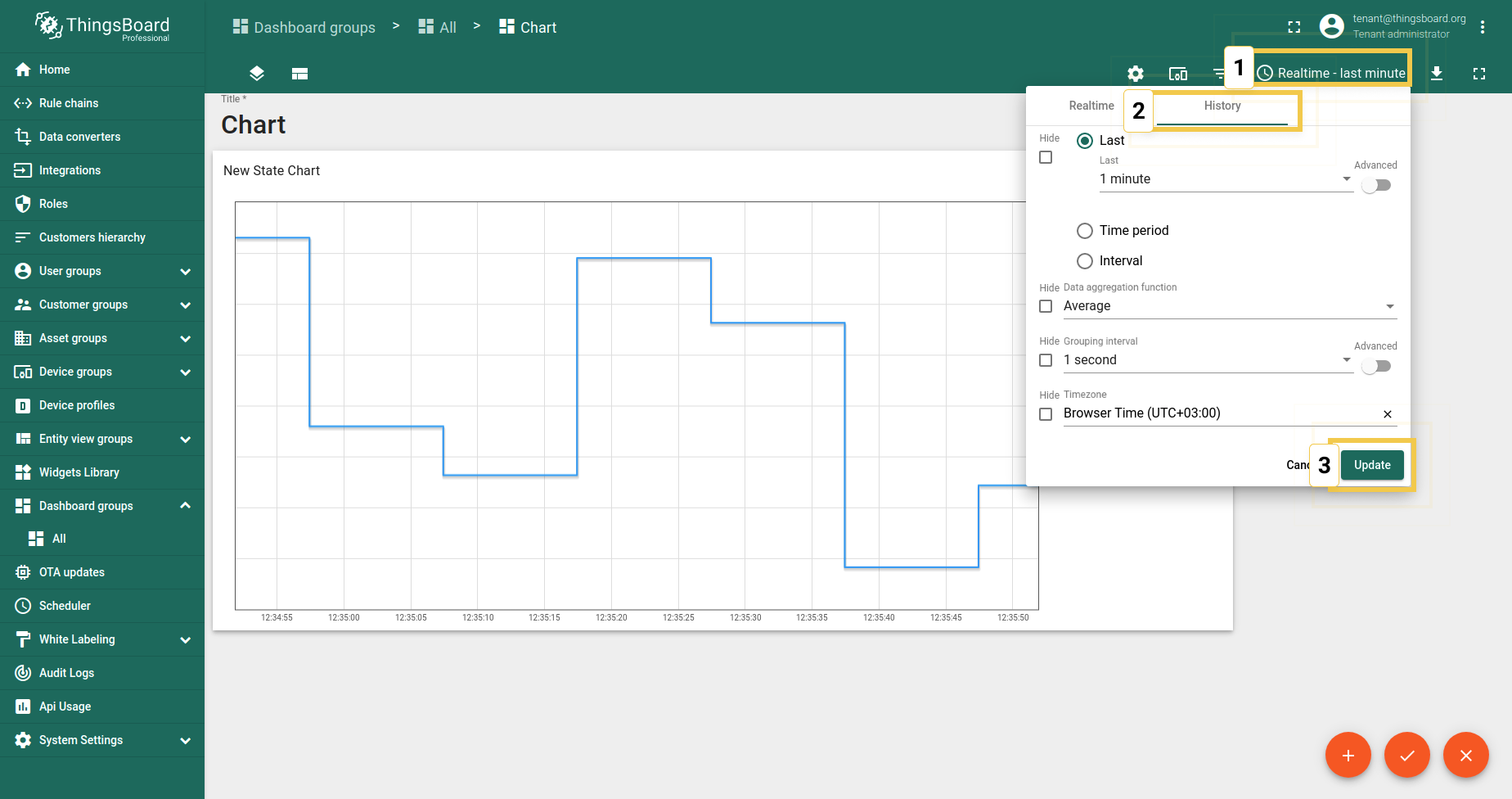
- Since comparison settings work only in History time window mode, click on the clock icon in the upper right corner and select the History time window there. Click "Update" to apply.
- As you can see on the widget, now you can compare value for last minute and the one from day ago. Click the big orange checkmark in the lower right corner to apply changes.

3. Custom Legend Settings
Custom Legend Settings are the same as in Time series Bar Chart.
Latest values Pie - Flot
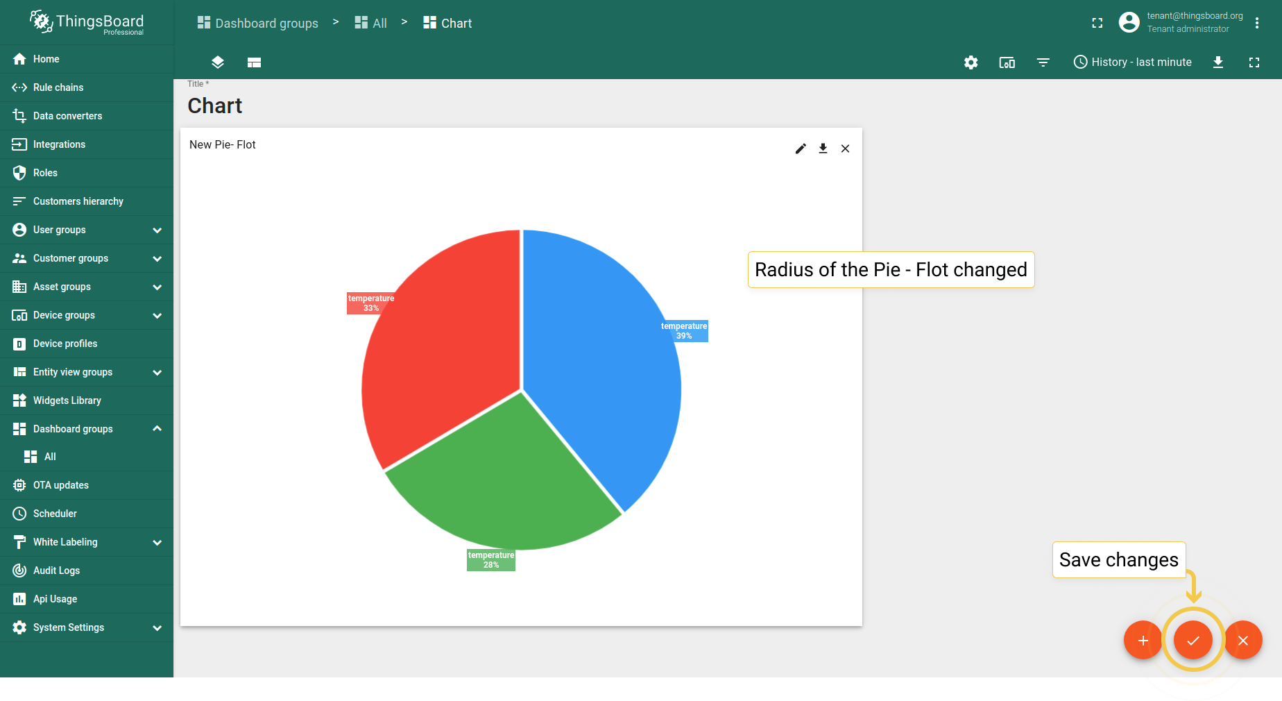
1. Radius
Sets the radius of the pie. If the value is between 0 and 1 (inclusive) then it will use that as a percentage of the available space (size of the container). Otherwise, it will use the value as a direct pixel length.
- In the Advanced tab, enter preferred radius (0 to 1) and click the orange checkmark in the upper right corner of the window to apply changes.
- Radius became smaller. Click the big orange checkmark in the lower right corner to apply changes.

2. Inner radius
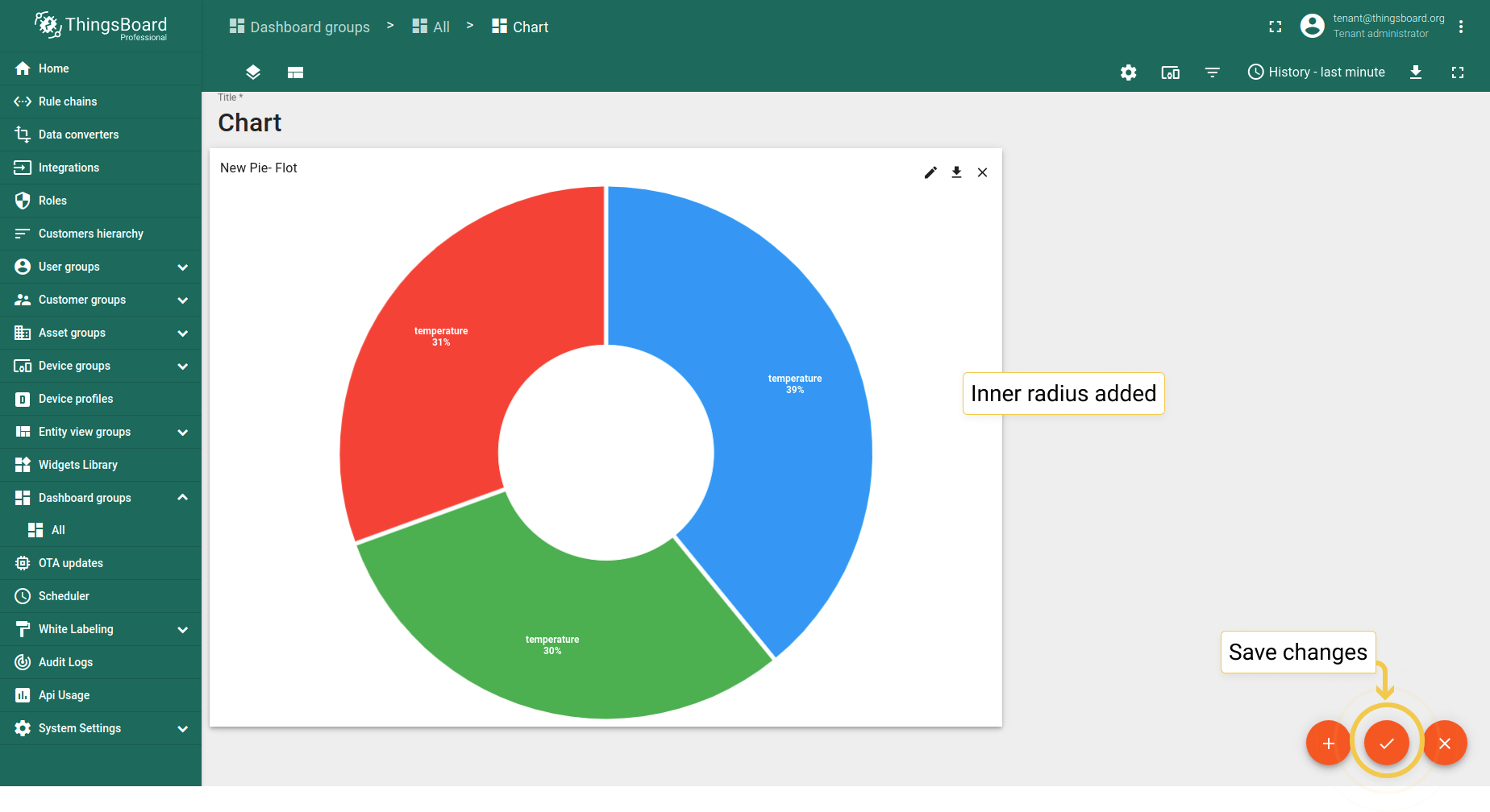
Sets the radius of the donut hole. If value is between 0 and 1 (inclusive) then it will use that as a percentage of the radius, otherwise it will use the value as a direct pixel length.
- In the Advanced tab, enter preferred inner radius (0 to 1) and click the orange checkmark in the upper right corner of the window to apply changes.
- Inner radius has been added. Click the big orange checkmark in the lower right corner to apply changes.

3. Enable pie animation
With the changing of entities values the Pie - Flot obviously moves, but these moves are rather sharp movements. Nevertheless, Pie animation makes these moves smoother and softer.
- In the Advanced tab, enable the experimental pie animation function and click the big orange checkmark in the upper right corner of the window to apply changes.

4. Tilt
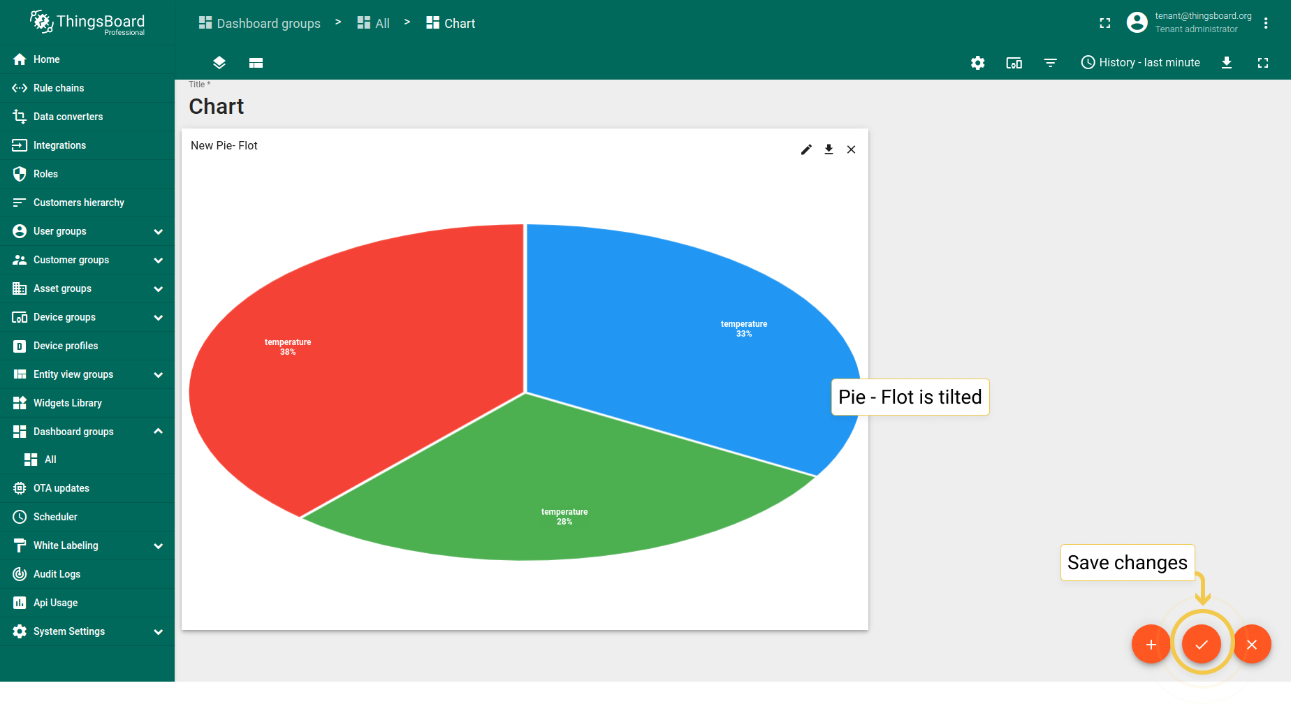
Percentage of tilt ranging from 0 and 1, where 1 has no change (fully vertical) and 0 is completely flat (fully horizontal, in which case nothing actually gets drawn). The tilt value is now used when calculating the maximum radius of the pie in relation to the height of the container. This should prevent the pie from being smaller than it needed to in some cases, as well as reducing the amount of extra white space generated above and below the pie.
- In the Advanced tab, enter preferred tilt (0 to 1) and click the orange checkmark in the upper right corner of the window to apply changes.
- As you can see, the Pie - Flot has been tilted. Save changes by clicking the big orange checkmark in the lower right of the page.

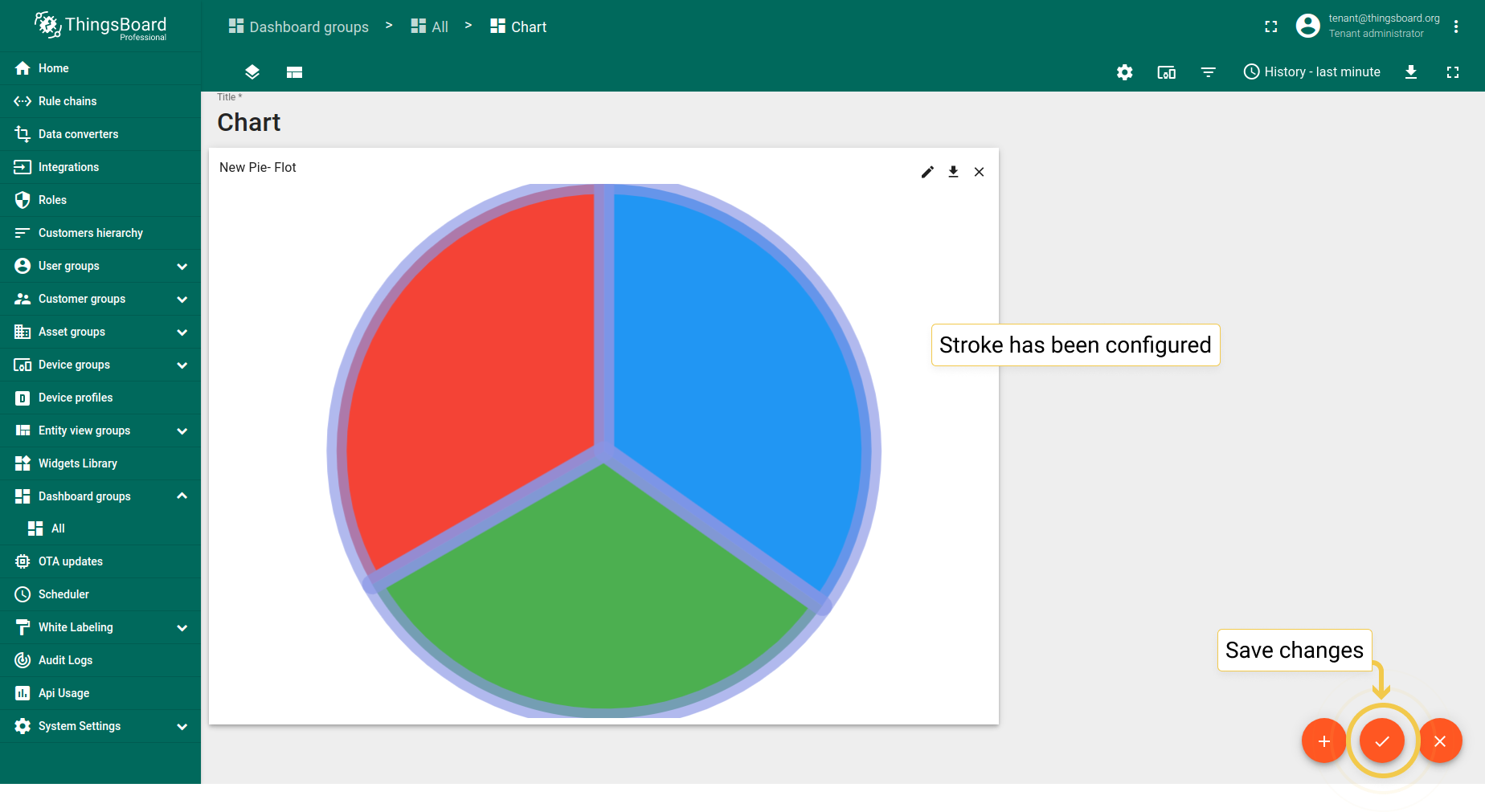
5. Stroke
- In the Advanced tab, click on the stroke color circle. In the opened dialog window, move sliders to adjust color and transparency of the stroke. Click "Select" when you are done.
- Also, you can change stroke width and disable labels visibility. Apply changes by clicking the orange checkmark in the upper right corner of the page.
- As you can see, stroke has been added to the Pie - Flot.


Latest values Doughnut
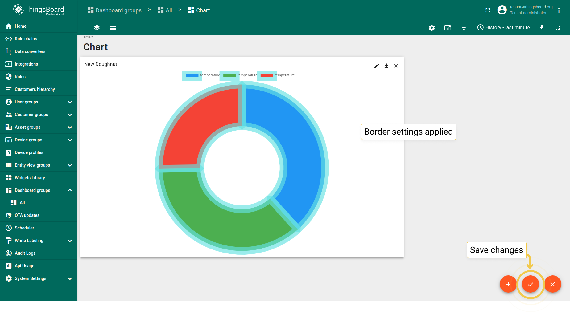
1. Border
- In the Advanced tab, click the border color circle. In the opened dialog, move sliders to adjust color and click "Select".
- Also, you can change border width. After configuring all preferred border settings, click the orange checkmark in the upper right corner of the window.
- As you can see on the widget, custom borders have been added to the Doughnut widget.


2. Legend settings
- In the Advanced tab, click the Labels font color circle. In the opened dialog, move sliders to adjust color and click "Select".
- Also, you can disable legend visibility. After you are done configuring legend settings, click the orange checkmark in the upper right corner of the window to apply changes.
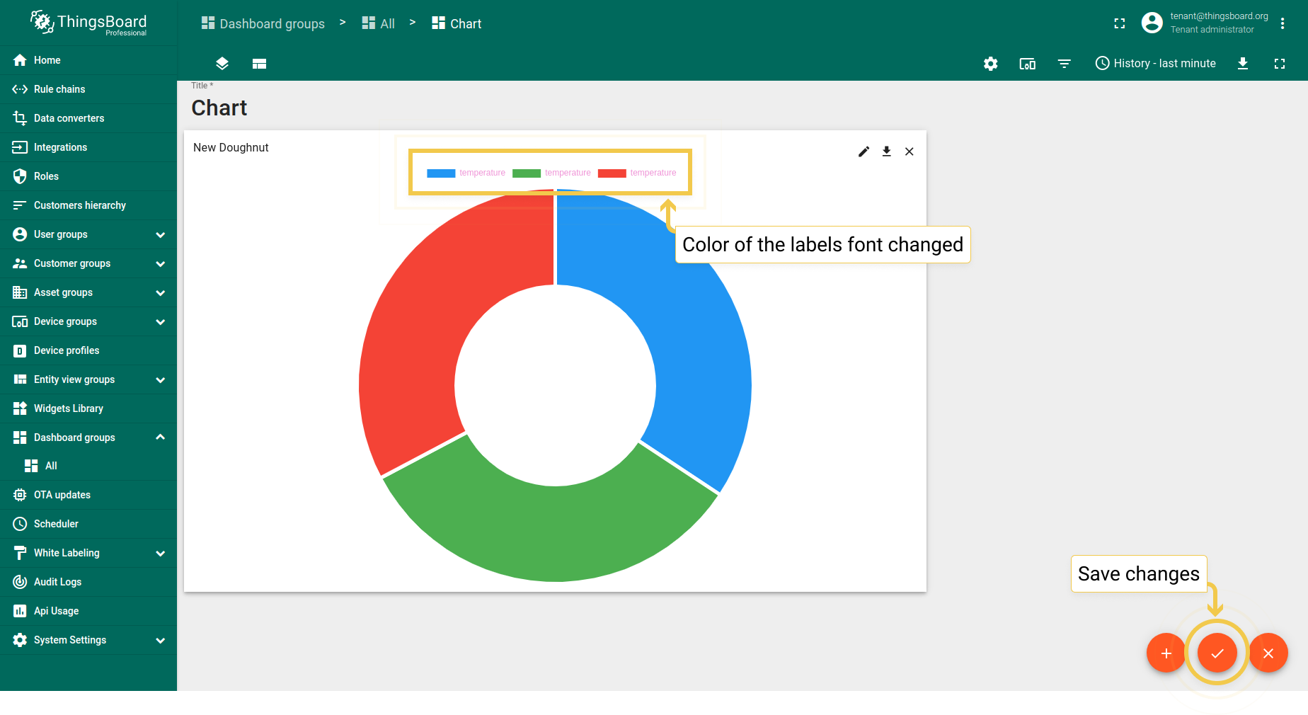
- As you can see on the widget, color of the labels font has been changed.


