Chart Widgets
Chart widgets display time-series data with customizable line charts and bar charts. You can also use various pie charts to display the latest values.
How to create a chart widget
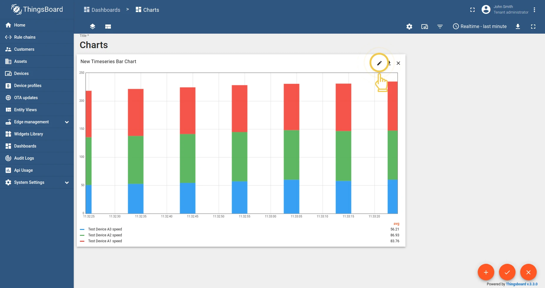
Section titled “How to create a chart widget”- Enter dashboard edit mode by clicking the pencil icon.
- Click the + sign to add a new widget.
- Select the Charts widget bundle.
- Choose the specific chart widget.
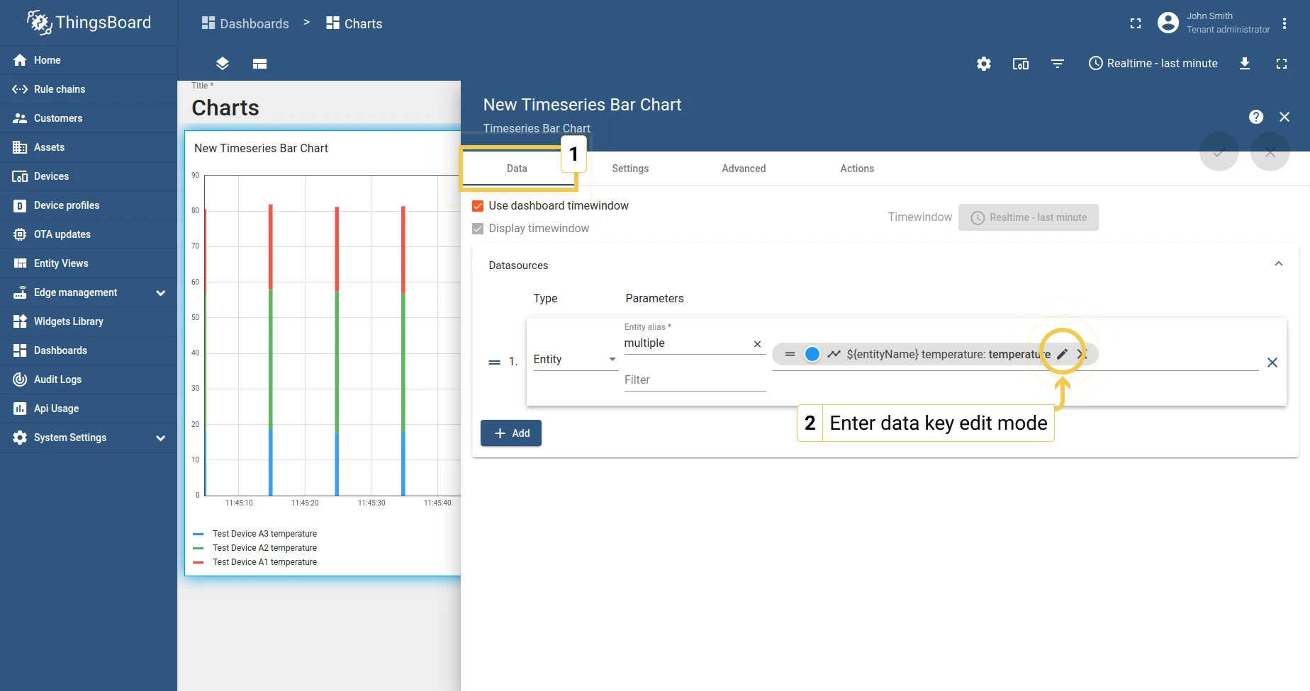
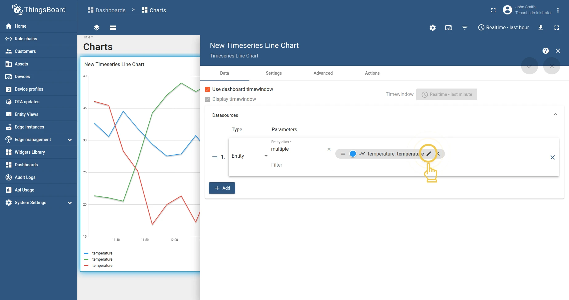
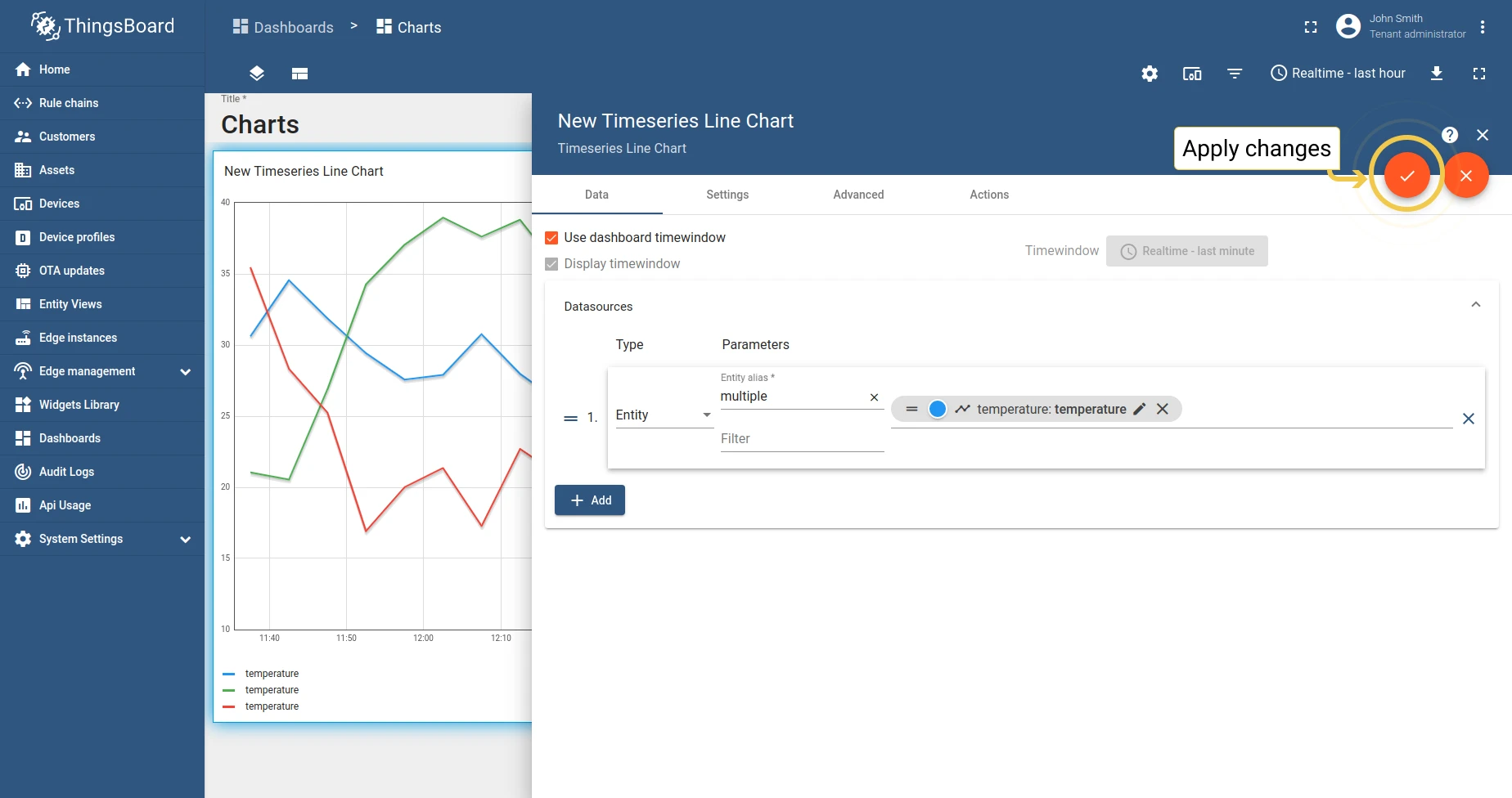
- Click Add to attach a datasource.
- Select an entity alias and add telemetry keys.
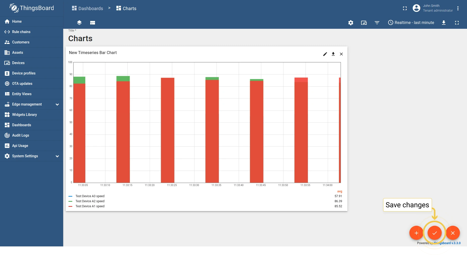
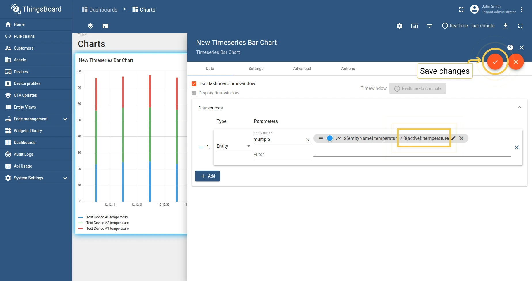
- Click Add and then apply changes.
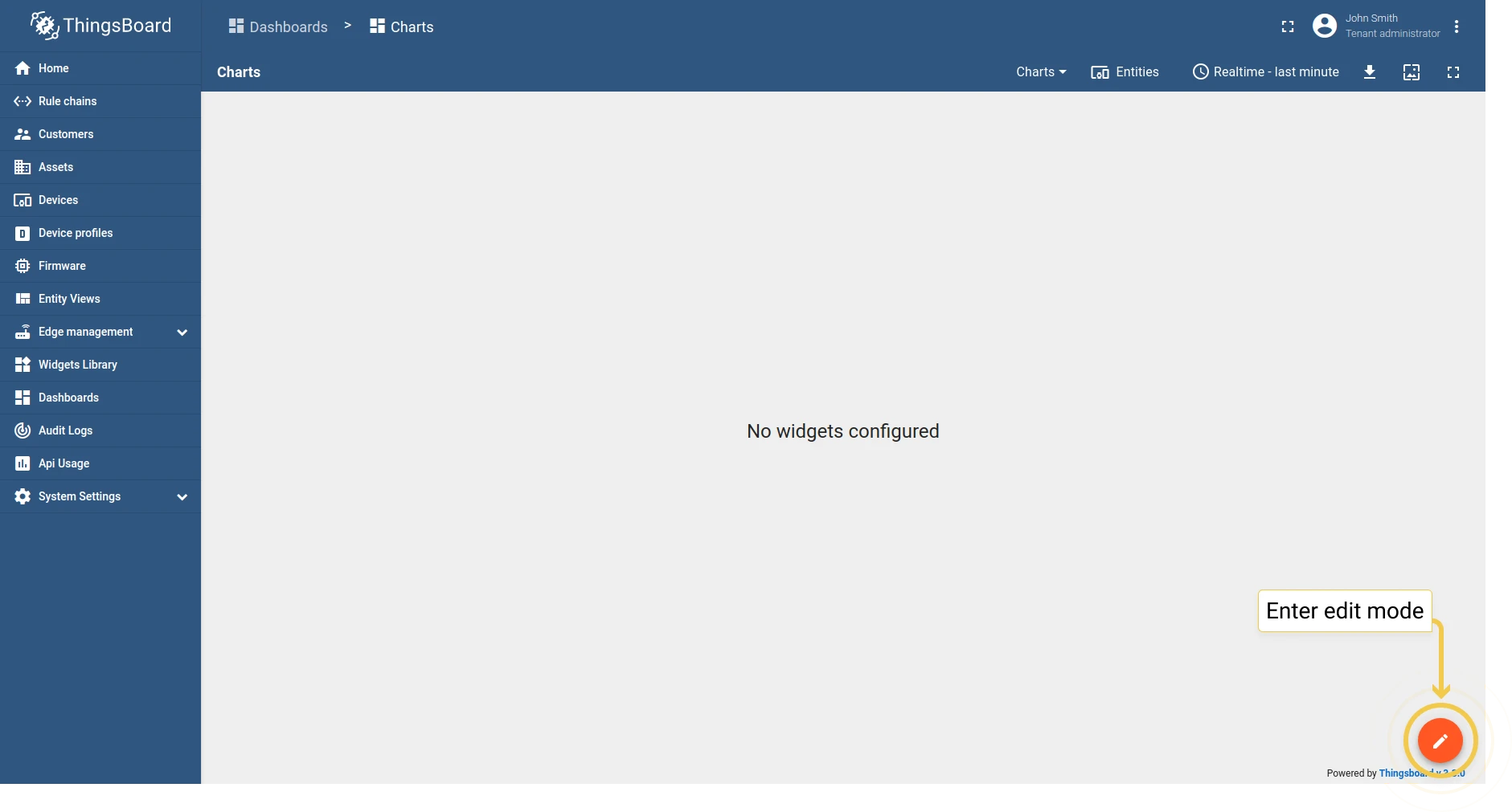
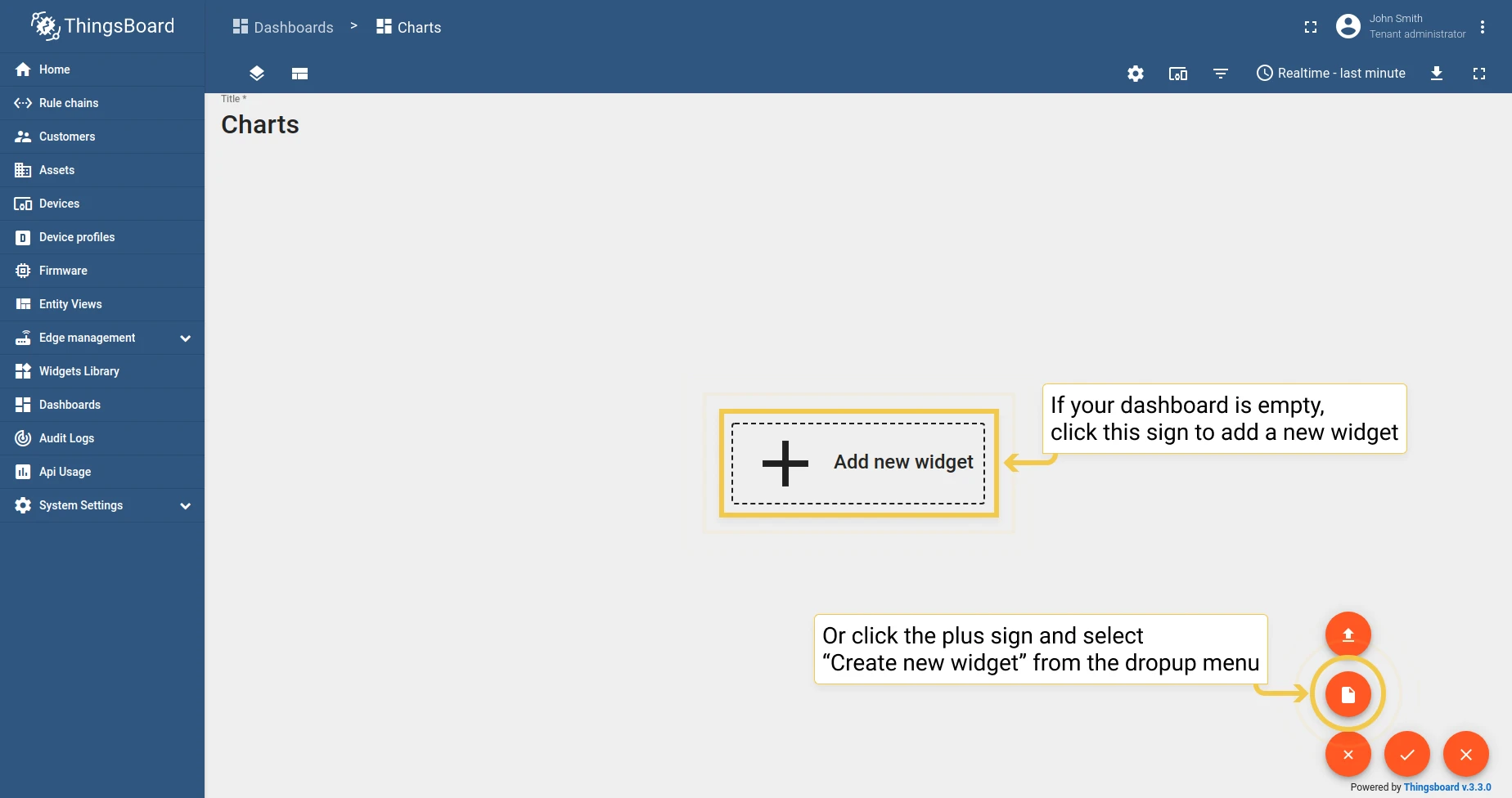
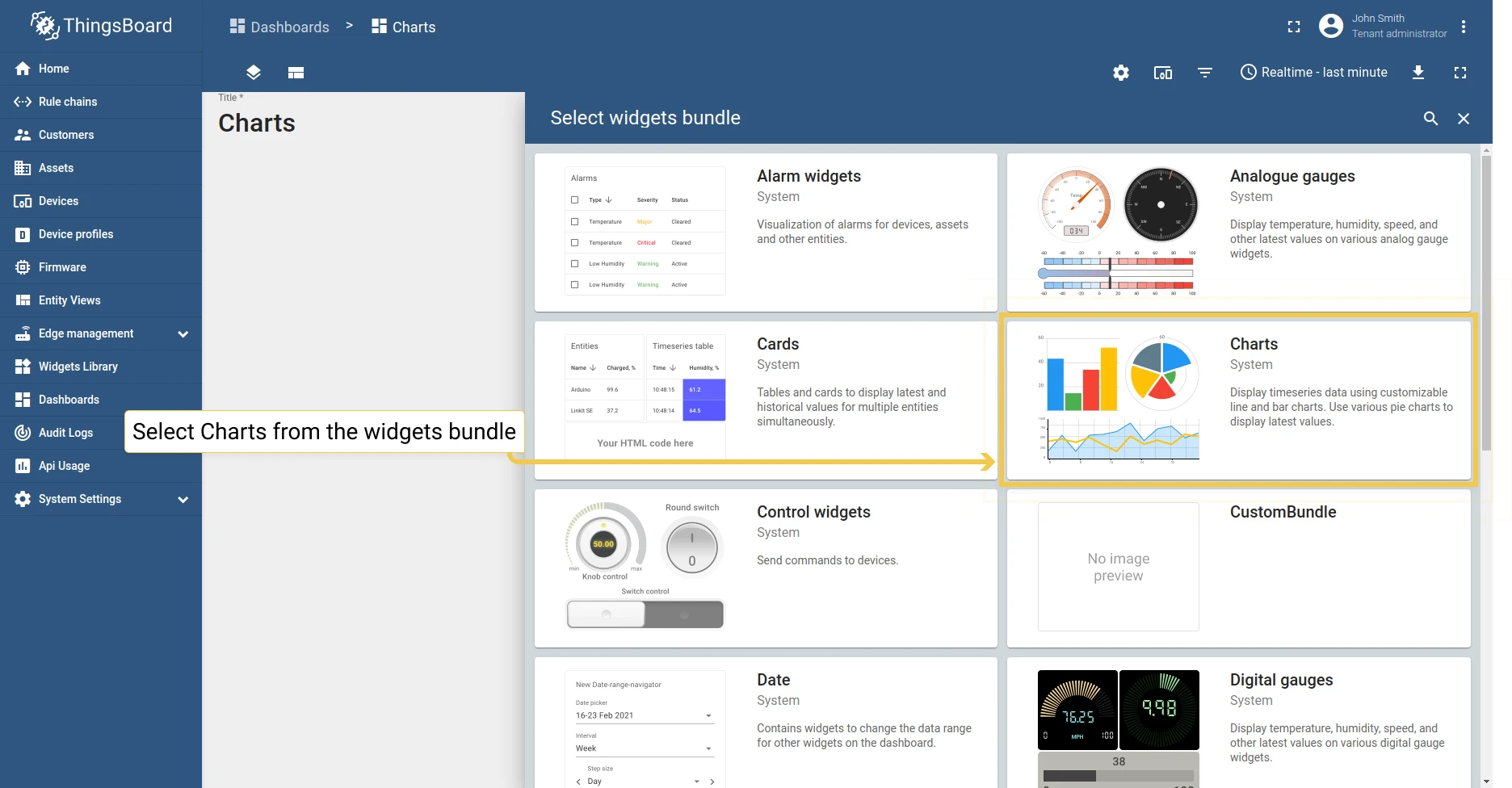
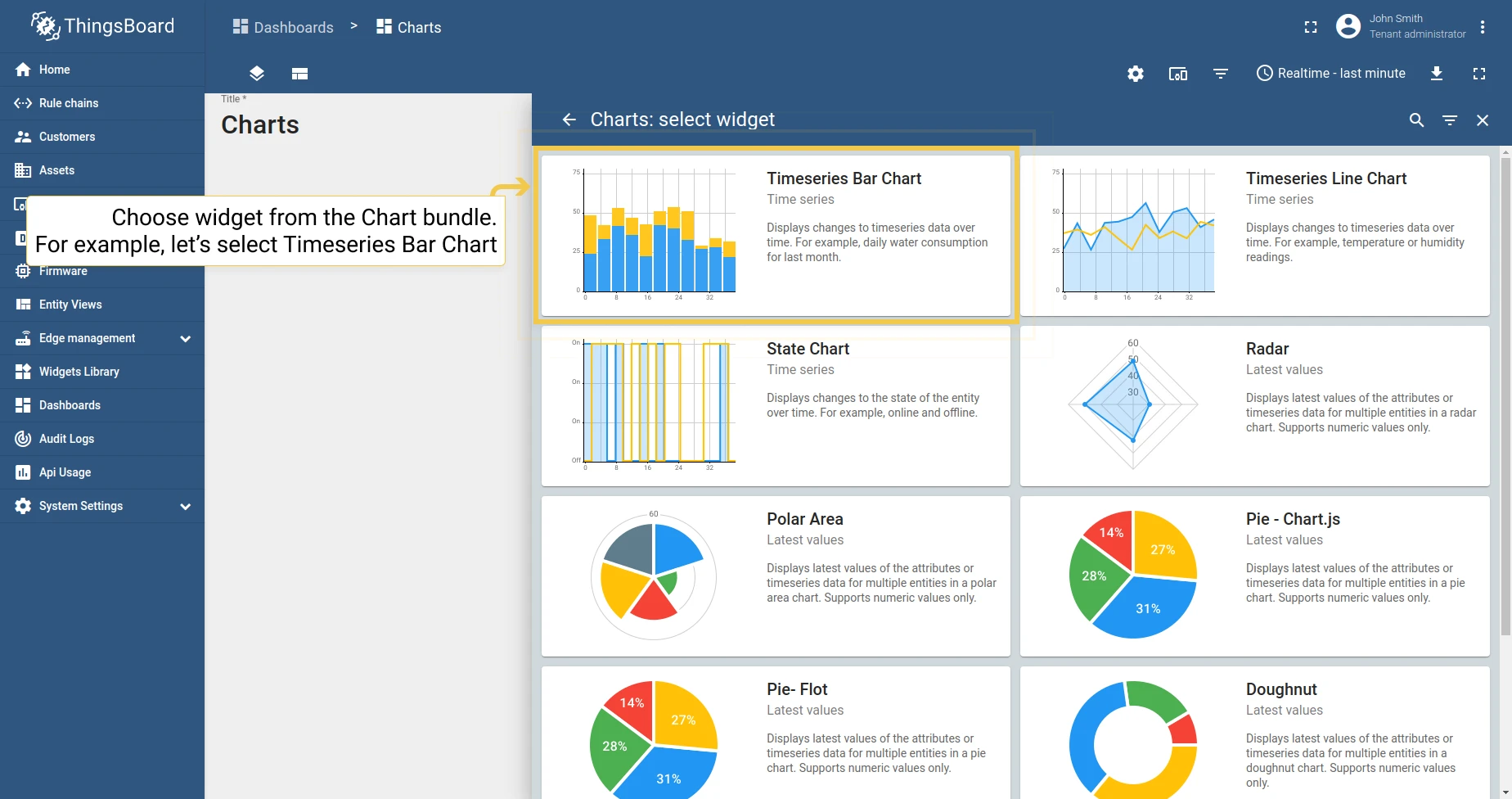
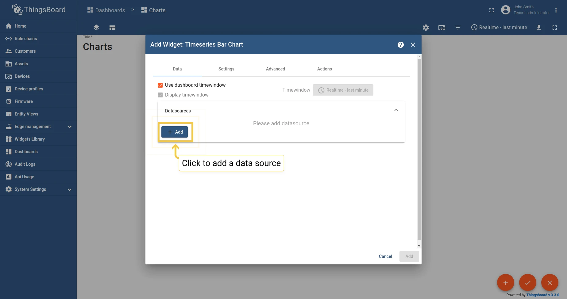
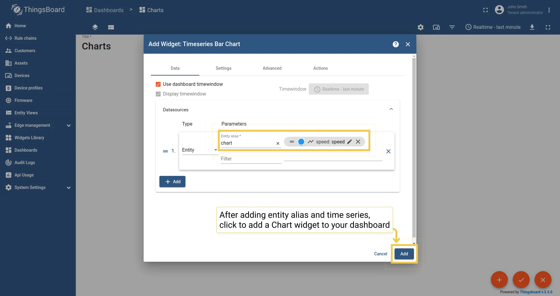
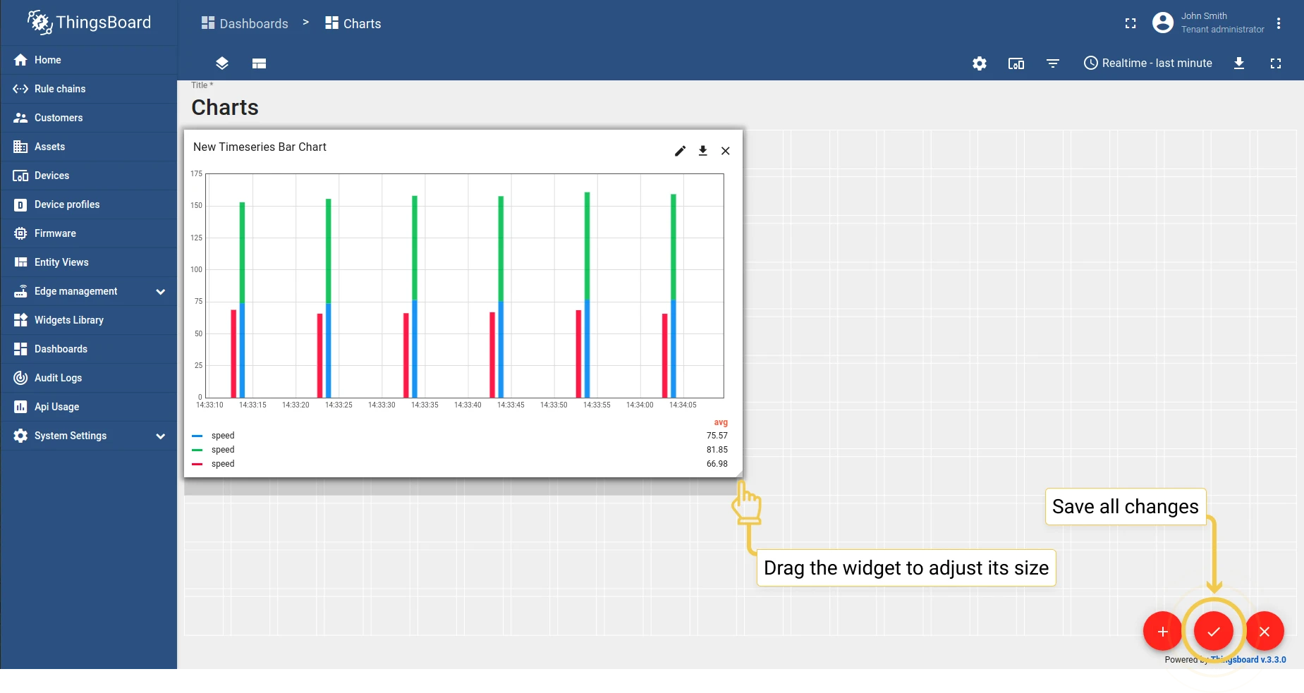
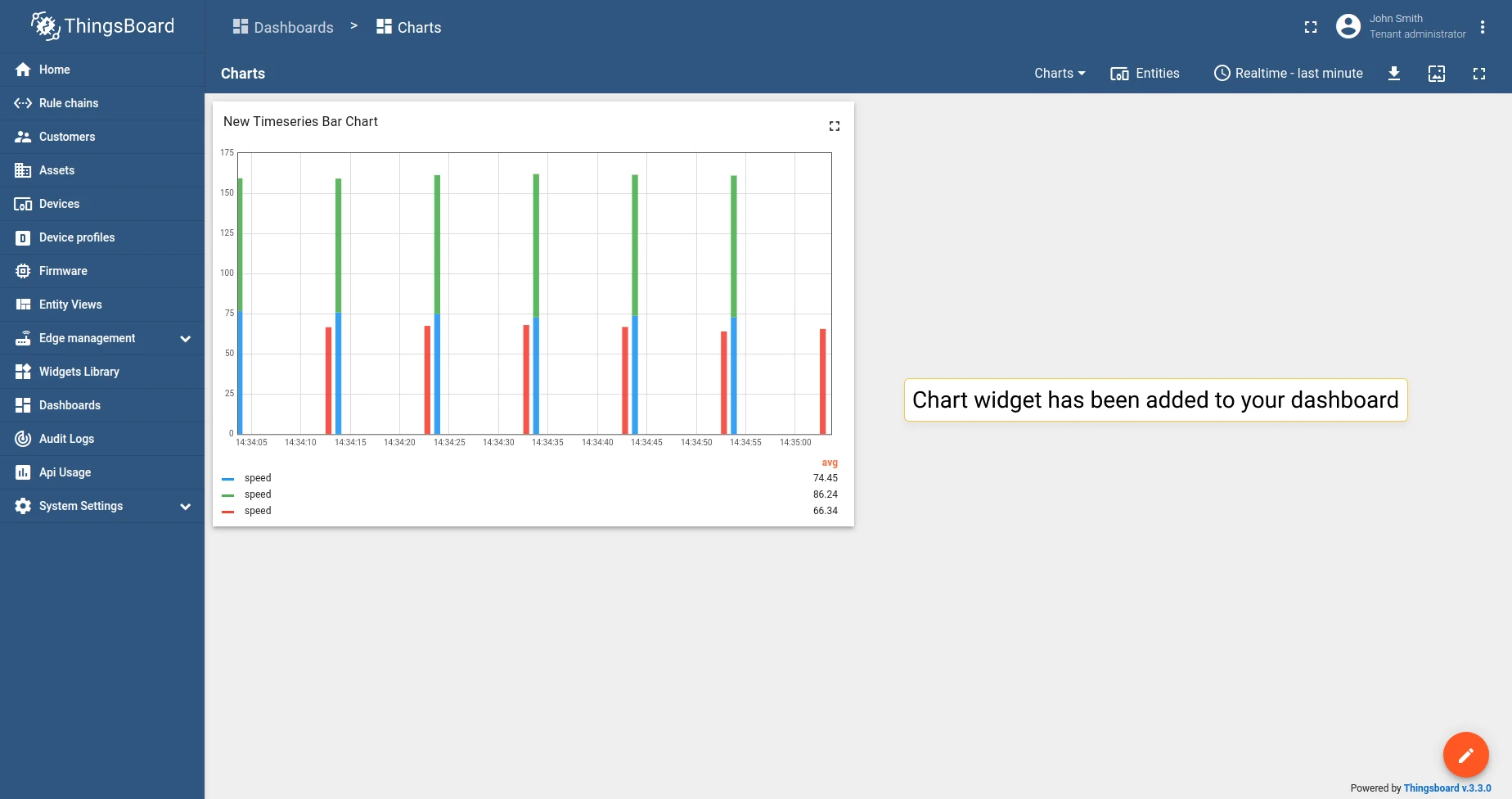
Chart widget types
Section titled “Chart widget types”Chart widgets are divided into Time series and Latest values widgets. Time series widgets visualize changes in data over time. Latest values widgets display the most recent values for multiple entities.
Time series widgets
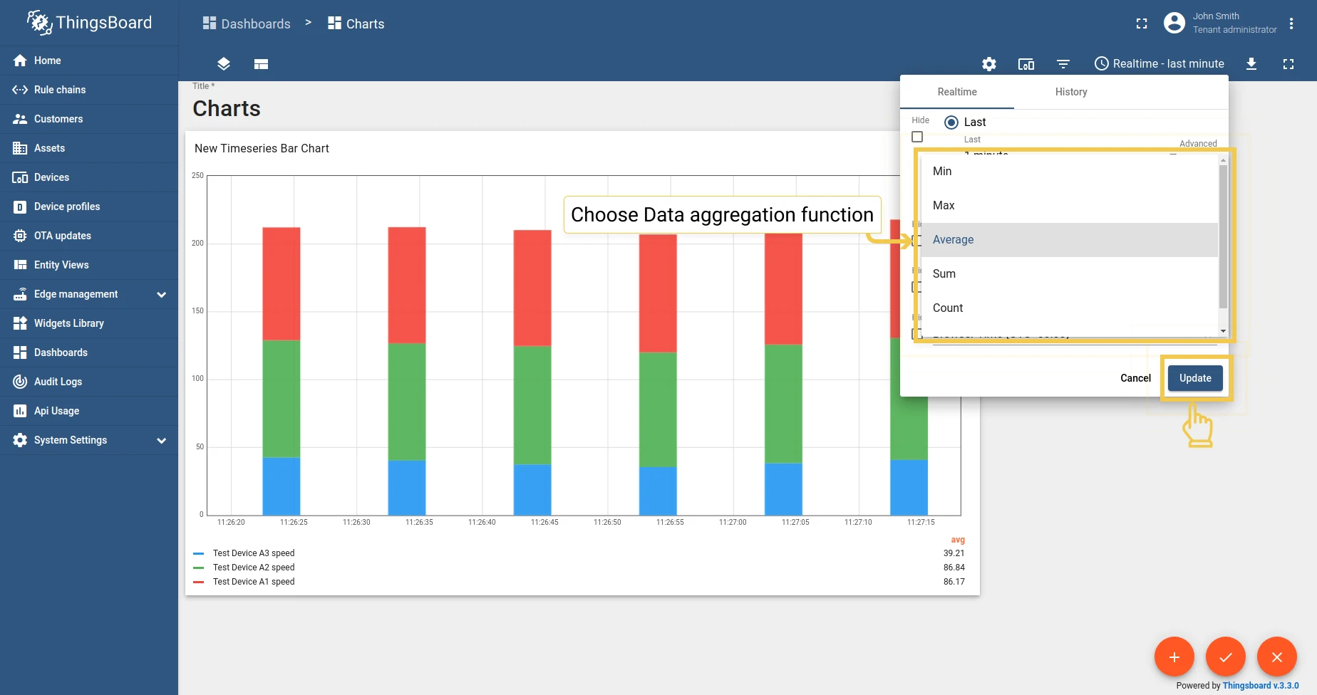
Section titled “Time series widgets”Time series widgets visualize changes in time-series data over time. See time window for configuration details.
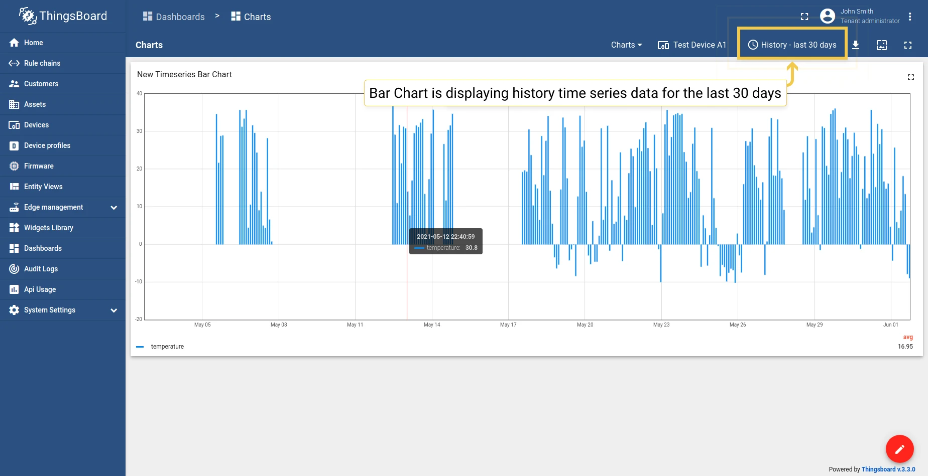
Bar Chart
Section titled “Bar Chart”Displays changes to time-series data over time as vertical bars.
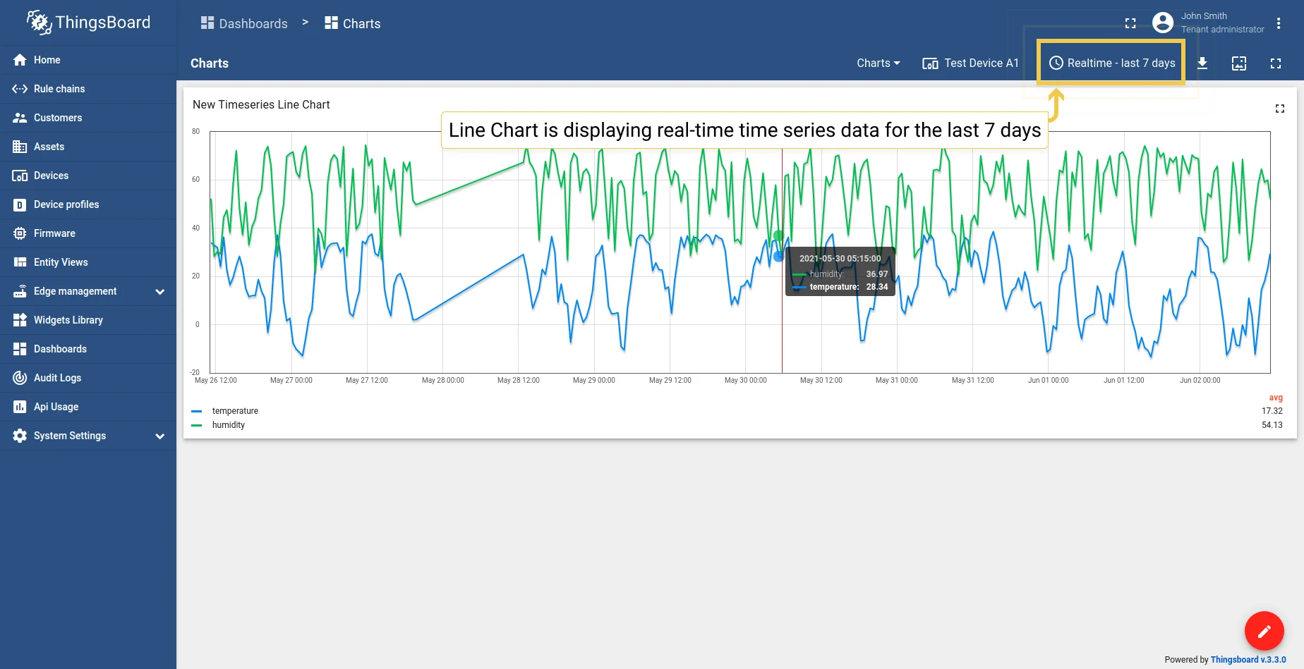
Line Chart
Section titled “Line Chart”Displays changes to time-series data over time as a continuous line.
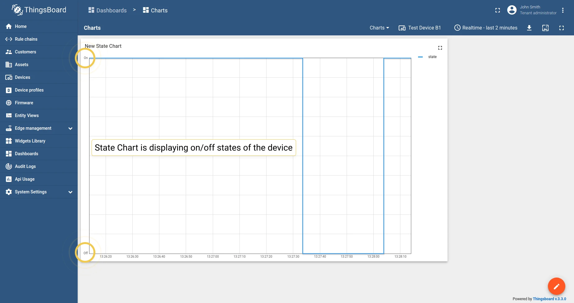
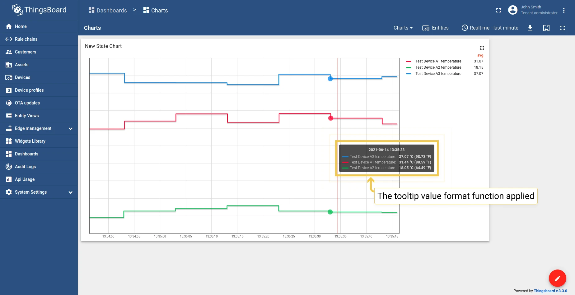
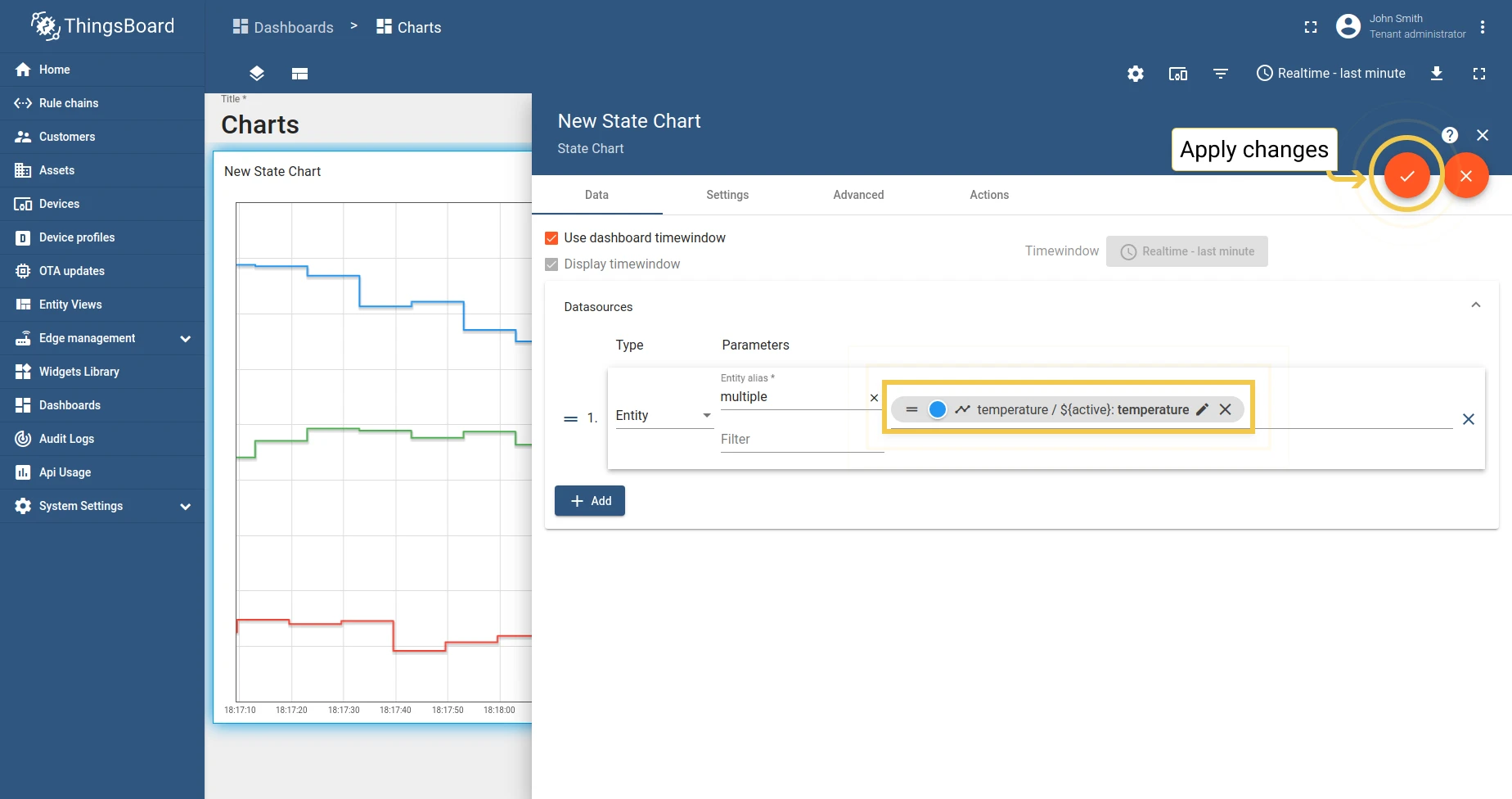
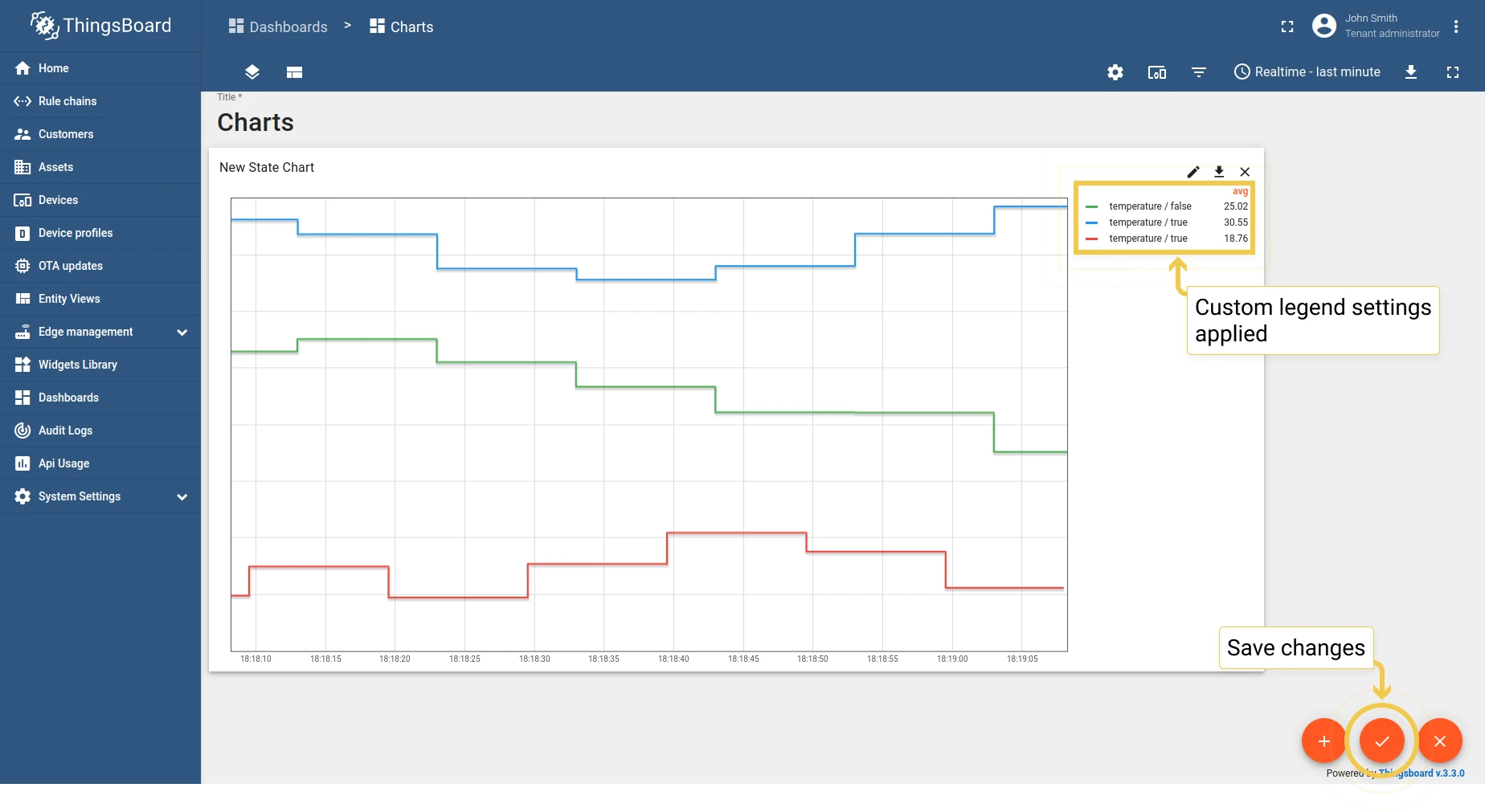
State Chart
Section titled “State Chart”Displays changes to the state of an entity over time — for example, whether a device is on or off.
Latest values widgets
Section titled “Latest values widgets”Latest values widgets render the most recent values of attributes or time-series data for multiple entities. Most support numeric values only.
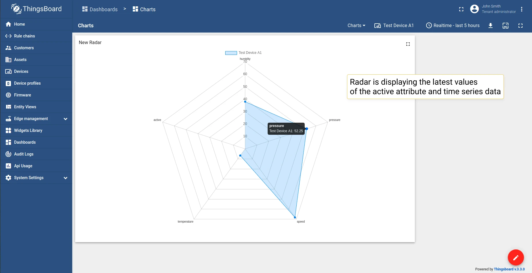
Displays the latest values in a radar chart. Supports numeric values only.
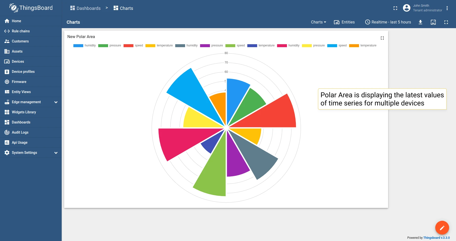
Polar Area
Section titled “Polar Area”Displays the latest values in a polar area chart.
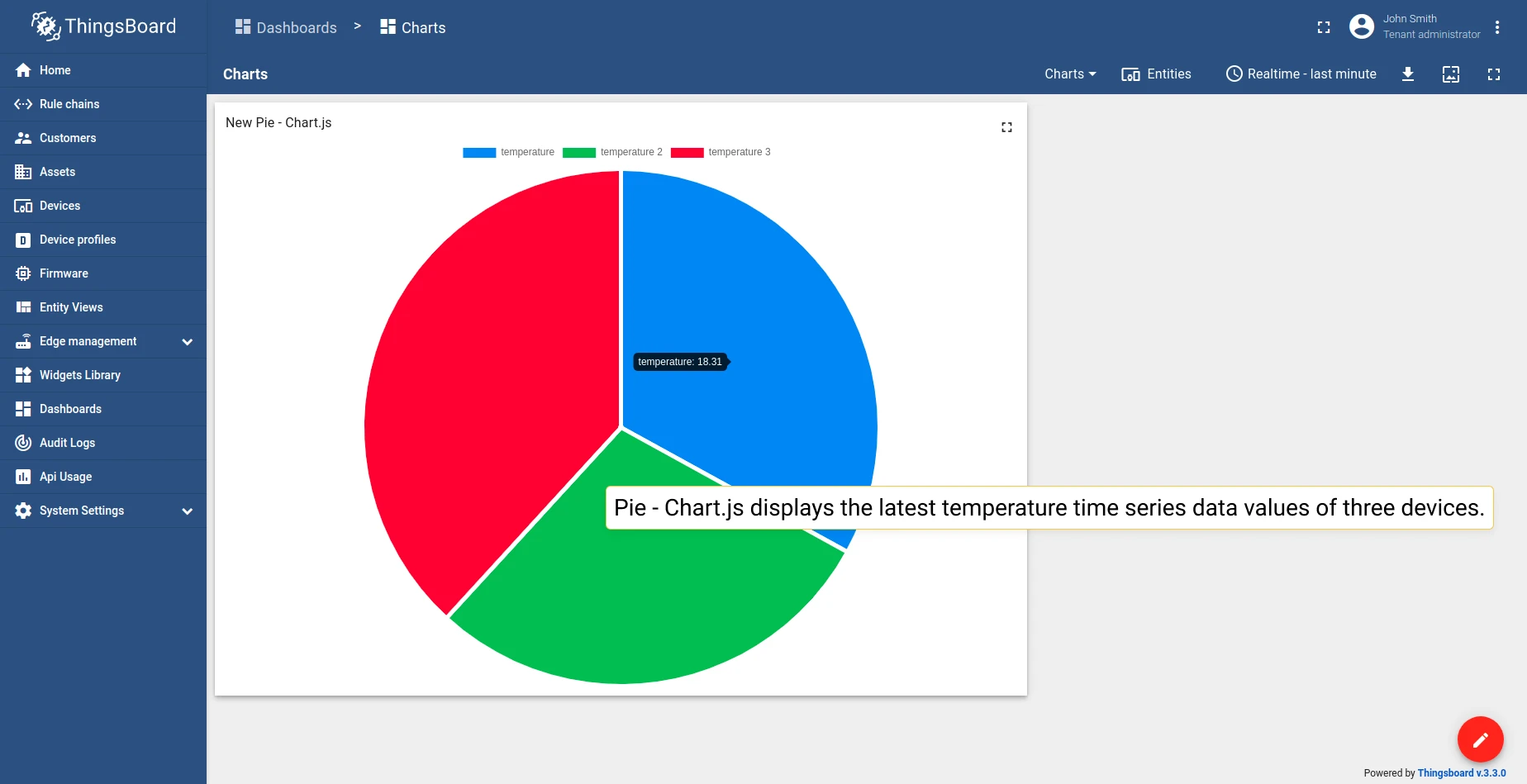
Pie - Chart.js
Section titled “Pie - Chart.js”Displays the latest values in a pie chart (Chart.js implementation).
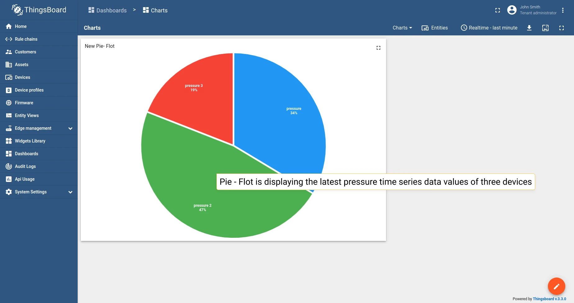
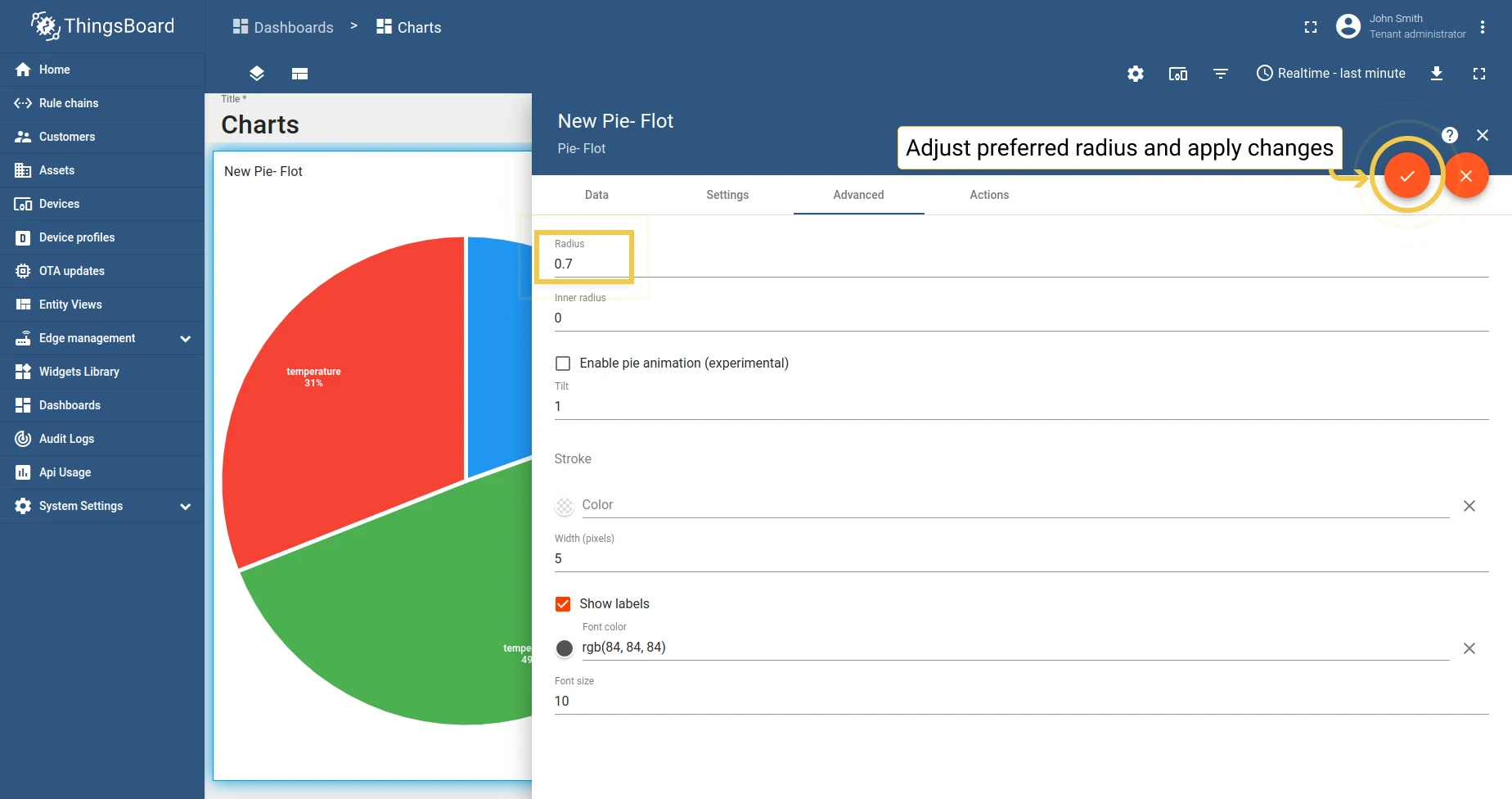
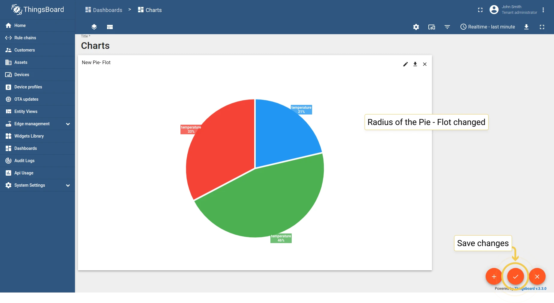
Pie - Flot
Section titled “Pie - Flot”Displays the latest values in a pie chart (Flot implementation).
Doughnut
Section titled “Doughnut”Displays the latest values in a doughnut chart.
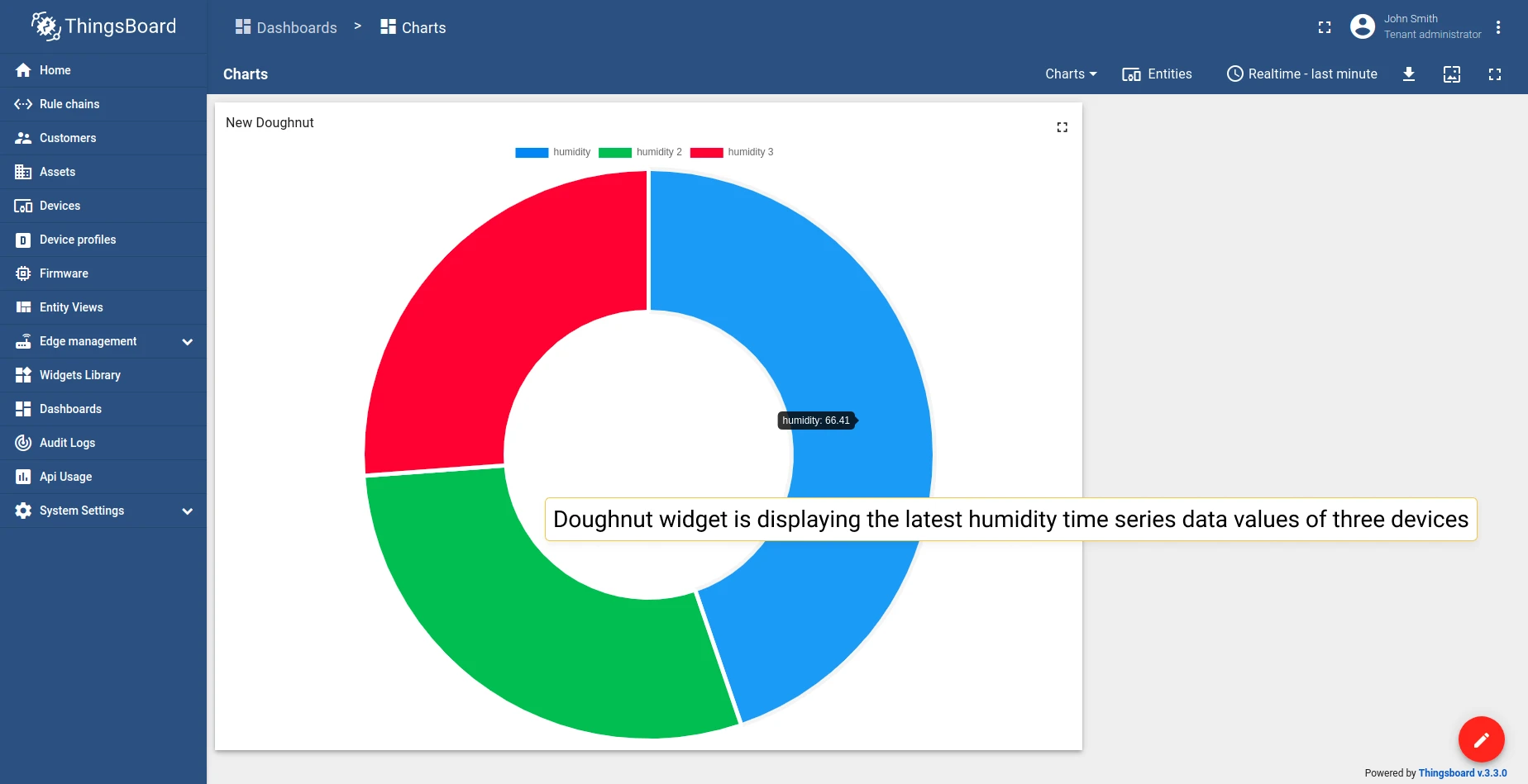
The only latest values chart widget that allows using not only numeric values.
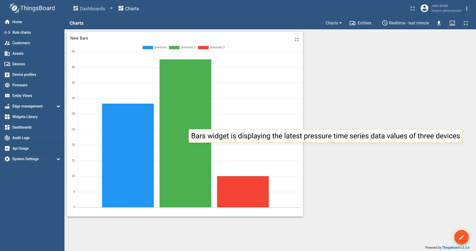
Chart widget settings
Section titled “Chart widget settings”Basic widget settings
Section titled “Basic widget settings”Basic widget settings control appearance and style — title, legend, and mobile device settings. All ThingsBoard widgets share the same basic settings. Learn how to customize them in the Dashboards guide.
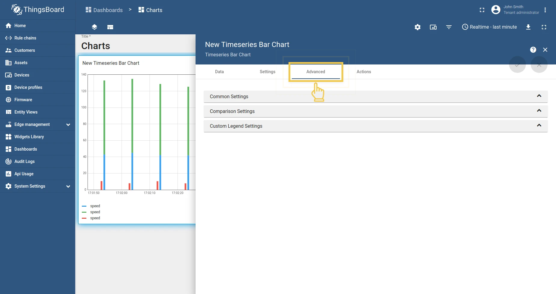
Advanced widget settings
Section titled “Advanced widget settings”Advanced settings vary by widget type and configure features specific to each chart.
Time series Bar Chart
Section titled “Time series Bar Chart”1. Common settings
Section titled “1. Common settings”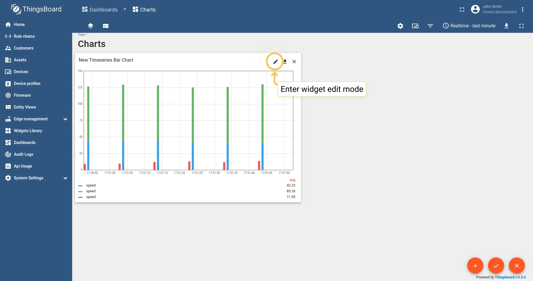
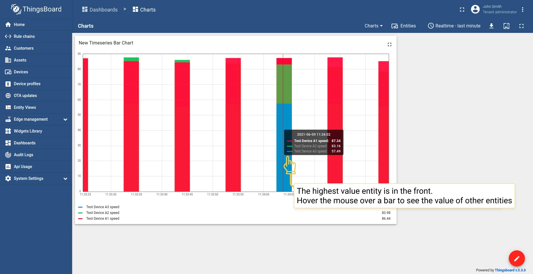
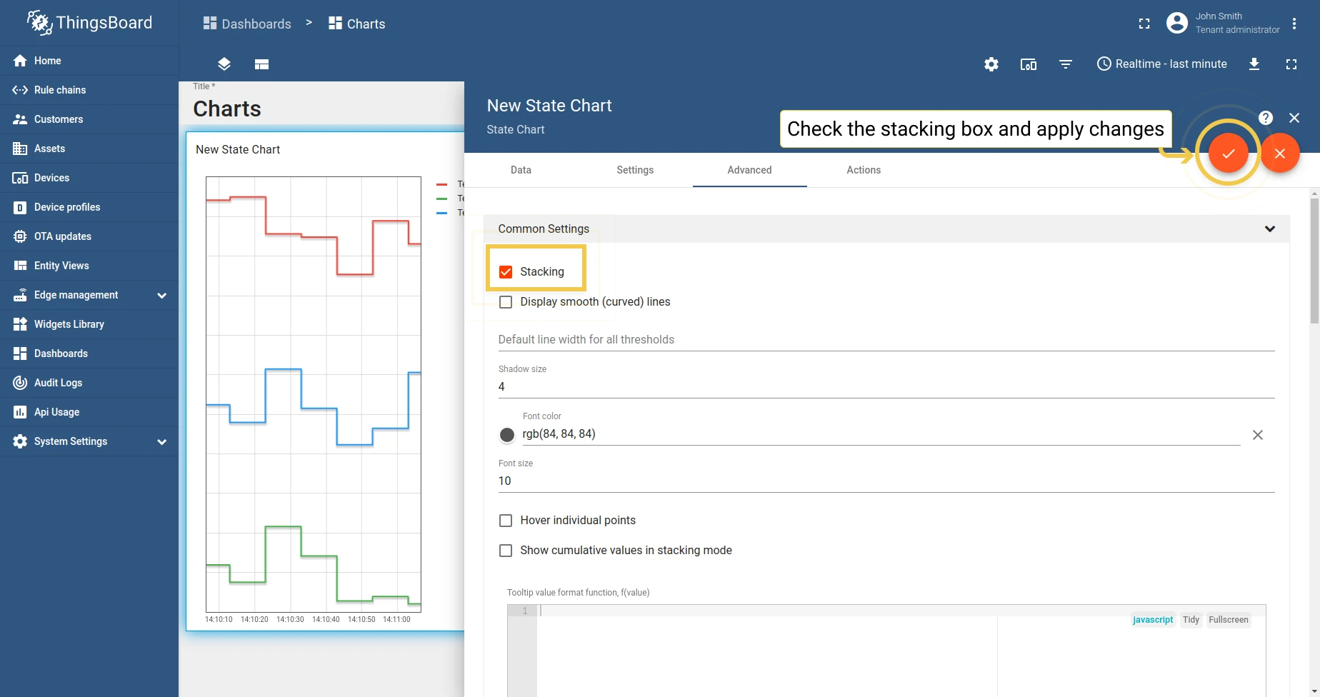
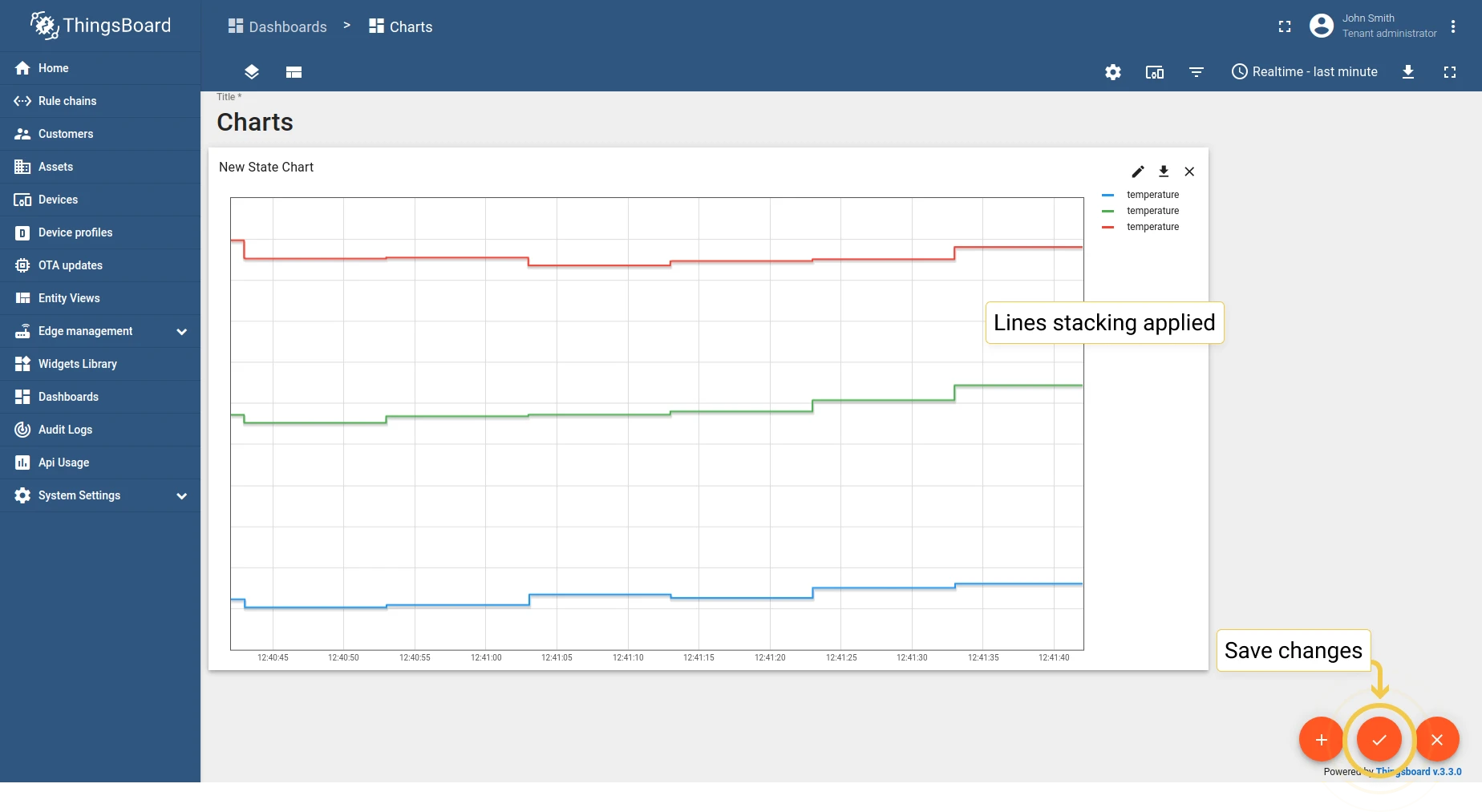
1.1 Stacking — when enabled, data from multiple entities is aggregated and displayed as stacked bars. Configure non-aggregated bar width, bar alignment, threshold line width, shadow size, and font color/size.
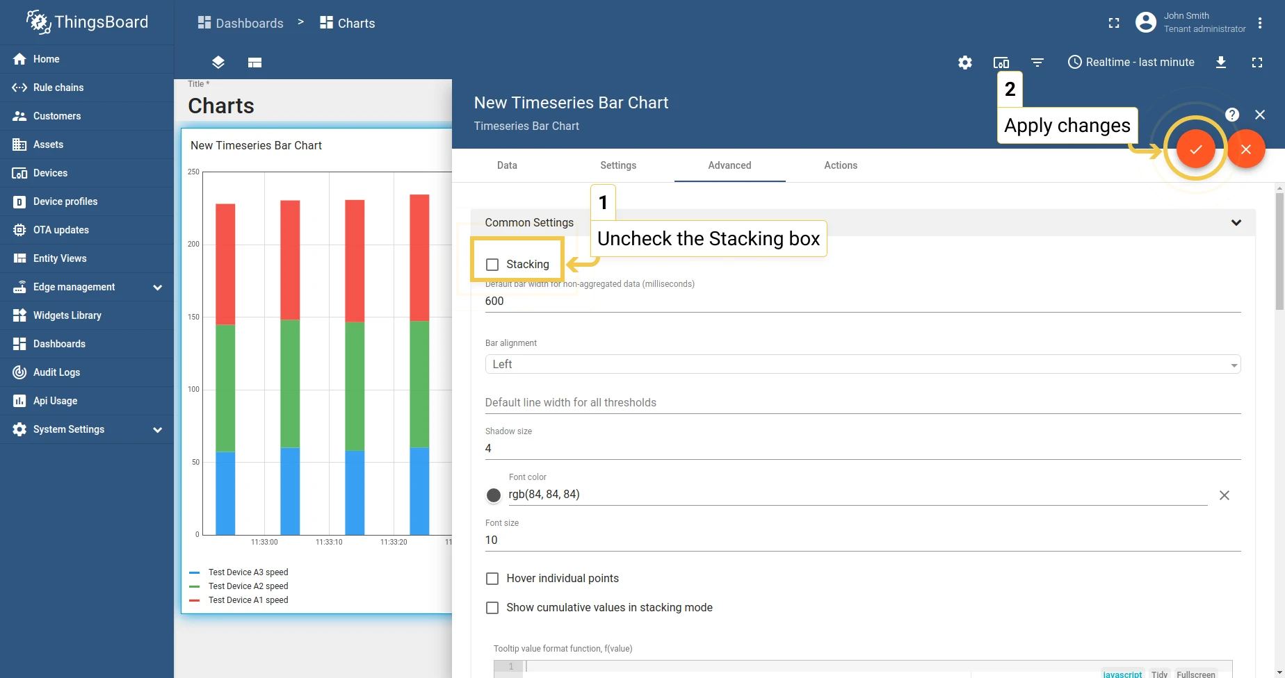
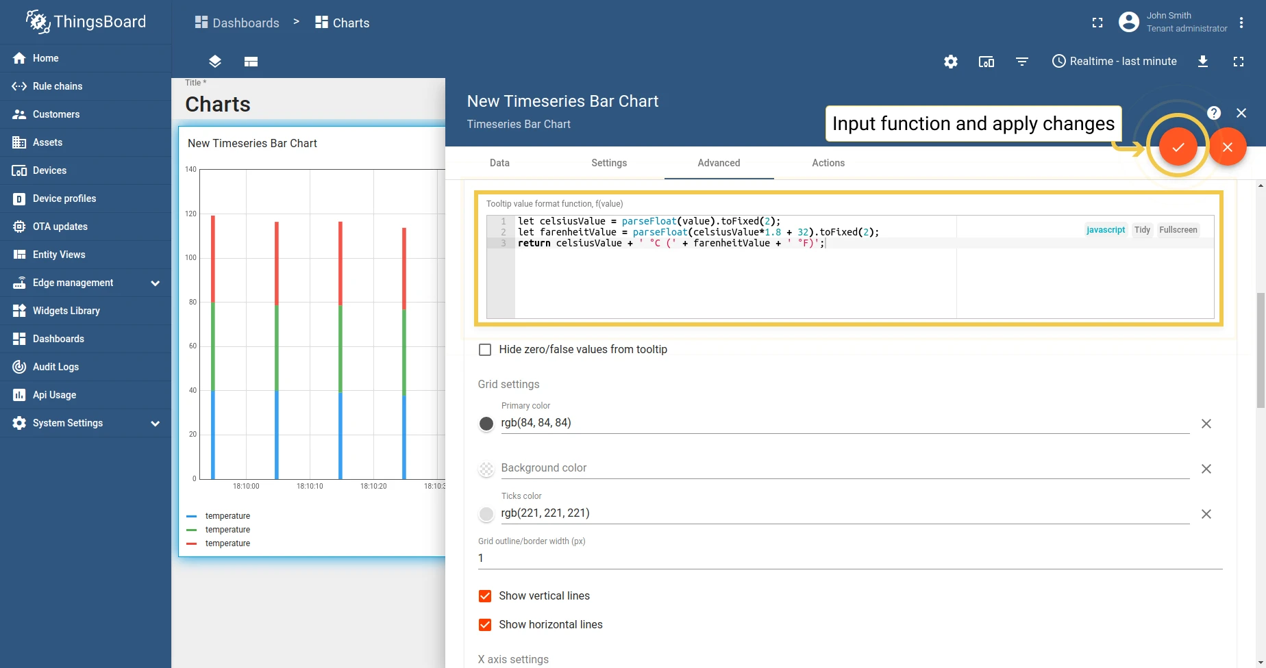
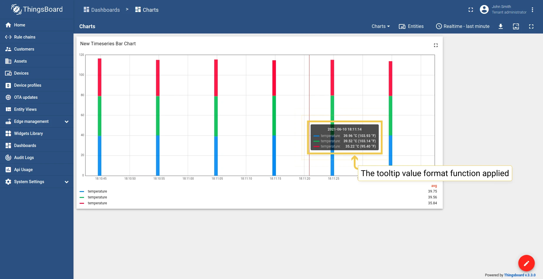
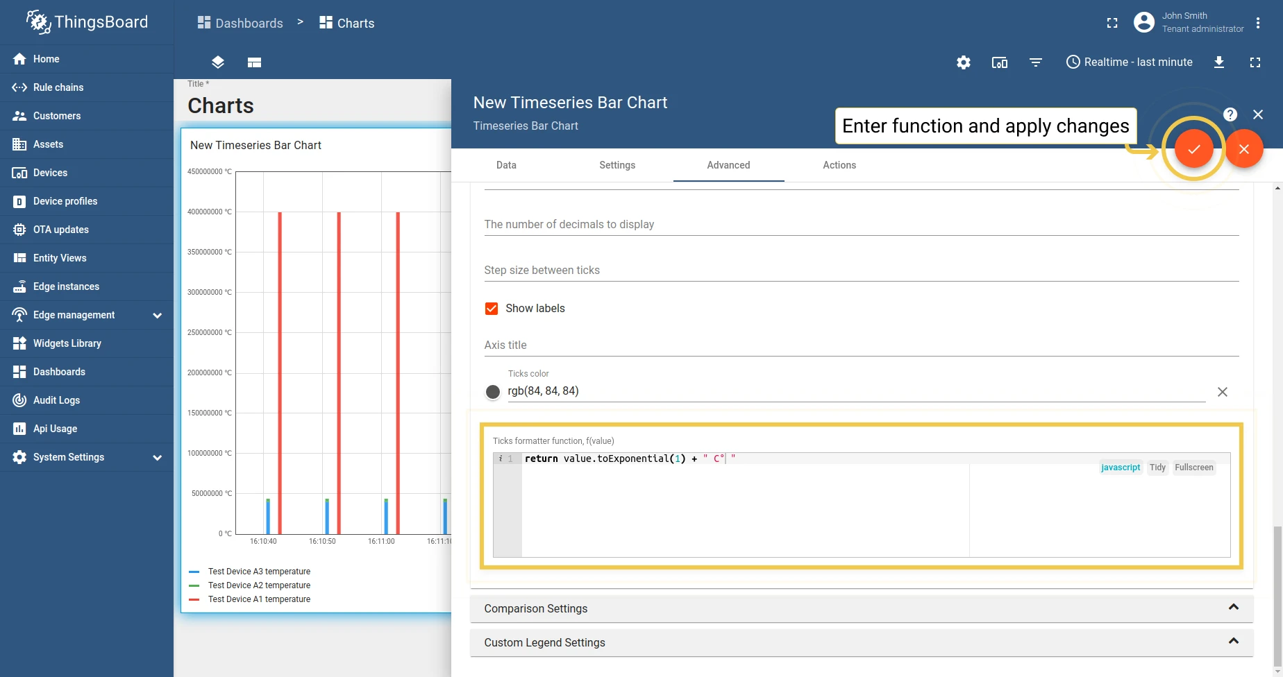
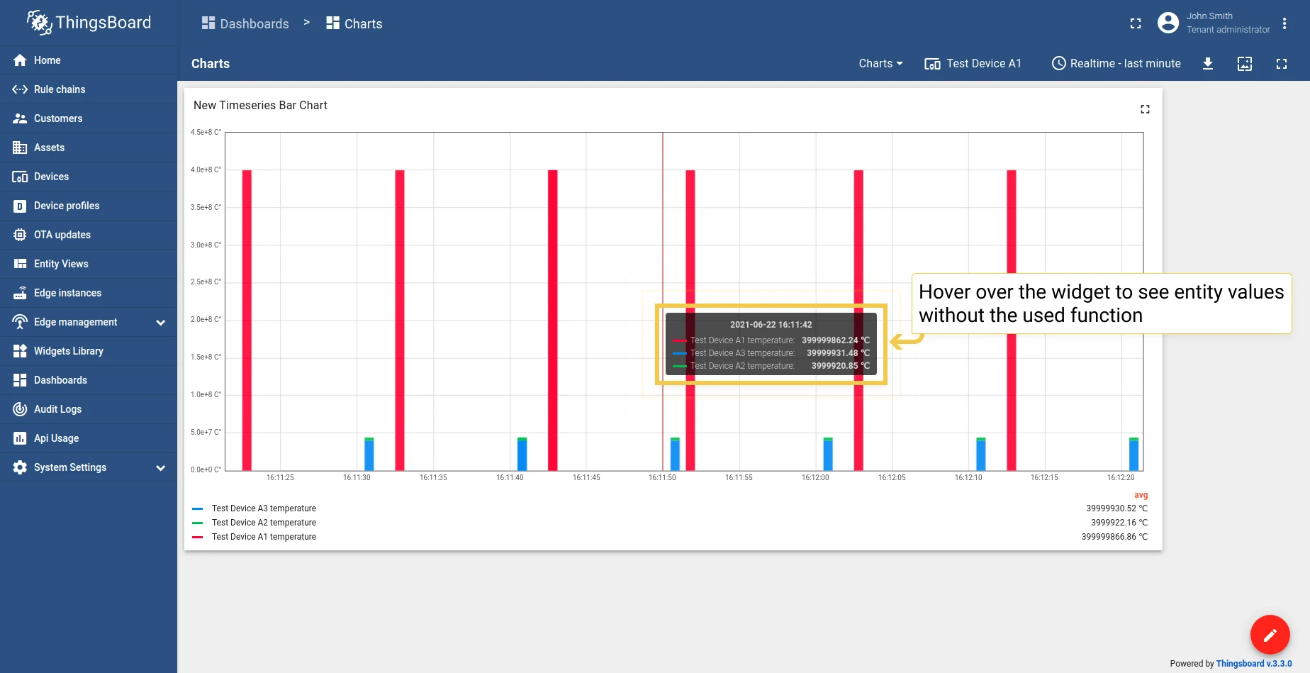
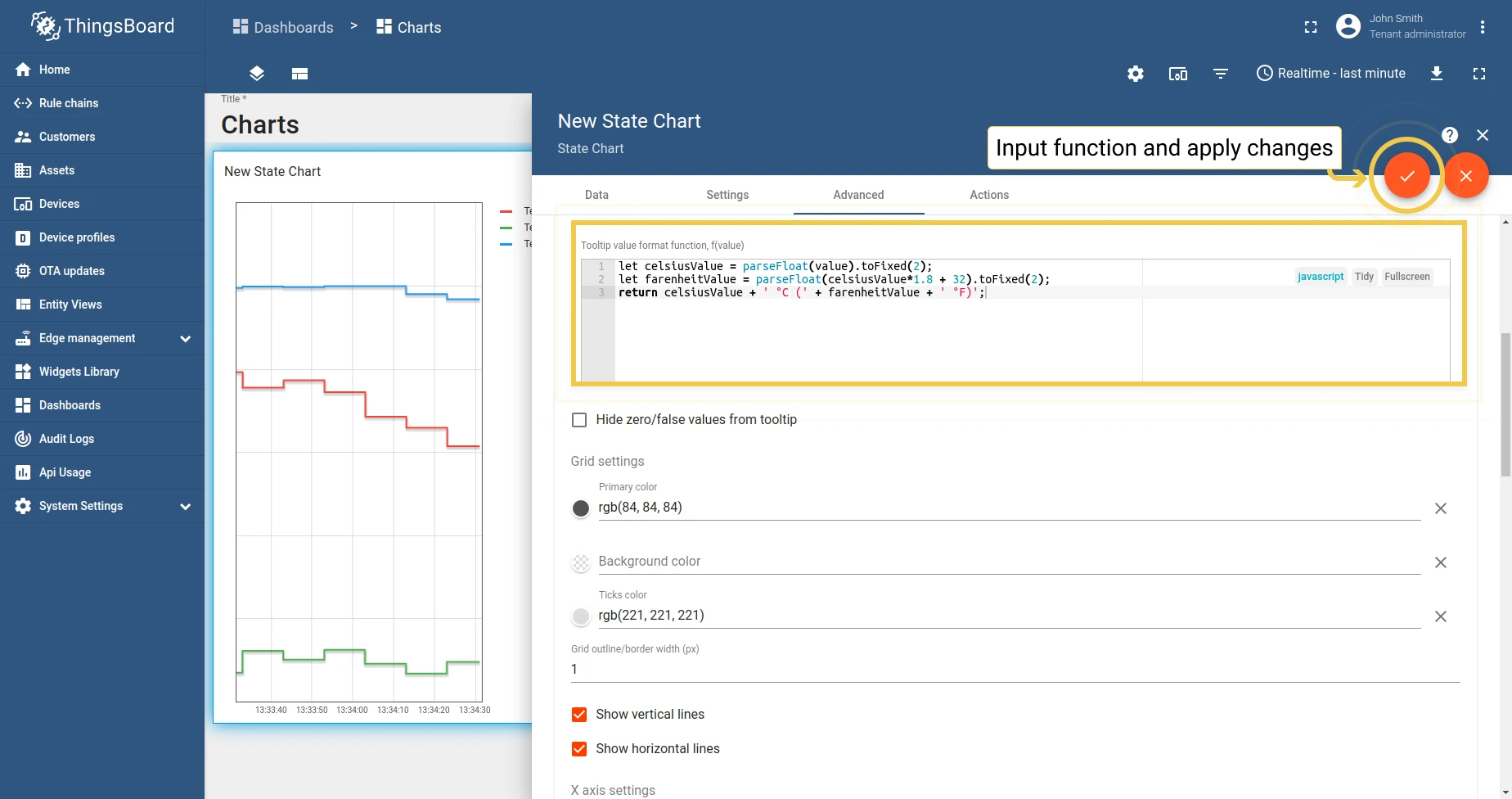
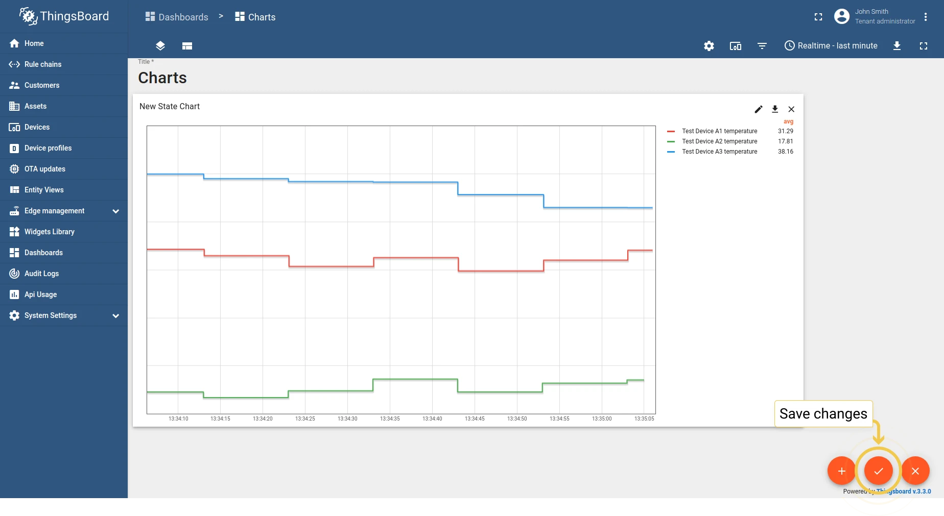
Tooltip value format function — customize the tooltip using a JavaScript function. See also tooltip settings.
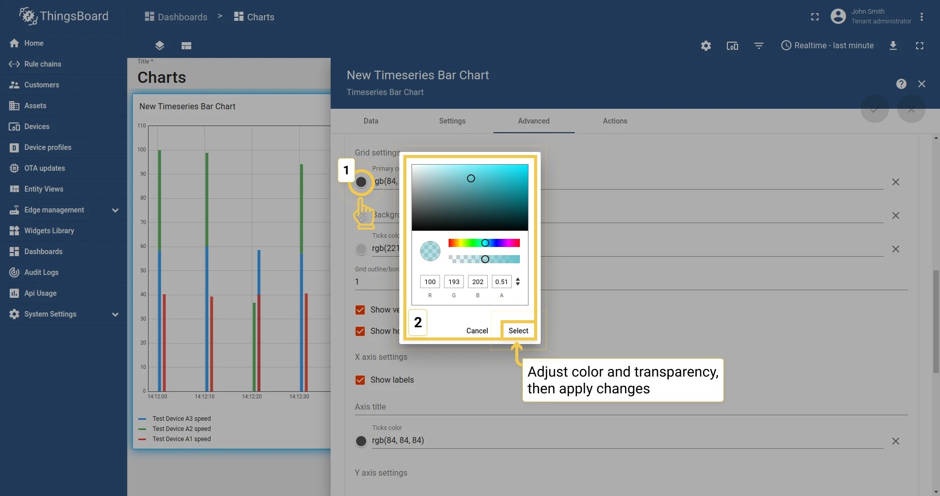
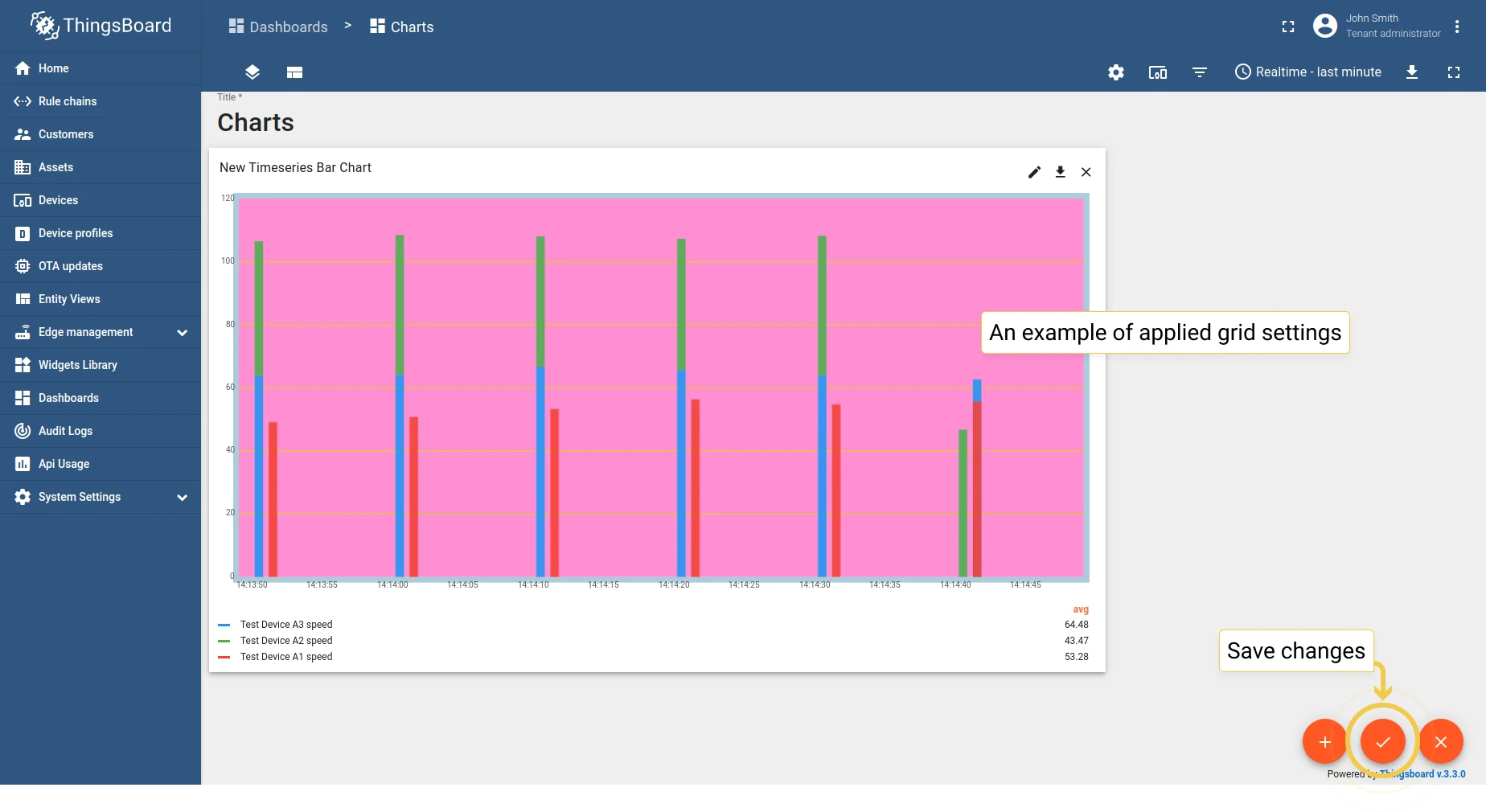
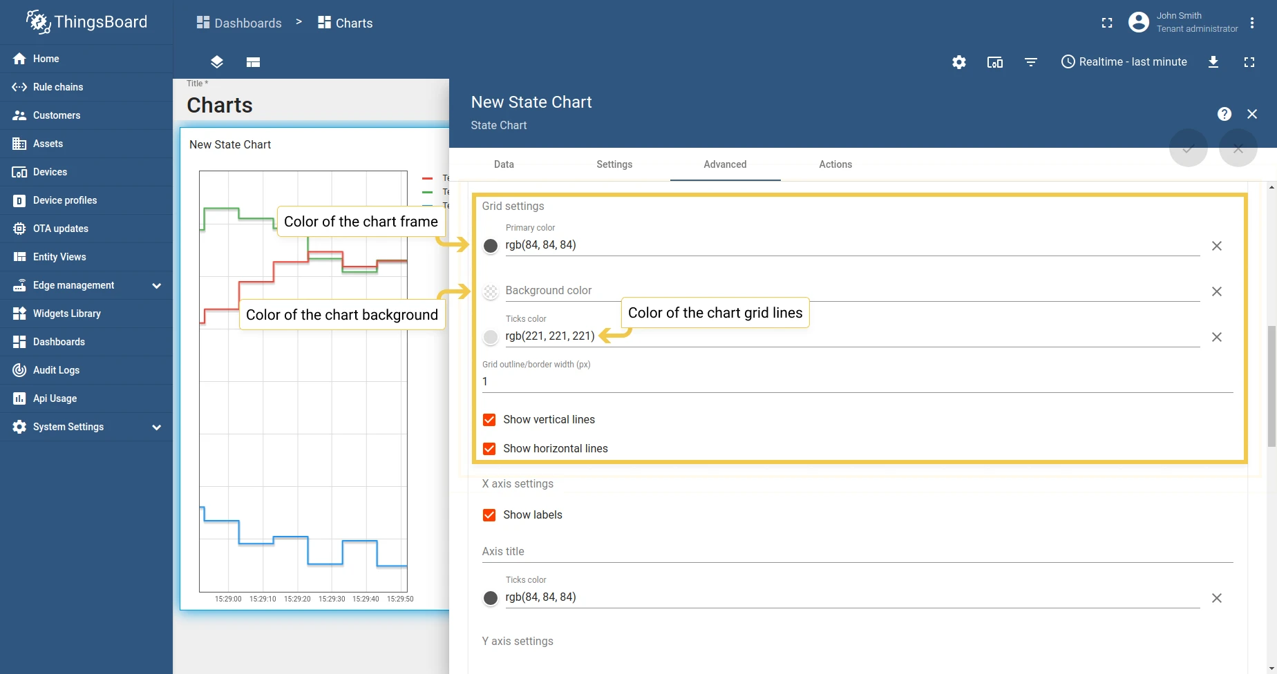
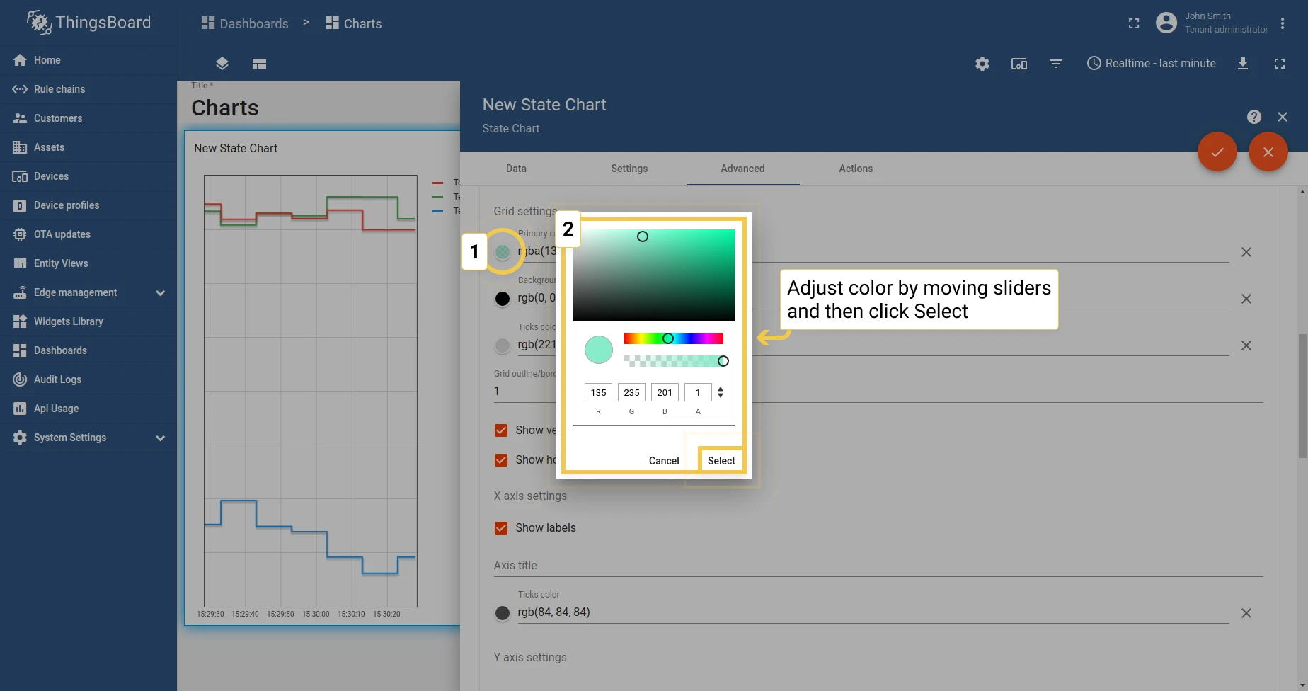
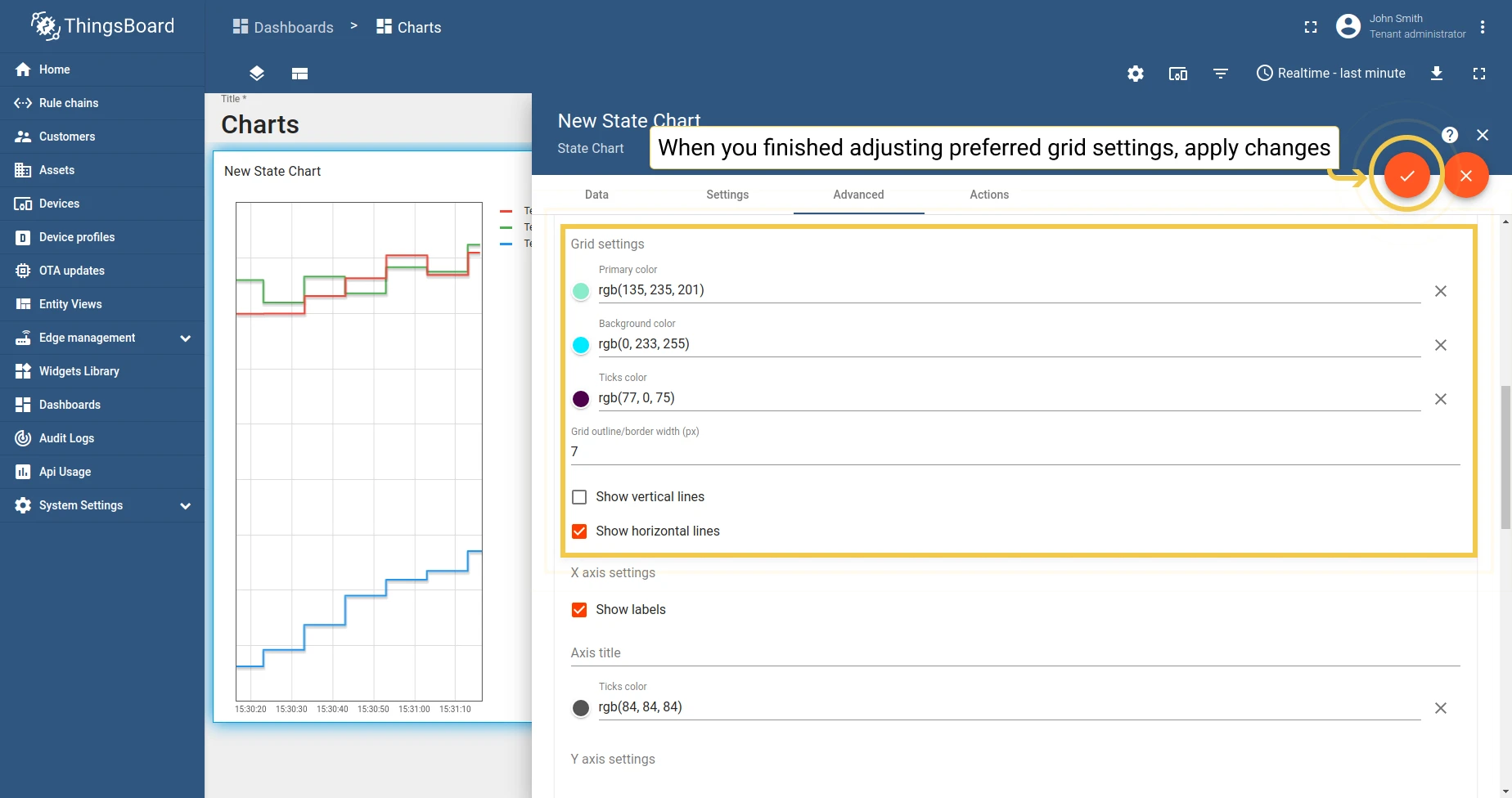
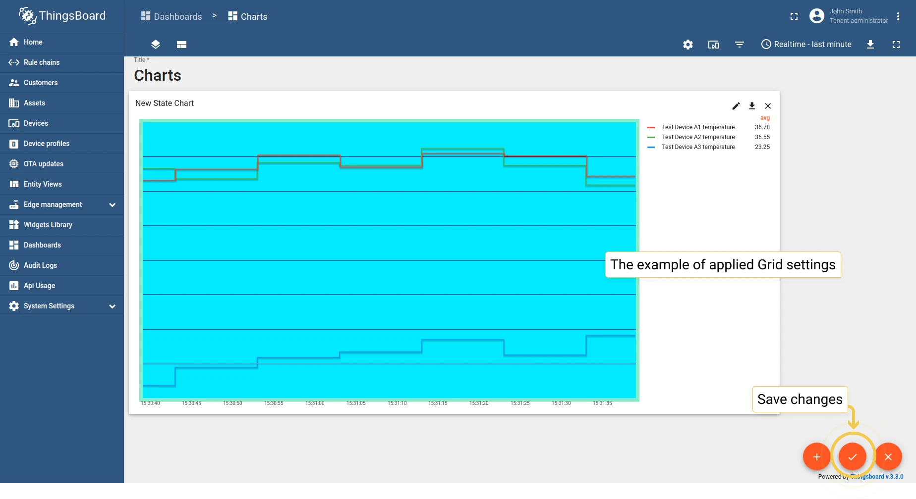
1.2 Grid settings — configure background color, grid frame, ticks, line width, and visibility.
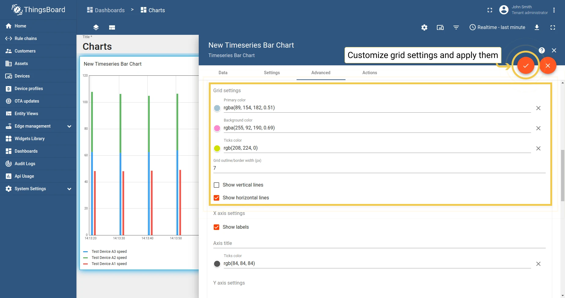
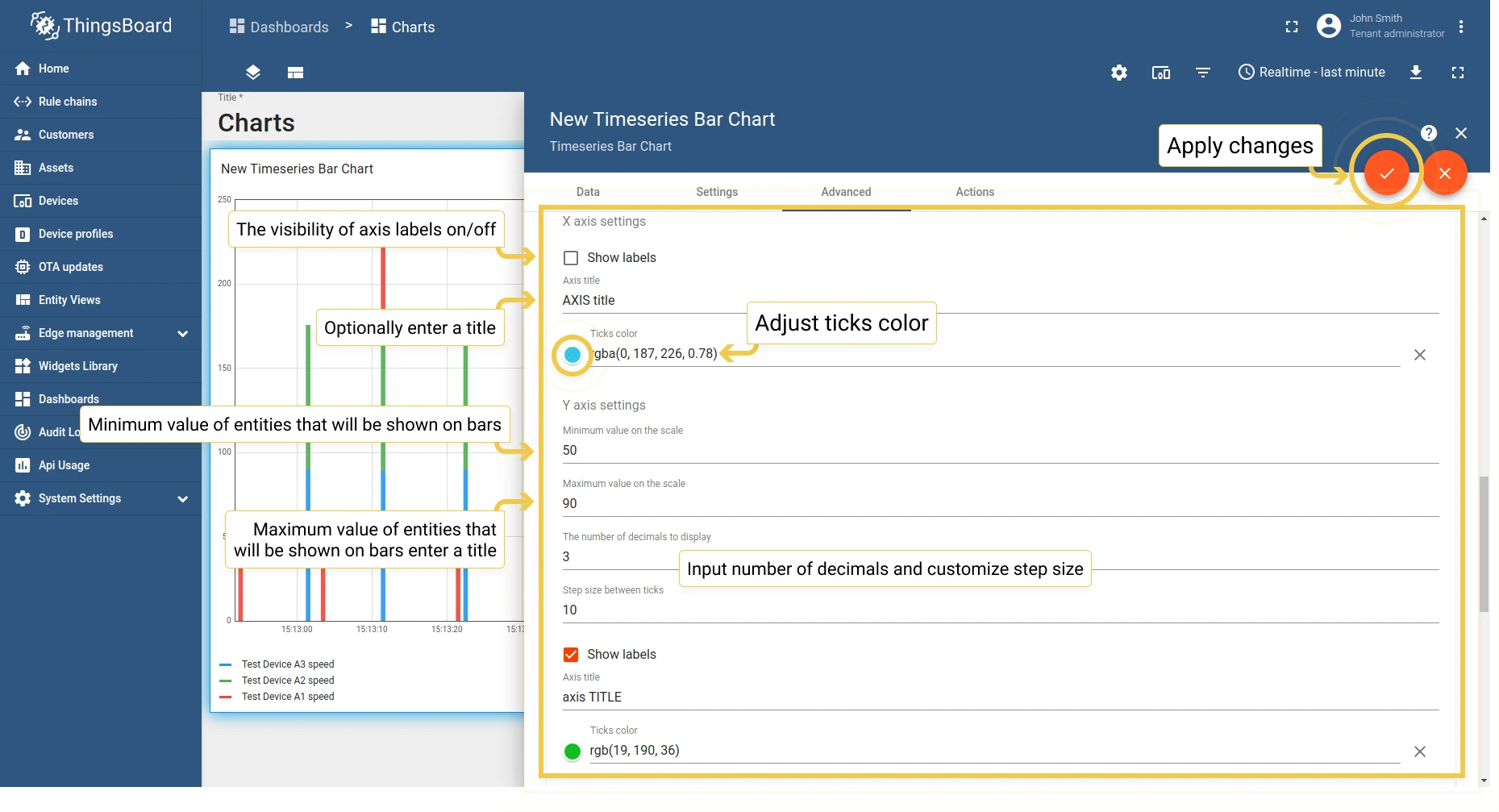
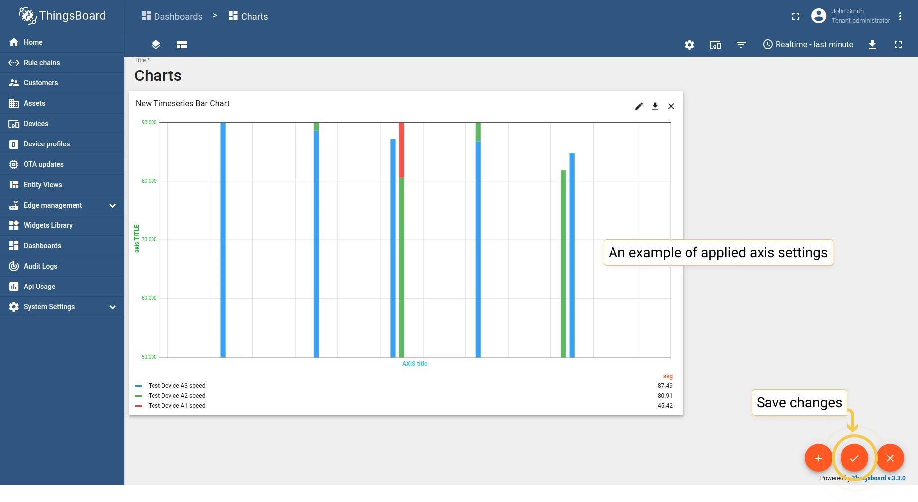
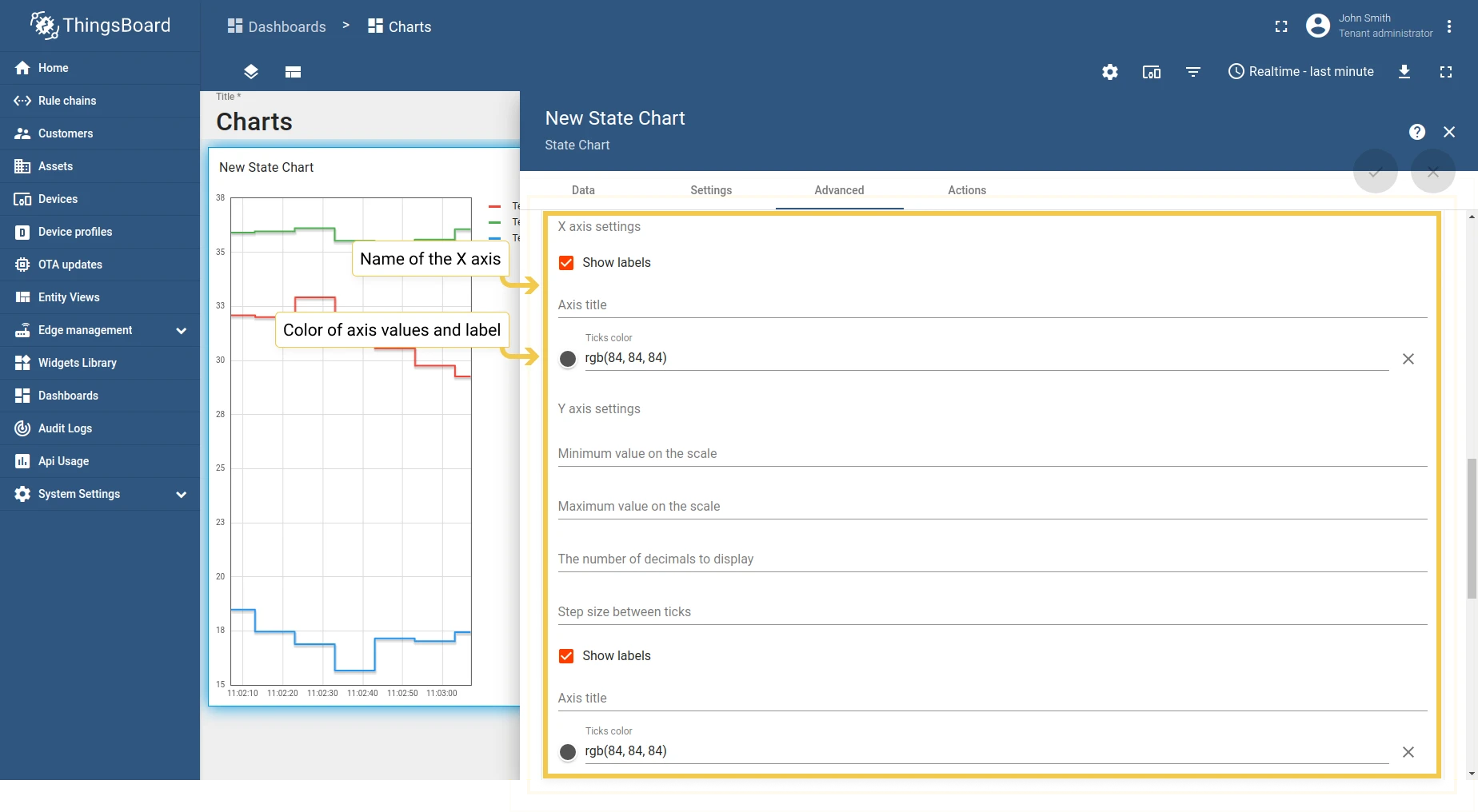
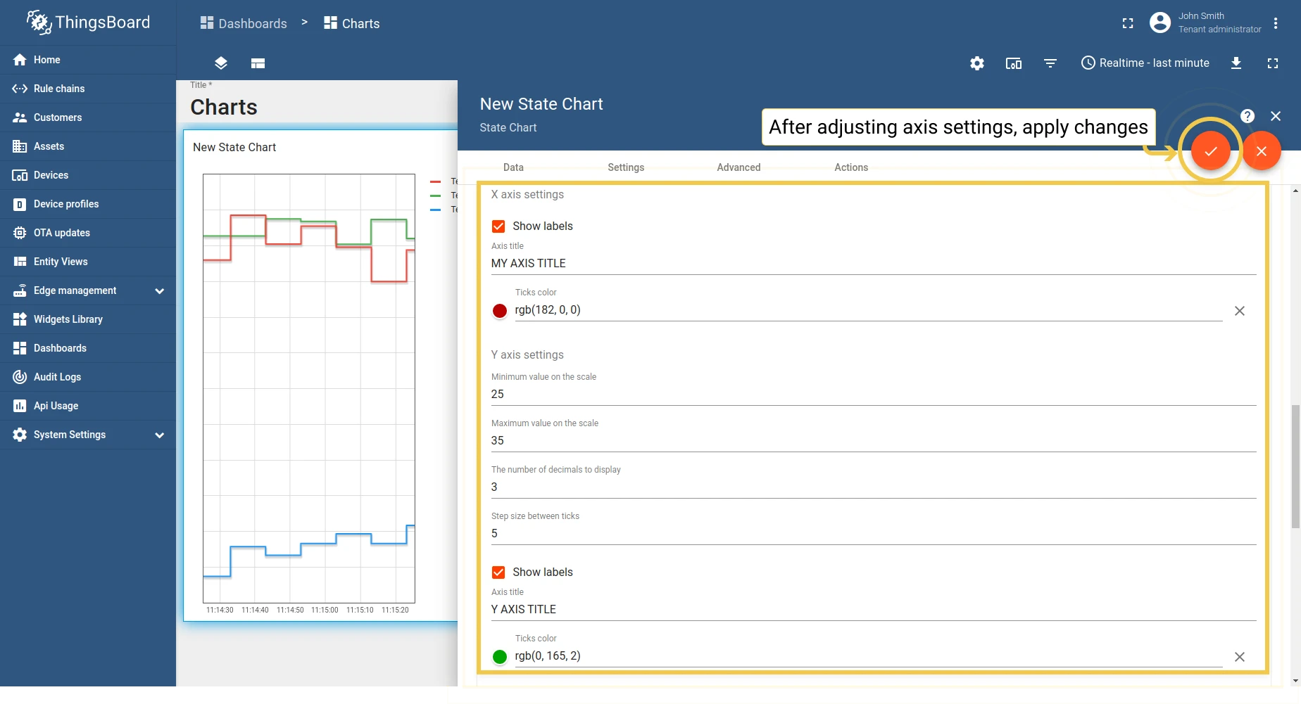
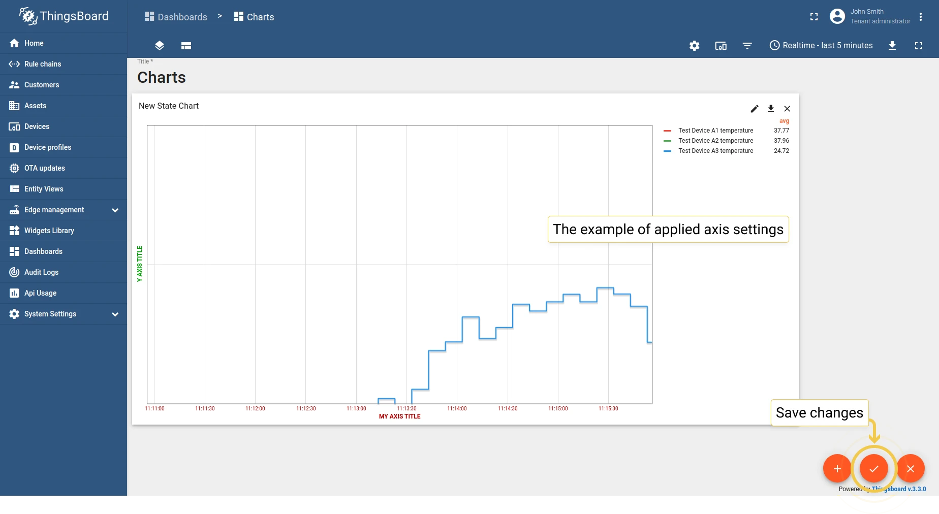
1.3 Axis settings — configure axis titles, colors, and value ranges.
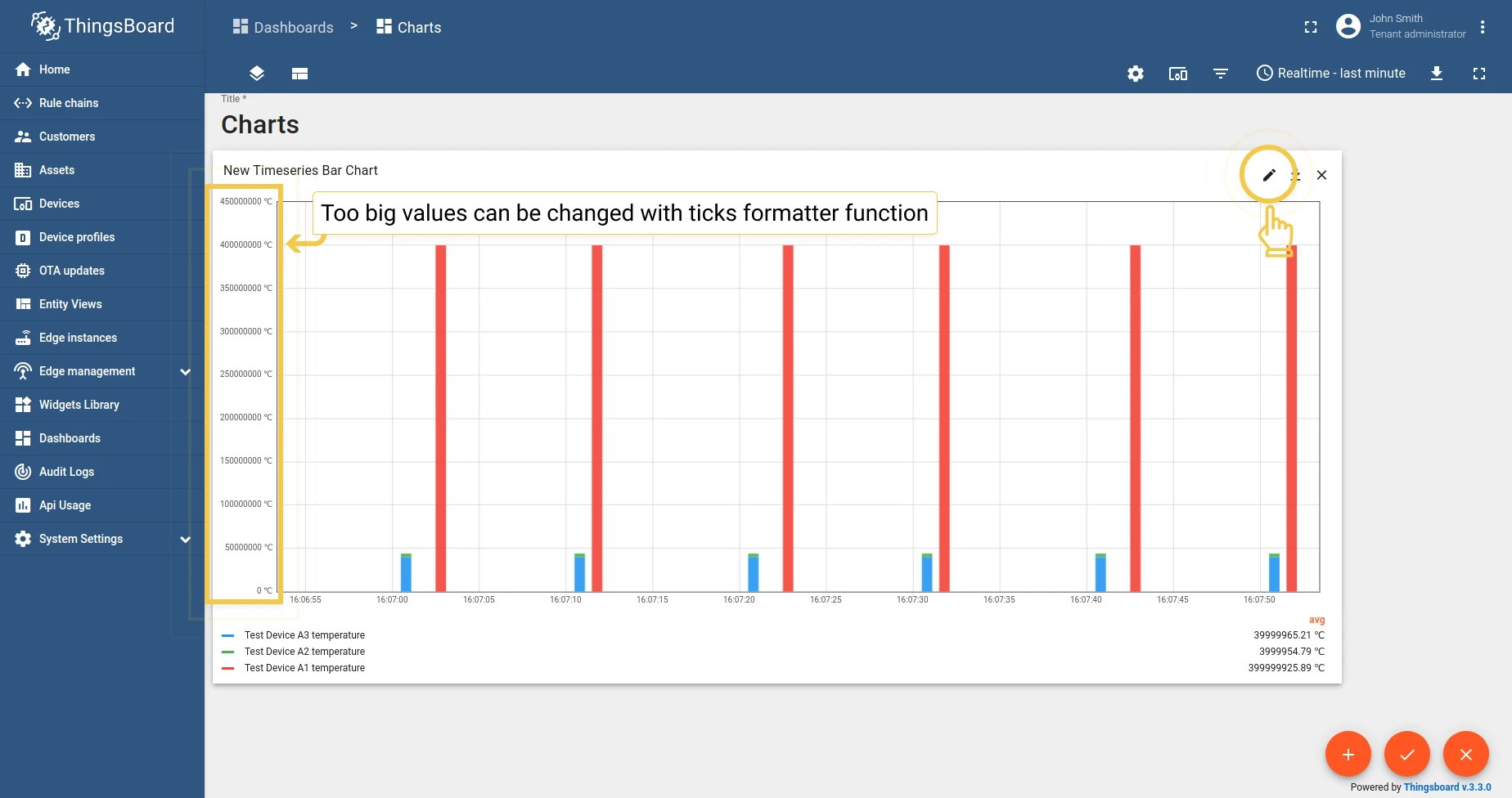
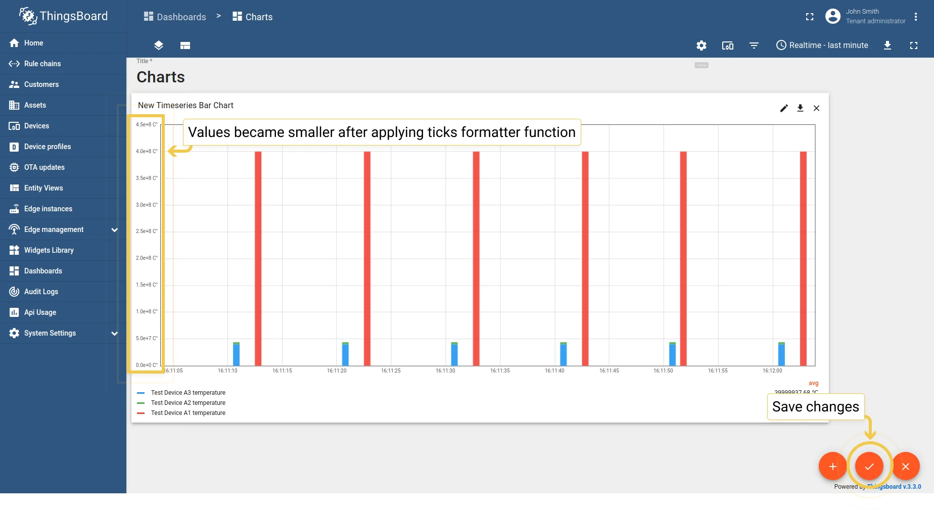
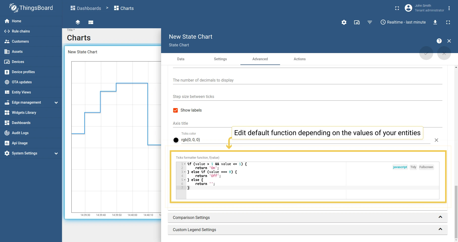
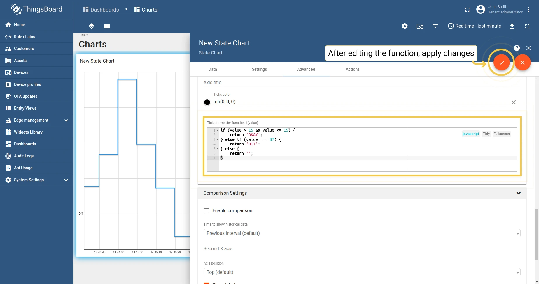
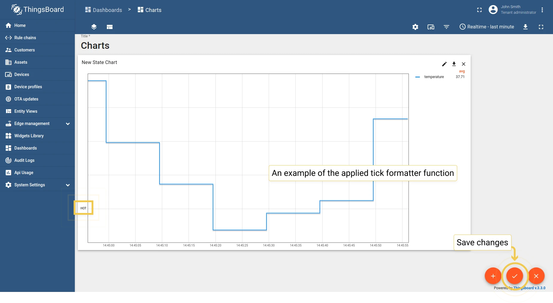
1.4 Ticks formatter function — convert tick values to a compact form for large numbers.
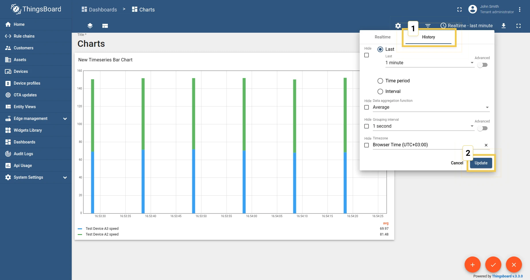
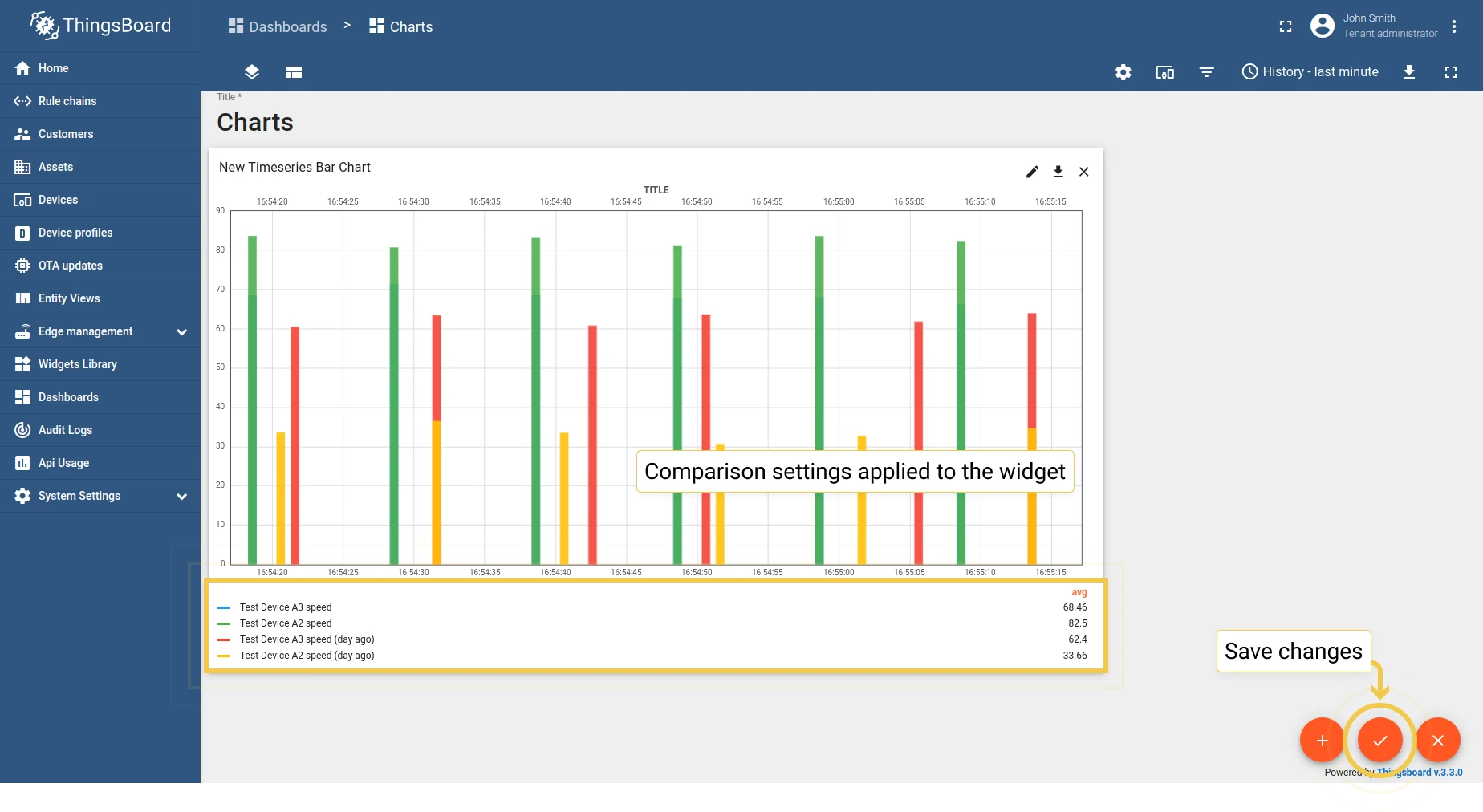
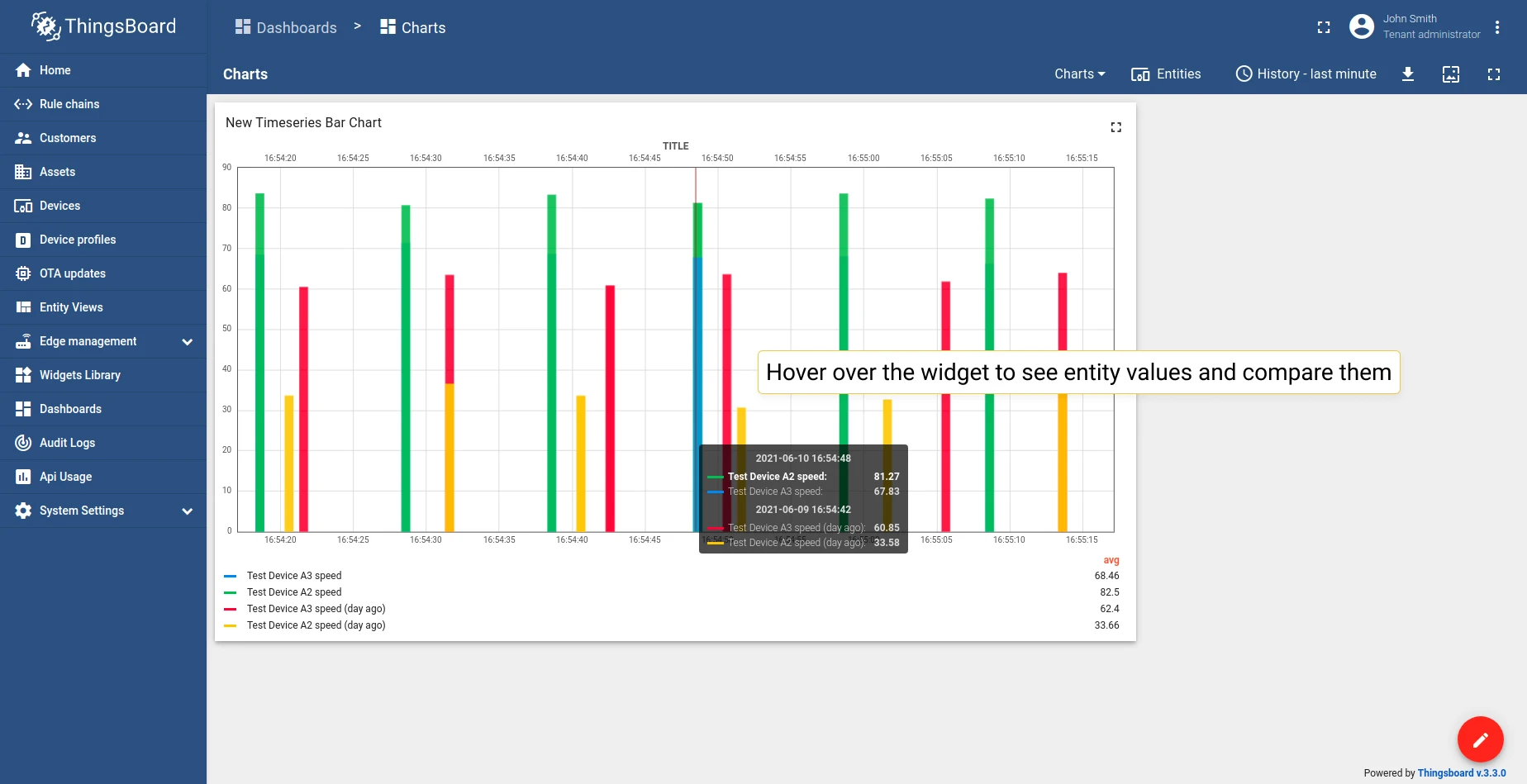
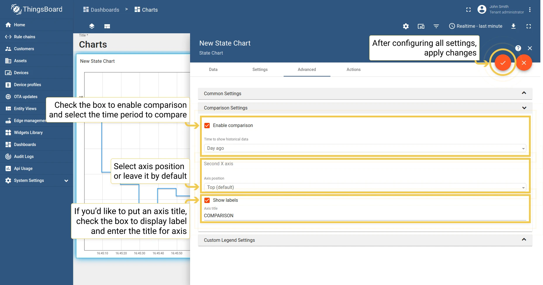
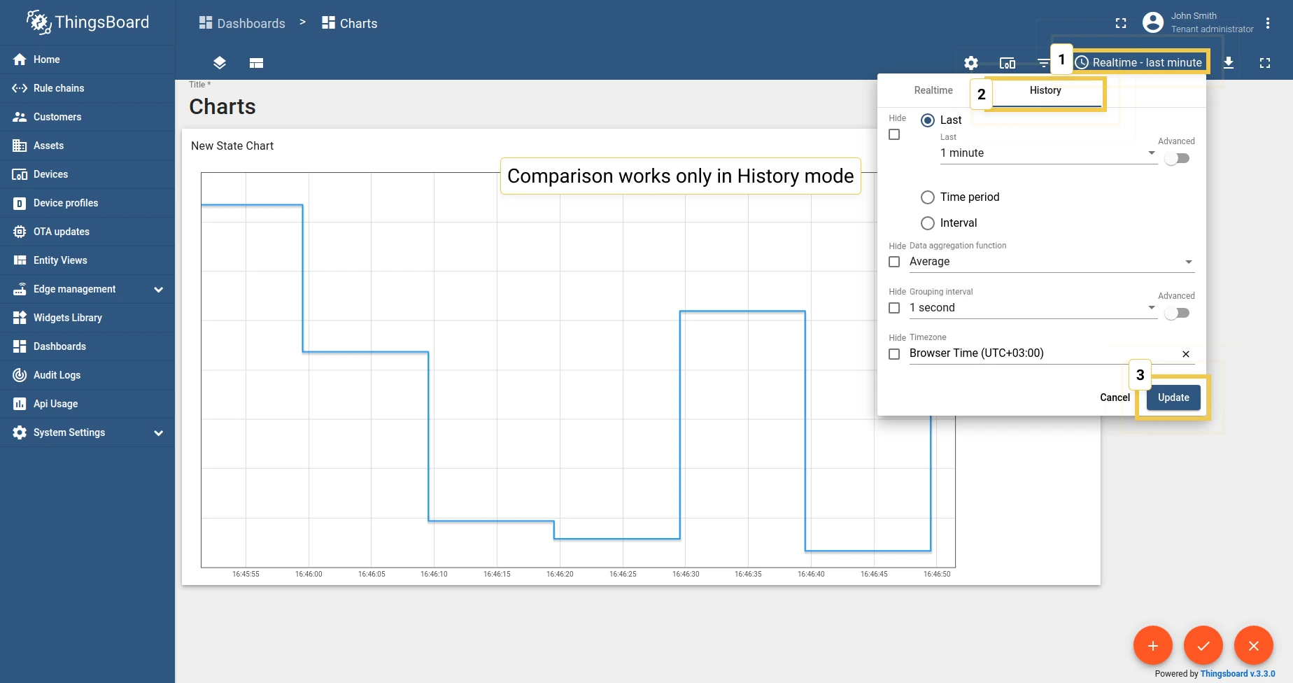
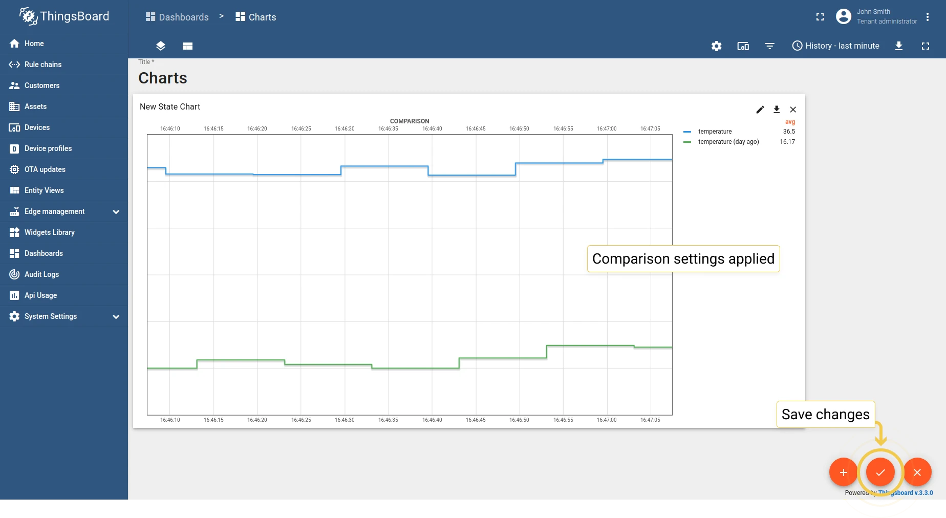
2. Comparison settings
Section titled “2. Comparison settings”Compare values with historical data over different time periods. Works in History time window mode only.
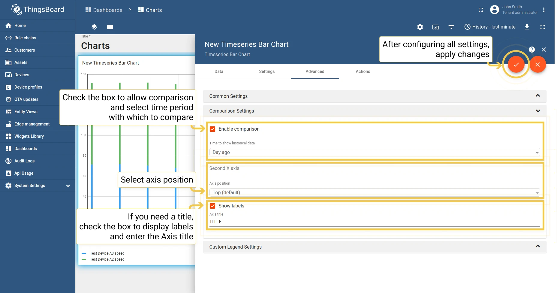
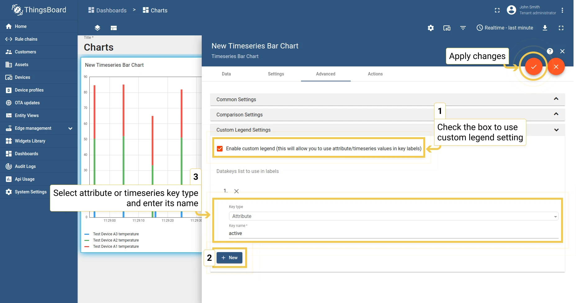
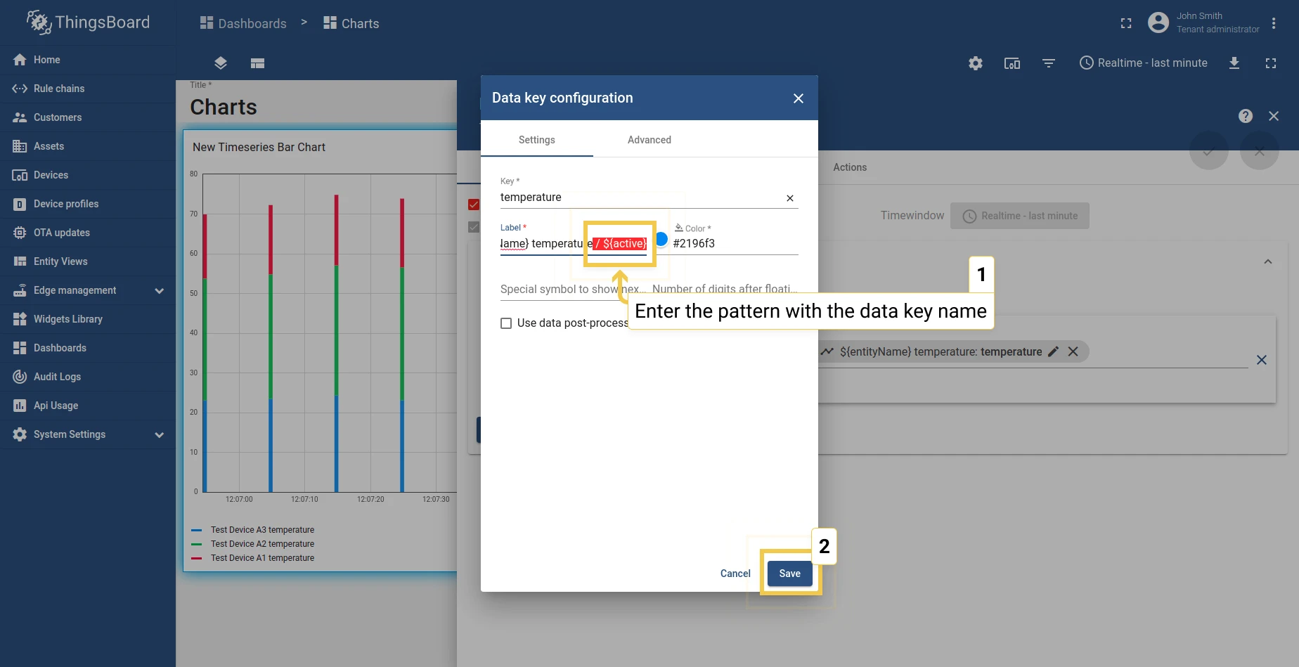
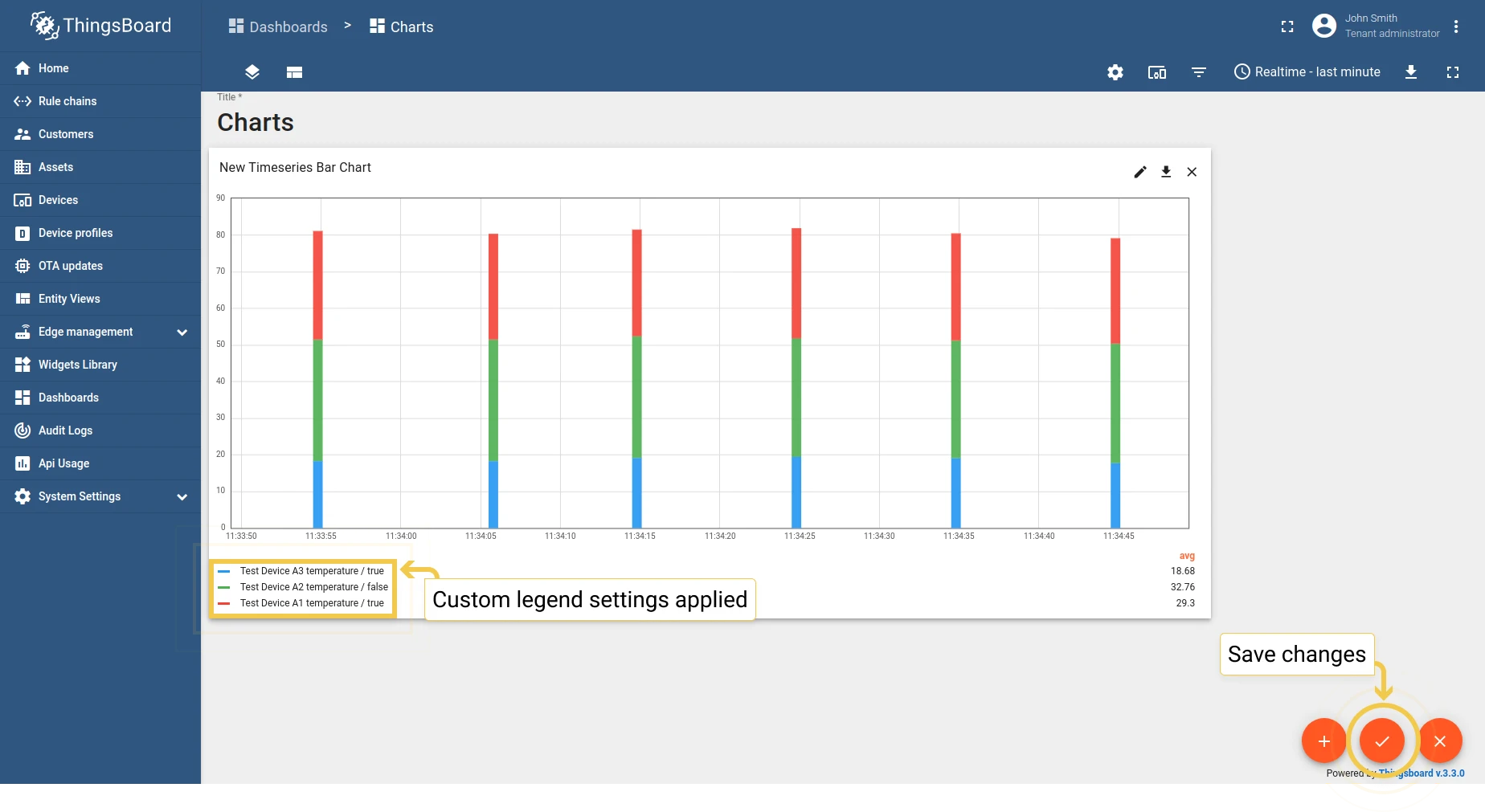
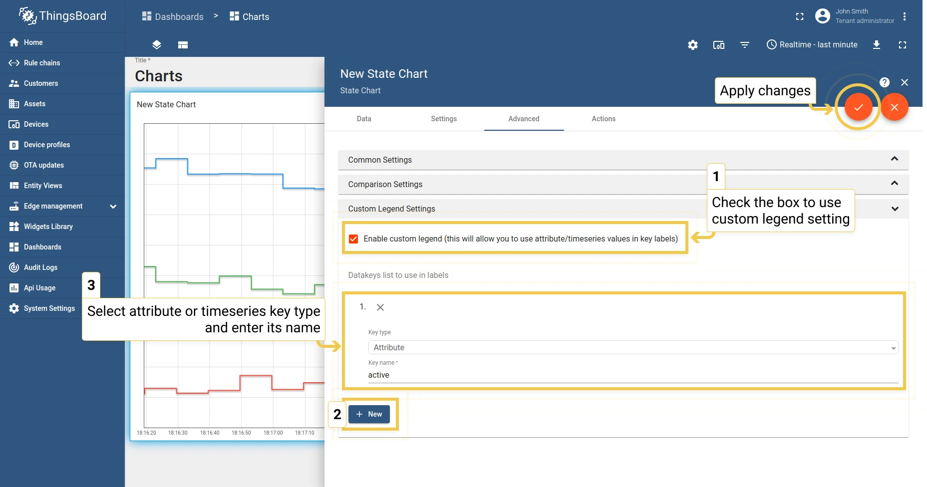
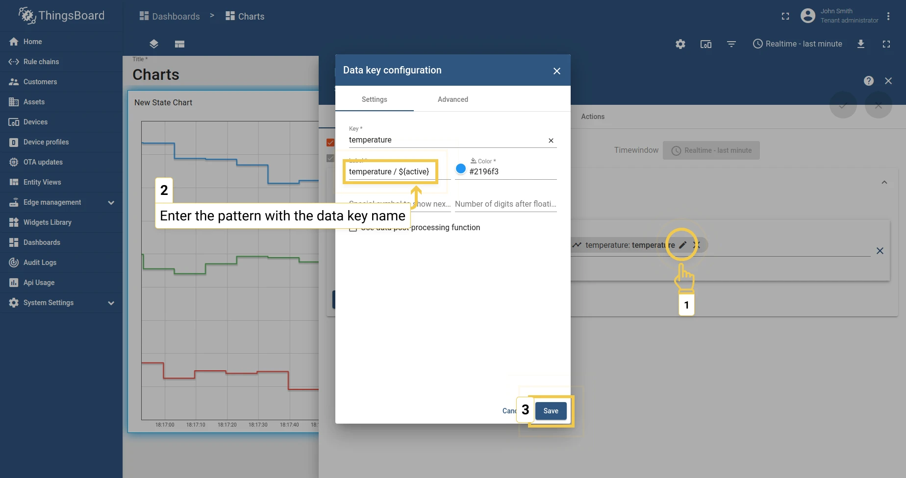
3. Custom legend settings
Section titled “3. Custom legend settings”Display attributes in the legend using the ${} pattern syntax — for example, ${active} to show an entity’s active status.
Time series Line Chart
Section titled “Time series Line Chart”Advanced settings for the Line Chart are the same as for the Bar Chart, with two additional options:
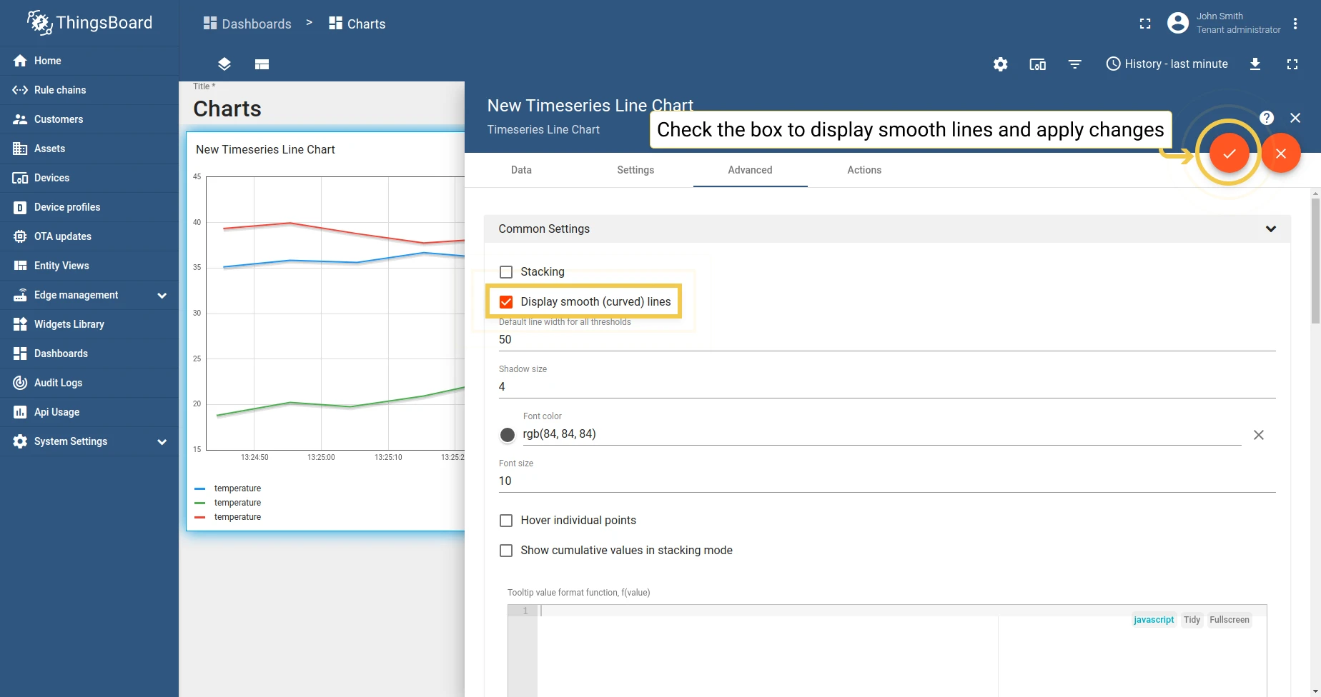
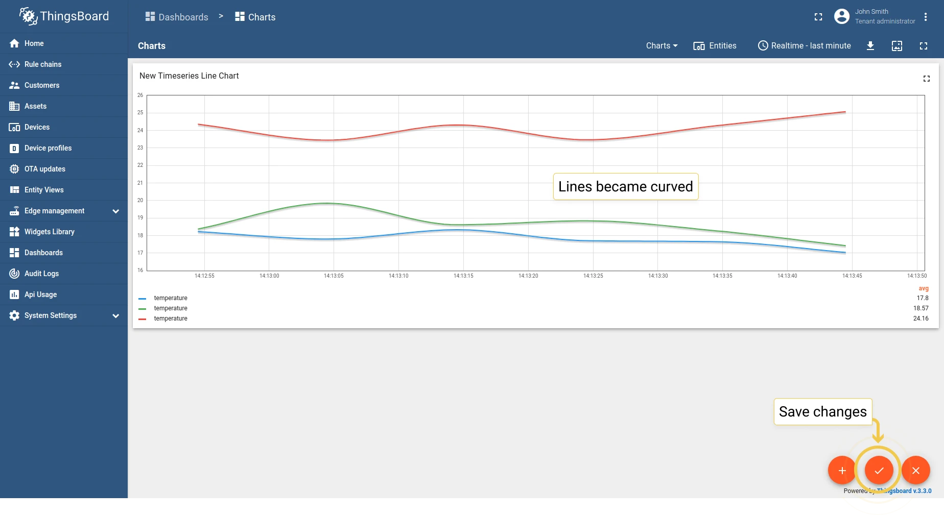
1. Display smooth (curved) lines — toggle between straight and curved line segments.
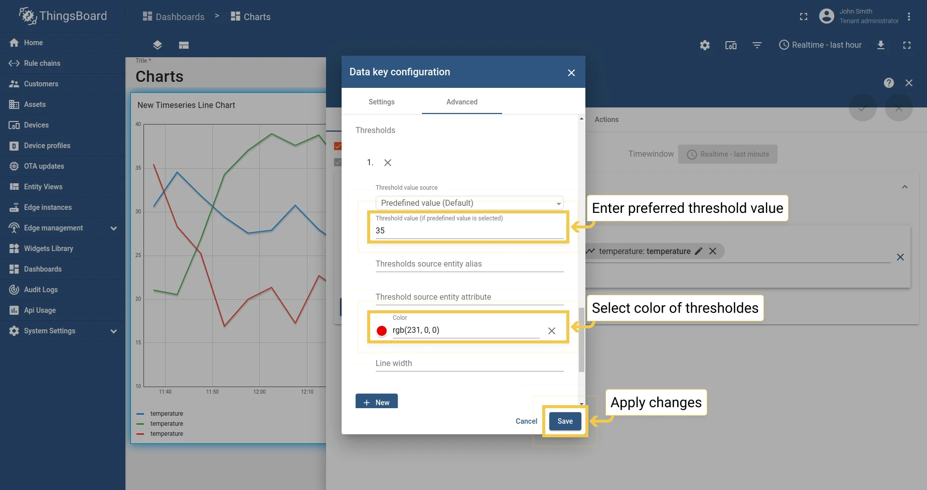
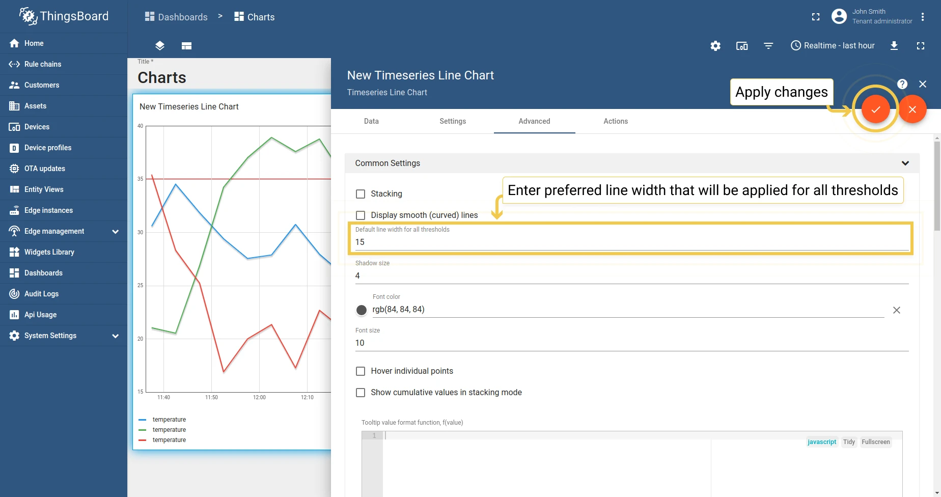
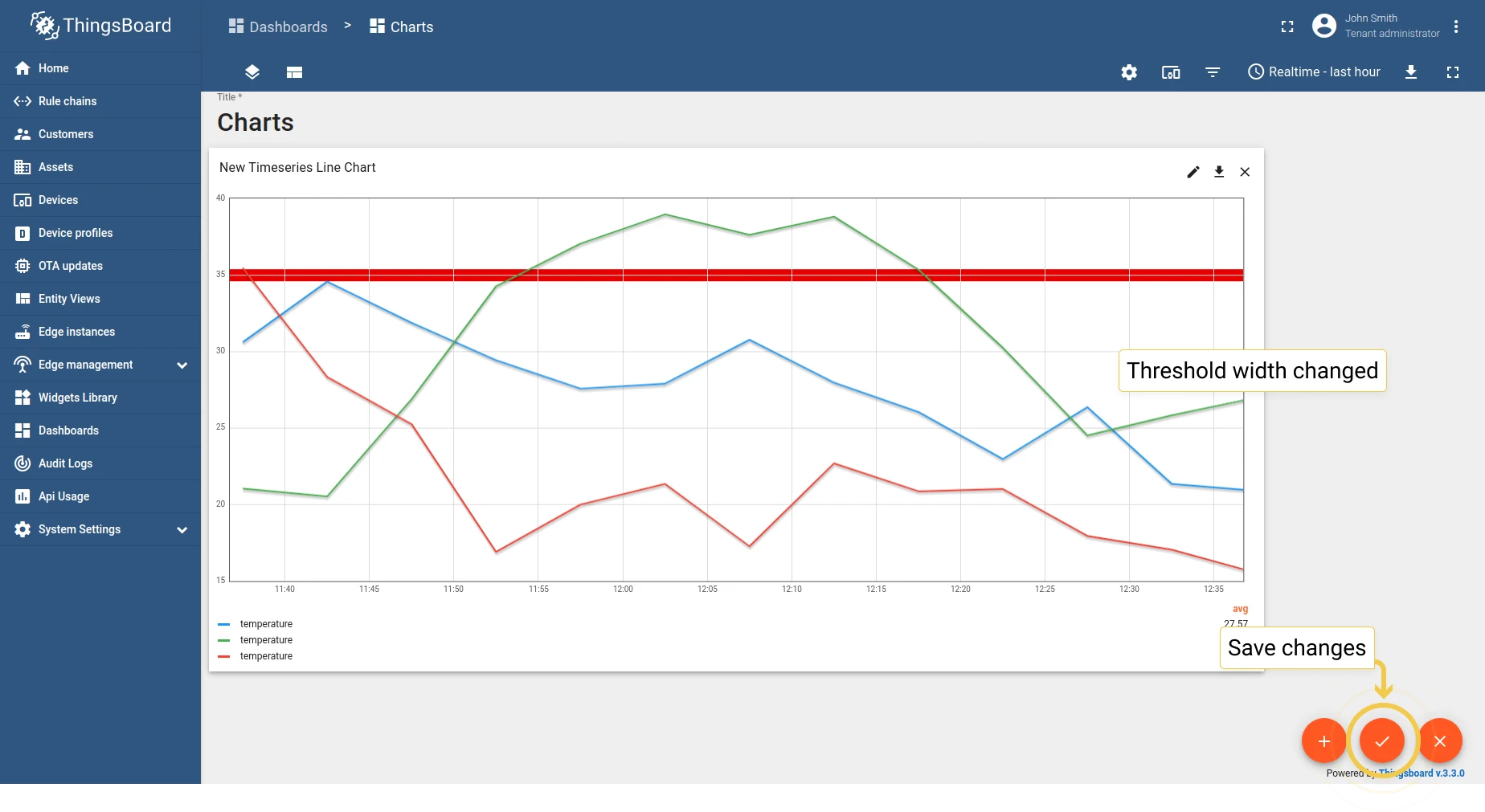
2. Default line width for all thresholds — set the line width and configure threshold lines.
State Chart
Section titled “State Chart”1. Common settings
Section titled “1. Common settings”The State Chart shares most common settings with the Bar Chart, with these additions:
- 1.1 Stacking — same as Bar Chart.
- 1.2 Display smooth (curved) lines — same as Line Chart.
- 1.3 Hover individual points — show/hide data points on hover.
- 1.4 Cumulative values in stacking mode — display cumulative totals.
1.5 Tooltip value format function — customize the tooltip display.
1.6 Grid settings — same as Bar Chart.
1.7 Axis settings — same as Bar Chart.
1.8 Ticks formatter function — same as Bar Chart.
2. Comparison settings
Section titled “2. Comparison settings”Same as Bar Chart — compare with historical data.
3. Custom legend settings
Section titled “3. Custom legend settings”Same as Bar Chart.
Latest values Pie - Flot
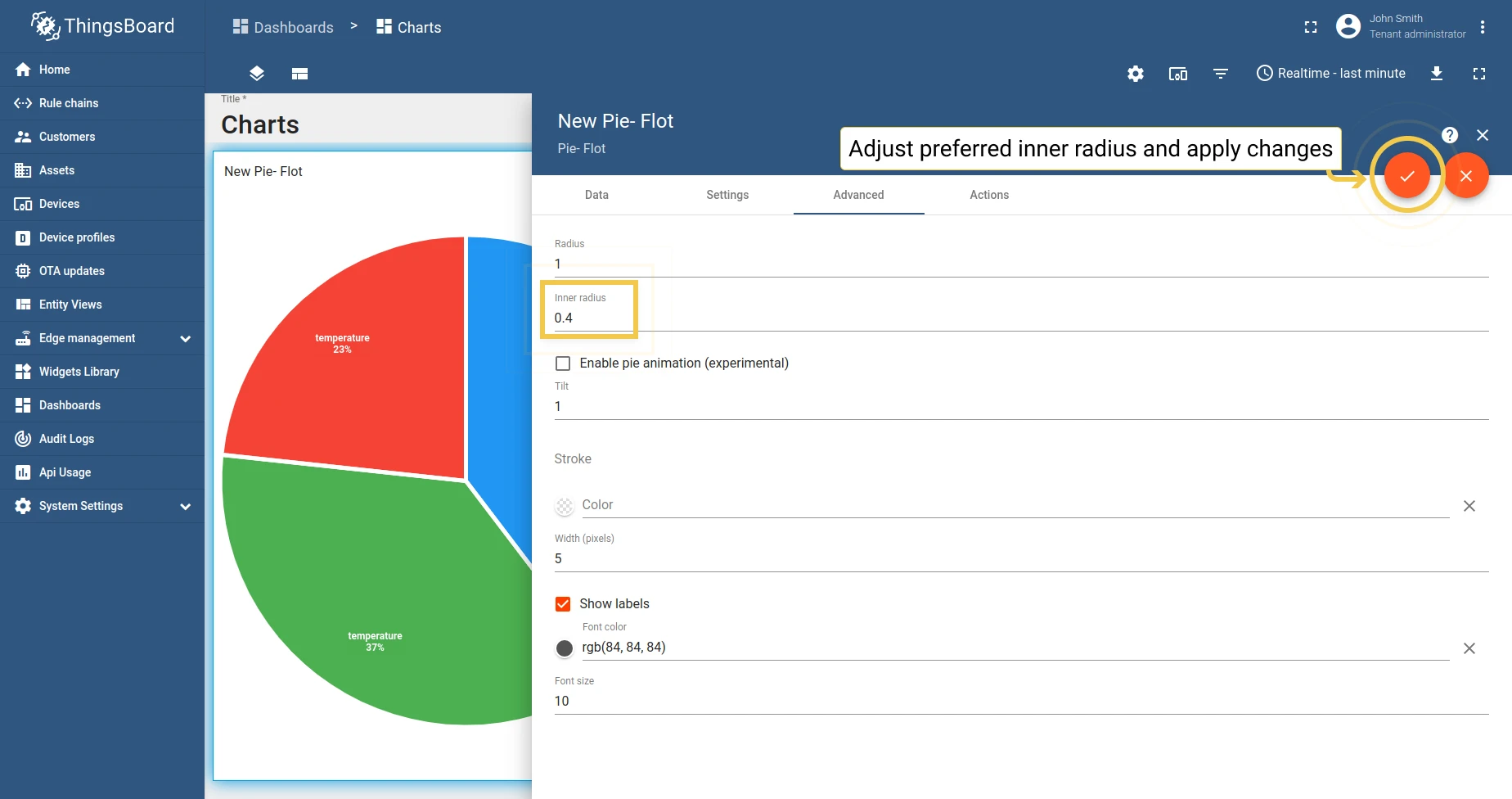
Section titled “Latest values Pie - Flot”1. Radius
Section titled “1. Radius”Set the pie radius as a fraction (0 to 1) of the available space, or use a direct pixel value.
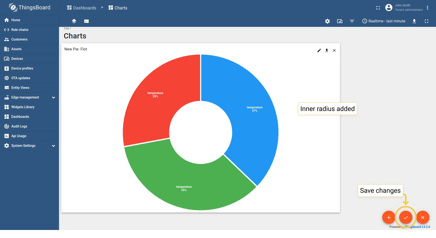
2. Inner radius
Section titled “2. Inner radius”Set the inner radius to create a donut-style pie chart.
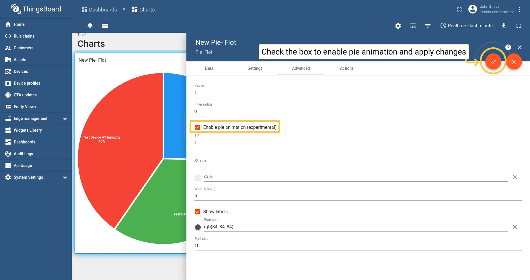
3. Enable pie animation
Section titled “3. Enable pie animation”Enable smoother transitions when data changes.
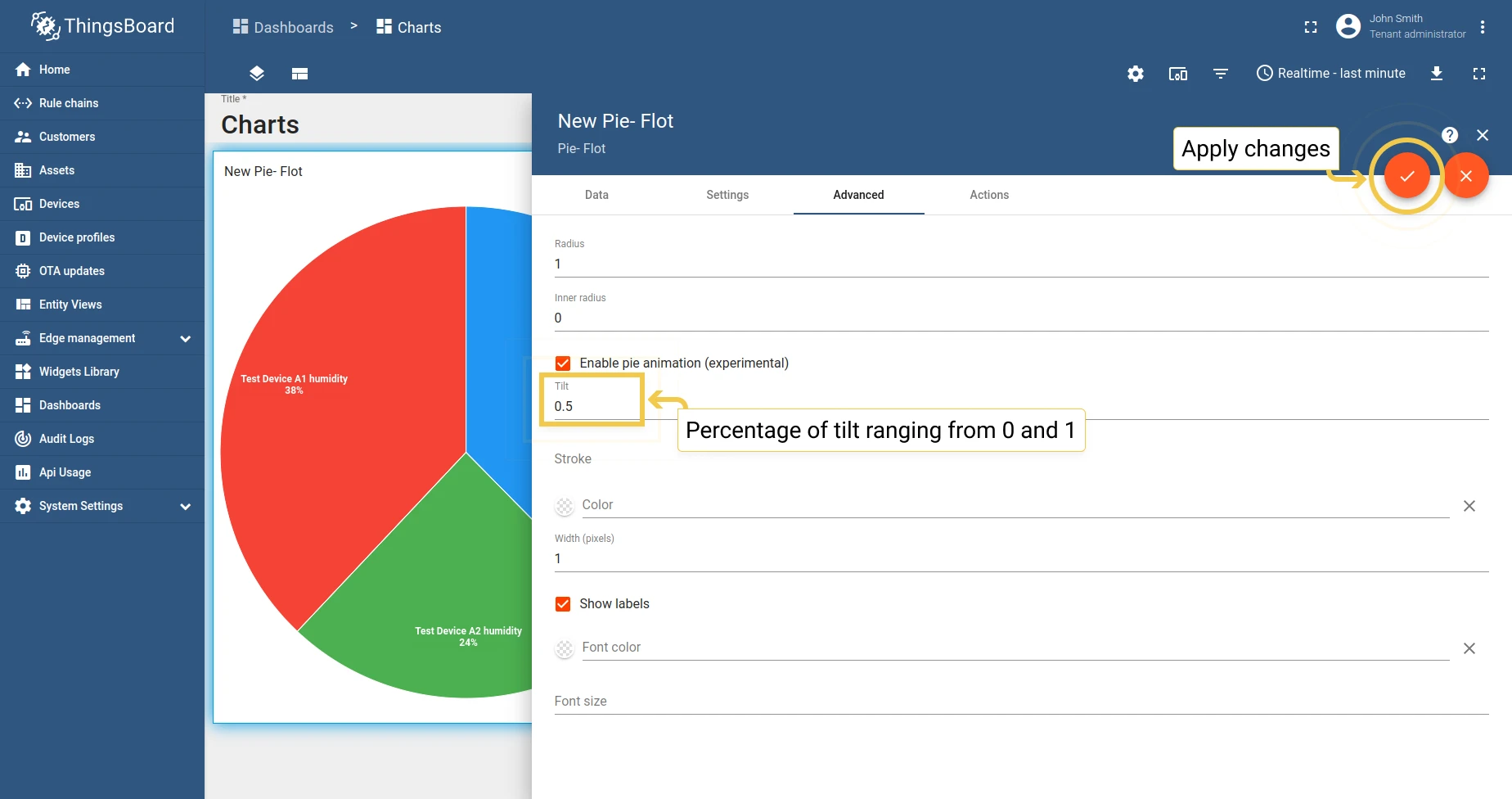
4. Tilt
Section titled “4. Tilt”Adjust the tilt (0 to 1) to change the perspective from vertical to horizontal.
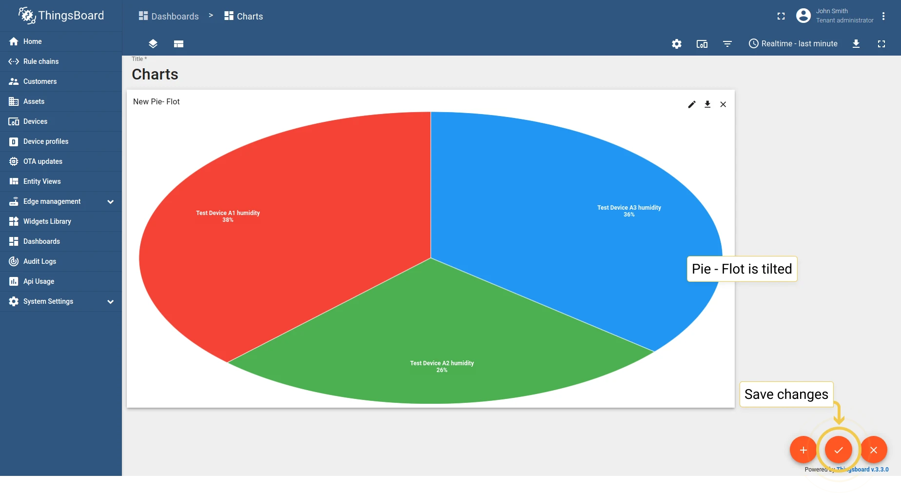
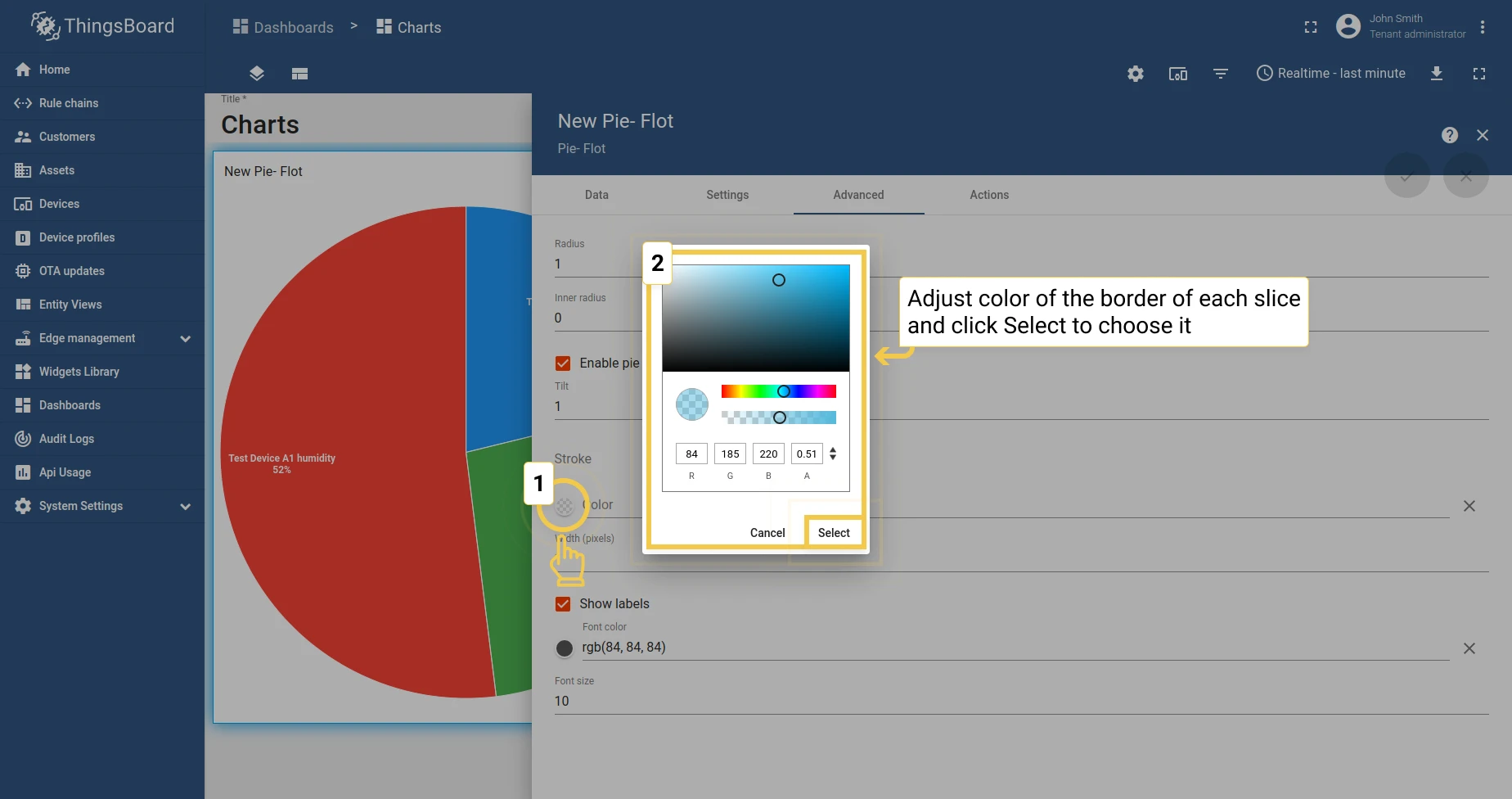
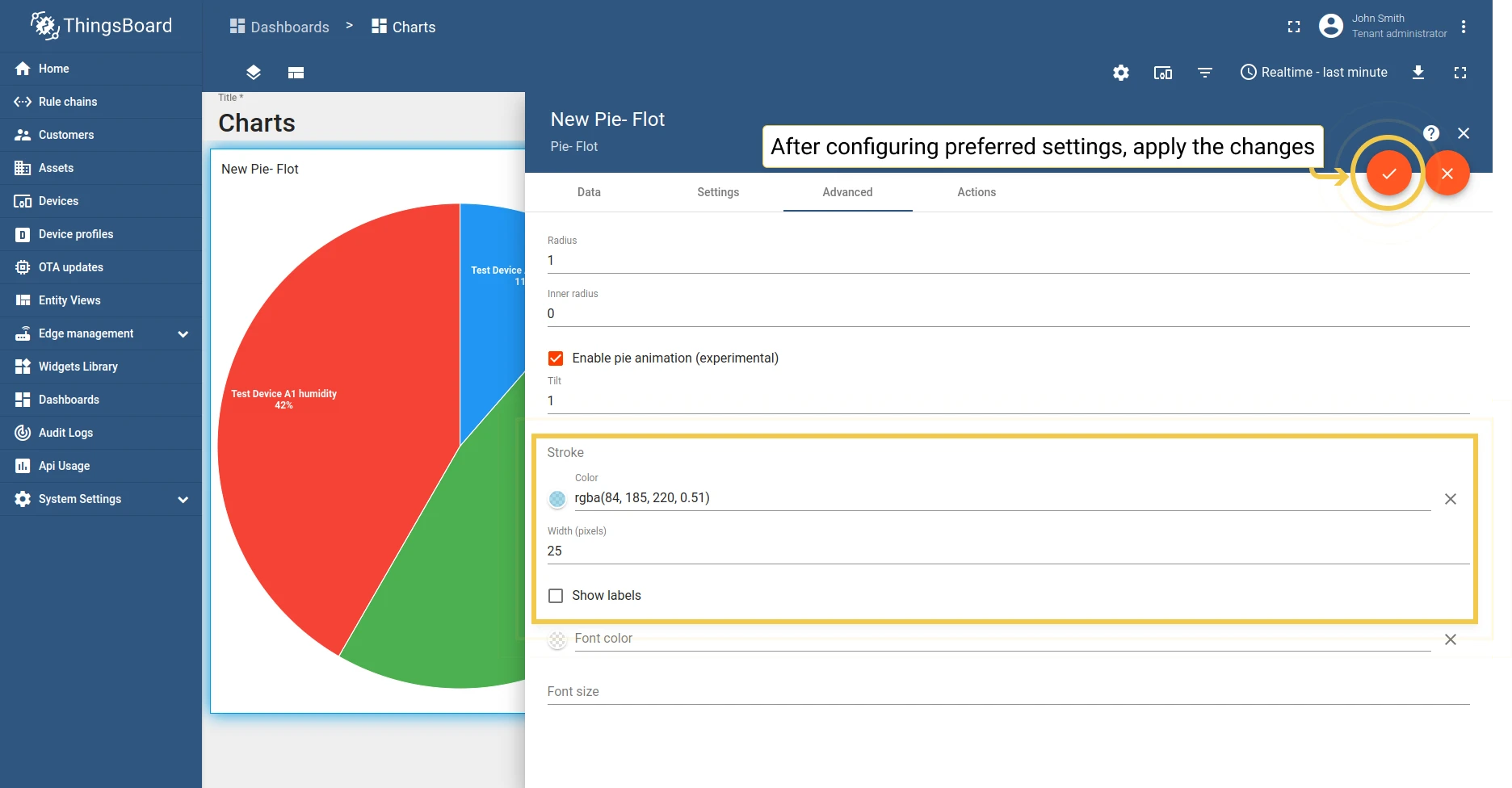
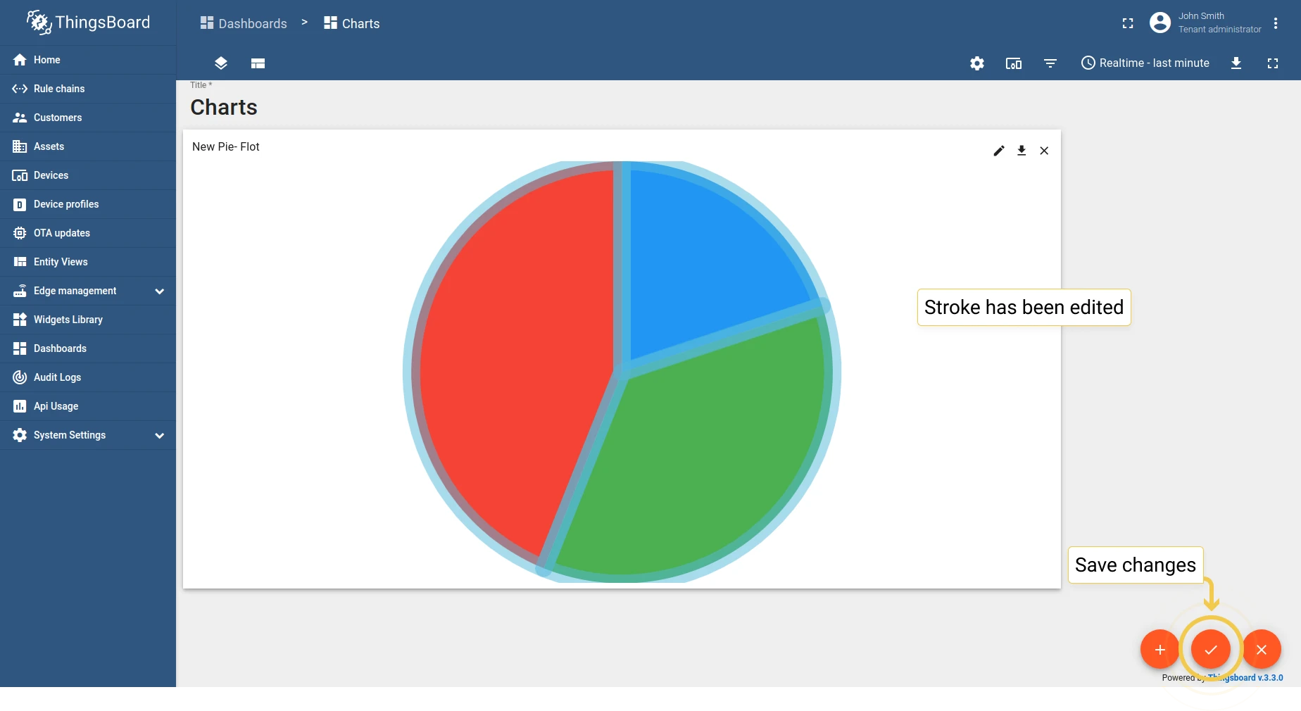
5. Stroke
Section titled “5. Stroke”Configure the stroke color, width, and label visibility.
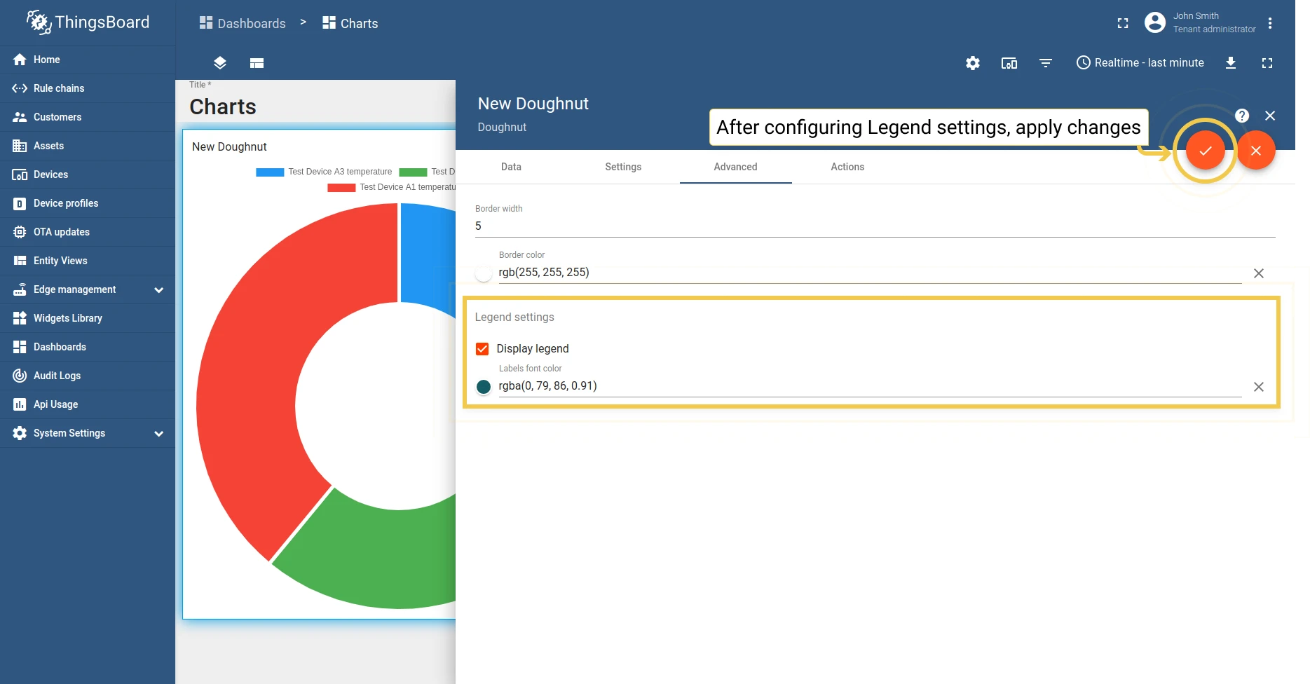
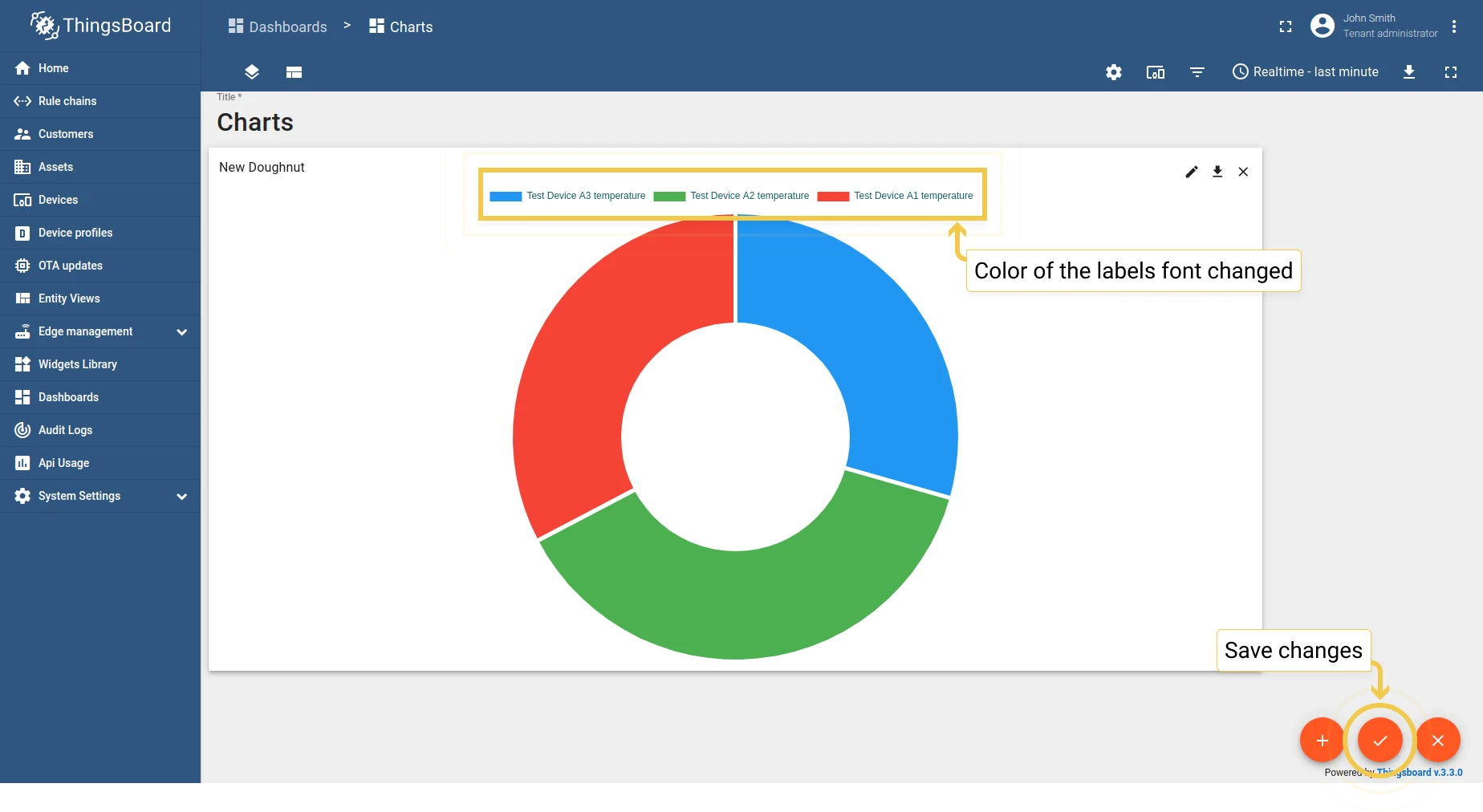
Latest values Doughnut
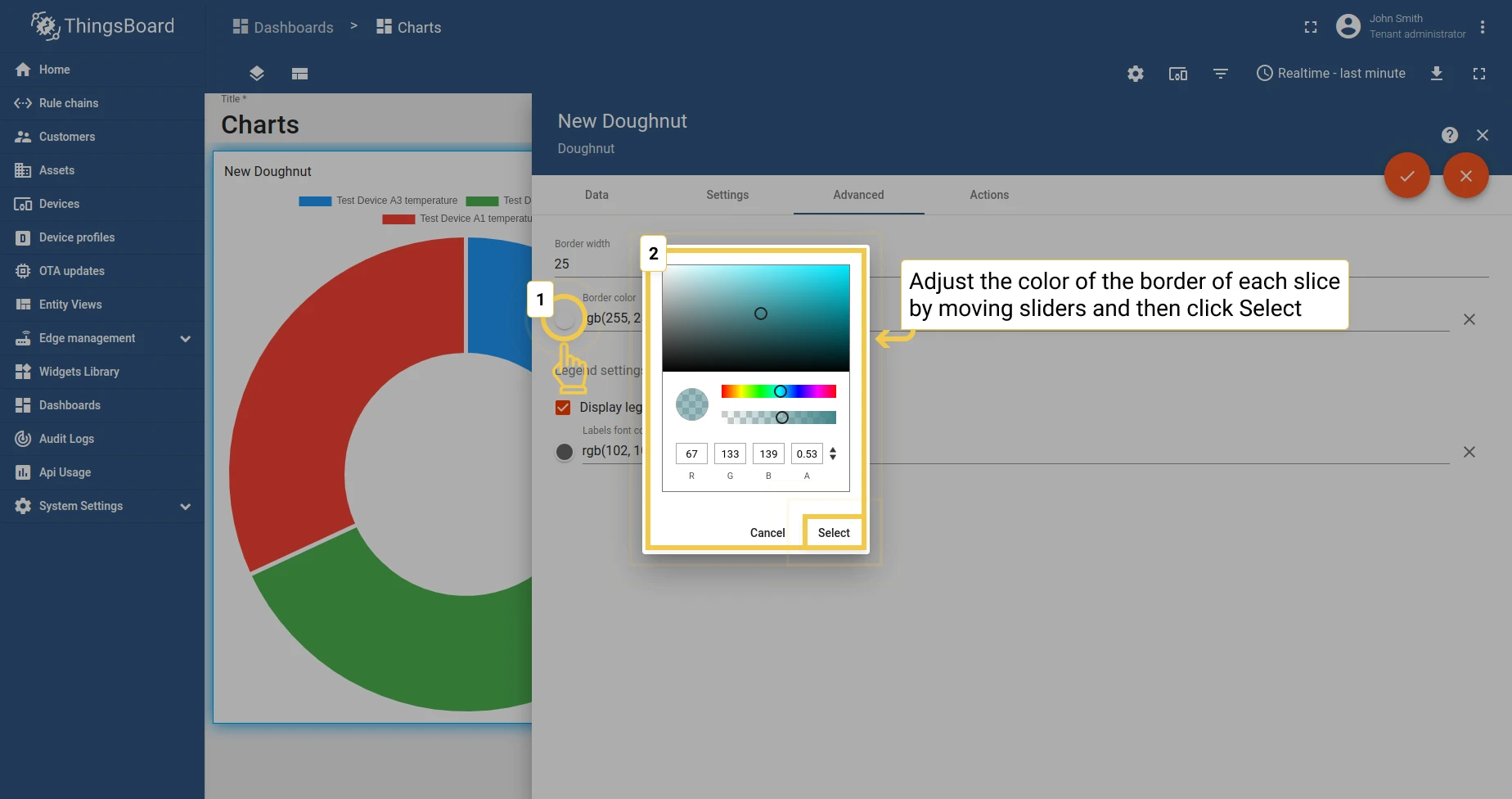
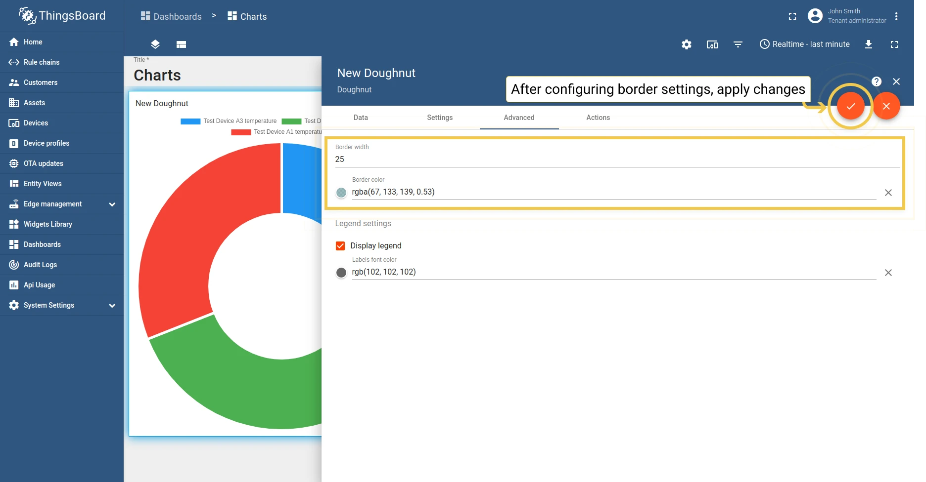
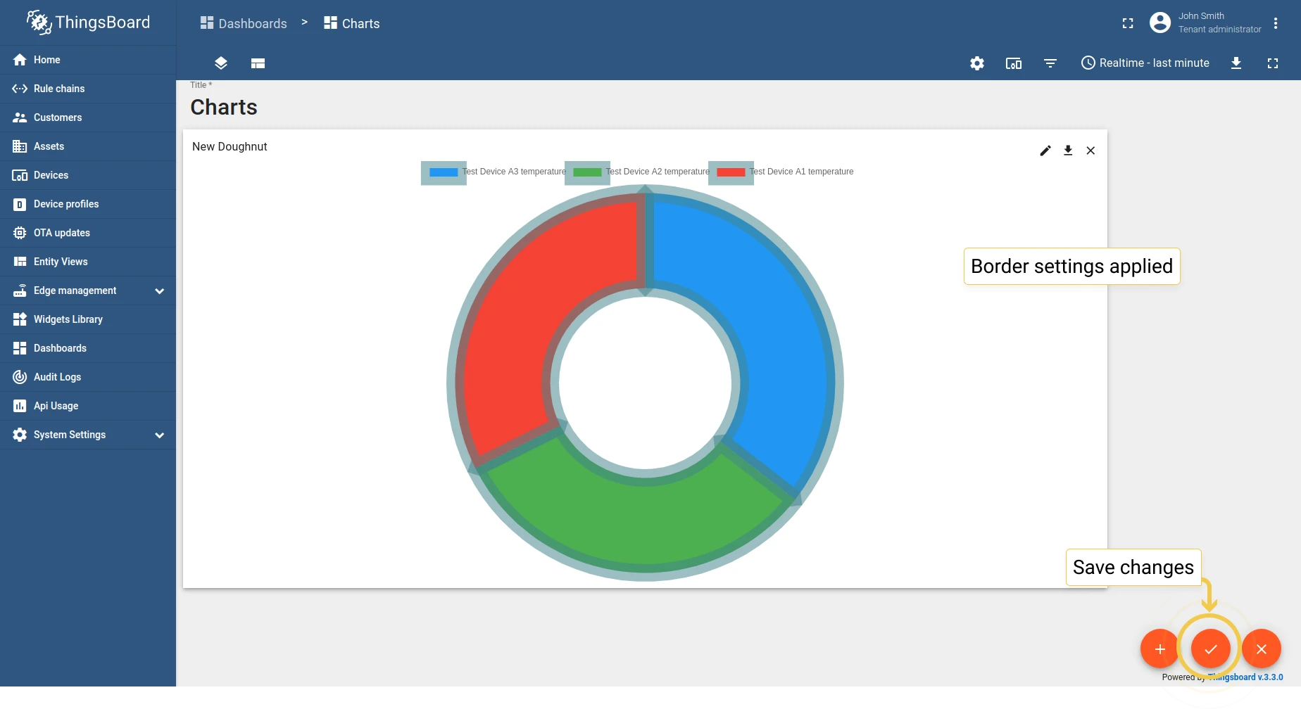
Section titled “Latest values Doughnut”1. Border
Section titled “1. Border”Configure the border color and width.
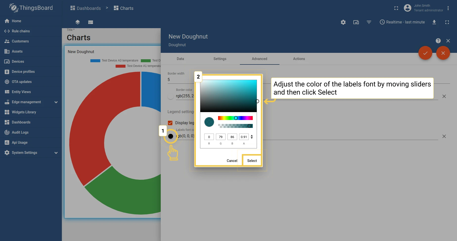
2. Legend settings
Section titled “2. Legend settings”Configure legend label font color and visibility.
Was this helpful?