- Introduction
- Advanced data key configuration
- Advanced data key configuration for “Charts” widget bundle
Introduction
Advanced data key configuration is responsible for the visibility, style, and appearance of a specific data key column or line on a chart on the widget.
The “Alarms table” widget and “Tables”, “Entity widgets”, and “Entity admin widgets” bundles have the same advanced data key configuration.
The “Charts” widget bundle has its unique advanced data key configuration.
All other widget bundles have only basic data key configuration.
To enter a data key configuration, click the pencil icon on the specific data key you want to adjust.

Advanced data key configuration
As we know, the “Alarms table” widget, “Tables”, “Entity widgets”, and “Entity admin widgets” bundles have the same advanced data key configuration. Let’s go through the advanced data key configuration for these widgets using the “Entities table” widget from the “Tables” bundle as an example.
Please follow these steps to start the advanced configuration of the key data.
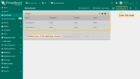
- Open the dashboard and enter edit mode by clicking the button in the top right corner of the screen;
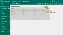
- In the top right corner of the widget, click the "pencil" icon to open the widget editing window;
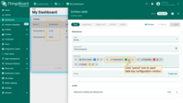
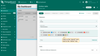
- Now, click "pencil" icon to next to the key that you want to edit;
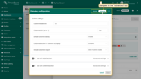
- The data key configuration window has been opened. Navigate to the "Advanced" tab to open advanced data key configuration.
Custom header title
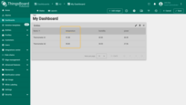
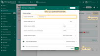
By default, the column name is the same as the key name. The “Custom header title” option allows you to change the column caption to whatever you prefer.

Column width (px or %)
The “Column width” function allows you to adjust the width of the column in pixels or percentages. Manually enter the desired width (for example, 200px). In the same way, you can change the width as a percentage.
Cell style function
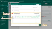
The “Cell style function” allows adjusting the color of rows based on values, entity, or ctx. To configure the cell style function, you should check the Use cell style function box and input the function in the Cell style function field below.
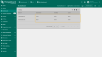
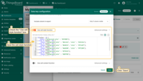
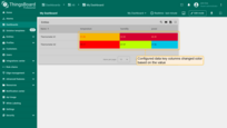
An example of a cell style function where the cell color changes depending on its values:
1
2
3
4
5
6
7
8
9
10
11
12
13
14
15
16
17
if(value < 0) {
   return {"background-color" : "#5F4DEB"};
} else if (value < 35) {
    return {"background-color" : "#62c5e3", "color" : "#19154a"};
} else if (value < 45) {
    return {"background-color" : "#b50232", "color" : "#f7e18f"};
} else if (value < 55) {
    return {"background-color" : "#e6b500", "color" : "#ff2200"};
} else if (value < 65) {
    return {"background-color" : "#ff9419"};
} else if (value < 75) {
    return {"background-color" : "#d0ff00"};
} else if (value < 85) {
    return {"background-color" : "#35c433"};
} else {
    return { "background-color" : "red" };
}
Cell content function
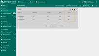
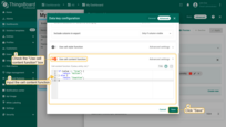
The “Cell content function” allows changing the text of the data key column based on the value, entity, or ctx. To configure the cell style function, you should check the Use cell content function box and input the function in the Cell content function field below.
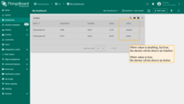
In the example, we have two possible device answers: true or false. Cell content function can change the answers text. It is acceptable when devices are not so many.
1
2
3
4
5
if (value == "true") {
    return "Active";
} else {
    return "Inactive";
}
However, sometimes reading return text to determine if a device is active or inactive isn’t convenient. The cell content function offers a more user-friendly approach, allowing the configuration of a custom function to visually represent the device’s status as active or inactive (refer to the example function below).


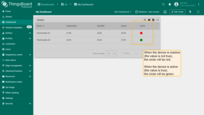
Configurable function to display an active/inactive status:
1
2
3
4
5
if (value == "true") {
    return '<div style="border-radius:50%;background-color:green;width:18px;height:18px"></div>';
} else {
    return '<div style="border-radius:50%;background-color:red;width:18px;height:18px"></div>';
}
Default column visibility
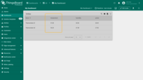
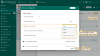
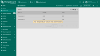
The “Default column visibility” function for the column allows you to choose whether the data key column will be visible on the widget or hidden. This is especially helpful when exporting a widget when you need to exclude a specific data key.
Column selection in ‘Column to display’
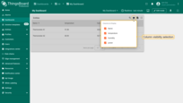
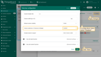
The “Column selection in ‘Column to display’” function allows you to select whether the column will be shown in the visibility selection menu. Therefore, clients without permission cannot hide it.
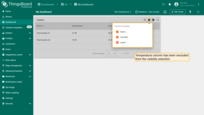
Include column in export
The “Include column in export” function allows you to choose under what conditions a widget can be exported with a specific data key column. There are three options: always, only if column is visible (you can change the visibility in default column visibility), and never.
Advanced data key configuration for “Charts” widget bundle
The advanced data key configuration for the “Charts” widget bundle is different from the advanced data key configuration for other widget bundles.
Let’s break down the data key configuration using the “Timeseries Line Chart” widget from the “Charts” bundle as an example.
Please follow these steps to start the advanced configuration of the data key.
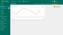
- Open the dashboard and enter edit mode by clicking the button in the top right corner of the screen.;
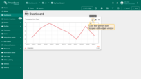
- In the top right corner of the widget, click the "pencil" icon to open the widget editing window;
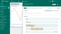
- Now, click "pencil" icon to next to the key that you want to edit;
- The data key configuration window has been opened. Navigate to the "Advanced" tab to open advanced data key configuration.
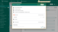
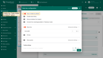
Data is hidden by default
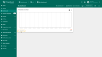
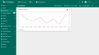
By default, all data from the keys specified in the data source is displayed on the chart.
Enable the “Data hidden by default” function for the selected key so that the data for this key is hidden by default on the chart.

Disable data hiding
Enable the “Disable data hide” function for the selected key so that you and your users cannot hide the data on the chart by clicking on the key name.
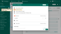

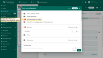
Remove datakey from legend
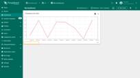
Enable the “Remove datakey from legend” function to prevent the selected key from being displayed in the legend.
Exclude from stacking
You can exclude a specific key from the stacking. This function is only available in “Stacking” mode. Read more about stacking mode and how to use it here.
Show line
You can show/hide the line on the chart using the “Show line” function and set the line width in pixels.
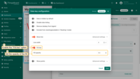
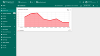
Fill line
Enable the “Fill line” function to fill the space between the line and the bottom border of the chart. You can also specify the fill’s opacity within the range of 0 to 1.
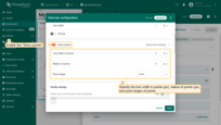
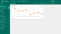
Show points
Enable the “Show points” function to display data points on the chart. You can also specify the line width of points (in pixels), their radius (in pixels), and their shapes.
Tooltip settings
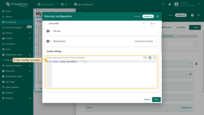
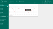
Customizing the tooltip through the advanced widget settings is a basic setting that applies to all data keys simultaneously. Read more about Tooltip settings for widget here.
By using the “Tooltip value format function” for the selected data key, you can configure the values that will be displayed in the tooltip only for that data key, and the basic tooltip function will be overwritten by this configuration.
Vertical axis
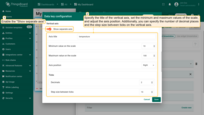
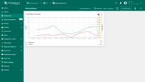
Enable “Show separate axes” to display a separate axis for this data key. For this axis, you can set your own title, minimum and maximum values of the scale, specify the number of decimal places, and the step size between ticks on the vertical axis.

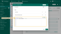
In the “Ticks formatter function” window, specify the function that will format the value to be displayed as Y axis tick.
Thresholds
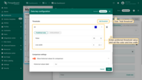
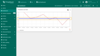
Use this function to set a threshold value for the selected key. The threshold value will be displayed on the chart as a horizontal line. You can specify the color and width of this line.
Comparison settings
Display historical data on the graph to easily compare data for different time periods. This function works when the comparison mode is activated in the widget settings. For more details on comparison settings and how to use it, please read here.


