Heatmap
The Heatmap reveals repeatable patterns and outliers by coloring a grid of cells based on a numeric value — making it immediately obvious which combinations of time, category, or entity stand out from the rest.
- X axis — fields that define the table columns (horizontal dimension)
- Y axis — fields that define the table rows (vertical dimension)
- Value — the numeric field that determines each cell’s color
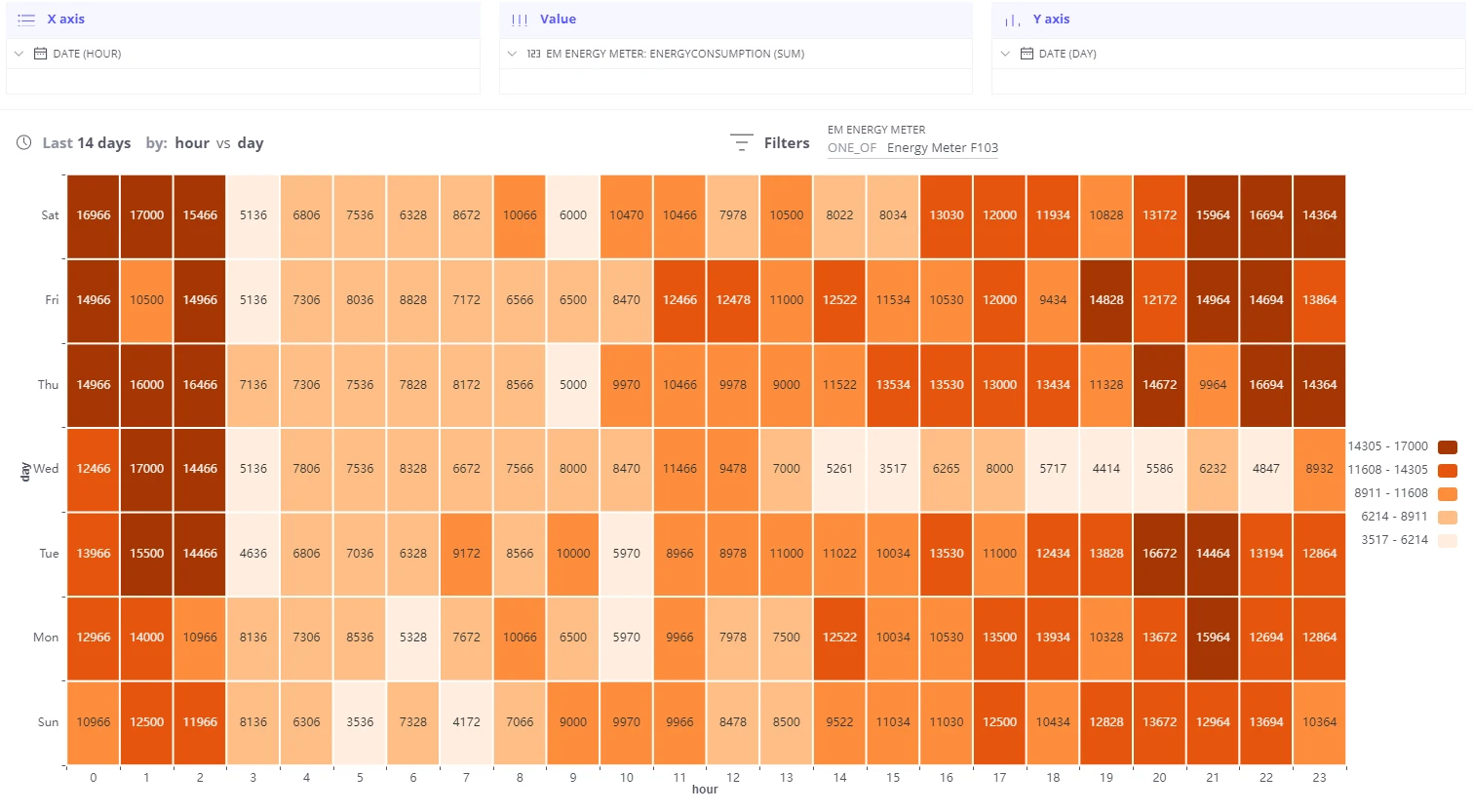
  Y-axis: Day of week  X-axis: Hour of day  Value:  energy_consumption
  Mon │  ░░░▒▒▓▓▓▓▓▒▒░░░░░░░░░░░░  Tue │  ░░░▒▒▓▓▓▓▓▒▒░░░░░░░░░░░░  Wed │  ░░░▒▒▓▓▓▓▓▒▒░░░░░░░░░░░░  Thu │  ░░░▒▒▓▓▓▓▓▒▒░░░░░░░░░░░░  Fri │  ░░░▒▒▓▓▓▓▓▒▒░░░░░░░░░░░░  Sat │  ░░░░░░░░░░░░░░░░░░░░░░░░  Sun │  ░░░░░░░░░░░░░░░░░░░░░░░░       └──────────────────────────          0h                   23h
  ░ low   ▒ medium   ▓ high  Pattern: peak consumption on weekdays 9–14h
Video tutorial
Section titled “Video tutorial”Day, week, and month heatmaps
Section titled “Day, week, and month heatmaps”Trendz ships with predefined time-bucketing templates. Select one from the By dropdown near the time range selector:
| Template | X axis | Y axis | Useful for |
|---|---|---|---|
| Hour VS Day of Week | Hour (0–23) | Day of week (Mon–Sun) | Weekly usage patterns |
| Minute VS Hour | Minute (0–59) | Hour (0–23) | Sub-hourly patterns |
| Day VS Month | Day of month (1–31) | Month (Jan–Dec) | Seasonal or monthly patterns |
| Hour VS Day of Month | Hour (0–23) | Day of month (1–31) | Intra-day patterns per calendar day |
The example below shows weekly energy consumption: the grid makes it easy to spot which day and hour is most energy-intensive.
Custom axis
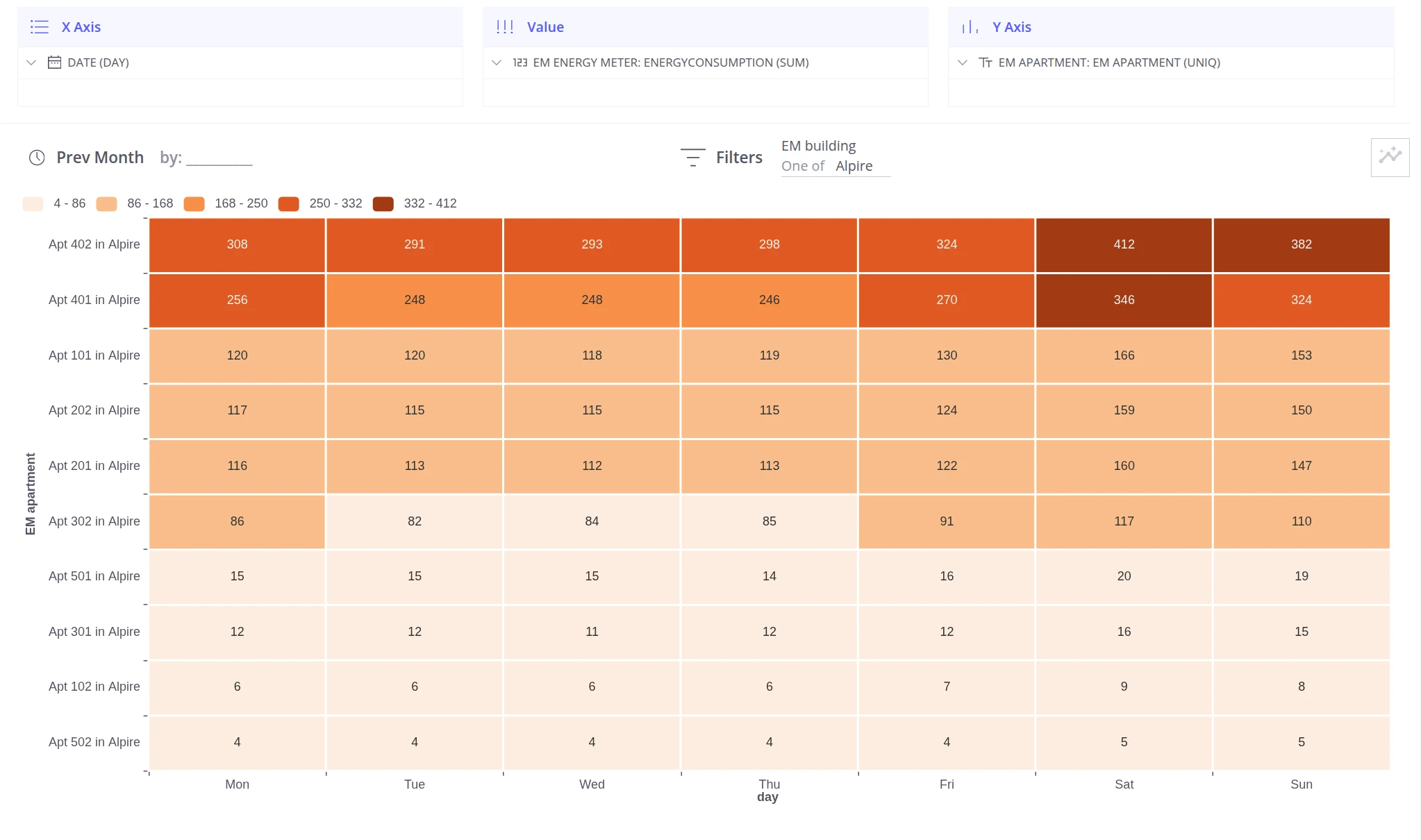
Section titled “Custom axis”When the predefined templates do not match your scenario, configure the X and Y axes manually by dragging any field into the Columns and Rows slots.
Example: energy consumption per apartment per month.
- Each apartment appears as a separate row.
- Each column represents a month of the year.
- Cell value is total energy consumed.
The result makes outliers and their dynamics immediately visible across the full year.
Was this helpful?