Scatter Plot
The Scatter Plot reveals correlations and dependencies between two or more numeric properties. Each data point is a single measurement plotted by its field values on the X and Y axes, making clusters, outliers, and trends immediately visible.
Video tutorial
Section titled “Video tutorial”Compare two dimensions
Section titled “Compare two dimensions”Drop one numeric field onto X-axis and another onto Y-axis. Each measurement becomes a dot at the intersection of its two values.
  Y-axis: heat_consumption  X-axis: energy_consumption
  heat │                    ●       │          ●    ●       │     ●  ●       │   ●       │ ●       └────────────────────── energy         low              high
  Trend: higher energy → higher heat (positive correlation)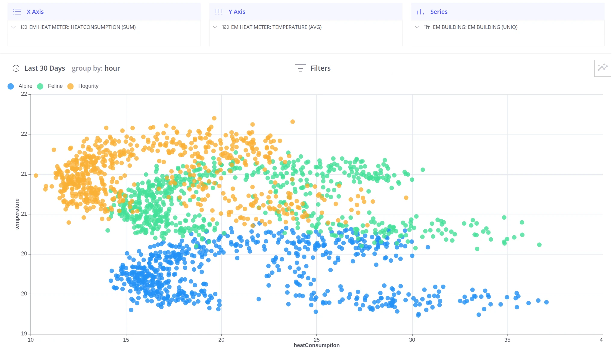
Compare many dimensions
Section titled “Compare many dimensions”When you need to compare more than two dimensions at once, add grouping fields to the Series section. Each unique combination of group values gets a distinct color, making it possible to spot patterns across multiple segments in a single chart.
Example: Compare heat and energy consumption across buildings and floors — each floor of each building is a separate color group.
  Y-axis:  heat_consumption  X-axis:  energy_consumption  Series:  building name + floor
  heat │  ● Retroville F1    ○ Retroville F3       │     ● Astarta F1       │  ○        ○       │     ●  ●     ○       │  ●       └────────────────────────── energy
  ● = Retroville F1/F3 (clustered low-right = efficient)  ● = Astarta F1 (clustered high = less efficient)
Was this helpful?