Card
The Card widget displays a single key metric and lets you monitor its trend by comparing it against a reference value or a previous time period.
Video tutorial
Section titled “Video tutorial”Simple card
Section titled “Simple card”Drop the field you want to monitor into the Main Value slot and choose an aggregation type (sum, average, last, etc.). The card shows the aggregated result for the current time range.
Compare with another value
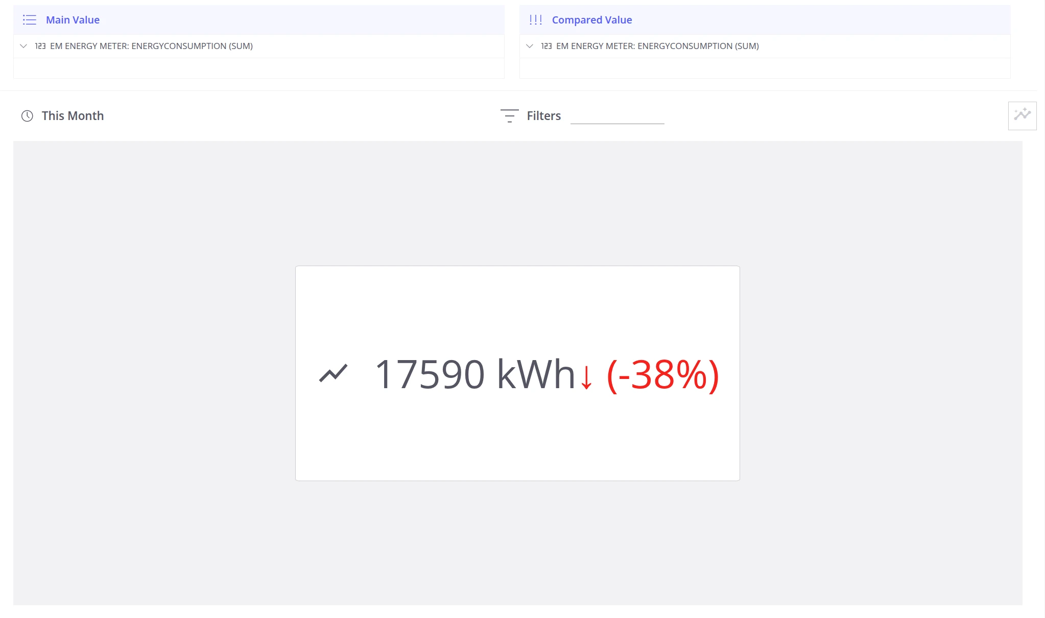
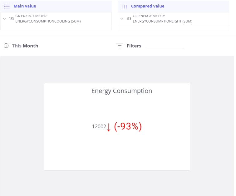
Section titled “Compare with another value”To show how a metric compares against a target or another measurement, add a second field to the Compared value slot. The card renders the difference between the two figures as a percentage badge — green when the main value is above the compared value, red when it is below.
Example: Compare the number of products actually produced against the required production target stored as device telemetry.
Compare with a previous interval
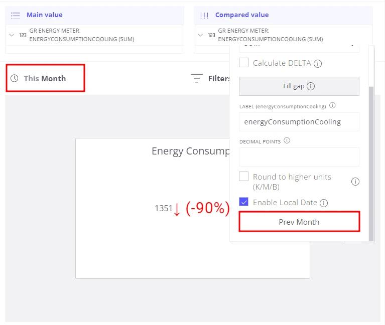
Section titled “Compare with a previous interval”Use Local Date to compare the current period with the immediately preceding one — without building a separate view.
Example: Show how much coffee was consumed this month versus last month.
  Time range selector:  This Month                        ┌────────────────┐  Main Value            │  87 kg         │                        │  ▲ +12%        │  ← vs. Prev Month                        └────────────────┘
  Compared value  ──▶  Local Date ON  +  Prev Month
To configure this:
- Add the same field to the Compared value slot.
- Enable Local Date for that field.
- Set the Compared value time range to Prev Month.
- Set the main view time range to This Month.
The card then shows the percentage change between this month and last month.
Card title
Section titled “Card title”Open Settings (bottom-right corner of the editor) and enter a name in the Title field to label the card for quick identification on a dashboard.
Was this helpful?