Line Chart
The Line Chart view in Trendz plots numeric telemetry over time. It shares its axis and series model with the Bar Chart — the same three sections control what appears on each axis and how data is grouped.
Video tutorial
Section titled “Video tutorial”Chart sections
Section titled “Chart sections”Line and Bar charts use three configurable drop zones:
| Section | Purpose |
|---|---|
| X-axis | Horizontal axis — usually a Date field, but can be any field or combination of fields |
| Y-axis | Vertical axis — drop one or more numeric telemetry fields here with the required aggregation |
| Series | Split data into groups — each group becomes a separate line |
Simple line chart
Section titled “Simple line chart”Drop a Date field onto X-axis and a numeric telemetry field onto Y-axis. Leave Series empty. Trendz plots one line for each entity that has data in the selected time range.
Line chart with series
Section titled “Line chart with series”Multiple telemetry fields as separate lines
Section titled “Multiple telemetry fields as separate lines”To plot several telemetry fields for the same device or asset on a single chart, add each field to Y-axis and leave Series empty. Use Filter to focus on a specific device.
  Y-axis: [ temperature ] [ humidity ] [ pressure ]  Series: (empty)
  ──────────────────────────────────────────────▶ time    temperature  ────────────────────    humidity     ·················    pressure     ─ ─ ─ ─ ─ ─ ─ ─ ─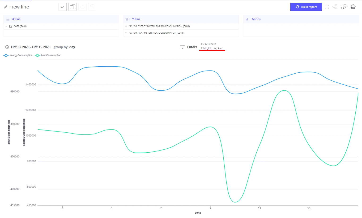
Groups as series
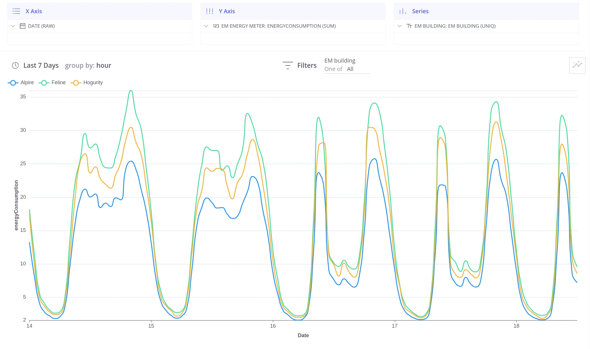
Section titled “Groups as series”To compare the same telemetry across different devices, assets, or categories, add a grouping field (such as a device name or asset attribute) to the Series section. Trendz draws one line per group.
  Y-axis:  [ energy_consumption ]  Series:  [ building name ]
  ──────────────────────────────────────────────▶ time    Building A   ────────────────────    Building B   ·················    Building C   ─ ─ ─ ─ ─ ─ ─ ─ ─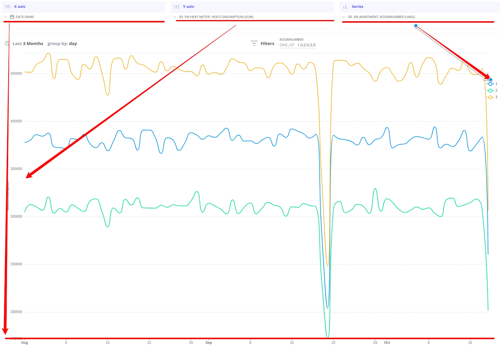
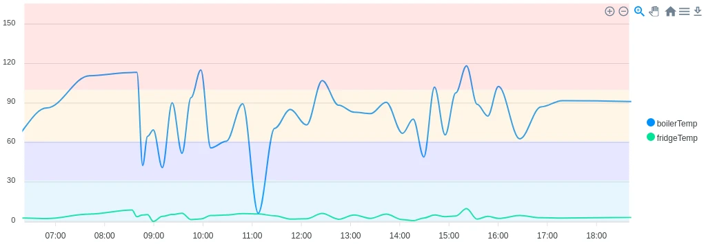
Color zones
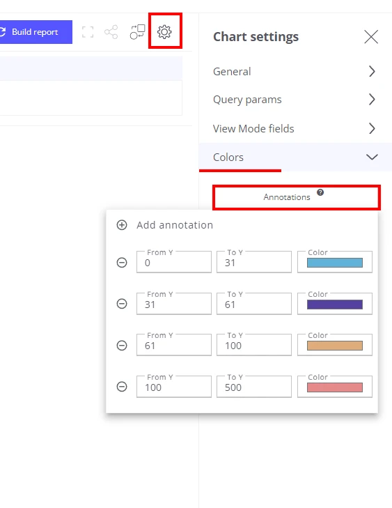
Section titled “Color zones”Color zones mark threshold regions on the chart background to make it immediately visible when a value crosses a limit. Thresholds are static values set at design time.
-
Open the Settings card for the view.
-
Go to the Annotation section.
-
Choose a value and a color, then click OK.
-
Click Build Report.
You can add multiple color zones to a single chart.
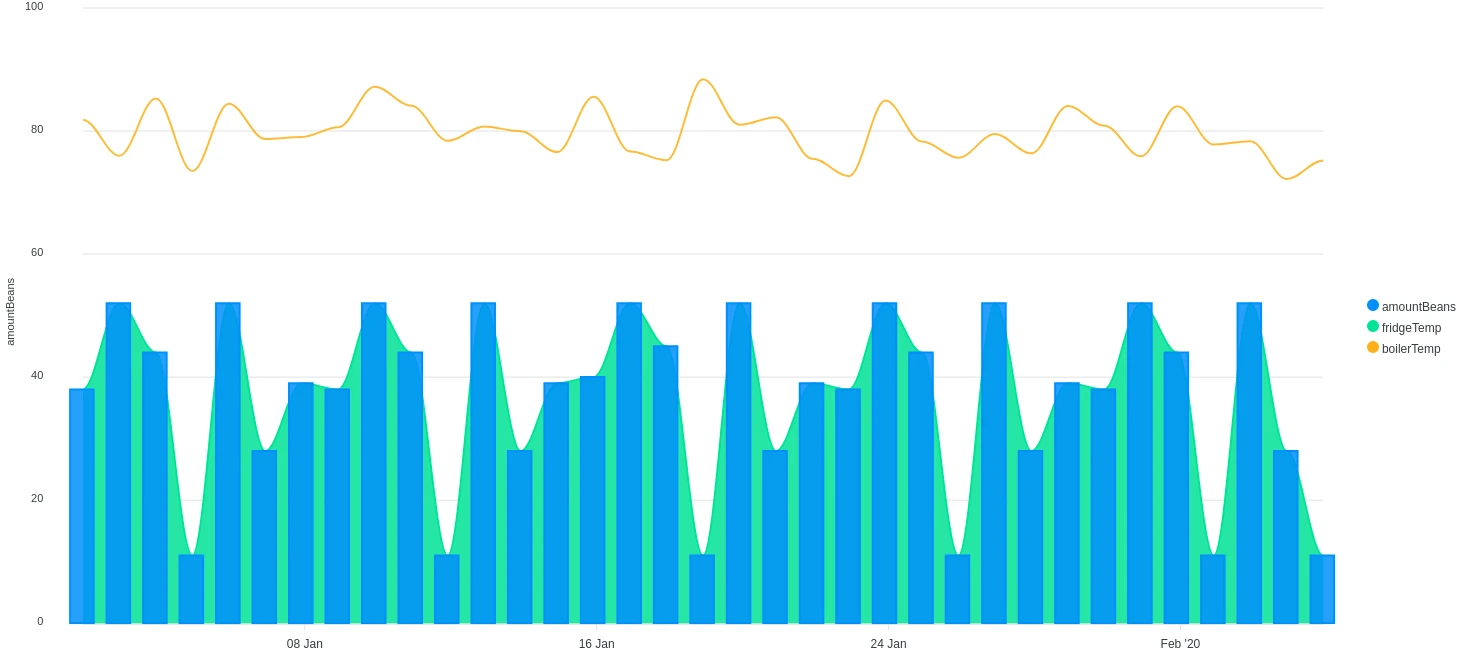
Mixed charts
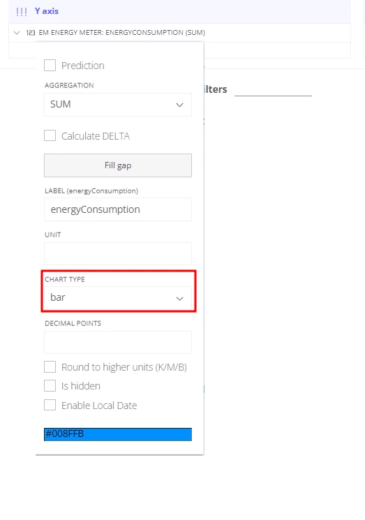
Section titled “Mixed charts”A mixed chart overlays columns, lines, and areas on a shared X-axis, with a separate Y-axis scale for each component. This is useful when combining fields with different units or magnitudes.
-
Open the settings card for the telemetry field you want to change.
-
Choose the chart type: Area, Line, or Bar.
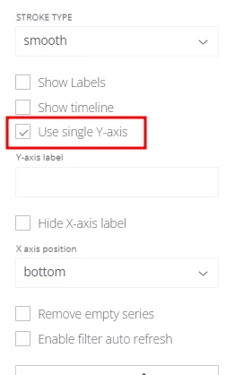
Y-axis control
Section titled “Y-axis control”By default each field on the Y-axis gets its own axis — three fields means three Y-axes on the chart, with the additional axes placed on the right side. When all fields share the same unit, you can merge them onto a single axis.
-
Open View Settings.
-
Enable Single axis.
Was this helpful?