Bar & Histogram
The Bar Chart view shares its axis and series model with the Line Chart — the same X-axis, Y-axis, and Series sections control how data is structured. This page covers bar-specific features: horizontal orientation, stacking, grouping by telemetry value, and value labels. For the basics (axis setup, series, color zones, mixed charts, Y-axis control) see the Line Chart page.
Video tutorial
Section titled “Video tutorial”
Playing this video loads it from YouTube (Google), which sets cookies on its own domain. See our Cookie Policy.
Video: https://www.youtube.com/watch?v=Sc6vySTadCQ
Horizontal bars
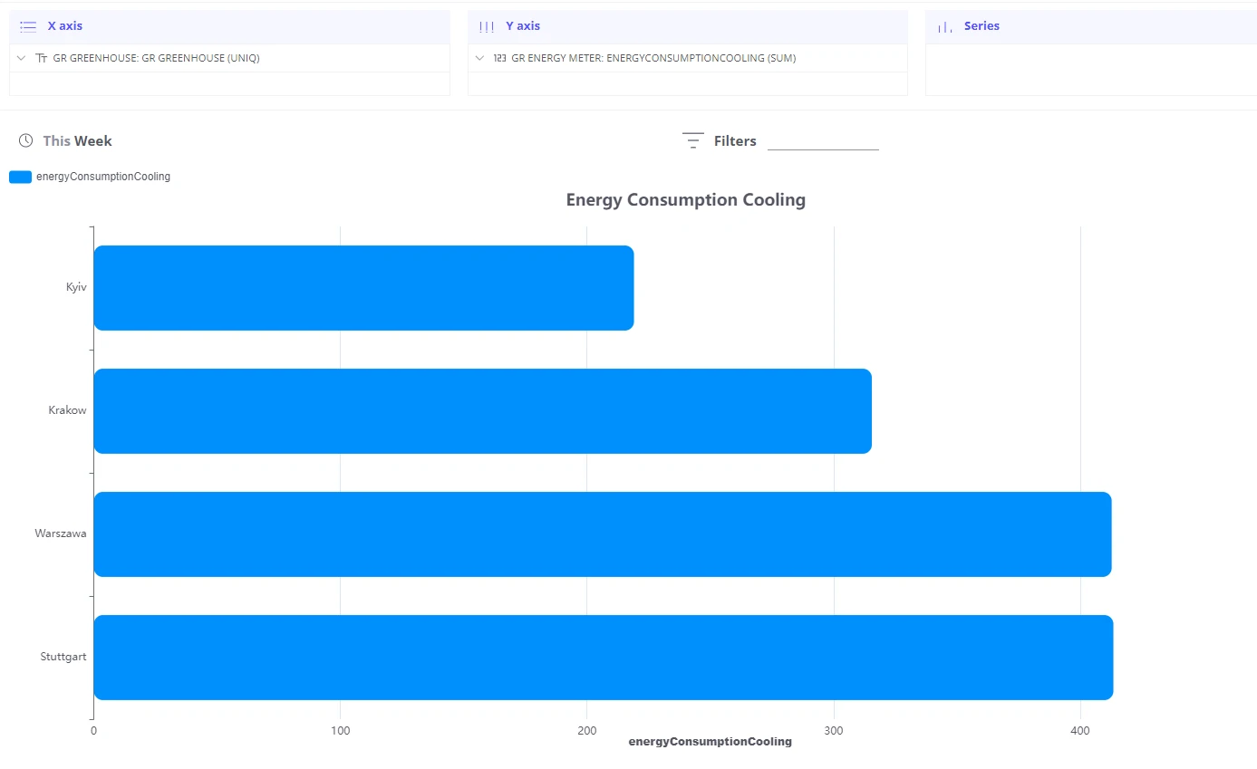
Section titled “Horizontal bars”By default bars are drawn vertically. To switch to a horizontal layout:
-
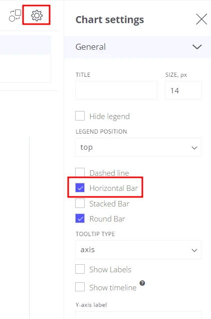
Open View Settings.
-
Enable Horizontal Bar mode.
Stacked bars
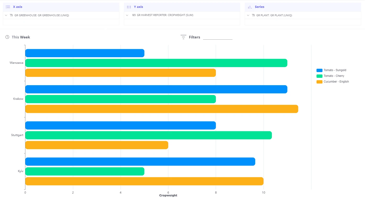
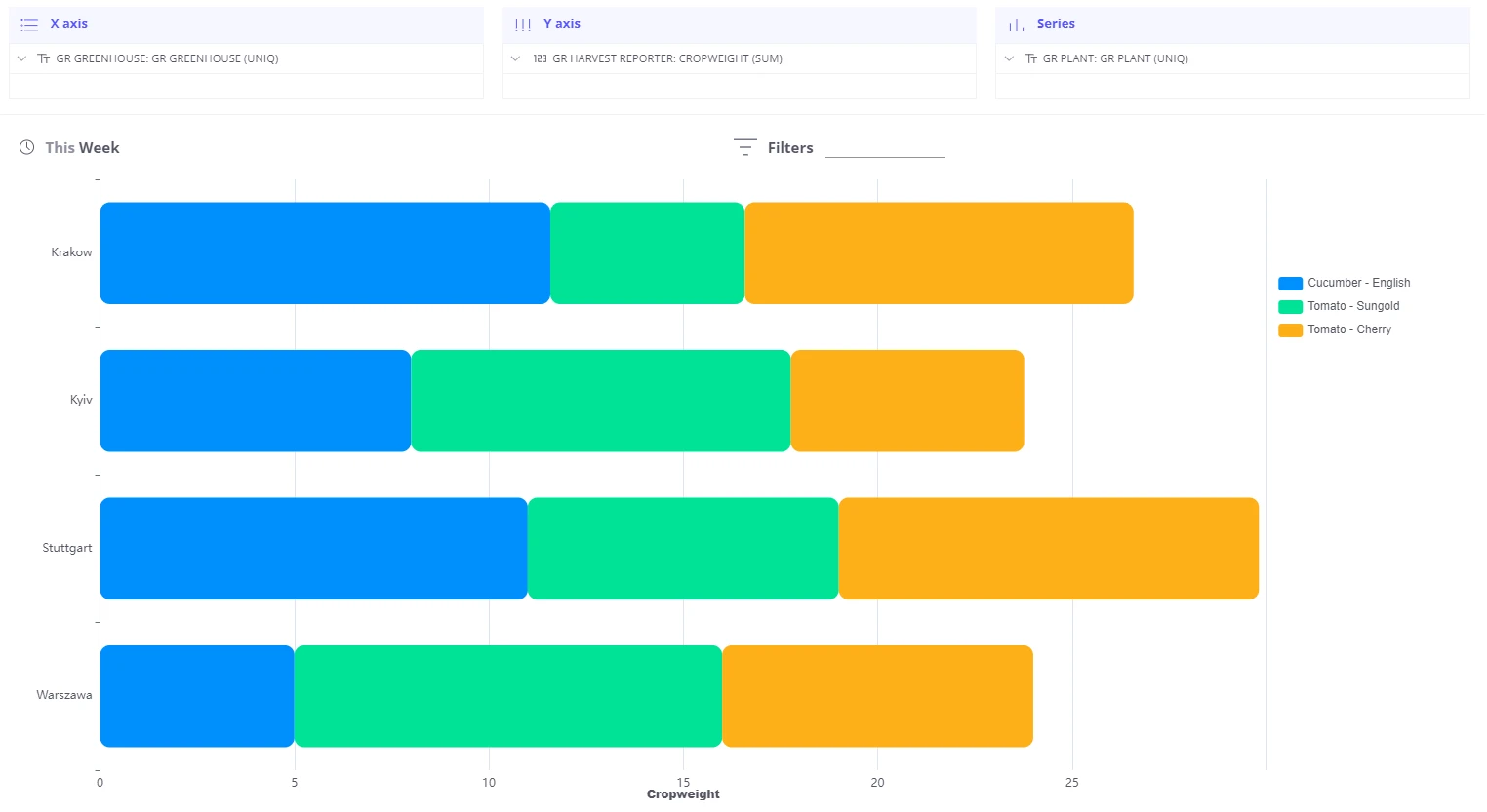
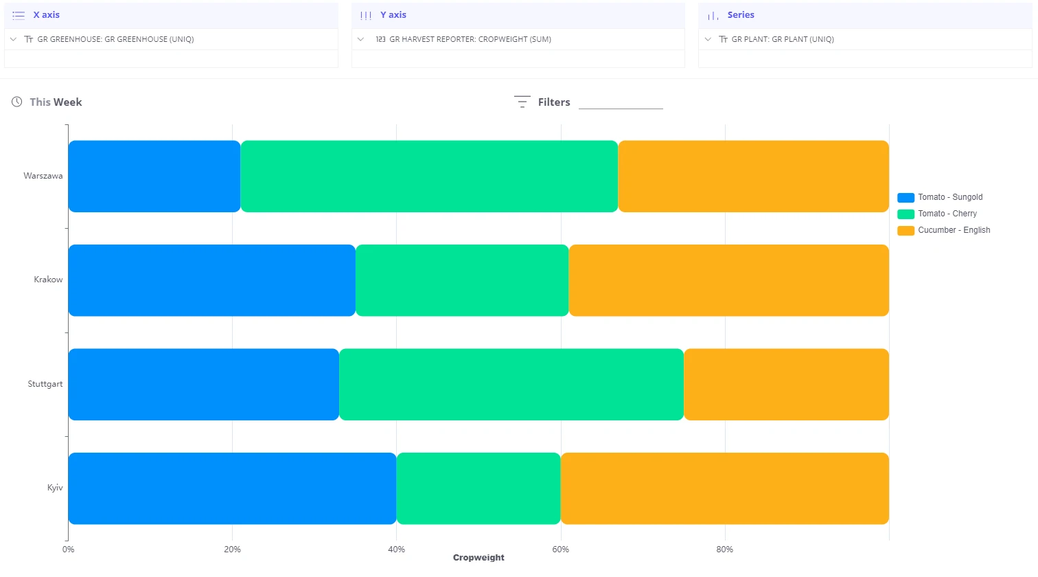
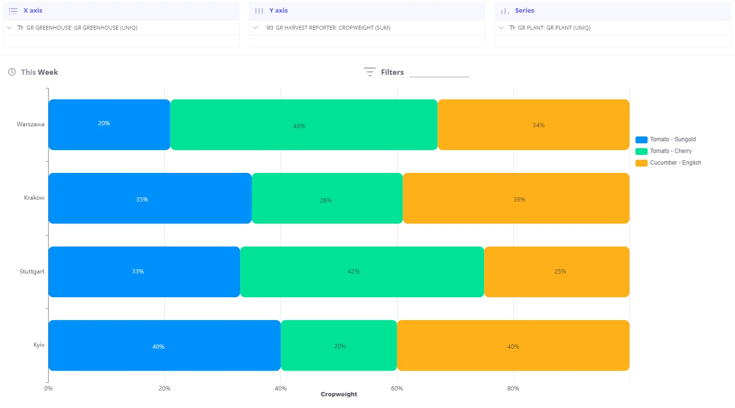
Section titled “Stacked bars”When a bar chart has multiple series or Y-axis fields, each series is shown side by side by default. You can switch to a stacked layout to show contribution of each series to the total.
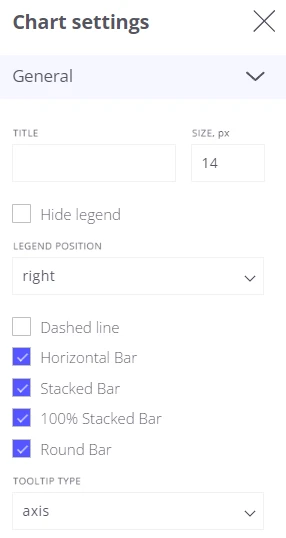
Three modes are available:
| Mode | Description |
|---|---|
| Stacking off | Bars for each series rendered side by side (default) |
| Stacking on | Bars stacked on top of each other, showing absolute totals |
| 100% stacked | Bars normalized to 100%, showing relative proportion per group |
Control the stack mode in View Settings. Stacked mode can be combined with horizontal mode.
Group by telemetry value
Section titled “Group by telemetry value”Use this pattern when a single telemetry payload contains both a numeric value and a category string, and you want to aggregate the numeric value per category.
Example payload — a machine reports the product type, the number of units produced, and the energy consumed per cycle:
{ "ts": 1540892498884, "amount": 12, "product": "glass", "energy": 218}To build a chart showing energy consumed per product type, broken down by machine:
-
Add the product field to the Series section with aggregation UNIQ — this groups the telemetry by product value.
-
Add the energy field to the Y-axis section with aggregation SUM — this sums energy for each product group.
-
Add the Machine name field to the X-axis section — this creates one bar group per machine.
  X-axis: Machine name  Y-axis: energy (SUM)  Series: product (UNIQ)
  Machine A            Machine B  ┌────┬────┬────┐    ┌────┬────┬────┐  │    │    │    │    │    │    │    │  │ ▓▓ │ ░░ │ ▒▒ │    │ ▓▓ │ ░░ │ ▒▒ │  └────┴────┴────┘    └────┴────┴────┘  glass  cup  bottle  glass  cup  bottle  ▓▓ = glass  ░░ = cup  ▒▒ = bottle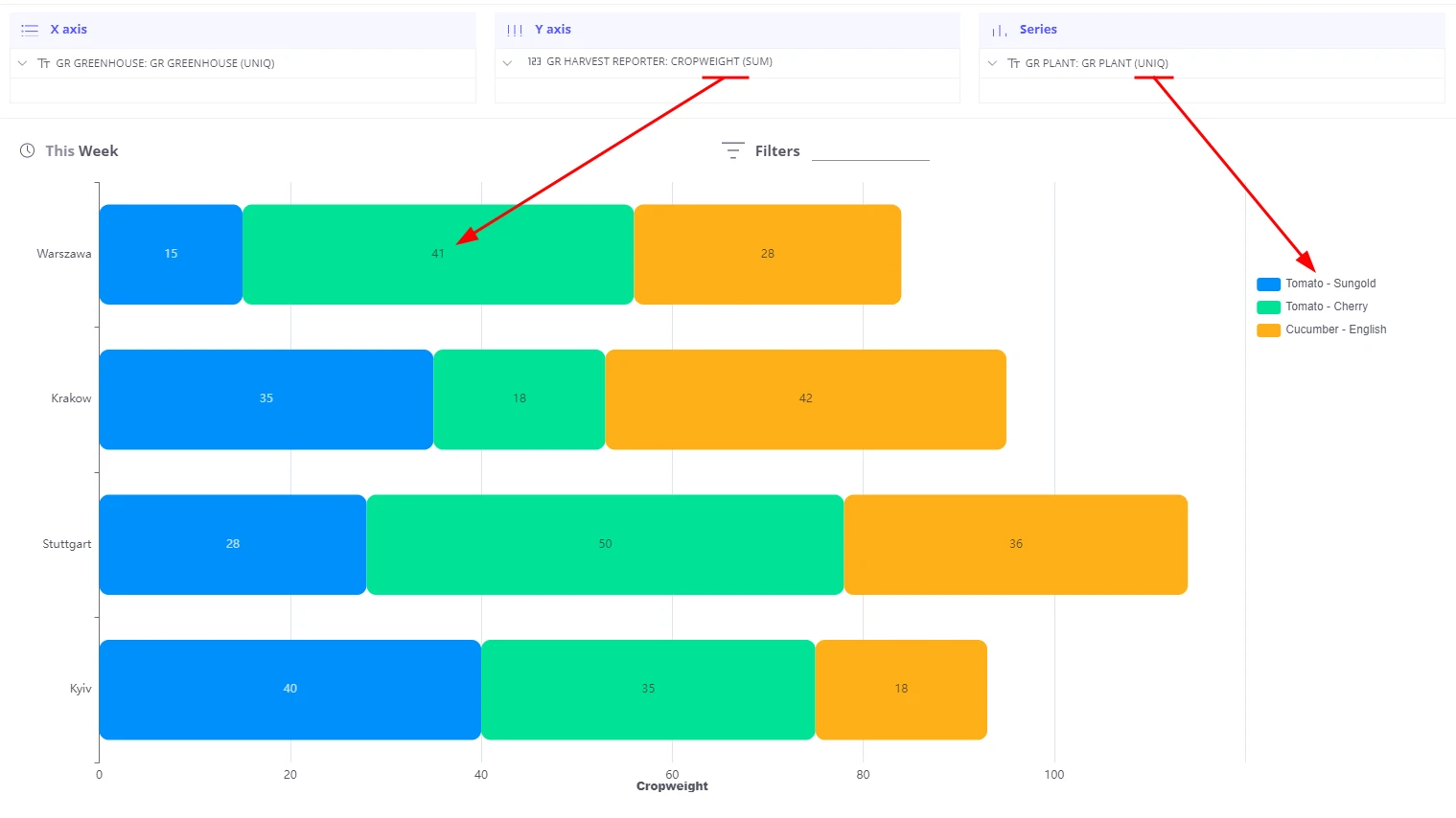
Value labels
Section titled “Value labels”Show or hide numeric value labels on each bar:
-
Open View Settings.
-
Toggle the Labels checkbox.
Was this helpful?