Visualizations Overview
Trendz provides a set of built-in visualization types for analyzing IoT datasets. Each type is optimized for a different analytical task — from spotting trends over time to comparing distributions across entities.
Available view types
Section titled “Available view types”-
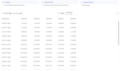
Table
Raw or aggregated values in a structured grid; supports data export.
-
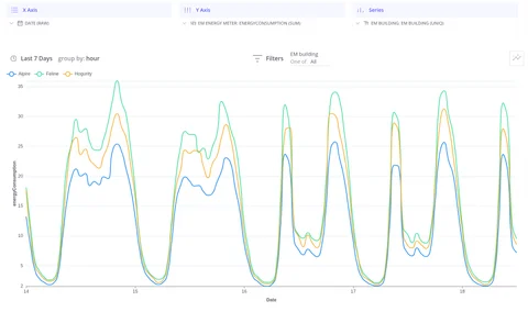
Line Chart
Track how a metric changes over time; compare multiple series.
-
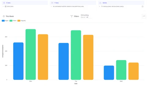
Bar Chart
Compare totals or distributions across entities or time intervals.
-
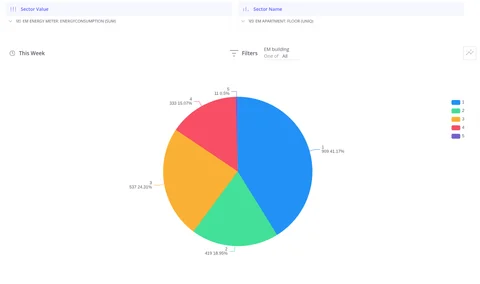
Pie Chart
Show proportional share of a total across a small number of categories.
-
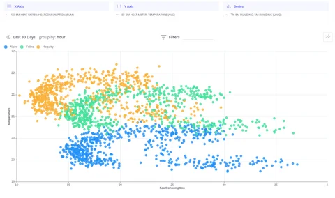
Scatter Plot
Reveal correlations or clusters between two numeric fields.
-
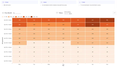
Heat Map
Spot patterns across two dimensions using color intensity.
-
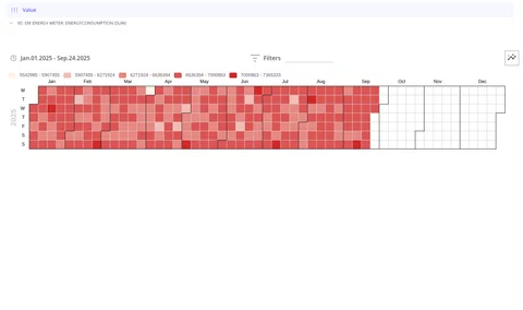
Calendar
Visualize daily values across weeks and months in a calendar layout.
-
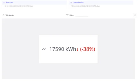
Card
Display a single key metric with an optional comparison value.
-
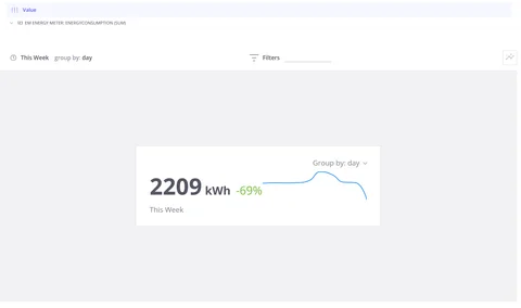
Card with Line Chart
Key metric alongside its trend sparkline with period-over-period comparison.
-
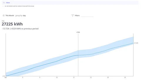
AI Card
Cumulative telemetry with forecasting and an AI-generated summary.
Create your first view
Section titled “Create your first view”-
Open the Trendz home page and click Create View.
-
Select Line as the chart type.
-
From the left panel, drag a Date field into the X axis slot.
-
Drag any telemetry field into the Y axis slot and click Build Report.
At this point, the chart shows the average measurement across all entities in ThingsBoard.
-
Add Entity Name to the Series slot to split the chart into one line per entity.
Video tutorial
Section titled “Video tutorial”Was this helpful?