Widgets
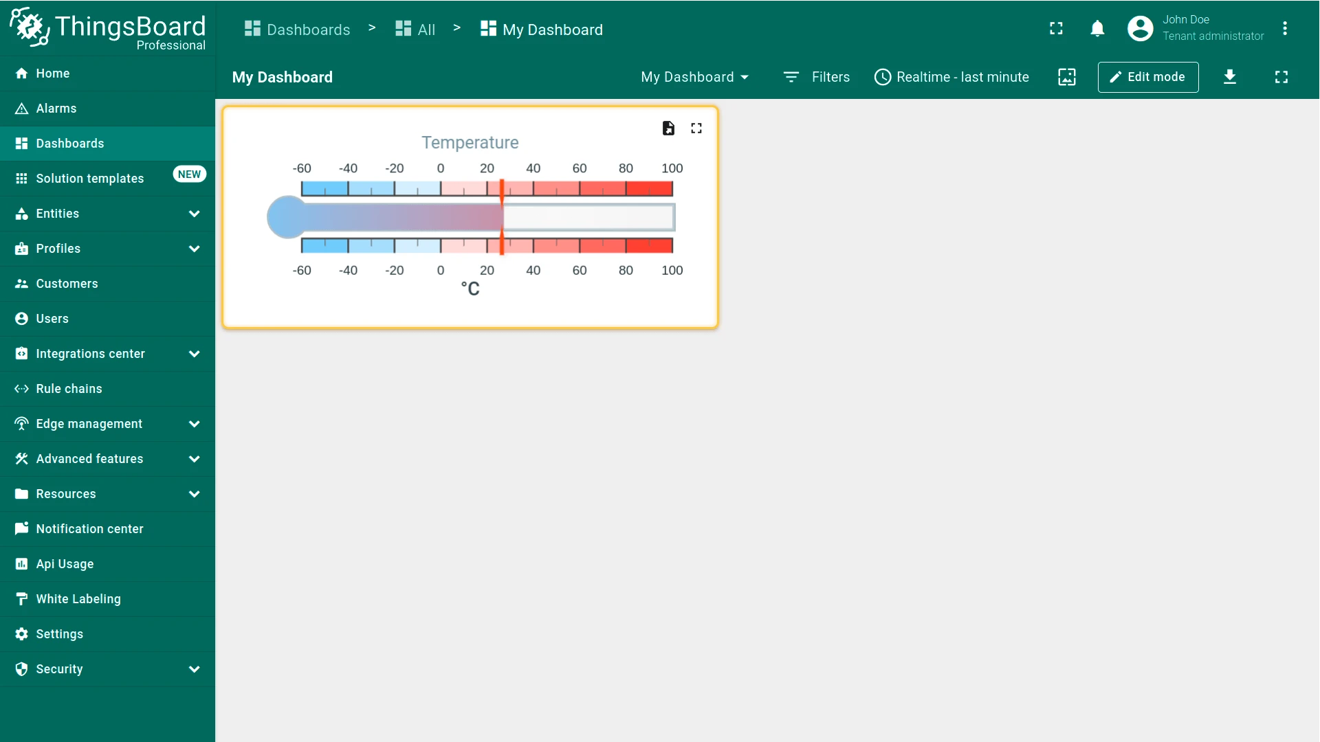
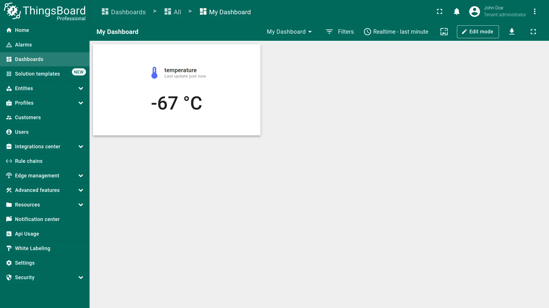
A Widget is a dashboard element that displays a specific type of data or provides specific functionality. Widgets enable visualization of device data, remote device control, alarm management, and display of custom HTML content.
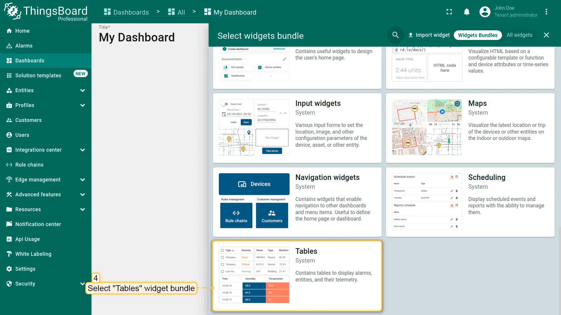
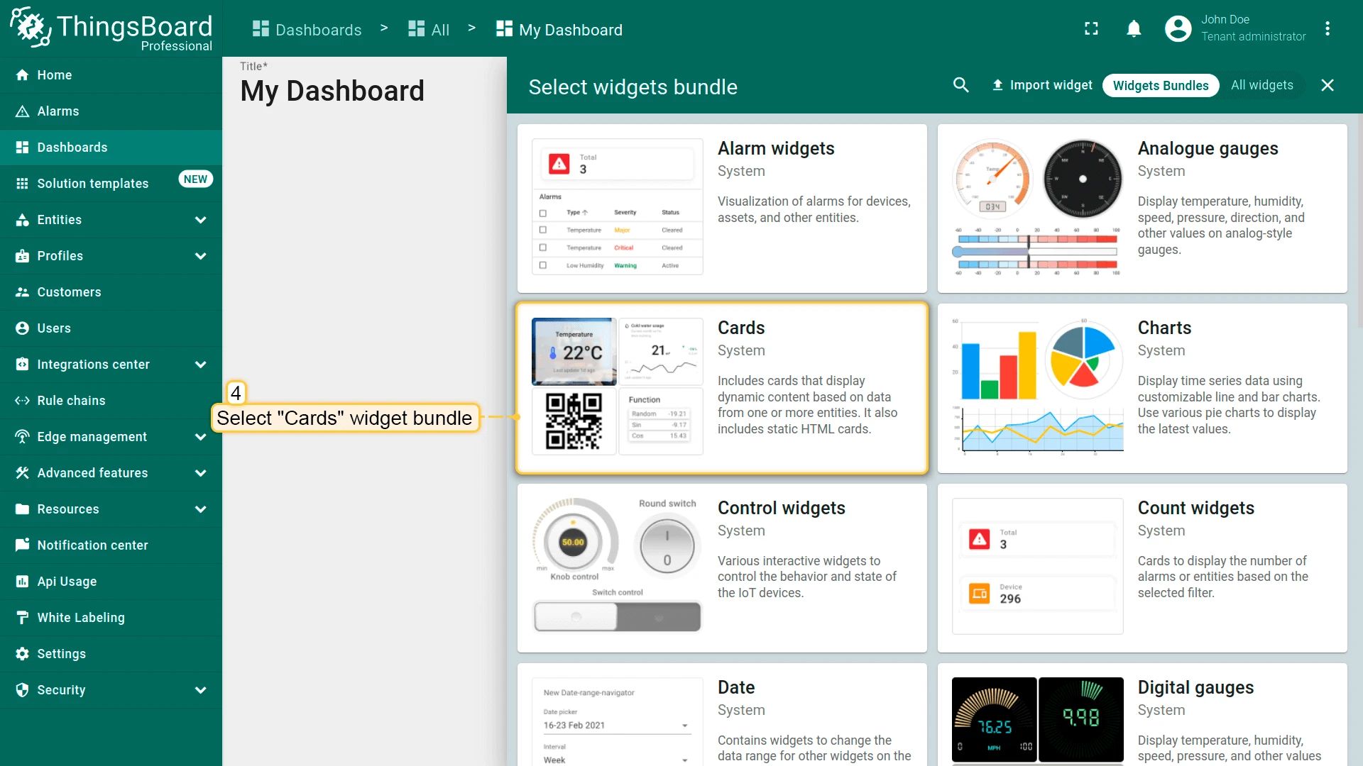
Widgets are organized into widget bundles, which group related widgets by functionality or use case.
Widgets Library
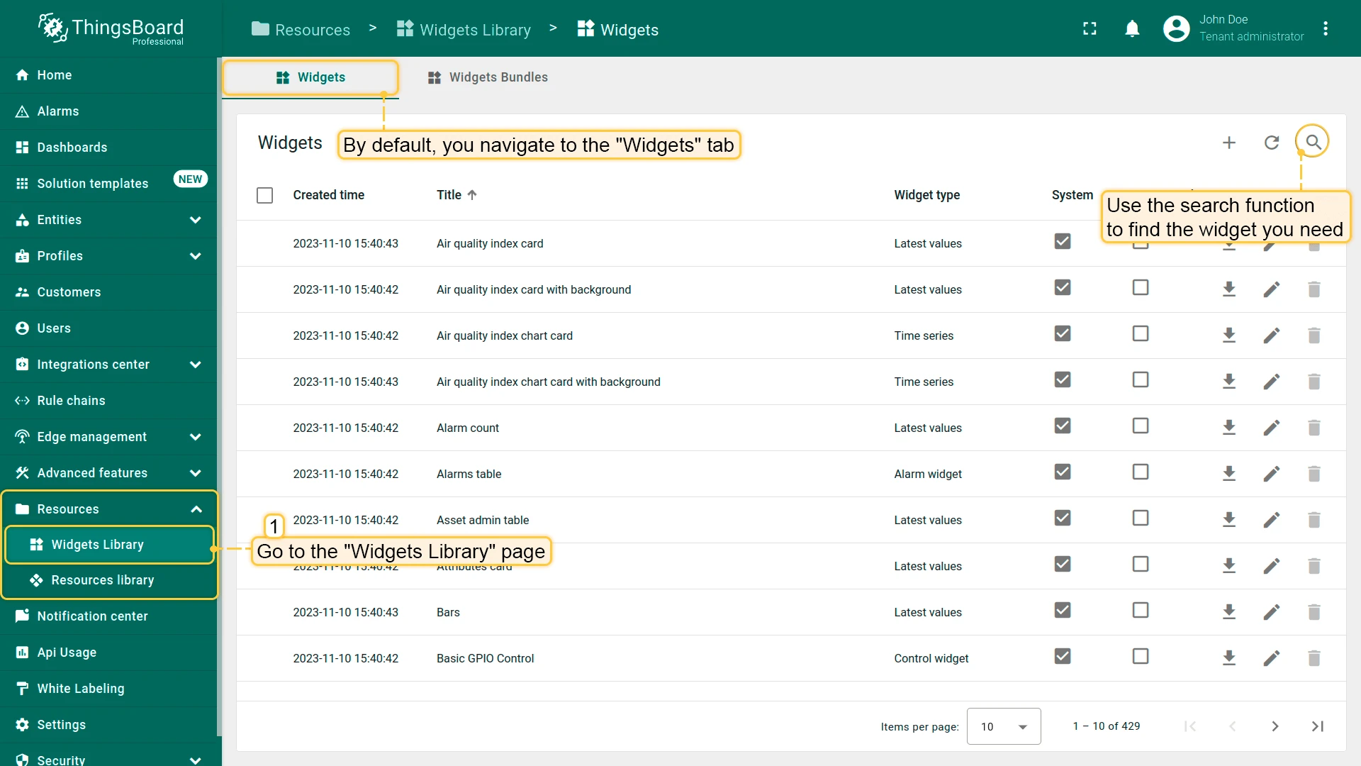
Section titled “Widgets Library”The Widgets Library contains the complete ThingsBoard widget collection, organized by bundle and use case — data visualization, alarms, device control, SCADA, maps, industrial monitoring, and more.
Widget Data Types
Section titled “Widget Data Types”| Type | Description | Example |
|---|---|---|
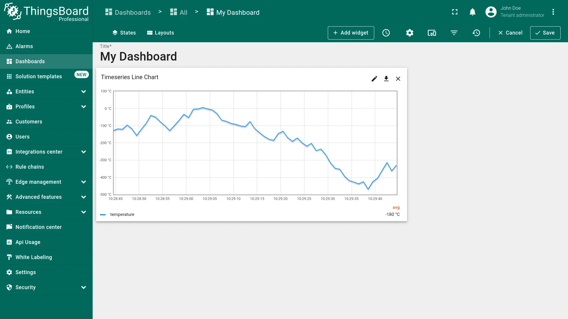
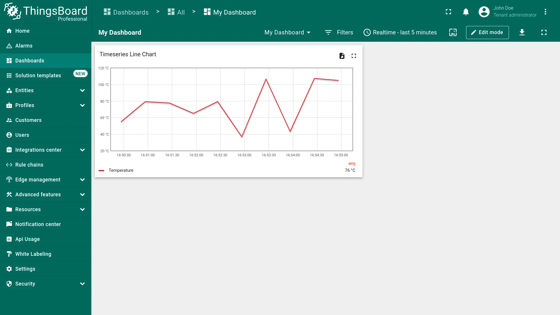
| Time series | Display data across selected time windows — real-time rolling intervals or fixed historical periods. Designed for telemetry rather than attributes. | Line chart, Bar chart |
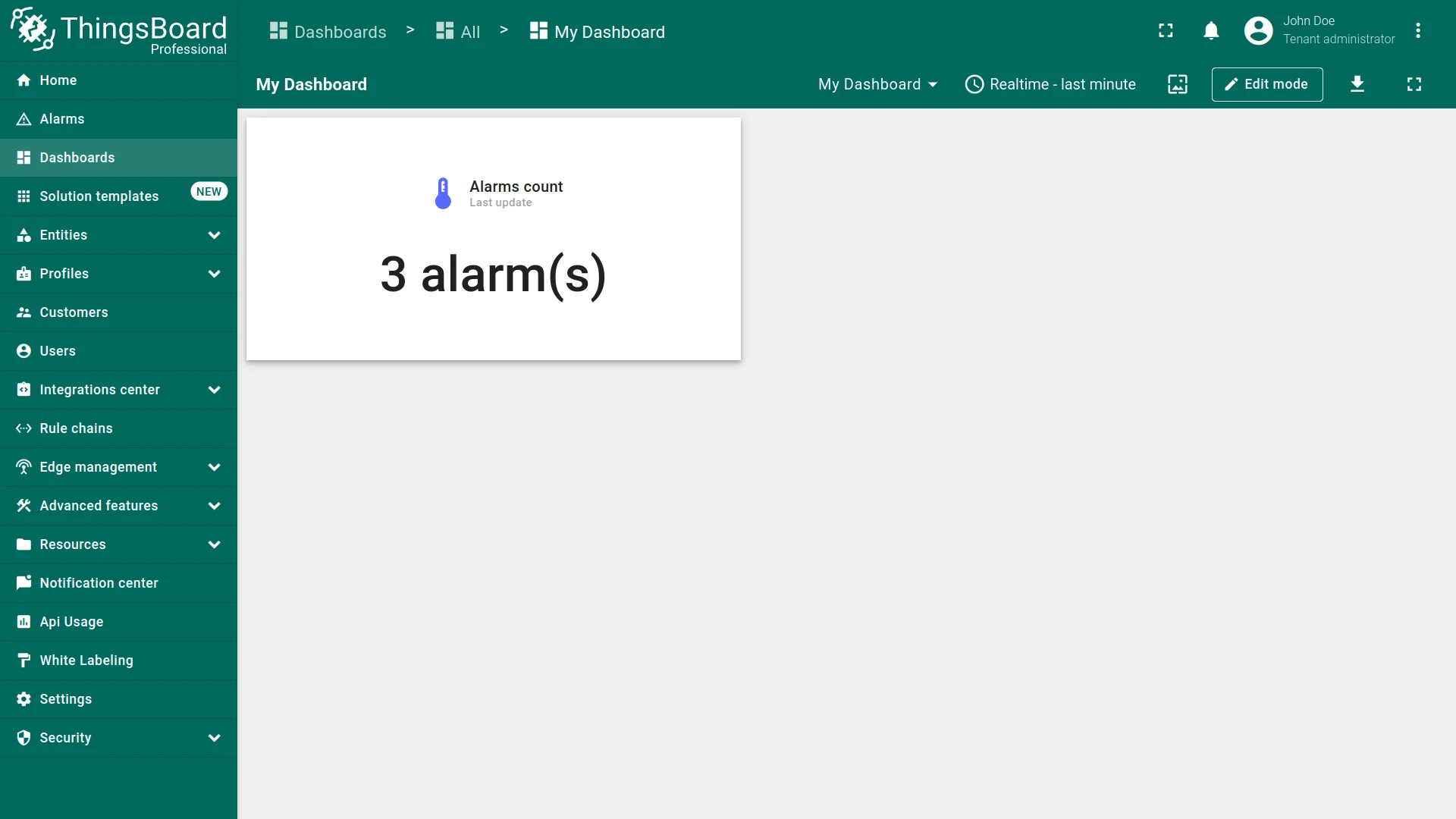
| Latest values | Show the most recent values of selected attributes or telemetry keys. | Temperature radial gauge, Value card |
| Control | Send RPC commands to your devices. | Value stepper, RPC Button |
| Alarm | Display and manage alarms and notifications. | Alarms table |
| Static | Present static content such as a floor plan or company information, including custom HTML. | HTML card |
See Widgets Library for the complete list of widget bundles.
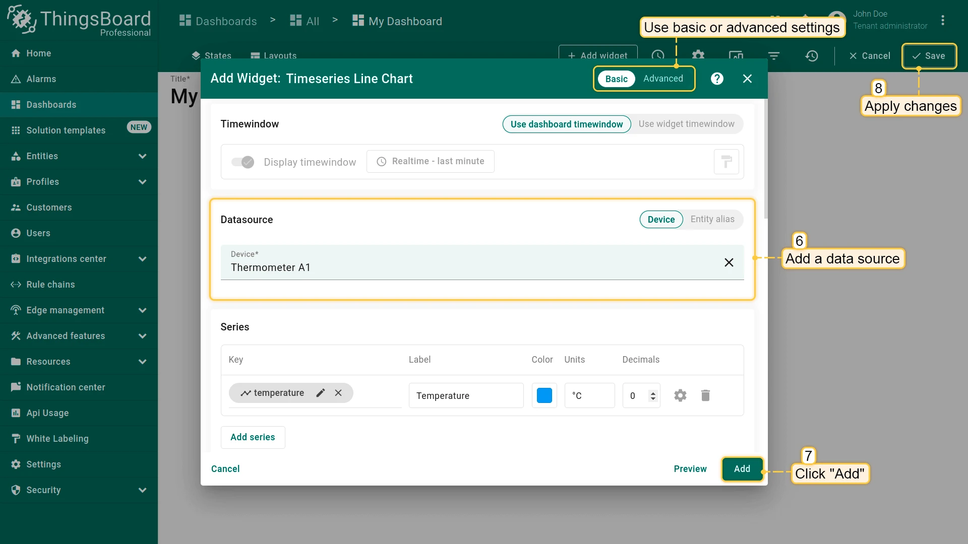
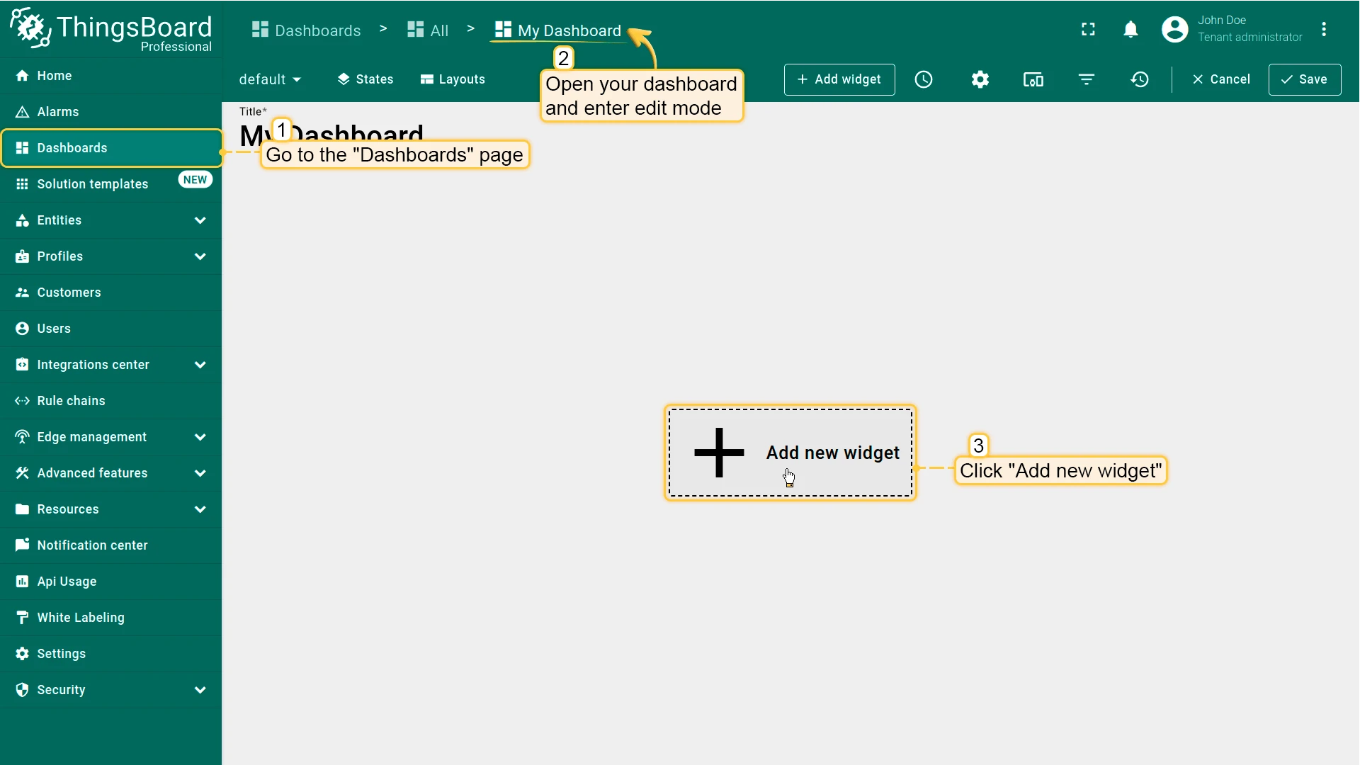
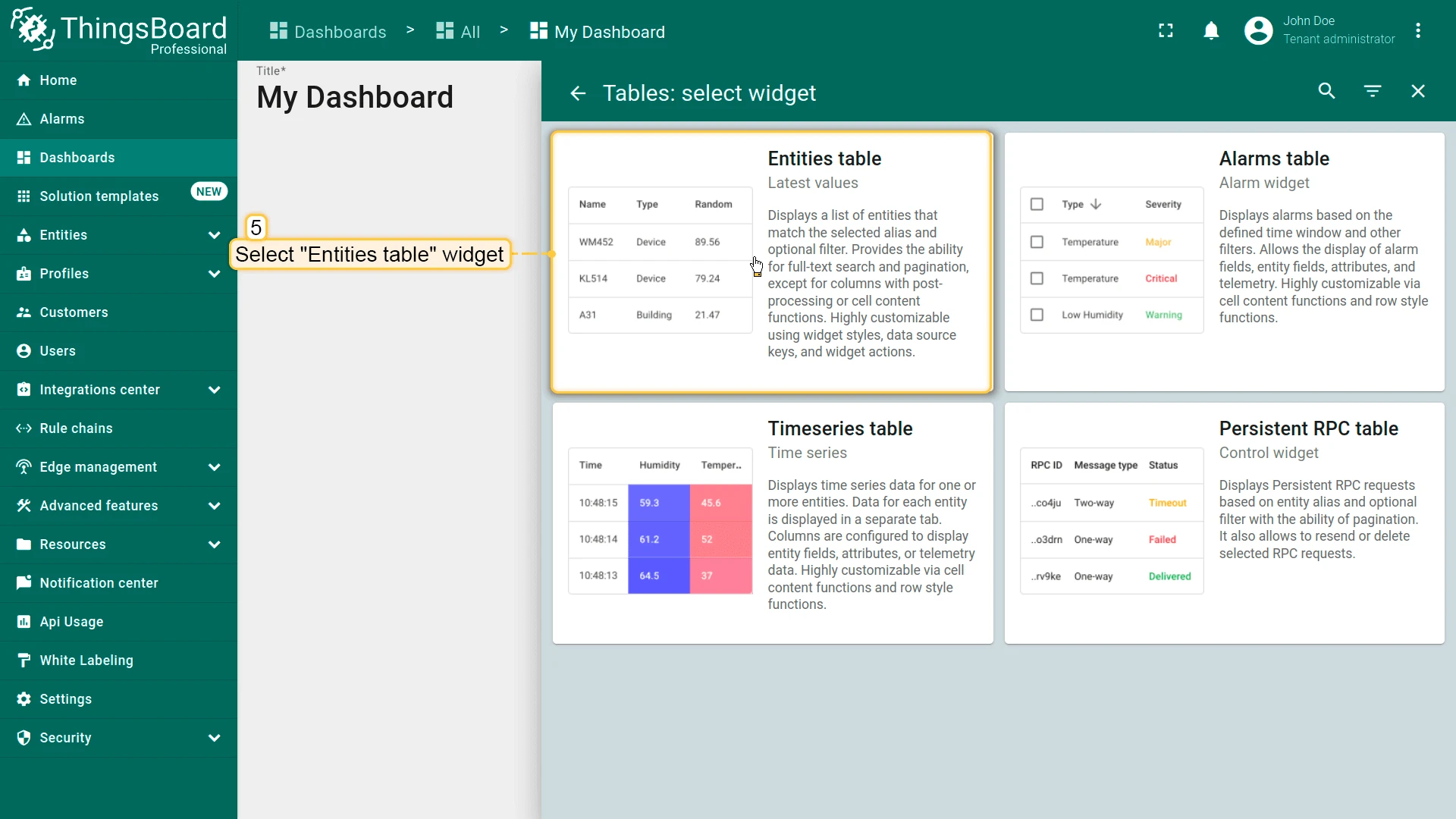
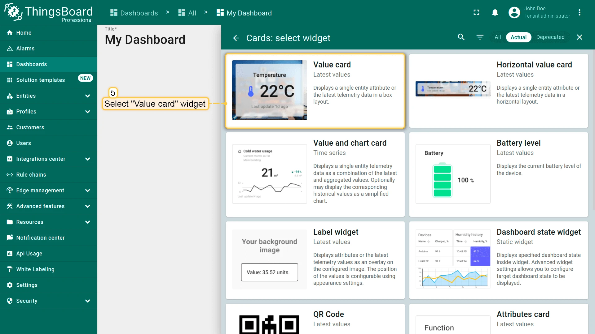
Add Widget to Dashboard
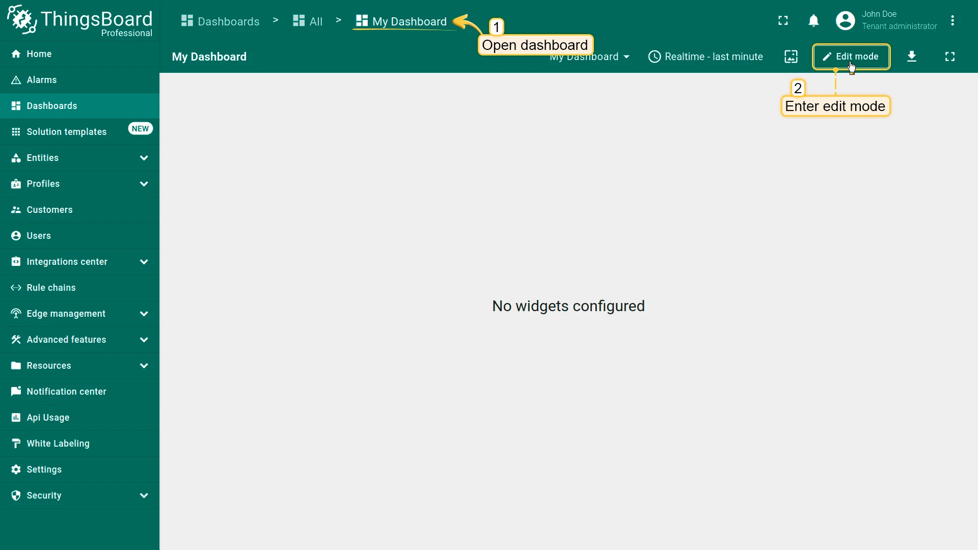
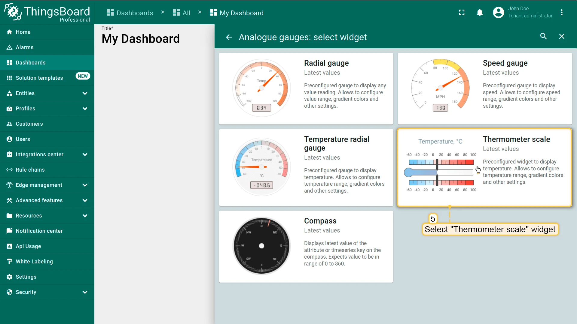
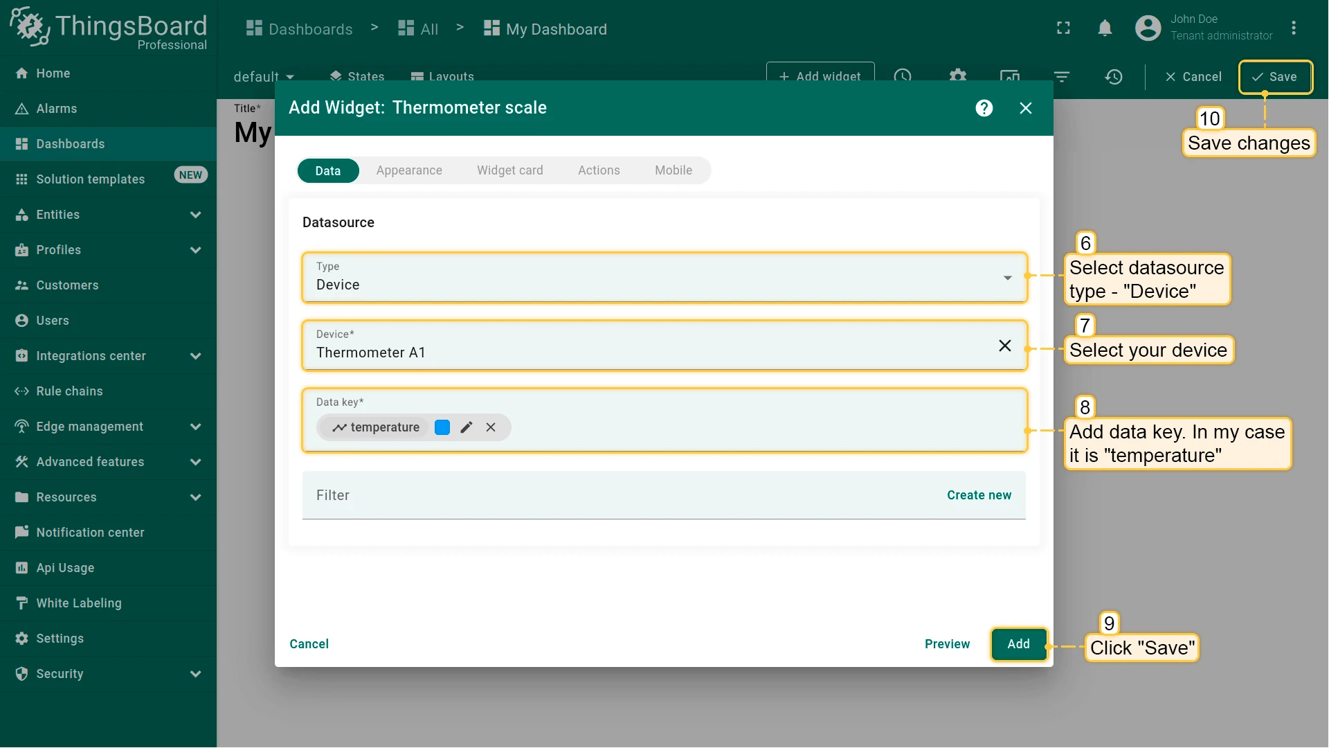
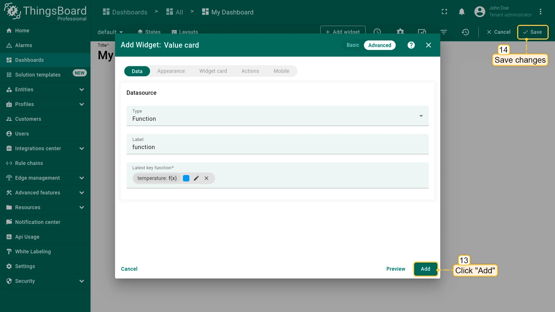
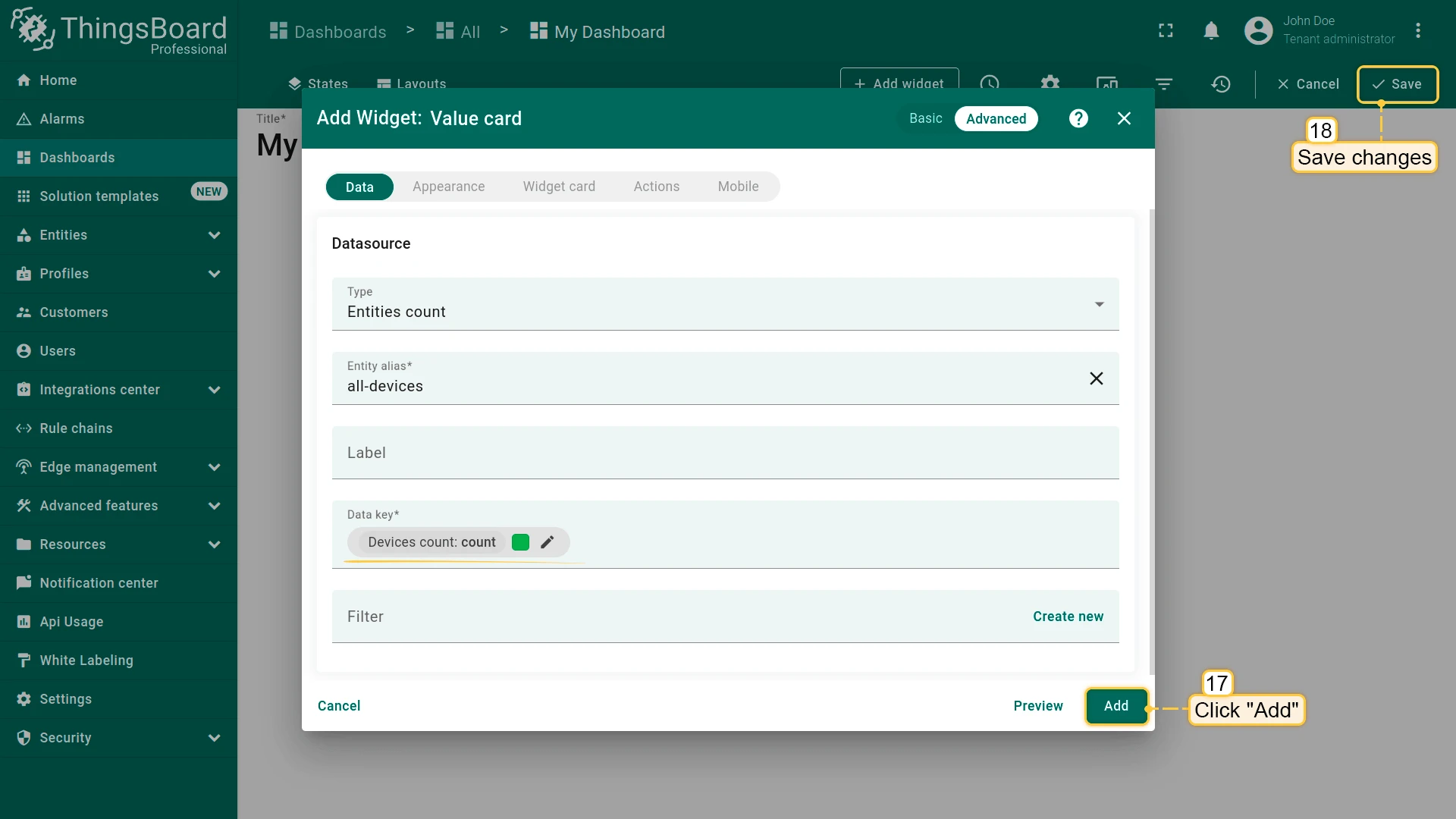
Section titled “Add Widget to Dashboard”- Open a dashboard and switch to edit mode.
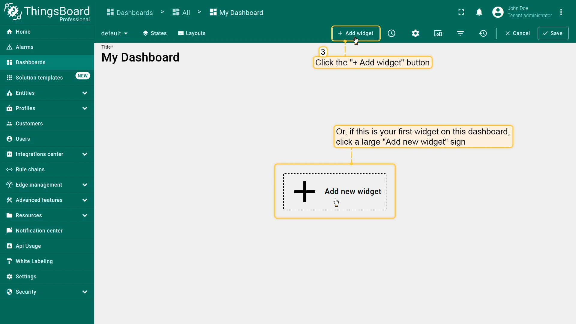
- Click + Add widget.
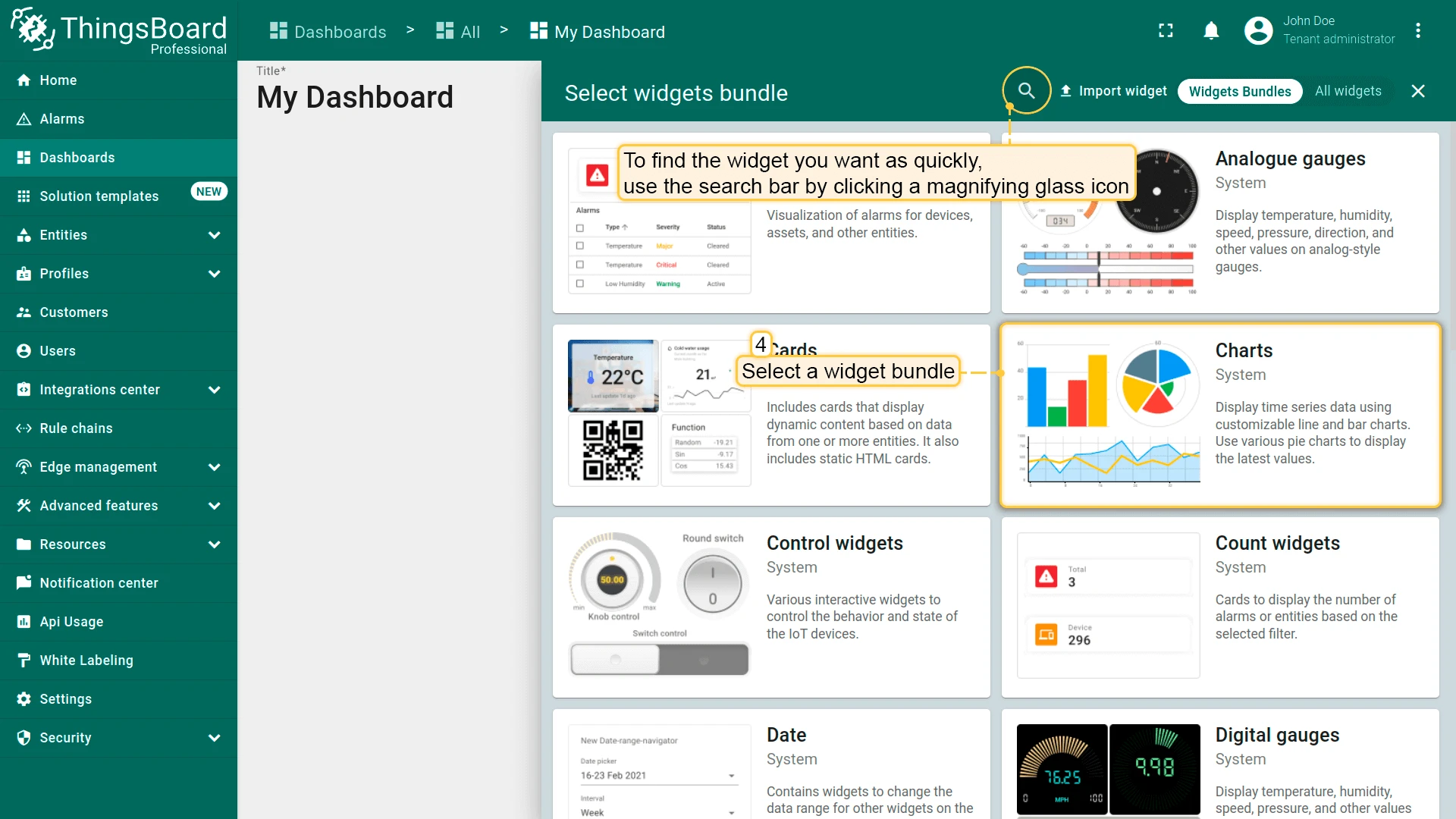
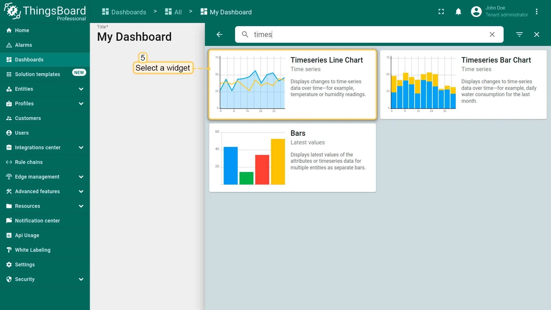
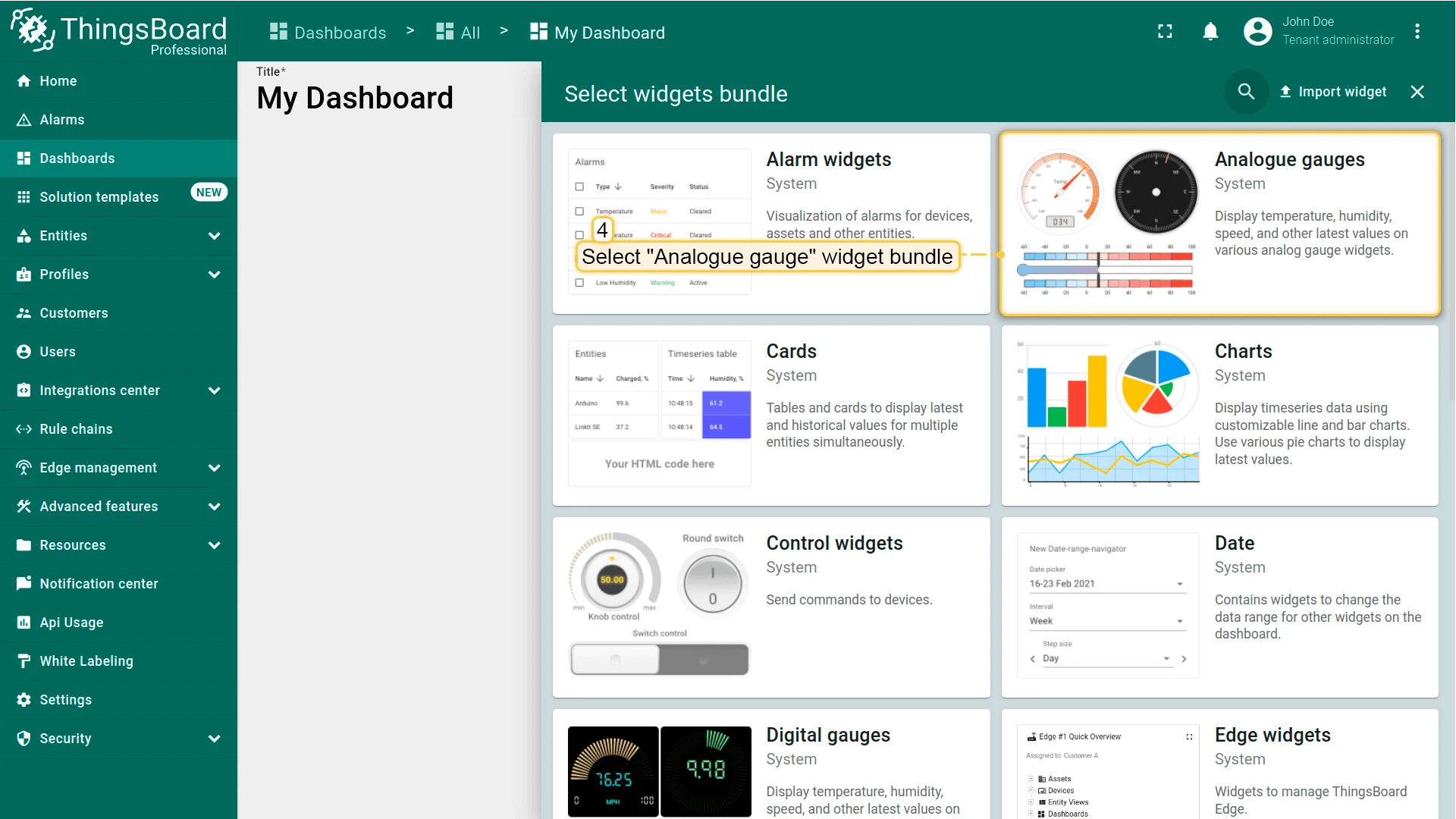
- Select a widget bundle, then choose the specific widget.
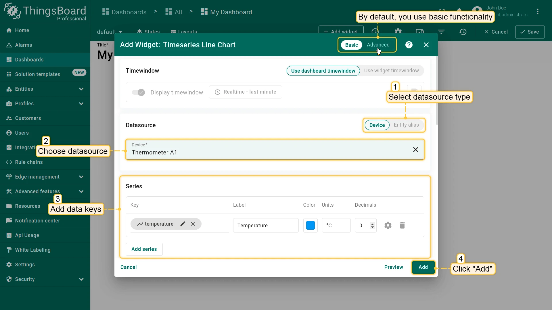
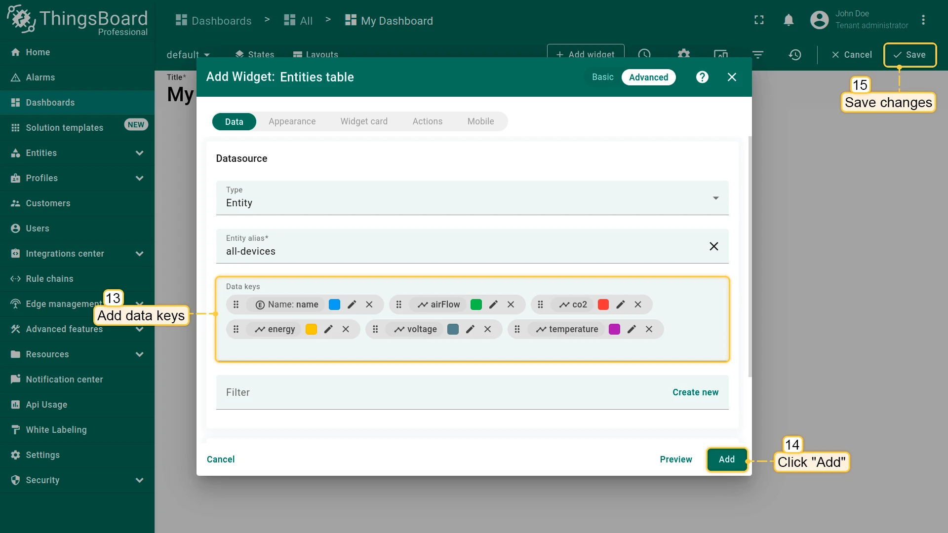
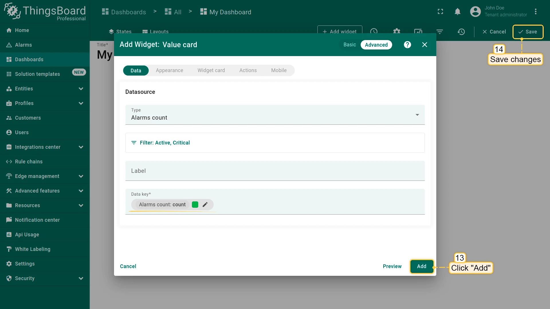
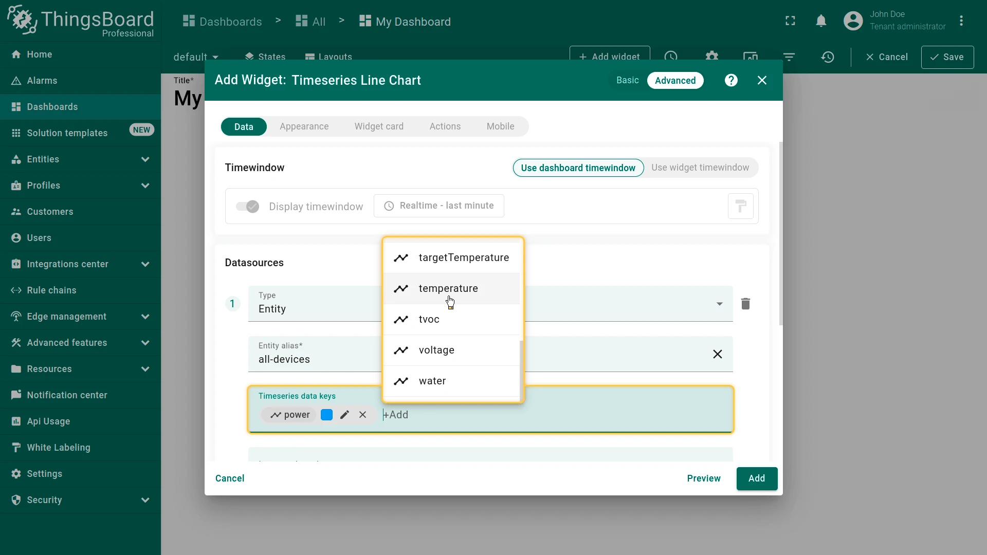
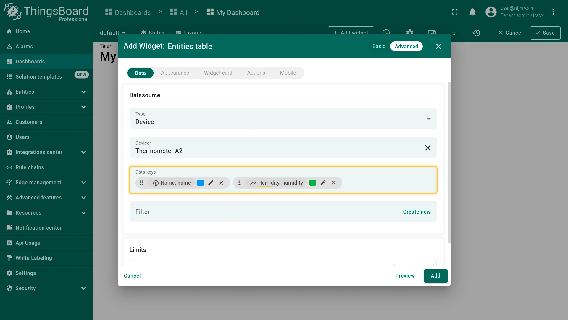
- Configure the datasource — select an entity alias (recommended) or select entities directly and add the required data keys.
- Adjust appearance and behavior (title, units, colors, thresholds, actions, etc.).
- Click Add.
- Drag to the desired position and resize on the grid.
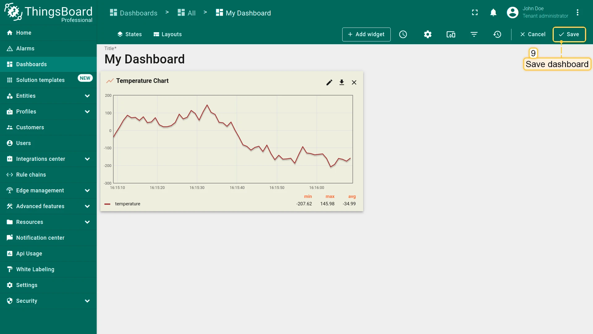
- Click Save to persist changes and exit edit mode.
Configure Widgets
Section titled “Configure Widgets”Available configuration tabs depend on the widget type:
| Widget type | Time window | Datasources | Appearance | Widget card | Actions |
|---|---|---|---|---|---|
| Time series | ✓ | ✓ | ✓ | ✓ | ✓ |
| Latest values | ◑ | ✓ | ✓ | ✓ | ✓ |
| Control | — | ✓ | ✓ | ✓ | ✓ |
| Alarm | ✓ | ✓ | ✓ | ✓ | ✓ |
| Static | — | — | — | ✓ | ✓ |
◑ — available when aggregation is enabled on a data key.
Layout settings (position and size on the dashboard grid) are available for all widget types.
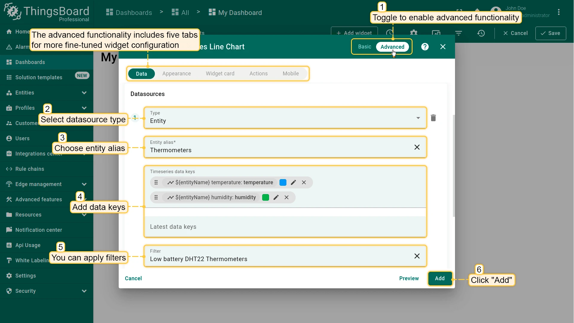
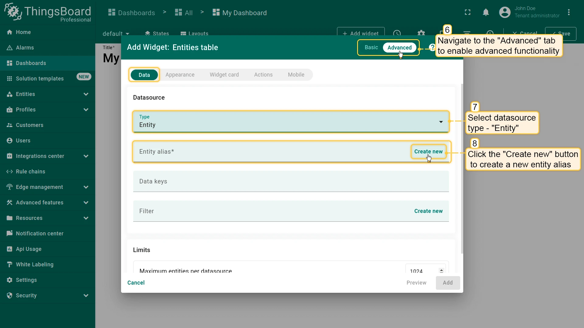
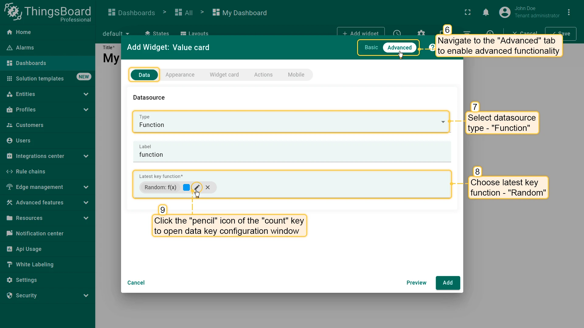
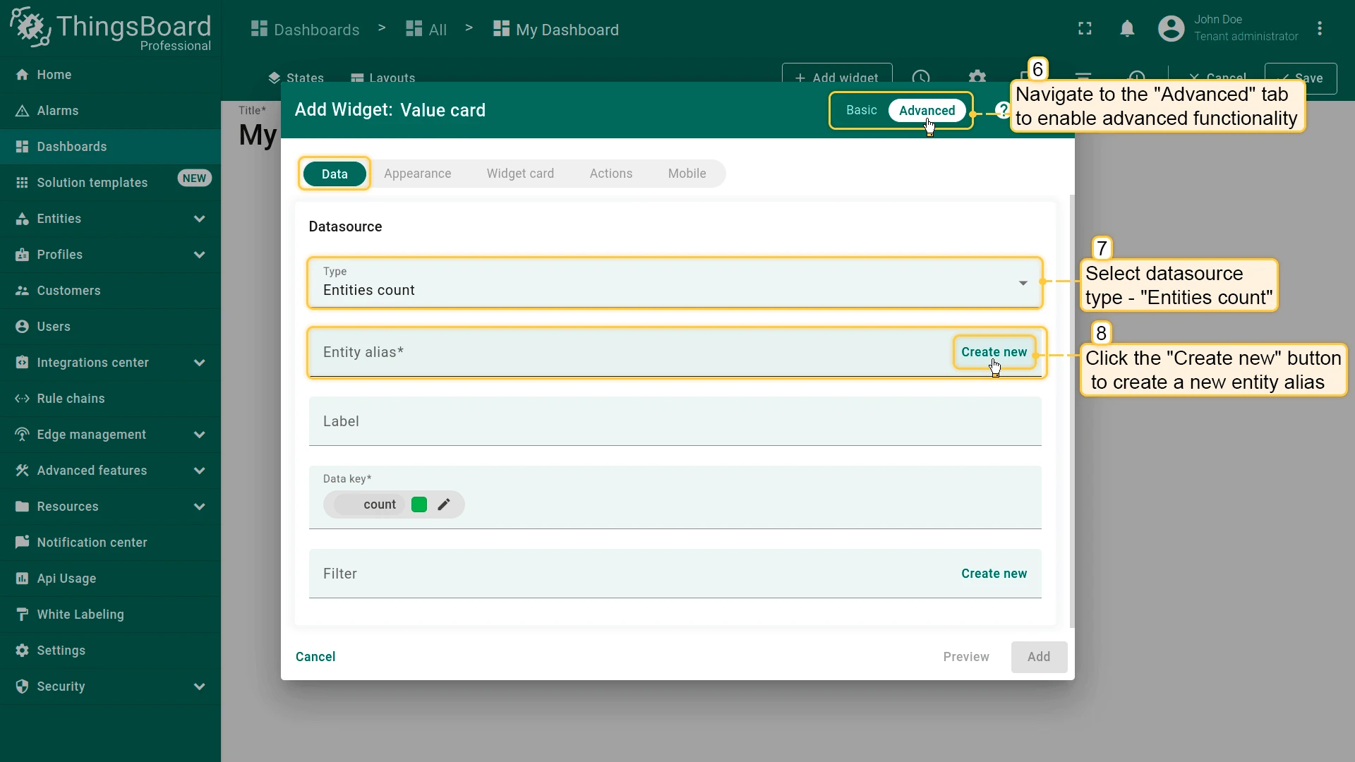
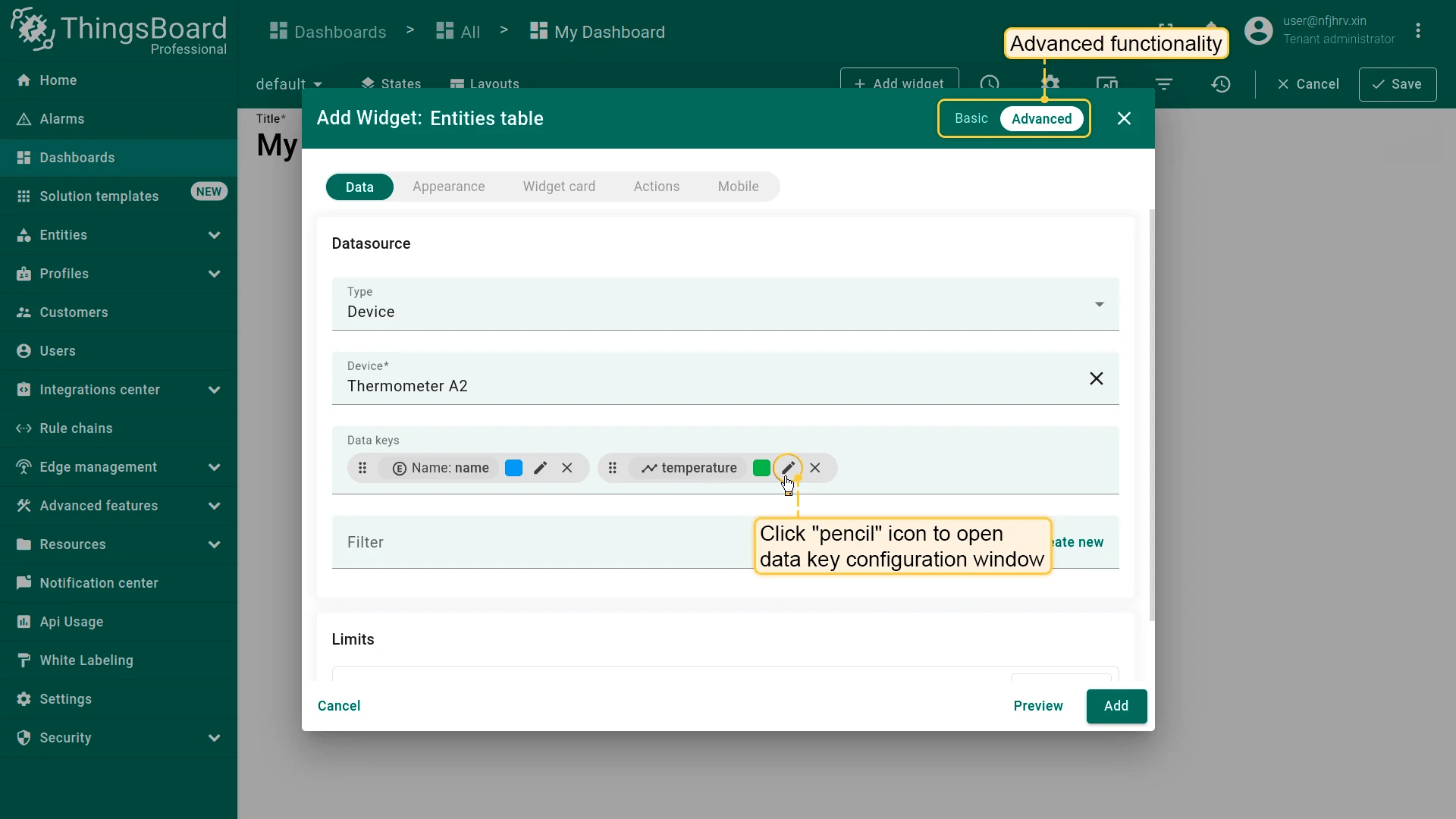
Basic and Advanced Settings
Section titled “Basic and Advanced Settings”The widget configuration dialog offers two modes. Switch between them using the toggle in the dialog header.
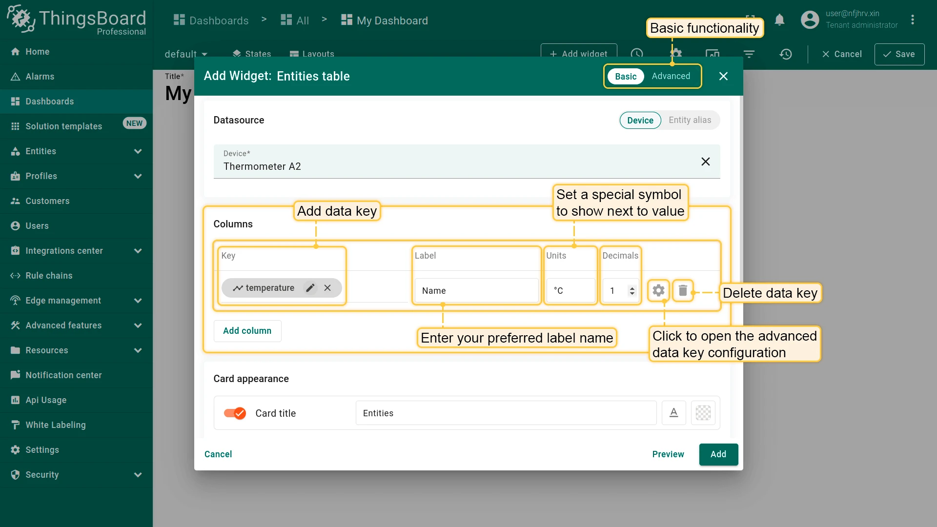
- Basic mode — shows only the most essential settings: datasource, key label, and a small set of appearance options. Best for quick setup.
- Advanced mode — exposes the full configuration across all tabs (data, appearance, widget card, actions, layout).
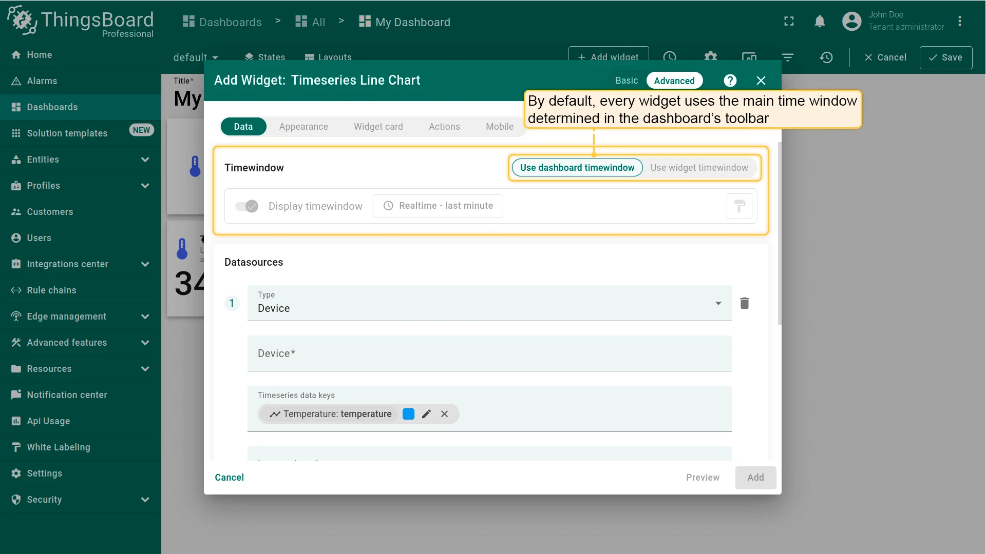
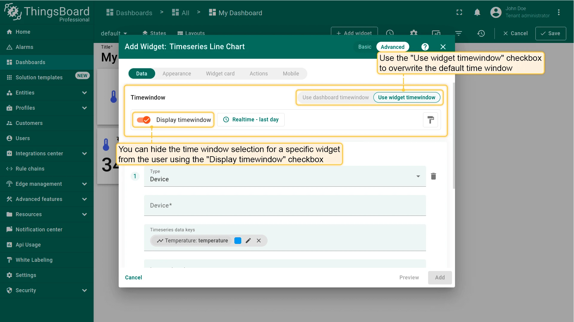
Widget Time Window
Section titled “Widget Time Window”The time window defines the time interval and aggregation/grouping rules applied to telemetry and alarm data. A widget can use either its own time window or inherit the dashboard time window.
See time window for complete details.
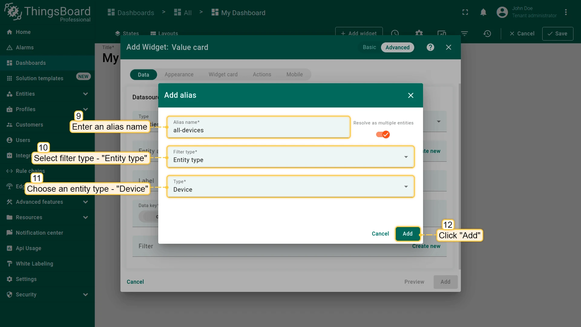
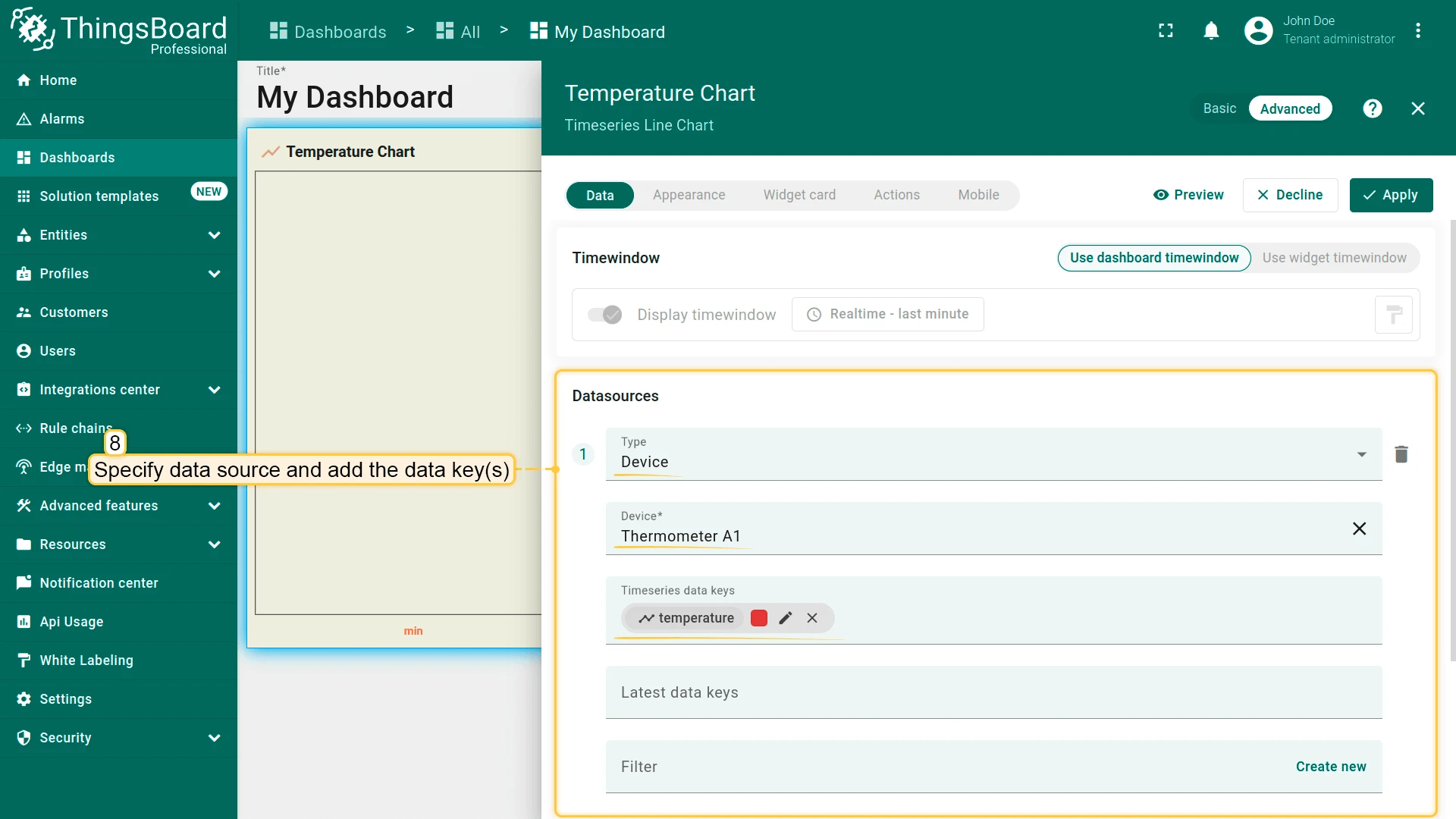
Datasources
Section titled “Datasources”A datasource defines where a widget gets its data — which entities to query and which keys to read. Most widgets have one or more datasources; Static widgets have none. Each datasource specifies a type, an entity scope (a single device or an alias-resolved set), optional filters, and a list of data keys.
Datasource Types
Section titled “Datasource Types”Device — reads data from a single explicitly selected device. Use when the widget always shows data for the same device, regardless of dashboard context.
Entity — reads data from one or more entities resolved by an entity alias. The alias can target a single entity (e.g., the device currently in dashboard context) or a dynamic list (e.g., all devices of a given type, assets in a group). Use for context-aware and multi-entity widgets.


Function — generates synthetic values using a JavaScript function (e.g., random numbers, sine waves). Use to configure and preview widget appearance during development without requiring live device data.
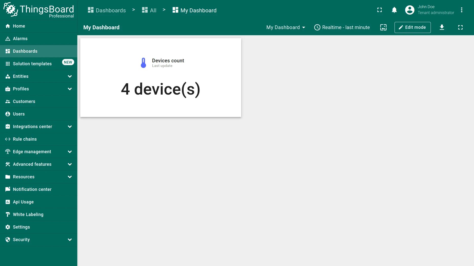
Entities count — returns the number of entities matched by an alias and optional filters as a single numeric value. Use with value card widgets to display metrics such as “Total devices” or “Active gateways”.
The dedicated Entity count widget is built around this datasource type.
Alarms count — returns the number of alarms matched by the selected entity scope and alarm filters (severity, status, type, assignee) as a single numeric value. Use with value card widgets to display metrics such as “Active critical alarms”.
The dedicated Alarm count widget is built around this datasource type.
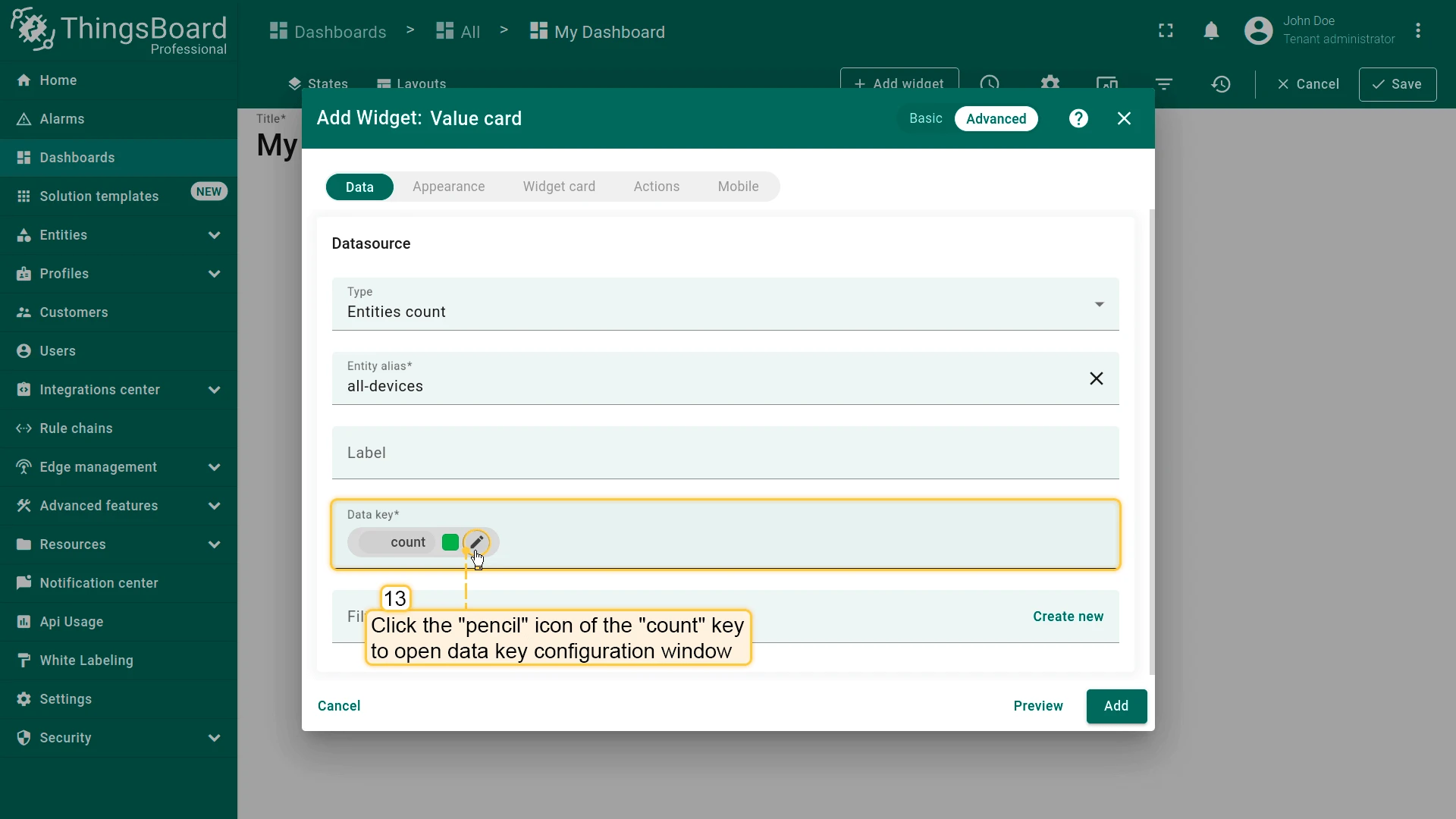
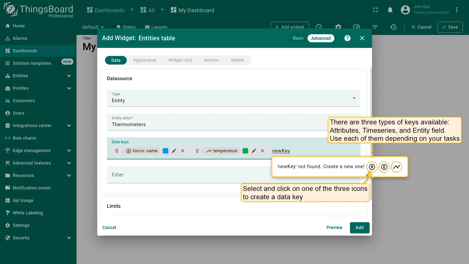
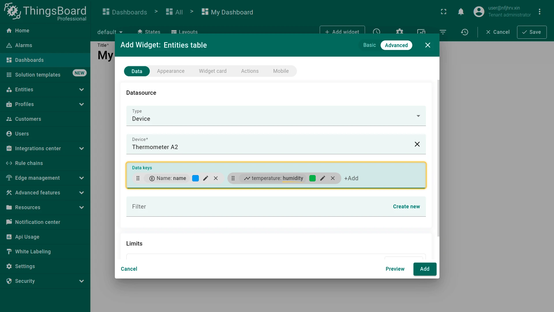
Data Keys
Section titled “Data Keys”A data key identifies the telemetry, attribute, or entity field a widget reads from its datasource. Each datasource can have multiple data keys.
Key source types:
- Time series — telemetry keys reported by devices or written via the Rule Engine/REST API.
- Attributes — Client, Server, and Shared attributes of the selected entity.
- Entity fields — metadata fields available for the entity type (e.g., name, type, label, created time).
Available sources depend on the widget type: time series widgets use time series keys; latest values widgets support all three types; alarm widgets also support alarm-specific fields; control and static widgets do not use data keys.
Add Key
Click the key input field and select from the dropdown of available keys.
To add a key not yet reported by the device, type the name manually and choose its source type — the widget will display data once values arrive.
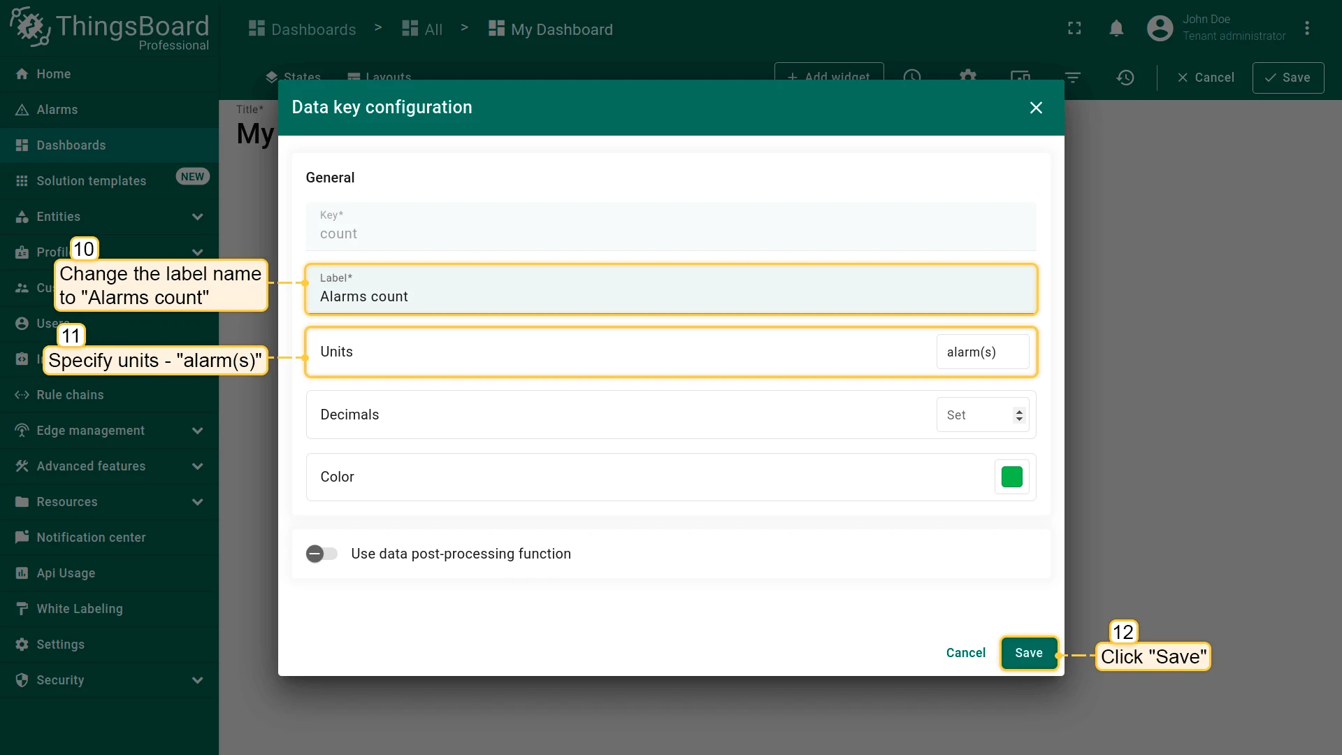
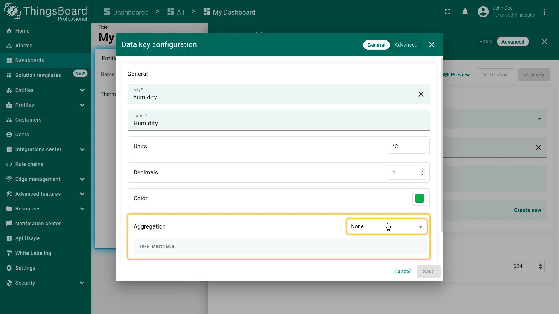
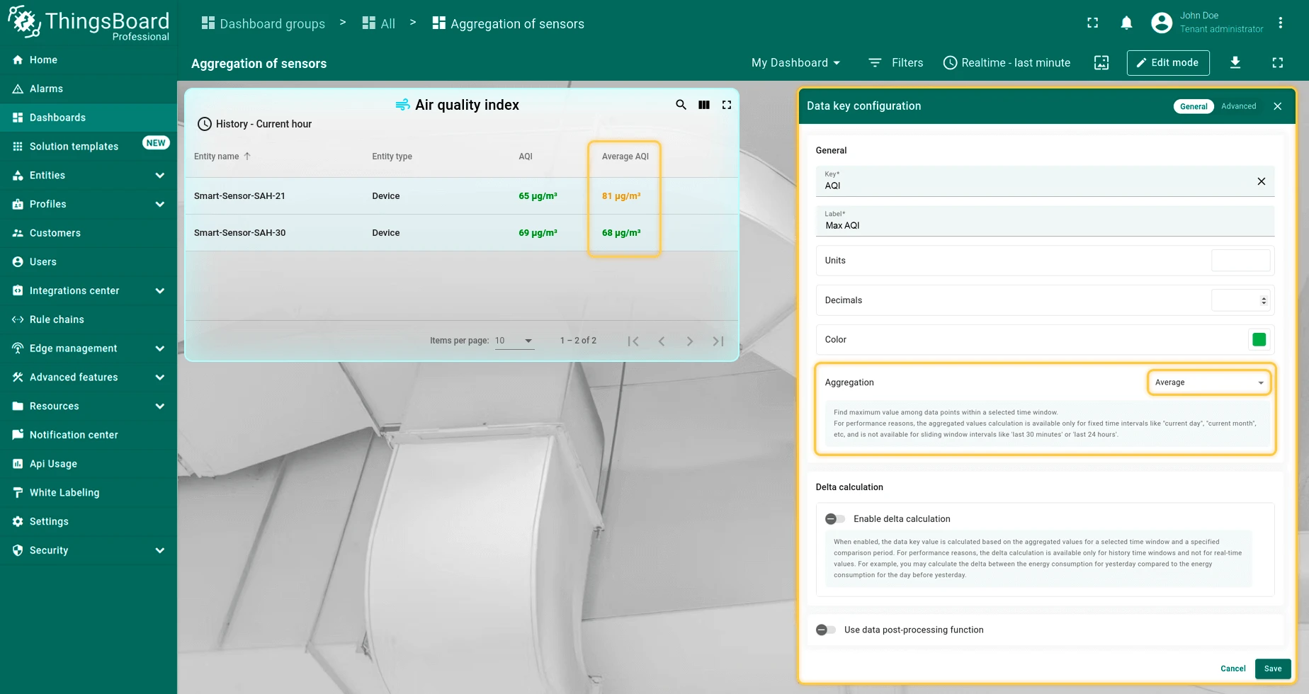
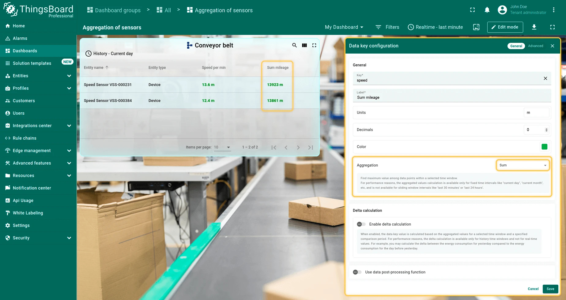
Basic Key Configuration
Each key row provides inline access to Label, Units, and Decimal places without opening the full dialog. Available fields may vary by widget type.
Advanced Key Configuration
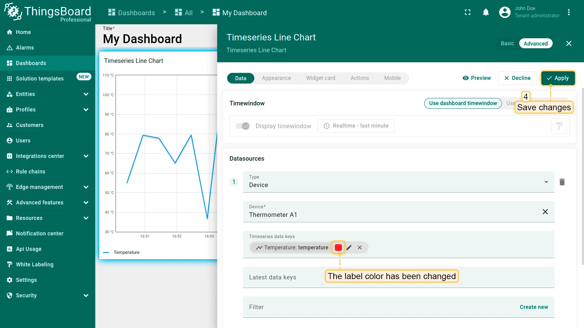
Click the pencil icon on a key row to open the full key configuration dialog.
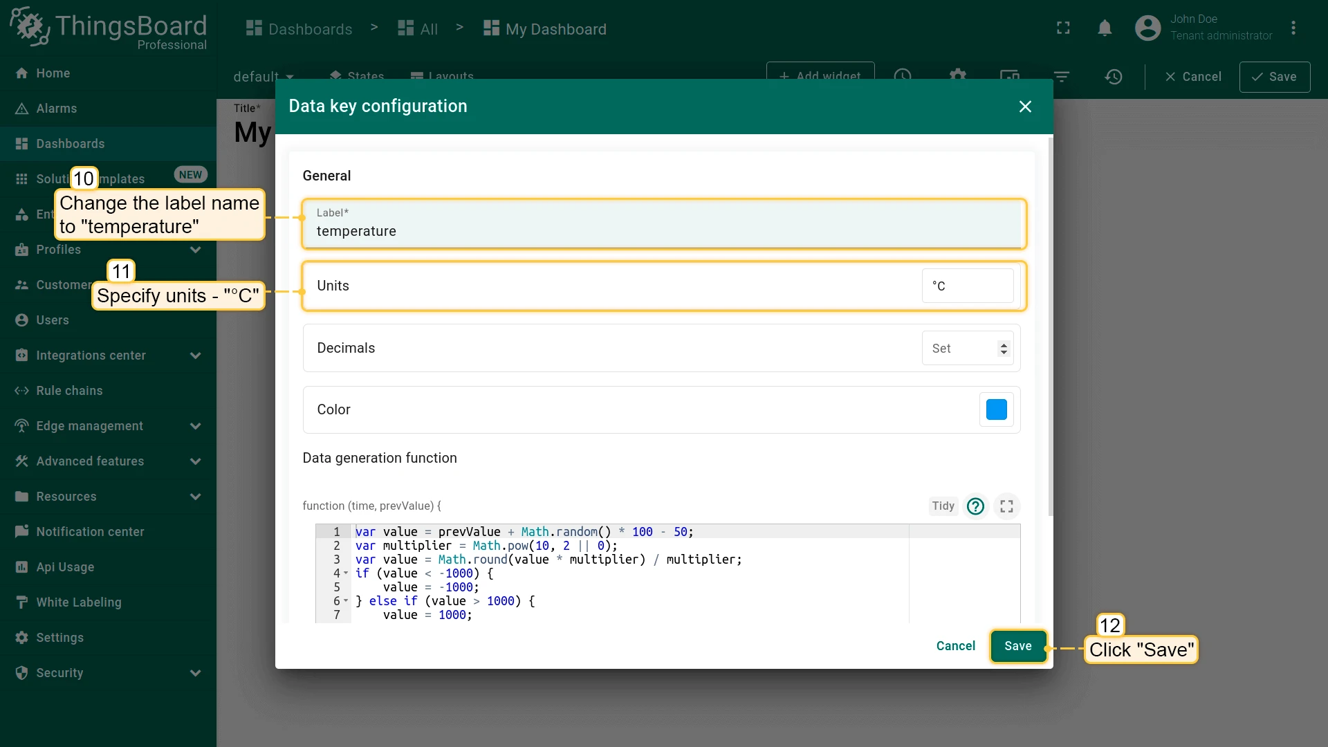
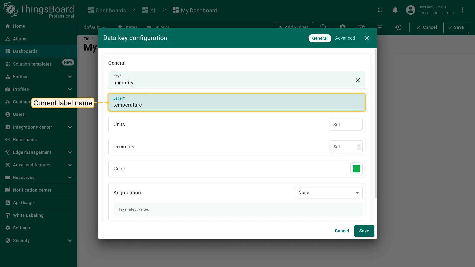
Key — The telemetry key the widget reads. Changing this remaps the widget to a different key without removing and re-adding the datasource.
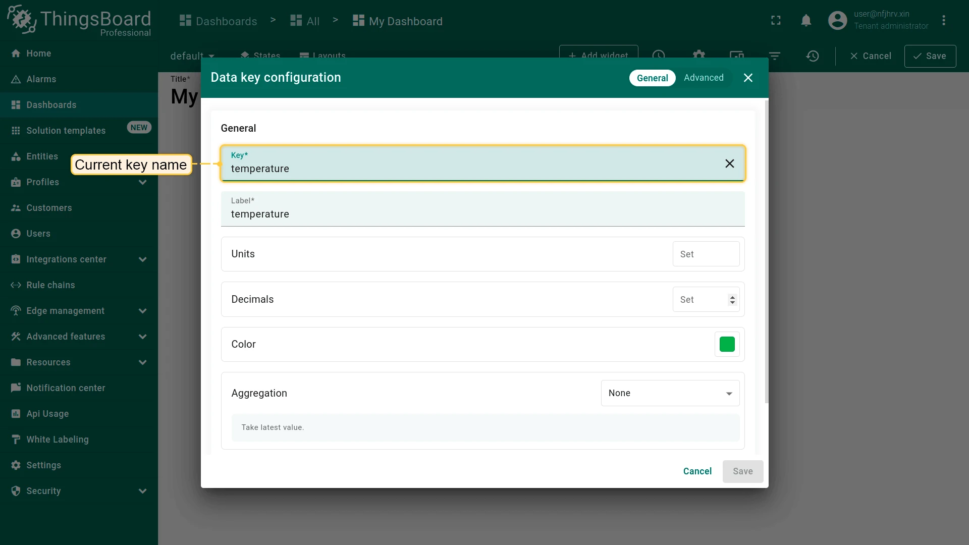
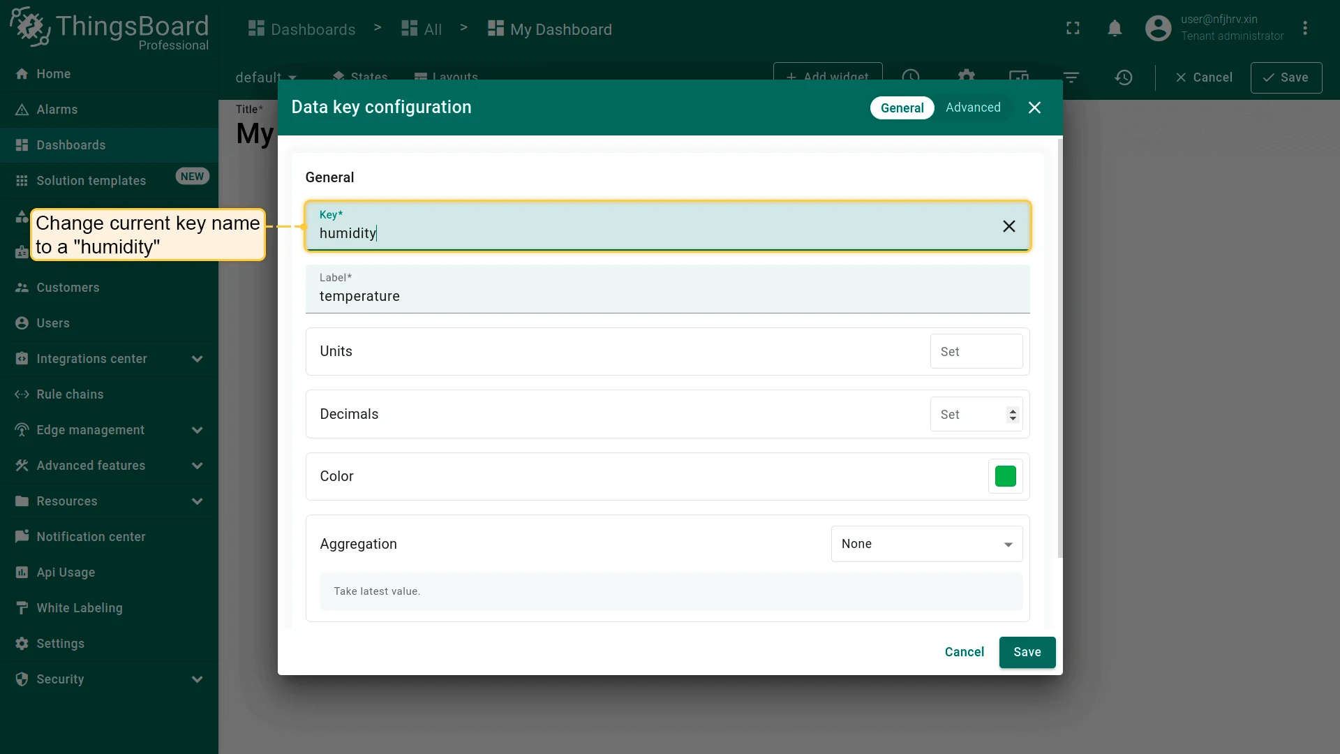
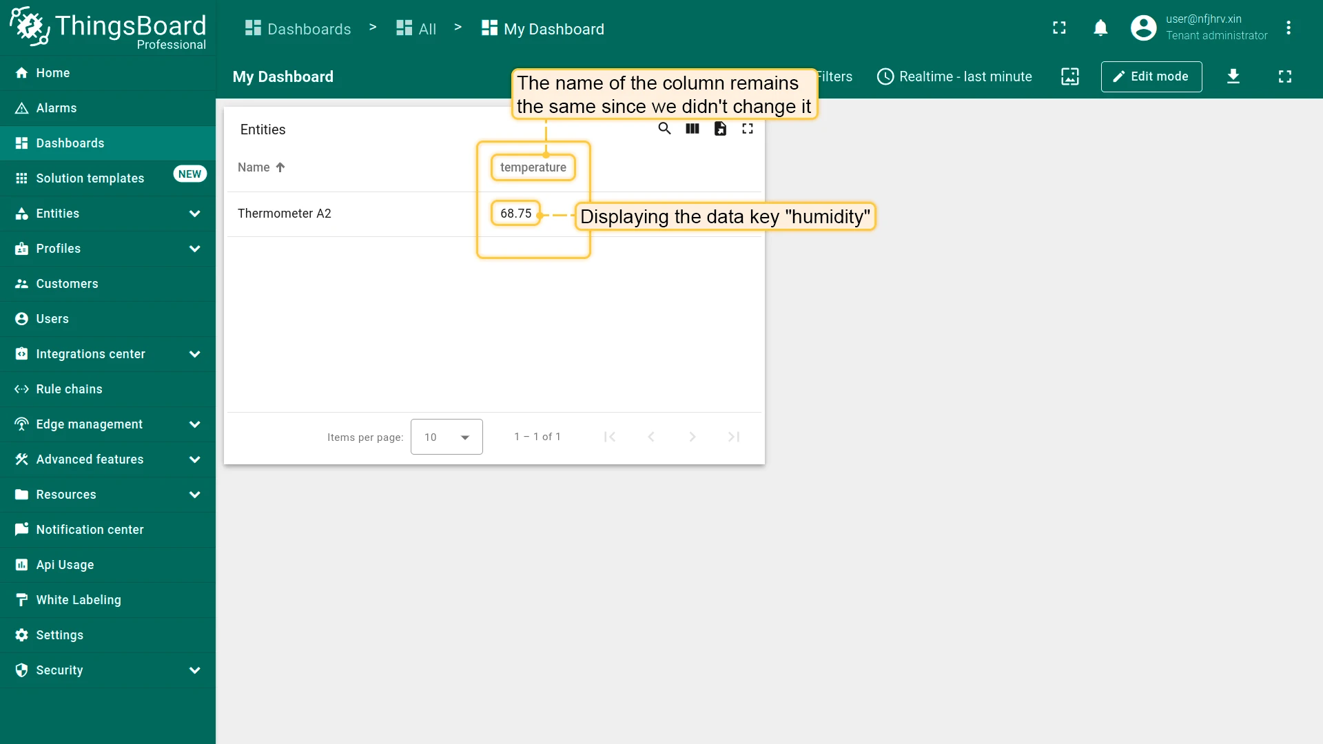
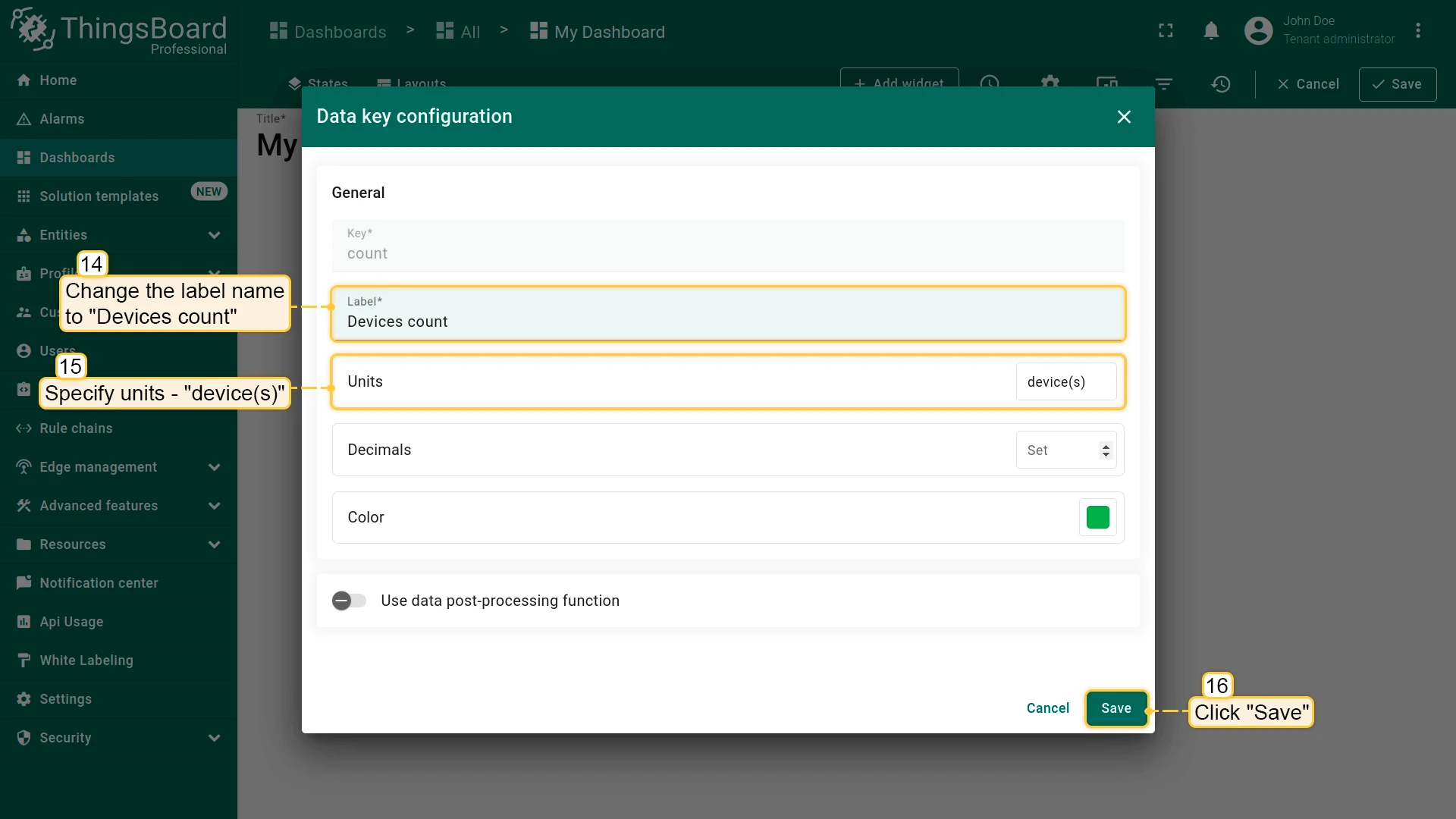
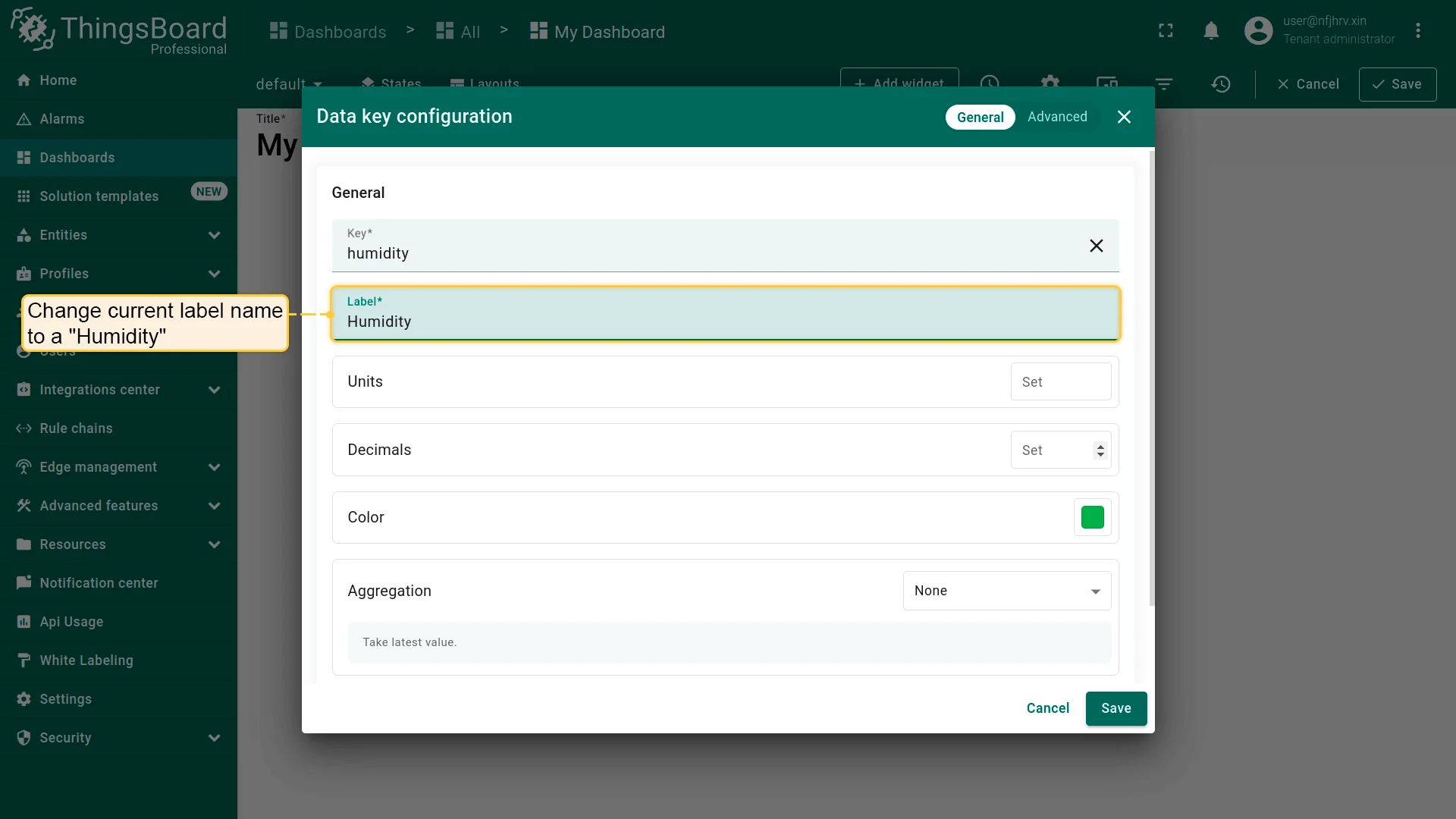
Label — Display name shown in the widget legend and tooltip. Defaults to the key name if left empty.

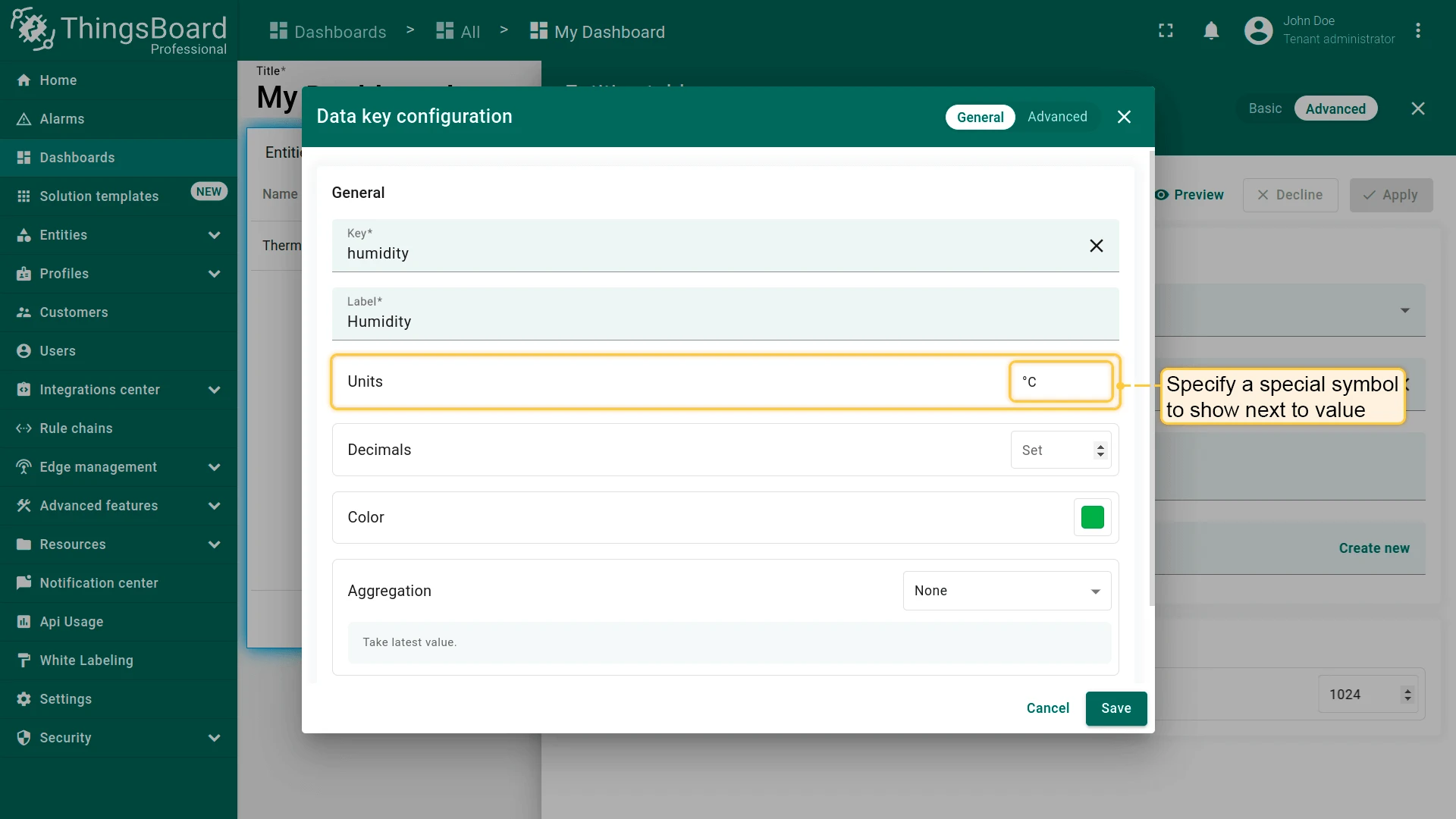
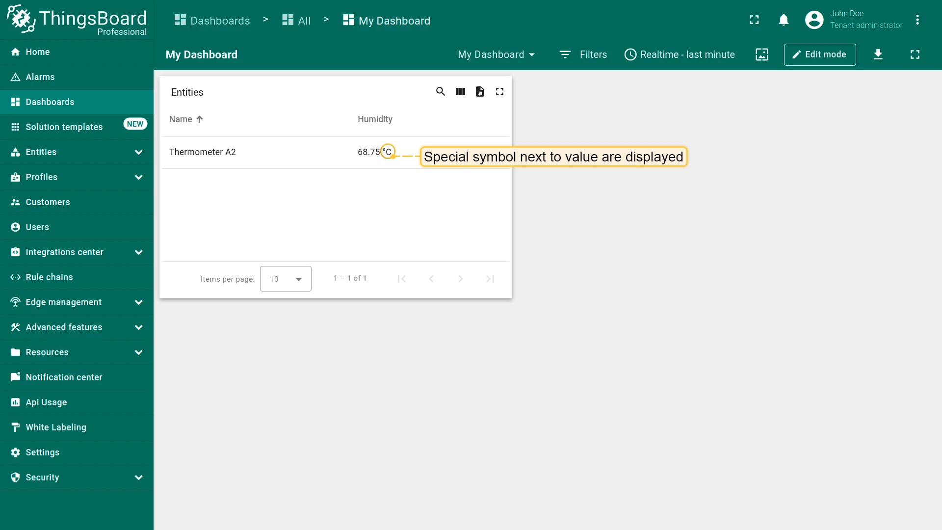
Units — Symbol appended to displayed values (e.g., °C, %, kWh).
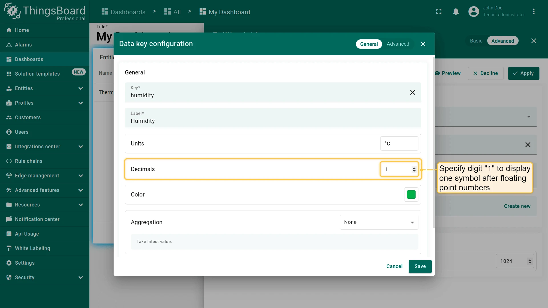
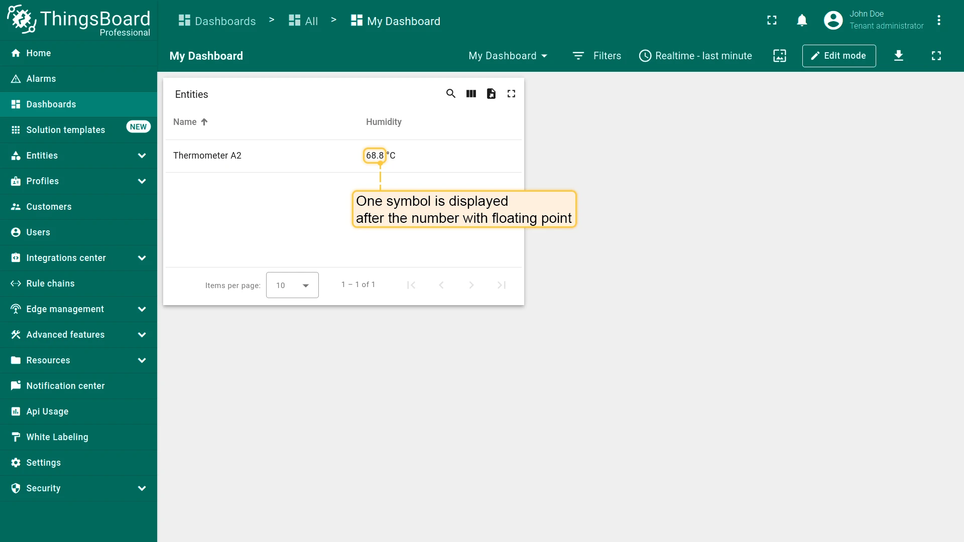
Decimal places — Number of decimal digits shown for numeric values.
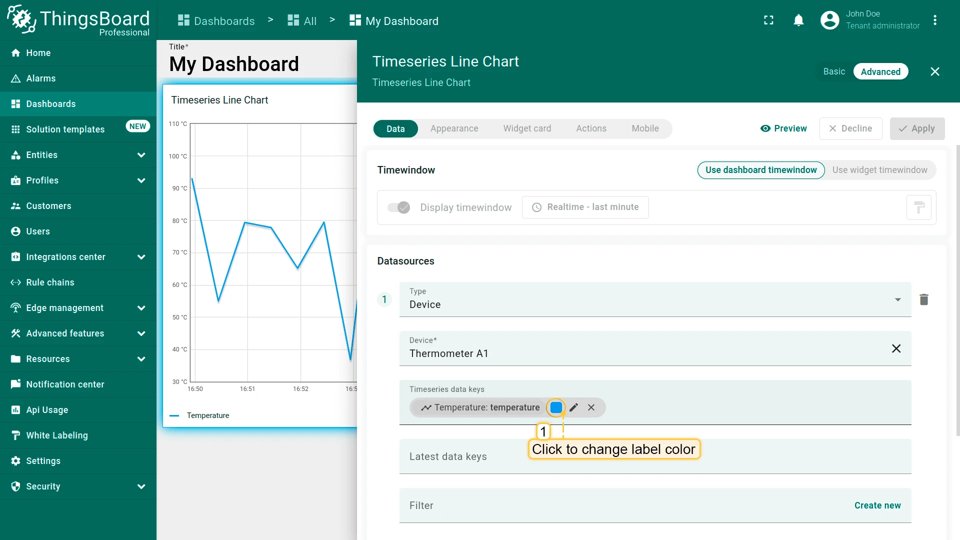
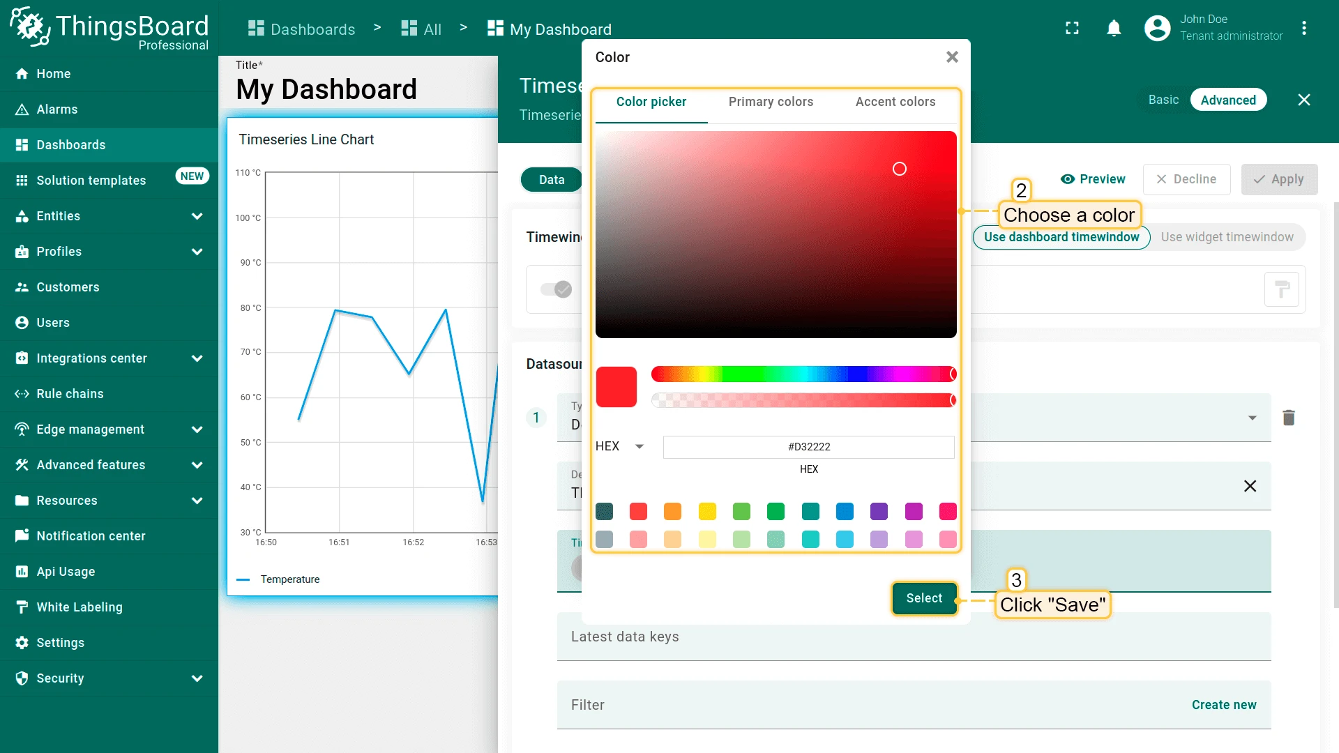
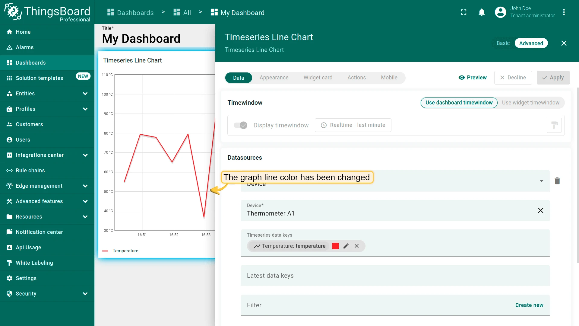
Color — Series color used in charts and legends.
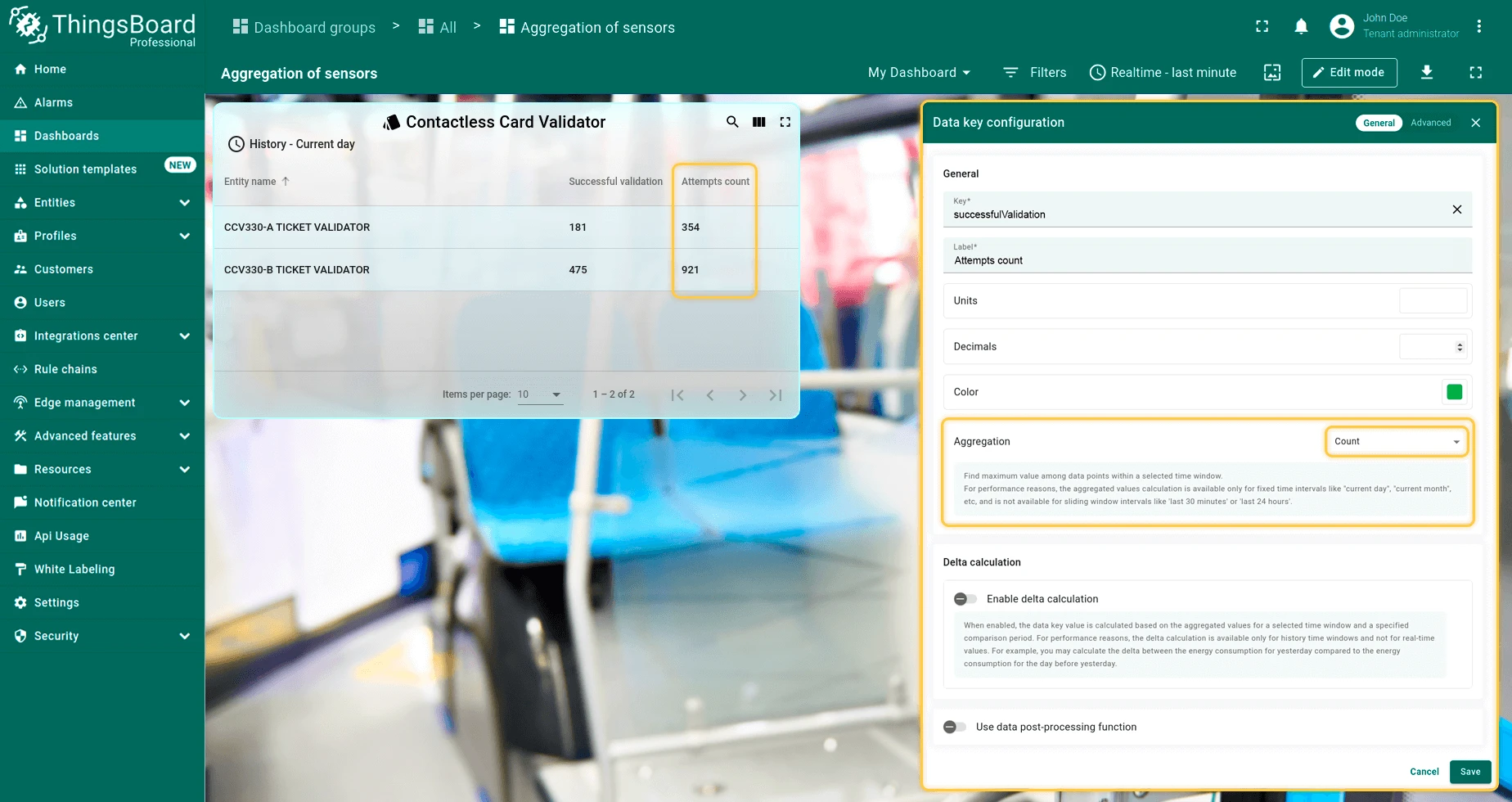
Aggregation — available for Latest values widgets only. Enables a time window and reduces the key’s time series data to a single aggregated value per interval.
Configurable per key individually.
Supported functions: Min, Max, Average, Sum, Count.
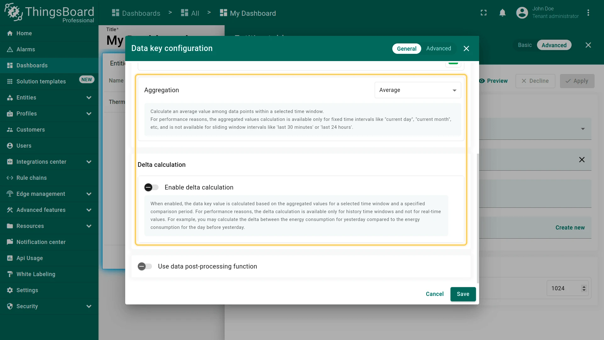
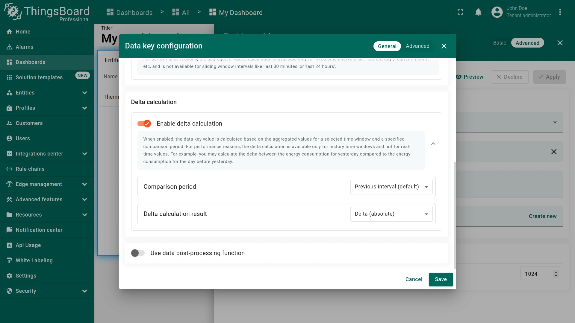

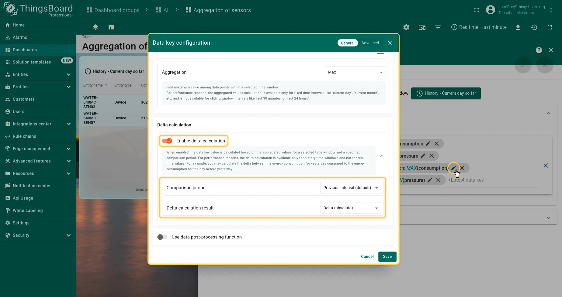
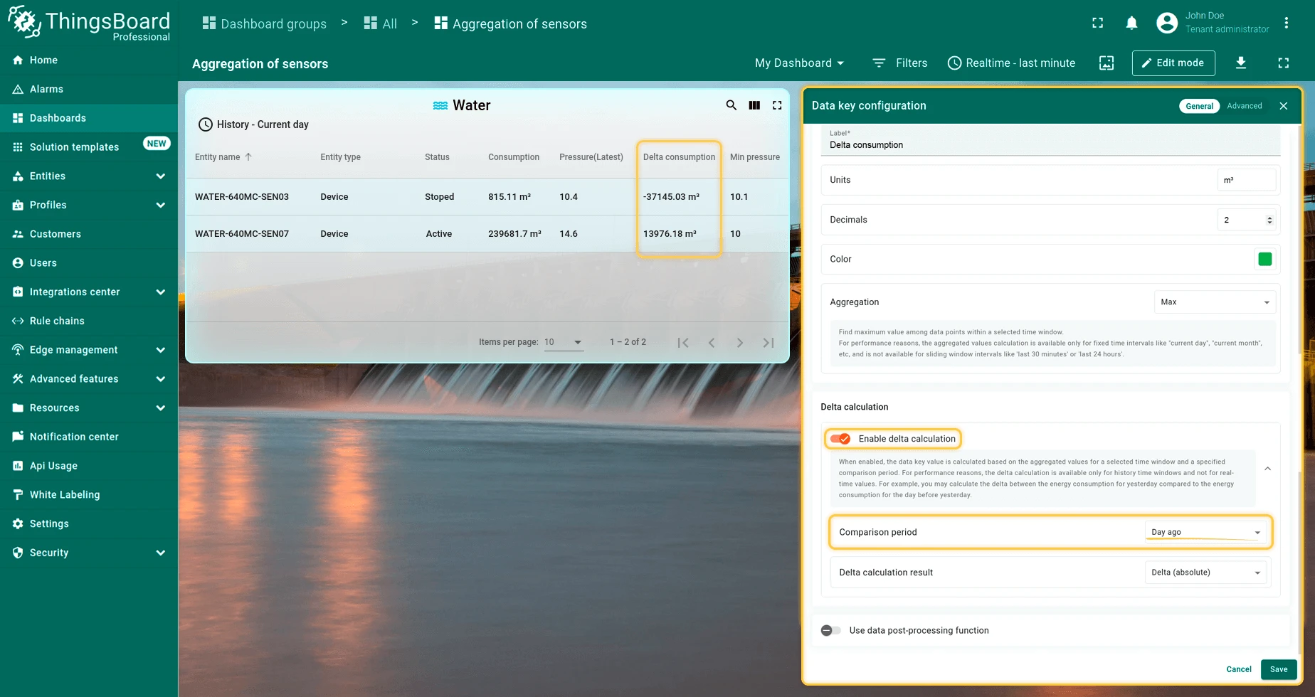
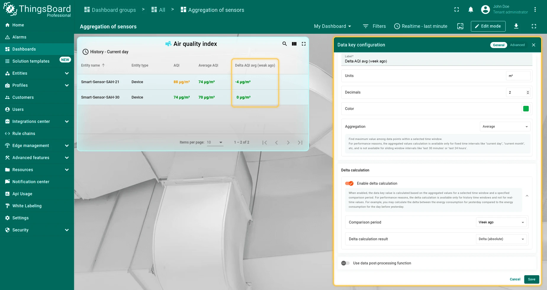
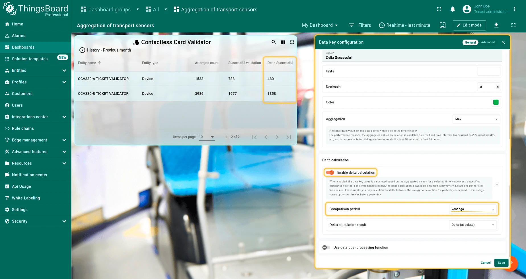
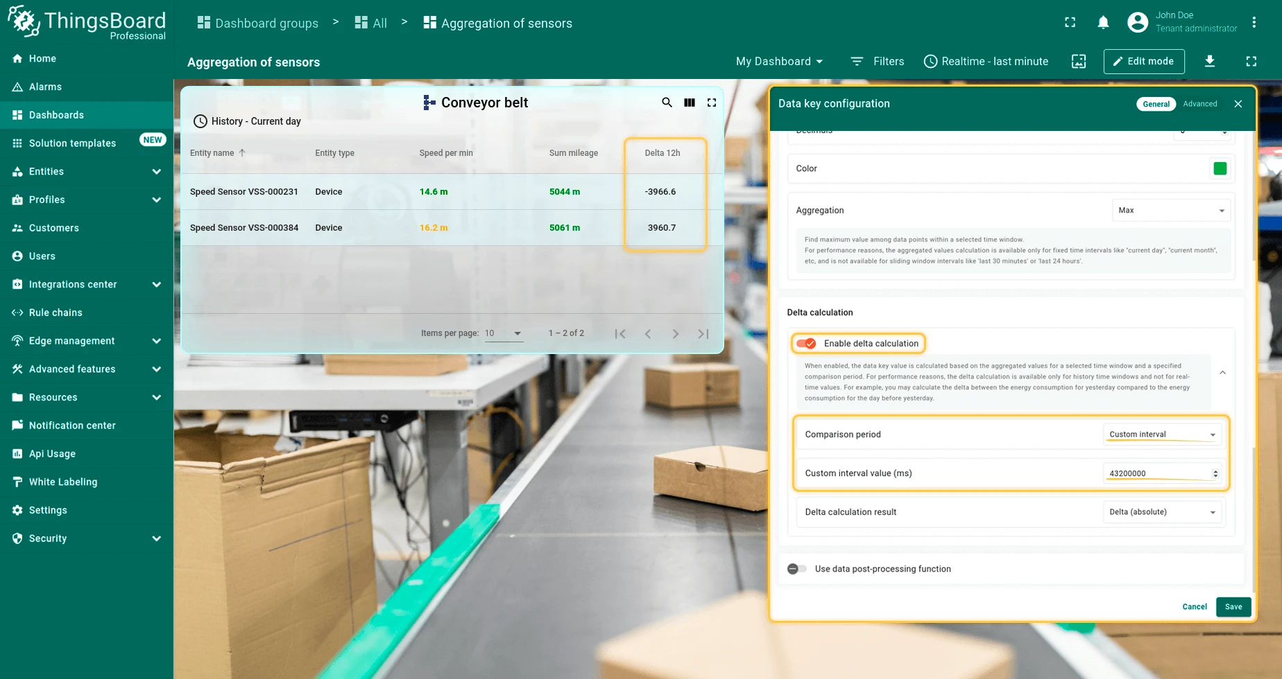
Delta calculation — Compares the current aggregated value against a historical reference period. Requires aggregation to be enabled.
The result can be shown as the Previous value, an Absolute delta (current − previous), or a Percentage delta (relative difference).
Available comparison periods: Previous interval, Day ago, Week ago, Month ago, Year ago, Custom.

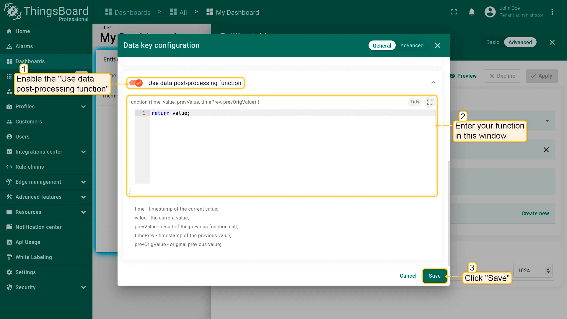
Data post-processing function — JavaScript function applied to each incoming value before it is displayed.
Use it to convert units, filter anomalies, or compute derived metrics.
The function receives time, value, prevValue, timePrev, and prevOrigValue, and must return number | string | boolean | null.
Returning null excludes the data point from the visualization.
Data Filters
Section titled “Data Filters”Filters narrow which data a widget retrieves from its data sources. Build a filter by adding keys and defining conditions on those keys — multiple keys and conditions can be combined.
See Filters for details.
Alarm Filters
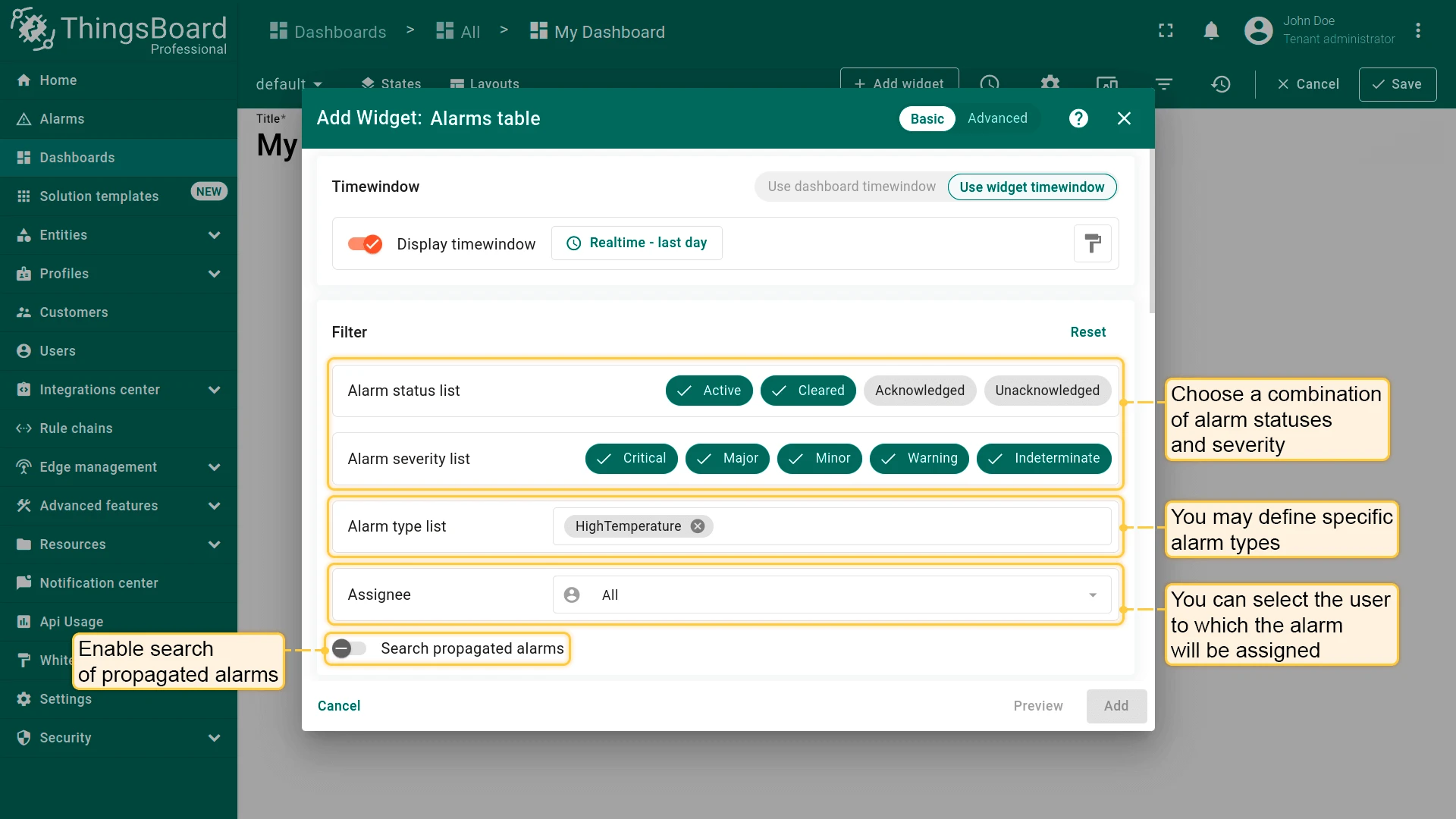
Section titled “Alarm Filters”Alarm widgets use a dedicated filter panel instead of a data key list. Use these filters to control which alarms appear in the widget — by status, severity, type, assignee, or entity scope.
- Alarm status list — show only alarms in the selected statuses: Active, Cleared, Acknowledged, Unacknowledged. Multiple statuses can be combined.
- Alarm severity list — show only alarms at the selected severities: Critical, Major, Minor, Warning, Indeterminate. Multiple severities can be combined.
- Alarm type list — restrict to specific alarm type names (e.g.,
HighTemperature). Leave empty to show all types. - Assignee — filter by the user the alarm is assigned to, or leave as All.
- Search propagated alarms — when enabled, the widget includes alarms that originated on child entities and were propagated up to the parent. Useful when the datasource resolves an asset or group and you want to see alarms from all devices within it, not just direct alarms on the asset itself.
Appearance
Section titled “Appearance”The Appearance tab controls the visual presentation, layout structure, and display behavior of a widget — how data is rendered and formatted — without affecting datasources, queries, or processing logic.
Available options depend on the widget type:
- Value formatting — default units, decimal precision, date format, and the “No data” message displayed when no data is available for the selected time window.
- Layout structure — layout type, auto scale, element visibility (label, icon, value, date), and icon sizing.
- Chart rendering — axes configuration (position, min/max, units), additional Y-axes, thresholds, grid lines, stacking, zoom, legend behavior, tooltip configuration, and aggregation display.
- Table presentation — header visibility, search, column management, actions column, pagination, tabs, and row styling.
- Styling and theming — background color, blur, padding, color palette, icon/value/label colors, and custom CSS.
- Animation and visual states — animation enablement, state-based styling, and dynamic effects.
- Domain-specific visuals (e.g., SCADA widgets) — symbol selection, flow direction, presence indicators, and animation speed.
Widget Card
Section titled “Widget Card”The widget card is the outer frame wrapping every widget on a dashboard. It provides a title bar, card-level visual styling, and optional header buttons available to end-users.
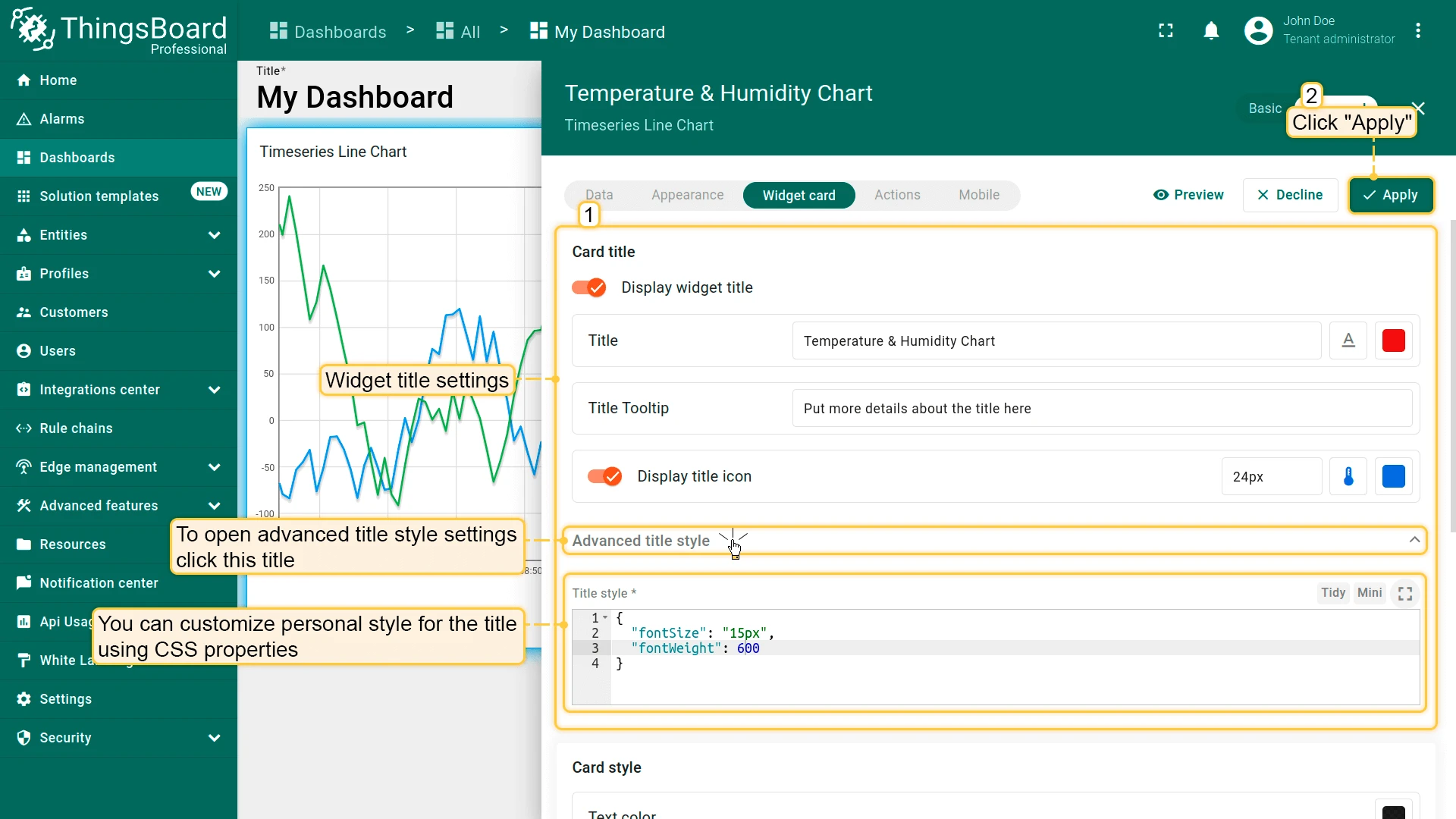
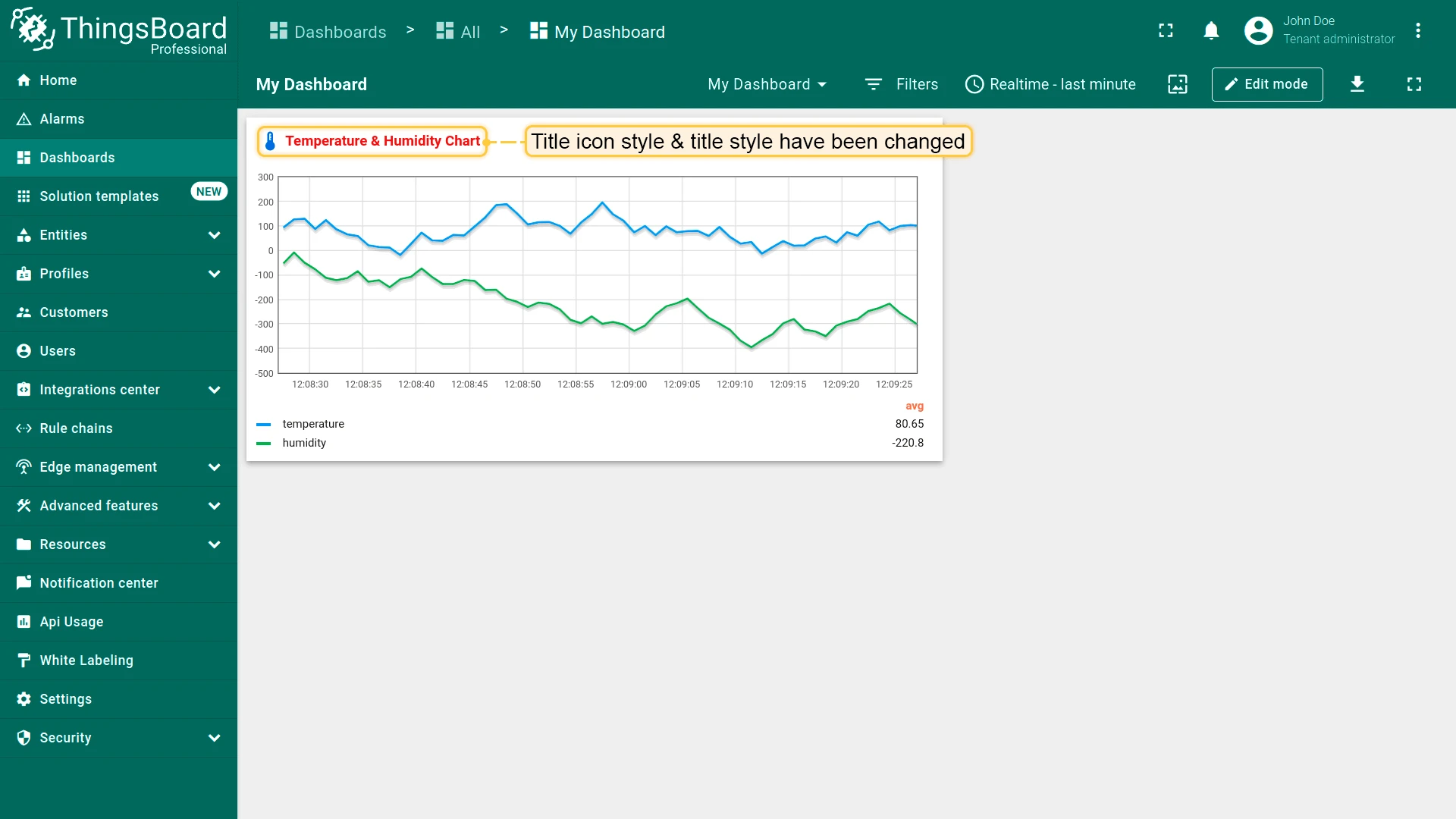
Card Title
- Display widget title — toggle that shows or hides the title bar entirely.
- Title — label displayed in the header. Supports dynamic patterns such as
${entityName}or${entityLabel}. - Title tooltip — tooltip text shown when hovering over the title.
- Display title icon — toggle that adds an icon before the title text. When enabled, configure the icon, its size, alignment, and color.
- Advanced title style — expandable section for fine-grained font and text styling (size, weight, color, decoration).

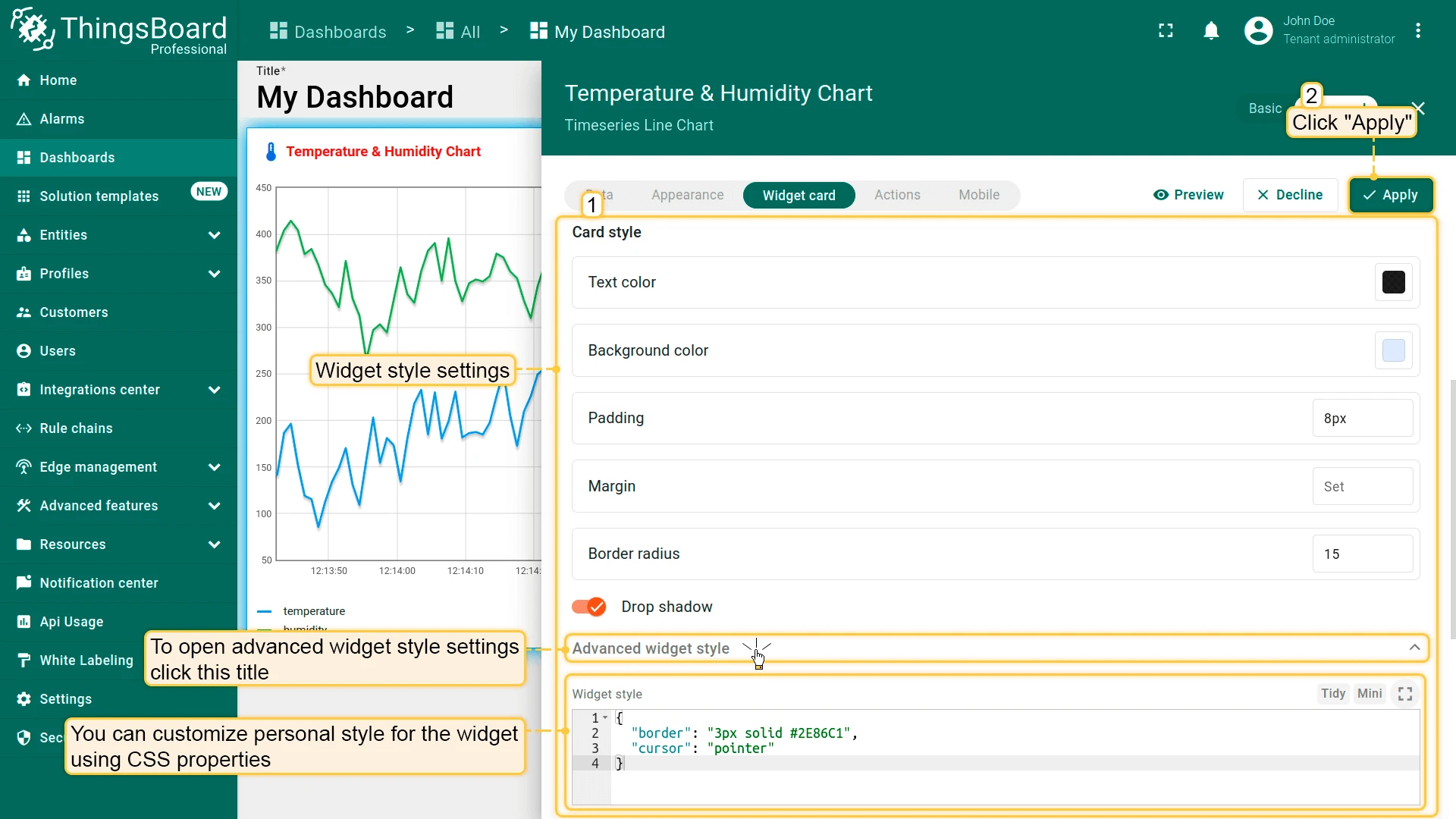
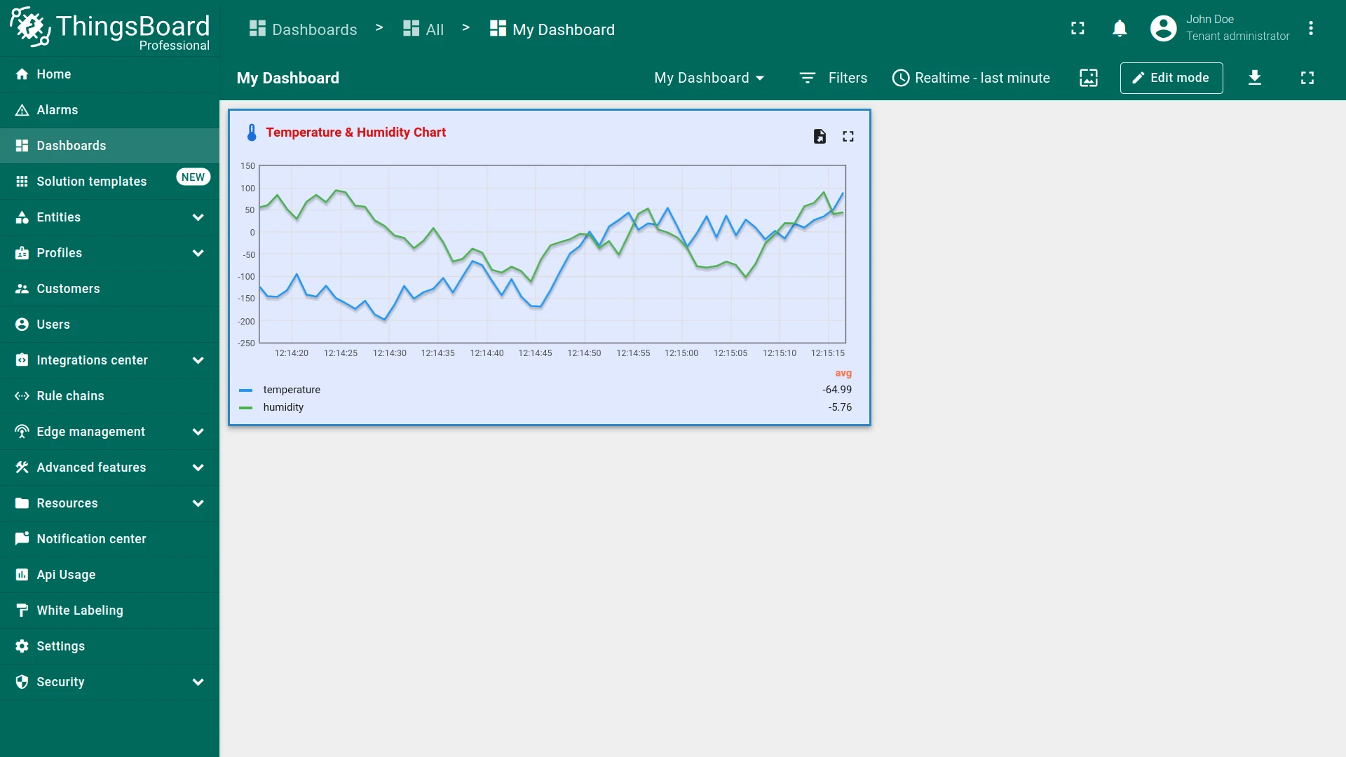
Card Style
Applies visual styling to the entire widget container.
- Text color — default text color inside the widget.
- Background color — fill color of the card.
- Padding — inner spacing between the card edge and its content.
- Margin — outer spacing around the card.
- Border radius — corner rounding of the card.
- Drop shadow — toggle that adds a drop-shadow effect around the card.
- Advanced widget style — expandable section for custom CSS applied to the widget container.
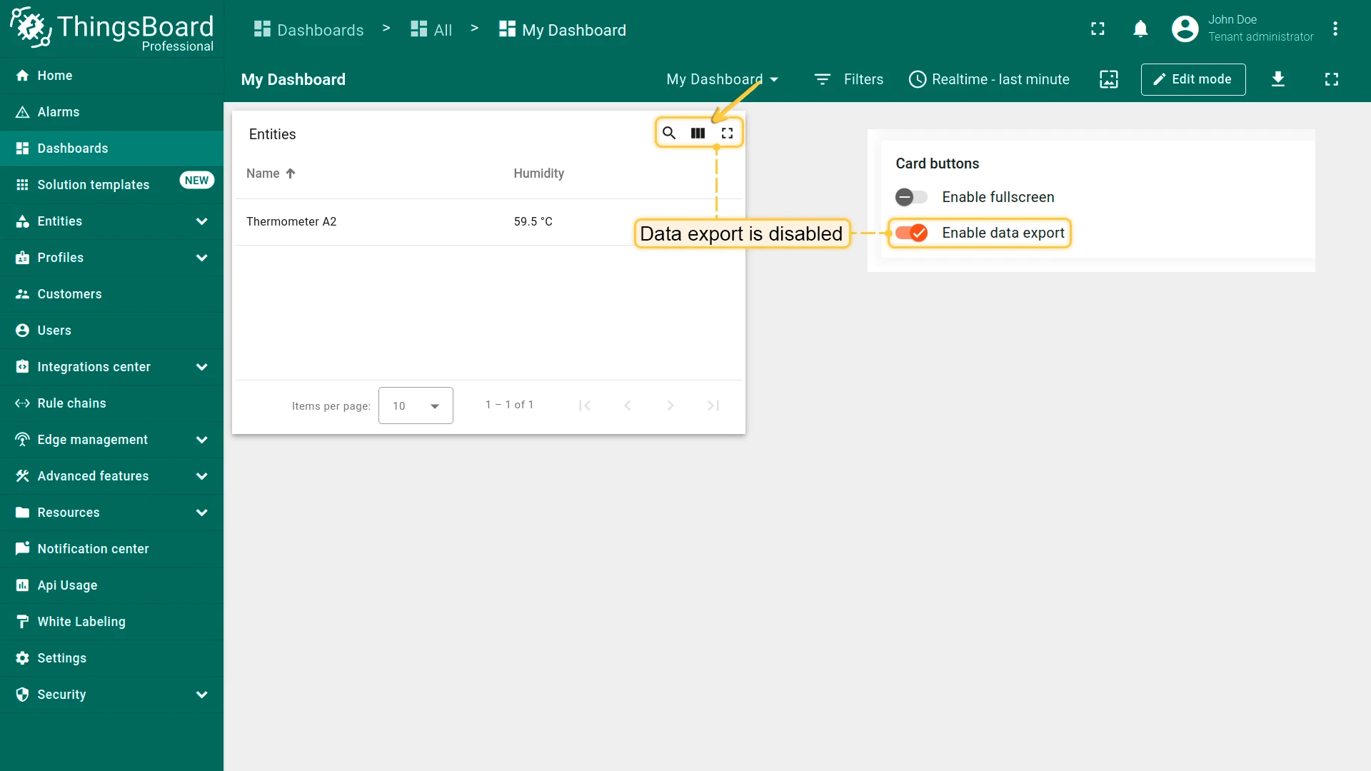
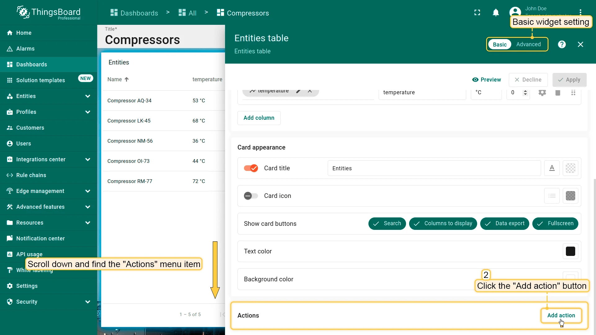
Card Buttons
Controls which action icons appear in the widget header.
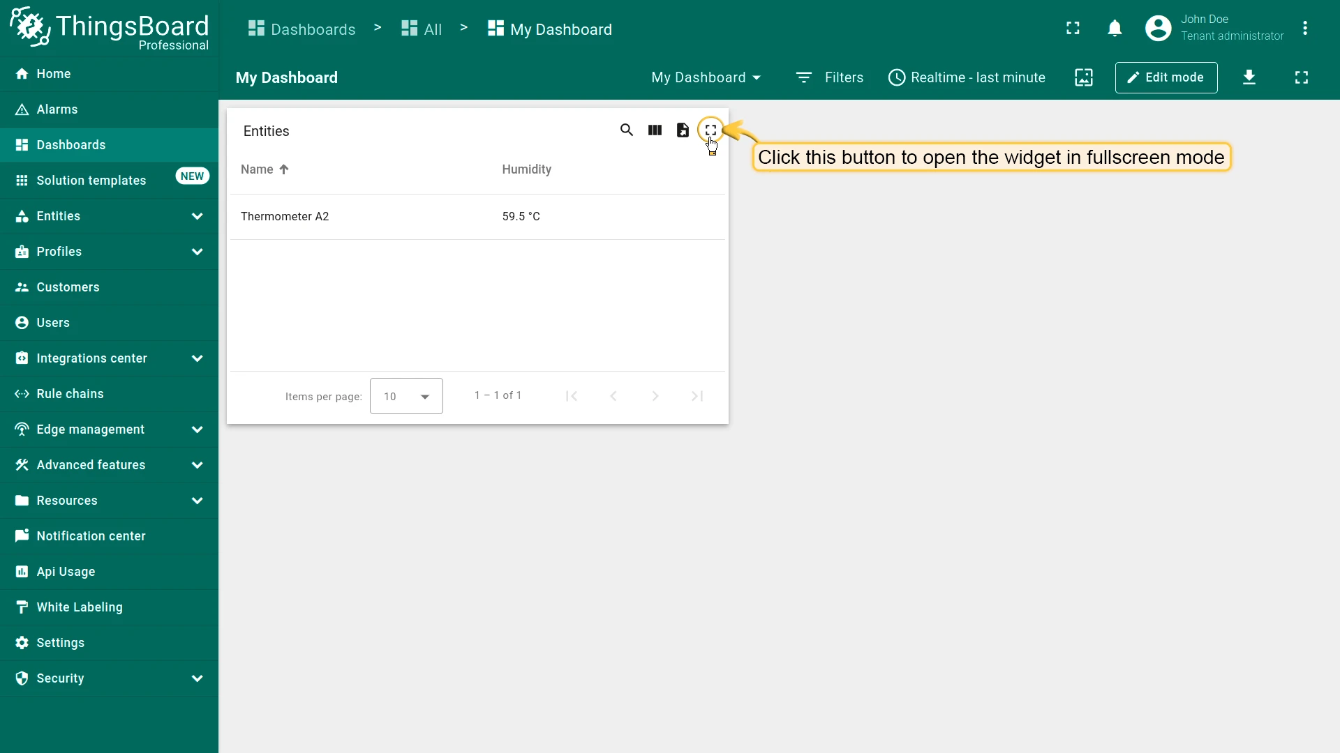
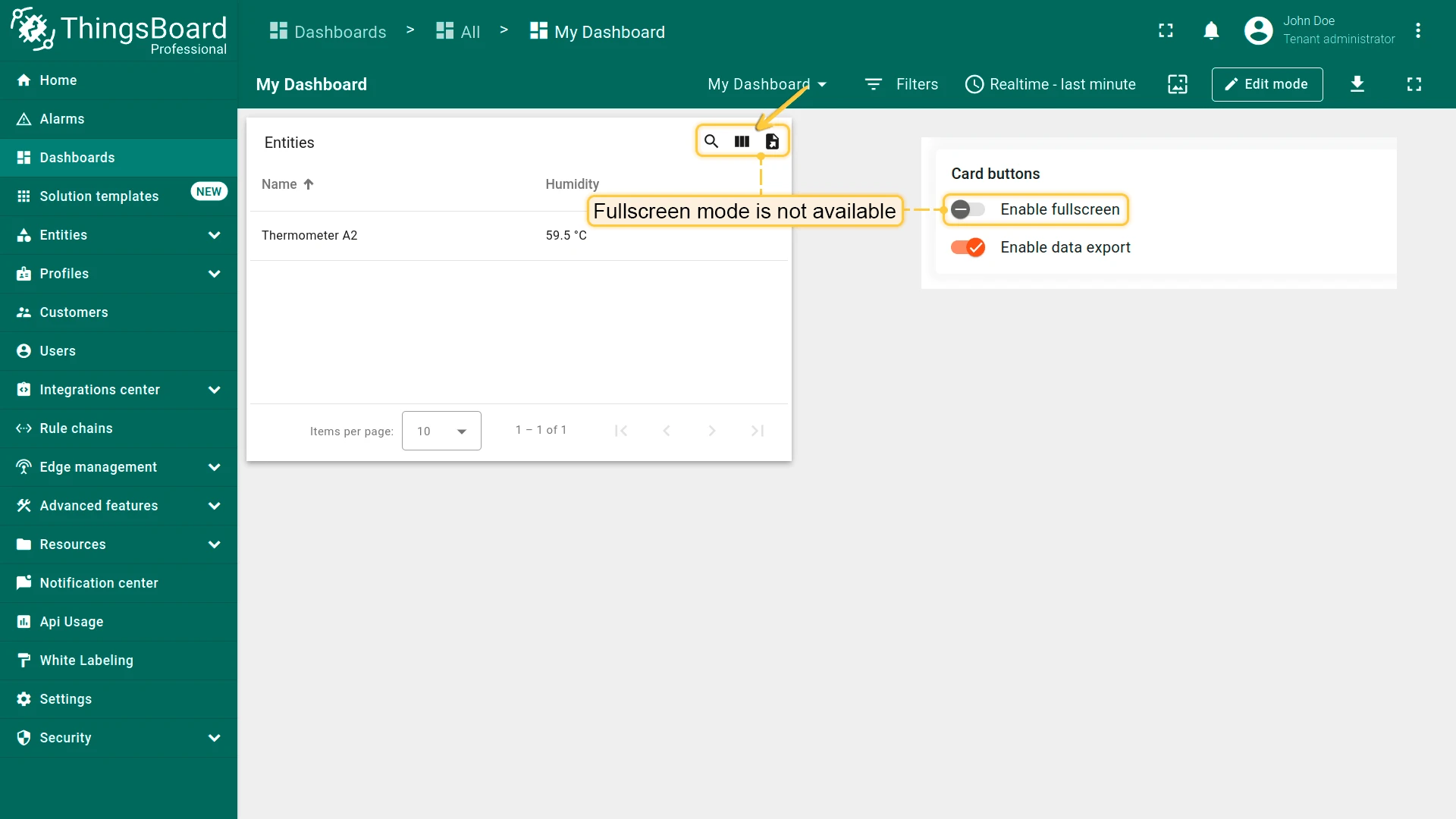
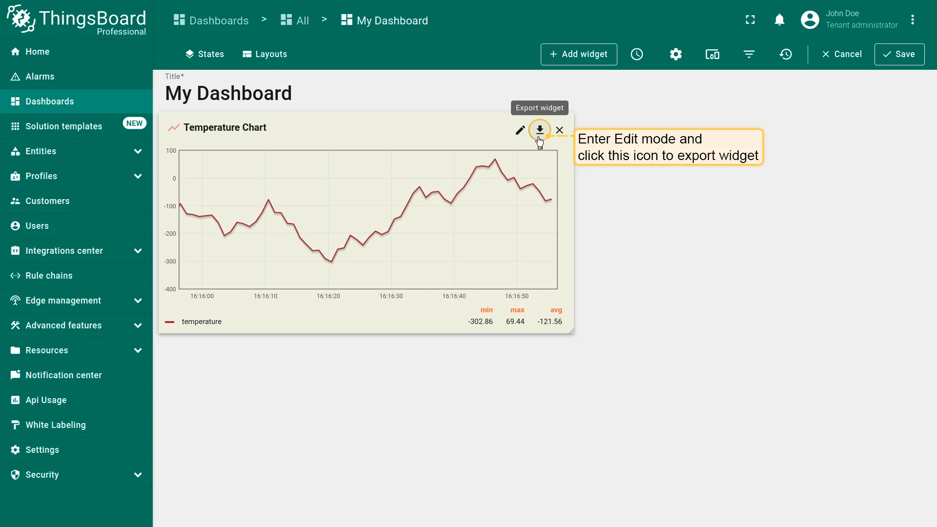
Enable fullscreen — shows an expand button in the widget header. When clicked, the widget opens in a full-screen overlay. Enabled by default.
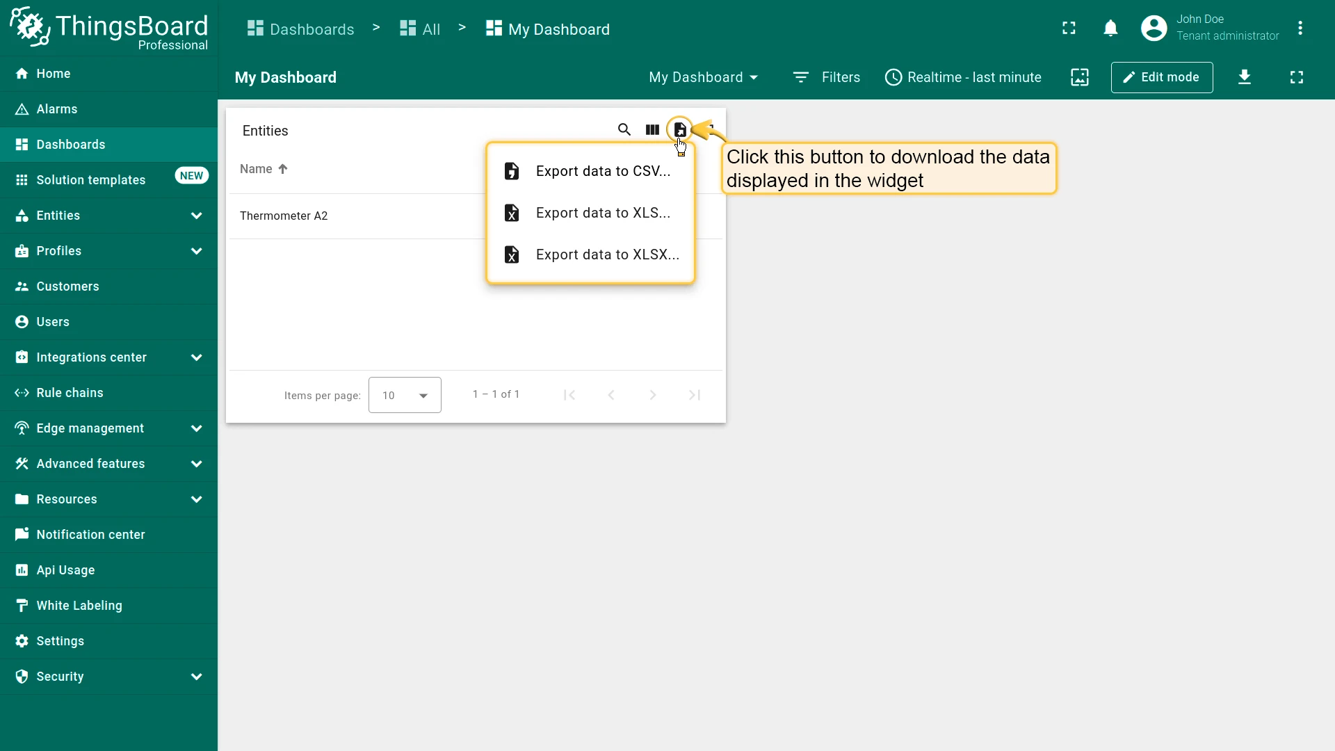
Enable data export — available in the Card buttons section alongside Enable fullscreen. When enabled, a download button appears in the widget header. Clicking it lets users export the widget's current dataset (based on the active time window) as CSV, XLS, or XLSX. See CSV/XLS data export for details.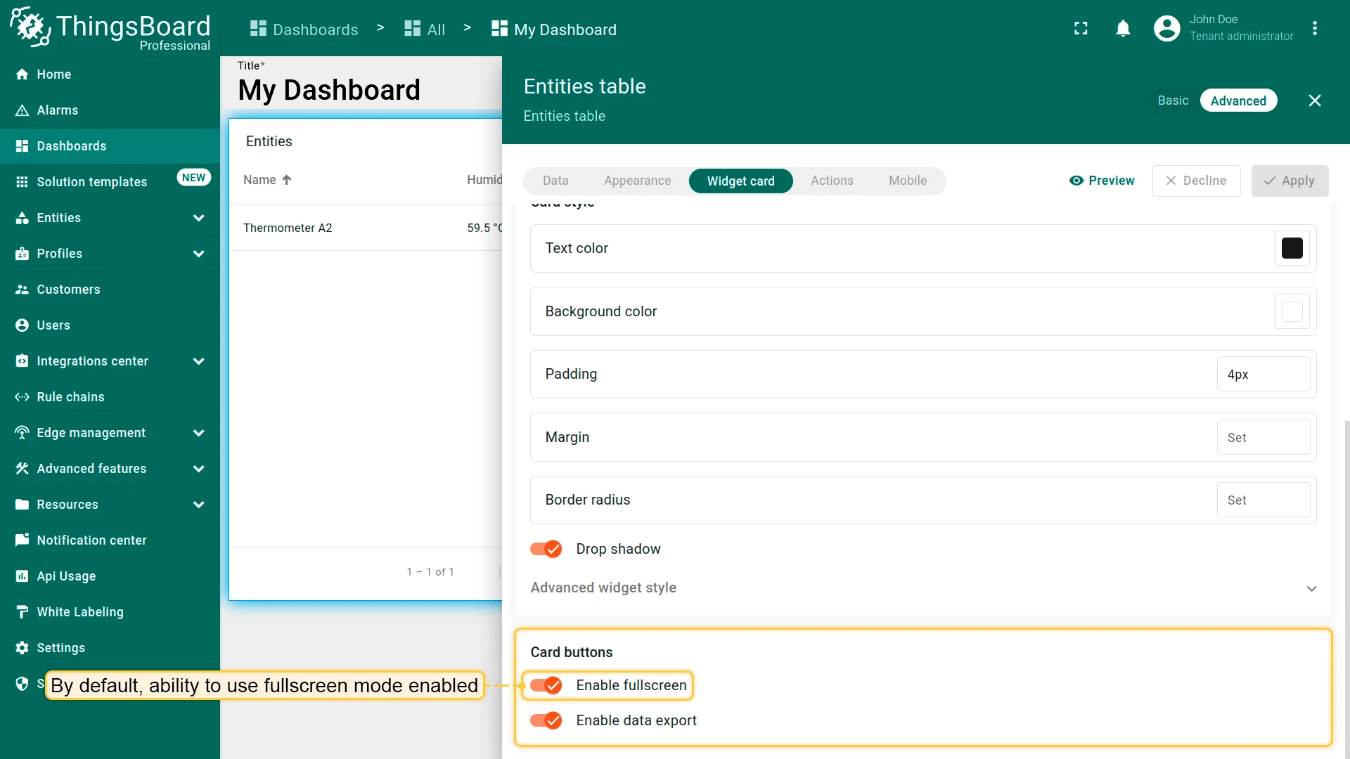

Widget Actions
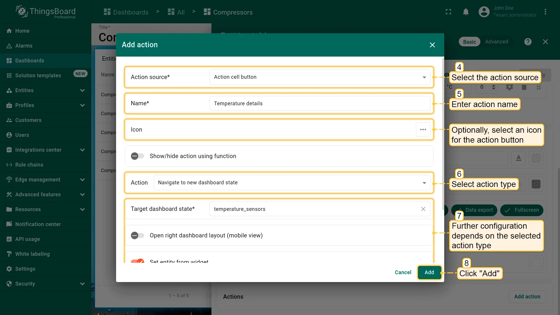
Section titled “Widget Actions”Actions connect user interactions to navigation or device control operations. Each action is defined by an action source (what triggers it) and an action type (what it does).
Action Sources
Action sources vary by widget type.
| Source | Widgets |
|---|---|
| Widget header button — a custom button in the widget title bar | All |
| On row click — clicking a table row | Tables |
| On row double click — double-clicking a table row | Tables |
| Action cell button — a custom button column in a table | Tables |
On HTML element click — a tagged id-marked HTML element | HTML widgets |
| On map element click — markers and polygons | Map widgets |
Action Types
Action types are the same for all widgets.
| Type | Description |
|---|---|
| Navigate to new dashboard state | Open a named state in the current dashboard |
| Update current dashboard state | Update the entity context of the current state |
| Navigate to other dashboard | Open a different dashboard |
| Open URL | Open a web URL |
| Custom action | Execute a custom JavaScript function |
| Custom action (with HTML template) | Execute a function inside an HTML popup |
| Mobile action | Trigger a mobile device function (camera, QR scan, location) |
| Place map item | Create and place a new entity on the map (map widgets only) |
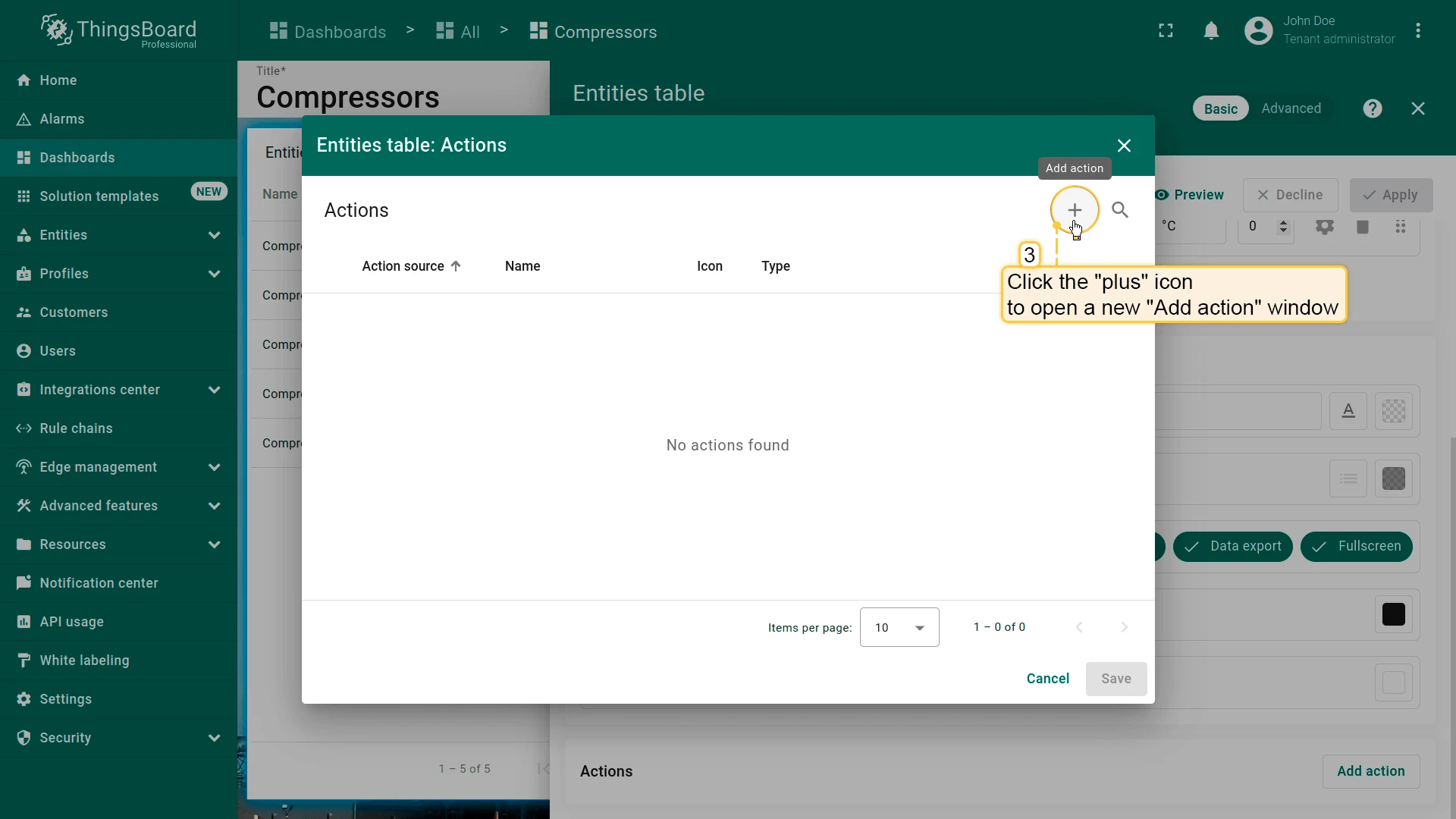
Add Action
In basic mode — open widget settings, scroll to Actions, click Add action, configure the source and type, then click Add and Save.
In advanced mode — open widget settings, go to the Actions tab, click +, configure, then click Add and Apply.
See Widget actions for complete examples of every source and type.
Widget Layout Settings
Section titled “Widget Layout Settings”The Layout tab controls how the widget behaves on the dashboard grid and on mobile screens.
Resize Options
- Resizable — when enabled, the widget can be resized by dragging its edges or corners in edit mode. Disable to lock the widget to its current size.
- Preserve aspect ratio — when enabled, resizing maintains the original width-to-height ratio.
Mobile
Controls widget visibility and sizing on mobile screens:
- Hide widget in mobile mode — removes the widget from the mobile layout while keeping it on desktop.
- Hide widget in desktop mode — removes the widget from the desktop layout while keeping it on mobile.
- Order — position of the widget in the mobile layout stack. Widgets stack vertically on mobile; lower values appear first.
- Height — widget height in the mobile grid (in grid units). Overrides the desktop height for mobile screens.
Import and Export Widget
Section titled “Import and Export Widget”Widgets can be exported as self-contained JSON files and imported into any dashboard or ThingsBoard instance. The exported file contains the full widget definition — type, configuration, appearance, and actions — but not the entity data itself.
Export Widget
Section titled “Export Widget”In the widget header, click Export widget to download the widget configuration as a .json file.
Import Widget
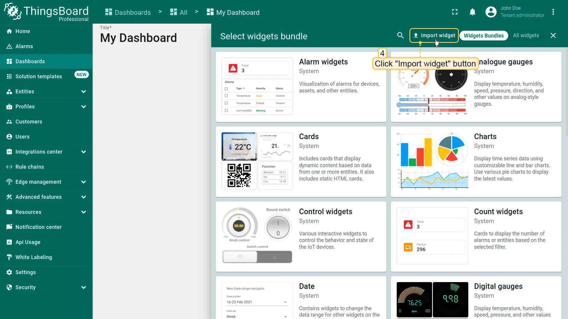
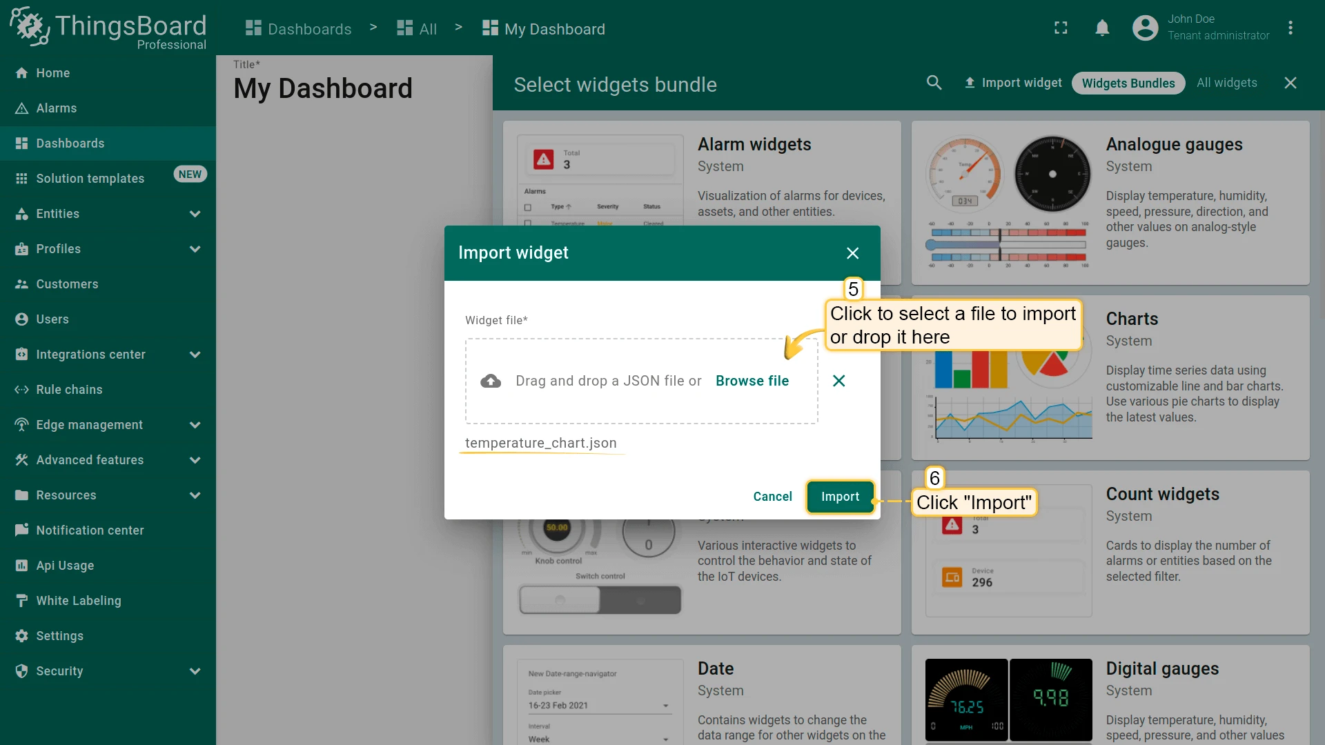
Section titled “Import Widget”- Open a dashboard and switch to edit mode.
- Click + Add widget, then select Import widget.
- Upload the
.jsonfile and click Import. - Reconfigure the datasource — the widget retains its original entity references, which must be updated for the target dashboard.
- Click Add, then Save.
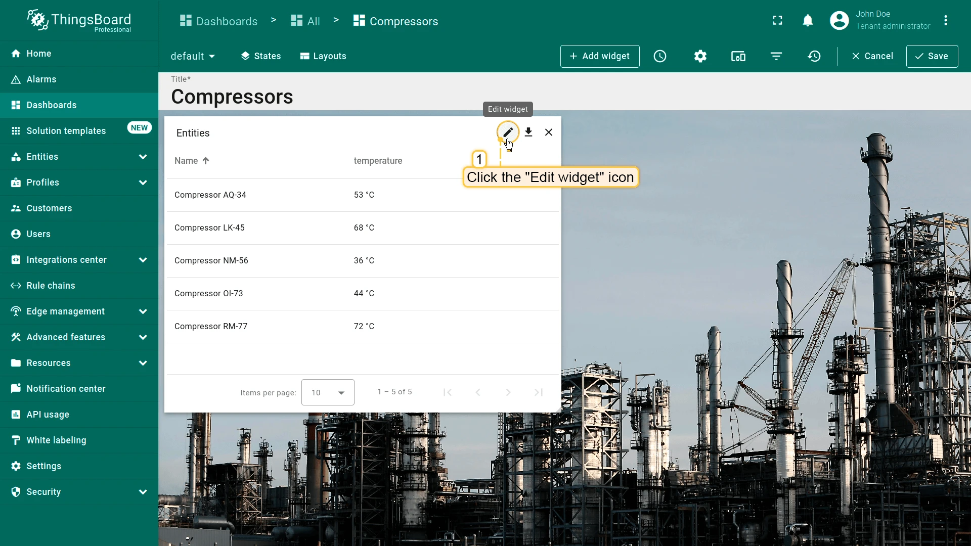
Edit Widget
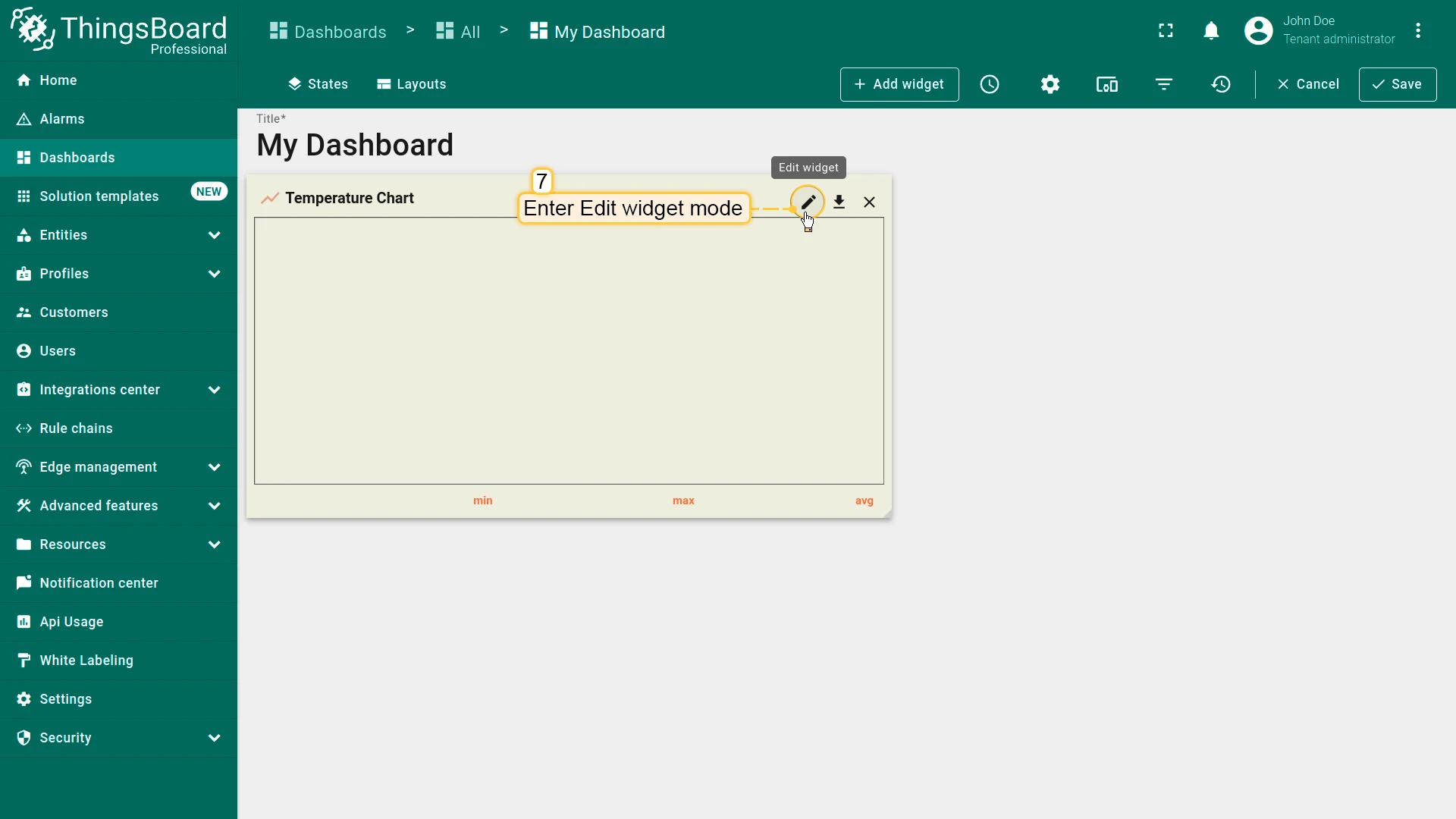
Section titled “Edit Widget”To edit a widget, switch to dashboard edit mode, then click the pencil icon on the widget header.
This opens the widget configuration dialog.
Duplicate Widget
Section titled “Duplicate Widget”Duplicating a widget allows you to reuse an existing configuration instead of creating a new widget from scratch. This is useful when multiple widgets share the same layout, style, or behavior but use different data.
Create a Full Copy
A full copy creates an independent duplicate with all settings preserved.
- Open the dashboard in edit mode.
- Right-click the widget and select Copy (or press Ctrl+C).
- Open the target dashboard (if needed).
- Right-click an empty area of the canvas and select Paste (or press Ctrl+V).
- Reposition the widget and save dashboard.
A full copy can be pasted into the same dashboard or into a different dashboard. After duplication, the new widget is independent and can be modified without affecting the original.
Create Referenced Copy
If you are working with multiple dashboard layouts (breakpoints) and want configuration changes to sync across all of them, use widget references. A referenced copy shares the same configuration as the original widget. Any changes made to one instance are automatically reflected in the other.
- Right-click the widget and select Copy reference (or press Ctrl+R).
- In the same dashboard, switch to another state.
- Right-click the canvas and select Paste reference (or press Ctrl+I).
- Reposition the widget and save dashboard.
Referenced copies can only be used within the same dashboard, typically across different states. They cannot be pasted into another dashboard.
Delete Widget
Section titled “Delete Widget”To delete a widget, switch to dashboard edit mode, then click the ✕ icon on the widget header. The widget is removed immediately. Click Save to persist the change, or Cancel to discard it and restore the widget.
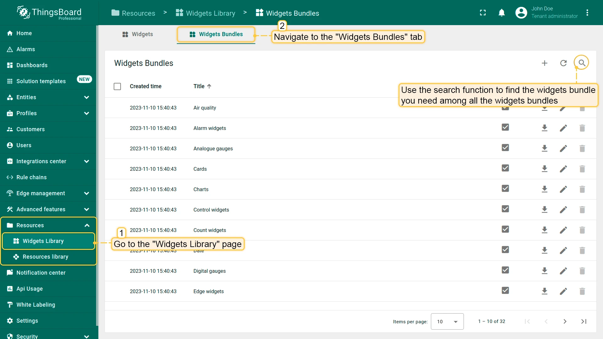
Widget Bundles
Section titled “Widget Bundles”Widgets are grouped into bundles according to their purpose. System-level bundles are managed by the System Administrator; tenant-level bundles can be created by individual tenants.
Operations with Widget Bundles
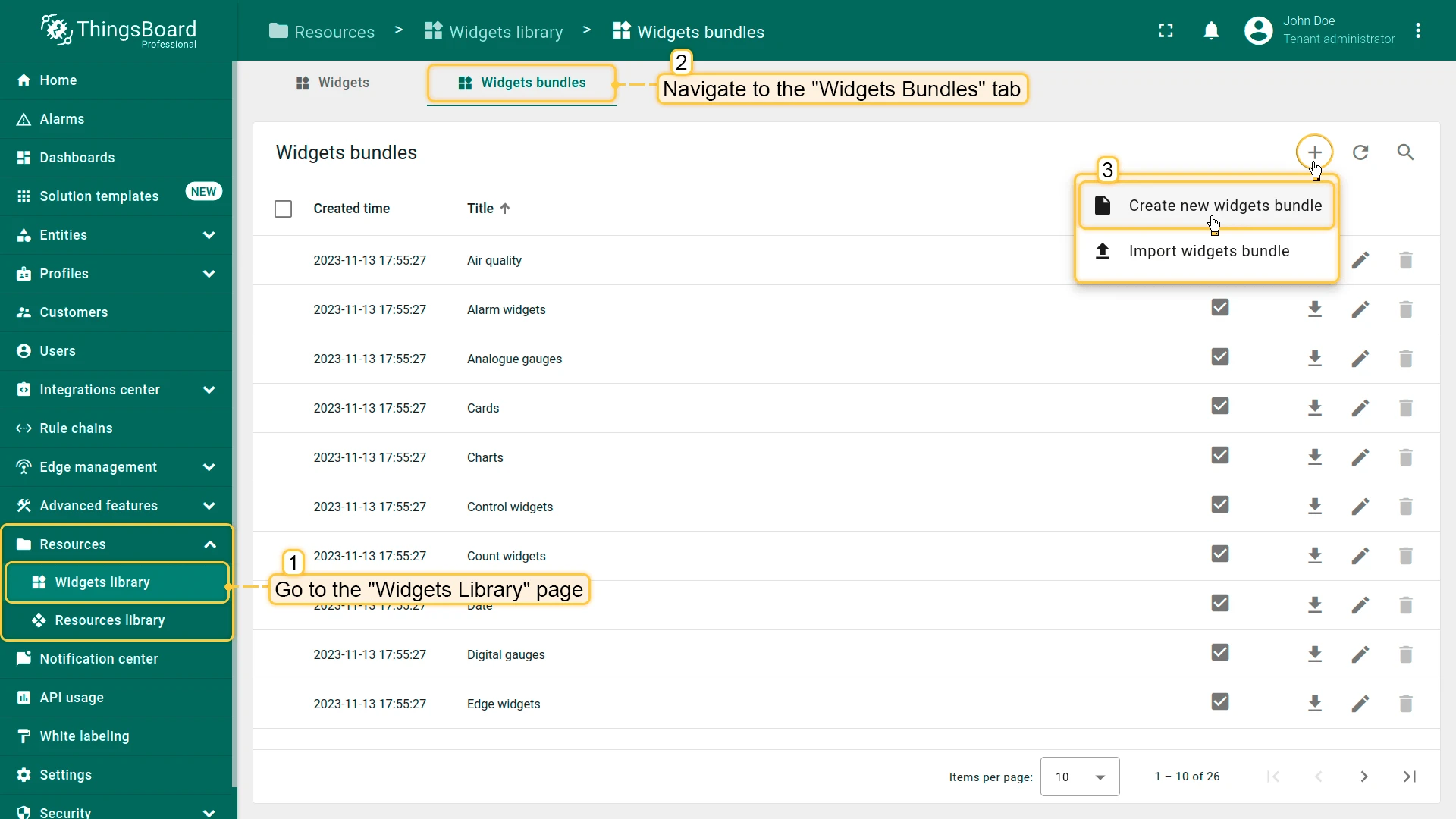
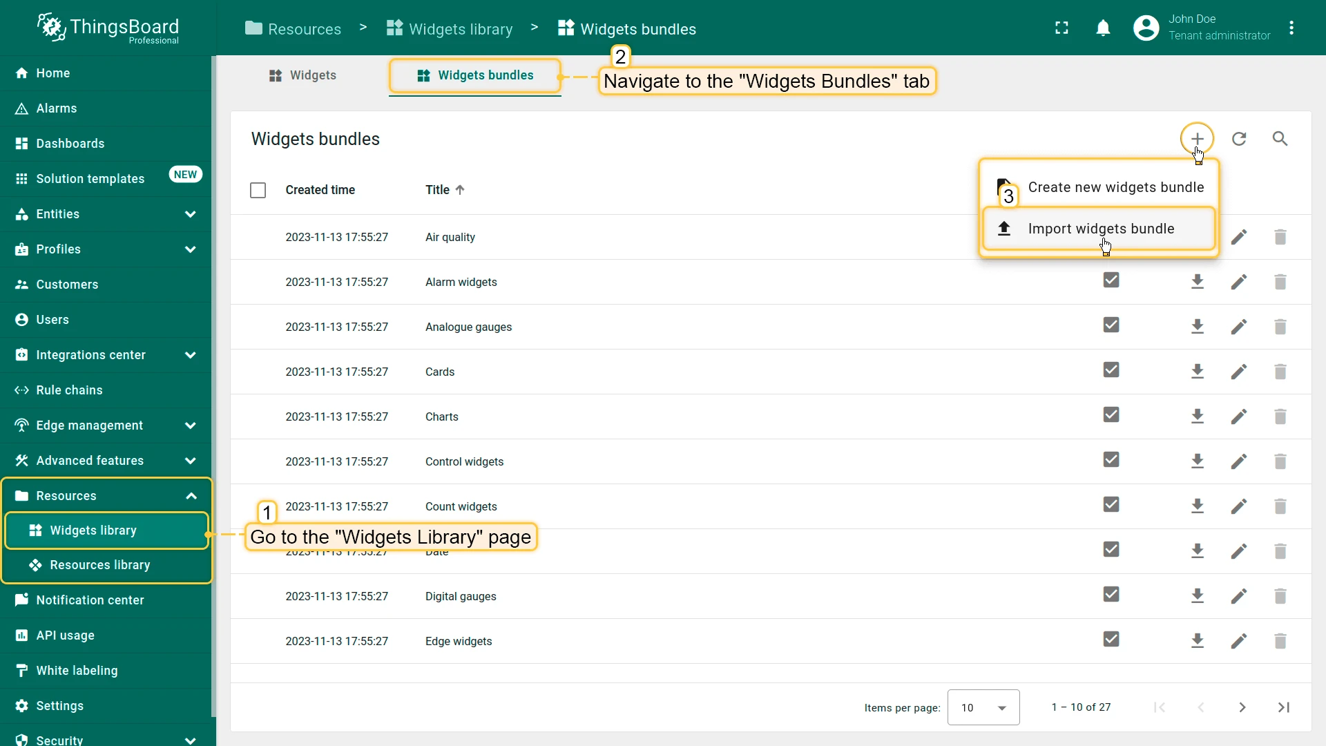
Section titled “Operations with Widget Bundles”Add Widget Bundle
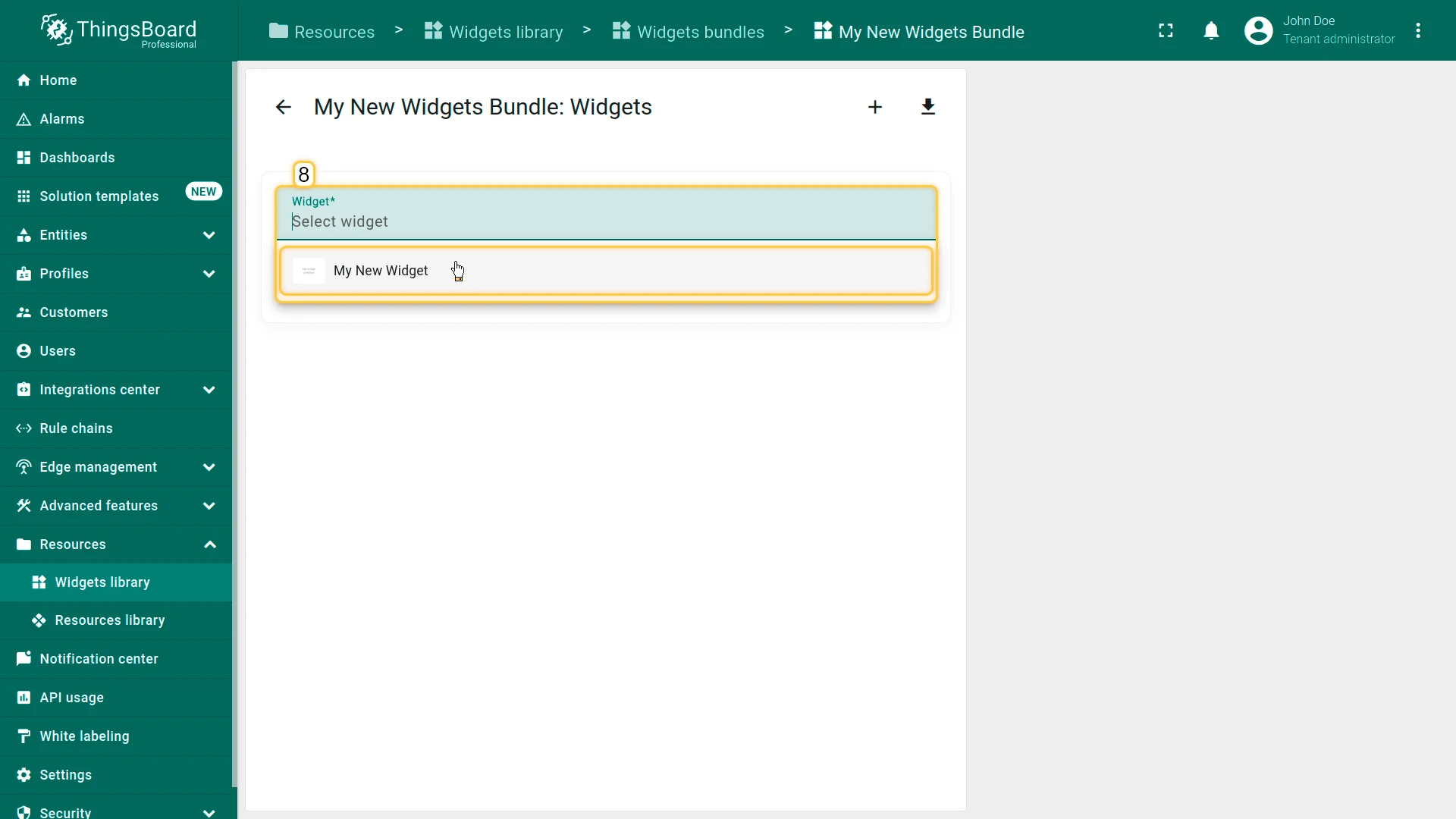
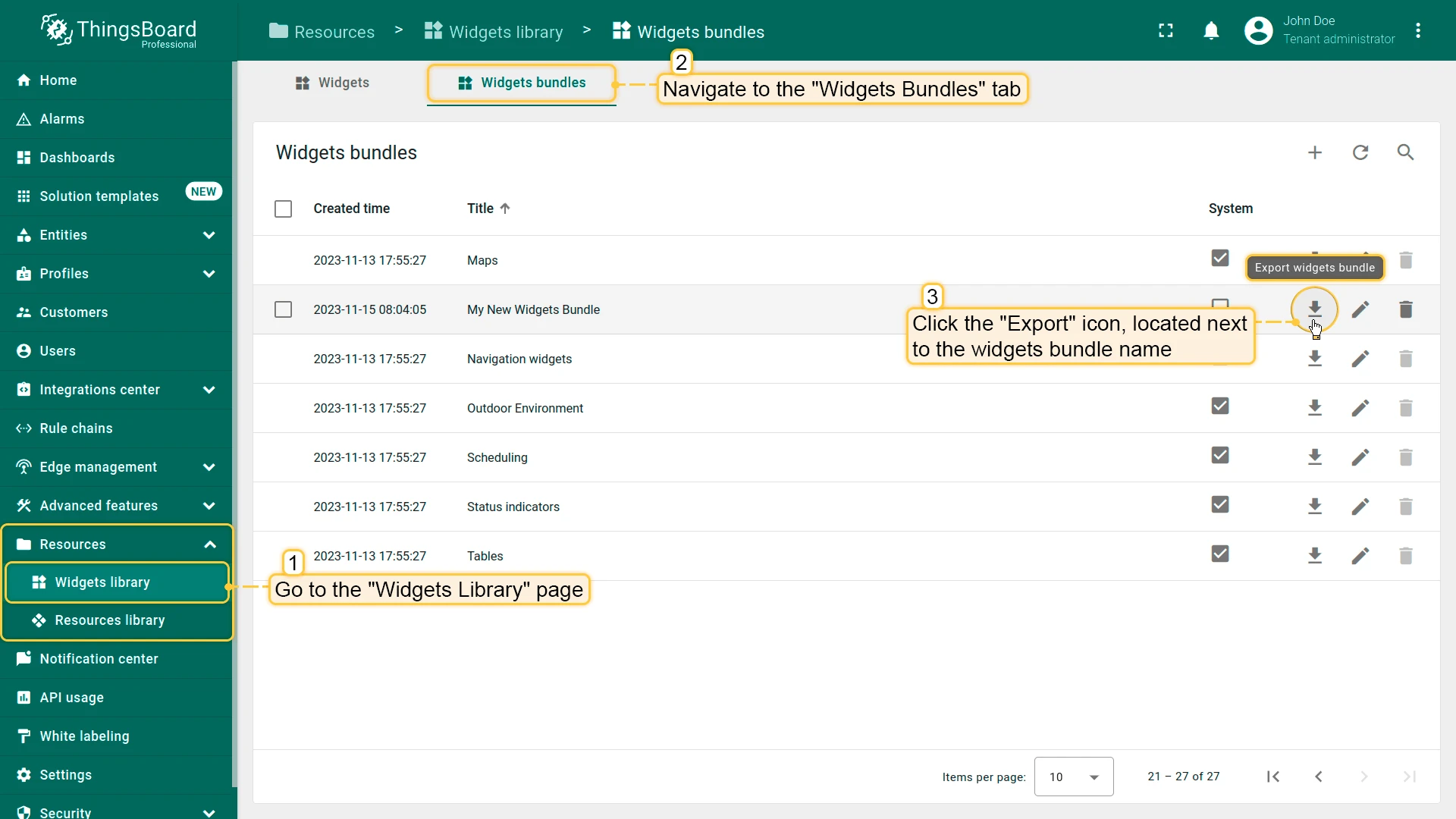
Section titled “Add Widget Bundle”- Navigate to the Widgets Library page.
- Click the + icon and select Create new widgets bundle.
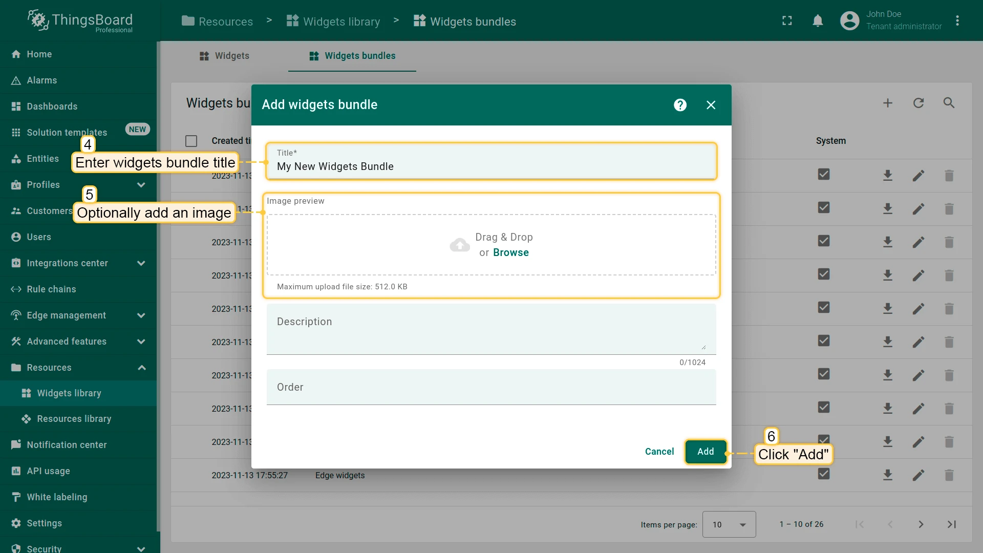
- Enter the bundle title and optional description.
- Optionally upload an image.
- Click Add.
- The new bundle appears in the list.
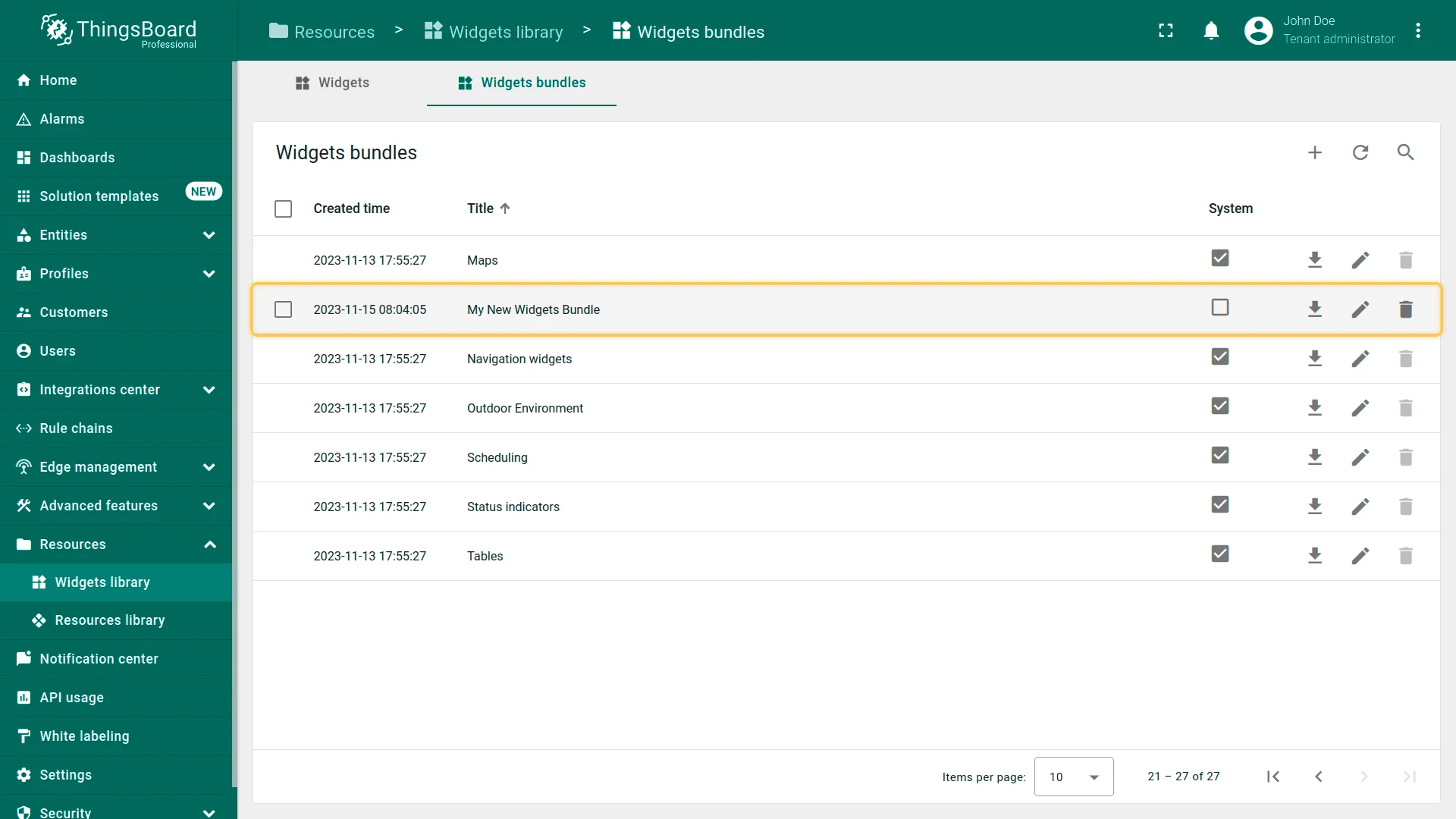
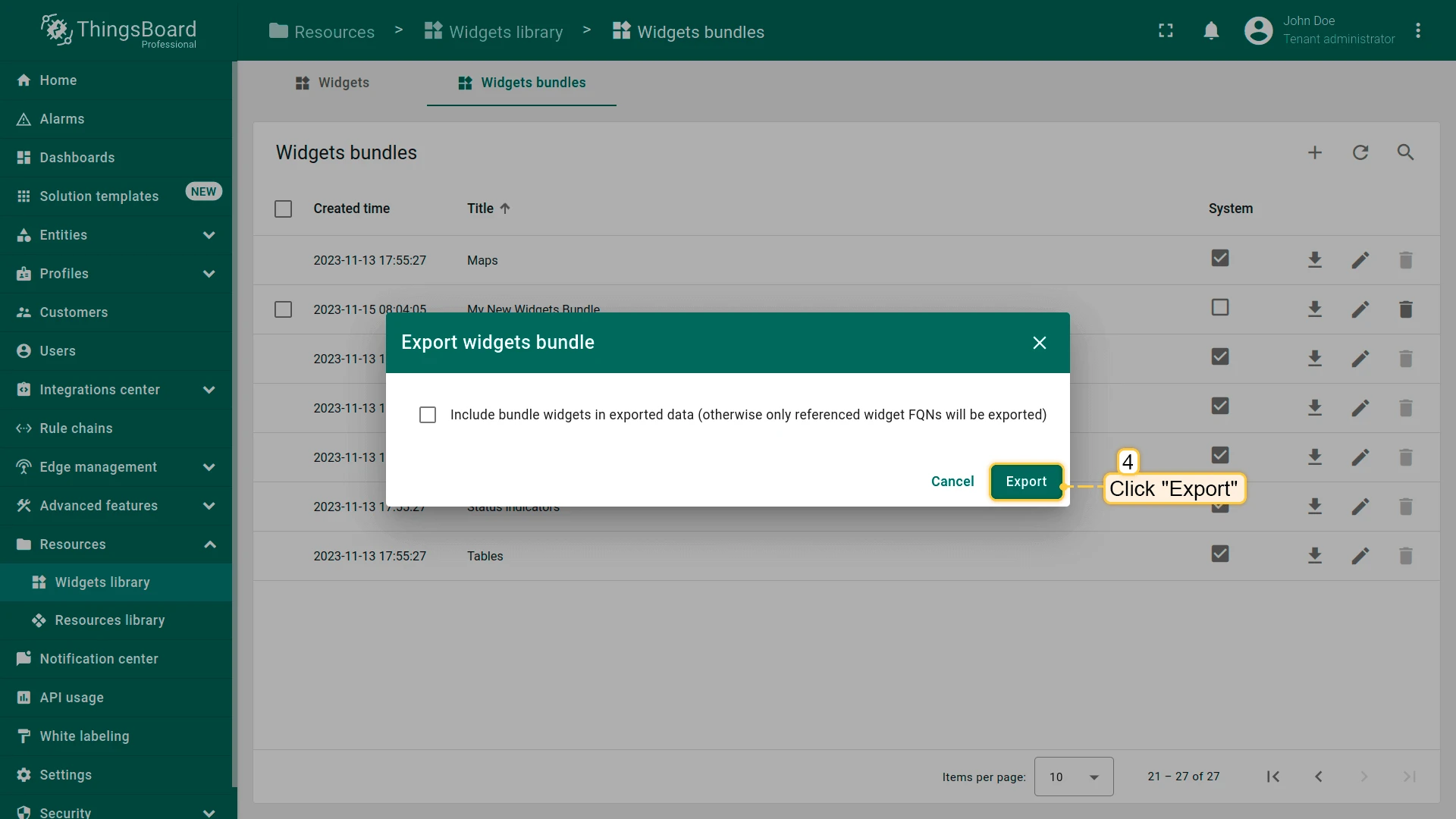
Export Widget Bundle
Section titled “Export Widget Bundle”Export an entire widget bundle as a JSON file.
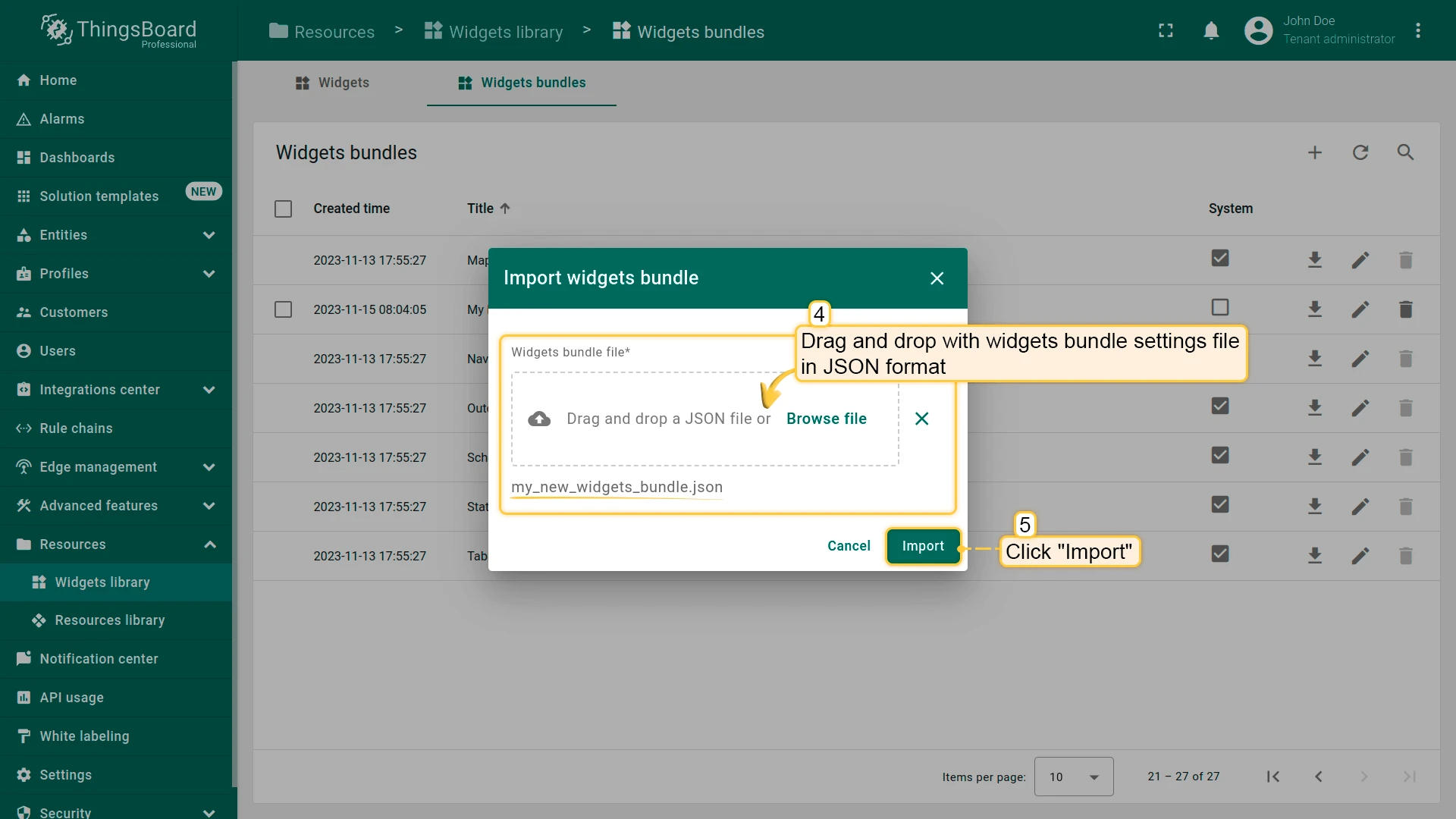
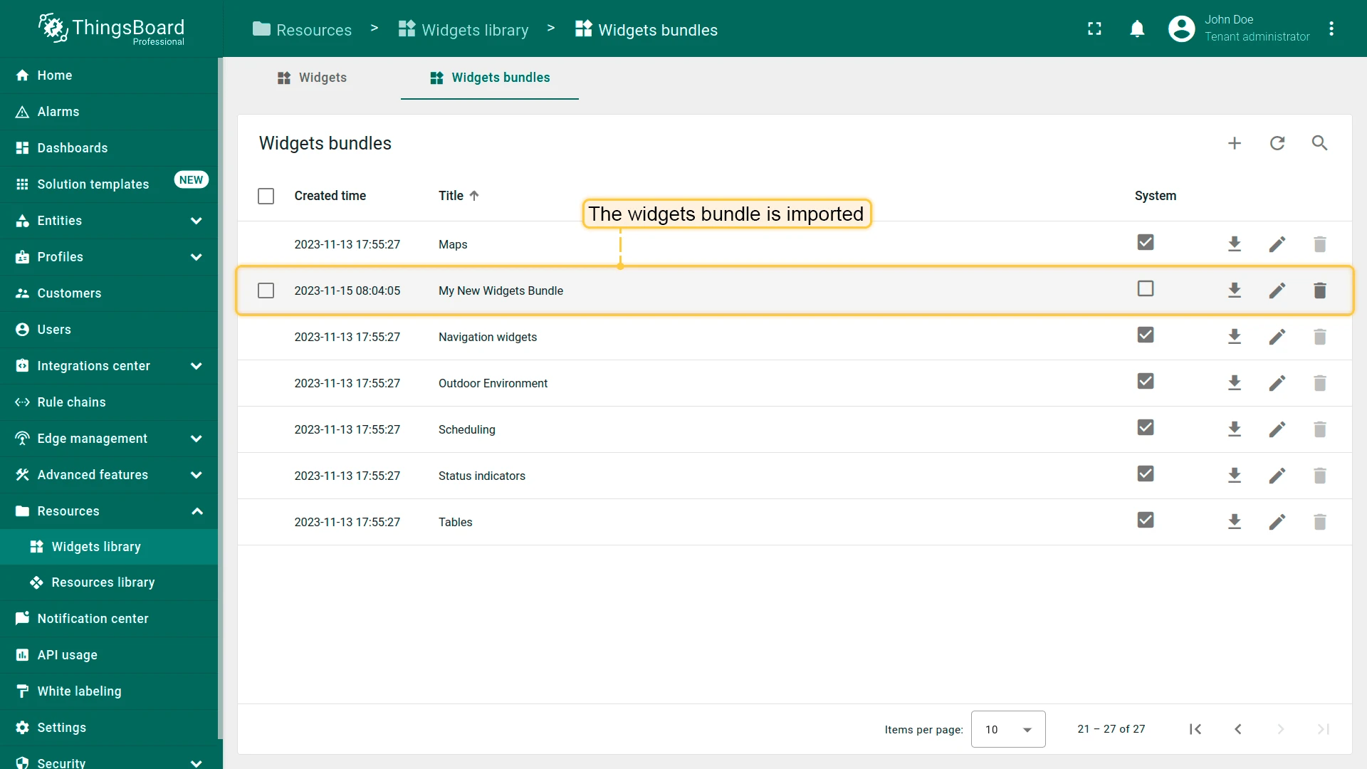
Import Widget Bundle
Section titled “Import Widget Bundle”- On the Widgets Library page, click + and select Import widgets bundle.
- Upload the JSON file.
- The bundle is imported.
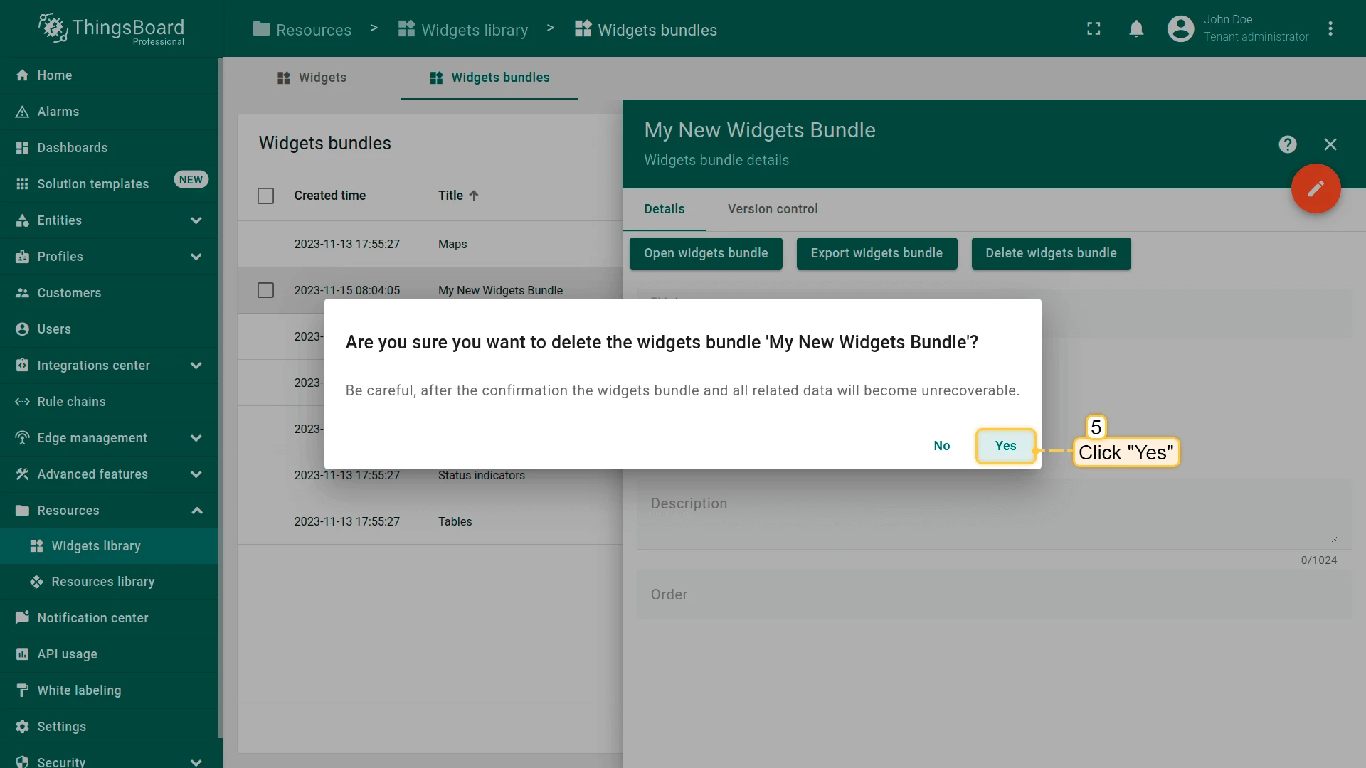
Delete Widget Bundle
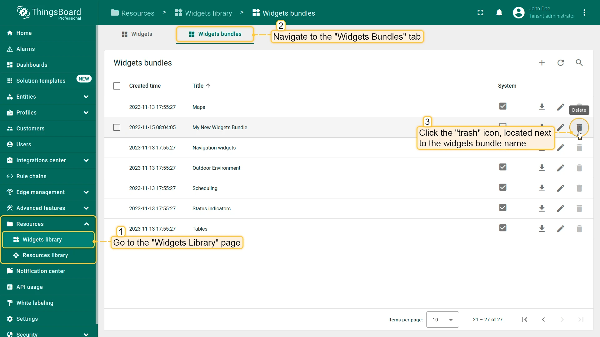
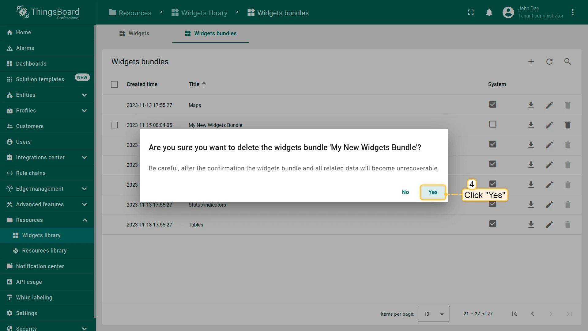
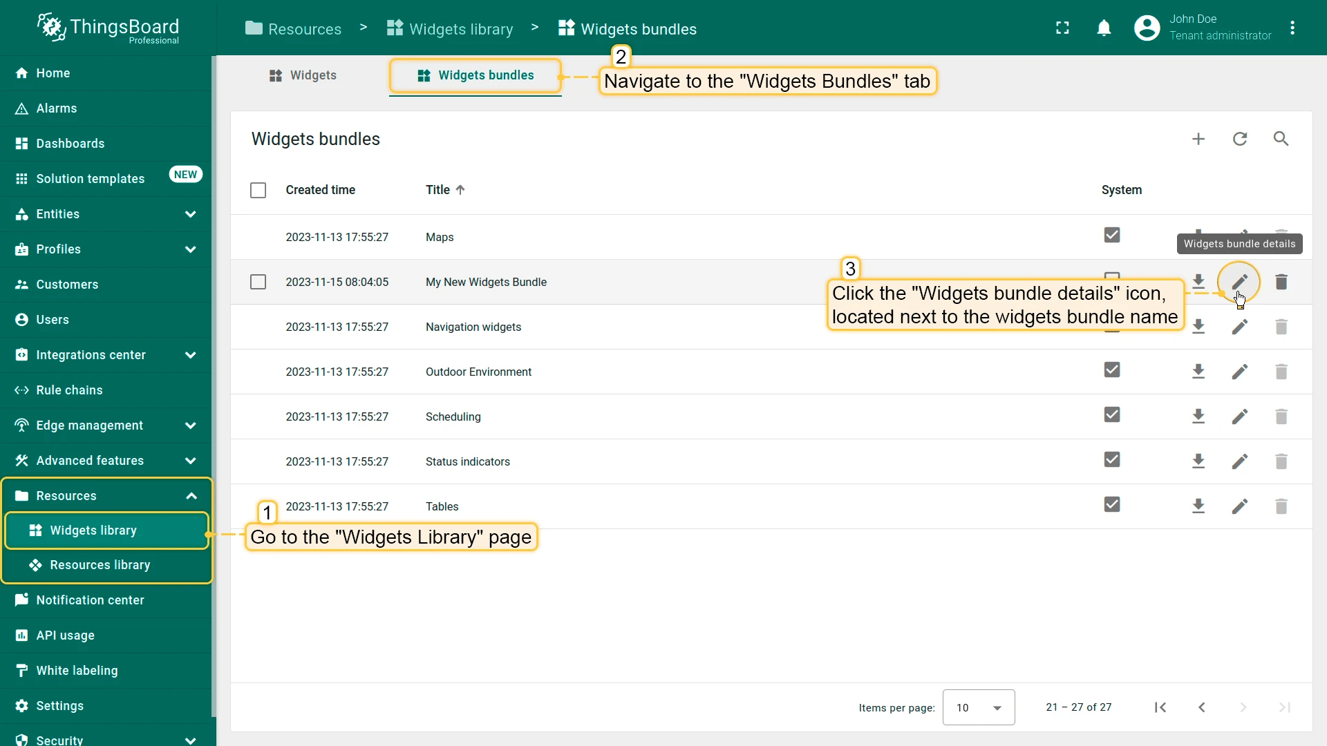
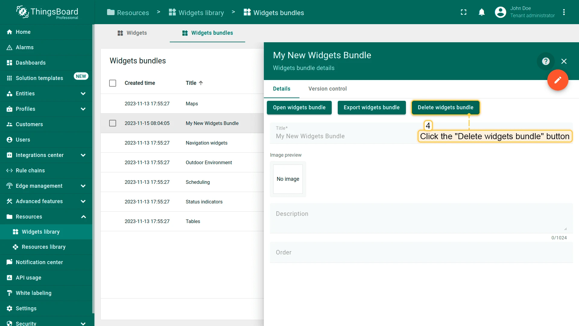
Section titled “Delete Widget Bundle”Delete a widget bundle using the trash icon, or use checkboxes for bulk deletion.
Widget Capabilities
Section titled “Widget Capabilities”| Capability | Description | Guide |
|---|---|---|
| Visualize time-series telemetry | Display rolling or historical telemetry data using line charts, bar charts, and other time-series widgets | Time window |
| Show latest values | Display the current state of attributes and telemetry using gauges, value cards, and indicator widgets | Entity aliases |
| Control devices remotely | Send RPC commands to devices using knobs, switches, and button widgets | RPC |
| Monitor alarms | Display, filter, and manage active and historical alarms using alarm table widgets | Alarms |
| Navigate between dashboard states | Use widget actions to link data points, table rows, or buttons to other states or dashboards | Widget actions |
| Resolve data dynamically | Use entity aliases to make widgets context-aware — showing data for the currently selected entity | Entity aliases |
| Build reusable widget templates | Export a configured widget as JSON and import it into other dashboards or ThingsBoard instances | Import and export |
| Organize widgets into dashboards | Combine multiple widgets on a single dashboard to create a complete monitoring interface | Dashboards |
| Extend with custom widgets | Develop fully custom widgets using HTML, CSS, and JavaScript via the Widget Library | Widget Development |
Was this helpful?