- Key capabilities
- Add the widget
- Data sources (optional)
- Configuration
- Card styling
- Actions & navigation
- Example: Office information card
A versatile widget for static or dynamic content on a ThingsBoard dashboard. It renders Markdown or free‑form HTML, and it can work with or without data sources. Use it for notes, contextual hints, KPIs, banners, or compact info cards alongside charts, tables, and maps.
Markdown vs HTML
- Markdown is a simple syntax for formatting text. Its advantages are speed and simplicity — you don't need to know HTML to produce clean formatting.
- HTML — choose this when you need precise control over layout, styling, or interactive elements (tables, icons, embedded media, complex grids).
Key capabilities
- Dynamic or static content. Author in Markdown or HTML; mix text, lists, tables, links, images, icons.
- Optional data. Pull telemetry/attributes via entity alias and data keys to inject values in a template or process them in a value function.
- Actions & navigation. Handle clicks on HTML elements (by id) to navigate to dashboard states, open dialogs/popovers, or trigger other actions.
- Styling. Add styles in the dedicated Markdown/HTML CSS section (recommended) or place inline styles in your markup.
- Fast integration. Works well alongside other widgets (time series, tables, maps) and is ideal for notes, contextual explanations, and compact info cards.
Add the widget
- Open your dashboard and switch to Edit mode.
- Click “Add widget” at the top of the screen.
- Choose the Markdown/HTML Card widget from the Cards widget bundle and place it on the dashboard.
Data sources (optional)
The Markdown/HTML Card can work with no data sources (purely static content) or with one or more data sources.
In the Data tab:
- Choose the data source type: Entity, Device, Entities count, Alarms count or Function.
- Configure filters and data keys (attributes / latest telemetry).
The added keys become available to the widget's content logic.
Configuration
Go to the widget's Appearance tab to manage its content and styles.
- Static Markdown/HTML template: best for static layouts with a few dynamic placeholders.
- Dynamic Markdown/HTML content: best for conditions/loops/calculations, combining multiple keys, or switching layouts based on data.
- Markdown/HTML CSS — central place to add CSS for maintainable styling; inline styles remain supported for quick tweaks.
Static Markdown/HTML template
Create static layouts with multiple variables, like ${key}, where key is the data key's label.
Basic numeric formatting for a data key's value is supported via ${key:n}, where n is the number of decimal places. For example:
${key}— display key value as is (no formatting).${key:0}— display key value with no decimal places.${key:2}— display key value with two decimal places.
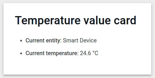
Example:
The Smart Device sends a temperature value to ThingsBoard. Display the temperature value in a card.
Datasource:
- Type: Device
- Device: Smart Device
- Data key: temperature
Use the following Markdown/HTML pattern:
1
2
3
### Temperature value card
- **Current entity**: ${entityName}
- **Current temperature**: ${temperature:1} °C
Notes
${entityName}– the system name of the entity from the data source.${temperature:1}- value of the temperature telemetry with one digit after the decimal point.
Result:
Download this widget and import it into your dashboard.
Dynamic Markdown/HTML content
Best for conditions, calculations, combining multiple keys, or switching layouts.
To use:
- Turn on Markdown/HTML value function to generate the card content via JavaScript.
- Implement a JavaScript function that receives data and the widget context
ctx, then returns a string with Markdown or HTML.
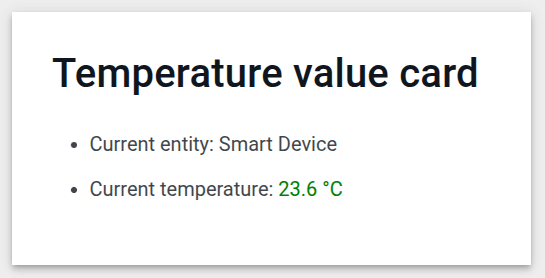
Example:
The Smart Device sends a temperature value to ThingsBoard. Display the temperature in a card with color rules:
- If the temperature is below 20 °C, the value is shown blue.
- If it's between 20 °C and 25 °C, the value is green.
- If it's above 25 °C, the value is red.
Datasource:
- Type: Device
- Device: Smart Device
- Data key: temperature
Use the following value function:
1
2
3
4
5
const entity = data[0];
const color = entity.temperature > 25 ? "red" : entity.temperature > 20 ? 'green' : 'blue'
const entityName = `### Temperature value card\n - Current entity: <span >${entity.entityName}</span>\n `
const temp = `- Current temperature: <span style="color:${color};">${entity.temperature.toFixed(1)} °C</span>\n `
return entityName + temp;
What it does
- Use the first datasource: entity is
data[0]. - Choose a value color based on temperature:
- > 25 → “red”
- > 20 (and ≤ 25) → “green”.
- ≤ 20 → “blue”.
- Build strings with Markdown + HTML:
entityName- the entity's name.tempa string with the temperature value, colored** according to the selected rule.toFixed(1)- rounds the temperature to one decimal place.
Result:
Download this widget and import it into your dashboard.
Content styling (CSS)
Apply default Markdown style
Applies ThingsBoard's built‑in Markdown typography (headings, paragraphs, lists, tables, code) aligned with the current dashboard theme.
- ON (recommended for most cases): you get clean defaults that match the dashboard look & feel.
- OFF: minimal browser defaults — choose this when you want full visual control via your own CSS.
You can still override default styles in Markdown/HTML CSS.
Markdown/HTML CSS
Use the Markdown/HTML CSS section to style your card—tune headings, spacing, fonts, colors, and icons so the card matches your design system.
These rules apply only inside this widget’s container, so they won’t leak into other widgets.
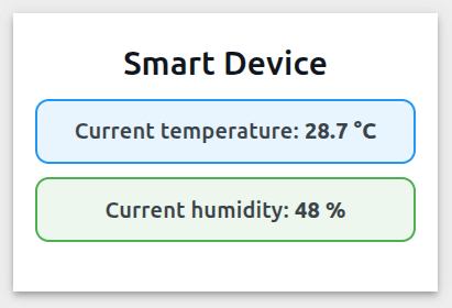
Example:
1. Wrap your content in a container class and target everything through it.
1
2
3
4
5
6
7
8
9
10
11
<div class="office-card">
  <h3>${entityName}</h3>
  <p class="blue-box">
    <strong>Current temperature:</strong>
    <span class="temp-value">${temperature:1}</span> °C
  </p>
  <p class="green-box">
    <strong>Current humidity:</strong>
    <span class="hum-value">${humidity:0}</span> %
  </p>
</div>
2. Write CSS in Markdown/HTML CSS section using selectors.
How it works
.office-card { … }— root scope. Any selector prefixed with .office-card applies only inside this card.h3rule — increases the title size and adds spacing under it (margin: 0 0 12px).prule — adds a gray background, borders, and rounded corners..temp-value— targets just the numeric value:color: #2e7d32highlights the telemetry value in green.font-weight: 600makes the value stand out.
Result:
Download this widget and import it into your dashboard.
Card styling
In the Widget card tab:
- Title & Icon — set a descriptive title/icon consistent with your dashboard.
- Card styles — configure text color, background, padding, margin, border radius, and shadow.
- Card buttons — optionally disable Enable fullscreen and Enable data export for purely informational cards.
Actions & navigation
The Markdown/HTML Card widget supports the following actions:
- Widget header button — adds an action button to the widget header; clicking it triggers the configured action.
- On HTML element click — clicking a specific HTML element inside the widget (by its id) triggers the configured action.
Example: Office information card
Create a compact office info card.
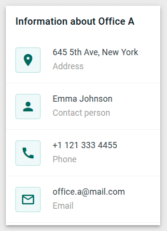
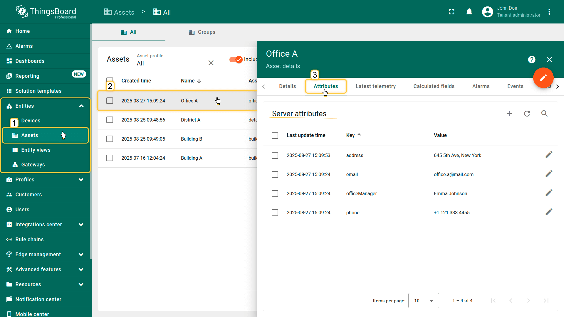
Step 1. Prepare the entity
Create the Asset named “Office A” with the following attributes:
- address: 645 5th Ave, New York
- officeManager: Emma Johnson
- phone: +1 121 333 4455
- email: [email protected]
(You can also import a prefilled Asset from CSV).
Step 2.1 Add the widget
- Open or create a dashboard, then add the Markdown/HTML Card widget.
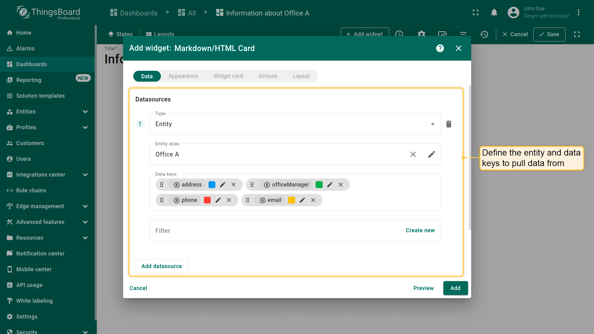
Step 2.2 Configure data ("Data" tab)
- Define the entity and data keys to pull data from.
- Create a new Entity alias with the filter type Single entity, choose the Office A asset, and click “Add”.
- In the Data keys section, add the following keys: address, officeManager, email, and phone.
Step 2.3 Enable dynamic content ("Appearance" tab)
- Turn on the “Use markdown/HTML value function” option.
- Paste the Markdown/HTML value function provided below:
- Scroll to Markdown/HTML CSS and insert the CSS provided below:
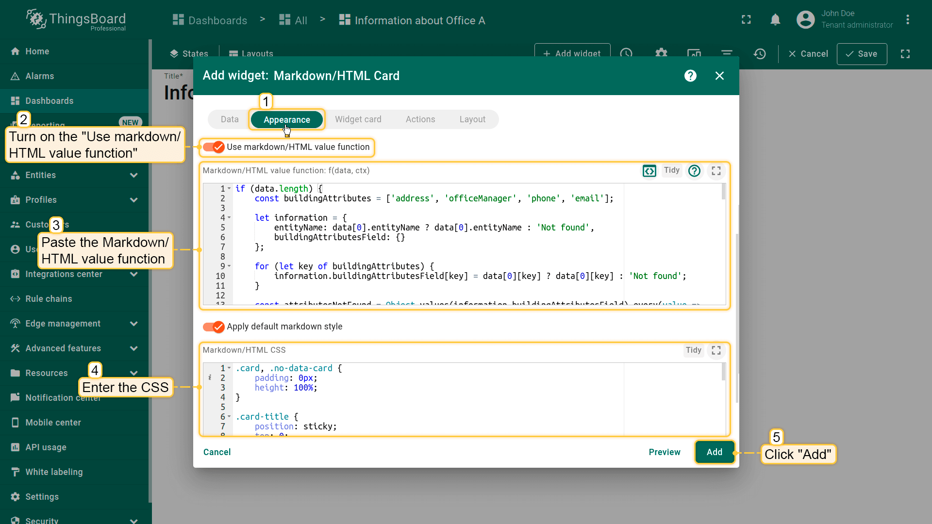
Step 2.4 Card settings ("Widget card" tab)
- Optionally disable “Enable fullscreen” and “Enable data export” if the card is informational only.
- Click “Add”.
Step 2.5 Save
- Resize the card freely within your dashboard layout. Then, save the dashboard.
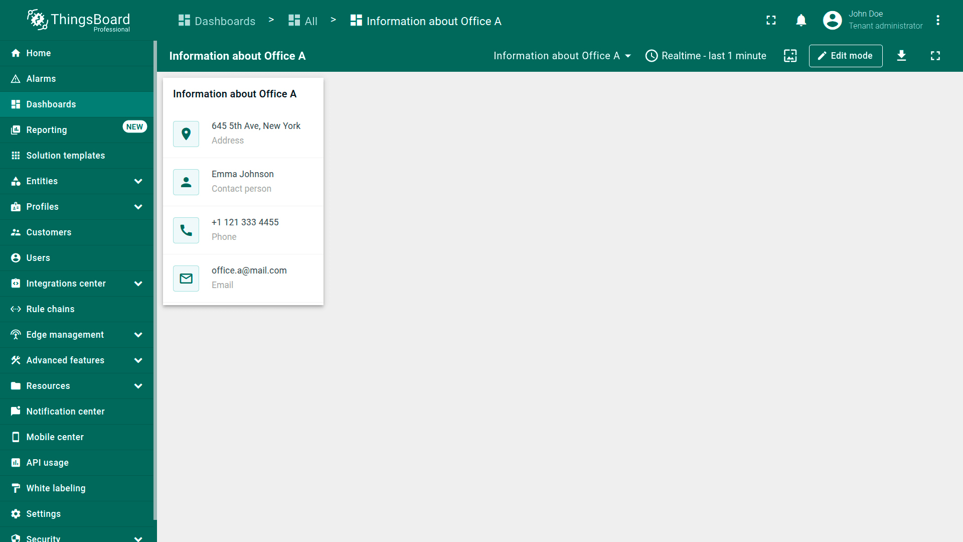
Expected result
You'll see a compact, clean office contact card on the dashboard. Missing attributes display as “Not found”. Resize the card freely within your dashboard layout.
Download the configured widget
You can download the configured Office information card and reuse it on your dashboards.
Important: After importing, update the target entity and data keys in the entity alias.