- Adding a Map widget to the dashboard
- Map type
- Overlays
- Additional datasources
- Map controls
- Map action buttons
- Common map settings
- Appearance
- Card appearance
- Actions
Map widgets in ThingsBoard enable you to visualize entities and data on a map. They allow placing markers, zones, routes, and other geo-objects in space, which is especially useful for IoT solutions involving physical locations.
In ThingsBoard version 4.0, we've completely reworked our Map widgets to make them more flexible, easier to configure, and more powerful for working with geospatial data.
Use cases
- Real-time entity location tracking (vehicles, drones, people)
- Route visualization and movement analysis (logistics, public transport, historical paths)
- Visualization of object layouts (factory layouts, parking, floor plans)
- Interactive mapping (user-placed markers, geofence creation)
Types of map widgets
- Map widget: Displays real-world locations using base maps like OpenStreetMap, Google Maps, HERE or Tencent.
- Image Map widget: Ideal for indoor layouts or relative positioning — perfect for floor plans, smart parking, factory zones, and more. Works with custom image backgrounds.
- Trip Map and Route Map widgets: Visualize movement on the map. The Trip Map includes animated playback and timeline control for enhanced tracking visualization.
Key improvements:
- Easily place elements on the map. Add items like markers, polygons, or circles to the map with just a few clicks. Under the hood, this triggers a custom function that captures the clicked location’s coordinates and stores them as attributes on the target entity.
- New unified Trip Map widget. Combines the features of the older Trip Animation and Router Map widgets into one powerful tool:
- Supports animated routes, moving markers, and stop points.
- Includes a set of dedicated marker icons.
- Offers multiple route styling options, including path decorators and visible points.
- Comes with customizable timeline controls — change date formats, playback speed, and more.
- Dynamic map layer switching. Switch between map types — standard, satellite, hybrid, or even your own custom layers — directly inside the widget.
- Reference layer support. Add an transparent overlay layer to provide extra map context or background visuals.
- Improved configuration for map items (Marker / Polygon / Circle)
- Each overlay type now has separate settings, so they don’t conflict with one another.
- Better coordinate validation reduces the chance of mistakes — fewer missing keys or misconfigured sources.
- Built-in marker shapes available out of the box, with full support for custom icons too.
- New “Range” color mode added — dynamically change marker color based on key values (e.g., temperature or status).
- Set separate “Action on click” and “Tag action” for each overlay for more precise interactivity.
- Easily group overlays — toggle visibility for multiple map items in one click.
- Improved editing experience — click on any map item to see contextual edit options right away.
- You can now choose the attribute scope (e.g., shared, server-side, telemetry) when setting coordinate values.
- Use extra data sources. Pull in additional values for labels, tooltips, or any extra info you want to show on the map.
- Flexible control panel placement. Move map controls (zoom, layer switchers, custom buttons) to any corner of the widget — perfect for adapting to different UI layouts.
- Map scale display. Add an optional scale bar to help users visually estimate distances on the map.
- Custom action buttons. Add your own buttons right on the map — each can trigger a specific custom action (like creating an entity, switching views, or opening URLs).
All of this — and more — is now available in the new Map widgets in ThingsBoard 4.0.
Adding a Map widget to the dashboard
To add a Map widget to the dashboard, follow these steps:
- In dashboard edit mode, click the “Add widget” button at the top of the screen, or click the large “Add new widget” icon in the center of the screen (if this is your first widget on the dashboard).
- Find the “Maps” widget bundle and click on it. This category includes all available map widget types.
- Select the map widget that best fits your use case.
- Configure the widget to match your data and visualization requirements. You can adjust data sources, appearance, map provider settings, and more.
- Click the “Add” in the bottom-right corner of the widget configuration window to place it on your dashboard.


Map type
The first step in configuring the map widget is selecting the map type. ThingsBoard offers several map widgets, including Image Map, which allows you to use a custom background image as the map.
You can also configure map layers, enabling flexible switching between different map styles — such as satellite, hybrid, or custom layers — directly within the widget, with just a few clicks.

Adding a new map layer
You can add additional layer to the map widget by following these steps:
- Click “Add layer”.
- Enter a label for the layer — this name will be shown in the widget's layer switcher.
- Choose the map provider by selecting from the available options (OpenStreetMap, Google, HERE, Tencent) or by specifying a custom tile server.
- Apply changes.


Now switch to the new layer on the widget.


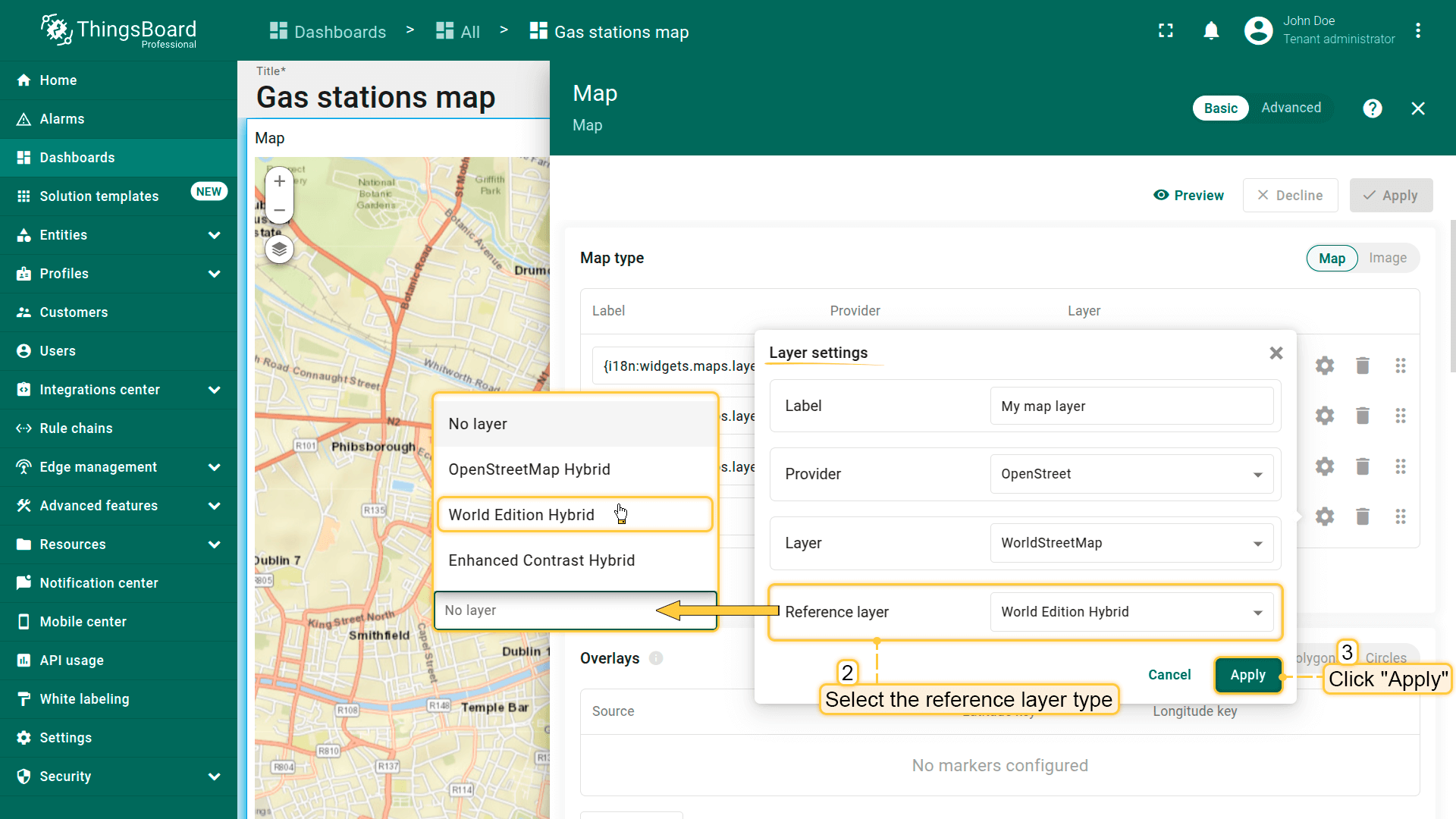
In the “Layer settings”, you can also enable the “Reference layer” option — a special transparent layer that contains labeled map elements:
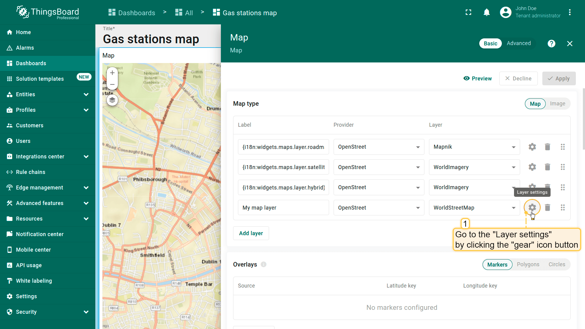
- Go to the “Layer settings” by clicking the “gear” icon.
- From the dropdown menu, select the layer type, or leave it as “No layer” if you don't want to use one.
- Apply changes.

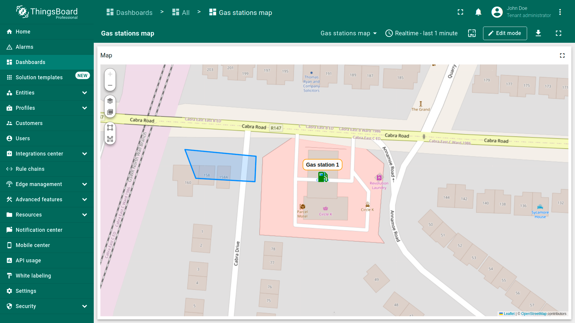
Overlays
Map items are visual elements displayed on a map widget to represent the spatial position, area, or influence zone of entities and data. These elements help visualize and interact with your devices, assets, or other tracked objects based on their spatial data.
ThingsBoard supports the following map item types:
- A marker is a point on the map based on the coordinates specified in the entity. It is used to display the location of a device, asset, vehicles or any tracked object.
- A polygon is a flat, closed shape made up of multiple connected points. It is used to represent areas or boundaries on the map. You can use the polygon option to mark your assets or any other objects. The polygon is based on coordinates specified in the entity.
- A circle is a flat shape defined by a center point and a radius, with all boundary points equidistant from the central point. It is ideal for visualizing zones of influence or coverage areas. The circle is based on coordinates specified in the entity.
Each map item type is bound to an entity and visualized based on its coordinates, provided as either attributes or telemetry. You can customize their appearance, behavior, and interaction rules directly in the widget settings.
Marker
Markers are commonly used to indicate the location of buildings, fixed sensors, vehicle tracking, or any other static or moving entities.
To be placed on the map, the entity must have coordinates as attributes or telemetry in the following format:
1
Latitude,Longitude

Place marker on map
To place a marker on the map, follow these steps:
- Enter widget edit mode and go to the “Overlays” section.
- Make sure you're on the “Marker” tab and click “Add marker”.
- Select the data source - it can be a device, an entity alias, or a function.
- Define the coordinate keys. By default, ThingsBoard uses latitude and longitude attributes as the coordinate keys for the marker. If your entity uses different key names, update them here.
- Apply the changes.
The marker will appear on the map based on the specified coordinates.


Marker configuration
To configure a specific marker, switch to the map widget's edit mode. In the “Overlays” section, click the “gear” icon button next to the desired marker to open its configuration panel.

Datasource
Specify the data source for the marker. It can be:
- A device
- An entity alias
- A function
If needed, use the data filter to refine the selection (e.g., filter by name or type).

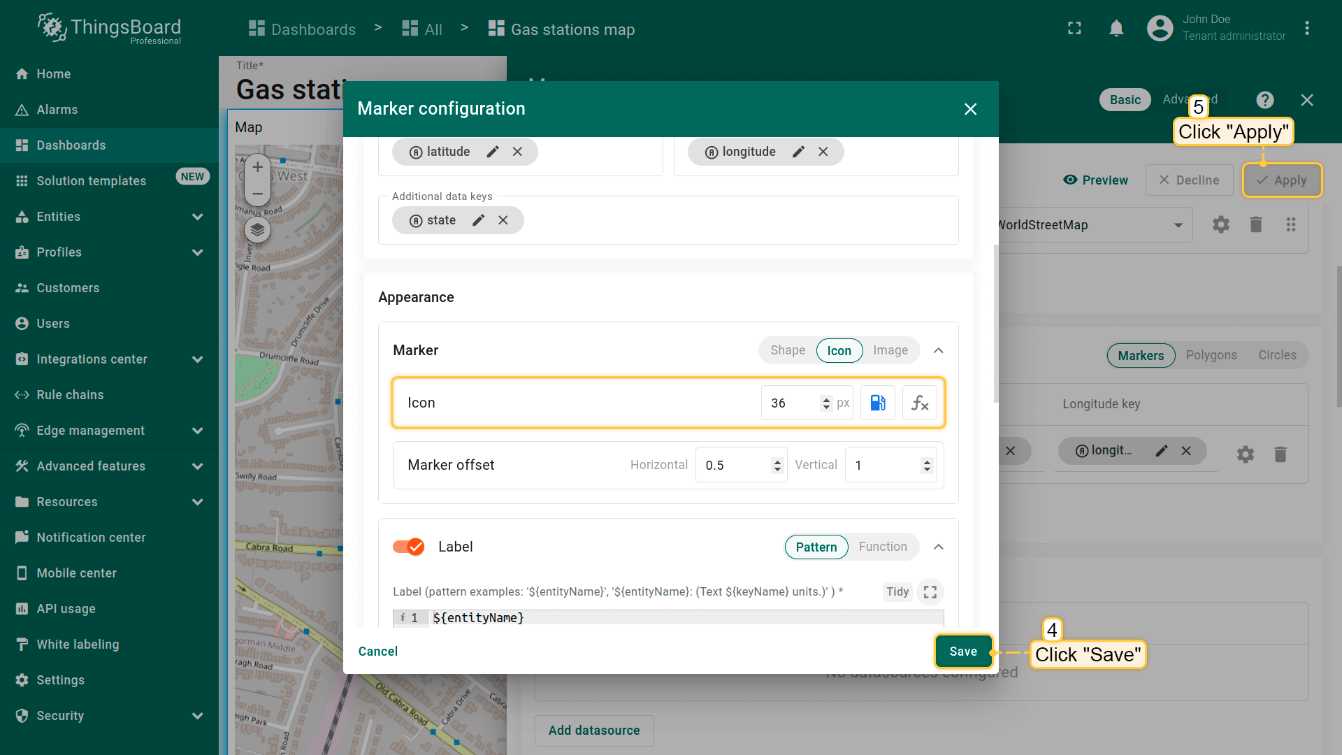
Keys
Define the coordinate keys. By default, ThingsBoard uses latitude and longitude attributes as the default coordinate keys. If your entity uses custom key names, update them accordingly.
You can also define additional keys for dynamic display elements, such as marker color, tooltip content, Label text, etc.

Marker
This section defines how marker appear on the map. Customize the marker by selecting a different one from a variety of standard shapes and icons, adjusting its size and color, or use your own images for full visual flexibility.
Marker styling example: This example demonstrates how to configure marker styling so that its color changes automatically based on the value of the “state” key:
- Green marker — when state = “opened”
- Red marker — when state has any other value
- Gray marker — if the state key does not exist
This approach visually reflects the status of the marker, greatly enhancing monitoring convenience.
- Customize the marker by selecting a different one from a variety of standard shapes and icons, and adjusting its size.
- Use a function that dynamically changes the marker color based on the value of the "state" key.
- Apply all changes.
Color-changing function based on the “state” key value:
1
2
3
4
5
6
7
8
9
10
var state = data.state;
if (state  !== '') {
  if (state == 'opened'){
    return 'green';
  } else {
    return 'red';
  }
} else {
  return 'grey';
}
Currently, the “state” key has the value “opened”, so the marker is displayed in green.
As soon as the value of the “state” key changes to anything else, the marker will turn red.
Label
The marker label is placed above the icon and, by default, displays the entity name. You can edit the label text or use a label function to show more dynamic information.
Label styling example:
1
2
3
4
<div style='position: relative; white-space: nowrap; text-align: center; font-size: 14px; top: 2px;'>
    <span style='margin-left: -500%;'></span>
    <div style='border: 2px solid #EC9704; border-radius: 10px; color: #000; background-color: #fff;  padding-left: 8px; padding-right: 8px; padding-top: 3px; padding-bottom: 3px;'>${entityName}</div>
</div>


Tooltip
Here you can configure a tooltip that appears when you click on or hover over the marker. Use the tooltip pattern or tooltip function to define more dynamic content. Alternatively, you can hide the tooltip altogether.
For example, you want the tooltip displays the status of a fueling station (open/closed) by retrieving the value from the “state” key, which is specified as one of the “Additional data keys” in the “Keys” section.
Use the function below and paste it into the Tooltip function window:


Tag actions
You can add an action to a tooltip as a tag. This can be to switch to a new dashboard state or another dashboard, to open an external URL, or even to initiate a custom action. Learn more about the available action types and how to configure them in the widget actions documentation.
First, you need to add a tag action and then reference its name in the tooltip function:
- Click the "Add tag action" icon button.
- Configure the action and click "Add".
- Now, you need to add the tag action link to the tooltip function. Expand the tooltip function window to fullscreen for easier editing.
- Edit the function by adding a link to the tag action. Be sure to specify the tag action name correctly.
- Apply all changes.


The function below already includes a reference to the tag action named “my-action”. If you gave your tag action a different name, please replace “my-action” with your actual tag name. Use this function to replace the previous tooltip function:
Click on the marker. In the tooltip that appears, you'll see a tag — click on it. The action you defined in the tag's settings will be executed.


Behavior
Set the behavior of the marker when you click it.
- Go to the "Behavior" section and click the "On click" action field to define the action instead of the default "Do nothing".
- Set up the desired action and apply the changes.
- Click on the marker.
- The action you specified in the action settings will be triggered.


Groups
Markers can be grouped, allowing you to easily show or hide grouped elements later using the “Groups” tab.
- In the “Groups” section, enter a name for the group to which you want to add this marker.
- A “Groups” icon button will appear on the widget. Click on it.
- To hide a group, uncheck the box next to its name.
- The markers that belong to this group have been hidden.


Marker editing tools
You can use the built-in tools to perform operations on markers such as Add / Move / Delete. By default, these tools are disabled.
Check the boxes next to the tools you want to enable.
- You can use the built-in tools to perform operations on markers such as Add / Move / Delete. By default, these tools are disabled. Check the boxes next to the tools you want to enable.

Adding marker
If your entity doesn't have coordinates set, you can manually place marker using the map widget tools — its coordinates will be automatically saved to the entity as attributes.
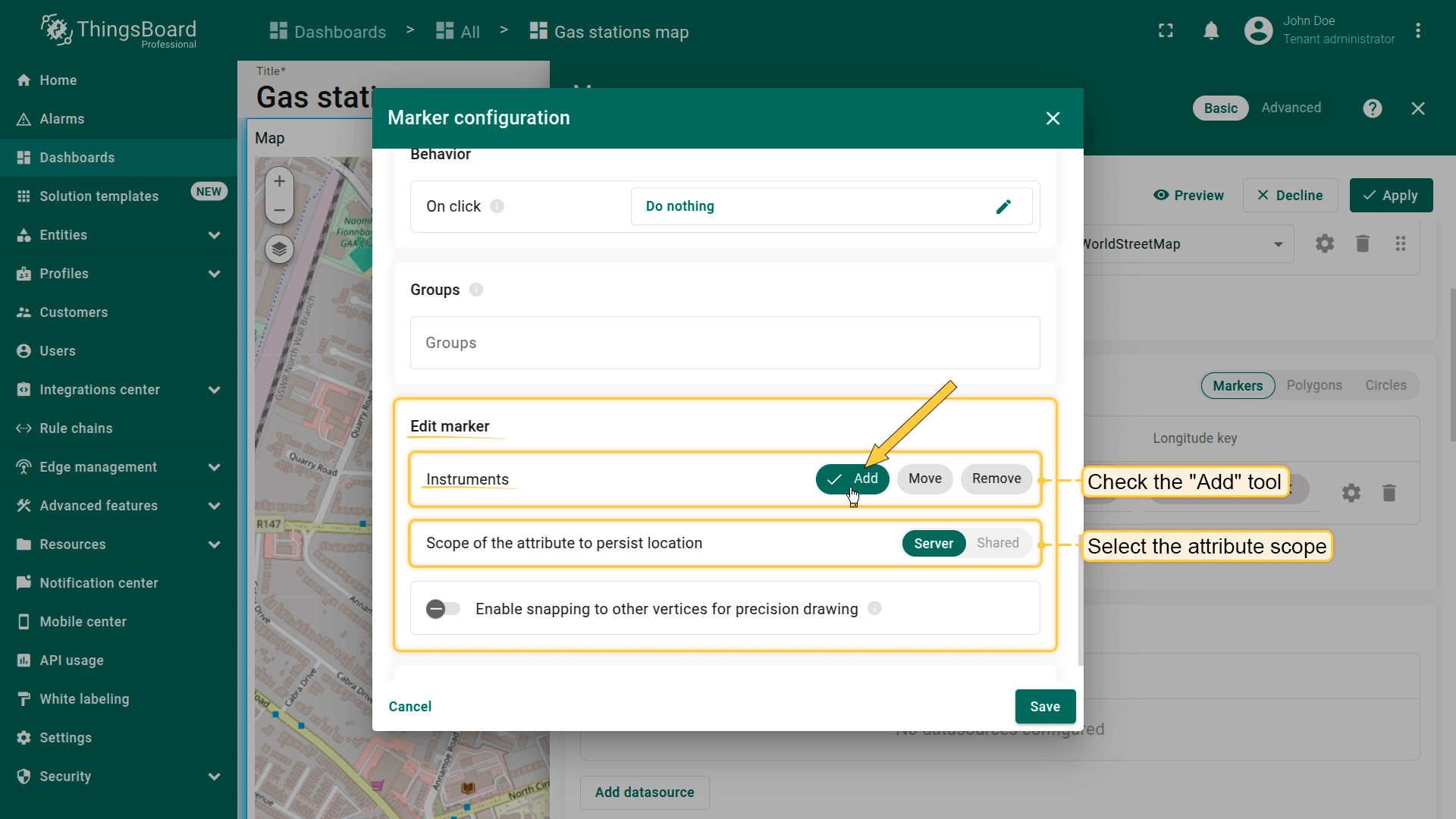
First, add the marker placement tool to the map:
- In the “Edit marker” section, check the “Add” tool.
- Next, select the attribute scope where the coordinates will be stored: “Server” or “Shared”.
- Optionally, enable snapping to other vertices for precision drawing.
- Then, save the changes.
You can now place the marker on the map:
- On the map widget, locate and click the “Place marker” icon button. If you're using an alias with multiple entities as the data source, you'll need to select the appropriate entity from the dropdown menu.
- Find the location on the map where you want to place the marker and click on it.
- The marker will be added, and its coordinates will be automatically saved to the entity as attributes.
- On the map widget, locate and click the "Place marker" icon button. If you're using an alias with multiple entities as the data source, you'll need to select the appropriate entity from the dropdown menu.
- Find the location on the map where you want to place the marker and click on it.
- The marker will be added, and its coordinates will be automatically saved to the entity as attributes.


Also, by selecting the checkboxes next to the desired tools, you'll be able to move or remove a marker.
Moving marker
Don't forget to enable the “Move” tool in the marker settings under the “Edit marker” section.
To move the marker, click and hold the marker with your mouse, drag it to the new location, and then release the mouse button.

Removing marker
Don't forget to enable the “Remove” tool in the marker settings under the “Edit marker” section.
To delete a marker, simply click on it, then click the trash bin icon in the menu at the bottom of the widget.

Use map markers clustering
Map clustering is a feature that automatically groups multiple markers located within the same visible area at a certain zoom level into a single cluster — a circular icon displaying the number of grouped items inside, instead of showing each marker individually.
This greatly improves map readability, especially when visualizing a large number of markers.


Polygon
The polygon is a flat shape defined by a finite number of points. It can be used to mark areas such as buildings, fields, service areas, visualize coverage areas or restricted regions, etc.

To display an entity as a polygon, it must have coordinates provided as attributes or telemetry in the following format:
1
[[1Latitude,1Longitude],[2Latitude,2Longitude],...,[nLatitude,nLongitude]]
where n - number of coordinates which polygon is described by.
Adding polygon
To place the polygon on the map, follow these steps:
- Enter widget edit mode and go to the “Overlays” section.
- Switch to the “Polygons” tab and click “Add polygon”.
- Select the entity that will be represented as a polygon. This can be a device, entity alias, or function.
- Define the key with the coordinates of the polygon. ThingsBoard will use the “perimeter” key by default to read the polygon coordinates from the entity's attributes. If you use a different key, update it accordingly.
- Click “Apply” — the polygon will appear on the map based on the entity's data.


Polygon configuration
To configure a specific polygon, switch to the map widget's edit mode. Then, in the “Polygon” tab under the “Overlays” section, click the “gear” icon button next to the desired polygon to open its configuration panel.

Datasource
Specify the polygon’s data source — it can be a device, an entity alias, or a function.
If needed, apply a filter to narrow down the selection.

Keys
Define the key that contains the polygon coordinates. By default, ThingsBoard uses “perimeter” as the polygon key. If your entity uses a different key name, make sure to update it here.
Additional data keys can be used for labels, tooltips, or to display extra information directly on the map.

Filling the polygon
Fill — defines how the polygon is filled on the map:
- Color – Sets a solid fill color.
- Stripe – Applies diagonal hatching instead of a solid color, useful for indicating special zones.
- Image – Allows you to use an image as the background fill.
Stroke – defines the polygon outline:
- Border color
- Line thickness


Label
Configure the label displayed above the polygon. By default, the label shows the name of the entity linked to that polygon. You can manually edit the label text or use a label function to display dynamic information.
For example, the label can show the current status of the polygon, providing users with a quick and clear understanding of its state. If desired, you can also hide the label entirely.
1
2
3
4
<div style='position: relative; white-space: nowrap; text-align: center; font-size: 10px; top: -7px;'>
  <span style='margin-left: -500%;'></span>
  <div style='border: 2px solid #3388FF; border-radius: 5px; color: #000; background-color: #fff;  padding-left: 4px; padding-right: 4px; padding-top: 2px; padding-bottom: 2px;'>${entityLabel}</div>
</div>


Tooltip
Here you can configure a tooltip that appears when you click on or hover over the polygon. Use the tooltip pattern or tooltip function to define more dynamic content. Alternatively, you can hide the tooltip altogether.


Behavior
- Go to the "Behavior" section and click the "On click" action field to define the action instead of the default "Do nothing".
- Set up the desired action and apply the changes.
- Click on the polygon.
- The action you specified in the action settings will be triggered.


Groups
Polygons can be grouped, allowing you to easily show or hide grouped elements later using the “Groups” tab.
- In the "Groups" section, enter a name for the group to which you want to add this polygon;
- A "Groups" icon button will appear on the widget. Click on it;
- To hide a group, uncheck the box next to its name.
- The polygon that belong to this group have been hidden.


Polygon editing tools
You can use the built-in tools to perform operations on markers such as Add / Edit / Move / Delete. By default, these tools are disabled.
Check the boxes next to the tools you want to enable.
- You can use the built-in tools to perform operations on markers such as Add / Move / Delete. By default, these tools are disabled. Check the boxes next to the tools you want to enable.

Adding polygon
If an entity doesn't have polygon coordinates set, you can manually place polygon using the map widget tools — its coordinates will be automatically saved to the entity as attribute.
First, add the polygon placement tool to the map:
- In the “Edit marker” section, check the “Add” tool.
- Next, select the attribute scope where the coordinates will be stored: “Server” or “Shared”.
- Optionally, enable snapping to other vertices for precision drawing.
- Then, save the changes.

You can now place the polygon on the map:
- The map widget now offers two tools for adding a polygon: "Drew rectangle" and "Drew polygon". Choose the option that suits your needs.
- If you're using an alias with multiple entities as the data source, select the desired entity from the dropdown list.
- Find the desired location on the map and click to place the first point;
- Adjust the polygon to the desired size, then click again to finish. If you're using "Drew polygon", make sure to close the shape by clicking the first point once you've placed all others.
- The polygon will be added, and its coordinates will be automatically saved to the entity as attribute.


Editing polygon
Don't forget to enable the “Edit” tool in the polygon settings under the “Edit polygon” section.
To resize the polygon, click on it — its vertices will appear. Drag any of the points to adjust the polygon’s size.


Moving polygon
Don't forget to enable the “Move” tool in the polygon settings under the “Edit polygon**” section.
To move the polygon, click on the polygon, hold down the mouse button, and drag it to the new location.


Rotating polygon
TO rotate a polygon:
- Select the polygon by clicking on it, then click the "Rotate polygon" icon button from the tools at the bottom.
- Grab any point of the polygon and drag it in the desired direction to rotate it.
- Once you're satisfied with the rotation, click the "Rotate polygon" icon button again to finish.


Cut polygon area
To cut out an area from a polygon:
- Select the polygon by clicking on it, then choose "Cut polygon area" from the tools at the bottom.
- Draw the area you want to remove by outlining it on the polygon.
- Close the shape by connecting the first and last points.
- Click anywhere outside the polygon to save the changes.


Removing polygon
Don't forget to enable the “Remove” tool in the polygon settings under the “Edit polygon” section.
To delete a polygon, simply click on it, then click the “trash bin” icon in the menu at the bottom of the widget.

Circle
Circle is a plane figure, boundary points of which are always the same distance away from a fixed central point. A circle can be used to define areas of influence, such as a Wi-Fi zone or the range of a sensor, and more. You may mark your assets and any other entities with a circle option.
Circle coordinates must follow this format:
1
{"latitude":CoordinateLatitude, "longitude":CoordinateLongitude, "radius":radius}

Add circle
You can mark your assets and any other entities with a circle using predefined coordinates received as attributes or telemetry. In this example, I'll use a device, which refers to assets of the type “Parking spots” as the data source.
To place the circle on the map, follow these steps:
- Enter widget edit mode and go to the “Overlays” section.
- Switch to the “Circles” tab and click “Add circle”.
- Select the entity that will be represented as a circle. This can be a device, entity alias, or function.
- Define the key with the coordinates of the circle. ThingsBoard will use the “perimeter” key by default to read the circle coordinates from the entity's attribute. If your entity uses a different key name, update it here.
- Click “Apply” — the circle will appear on the map based on the entity’s data.


Circle configuration
To configure a specific circle, switch to the map widget's edit mode. Then, in the “Circle” tab under the “Overlays” section, click the “gear” icon button next to the desired circle to open its configuration panel.

Datasource
Specify the circle's data source — it can be a device, an entity alias, or a function.
If needed, apply a filter to narrow down the selection.

Keys
Define the key that contains the circle coordinates. By default, ThingsBoard uses “perimeter” as the circle key. If your entity uses a different key name, make sure to update it here.
Additional data keys can be used for labels, tooltips, or to display extra information directly on the map.

Filling the circle
Fill — defines how the circle is filled on the map:
- Color – Sets a solid fill color.
- Stripe – Applies diagonal hatching instead of a solid color, useful for indicating special zones.
- Image – Allows you to use an image as the background fill.
Stroke – defines the circle outline:
- Border color
- Line thickness


Label
Configure the label displayed above the circle. By default, the label shows the name of the entity linked to that circle. You can manually edit the label text or use a label function to display dynamic information.
For example, the label can show the current status of the circle, providing users with a quick and clear understanding of its state. If desired, you can also hide the label entirely.
1
2
3
4
<div style='position: relative; white-space: nowrap; text-align: center; font-size: 10px; top: -7px;'>
    <span style='margin-left: -500%;'></span>
    <div style='border: 2px solid #3B7FE1; border-radius: 5px; color: #000; background-color: #fff;  padding-left: 4px; padding-right: 4px; padding-top: 2px; padding-bottom: 2px;'>${entityLabel}</div>
</div>
- Configure the label displayed above the circle. By default, the label shows the name of the entity linked to that circle. You can manually edit the label text or use a label function to display dynamic information.
- Custom circle label.


Tooltip
- Use tooltip pattern or tooltip function.
- Click on the circle to display the tooltip.


Behavior
Set the behavior of the circle when you click it.
- Go to the "Behavior" section and click the "On click" action field to define the action instead of the default "Do nothing".
- Set up the desired action and apply the changes.
- Click on the circle.
- The action you specified in the action settings will be triggered.


Groups
Circles can be grouped, allowing you to easily show or hide grouped elements later using the “Groups” tab.
- In the "Groups" section, enter a name for the group to which you want to add this circle.
- Click on the "Groups" icon button.
- To hide a group, uncheck the box next to its name.
- The circle that belong to this group have been hidden.


Circle editing tools
You can use the built-in tools to perform operations on circles such as Add / Move / Delete. By default, these tools are disabled.
Check the boxes next to the tools you want to activate.

Adding circle
If an entity doesn't have circle coordinates set, you can manually place polygon using the map widget tools — its coordinates will be automatically saved to the entity as attribute.
First, add the circle placement tool to the map:
- In the “Edit marker” section, check the “Add” tool.
- Next, select the attribute scope where the coordinates will be stored: “Server” or “Shared”.
- Optionally, enable snapping to other vertices for precision drawing.
- Then, save the changes.

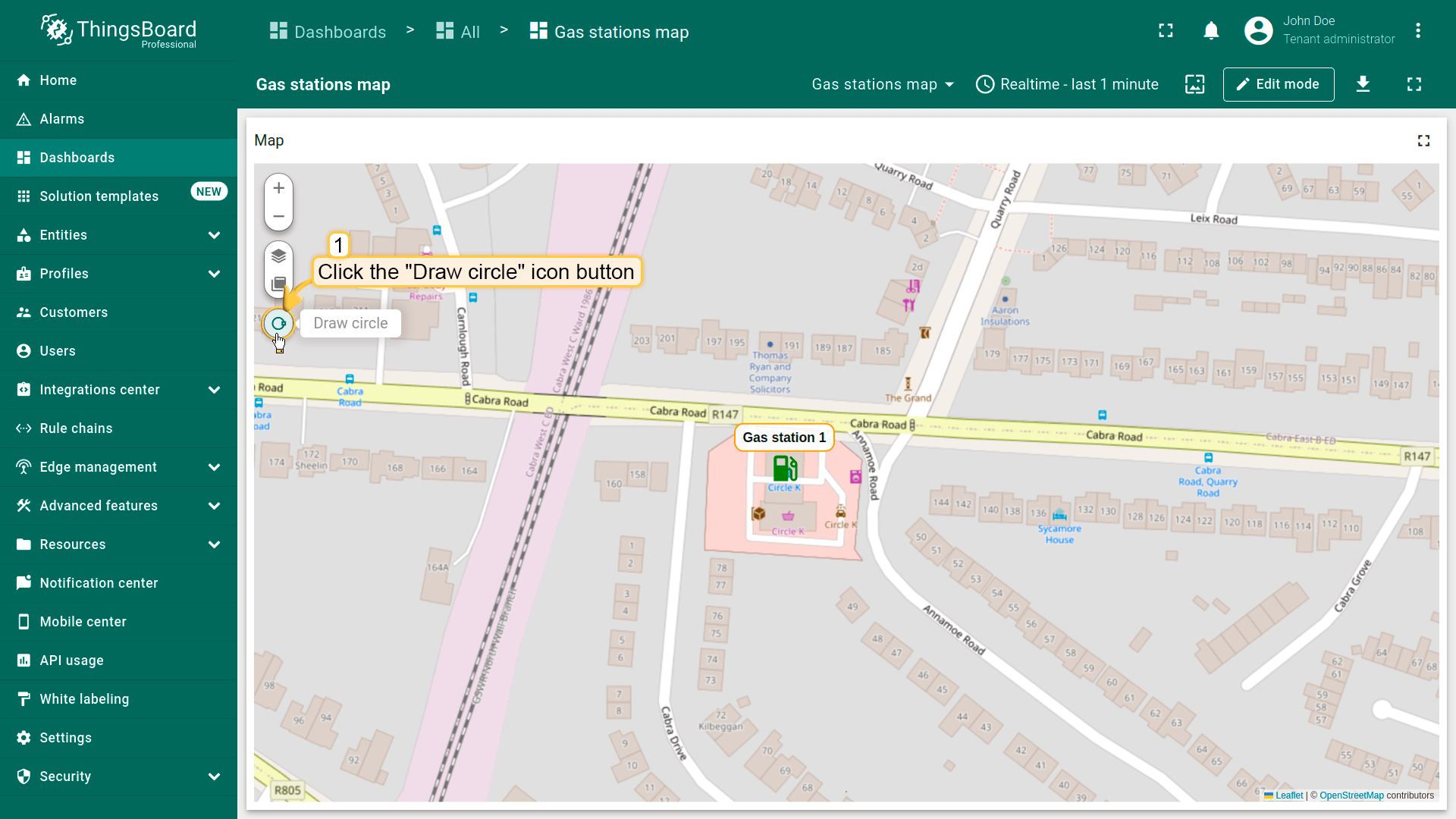
You can now place the circle on the map:
- The map widget now offers a tool for adding a circle: "Draw circle". Click on this icon button to begin.
- Find the desired location on the map and click to place the first point;
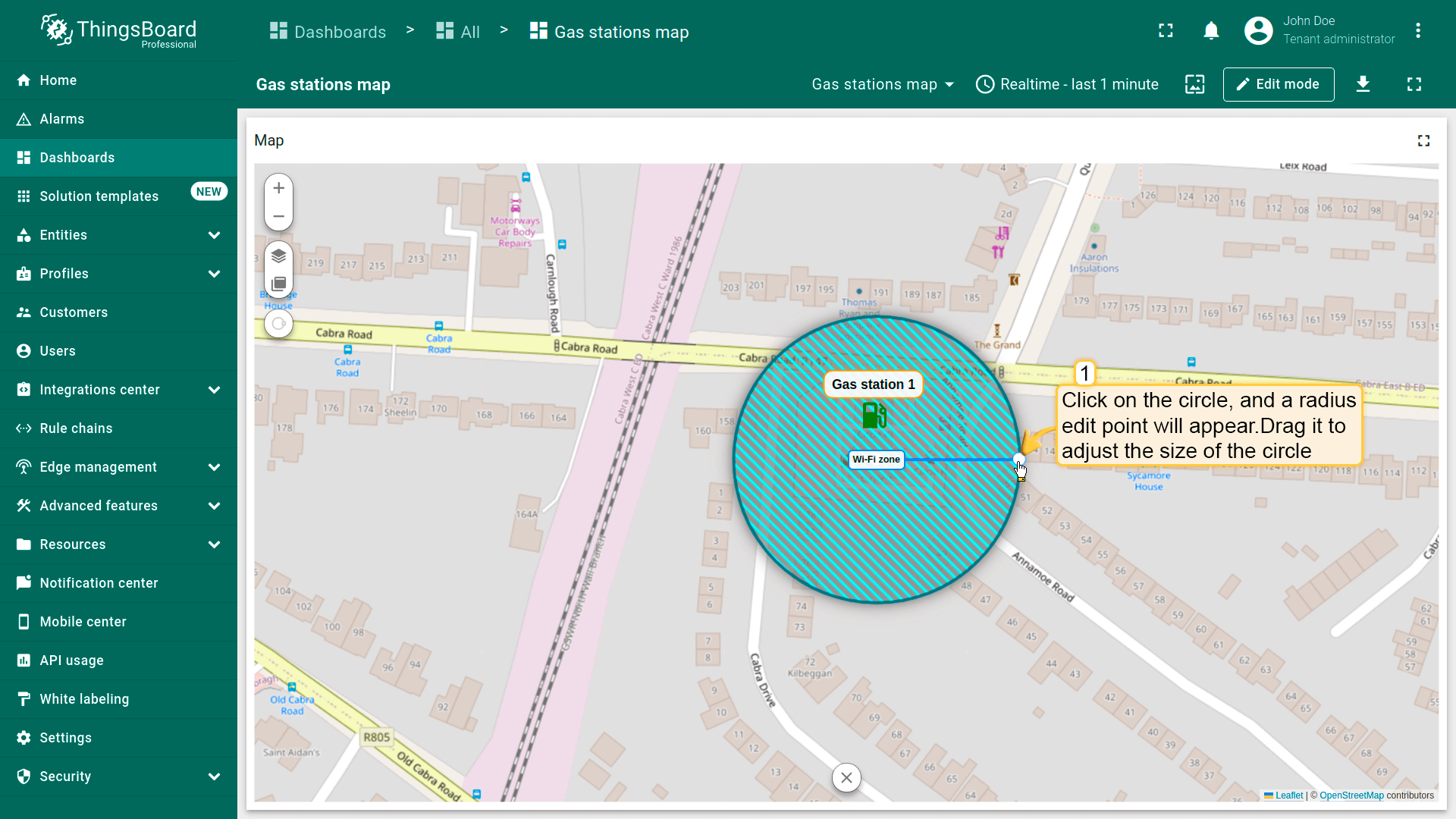
- Adjust the circle to the desired size, then click again to finish.
- The circle has been added to the map.


Editing circle
Don't forget to enable the “Edit” tool in the circle settings under the “Edit polygon” section.
To resize the circle, click on it — the radius handle will appear. Drag this point to adjust the size of the circle. Once you're satisfied with the new size, click anywhere outside the circle to apply the current dimensions.

Moving circle
Don't forget to enable the “Move” tool in the circle settings under the “Edit circle” section.
To move a circle, click on it, hold down the mouse button, and drag circle to the new location.


Removing circle
Don't forget to enable the “Remove” tool in the circle settings under the “Edit polygon” section.
To delete a circle, simply click on it, then click the “trash bin” icon in the menu at the bottom of the widget.’

Additional datasources
Additional datasources are auxiliary data sources that can be used for processing, filtering, or overlaying data on the main entities. They are often used in map overlay features or tooltips when additional context or information needs to be provided.

Map controls
Map controls are settings for configuring map control buttons within the widget. They allow you to:
- Specify the position of control elements (e.g., top-left, bottom-right, etc.);
- Configure zoom interactions (via buttons, mouse wheel, or double-click);
- Choose the zoom scale units: metric or imperial.


Map action buttons
Map action buttons are interactive buttons displayed on top of the map that trigger predefined actions. Learn more about the available action types and how to configure them in the widget actions documentation.
Let's consider an example of adding an action button that will allow users to place new objects on the map.
- In the “Map action buttons” section, click “Add button”.
- Specify a name for the new button — for our example, “Add building” — and set its icon and color.
- Now click the “Action” field to define the action, and instead of the default “Do nothing”, select “Place map item”.
- Select the map item type to be placed — in this case, it's “Marker”.
- The custom action function field contains a default function that displays a dialog for creating a device or an asset — exactly what we need.
- Save the changes.


To ensure that newly created entities are immediately displayed on the map, you need to properly configure the data source.
- In the “Overlays” section, under the “Marker” tab, create a new entity alias as the data source. Name it “buildings”.
- Since I'll be creating assets with the asset type “buildings”, set the filter type to “Asset type” and specify the type as “buildings”.
- Apply all changes.


Now, the action button labeled “Add building” has appeared at the top of the map.
- Find the location on the map where you want to place the entity and click on it.
- In the “Add entity” dialog window that appears, make sure to enter a name for the new entity and select its type — Asset. Other fields are optional.
- Then, click “Create”.
The new marker is now added to the map.


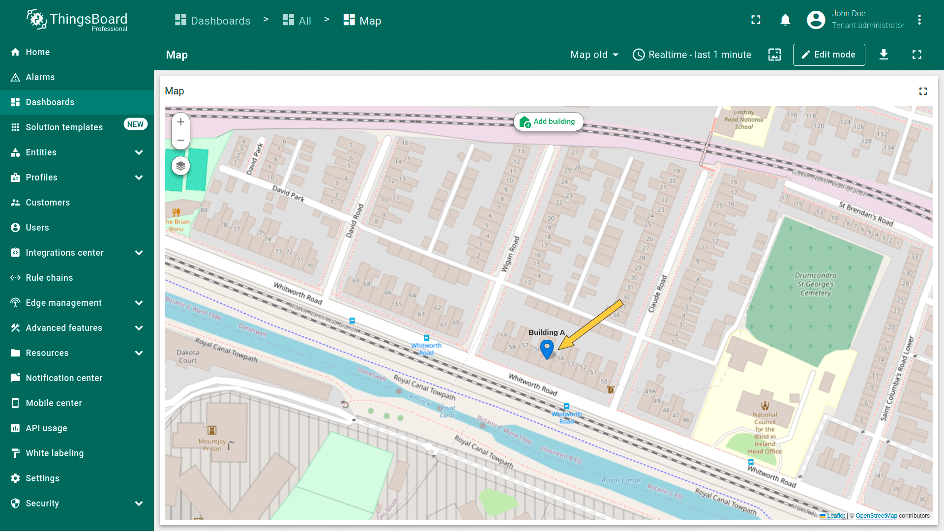
Go to the “Assets” page — here you'll find your newly created asset, “Building A”.

Common map settings
Common map settings are the basic global settings for the Map widget in ThingsBoard. They define how the map behaves on load and what is displayed initially.
- Fit map bounds to cover all markers: Automatically adjusts the map zoom and position so that all markers are visible when the widget loads.
- Default map center position: Sets the center of the map (lat/lng coordinates) if auto-zoom is disabled. Used as the initial map position when the widget is opened.
- Default map zoom level: Sets the default zoom level (e.g., 7 for country-level view, 15 for street-level view).
- Limit of entities to load: Restricts the number of entities loaded onto the map. This helps protect performance when working with large datasets (for example, a limit of 100 will prevent more than 100 markers from loading at once).

Appearance
Customize the widget's appearance.
- Title – Sets the name of the widget that appears at the top of the map. This helps identify the map on the dashboard (e.g., “Vehicle Tracking”, “Sensor Locations”).
- Card icon – Defines the icon displayed in the widget header (next to the title). It can be used to visually indicate the map’s context or theme (e.g., GPS, map, transportation icons).

Card appearance
Card appearance section controls the visual appearance of the widget on the dashboard.
- Background: Sets the background color of the card.
- Show card buttons: Enables or disables the edit and fullscreen buttons in the top-right corner.
- Card border radius: Defines the corner rounding of the card.
- Card padding: Sets the inner spacing between the map content and the card edges.

Actions
You can add buttons to the widget header that will trigger predefined actions. You can learn more about the available action types at this link.
As an example, let''s add a button that allows users to place charging stations on the map:
To start, and to ensure that newly created entities are instantly displayed on the map, you need to properly configure the data source.
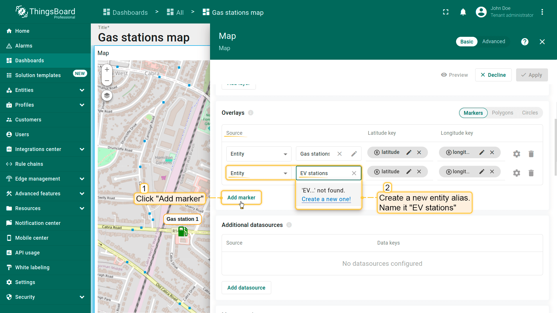
- In the “Overlays” section, under the “Marker” tab, create a new entity alias as the data source. Name it “EV stations”.
- Since we'll be creating entities of the type “EV station”, set the filter type to “Asset type” and specify the type as “EV station”.
- Apply changes.

Now let's move on to configuring the action:
- Scroll down to the “Actions” section and click the “Add action” button.
- A new window will open, displaying all your created actions. Click the “plus” icon button in the top-right corner to add one.
- Select the action source as “Widget header button”, enter a name for the button, and choose its type.
- Optionally, change the icon that will appear next to the button or hide it entirely. You can also set a custom color for the button.
- From the dropdown menu, select the type of action to be performed. In our case, it's “Place map item”.
- Next, choose the type of map item to be placed — we'll be placing a “Marker”.
- The custom action function field already contains a default function that opens a dialog for creating a device or an asset — exactly what we need.
- In the “Action” section, choose “Place map item” from the dropdown menu. Select the type of map item to be placed — in our case, it's “Marker”. The Custom action function field contains a default function that opens a dialog to create a device or an asset — exactly what we need.
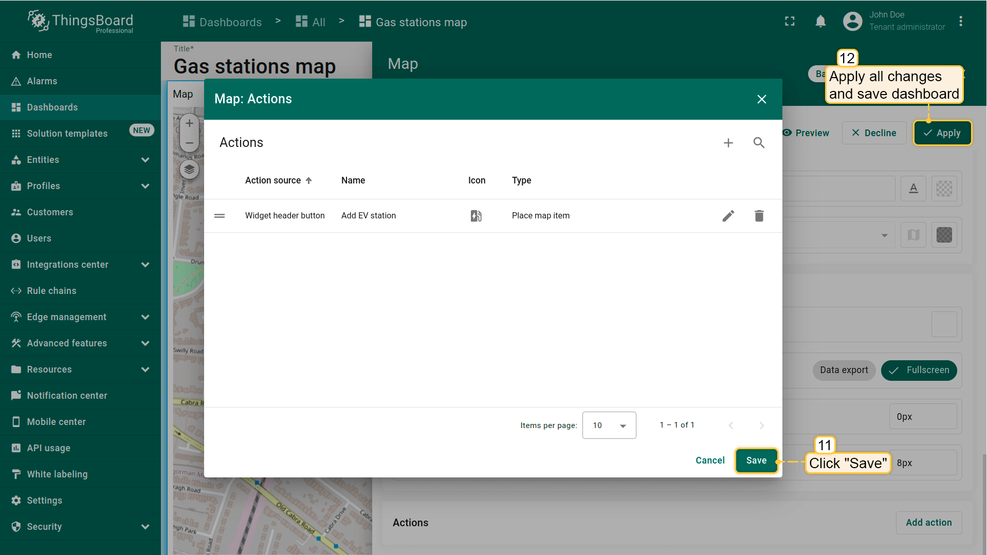
- Then click “Add”.
- Apply all changes and save the dashboard.


A new action button labeled “Add EV station” has now appeared at the top of the map. Let's use it.
- Click the newly created "Add EV station" button. Then, find the location on the map where you want to place the EV station and click on it.
- In the "Add entity" dialog that appears, make sure to enter a name for the new entity and select its type — Asset. The other fields are optional. Then click "Create".
- The new "EV station" marker is now added to the map.


Go to the “Assets” page — there you'll find your newly created asset, “EV station 1”.
