Dashboard layouts organize how widgets appear on the dashboard grid. Each dashboard state can have its own layout type, settings, and breakpoints, which helps create tailored visual presentations for different IoT use cases and screen resolutions.
To modify layouts for a specific state, follow these steps:
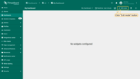
- Enter dashboard edit mode by clicking the “Edit mode” button in the upper right corner of the window;
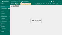
- Click the “Layouts” button located in the upper left corner of the dashboard window. This will open the layout management window.
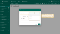
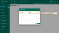
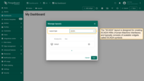
In the “Manage layouts” window, you can select the layout type suitable for your needs:
- Default - a flexible, general-purpose layout;
- SCADA - best suited for displaying SCADA HMIs (Human-Machine Interfaces);
- Divider - useful for separating sections visually.
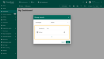
Breakpoints allow you to create responsive layouts that adapt to different screen sizes.
You can add and configure breakpoints to ensure your dashboard looks perfect on any device.
Further details on setting up each layout type and configuring breakpoints will be discussed below.
Layout types
The platform supports three layout types: Default, SCADA, and Divider. Each dashboard state has exactly one layout type configured.
Default layout
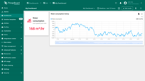
The Default layout is a general-purpose layout that fits most dashboards. This layout type supports screen breakpoints for responsive design.
SCADA
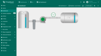
The SCADA layout is designed for creating SCADA HMIs (Human-Machine Interfaces). SCADA HMIs typically consist of scalable widgets called SCADA symbols. However, you can also combine SCADA symbols with over 500 existing ThingsBoard widgets on the same layout. This layout type also supports screen breakpoints for responsive design.
Divider
The legacy Divider layout lets you split one “Default” layout into two sub-layouts: left and right. You can configure the width of these sub-layouts using either a fixed pixel value or a percentage of the screen width. Most layout parameters available for the “Default” layout are also supported by the sub-layouts. However, sub-layouts do not support breakpoints at this time.
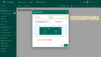
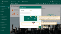
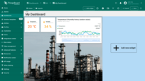
Just to see how it can look like, let’s set up both layouts in completely different ways. Add a background image to the left layout and apply a new background color to the right layout. And we resize the window in a certain percentage ratio to each other (it is just an example and definitely not a recommendation). After setting the parameters, click the “Save” button in the Layouts window to see the changes.
Breakpoints
Breakpoints were introduced in ThingsBoard 3.8.0. They allow you to define different layout settings and widgets based on the screen width of the end-user.
Each dashboard state has a Default breakpoint.
This layout is used if no other breakpoints match the current screen resolution.
You can define the following breakpoints:
- Desktop (xl) - min 1920px, max 5000px;
- Desktop (lg) - min 1280px, max 1919px;
- Laptop (md) - min 960px, max 1279px;
- Tablet (sm) - min 600px, max 959px;
- Mobile (xs) - max 599px.
Adding a Breakpoint
To add a breakpoint, open the “Manage layouts” window and click the “+” button in the breakpoints table. When adding a new breakpoint, you can select the corresponding screen resolution and copy both widgets and layout settings from another breakpoint.
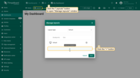
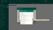
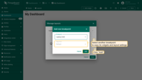
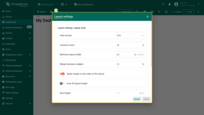
You can click the “gears” icon to open the layout settings for that breakpoint. Layout settings determine the background configurations of the dashboard and how widgets will be arranged on it.
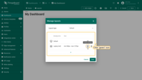
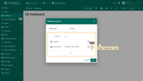
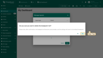
You can also click the “waste-bin” icon to delete a breakpoint. Confirm deleting the breakpoint in the dialog box.
Switching between Breakpoints
When a user opens the dashboard, the appropriate breakpoint layout is automatically selected based on the screen resolution.
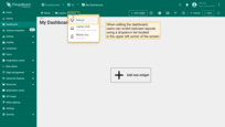
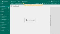
When editing the dashboard, users can switch between layouts using the combobox located in the top-left corner of the screen.
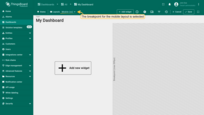
Breakpoints demo dashboard
We have prepared a demo dashboard with some configured breakpoints. You can import it into your environment to explore how to switch between different breakpoints in edit mode. You can also change the screen resolution in your browser’s developer tools to see how layouts change when crossing certain screen resolution breakpoints.
See how the same dashboard looks on different screen types:
Widget references vs widget copies
Widget references
When working with multiple breakpoints, it’s important to understand the difference between a widget reference and a widget copy.
By default, when a new breakpoint layout is created, all widgets from the source layout are copied by reference. For example, if two breakpoints—Default and Desktop (xl)—reference the same chart widget, any changes made to the widget configuration will be synchronized between both layouts. However, changes to the widget’s position and size are independent for each layout.
- To copy a widget by reference, right-click on the widget and select “Copy reference” (Ctrl+R);
- To paste the widget as a reference in another breakpoint layout, right-click on the empty space and select “Paste reference” (Ctrl+I).
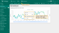
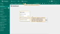
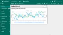
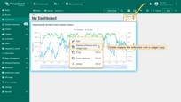
In edit mode, you can identify a referenced widget by the presence of a “Reference” button in the widget’s edit panel.
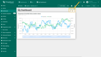
To replace the reference with the widget copy, click the “Reference” button on the widget editing panel, or right-click on the widget and select “Replace reference with widget copy”.
Widget copies
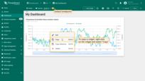
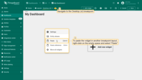
A widget copy is a complete and independent copy of the widget configuration. Changes made to the copied widget will not affect the original widget.
- To copy a widget, right-click on the widget and select “Copy” (Ctrl+C);
- To paste the widget in another breakpoint layout, right-click on the empty space and select “Paste” (Ctrl+V).
Layout settings
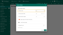
Click the “gear” icon opposite the breakpoint to open the layout settings.
Columns count
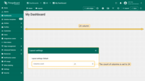
While editing the dashboard, specifically the size and space of your widgets, you can notice a whitish grid on a gray background. These are columns that determine how many widgets can fit horizontally on a Dashboard. By default, the number of columns is 24. You can increase or decrease their number. The minimum number of columns is 10. The maximum number is 1000 columns.
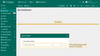
Minimum layout width
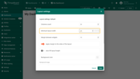
By default, the minimum number of columns is 24. You can increase or decrease this number. The minimum number of columns is 10. We recommend that the value of this parameter be equal to or more than the column count.
Margin between widgets
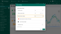
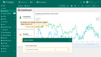
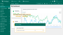
This margin type determines how much space is between widgets. By default, the margin is set to 10. You can remove it by setting the “Margin between widgets” field to 0 or increasing the margin, meaning the distance between widgets. The maximum allowable margin is 50.
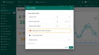
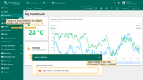
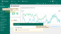
Apply margin to the sides of the layout
This parameter determines whether the “Margin between widgets” value should be applied to the sides of the layout.
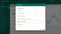
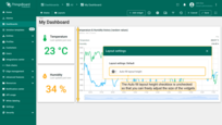
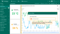
Auto fill layout height
By default, the “Auto fill layout height” checkbox is unchecked so that you can freely adjust the size of the widgets. If you tick this option, all the widgets on the dashboard will fill in vertically in the space of the screen.
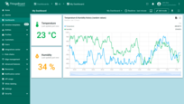
Background color
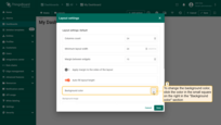
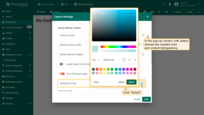
The “Background color setting allows you to customize the color of the dashboard’s background. To change the background color, click the color in the small square on the right in the background color section. In the popup window, select the desired color and transparency. Then click “Select”. Afterward, apply the layout settings. After saving, you can see the customized background.
Background image
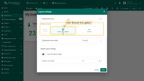
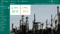
This option allows you to set an image as the background of the dashboard. You can choose an image from the Image gallery or set a direct link.
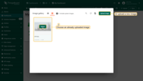
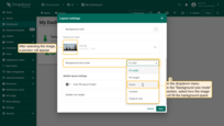
To select an image from the gallery, click “Browse from gallery”. Choose an already uploaded image or add a new one. To more precisely adjust the position of the image, click the dropdown menu of the “Background size mode” section and select how exactly the image will fill the background space. For example, let’s choose “Cover” and click “Save” to see how the background has changed.
Mobile layout settings
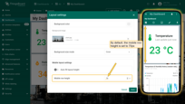
By default, the “Auto fill layout height” checkbox is unchecked so that you can freely adjust the size of the widgets for your mobile device. If you tick this option, all the widgets on the Dashboard will fill in vertically in the space of the screen.
Mobile row height
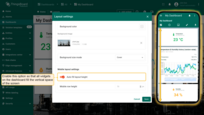
Mobile row height determines how tall you’d like your widgets to be on your mobile device. By default, the height is set to 70px, but you can make it smaller or larger. The minimum Mobile row height is 5px, and the maximum allowable value is 200px.


