Widget Development
Custom widgets let you build tailored UI components — cards, charts, control panels, tables — that plug directly into ThingsBoard dashboards. You write HTML, CSS, and JavaScript in the built-in Widget Editor; no external build tools or IDE required.
Every widget lives inside a widget bundle (a folder-like container in the Widget Library). ThingsBoard ships with dozens of bundles for charts, maps, controls, and more. When the built-in widgets don’t fit your use case, you create a custom widget type inside your own bundle.
Widget Types
Section titled “Widget Types”| Type | Data source | Typical use |
|---|---|---|
| Latest Values | Last known value of each data key | Sensor cards, gauges, status indicators |
| Time-Series | Historical data within a time window | Charts, trend lines, heatmaps |
| RPC (Control) | Sends RPC commands, displays responses | Buttons, sliders, device control panels |
| Alarm | Active alarms matching filter criteria | Alarm tables, severity dashboards |
| Static | No data subscription | Navigation menus, info banners, branding |
Widget Editor Tour
Section titled “Widget Editor Tour”Open Widget Library from the left menu, then click any widget type to open the Widget Editor. The editor has the following sections:
Toolbar — Save, Undo, Redo, and Run buttons. Click Save (or Ctrl+S) to save your widget. Click Run (or Ctrl+Enter) to preview your widget without saving.
Resources tab — Add external JavaScript or CSS libraries by URL (e.g., ECharts, D3). They’re loaded before your code executes.
HTML tab — Your widget’s Angular template. Supports Angular directives (*ngIf, *ngFor, [ngStyle], [ngClass]), Angular Material components (mat-icon, mat-button, mat-select), and ThingsBoard components (tb-icon, tb-time-series-chart-widget).
CSS tab — Scoped styles for your widget. Use standard CSS — it’s automatically scoped to your widget instance.
JavaScript tab — Widget logic via lifecycle functions:
self.onInit()— called once when the widget loadsself.onDataUpdated()— called each time new data arrivesself.onResize()— called when the widget container resizesself.onDestroy()— called when the widget is removedself.onEditModeChanged()— called when the dashboard switches between view and edit modeself.onMobileModeChanged()— called when the dashboard enters or exits mobile modeself.typeParameters()— returns configuration like max datasources, data keys, etc.self.actionSources()— declares clickable actions the widget exposes
Inside every lifecycle function, self.ctx is your main entry point to the platform — it provides access to settings, data, the DOM container, HTTP client, and platform services. See the Widget context (ctx) reference for the full list of available properties.
Settings form tab — Defines the configuration form end users see in the widget settings dialog. Fields are added through a built-in form — click the add button, select a field type, and fill in the field properties. Each field has an id, display name, type, and optional group, default, and condition. See the Field types reference for the full list of supported field types.
Data key settings form — Defines the configuration form shown in the data key settings dialog. Each data key already has built-in options (label, color); the data key settings form lets you add extra fields specific to your widget — for example, a threshold value or display format per key.
Widget settings — Stores basic metadata: widget image, description, deprecated status, and the selectors that link to the settings form and data key settings form.
Preview section — Shows a live preview of your widget. Configure test datasources and time windows to simulate real data.
Hello World: Your First Widget
Section titled “Hello World: Your First Widget”Build a minimal static widget that displays a configurable greeting message.
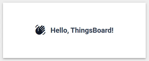
- Navigate to Resources ⇾ Widgets ⇾ Widgets bundles tab.
- Click + Add widgets bundle ⇾ Create new widgets bundle. Name it
My Widgetsand click Add. - Open the bundle, click + Add new widget ⇾ Create new widget, and select Static widget as the widget type.
- In the HTML tab, paste:
<div class="hello-container"><div class="hello-icon"><mat-icon>waving_hand</mat-icon></div><div class="hello-text" id="greeting"></div></div>
- In the CSS tab, paste:
.hello-container {width: 100%;height: 100%;display: flex;align-items: center;justify-content: center;gap: 16px;}.hello-icon mat-icon {font-size: 36px;width: 36px;height: 36px;color: var(--tb-primary-500);}.hello-text {font-size: 24px;font-weight: 600;color: #344054;}
- In the JavaScript tab, paste:
This reads theself.onInit = function() {let settings = self.ctx.settings || {};let message = settings.greetingMessage || 'Hello, ThingsBoard!';let element = self.ctx.$container[0].querySelector('#greeting');if (element) {element.textContent = message;}};self.typeParameters = function() {return {datasourcesOptional: true,dataKeysOptional: true};};
greetingMessagefrom widget settings and writes it into the DOM. ThetypeParametersfunction tells ThingsBoard that this widget doesn’t require a datasource. - In the Settings form tab, add a field using one of two methods:
- Import from JSON — click the Import from JSON button, select the JSON content tab, and paste:
[{"id": "greetingMessage","name": "Greeting message","group": "Appearance","type": "text","default": "Hello, ThingsBoard!","required": false}]
- Manually — click the add button, select
textas the field type, and fill in theid,name,group, anddefaultproperties in the form. This creates a text field in the widget settings dialog where users can customize the greeting.
- Import from JSON — click the Import from JSON button, select the JSON content tab, and paste:
- Click Run to preview — you should see “Hello, ThingsBoard!” centered in the preview panel.
- Click Save (or
Ctrl+S) ⇾ name the widget “Hello World”. - Open any dashboard ⇾ click Add widget ⇾ find your “My Widgets” bundle ⇾ add the “Hello World” widget. Open its settings to change the greeting message and verify it updates.
How It Works
Section titled “How It Works”The Hello World widget demonstrates the core pattern every widget follows:
- HTML defines the structure — static markup or Angular templates.
- CSS styles the widget — scoped to the widget container.
- JavaScript provides behavior via lifecycle functions.
self.onInit()runs once to set up the widget;self.ctxgives you access to settings, data, services, and the DOM container. - Settings form defines the per-widget configuration form. Data key settings form defines a parallel form shown per data key, where you can add extra fields beyond the built-in label and color options. Each field in both forms has an
id, displayname,type, and optionally agroup,default, andcondition. - Type parameters tell the platform what data configuration the widget expects (or doesn’t expect).
Next Steps
Section titled “Next Steps”Each widget type has its own page with an overview, use cases, and two hands-on examples:
- Latest Values — sensor cards, multi-key status panels, current-state display
- Time-Series — embedded platform chart with key selector, ECharts line chart
- RPC Control — ON/OFF panel, numeric value input
- Alarm Widget — alarm table with ack/clear, severity counter
- Static Widget — configurable info card, navigation menu
- Widget Patterns — CRUD tables, navigation, entity hierarchy, and more
- Advanced Topics — external libraries, inter-widget communication, debugging
- Widget API Reference — comprehensive API reference
Was this helpful?