Period Total: Forecast Monthly Energy & Usage
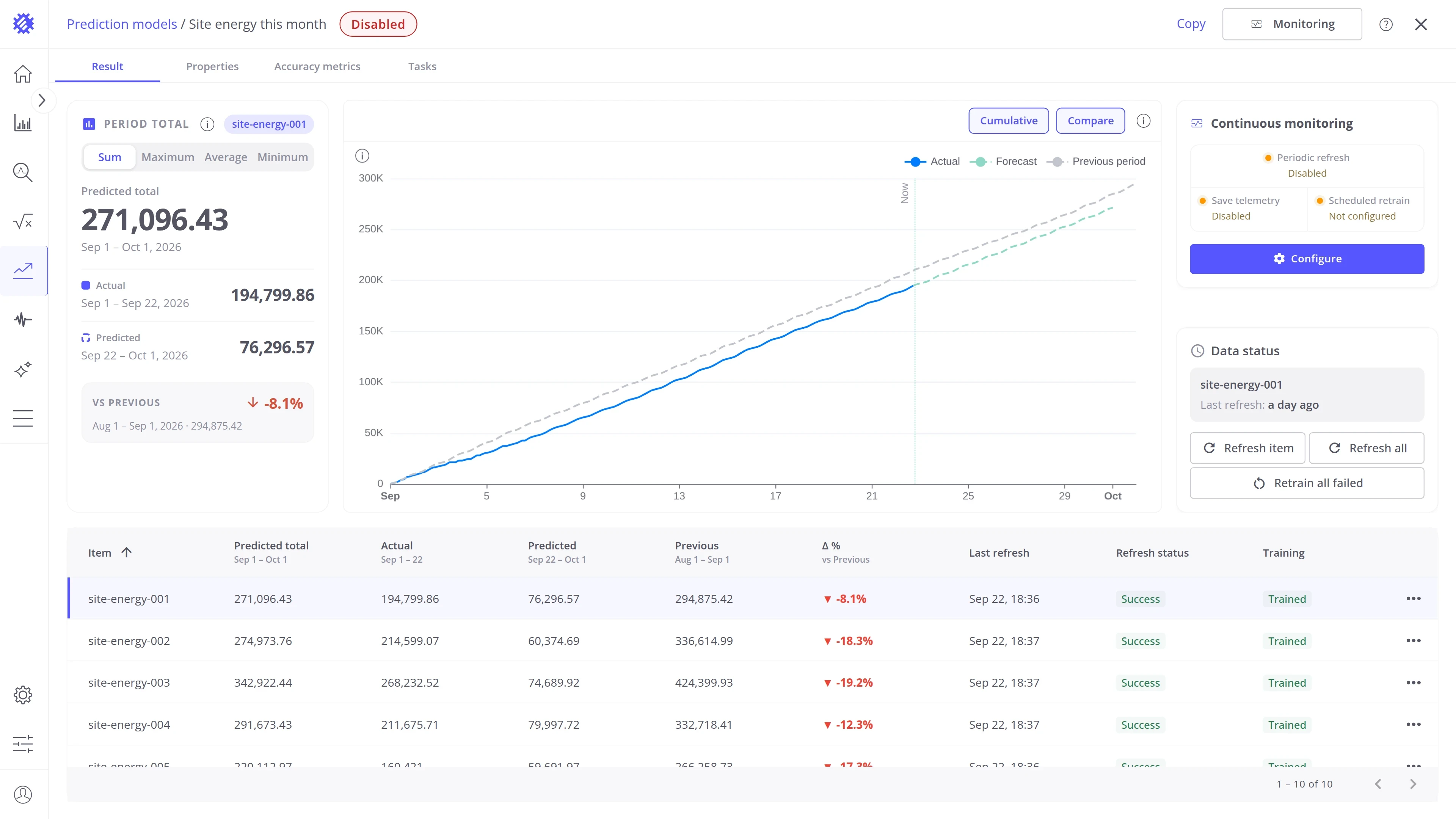
Period Total answers the question a budget asks: how much by the end of the period? The model forecasts the metric for the rest of the period, adds what has been measured so far, and reports the total, peak, average, or minimum for the whole period next to the same figure for the previous period.
When to use it
Section titled “When to use it”Use Period Total when you need one number for a whole period, such as a month, rather than the curve.
| Use case | What Period Total predicts | What you do with it |
|---|---|---|
| Check the energy bill | Total energy of each site for this month | See the bill before the invoice arrives, and compare it with last month |
| Estimate fuel spend | Total fuel each vehicle of a fleet will use this month | See which vehicles will go over the monthly fuel budget |
| Report water use | Total water use of each building for this quarter | Report the change against the previous quarter before the quarter ends |
Period Total raises no alarms. To be warned when a metric crosses a limit, use Time to Threshold. To track a goal with a risk score and alarms, use Hit Target. For the plain curve over a horizon, use Forecast.
How to create a model
Section titled “How to create a model”Step 1: Open the wizard
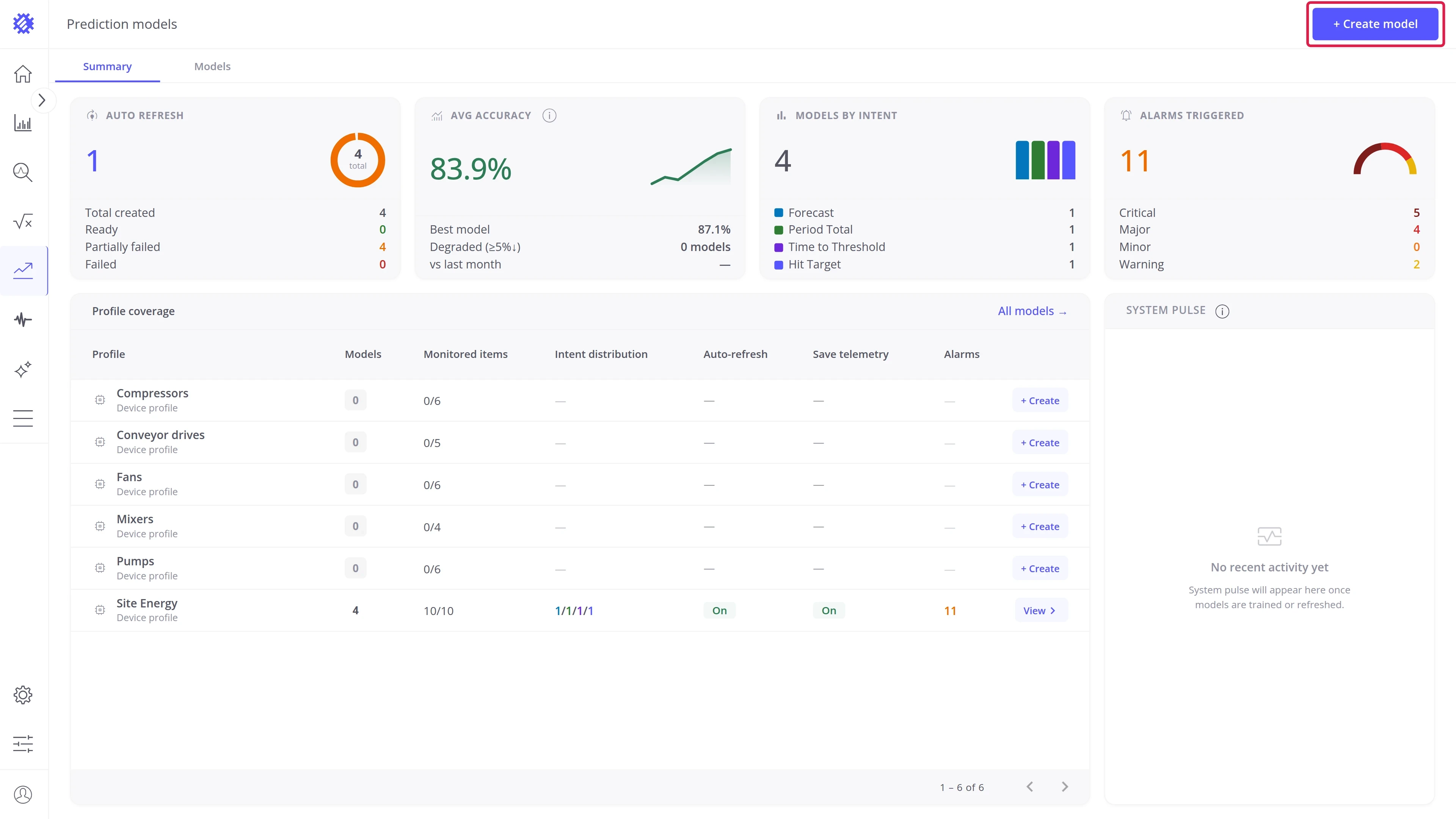
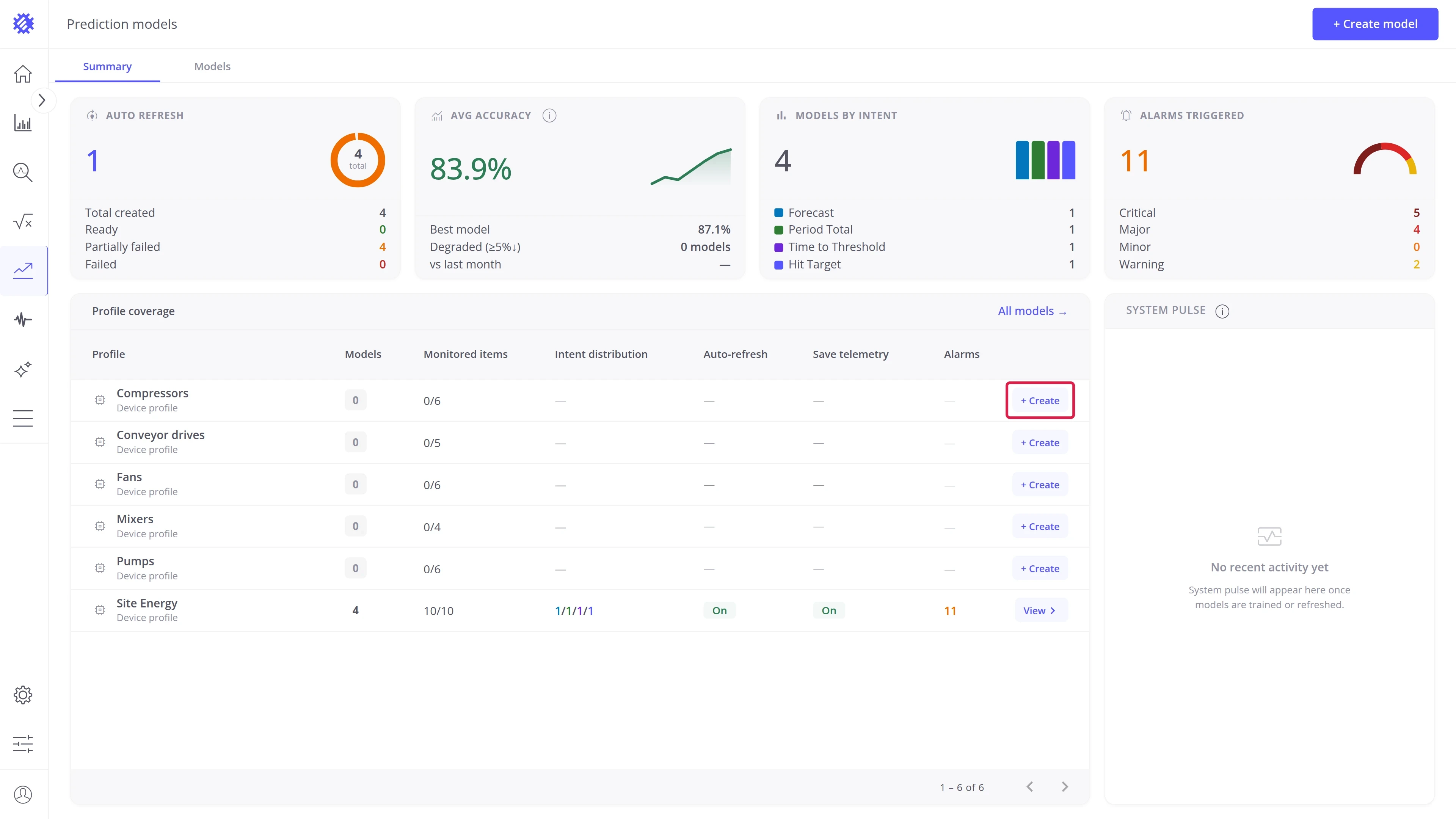
Section titled “Step 1: Open the wizard”Two entry points are available on the Prediction models page:
- Create model — button in the top-right corner, visible on both tabs.
- + Create — inline button on any profile row of the Profile coverage table. Opens the wizard with that profile pre-selected.
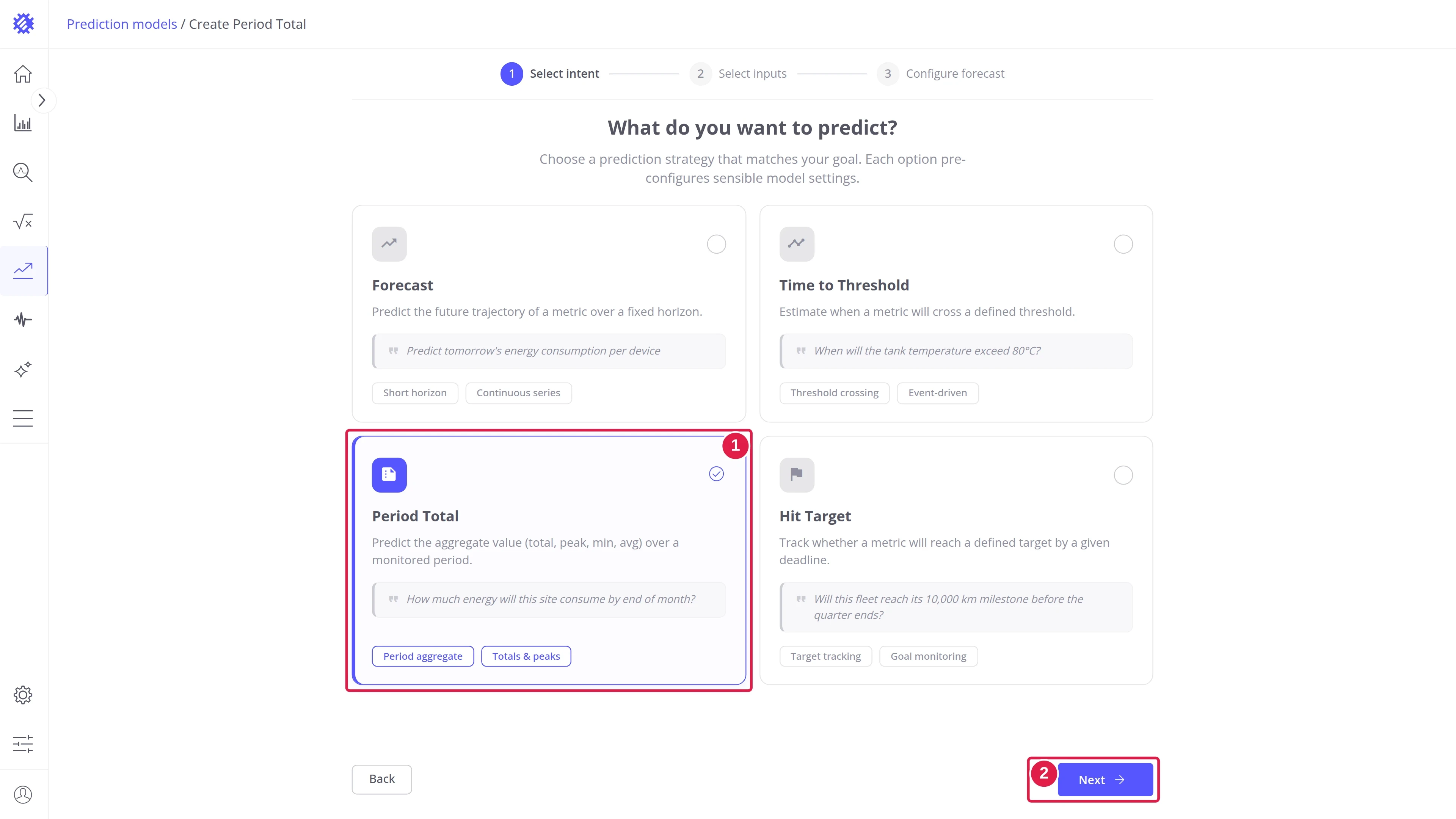
The wizard opens on What do you want to predict?:
- Select the Period Total card (1).
- Click Next (2).
- The intent decides what the model reports and cannot be changed later.
- The other three intents are described in Forecast, Time to Threshold, and Hit Target.
Step 2: Configure inputs
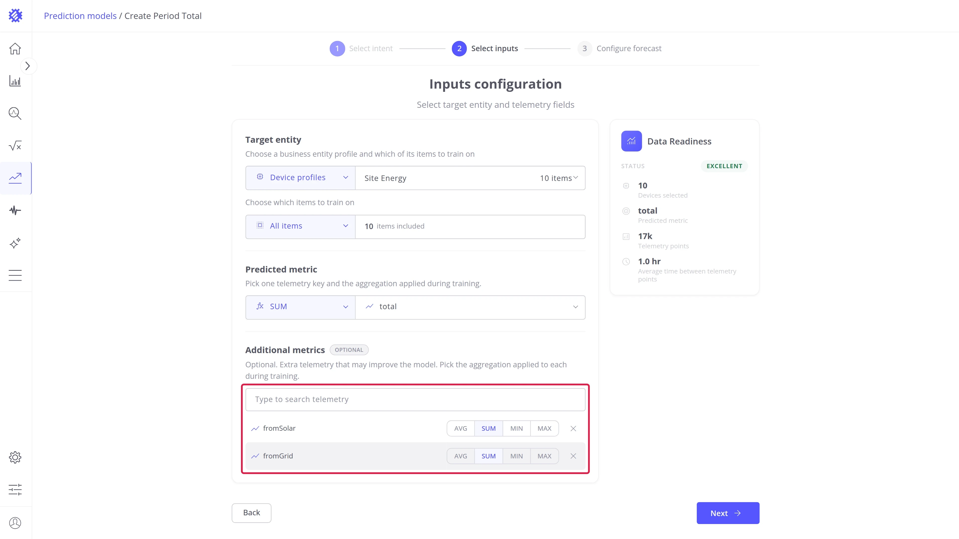
Section titled “Step 2: Configure inputs”The Inputs configuration step defines the items the model trains on and the metric it totals.
Entity selection — select the entity type and the profile to predict:
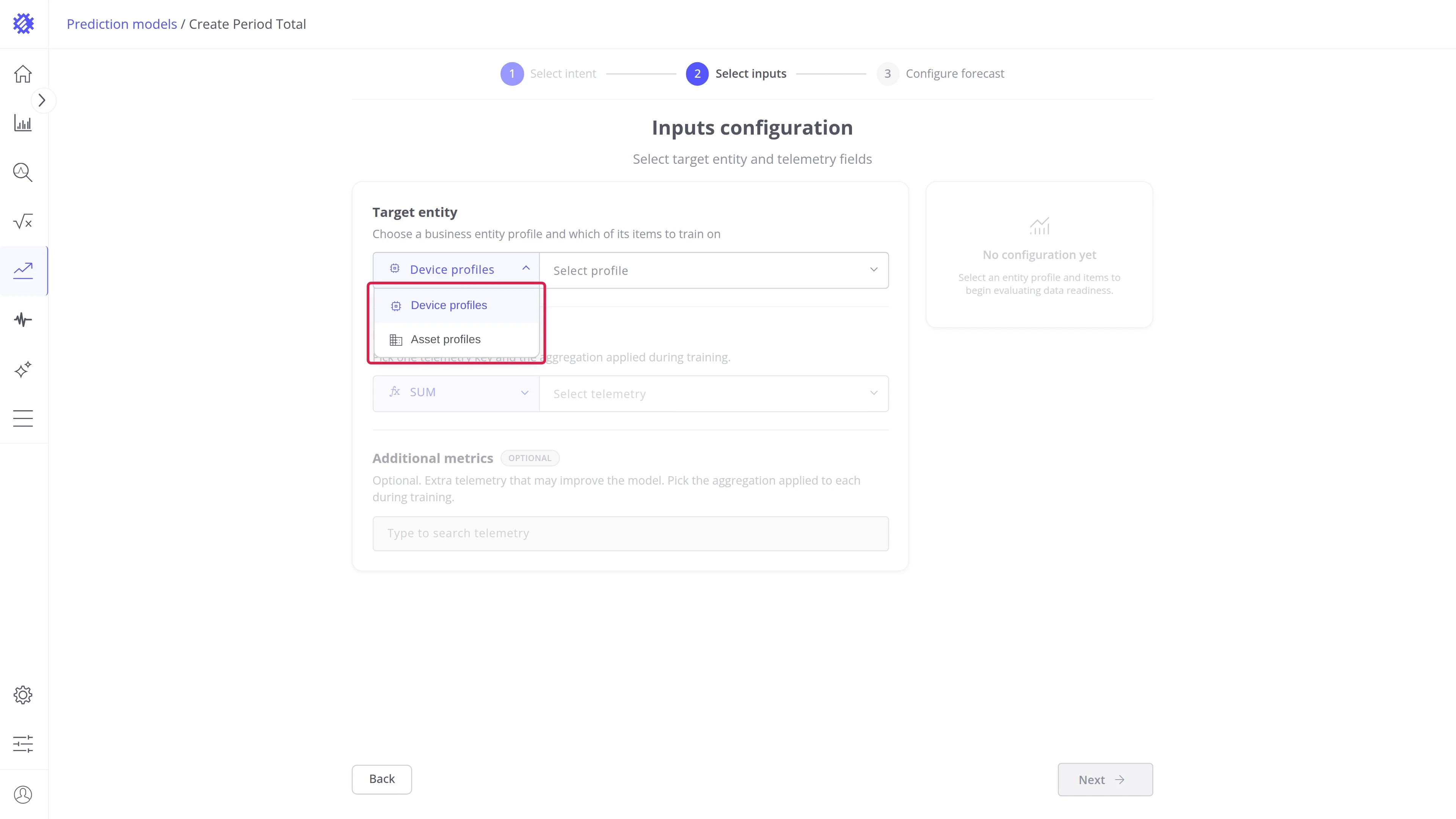
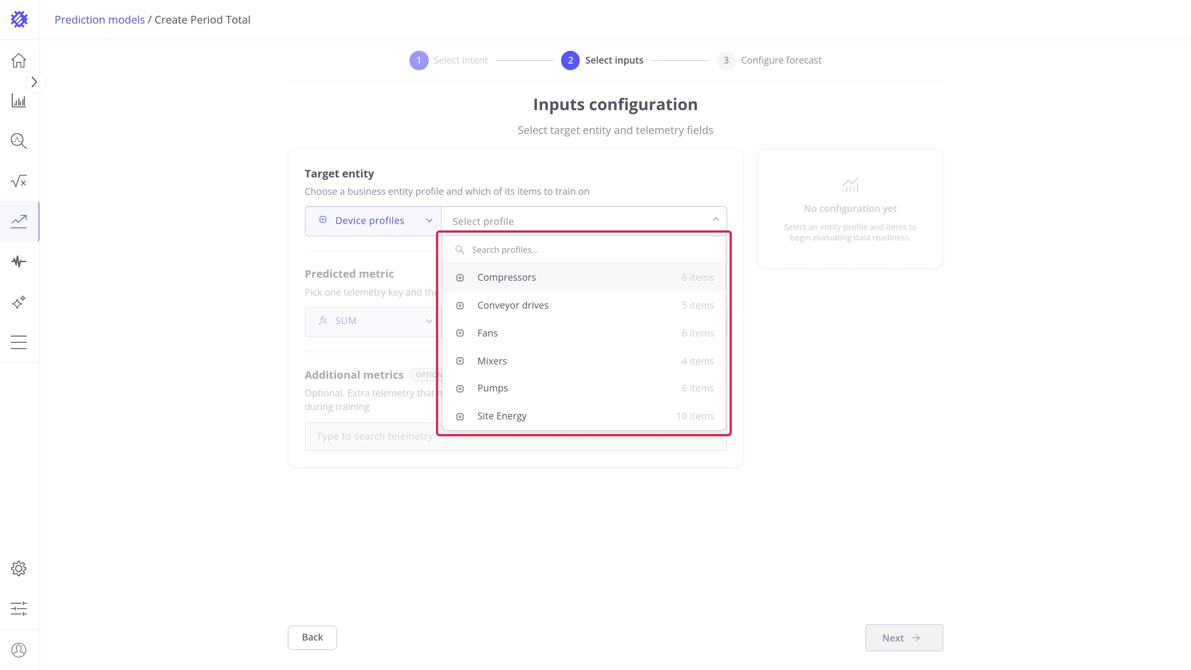
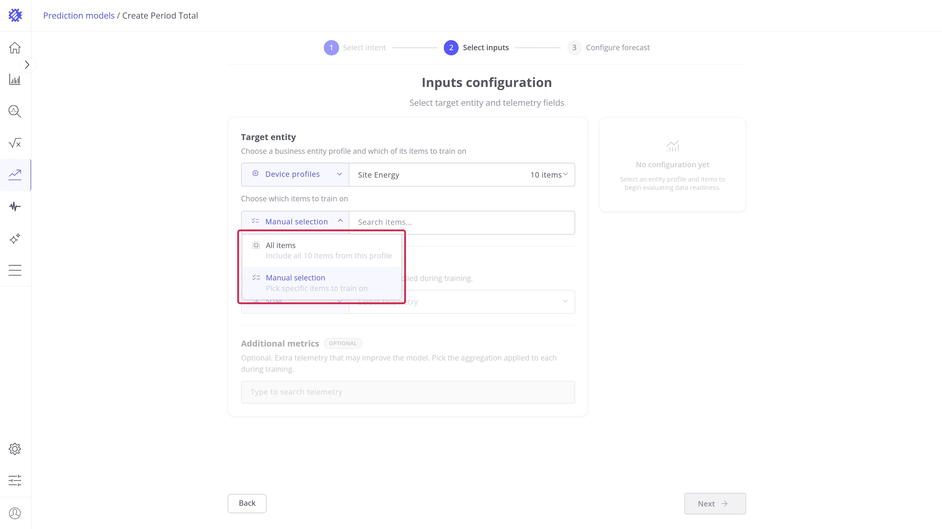
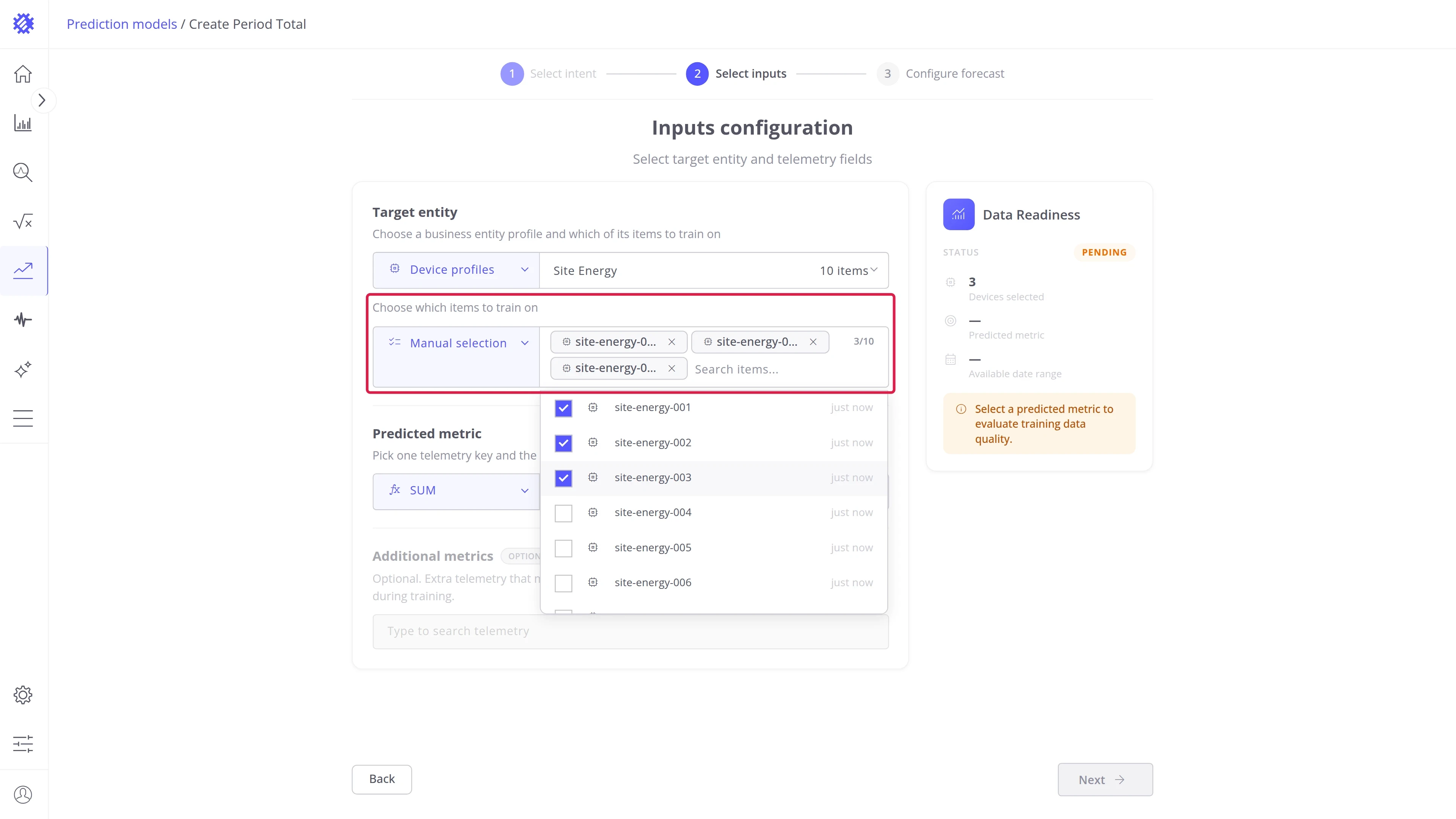
Item selection — choose which items of the profile train the model:
| Mode | Behavior |
|---|---|
| All items | Includes every item in the profile, including devices added to it later. |
| Manual selection | Pick specific items from a searchable list. |
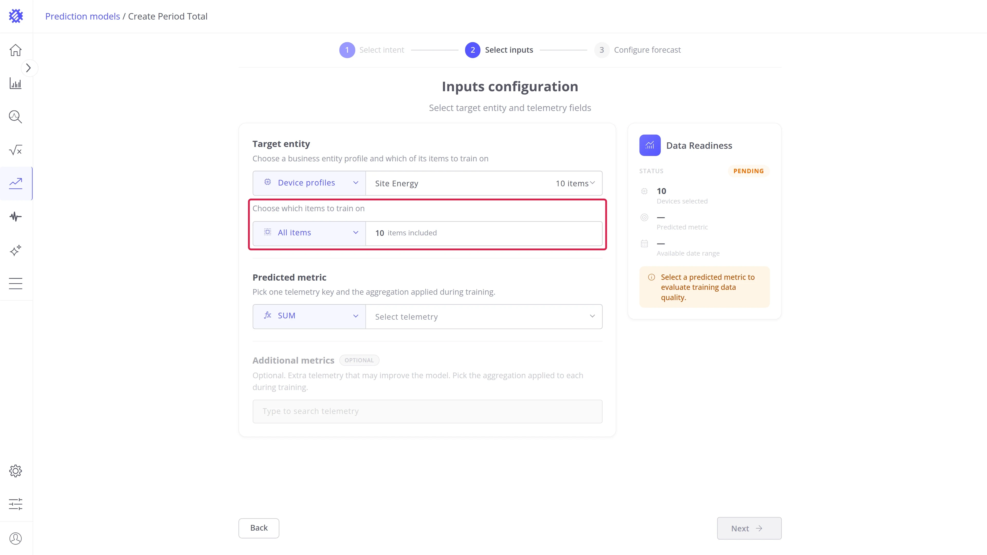
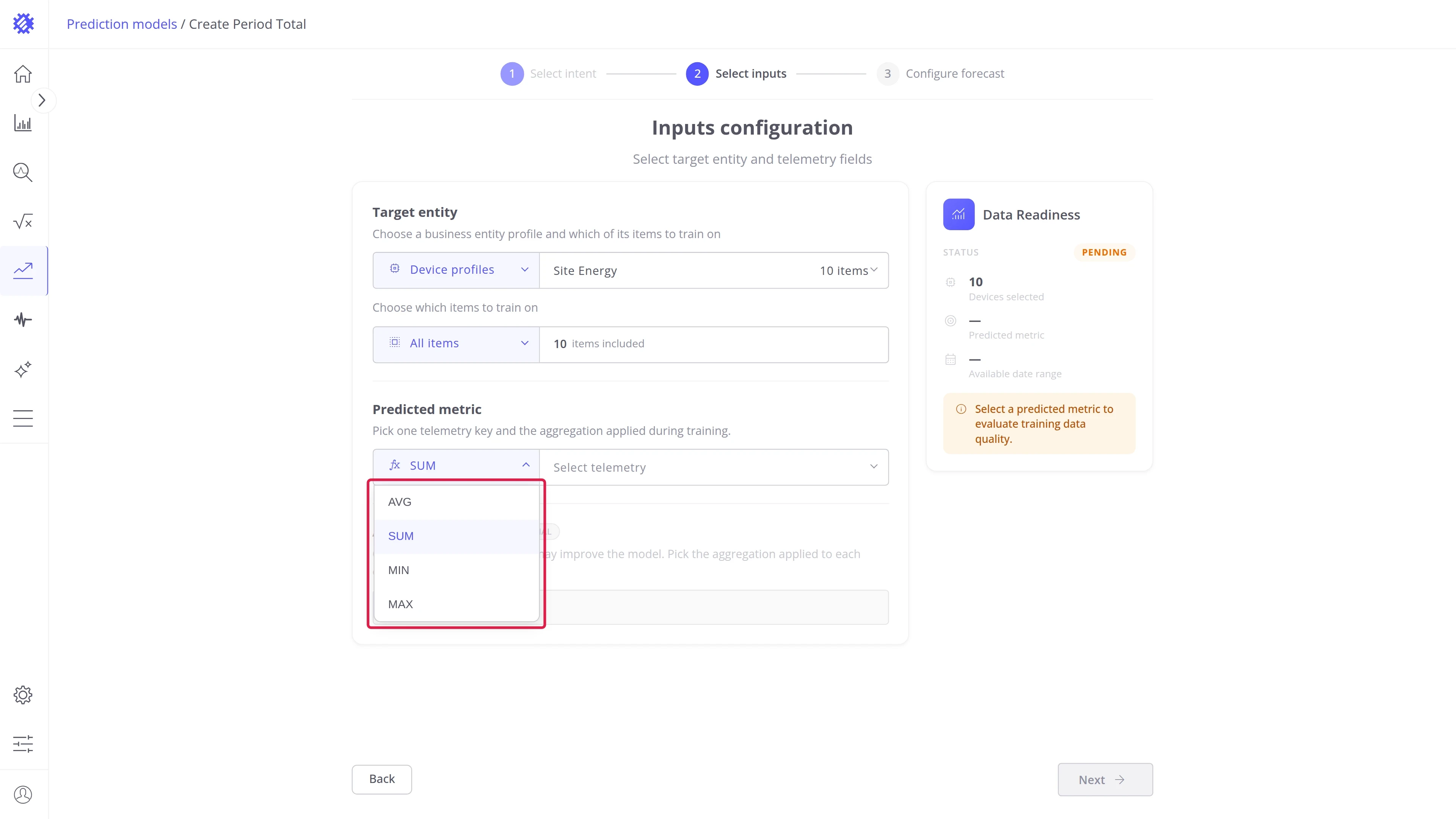
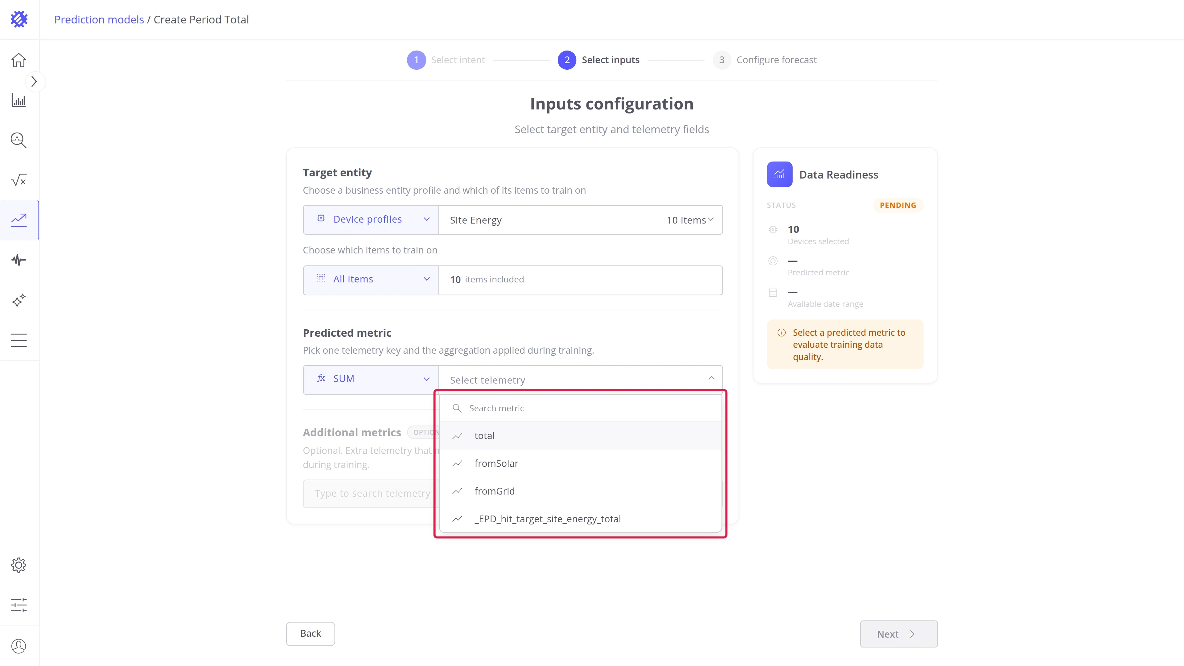
Predicted metric — pick the telemetry key to total and the aggregation applied to it during training:
| Aggregation | Use for |
|---|---|
| SUM | Counters such as energy, water, or produced units. |
| AVG | Levels such as temperature, pressure, or humidity. |
| MAX, MIN | Peaks and troughs, for example the highest demand of an hour. |
The aggregation chosen here is the default of the Result tab, where all four are available without rebuilding.
Additional metrics — optional extra telemetry that may explain the predicted one, each with its own aggregation. Type to search the keys of the profile:
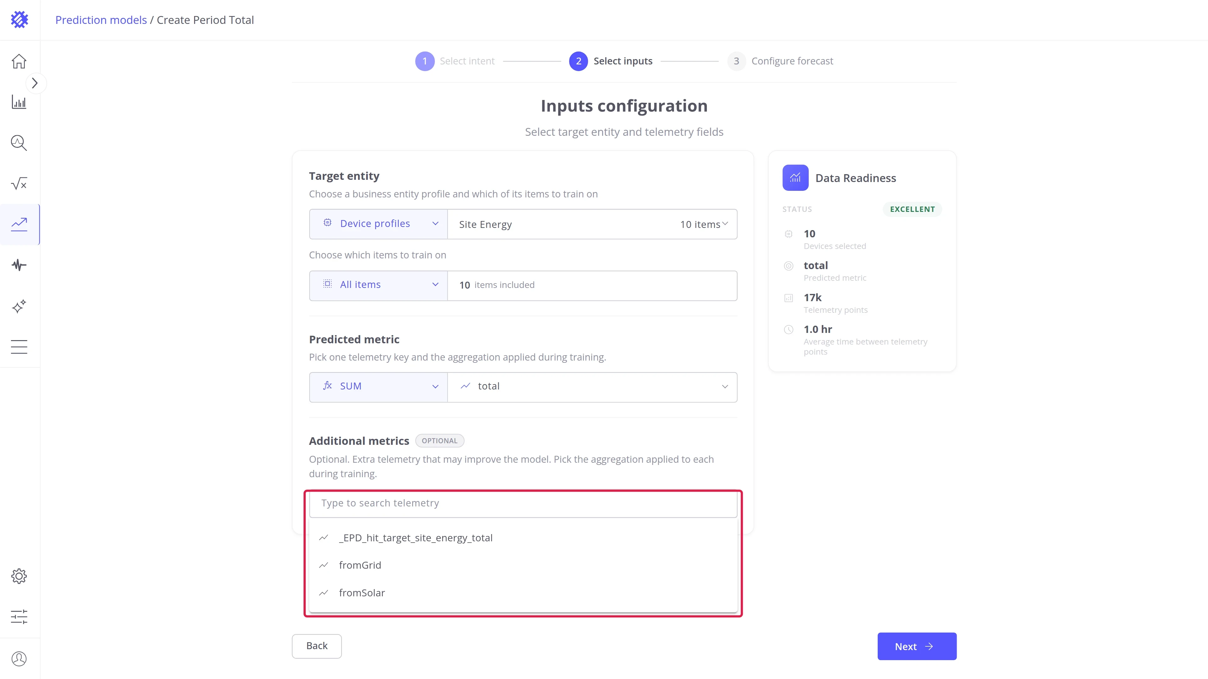
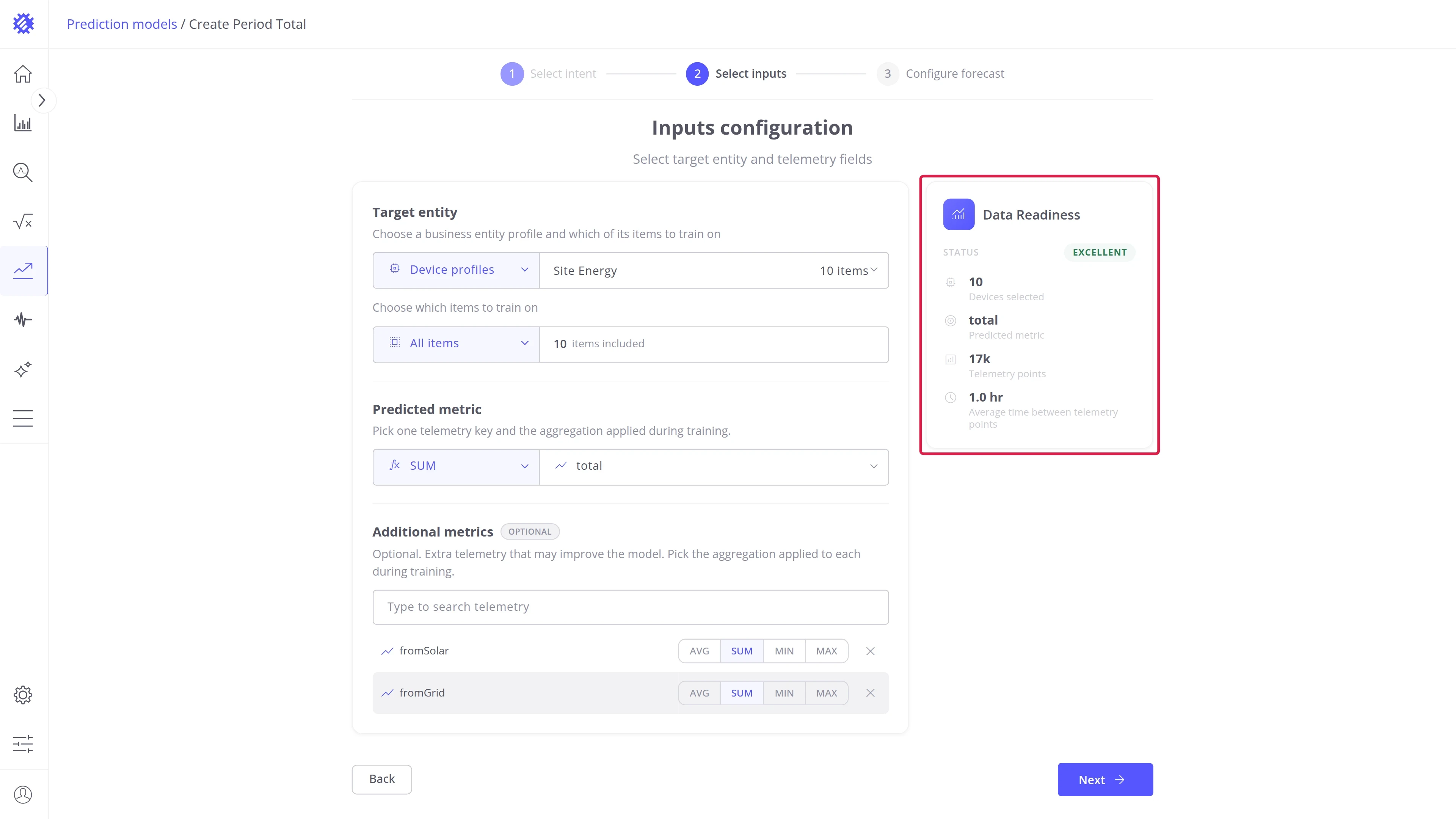
Data Readiness — grades the choice as you go: items selected, the predicted metric, how many telemetry points they hold, and the average spacing between them.
Step 3: Configure the period
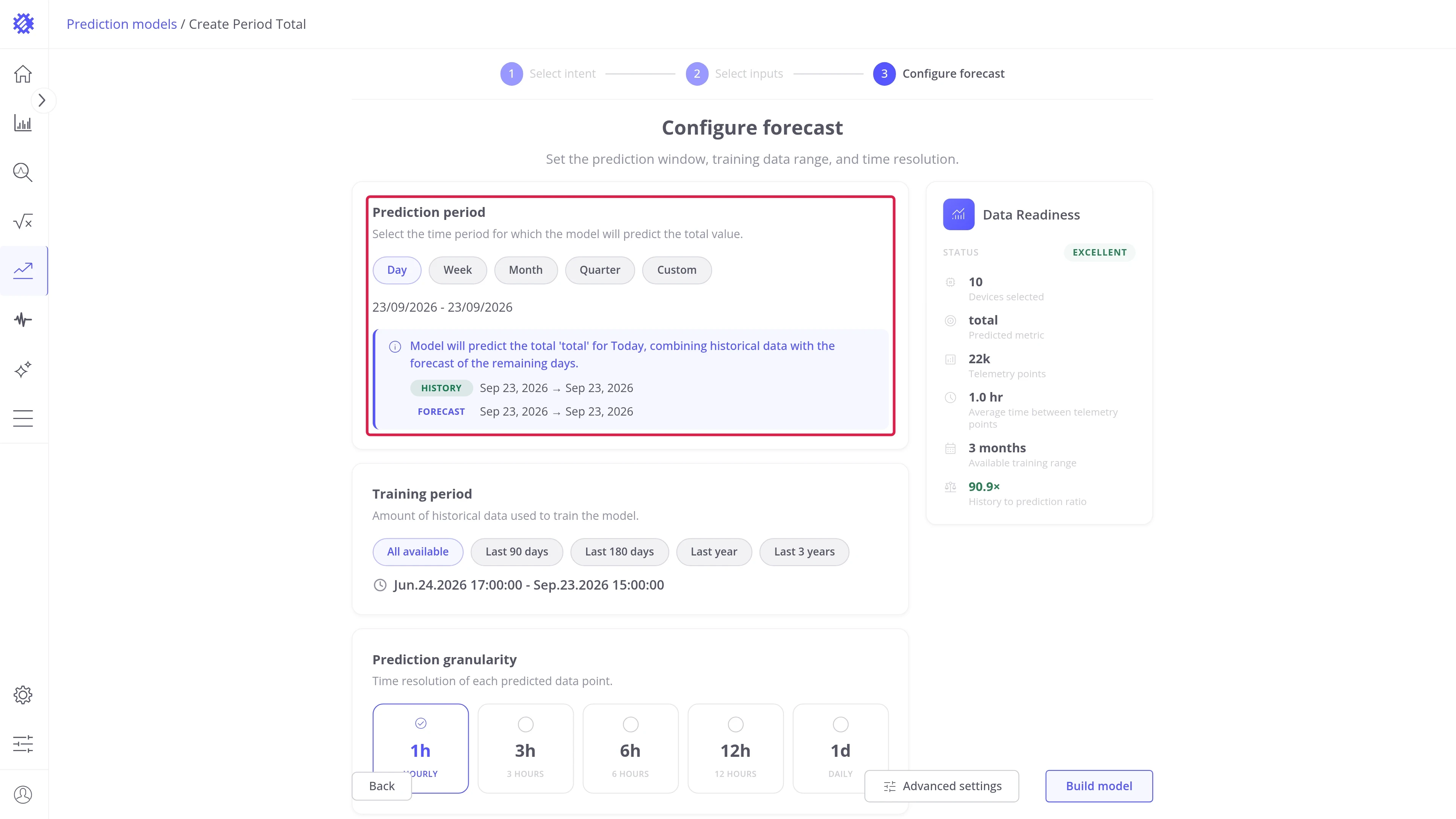
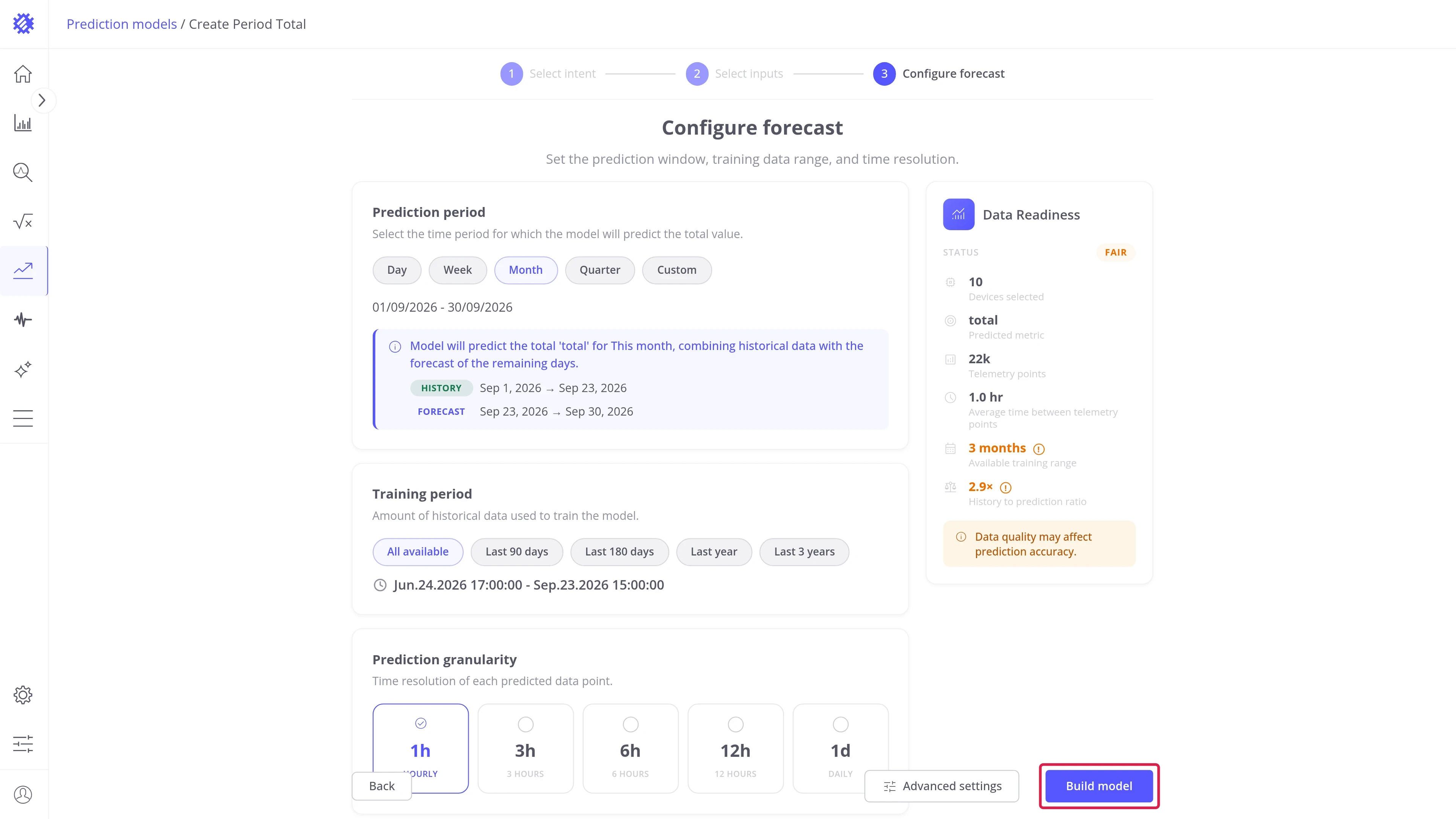
Section titled “Step 3: Configure the period”The Configure forecast step sets the period the model totals, how much history it learns from, and how fine the result is.
Prediction period — choose the calendar period to total. Pick Day, Week, Month, or Quarter, or Custom and type the number of units. The info block splits the period into the part already measured and the part still to be forecast:
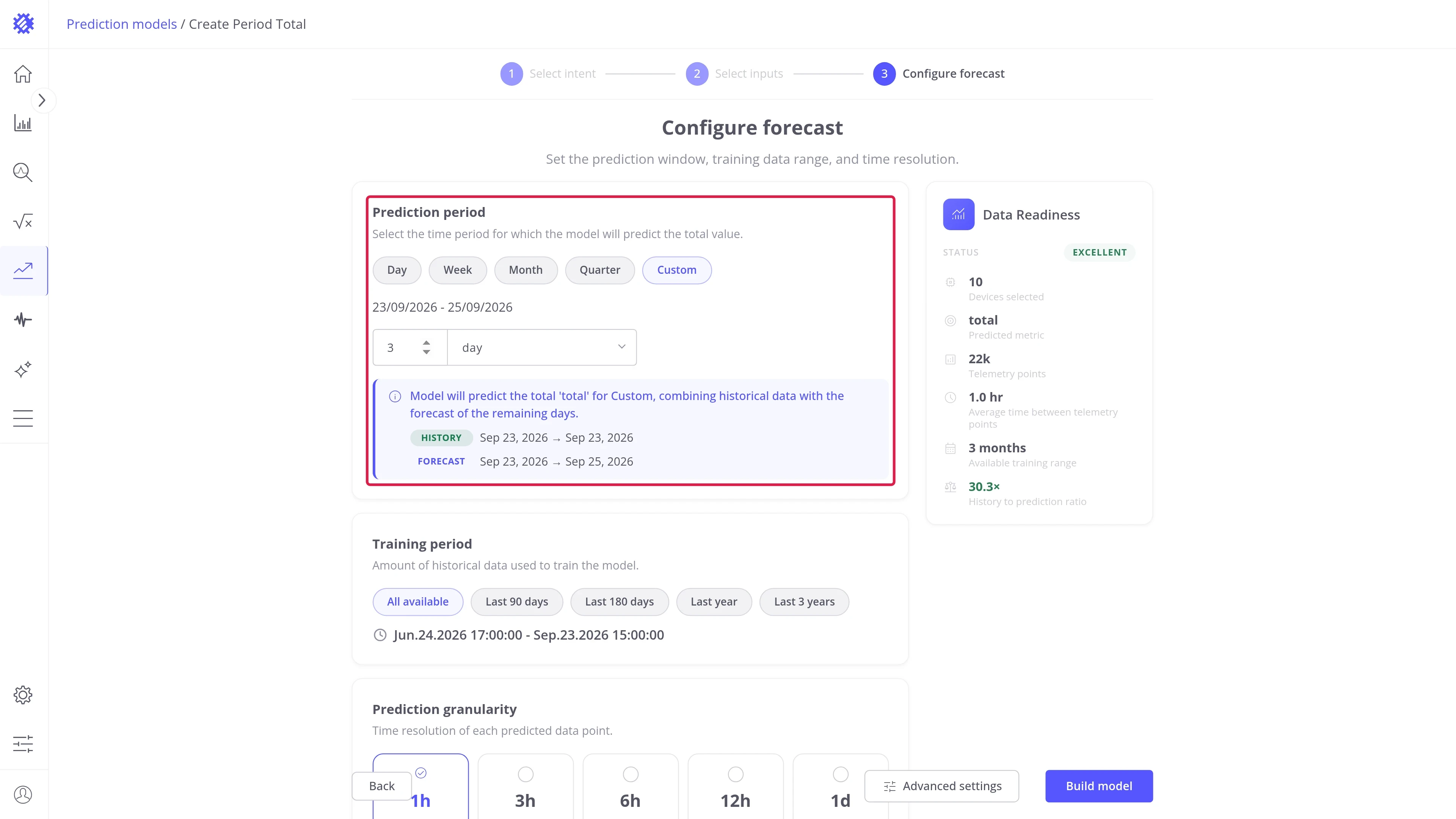
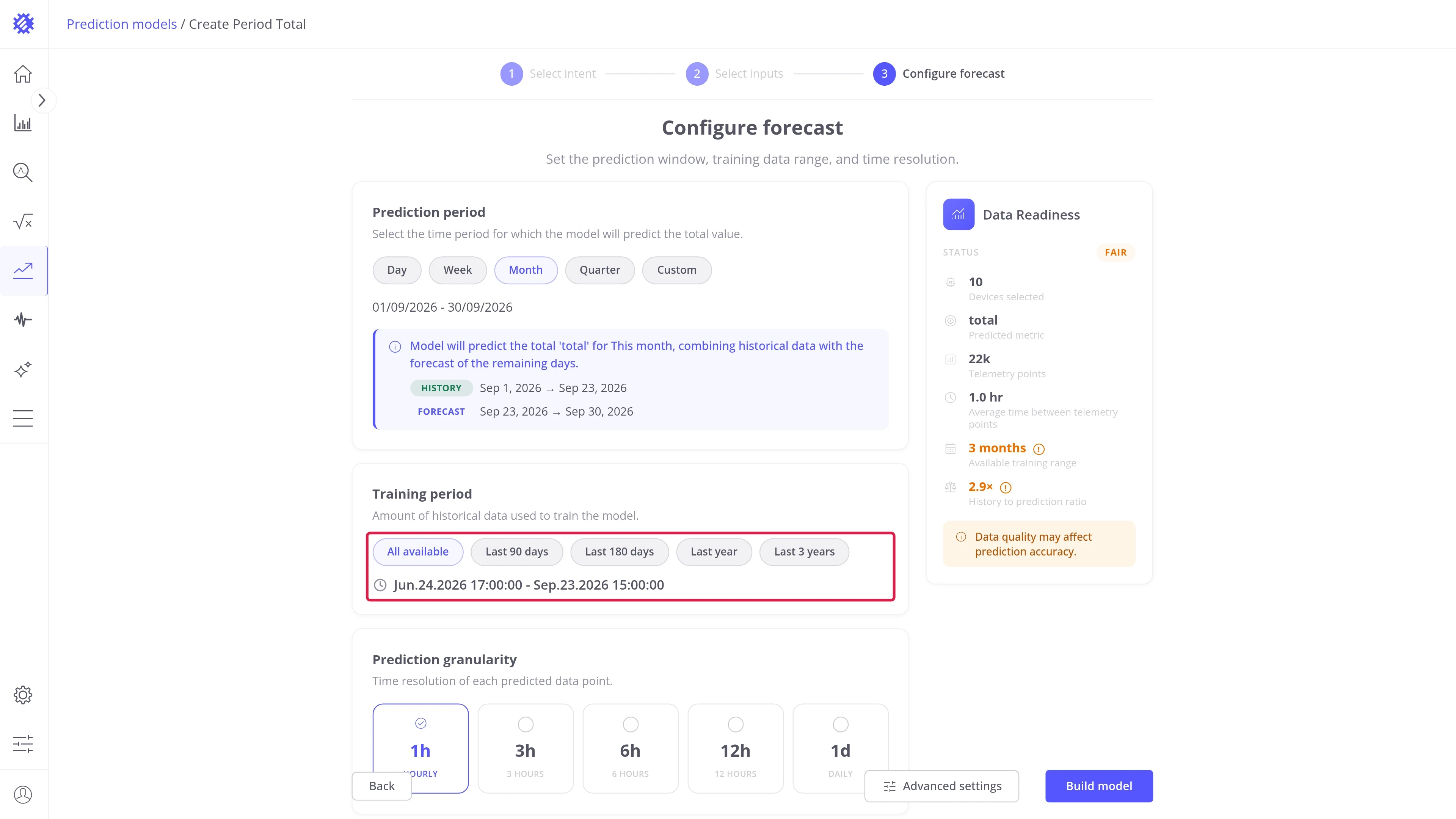
Training period — choose how much history the model learns from. A one-month period wants at least three months of history, so a ratio below three is graded as weak:
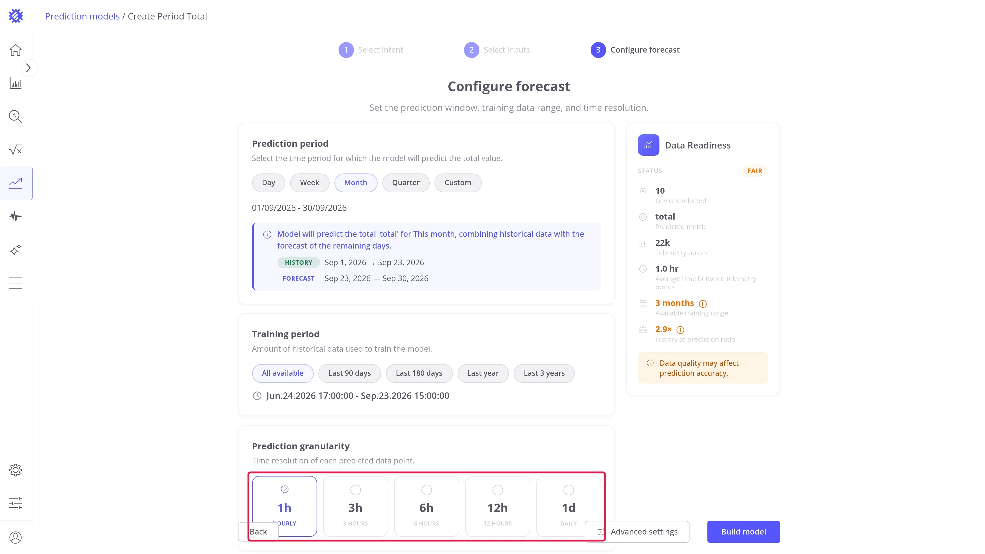
Prediction granularity — pick the length of one bucket. The forecast that fills the rest of the period has the same step:
Step 4: Build the model
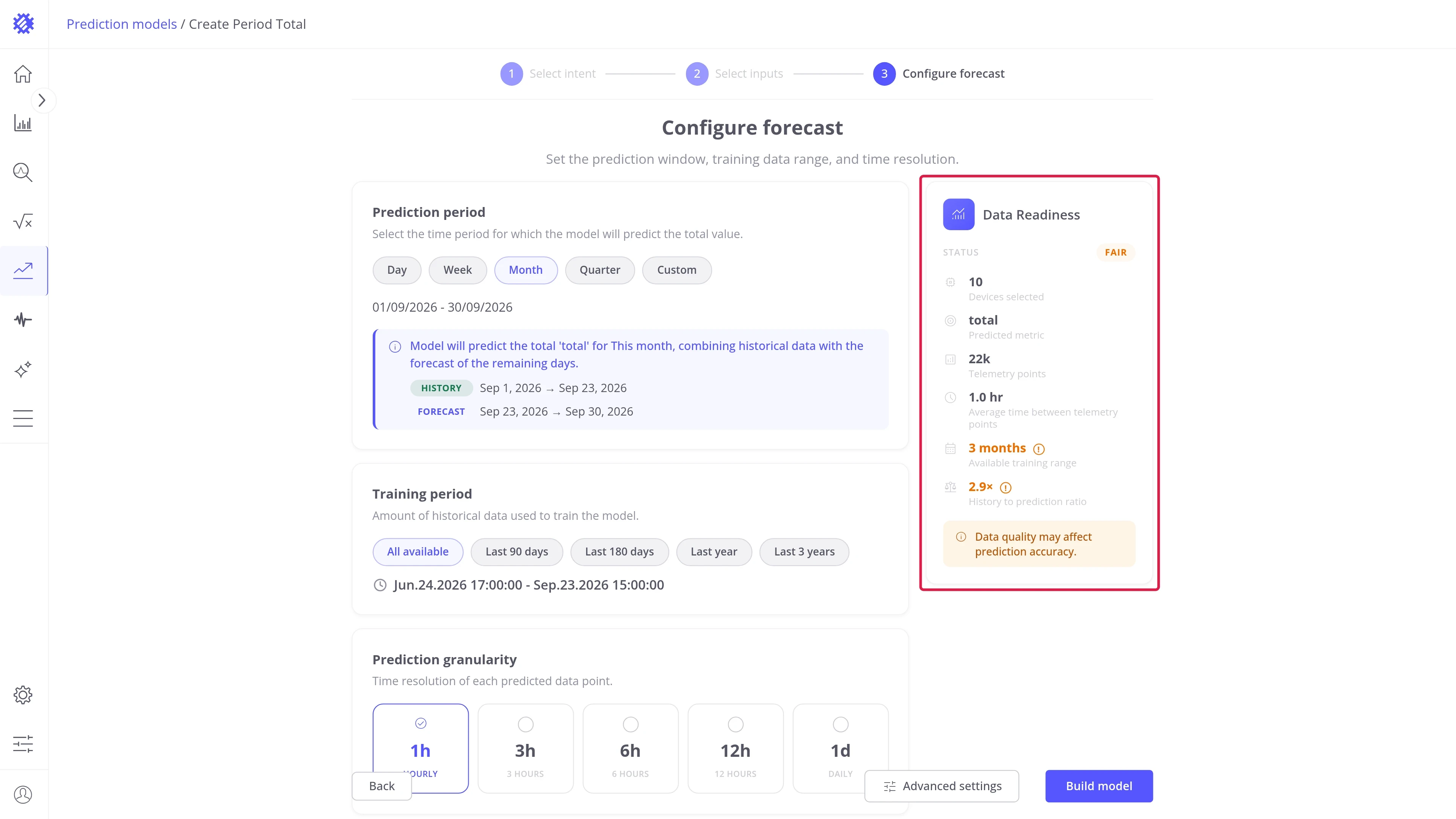
Section titled “Step 4: Build the model”Data Readiness — check the status before you train. The better it is, the better the resulting forecast:
Advanced settings — optional. Opens the prediction method and the forecast bounds. Leaving the method on Auto lets Trendz pick one per item:
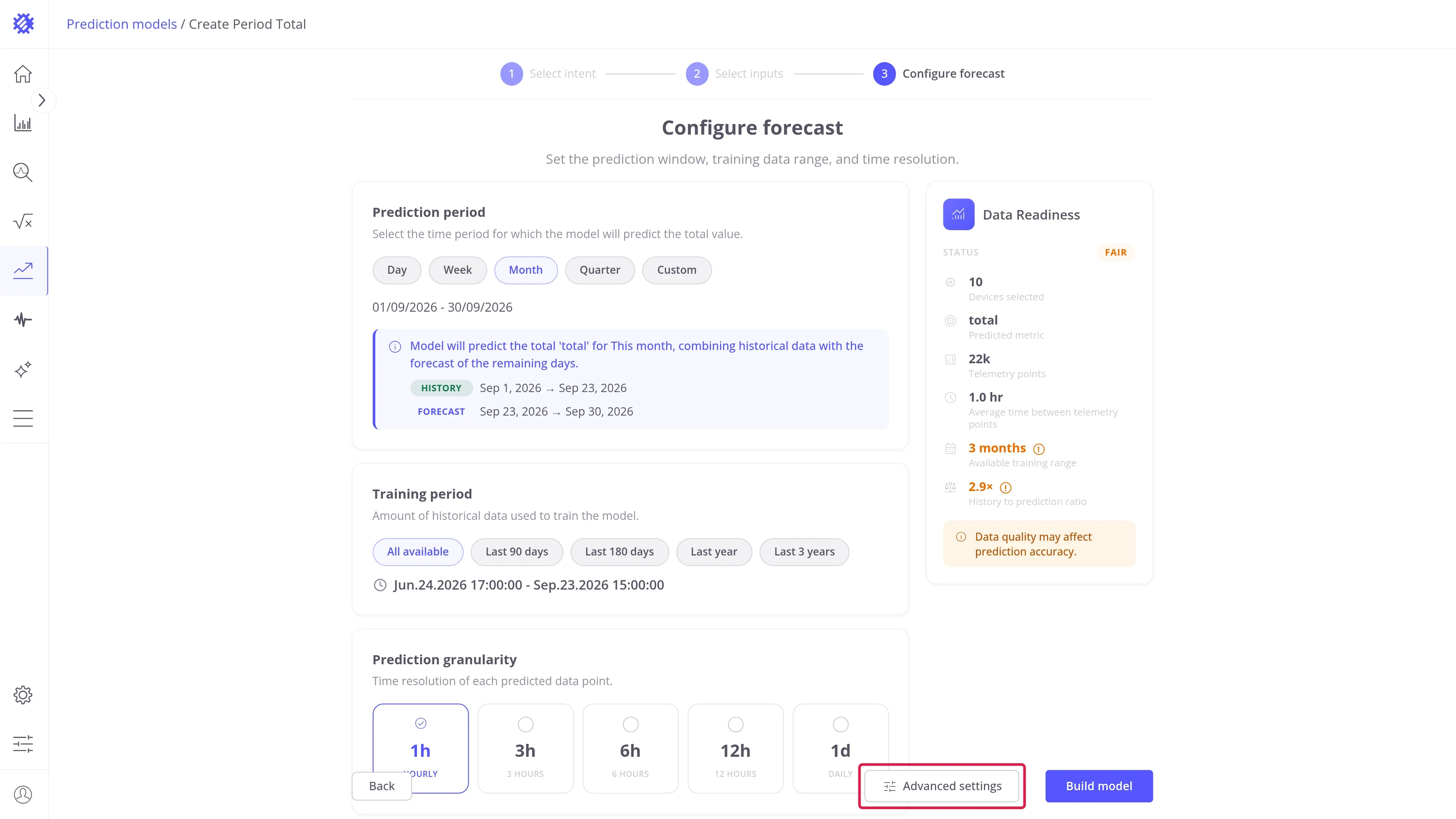
Every setting of this step is described in Wizard advanced settings.
Build model — trains one model per item and opens the Result tab when the run finishes:
Period Total result page
Section titled “Period Total result page”The Result tab shows the period of one item at a time. Pick the item in the table below the chart; the cards on the right show the monitoring settings and the data status of the model.
Period total card
Section titled “Period total card”The card on the left shows the period of the selected item:
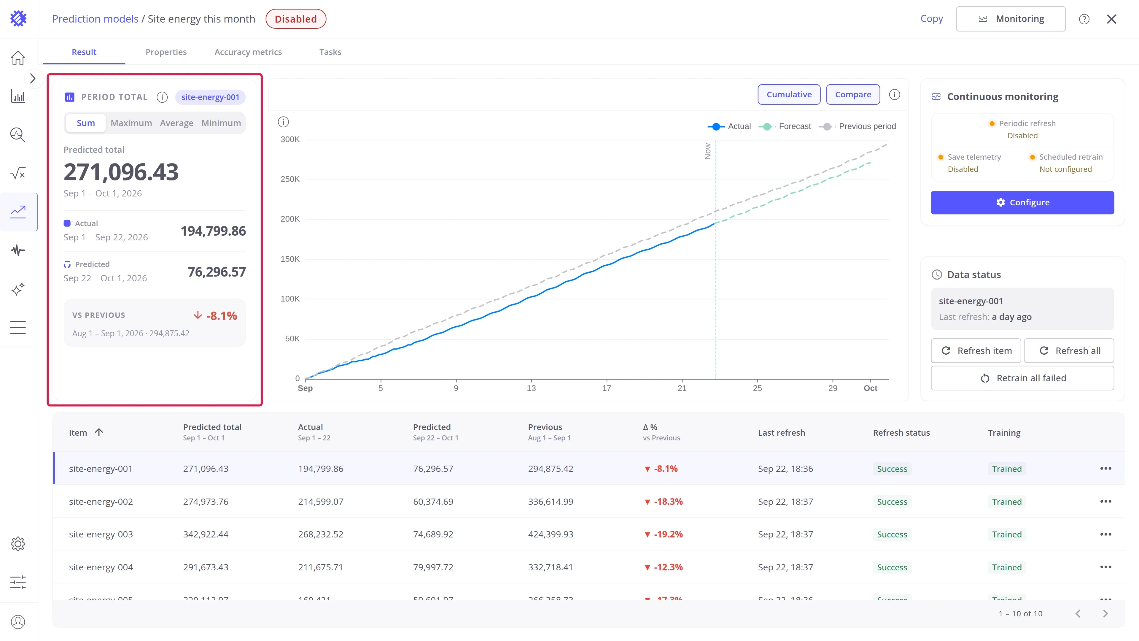
| Part | What it shows |
|---|---|
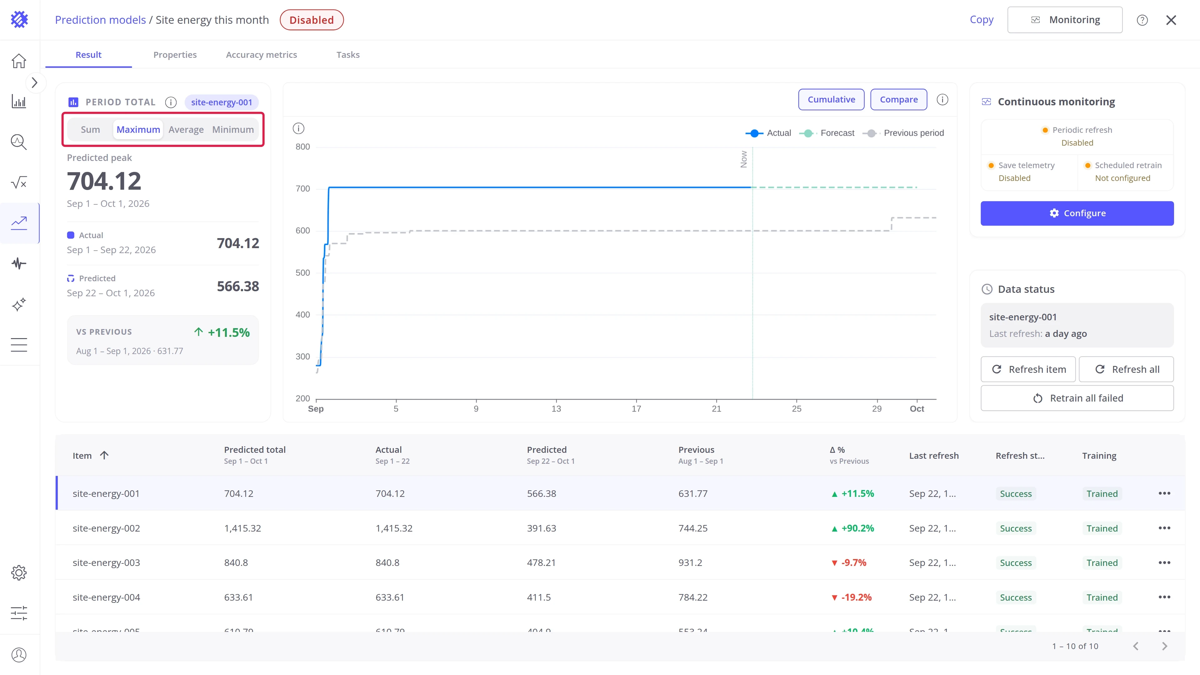
| Sum, Maximum, Average, Minimum | Tabs that switch the aggregation. All four come from the same forecast |
| Predicted total | The value for the whole period, measured part plus forecast |
| Actual | The measured part, from the start of the period to the latest reading |
| Predicted | The forecast part, from the latest reading to the end of the period |
| vs Previous | The same value for the previous period, and the change in percent |
A rise shows as good news in green. For a metric where less is better, such as energy, turn on Reverse comparison colors on the Properties tab.
Period chart
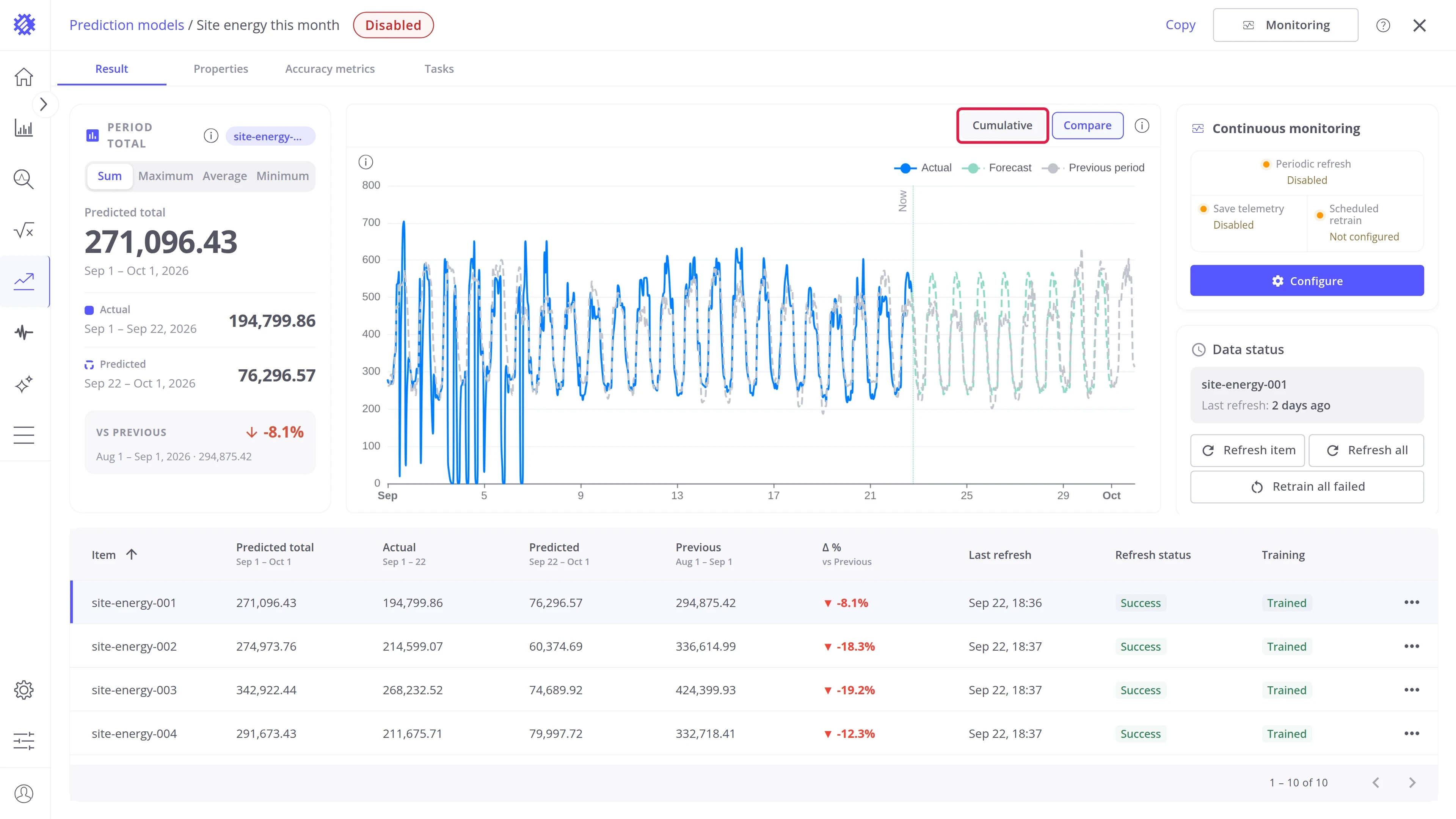
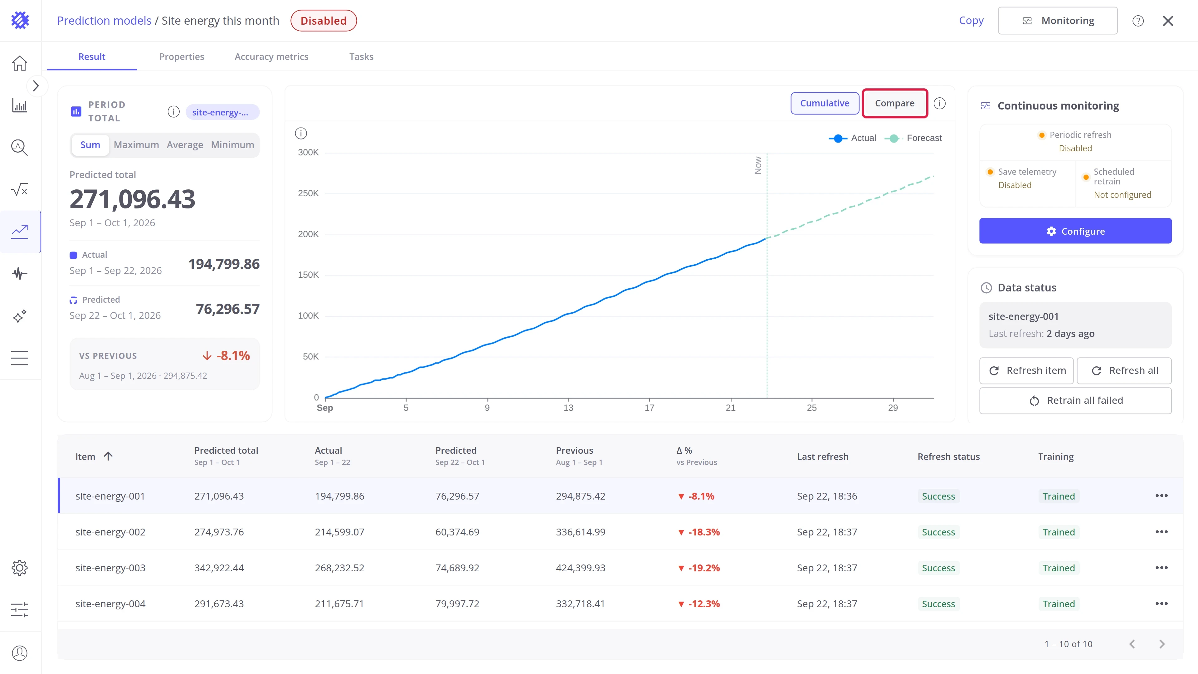
Section titled “Period chart”The chart shows the selected item over the whole period: Actual, Forecast, and Previous period, with a Now marker at the latest reading.
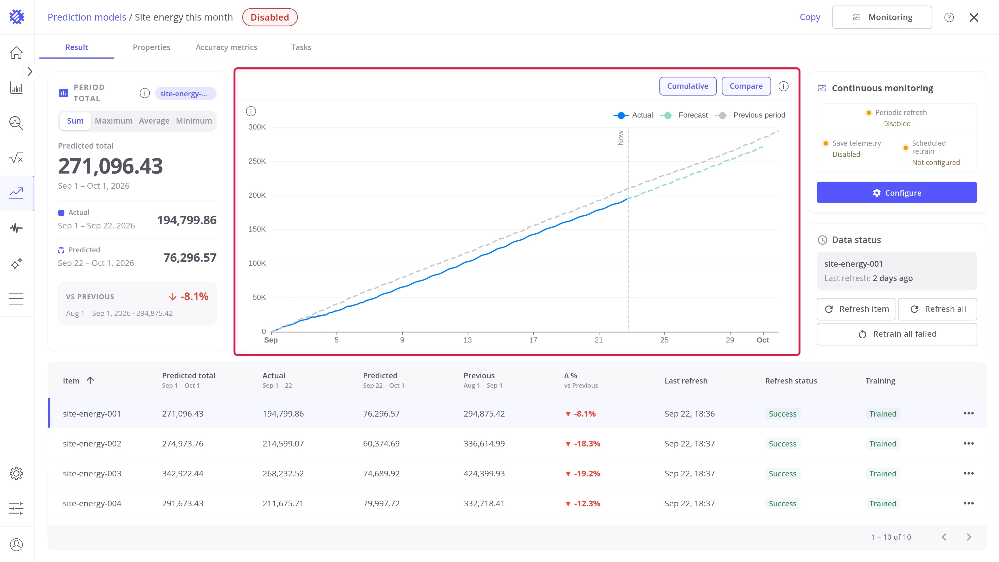
Two buttons above the chart switch what it draws. They open as set in Result page settings; click one to switch it.
| Button | On | Off |
|---|---|---|
| Cumulative | Each point adds up everything from the start of the period, so the line climbs toward the period total | Each point shows only its own hour or day, for example the energy used from 14:00 to 15:00 |
| Compare | The previous period is drawn over the current one | Only the current period |
Items table
Section titled “Items table”The table under the chart lists every item in the model’s scope. Select a row to switch the card and the chart to that item.
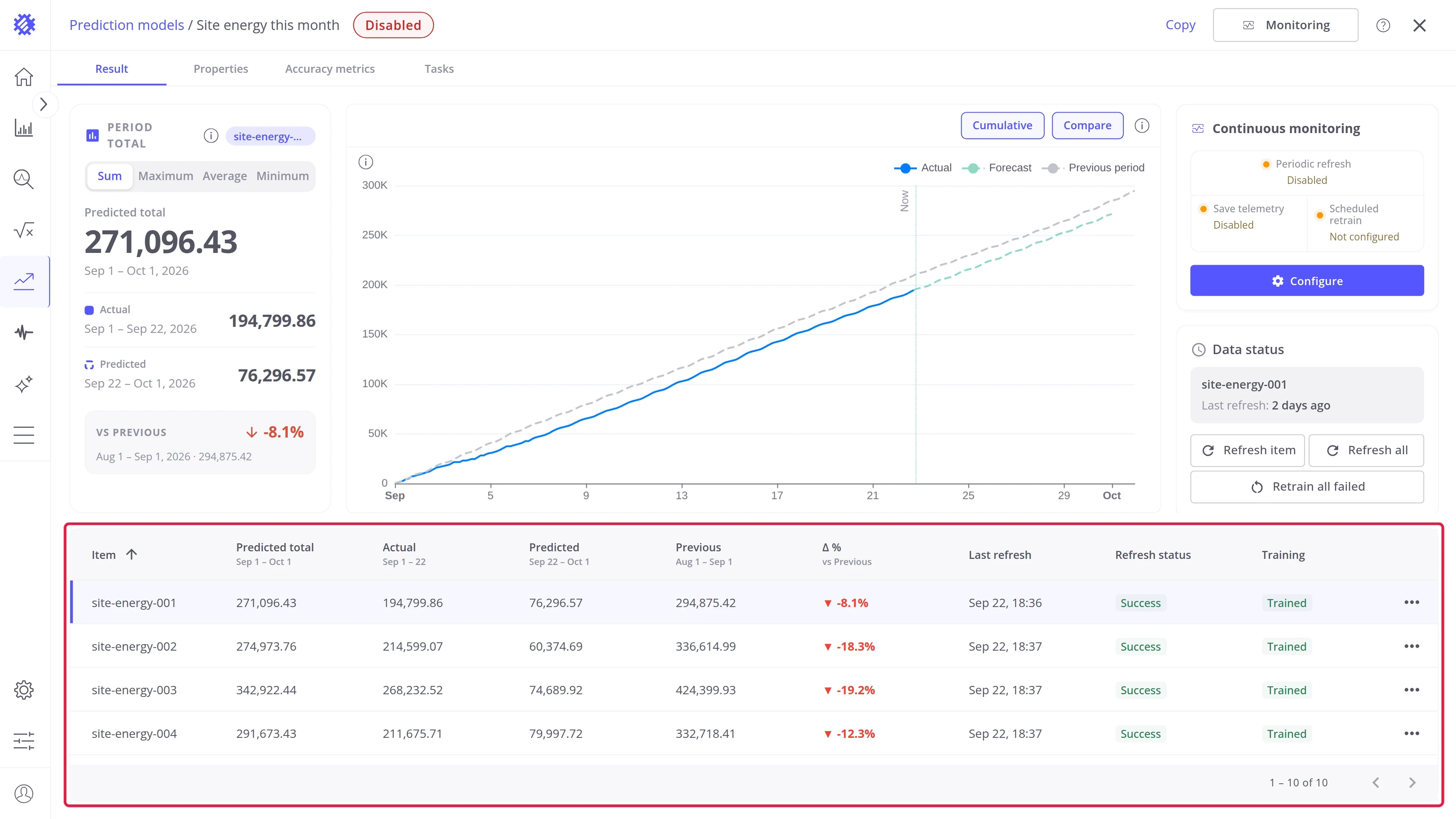
| Column | Meaning |
|---|---|
| Item | The device or asset name |
| Predicted total | The value for the whole period, measured part plus forecast |
| Actual | The measured part, from the start of the period to the latest reading |
| Predicted | The forecast part, from the latest reading to the end of the period |
| Previous | The same value for the previous period |
| Δ % | The change against the previous period |
| Last refresh, Refresh status, Training | The item’s refresh and training state |
Each column header shows the dates it covers. The names follow the selected tab, so with Maximum selected the first value column reads Predicted peak.
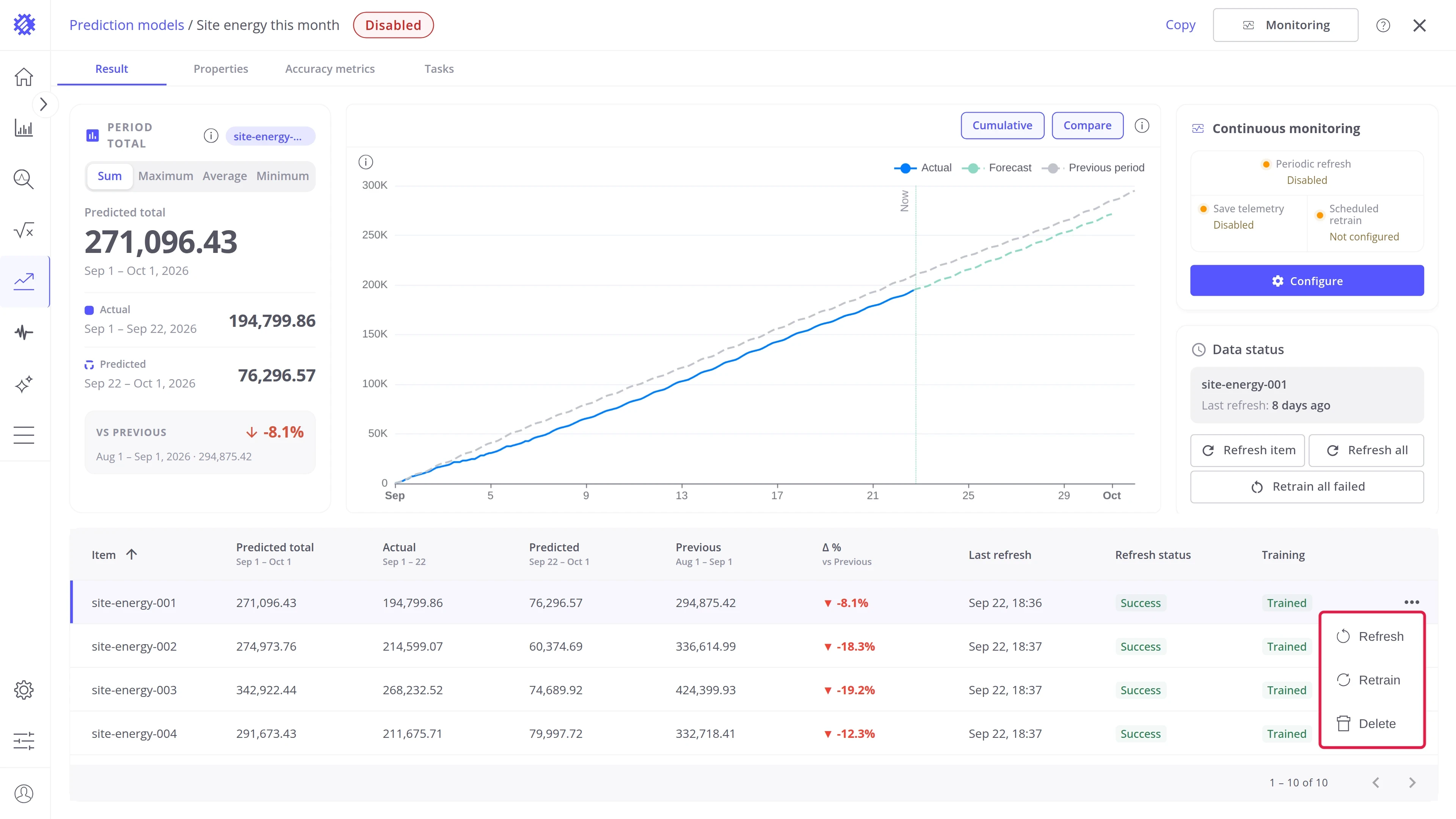
Item actions
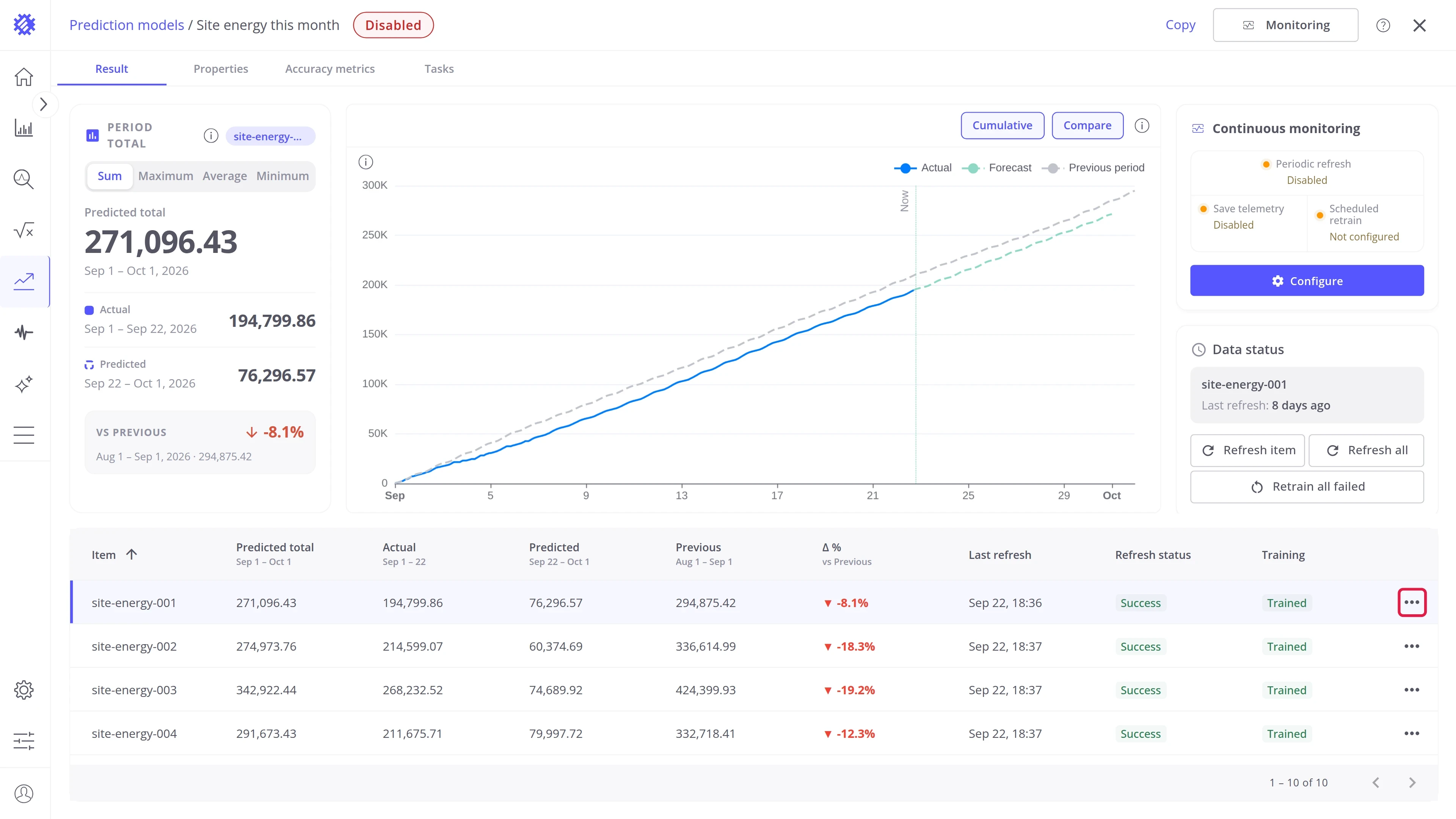
Section titled “Item actions”The ⋯ button at the end of each item row — Refresh, Retrain, and Delete for one item — works the same for every intent. See Interface Overview.
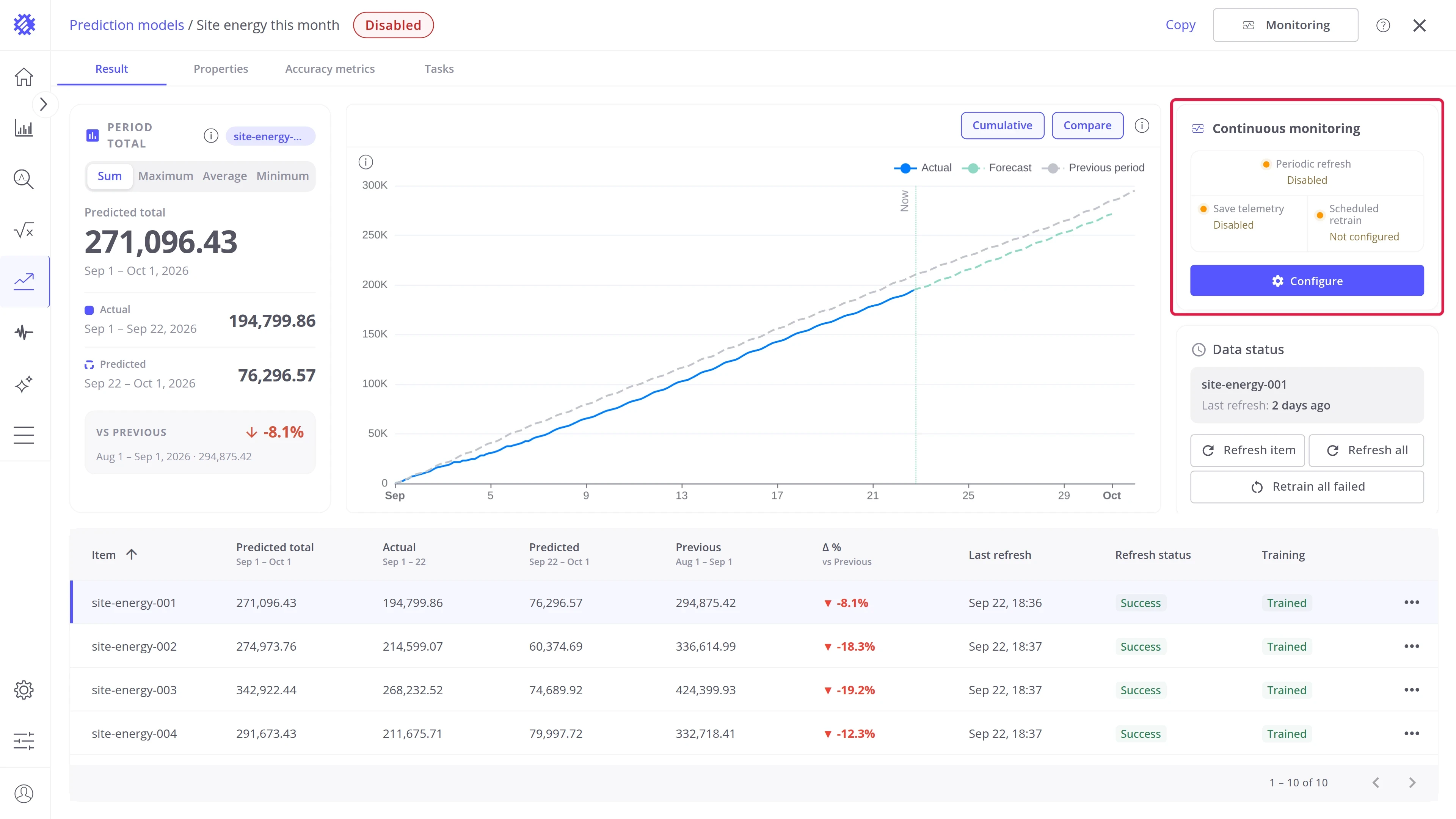
Continuous monitoring
Section titled “Continuous monitoring”The Continuous monitoring card shows the monitoring status of this model. What each setting does and how to configure it is described in Monitoring & Alarms. Without a periodic refresh, the measured part of the period stops growing at the last refresh.
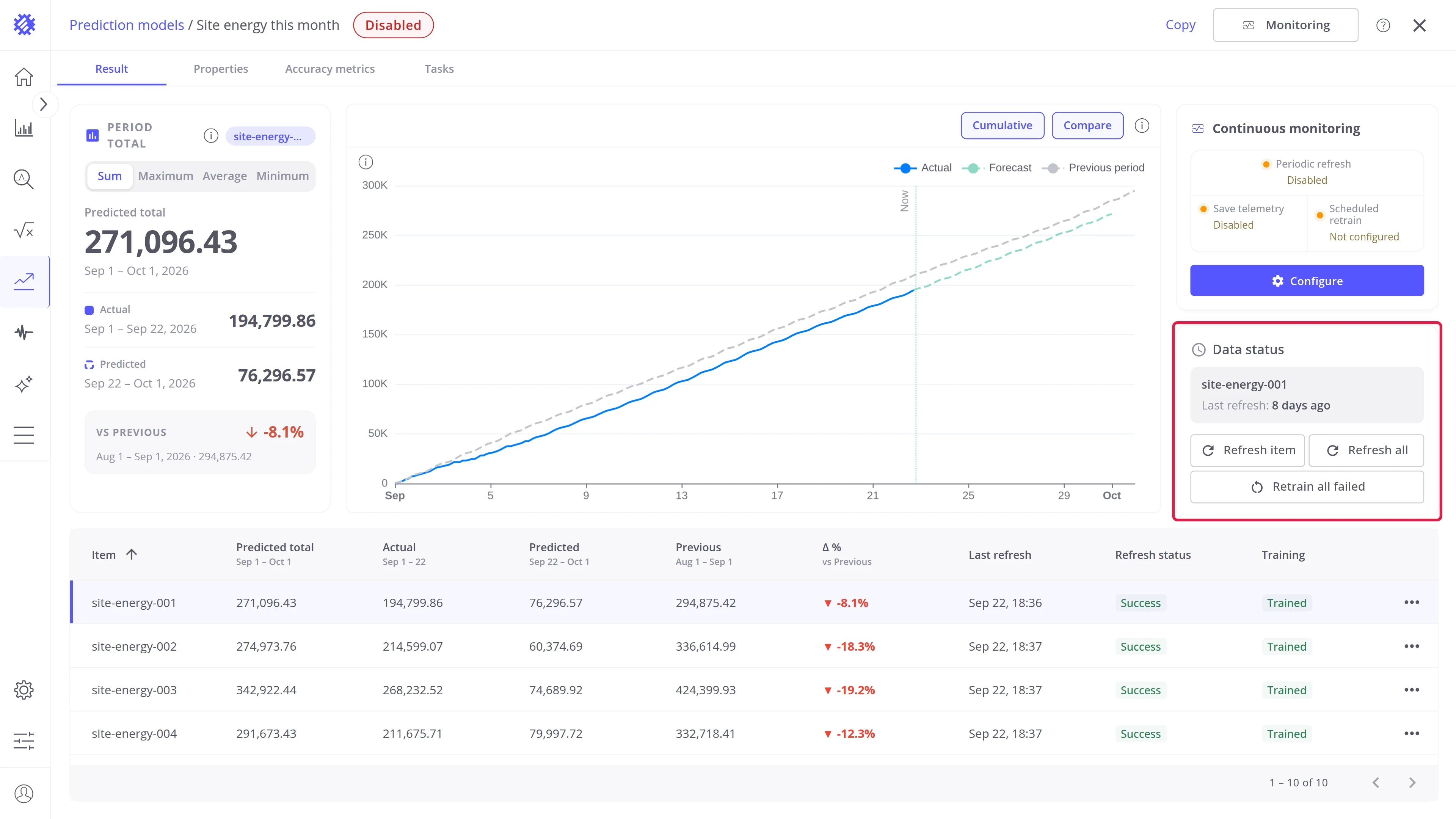
Data status
Section titled “Data status”The Data status card and its Refresh item, Refresh all, and Retrain all failed buttons work the same for every intent. See Interface Overview.
Result page settings
Section titled “Result page settings”The Result page card on the Properties tab sets how the Result tab opens for everyone. The Cumulative and Compare buttons on the chart change the view only for your session.
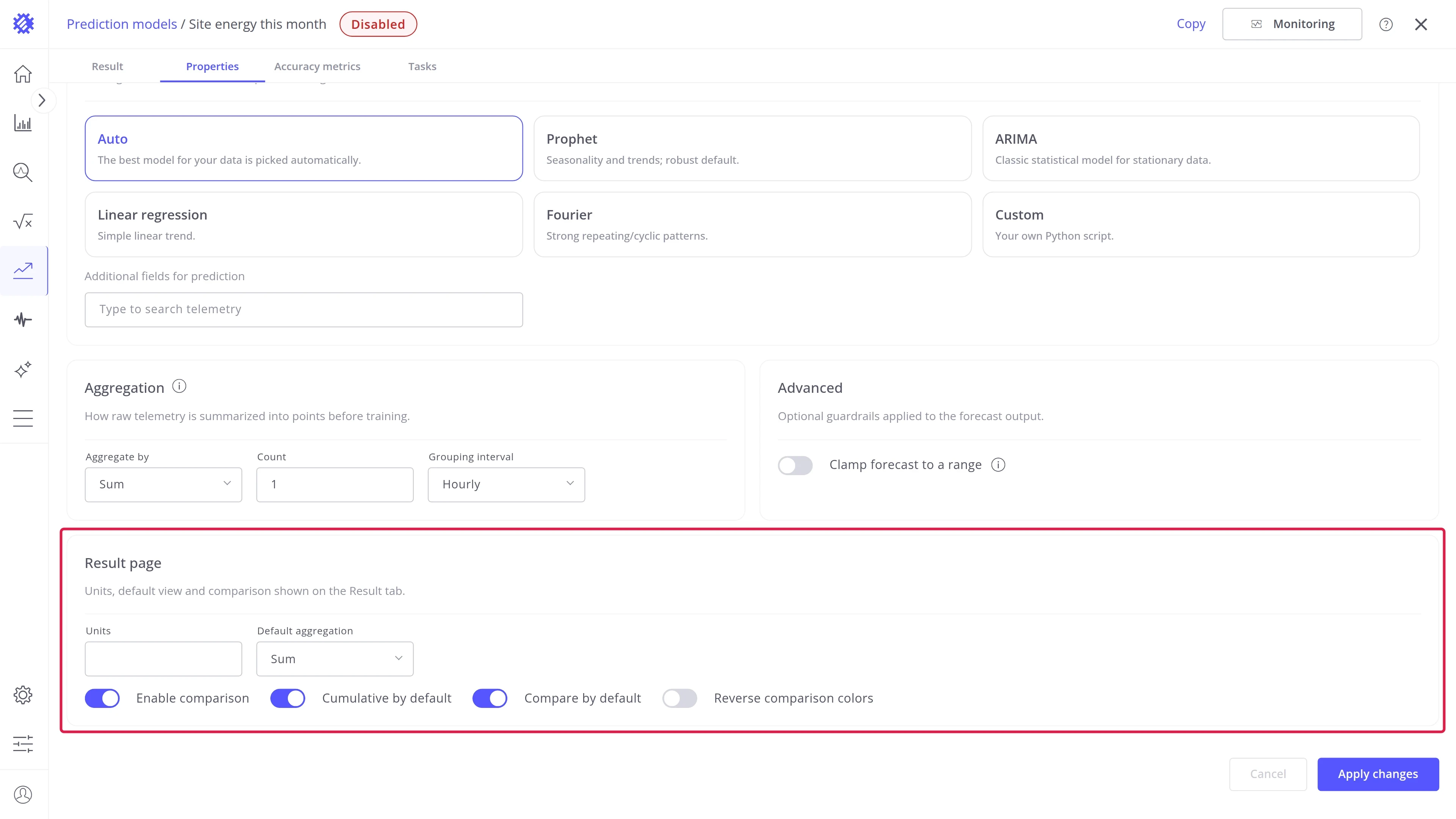
| Setting | Effect |
|---|---|
| Units | Printed after the values on the card and in the table |
| Default aggregation | The tab the card opens on: Sum, Maximum, Average, or Minimum |
| Enable comparison | Master switch for the previous period. Off hides vs Previous, the Compare button, and the Δ % column |
| Cumulative by default | Whether the chart opens on the running aggregate |
| Compare by default | Whether the previous period is overlaid when the tab opens |
| Reverse comparison colors | Colors a fall as good news, for metrics where less is better, such as energy |
None of them rebuilds the model. Click Apply changes and the Result tab follows.
Where to go next
Section titled “Where to go next”Explore other intents
Section titled “Explore other intents”-
Forecast
Predict the next values of a metric, like the energy of the next 7 days.
-
Time to Threshold
Predict when a metric crosses a limit, and raise an alarm before it happens.
-
Hit Target
Predict whether a goal is reached by the end of a period, and how far off it is.
Explore more
Section titled “Explore more”-
Explore Interface
Find your way around the models list, the model page, and its tabs.
-
Monitoring & alarms
Refresh and retrain on a schedule, save forecasts to ThingsBoard, and raise alarms.
-
Show on dashboards
Chart history and forecast together in Trendz views and ThingsBoard dashboards.
-
Models & accuracy
How a model learns, its settings, and how accurate its forecasts are.
Was this helpful?