Vibration Model Overview: Faults & ISO Zones
The Overview tab answers the first question about a machine: is it healthy, and if not, what is wrong with it. It gives the verdicts on the latest sample and shows how the machine degrades over time.
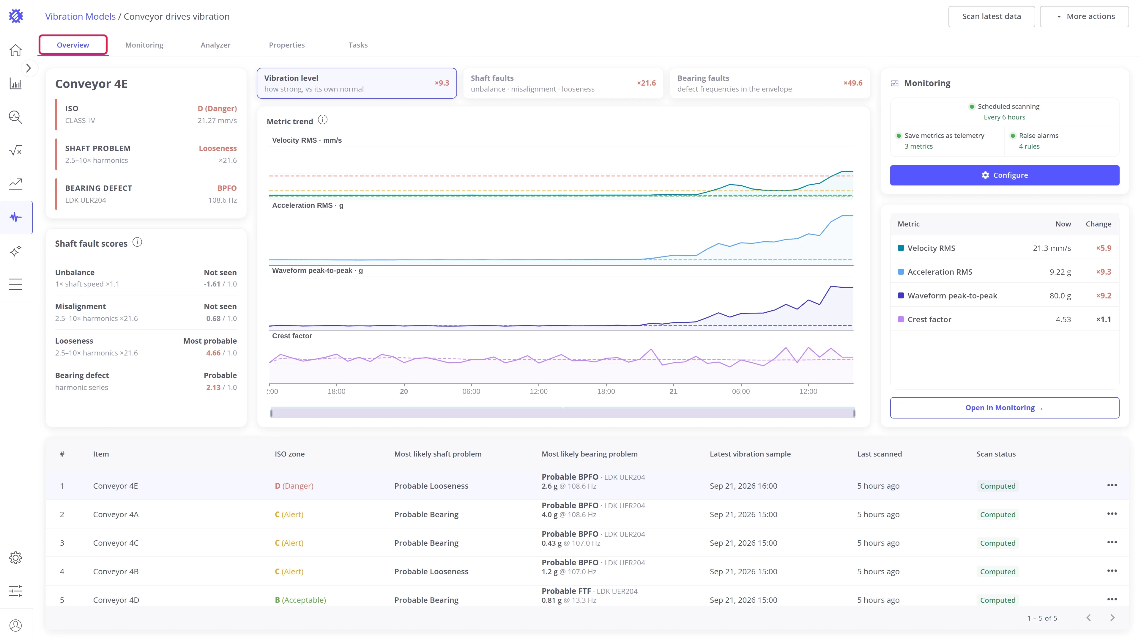
Open it after a scan to see which machines are in trouble, or to pick the machine to study in the Analyzer. Click a machine in the items table, and every card above shows that machine.
Layout
Section titled “Layout”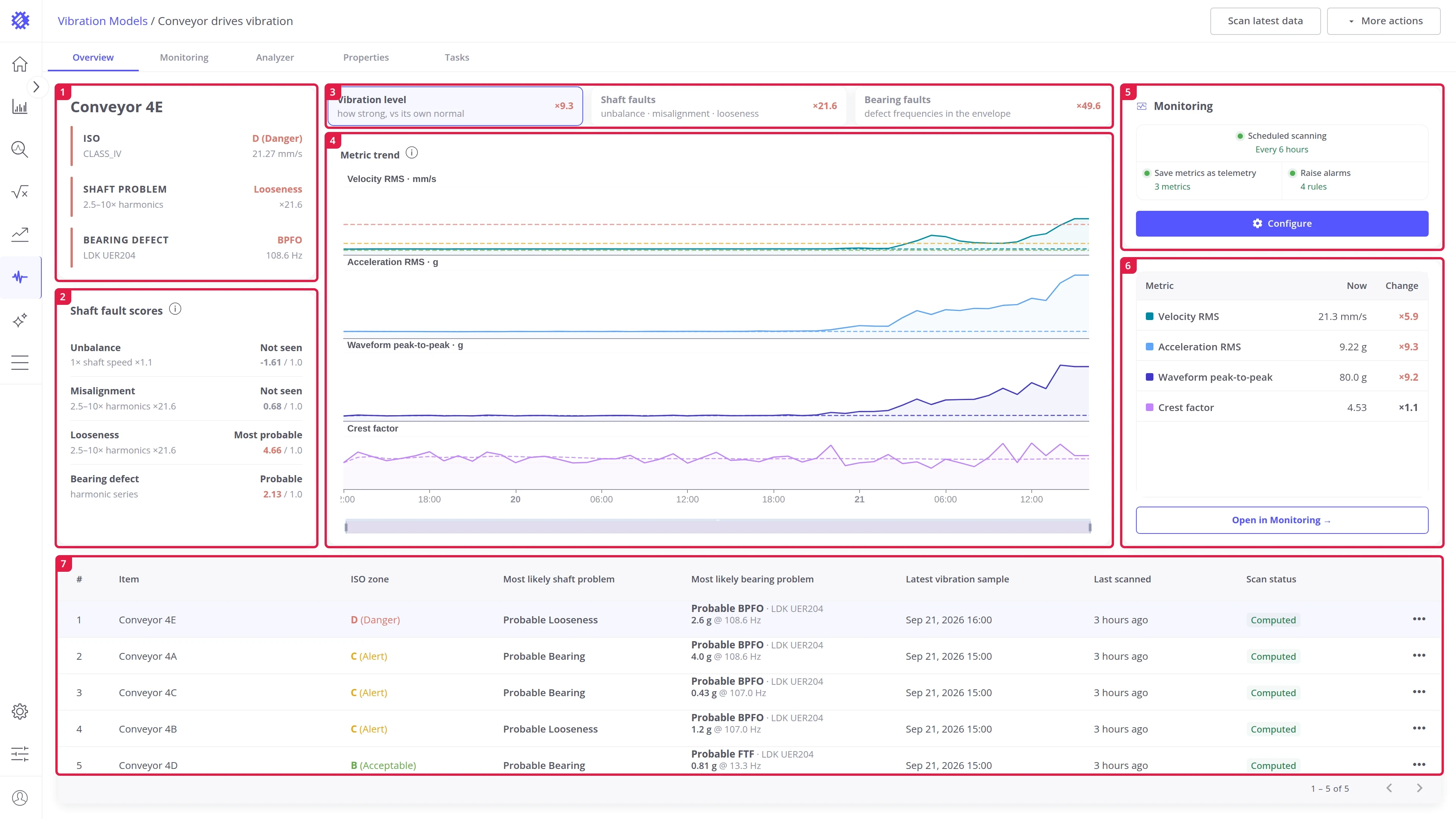
| # | Area | Contents |
|---|---|---|
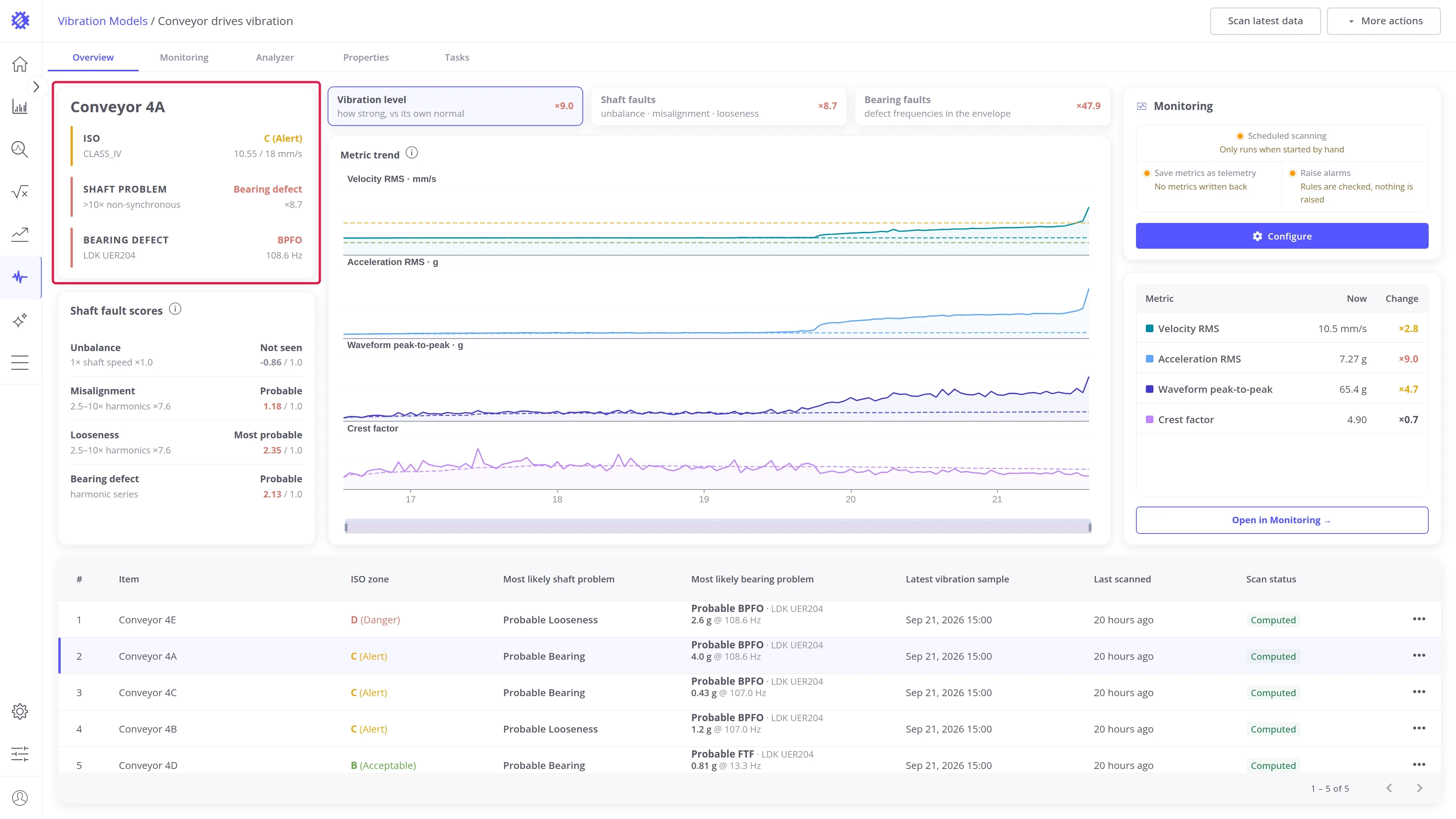
| 1 | Item status card | Three results for the selected machine: its ISO zone, its most likely shaft problem, and its most likely bearing problem |
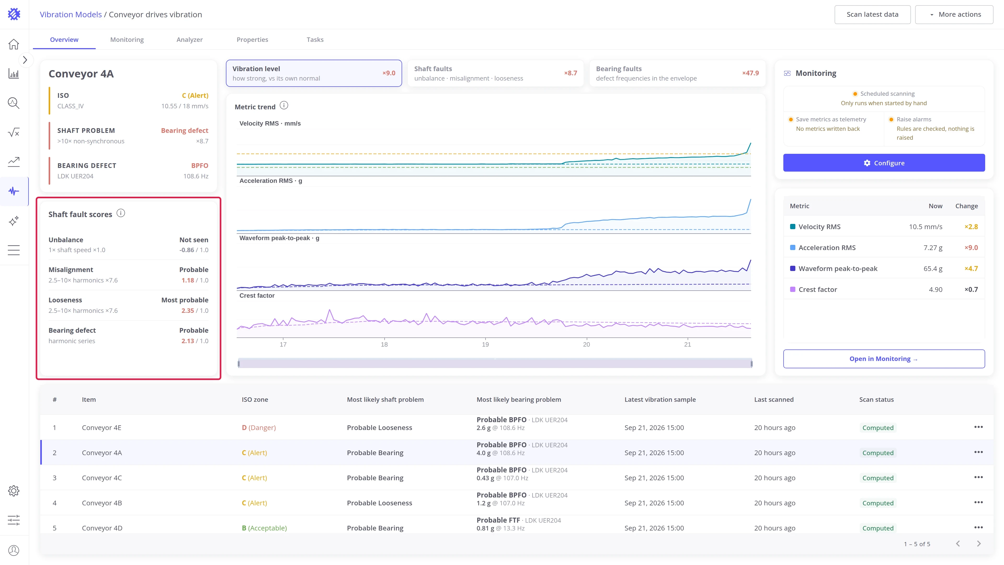
| 2 | Shaft fault scores | How likely each fault is, scored from how the frequency bands grew against the machine’s median |
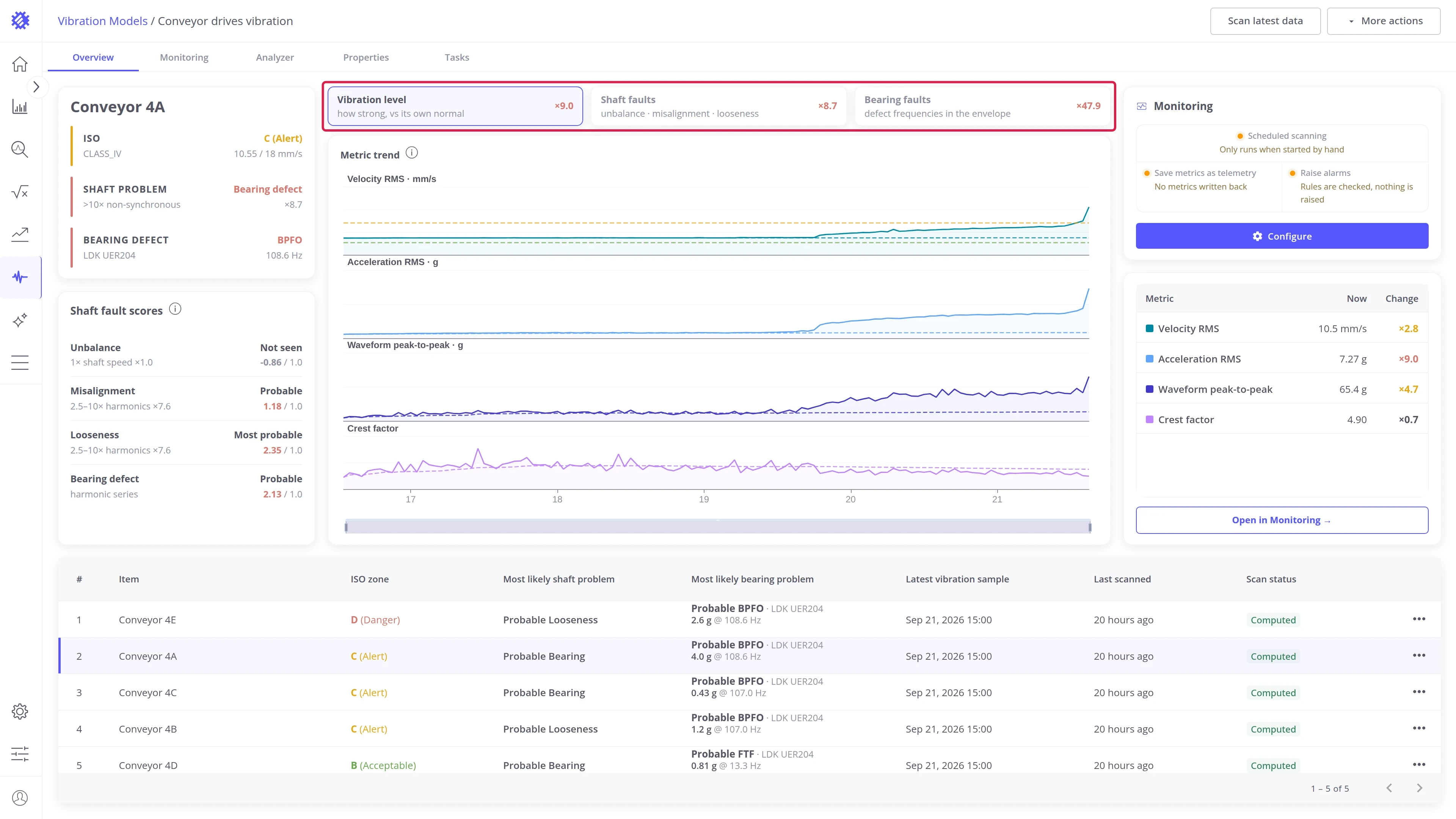
| 3 | View switch | Decides which view the chart and the panel show: Vibration level, Shaft faults, or Bearing faults |
| 4 | Chart | How the values of the selected view changed over time |
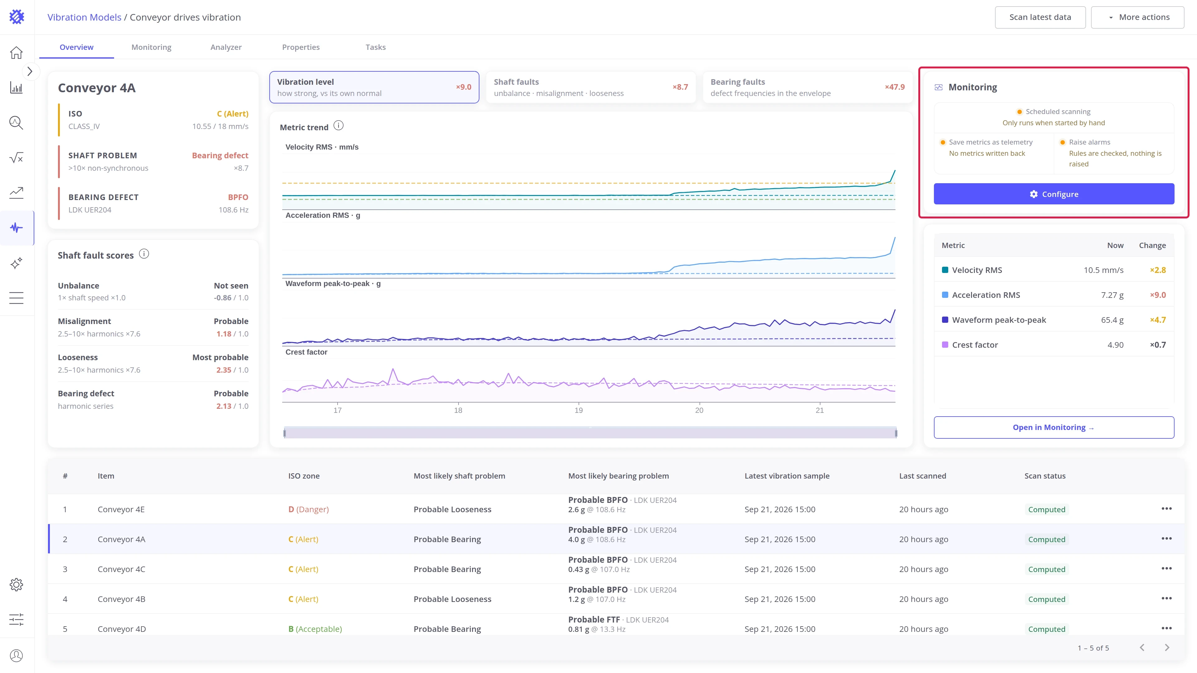
| 5 | Monitoring card | The state of continuous monitoring for the model |
| 6 | View panel | Details of the selected view, next to its chart. What it lists depends on the view |
| 7 | Items table | All machines of the model, with the results of their latest sample |
Components
Section titled “Components”Item status card
Section titled “Item status card”The card at the top left shows the name of the selected machine and three results from its latest sample:
| Result | Description |
|---|---|
| ISO | The ISO 10816-1 zone, from A (good) to D (danger). Next to it: the ISO machine class used, and the velocity RMS the zone is based on |
| Shaft problem | The most likely shaft problem, such as unbalance or looseness. Next to it: the frequency band that points to it, and how many times that band has grown |
| Bearing defect | The strongest bearing fault frequency found, the bearing it belongs to, and its frequency in Hz |
Shaft fault scores
Section titled “Shaft fault scores”The card below scores each fault by how the frequency bands of this machine have grown against its own median. One row per fault:
| Column | Description |
|---|---|
| Fault | Unbalance, Misalignment, Looseness, or Bearing defect |
| Verdict | Not seen, Probable, or Most probable. Most probable marks the fault with the highest score |
| Band | The frequency band the score is based on, and how many times it has grown. The bearing row names what was found instead, such as a series of harmonics |
| Score | The score of the fault. At 1.00 or higher, the fault counts as present |
What each fault looks like in the bands is described in Introduction to vibration analysis.
Monitoring card
Section titled “Monitoring card”The card on the right shows the state of continuous monitoring for the model. How continuous monitoring works is described in Monitoring & Alarms.
Items table
Section titled “Items table”The table at the bottom lists all machines of the model, the most recently scanned first. Click a row to select that machine, and the cards, charts, and panels above show it.
| Column | Description |
|---|---|
| Item | The machine |
| ISO zone | The zone of the latest sample: A good, B acceptable, C alert, D danger |
| Most likely shaft problem | The shaft problem with the highest score, or a dash when no problem is found |
| Most likely bearing problem | The strongest bearing fault frequency found, with its bearing, its amplitude, and its frequency |
| Latest vibration sample | When the newest stored sample was recorded |
| Last scanned | When a scan was last launched for this machine |
| Scan status | The state of this machine in the last scan |
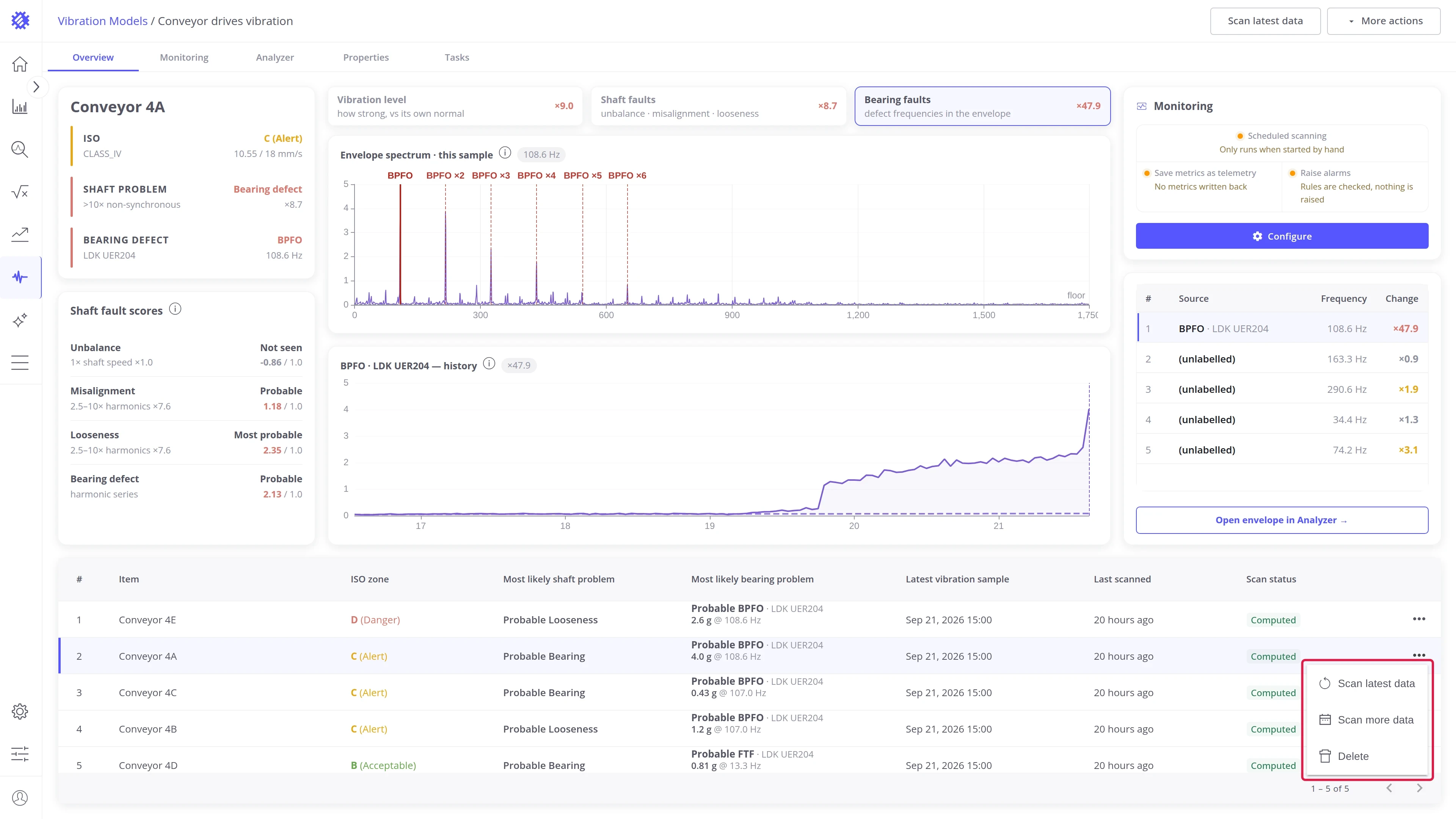
| Actions | The row menu: Scan latest data, Scan more data, Delete |
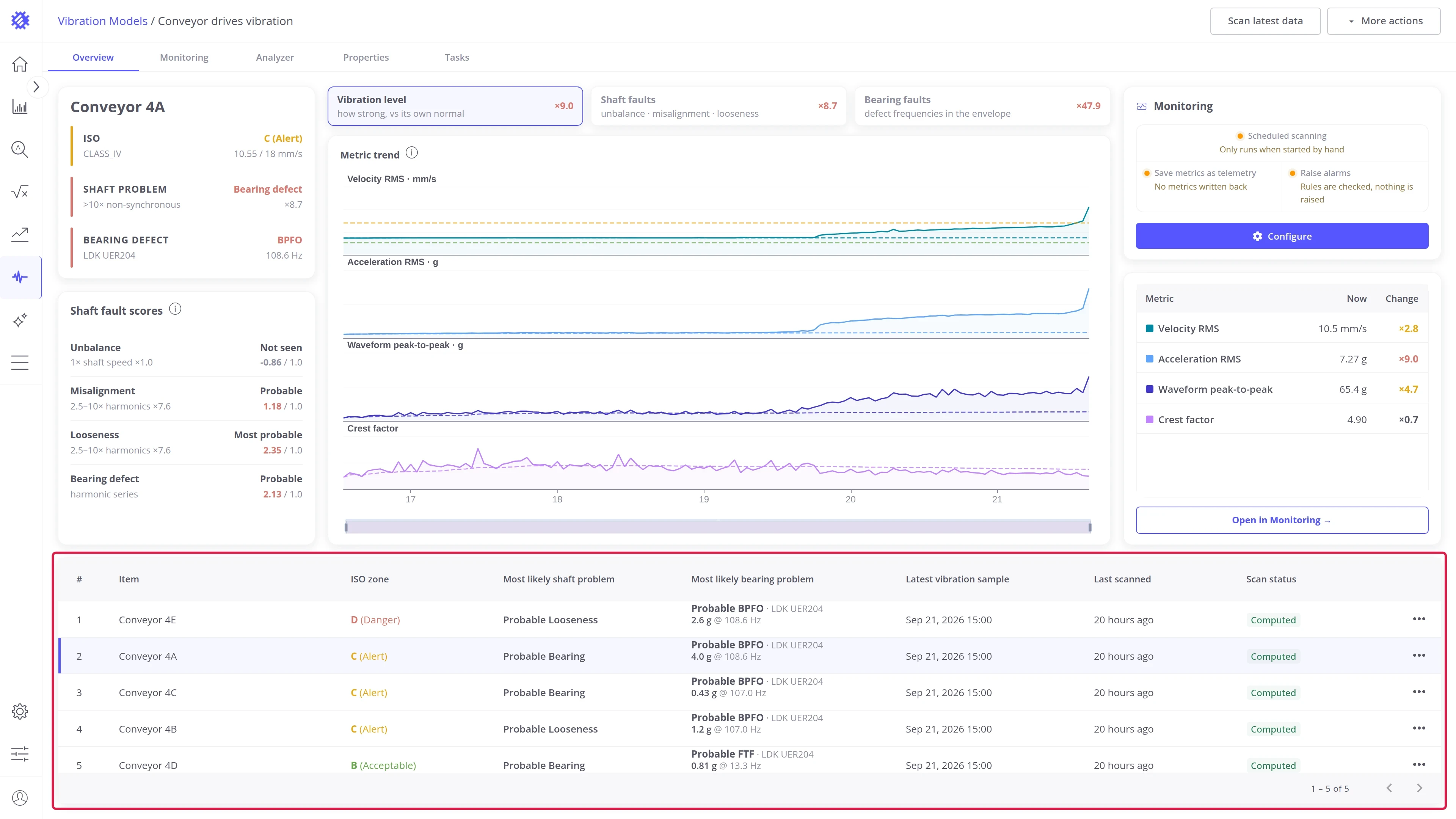
Scan status shows the state of each machine in the last scan:
| Status | Meaning |
|---|---|
| Queued | The scan has started, but has not reached this machine yet |
| Computing | The machine is being scanned now. The counter shows how many samples are done |
| Computed | The scan of this machine finished, and its results are shown on the tabs |
| Failed | The scan of this machine failed. Hover the status to see why |
| Cancelled | The scan was stopped before it reached this machine |
| Interrupted | The scan ended before it finished, for example because the server restarted |
The … menu at the end of a row works on that one machine:
- Scan latest data and Scan more data scan only this machine. How both scans work is described in Actions.
- Delete removes the machine from the model, with its samples, spectra, and alarms. You can add it back on the Properties tab.
Switch
Section titled “Switch”The view switch decides what the chart and the panel show for the selected machine:
| View | What it shows |
|---|---|
| Vibration level | The overall vibration metrics, such as velocity RMS, compared with this machine’s usual level |
| Shaft faults | The frequency bands that show unbalance, misalignment, and looseness |
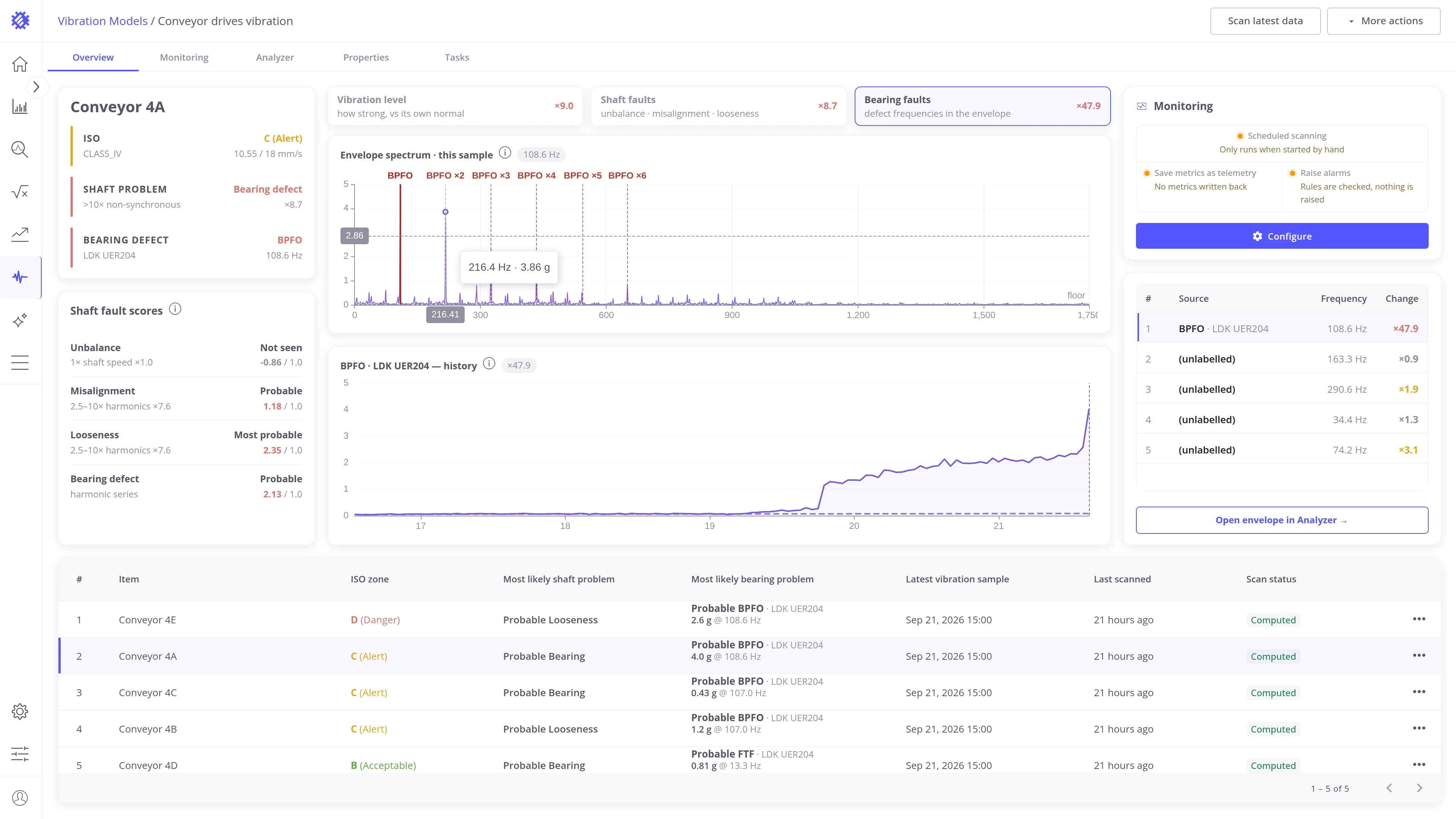
| Bearing faults | The bearing fault frequencies in the envelope spectrum, and how they grow over time |
Each button shows how many times the worst value in that view is above the machine’s usual level, colored by severity. You can see which view needs attention before you open it.
Vibration level view
Section titled “Vibration level view”The view has two blocks: the metric trend on the left and the metrics panel on the right.
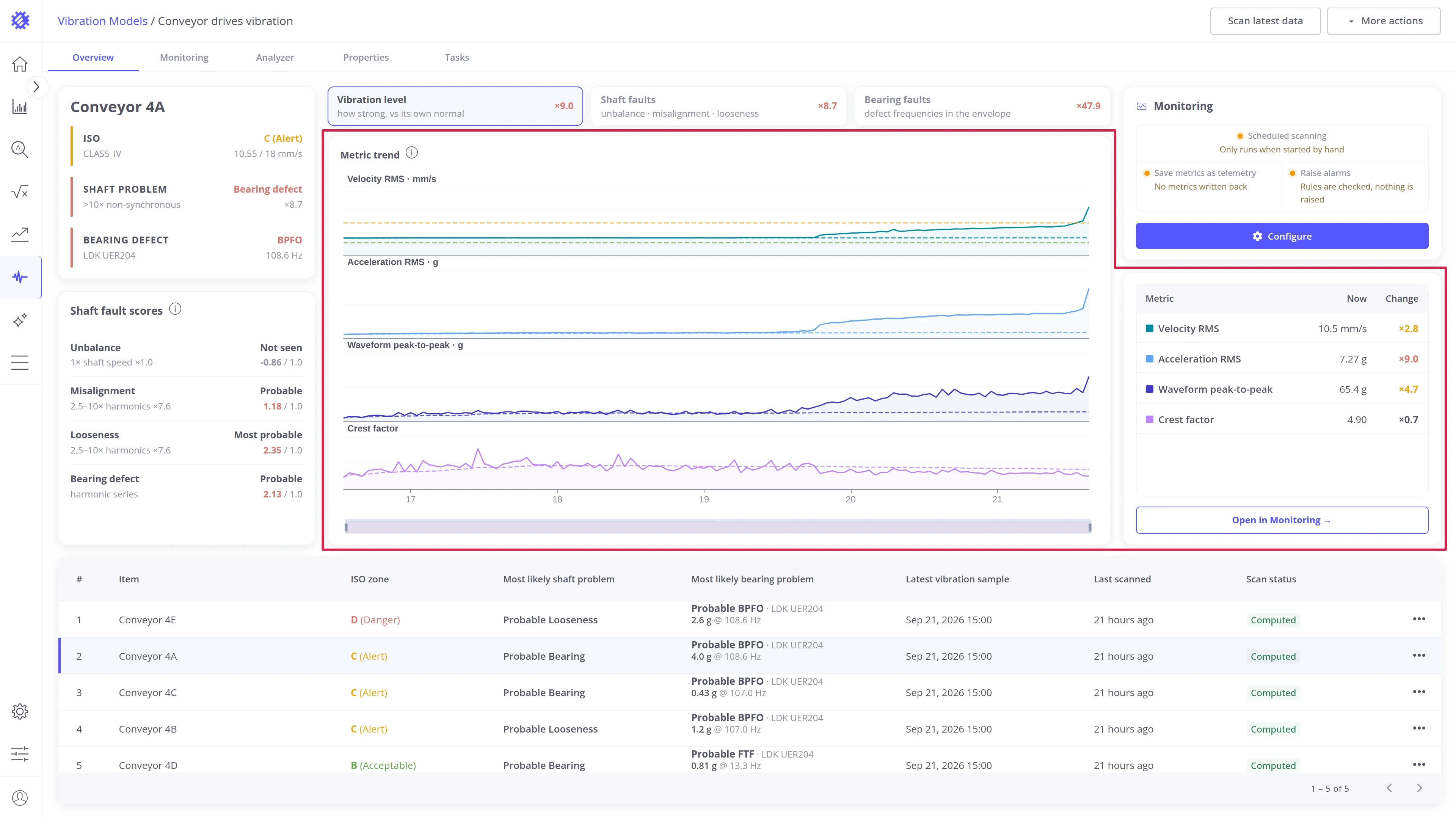
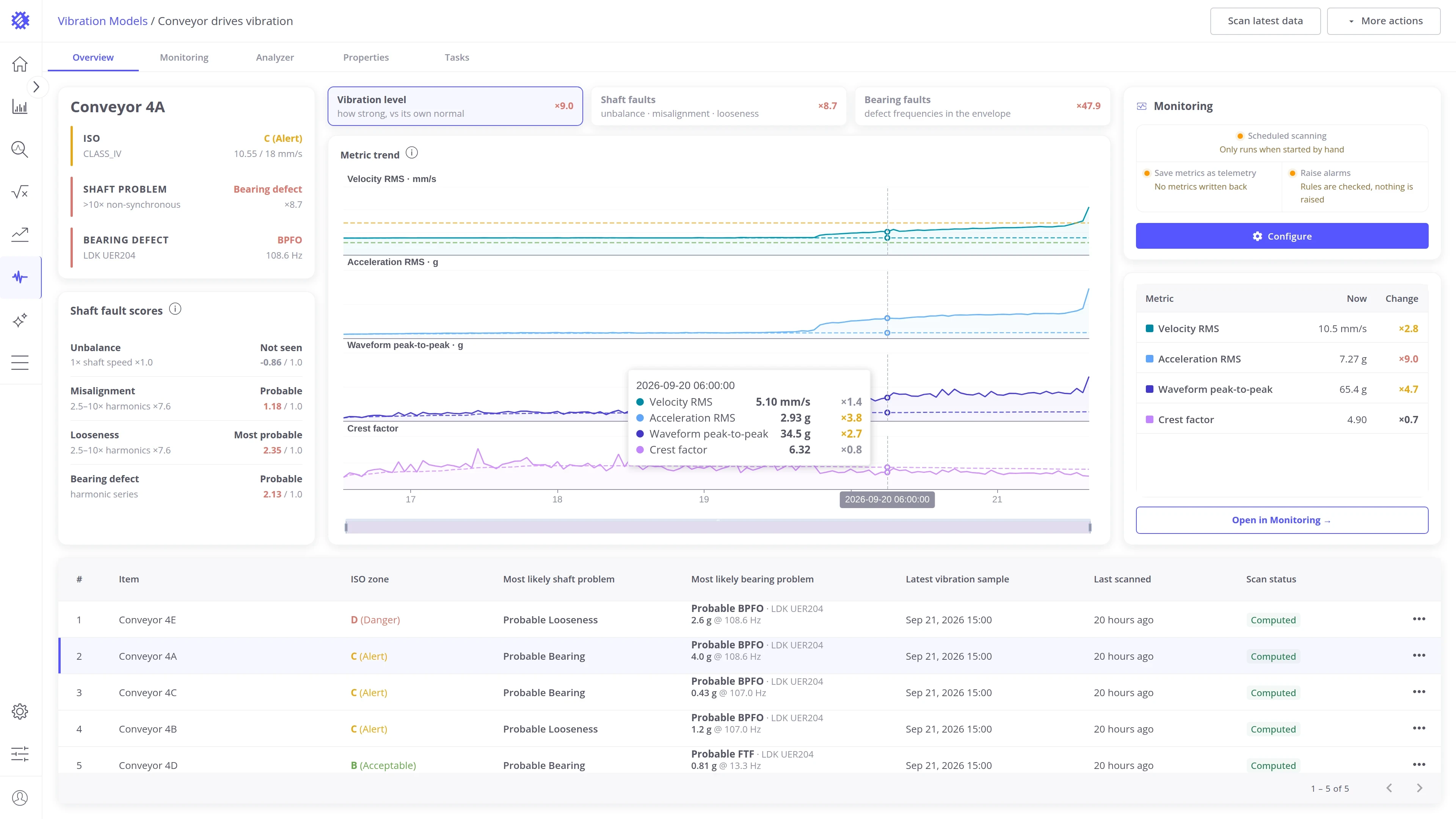
Metric trend. One chart row per metric, with every sample in the time window. The dashed line is the machine’s usual level, its median. Drag the bar under the chart, or scroll over the chart, to zoom into part of the time window.
Metrics panel. The value of each metric in the latest sample, and how many times higher or lower it is than the median.
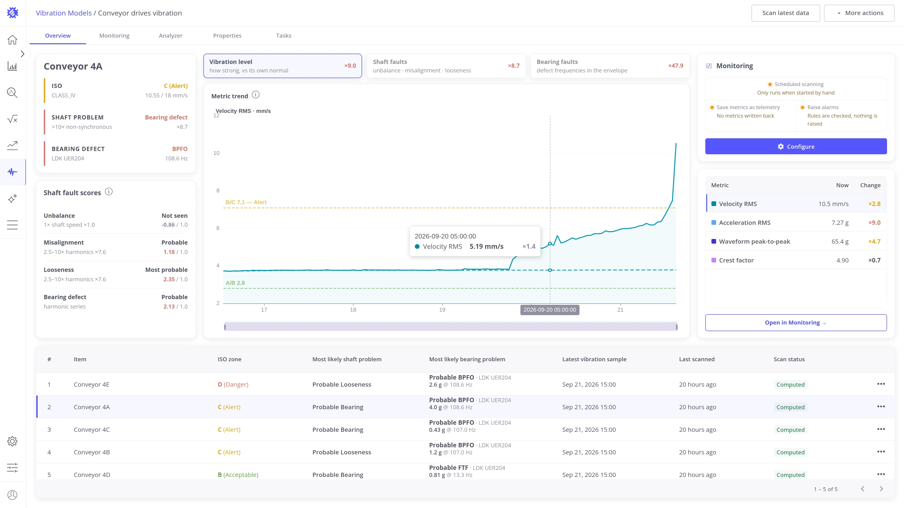
Show one metric. Click a row in the panel to show only that metric, with its own scale. For velocity RMS, the chart also draws the ISO zone borders. Click the same row again to show all four metrics.
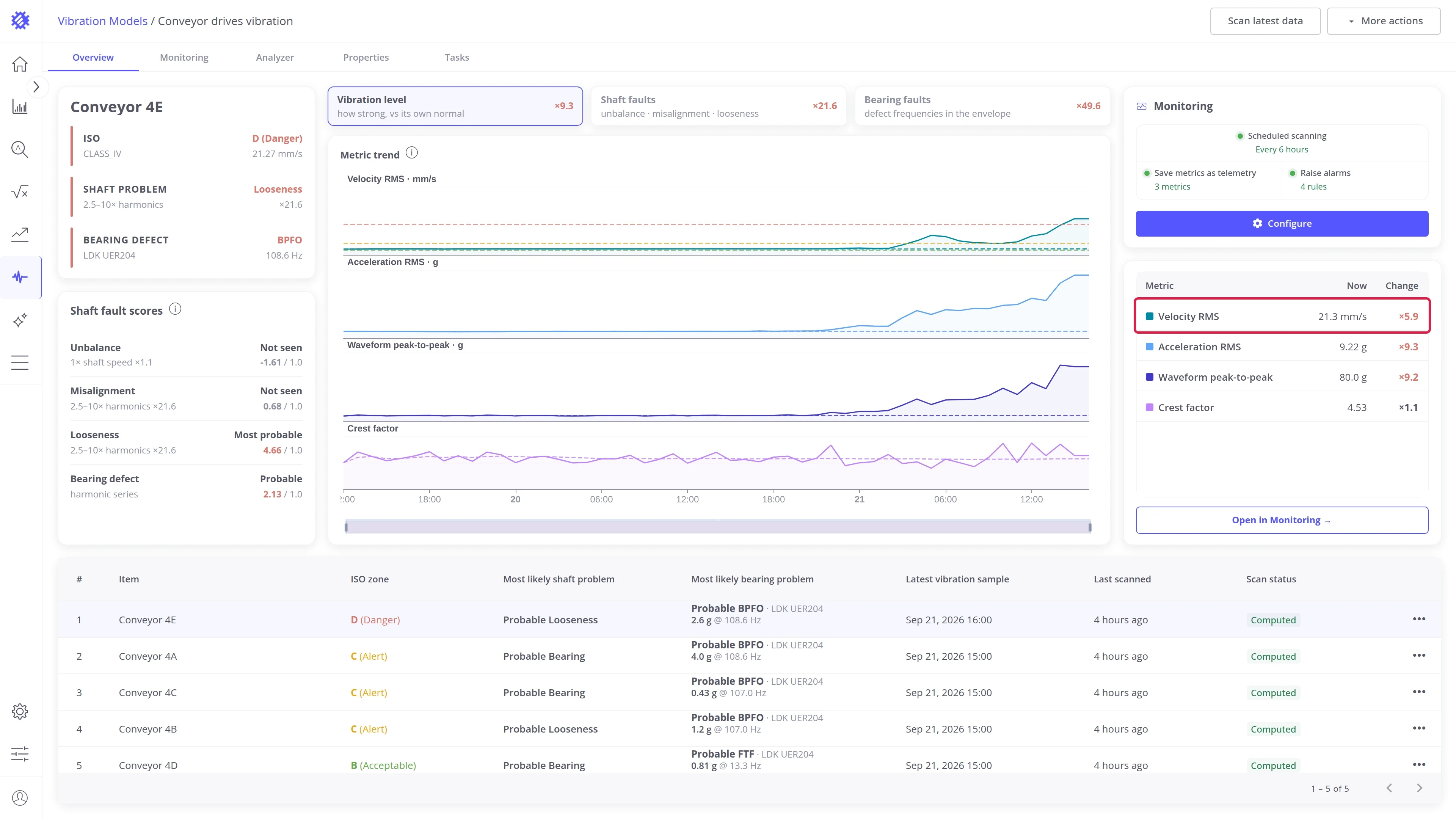
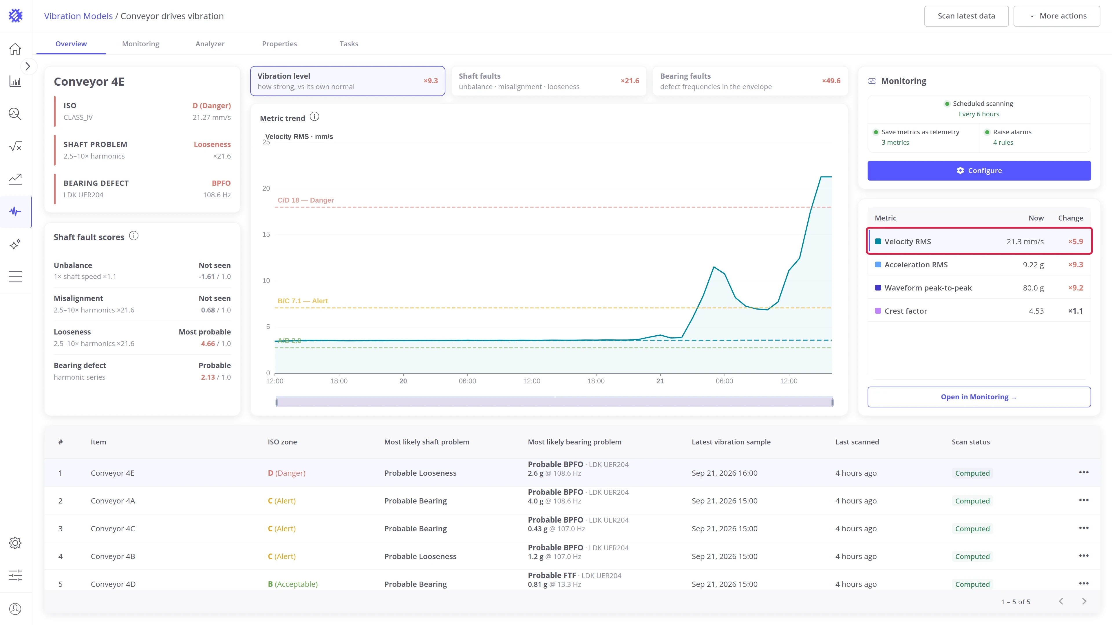
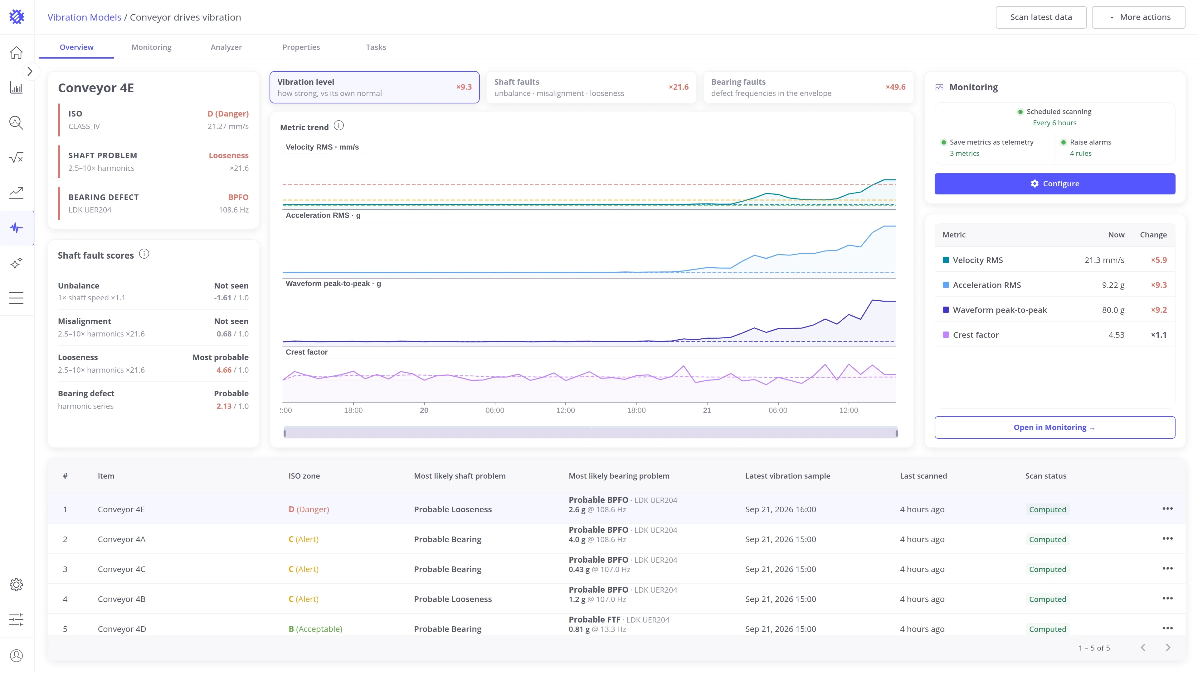
Read one sample. Hover the chart to see the values of the sample under the pointer. With all metrics shown, the tooltip lists every metric with its value and how many times it is above the median. With one metric shown, it lists only that metric.
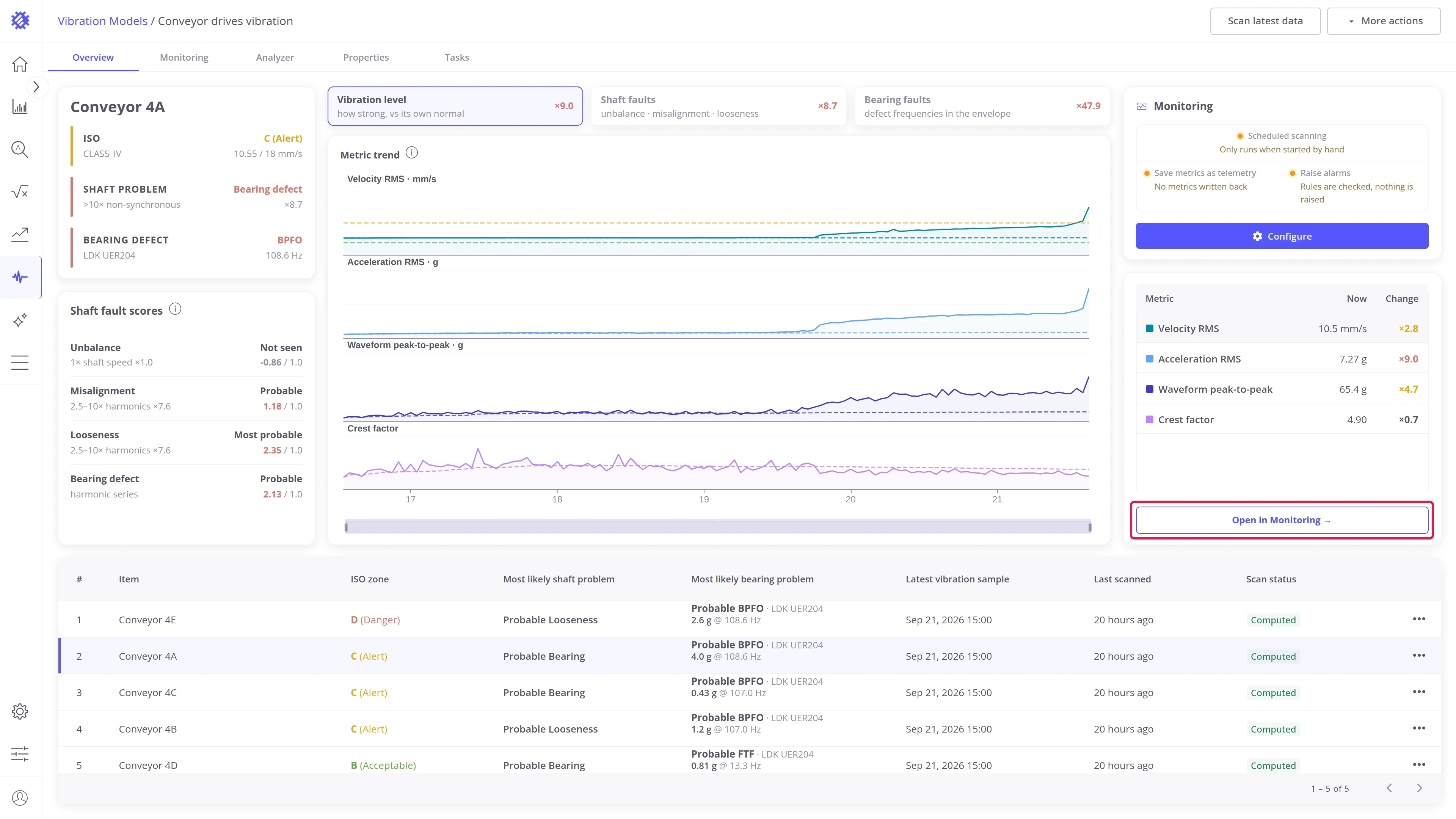
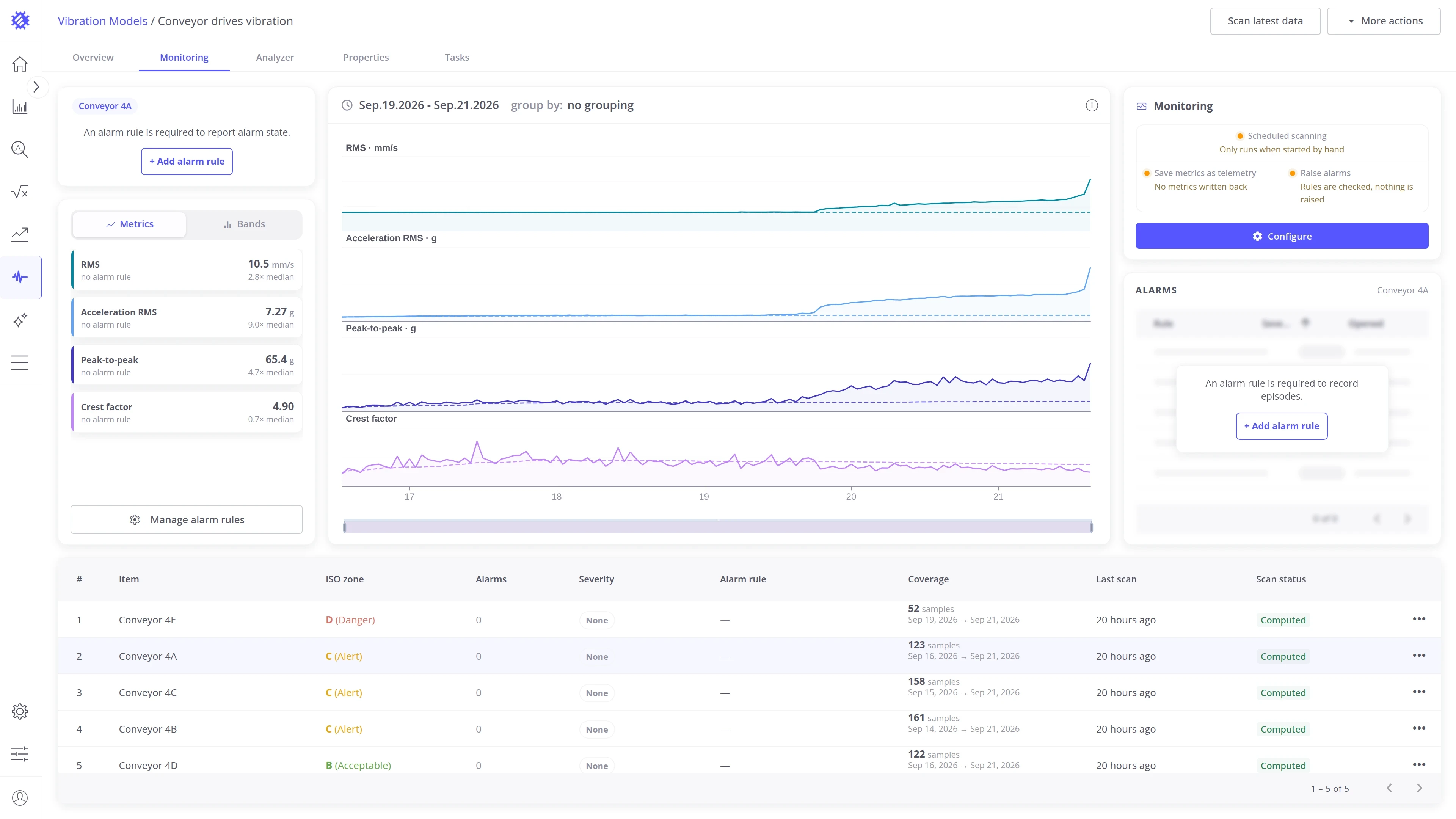
Open in Monitoring opens the Monitoring tab on the same machine, the same metric, and the same time window, so you do not have to select them again.
Shaft faults view
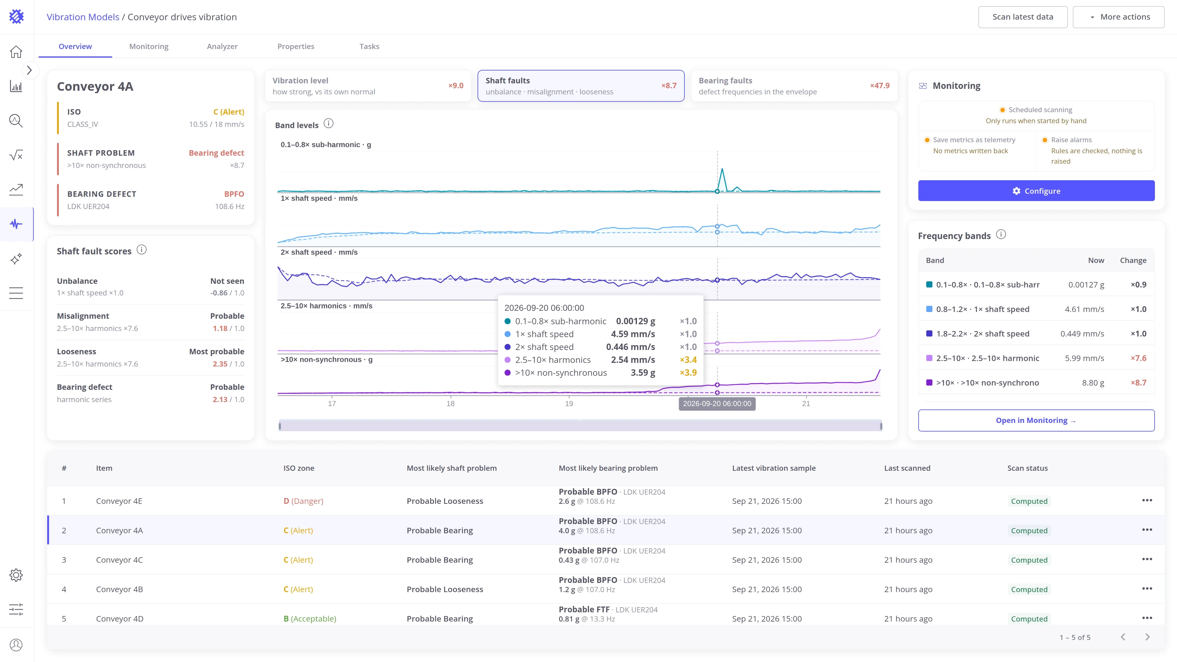
Section titled “Shaft faults view”The view has two blocks: the band levels on the left and the frequency bands panel on the right.
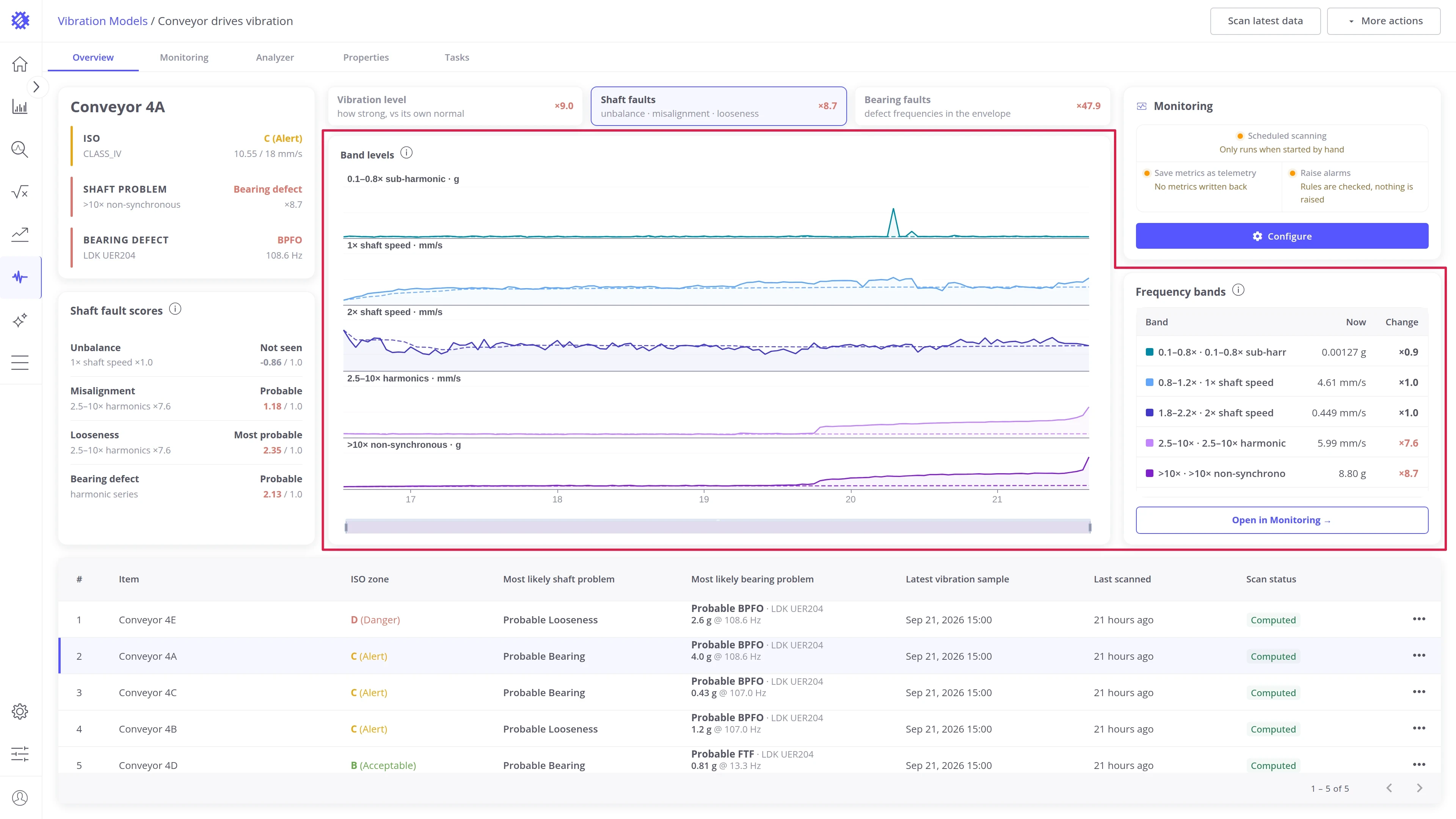
Band levels. One chart row per band, with every sample in the time window. The dashed line is the machine’s usual level, its median. The five bands are ranges in multiples of the shaft speed: 0.1 to 0.8× (sub-harmonic), 1×, 2×, 2.5 to 10× (harmonics), and above 10× (non-synchronous).
Frequency bands panel. The level of each band in the latest sample, and how many times higher or lower it is than the median.
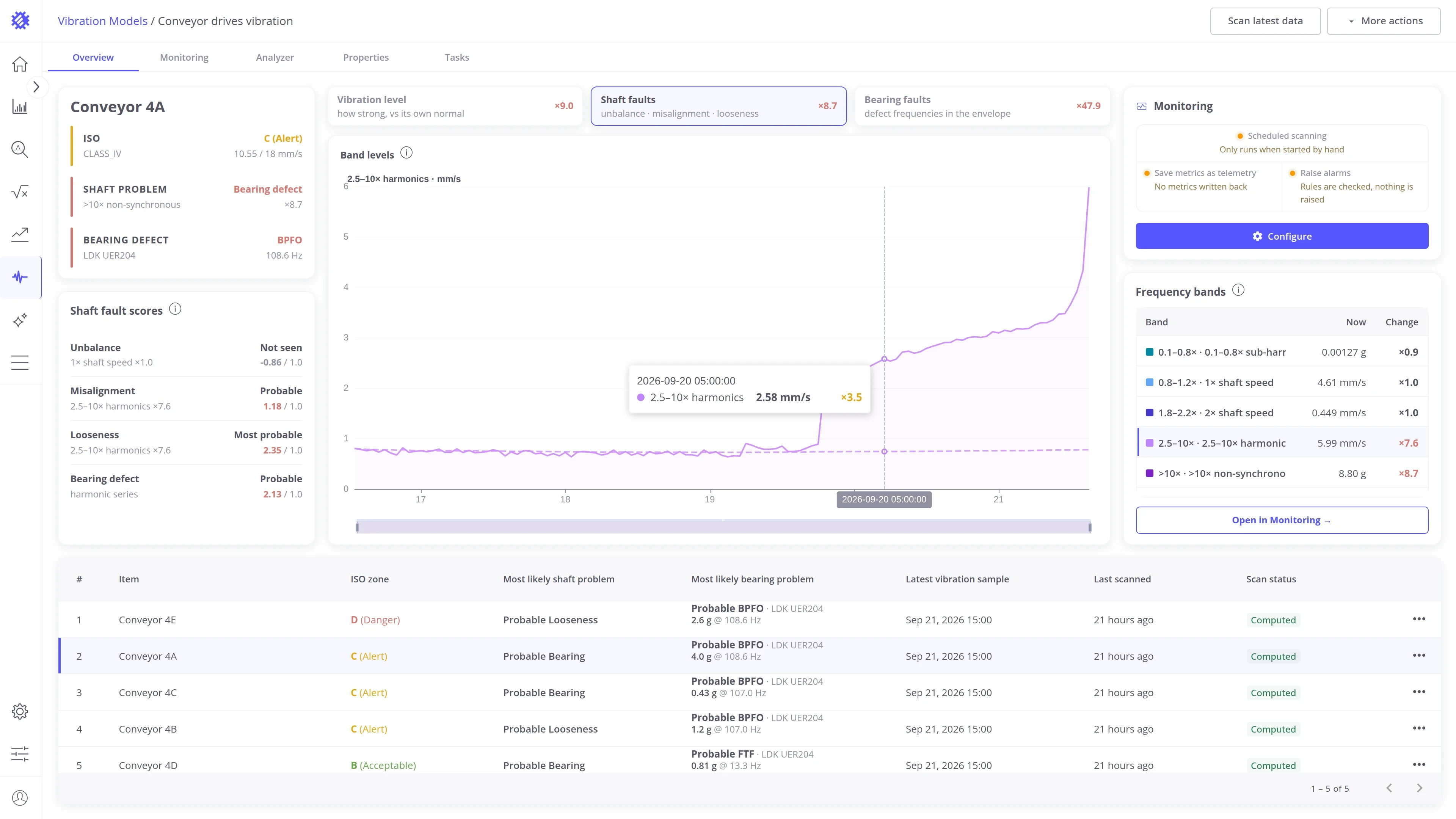
Show one band. Click a row in the panel to show only that band, with its own scale. Click the same row again to show all five bands.
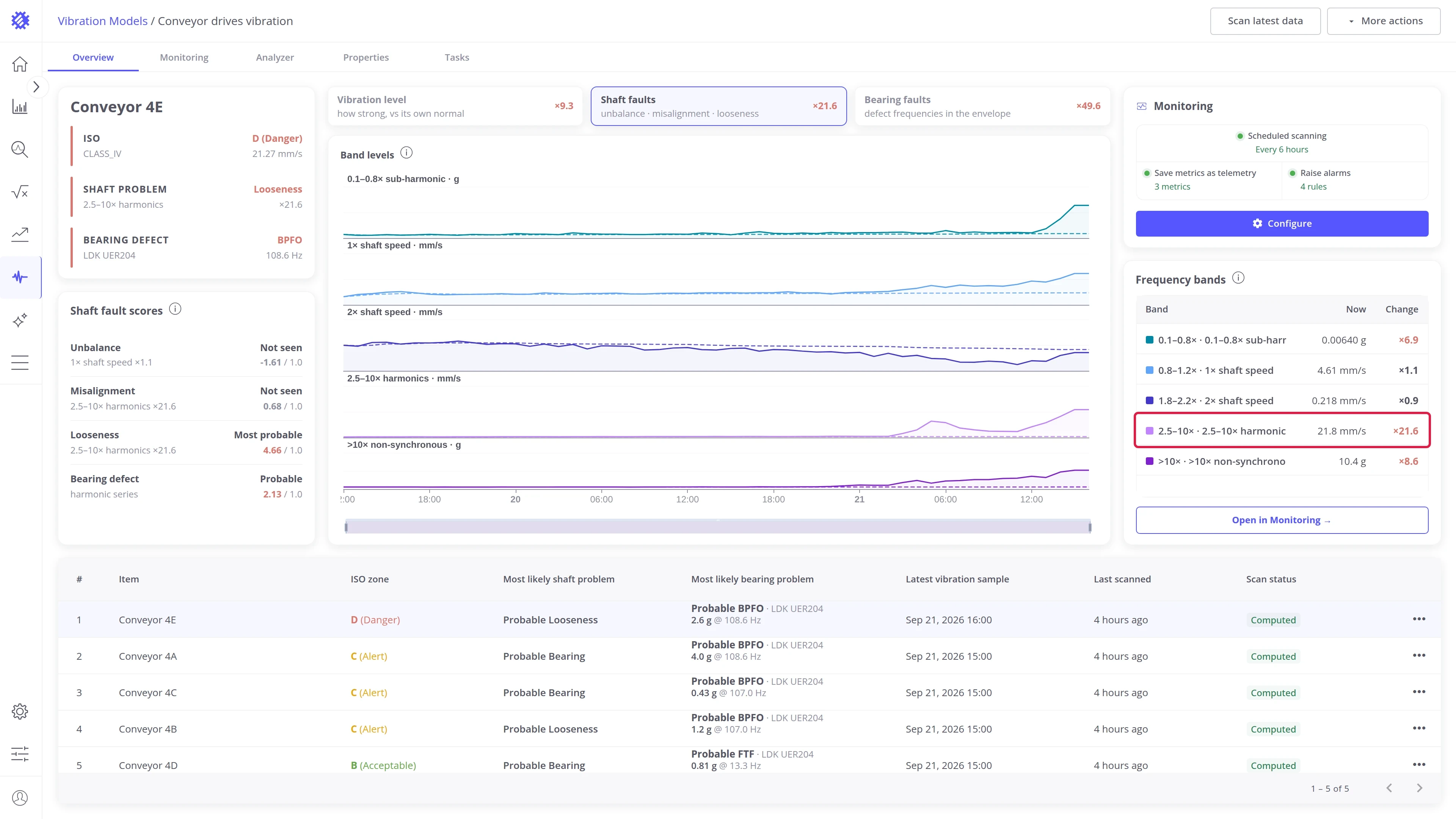
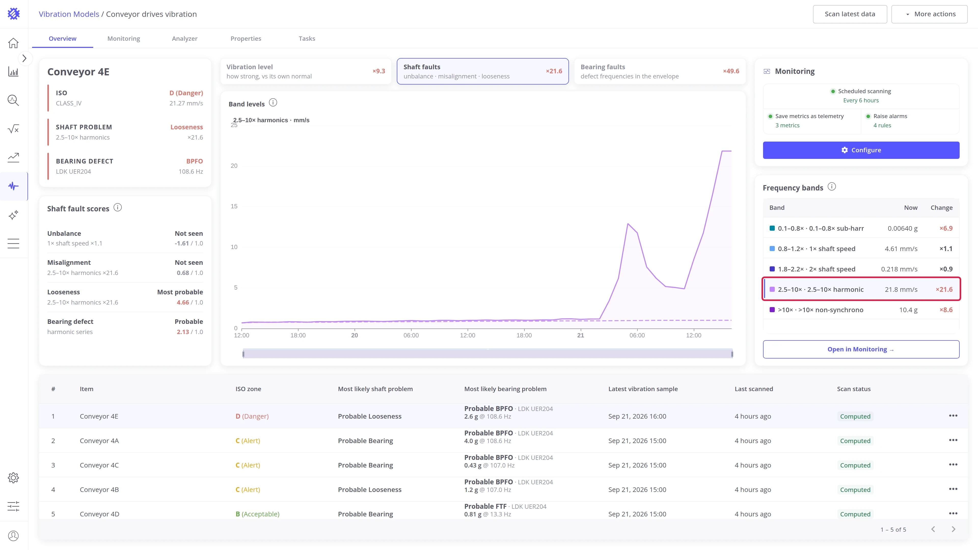
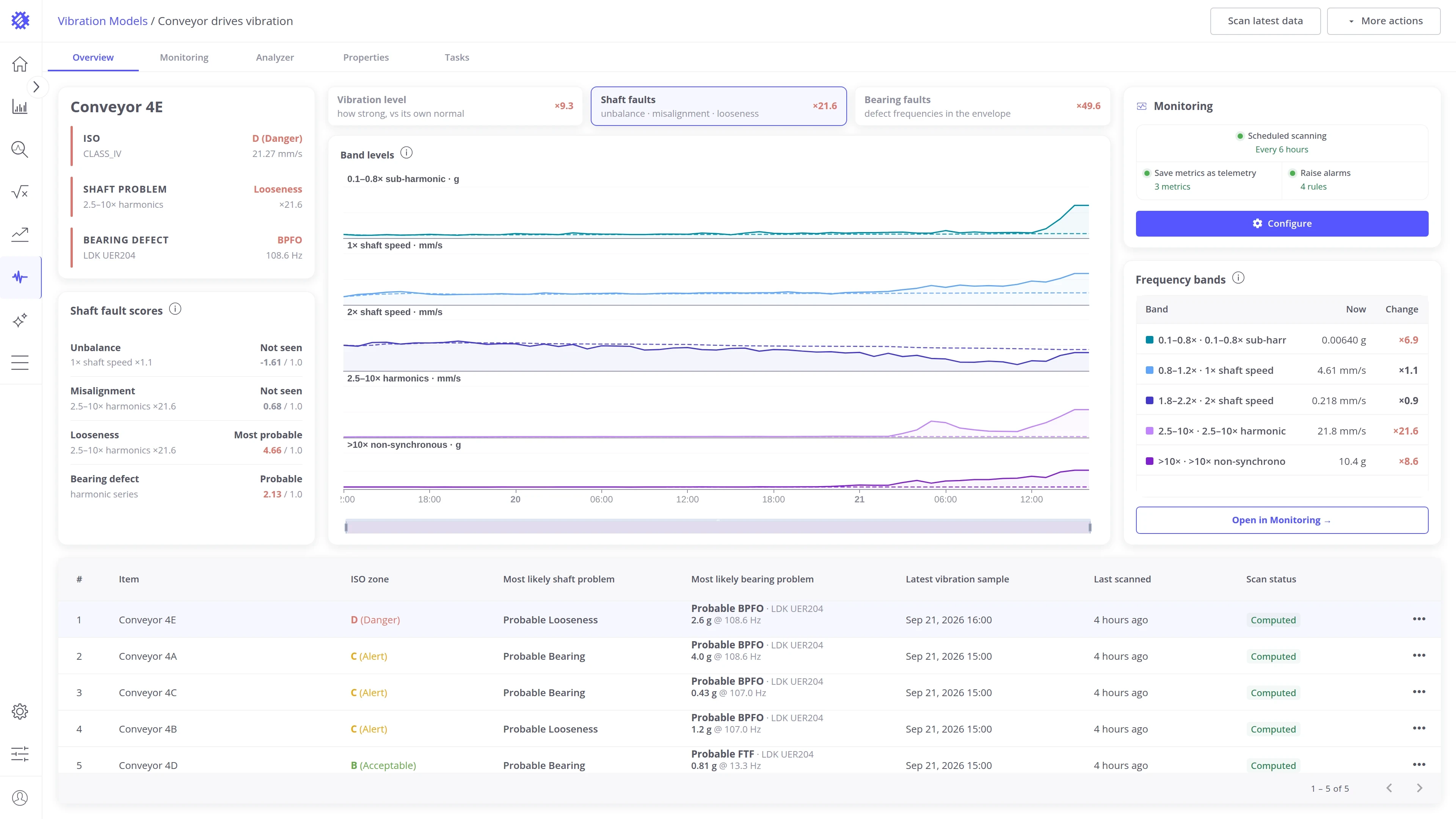
Read one sample. Hover the chart to see the levels of the sample under the pointer. With all bands shown, the tooltip lists every band with its level and how many times it is above the median. With one band shown, it lists only that band.
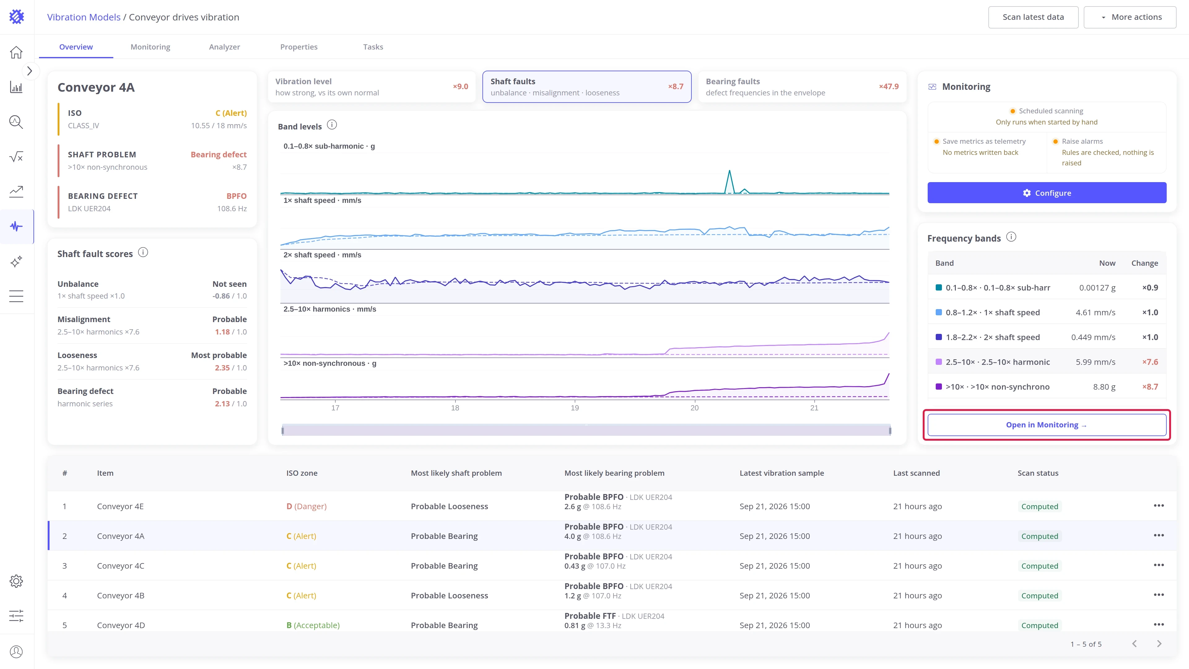
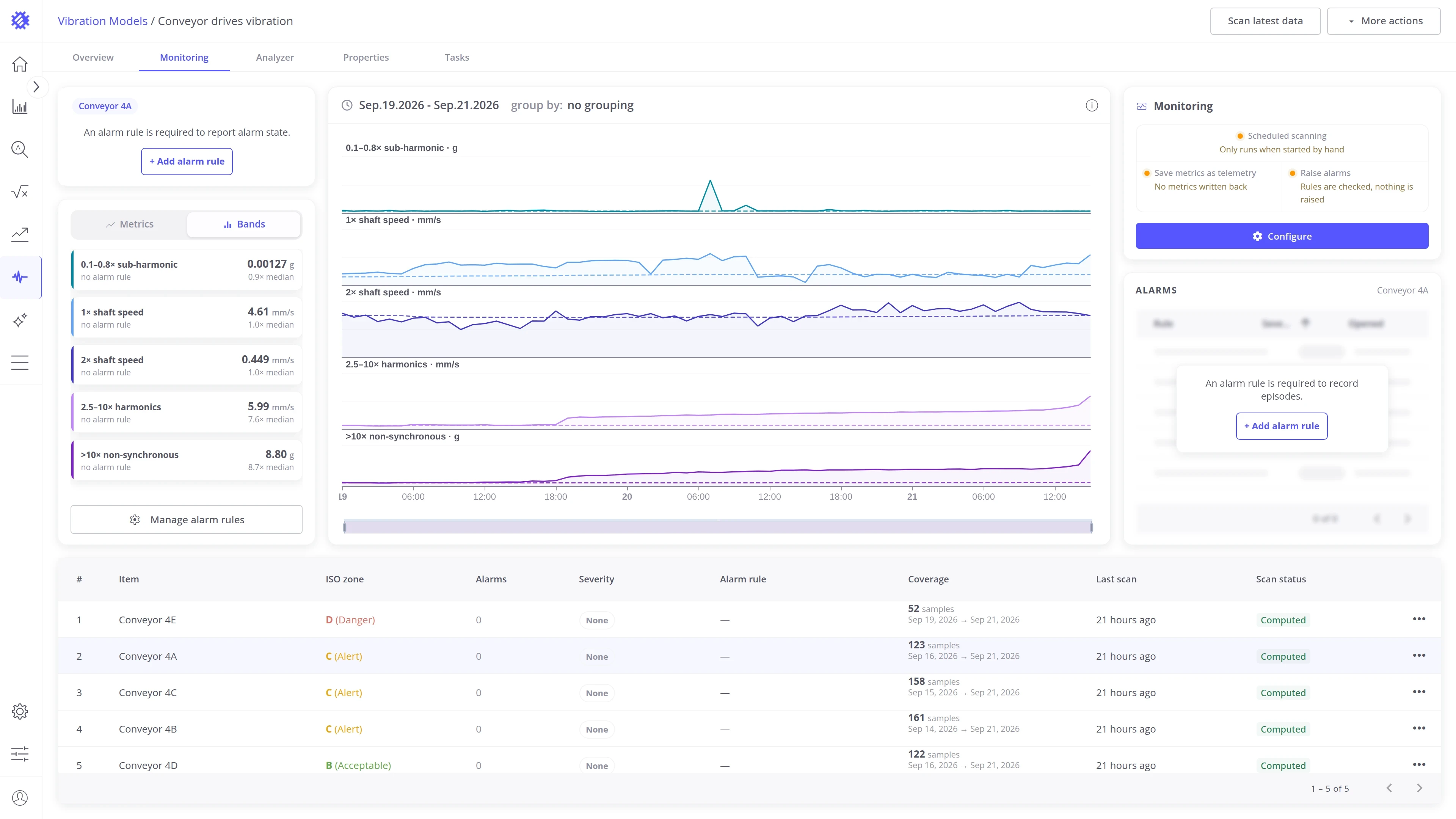
Open in Monitoring opens the Monitoring tab on the same machine, the same band, and the same time window.
The bands are measured relative to the shaft speed, so this view needs a shaft speed.
Bearing faults view
Section titled “Bearing faults view”The view has three blocks: the envelope spectrum and the frequency history on the left, and the strongest frequencies panel on the right.
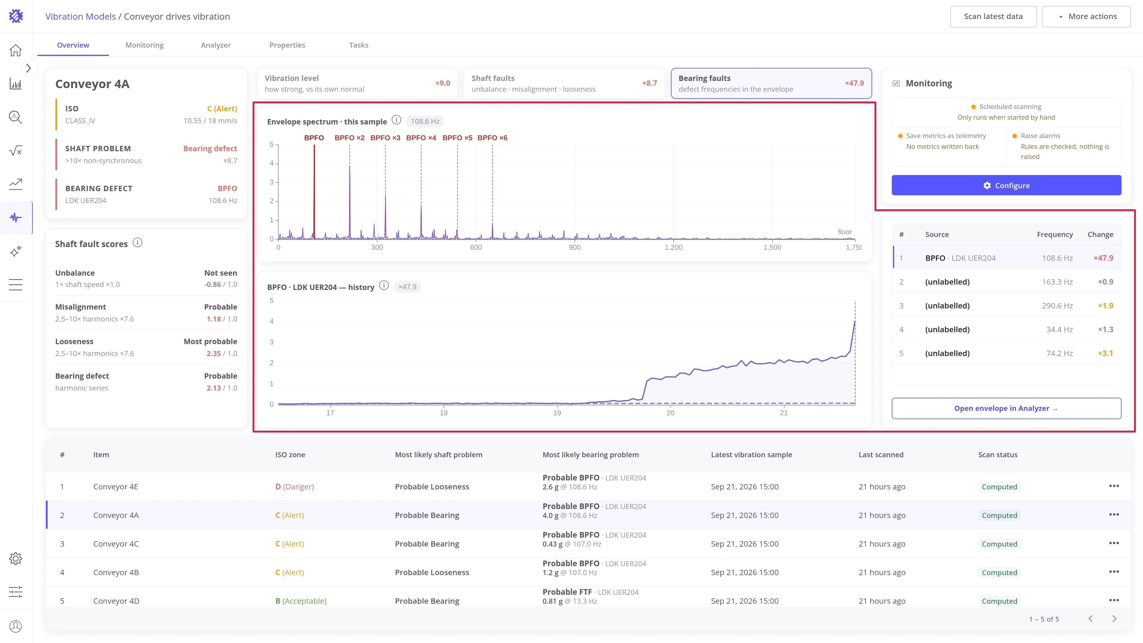
Envelope spectrum. The envelope spectrum of the latest sample. The frequency selected in the panel and its harmonics are marked on it.
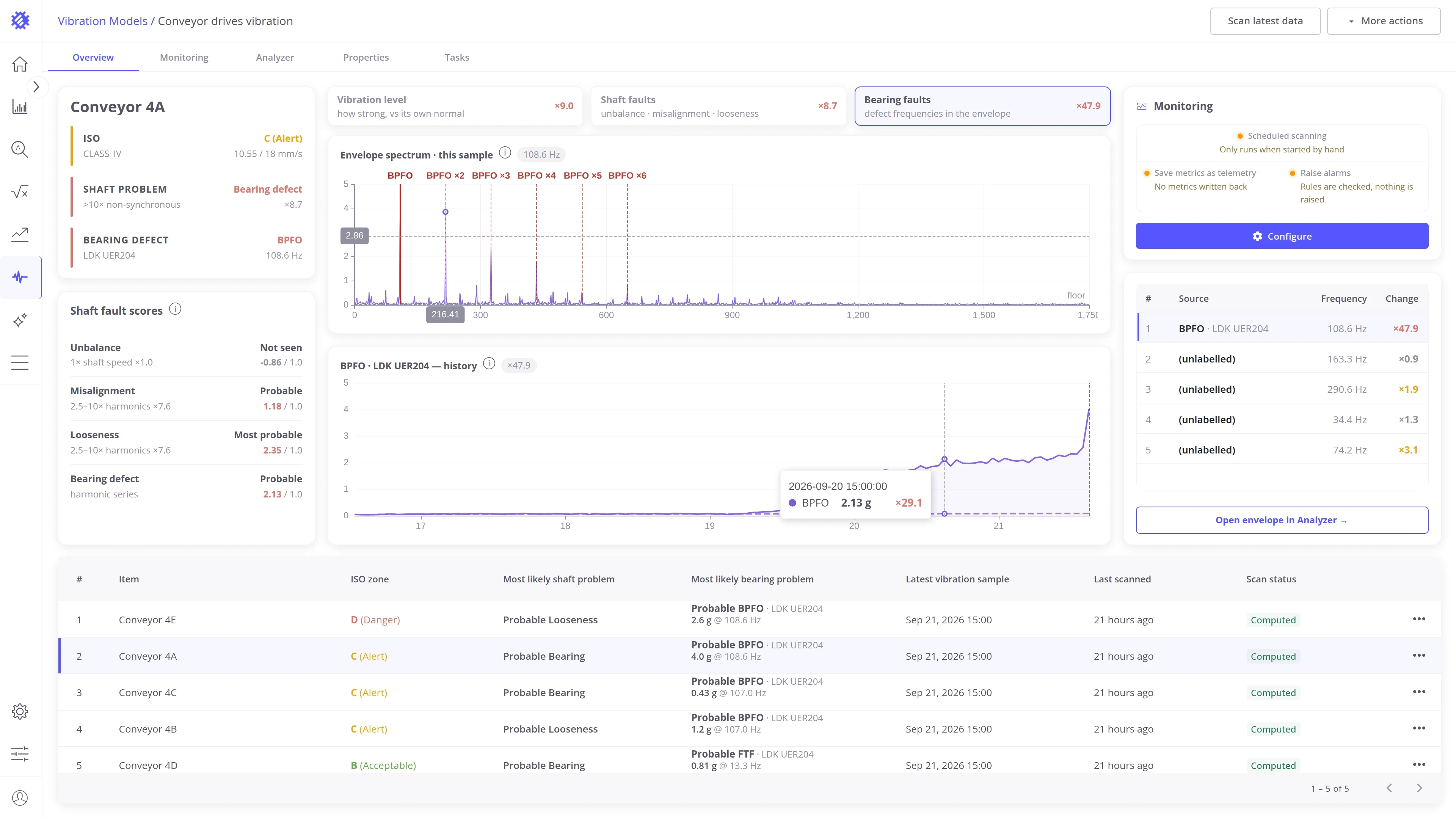
Frequency history. The amplitude of the selected frequency in every sample of the time window. The dashed line is the machine’s usual level, its median.
Strongest frequencies panel. The strongest frequencies of the latest sample, the strongest first, with how many times each is above the median. A frequency is named when it matches a bearing fault frequency or a multiple of the shaft speed, and shows (unlabelled) otherwise.
Show one frequency. Click a row in the panel to mark that frequency and its harmonics on the spectrum, and to show its history below. Click another row to switch to it.
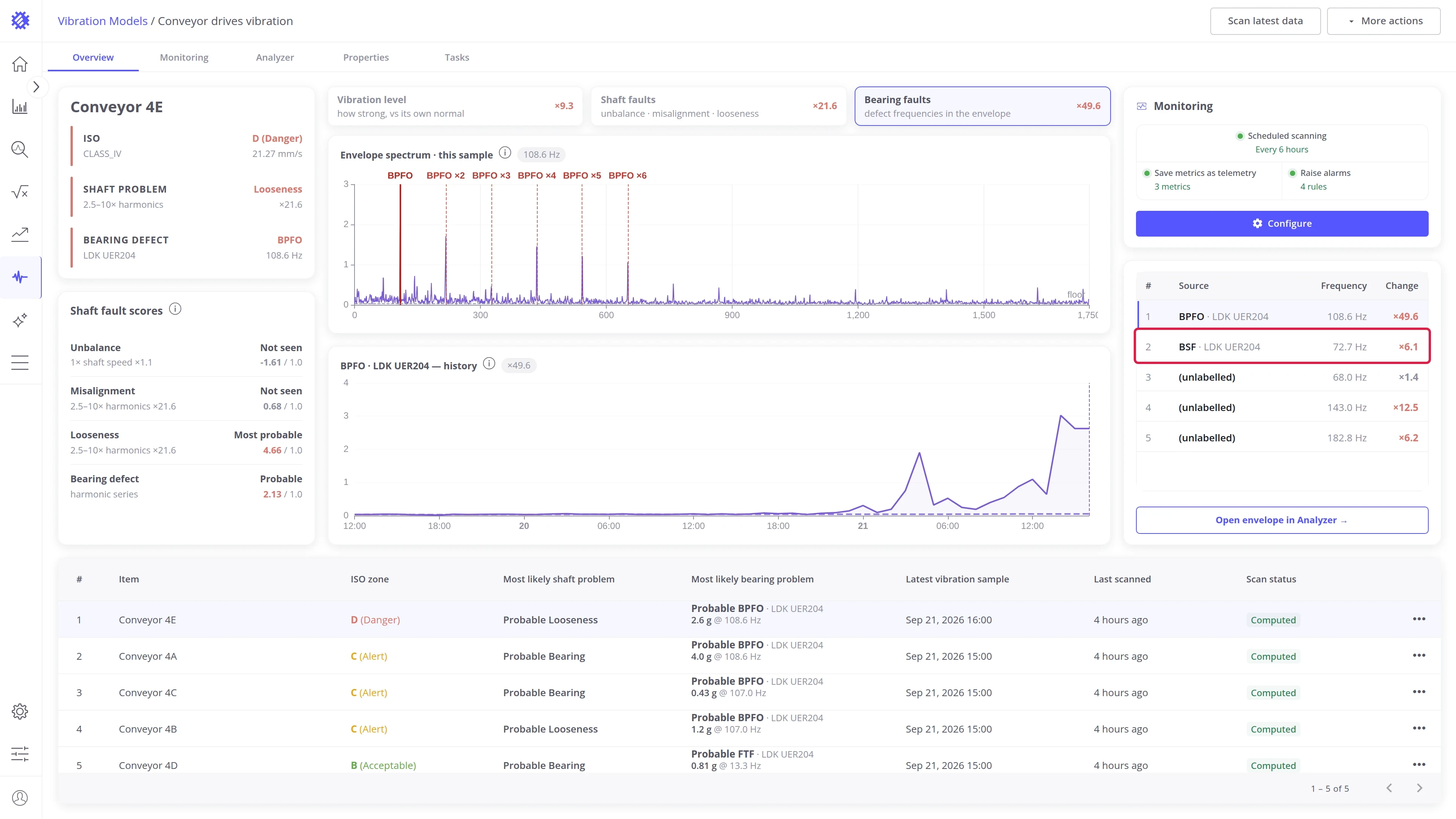
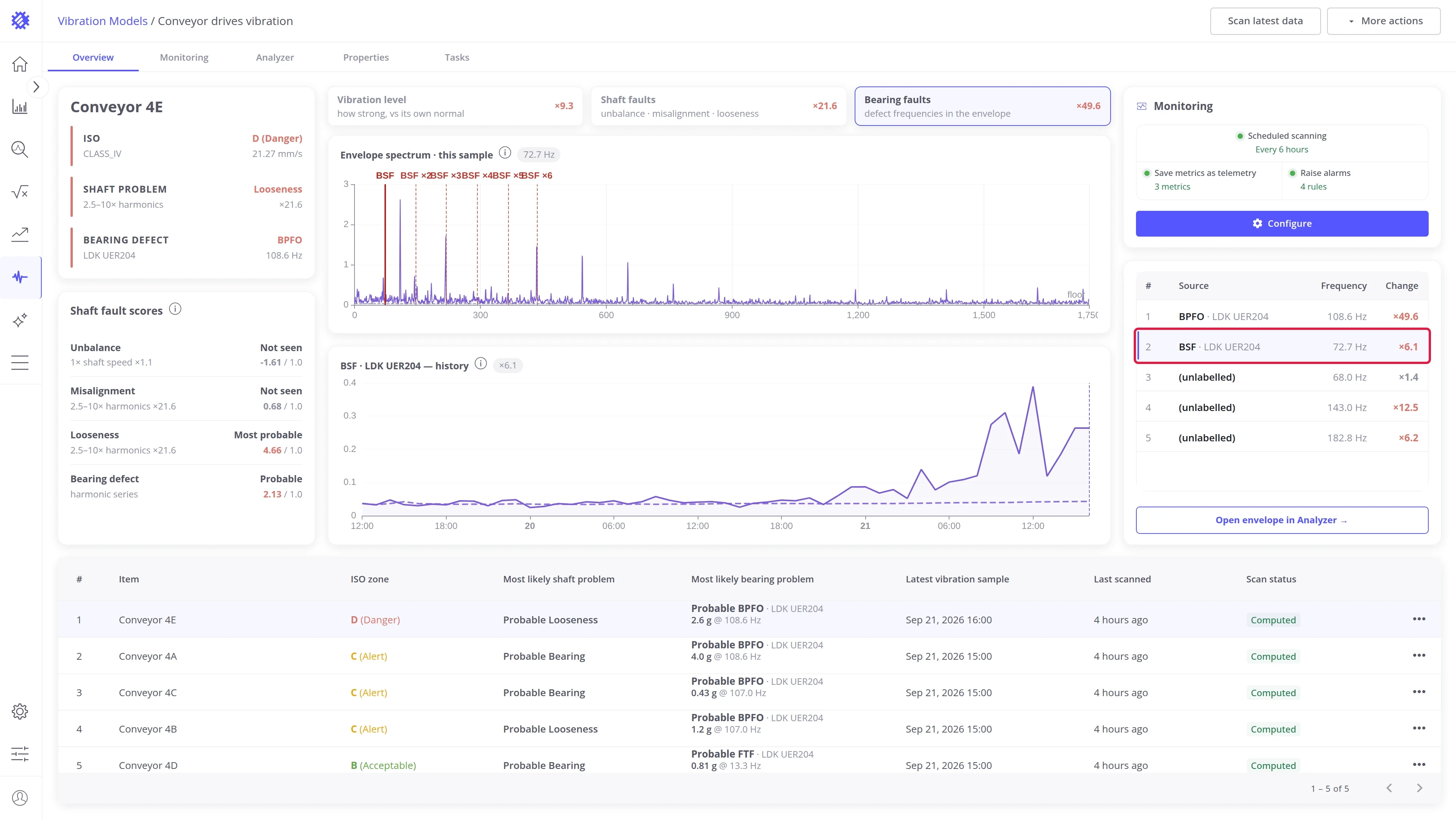
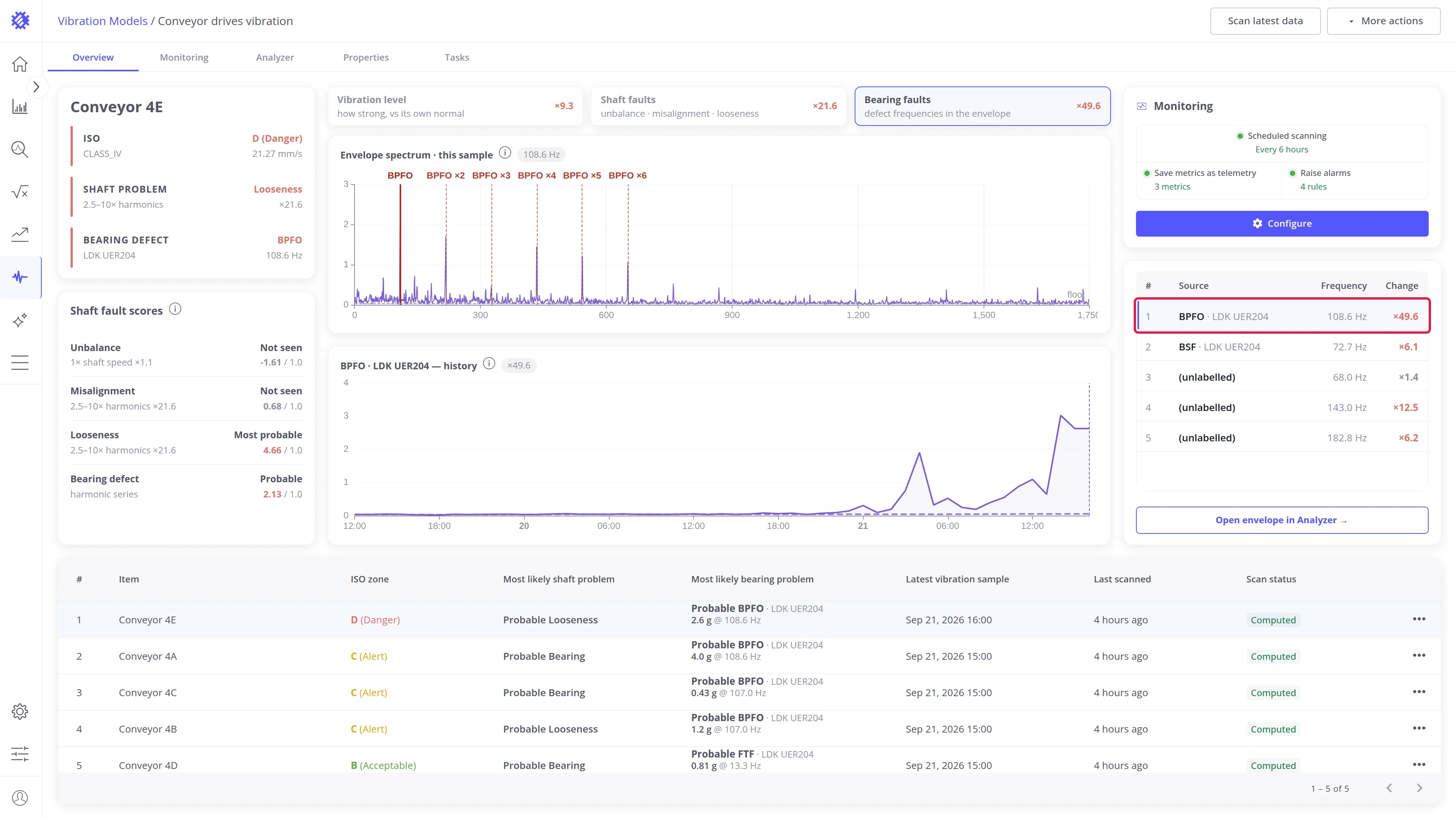
Read one point. Hover the spectrum to see the frequency and amplitude under the pointer. Hover the history to see one sample: its time, the amplitude of the frequency, and how many times it is above the median.
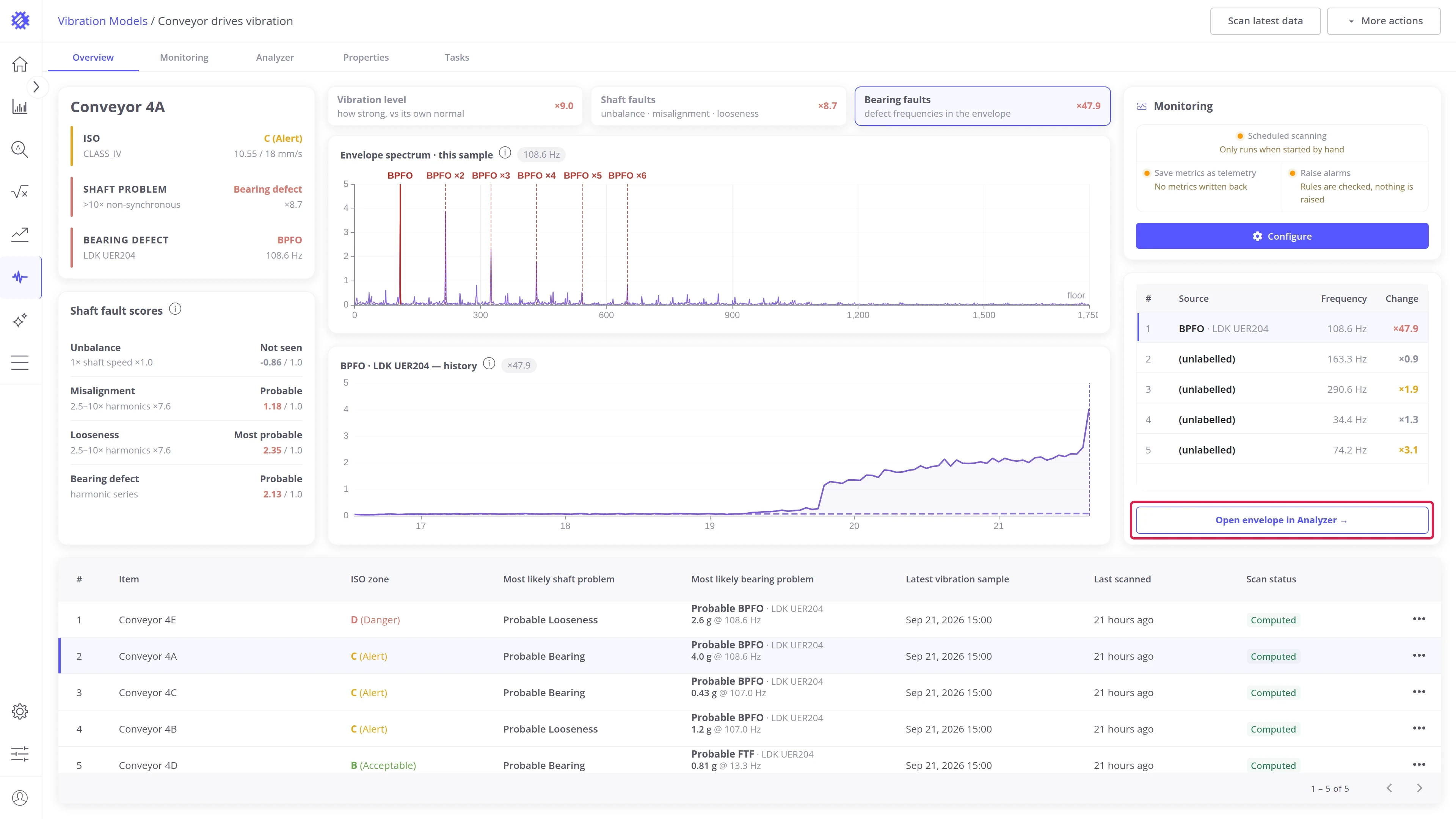
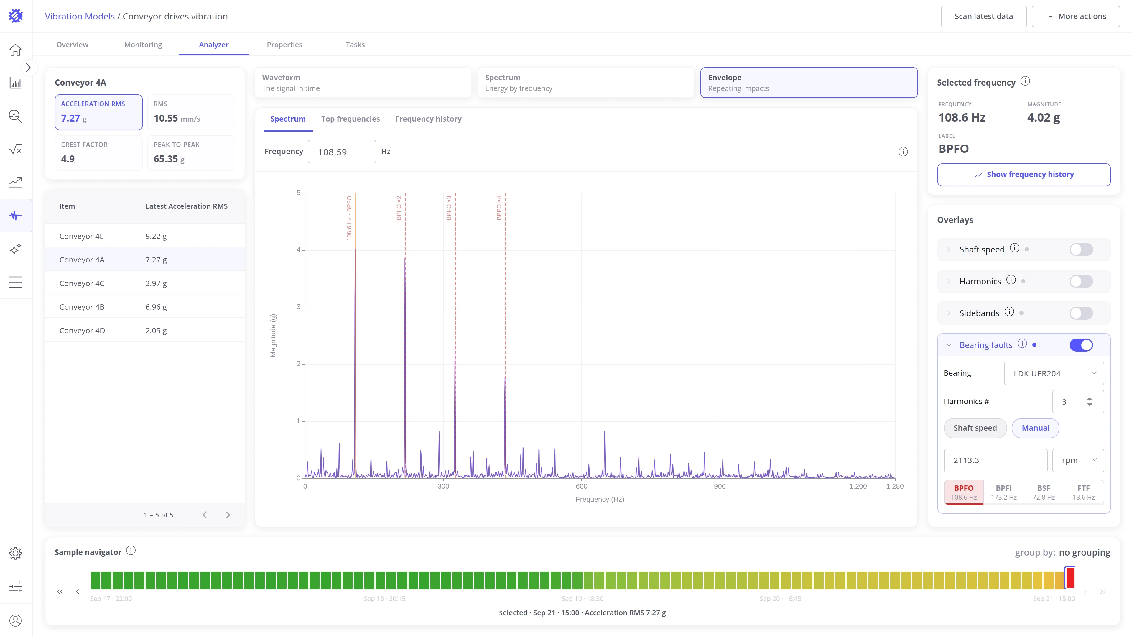
Open envelope in Analyzer opens the same sample in the Analyzer tab. There you can mark every bearing fault frequency on the spectrum and inspect each peak.
Explore other tabs
Section titled “Explore other tabs”Was this helpful?