Vibration Analyzer: Waveform, FFT & Envelope
The Analyzer tab shows one sample of one machine in full. Where the Overview tab trends a number across samples, the Analyzer draws the recording that produced it: the time waveform, its spectrum, and its envelope spectrum, with overlays that name the frequencies.
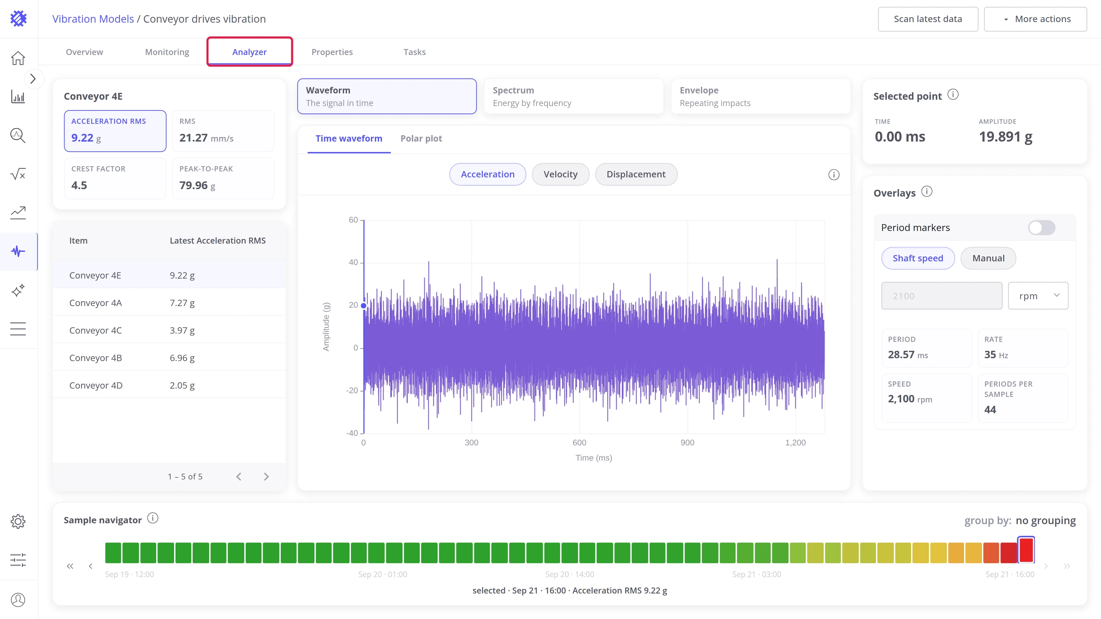
Use it when a number alone is not enough: to confirm a verdict before you send a technician, to find which frequency drives a rising level, or to compare a good and a bad sample of the same machine. The path is always the same. Pick the machine and the sample, choose a view, then read the chart together with the cards beside it.
Layout
Section titled “Layout”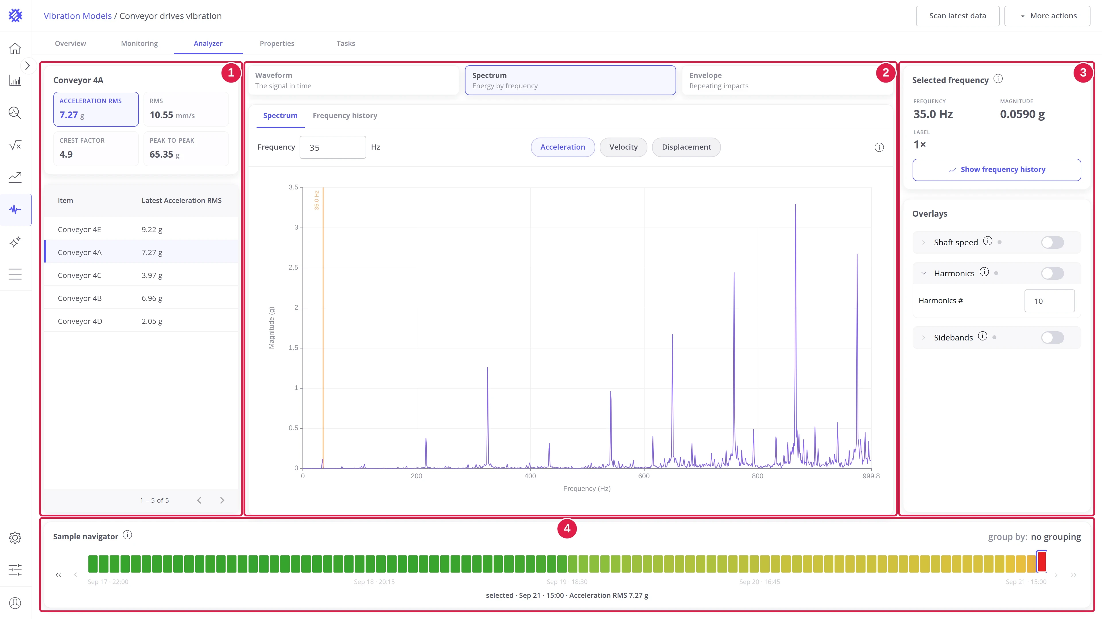
| # | Area | Contents |
|---|---|---|
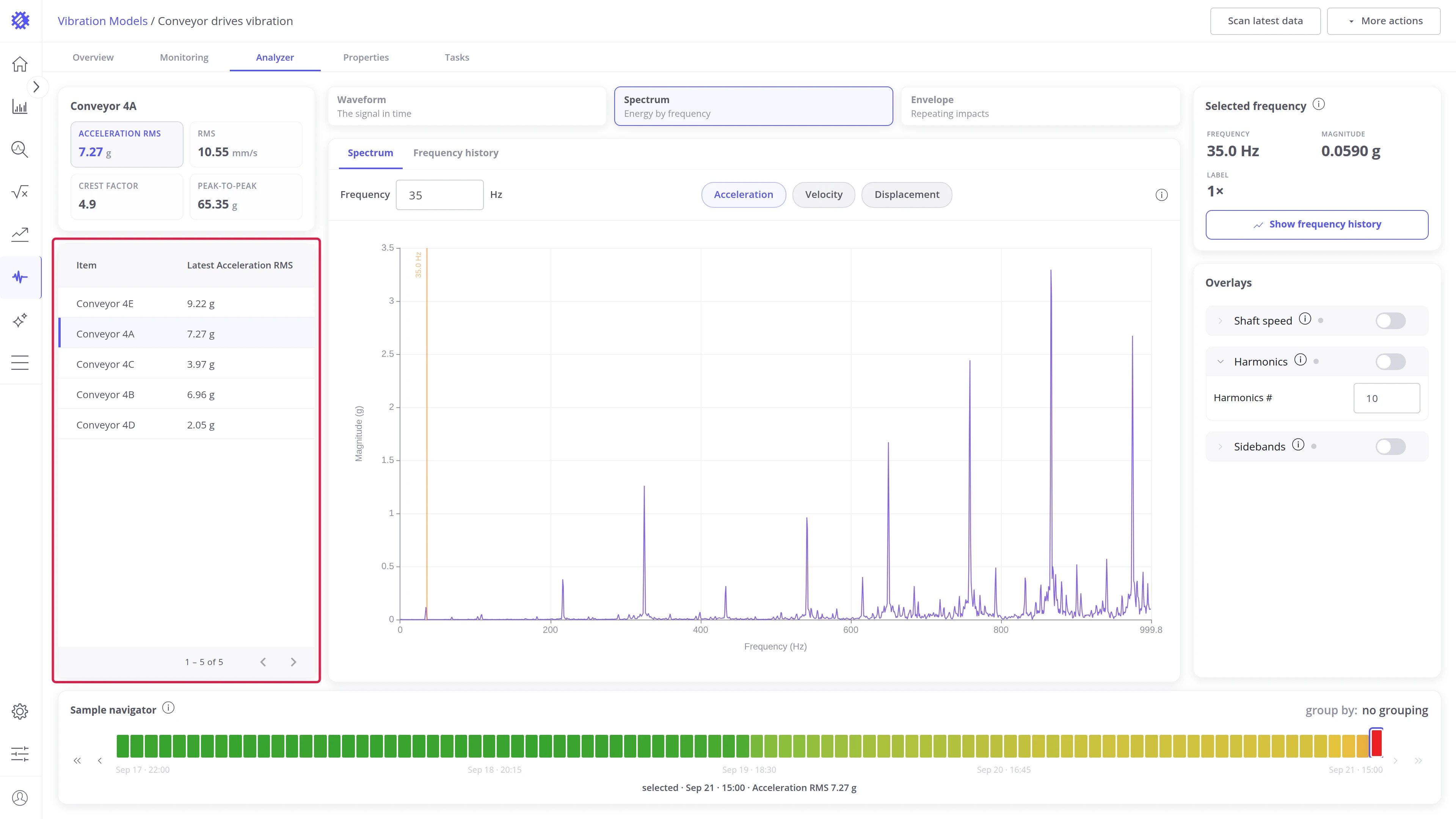
| 1 | Item rail | The selected machine, four metric tiles, and a table of all machines in the model |
| 2 | Chart area | The view switch, the panel strip, the toolbar, and the chart |
| 3 | Context cards | Cards that change with the view: the selected point or frequency, and the overlays |
| 4 | Sample navigator | Every sample of the machine in the window, one cell each, with stepping buttons |
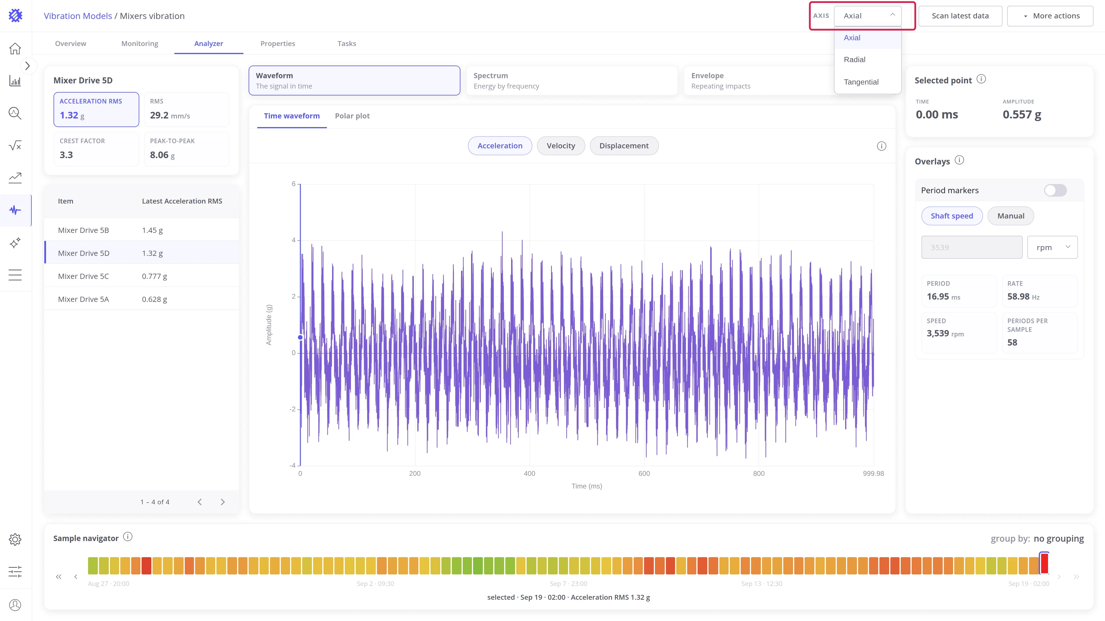
On multi-axis models the Axis picker in the page header selects the axis for the whole tab: the tiles, the table, the navigator, and the charts all follow it.
Select a machine and a sample
Section titled “Select a machine and a sample”Three clicks decide what the charts show.
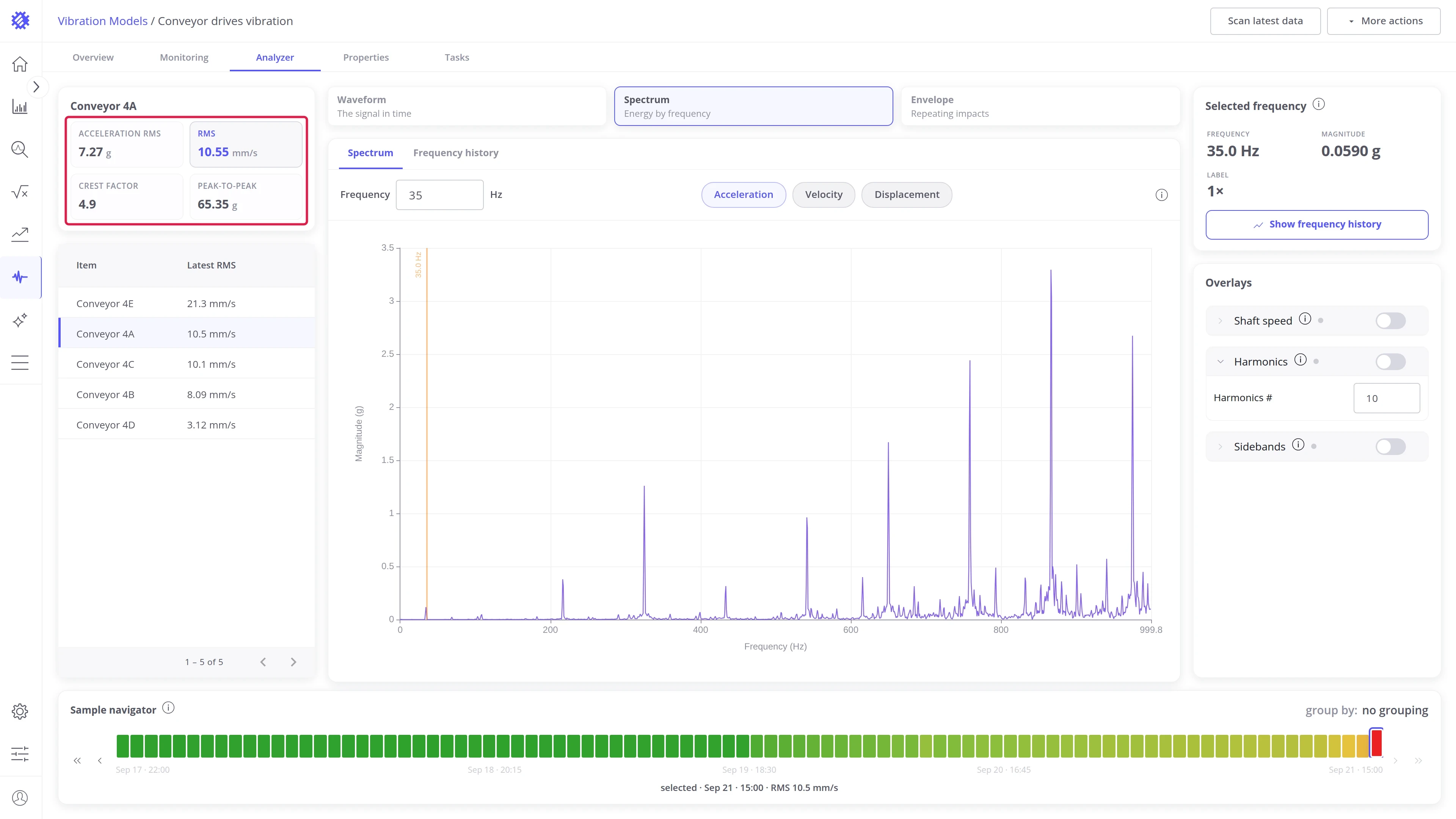
- Metric. The four tiles above the item table, Acceleration RMS, RMS, Crest factor, and Peak-to-peak, show the latest values of the selected machine. The highlighted tile is the metric the table’s second column lists and the sample navigator colors, so pick the one you want to judge machines by.
- Machine. Click a row of the item table. The tiles, the navigator, and the chart switch to that machine.
- Sample. Click a cell of the sample navigator. The chart area loads that sample.
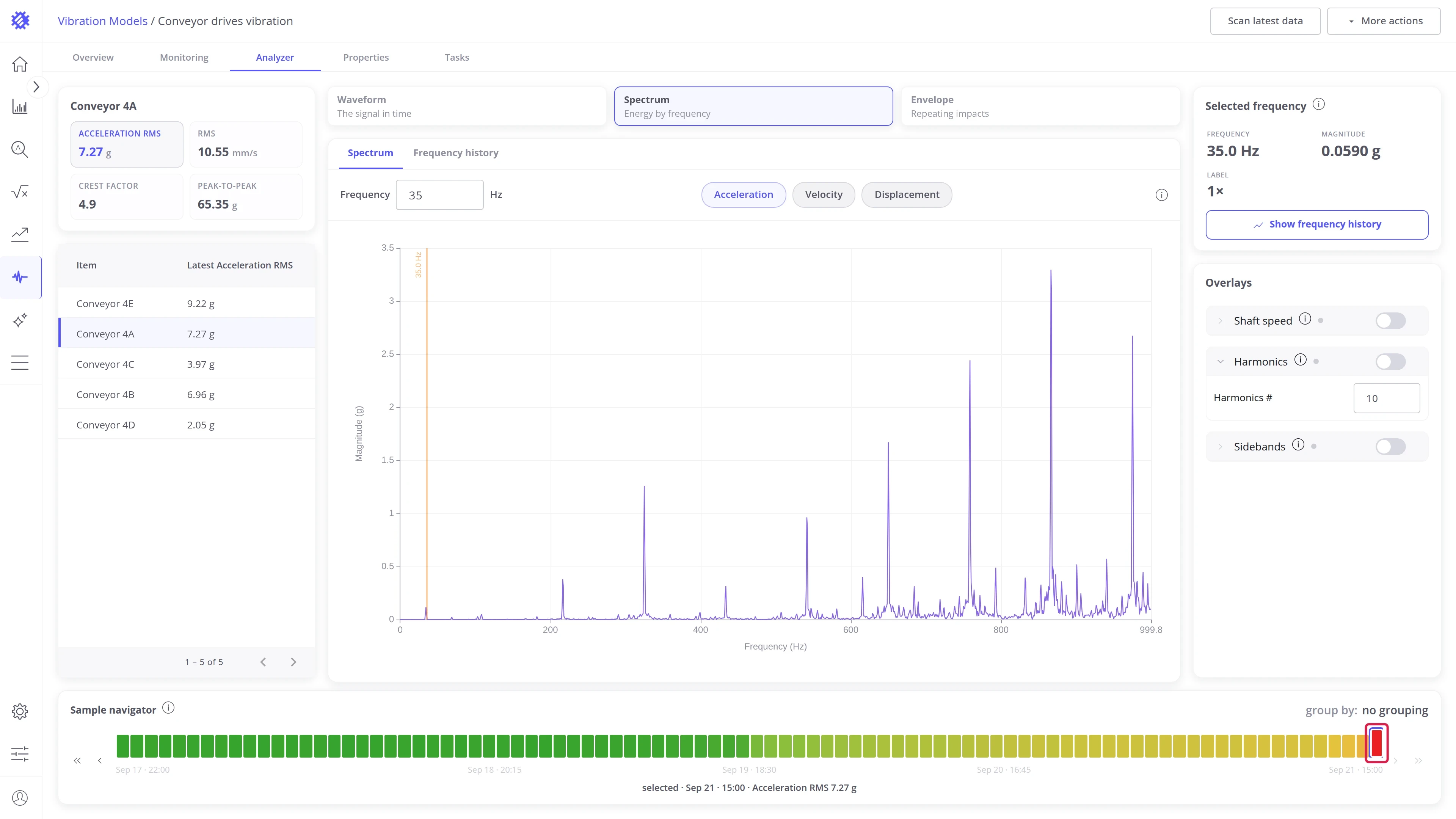
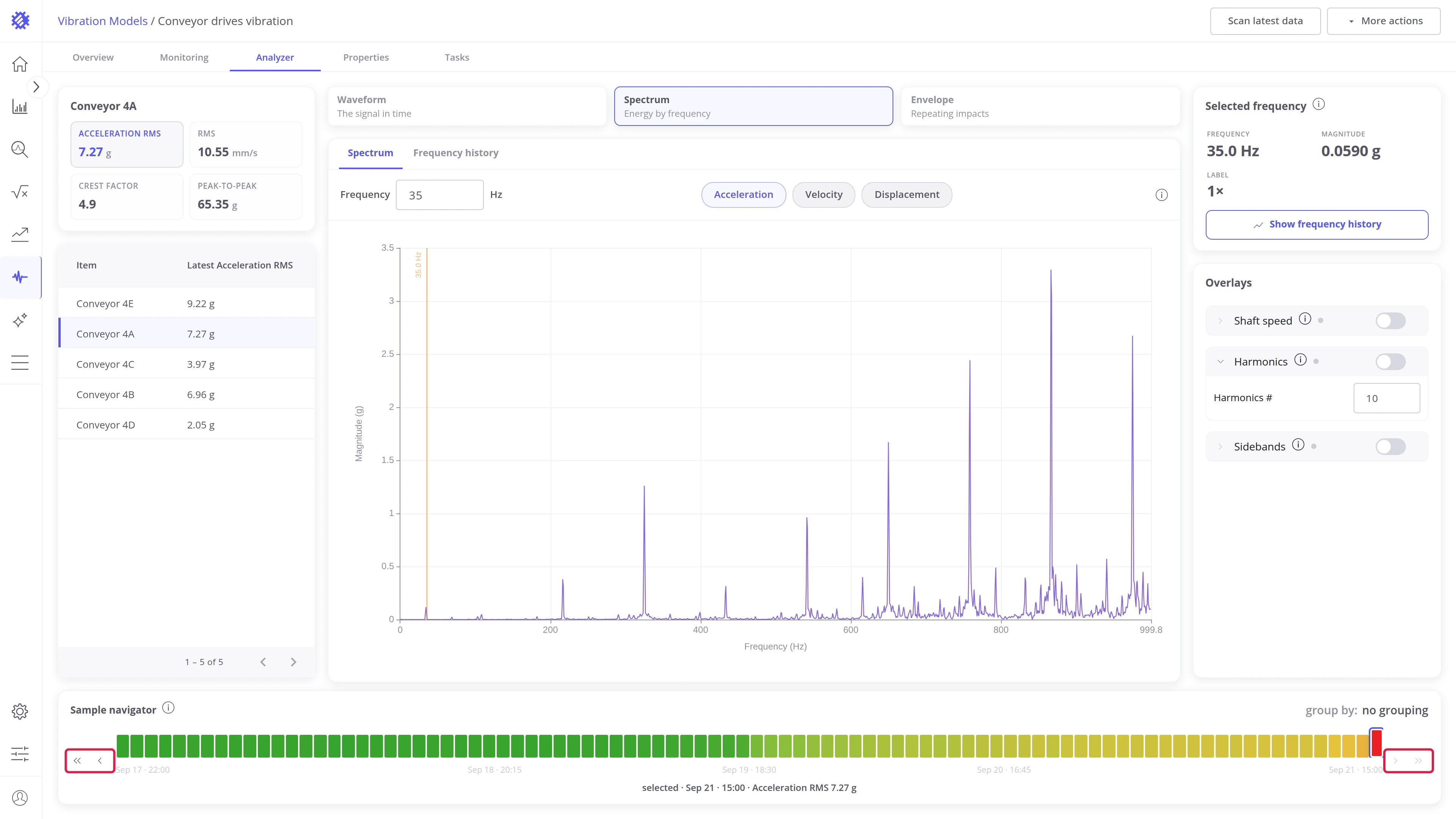
The navigator holds every sample of the selected machine in the current window, oldest to newest, colored from green at the window’s lowest value of the metric to red at its highest. The strip shows 45 cells at a time. A longer history scrolls behind them and re-centers on the sample you select. Step with Earliest sample, Previous sample, Next sample, and Latest sample. The readout line under the strip shows the timestamp and the metric value of the loaded sample.
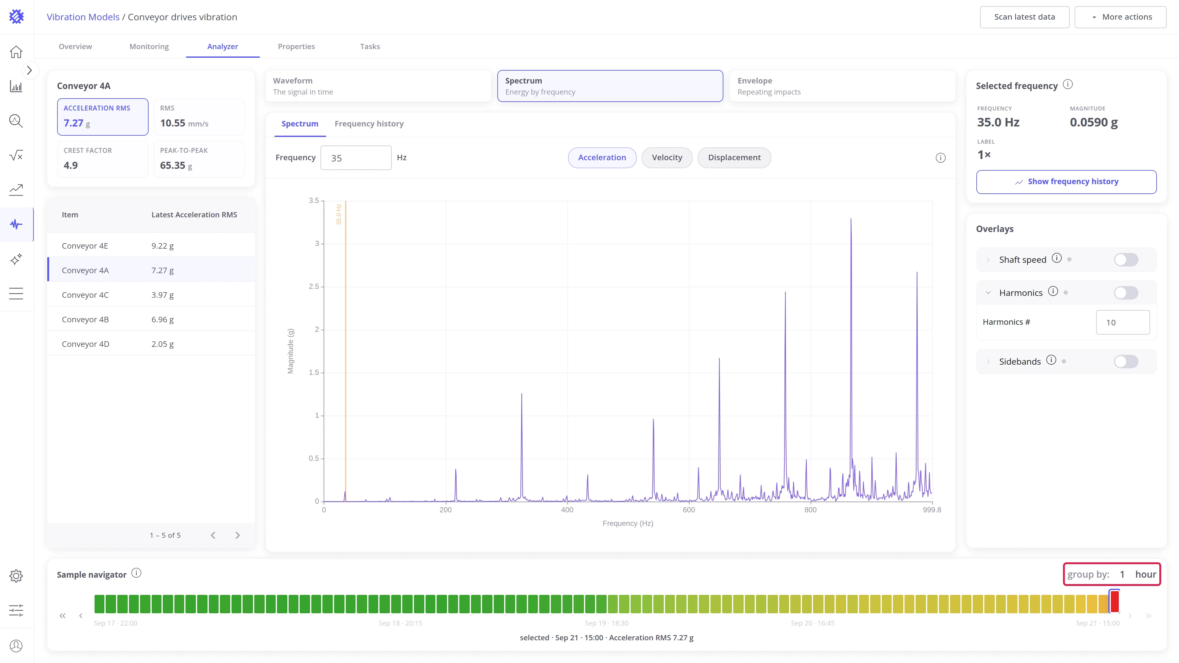
Group by buckets a dense history by hour, day, or another unit. Each cell then stands for the bucket’s peak of the selected metric, and clicking it loads that peak sample, the most critical one of the bucket.
Views and panels
Section titled “Views and panels”The view switch above the chart offers three views. Each view has one or more panels, selected in the strip on the chart’s top edge.
| View | Shows | Panels |
|---|---|---|
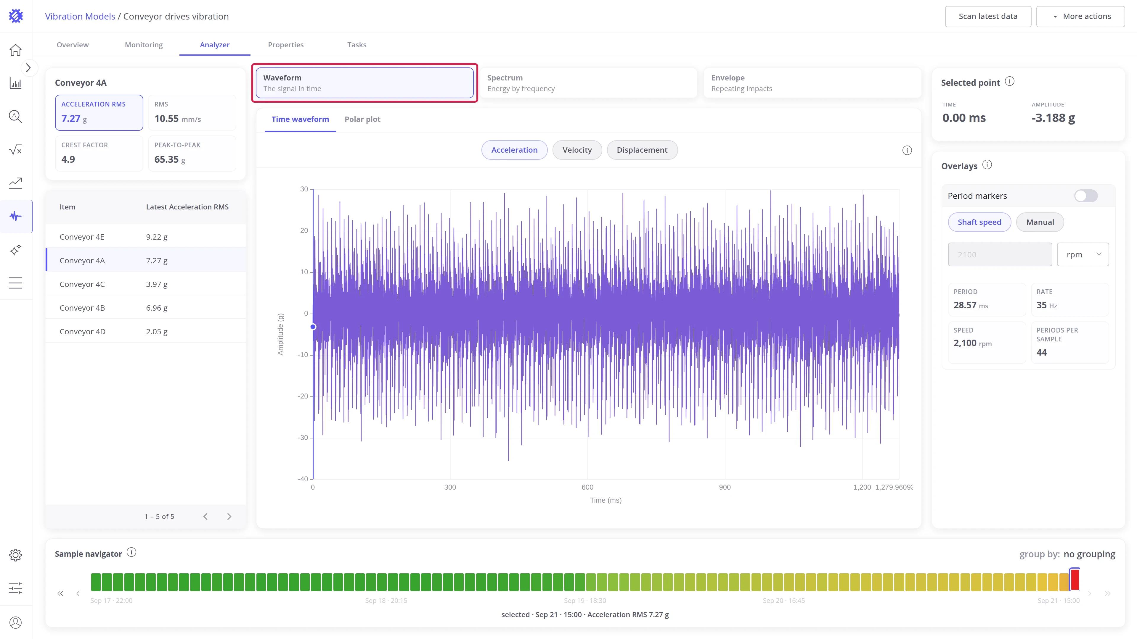
| Waveform | The signal in time | Time waveform, Polar plot |
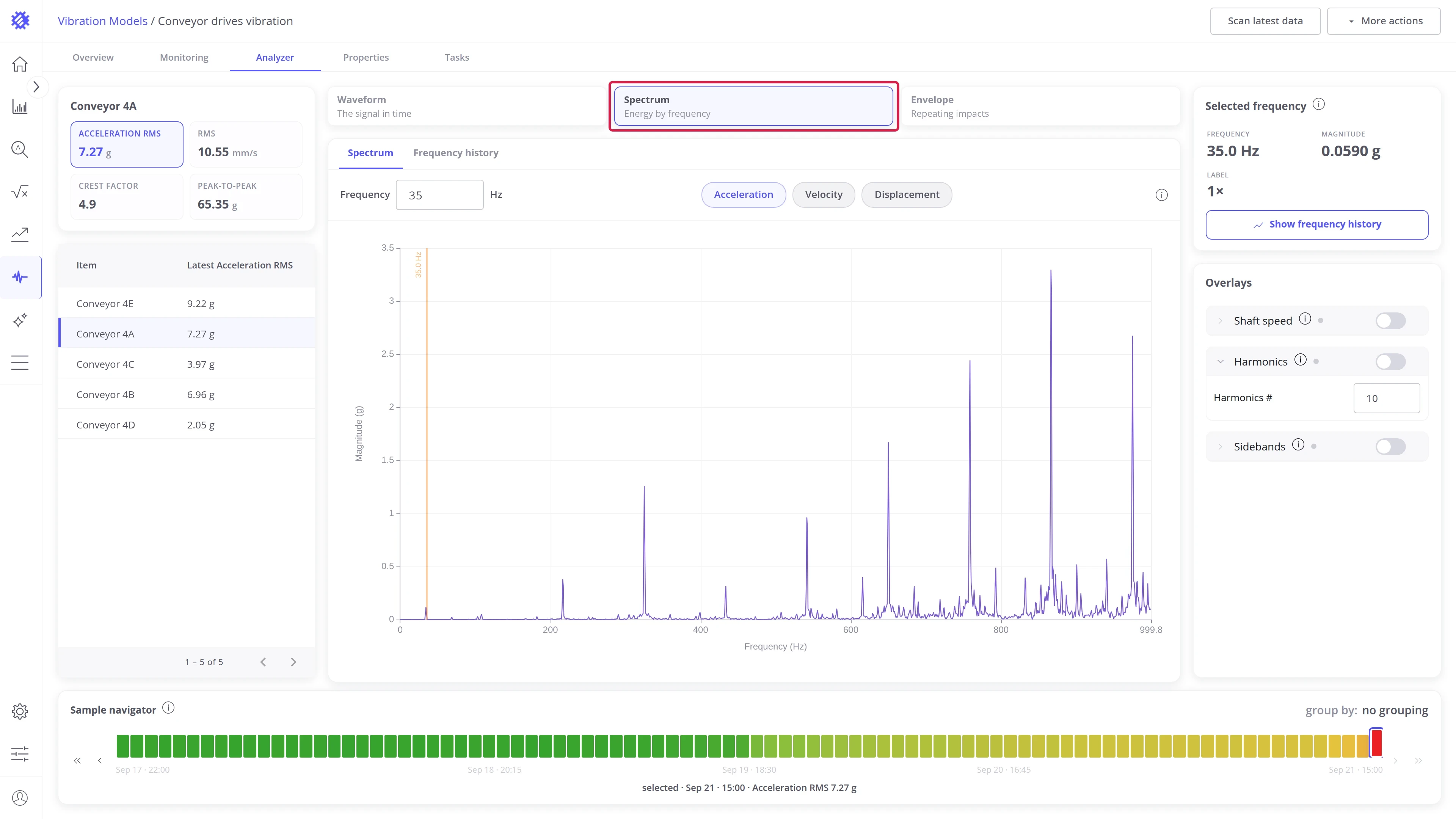
| Spectrum | Energy by frequency | Spectrum, Frequency history |
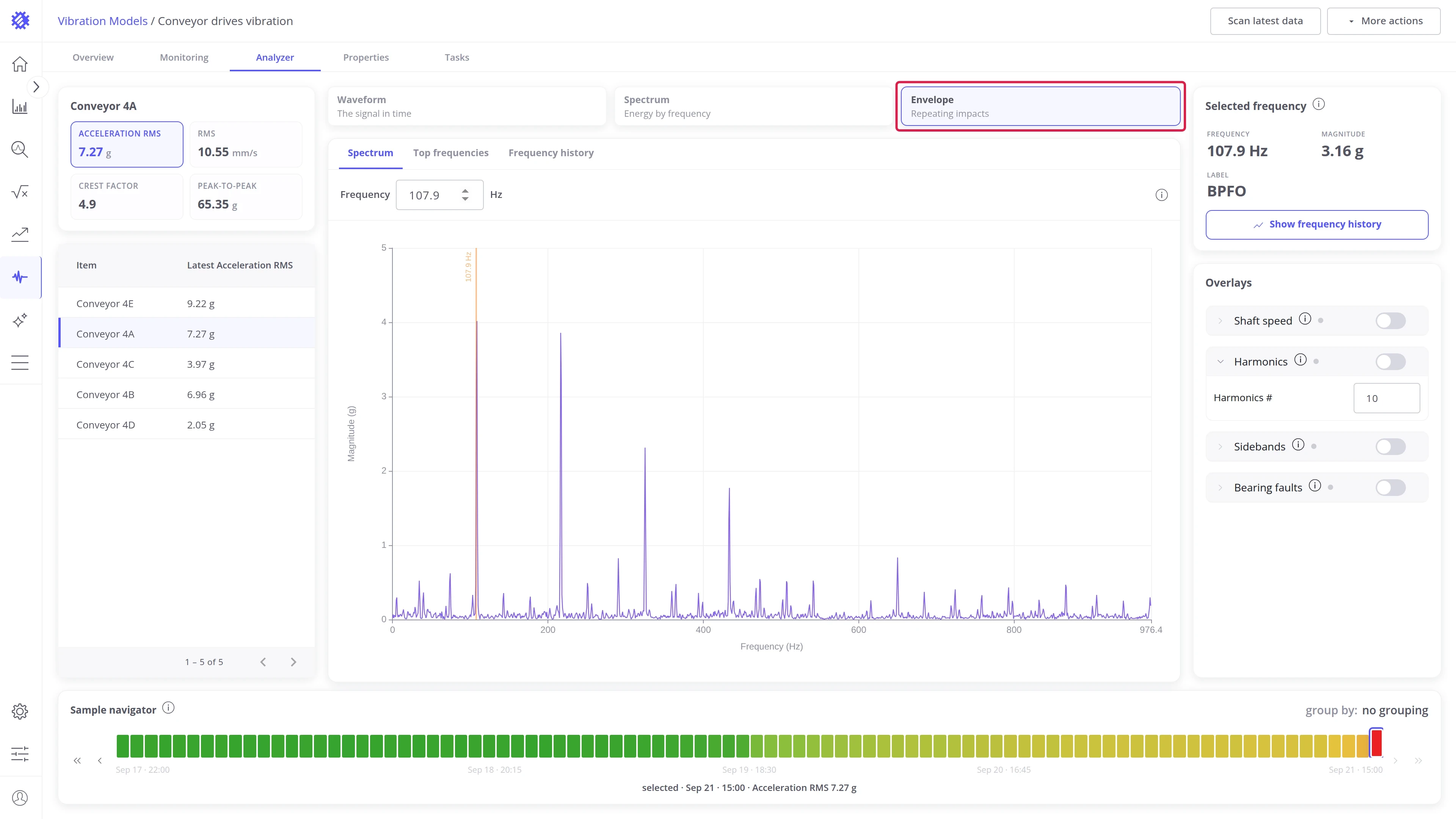
| Envelope | Repeating impacts | Spectrum, Top frequencies, Frequency history |
Waveform view
Section titled “Waveform view”Time waveform
Section titled “Time waveform”The sample as recorded: amplitude over time. This is the raw evidence behind every other chart, and the place to see impacts, clipping, or a bad recording with your own eyes. Open it from the Time waveform tab of the panel strip.
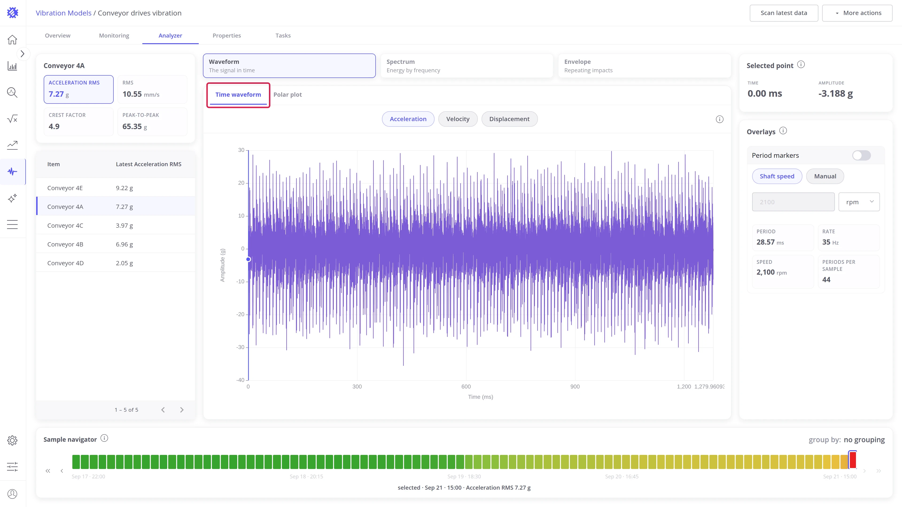
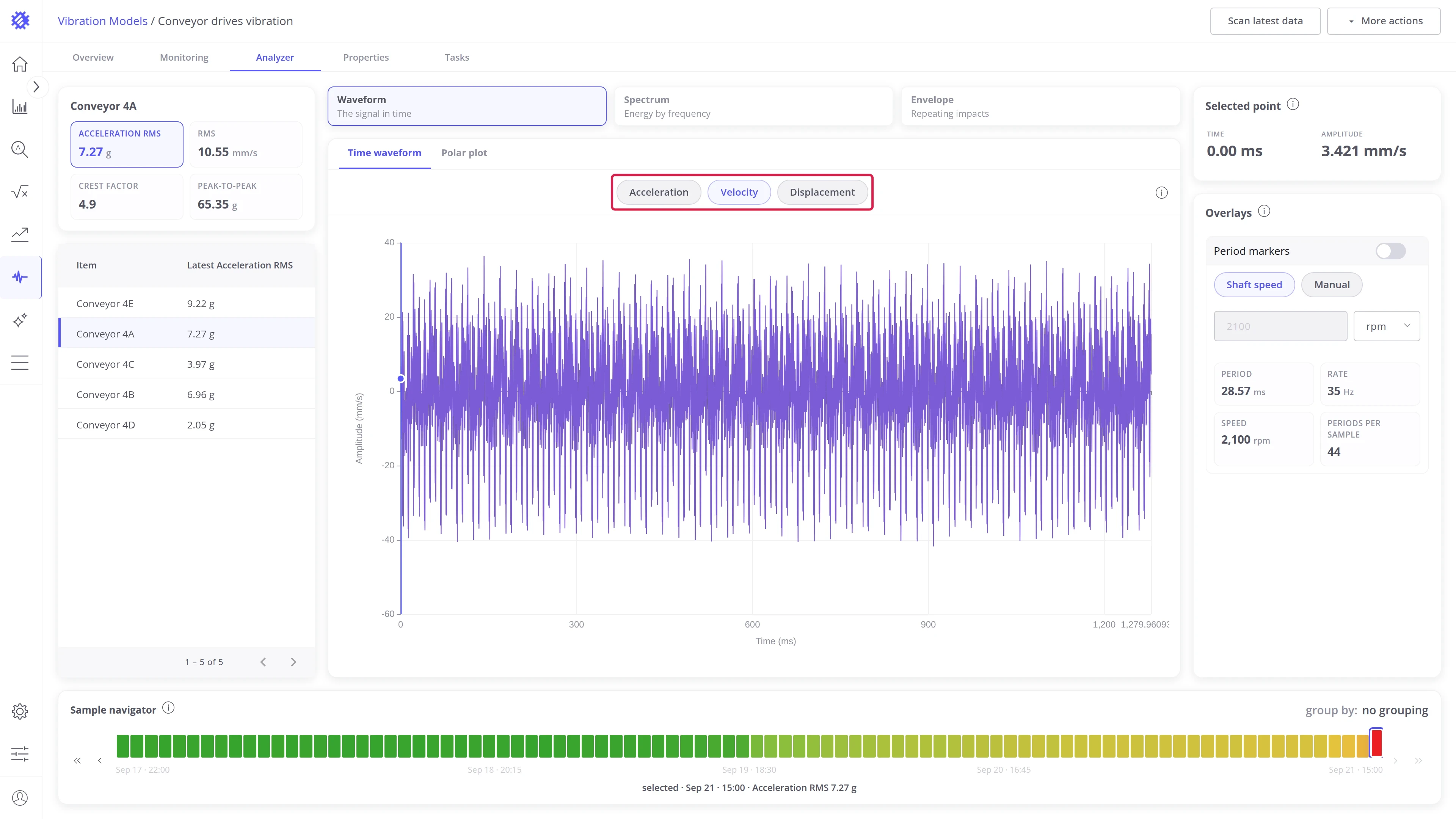
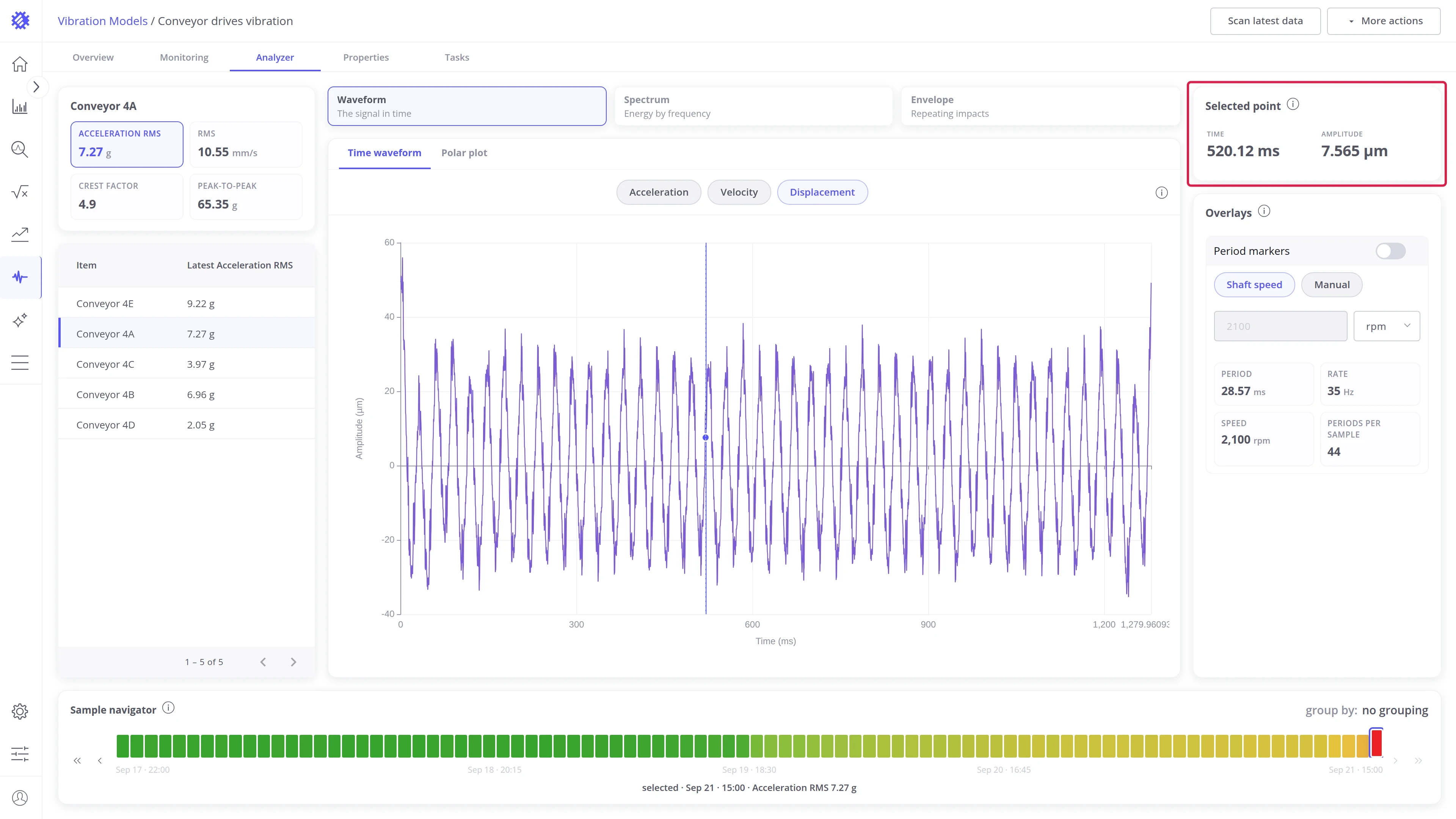
- The Acceleration, Velocity, and Displacement chips above the chart convert the trace on the fly. The recording is acceleration; velocity and displacement are derived from it.
- Click anywhere on the trace to place the pointer. The Selected point card shows its Time and Amplitude in the current quantity.
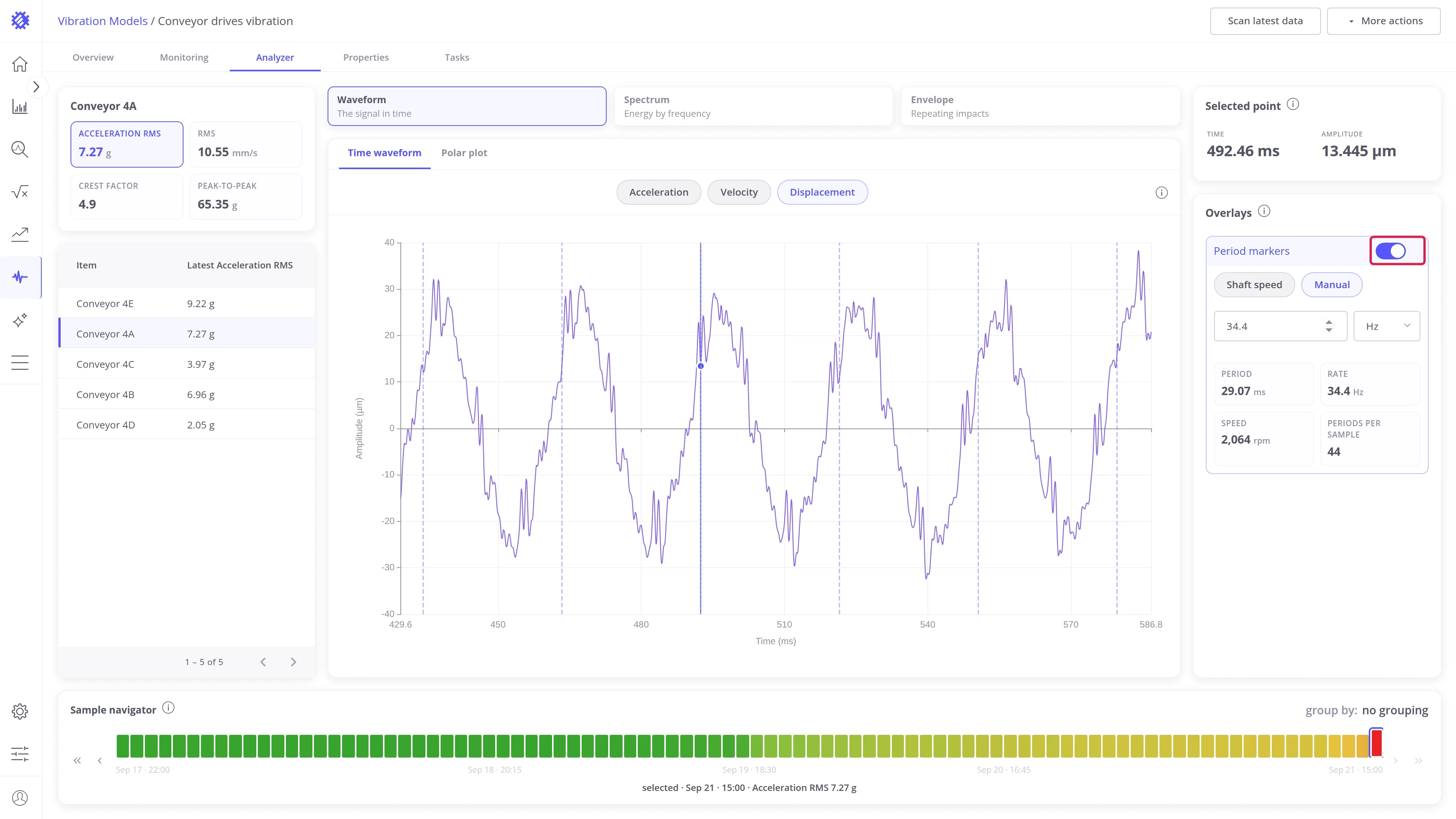
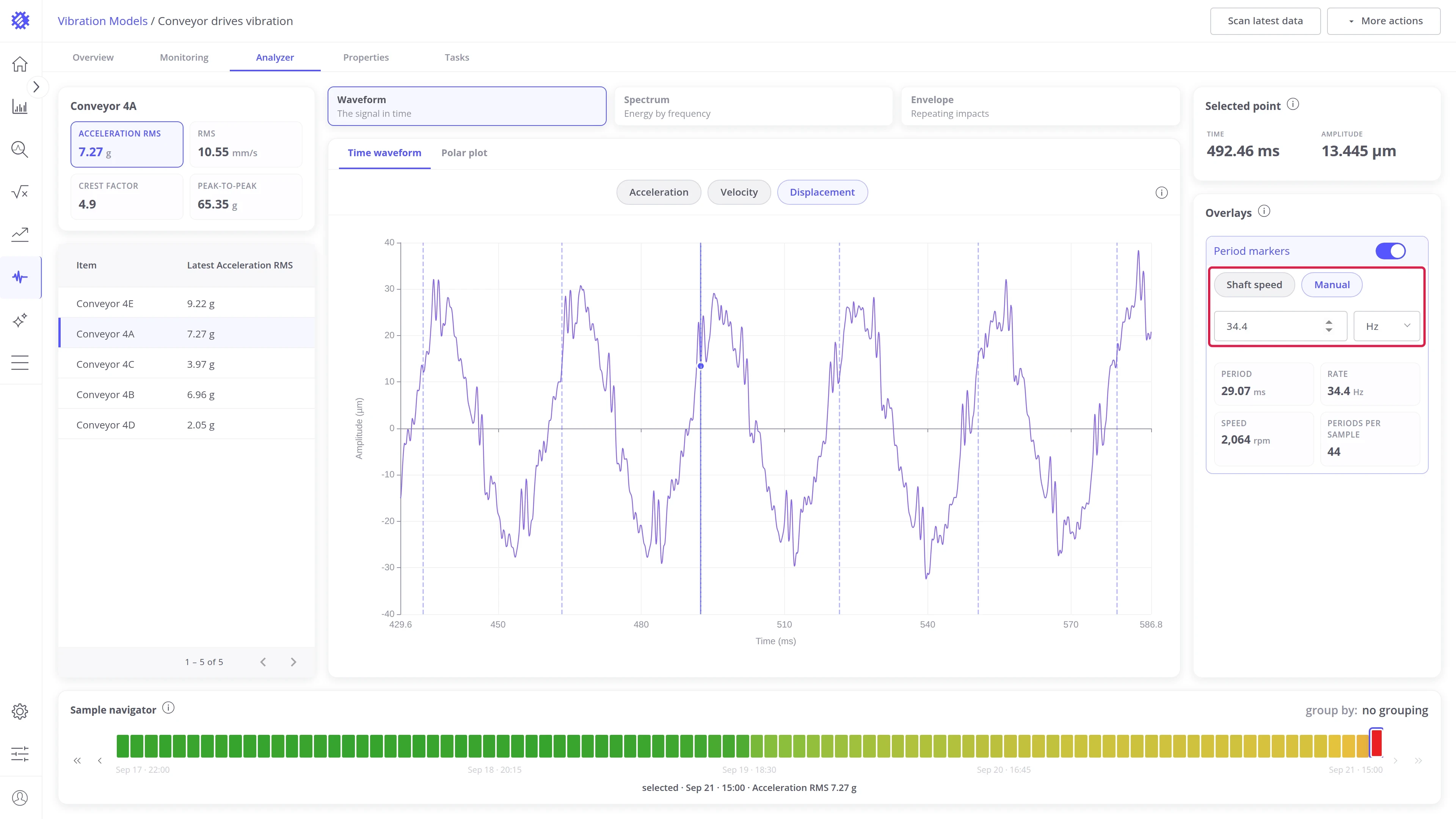
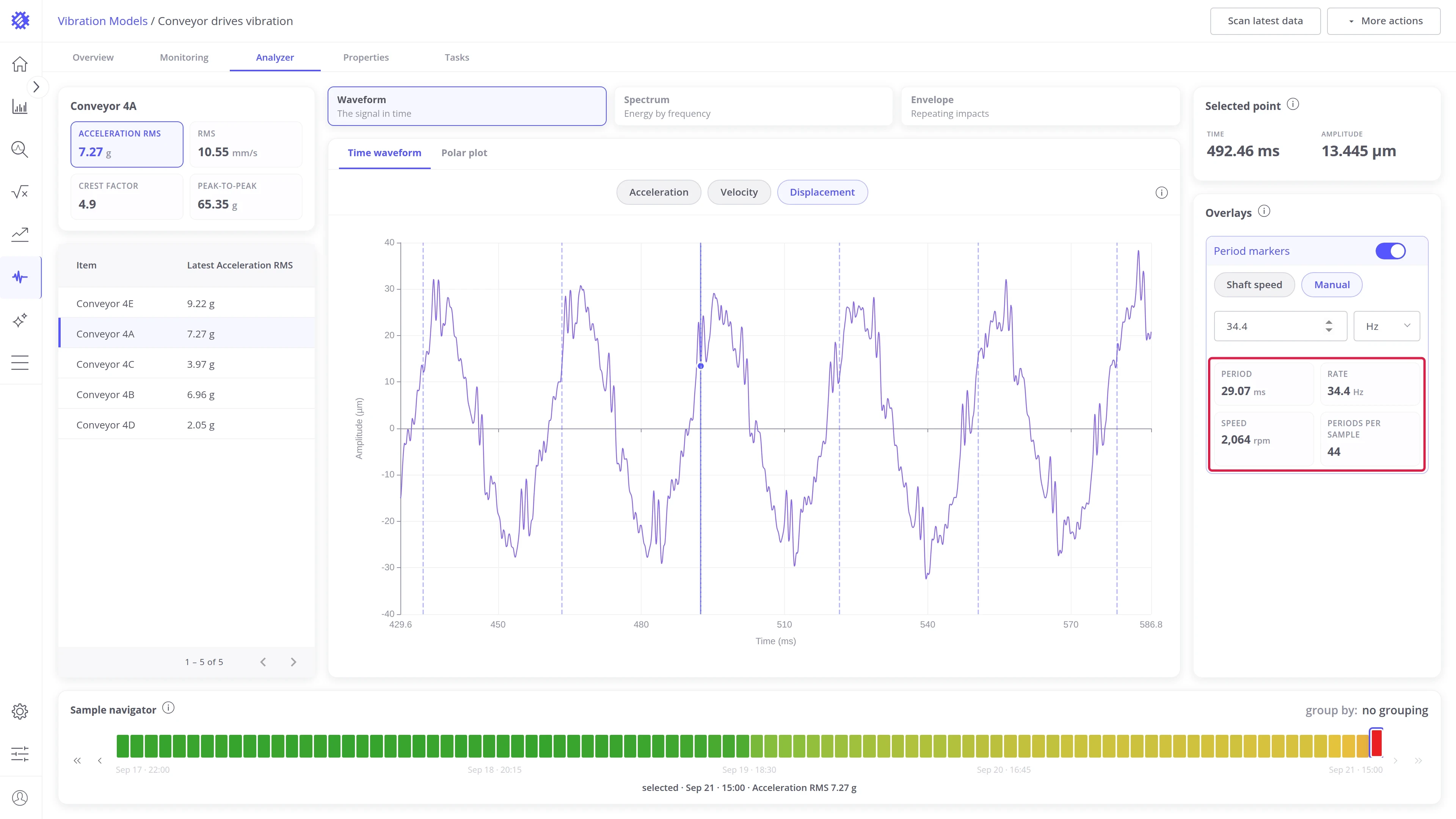
The Overlays card offers Period markers: one dashed line per shaft revolution. Marks that line up with repeating peaks tie the pattern to the shaft. Zoom into a few revolutions to compare them.
- Switch Period markers on to draw the lines.
- Shaft speed takes the period from the model’s speed. Manual takes a value you type in ms, Hz, or rpm, for a machine without a configured speed or to test another rate.
- The stats show Period, Rate, Speed, and Periods per sample, so you can check that the marks match the machine.
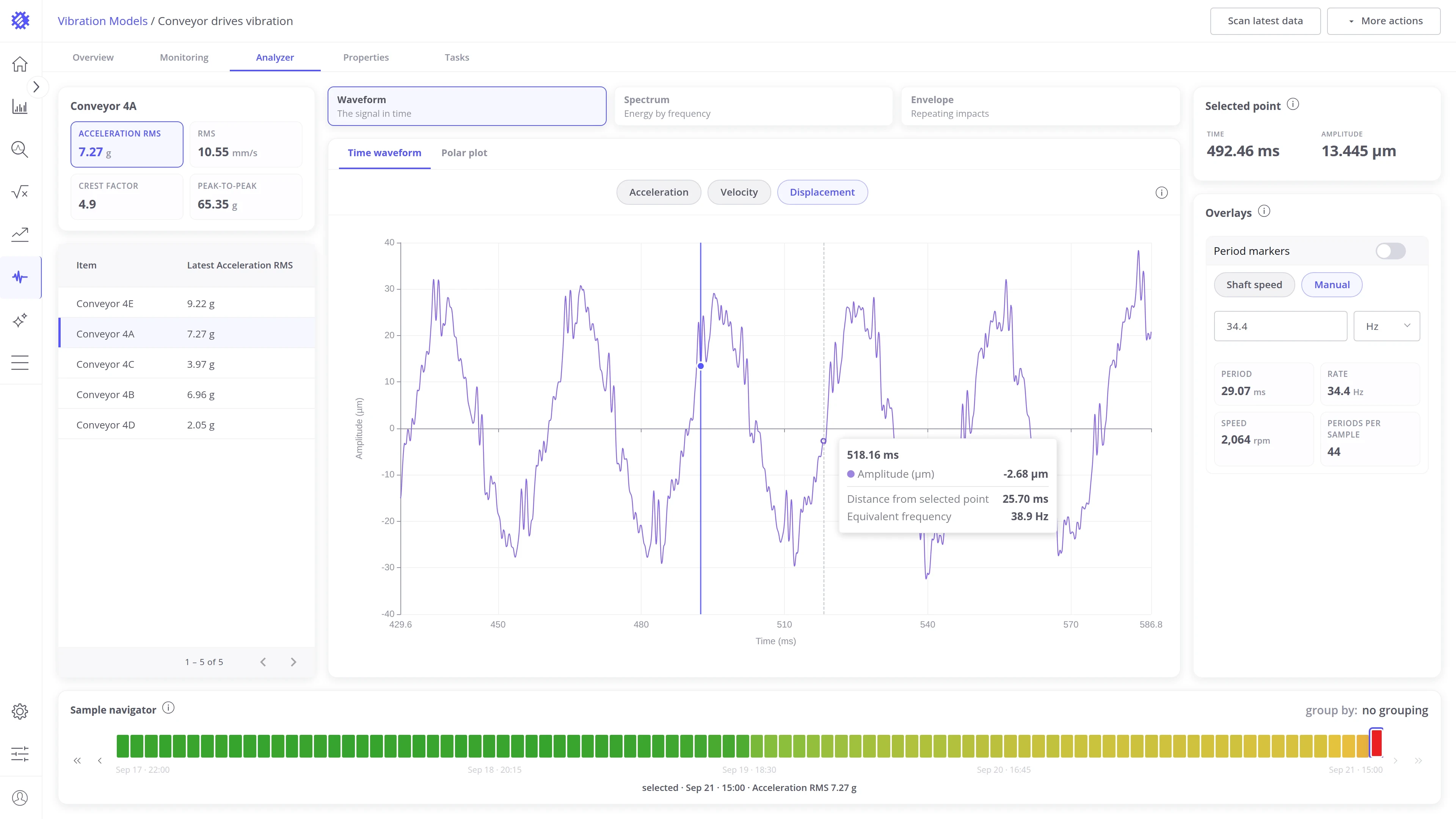
Hovering the trace shows a readout under the pointer. It measures the hovered point against the selected one, so you can read the spacing of two peaks without a calculator.
- Time and Amplitude: the hovered point, in the current quantity.
- Distance from selected point: the time between the hovered point and the selected one.
- Equivalent frequency: the frequency of a pattern that repeats at that distance. Two peaks 34 ms apart repeat at about 29 Hz.
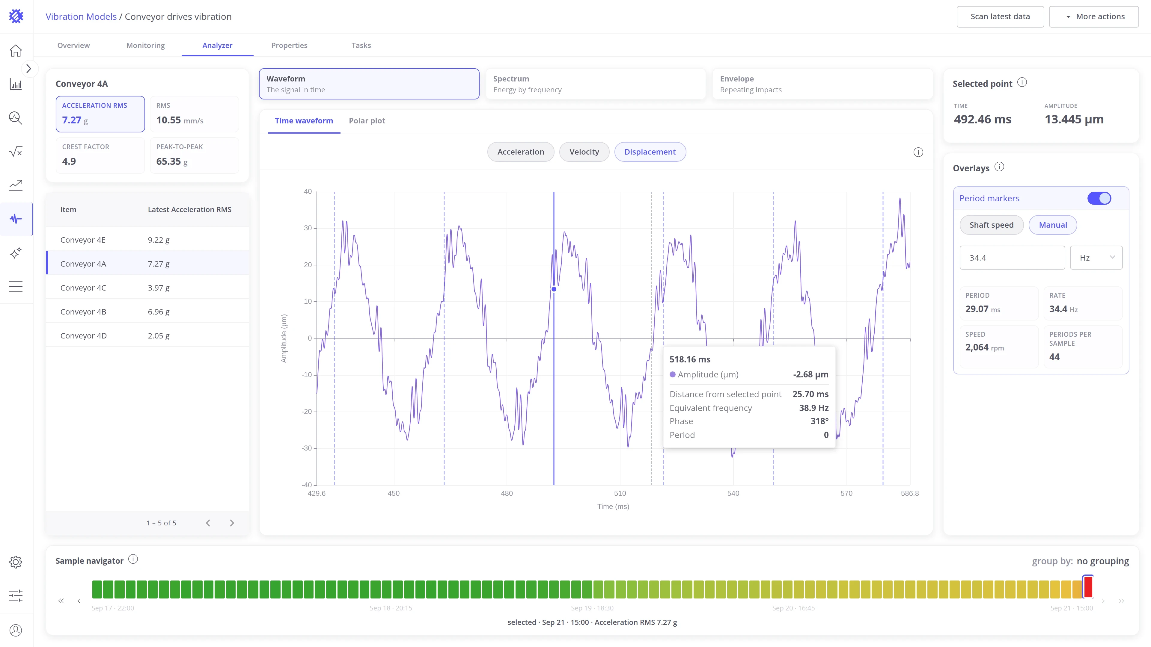
With period markers on, the readout adds two rows:
- Phase: the angle of the hovered point within its revolution, from 0° at a marker to 360° at the next.
- Period: how many revolutions the hovered point sits from the selected one, negative when it comes earlier.
Polar plot
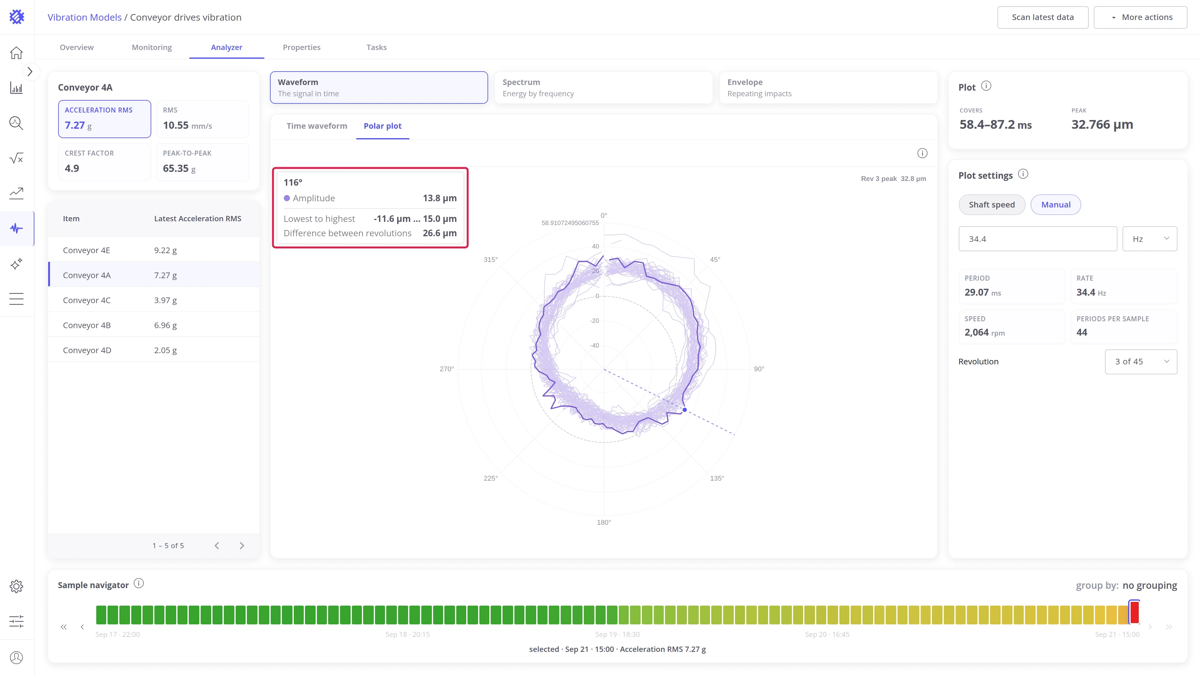
Section titled “Polar plot”The waveform wrapped one shaft revolution per turn, so every revolution becomes a ring. Even rings mean steady vibration. A bulge at one angle that repeats on every ring is a force locked to the shaft, the signature of unbalance. The plot draws displacement. Open it from the Polar plot tab of the panel strip.
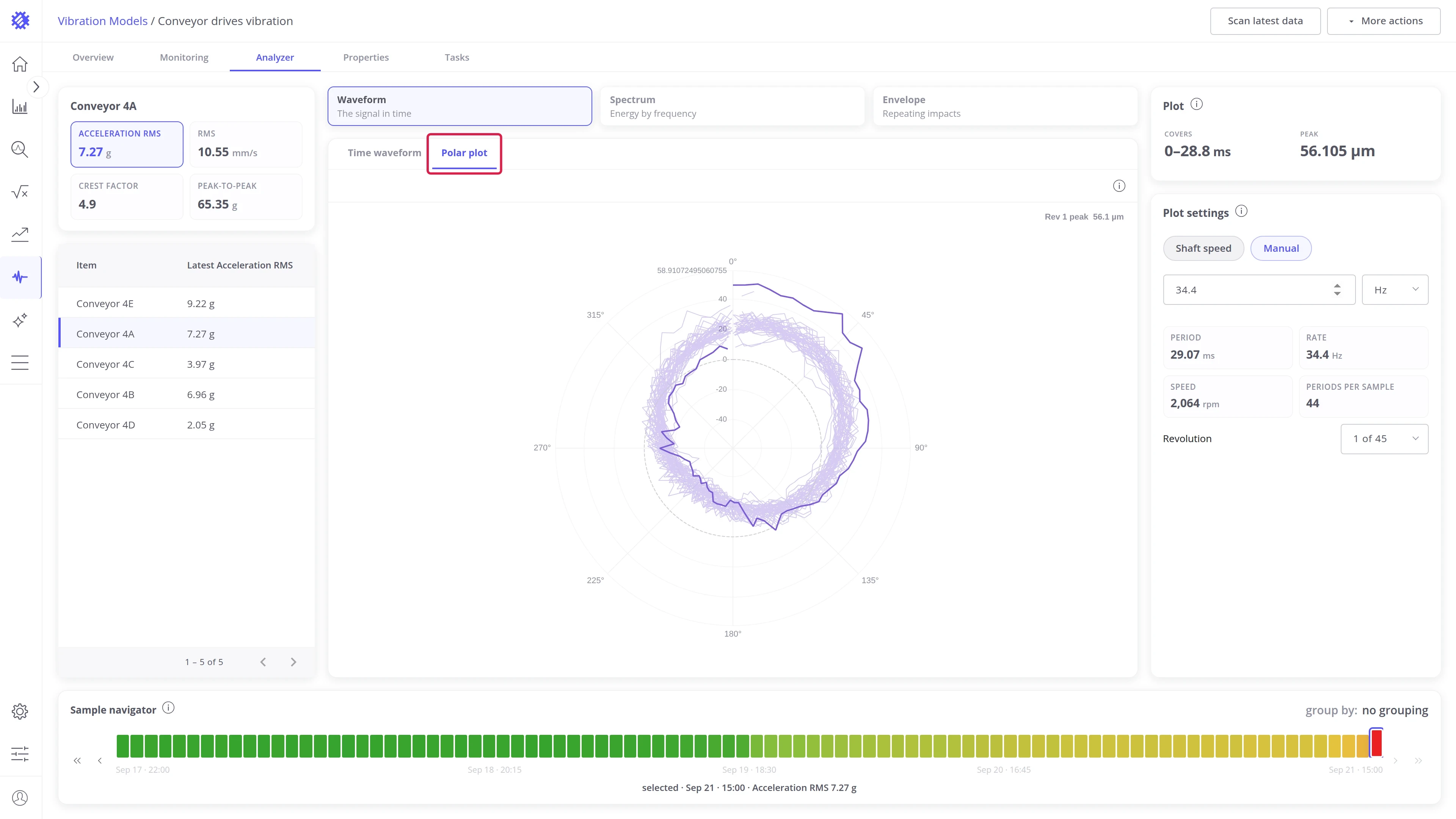
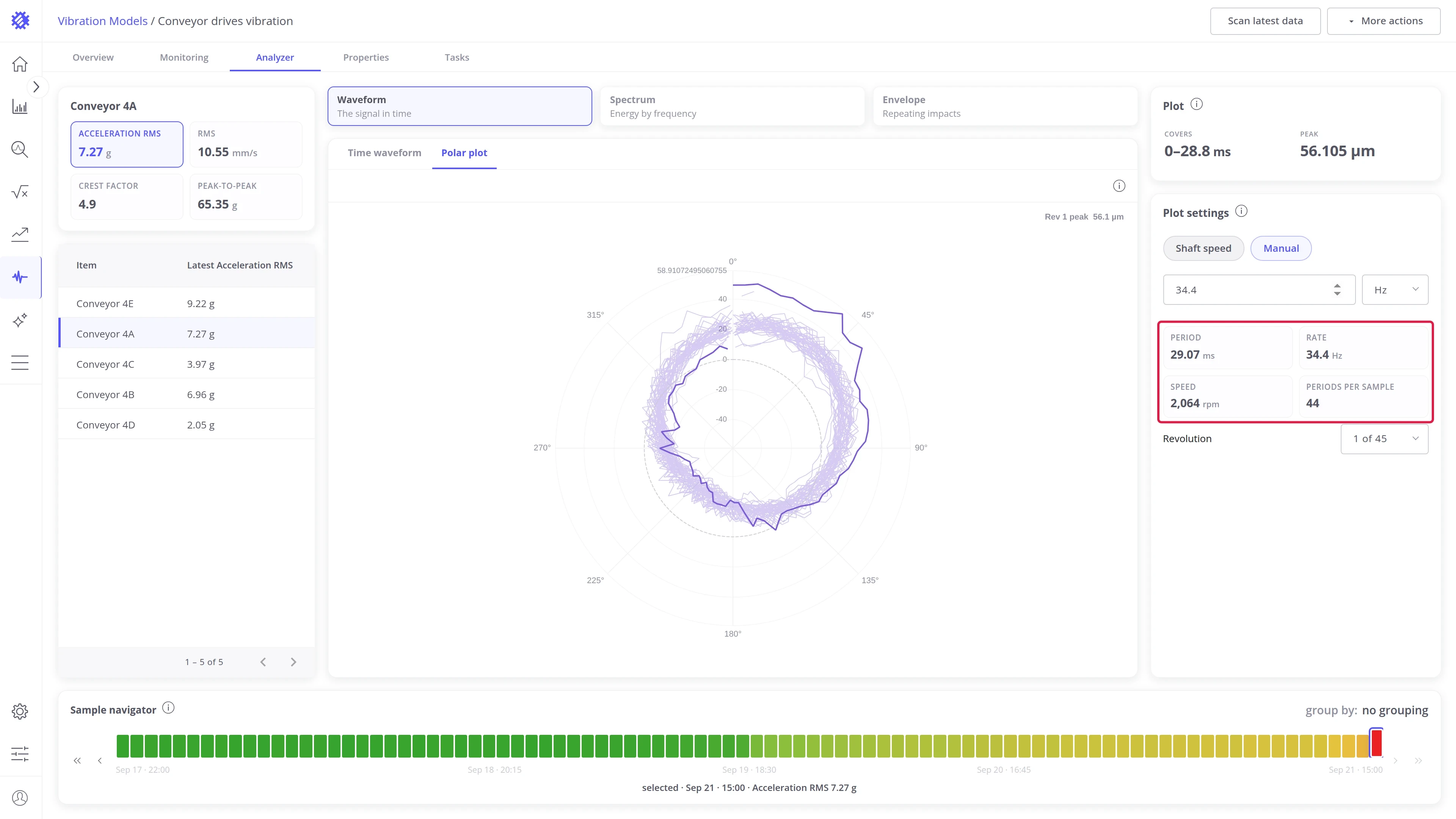
The Plot settings card controls the fold. It shares the period with the period markers of the time waveform.
- Shaft speed takes the period from the model’s speed. Manual takes a value you type in ms, Hz, or rpm. Use it when the model has no speed, or to test whether a pattern repeats at a different rate: fold at the right period and the rings line up, fold at a wrong one and they smear.
- The stats show Period, Rate, Speed, and Periods per sample, so you can check the fold against the machine.
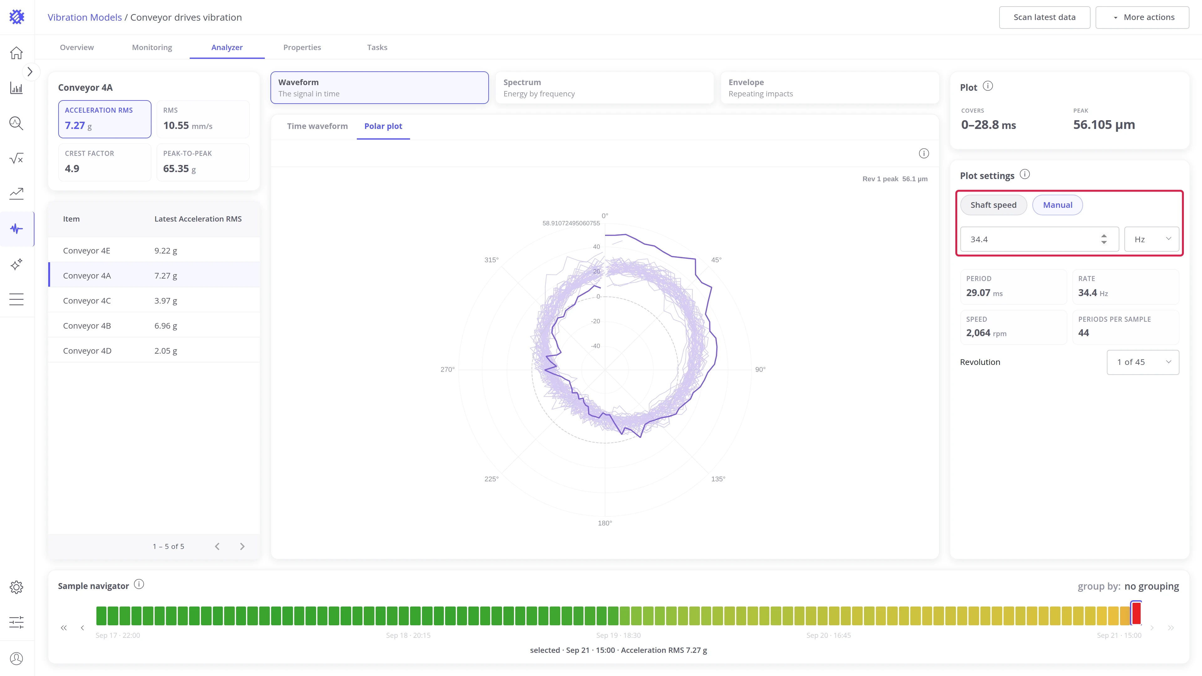
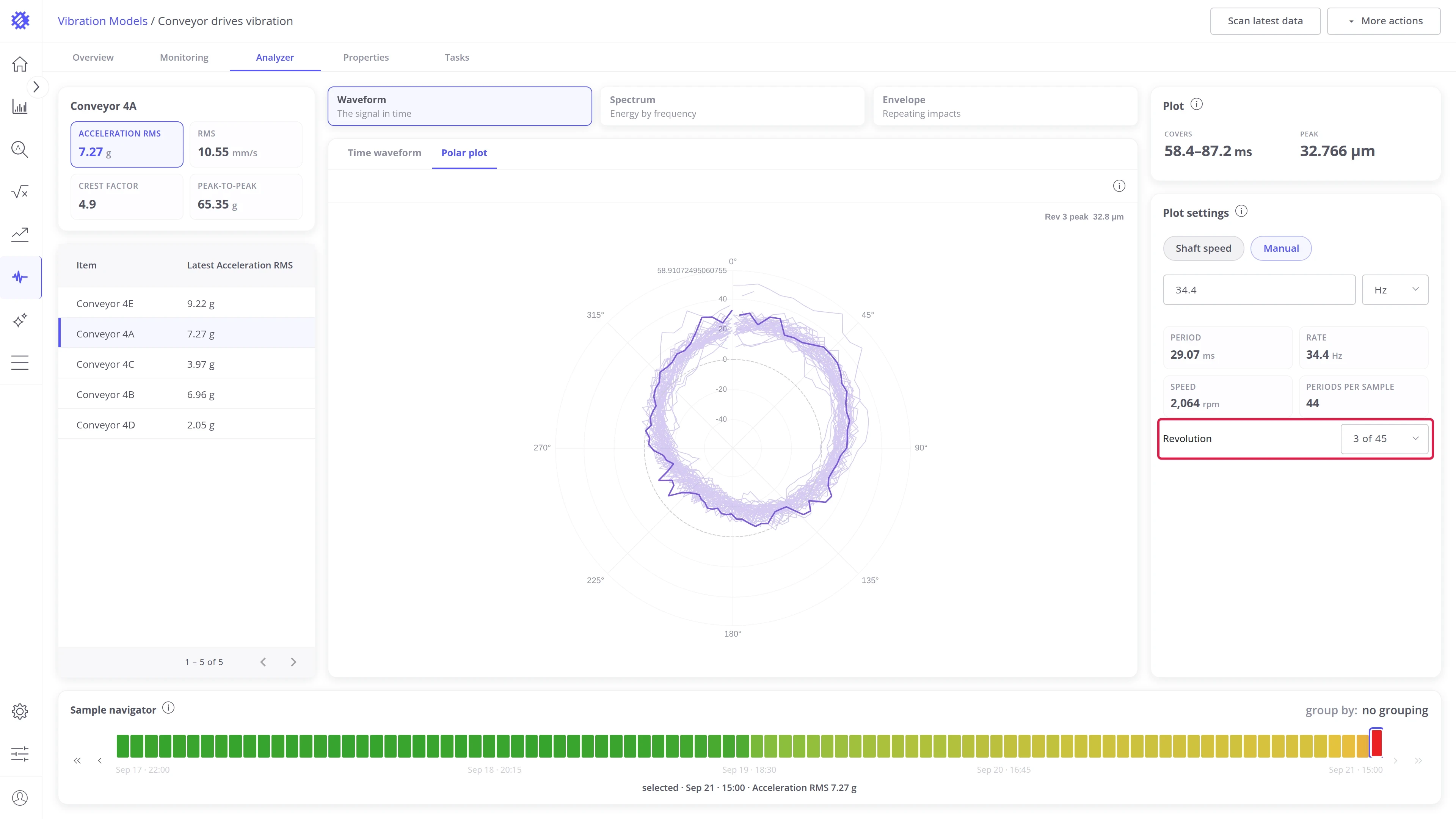
Every faint ring is one revolution of the sample. The bold ring is the selected revolution, and the label in the chart’s corner names it with its peak.
- Revolution in the Plot settings card picks which turn is drawn bold, so you can step through the sample one revolution at a time.
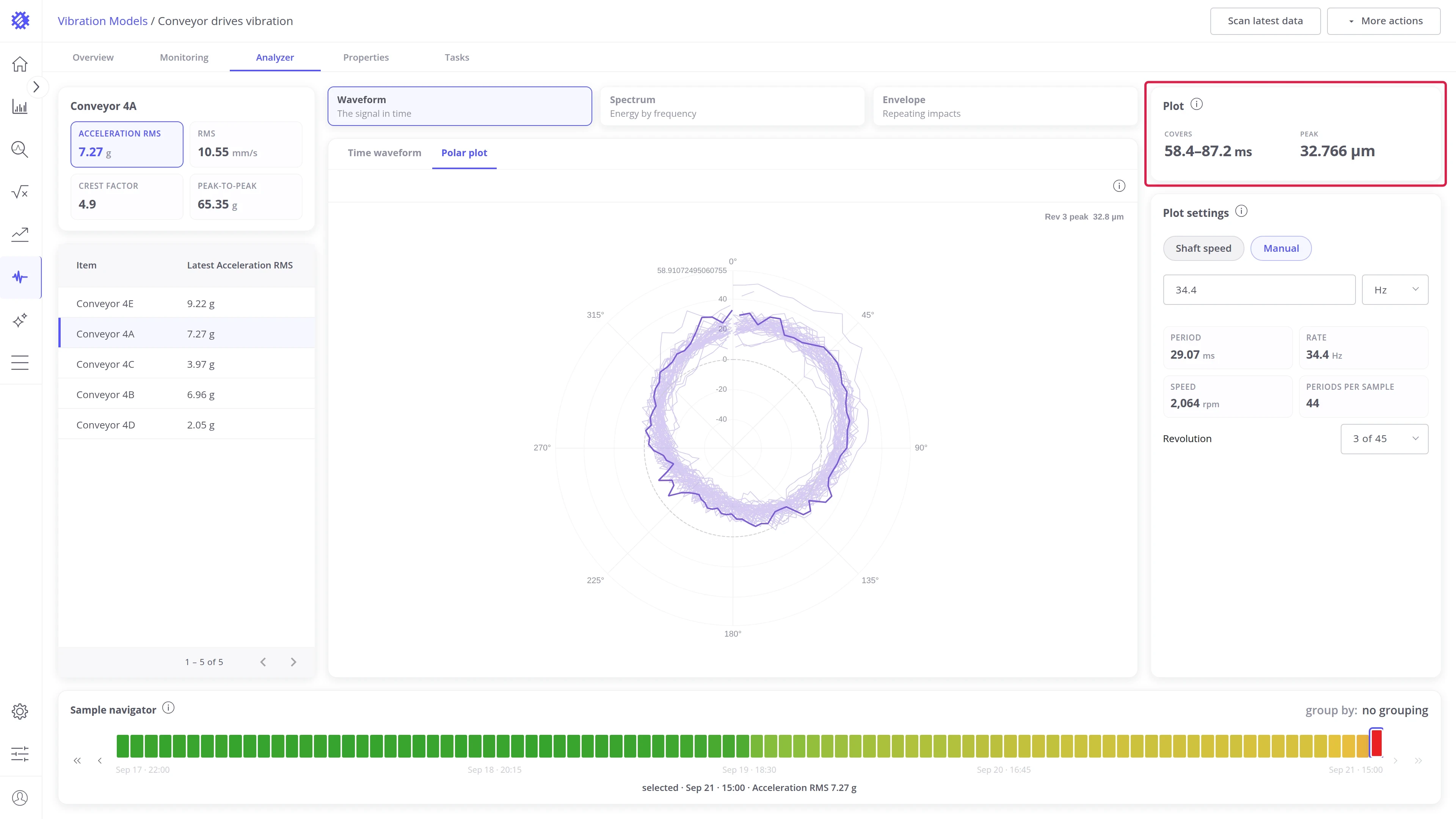
- The Plot card shows Covers, the stretch of the sample folded into the bold ring, and Peak, the highest displacement in the whole plot and the revolution it falls in.
Hovering the plot reads one shaft angle. A dashed spoke marks the angle, a dot marks where it crosses the bold ring, and a card reports what every revolution measures there. The spread across revolutions is the reading the fold exists for: near zero and the vibration repeats every turn, wide and it does not.
- The heading is the angle under the pointer, in degrees from the top of the plot.
- Amplitude: the value of the bold ring at that angle.
- Lowest to highest: the smallest and largest value any revolution reaches at that angle.
- Difference between revolutions: the gap between those two values.
Spectrum view
Section titled “Spectrum view”Spectrum
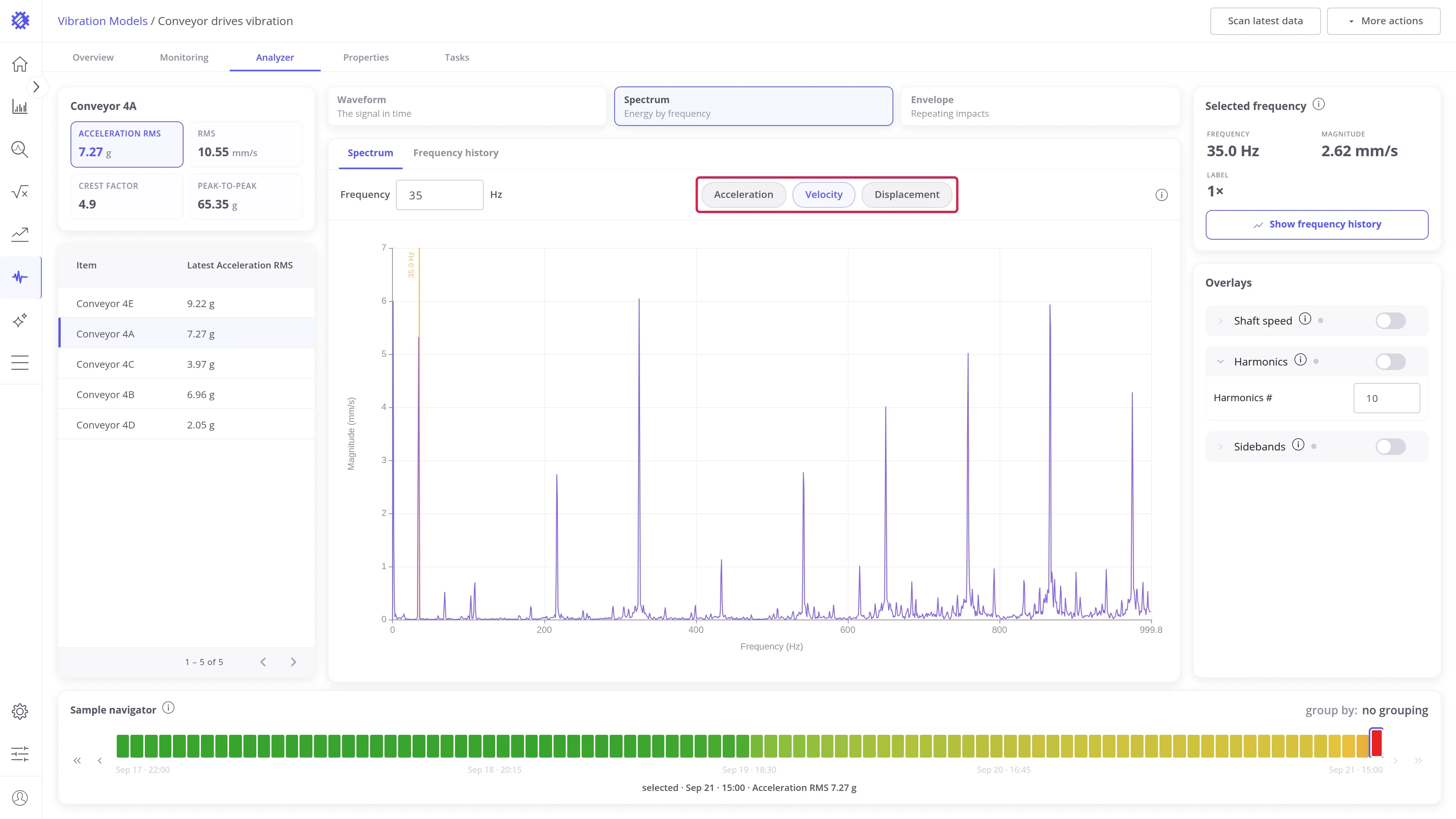
Section titled “Spectrum”The Fast Fourier Transform (FFT) of the sample: amplitude per frequency. This is where you find out which frequencies carry the energy, and whether they belong to the shaft, a gear, or a bearing. Open it from the Spectrum tab of the panel strip.
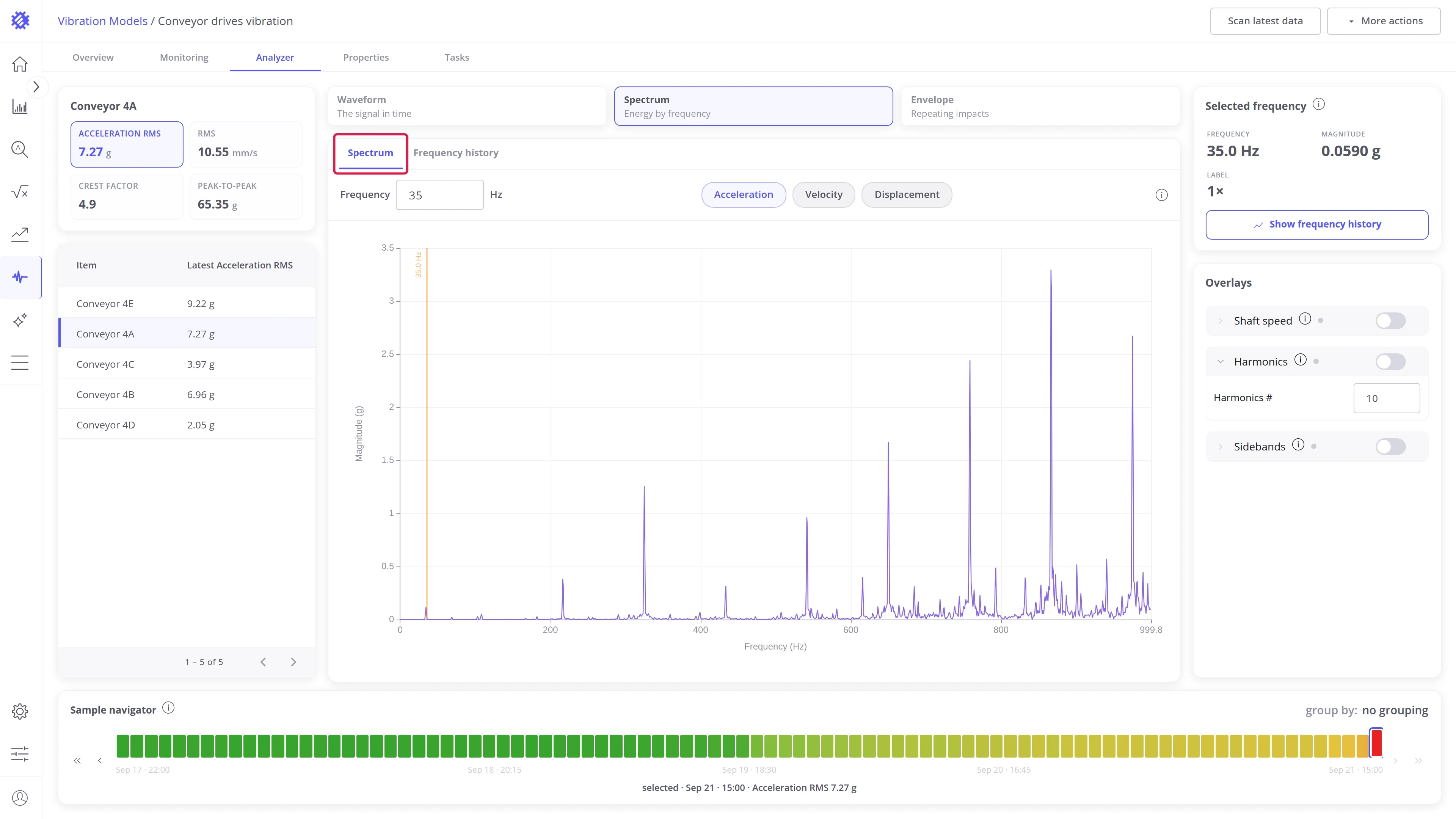
Pick a frequency to read it.
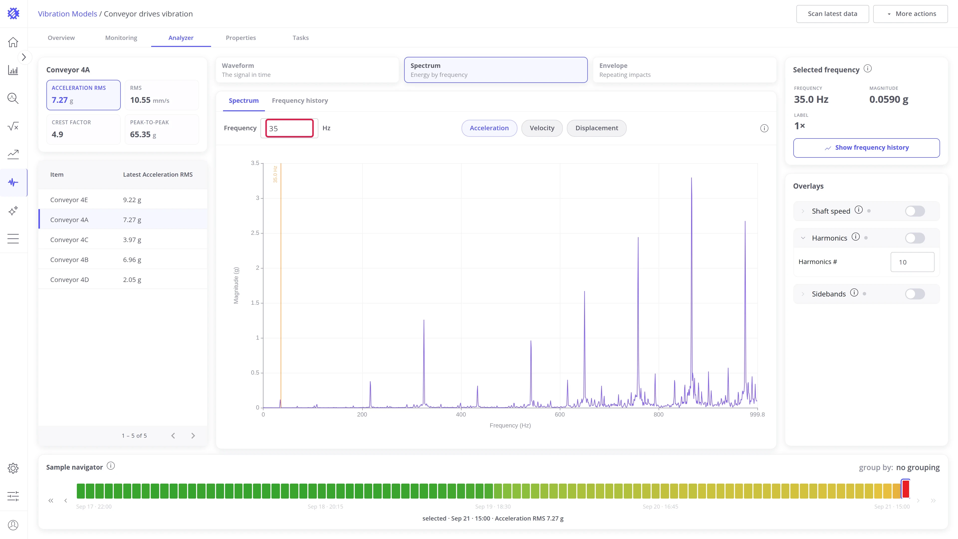
- Click a peak, or type a value into the Frequency field in the toolbar.
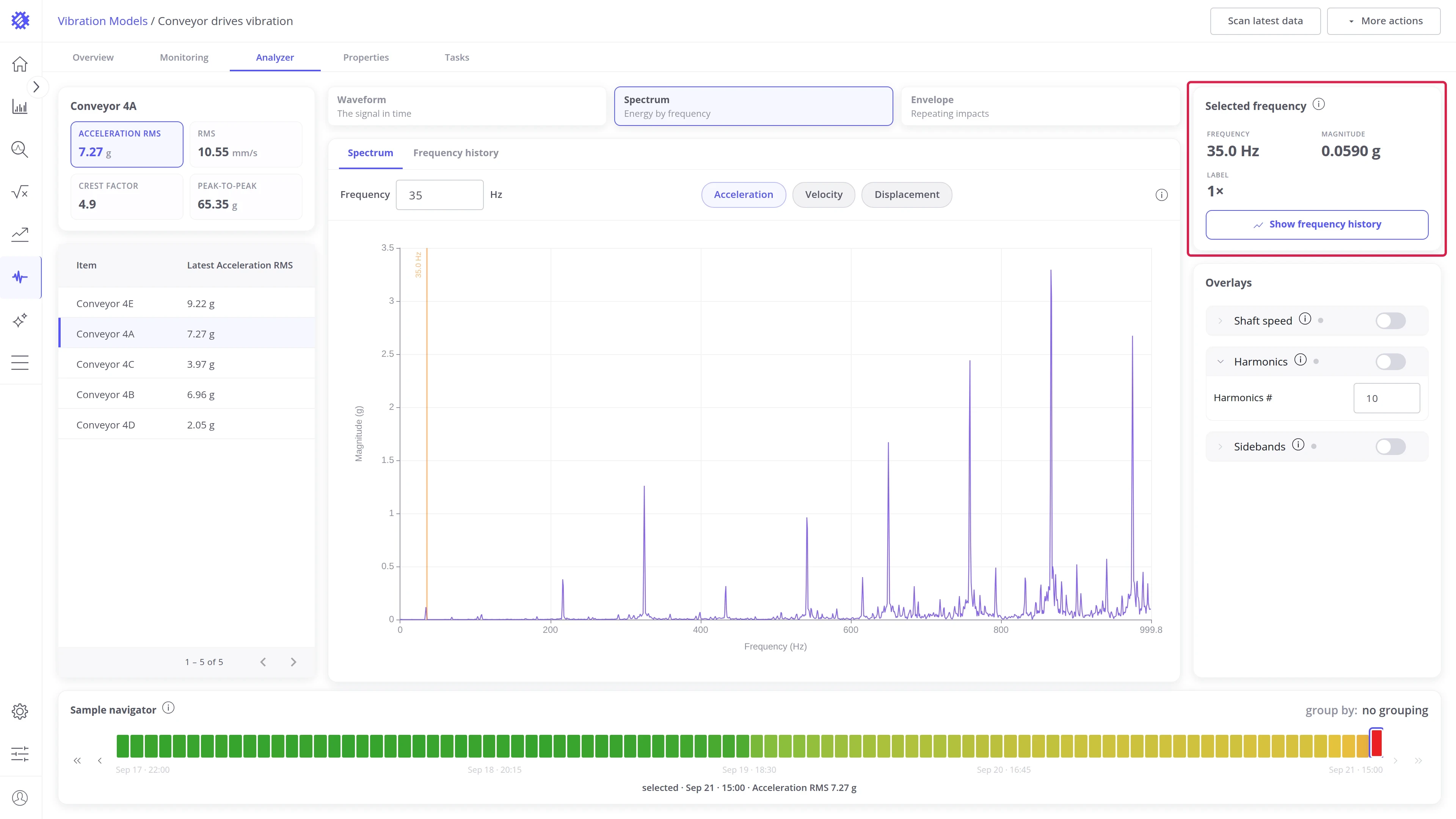
- The Selected frequency card shows Frequency and Magnitude, and a Label when the frequency sits within 1% of a known line: 1×, 2×, or a bearing fault frequency. Show frequency history opens the Frequency history panel on that frequency.
Change what the spectrum shows.
- The Acceleration, Velocity, and Displacement chips convert the spectrum on the fly.
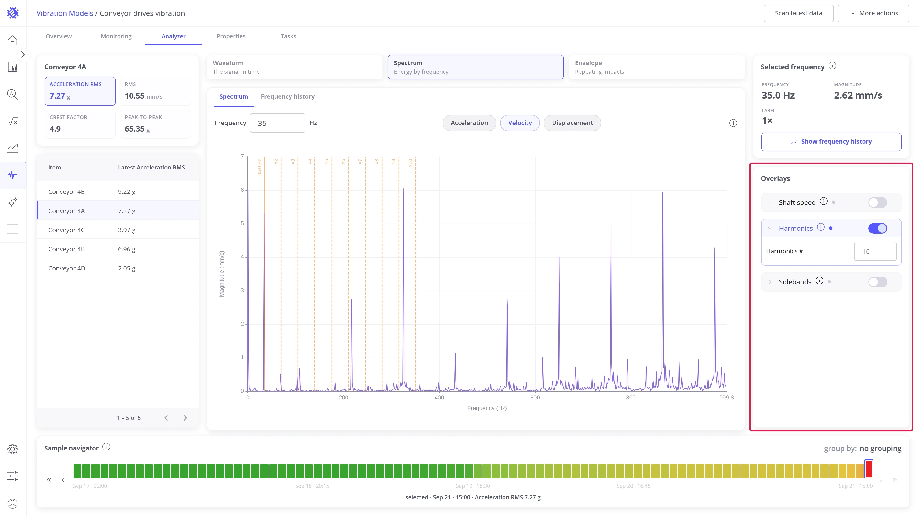
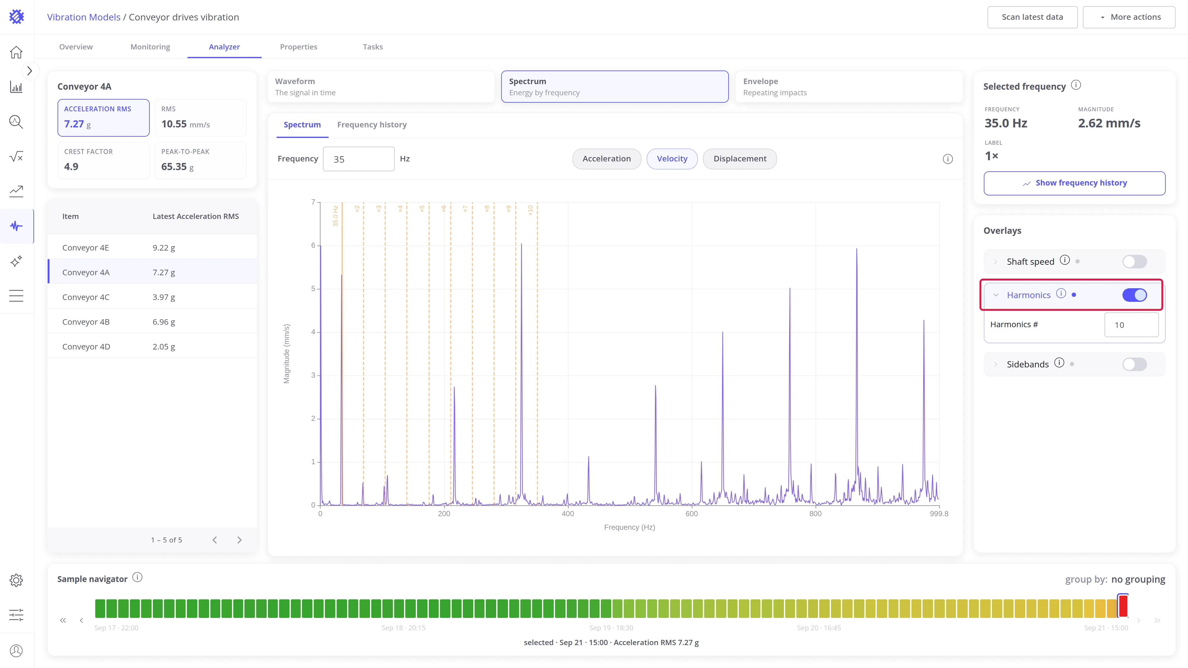
- The Overlays card marks known frequencies on the spectrum. With Harmonics on, the selected frequency and its whole multiples are drawn, so a pattern of 1×, 2×, 3× reads at a glance. All overlays are listed under Overlays.
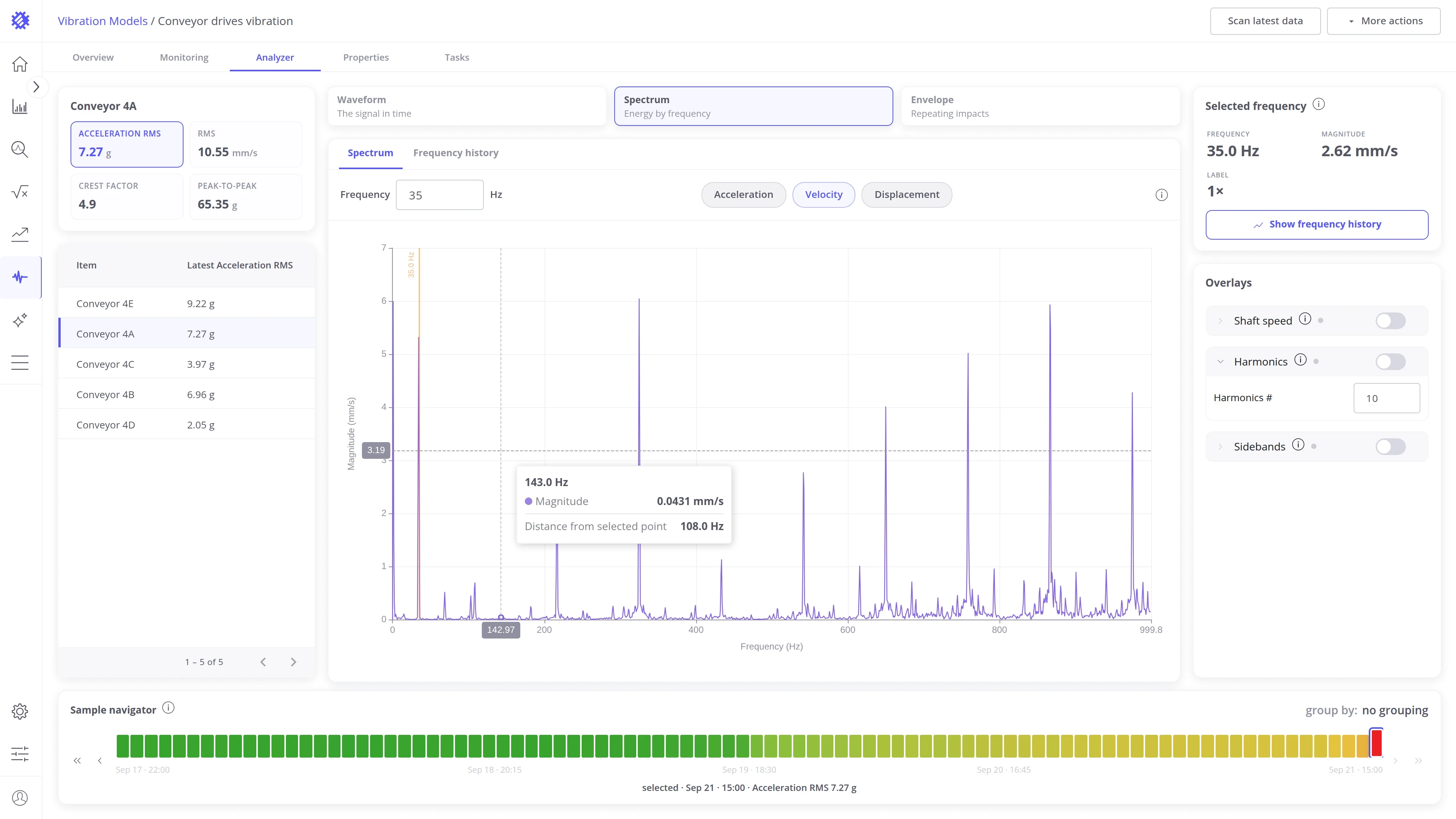
Hovering the spectrum reads one frequency against the selected one.
- The heading is the frequency under the pointer.
- Magnitude: the spectrum’s amplitude there, in the current quantity.
- Distance from selected point: the gap in Hz between the hovered frequency and the selected one, so the spacing of two peaks, or of a sideband from its carrier, reads directly.
Frequency history
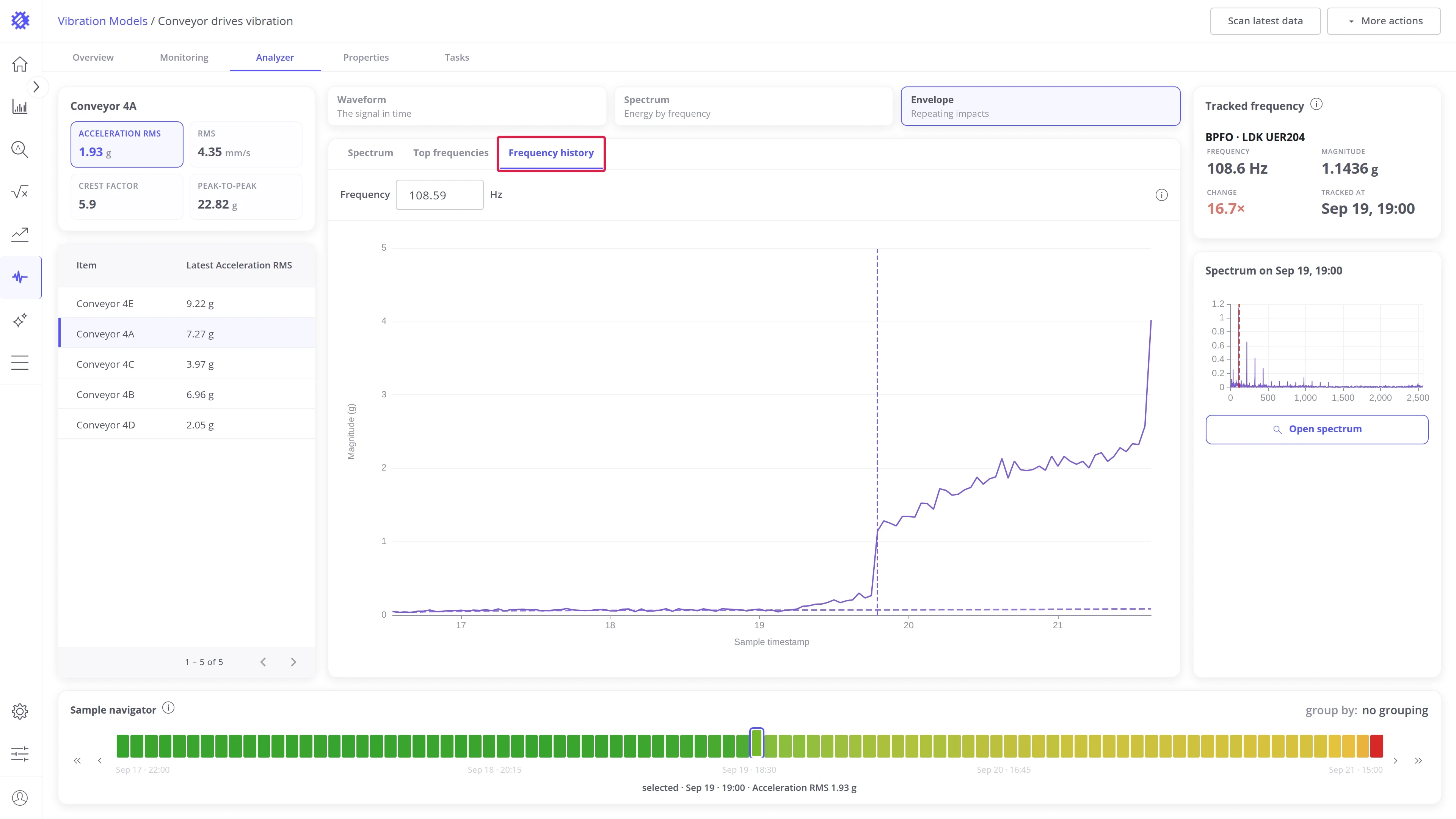
Section titled “Frequency history”The magnitude within 5% of the tracked frequency in every sample of the window, as a trend. This answers the question the spectrum cannot: since when, and how fast. Open it from the Frequency history tab, or from Show frequency history on the Selected frequency card.
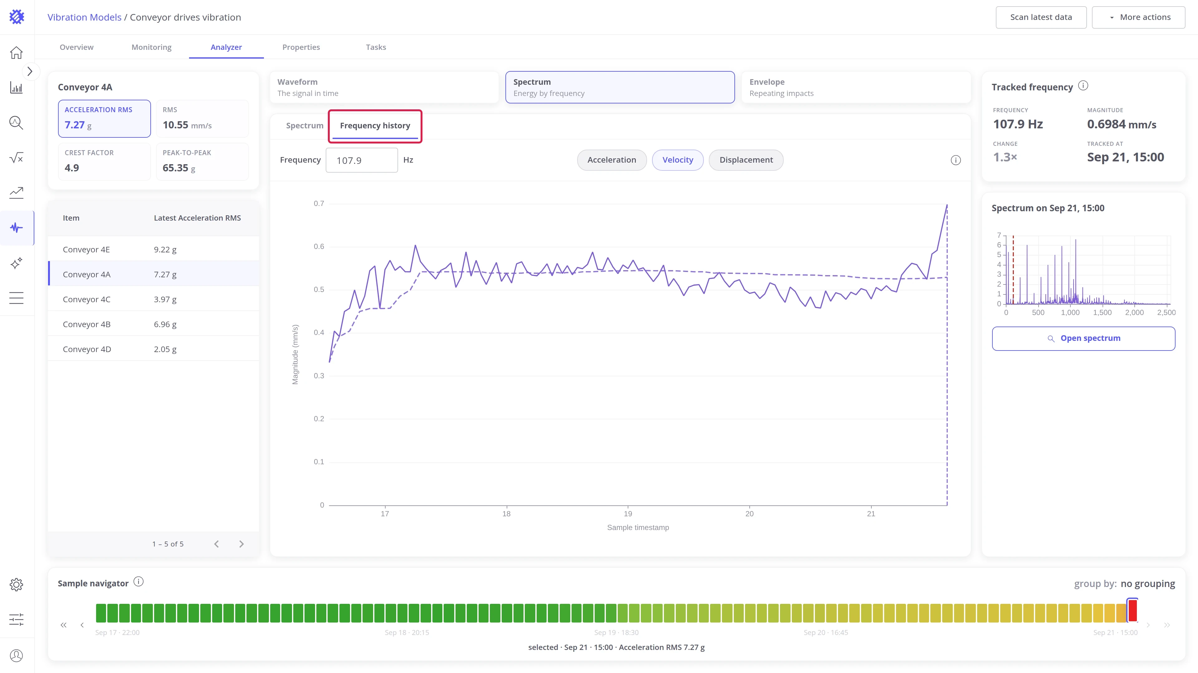
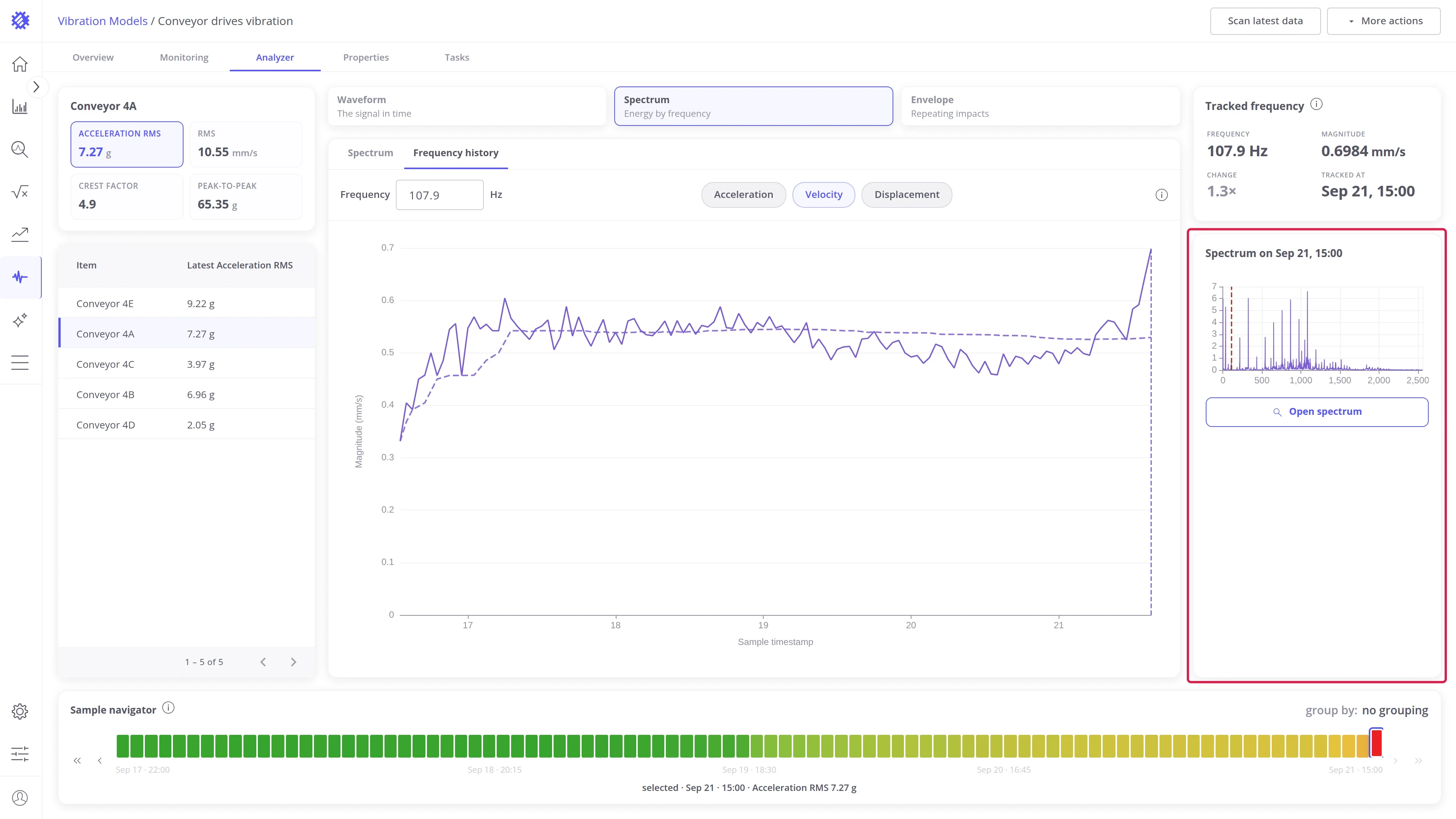
Two cards describe the tracked line and the selected sample.
- The Tracked frequency card shows Frequency, Magnitude at the selected sample, Change against the median, and Tracked at, the selected sample’s time.
- The Spectrum card shows a small spectrum of the selected sample with the tracked frequency marked, and an Open spectrum button that returns to the Spectrum panel on that sample.
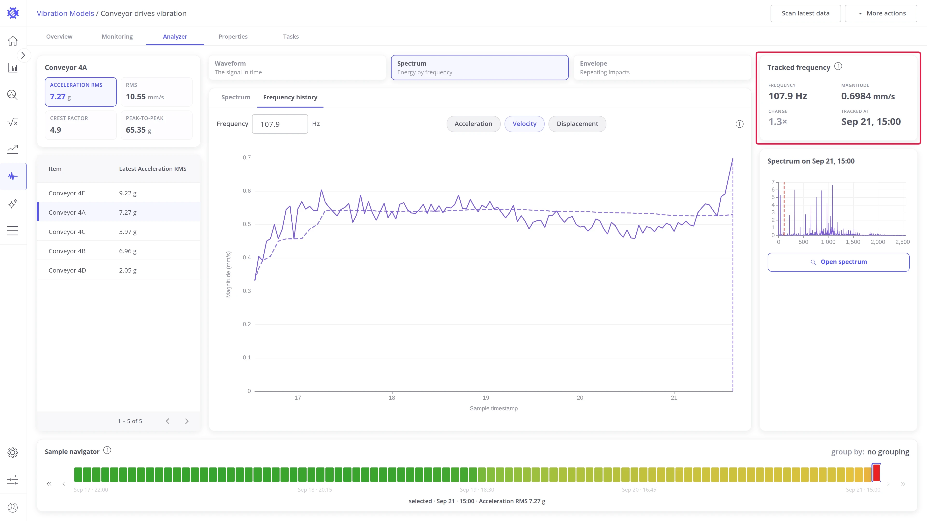
Hovering the trend shows one sample: its timestamp, the line’s magnitude there, and the change against the median.
Envelope view
Section titled “Envelope view”Envelope spectrum
Section titled “Envelope spectrum”The spectrum of the impact envelope: how often impacts repeat. This is where bearing faults show, long before they move the overall level. Open it from the Spectrum tab of the panel strip.
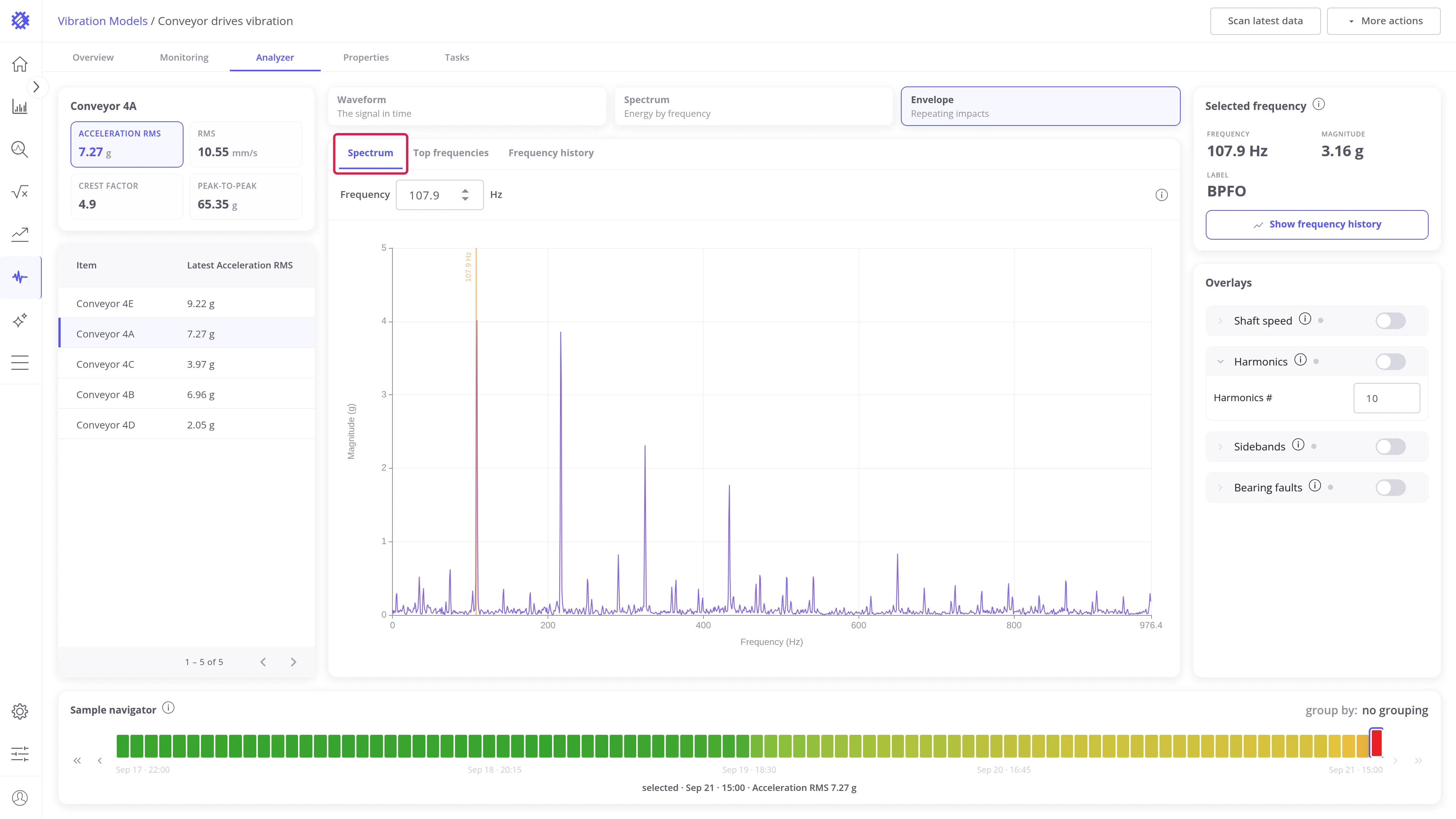
Read a line the way you read the spectrum, and let the overlay name it.
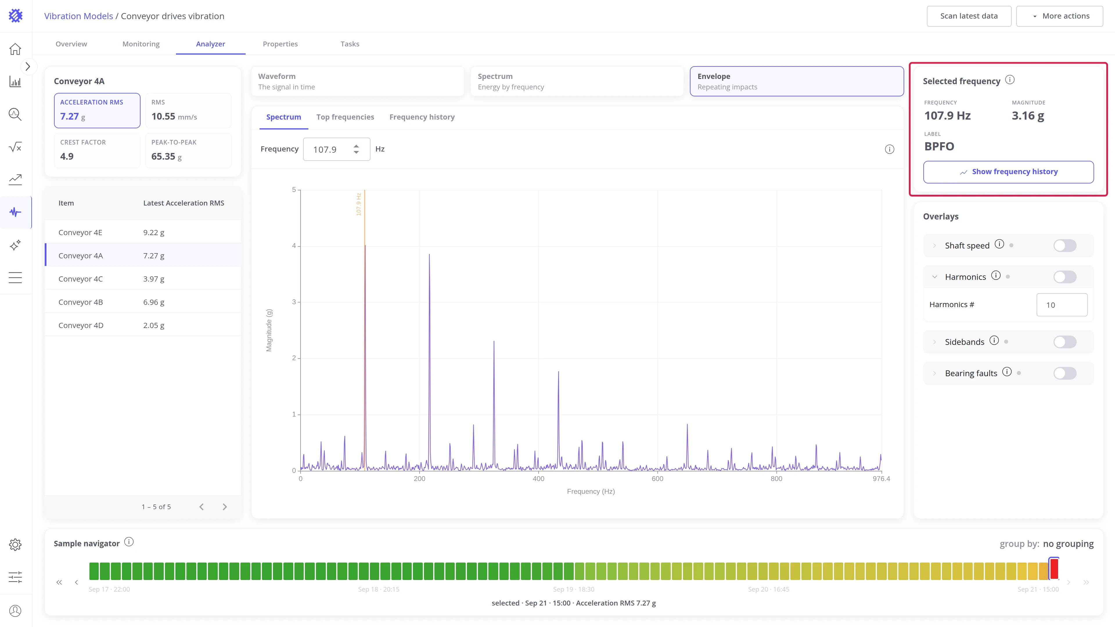
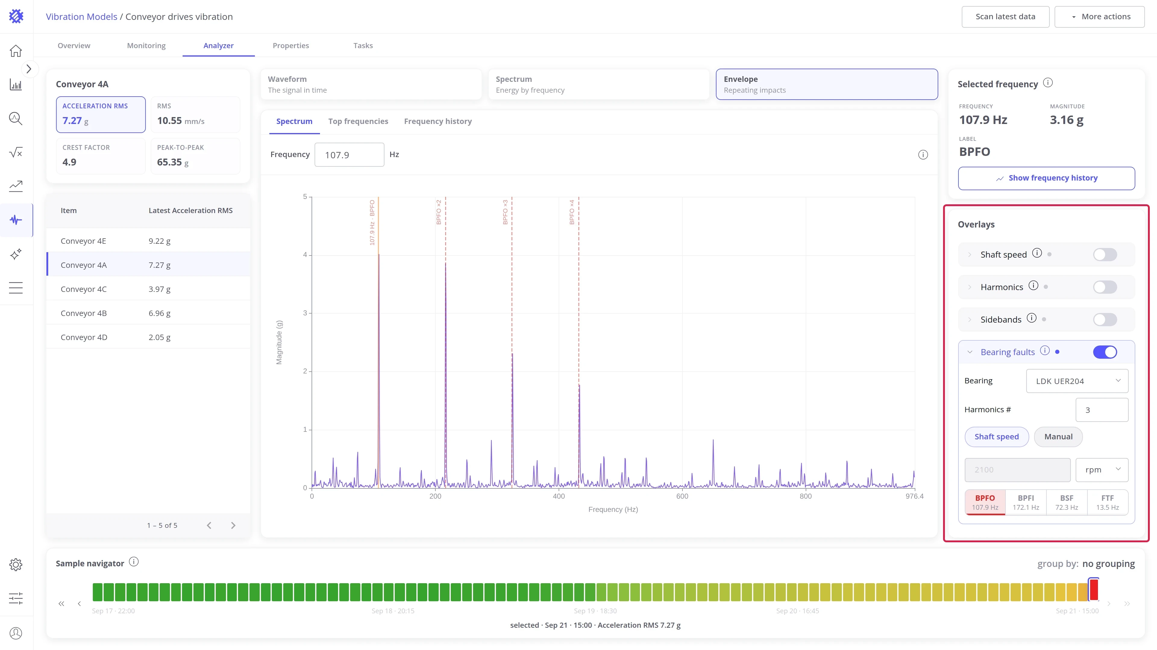
- Click a peak, or type a value into the Frequency field. The Selected frequency card shows Frequency, Magnitude, and a Label when the line belongs to a configured bearing.
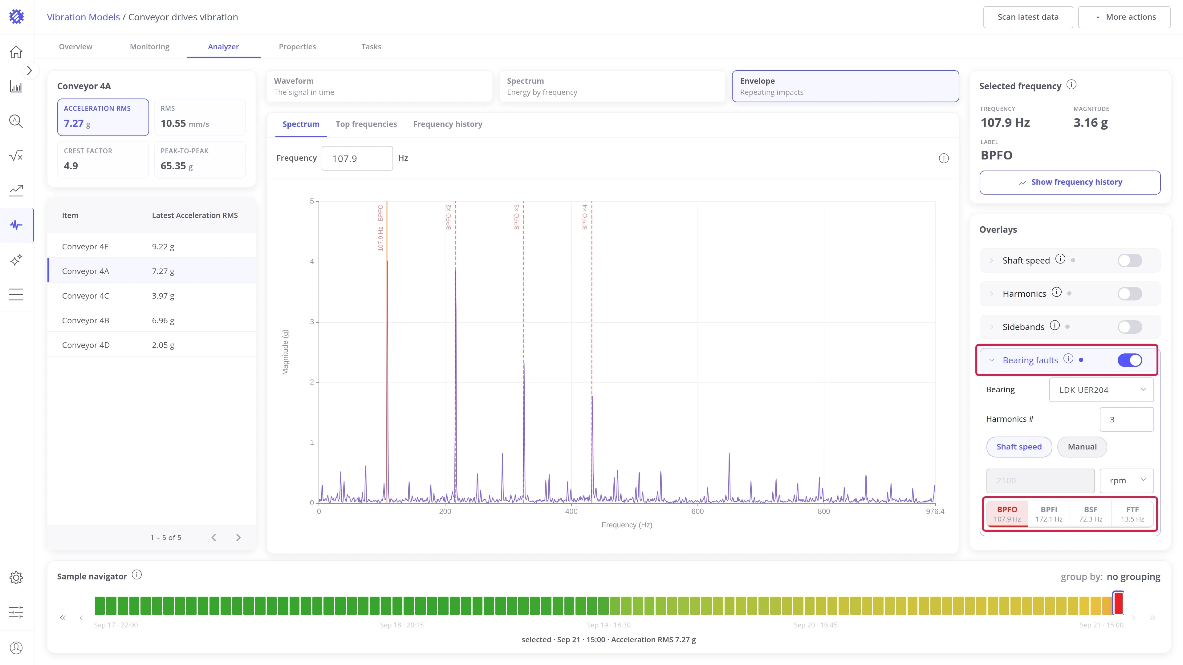
- With bearings and a shaft speed configured, the Bearing faults overlay marks BPFO, BPFI, BSF, and FTF of the selected bearing, each with its harmonics. The overlay’s settings are described under Overlays.
The envelope is always an acceleration measure, so the quantity chips do not apply here.
Top frequencies
Section titled “Top frequencies”The strongest envelope lines of each sample, tracked across the window, one trend line per frequency. It shows which lines dominate and how each one develops without picking a frequency first. Open it from the Top frequencies tab of the panel strip.
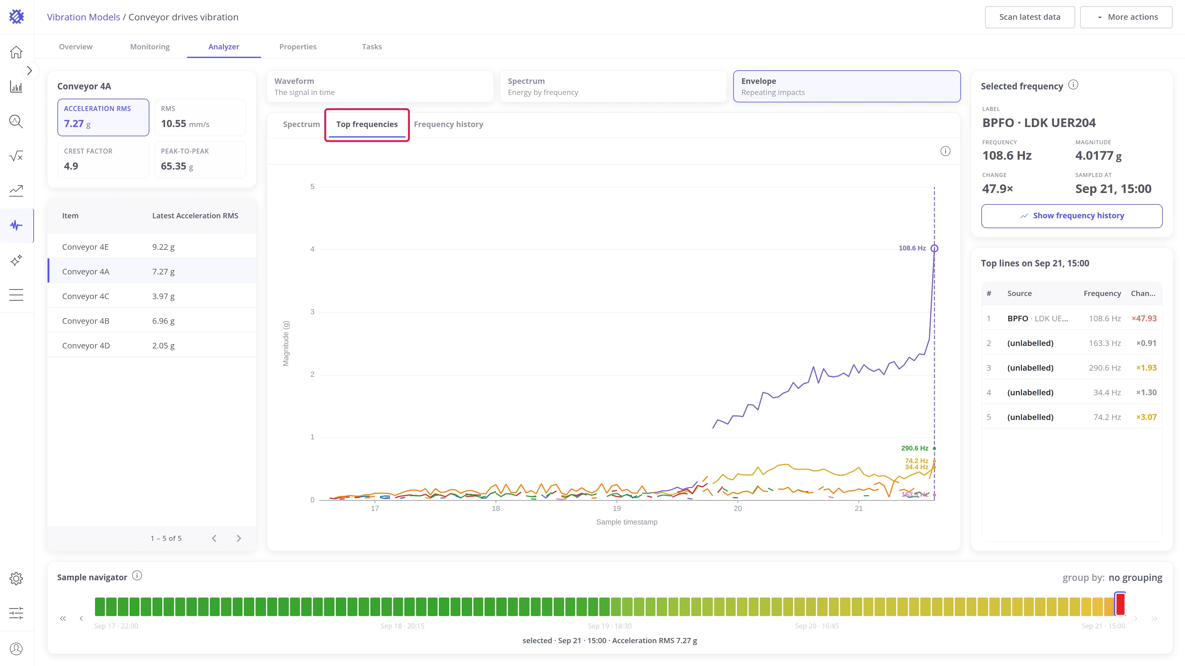
Read a line from the chart or from the table.
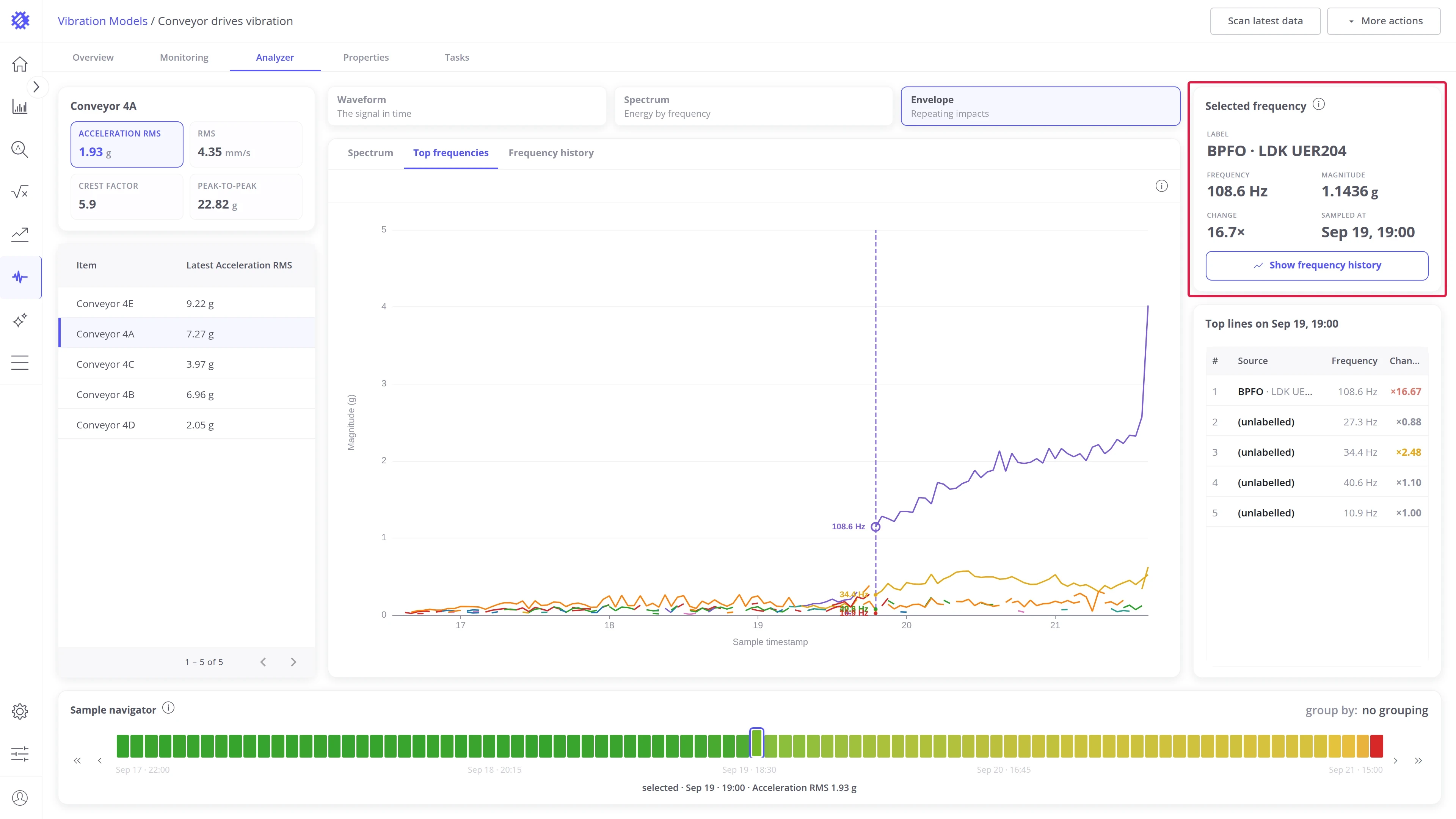
- Click a point on the chart. The Selected frequency card shows what that line is (Label, for example BPFO), its Frequency and Magnitude, how many times it has grown against its median (Change), and when the sample was taken (Sampled at).
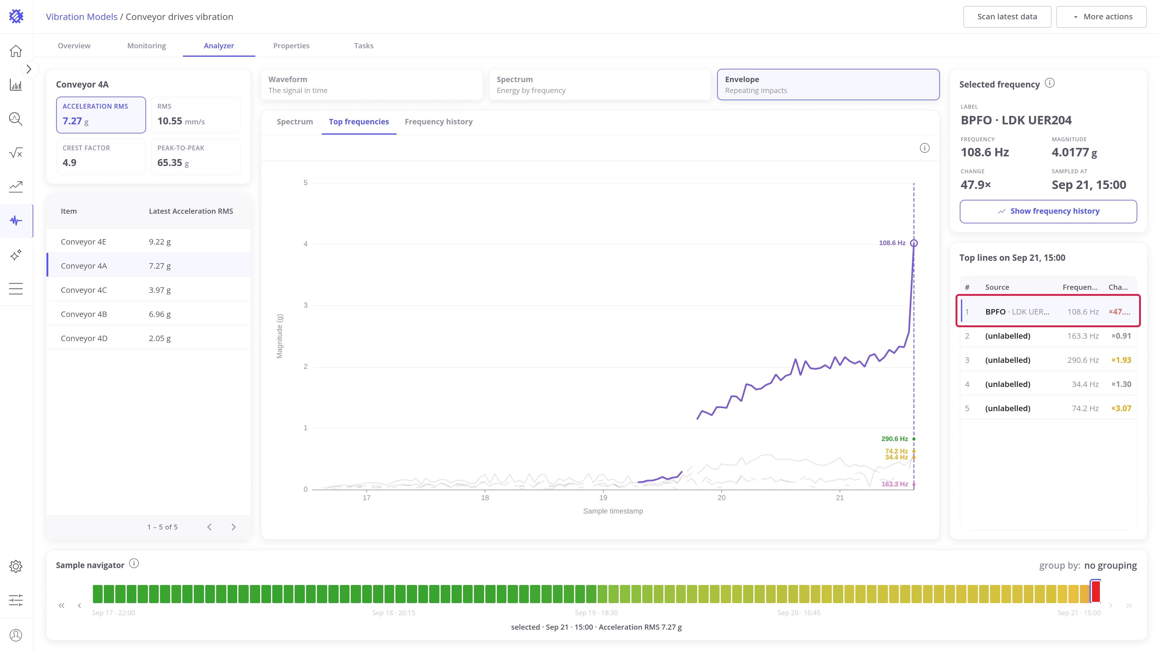
- The Top lines table lists the strongest lines of the selected sample: what each one is (Source), its Frequency, and its Change. Click a row to highlight that line on the chart and fade the others. Click the row again to show all lines.
Frequency history
Section titled “Frequency history”The same tracking as in the Spectrum view’s Frequency history, applied to the envelope spectrum.
Display units
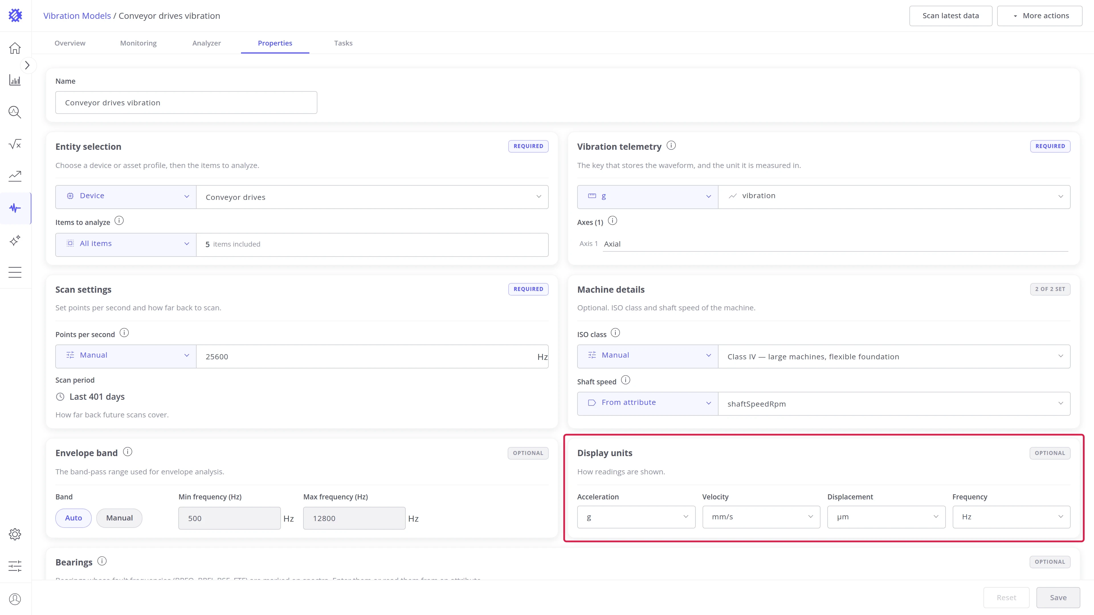
Section titled “Display units”The units of every chart, card, and readout in the Analyzer, and whether frequency reads in Hz or RPM, are set in the Display units card on the model’s Properties tab. See Display units for the options.
Overlays
Section titled “Overlays”The Overlays card draws lines where known frequencies should be. A peak on a line matches that frequency.
- Turn on: the switch on the overlay’s row.
- Settings: click the row to expand them.
- Combine: several overlays can be on at once.
Shaft speed
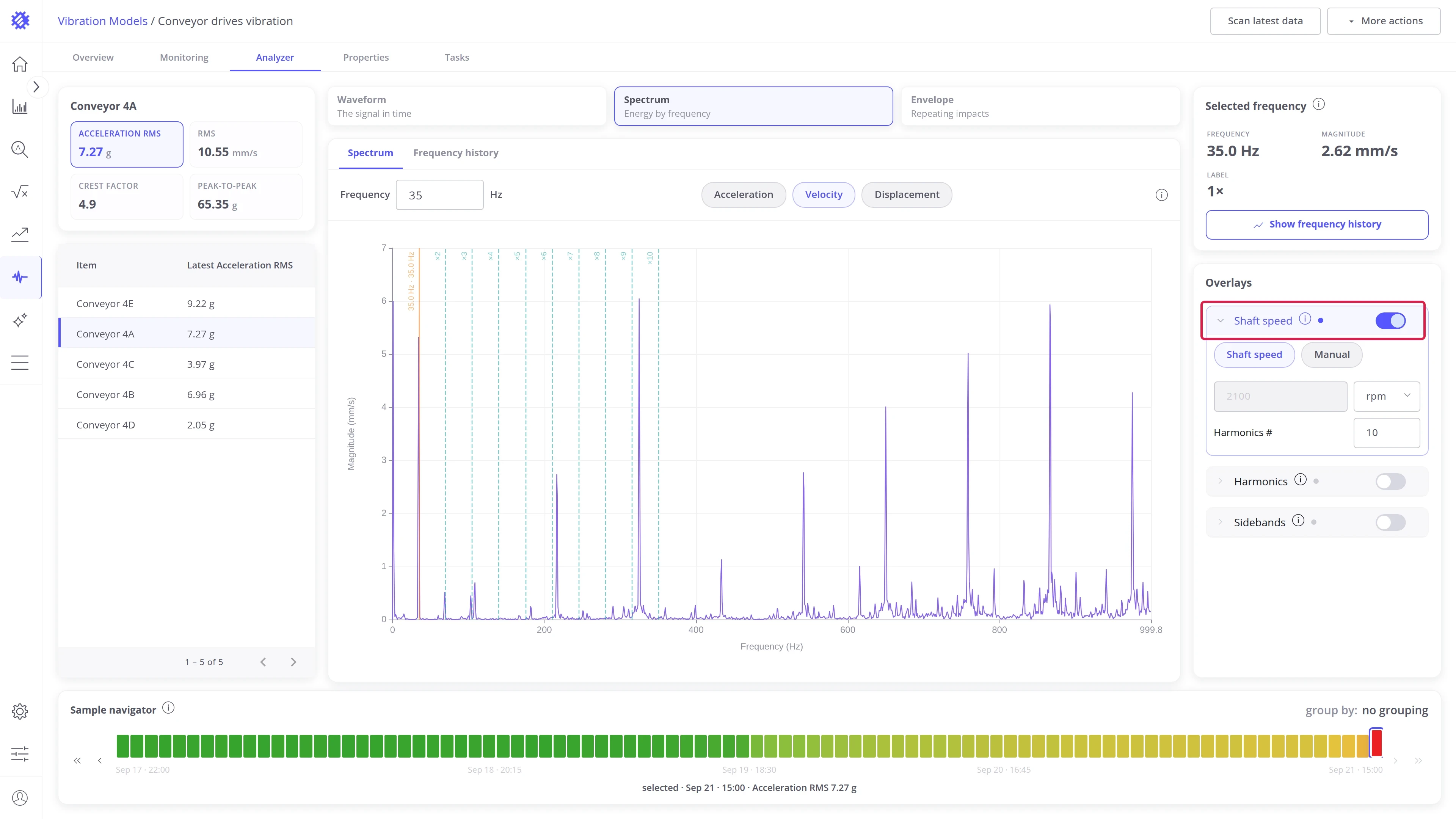
Section titled “Shaft speed”Marks the shaft frequency, 1×, and its multiples.
| Setting | What it does |
|---|---|
| Shaft speed | Uses the speed saved on the model |
| Manual | Uses a speed you type, in ms, Hz, or rpm |
| Harmonics # | Number of multiples to draw |
How to read it: turn this on first. If the marks miss the peaks, the model’s shaft speed is wrong.
Harmonics
Section titled “Harmonics”Marks multiples of the selected frequency. Click a peak or type into the Frequency field to select it.
| Setting | What it does |
|---|---|
| Harmonics # | Number of multiples to draw |
How to read it: peaks on 2×, 3×, and higher point to misalignment or looseness. A single peak on 1× points to unbalance. More patterns are in fault signatures.
Sidebands
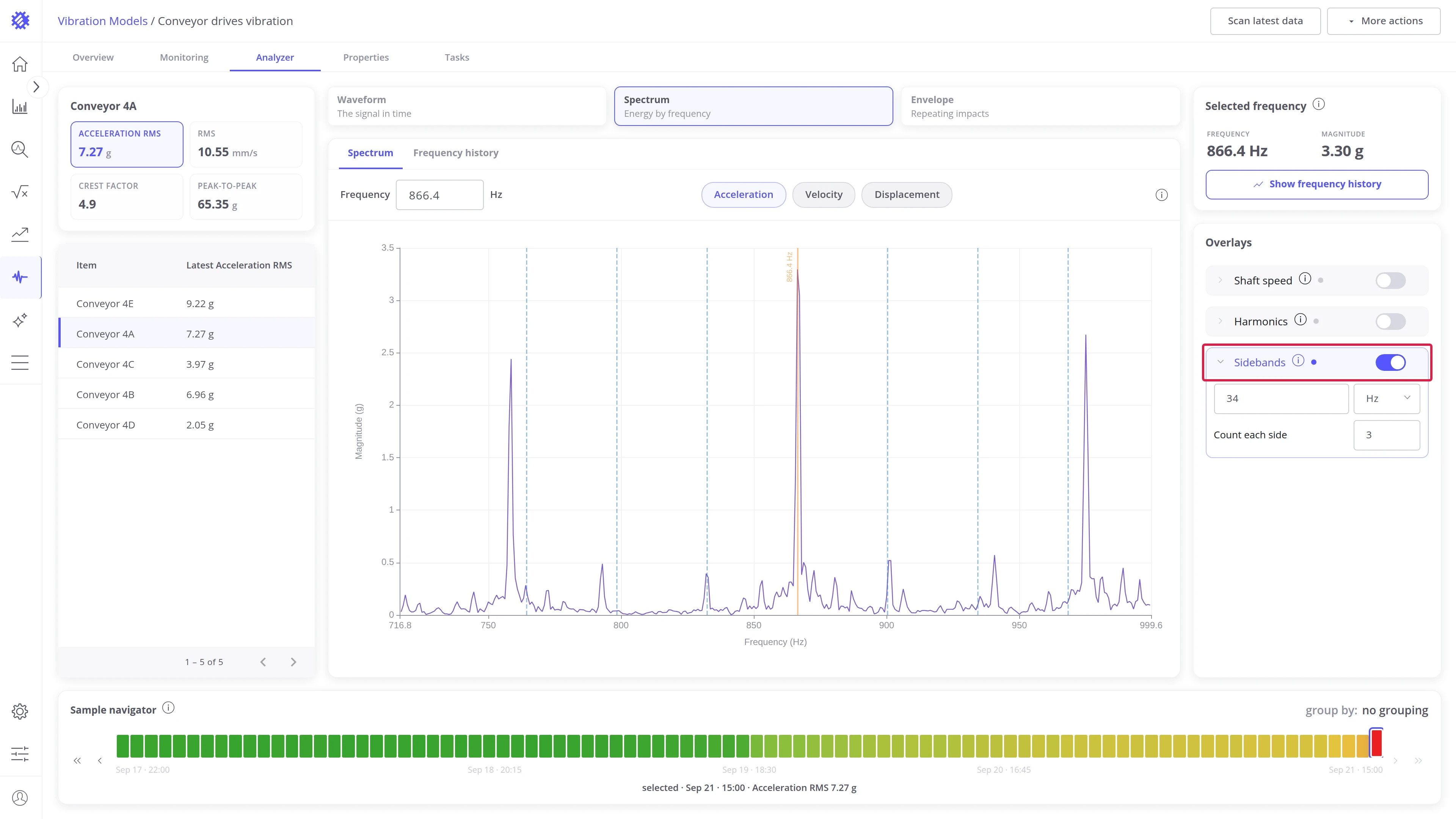
Section titled “Sidebands”Marks lines at equal steps on both sides of the selected frequency.
| Setting | What it does |
|---|---|
| Spacing | Step between the lines, in Hz or RPM |
| Count each side | Number of lines on each side |
How to read it: select the carrier peak and set Spacing to the frequency you suspect modulates it. If the marks land on the neighboring peaks, that frequency is modulating the carrier.
Example: the carrier is 866 Hz and the spacing is 34 Hz shaft speed. The first pair of marks, at 832 Hz and 900 Hz, lands on peaks, which points to modulation at shaft speed. The outer marks fall between peaks.
Bearing faults
Section titled “Bearing faults”Marks the four fault frequencies of a configured bearing at the current speed. Use it in the Envelope view, where bearing damage shows first.
| Line | Stands for | A peak on it means |
|---|---|---|
| BPFO | Ball pass frequency, outer race | A defect on the outer race, the most common bearing failure |
| BPFI | Ball pass frequency, inner race | A defect on the inner race, often with sidebands one shaft speed apart |
| BSF | Ball spin frequency | A damaged rolling element |
| FTF | Fundamental train frequency | A worn or broken cage, the slowest of the four |
Where the numbers come from is explained in Introduction to vibration analysis.
| Setting | What it does |
|---|---|
| Bearing | Which configured bearing to mark |
| Harmonics # | Number of multiples to draw for each fault frequency |
| Shaft speed / Manual | Uses the model’s speed, or a speed you type |
| BPFO, BPFI, BSF, FTF | One button per fault frequency, with its value in Hz. Click a button to show or hide that frequency |
How to read it: show one fault frequency at a time. A peak on its mark, with more peaks on its harmonics, confirms that fault.
Explore other tabs
Section titled “Explore other tabs”Was this helpful?