Lesson 2. Dashboard States & Navigation
Dashboard states enable multi-level navigation within a single dashboard. Each state is a separate view scoped to an entity selected in the previous level. This lesson adds building and office states with drill-down navigation from buildings to offices to devices.
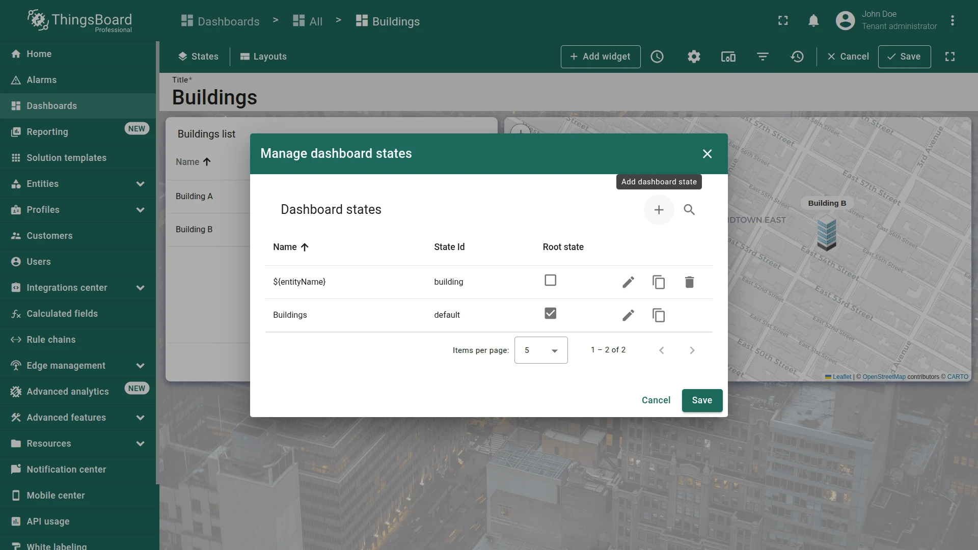
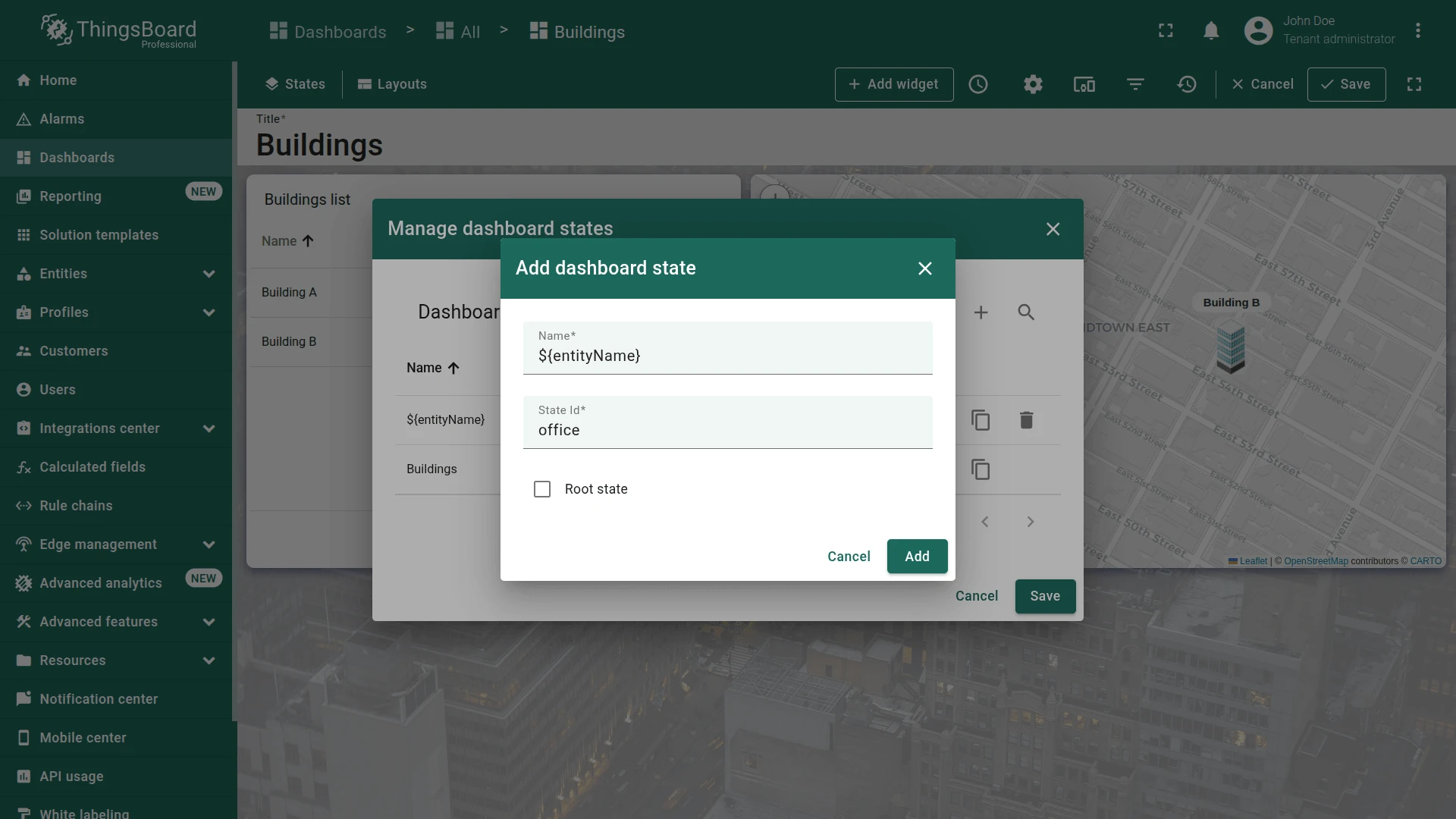
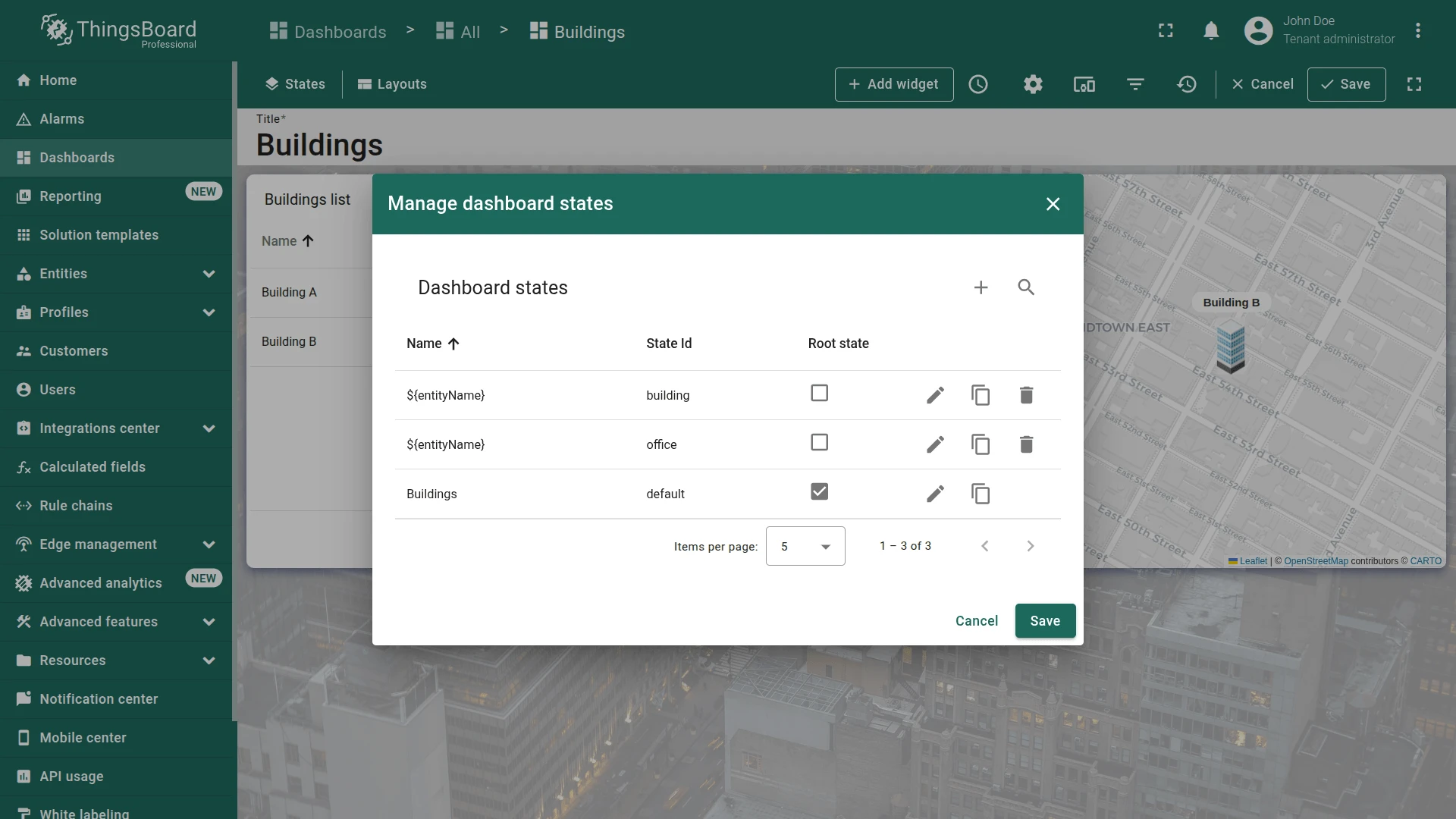
Step 2.1 Add Dashboard States
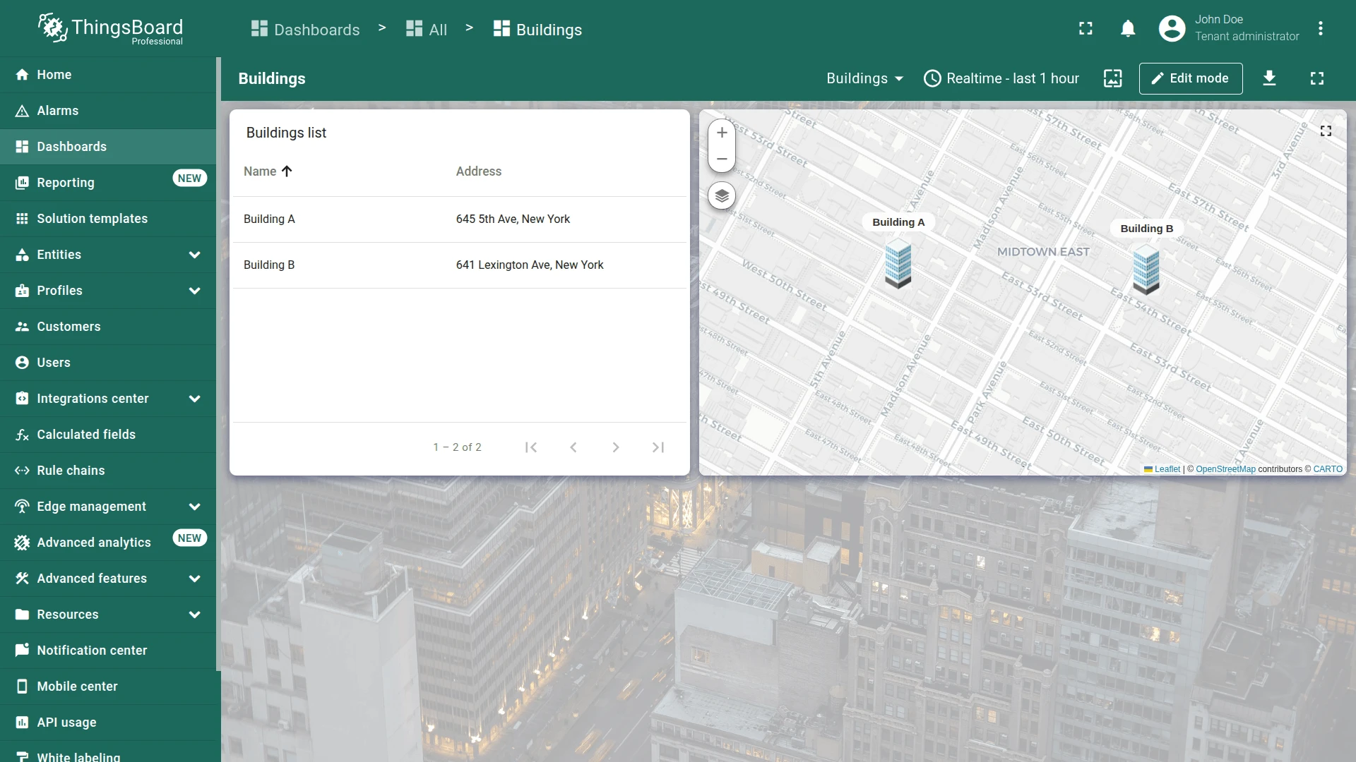
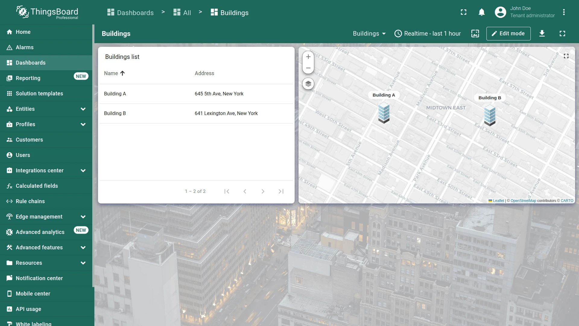
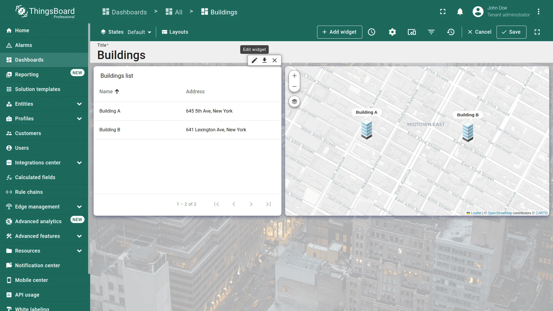
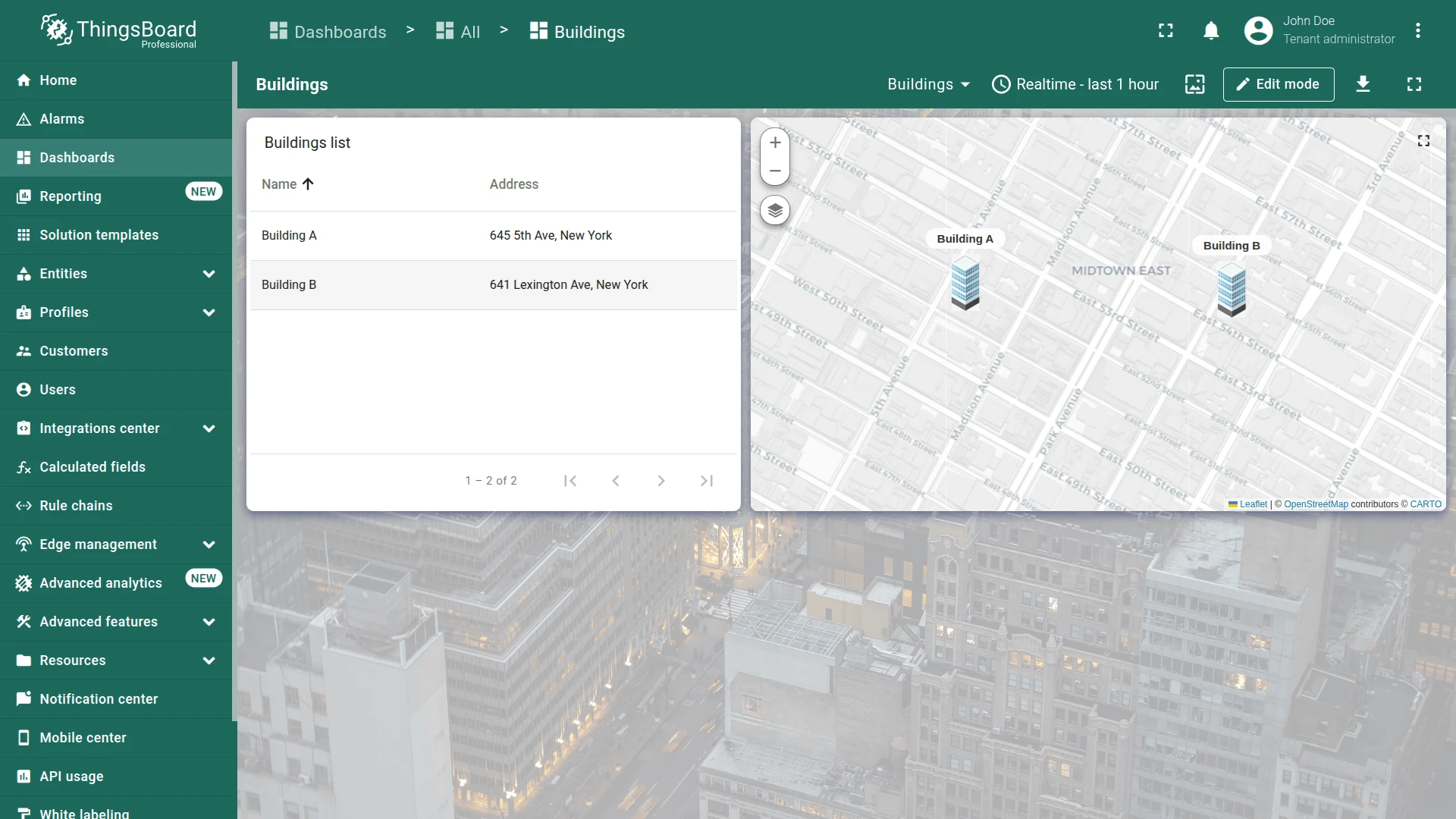
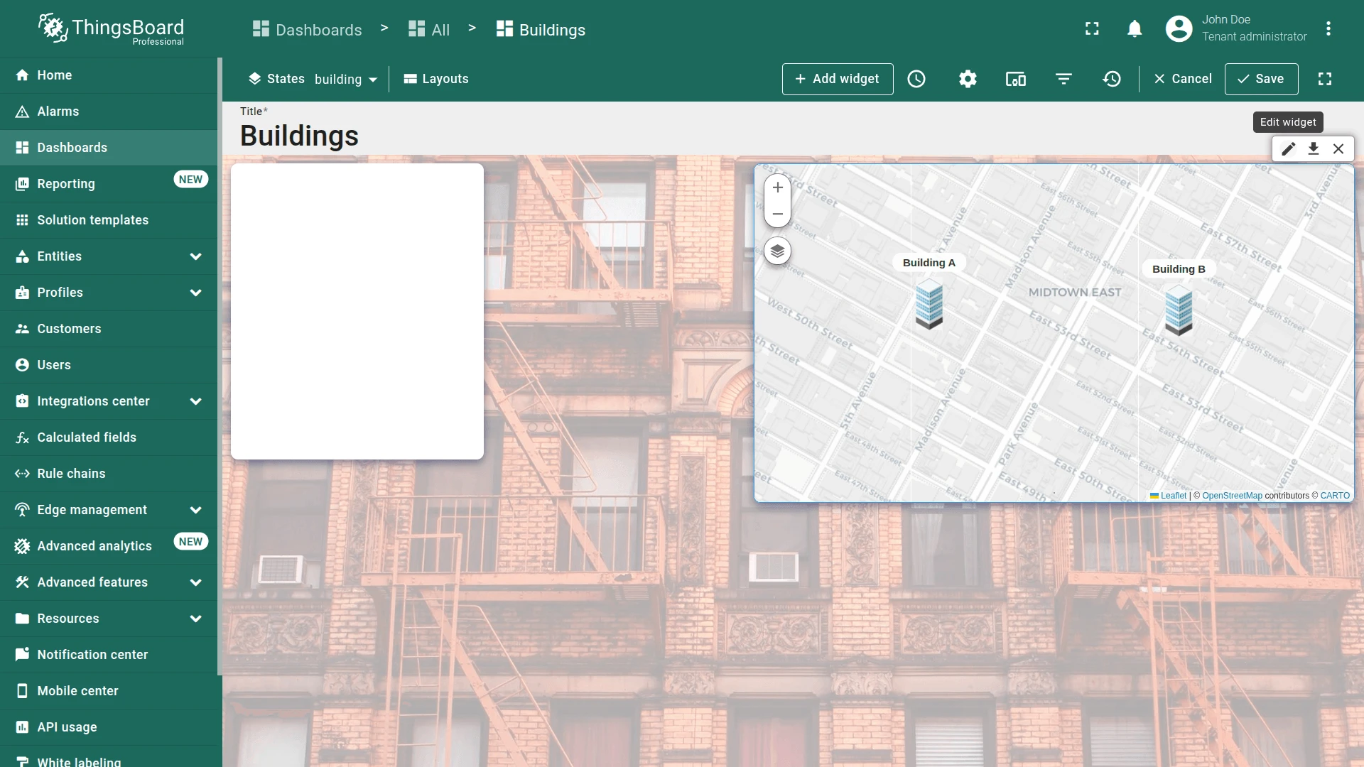
Section titled “Step 2.1 Add Dashboard States”- Open the Buildings dashboard and enter edit mode.
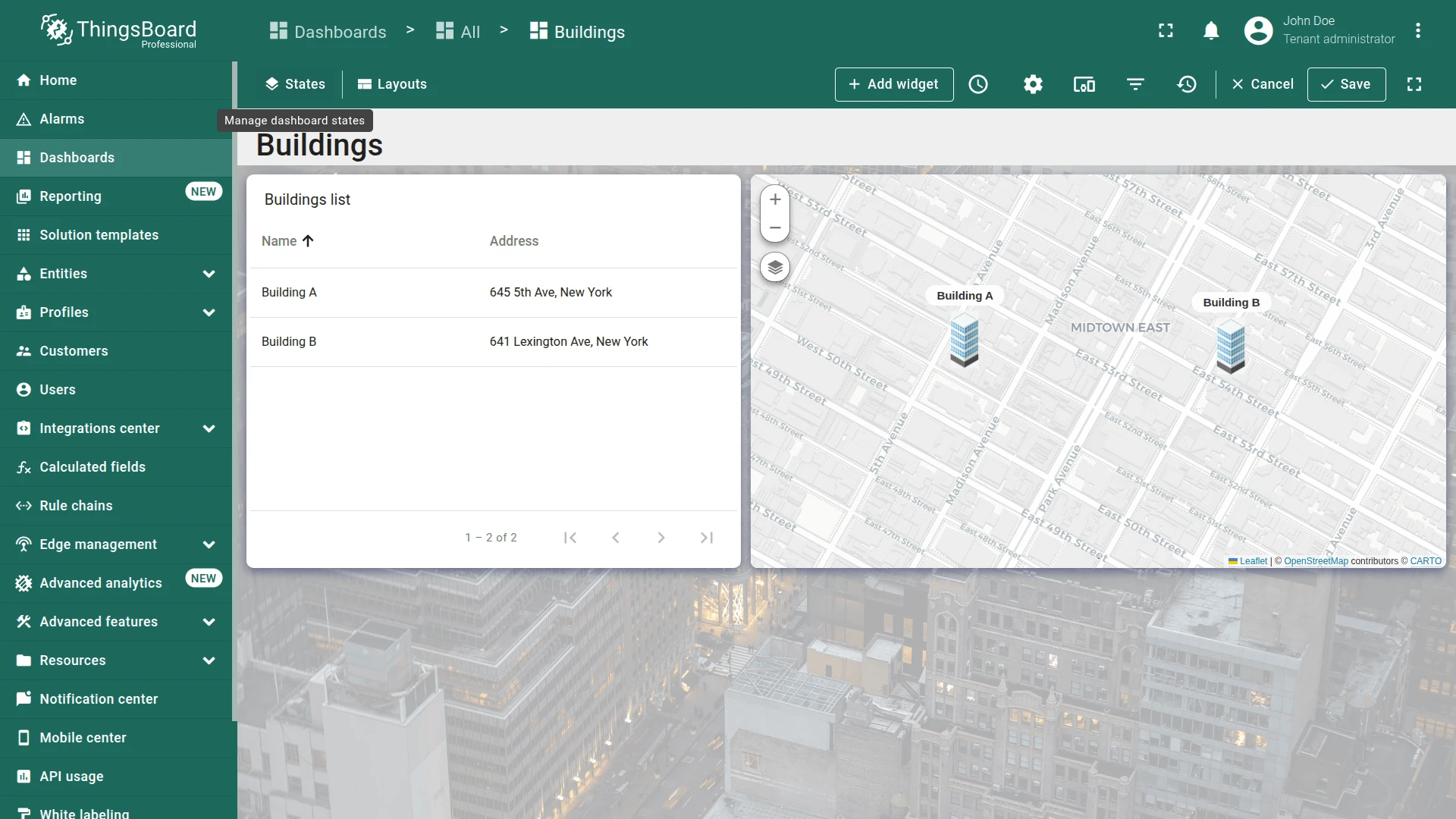
- Click the States icon in the upper-left corner.
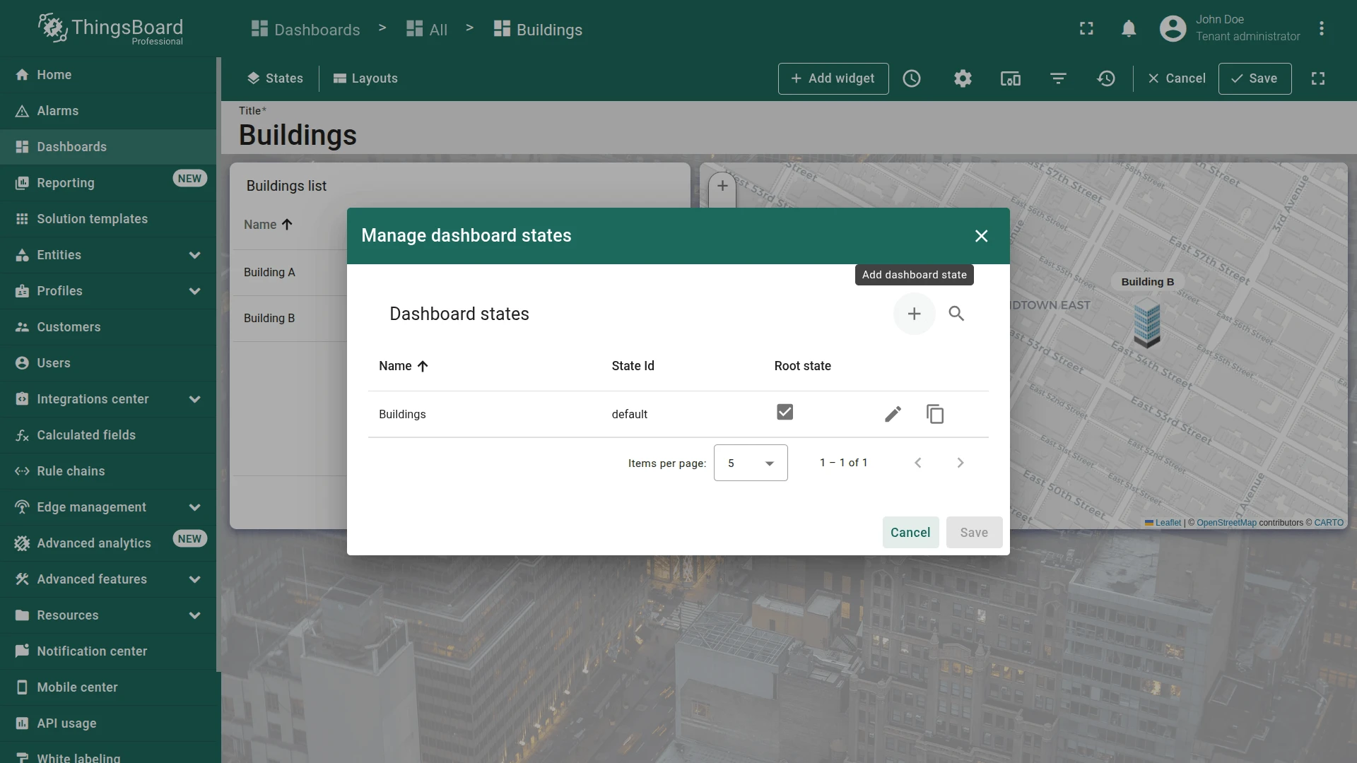
- Click + (Add dashboard state) and add a state: name
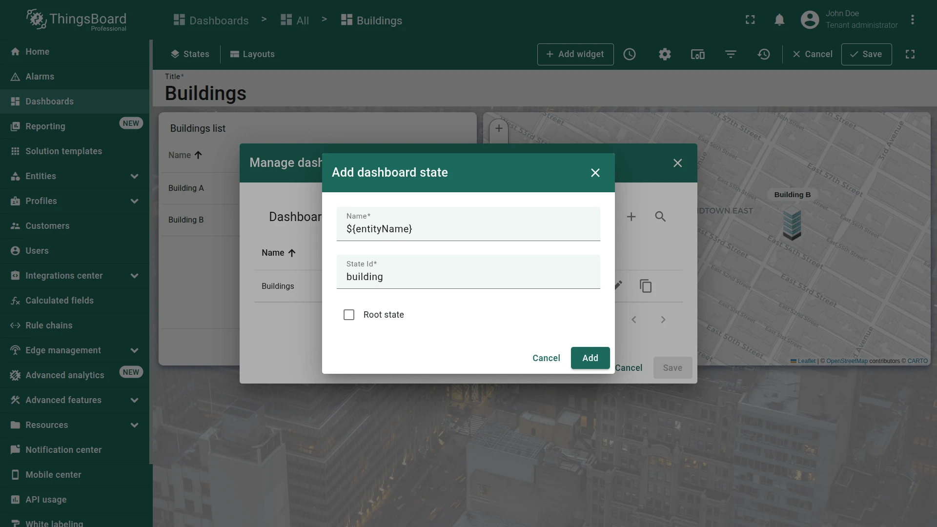
${entityName}, state IDbuilding. - Click + again and add: name
${entityName}, state IDoffice. - Click Save.
The special ${entityName} variable makes state names dynamic — at runtime it’s replaced with the entity name that triggered navigation.
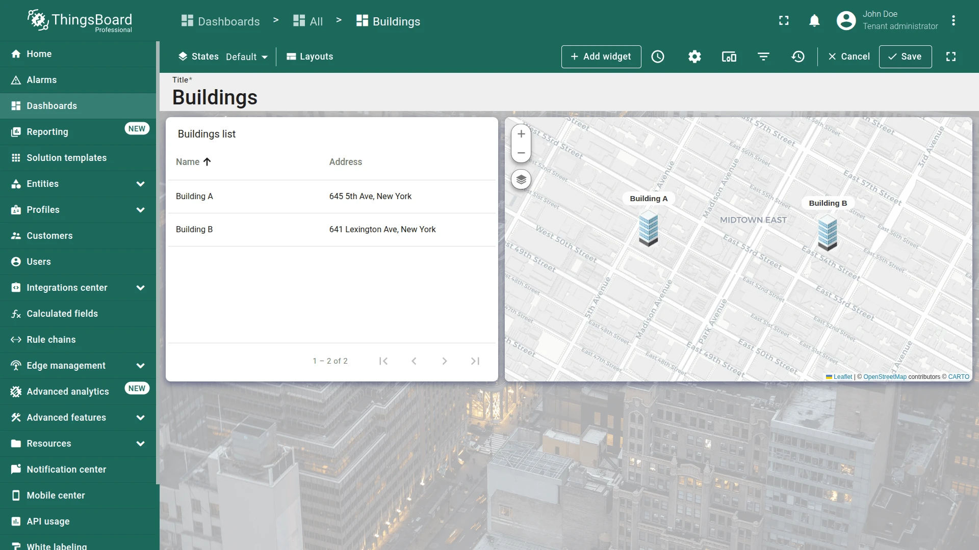
Step 2.2 Default State — Navigation to Building
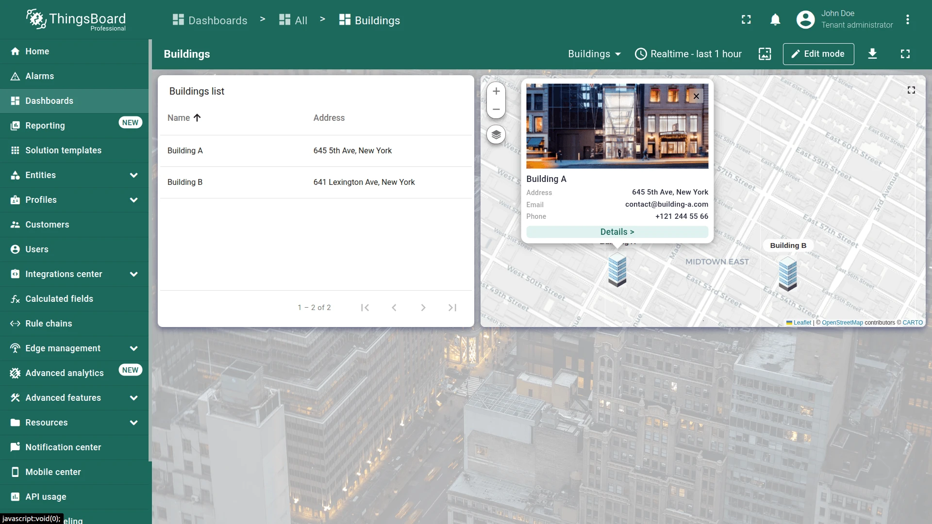
Section titled “Step 2.2 Default State — Navigation to Building”Connect the default state to the building state via a Tooltip tag action on the map widget and an On row click action on the Buildings list.
Map Widget Action
Section titled “Map Widget Action”-
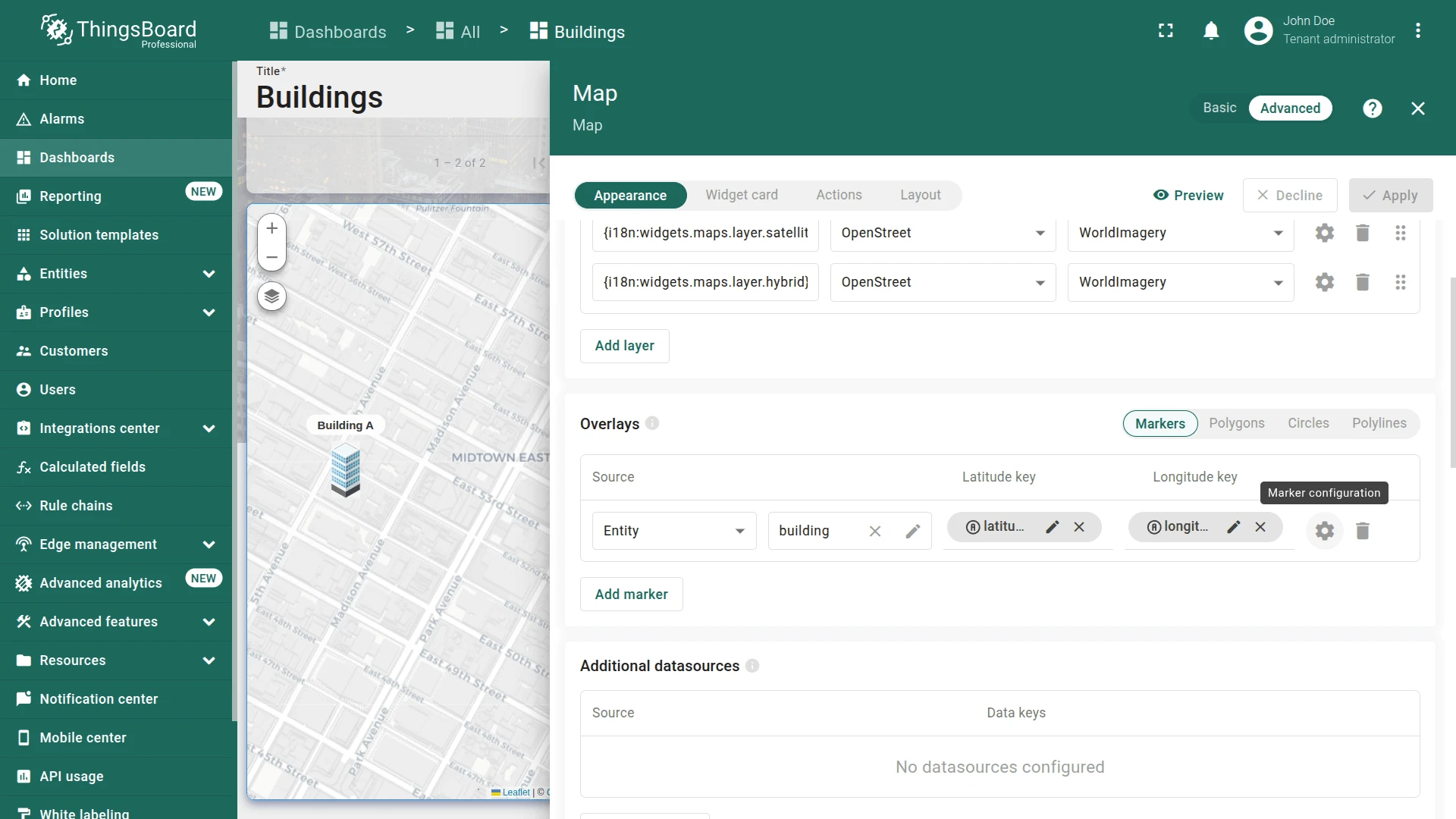
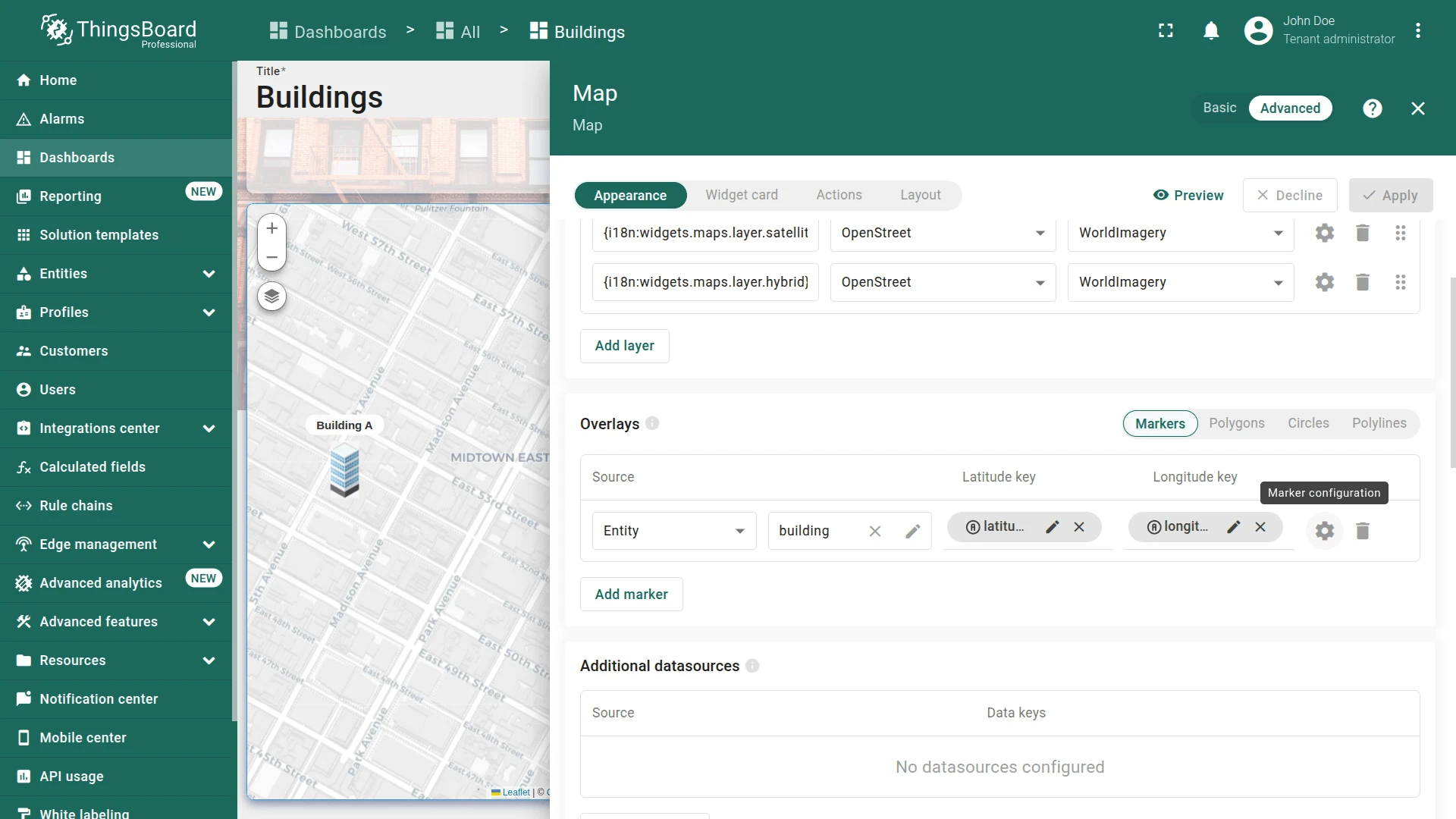
Enter edit mode and click the pencil icon on the Map widget.
-
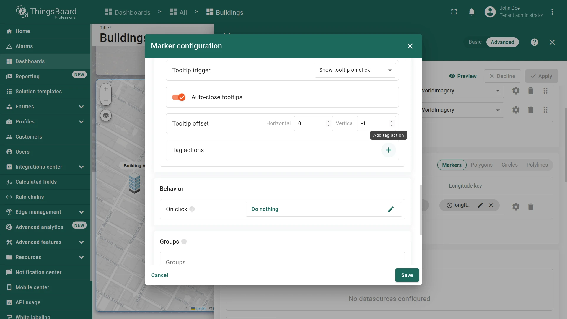
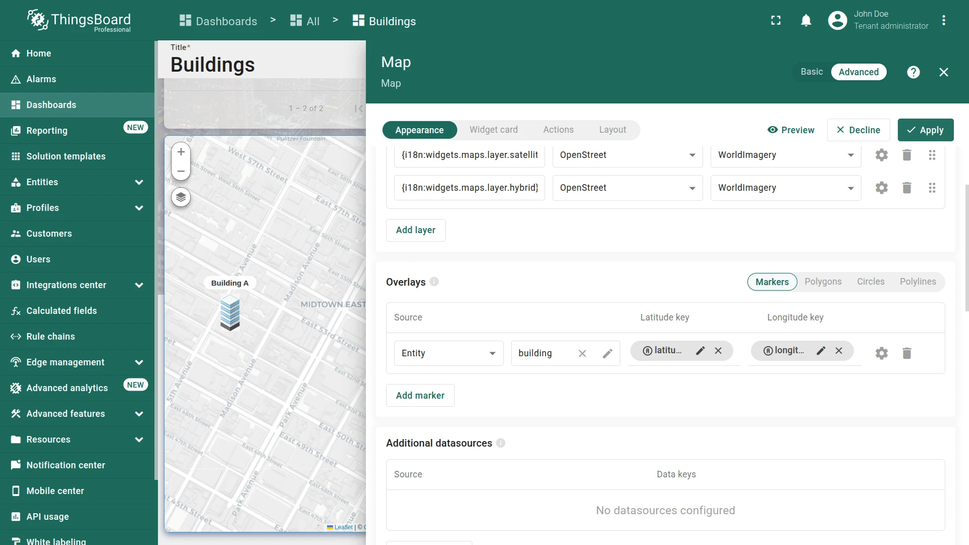
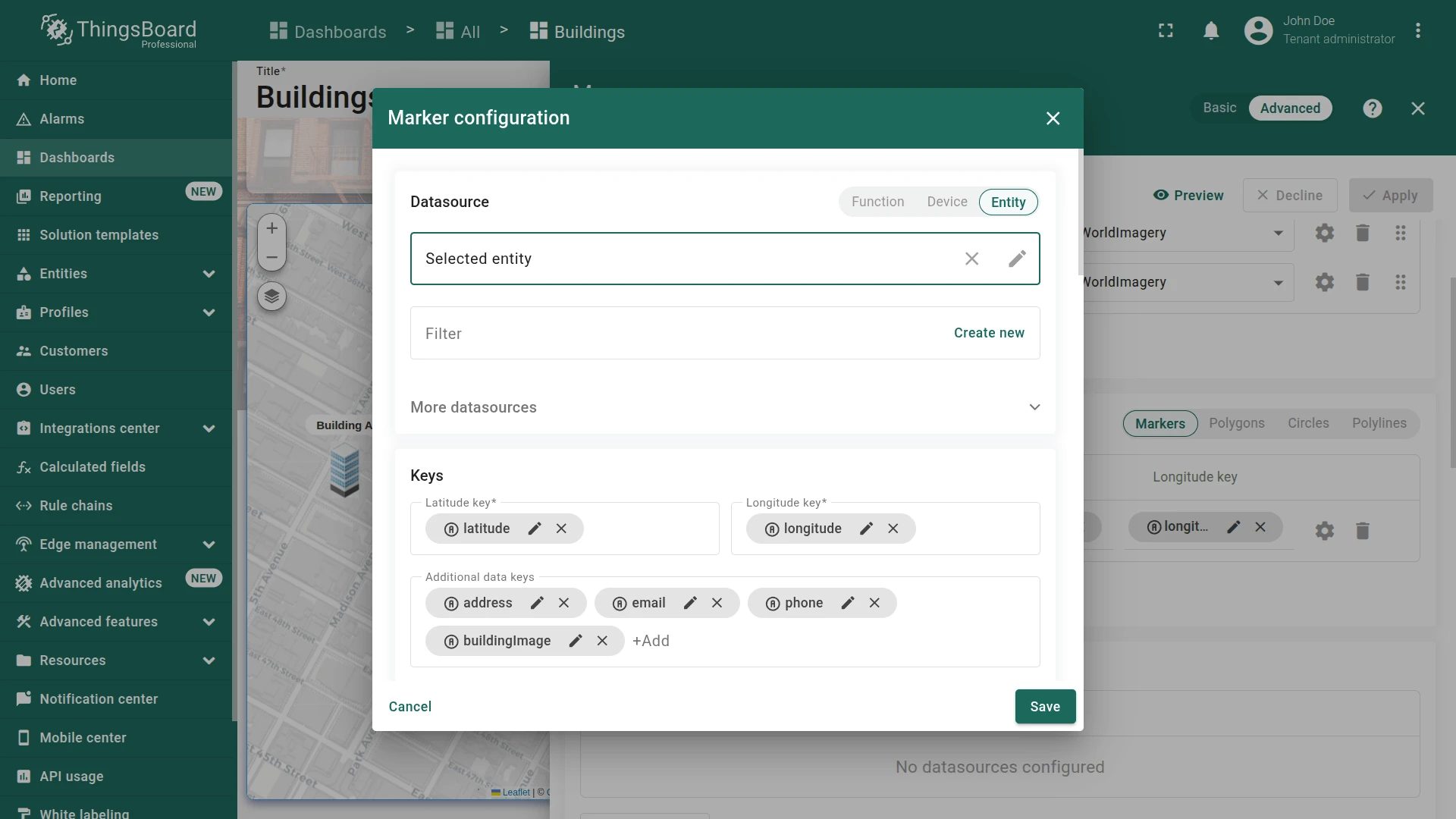
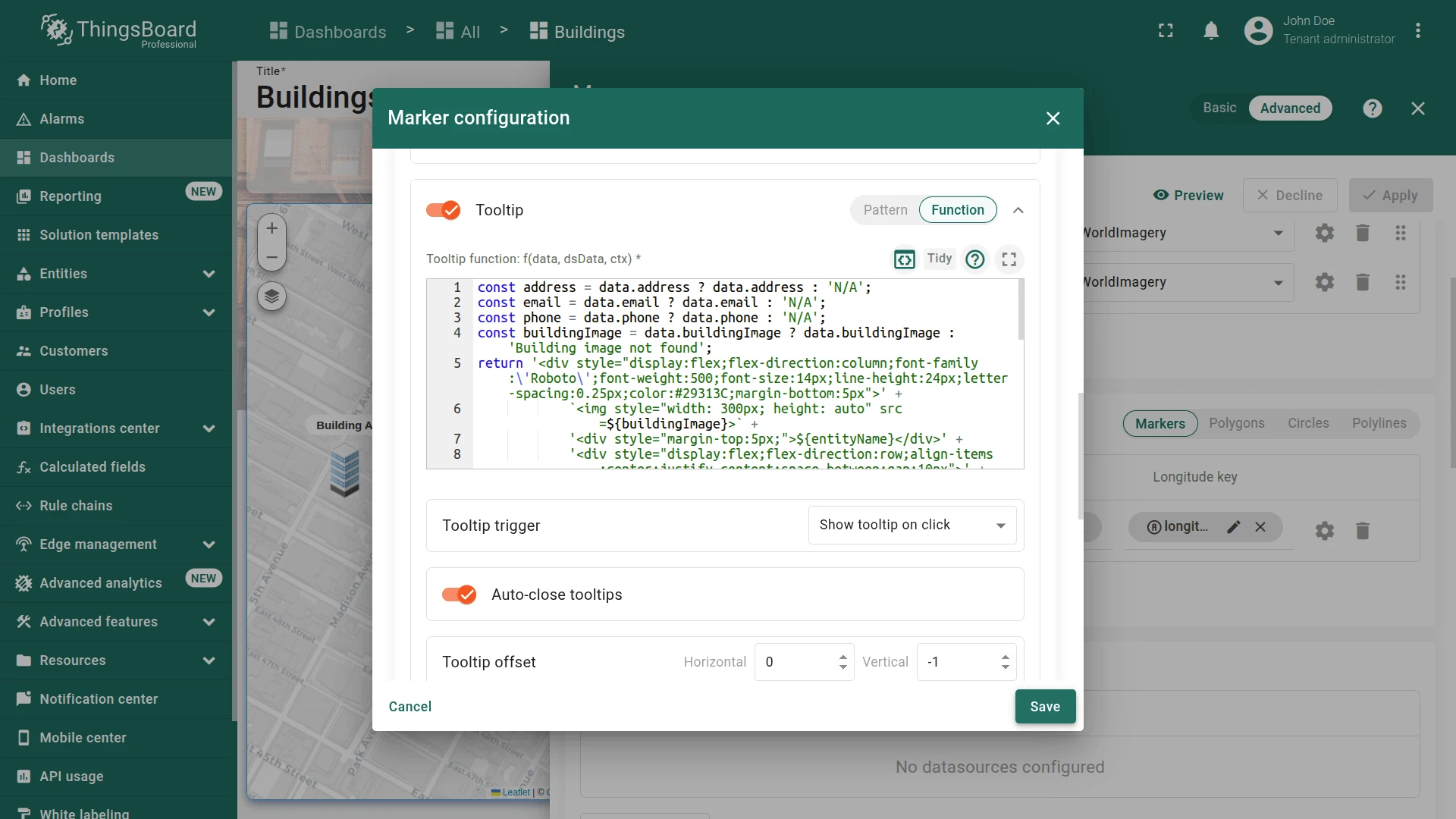
In the Overlays section, click the marker configuration button.
-
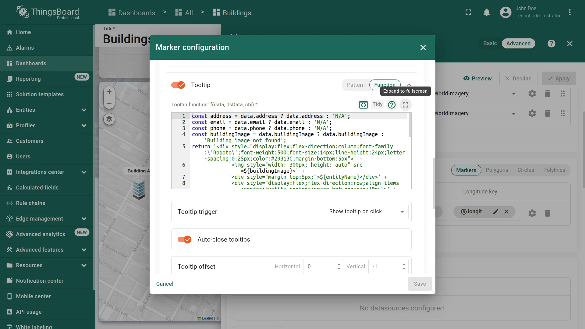
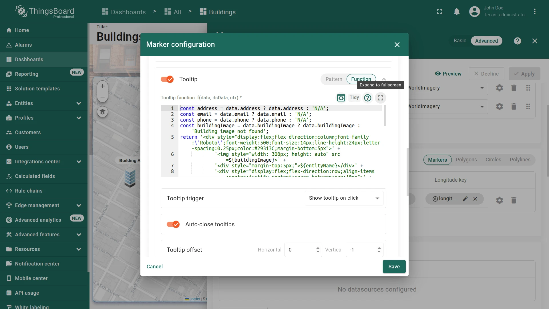
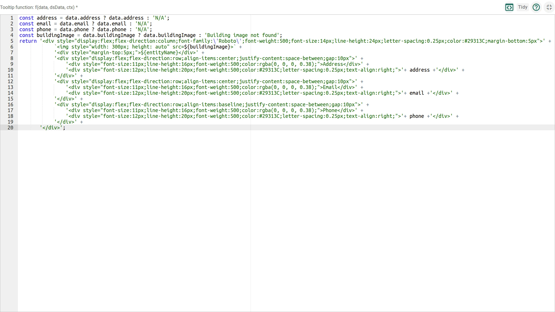
In the Tooltip section, click the fullscreen button to open the tooltip function editor.
-
And add the link-act tag to the tooltip function to display the Details > action button:
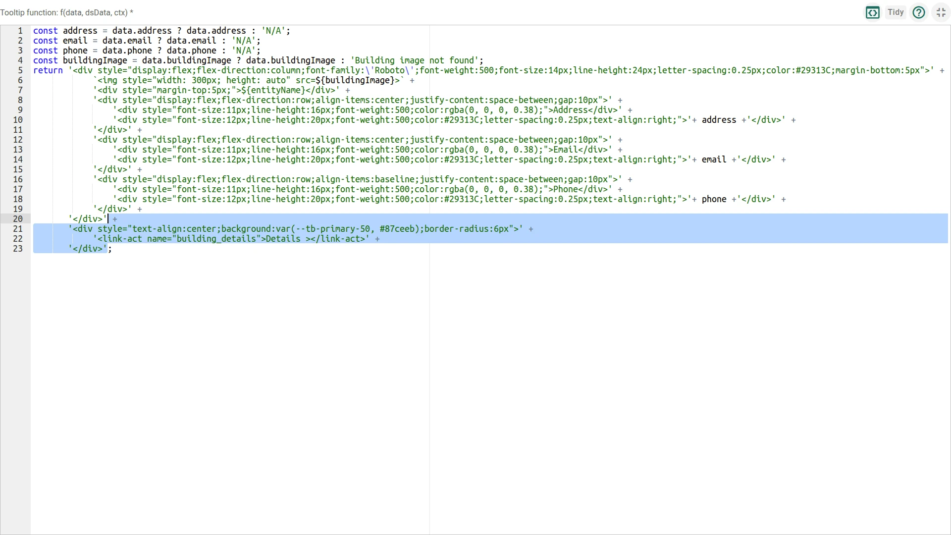
+ '<div style="text-align:center;background:var(--tb-primary-50, #87ceeb);border-radius:6px">' +'<link-act name="building_details">Details ></link-act>' +'</div>'Reference (full tooltip function after modification):
const address = data.address ? data.address : 'N/A';const email = data.email ? data.email : 'N/A';const phone = data.phone ? data.phone : 'N/A';const buildingImage = data.buildingImage ? data.buildingImage : '';return '<div style="display:flex;flex-direction:column;font-family:\'Roboto\';font-weight:500;font-size:14px;line-height:24px;letter-spacing:0.25px;color:#29313C;margin-bottom:5px">' +(buildingImage ? `<img style="width: 300px; height: auto" src=${buildingImage}>` : '') +'<div style="margin-top:5px;">${entityName}</div>' +'<div style="display:flex;flex-direction:row;align-items:center;justify-content:space-between;gap:10px">' +'<div style="font-size:11px;line-height:16px;font-weight:500;color:rgba(0,0,0,0.38);">Address</div>' +'<div style="font-size:12px;line-height:20px;font-weight:500;color:#29313C;text-align:right;">' + address + '</div>' +'</div>' +'<div style="display:flex;flex-direction:row;align-items:center;justify-content:space-between;gap:10px">' +'<div style="font-size:11px;line-height:16px;font-weight:500;color:rgba(0,0,0,0.38);">Email</div>' +'<div style="font-size:12px;line-height:20px;font-weight:500;color:#29313C;text-align:right;">' + email + '</div>' +'</div>' +'<div style="display:flex;flex-direction:row;align-items:baseline;justify-content:space-between;gap:10px">' +'<div style="font-size:11px;line-height:16px;font-weight:500;color:rgba(0,0,0,0.38);">Phone</div>' +'<div style="font-size:12px;line-height:20px;font-weight:500;color:#29313C;text-align:right;">' + phone + '</div>' +'</div>' +'</div>' +'<div style="text-align:center;background:var(--tb-primary-50, #87ceeb);border-radius:6px">' +'<link-act name="building_details">Details ></link-act>' +'</div>'; -
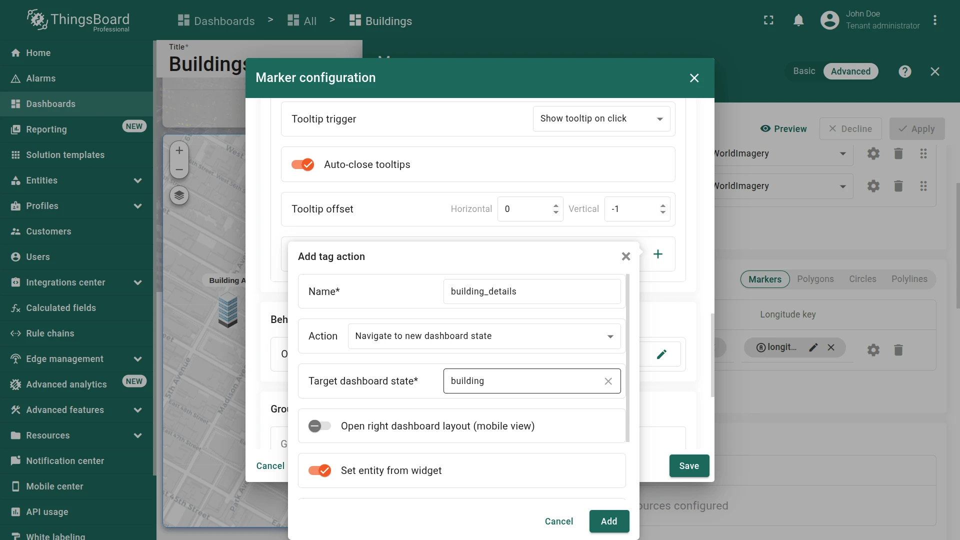
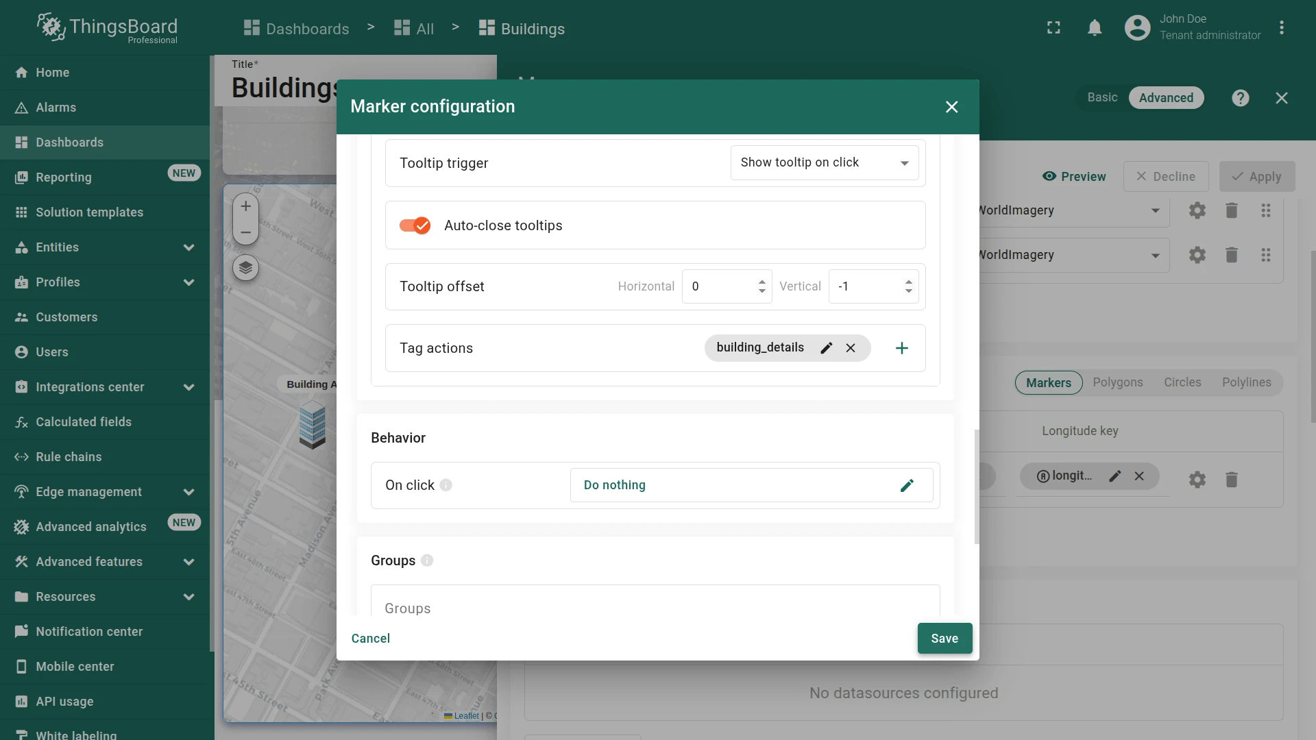
In the Tag actions section, click the Add tag action button. Configure the action:
- Name it
building_details. - Set Action to Navigate to new dashboard state
- Specify Target dashboard state to building.
- Click Add.
- Name it
-
Save the marker configuration and apply the changes to the widget and dashboard.
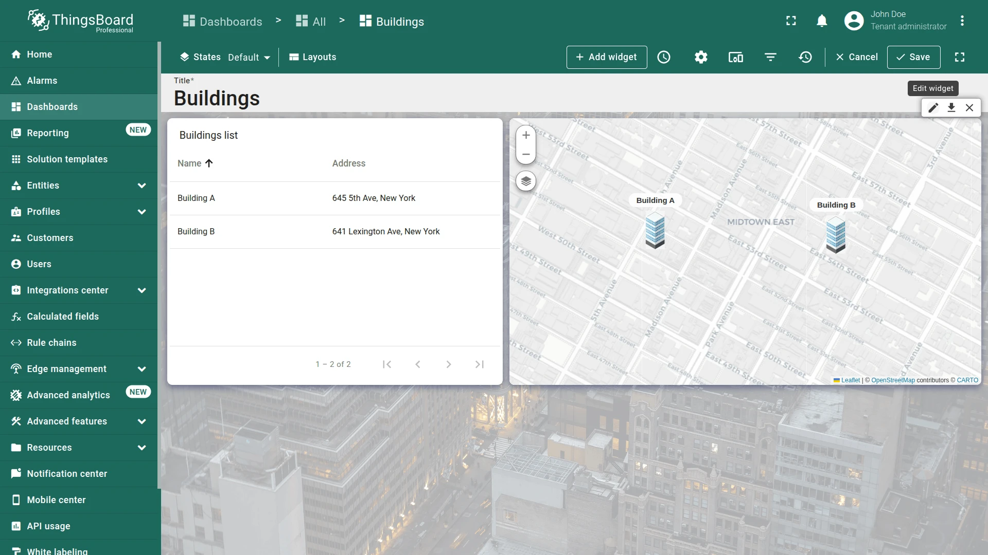

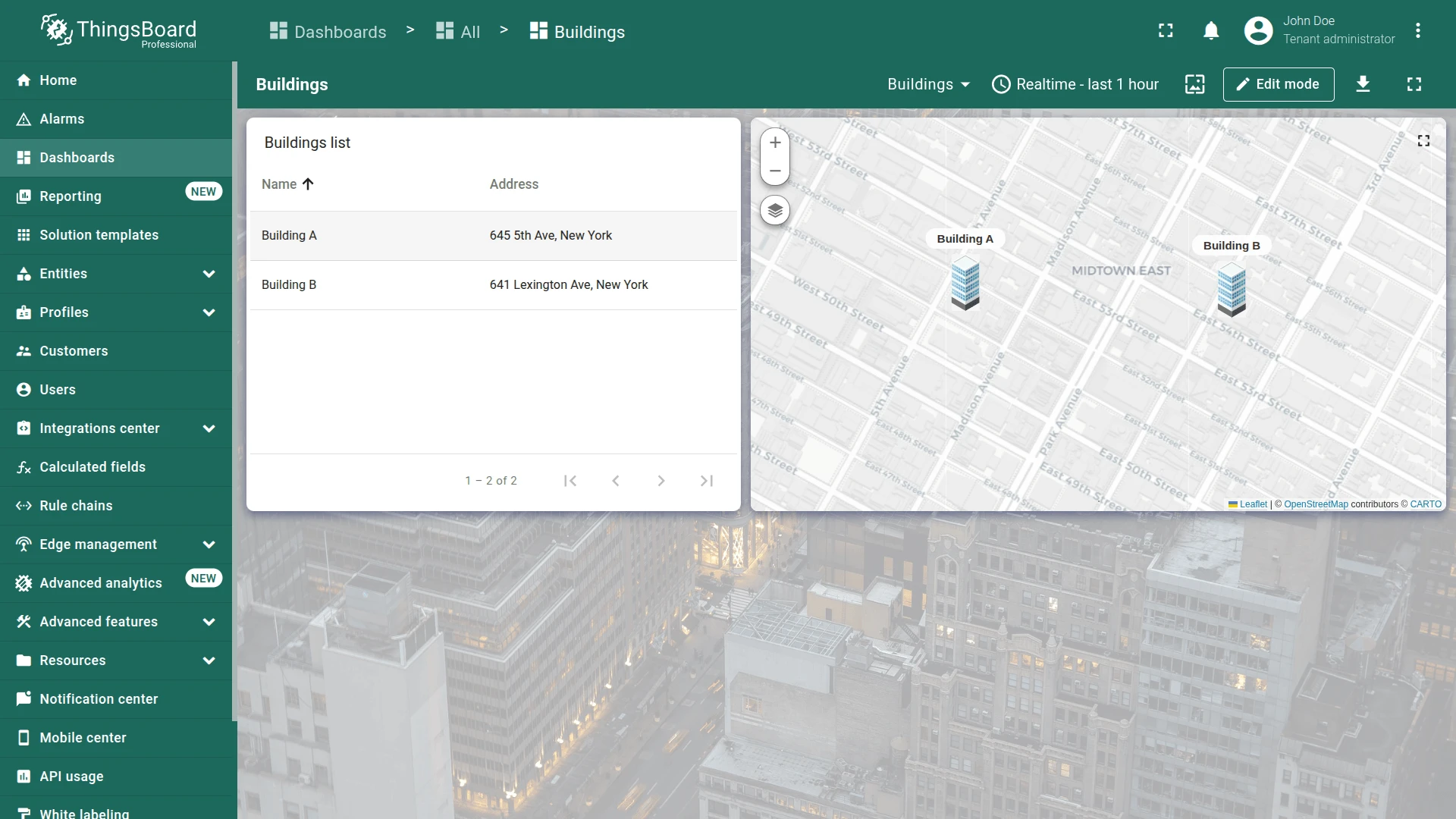
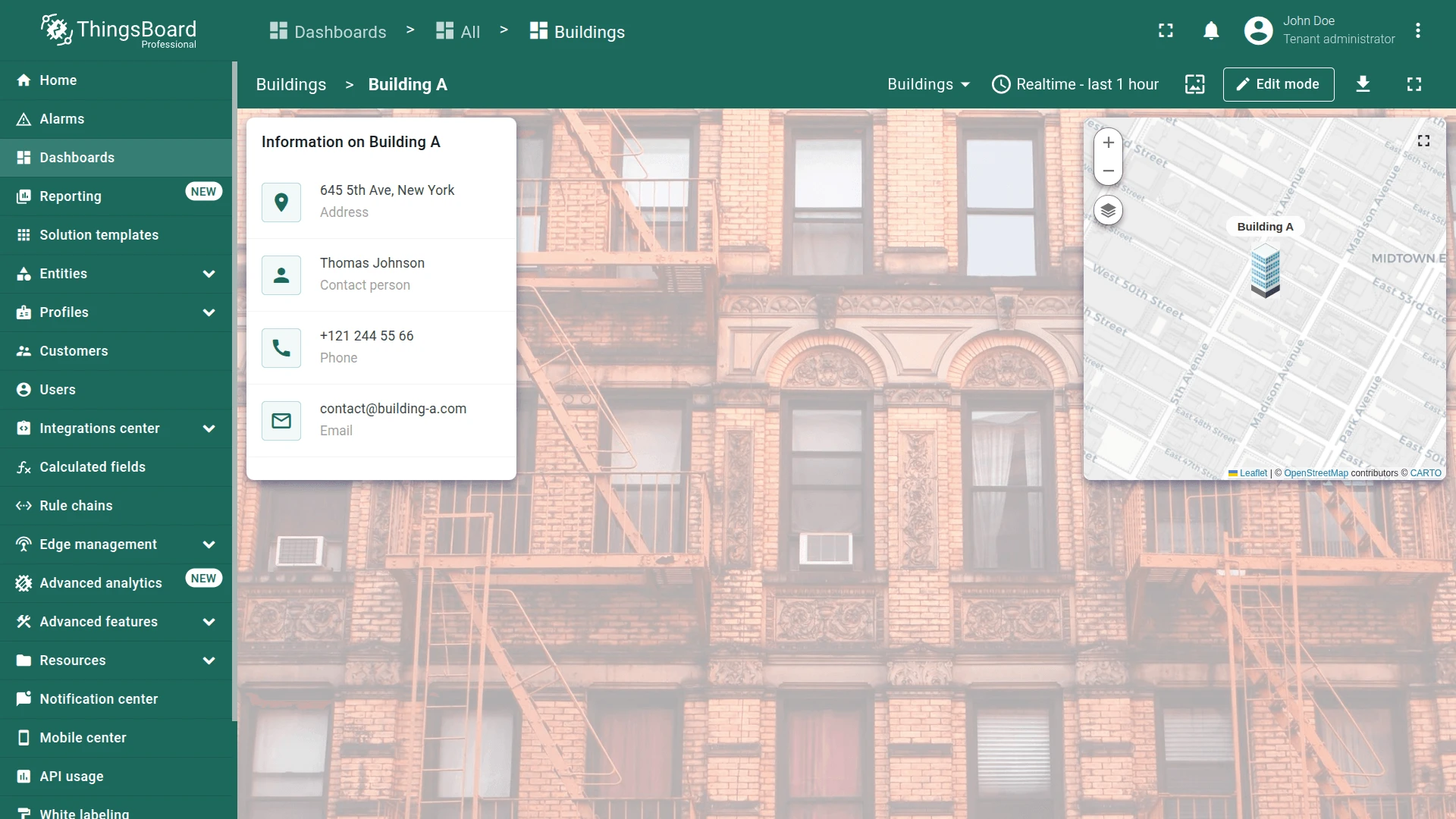
Click a marker to open the tooltip and use the Details > link. You are redirected to the Building A dashboard state.
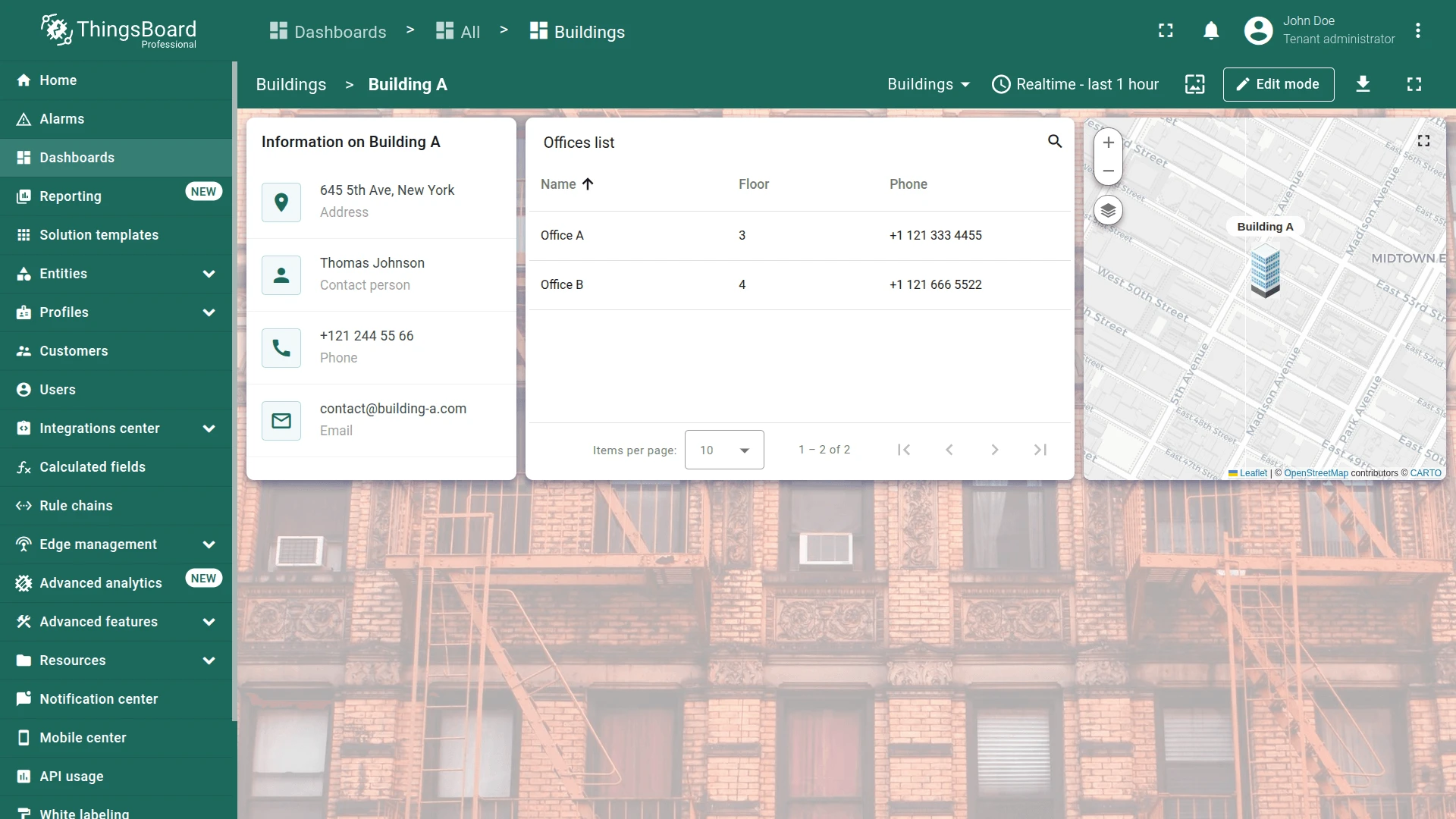
Buildings List Action
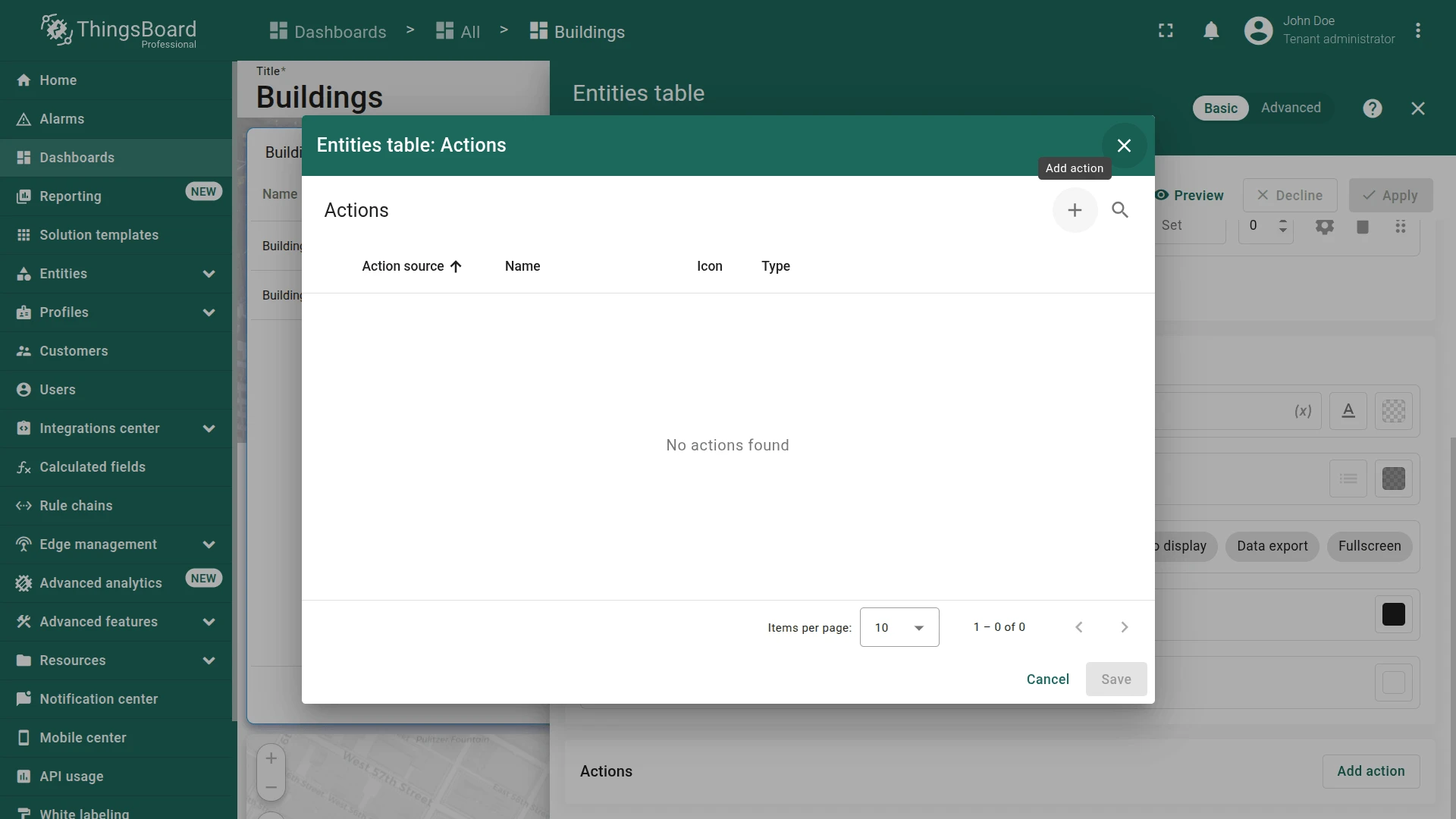
Section titled “Buildings List Action”- With the default Buildings state active, click the pencil icon on the Buildings list widget.
- Scroll to Actions and click Add action.
- Click +.
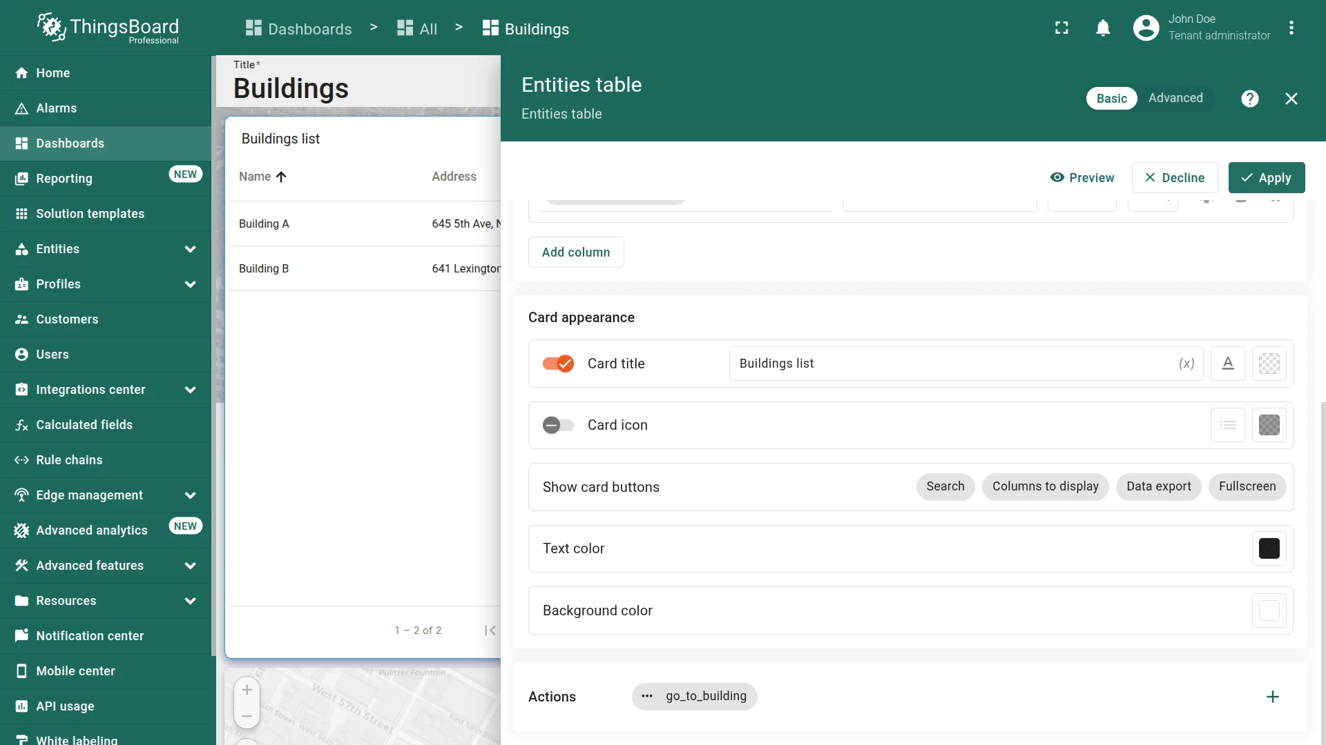
- Set source to On row click, enter an action name (e.g.,
go_to_building). - Set type to Navigate to new dashboard state and select building.
- Click Add, review, then click Save.
- Click Apply, then save the dashboard.


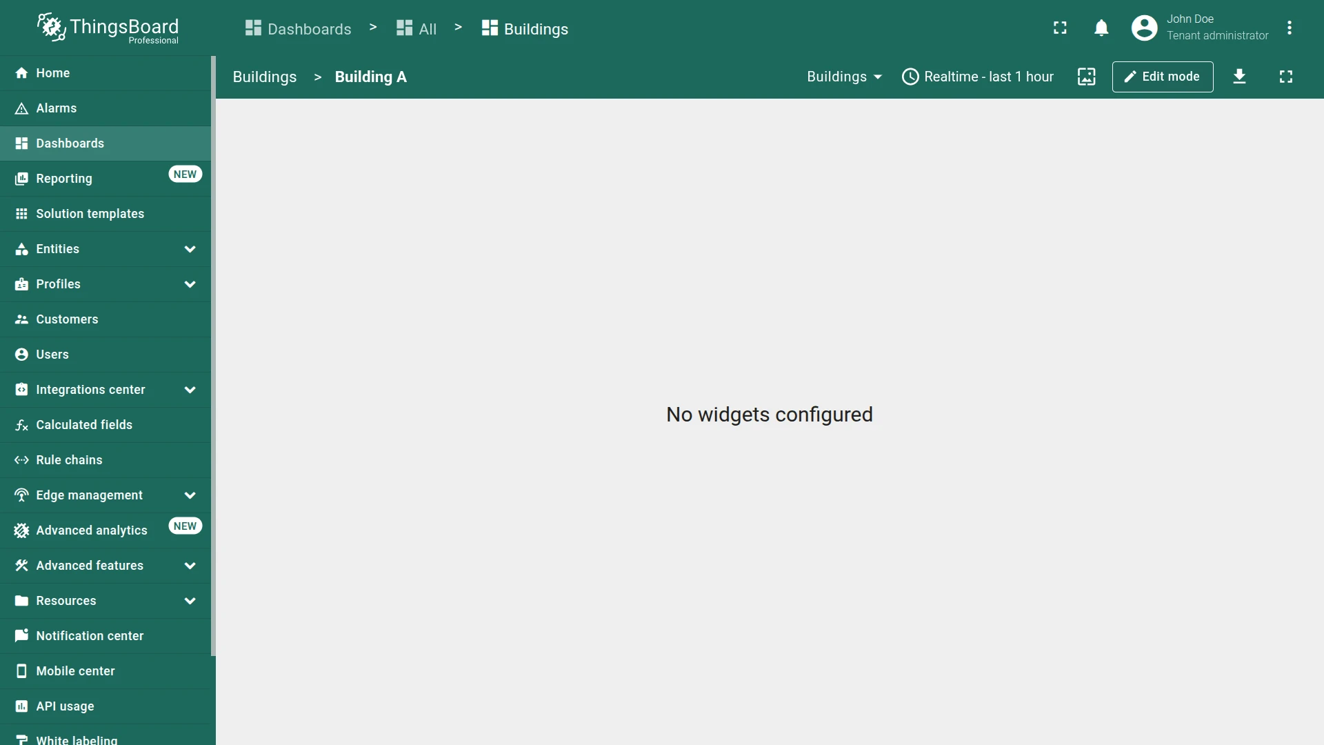
Click a building row to test navigation.

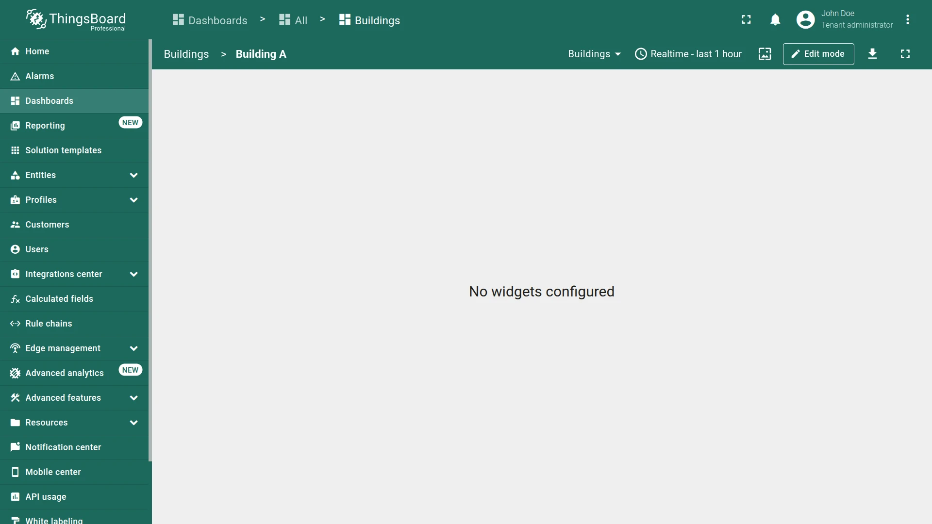
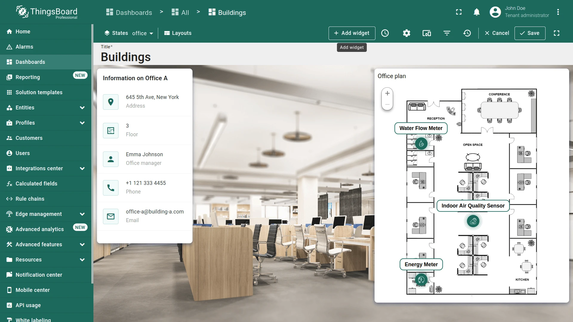
Step 2.3 Building State
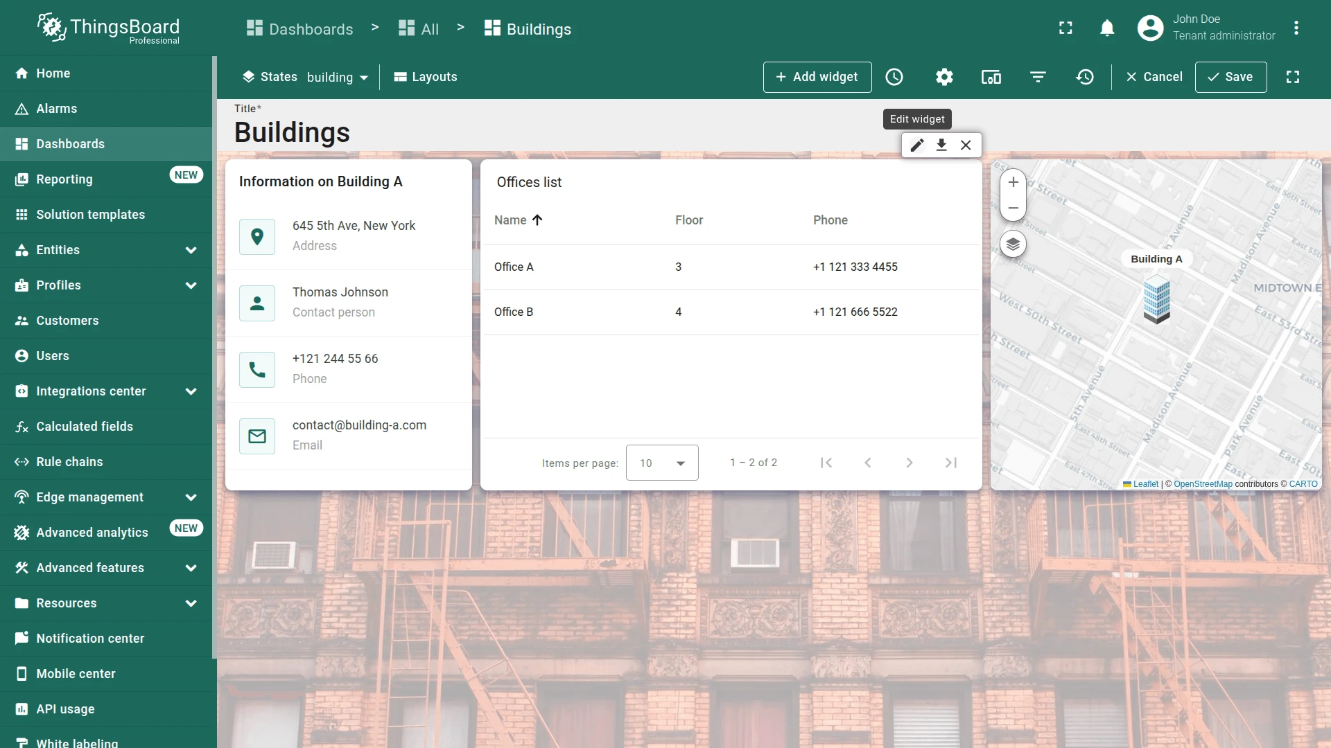
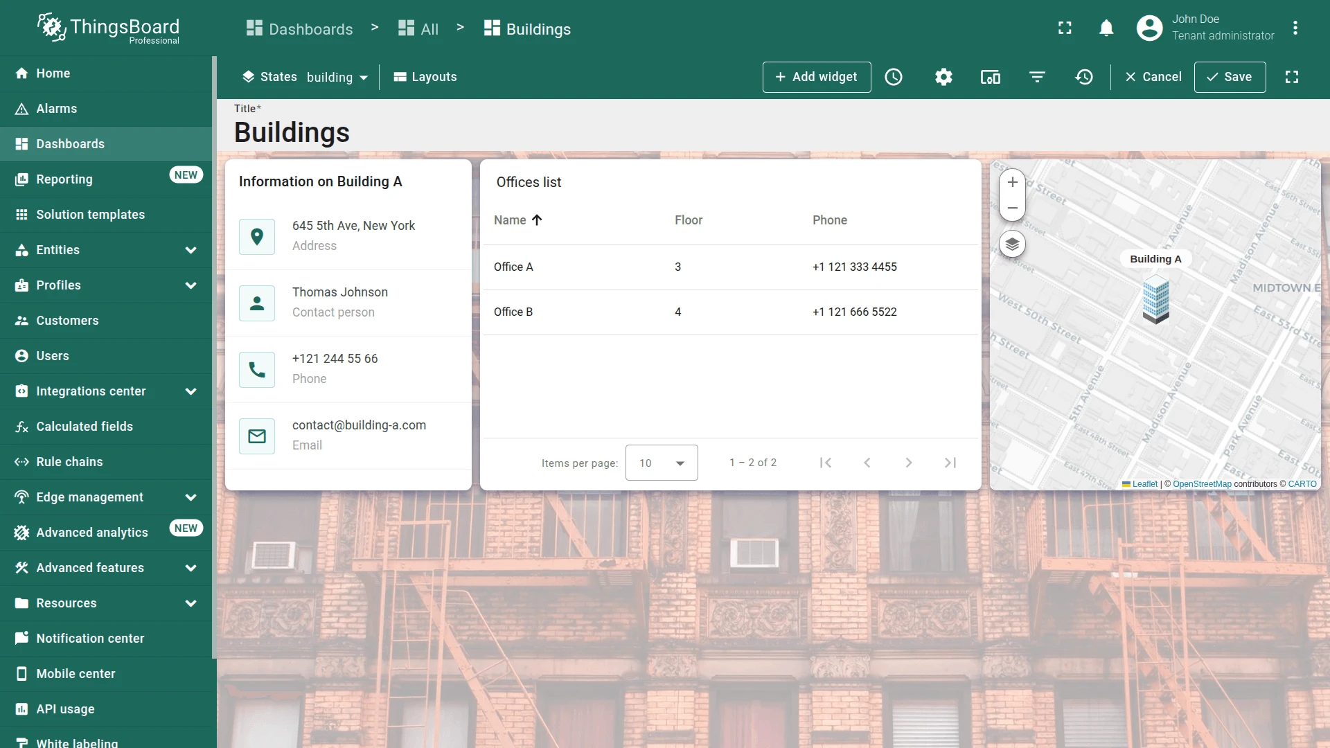
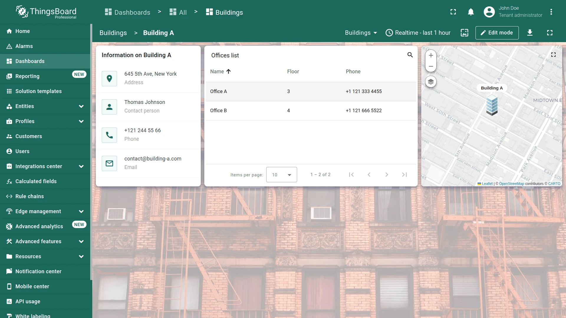
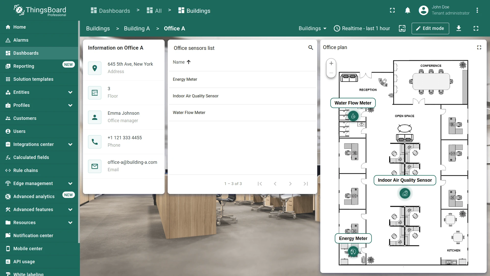
Section titled “Step 2.3 Building State”Add a background image, building info card, focused map widget, and offices list to the building state.
Background Image
Section titled “Background Image”- Navigate to the state of Building A.
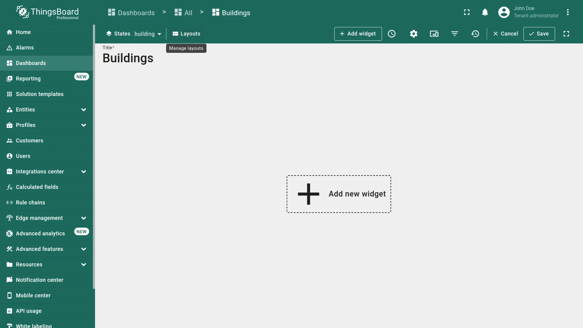
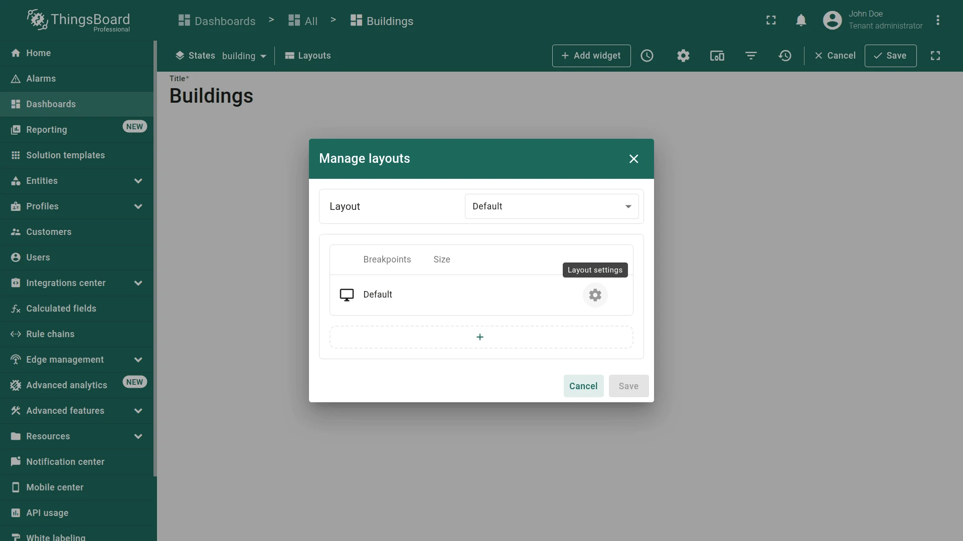
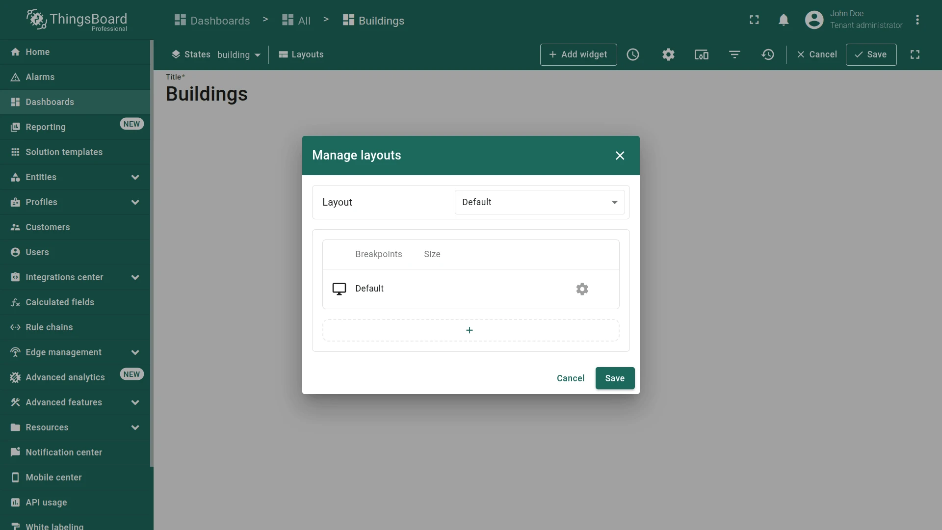
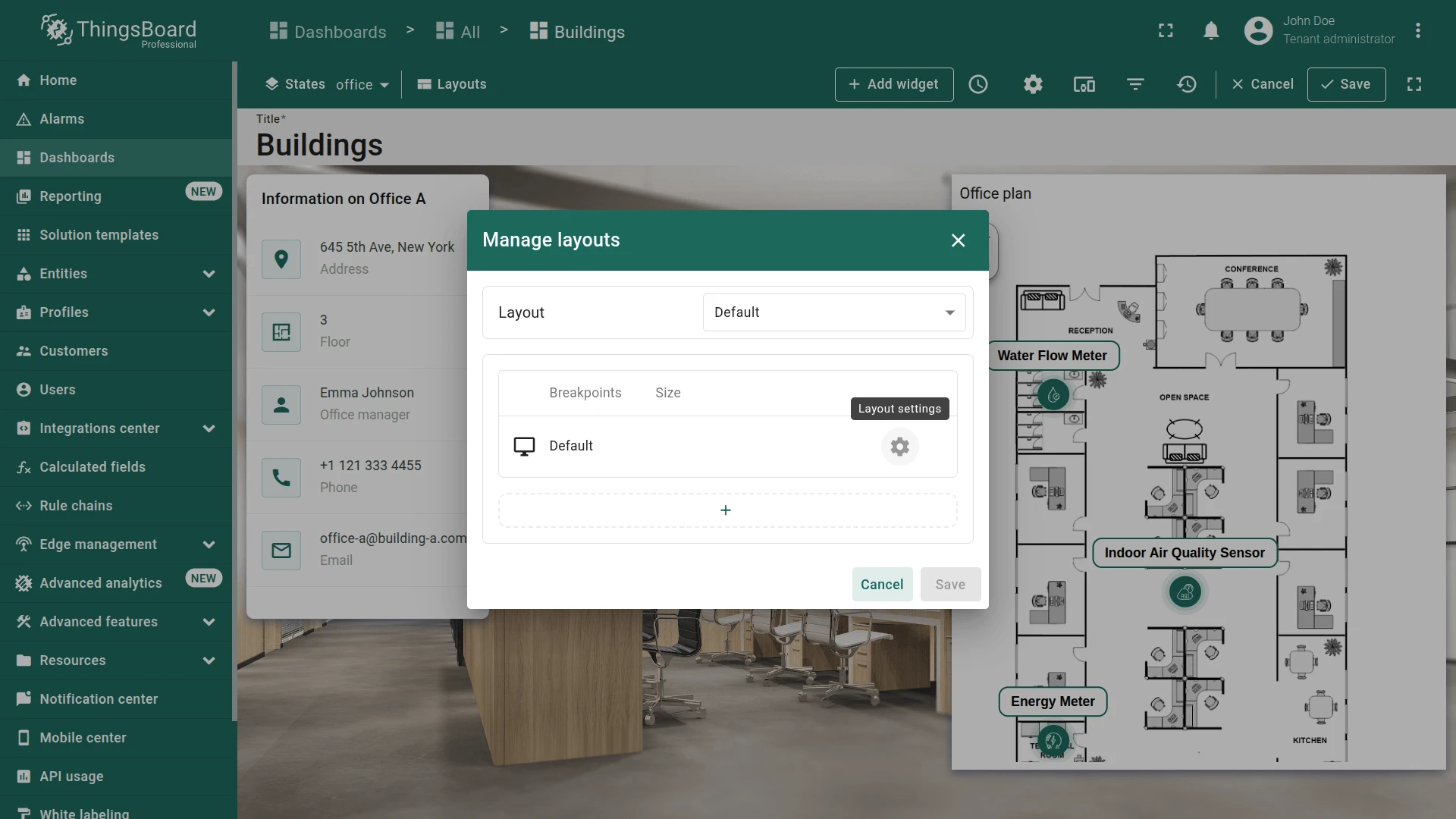
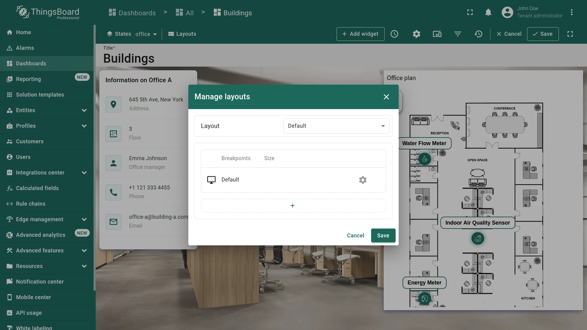
- Enter edit mode and click the Manage layouts.
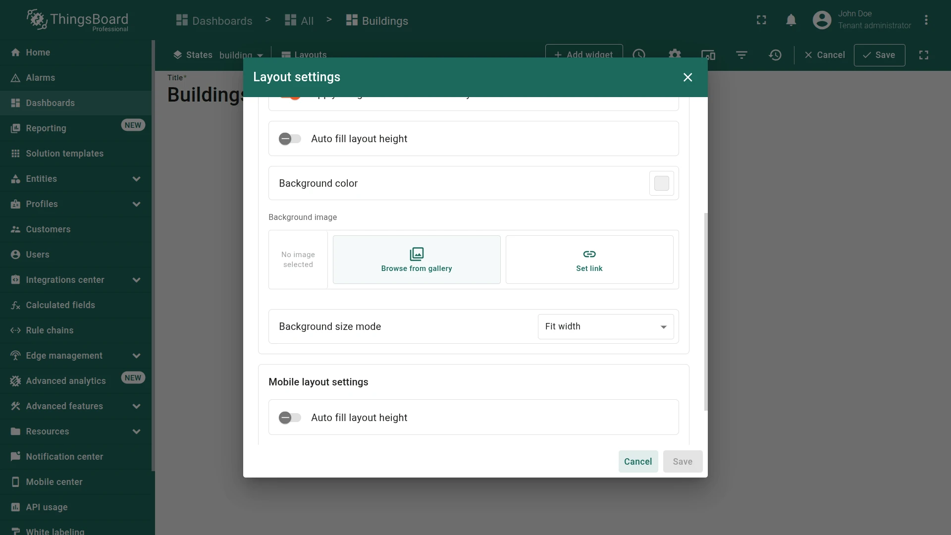
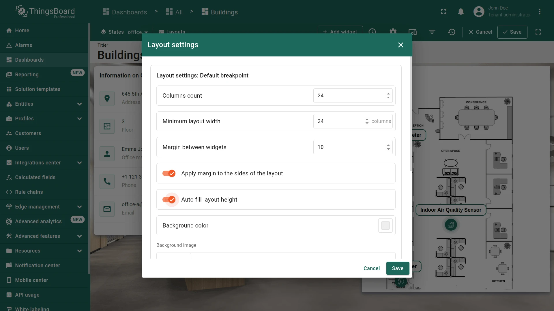
- Click the gear icon to open layout settings.
- Scroll to Background image and click Browse from gallery.
- Download the sample building background.
- Click Upload image, drop or browse the image, then click Upload.
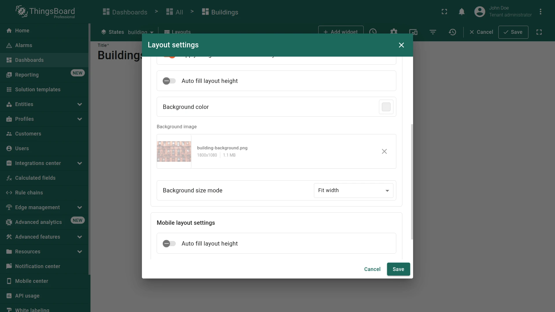
- Select the uploaded image and click Apply.
- Click Save, then save the dashboard.
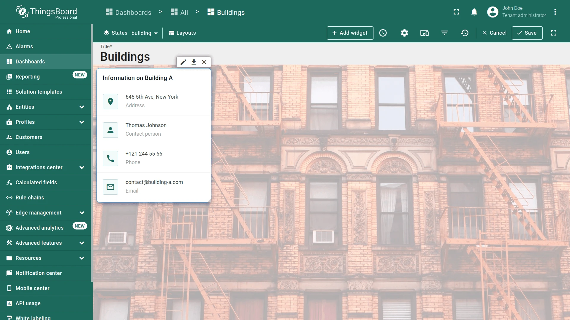
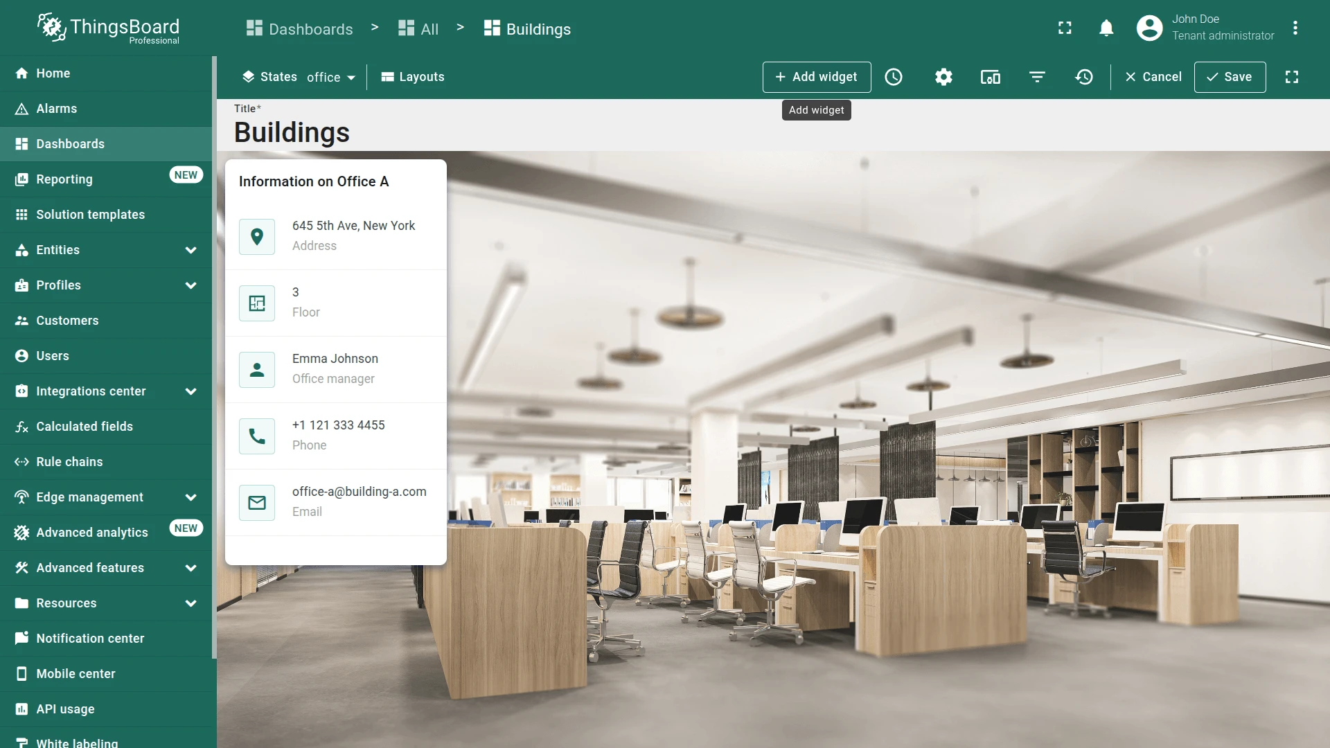
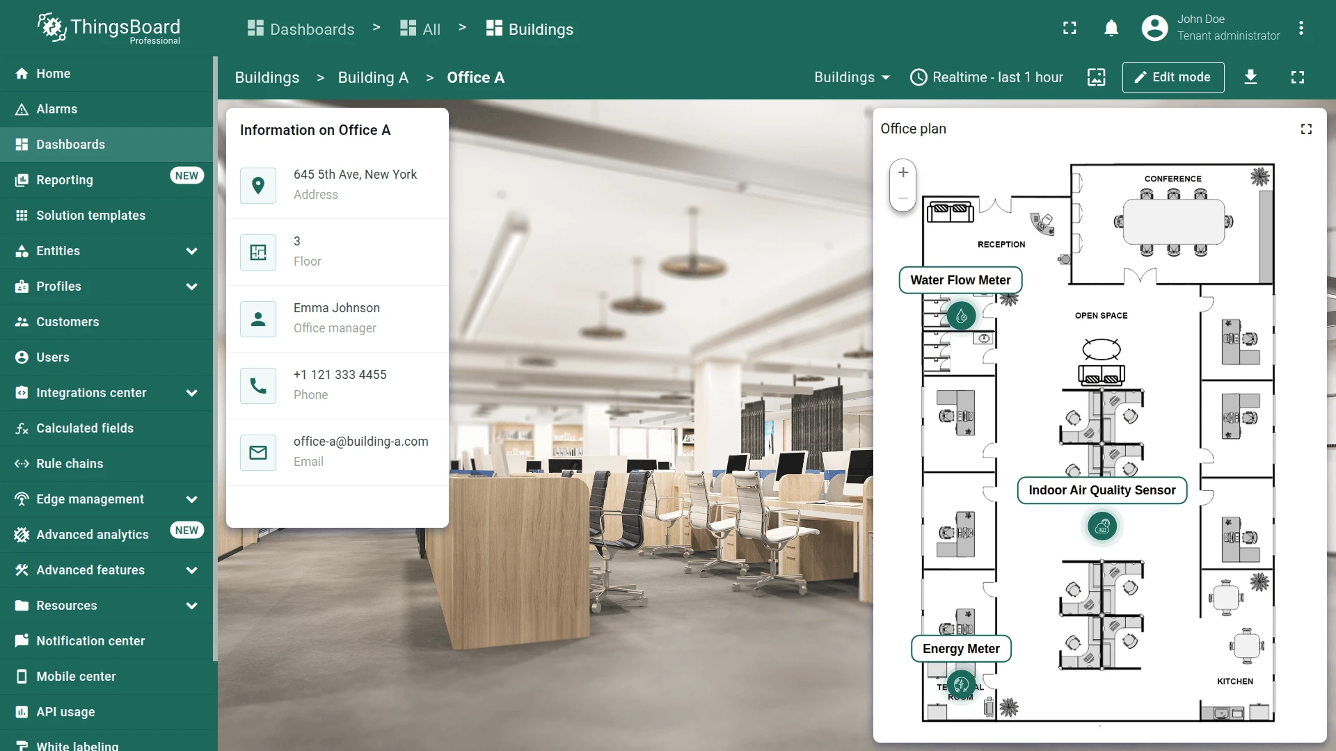
Building Info Card
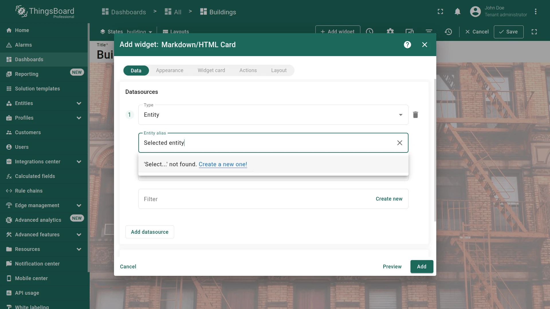
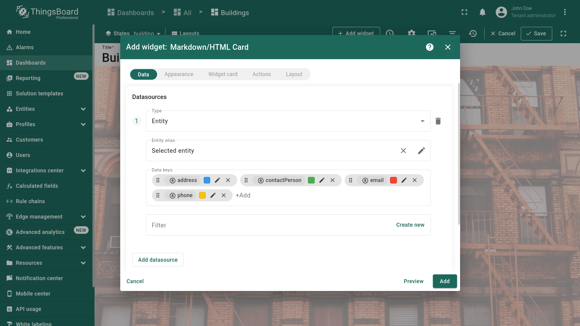
Section titled “Building Info Card”The Markdown/HTML Card widget displays entity attributes using custom HTML. Configure it with the Selected entity alias (from dashboard state) and render building address, contact person, phone, and email.
Datasource:
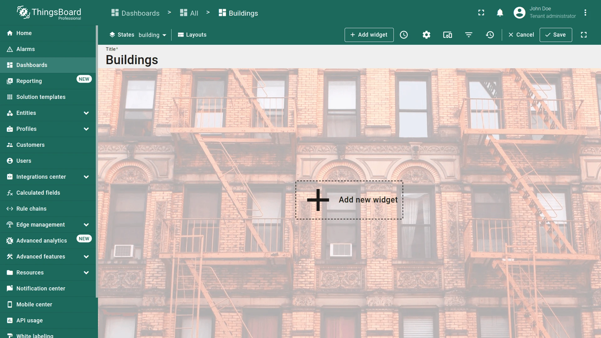
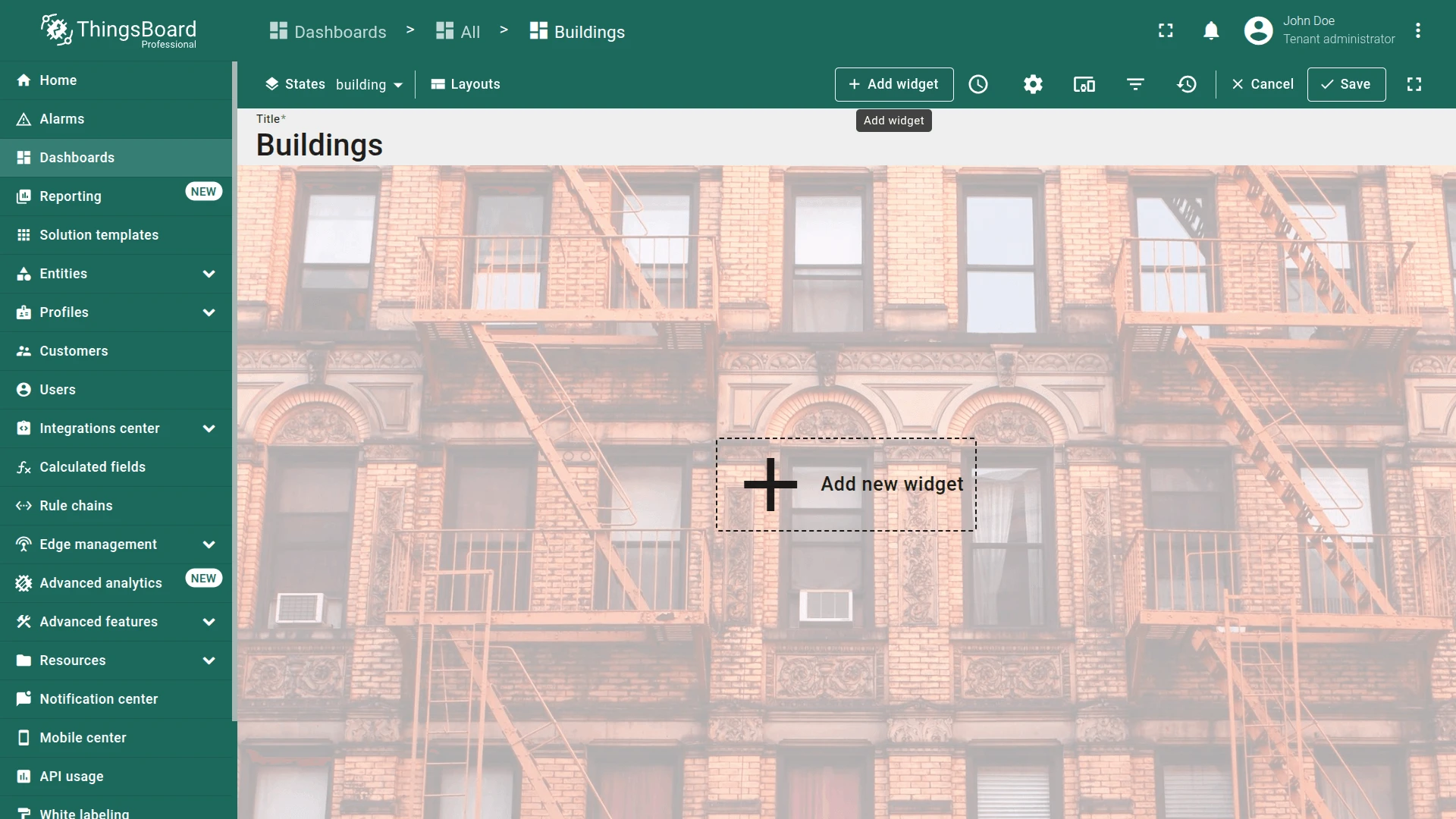
- In the building state (edit mode), click Add widget.
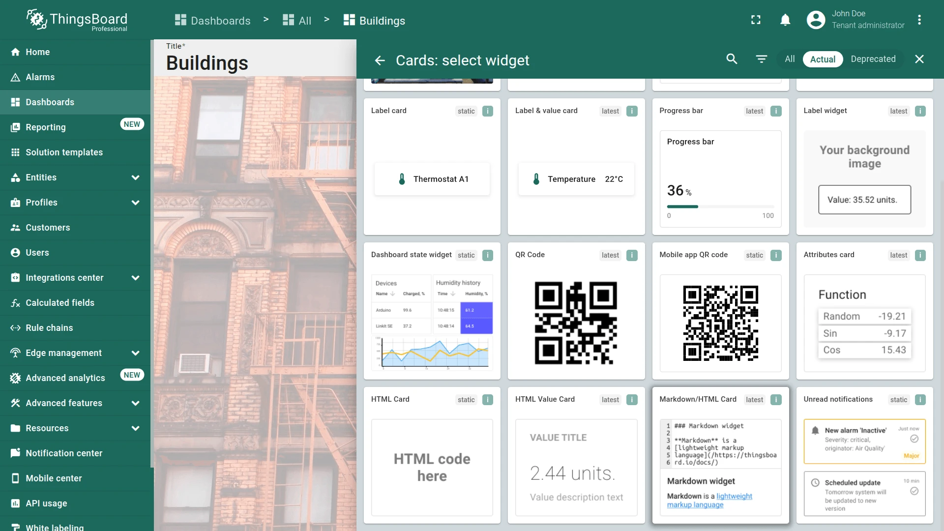
- Select Cards ⇾ Markdown/HTML Card.
- Create the new entity alias:
- Type
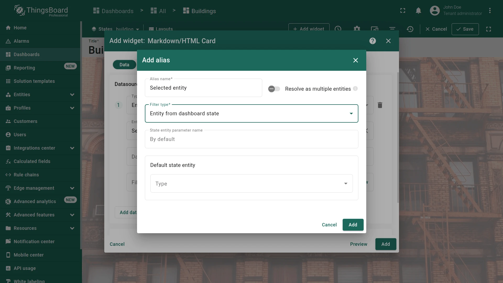
Selected entityin the alias field and click Create a new one! - Set filter type to Entity from dashboard state and click Add.
- Type
- Add data keys:
address,contactPerson,email,phone.
-
Appearance tab. Enable Use markdown/HTML value function and paste:
if (data.length) {const attributes = ['address', 'contactPerson', 'phone', 'email'];let info = {entityName: data[0].entityName || 'Not found',fields: {}};attributes.forEach(key => {info.fields[key] = data[0][key] || 'Not found';});const allMissing = Object.values(info.fields).every(v => v === 'Not found');if (allMissing) {return `<div class="no-data-card"><h1 class="card-title">Information on ${info.entityName}</h1><div class="no-data-block"><div class="no-data-content"><p class="no-data-title">No building information available</p></div></div></div>`;}const icons = { address: 'place', contactPerson: 'person', phone: 'call', email: 'mail_outline' };const labels = { address: 'Address', contactPerson: 'Contact person', phone: 'Phone', email: 'Email' };let html = `<div class="card"><h1 class="card-title">Information on ${info.entityName}</h1><div class="attributes">`;attributes.forEach(key => {html += `<div class="attribute_container"><div class="icon_wrapper"><tb-icon class="icon" color="primary" matButtonIcon>${icons[key]}</tb-icon></div><div class="attribute_content"><p class="attribute">${info.fields[key]}</p><span class="attribute_label">${labels[key]}</span></div></div>`;});return html + '</div></div>';}In the Markdown/HTML CSS section, paste:
.card, .no-data-card {padding: 0px;height: 100%;}.card-title {position: sticky;top: 0;z-index: 2;font-size: 16px;letter-spacing: 0.25px;padding: 16px;}.attribute_container {display: flex;align-items: center;gap: 20px;padding: 16px;border-bottom: 1px solid #0000000d;}.icon_wrapper {display: flex;position: relative;align-items: center;padding: 8px;border: 1px solid var(--tb-primary-100, #305680);border-radius: 4px;}.icon_wrapper:before {content: '';z-index: 0;position: absolute;opacity: 0.1;background-color: var(--tb-primary-200, #305680);width: 100%;height: 100%;left: 0;top: 0;}.icon {z-index: 1;}.attribute, .attribute_label {font-size: 14px;line-height: 20px;}.attribute_label {color: #00000061;}.no-data-card {display: flex;flex-direction: column;}.no-data-block {display: flex;flex-direction: column;justify-content: center;height: 100%;max-width: 345px;padding: 0 15px;margin: 0 auto;text-align: center;}.no-data-content {transform: translateY(-30%);}.no-data-title {color: rgba(0, 0, 0, 0.54);font-weight: 500;}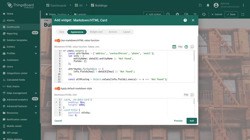

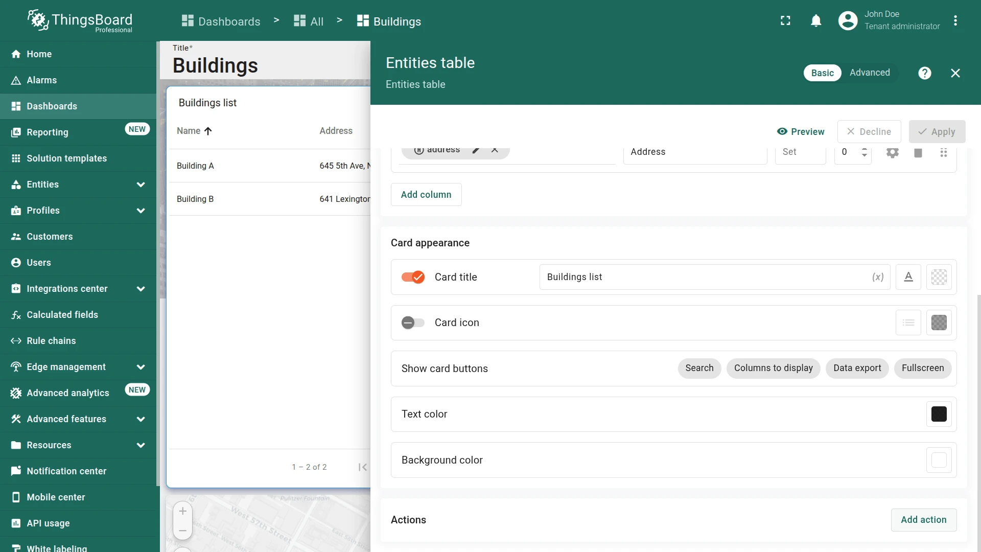
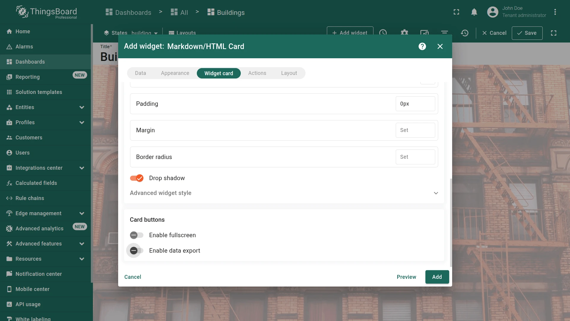
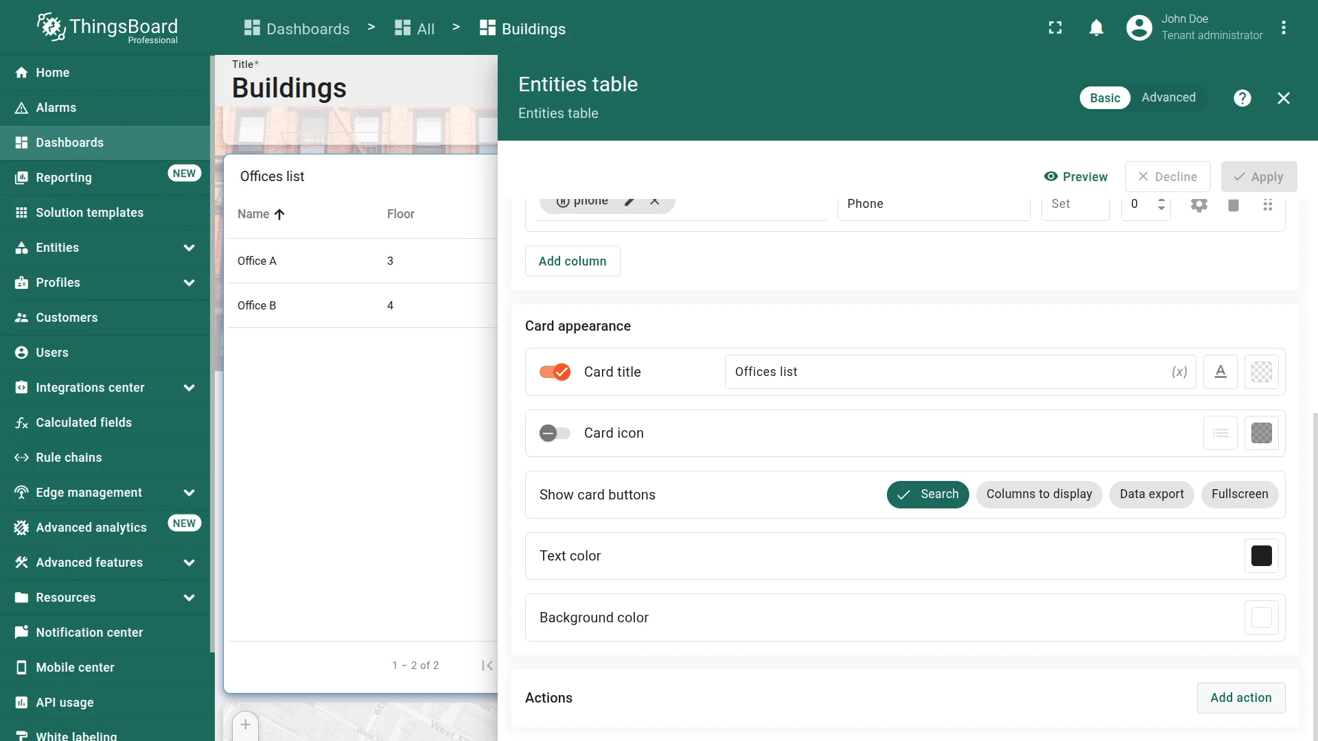
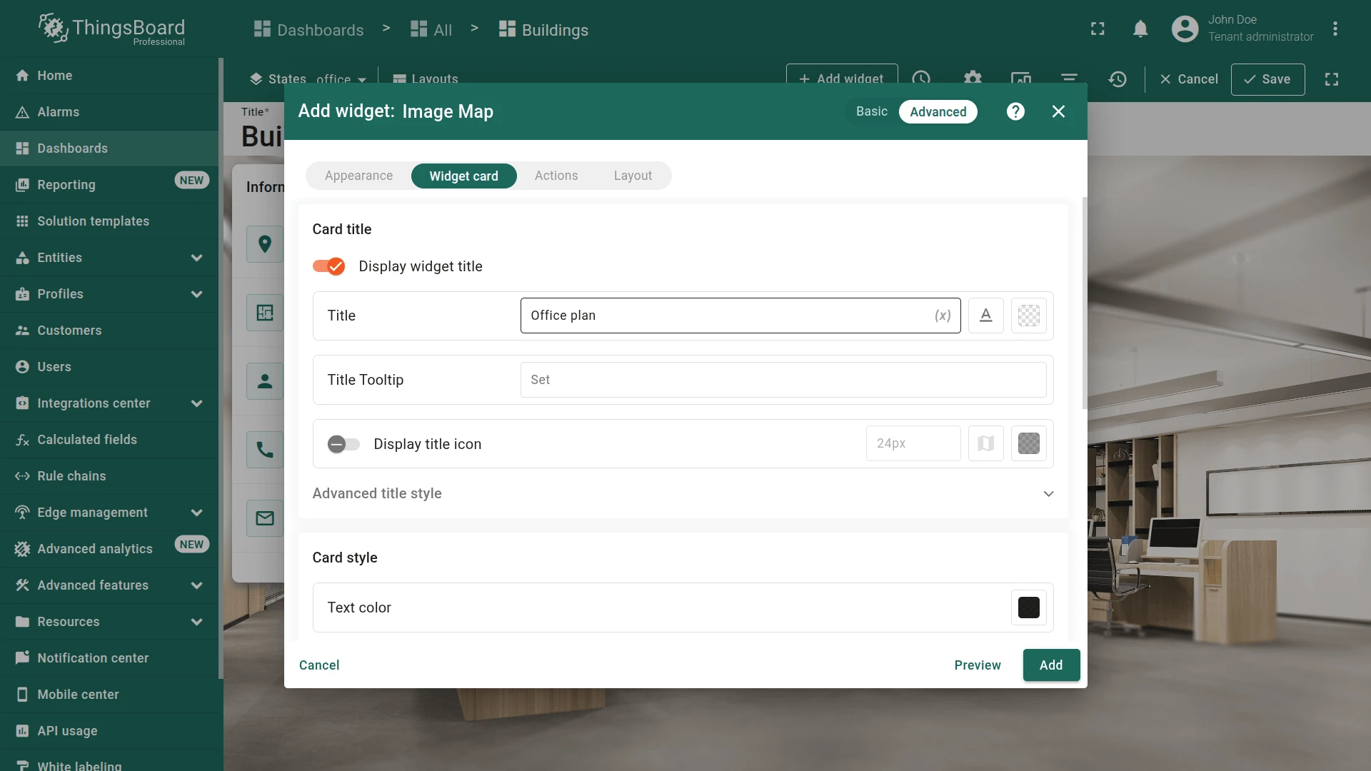
- Widget card tab. Disable Enable fullscreen and Enable data export, then click Add. Resize and position on the left side:
- Resize and position on the left side and save dashboard.
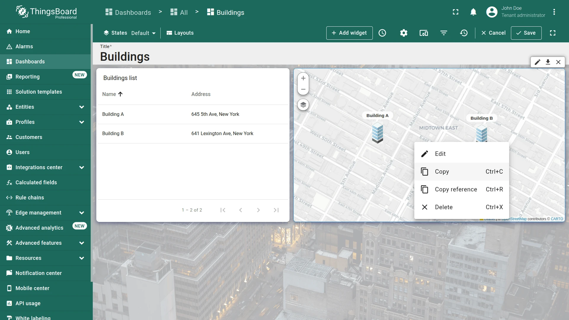
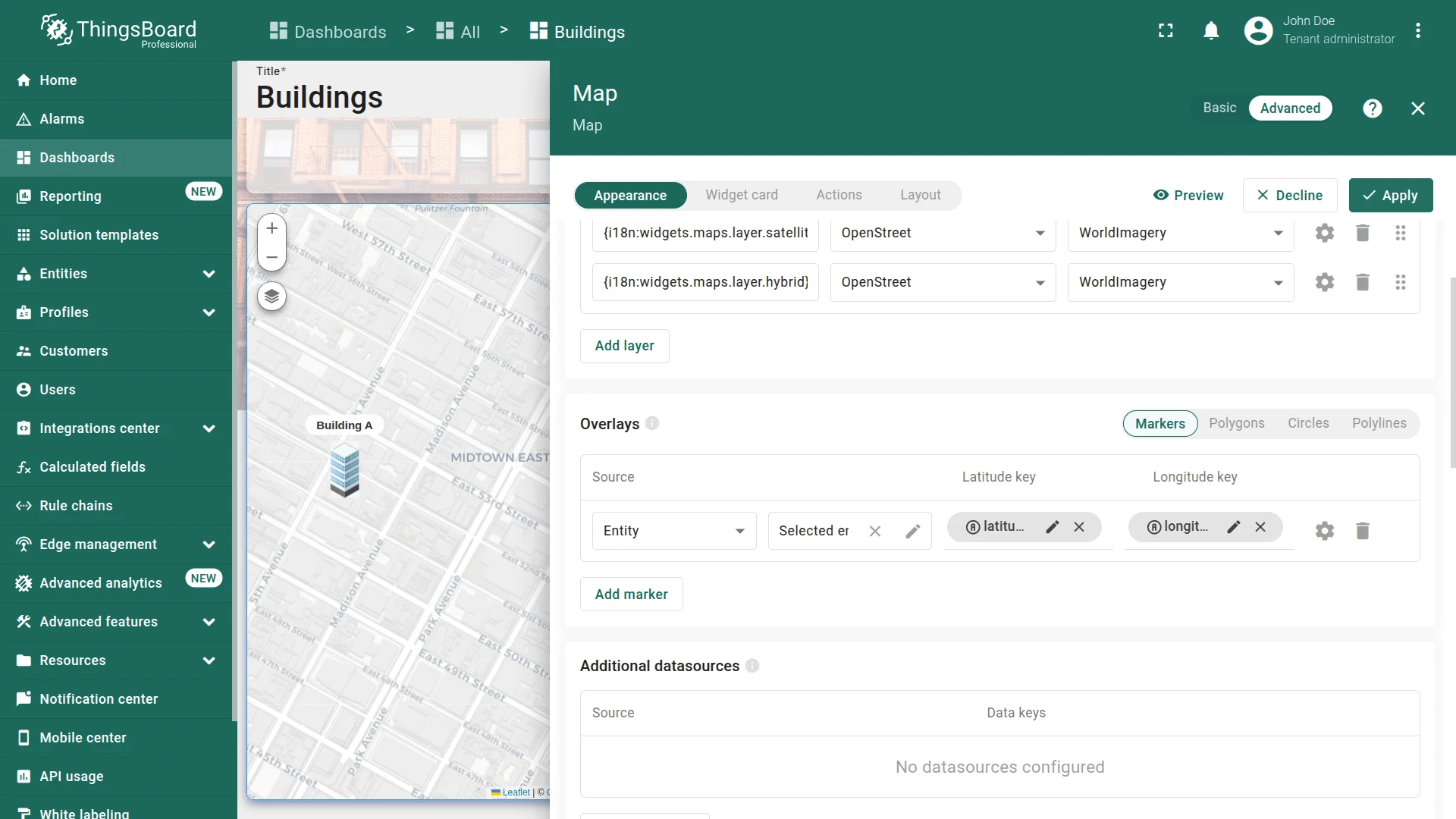
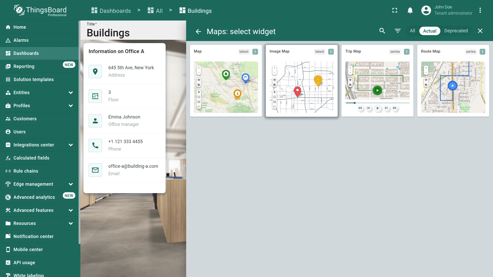
Map Widget
Section titled “Map Widget”Copy the Map widget from the default state and re-point it to the Selected entity alias to show only the currently selected building.
- Navigate to the default Buildings state, enter edit mode, right-click the Map widget, and select Copy.
- Navigate to the building state, right-click an empty area, and select Paste.
- Click the pencil icon on the pasted widget.
- In Datasource, change the alias from Buildings to Selected entity.
- Go to Appearance, find Tooltip, and remove the
<link-act>lines (no deeper navigation needed here). - Click Apply, position in the upper-right area, and save the dashboard.
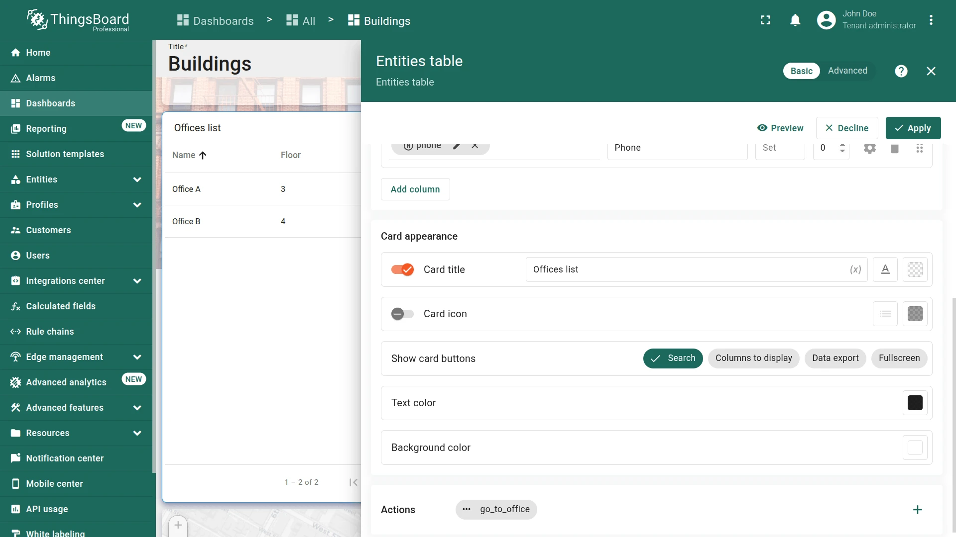
Offices List Widget
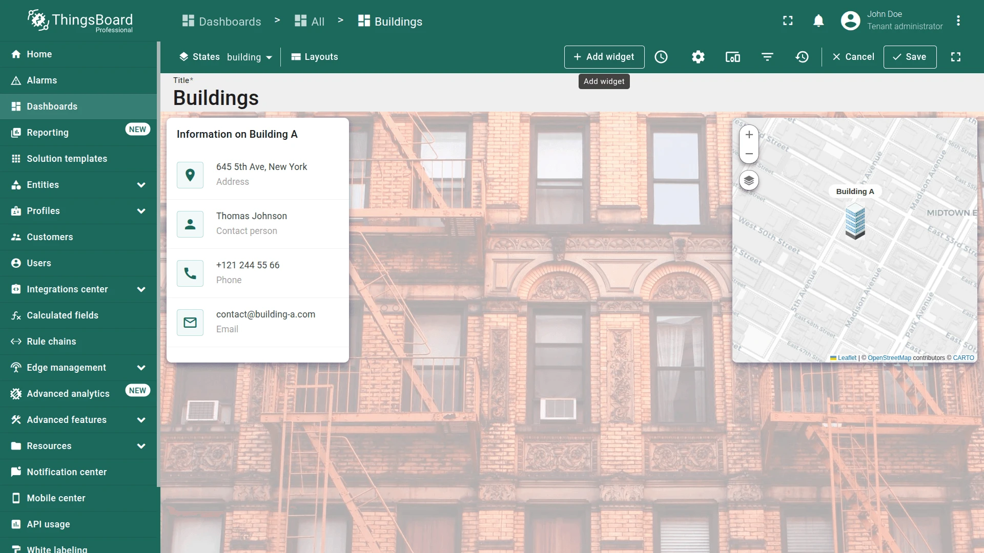
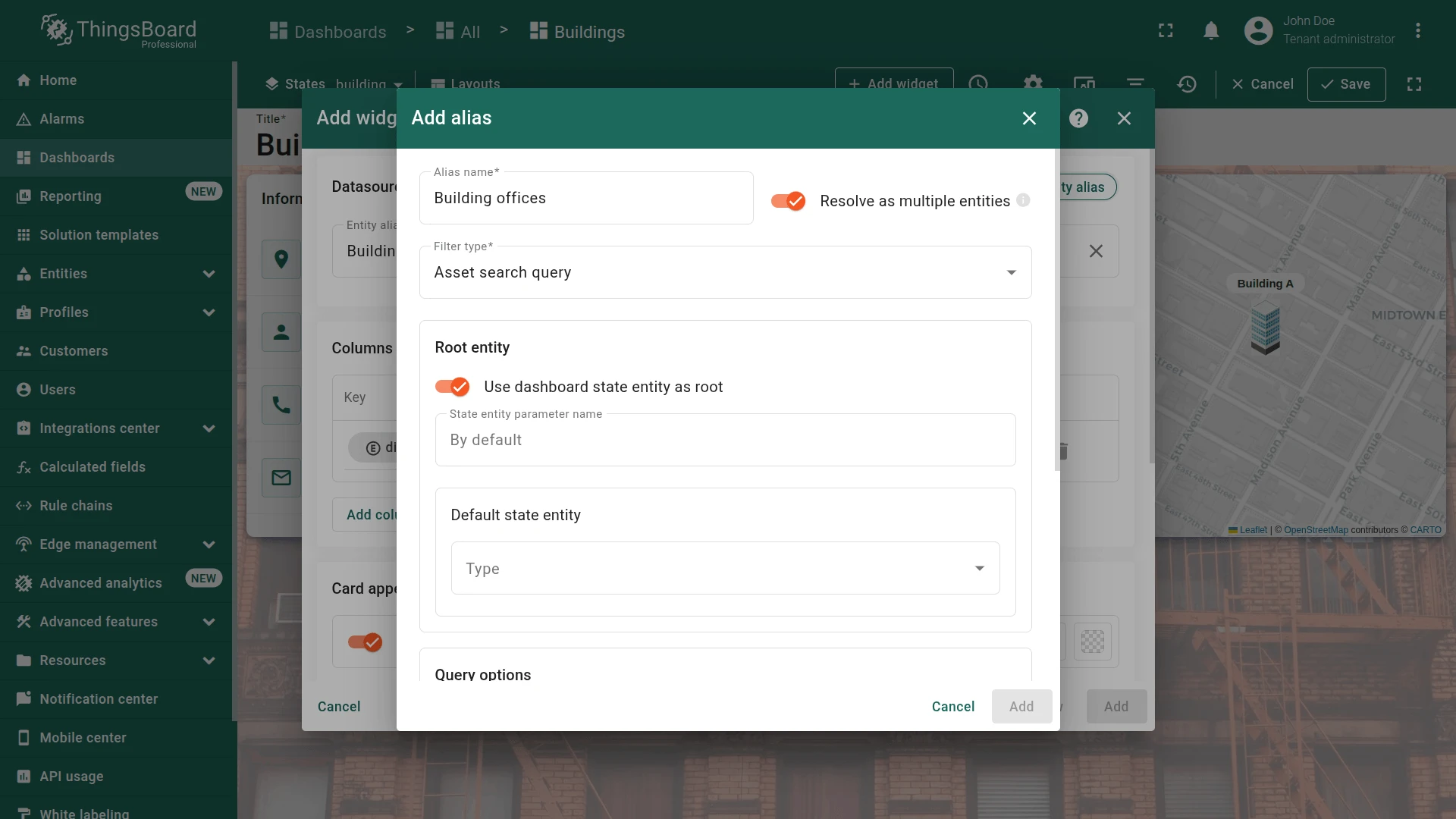
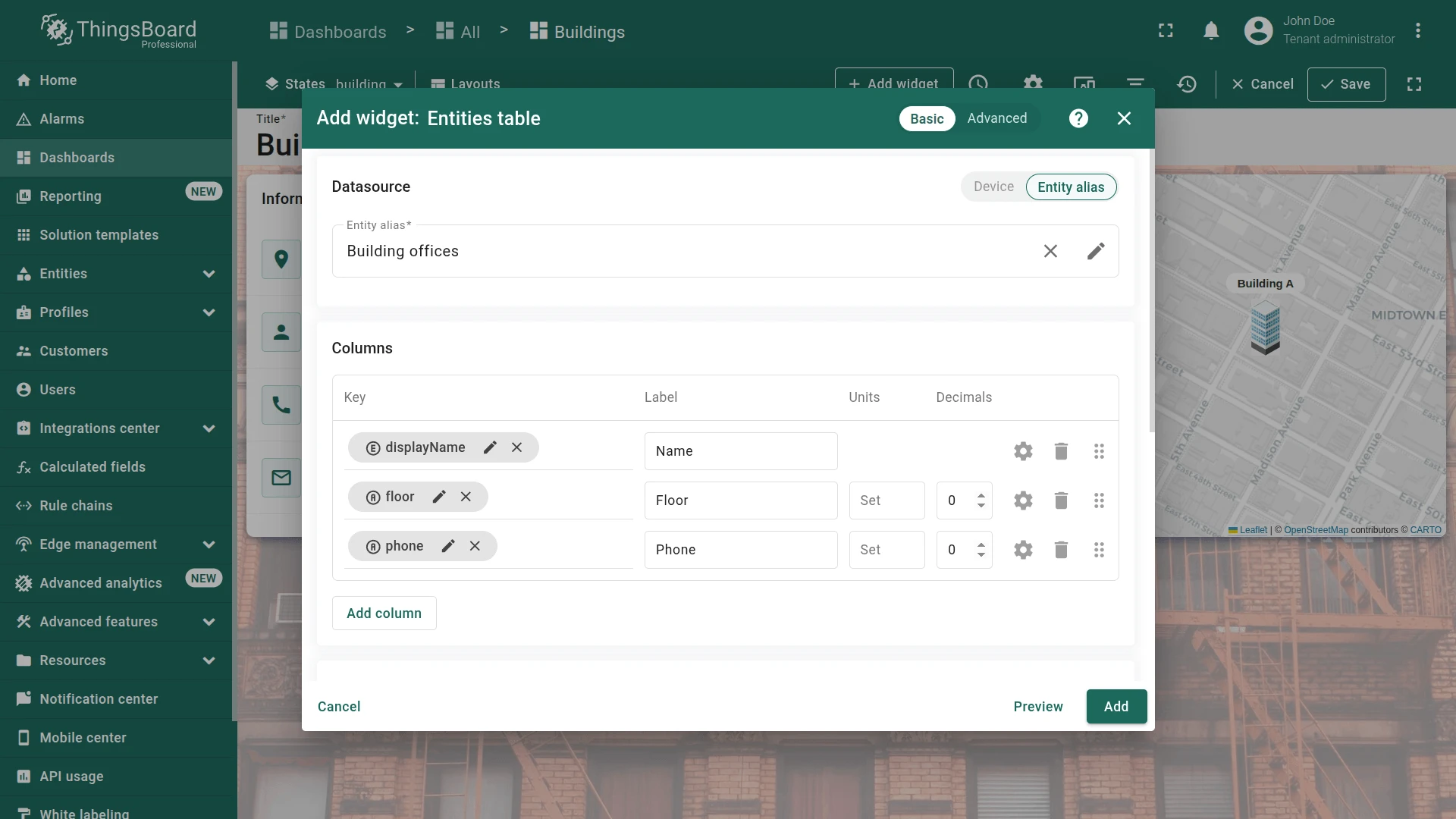
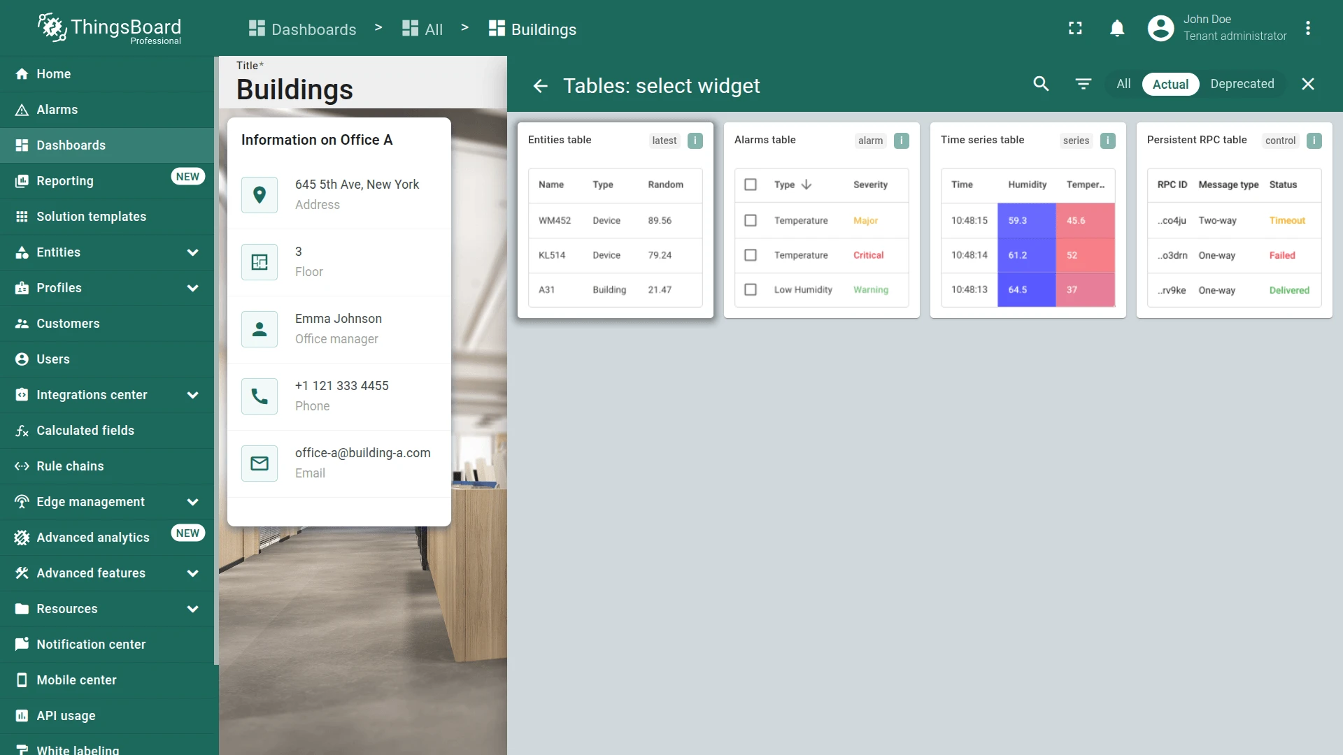
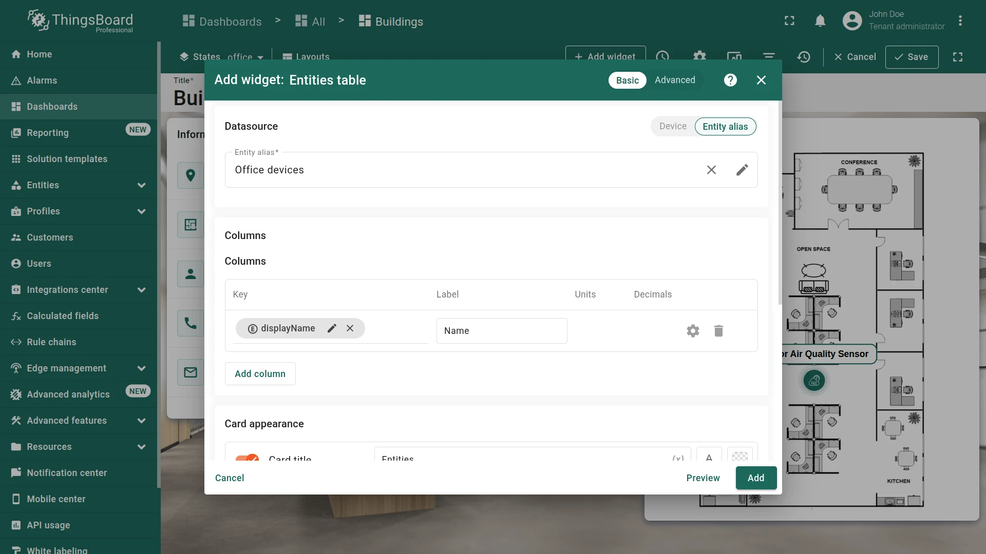
Section titled “Offices List Widget”Use an Entities table widget with Asset search query alias type to list all offices related to the currently selected building.
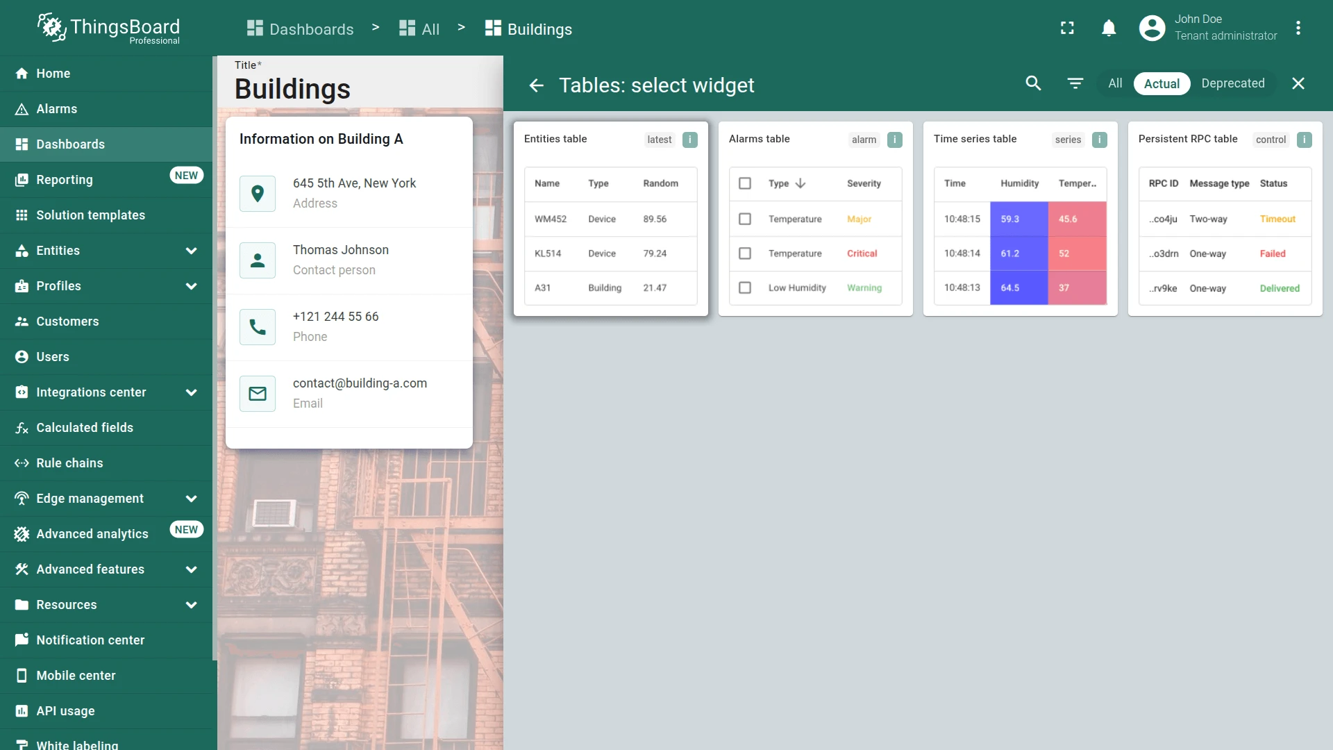
- In the building state (edit mode), click + Add widget.
- Select Tables ⇾ Entities table.
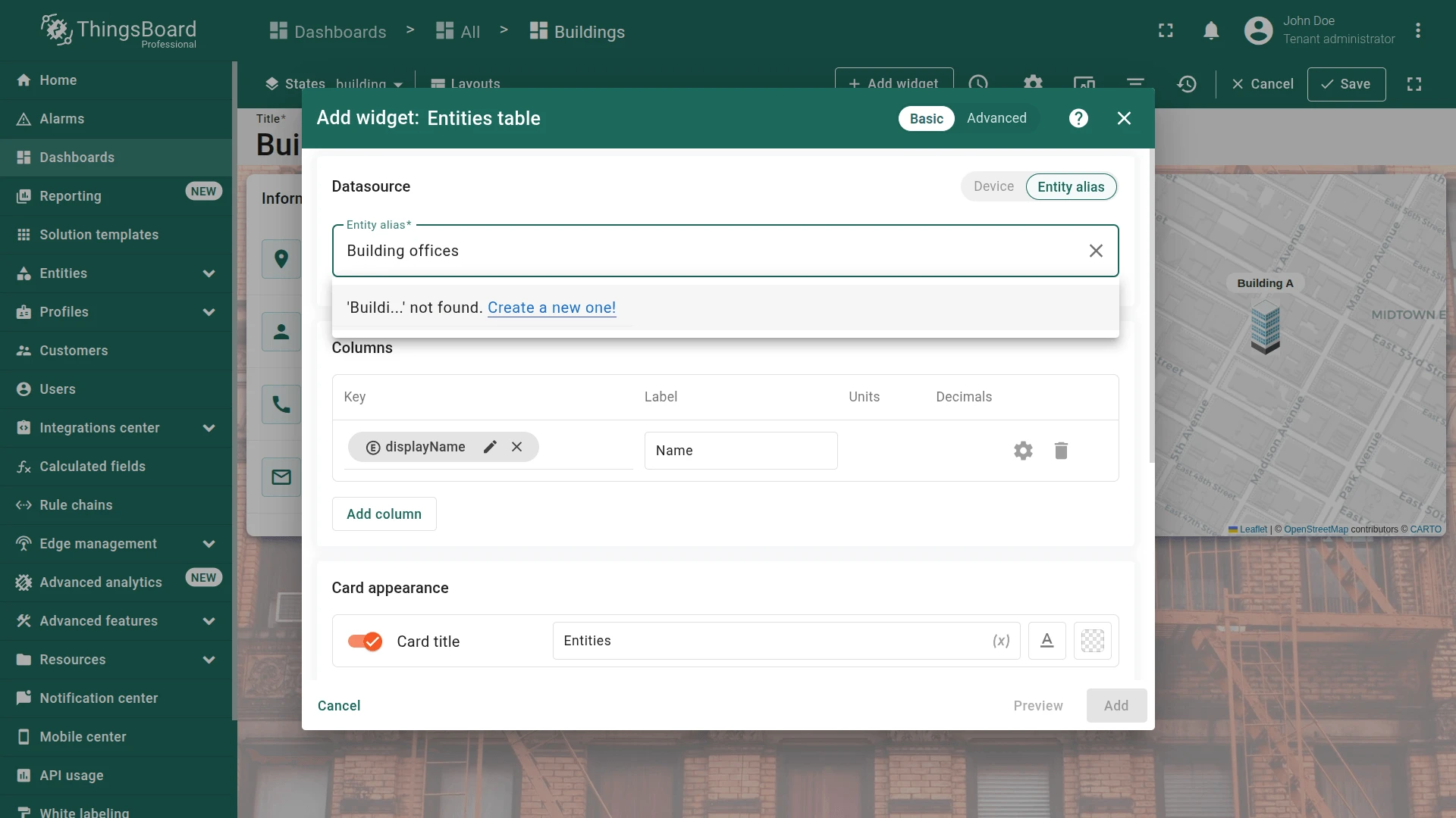
- Create the new entity alias:
- Type
Building officesin the alias field and click Create a new one! - Set filter type to Asset search query.
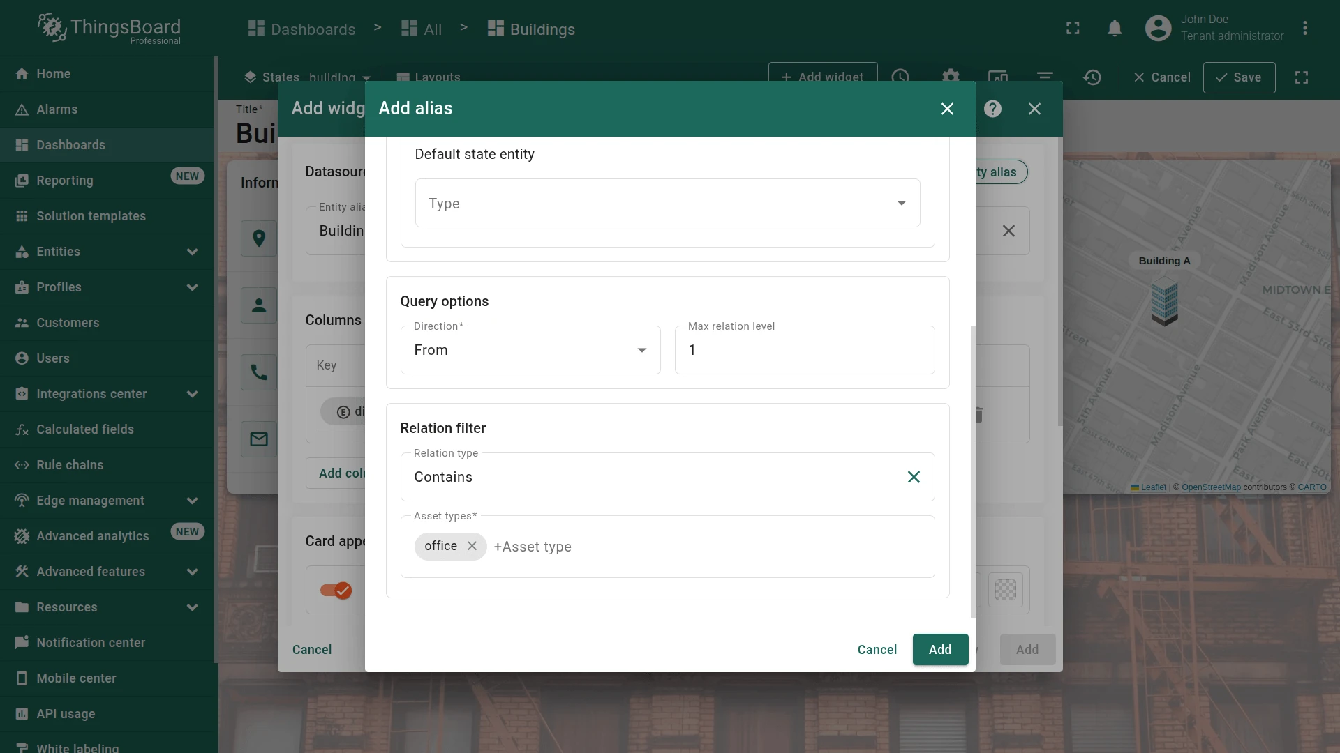
- Enable Use dashboard state entity as root.
- Set Max relation level to
1, relation type to Contains, asset type tooffice. - Click Add.
- Type
- Add data keys:
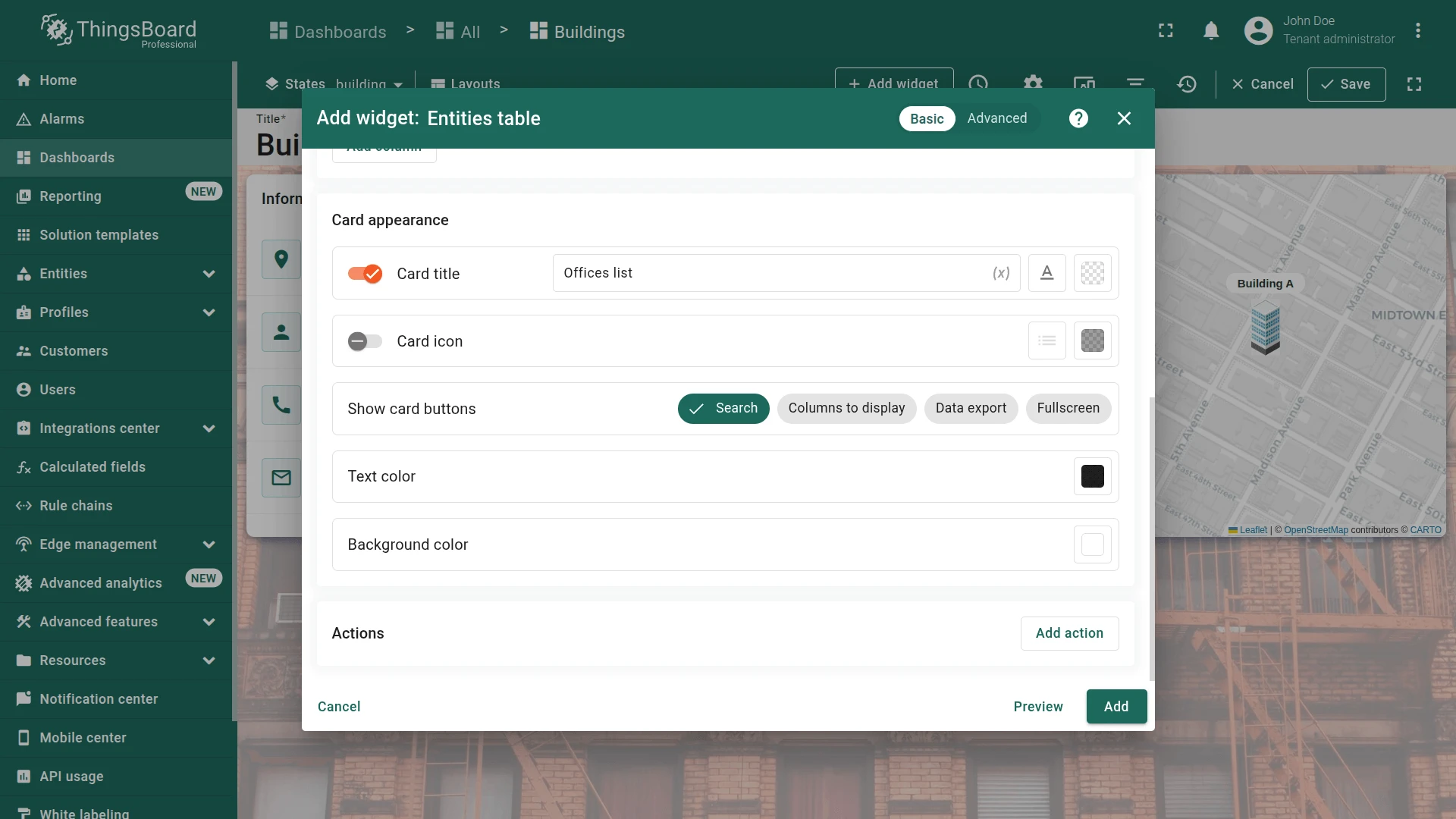
floor,phone. - Set card title to
Offices listand uncheck all card buttons except Search. - Click Add, resize below the info card, and save the dashboard.

Step 2.4 Office State
Section titled “Step 2.4 Office State”Add a background image, office info card, Image Map widget, and sensors list to the office state.
Navigation from Offices List
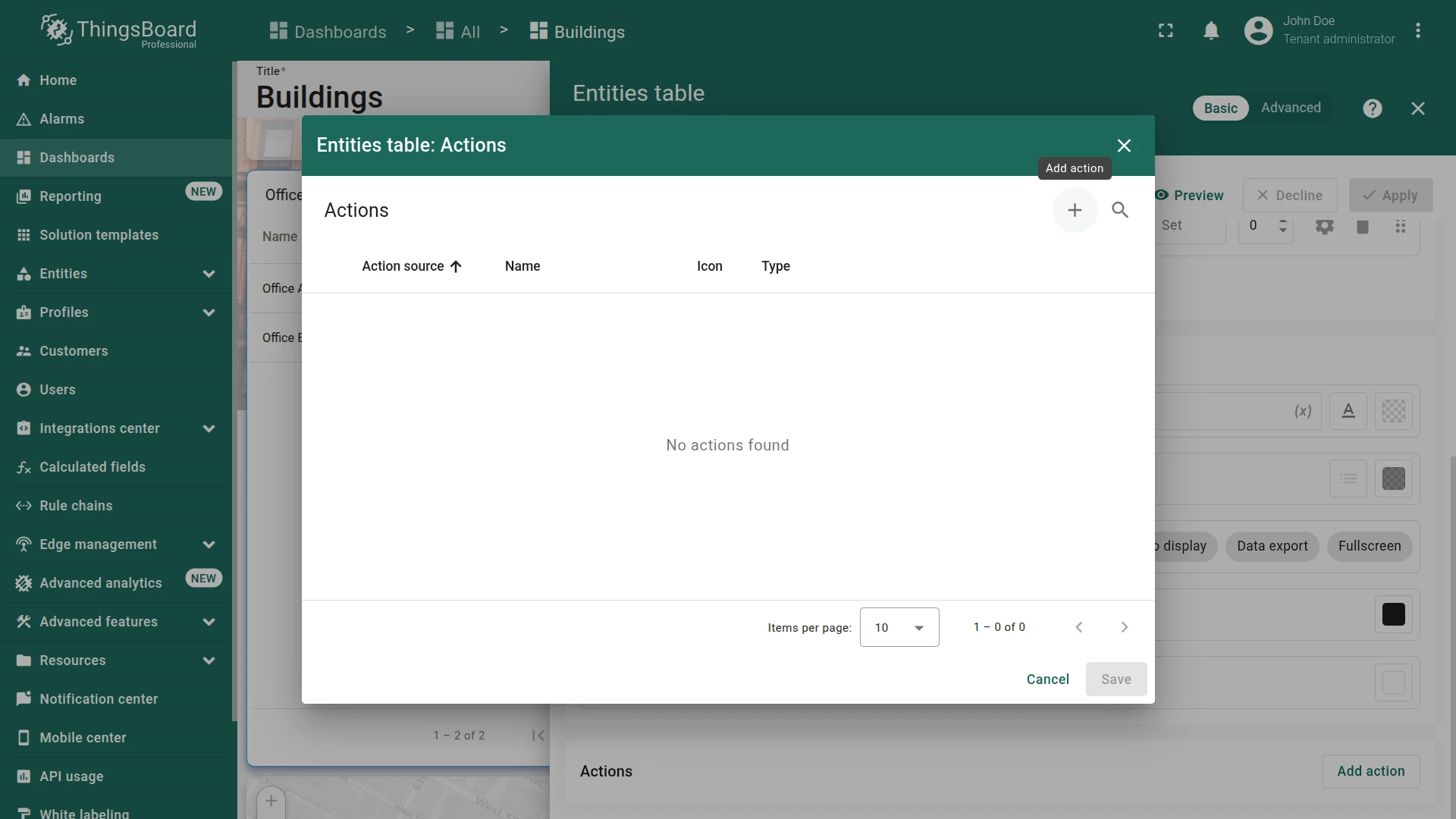
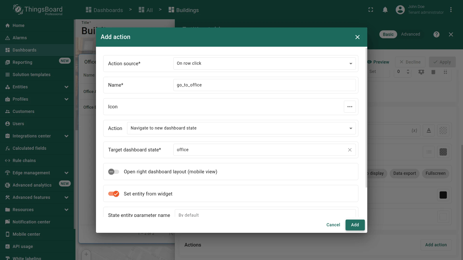
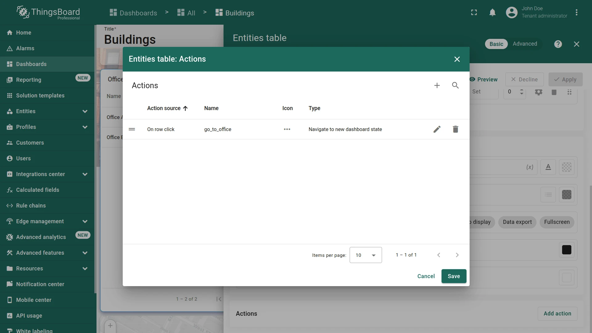
Section titled “Navigation from Offices List”Add an On row click action to the Offices list widget to navigate to the office state.
- On the building state and enter edit mode.
- Click the pencil icon on the Offices list widget.
- Scroll to Actions and click Add action.
- Click +.
- Set source to On row click, enter an action name (e.g.,
go_to_office). - Set type to Navigate to new dashboard state and select office.
- Click Add, then Save.
- Click Apply, then save the dashboard.
Open the Office A state by clicking it in the Office list widget.

Background Image
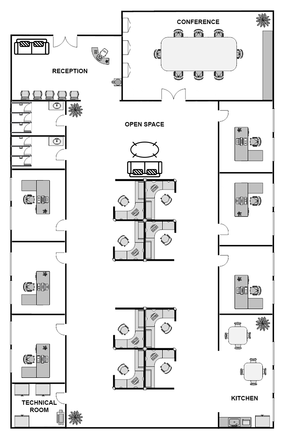
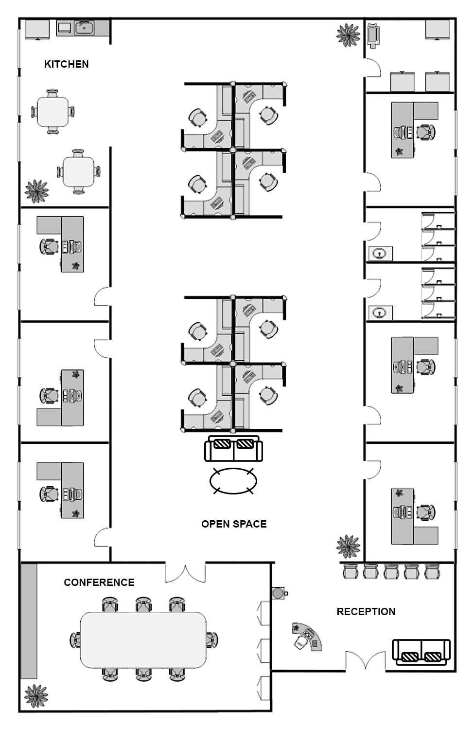
Section titled “Background Image”- Download the sample office floor plan.
- Select the office state from the toolbar state selector.
- Enter edit mode, click Manage layouts ⇾ gear icon.
- Click Browse from gallery, upload your floor plan, select it, and click Apply.
- Click Save, then save the dashboard.
Office Info Card
Section titled “Office Info Card”The office info card displays office attributes (floor, officeManager, phone, email) from the selected entity and the parent building’s address via a Relation type alias.
Datasources:
- In the office state (edit mode), click Add widget and select Markdown/HTML Card from Cards bundle.
- Add first datasource:
- Set Selected entity alias.
- Specify data keys:
floor,officeManager,phone,email.
- Add second datasource:
- Type
Entity with relation to dashboard state (asset)in the alias field and click Create a new one! - Set filter type to Relation type, enable Use dashboard state entity as root.
- Set direction to To, max relation level to 1.
- Add relation filter: type Contains, entity type Asset.
- Click Add.
- Add key
addressto this second datasource.
- Type
-
Appearance tab. Enable Use markdown/HTML value function and paste:
// data[0] = Selected entity (office), data[1] = parent building (via Relation type alias)if (data.length > 1) {const officeAttrs = ['floor', 'officeManager', 'phone', 'email'];const icons = { floor: 'mdi:floor-plan', officeManager: 'person', phone: 'call', email: 'mail_outline' };const labels = { floor: 'Floor', officeManager: 'Office manager', phone: 'Phone', email: 'Email' };let info = {entityName: data[0].entityName || 'Not found',address: data[1].address || 'Not found',fields: {}};officeAttrs.forEach(key => {info.fields[key] = data[0][key] || 'Not found';});const allMissing = Object.values(info.fields).every(v => v === 'Not found') && info.address === 'Not found';if (allMissing) {return `<div class="no-data-card"><h1 class="card-title">Information on ${info.entityName}</h1><div class="no-data-block"><div class="no-data-content"><p class="no-data-title">No office or building address information available</p></div></div></div>`;}let html = `<div class="card"><h1 class="card-title">Information on ${info.entityName}</h1><div class="attributes"><div class="attribute_container"><div class="icon_wrapper"><tb-icon class="icon" color="primary" matButtonIcon>place</tb-icon></div><div class="attribute_content"><p class="attribute">${info.address}</p><span class="attribute_label">Address</span></div></div>`;officeAttrs.forEach(key => {html += `<div class="attribute_container"><div class="icon_wrapper"><tb-icon class="icon" color="primary" matButtonIcon>${icons[key]}</tb-icon></div><div class="attribute_content"><p class="attribute">${info.fields[key]}</p><span class="attribute_label">${labels[key]}</span></div></div>`;});return html + '</div></div>';}
-
Use the same CSS from the building info card in the Markdown/HTML CSS section.
.card, .no-data-card {padding: 0px;height: 100%;}.card-title {position: sticky;top: 0;z-index: 2;font-size: 16px;letter-spacing: 0.25px;padding: 16px;}.attribute_container {display: flex;align-items: center;gap: 20px;padding: 16px;border-bottom: 1px solid #0000000d;}.icon {z-index: 1;}.icon_wrapper {display: flex;position: relative;align-items: center;padding: 8px;border: 1px solid var(--tb-primary-100, #305680);border-radius: 4px;}.icon_wrapper:before {content: '';z-index: 0;position: absolute;opacity: 0.1;background-color: var(--tb-primary-200, #305680);width: 100%;height: 100%;left: 0;top: 0;}.attribute, .attribute_label {font-size: 14px;line-height: 20px;}.attribute_label {color: #00000061;}.no-data-card {display: flex;flex-direction: column;}.no-data-block {display: flex;flex-direction: column;justify-content: center;height: 100%;max-width: 345px;padding: 0 15px;margin: 0 auto;text-align: center;}.no-data-content {transform: translateY(-30%);}.no-data-block p {font-weight: 500;}.no-data-title {color: rgba(0, 0, 0, 0.54);}.no-data-subtitle {font-size: 13px;color: rgba(0, 0, 0, 0.38);}
- Widget card tab. Enable fullscreen and data export, then click Add.
- Resize and save the dashboard.
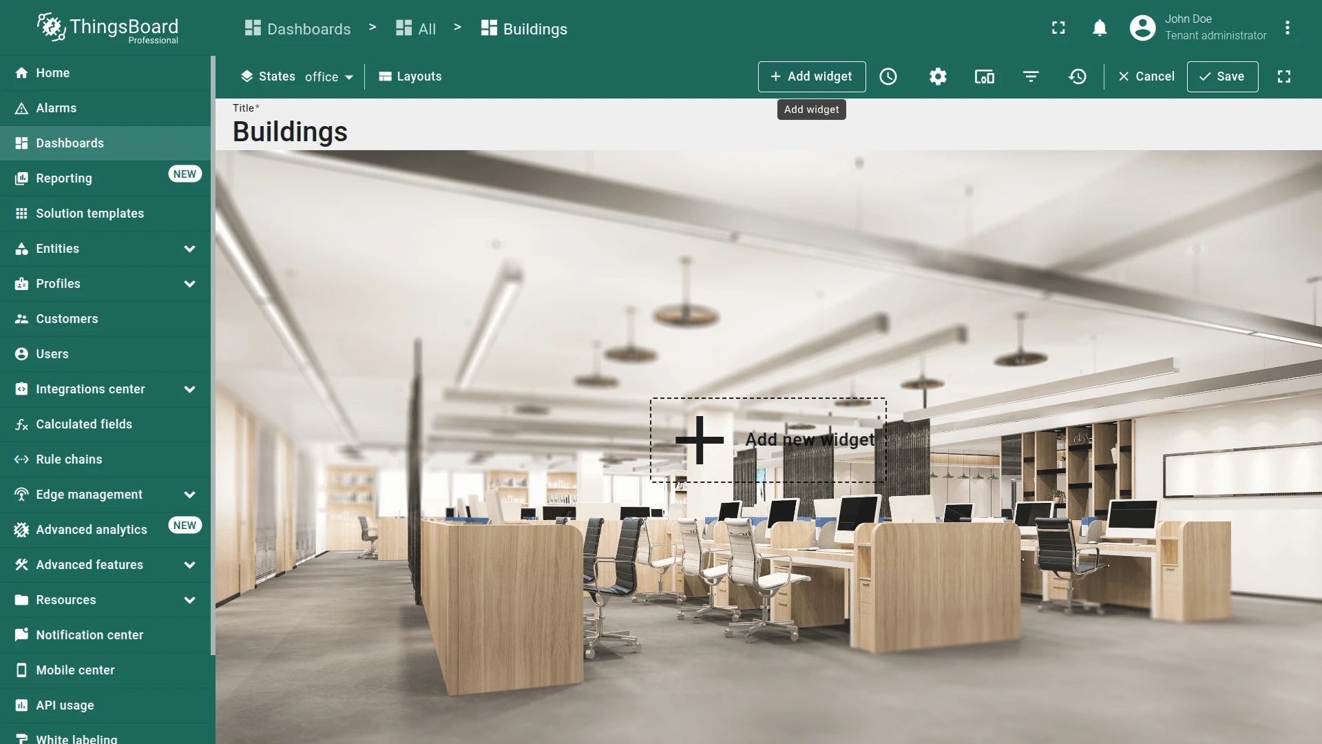
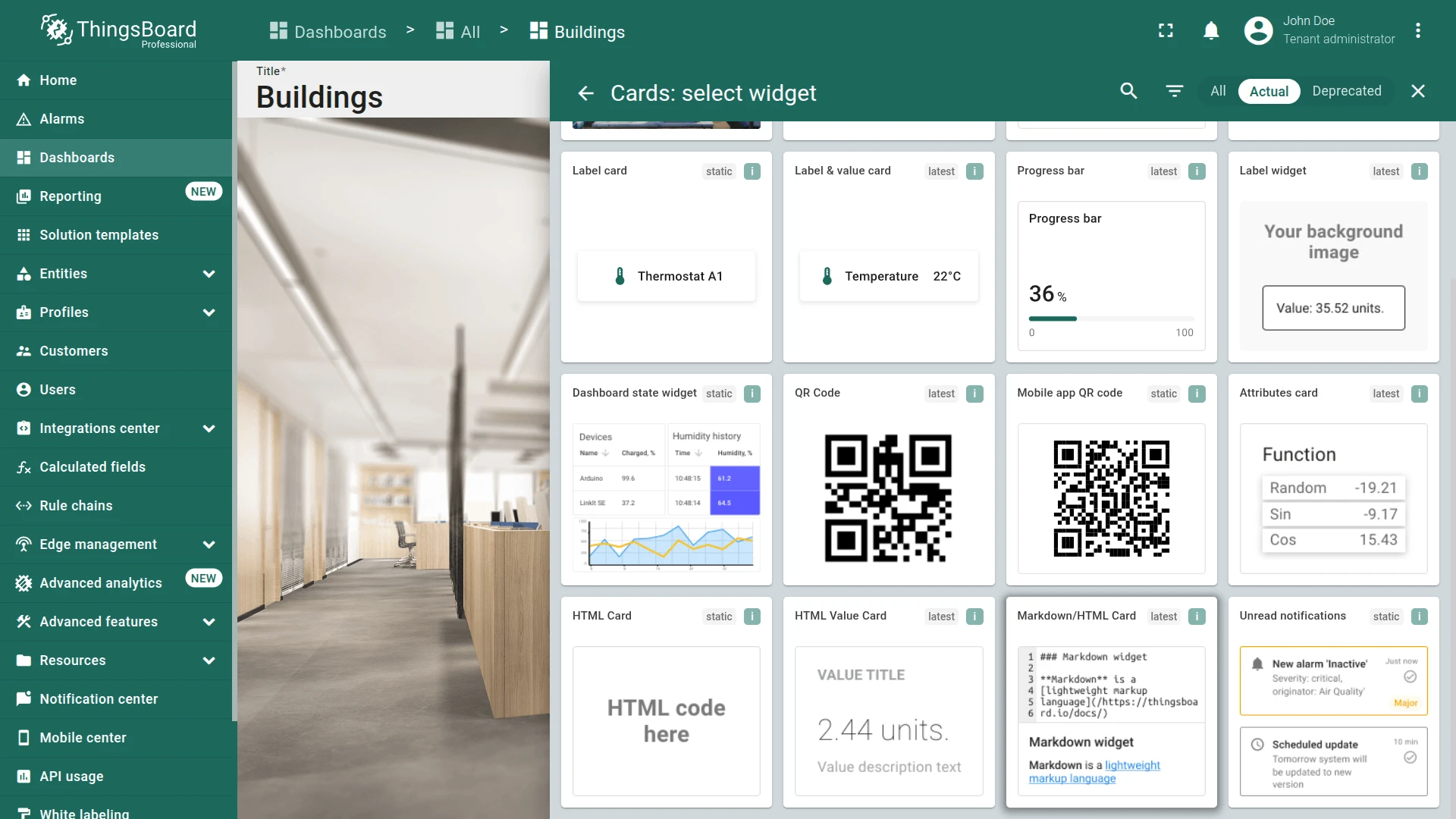
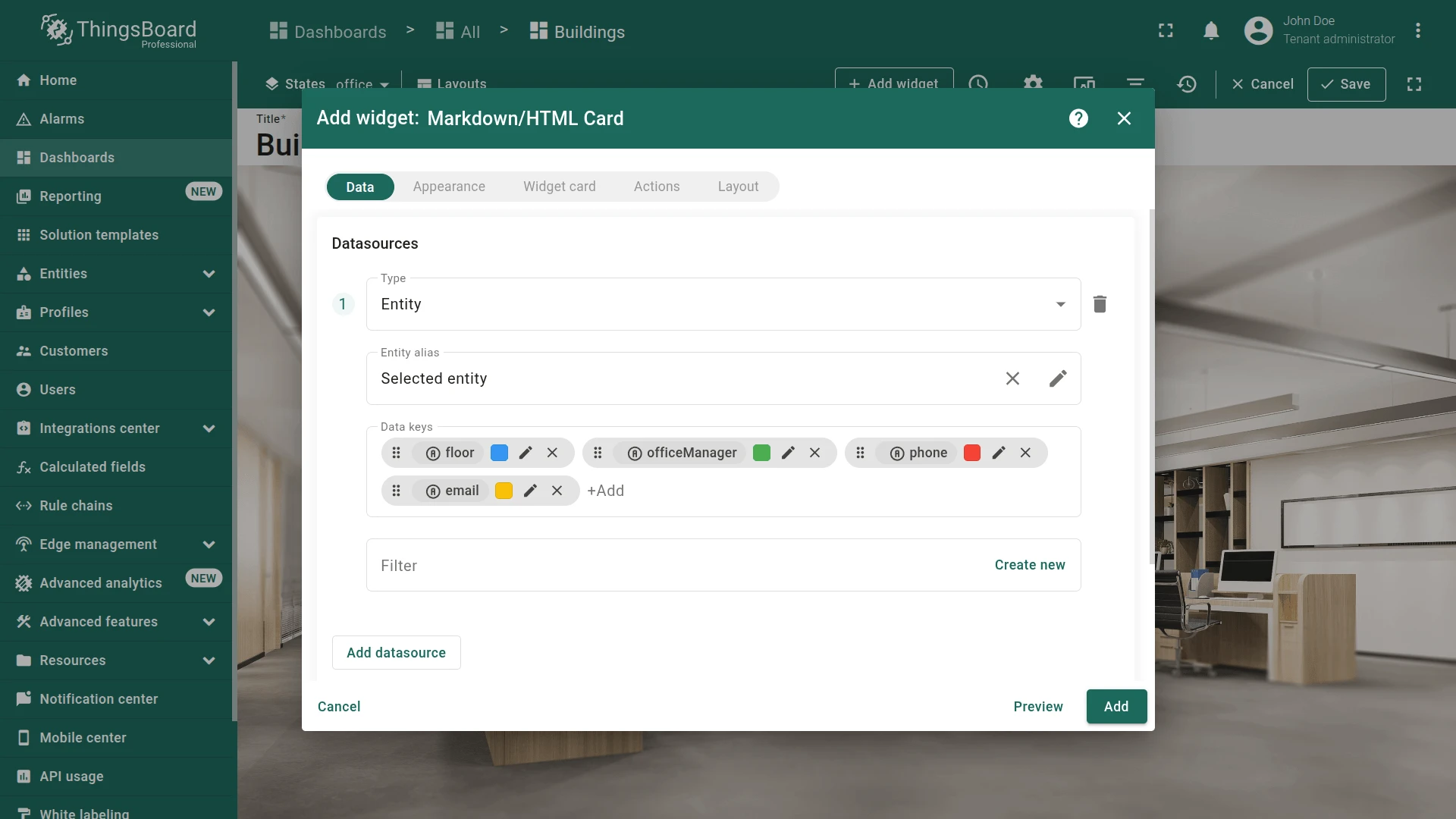
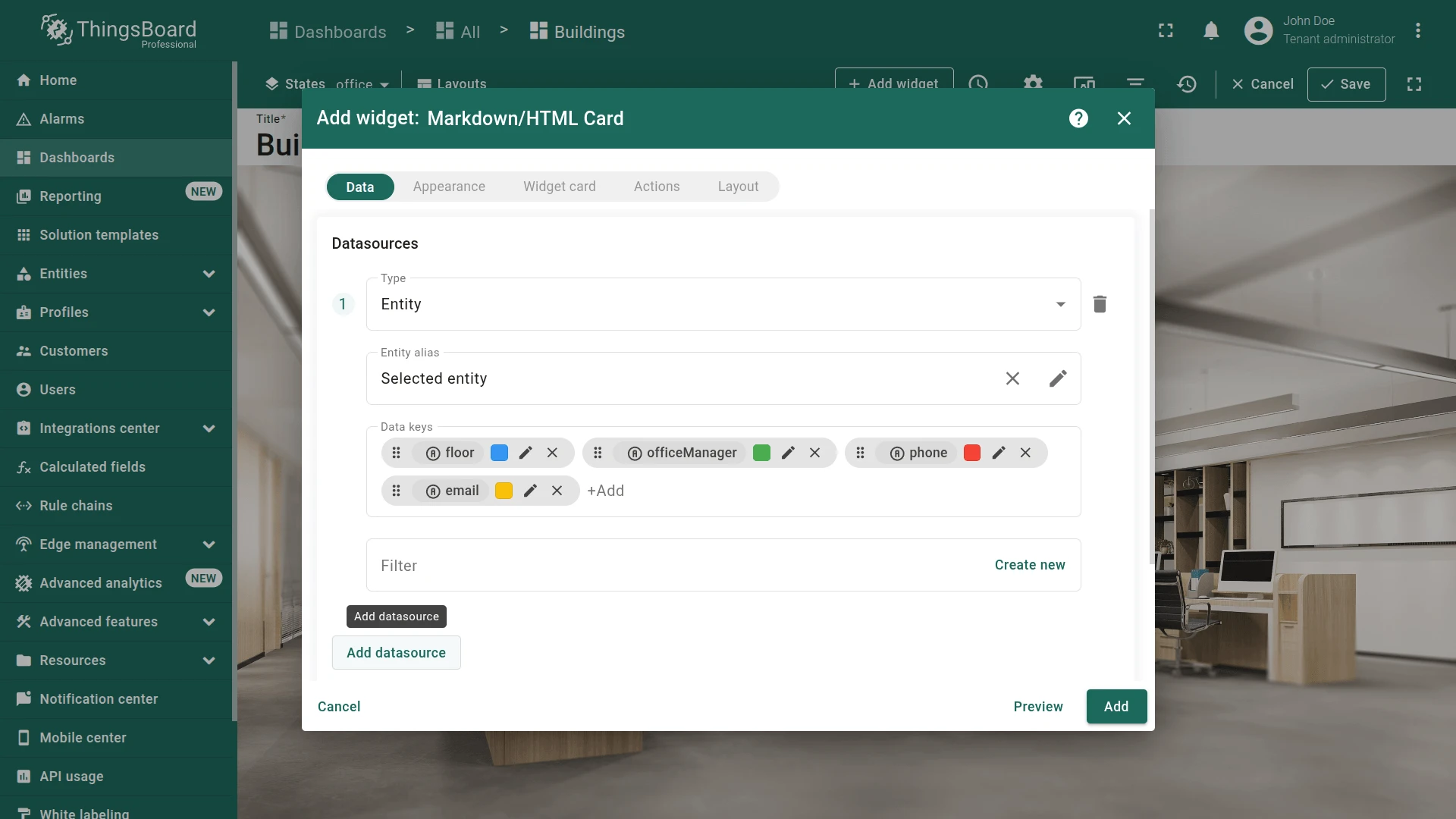
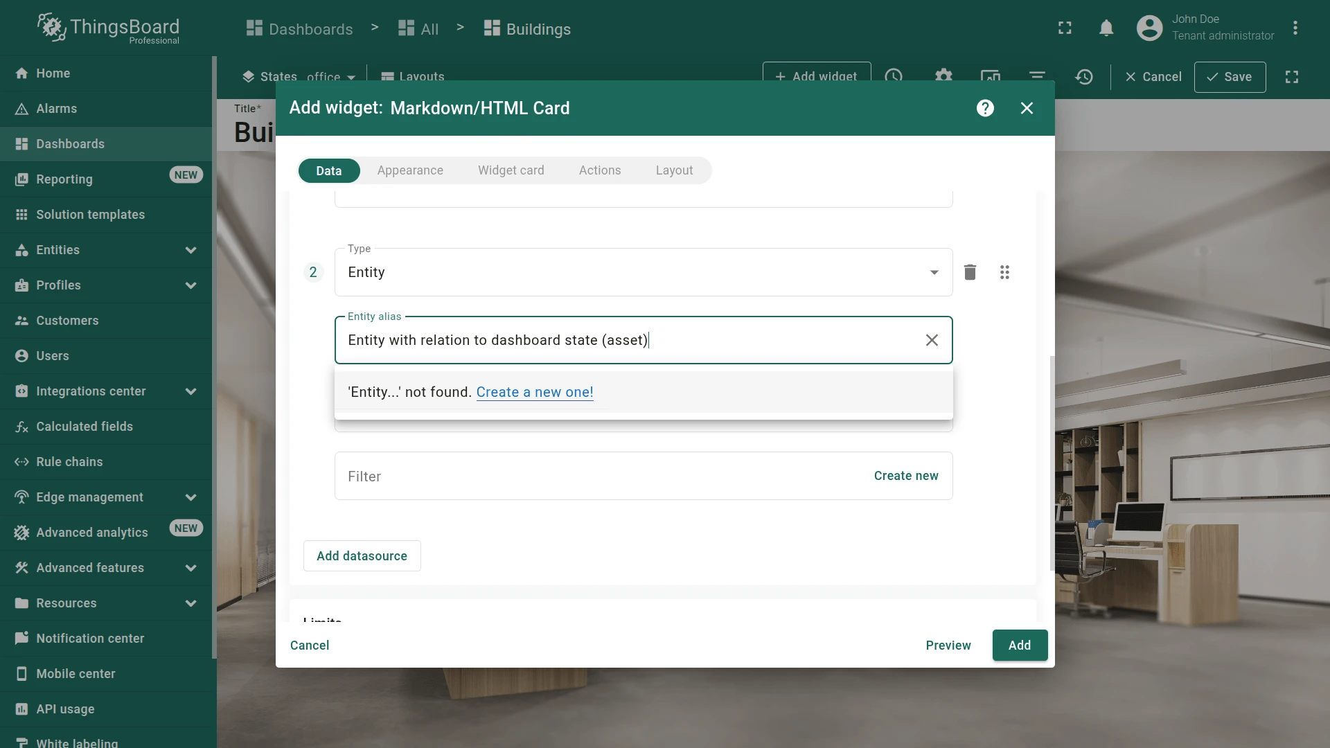
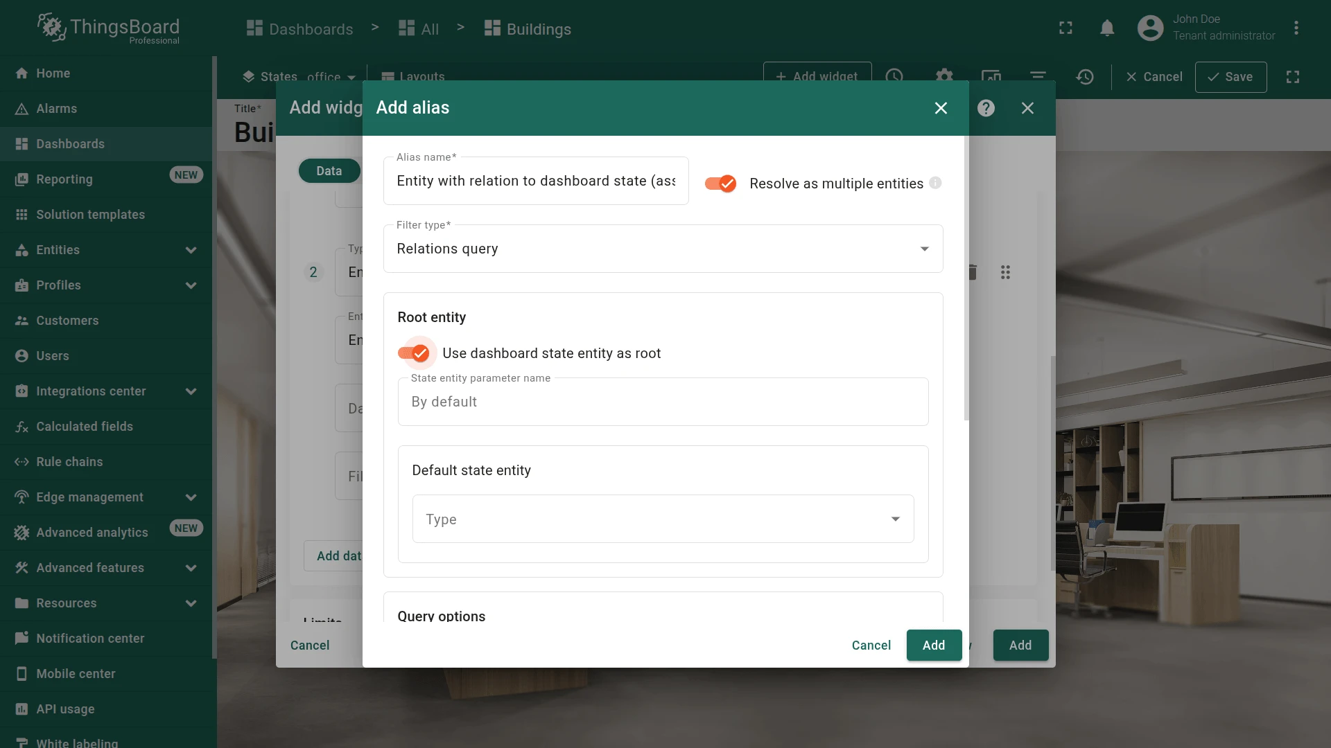
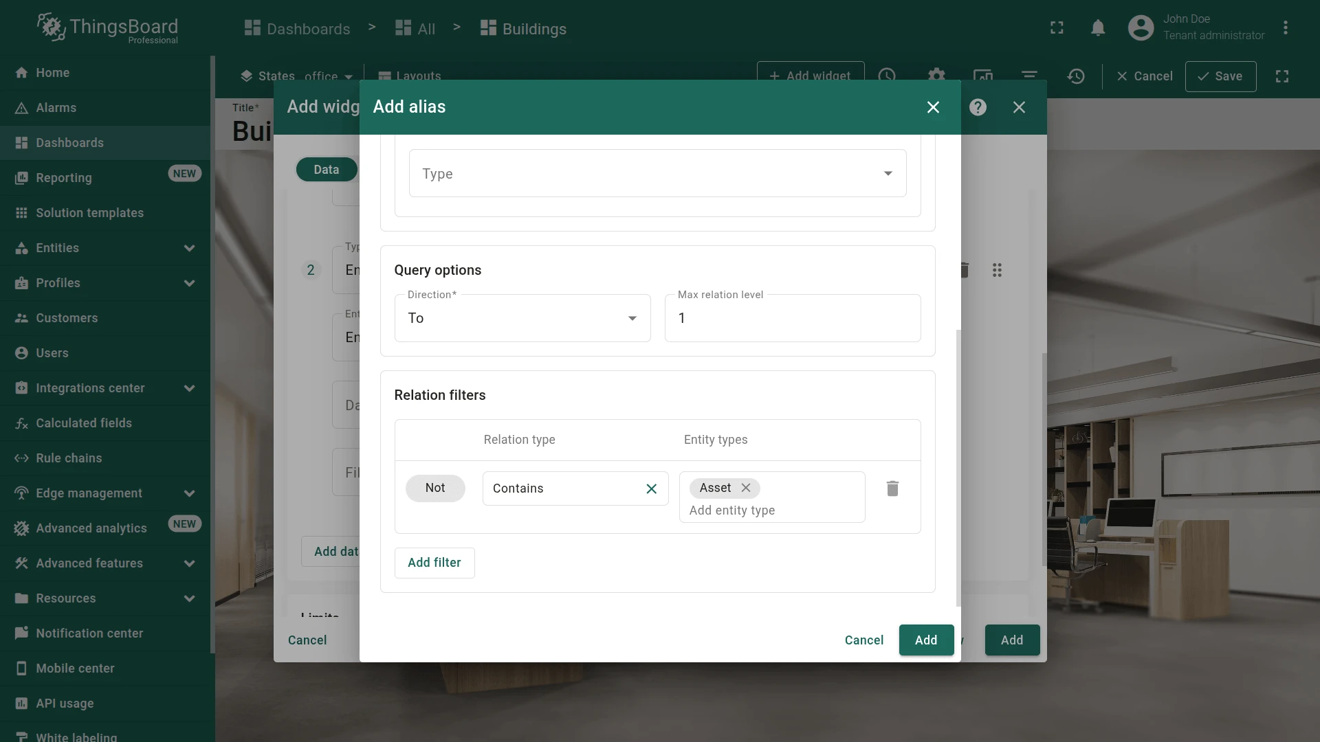
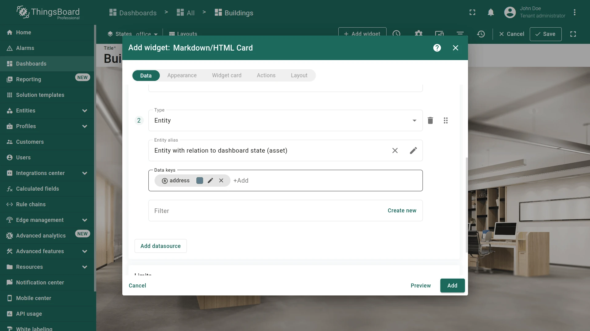
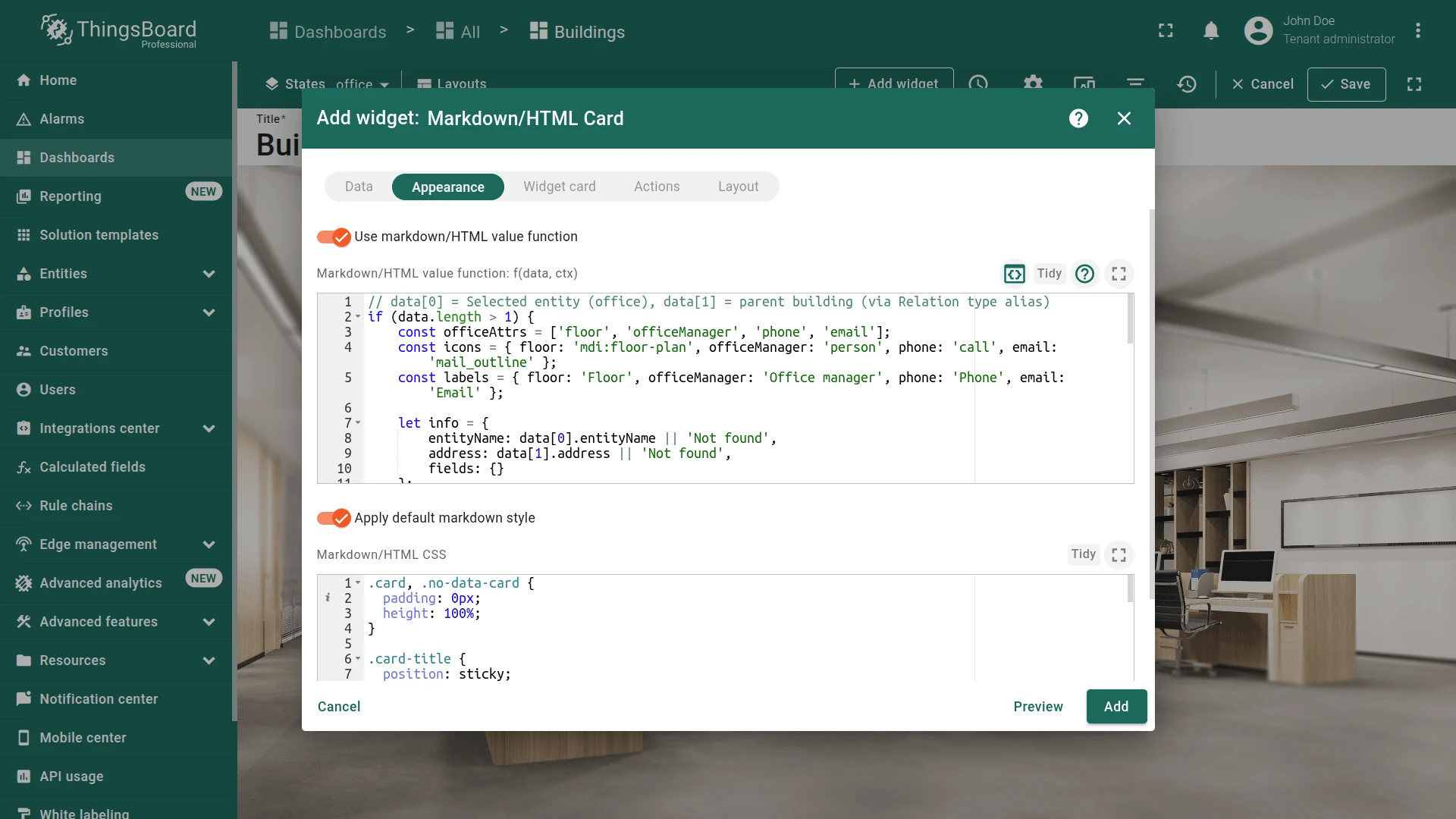
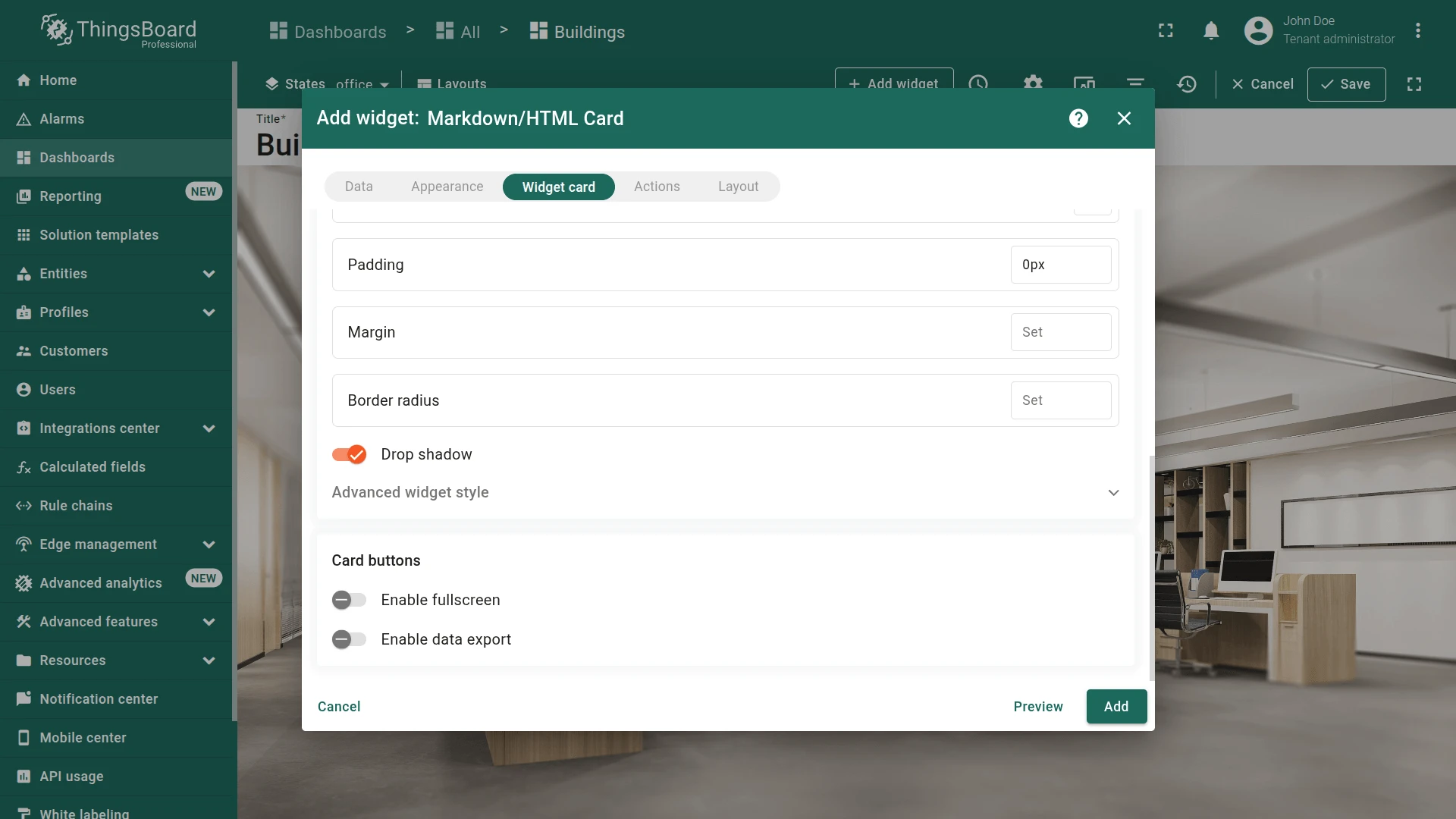
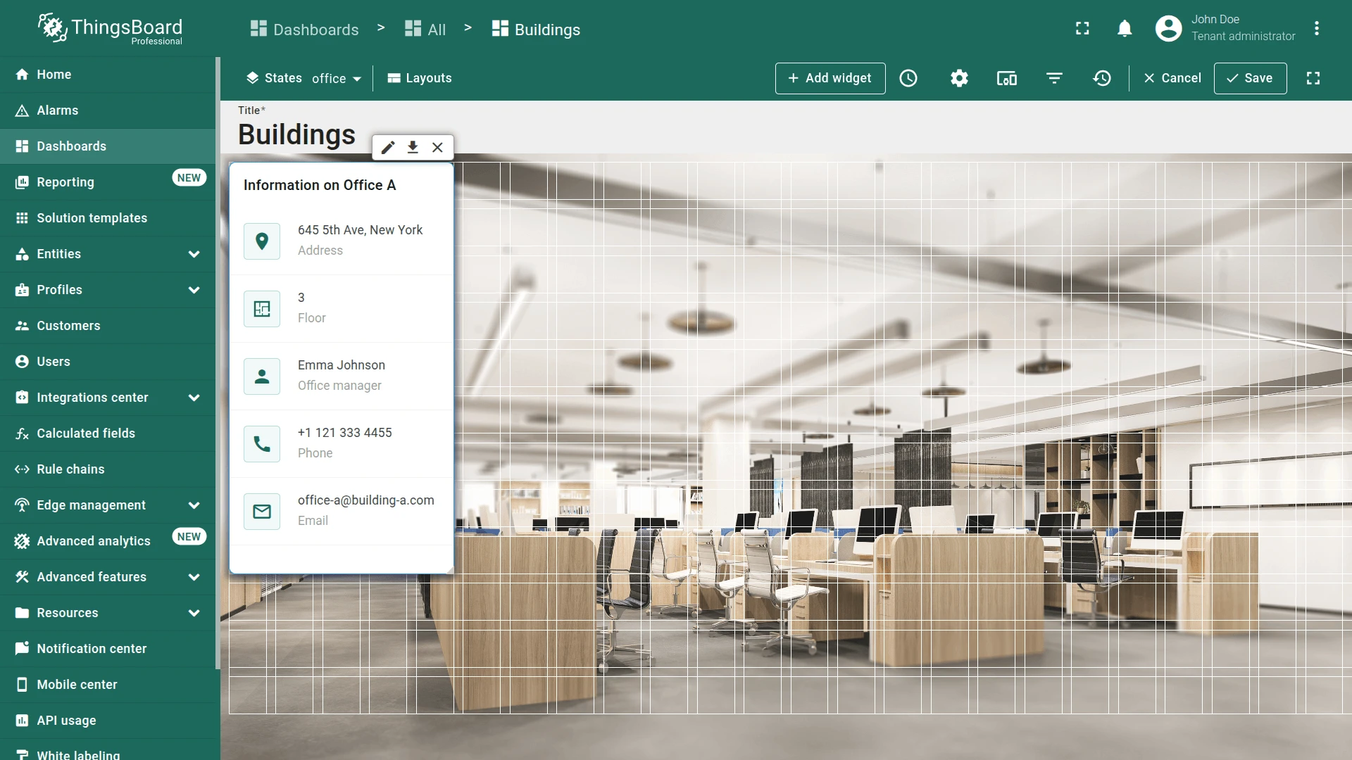
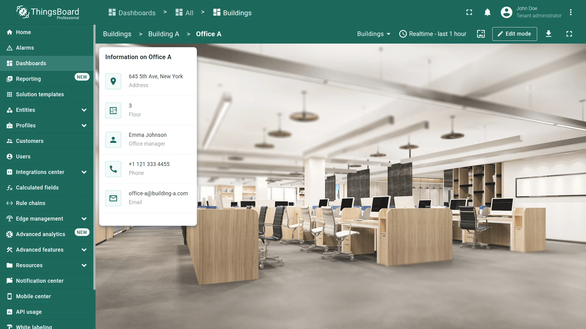
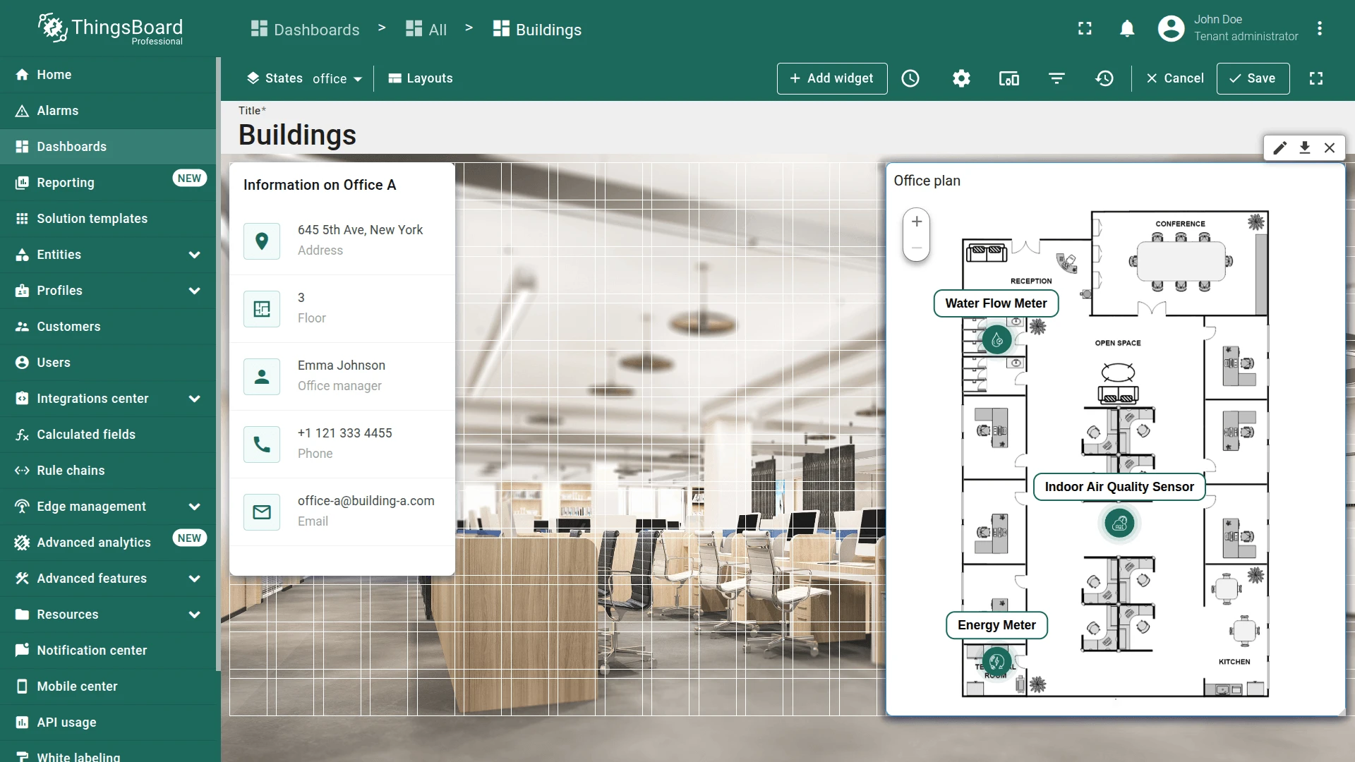
Image Map Widget
Section titled “Image Map Widget”The Image Map widget places device markers on a custom floor plan using percentage-based X/Y coordinates (0–1) stored as entity attributes.
Device Coordinates
Section titled “Device Coordinates”The coordinates used to determine device positions on the floor plan were defined during devices creation as the xPos and yPos attributes.
| Device | xPos | yPos |
|---|---|---|
| SD-001 | 0.51 | 0.68 |
| EM-002 | 0.14 | 0.95 |
| WM-003 | 0.14 | 0.32 |
| AM-307 | 0.49 | 0.38 |
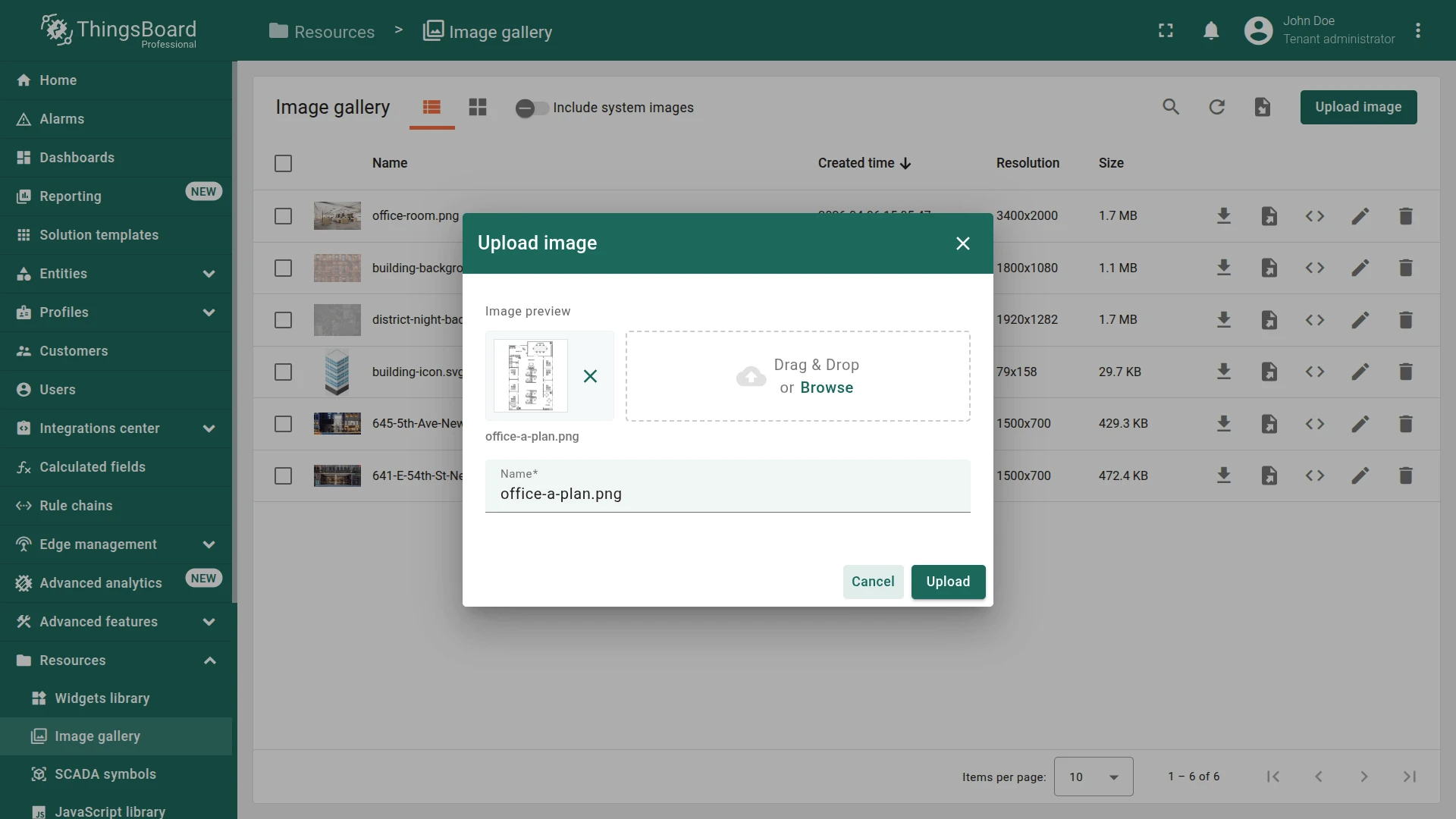
Upload the Office Plan Image
Section titled “Upload the Office Plan Image”- Download the sample office floor plan.
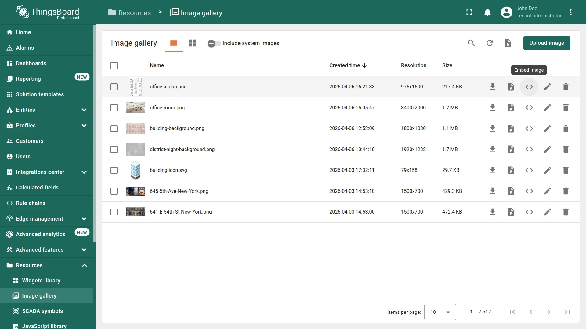
- Go to Resources ⇾ Image gallery and click Upload image.
- Upload the office floor plan.
- Copy the Embed image link — you’ll need it for the widget background.
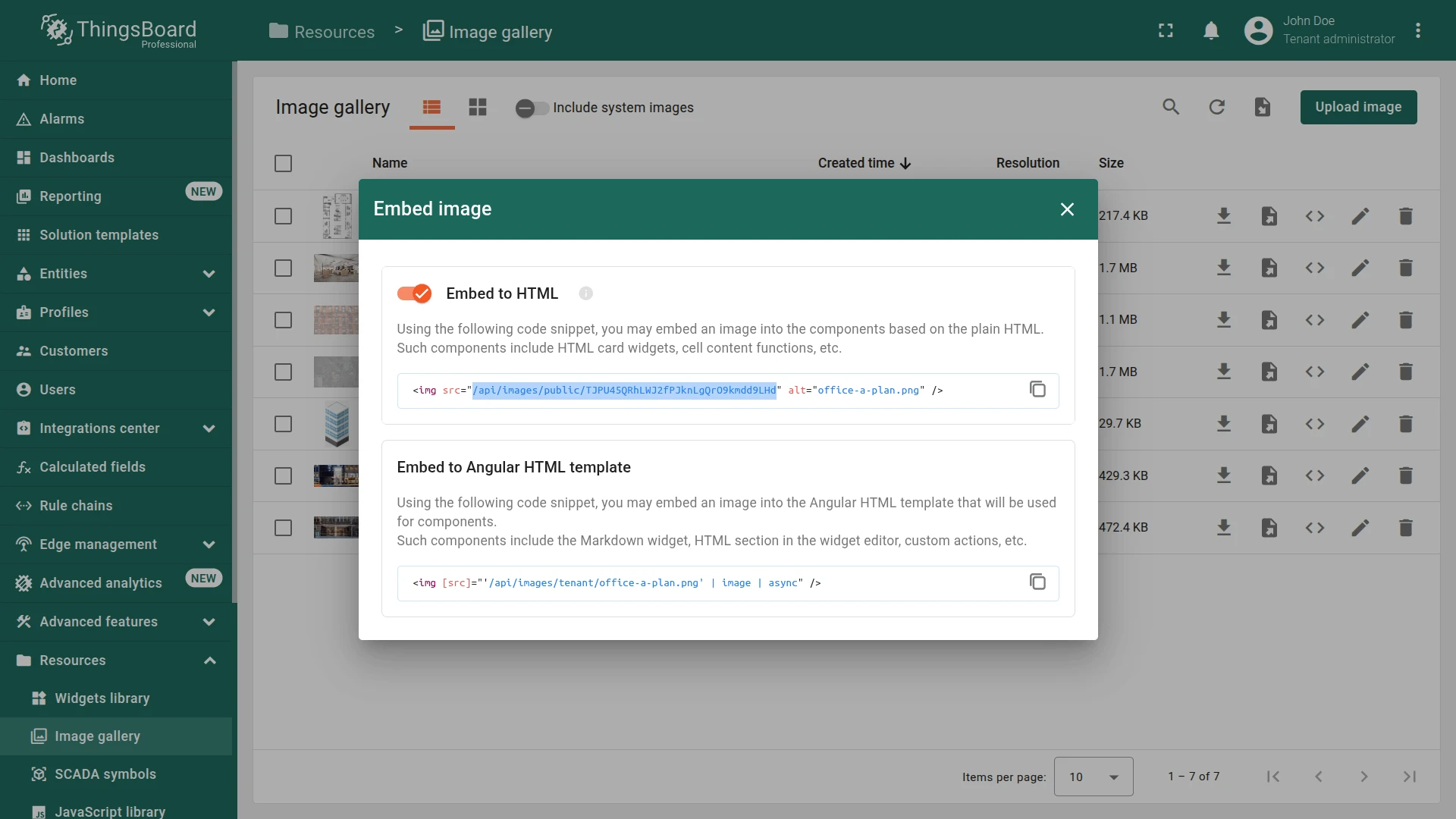
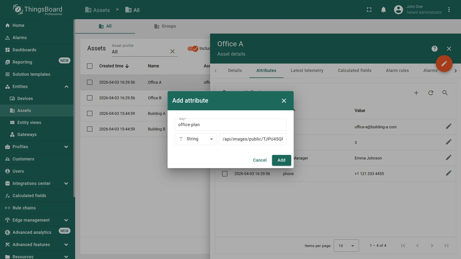
- Go to Entities ⇾ Assets, and select Office A.
- Navigate to the Attributes.
- Click +.
- Name it
office-plan, choose String as the value type, and paste the previously copied link into the value field. - Click Add.

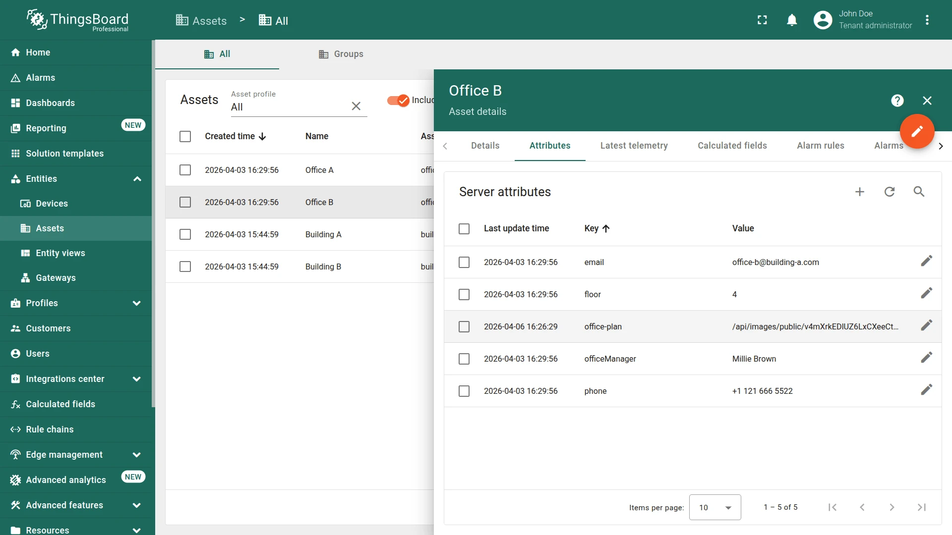
Similarly, upload the Office B plan image to the Image gallery, and add a link to it for “Office B” asset as a server attribute. Use the provided Office B plan image or upload your own image.
Add the Widget
Section titled “Add the Widget”- In the office state (edit mode), click + Add widget.
- Select the Maps ⇾ Image Map.
- Set the office plan image as widget background:
- Go to Appearance ⇾ Image source.
- Switch to the Entity key.
- Set source entity alias to Selected entity alias.
- Set image URL key to
office-planattribute.
- Create the new entity alias:
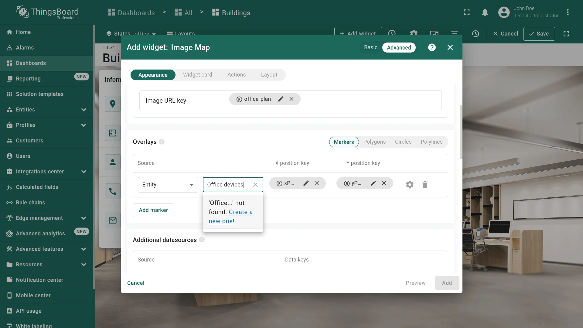
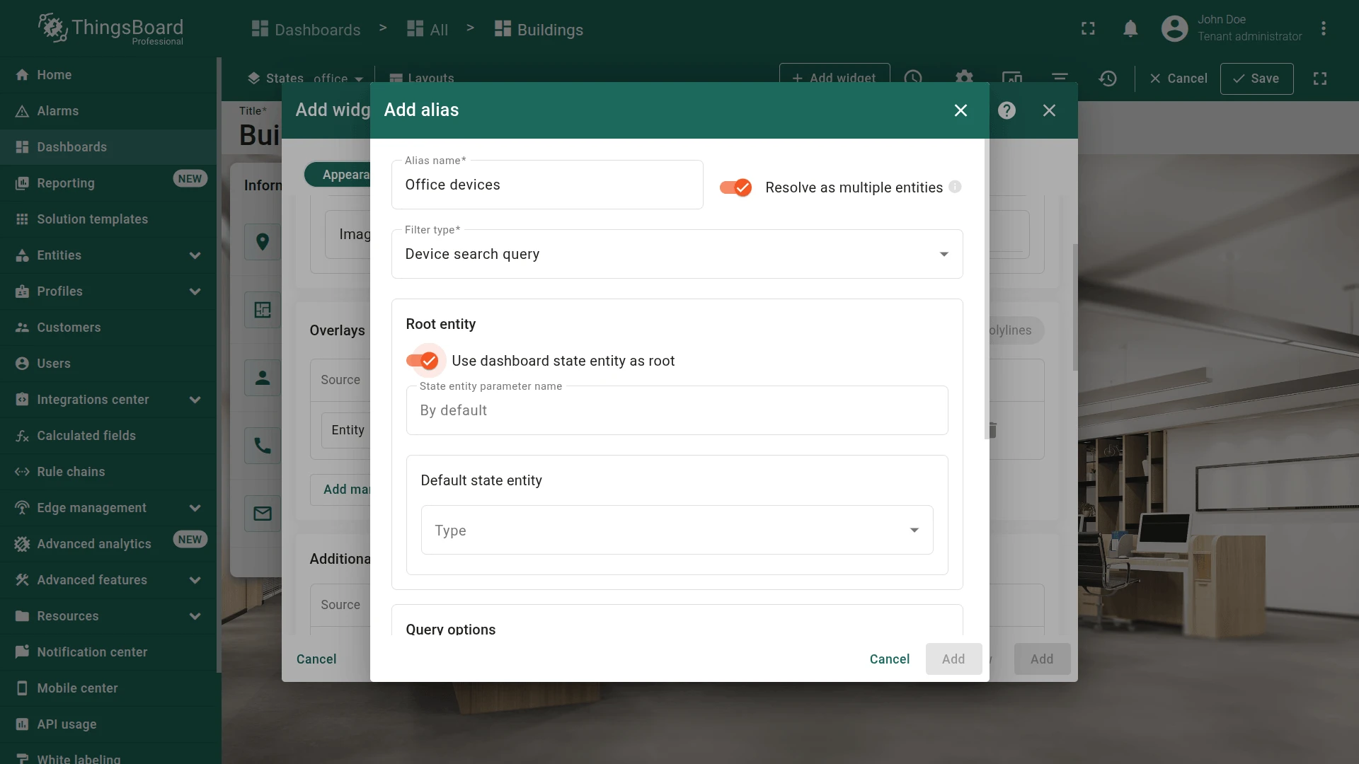
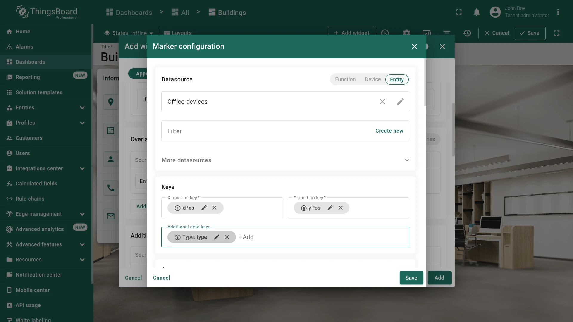
- Click Add marker
- Type
Office devicesand click Create a new one! - Set filter type to Device search query.
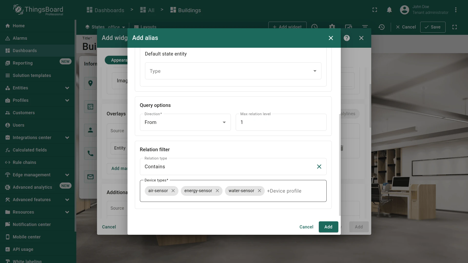
- Enable Use dashboard state entity as root.
- Set Max relation level to
1, relation type to Contains. - List the following device types: air-sensor, energy-sensor, and water-sensor.
- Click Add.
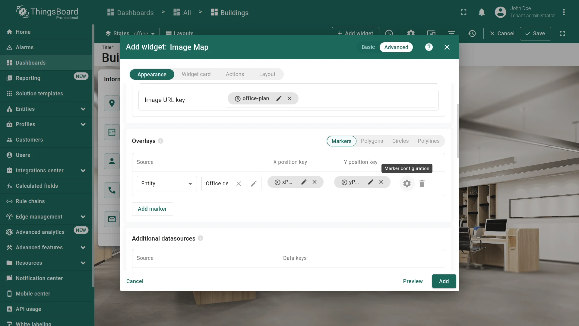
- Open marker configuration and verify that the marker uses the
Office devicesalias and:xPos/yPosis set as the coordinate keytypeis set as the additional data key

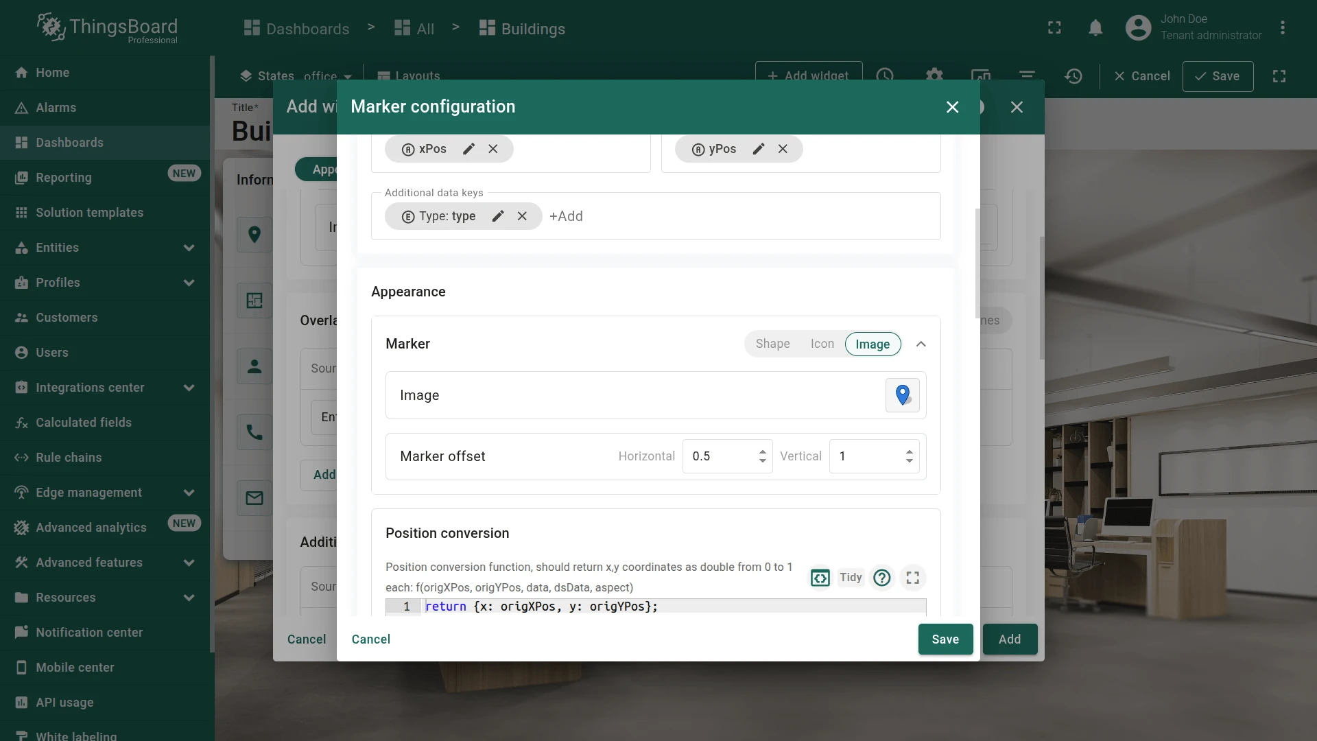
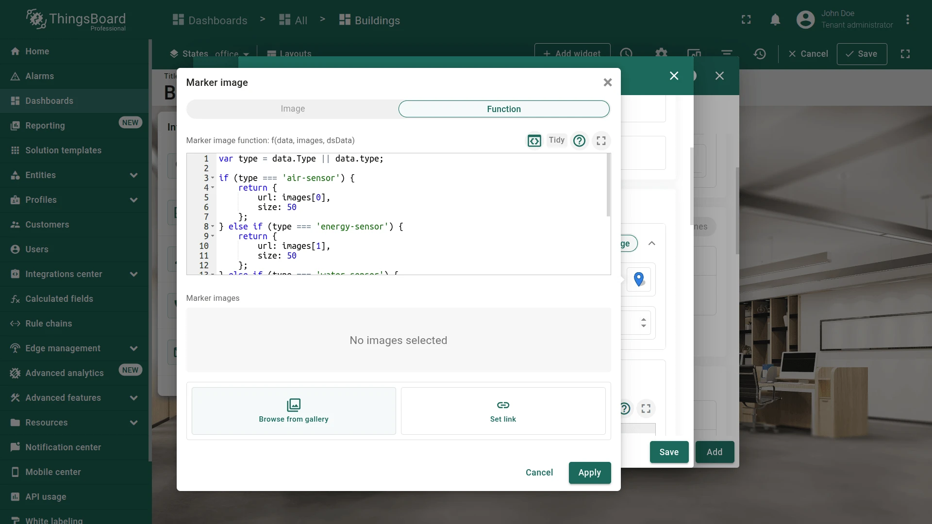
Appearance tab:
- Use the function to display a marker image with the corresponding index, depending on the device type:

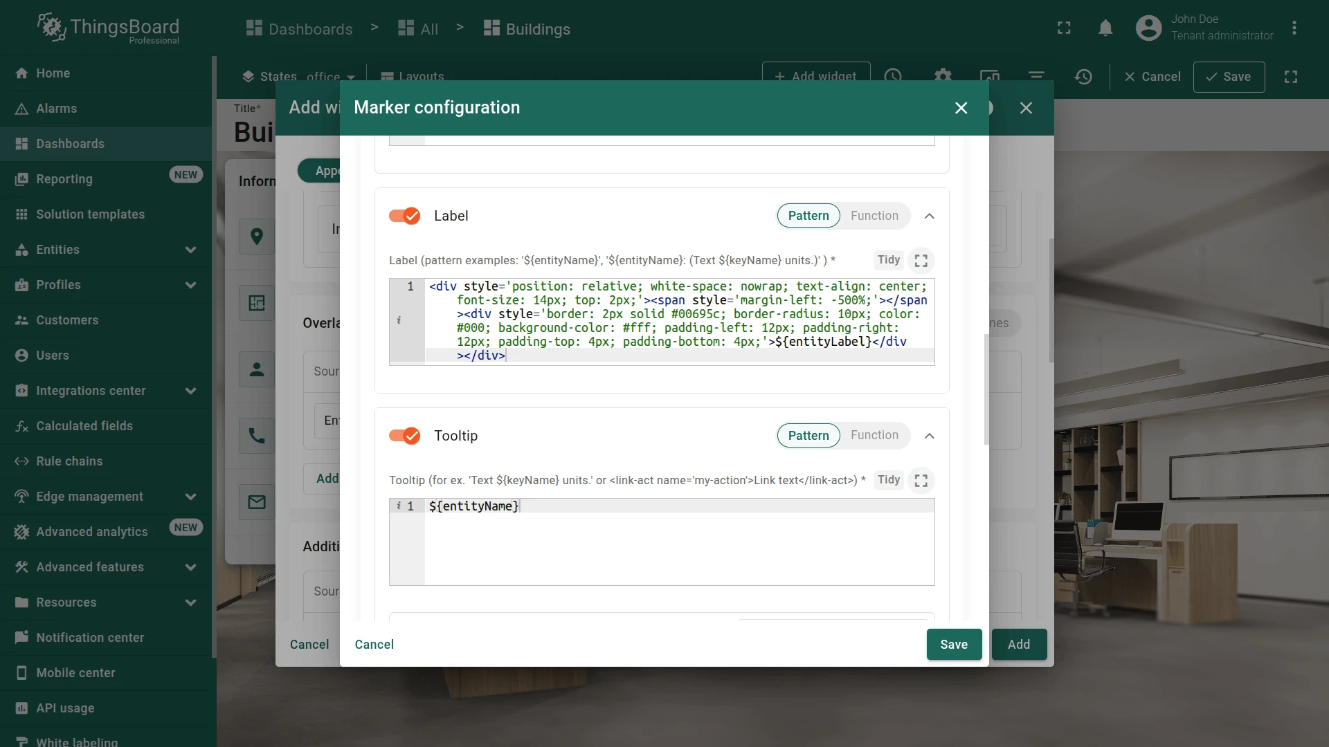
- Configure labels:
- Paste the label HTML:
<div style='position: relative; white-space: nowrap; text-align: center; font-size: 14px; top: 2px;'><span style='margin-left: -500%;'></span><div style='border: 2px solid #00695c; border-radius: 10px; color: #000; background-color: #fff; padding-left: 12px; padding-right: 12px; padding-top: 4px; padding-bottom: 4px;'>${entityLabel}</div></div>- Configure tooltip:
- Keep only
${entityName}.
- Keep only
Widget card tab:
-
Set card title to
Office plan. -
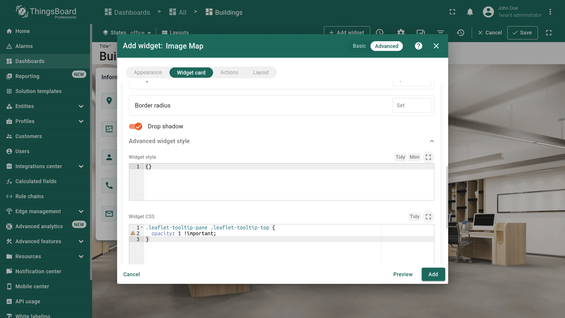
Go to Advanced widget style → Widget CSS and paste:
.leaflet-tooltip-pane .leaflet-tooltip-top {opacity: 1 !important;}
- Uncheck Enable data export in Card buttons.
- Click Add.
- Resize the widget to the right corner.
- Go to Layout settings and enable Auto fill layout height.
- Save the dashboard.
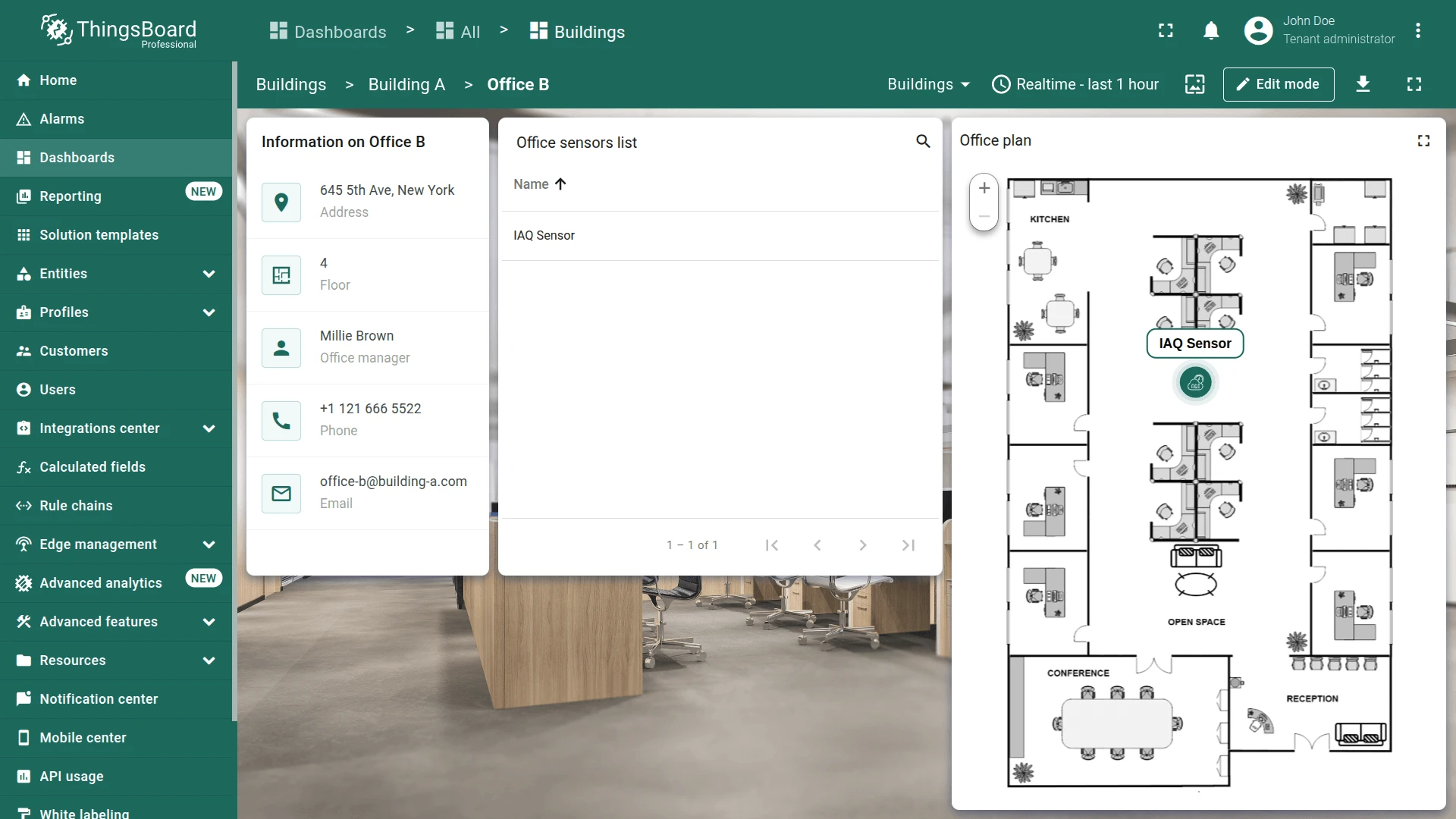
A widget has been added that displays the plan of the selected office and the placement of devices on it.
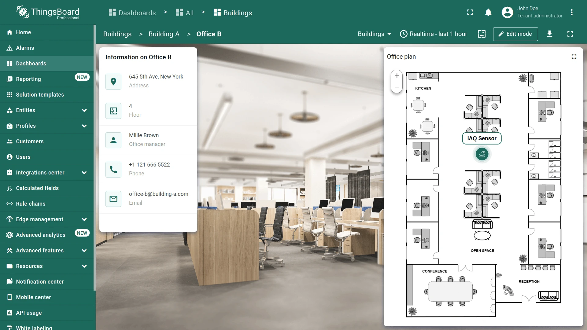
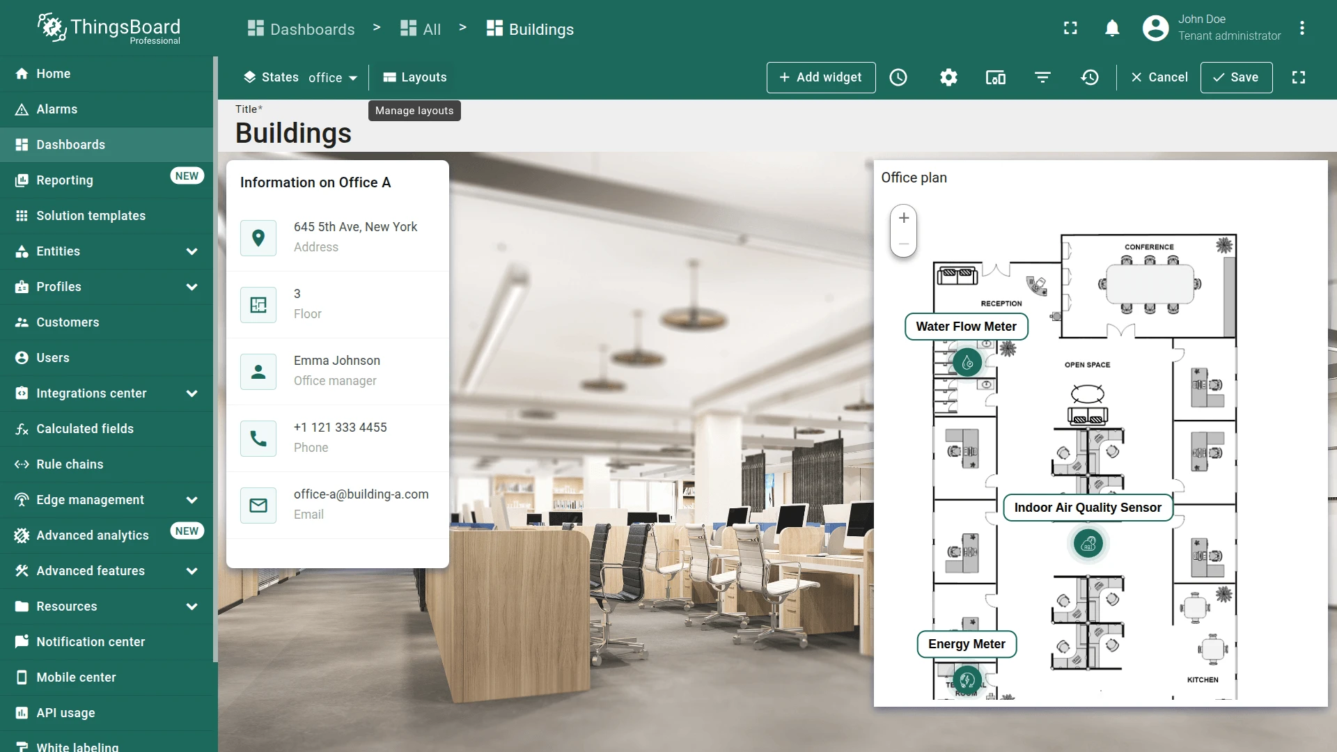
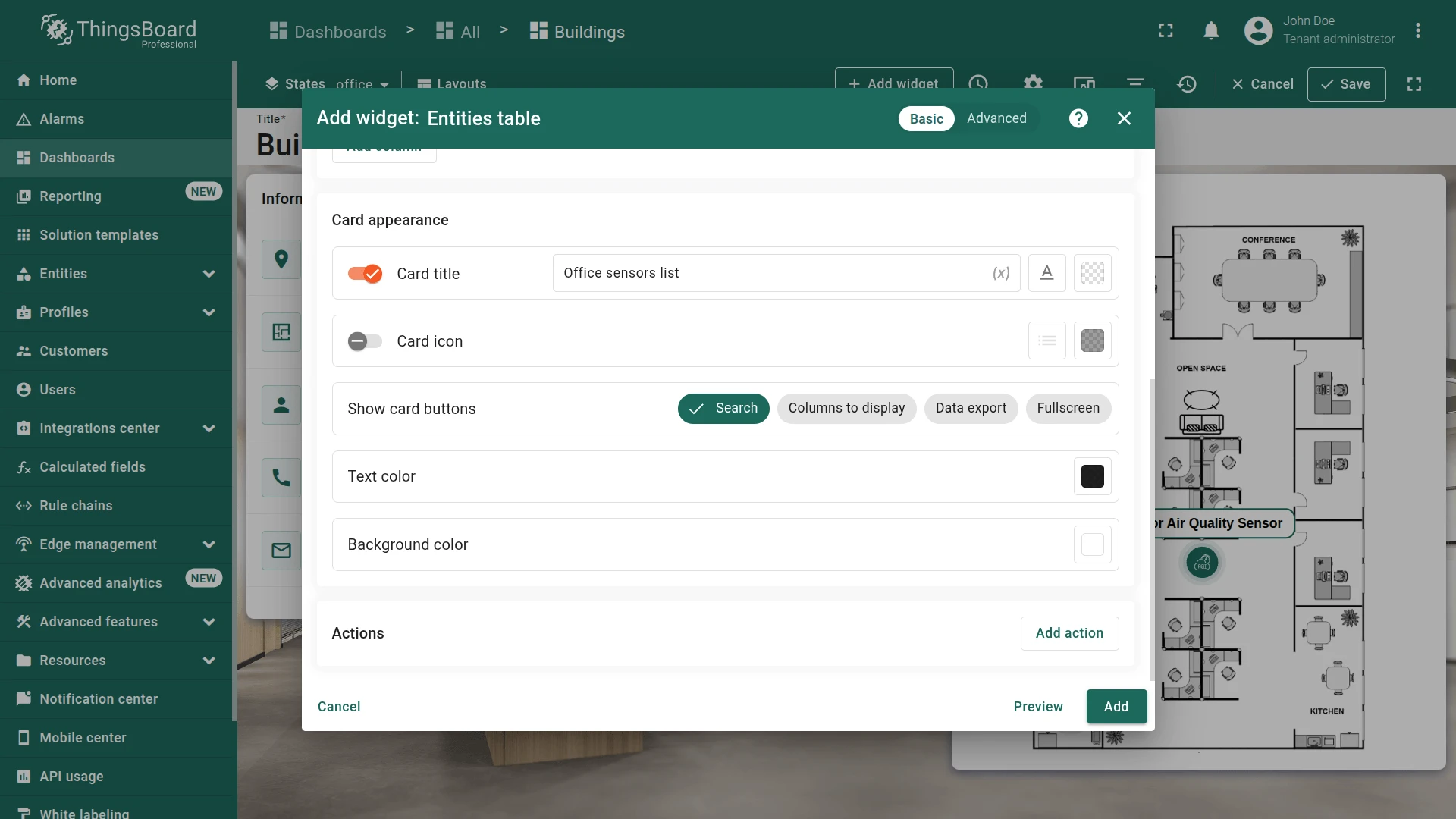
Office Sensors List Widget
Section titled “Office Sensors List Widget”Add an Entities table widget to list all devices in the currently selected office.
- In the office state (edit mode), click + Add widget.
- Select Entities table from the Tables bundle.
- Reuse the Office devices alias.
- Set card title to Office sensors list.
- Click Add, resize alongside the Image Map, and save the dashboard.
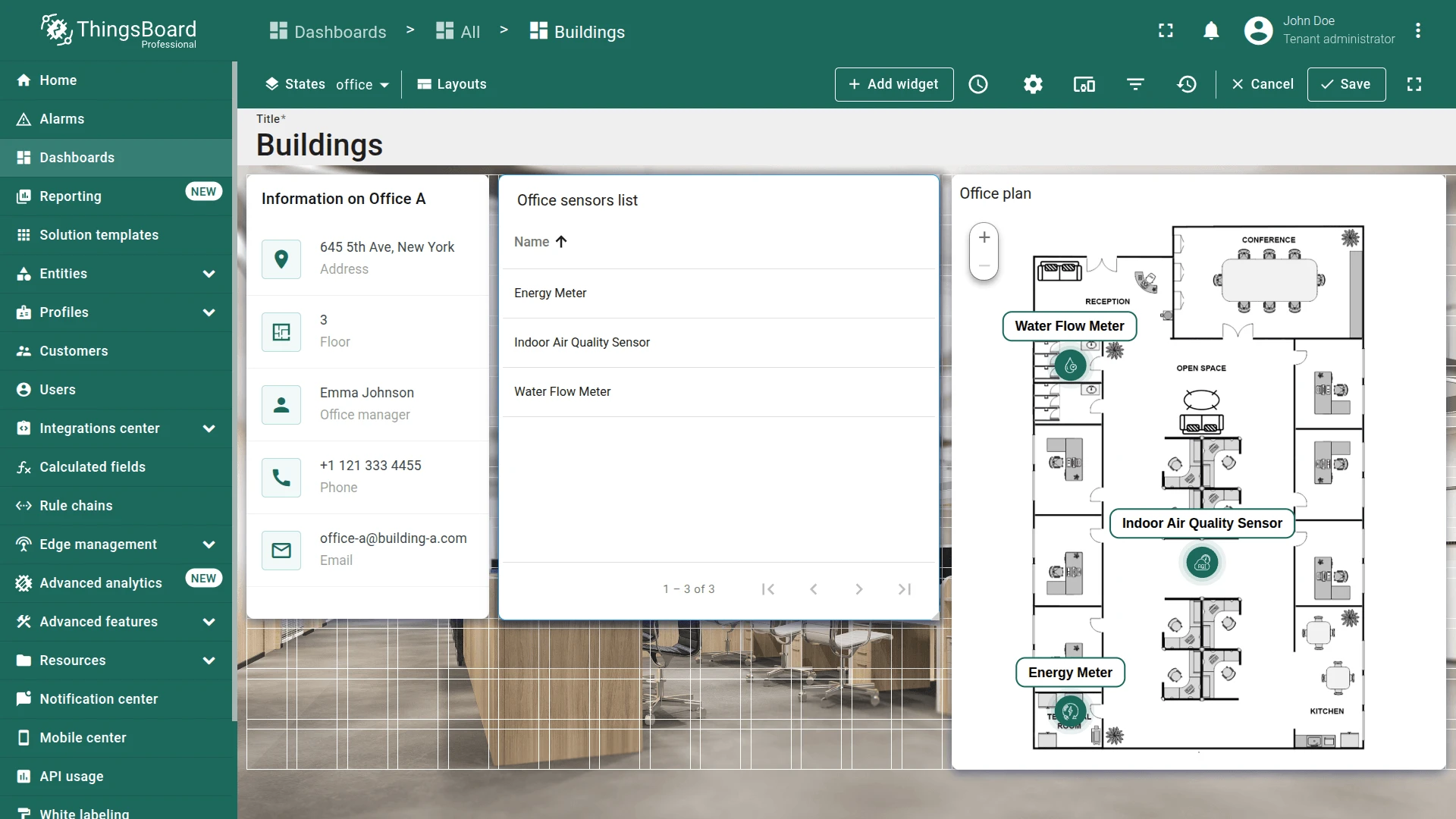
The configured “office” state should look like this:

Final View
Section titled “Final View”
Best Practices for Dashboard States
Section titled “Best Practices for Dashboard States”Hierarchy & Context: Use dashboard states to create drill-down hierarchies (Buildings → Offices ⇾ Devices). Each state should narrow the entity context, reducing data and improving readability.
Entity from Dashboard State: This alias type automatically binds widgets to the currently selected entity in the state. Use it for re-focused views (e.g., map showing only the selected building).
Asset Search Query: Combine with Use dashboard state entity as root and relation filters to fetch related entities. Set Max relation level carefully—level 1 gets direct children; higher levels traverse further.
Relation Type: Use to fetch parent or cross-referenced entities (e.g., building address from an office state). Set direction To to traverse backward through relations.
Smart Aliases & Navigation: Name aliases clearly (Selected entity, Building offices, Office devices). Avoid hardcoding entity IDs—use aliases to make widgets reusable across states.
Widget Reuse: Copy widgets between states, then re-point aliases. Extract common layout patterns (card + map + list) to reduce repetition.
Checklist for moving on
Section titled “Checklist for moving on”Was this helpful?