Latest Values Widget
Latest Values widgets subscribe to the most recent known value of each configured data key. The platform calls self.onDataUpdated() once when the widget loads and again whenever a new value arrives — you never poll; the platform pushes.
Each data key maps to one entry in self.ctx.data[]. For Latest Values widgets, data[i].data contains a single [timestamp, value] pair — the most recent reading.
When to Use Latest Values
Section titled “When to Use Latest Values”Use this type to display the current state of a device or asset — not history, not trends, just “what is the value right now”:
- Sensor reading cards (temperature, humidity, pressure)
- Device status indicators (online/offline, door open/closed)
- KPI tiles showing a current metric
- Asset attribute panels
If you need historical data over a time window, use the Time-Series type instead.
Example 1: Sensor Card
Section titled “Example 1: Sensor Card”A compact horizontal card showing a single telemetry value with a configurable icon, dynamic value-based color, and a relative timestamp.
-
Open Widget Library → open your bundle → click + → select Latest Values as the type.
-
In the HTML tab, paste:
<div class="sensor-card"><div class="sensor-card__icon" id="icon-badge"><i class="material-icons" id="icon-text">thermostat</i></div><div class="sensor-card__body"><span class="sensor-card__label" id="label">Temperature</span><span class="sensor-card__value" id="value">--</span><span class="sensor-card__units" id="units"></span></div><span class="sensor-card__timestamp" id="timestamp"></span></div>The layout is a single horizontal row: icon badge on the left, then label, value, and units, with a relative timestamp pushed to the far right.
<i class="material-icons">is used here rather than<mat-icon>— Material Icons is globally available, and plain HTML elements work reliably without Angular rendering. -
In the CSS tab, paste:
.sensor-card {width: 100%;height: 100%;display: flex;align-items: center;gap: 14px;font-family: 'Roboto', sans-serif;box-sizing: border-box;}.sensor-card__icon {width: 36px;height: 36px;border-radius: 10px;display: flex;align-items: center;justify-content: center;background: #305680;color: #fff;flex-shrink: 0;}.sensor-card__icon i {font-size: 20px;}.sensor-card__body {display: flex;align-items: baseline;gap: 8px;min-width: 0;}.sensor-card__label {font-size: 16px;font-weight: 400;color: #344054;white-space: nowrap;}.sensor-card__value {font-size: 20px;font-weight: 600;line-height: 1;color: #101828;}.sensor-card__units {font-size: 14px;color: #667085;}.sensor-card__timestamp {margin-left: auto;font-size: 12px;color: #98a2b3;white-space: nowrap;flex-shrink: 0;} -
In the JavaScript tab, paste:
let settings, container, init = false;let labelEl, valueEl, unitsEl, iconBadgeEl, iconTextEl, timestampEl;self.onInit = function() {container = self.ctx.$container[0];let utils = self.ctx.$scope.$injector.get(self.ctx.servicesMap.get('utils'));settings = utils.deepClone(self.ctx.settings) || {};labelEl = container.querySelector('#label');valueEl = container.querySelector('#value');unitsEl = container.querySelector('#units');iconBadgeEl = container.querySelector('#icon-badge');iconTextEl = container.querySelector('#icon-text');timestampEl = container.querySelector('#timestamp');if (settings.displayIcon === false) {iconBadgeEl.style.display = 'none';} else {iconTextEl.textContent = settings.icon || 'thermostat';}applyColors(0);};self.onDataUpdated = function() {let data = self.ctx.data;if (data.length === 0 || data[0].data.length === 0) {valueEl.textContent = '--';return;}if (!init) {labelEl.textContent = data[0].dataKey.label;unitsEl.textContent = data[0].dataKey.units || '';init = true;}let val = data[0].data[0][1];let ts = data[0].data[0][0];let decimals = data[0].dataKey.decimals;let displayVal = (decimals != null && decimals >= 0)? parseFloat(val).toFixed(decimals) : val;valueEl.textContent = displayVal;applyColors(val);timestampEl.textContent = moment(ts).fromNow();};function applyColors(val) {valueEl.style.color = resolveColor(settings.valueColor, val, '#101828');if (settings.displayIcon !== false) {iconBadgeEl.style.background = resolveColor(settings.iconBackground, val, '#305680');iconBadgeEl.style.color = resolveColor(settings.iconColor, val, '#ffffff');}}function resolveColor(setting, value, fallback) {if (!setting) return fallback;if (setting.type === 'constant' || !setting.type) return setting.color || fallback;if (setting.type === 'range' && setting.rangeList?.range) {for (let r of setting.rangeList.range) {let from = r.from != null ? r.from : -Infinity;let to = r.to != null ? r.to : Infinity;if (value >= from && value < to) return r.color;}return setting.color || fallback;}if (setting.type === 'function' && setting.colorFunction) {try {return new Function('value', setting.colorFunction)(value);} catch (e) {return setting.color || fallback;}}return setting.color || fallback;}self.typeParameters = function() {return {maxDataKeys: 1,singleEntity: true,dataKeysOptional: false,ignoreDataUpdateOnIntervalTick: true};};Key points:
self.onDataUpdated()— reads the latest data point. On the first call it copies the label and units fromdataKeymetadata. On every call it updates the value, recalculates colors, and refreshes the timestamp usingmoment(ts).fromNow()—momentis available globally in the widget environment.resolveColor(setting, value, fallback)— resolves acolor_settingsobject to a CSS string. Supports three modes: constant (fixed color), range (value-based ranges), and function (user-provided JS).ignoreDataUpdateOnIntervalTick: true— preventsonDataUpdatedfrom firing on the platform’s polling interval when no new data has arrived. -
In the Settings form tab, click Import from JSON → select the JSON content tab → paste:
[{"id": "valueColor","name": "Value color","group": "Card appearance","type": "color_settings","default": { "type": "constant", "color": "#101828" }},{"id": "displayIcon","name": "Display icon","group": "Icon settings","type": "switch","default": true,"required": false},{"id": "icon","name": "Icon","group": "Icon settings","type": "icon","default": "thermostat","required": false,"condition": "return model.displayIcon==true;"},{"id": "iconColor","name": "Icon color","group": "Icon settings","type": "color_settings","default": { "type": "constant", "color": "#ffffff" },"required": false,"condition": "return model.displayIcon==true;"},{"id": "iconBackground","name": "Icon background","group": "Icon settings","type": "color_settings","default": { "type": "constant", "color": "#305680" },"required": false,"condition": "return model.displayIcon==true;"}] -
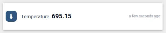
Click Run (or
Ctrl+Enter) → you should see a card with a blue icon badge, label, value placeholder, and timestamp. Click Save → name it “Sensor Card”. -
Add the widget to a dashboard. Select a device that publishes telemetry, configure the data key (e.g.,
temperature). Once data flows, the card shows the label, latest value, units, and a relative timestamp. -
Open widget settings → Advanced tab. Try Value color in Range mode — add ranges like 0–20 = blue, 20–30 = green, 30+ = red. Watch the value color change as telemetry updates.
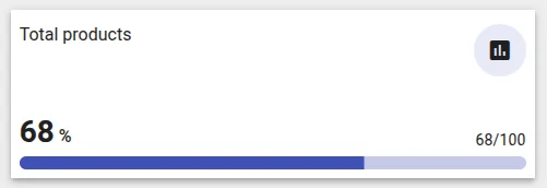
Example 2: Progress Bar Card
Section titled “Example 2: Progress Bar Card”A card that shows the current value as a percentage progress bar alongside the raw current / max text. Instead of relying on fixed data key names, each key is assigned a role (value, min, max) in the Data key settings form — the widget finds the right key by role, making it robust to any label or naming convention.
This example introduces two important patterns:
dashboardWidgettitle hijacking — reading the platform title and rendering it inside the widget body for full layout control- Data key roles — assigning semantic meaning to keys via the Data key settings form instead of matching by name
-
Open Widget Library → open your bundle → click + → select Latest Values as the type.
-
In the HTML tab, paste:
<div class="progress-bar-card-container"><div class="title-panel"><div *ngIf="showTitle" class="title" [ngStyle]="titleStyle">{{title$ | async}}</div><div class="icon-wrapper" *ngIf="showTitleIcon"[style.backgroundColor]="iconBackground"><mat-icon [ngStyle]="titleIconStyle">{{titleIcon}}</mat-icon></div></div><div class="progress-bar-panel"><div class="stats-container"><div><span class="percent-value">{{currentPercentage}}</span><span class="percent-unit">%</span></div><div class="number-progress">{{currentValue}}/{{maxValue}}{{units}}</div></div><div class="progress-bar"><mat-progress-bar mode="determinate"class="progressBar"[value]="currentPercentage"></mat-progress-bar></div></div></div>Key details:
{{title$ | async}}— renders an Observable value using Angular’s async pipe.title$is assigned fromself.ctx.dashboardWidget.title$, which emits the widget title string whenever it changes.<mat-progress-bar mode="determinate" [value]="currentPercentage">— Angular Material’s built-in progress bar.[value]expects a number from 0–100.- The title panel is rendered inside the widget body. The platform’s default title bar is hidden in JavaScript (
dashboardWidget.showTitle = false), giving full control over where and how the title appears.
-
In the CSS tab, paste:
.progress-bar-card-container {width: 100%;height: 100%;display: flex;flex-direction: column;justify-content: space-between;}.title-panel {display: flex;justify-content: space-between;}.icon-wrapper {width: 48px;height: 48px;min-width: 48px;min-height: 48px;border-radius: 50%;display: flex;justify-content: center;align-items: center;}.stats-container {display: flex;justify-content: space-between;align-items: flex-end;margin-bottom: 4px;}.percent-value {color: #212121;font-size: 28px;font-weight: 600;line-height: 36px;margin-right: 4px;}.percent-unit {color: #212121;font-size: 16px;font-weight: 500;}.number-progress {color: #212121;font-size: 14px;line-height: 21px;letter-spacing: 0.2px;}.mdc-linear-progress,.mdc-linear-progress__buffer,.mdc-linear-progress__bar {height: 12px !important;border-radius: 16px !important;}.mdc-linear-progress__bar-inner {border-top-width: 12px !important;} -
In the JavaScript tab, paste:
let settings;self.onInit = function() {// Read the platform title configuration and render it inside the widgetself.ctx.$scope.showTitle = self.ctx.dashboardWidget.showTitle;self.ctx.$scope.titleStyle = self.ctx.dashboardWidget.titleStyle;self.ctx.$scope.title$ = self.ctx.dashboardWidget.title$;self.ctx.$scope.showTitleIcon = self.ctx.dashboardWidget.showTitleIcon;self.ctx.$scope.titleIcon = self.ctx.dashboardWidget.titleIcon;self.ctx.$scope.titleIconStyle = self.ctx.dashboardWidget.titleIconStyle;// Hide the platform's default title barself.ctx.dashboardWidget.showTitle = false;let utils = self.ctx.$scope.$injector.get(self.ctx.servicesMap.get('utils'));settings = utils.deepClone(self.ctx.settings) || {};};self.onDataUpdated = function() {// Find a data key by its configured role (set in Data key settings form)const findByRole = function(role) {return self.ctx.data.find(function(d) {return (d.dataKey.settings.role || 'value') === role;});};let valueData = findByRole('value');let maxData = findByRole('max');let minData = findByRole('min');let currentValue = (valueData && valueData.data.length)? parseFloat(valueData.data[0][1]) : 0;let maxValue = (maxData && maxData.data.length)? parseFloat(maxData.data[0][1]) : 100;let minValue = (minData && minData.data.length)? parseFloat(minData.data[0][1]) : 0;self.ctx.$scope.currentValue = currentValue;self.ctx.$scope.maxValue = maxValue;self.ctx.$scope.units = valueData ? valueData.dataKey.units || '' : '';let range = maxValue - minValue;let pct = range > 0? Math.round(((currentValue - minValue) / range) * 100): 0;self.ctx.$scope.currentPercentage = Math.max(0, Math.min(100, pct));self.ctx.$scope.iconBackground = resolveColor(settings.iconBackground, currentValue, '#000000');self.ctx.detectChanges();};function resolveColor(setting, value, fallback) {if (!setting) return fallback;if (setting.type === 'constant' || !setting.type) return setting.color || fallback;if (setting.type === 'range' && setting.rangeList?.range) {for (let r of setting.rangeList.range) {let from = r.from != null ? r.from : -Infinity;let to = r.to != null ? r.to : Infinity;if (value >= from && value < to) return r.color;}return setting.color || fallback;}if (setting.type === 'function' && setting.colorFunction) {try {return new Function('value', setting.colorFunction)(value);} catch (e) {return setting.color || fallback;}}return setting.color || fallback;}self.actionSources = function() {return {'elementClick': {name: 'widget-action.element-click',multiple: true}};};self.typeParameters = function() {return {datasourcesOptional: true,dataKeysOptional: true};};self.onDestroy = function() {};Key concepts:
self.ctx.dashboardWidget— exposes the widget’s title configuration set in the dashboard editor. By copying its properties to$scopeand then settingshowTitle = false, you hide the platform’s header bar and take over rendering it inside the widget body. This gives full control over title placement in the layout.title$— an Observable that emits the widget title string. The| asyncpipe in the template subscribes automatically and updates the DOM when the title changes (e.g., when it contains${entityName}and the entity context changes).findByRole(role)— looks up a data key by itsrolesetting from the Data key settings form. This is more robust than matching by label name: renaming a key in the dashboard doesn’t break the widget as long as the role is set correctly.Percentage with min — when a
minkey is configured (e.g., a minimum threshold), the percentage is calculated as(current − min) / (max − min) × 100. Without a min key it defaults to0, matching the simplercurrent / max × 100formula. The result is clamped to[0, 100]. -
In the Data key settings form tab, click Import from JSON → select the JSON content tab → paste:
[{"id": "role","name": "Role","type": "select","items": [{ "value": "value", "label": "Current value" },{ "value": "max", "label": "Maximum" },{ "value": "min", "label": "Minimum" }],"default": "value","required": true}]This adds a Role dropdown to the per-key settings dialog. For each data key, the user opens its settings and picks one of the three roles. The widget then uses these roles to identify which key is which — regardless of key name or label.
-
In the Settings form tab, click Import from JSON → select the JSON content tab → paste:
[{"id": "iconBackground","name": "Icon background","type": "color_settings","default": { "type": "constant", "color": "#000000" },"required": false}] -
Click Save → name it “Progress Bar Card”.
-
Add the widget to a dashboard:
- Select a device as the datasource
- Add three data keys: the current value key, a maximum key (e.g., from server attributes), and optionally a minimum key
- For each key, open its settings → set the Role dropdown (
Current value,Maximum, orMinimum) - The progress bar fills relative to the min–max range; the
current / maxtext updates in real time
Understanding dataKey.settings
Section titled “Understanding dataKey.settings”dataKey.settings holds the values from the Data key settings form — per-key configuration scoped to an individual data key, as opposed to self.ctx.settings which is widget-wide:
// Widget-wide settingslet iconBg = self.ctx.settings.iconBackground;
// Per-key settings — different per data keylet role = d.dataKey.settings.role; // 'value', 'max', or 'min'
The role pattern shown in this example is a common idiom for widgets that need to consume multiple keys with different semantic meanings. Instead of requiring specific key names (fragile, breaks on rename), you let the user declare intent via a settings field — the widget adapts to any key name as long as the role is set.
Data Model
Section titled “Data Model”When ThingsBoard calls self.onDataUpdated(), the data is available at self.ctx.data — an array with one entry per configured data key:
self.ctx.data = [ { dataKey: { name: 'temperature', // raw key name as configured in the datasource label: 'Temperature', // display label — editable by the user in the key dialog type: 'timeseries', // 'timeseries', 'attribute', or 'entityField' units: '°C', // units string configured in the key dialog decimals: 1, // decimal places (null if not set) settings: {} // values from the Data key settings form }, data: [ [1710000000000, '24.5'] // [timestamp_ms, value] — single entry for Latest Values ] }, // one entry per additional configured data key];Latest Values widgets receive one [timestamp, value] pair per key — the most recent reading. data[i].data[0][0] is the timestamp in milliseconds; data[i].data[0][1] is the value.
Values are always strings. Even numeric telemetry arrives as '24.5', not 24.5. Always convert before doing arithmetic:
let raw = self.ctx.data[0].data[0][1]; // '24.5'let num = parseFloat(raw); // 24.5dataKey.decimals is the “Decimal places” setting from the key dialog — use it to round the displayed value consistently with the rest of the dashboard:
let val = (decimals != null && decimals >= 0) ? parseFloat(raw).toFixed(decimals) : raw;dataKey.settings holds values from the Data key settings form — per-key configuration you define in the Widget Editor. For example, if your Data key settings form has a role field, read it as d.dataKey.settings.role. This is distinct from self.ctx.settings, which holds widget-wide configuration.
Multiple datasources — if the widget has more than one datasource (e.g., multiple devices), self.ctx.data contains entries for all keys from all datasources in the order they were added.
Next Steps
Section titled “Next Steps”- Time-Series — embedded platform chart, custom subscriptions, and ECharts integration
- RPC Control — send commands to devices and handle responses
- Alarm Widget — display and manage active alarms
- Widget Patterns — CRUD tables, navigation, entity hierarchy
- Widget API Reference — full
ctx, lifecycle, and data structure reference
Was this helpful?