Status Widget
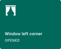
The Status widget displays the current binary state of a device or entity as a labeled card — an icon, a label, and a status text that switch together when the monitored state changes between on and off. Use it to represent any two-state condition — open/closed, active/inactive, online/offline, locked/unlocked — wherever a glance at the icon and label is clearer than reading a raw telemetry value.
Key Capabilities
Section titled “Key Capabilities”- Two independently styled visual states: On (active) and Off (inactive), each with its own label, status text, icon, and three-color palette (icon/label, status, background).
- Three layout options: Default (icon + label + status), Center (all centered), and Icon (icon only).
- Six sources for reading the device state — Execute RPC, Get attribute, Get time series, Get alarm status, Get dashboard state id, Get dashboard state object.
- Optional disabled state with its own color palette, triggered independently from the on/off state.
- Widget header button action.
Adding the Widget
Section titled “Adding the Widget”- Open the dashboard in edit mode. Click Add widget in the top toolbar, or click the Add new widget icon in the center of an empty dashboard.
- In the widget bundle selection dialog, find and click Status indicators.
- Select the Status widget.
- Configure the target device, behavior, and appearance, then click Add.
Configuration
Section titled “Configuration”All settings are on the Basic tab. Switch to Advanced for card-level controls — title font, tooltip, border radius, and CSS overrides.
Target Device
Section titled “Target Device”Select the device whose state the widget will monitor:
- Device — a specific device selected by name.
- Entity alias — a set of entities matched by an entity alias; use when the target device is selected dynamically at runtime.
Behavior
Section titled “Behavior”The Behavior section defines how the widget reads the device state and when it enters a disabled appearance. Each parameter opens a sub-dialog where you choose an action type and configure it.
Initial State
Section titled “Initial State”Controls which visual state the widget shows — On (active) or Off (inactive). Click the edit icon to configure.
| Action | Description |
|---|---|
| Do nothing | Widget uses a static On or Off value until data arrives. |
| Execute RPC | Calls an RPC method on the device and evaluates the response. Configure the Method name, an optional Action result converter function, and the value that maps to On. |
| Get attribute | Reads a device attribute. Configure the Attribute scope, Attribute key, an optional converter, and the value that maps to On. |
| Get time series | Reads the latest telemetry value. Configure the Time series key, an optional converter, and the value that maps to On. |
| Get alarm status | Activates the On state when a matching alarm is active. Filter by severity and alarm type. |
| Get dashboard state id | Maps a dashboard state name to On. |
| Get dashboard state object | Evaluates the full dashboard state object via a JavaScript f(data): boolean function. |
Disabled State
Section titled “Disabled State”Controls when the widget renders in a disabled appearance (using the Disabled color palette). Supports the same action types as Initial state, with the evaluated condition mapped to a Disabled flag instead of On/Off.
Appearance
Section titled “Appearance”Layout
Section titled “Layout”| Layout | Description |
|---|---|
| Default | Icon in the top-left area with label and status text below. Default. |
| Center | Icon, label, and status text all horizontally centered. |
| Icon | Icon only — no label or status text. |
Card Style
Section titled “Card Style”The Card style toggle switches the configuration view between the On state and the Off state. Both states are configured independently using the same fields.
| Setting | Description |
|---|---|
| Label | Text displayed as the primary label on the card. Supports entityName and entityLabel dynamic substitution. |
| Status | Text displayed below the label as the state description (for example, Opened or Closed). |
| Icon | Icon displayed on the card. Set width and height in pixels independently. |
| Primary color | Color of the icon and label text. |
| Secondary color | Color of the status text. |
| Background color | Card background fill for this state. |
| Disabled primary color | Icon and label color when the Disabled state condition is active. |
| Disabled secondary color | Status text color when disabled. |
| Disabled background color | Background fill when disabled. |
Configure the On state first, then toggle to Off and configure the alternate appearance.
Card Appearance
Section titled “Card Appearance”| Setting | Description |
|---|---|
| Show card buttons | Toggle Fullscreen button in the widget header. |
| Card border radius | Corner rounding in pixels. |
| Card padding | Spacing between card content and its border. |
Actions
Section titled “Actions”The Status widget supports the Widget header button action — a custom button placed in the widget header that triggers a configured action when clicked.
Example
Section titled “Example”Door and Window State Panel
Section titled “Door and Window State Panel”Goal: Display the open/closed state of a door sensor on a security dashboard, with a green card when the door is closed and a red card when it is open.
Prerequisites: A device sending doorState as a telemetry key — true when open, false when closed.
Step 1. Add the widget. Open your dashboard in edit mode, click Add widget, select Status indicators, then choose Status widget.
Step 2. Set the target device. Select the door sensor device.
Step 3. Configure Initial state. Click the edit icon on Initial state. Set Action to Get time series, enter doorState as the Time series key, and set ‘On’ when result is to True.
Step 4. Configure the On state appearance. In Appearance, make sure Card style is set to On. Set Label to {entityName}, Status to Open, and choose a red Background color to signal an alert condition.
Step 5. Configure the Off state appearance. Toggle Card style to Off. Set Status to Closed and choose a green Background color.
Step 6. Set the layout. Choose Default to show the icon alongside both label and status text.
Step 7. Save. Click Add, arrange the widget, then save the dashboard.
Result: The card turns green with “Closed” when the door is shut and switches to red with “Open” when the sensor detects the door is ajar — updating automatically as new telemetry arrives.
Troubleshooting
Section titled “Troubleshooting”Widget Always Shows the Off State
| Cause | Solution |
|---|---|
| Initial state action is Do nothing | Open Initial state, set the correct Action (Get time series, Get attribute, etc.), and configure the matching key and condition. |
| Key name mismatch | Verify that the key name in the Initial state configuration exactly matches what the device reports. Key names are case-sensitive. |
| Condition value mismatch | Check the ‘On’ when result is toggle or value — the device may send 1/0 or a string instead of true/false. Use an Action result converter function to normalize the value if needed. |
Widget Appears Greyed Out
| Cause | Solution |
|---|---|
| Disabled state condition is active | Open Disabled state and verify the condition. If you do not want disabled behavior, set Action to Do nothing with Value set to False. |
Label Shows Entity Name Instead of Custom Text
| Cause | Solution |
|---|---|
| Dynamic placeholder in use | The Label field supports entityName and entityLabel substitution. Replace with static text in the field if dynamic substitution is not needed. |
Was this helpful?