Markdown/HTML Card
The Markdown/HTML Card widget renders Markdown or HTML content on a dashboard. Use it for static information displays, templated data cards, or fully custom HTML layouts styled with CSS.
Key capabilities
Section titled “Key capabilities”- Display static Markdown or HTML with
${key}placeholders that resolve to live entity data. - Build content programmatically using a JavaScript value function — apply conditional formatting, combine multiple keys, or construct complex HTML.
- Style the card with custom CSS scoped to the widget.
- Embed other dashboard states inside the card using
<tb-dashboard-state>— use for tabbed layouts without duplicating shared widgets.
Adding the widget
Section titled “Adding the widget”- Open the dashboard in edit mode. Click Add widget in the top toolbar, or click the Add new widget icon in the center of an empty dashboard.
- In the widget bundle selection dialog, find and click HTML widgets.
- Select the Markdown/HTML Card widget.
- Configure the datasource and appearance, then click Add.
Configuration
Section titled “Configuration”The widget is configured across three tabs: Data (datasource), Appearance (HTML content and styling), and Card (widget card settings).
Datasource
Section titled “Datasource”Select the source of the data that populates ${key} placeholders or is passed to the value function:
- Device — a specific device; the widget resolves placeholders using the latest attribute and telemetry data from this device.
- Entity alias — a set of entities matched by an entity alias; use this when the target entity is selected dynamically at runtime.
- Function — generates data using a JavaScript function; use this for testing or when no real device is needed.
If no datasource is configured, the widget renders the static template with no live data substitution.
Static Markdown/HTML template
Section titled “Static Markdown/HTML template”Enter Markdown or HTML directly in the Markdown/HTML pattern field. Use ${key} to insert live values and ${key:N} to control decimal places.
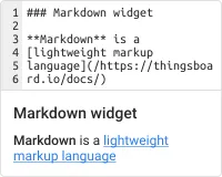
### Temperature value card- **Current entity**: ${entityName}- **Current temperature**: ${temperature:1} °CDynamic Markdown/HTML content
Section titled “Dynamic Markdown/HTML content”Enable the Use value function toggle to build content programmatically. The function receives a data array with the latest values for each entity and must return an HTML string.
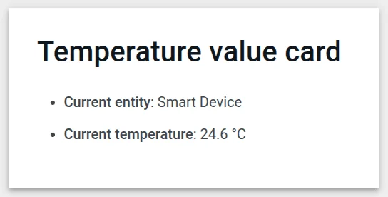
const entity = data[0];const color = entity.temperature > 25 ? "red" : entity.temperature > 20 ? "green" : "blue";return `### Temperature value card- Current entity: <span>${entity.entityName}</span>- Current temperature: <span style="color:${color};">${entity.temperature.toFixed(1)} °C</span>`;Content styling (CSS)
Section titled “Content styling (CSS)”Add custom CSS in the widget’s CSS tab. Class names used in the Markdown/HTML template are available for styling.
Markdown/HTML pattern:
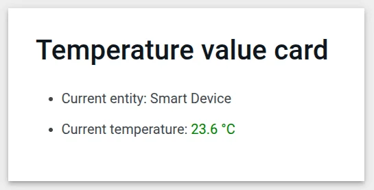
<div class="office-card"> <h3>${entityName}</h3> <p class="blue-box"> <strong>Current temperature:</strong> <span class="temp-value">${temperature:1}</span> °C </p> <p class="green-box"> <strong>Current humidity:</strong> <span class="hum-value">${humidity:0}</span> % </p></div>Markdown/HTML CSS:
.office-card { box-sizing: border-box; padding: 15px; margin: 6px 0; text-align: center; font-family: system-ui, -apple-system, Segoe UI, Roboto, Arial, "Noto Sans";}.office-card h3 { margin: 0 0 12px; font-size: 24px;}.blue-box { background: #2196F31A; border: 2px solid #2196F3; border-radius: 10px; padding: 10px; margin: 8px 0; font-weight: 700;}.green-box { background: #4CAF501A; border: 2px solid #4CAF50; border-radius: 10px; padding: 10px; margin: 6px 0; font-weight: 700;}Card appearance
Section titled “Card appearance”Configure card-level settings in the Card tab.
| Setting | Description |
|---|---|
| Title | Text displayed in the widget header. |
| Card icon | Icon shown next to the title. |
| Background color | Card background. Set to #FFFFFF00 (transparent) when using a CSS-defined background. |
| Card border radius | Roundness of card corners. |
| Card padding | Spacing between card content and its border. Set to 0 when the HTML template manages its own padding. |
| Show card buttons | Toggle Fullscreen. Data export is available on PE, PaaS, and PaaS/EU only. |
Actions
Section titled “Actions”The Markdown/HTML Card supports widget actions on the following sources:
- On card click — triggered when the user clicks anywhere on the card.
- Widget header button — adds a custom button to the widget header bar.
Examples
Section titled “Examples”Office information card
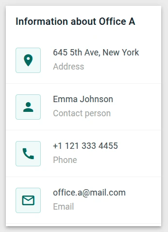
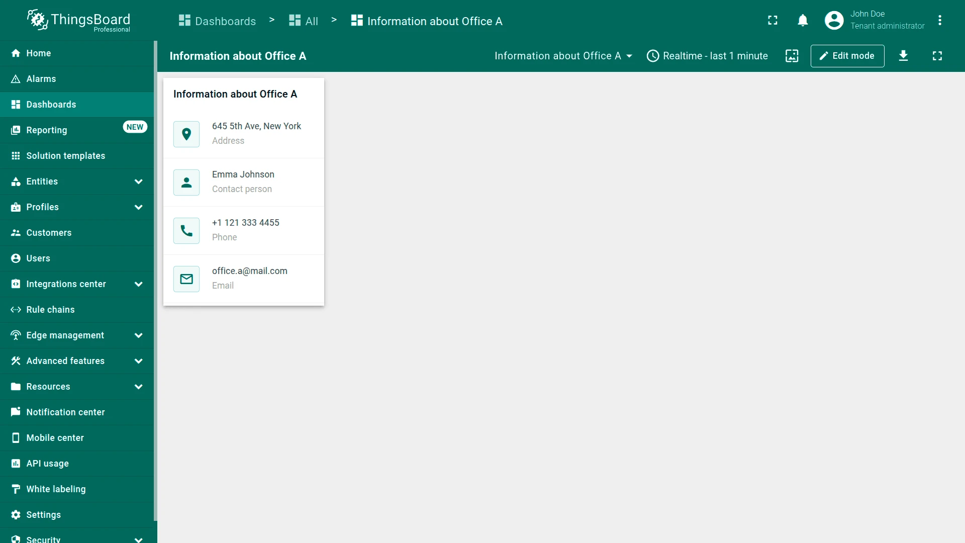
Section titled “Office information card”Goal: Display address, manager, phone, and email attributes for an office asset in a styled information card with icons.
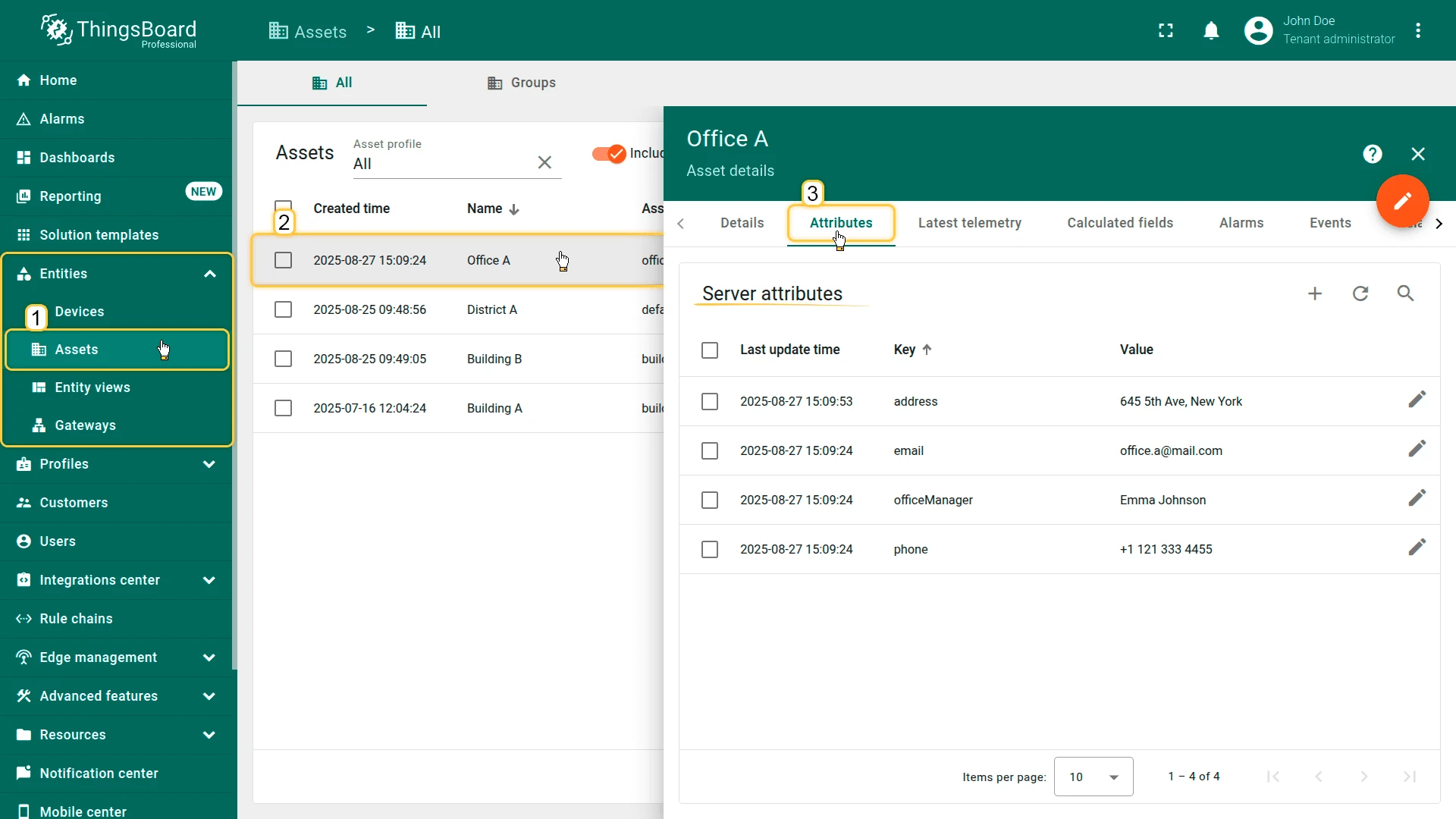
Step 1. Prepare the entity. Import the office asset using this CSV: office_a_asset.csv. The asset must have server attributes: address, officeManager, phone, and email.
Step 2. Add the widget. Open your dashboard in edit mode, click Add widget, select HTML widgets, then choose Markdown/HTML Card.
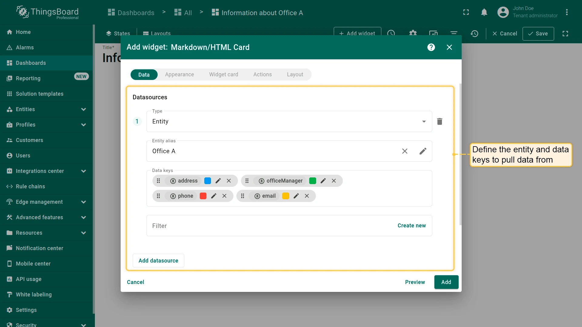
Step 3. Configure the datasource. On the Data tab, set the datasource to the office asset entity. Add address, officeManager, phone, and email as data keys.
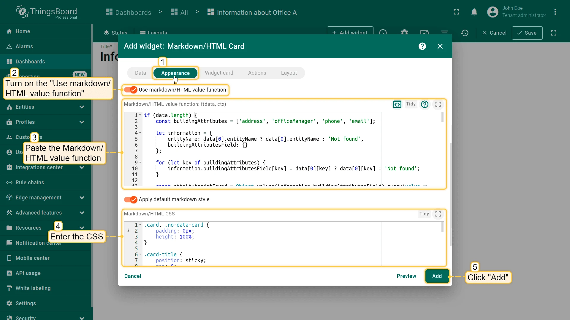
Step 4. Configure the value function. On the Appearance tab, enable Use markdown/HTML value function and paste the JavaScript function:
if (data.length) { const buildingAttributes = ['address', 'officeManager', 'phone', 'email']; let information = { entityName: data[0].entityName ? data[0].entityName : 'Not found', buildingAttributesField: {} }; for (let key of buildingAttributes) { information.buildingAttributesField[key] = data[0][key] ? data[0][key] : 'Not found'; } const attributesNotFound = Object.values(information.buildingAttributesField) .every(value => value === 'Not found'); if (attributesNotFound) { return '<div class="no-data-card">' + '<h1 class="card-title">Information on ' + information.entityName + '</h1>' + '<div class="no-data-block"><div class="no-data-content">' + '<p class="no-data-title">There is no information about the building</p>' + '</div></div></div>'; } else { return '<div class="card">' + '<h1 class="card-title">Information on ' + information.entityName + '</h1>' + '<div class="attributes">' + '<div class="attribute_container"><div class="icon_wrapper"><tb-icon class="icon">place</tb-icon></div>' + '<div><div class="attribute_label">Address</div><div class="attribute">' + information.buildingAttributesField.address + '</div></div></div>' + '<div class="attribute_container"><div class="icon_wrapper"><tb-icon class="icon">person</tb-icon></div>' + '<div><div class="attribute_label">Manager</div><div class="attribute">' + information.buildingAttributesField.officeManager + '</div></div></div>' + '<div class="attribute_container"><div class="icon_wrapper"><tb-icon class="icon">call</tb-icon></div>' + '<div><div class="attribute_label">Phone</div><div class="attribute">' + information.buildingAttributesField.phone + '</div></div></div>' + '<div class="attribute_container"><div class="icon_wrapper"><tb-icon class="icon">mail_outline</tb-icon></div>' + '<div><div class="attribute_label">Email</div><div class="attribute">' + information.buildingAttributesField.email + '</div></div></div>' + '</div></div>'; }}Step 5. Add CSS. Paste the CSS styles into the Markdown/HTML CSS field:
.card, .no-data-card { padding: 0px; height: 100%; }.card-title { position: sticky; top: 0; z-index: 2; font-size: 16px; letter-spacing: 0.25px; padding: 16px; }.attribute_container { display: flex; align-items: center; gap: 20px; padding: 16px; border-bottom: 1px solid #0000000d; }.icon { z-index: 1; }.icon_wrapper { display: flex; position: relative; align-items: center; padding: 8px; border: 1px solid var(--tb-primary-100, #305680); border-radius: 4px; }.icon_wrapper:before { content: ''; z-index: 0; position: absolute; opacity: 0.1; background-color: var(--tb-primary-200, #305680); width: 100%; height: 100%; left: 0; top: 0; }.attribute, .attribute_label { font-size: 14px; line-height: 20px; }.attribute_label { color: #00000061; }.no-data-card { display: flex; flex-direction: column; }.no-data-block { display: flex; flex-direction: column; justify-content: center; height: 100%; max-width: 345px; padding: 0 15px; margin: 0 auto; text-align: center; }.no-data-content { transform: translateY(-30%); }.no-data-block p { font-weight: 500; }.no-data-title { color: rgba(0, 0, 0, 0.54); }Step 6. Save. Click Add, resize and reposition as needed, then click Save on the dashboard toolbar.
Result: The card displays the office name, address, manager, phone, and email with icons. If an attribute is missing, the card shows “Not found” for that field.
Embedded dashboard state panel
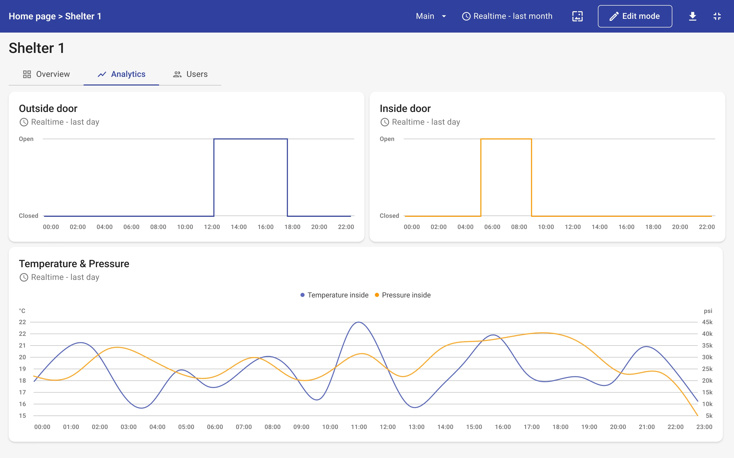
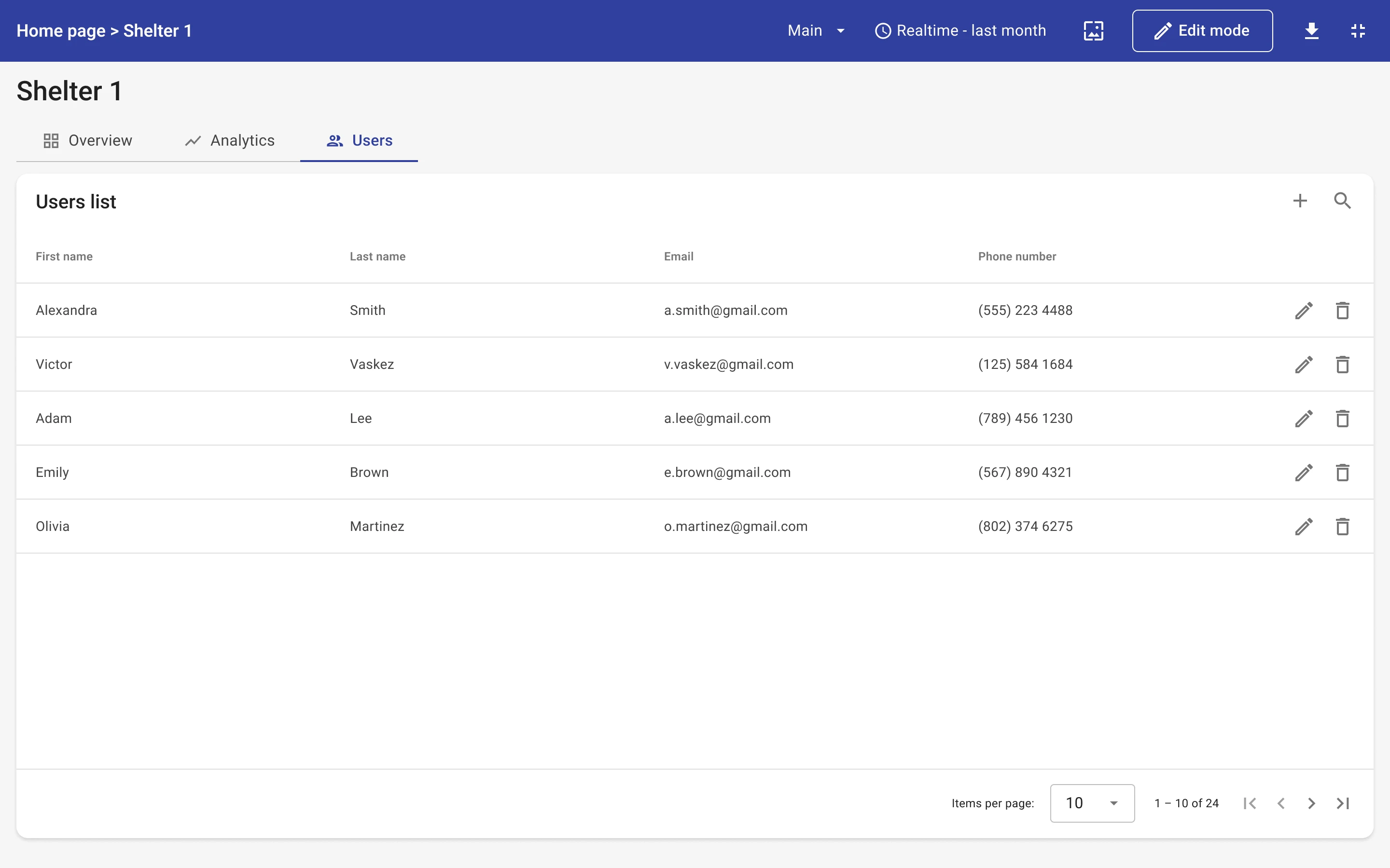
Section titled “Embedded dashboard state panel”A common pattern in hierarchical dashboards is a detail page with multiple sub-views scoped to the same selected entity. Rather than duplicating shared widgets (header, breadcrumb, etc.) across many states, you can use a single dashboard state as the container and embed sub-view content inside one Markdown/HTML Card widget. The widget reads a subState parameter from the URL and renders the matching <tb-dashboard-state> component — effectively acting as a switchable content area.
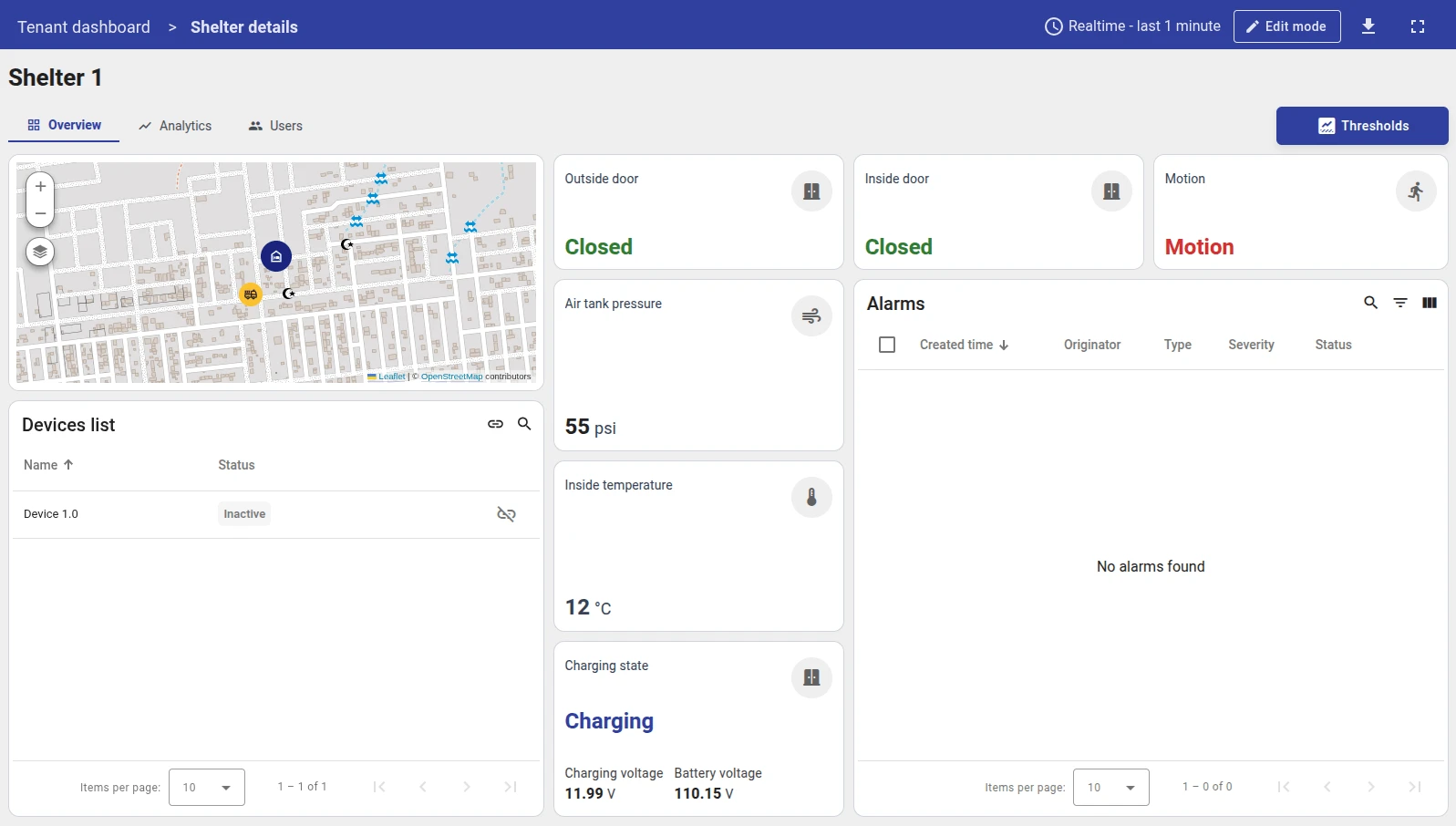
In this example the entity is a shelter. The detail page has three tabs: Overview, Analytics, and Users.
How the layout works:
shelterDetailsPage (one dashboard state) ├── header widget — shows selected shelter name (placed once, never duplicated) ├── navigation widget — tab buttons; each tab updates the subState URL parameter └── Markdown/HTML Card — reads subState, renders the matching <tb-dashboard-state> ├── subState = "Overview" → embeds shelterOverview state ├── subState = "Analytics" → embeds shelterAnalytics state └── subState = "Users" → embeds shelterUsers stateThe navigation widget updates subState via an Update current dashboard state action on each tab button click. The Markdown/HTML Card reacts to the parameter change and swaps the embedded state — no page transition, no duplication. See Example 2: Navigation menu for a step-by-step guide on building the navigation widget itself.
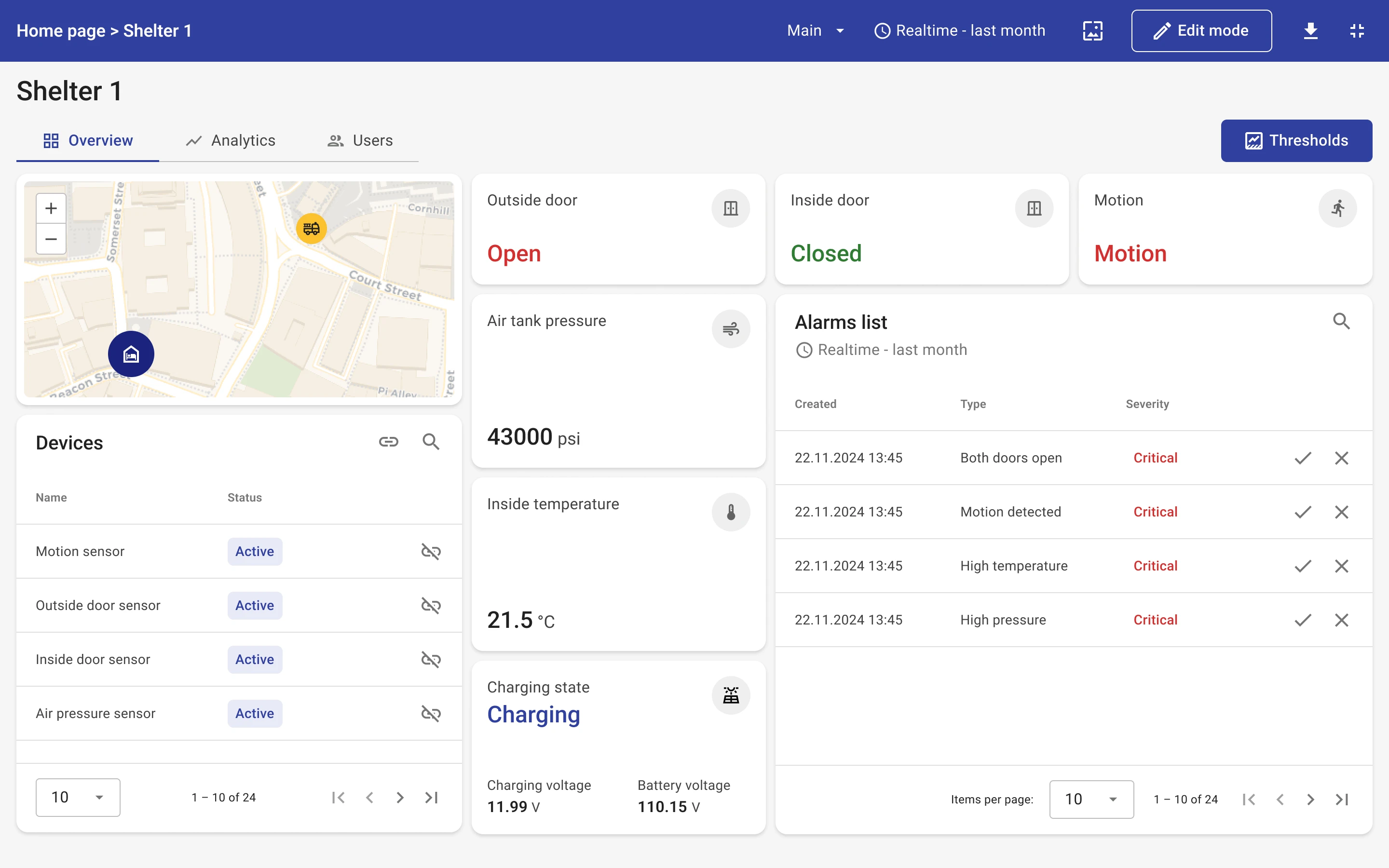
Step 1. Create the sub-states. In your dashboard settings, create a separate state for each sub-view: shelterOverview, shelterAnalytics, and shelterUsers. Build the content of each state independently — they will be embedded inside the panel widget.
Step 2. Add the widget. Open the container state (shelterDetailsPage) in edit mode, click Add widget, select HTML widgets, then choose Markdown/HTML Card.
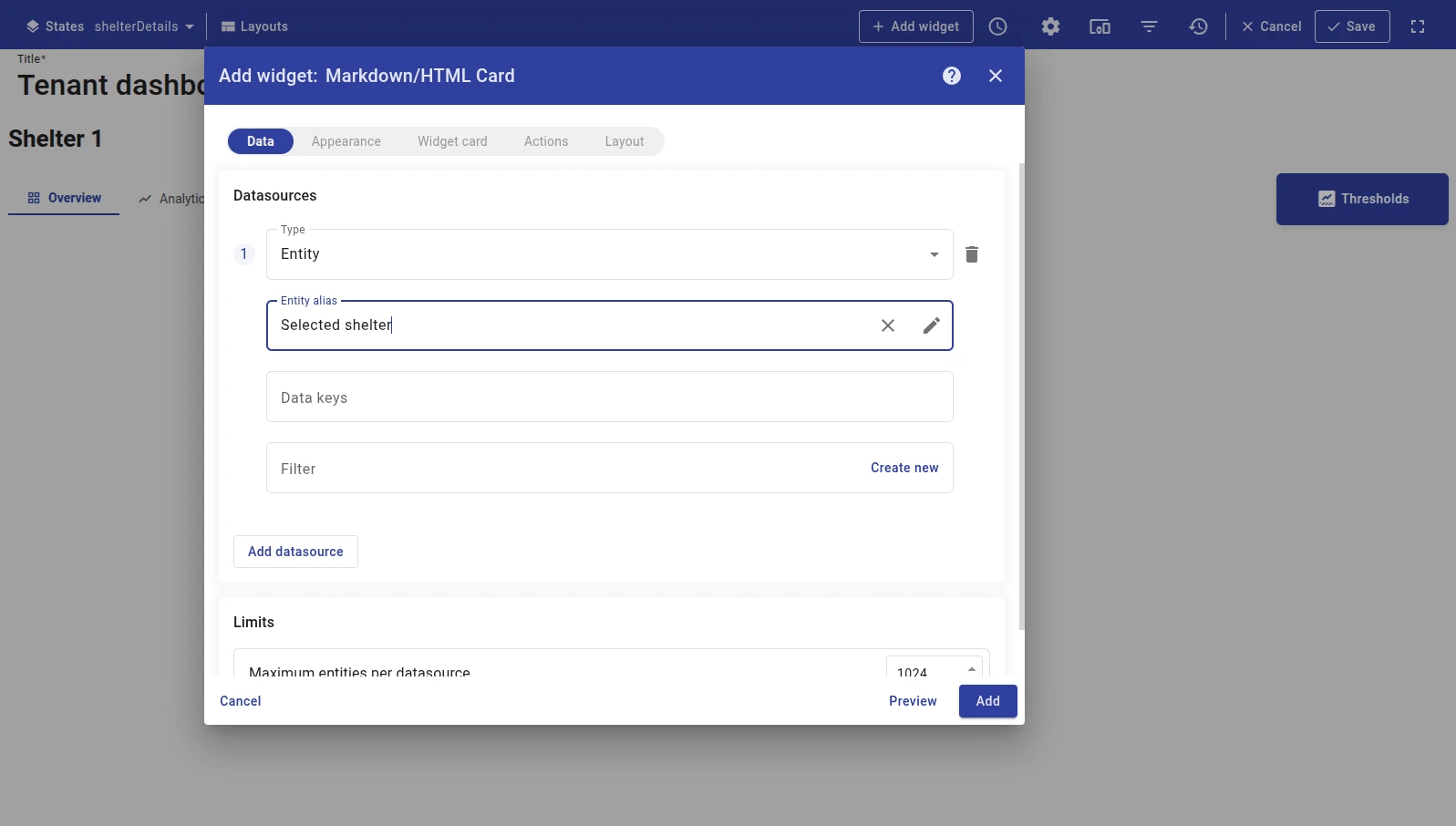
Step 3. Configure the datasource. On the Data tab, add a datasource pointing to the selected shelter entity alias with no data keys. This is required because the navigation widget calls self.ctx.updateAliases() when switching tabs, which triggers the Markdown/HTML Card to re-evaluate its value function and re-render the HTML with the updated subState parameter.
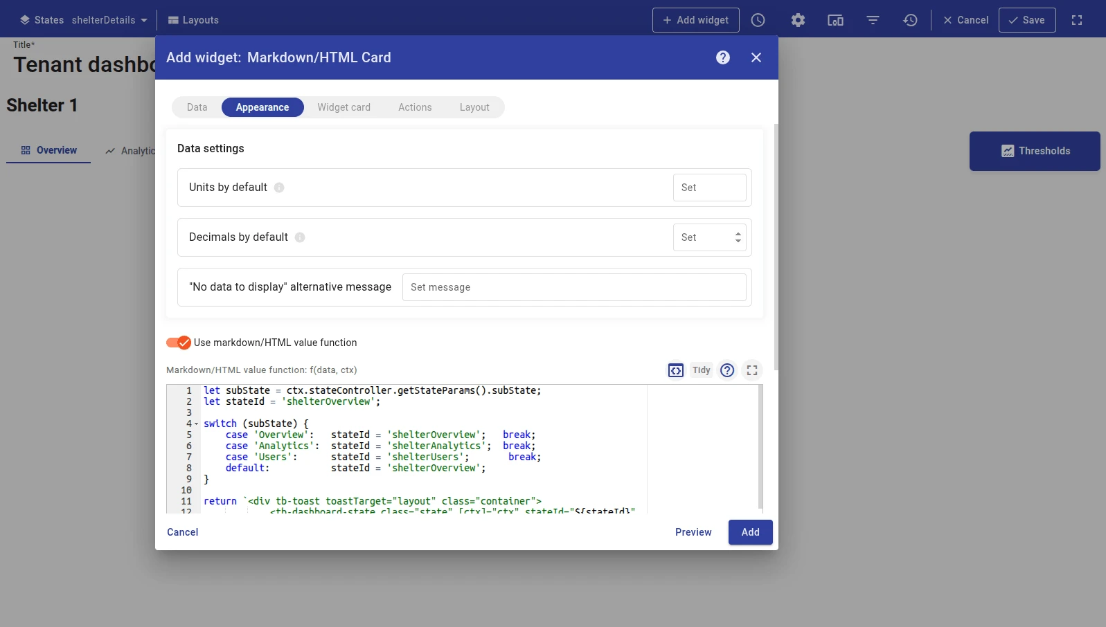
Step 4. Configure the value function. On the Appearance tab, enable Use markdown/HTML value function and paste the JavaScript function:
let subState = ctx.stateController.getStateParams().subState;let stateId = 'shelterOverview';
switch (subState) { case 'Overview': stateId = 'shelterOverview'; break; case 'Analytics': stateId = 'shelterAnalytics'; break; case 'Users': stateId = 'shelterUsers'; break; default: stateId = 'shelterOverview';}
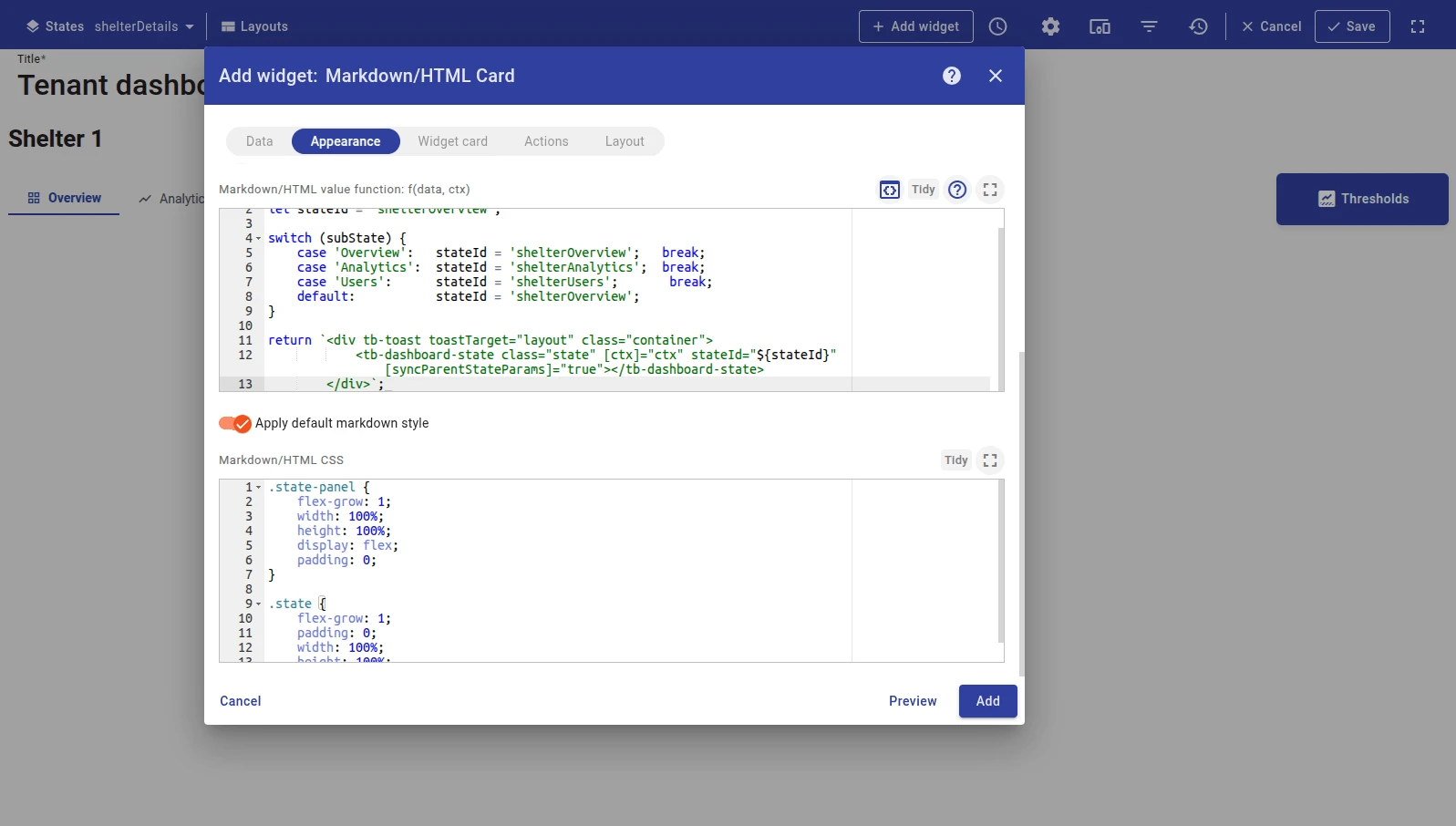
return `<div tb-toast toastTarget="layout" class="container"> <tb-dashboard-state class="state" [ctx]="ctx" stateId="${stateId}" [syncParentStateParams]="true"></tb-dashboard-state> </div>`;Key points:
ctx.stateController.getStateParams().subStatereads thesubStateURL parameter set by the navigation widget.- The
switchmaps each tab name to astateIdstring; thedefaultbranch sets the fallback state shown when no parameter is present. <tb-dashboard-state stateId="...">embeds a full dashboard state inline. Replace thestateIdvalues with your actual state IDs.[syncParentStateParams]="true"passes the parent state’s entity context into the embedded state so its widgets resolve aliases correctly.
Step 5. Add CSS. Paste the CSS styles into the Markdown/HTML CSS field:
.state-panel {    flex-grow: 1;    width: 100%;    height: 100%;    display: flex;    padding: 0;}
.state {    flex-grow: 1;    padding: 0;    width: 100%;    height: 100%;}
Step 6. Configure card appearance. Set Card padding to 0 so the widget fills its entire cell. In the Card tab, remove any default padding.
Step 7. Save. Click Add, resize and reposition as needed, then click Save on the dashboard toolbar.
Troubleshooting
Section titled “Troubleshooting”Widget shows blank content
| Cause | Solution |
|---|---|
| Placeholder key not found | Verify the ${key} name matches the data key label in the datasource exactly. Key names are case-sensitive. |
| No datasource configured | If you use ${key} placeholders, a datasource with matching data keys must be configured. |
| Device has not sent data | Open Devices → Latest telemetry and confirm the key has a recent value. |
Value function produces no output or an error
| Cause | Solution |
|---|---|
Missing return statement | The function must explicitly return an HTML string. Check that all code paths return a value. |
data[0] is undefined | The function receives an empty data array when the datasource has no results. Add a guard: if (!data.length) return ''; |
| JavaScript syntax error | Open the browser console to see the exact error and line number. |
CSS styles not applying
| Cause | Solution |
|---|---|
| Class name mismatch | Verify the class names in the CSS exactly match those in the HTML template. |
| Styles overridden by widget defaults | Use more specific CSS selectors or add !important as a last resort. |
Was this helpful?