Trip Map
The Trip Map widget replays an entity’s route as an animation — letting you play, pause, and scrub through movement over a selected time period. Use it for step-by-step analysis of vehicle trips, delivery paths, or any entity reporting latitude/longitude telemetry. The timeline control panel is enabled by default, providing interactive playback at adjustable speeds.
Key capabilities
Section titled “Key capabilities”Trip Map is one of four map widgets in ThingsBoard, each serving a distinct purpose:
| Widget | Primary use |
|---|---|
| Map | Displays current entity locations in real time. |
| Image Map | Uses a custom background image. Best for floor plans, parking lots, and indoor layouts. |
| Trip Map | Animated route replay with full timeline controls. Best for step-by-step movement analysis. |
| Route Map | Renders the full historical path as a static route line. Best for reviewing complete trips at a glance. |
What sets Trip Map apart:
- Draws the route from timeseries latitude/longitude data and animates movement frame by frame.
- Timeline control panel is enabled by default — play, pause, scrub, and adjust playback speed.
- Supports Trips, Markers, Polygons, Circles, and Polylines overlays simultaneously on the same map.
- Supports the Polylines overlay for displaying fixed infrastructure routes like bus lines or pipelines.
Add the widget
Section titled “Add the widget”- Open the dashboard and switch to edit mode.
- Click Add widget at the top, or the Add new widget icon in the center of the screen.
- Open the Maps widget bundle.
- Select Trip Map.
- Configure the widget settings, then click Add.
Time window
Section titled “Time window”The time window defines the period over which trip data is loaded for playback.
-
Use dashboard time window: The widget inherits the global time range set on the dashboard. All widgets using this mode stay synchronized when the dashboard time range changes.
-
Use widget time window: The widget uses its own independent time range. Select a mode:
- History — a fixed range with a specific start and end. Default for Trip Map — use this to load a defined trip for replay.
- Realtime — the window slides forward as time passes, always showing the most recent interval (like “last 1 day”). Use this for ongoing continuous monitoring.
-
Display time window: Toggle the time interval label on the widget card.
For details on time window settings, see Time window.
Map type
Section titled “Map type”Choose between Map (tile-based) and Image (custom background).
Renders the route on a standard tile map. Configure one or more layers:
- Label: Display name shown in the layer switcher on the widget.
- Provider: OpenStreet, Google, HERE, Tencent, or Custom (enter a tile server URL).
- Layer: Tile style — Mapnik, HOT, WorldStreetMap, WorldTopoMap, WorldImagery, Roadmap, etc. Available options depend on the provider.
- Reference layer: A transparent overlay with labeled map elements (streets, borders). Configure via the layer gear icon menu.
Click Add layer to configure additional switchable layers. Users switch between layers using the layer icon button directly on the widget.
Uses a static image as the map background — for example, a floor plan or a custom site diagram:
- Image source: Upload via gallery or enter a URL.
- Entity key: Bind the image to an entity attribute key — useful when the background image varies per entity.
Overlays
Section titled “Overlays”Overlays are the visual elements rendered on the map. Each overlay type binds to its own data source and is configured independently.
The Trips overlay draws the path traveled by an entity as a continuous line, based on timeseries latitude/longitude data. During playback, a marker animates along the route, showing the entity’s position at each recorded timestamp.
Add a trip: Click Add trip, select a data source, define coordinate keys, and click Save.
Datasource
Select the entity providing timeseries coordinates: Function, Device, or Entity (entity alias). Apply a filter to narrow the selection. Expand More datasources to add additional data sources.
Keys
- Latitude key: Timeseries key containing latitude values (default:
latitude). - Longitude key: Timeseries key containing longitude values (default:
longitude). - Additional data keys: Extra telemetry keys (like
speed,status) available in label and tooltip functions.
Appearance — Marker
The icon displayed at the entity’s current position during playback. Three display modes:
- Shape: Select a built-in shape; set size (px) and color. Use a color function (JavaScript) to change the marker color dynamically based on telemetry values.
- Icon: Select a built-in icon; set size and color.
- Image: Provide an image URL, or use a marker image function that returns
{ url, size, offset }. Set a custom marker image size.
Marker offset — fine-tune the anchor point position (Horizontal, Vertical; 0–1 range).
Rotate marker — rotates the marker icon to match the direction of movement. Set an Offset angle (degrees) to adjust the base orientation.
Appearance — Label
Text shown above the marker:
- Pattern (default): Use template variables like
${entityName},${entityLabel}, or any data key. - Function: Return an HTML string based on data values.
Appearance — Tooltip
Popup shown on marker interaction:
- Pattern / Function: Define content as a template or a JavaScript function.
- Tooltip trigger: Show on click or show on hover.
- Auto-close tooltips: Close when clicking elsewhere on the map.
- Tag actions: Add named action links inside the tooltip using
<link-act name='action-name'>Label</link-act>. Clicking the link triggers the configured widget action.
Behavior
On click — action triggered when the marker is clicked. Available types: Do nothing, Navigate to new dashboard state, Update current dashboard state, Navigate to other dashboard, Custom action, Custom action (HTML template), Mobile action, Open URL.
Position conversion (Image map type only)
A JavaScript function that converts the original relative x/y coordinates of the marker before rendering on the image. Useful when markers from multiple entities share the same position and need to be spread apart, or when coordinates need to be remapped to a custom image scale.
Function signature: f(origXPos, origYPos, data, dsData, aspect)
Parameters:
origXPos: number— original relative x coordinate (0 to 1).origYPos: number— original relative y coordinate (0 to 1).data— entity data for this trip point: entity properties and telemetry from the configured datasource.dsData— all data from all data layers, including additional datasources.aspect: number— image map aspect ratio (width / height).
Must return { x: number, y: number } — new relative coordinates, each from 0 to 1.
Default (pass-through):
return {x: origXPos, y: origYPos};Example — detect markers with same positions and place them with minimum overlap:
var xPos = data.xPos;var yPos = data.yPos;var locationGroup = dsData.filter((item) => item.xPos === xPos && item.yPos === yPos);if (locationGroup.length > 1) { const count = locationGroup.length; const index = locationGroup.indexOf(data); const radius = 0.035; const angle = (360 / count) * index - 45; const x = xPos + radius * Math.sin(angle * Math.PI / 180) / aspect; const y = yPos + radius * Math.cos(angle * Math.PI / 180); return {x: x, y: y};} else { return {x: xPos, y: yPos};}Path
- Path: Enable to display the route line. Set line thickness (px) and color.
- Path decorator: Directional symbols rendered along the path:
- Decorator symbol: Arrow or Dash.
- Size and color of the symbol.
- Decorator arrangement: Start offset, End offset, and Repeat interval (all in px).
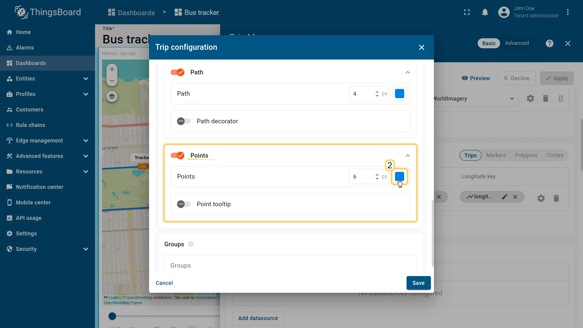
- Points: Dot markers at each recorded data point. Set size (px) and color.
- Point color function: JavaScript function that returns a color string based on telemetry values at each point (for example, color-code points by speed).
- Point tooltip: Popup at each recorded point. Configure pattern or function, tooltip trigger, auto-close, and tag actions.
Groups
Assign a group name. Groups appear in the Groups panel on the widget, where entire groups can be shown or hidden at once.
The Markers overlay places point icons on the map to represent entity positions — vehicles, sensors, devices, or any asset with a location. Positions are read from attributes or telemetry.
Add a marker: Click Add marker, select a data source, define coordinate keys, and click Save.
Datasource
Function, Device, or Entity alias. Apply a filter to narrow the selection.
Keys
- Latitude key: Attribute or telemetry key with latitude (default:
latitude). - Longitude key: Attribute or telemetry key with longitude (default:
longitude). - Additional data keys: Extra keys for labels, tooltips, or color functions.
Appearance — Marker
Three display modes:
- Shape: Built-in shape; set size and color. Supports a color function.
- Icon: Built-in icon; set size and color.
- Image: Image URL or a marker image function returning
{ url, size, offset }.
Marker offset — fine-tune anchor point (Horizontal, Vertical).
Appearance — Label
Text above the marker. Pattern (like ${entityName}) or Function. Enable Tip for multi-line content.
Appearance — Tooltip
Popup on click or hover. Pattern or Function. Configure:
- Tooltip trigger: On click or on hover.
- Auto-close tooltips.
- Tooltip offset: Horizontal and Vertical position adjustment.
- Tag actions: Named action links inside the tooltip.
Behavior
On click action. Types: Do nothing, Navigate to new dashboard state, Update current dashboard state, Navigate to other dashboard, Custom action, Custom action (HTML template), Mobile action, Open URL.
Position conversion (Image map type only)
A JavaScript function that converts the original relative x/y coordinates of the marker before rendering on the image. Useful when markers share the same position and need to be spread apart, or when coordinates require remapping to a custom image scale.
Function signature: f(origXPos, origYPos, data, dsData, aspect)
Parameters:
origXPos: number— original relative x coordinate (0 to 1).origYPos: number— original relative y coordinate (0 to 1).data— entity data for this marker: entity properties and telemetry from the configured datasource.dsData— all data from all data layers, including additional datasources.aspect: number— image map aspect ratio (width / height).
Must return { x: number, y: number } — new relative coordinates, each from 0 to 1.
Default (pass-through):
return {x: origXPos, y: origYPos};Example — spread overlapping markers in a circle:
var xPos = data.xPos;var yPos = data.yPos;var locationGroup = dsData.filter((item) => item.xPos === xPos && item.yPos === yPos);if (locationGroup.length > 1) { const count = locationGroup.length; const index = locationGroup.indexOf(data); const radius = 0.035; const angle = (360 / count) * index - 45; const x = xPos + radius * Math.sin(angle * Math.PI / 180) / aspect; const y = yPos + radius * Math.cos(angle * Math.PI / 180); return {x: x, y: y};} else { return {x: xPos, y: yPos};}Groups
Assign a group name for visibility toggling.
Edit marker
Enable interactive placement and manipulation tools on the widget:
- Instruments: Enable Add, Move, and/or Remove tools.
- Scope of the attribute to persist location: Server or Shared — controls where the coordinates are saved.
- Enable snapping to other vertices for precision drawing: Snaps the new point to nearby vertices.
Use map markers clustering
Groups nearby markers into a single cluster icon at lower zoom levels. The cluster icon displays the count of items inside. Improves readability for large numbers of markers.
Polygons define areas or zones on the map — work zones, geofences, restricted regions, and more. Polygon coordinates are stored as an attribute on the entity.
Coordinate format:
[[lat1,lng1],[lat2,lng2],...,[latN,lngN]]Add a polygon: Click Add polygon, select a data source, define the polygon key, and click Save.
Datasource
Function, Device, or Entity alias. Apply a filter if needed.
Keys
- Polygon key: Attribute key holding the coordinate array (default:
perimeter). - Additional data keys: Extra keys for labels, tooltips, or functions.
Appearance — Fill
How the polygon interior is rendered:
- Color: Solid fill color.
- Stripe: Diagonal hatching pattern — useful for indicating zones or restricted areas.
- Image: Custom image fill.
Appearance — Stroke
Border line. Set thickness (px) and color.
Appearance — Label
Text shown at the polygon center. Pattern or Function.
Appearance — Tooltip
Popup on click or hover. Pattern or Function. Configure trigger, auto-close, and tag actions.
Behavior
On click action. Same action types as Markers.
Groups
Assign a group name for visibility toggling.
Edit polygon
Interactive tools:
- Instruments: Enable Add, Edit (resize vertices), Move, and/or Remove tools.
- Scope: Server or Shared attribute scope for saving coordinates.
- Enable snapping to other vertices for precision drawing.
Circles define round areas based on a center coordinate and radius — useful for signal coverage, detection ranges, or impact zones.
Coordinate format:
{"latitude": value, "longitude": value, "radius": value}Add a circle: Click Add circle, select a data source, define the circle key, and click Save.
Datasource
Function, Device, or Entity alias. Apply a filter if needed.
Keys
- Circle key: Attribute key holding the center and radius data (default:
perimeter). - Additional data keys: Extra keys for labels, tooltips, or functions.
Appearance — Fill
Color, Stripe, or Image — same options as Polygons.
Appearance — Stroke
Border line thickness and color.
Appearance — Label
Text shown at the circle center. Pattern or Function.
Appearance — Tooltip
Popup on click or hover. Pattern or Function. Configure trigger, auto-close, and tag actions.
Behavior
On click action. Same action types as Markers.
Groups
Assign a group name for visibility toggling.
Edit circle
Interactive tools:
- Instruments: Enable Add, Edit (resize radius), Move, and/or Remove tools.
- Scope: Server or Shared attribute scope.
- Enable snapping to other vertices for precision drawing.
Polylines display static route paths stored as attribute coordinate arrays — for example, a fixed bus route with stops, a subway line, or a pipeline. Unlike Trips (which trace paths from timeseries data), Polylines render a static shape from an entity attribute.
Coordinate format:
[[lat1,lng1],[lat2,lng2],...,[latN,lngN]]Add a polyline: Click Add polyline, select a data source, define the polyline key, and click Save.
Datasource
Function, Device, or Entity alias. Apply a filter if needed.
Keys
- Polyline key: Attribute key holding the coordinate array (default:
perimeter). - Additional data keys: Extra keys for labels or tooltips.
Appearance — Stroke
Line thickness (px) and color.
Appearance — Label
Text shown along the polyline. Pattern or Function.
Appearance — Tooltip
Popup on click or hover. Pattern or Function. Configure:
- Tooltip trigger: On click or on hover.
- Auto-close tooltips.
- Tag actions: Named action links inside the tooltip.
Behavior
On click action. Types: Do nothing, Navigate to new dashboard state, Update current dashboard state, Navigate to other dashboard, Custom action, Custom action (HTML template), Mobile action, Open URL.
Groups
Assign a group name for visibility toggling.
Edit polyline
Interactive tools:
- Instruments: Enable Add, Edit, Move, and/or Remove tools.
- Scope: Server or Shared attribute scope for saving coordinates.
- Enable snapping to other vertices for precision drawing.
Additional datasources
Section titled “Additional datasources”Additional datasources provide telemetry or attributes from entities not directly displayed on the map. Use them in overlay functions for conditional logic — color-changing markers, enriched tooltips, or computed display values based on data from related devices.
- Source: Entity type — Function, Device, or Entity alias.
- Data keys: Telemetry or attribute keys to read from the entity.
Click Add datasource to configure more.
Map controls
Section titled “Map controls”Configure the interactive controls available on the widget.
Position — placement of the controls panel: Top-left, Top-right, Bottom-left, or Bottom-right.
Zoom actions — enable zoom via:
- Scroll: Mouse wheel zoom.
- Double click: Zoom in on double-click.
- Control buttons: Show + / − zoom buttons on the map.
Scale — display a distance scale bar: Metric (km / m) or Imperial (mi / ft).
Timeline control panel — enabled by default. Adds interactive playback controls for stepping through the route:
- Time step: How much time advances per animation frame (ms).
- Speed options: Comma-separated list of playback speed multipliers shown to the user (like
1, 5, 10, 15, 25). - Timestamp: Toggle to display the current playback time. Select a date/time format from the dropdown.
- Snap to real location: When enabled, the marker snaps to the nearest actual data point during playback. Expand to configure a JavaScript filter function — receives
dataanddsData, returnstrueif the point should be used as an anchor (like filter by time interval:return data.time % 1000 === 0).
Map action buttons
Section titled “Map action buttons”Add custom buttons overlaid on the map. Each button triggers a predefined action when clicked.
Each button has a Label, Icon, Color, and Action.
Available action types: Do nothing, Navigate to new dashboard state, Update current dashboard state, Navigate to other dashboard, Custom action, Custom action (HTML template), Mobile action, Open URL, Place map item.
Click Add button to configure more buttons.
For action configuration details, see Widget actions.
Common map settings
Section titled “Common map settings”- Fit map bounds to cover all markers: Auto-adjusts zoom and position on load to fit all visible map items. Enabled by default.
- Default map center position: Initial map center coordinates (latitude, longitude) used when auto-fit is disabled.
- Default map zoom level: Initial zoom level. Higher values zoom in closer (like 7 for country level, 15 for street level).
- Limit of entities to load: Maximum entities loaded simultaneously. Prevents performance issues with large datasets (default: 16384).
Appearance
Section titled “Appearance”- Title: Widget header label. Disabled by default. Use
${entityName}or${entityLabel}as pattern variables, or enter a static string. - Card icon: Icon displayed next to the title in the header. Set size (px), alignment, and color.
Card appearance
Section titled “Card appearance”- Background: Card background color.
- Show card buttons: Toggle Data export and Fullscreen buttons in the widget header.
- Card border radius: Corner rounding in px (default: 0px).
- Card padding: Inner spacing between content and card edge in px (default: 8px).
Actions
Section titled “Actions”Add Widget header button actions — icon buttons in the widget header that trigger a configured action when clicked.
See Widget actions for available action types and configuration.
Examples
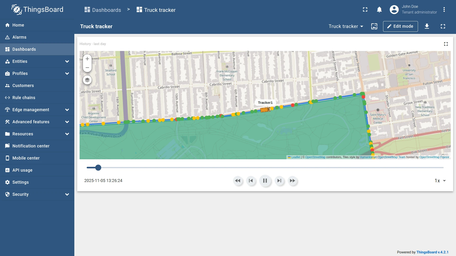
Section titled “Examples”Bus tracking
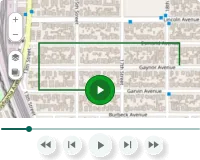
Section titled “Bus tracking”Goal: Visualize the bus route over the last hour with the ability to play, pause, and scrub through the timeline.
Download the example widget
You can download a preconfigured Trip Map widget for this example and reuse it in your own dashboards.
After importing, update these settings to match your environment:
- Datasource: select your actual device (for example, your own Tracker1).
- Data keys: replace telemetry key names if they differ (
latitude,longitude,speed,status). - Map provider: choose the provider your ThingsBoard instance supports.
Prerequisites
You need a device that continuously sends latitude, longitude, speed, and status as timeseries telemetry.
-
Create a device named Tracker1.
-
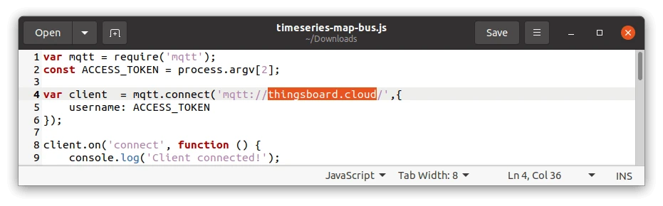
Download the emulator script. It connects to
thingsboard.cloudby default — replace the host with your own ThingsBoard instance URL.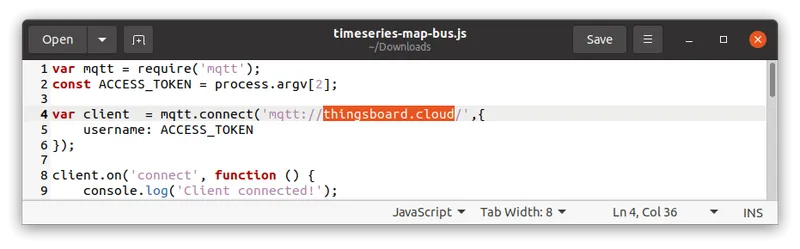
-
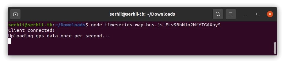
Run the script:
Terminal window node timeseries-map-bus.js $ACCESS_TOKENwhere
$ACCESS_TOKENis the device access token from the device details page.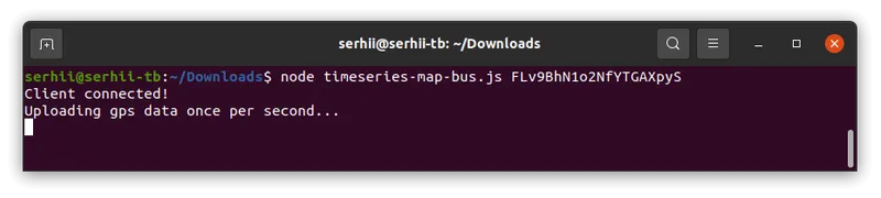
The emulator requires Node.js 12 or higher.
-
Confirm that Tracker1 is receiving telemetry with keys
latitude,longitude,speed, andstatus.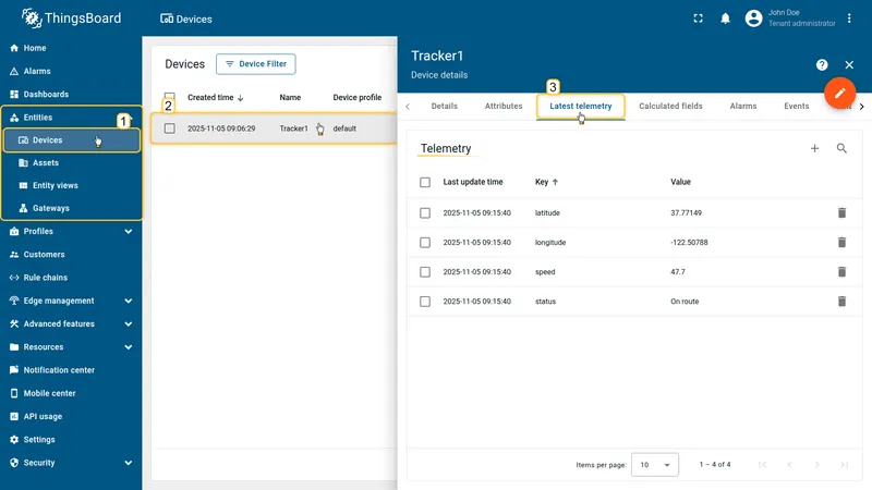

Step 1: Add the widget
Open the dashboard in edit mode and add a Trip Map widget.
Step 2: Configure the widget
Time window
Set the time interval:
- Period: History, last 1 hour
- Aggregation: None
Map type
Select Map and configure three layers:
| Label | Provider | Layer |
|---|---|---|
| Roadmap | OpenStreet | HOT |
| Satellite | OpenStreet | Mapnik |
| Hybrid | OpenStreet | WorldImagery |
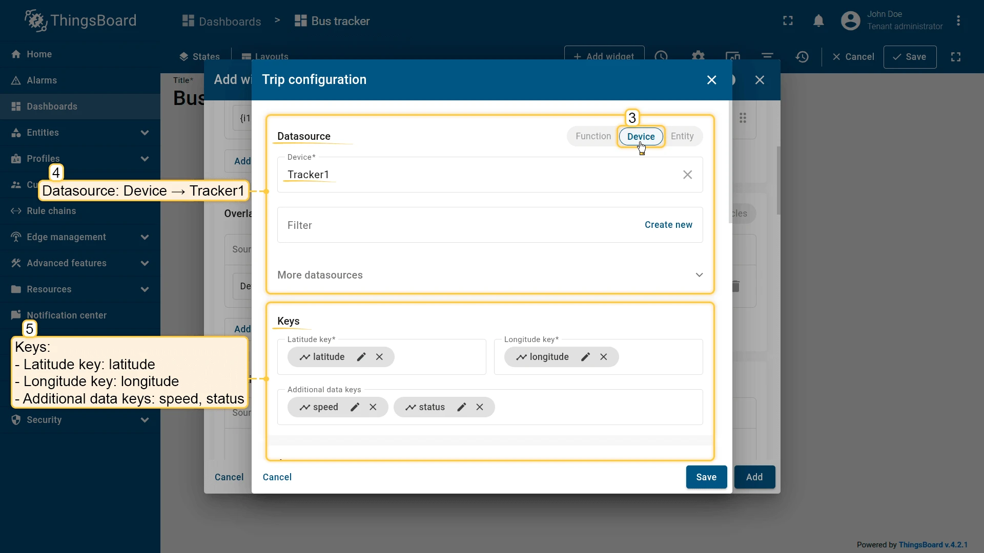
Overlays
Go to Overlays ⇾ Trips and click Add trip.
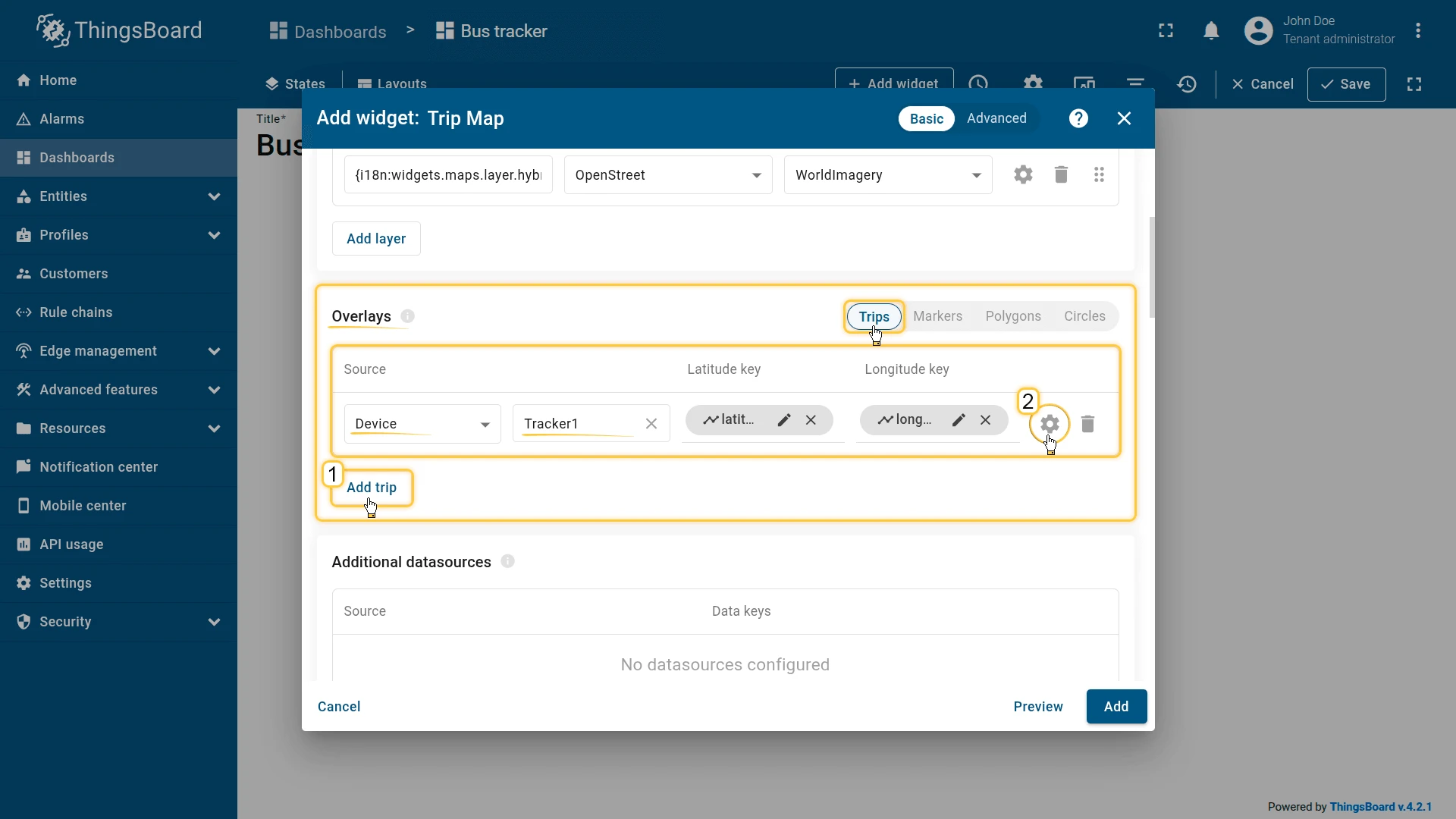
Configure the trip:
- Datasource: Device — Tracker1
- Latitude key:
latitude, Longitude key:longitude - Additional data keys:
speed,status
Configure marker and label:
- Marker: Shape — bus icon, size 34, color
#E89623 - Label pattern:
<div style="position: relative; white-space: nowrap; text-align: center; font-size: 12px; top: 5px;"><span style="border-radius: 10px; background-color: #fff; padding-left: 12px; padding-right: 12px; padding-top: 4px; padding-bottom: 4px;">${entityName}</span></div>Configure the tooltip function:
var speed = data['speed'];var res;
if (speed > 0) {  res = "<b>${entityName}</b><br/><b>Speed:</b> " + String(speed) + " km/h";} else {  res = "<b>${entityName}</b><br/><b>Status:</b> At the stop";}
return res;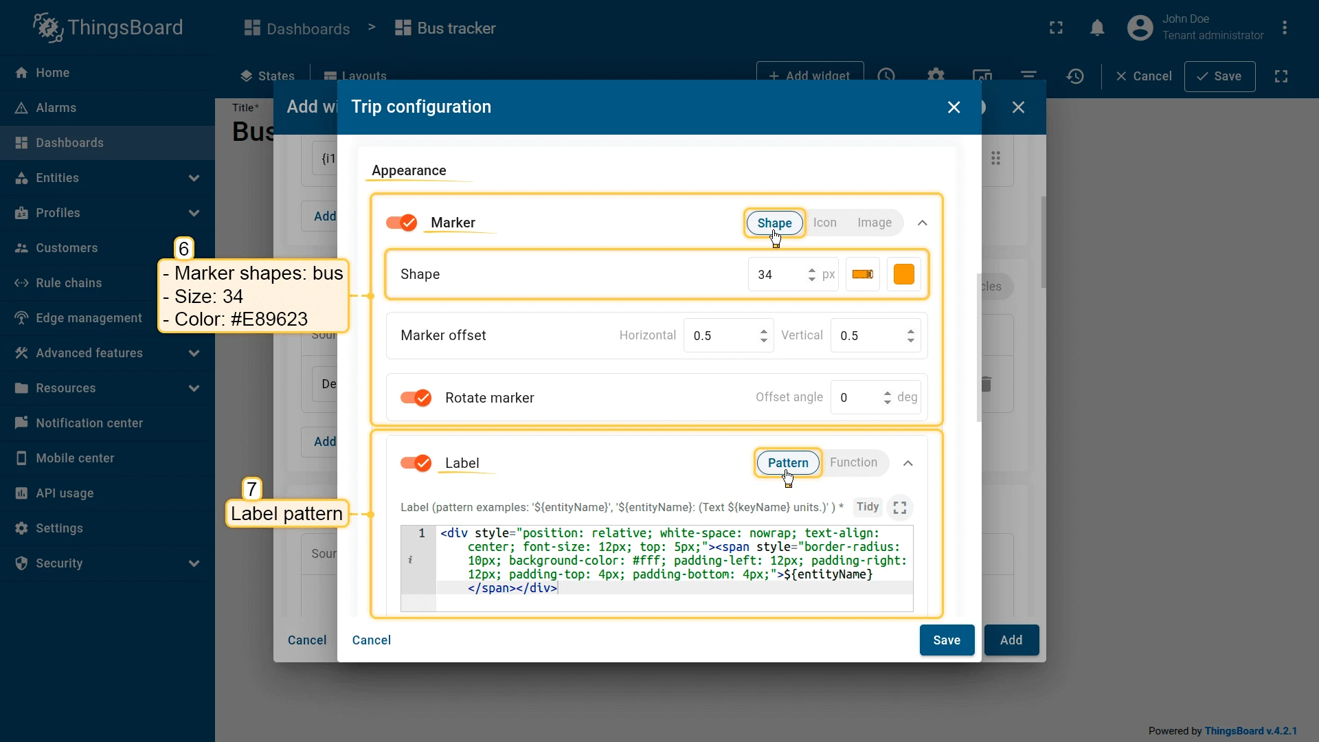
Save the trip configuration.
Appearance
Disable the Title display. Click Add to insert the widget into the dashboard. Resize and reposition as needed, then save the dashboard.
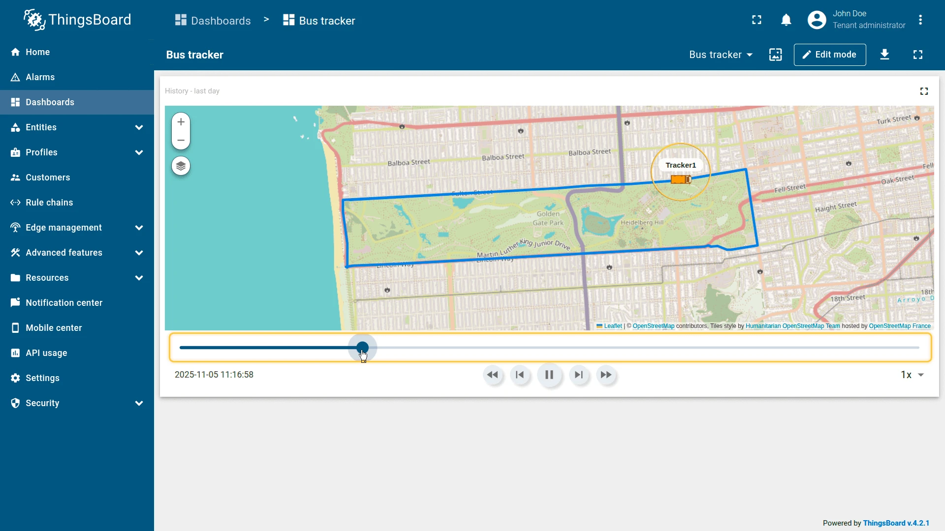
Step 3: Trip playback
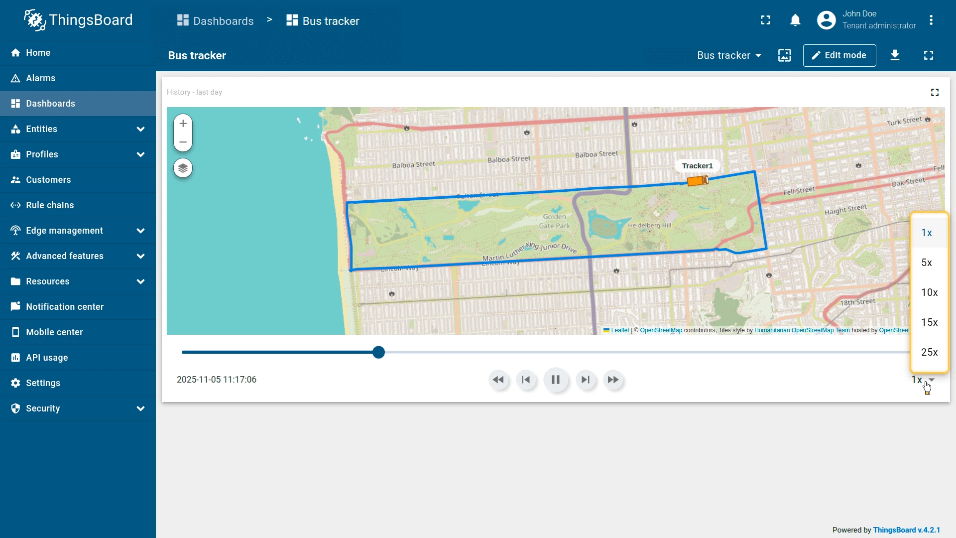
With the widget added, use the timeline control panel to replay the route:
- Click Play on the timeline panel. The bus marker begins moving along its recorded route.
- Scrub the timeline slider to jump to a specific moment in the trip.
- Adjust the playback speed (5×, 10×, 15×, 25×) to review the entire route faster.
- Click the bus marker to display a tooltip showing speed or stop status at that timestamp.
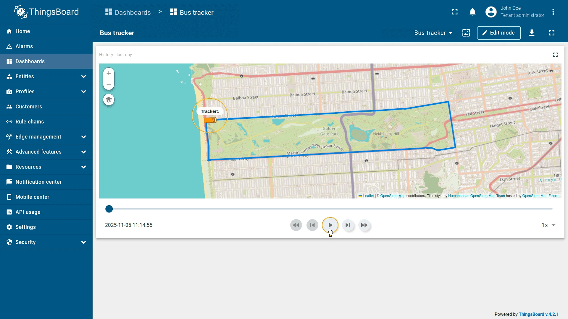
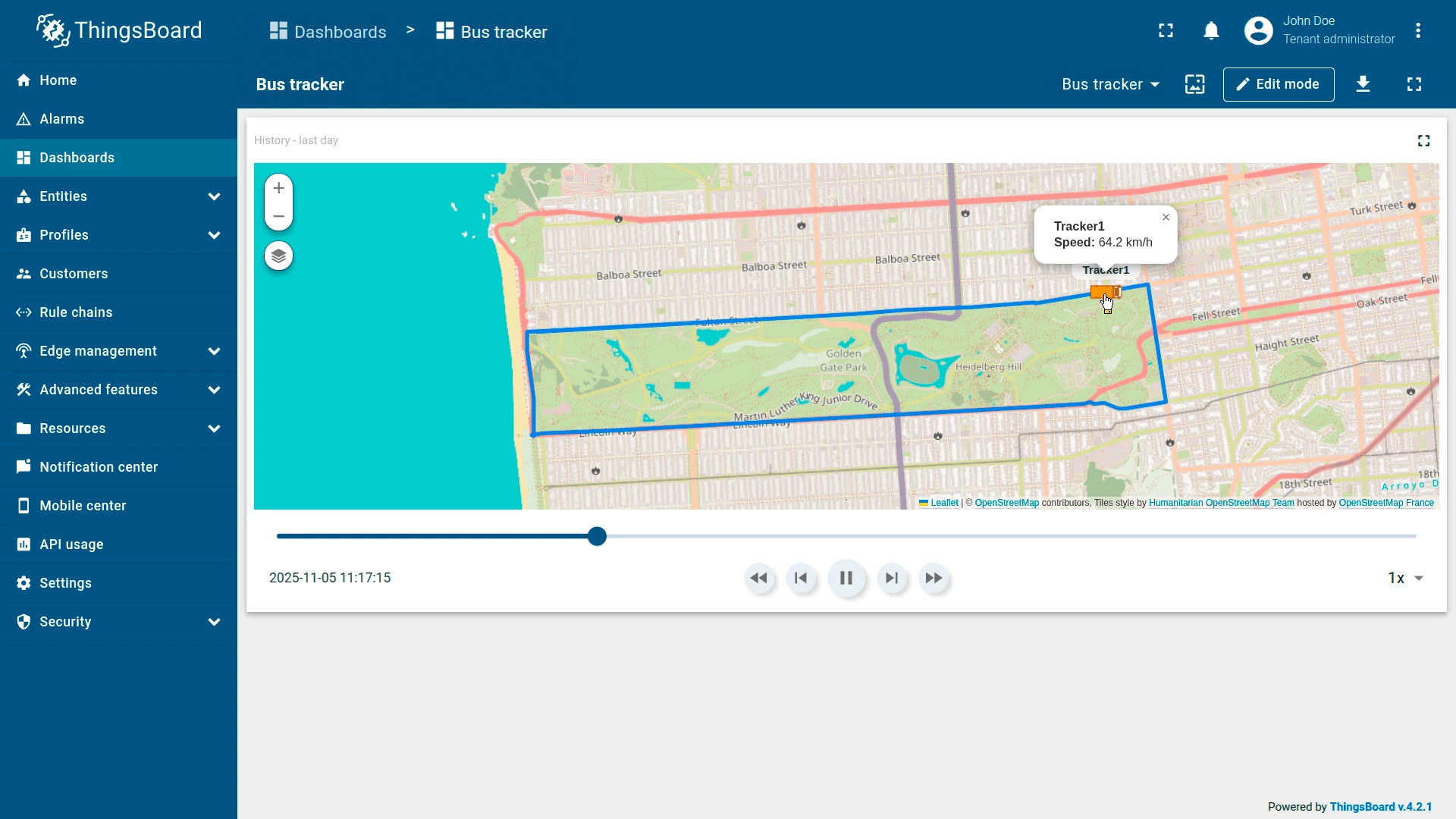
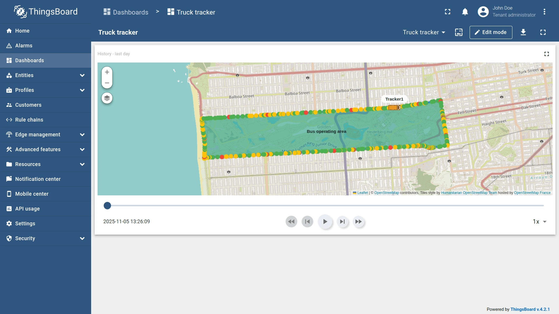
Result
The Trip Map widget displays the complete route of the bus over the last hour. The bus marker moves smoothly along the path, and you can observe:
- Speed changes — reflected dynamically in the tooltip.
- Stops — where the bus marker pauses and the tooltip shows “At the stop”.
- Continuous path — connecting all recorded latitude and longitude points.
The timeline panel gives you full control: pause, rewind, or accelerate the trip to inspect any moment of the journey.
Bus tracking with polygon area and color-coded points
Section titled “Bus tracking with polygon area and color-coded points”Goal: Visualize the bus route and highlight its operating zone on the map, while dynamically coloring trip points based on speed.
This example continues from Bus tracking example. Complete it before proceeding.
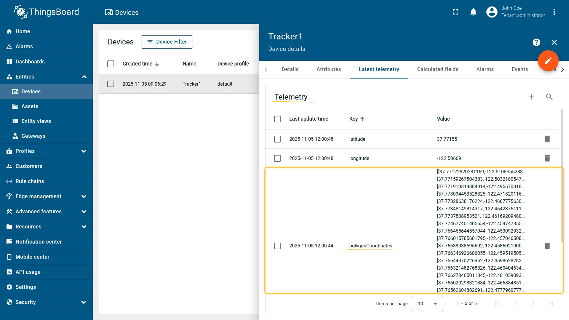
Step 1: Add polygon telemetry
Add a polygonCoordinates key with polygon coordinates to the Tracker1 device. This polygon defines the bus’s operating range — the area around which the vehicle usually moves.
Example of polygon telemetry data:
[[37.77122820281169,-122.51083552837373],[37.77159267504383,-122.50321805477144],[37.771919319384914,-122.49567031860353],[37.773034453528325,-122.4718201160431],[37.77328638176224,-122.4667775630951],[37.77348149814317,-122.46423751115802],[37.7737808953521,-122.46169209480287],[37.774677401405654,-122.45474785566331],[37.766465644557044,-122.45309293270111],[37.766015785681795,-122.45704650878908],[37.76638938596602,-122.45860219001771],[37.766346926686055,-122.45951950550081],[37.76644870226952,-122.45986282825471],[37.766321482768326,-122.46040463447572],[37.766270465011345,-122.46105909347536],[37.766020298321884,-122.4668848514557],[37.76562604882691,-122.47779607772829],[37.7649135114535,-122.49398589134218],[37.7642346742055,-122.51012206077577],[37.76598228246535,-122.50999331474306],[37.76776339244564,-122.51014351844788]]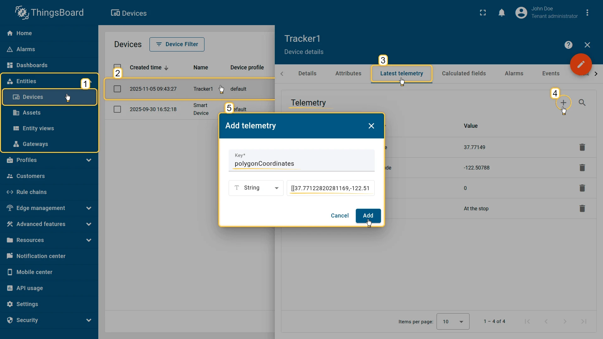
Step 2: Edit the widget
Switch the Trip Map widget to edit mode.
Trip — point color function
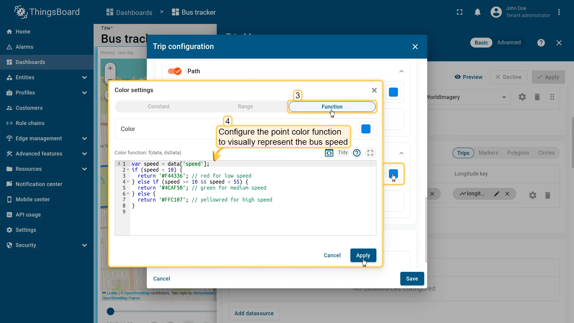
Go to Overlays ⇾ Trips ⇾ Trip configuration ⇾ Points and add a Points color function to visually represent bus speed along the route:
- Red — slow zones (traffic or stops)
- Green — normal speed
- Yellow — high-speed sections
var speed = data['speed'];if (speed < 10) { return '#F44336';} else if (speed >= 10 && speed < 55) { return '#4CAF50';} else { return '#FFC107';}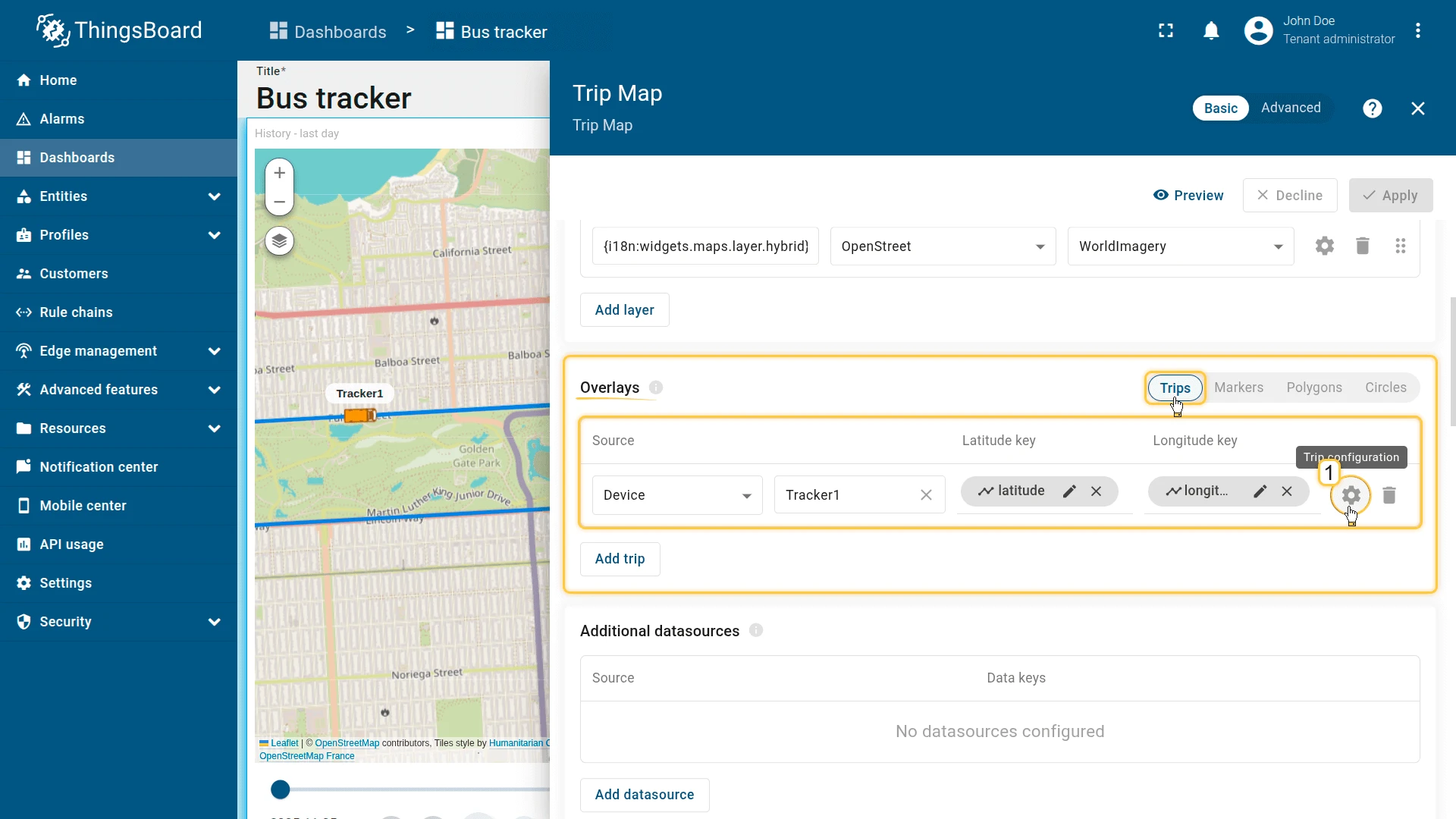
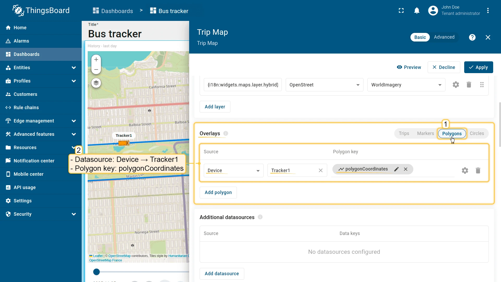
Polygon — add operating zone
Go to Overlays ⇾ Polygons and click Add polygon. Configure:
- Datasource: Device — Tracker1
- Polygon key:
polygonCoordinates - Fill color:
#00968878 - Stroke:
#009688B3 - Label:
Bus operating area
Click Add to save the widget, then save the dashboard.
Result
The Trip Map widget now provides enhanced visualization:
- A moving bus marker following its trip route during playback.
- A polygon area representing the bus’s operating zone.
- Color-coded trip points indicating speed variations along the route — red for slow, green for normal, yellow for high speed.
Troubleshooting
Section titled “Troubleshooting”Route not displayed:
- Verify the device has timeseries records with the latitude and longitude keys matching the configured key names (default:
latitude,longitude). - Check the time window — if the range is too narrow, no data points may fall within it.
- Confirm the datasource entity is correct and key names are spelled exactly as they appear in the telemetry.
Markers not visible:
- Confirm the entity has
latitudeandlongitudeattributes or telemetry populated. - Make sure the coordinate key names in the widget configuration match the entity’s actual key names.
Polyline not shown:
- Confirm the entity has the polyline attribute with the correct key name.
- Verify the attribute value follows the expected format:
[[lat1,lng1],[lat2,lng2],...].
Map loads blank:
- For Google Maps, HERE, or Tencent — verify the API credentials are configured in ThingsBoard system settings.
- For OpenStreetMap, no credentials are required.
Animation does not play:
- Confirm the Timeline control panel is enabled under Map controls.
- Verify the device has timeseries data within the selected time window.
Was this helpful?