Entities Table
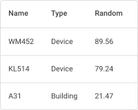
The Entities table widget displays a list of entities — devices, assets, customers, or any other entity type — together with their latest attribute values, telemetry, or entity fields. It supports real-time updates, column sorting, pagination, full-text search, and configurable columns, making it ideal for system overviews, asset management, and device monitoring dashboards.
Adding the Widget
Section titled “Adding the Widget”- Open the dashboard in edit mode. Click Add widget in the top toolbar, or click the Add new widget icon in the center of an empty dashboard.
- In the widget bundle selection dialog, find and click Tables.
- Select the Entities table widget.
- Configure the datasource, columns, and appearance, then click Add.
Configuration
Section titled “Configuration”The widget configuration dialog has Basic and Advanced tabs. The Basic tab groups settings into: Datasource, Columns, Card appearance, and Actions.
Datasource
Section titled “Datasource”Select the source of entity data for the table.
- Device — displays data from a single device.
- Entity alias — displays data for all entities matched by an entity alias. Use this to monitor multiple devices, assets, or other entity types at once.
Columns
Section titled “Columns”Each column maps to a data key — an entity field (e.g. name, type), an attribute, or a telemetry key. For each column you configure:
| Field | Description |
|---|---|
| Key | Data key name (e.g. temperature, active, name). |
| Label | Column header text. Defaults to the key name. |
| Units | Optional unit suffix shown after the value (e.g. °C, %). |
| Decimals | Number of decimal places for numeric values. |
Click Add column to add columns. Drag the handle on the right of any column row to reorder.
Column Settings
Section titled “Column Settings”Click the gear icon on a column row to open the Data key configuration dialog. It has two tabs: General and Advanced.
General tab:
| Setting | Description |
|---|---|
| Key | The data key to display. |
| Label | Column header label. |
| Units | Unit suffix. |
| Decimals | Decimal places for numeric values. |
| Aggregation | Aggregation applied to the key: None, Min, Max, Avg, Sum, or Count. When set to None, the latest value is displayed. |
| Use data post-processing function | JavaScript function that transforms the data key value before it is displayed. Enabling it disables sorting for this column. |
Advanced tab:
| Setting | Description |
|---|---|
| Custom header title | Overrides the column header text displayed in the table. |
| Column width | Fixed width in pixels or percent (e.g. 120px, 20%). Default 0px = auto-width. |
| Default column visibility | Visible — always shown. Hidden — not displayed by default. Hidden in mobile mode — visible on desktop, hidden on mobile. |
| Column selection in “Columns to Display” | Whether the user can toggle this column in the Columns to Display panel. When disabled, the column cannot be hidden by the user. |
| Include column in export | Controls whether this column is included in CSV/Excel export output. |
| Disable sorting | Prevents sorting by this column. Useful for columns with complex or non-numeric content. |
| Use cell style function | JavaScript function for per-cell styling. Signature: f(value, entity, ctx). Must return a CSS style object (e.g. { color: 'red', fontWeight: 'bold' }). |
| Use cell content function | JavaScript function for custom cell content rendering. Signature: f(value, entity, ctx). Return a formatted value or an HTML string. Enable Use cell content function on export to apply the same logic during data export. |
Pagination
Section titled “Pagination”Pagination settings are on the Advanced tab of the widget configuration dialog.
| Setting | Description |
|---|---|
| Display pagination | Shows page navigation controls below the table. Enabled by default. |
| Page step settings | Available page sizes in the page-size dropdown, like 10, 25, 50. |
| Default page size | Number of rows shown per page on initial load. |
Card Appearance
Section titled “Card Appearance”| Setting | Description |
|---|---|
| Card title | Title text displayed in the widget header. |
| Card icon | Optional icon shown next to the title. |
| Show card buttons | Toolbar buttons: Search — full-text entity filter; Columns to display — column toggle panel; Data export — CSV/XLS export; Fullscreen — fullscreen view. |
| Text color | Color applied to all text within the widget. |
| Background color | Widget card background color. |
Actions
Section titled “Actions”The Entities table widget supports the following action sources:
| Action source | When triggered |
|---|---|
| Action cell button | A button appended to the end of each row. |
| On cell click | User clicks a specific cell. |
| On row click | User clicks anywhere in a row. |
| On row double click | User double-clicks a row. |
| Widget header button | A button in the widget header, used for global actions such as adding or deleting entities. |
See Widget Actions for the full list of action types and configuration options.
Example: Device List with Status, Temperature, and Humidity
Section titled “Example: Device List with Status, Temperature, and Humidity”Goal: Display all devices with their name, type, connection status, and current temperature and humidity readings. The Active column shows a colored circle — green for connected devices, red for disconnected.
Prerequisites
Prepare several devices that send temperature and humidity as telemetry keys. The active connection status is provided automatically by ThingsBoard.
Step 1. Add the widget
Open your dashboard in edit mode. Click Add widget, select the Tables bundle, then choose Entities table.
Step 2. Configure the datasource
In the Datasource section, select Entity alias. Choose or create an alias to display all devices:
- Alias name:
All devices - Filter type:
Entity list - Type:
Device
Step 3. Configure columns
Click Add column for each of the following:
| Key | Label | Units | Decimals |
|---|---|---|---|
name |
Name | — | — |
type |
Type | — | — |
active |
Active | — | 0 |
temperature |
Temperature | °C | 1 |
humidity |
Humidity | % | 1 |
Step 4. Style the “active” column
Click the gear icon on the active column row to open its Data key configuration dialog. Switch to the Advanced tab.
Enable “Use cell style function” and enter:
var color;if (value === 'true') { color = 'green';} else { color = 'red';}return { color: color, fontSize: '18px'};Enable “Use cell content function” and enter:
value = '⬤';return value;This replaces the raw true/false text with a large colored circle (⬤).
Step 5. Set the card title
In the Card appearance section, enable Card title and enter:
My devicesSet the font size to 18 px.
Step 6. Save
Click Add to place the widget on the dashboard. Resize and reposition it as needed, then click Save on the dashboard toolbar.
Result
The Entities table displays a live list of devices with:
- a colored circle (🟢 green = active, 🔴 red = inactive) in the Active column;
- current Temperature and Humidity values, updated in real time as new telemetry arrives.
Troubleshooting
Section titled “Troubleshooting”Some Entities Are Missing from the Table
| Cause | Solution |
|---|---|
| Display pagination disabled with more than 1024 entities | Re-enable Display pagination on the Advanced tab. With it off the table stops at 1024 rows and shows no sign that the rest were left out. |
| Entity alias does not resolve to all expected entities | Open Entity aliases in the dashboard and confirm the filter returns the full set. |
| Search filter still applied | Clear the toolbar Search field — it filters the rows currently displayed. |
Widget Is Slow to Render
| Cause | Solution |
|---|---|
| Display pagination disabled | Re-enable Display pagination on the Advanced tab. With it off the widget builds up to 1024 rows at once instead of one page. |
| Too many columns | Every column adds a cell to every row. Split a wide table into several narrower ones, or set Default column visibility to Hidden for columns that are not needed on load. |
| Entity alias resolves to a large set | Narrow the alias filter so the widget subscribes to fewer entities. |
Was this helpful?