HTML Container
The HTML Container widget renders fully custom, self-contained content on a dashboard — your own HTML markup (or an Angular template), CSS, JavaScript, and any external resources you load. It is the most flexible widget in the library: instead of binding to a fixed visual, you write the entire markup and behavior yourself.
The widget was created to remove the constraints of the dashboard grid layout. A standard widget occupies a rectangular cell whose size and breakpoints the dashboard grid manages for you, which makes pixel-precise or free-flowing layouts hard to build. The HTML Container fills its area with whatever you put inside it, so you can lay content out however you like and implement any logic you need.
Key capabilities
Section titled “Key capabilities”- Two template modes — render a plain HTML block, or an Angular template that supports Angular bindings and directives. A single setting switches between the two.
- Bring your own resources — load external JavaScript and CSS from a CDN, or attach ThingsBoard extension modules, exactly as you would in the Widget Library editor.
- Full control over markup, style, and logic — write the HTML/Angular template, the CSS, and a JavaScript block in dedicated fields on the widget configuration.
- Free-form layout — the content fills the widget area, so you are not bound to the visual structure of a pre-built widget. Combined with widget resizing, this lets you build layouts the dashboard grid alone cannot express.
- No datasource binding in settings — unlike a chart or card, the widget has no datasource configuration in its UI. When you need data, you work with it programmatically: create a custom subscription for live telemetry and attribute updates, or call the platform REST API — all from the JavaScript block.
When to use it
Section titled “When to use it”Reach for the HTML Container whenever a standard, grid-bound widget can’t express what you need:
- Free-form layout. Arrange content with pixel precision or fluid CSS instead of the fixed dashboard grid — hero banners, overview headers, split panels, or overlapping elements that the grid alone cannot produce.
- Several dashboard states in one widget. Render multiple dashboard states side by side inside a single widget using
<tb-dashboard-state>tags, each showing a compact set of widgets. Ideal for summary screens that stitch several small dashboards together. (Requires Angular template mode.) - Custom navigation. Build your own tab bar, sidebar, breadcrumb, or button group that switches dashboard states, paired with a
<tb-dashboard-state>region that renders the selected state. (Requires Angular template mode.) - Arbitrary RPC and control panels. Wire buttons, sliders, or bespoke controls to RPC calls from the JavaScript block to build device-control panels that the stock control widgets can’t reproduce.
- Widgets the library doesn’t have. When no built-in widget fits, load a third-party JavaScript library (charting, 3D, gauges, diagrams) via Resources and render it into your own template.
- Embedding external content. Frame iframes, web components, or third-party UIs and style them to match the dashboard.
- Custom input forms. Build forms — text fields, selects, toggles — that write to entity attributes or a REST endpoint from the JavaScript block.
- Branded chrome and reusable templates. Define headers, footers, legends, or branding blocks to reuse across dashboards.
- Data-driven structure. In Angular mode, use
*ngIf/*ngForto show, hide, or repeat layout regions based on state. - Live KPI strips and status overviews. Combine a custom layout with periodic REST polling in JavaScript to keep a compact status bar up to date.
Adding the widget
Section titled “Adding the widget”- Open the dashboard in edit mode. Click Add widget in the top toolbar, or click the Add new widget icon in the center of an empty dashboard.
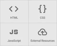
- In the widget bundle selection dialog, find and click HTML Widgets.
- Select the HTML Container widget.
- Enter your content (see Configuration below) and click Add.
Configuration
Section titled “Configuration”The content is written across four tabs — Resources, CSS, HTML (the template), and JavaScript — with a Plain HTML / Angular toggle at the top of the editor and an Actions section below it. The remaining widget tabs (Widget card, Actions, Layout) behave the same as on other widgets.
Plain HTML / Angular
Section titled “Plain HTML / Angular”A toggle at the top of the editor selects how the HTML tab is interpreted:
| Mode | Description |
|---|---|
| Plain HTML | The template is static HTML markup, and the JavaScript receives the container DOM node. Use this for self-contained content that doesn’t need a framework. |
| Angular | The template is compiled as an Angular template — Angular bindings, structural directives (*ngIf, *ngFor), and components (<tb-dashboard-state>, mat-*, …) are available, and the template binds to the widget instance (this). |
The Resources, CSS, and JavaScript tabs are identical in both modes — only the HTML tab is processed differently.
Resources
Section titled “Resources”The Resources section lets you load external code the widget depends on, the same way the Widget Library editor does:
| Resource type | Description |
|---|---|
| External JavaScript / CSS (CDN) | Add a URL to a script or stylesheet hosted on a CDN. The resource is loaded before your JavaScript runs, so libraries it defines are available to your code. |
| Extension module | Attach a ThingsBoard extension (a packaged JS/CSS module) that has been uploaded to the platform. |
Add one entry per resource. List resources in dependency order — a resource that depends on another must come after it.
Write CSS in the CSS field to style your markup. Styles are scoped to the widget content and do not affect other widgets on the dashboard. Class names you define in the template are available here.
The HTML tab (labelled Angular HTML template when Angular mode is on) holds your markup. In Plain HTML mode it is rendered as-is; in Angular mode it is compiled as an Angular template. Any valid markup is accepted — containers, tables, SVG, canvas elements, custom layout, and so on.
<div class="container"> <!-- your content here --></div>JavaScript
Section titled “JavaScript”The JavaScript tab holds the widget logic. Your code runs as the body of a function the widget provides — f(ctx, container) in Plain HTML mode, or f(ctx) in Angular mode (no container). You don’t declare the function yourself; you just write its body, which runs once after the template is rendered. The arguments:
| Argument | Description |
|---|---|
ctx | The standard widget context — the same object available to every widget. Use it to send RPC, switch dashboard states, create data subscriptions, read settings, and access platform services. See the Widget API reference for its full surface. |
container | Plain HTML mode only. The widget’s content element — a native DOM node (<div class="tb-absolute-fill">) that wraps your rendered template; query it with container.querySelector(...). In Angular mode it is not passed — bind through this instead, and if you need the root element use ctx.$container[0] or event.currentTarget.closest(...) from a handler. |
Use this function to initialize libraries loaded from Resources, build or update the DOM inside container, wire up event handlers, and drive the widget through ctx.
The JavaScript editor also supports reusing ThingsBoard JavaScript modules from the platform’s Resource library, letting you share common code across widgets and other UI JavaScript functions.
In Angular mode, the template binds to the widget instance (this). Expose data and handlers to the template by assigning them to this — this.myValue = … (or this.myHandler = () => …) — and reference myValue / myHandler(...) from the template. Define any helper functions as arrow functions so they keep the same this (a plain function declaration would not). After changing any template-bound value — for example inside a subscription callback — call ctx.detectChanges() so the template re-renders. Keep internal state the template never reads in ordinary local variables.
Real-time data with custom subscriptions
Section titled “Real-time data with custom subscriptions”Since the widget has no datasource field, live data is wired up in code. Create a custom subscription through ctx.subscriptionApi and react to updates in its onDataUpdated callback.
A subscription is built from one or more datasources, each referencing an entity alias and a list of data keys:
const datasource = {  type: 'entity',  entityAliasId: aliasId, // resolve from ctx.aliasController.getEntityAliases()  dataKeys: [    { type: 'entityField', name: 'name', settings: {} },    { type: 'attribute', name: 'liquidType', settings: {} },    { type: 'timeseries', name: 'temperature', settings: {} },  ],};
const subscriptionOptions = {  type: 'latest', // 'latest' for current values, 'timeseries' for history  datasources: [datasource],  callbacks: {    onDataUpdated: (subscription) => {      const data = subscription.data; // see "Data shape" below      // update your model / DOM here      ctx.detectChanges(); // refresh Angular bindings (Angular mode)    },    onDataUpdateError: (subscription, e) => {      console.error(e);    },  },};
ctx.subscriptionApi.createSubscription(subscriptionOptions, true).subscribe((subscription) => {  this.subscriptionId = subscription.id; // keep the id to remove it later});
createSubscription(options, subscribe) returns an observable that emits the created subscription; the second argument (true) starts it immediately. Store subscription.id so you can tear the subscription down with ctx.subscriptionApi.removeSubscription(id) — for example, before re-creating it when the selected entity changes.
For a time-series subscription, set type: 'timeseries' and supply a time window — either useDashboardTimewindow: true to follow the dashboard’s window, or your own timeWindowConfig:
const subscriptionOptions = { type: 'timeseries', useDashboardTimewindow: false, timeWindowConfig: { selectedTab: 0, realtime: { realtimeType: 1, quickInterval: 'CURRENT_QUARTER', interval: 24 * 60 * 60 * 1000 }, aggregation: { type: 'AVG' }, }, datasources: [tsDatasource], callbacks: { /* onDataUpdated, onDataUpdateError */ },};Data shape. subscription.data is a flat array with one entry per datasource × data key combination, in the order the keys were declared. Each entry carries its datasource and a data array of [timestamp, value] pairs (latest values hold a single pair). Index into it as rowIndex * dataKeys.length + keyIndex, and read a value straight from an entry’s data — the latest value is the second element of the last pair, data[data.length - 1][1].
Cleaning up
Section titled “Cleaning up”The JavaScript runs again every time the widget reloads (dashboard navigation, edit/view switch, layout change). Register a teardown callback with ctx.registerDestroyCallback(callback) to release anything you acquired during setup so it doesn’t leak across reloads:
ctx.registerDestroyCallback(() => { // your cleanup here});The callback runs exactly once, just before the widget is destroyed. Register several if needed — they run in registration order. Use it to unsubscribe custom subscriptions, disconnect observers, clear setInterval / setTimeout timers, abort outstanding requests, and destroy third-party plugin instances.
Widget card
Section titled “Widget card”| Setting | Description |
|---|---|
| Display widget title | Show or hide the widget title bar. Disable it to let your content fill the full card area. |
| Title | Widget title text shown in the header when the title bar is enabled. Configure font and color. |
| Card style | Text color, background color, padding, margin, border radius, and drop shadow for the widget container. Set Background color to #FFFFFF00 (transparent) and Padding to 0 when your template manages its own background and spacing. |
| Advanced widget style / Widget CSS | Additional CSS applied to the widget container itself, separate from the content CSS on the configuration tab. |
Actions
Section titled “Actions”Add actions in the Actions section. Each action has a source:
| Source | Description |
|---|---|
| Widget header button | Adds a custom button to the widget header bar that runs the configured action when clicked. |
| JavaScript | A named action you trigger from your own code with ctx.actionsApi.invokeAction($event, actionName, additionalParams?) — run it from any element you build (a button, a table row, a chart point) to update dashboard state, navigate, call a custom function, and so on. |
additionalParams is an optional object you pass from your code into the action. The configured action receives it — a custom-function action reads it as its additionalParams, and for navigation / state actions it is merged into the target state params — so you can hand the action context such as the clicked entity or a value.
// run the configured "openDetails" action (source: JavaScript) and pass it some datactx.actionsApi.invokeAction(event, 'openDetails', { deviceId: 'd-123' });Layout
Section titled “Layout”| Setting | Description |
|---|---|
| Resizable | Allow the widget to be resized on the dashboard grid. Enabled by default. |
| Preserve aspect ratio | Maintain the width-to-height ratio when resizing. |
| Mobile | Control visibility, stacking order, and fixed height in the mobile layout. |
Examples
Section titled “Examples”Resizable split master–detail (Angular)
Section titled “Resizable split master–detail (Angular)”This example splits the widget into a device list and a detail pane with a draggable divider between them — like an IDE. Drag the handle and the panes resize live. Interactive pane resizing inside a single widget is something the dashboard grid can’t do at all — there, every widget is a fixed cell you only resize in edit mode.
It uses Angular template mode; the split logic is plain mouse-event JavaScript.
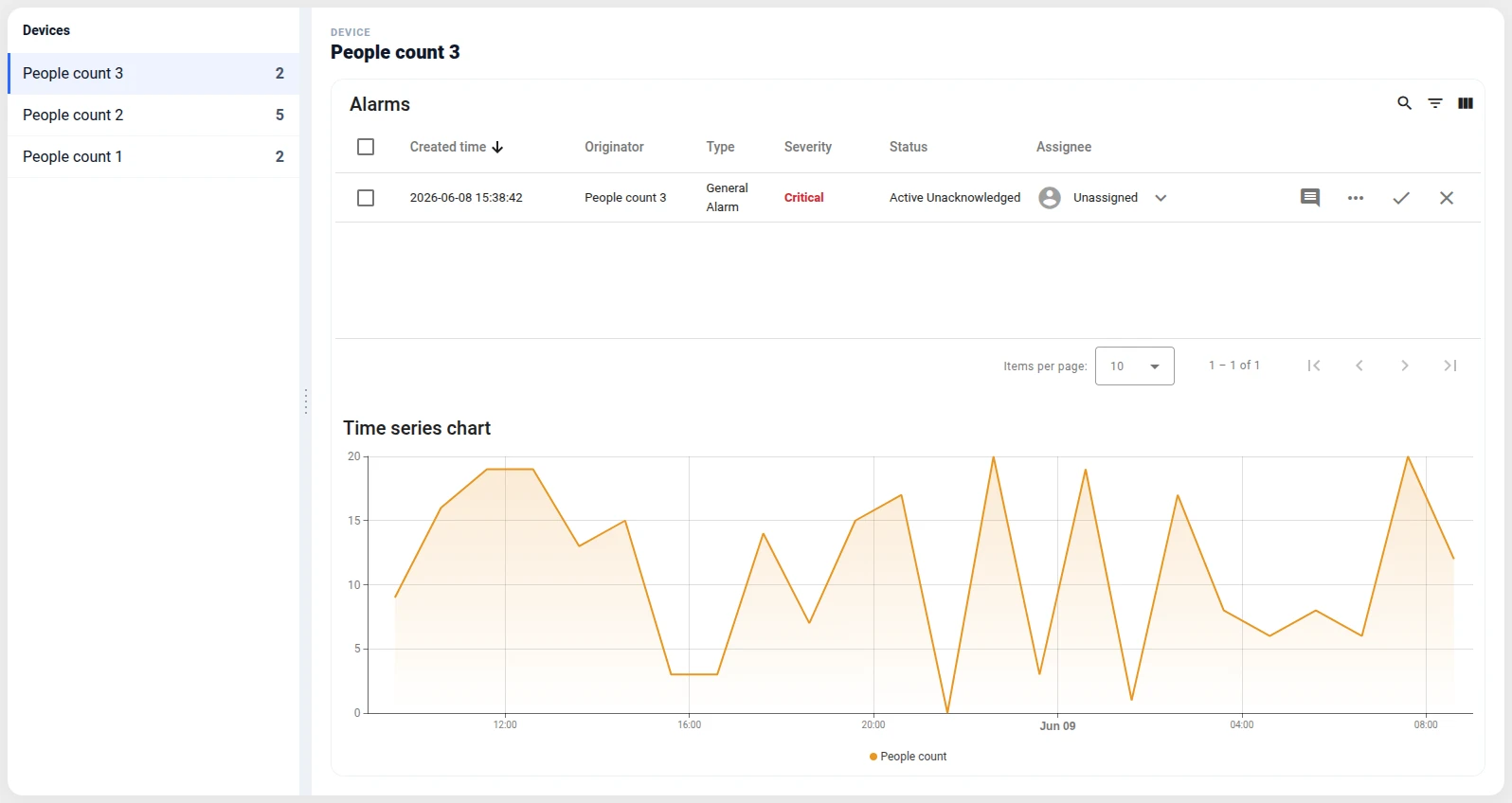
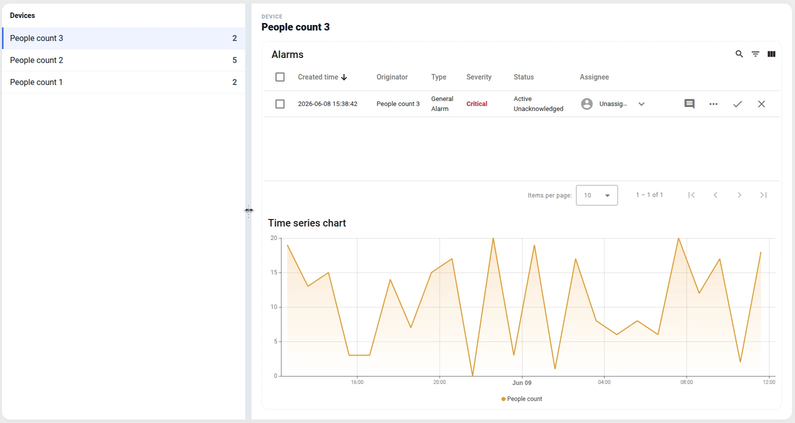
What it does
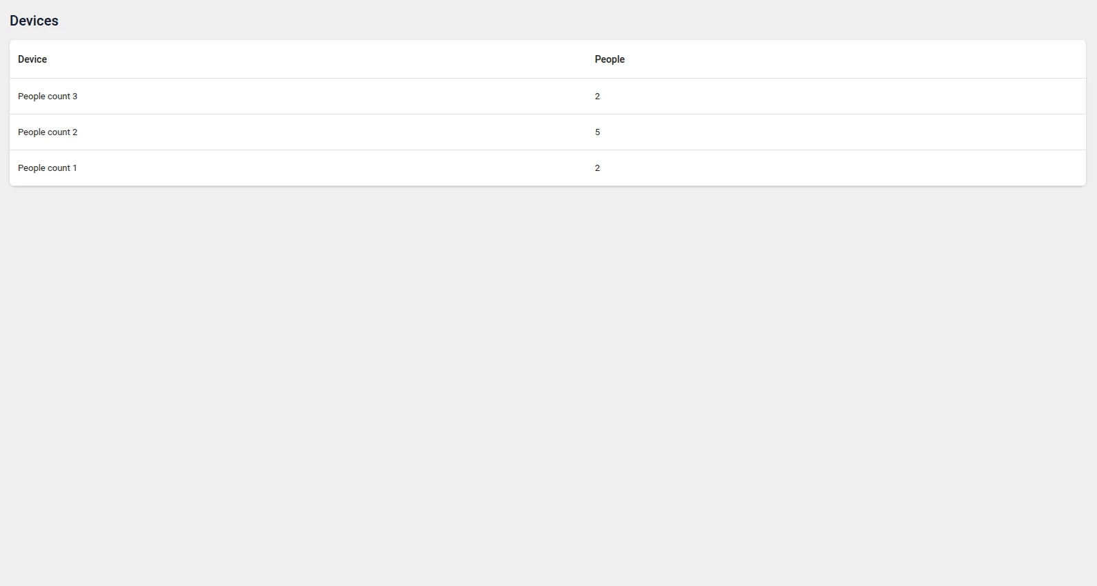
- Lists devices of type
peopleCountin the left pane (name + latest reading). - Clicking a device shows its detail on the right — a custom header plus an embedded
deviceChartsdashboard state for that device (handed over through the state params,[syncParentStateParams]="true"). - A drag handle between the panes resizes them live:
mousedownon the divider tracks the pointer and updates the list-pane width.
Step 1. Add the widget. Open the dashboard in edit mode, click Add widget, select HTML Widgets, choose HTML Container, and set Template mode to Angular.
Step 2. Create the detail state. Add a deviceCharts dashboard state holding widgets bound to the state entity (time-series charts, cards, …) so it reacts to the selected device.
Step 3. Enter the Angular template.
<div class="split">  <aside class="split__list" [style.width.px]="listWidth">    <h3 class="split__title">Devices</h3>    <ul class="split__items">      <li *ngFor="let d of devices"          class="split__item"          [class.is-active]="d.entityId === selectedId"          (click)="select(d)">        <span class="split__name">{{ d.name }}</span>        <span class="split__value">{{ d.lastValue }}</span>      </li>    </ul>  </aside>
  <div class="split__divider" (mousedown)="startDrag($event)"></div>
  <section class="split__detail">    <ng-container *ngIf="selected; else empty">      <header>        <div class="split__eyebrow">Device</div>        <h3 class="split__detail-title">{{ selected.name }}</h3>      </header>      <div class="split__state">        <tb-dashboard-state [ctx]="ctx" stateId="deviceCharts" [syncParentStateParams]="true"></tb-dashboard-state>      </div>    </ng-container>    <ng-template #empty><div class="split__empty">Select a device</div></ng-template>  </section></div>
Step 4. Add CSS.
.split {  display: flex;  height: 100%;  box-sizing: border-box;  font-family: 'Inter', 'Roboto', system-ui, sans-serif;  color: #0f172a;  background: #fff;  border-radius: 16px;  box-shadow: 0 4px 24px rgba(15, 23, 42, 0.06);  overflow: hidden;}
/* List pane — width is bound inline and changes while dragging */.split__list { flex: 0 0 auto; min-width: 160px; overflow: auto; border-right: 1px solid #eef1f6; }.split__title { margin: 0; padding: 16px; font-family: 'Roboto', sans-serif; font-size: 20px; font-weight: 500; }.split__items { list-style: none; margin: 0; padding: 0; }.split__item { display: flex; justify-content: space-between; gap: 12px; padding: 12px 16px; cursor: pointer; border-bottom: 1px solid #f1f5f9; transition: background 0.15s ease; }.split__item:hover { background: #f8fafc; }.split__item.is-active { background: rgba(47, 107, 255, 0.08); box-shadow: inset 3px 0 0 #2f6bff; }.split__value { font-weight: 700; color: #475569; }
/* Drag handle */.split__divider {  flex: 0 0 12px;  display: flex;  align-items: center;  justify-content: center;  cursor: col-resize;  background: #eef1f6;  transition: background 0.15s ease;}.split__divider:hover { background: #e2e8f0; }.split__divider::before {  content: '';  width: 4px;  height: 32px;  background-image: radial-gradient(circle, #94a3b8 1.2px, transparent 1.4px); /* grip dots */  background-position: center;  background-size: 4px 6px;  background-repeat: repeat-y;}.split--dragging { user-select: none; }.split--dragging .split__list, .split--dragging .split__detail { pointer-events: none; } /* let mousemove reach window during drag */
/* Detail pane */.split__detail { flex: 1 1 0; min-width: 220px; display: flex; flex-direction: column; gap: 16px; padding: 20px; overflow: auto; }.split__eyebrow { font-size: 11px; font-weight: 700; text-transform: uppercase; letter-spacing: 0.08em; color: #94a3b8; }.split__detail-title { margin: 2px 0 0; font-size: 20px; font-weight: 800; }.split__state { flex: 1 1 auto; min-height: 260px; border: 1px solid #eef1f6; border-radius: 14px; overflow: hidden; }.split__state tb-dashboard-state { display: block; width: 100%; height: 100%; }.split__empty { margin: auto; color: #94a3b8; font-size: 14px; }
Step 5. Add the JavaScript.
this.ctx = ctx; // exposed to the template for <tb-dashboard-state [ctx]="ctx">this.devices = [];this.selected = null;this.selectedId = null;this.listWidth = 280; // px, bound to [style.width.px] on the list pane
// Select a device → show its detail state on the right.this.select = (d) => {  this.selected = d;  this.selectedId = d.entityId;  ctx.stateController.updateState(null, {    entityId: { entityType: d.entityType, id: d.entityId },    entityName: d.name,  });  ctx.detectChanges();};
// Drag the divider to resize the panes. Mouse events live on window so the drag// continues even when the pointer moves off the thin handle.this.startDrag = (event) => {  event.preventDefault();  const root = event.currentTarget.closest('.split'); // Angular mode has no `container`  const left = root.getBoundingClientRect().left;  // While dragging, the panes ignore the pointer — otherwise the embedded  // dashboard state swallows mousemove and the drag stops over it.  root.classList.add('split--dragging');  const onMove = (e) => {    this.listWidth = Math.max(160, Math.min(e.clientX - left, root.clientWidth - 220));    ctx.detectChanges();  };  const onUp = () => {    root.classList.remove('split--dragging');    window.removeEventListener('mousemove', onMove);    window.removeEventListener('mouseup', onUp);  };  window.addEventListener('mousemove', onMove);  window.addEventListener('mouseup', onUp);};
// List devices of type "peopleCount" with their latest reading.const subOpts = {  type: 'latest',  datasources: [    {      type: 'entity',      entityFilter: { type: 'deviceType', deviceTypes: ['peopleCount'], deviceNameFilter: '', resolveMultiple: true },      dataKeys: [{ type: 'timeseries', name: 'peopleCount', settings: {} }],    },  ],  callbacks: {    onDataUpdated: (subscription) => {      this.devices = (subscription.data || []).map((entry) => {        const ds = entry.datasource;        const last = entry.data && entry.data.length ? entry.data[entry.data.length - 1] : null;        return { entityId: ds.entityId, entityType: ds.entityType, name: ds.entityName, lastValue: last ? last[1] : '—' };      });      ctx.detectChanges();    },    onDataUpdateError: (subscription, e) => console.error(e),  },};// The JS re-runs on every reload — capture the id and remove the subscription on destroy.let subscriptionId = null;ctx.subscriptionApi.createSubscription(subOpts, true).subscribe((subscription) => {  subscriptionId = subscription.id;});ctx.registerDestroyCallback(() => {  if (subscriptionId != null) ctx.subscriptionApi.removeSubscription(subscriptionId);});
Step 6. Save and resize. Click Add, give the widget room, and click Save. Drag the divider to balance the list and detail panes.
Result: One HTML Container becomes a resizable master–detail layout with a draggable splitter — the list and the embedded deviceCharts state share the space in whatever proportion you drag to. Interactive pane sizing like this is outside what the widget grid can express.
Slide-over device detail with mat-drawer (Angular)
Section titled “Slide-over device detail with mat-drawer (Angular)”This example is the clearest answer to “what does the grid stop me from doing?”. A device table fills the widget; clicking a device slides a right-hand drawer (~70% wide) over the dashboard, showing custom cards plus two embedded dashboard states for that device. An overlay panel like this — floating above other content, sized as a fraction of the screen — is impossible with the rectangular widget grid, where every widget is a fixed cell. Here it’s just markup and CSS.
It uses Angular template mode and the platform’s Angular Material mat-drawer.
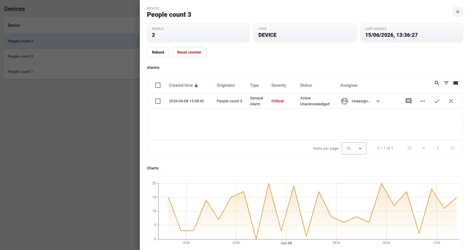
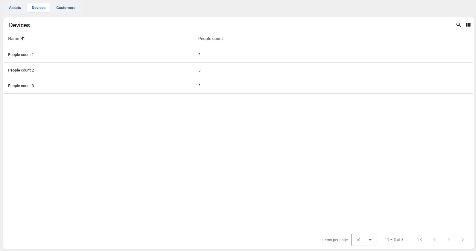
What it does
- Lists devices of type
peopleCountin an Angular Materialmat-table(name + latest reading). - Clicking a row opens an Angular Material
mat-drawerfrom the right (position="end",mode="over"), ~70% wide, overlaying the list. - The drawer shows custom cards (people, type, last update) plus two embedded
<tb-dashboard-state>panels —deviceAlarmsanddeviceCharts. - The selected device is handed to those states through the dashboard state params (
[syncParentStateParams]="true"), so the alarms and charts are for that device. - Two RPC buttons (Reboot, Reset counter) send a two-way RPC to the selected device —
POST /api/rpc/twoway/{deviceId}viactx.http— each showing amat-progress-barunder the button while it waits for the response. (ctx.controlApifrom the RPC control guide is for dedicated control widgets with a configured target device; an HTML Container has none, so it sends nothing — target the selected device by id over REST instead.)
Step 1. Add the widget. Open the dashboard in edit mode, click Add widget, select HTML Widgets, choose HTML Container, and set Template mode to Angular.
Step 2. Create the embedded states. Add two dashboard states, deviceAlarms and deviceCharts, each holding widgets bound to the state entity (an alarms table, time-series charts, …) so they react to the selected device.
Step 3. Enter the Angular template.
<mat-drawer-container class="dd">  <mat-drawer-content class="dd__main">    <h3 class="dd__title">Devices</h3>    <div class="dd__card">      <mat-table [dataSource]="devices" class="dd__table">        <ng-container matColumnDef="name">          <mat-header-cell *matHeaderCellDef>Device</mat-header-cell>          <mat-cell *matCellDef="let d">{{ d.name }}</mat-cell>        </ng-container>        <ng-container matColumnDef="people">          <mat-header-cell *matHeaderCellDef>People</mat-header-cell>          <mat-cell *matCellDef="let d">{{ d.lastValue }}</mat-cell>        </ng-container>        <mat-header-row *matHeaderRowDef="columns"></mat-header-row>        <mat-row *matRowDef="let d; columns: columns" [class.is-active]="d.entityId === selectedId" (click)="openDevice(d)"></mat-row>      </mat-table>    </div>  </mat-drawer-content>
  <mat-drawer class="dd__drawer" mode="over" position="end" [opened]="drawerOpen" (openedChange)="drawerOpen = $event">    <div class="dd__panel" *ngIf="selected">      <header class="dd__panel-bar">        <div>          <div class="dd__panel-eyebrow">Device</div>          <h3 class="dd__panel-title">{{ selected.name }}</h3>        </div>        <button class="dd__close" (click)="drawerOpen = false">✕</button>      </header>
      <div class="dd__cards">        <div class="card"><span class="card__label">People</span><span class="card__value">{{ selected.lastValue }}</span></div>        <div class="card"><span class="card__label">Entity type</span><span class="card__value">{{ selected.entityType }}</span></div>        <div class="card"><span class="card__label">Last update</span><span class="card__value">{{ selected.lastSeen }}</span></div>      </div>
      <div class="dd__actions">        <div class="dd__action">          <button class="dd__btn" [disabled]="rebooting" (click)="reboot()">Reboot</button>          <mat-progress-bar *ngIf="rebooting" mode="indeterminate"></mat-progress-bar>        </div>        <div class="dd__action">          <button class="dd__btn dd__btn--warn" [disabled]="resetting" (click)="resetCounter()">Reset counter</button>          <mat-progress-bar *ngIf="resetting" mode="indeterminate"></mat-progress-bar>        </div>      </div>
      <section class="dd__section">        <h4 class="dd__section-title">Alarms</h4>        <div class="dd__state"><tb-dashboard-state [ctx]="ctx" stateId="deviceAlarms" [syncParentStateParams]="true"></tb-dashboard-state></div>      </section>      <section class="dd__section">        <h4 class="dd__section-title">Charts</h4>        <div class="dd__state"><tb-dashboard-state [ctx]="ctx" stateId="deviceCharts" [syncParentStateParams]="true"></tb-dashboard-state></div>      </section>    </div>  </mat-drawer></mat-drawer-container>
Step 4. Add CSS.
.dd { height: 100%; font-family: 'Inter', 'Roboto', system-ui, sans-serif; color: #0f172a; }
/* Device list — Angular Material table (mat-table) */.dd__main { padding: 20px; box-sizing: border-box; }.dd__title { margin: 0 0 16px; font-family: 'Roboto', sans-serif; font-size: 20px; font-weight: 500; }.dd__card { background: #fff; border-radius: 8px; overflow: hidden; box-shadow: 0 1px 2px rgba(0, 0, 0, 0.08), 0 1px 3px rgba(0, 0, 0, 0.12); }.dd__table { width: 100%; } /* flex-based mat-table: columns are flex items */.dd__table .mat-column-name { flex: 1; } /* Device column eats the slack */.dd__table .mat-column-people { flex: 0 0 120px; justify-content: flex-end; } /* numeric column */.dd__table .mat-mdc-row { cursor: pointer; }.dd__table .mat-mdc-row:hover { background: rgba(0, 0, 0, 0.04); }.dd__table .mat-mdc-row.is-active { background: rgba(47, 107, 255, 0.08); }
/* Right slide-over drawer (~70% of the widget) */.dd__drawer { width: 70%; box-sizing: border-box; }.dd__panel { display: flex; flex-direction: column; gap: 16px; padding: 24px; }.dd__panel-bar { display: flex; align-items: flex-start; justify-content: space-between; }.dd__panel-eyebrow { font-size: 11px; font-weight: 700; text-transform: uppercase; letter-spacing: .08em; color: #94a3b8; }.dd__panel-title { margin: 2px 0 0; font-size: 22px; font-weight: 800; }.dd__close { border: 0; background: #f1f5f9; border-radius: 10px; width: 36px; height: 36px; font-size: 16px; cursor: pointer; color: #475569; }.dd__close:hover { background: #e2e8f0; }
/* Custom cards */.dd__cards { display: grid; grid-template-columns: repeat(3, 1fr); gap: 12px; }.card { display: flex; flex-direction: column; gap: 4px; padding: 14px 16px; border-radius: 14px; background: linear-gradient(180deg, #f8fafc, #eef2f7); border: 1px solid #e6ebf2; }.card__label { font-size: 10px; font-weight: 700; text-transform: uppercase; letter-spacing: .08em; color: #94a3b8; }.card__value { font-size: 18px; font-weight: 800; }
/* RPC action buttons */.dd__actions { display: flex; gap: 10px; }.dd__action { display: inline-flex; flex-direction: column; gap: 6px; }.dd__btn { padding: 9px 16px; border: 1px solid #d8dee9; border-radius: 10px; background: #fff; color: #0f172a; font-size: 13px; font-weight: 600; cursor: pointer; transition: background 0.15s ease; }.dd__btn:hover { background: #f8fafc; }.dd__btn:disabled { opacity: 0.6; cursor: default; }.dd__btn--warn { color: #b91c1c; border-color: #fecaca; }.dd__btn--warn:hover { background: #fef2f2; }
/* Embedded dashboard states */.dd__section { display: flex; flex-direction: column; gap: 8px; }.dd__section-title { margin: 0; font-size: 13px; font-weight: 700; color: #334155; }.dd__state { height: 280px; border: 1px solid #eef1f6; border-radius: 14px; overflow: hidden; }.dd__state tb-dashboard-state { display: block; width: 100%; height: 100%; }
Step 5. Add the JavaScript.
this.ctx = ctx; // exposed to the template for <tb-dashboard-state [ctx]="ctx">this.devices = [];this.columns = ['name', 'people']; // mat-table column orderthis.selected = null;this.selectedId = null;this.drawerOpen = false;
// Open the right drawer for a device, and pass it to the embedded states via the// dashboard state params (the states use [syncParentStateParams]="true").this.openDevice = (d) => {  this.selected = d;  this.selectedId = d.entityId;  this.drawerOpen = true;  ctx.stateController.updateState(null, {    entityId: { entityType: d.entityType, id: d.entityId },    entityName: d.name,  });  ctx.detectChanges();};
this.rebooting = false;this.resetting = false;
// Reboot — two-way RPC to the selected device via ctx.http. (ctx.controlApi sends// nothing from an HTML Container: it needs a widget target device, which there is none.)this.reboot = () => {  if (!this.selected || this.rebooting) return;  this.rebooting = true;  ctx.detectChanges();  ctx.http.post('/api/rpc/twoway/' + this.selected.entityId, { method: 'reboot', params: {} }).subscribe({    error: (e) => {      console.error(e);      this.rebooting = false;      ctx.detectChanges();    },    complete: () => {      this.rebooting = false;      ctx.detectChanges();    },  });};
// Reset counter — two-way RPC to the selected device via ctx.http.this.resetCounter = () => {  if (!this.selected || this.resetting) return;  this.resetting = true;  ctx.detectChanges();  ctx.http.post('/api/rpc/twoway/' + this.selected.entityId, { method: 'resetCounter', params: {} }).subscribe({    error: (e) => {      console.error(e);      this.resetting = false;      ctx.detectChanges();    },    complete: () => {      this.resetting = false;      ctx.detectChanges();    },  });};
// List devices of type "peopleCount" with their latest reading.const subOpts = {  type: 'latest',  datasources: [    {      type: 'entity',      entityFilter: { type: 'deviceType', deviceTypes: ['peopleCount'], deviceNameFilter: '', resolveMultiple: true },      dataKeys: [{ type: 'timeseries', name: 'peopleCount', settings: {} }],    },  ],  callbacks: {    onDataUpdated: (subscription) => {      this.devices = (subscription.data || []).map((entry) => {        const ds = entry.datasource;        const last = entry.data && entry.data.length ? entry.data[entry.data.length - 1] : null;        return {          entityId: ds.entityId,          entityType: ds.entityType,          name: ds.entityName,          lastValue: last ? last[1] : '—',          lastSeen: last ? new Date(last[0]).toLocaleString() : '—',        };      });      ctx.detectChanges();    },    onDataUpdateError: (subscription, e) => console.error(e),  },};// The JS re-runs on every reload — capture the id and remove the subscription on destroy.let subscriptionId = null;ctx.subscriptionApi.createSubscription(subOpts, true).subscribe((subscription) => {  subscriptionId = subscription.id;});ctx.registerDestroyCallback(() => {  if (subscriptionId != null) ctx.subscriptionApi.removeSubscription(subscriptionId);});
Step 6. Save and resize. Click Add, give the widget plenty of room, and click Save.
Result: One HTML Container becomes a master device list with a 70%-wide slide-over detail drawer that overlays the dashboard, composing custom cards with two full dashboard states (alarms, charts) for the selected device — an overlay, free-placement layout the widget grid simply can’t produce.
Composite dashboard with tab navigation (Angular)
Section titled “Composite dashboard with tab navigation (Angular)”This example puts several dashboards inside one widget. A custom tab bar switches which dashboard state is rendered in an embedded <tb-dashboard-state> region, turning a single HTML Container into a multi-view panel. The active view is stored in the dashboard state params, so it survives deep links and browser back/forward.
What it does
- Renders a custom tab bar; each tab maps to a dashboard state (
assetsState,devicesState,customersState). - Embeds the selected state inline with
<tb-dashboard-state [ctx]="ctx" [stateId]="stateId" [syncParentStateParams]="true">— a whole dashboard state rendered inside the widget. - Clicking a tab writes the choice into the dashboard state params (
subState) throughctx.stateController; the widget reacts to that change and swaps the embedded state. Because the selection lives in the state params, it is shareable by URL and survives back/forward.
Step 1. Add the widget. Open the dashboard in edit mode, click Add widget, select HTML Widgets, choose HTML Container, and set Template mode to Angular.
Step 2. Create the states to embed. Add the dashboard states you want as tabs — for example assetsState, devicesState, and customersState — each a normal state with its own widgets (an assets table, a devices table, a customers table, and so on).
Step 3. Enter the Angular template.
<div class="composite"> <nav class="tabs"> <button *ngFor="let tab of tabs" class="tab" [class.is-active]="tab.id === activeTab" (click)="selectTab(tab.id)"> {{ tab.label }} </button> </nav> <div tb-toast toastTarget="layout" class="container"> <tb-dashboard-state class="state" [ctx]="ctx" [stateId]="stateId" [syncParentStateParams]="true"></tb-dashboard-state> </div></div>Step 4. Add CSS.
.composite {  display: flex;  flex-direction: column;  gap: 12px;  height: 100%;  box-sizing: border-box;  padding: 12px;  font-family: 'Roboto', system-ui, sans-serif;}
/* Segmented tab bar */.tabs { display: inline-flex; gap: 4px; padding: 4px; align-self: flex-start; background: #eef1f6; border-radius: 10px; }.tab {  border: 0;  background: transparent;  padding: 8px 16px;  border-radius: 7px;  font-size: 13px;  font-weight: 600;  color: #5b6472;  cursor: pointer;  transition: background 0.15s ease, color 0.15s ease;}.tab:hover { color: #1f2733; }.tab.is-active { background: #fff; color: #2f6bff; box-shadow: 0 1px 2px rgba(16, 24, 40, 0.08); }
/* Embedded dashboard state fills the remaining area */.container { flex-grow: 1; width: 100%; display: flex; padding: 0; border: 1px solid #e6eaf0; border-radius: 12px; overflow: hidden; }.state { flex-grow: 1; width: 100%; height: 100%; padding: 0; }
Step 5. Add the JavaScript. This maps the tabs to states, swaps the embedded state from the subState param, and handles tab clicks.
this.ctx = ctx; // exposed to the template for <tb-dashboard-state [ctx]="ctx">
// Tabs → embedded dashboard states.this.tabs = [  { id: 'assets', label: 'Assets', stateId: 'assetsState' },  { id: 'devices', label: 'Devices', stateId: 'devicesState' },  { id: 'customers', label: 'Customers', stateId: 'customersState' },];
// Map the subState param to the active tab and the embedded stateId.const apply = (subState) => {  const tab = this.tabs.find((t) => t.id === subState) || this.tabs[0];  this.activeTab = tab.id;  this.stateId = tab.stateId;};apply(ctx.stateController.getStateParams().subState);
// A tab click writes the choice into the state params — no navigation here.this.selectTab = (subState) => ctx.stateController.updateState(null, { subState });
// React to state-param changes (tab clicks, deep links, back/forward),// then swap the embedded state.const stateSub = ctx.stateController.dashboardCtrl.dashboardCtx.stateChanged.subscribe(() => {  apply(ctx.stateController.getStateParams().subState);  ctx.detectChanges();});
// The JS re-runs on every reload — release the subscription so handlers don't pile up.ctx.registerDestroyCallback(() => stateSub.unsubscribe());
Step 6. Save and resize. Click Add, size the widget to span the area you want, and click Save.
Result: One HTML Container becomes a tabbed, multi-dashboard panel — each tab swaps a full embedded dashboard state in place, with the active view kept in the dashboard state params. The grid layout can’t express this on its own.
Kanban board with a CDN drag-and-drop library (Plain HTML)
Section titled “Kanban board with a CDN drag-and-drop library (Plain HTML)”This is custom interactive logic, not just layout: each device is a card in the column matching its status attribute, and dragging a card to another column writes the new status back to the device. It also shows how to pull in an external library — drag-and-drop is powered by SortableJS loaded from a CDN through the Resources tab. No stock widget offers drag-between-columns with write-back, and the dashboard grid can’t host this kind of interaction at all.
It uses Plain HTML mode (so the container argument is available), the Sortable global from the CDN, and ctx.attributeService for the write-back.
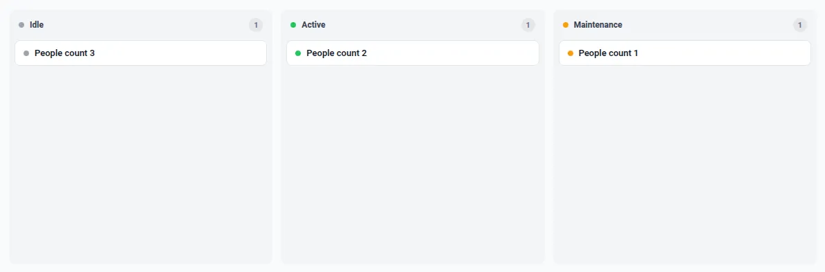
What it does
- Loads SortableJS from a CDN via the Resources tab — the
Sortableglobal, accessed aswindow.Sortable. - Subscribes to every device of type
machineand itsstatusattribute, and renders each device as a card in its status column (Idle · Active · Maintenance). - SortableJS drives smooth drag-and-drop between columns; on drop (
onAdd) it persists the new status to the device viactx.attributeService.saveEntityAttributes. The subscription keeps the board in sync.
Step 1. Add the widget. Open the dashboard in edit mode, click Add widget, select HTML Widgets, choose HTML Container, and keep Template mode on Plain HTML.
Step 2. Add the library under Resources. On the configuration’s Resources section, add a JavaScript URL:
https://cdn.jsdelivr.net/npm/sortablejs@1/Sortable.min.jsStep 3. Provide data. Use devices of type machine, each with a status server attribute whose value is idle, active, or maintenance (edit the statuses list and the device type in the JavaScript to match your data).
Step 4. Enter the HTML template.
<div class="kanban" id="board"></div>Step 5. Add CSS.
.kanban { display: flex; gap: 12px; height: 100%; box-sizing: border-box; padding: 16px; overflow-x: auto; background: #f9fafb; font-family: 'Inter', 'Roboto', system-ui, sans-serif; color: #111827; font-size: 13px;}.kanban__col { flex: 1 1 0; min-width: 220px; display: flex; flex-direction: column; background: #f3f4f6; border-radius: 10px; }.kanban__head { display: flex; align-items: center; gap: 8px; padding: 12px 14px 8px; }.kanban__title { font-size: 12px; font-weight: 600; color: #374151; }.kanban__count { margin-left: auto; min-width: 20px; height: 20px; padding: 0 6px; display: inline-flex; align-items: center; justify-content: center; border-radius: 999px; background: #e5e7eb; color: #6b7280; font-size: 11px; font-weight: 600; }.kanban__cards { display: flex; flex-direction: column; gap: 8px; padding: 4px 8px 12px; flex: 1; min-height: 24px; overflow-y: auto; }.kanban__card { display: flex; align-items: center; gap: 8px; padding: 10px 12px; background: #fff; border: 1px solid #e5e7eb; border-radius: 8px; cursor: grab; transition: border-color 0.12s ease, box-shadow 0.12s ease;}.kanban__card:hover { border-color: #d1d5db; box-shadow: 0 1px 2px rgba(0, 0, 0, 0.05); }.kanban__name { font-weight: 500; color: #111827; }.kanban__dot { width: 8px; height: 8px; border-radius: 50%; flex: none; }.kanban__dot--idle { background: #9ca3af; }.kanban__dot--active { background: #22c55e; }.kanban__dot--maintenance { background: #f59e0b; }.kanban__card.sortable-ghost { opacity: 0; }.kanban__card.sortable-chosen { box-shadow: 0 4px 12px rgba(0, 0, 0, 0.12); }Step 6. Add the JavaScript.
// Plain HTML mode: `container` is the widget's DOM. Build a status board and,// on drop, persist the card's new column (status) back to the device.const Sortable = window.Sortable; // loaded from the CDN added under Resourcesconst statuses = ['idle', 'active', 'maintenance'];const labels = { idle: 'Idle', active: 'Active', maintenance: 'Maintenance' };
const board = container.querySelector('#board');let devices = []; // { id, entityType, name, status }
// Escape untrusted strings (e.g. device names) before putting them in innerHTML.const esc = (s) => String(s).replace(/[&<>"']/g, (c) => ({ '&': '&', '<': '<', '>': '>', '"': '"', "'": ''' })[c]);
function render() { board.innerHTML = statuses .map((s) => { const items = devices.filter((d) => d.status === s); const cards = items .map( (d) => `<div class="kanban__card" data-id="${esc(d.id)}" data-type="${esc(d.entityType)}"><span class="kanban__dot kanban__dot--${s}"></span><span class="kanban__name">${esc(d.name)}</span></div>`, ) .join(''); return `<section class="kanban__col"> <header class="kanban__head"><span class="kanban__dot kanban__dot--${s}"></span><span class="kanban__title">${labels[s]}</span><span class="kanban__count">${items.length}</span></header> <div class="kanban__cards" data-status="${s}">${cards}</div> </section>`; }) .join('');
// Make each column a Sortable list; cards share one group so they move between columns. board.querySelectorAll('.kanban__cards').forEach((listEl) => { new Sortable(listEl, { group: 'kanban', animation: 150, onAdd: (evt) => { const id = evt.item.dataset.id; const entityType = evt.item.dataset.type; const status = evt.to.dataset.status; // destination column const dev = devices.find((d) => d.id === id); if (dev) dev.status = status; ctx.attributeService .saveEntityAttributes({ id, entityType }, 'SERVER_SCOPE', [{ key: 'status', value: status }]) .subscribe(); }, }); });}
// Live data: devices of type "machine" with their "status" attribute.const subOpts = { type: 'latest', datasources: [ { type: 'entity', entityFilter: { type: 'deviceType', deviceTypes: ['machine'], deviceNameFilter: '', resolveMultiple: true }, dataKeys: [{ type: 'attribute', name: 'status', settings: {} }], }, ], callbacks: { onDataUpdated: (subscription) => { devices = (subscription.data || []).map((entry) => { const ds = entry.datasource; const last = entry.data && entry.data.length ? entry.data[entry.data.length - 1] : null; const status = last ? String(last[1]) : 'idle'; return { id: ds.entityId, entityType: ds.entityType, name: ds.entityName, status: statuses.includes(status) ? status : 'idle' }; }); render(); }, onDataUpdateError: (subscription, e) => console.error(e), },};// The JS re-runs on every reload — capture the id and remove the subscription on destroy.let subscriptionId = null;ctx.subscriptionApi.createSubscription(subOpts, true).subscribe((subscription) => { subscriptionId = subscription.id;});ctx.registerDestroyCallback(() => { if (subscriptionId != null) ctx.subscriptionApi.removeSubscription(subscriptionId);});Step 7. Save. Click Add, size the widget, and click Save. Drag a card to another column — the device’s status attribute updates and the move sticks.
Result: A live kanban, powered by a CDN library, where dragging a card persists the new status back to the device — stateful, interactive UI that no stock widget provides and the dashboard grid can’t host, plus a clean example of loading an external resource.
Visitor analytics with a custom range and working hours (Plain HTML)
Section titled “Visitor analytics with a custom range and working hours (Plain HTML)”This example is a small interactive analytics panel: pick a date range and working hours, and it pulls raw telemetry from a custom time window, keeps only points inside the working hours, and aggregates visitors across all peopleCount devices. The daily chart shows stacked bars per device, and clicking a day drills into that day’s hourly breakdown. It shows how to drive a timeseries subscription with a fixed history window you build yourself, re-filter the result on the fly, and wire up chart interactions — all in Plain HTML with ECharts from a CDN.
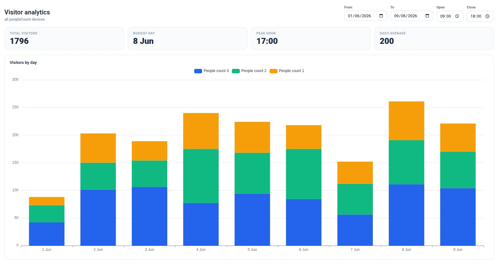
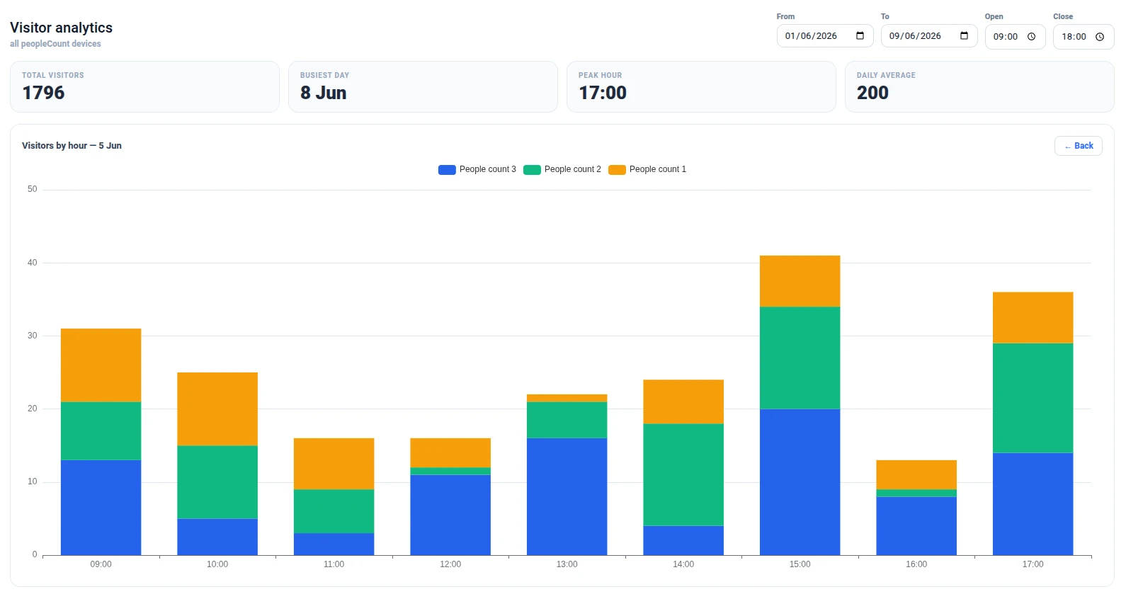
What it does
- Date range (two date inputs) builds a fixed-history
timeWindowConfig(useDashboardTimewindow: false, raw points); changing it re-creates thetimeseriessubscription for every device of typepeopleCount. - Working hours (two time inputs) filter the points client-side; changing them re-aggregates the cached data with no re-subscription.
- The daily view draws one stacked bar series per device over a dynamic date X axis, with KPIs (total, busiest day, peak hour, daily average).
- Clicking a day drills into that day’s hourly breakdown (also stacked by device); Back returns to the daily view.
Step 1. Add the widget. Open the dashboard in edit mode, click Add widget, select HTML Widgets, choose HTML Container, and keep Template mode on Plain HTML.
Step 2. Add the library under Resources. On the configuration’s Resources section, add a JavaScript URL:
https://cdn.jsdelivr.net/npm/echarts@5/dist/echarts.min.jsStep 3. Provide data. Report a peopleCount time-series key on your devices of type peopleCount — each point is the number of visitors counted in that interval.
Step 4. Enter the HTML template.
<div class="vc"> <header class="vc__head"> <div> <h3 class="vc__title">Visitor analytics</h3> <span class="vc__sub">all peopleCount devices</span> </div> <div class="vc__controls"> <label class="vc__field"><span>From</span><input type="date" id="vcStart" /></label> <label class="vc__field"><span>To</span><input type="date" id="vcEnd" /></label> <label class="vc__field"><span>Open</span><input type="time" id="vcOpen" value="09:00" /></label> <label class="vc__field"><span>Close</span><input type="time" id="vcClose" value="18:00" /></label> </div> </header> <div class="vc__kpis"> <div class="vc-kpi"><span class="vc-kpi__label">Total visitors</span><span class="vc-kpi__value" id="vcTotal">—</span></div> <div class="vc-kpi"><span class="vc-kpi__label">Busiest day</span><span class="vc-kpi__value" id="vcPeakDay">—</span></div> <div class="vc-kpi"><span class="vc-kpi__label">Peak hour</span><span class="vc-kpi__value" id="vcPeakHour">—</span></div> <div class="vc-kpi"><span class="vc-kpi__label">Daily average</span><span class="vc-kpi__value" id="vcAvg">—</span></div> </div> <div class="vc__card"> <div class="vc__card-head"> <span class="vc__card-title" id="vcChartTitle">Visitors by day</span> <button class="vc__back" id="vcBack" hidden>← Back</button> </div> <div class="vc__chart" id="vcChart"></div> </div></div>Step 5. Add CSS.
.vc { display: flex; flex-direction: column; gap: 16px; height: 100%; box-sizing: border-box; padding: 20px; background: #fff; font-family: 'Inter', 'Roboto', system-ui, sans-serif; color: #0f172a;}.vc__head { display: flex; align-items: flex-end; justify-content: space-between; gap: 16px; flex-wrap: wrap; }.vc__title { margin: 0; font-family: 'Roboto', sans-serif; font-size: 20px; font-weight: 500; }.vc__sub { font-size: 12px; font-weight: 600; color: #94a3b8; }.vc__controls { display: flex; gap: 10px; flex-wrap: wrap; }.vc__field { display: flex; flex-direction: column; gap: 4px; font-size: 11px; font-weight: 600; color: #64748b; }.vc__field input { padding: 7px 10px; border: 1px solid #d8dee9; border-radius: 10px; font-size: 13px; color: #0f172a; }.vc__field input:focus { outline: none; border-color: #2f6bff; box-shadow: 0 0 0 3px rgba(47, 107, 255, 0.15); }.vc__kpis { display: grid; grid-template-columns: repeat(4, 1fr); gap: 12px; }.vc-kpi { display: flex; flex-direction: column; gap: 6px; padding: 14px 16px; border-radius: 14px; background: #f8fafc; border: 1px solid #e6ebf2; }.vc-kpi__label { font-size: 10px; font-weight: 700; text-transform: uppercase; letter-spacing: 0.08em; color: #94a3b8; }.vc-kpi__value { font-size: 26px; font-weight: 800; line-height: 1; color: #1e293b; }.vc__card { flex: 1; min-height: 240px; display: flex; flex-direction: column; padding: 16px; border: 1px solid #e6ebf2; border-radius: 14px; }.vc__card-head { display: flex; align-items: center; justify-content: space-between; margin-bottom: 8px; }.vc__card-title { font-size: 13px; font-weight: 700; color: #334155; }.vc__back { padding: 6px 12px; border: 1px solid #d8dee9; border-radius: 8px; background: #fff; color: #2f6bff; font-size: 12px; font-weight: 600; cursor: pointer; }.vc__back[hidden] { display: none; }.vc__back:hover { background: #f0f5ff; border-color: #2f6bff; }.vc__chart { flex: 1; min-height: 200px; }Step 6. Add the JavaScript.
// Plain HTML mode: `container` is the widget's DOM; ECharts comes from the CDN.const echarts = window.echarts;const el = (sel) => container.querySelector(sel);const pad = (n) => String(n).padStart(2, '0');const isoDate = (d) => d.getFullYear() + '-' + pad(d.getMonth() + 1) + '-' + pad(d.getDate());const dayLabel = (d) => d.toLocaleDateString(undefined, { month: 'short', day: 'numeric' });const minutes = (v) => {  const [h, m] = (v || '0:0').split(':').map(Number);  return h * 60 + m;};const palette = ['#2563eb', '#10b981', '#f59e0b', '#8b5cf6', '#ef4444', '#0ea5e9'];
const chart = echarts.init(el('#vcChart'));chart.setOption({  tooltip: { trigger: 'axis', axisPointer: { type: 'shadow' } },  legend: { top: 0 },  grid: { left: 8, right: 16, top: 40, bottom: 8, containLabel: true },  xAxis: { type: 'category', data: [], axisLabel: { hideOverlap: true } },  yAxis: { type: 'value' },  series: [],});const resizeObserver = new window.ResizeObserver(() => chart.resize());resizeObserver.observe(el('#vcChart'));
let lastEntries = [];let mode = 'daily';let selectedDate = null;let dailyDates = []; // iso date per daily x-index, for drill-down
// Click a day → drill into its hourly breakdown.chart.on('click', (p) => {  if (mode !== 'daily' || p.dataIndex == null || dailyDates[p.dataIndex] == null) return;  selectedDate = dailyDates[p.dataIndex];  mode = 'hourly';  el('#vcBack').hidden = false;  recompute();});el('#vcBack').addEventListener('click', () => {  mode = 'daily';  selectedDate = null;  el('#vcBack').hidden = true;  recompute();});
// One stacked series per device, summing values into the given bucket index.function buildSeries(labelCount, bucketOf) {  return lastEntries.map((entry, k) => {    const arr = new Array(labelCount).fill(0);    (entry.data || []).forEach(([ts, value]) => {      const i = bucketOf(new Date(Number(ts)));      if (i != null && i >= 0) arr[i] += Number(value);    });    return { name: entry.datasource.entityName, type: 'bar', stack: 'v', data: arr, itemStyle: { color: palette[k % palette.length] } };  });}
function recompute() {  const open = minutes(el('#vcOpen').value);  const close = minutes(el('#vcClose').value);  const inHours = (d) => {    const m = d.getHours() * 60 + d.getMinutes();    return m >= open && m < close;  };
  // KPIs over the whole range (per day, summed across devices).  const start = new Date(el('#vcStart').value + 'T00:00:00');  const end = new Date(el('#vcEnd').value + 'T00:00:00');  const dayIndex = {};  const dayLabels = [];  dailyDates = [];  for (let t = new Date(start); t <= end; t.setDate(t.getDate() + 1)) {    dayIndex[isoDate(t)] = dayLabels.length;    dailyDates.push(isoDate(t));    dayLabels.push(dayLabel(t));  }  const dayTotals = dayLabels.map(() => 0);  const perHour = {};  let total = 0;  lastEntries.forEach((entry) =>    (entry.data || []).forEach(([ts, value]) => {      const d = new Date(Number(ts));      if (!inHours(d)) return;      const i = dayIndex[isoDate(d)];      if (i === undefined) return;      const v = Number(value);      dayTotals[i] += v;      perHour[d.getHours()] = (perHour[d.getHours()] || 0) + v;      total += v;    }),  );  el('#vcTotal').textContent = total;  el('#vcPeakDay').textContent = total ? dayLabels[dayTotals.indexOf(Math.max(...dayTotals))] : '—';  const ph = Object.keys(perHour).sort((a, b) => perHour[b] - perHour[a])[0];  el('#vcPeakHour').textContent = ph != null ? ph + ':00' : '—';  el('#vcAvg').textContent = Math.round(total / (dayTotals.filter((x) => x > 0).length || 1));
  // Chart: daily (stacked by device) or the hourly breakdown of the selected day.  if (mode === 'daily') {    el('#vcChartTitle').textContent = 'Visitors by day';    const series = buildSeries(dayLabels.length, (d) => (inHours(d) ? dayIndex[isoDate(d)] : null));    chart.setOption({ xAxis: { data: dayLabels }, series }, { replaceMerge: ['series'] });  } else {    const h0 = Math.floor(open / 60);    const h1 = Math.ceil(close / 60);    const labels = [];    for (let h = h0; h < h1; h++) labels.push(pad(h) + ':00');    el('#vcChartTitle').textContent = 'Visitors by hour — ' + dayLabel(new Date(selectedDate + 'T00:00:00'));    const series = buildSeries(labels.length, (d) =>      isoDate(d) === selectedDate && inHours(d) ? d.getHours() - h0 : null,    );    chart.setOption({ xAxis: { data: labels }, series }, { replaceMerge: ['series'] });  }}
// (Re)subscribe for the chosen date range (a fixed history window).let subscriptionId = null;function subscribe() {  if (subscriptionId != null) {    ctx.subscriptionApi.removeSubscription(subscriptionId);    subscriptionId = null;  }  const startTimeMs = new Date(el('#vcStart').value + 'T00:00:00').getTime();  const endTimeMs = new Date(el('#vcEnd').value + 'T23:59:59').getTime();  const subOpts = {    type: 'timeseries',    useDashboardTimewindow: false,    timeWindowConfig: {      selectedTab: 1,      history: { historyType: 1, fixedTimewindow: { startTimeMs, endTimeMs } },      aggregation: { type: 'NONE', limit: 50000 },    },    datasources: [      {        type: 'entity',        entityFilter: { type: 'deviceType', deviceTypes: ['peopleCount'], deviceNameFilter: '', resolveMultiple: true },        dataKeys: [{ type: 'timeseries', name: 'peopleCount', settings: {} }],      },    ],    callbacks: {      onDataUpdated: (subscription) => {        lastEntries = subscription.data || [];        recompute();      },      onDataUpdateError: (subscription, e) => console.error(e),    },  };  ctx.subscriptionApi.createSubscription(subOpts, true).subscribe((subscription) => {    subscriptionId = subscription.id;  });}
// Changing the range resets the drill-down and re-subscribes; hours just re-filter.function onRangeChange() {  mode = 'daily';  selectedDate = null;  el('#vcBack').hidden = true;  subscribe();}
// Defaults: the current month (1st → today).const now = new Date();el('#vcEnd').value = isoDate(now);el('#vcStart').value = isoDate(new Date(now.getFullYear(), now.getMonth(), 1));
el('#vcStart').addEventListener('change', onRangeChange);el('#vcEnd').addEventListener('change', onRangeChange);el('#vcOpen').addEventListener('change', recompute);el('#vcClose').addEventListener('change', recompute);subscribe();
// The JS re-runs on every reload — release the subscription, observer and chart.ctx.registerDestroyCallback(() => {  if (subscriptionId != null) ctx.subscriptionApi.removeSubscription(subscriptionId);  resizeObserver.disconnect();  chart.dispose();});
Step 7. Save. Click Add, size the widget, and click Save. Set the range and working hours; click any day’s bar to drill into its hourly profile, and Back to return.
Result: A self-contained, interactive visitor-analytics panel — custom date range with a dynamic X axis, adjustable working hours, KPIs, per-device stacked bars, and click-to-drill from days into hours — aggregated across all peopleCount devices from raw telemetry the dashboard’s own time window never touches.
Troubleshooting
Section titled “Troubleshooting”Content is not displayed
| Cause | Solution |
|---|---|
| Template field is empty | Open widget configuration and enter markup in the HTML / Angular template field. |
| Wrong template mode | If you wrote Angular bindings (*ngIf, {{ }}), make sure Template mode is set to Angular. Plain HTML mode does not evaluate Angular syntax. |
| Malformed markup | Validate the template — missing closing tags or unclosed attributes can prevent rendering. |
A library from a CDN is undefined in my JavaScript
| Cause | Solution |
|---|---|
| Referenced by bare name | The editor’s linter flags globals it doesn’t recognise — CDN libraries and some browser APIs — as 'x' is not defined. Access them through window: const echarts = window.echarts;, new window.ResizeObserver(...). This satisfies the linter and resolves the global at runtime. |
| Resource not added | Add the script URL under Resources. The JavaScript block only sees libraries declared there. |
| Wrong load order | List resources in dependency order — a library that depends on another must come after it in the Resources list. |
CSS styles are not applying
| Cause | Solution |
|---|---|
| Class name mismatch | Verify the class names in the CSS exactly match those in the template. |
| Styles overridden by widget defaults | Use more specific CSS selectors, or add !important as a last resort. |
I need to show live telemetry or attribute values
| Cause | Solution |
|---|---|
| No datasource bound | The HTML Container has no datasource binding in its settings, but you can still get live data from the JavaScript block — create a custom subscription, or call the platform REST API for one-off fetches. If you’d rather not write code, the HTML Value Card or Markdown/HTML Card bind values through settings. |
Was this helpful?