Line Chart
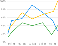
The Line chart widget visualizes time-series telemetry as lines. It supports real-time updates, multiple series, dual Y axes, data aggregation, thresholds, and comparison mode — making it ideal for tracking metrics such as temperature, pressure, voltage, or energy consumption over time.
Key Capabilities
Section titled “Key Capabilities”- Multiple data series with independent colors, line styles, and Y axis assignments.
- Real-time and history modes with configurable time window and data aggregation (average, sum, min, max).
- Comparison overlay: plot the same series from a previous period (yesterday, last week, etc.) on top of current data.
- Configurable thresholds as horizontal reference lines with labels and custom styles.
- Legend with per-series statistics: min, max, average, total, and latest.
- Line style options: smooth curves, stepped function, dashed or dotted, and area fill.
- Data zoom for inspecting narrow time ranges without changing the dashboard time window.
Adding the Widget
Section titled “Adding the Widget”- Open the dashboard in edit mode. Click Add widget in the top toolbar, or click the Add new widget icon in the center of an empty dashboard.
- In the widget bundle selection dialog, find and click Charts.
- Select the Line chart widget.
- Configure the datasource, series, and appearance, then click Add.
Configuration
Section titled “Configuration”All settings in this section use Basic mode — a quick-start configuration covering the essentials. For finer widget controls like custom tooltip functions and advanced axis formatting, switch to the Advanced tab.
The Basic tab groups settings into: Time window, Datasource, Series, Y axes, Thresholds, Appearance, Chart, X axis, Legend, Tooltip, Animation, and Card appearance.
Time Window
Section titled “Time Window”Define the time interval to display, like Last 24 hours or Current week. Enable data aggregation to summarize values over specific intervals, like hourly averages. Learn more in the Time window guide.
Datasource
Section titled “Datasource”Select the source of telemetry data:
- Device — a specific device; shows telemetry series from this device over the configured time range.
- Entity alias — a set of entities matched by an entity alias; use this to compare metrics from multiple devices on the same chart.
Series
Section titled “Series”The widget supports two display modes: Series and Comparison.
Series Mode
Section titled “Series Mode”Each data key is rendered as an independent line. Add a key for each telemetry value to display, like temperature or humidity. Each line updates dynamically as new telemetry arrives.
Click the settings icon on a series row to open the Data key configuration dialog with General and Advanced tabs.
General tab:
| Setting | Description |
|---|---|
| Key | Telemetry or attribute key name. |
| Label | Legend label for this series. |
| Units | Unit suffix, like °C or %. |
| Decimals | Decimal places for displayed values. |
| Color | Line color. |
| Use data post-processing function | Optional JavaScript transform applied to the raw value before display. Signature: f(value, latestData). |
Advanced tab — Legend:
| Setting | Description |
|---|---|
| Show in legend | Include this series in the chart legend. |
| Hidden by default | Series is rendered but hidden in the legend until toggled by the user. |
Advanced tab — Y axis: Select which Y axis this series is plotted against.
Advanced tab — Line settings:
| Setting | Description |
|---|---|
| Show line | Render this series as a line. |
| Step line | Draw the line as a stepped function. Choose step position: Start, Middle, or End. |
| Smooth line | Use curved Bezier segments instead of straight lines. |
| Line type | Line dash style: Solid, Dashed, or Dotted. |
| Line width | Stroke width in pixels. |
Advanced tab — Points settings:
| Setting | Description |
|---|---|
| Show points | Render a marker at each data point. |
| Point label | Display the value as a label above or below the point. Configure label position and font. |
| Point label background | Show a background behind point labels. |
| Point shape | Marker shape: Empty circle, Rectangle, Diamond, etc. |
| Point size | Marker diameter in pixels. |
Advanced tab — Fill: Shade the area beneath the line. Options: None, Opacity (solid fill with transparency), Gradient.
Advanced tab — Tooltip value format function: Optional JavaScript function f(value, latestData) to format the value shown in the hover tooltip for this series.
Advanced tab — Comparison settings: Enable Show historical data for comparison to plot a comparison line from a previous time period alongside this series. Configure Comparison key label (auto or custom) and Comparison data color.
Comparison Mode
Section titled “Comparison Mode”In Comparison mode, the widget overlays the same data keys from a previous time period on top of the current data — for example, today vs. yesterday or this week vs. last week. Each period is drawn as a separate line, making it easy to spot trends or anomalies across intervals.
Switch to the Comparison tab in the Series section to enable this mode. Each comparison entry has an interval dropdown, an X axis button, and a list of data keys (Show, Key, Label, Color).
Comparison interval options:
| Option | Description |
|---|---|
| Previous interval (default) | Shifts the time window back by one full interval length. |
| Day ago | Compares with the same period from 24 hours earlier. |
| Week ago | Compares with the same period from 7 days earlier. |
| Month ago | Compares with the same period from one month earlier. |
| Year ago | Compares with the same period from one year earlier. |
| Custom interval | Enter a custom offset in milliseconds. |
Comparison X axis settings — click the X axis button to configure how the comparison time axis is displayed:
| Setting | Description |
|---|---|
| Show | Display the comparison X axis on the chart. |
| Label | Text label for the comparison axis. |
| Position | Top or Bottom. |
| Tick labels | Show date/time labels on ticks. Configure font and color. |
| Show ticks | Render tick marks on the axis. |
| Show line | Render the axis baseline. |
| Show split lines | Render vertical grid lines for each tick. |
Y Axes
Section titled “Y Axes”Configure one or more Y axes to control vertical scaling and labeling. Each series can be assigned to a different axis via its Y axis field in the series settings. Click Add Y axis to add a new axis.
Each axis row shows the following columns:
| Column | Description |
|---|---|
| Id | Unique identifier used to assign series to this axis. |
| Show | Toggle axis visibility on the chart. |
| Label | Text label shown next to the axis. |
| Position | Left or Right. |
| Min / Max | Fixed scale bounds. Leave empty for auto-scaling. |
| Units | Unit suffix for axis tick labels. |
| Decimals | Decimal places for tick label values. |
Click the settings icon on an axis row to open the Y axis settings dialog:
| Setting | Description |
|---|---|
| Label | Text label with configurable font and color. |
| Tick labels | Show value labels on each tick. Configure font and color. |
| Show ticks | Render tick marks on the axis line. |
| Show line | Render the axis baseline. |
| Show split lines | Render horizontal grid lines across the chart for each tick. |
| Ticks interval | Interval between ticks. Auto derives it from the data range. |
| Split number | Suggested number of tick intervals. Auto lets the chart decide. |
Scale limits — set explicit minimum and maximum bounds for the axis scale. Each bound has a Source:
| Source | Description |
|---|---|
| Constant | Fixed numeric value entered directly. |
| Key | Value taken from a telemetry or attribute key of the current entity. |
| Entity | Value taken from a specified entity’s attribute or telemetry key. |
Thresholds
Section titled “Thresholds”Add horizontal reference lines to mark safe, warning, or critical levels. Click Add threshold to add a row.
| Column | Description |
|---|---|
| Source | Constant — a fixed numeric value. Entity — value pulled from an entity attribute or telemetry key. |
| Key / Value | The numeric value (Constant) or the attribute/telemetry key name (Entity). |
| Y axis | Which Y axis the threshold is drawn against. |
| Color | Threshold line color. |
| Units | Unit suffix displayed in the threshold label. |
| Decimals | Decimal places for the threshold label value. |
Click the settings icon on a threshold row to open the Threshold settings dialog:
| Setting | Description |
|---|---|
| Label | Toggle to show a text label on the threshold line. Set position: Start, Middle, End, Inside start, Inside start top, or Inside start bottom. Configure font and color. |
| Label background | Show a filled background behind the label text. |
| Line color | Color of the threshold line. |
| Line type | Dash style: Solid, Dashed, or Dotted. |
| Line width | Stroke width in pixels. |
| Start symbol | Marker at the left end of the line, like None or Arrow. Set symbol size. |
| End symbol | Marker at the right end of the line, like None or Arrow. Set symbol size. |
Appearance
Section titled “Appearance”Controls the chart title displayed in the widget header.
| Setting | Description |
|---|---|
| Title | Text shown in the widget header. Configure font, size, weight, and color. |
| Card icon | Optional icon displayed next to the title. |
Controls interactive behavior and chart area layout.
| Setting | Description |
|---|---|
| Data zoom | Enable horizontal zoom for inspecting narrow time ranges without changing the dashboard time window. |
| Grid | Adjust padding inside the chart area. |
| Stack mode | Accumulate multiple series on the same axis, useful for showing contribution totals. |
X Axis
Section titled “X Axis”Configure the horizontal time axis. Use the Show toggle to hide the axis entirely.
| Setting | Description |
|---|---|
| Label | Text label displayed along the axis. Configure font and color. |
| Position | Bottom or Top. |
| Tick labels | Show date/time labels on each tick. Configure date format, font, and color. |
| Show ticks | Render tick marks on the axis. Configure color. |
| Show line | Render the axis baseline. Configure color. |
| Show split lines | Render vertical grid lines across the chart for each tick. |
Legend
Section titled “Legend”Use the master toggle to show or hide the legend entirely.
| Setting | Description |
|---|---|
| Position | Legend placement: Top, Bottom, Left, or Right. |
| Show values | Statistics displayed per series: Min, Max, Average, Total, Latest. Multiple values can be enabled simultaneously. |
| Label | Font and color for series name labels. |
| Value | Font and color for statistic values. |
| Column title | Font and color for the column header row (visible when Show values is enabled). |
| Sort datakeys in legend | Sort series entries alphabetically. |
Tooltip
Section titled “Tooltip”Use the master toggle to show or hide the tooltip entirely.
| Setting | Description |
|---|---|
| Trigger | Point — hover over a data point; Axis — hover anywhere on the chart shows values for all series at that timestamp. |
| Date | Toggle to show the timestamp. Select the date format and configure font and color. |
| Show date time interval | Display the time interval range in the tooltip header. |
| Hide zero values | Suppress series entries with a value of zero from the tooltip. |
| Show total value in stack mode | Show the summed total of all series when Stack mode is enabled. |
| Label | Font and color for series name labels in the tooltip. |
| Value | Font and color for value text in the tooltip. |
| Background color | Tooltip background fill color. |
| Background blur | Blur radius (px) applied to the tooltip background. |
Animation
Section titled “Animation”Use the master toggle to enable or disable chart animation. When enabled:
| Setting | Description |
|---|---|
| Animation threshold | If the number of data points exceeds this value (default 2000), animation is disabled to maintain performance. |
| Animation duration | Duration of the initial load animation in milliseconds (default 500 ms). |
| Animation easing | Easing function for the initial animation, like cubicOut. |
| Animation delay | Delay before the initial animation starts, in milliseconds. |
| Update animation duration | Duration of the animation when data updates arrive (default 300 ms). |
| Update animation easing | Easing function for update animations. |
| Update animation delay | Delay before update animations start, in milliseconds. |
Card Appearance
Section titled “Card Appearance”| Setting | Description |
|---|---|
| Background | Solid color or image background for the card. |
| Show card buttons | Enable Fullscreen and Data export toolbar buttons. |
| Card border radius | Corner rounding in pixels. |
| Card padding | Spacing between content and card border. |
Actions
Section titled “Actions”The Line chart supports the Widget header button action — a button placed in the widget header that triggers a configured action when clicked.
Example
Section titled “Example”Temperature and Humidity Monitoring
Section titled “Temperature and Humidity Monitoring”Goal: Display temperature and humidity telemetry from a single device on the same Line chart, with separate Y axes and a 12-hour real-time time window.
Prerequisites: A device named Thermo-hygrometer that sends temperature (°C) and humidity (%) as telemetry keys.
Step 1. Add the widget. Open your dashboard in edit mode, click Add widget, select the Charts bundle, then choose Line chart.
Step 2. Configure the time window. Set Period to Realtime — last 12 hours, Aggregation to Average, and Grouping interval to 30 minutes.
Step 3. Configure the datasource. Set Datasource type to Device, then select Thermo-hygrometer.
Step 4. Add series. In the Series section, add two data keys:
| Key | Label | Y axis | Color | Units | Decimals |
|---|---|---|---|---|---|
temperature |
Temperature | default |
#F17F42 |
°C | 1 |
humidity |
Humidity | axis1 |
#7CB9E8 |
% | 1 |
For each key, open advanced settings, enable Smooth line, and set Line width to 3.
Step 5. Configure Y axes. Add two Y axes:
| ID | Label | Position | Units | Decimals |
|---|---|---|---|---|
default |
Temperature, °C | Left | °C | 0 |
axis1 |
Humidity, % | Right | % | 0 |
Step 6. Configure appearance and legend. In the Appearance section set Title to Temperature and Humidity, font size 18 px, weight 600. In the Legend section set Position to Top and enable Min, Max, Average.
Step 7. Save. Click Add, resize and reposition as needed, then click Save on the dashboard toolbar.
Result: The chart displays two lines updated in real time — an orange line for temperature and a blue line for humidity — tracked over 12 hours. The legend shows min/max/avg statistics for each series; the tooltip displays exact readings at any hovered timestamp.
Troubleshooting
Section titled “Troubleshooting”Widget Shows No Data
| Cause | Solution |
|---|---|
| Wrong data key name | Confirm the key name matches the telemetry key sent by the device. Key names are case-sensitive. |
| Incorrect datasource or entity alias | Verify the correct Device or Entity alias is selected. Open Entity aliases to confirm the alias resolves to results. |
| Device not sending data | Open Devices → Latest telemetry and check for recent values. If empty, verify the device transport configuration and access token. |
| No telemetry in the selected time window | Extend the time range or switch to Realtime mode to confirm data exists. |
| Rule chain misconfiguration | Check that the Rule Chain has a Save time series node routing device telemetry to the database. |
| Datasource updated after import | After importing a widget, update the datasource to point to your device and update data key names to match your device’s actual telemetry keys. |
Data Updates Stop or Show Partial Data
| Cause | Solution |
|---|---|
| Time window type mismatch | Use Realtime for live monitoring, History for fixed date ranges. |
| Aggregation interval too large | Reduce the grouping interval, like from 1 day to 1 hour, for finer granularity. |
| Browser time zone mismatch | Ensure the dashboard and device use the same time zone. |
A Series Does Not Appear on the Chart
| Cause | Solution |
|---|---|
| Data key not added | Open the Series section and confirm the telemetry key is added as a data key row. |
| Series hidden by default | Open the data key’s Advanced settings and disable Hidden by default. |
| Wrong Y axis assignment | Check that the series is assigned to an existing Y axis ID. |
Was this helpful?