Value Card
The Value card widget displays a single value — the latest telemetry reading or attribute from an entity. Use it for KPIs and status metrics like temperature, battery level, or device uptime where instant readability matters.
Key capabilities
Section titled “Key capabilities”- Display the latest telemetry or attribute value from any device or entity alias.
- Built-in formatting: units, decimal places, and optional timestamp of the last update.
- Multiple preset layouts for arranging the icon, label, and value.
- Gradient color coding tied to the value range — icon and value color shift automatically as the value changes.
- No HTML or CSS knowledge required (unlike the HTML Value Card).
Adding the widget
Section titled “Adding the widget”- Open the dashboard in edit mode. Click Add widget in the top toolbar, or click the Add new widget icon in the center of an empty dashboard.
- In the widget bundle selection dialog, find and click Cards.
- Select the Value card widget.
- Configure the datasource and appearance, then click Add.
Configuration
Section titled “Configuration”All settings in this section use Basic mode — a quick-start configuration covering the essentials. For finer widget controls like title font, card style, and tooltip, switch to the Advanced tab.
Datasource
Section titled “Datasource”Select the source of the displayed value:
- Device — a specific device; the card shows the latest telemetry or attribute value from this device.
- Entity alias — a set of entities matched by an entity alias; use this when the target device is selected dynamically at runtime.
Add exactly one data key — a telemetry key or attribute — whose latest value the card will display.
Appearance
Section titled “Appearance”Controls the card layout, label, icon, and value display.
| Setting | Description |
|---|---|
| Layout | Arrangement of card elements (label, icon, value). Choose from available preset layouts. |
| Auto scale | Automatically adjusts text size to fit the available card area when the widget is resized. |
| Label | Descriptive text shown on the card, like Temperature or Status. |
| Icon | Optional icon displayed next to the label. Set icon type, size, and color. |
| Value | Displays the resolved data key value. Configure units, decimal places, and font color. |
| Date | Optional timestamp of the last data update. Select a display format. |
Color settings
Section titled “Color settings”Color settings are available for Label, Icon, and Value independently. Three modes:
| Mode | Description |
|---|---|
| Constant | Fixed color regardless of the incoming value. |
| Gradient | Color transitions smoothly as the value changes across a defined range. Set start value, end value, and color stops. Use Copy from to reuse the same gradient from another element — for example, set the Icon gradient first, then copy it to Value. |
| Function | A JavaScript function f(value) that returns a hex color string based on the current value. Use for non-linear or threshold-based coloring. |
Card appearance
Section titled “Card appearance”| Setting | Description |
|---|---|
| Background | Solid color or image background for the card. |
| Show card buttons | Toggle Data export and Fullscreen buttons in the widget header. |
| Card border radius | Corner rounding in pixels. |
| Card padding | Spacing between card content and its border. |
Actions
Section titled “Actions”The Value card supports the Widget header button action — a button placed in the widget header that triggers a configured action when clicked.
Example
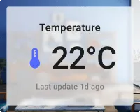
Section titled “Example”Device temperature with gradient color
Section titled “Device temperature with gradient color”Goal: Display the current temperature from a device named Smart Device. The value and icon color shift from blue to green to red as the temperature rises from 20 °C to 30 °C.
Prerequisites: A device named Smart Device that sends temperature (°C) as a telemetry key.
Step 1. Add the widget. Open your dashboard in edit mode, click Add widget, select Cards, then choose Value card.
Step 2. Configure the datasource. Set Datasource type to Device, select Smart Device, and add temperature as the data key.
Step 3. Configure appearance.
Label: Temperature
Icon: Size 32, Color settings — Gradient:
- Start value
20→ color#048AD3 - Mid color
#06E10E - End value
30→ color#FF0000
Value: Units °C, Decimals 1, Color settings — Gradient → Copy from: Icon.
Step 4. Configure card appearance. Set Background color to white and Card border radius to 12px.
Step 5. Save. Click Add, resize and reposition as needed, then click Save on the dashboard toolbar.
Result: The card displays the device’s current temperature. The value and icon color shift smoothly from blue (≤20 °C) through green to red (≥30 °C), giving an instant visual indication of the temperature range. The card updates automatically as new telemetry arrives.
Troubleshooting
Section titled “Troubleshooting”Widget shows no data
| Cause | Solution |
|---|---|
| Wrong data key name | Confirm the key name matches the telemetry key sent by the device. Key names are case-sensitive. |
| Device not sending data | Open Devices → Latest telemetry and check for recent values. If empty, verify the device transport configuration and access token. |
| Entity alias resolves to no entities | Open Entity aliases in the dashboard and verify the alias returns results. |
Value shows N/A or does not update
| Cause | Solution |
|---|---|
| Device has stopped sending telemetry | Check device connectivity and the last activity timestamp in Devices → Latest telemetry. |
| Wrong datasource entity selected | Verify the correct device or alias is selected in the datasource configuration. |
Value displays wrong units or decimal places
| Cause | Solution |
|---|---|
| Units not configured | Set the Units field in the Value appearance section. |
| Decimals not set | Set the Decimals field in the Value appearance section. |
Was this helpful?