Scheduler Events
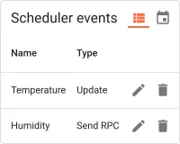
The Scheduler events widget embeds a full scheduler management panel directly inside a dashboard, letting users view, create, edit, and delete scheduler events across a list or calendar view without navigating away. Use it when operators or customers need day-to-day control over scheduled tasks — RPC commands, attribute updates, firmware pushes, or rule engine triggers — from a dashboard instead of the Scheduler administration page.
Adding the Widget
Section titled “Adding the Widget”- Open the dashboard in edit mode. Click Add widget in the top toolbar, or click the Add new widget icon in the center of an empty dashboard.
- In the widget bundle selection dialog, find and click Scheduling.
- Select the Scheduler events widget.
- Configure the appearance and click Add.
Configuration
Section titled “Configuration”The Scheduler events widget reads directly from the scheduler service and requires no datasource. All configuration lives in four tabs: Appearance, Widget card, Actions, and Layout.
Appearance
Section titled “Appearance”Controls which columns appear in the table, pagination behavior, available view modes, and any custom event type definitions embedded in the widget.
Display Columns
Section titled “Display Columns”Select which columns are visible in the list view:
| Column | Description |
|---|---|
| Created time | Timestamp when the event was created |
| Type | The event type (for example, Update Attributes, Send RPC Request to Device, or a custom type) |
| Created by customer | The customer who created the event |
| Schedule | The configured schedule — start time, recurrence, and timezone |
Pagination
Section titled “Pagination”Toggle Display pagination to enable paged navigation when the event list is longer than the page size.
When pagination is enabled:
| Setting | Description |
|---|---|
| Step increment | Number of rows added per step when the user changes the page size |
| Number of steps | How many page-size options appear in the selector |
| Default page size | Initial number of rows per page (default: 10) |
Sort and View Options
Section titled “Sort and View Options”| Setting | Description |
|---|---|
| Default sort order | The field used to sort the event list on first load (default: name) |
| Enabled scheduler events views | Which view modes the widget offers: Both (list and calendar toggles visible), List View Only, or Calendar View Only |
| “No data to display” alternative message | A custom message shown inside the widget when there are no scheduler events |
| Force default event type | Pre-selects a specific event type in the creation dialog; leave blank to let the user choose freely |
Custom Event Types
Section titled “Custom Event Types”Define domain-specific event types with tailored configuration forms. Each custom event type is shown alongside the built-in types (Update Attributes, Send RPC, etc.) in the creation dialog.
Click Add custom event type to configure a new type:
| Field | Description |
|---|---|
| Display name | Human-readable label shown in the event type selector |
| Type name | Internal identifier used as the Rule Engine message type |
| Display originator entity select | When enabled, shows a field in the creation form for selecting the message originator (device, asset, etc.) |
| Display message type select | When enabled, shows a field for setting the Rule Engine message type |
| Display message metadata table | When enabled, shows a key-value editor for message metadata |
| Configuration HTML template | An HTML form template rendered inside the event creation and edit dialog for capturing event-specific parameters |
Widget Card
Section titled “Widget Card”Standard card settings shared across all ThingsBoard widgets.
Card Title
Section titled “Card Title”| Setting | Description |
|---|---|
| Display widget title | Toggle to show or hide the widget title bar |
| Title | Widget title text (default: Scheduler events) |
| Title Tooltip | Optional tooltip shown on title hover |
| Display title icon | Toggle to show an icon next to the title; configure the icon and its size |
| Advanced title style | JSON object for fine-grained title CSS (font size, weight, padding, etc.) |
Card Style
Section titled “Card Style”| Setting | Description |
|---|---|
| Text color | Default text color across the card |
| Background color | Card background fill |
| Padding | Inner spacing between card edge and content (default: 4px) |
| Margin | Outer spacing around the card |
| Border radius | Corner rounding in pixels |
| Drop shadow | Card elevation shadow (enabled by default) |
| Advanced widget style | JSON object for custom CSS applied to the widget container |
| Widget CSS | Raw CSS injected into the widget scope for full visual customization |
Card Buttons
Section titled “Card Buttons”| Setting | Description |
|---|---|
| Enable fullscreen | Adds a fullscreen toggle button in the widget header |
Actions
Section titled “Actions”The Scheduler events widget supports the Widget header button action — a custom button placed in the widget header that triggers a configured action when clicked.
Layout
Section titled “Layout”| Setting | Description |
|---|---|
| Resizable | Allow the widget to be resized on the dashboard grid (enabled by default) |
| Preserve aspect ratio | Maintain the width-to-height ratio when resizing |
| Hide widget in mobile mode | Hides the widget when the dashboard is displayed in mobile layout |
| Hide widget in desktop mode | Hides the widget when the dashboard is displayed in desktop layout |
| Order | Position in the mobile layout stacking order |
| Height | Fixed height in rows for mobile layout |
Troubleshooting
Section titled “Troubleshooting”Widget Shows No Events
| Cause | Solution |
|---|---|
| No scheduler events have been created yet | Click the + button inside the widget to create a new event, or add events from the Scheduler administration page. |
| The current user has no permission to view scheduler events | Verify the user’s role and customer permissions in Roles. |
Calendar View Is Not Available
| Cause | Solution |
|---|---|
| Enabled scheduler events views is set to List View Only | Open the widget configuration → Appearance and change the setting to Both or Calendar View Only. |
Custom Event Type Form Is Not Displayed
| Cause | Solution |
|---|---|
| Configuration HTML template field is empty | Every custom event type requires a non-empty HTML template. Add at least a minimal placeholder element to the template field. |
| Force default event type points to an undefined type | Clear the field or enter a type name that matches one of the configured custom event types. |
Was this helpful?