Image Map
The Image Map widget displays entities on a custom image background instead of a tile-based geographic map. Upload a floor plan, equipment layout, or any site diagram, then place markers, polygons, and circles on it — linked to live telemetry from your devices.
Use it for indoor positioning, smart building visualizations, parking lot monitoring, factory floor layouts, or any scenario where a geographic map is not the right background.
Key capabilities
Section titled “Key capabilities”Image Map is one of four map widgets in ThingsBoard, each serving a distinct purpose:
| Widget | Primary use |
|---|---|
| Map | Displays current entity locations in real time on a geographic tile map. |
| Image Map | Uses a custom background image. Best for floor plans, parking lots, and indoor layouts. |
| Trip Map | Animated route replay with full timeline controls. Best for step-by-step movement analysis. |
| Route Map | Renders the full historical path as a static route line. Best for reviewing complete trips at a glance. |
What sets Image Map apart:
- Uses any uploaded image as the map background — floor plans, diagrams, schematics.
- Entity positions are defined as relative coordinates (0 to 1), not latitude/longitude.
- Supports interactive editing — place, move, and remove markers, polygons, and circles directly on the widget.
- Supports Markers, Polygons, Circles, and Polylines overlays.
Add the widget
Section titled “Add the widget”- Open the dashboard and switch to edit mode.
- Click Add widget at the top, or the Add new widget icon in the center of the screen.
- Open the Maps widget bundle.
- Select Image Map.
- Configure the widget settings, then click Add.
Map type
Section titled “Map type”Image Map always uses an image as its background. Configure the image source:
- Image source — Image: Upload a static image from your local machine or select one from the ThingsBoard Image Gallery. Supports PNG, JPEG, and other common formats.
- Image source — Entity key: Load the background image dynamically from an entity attribute or telemetry value.
- Source entity alias: The entity alias that holds the image URL key.
- Image URL key: The attribute or telemetry key whose value is the image URL.
Use Entity key when different entities display different floor plans, or when the background image should update at runtime.
Overlays
Section titled “Overlays”Overlays are the visual elements placed on top of the image. Each overlay type binds to its own data source and is configured independently.
Markers represent individual entities — sensors, devices, or assets — displayed as icons at specific positions on the image.
Add a marker: Click Add marker, select a data source, define position keys, and click Save.
Datasource
Select the entity providing position data: Function, Device, or Entity (entity alias). Apply a filter to narrow the selection.
Keys
- X position key: Attribute or telemetry key containing the horizontal position (0 = left edge, 1 = right edge). Default:
xPos. - Y position key: Attribute or telemetry key containing the vertical position (0 = top edge, 1 = bottom edge). Default:
yPos. - Additional data keys: Extra keys (like
temperature,status) used in labels, tooltips, or color functions.
For example, if the entity has xPos = 0.25 and yPos = 0.6, the marker appears 25% from the left and 60% from the top of the image.
Appearance — Marker
Three display modes:
- Shape: Select a built-in shape; set size (px) and color. Use a color function (JavaScript) to change the marker color dynamically based on telemetry values.
- Icon: Select a built-in icon; set size and color. Use color range rules to map value ranges to specific colors.
- Image: Provide an image URL, or use a marker image function that returns
{ url, size, offset }.
Marker offset — fine-tune the anchor point position (Horizontal, Vertical; 0–1 range).
Appearance — Label
Text shown above the marker:
- Pattern (default): Use template variables like
${entityName},${entityLabel}, or any data key. - Function: Return an HTML string based on data values.
Appearance — Tooltip
Popup shown on marker interaction:
- Pattern / Function: Define content as a template or a JavaScript function.
- Tooltip trigger: Show on click or show on hover.
- Auto-close tooltips: Close when clicking elsewhere on the map.
- Tooltip offset: Horizontal and Vertical position adjustment.
- Tag actions: Add named action links inside the tooltip using
<link-act name='action-name'>Label</link-act>.
Behavior
On click — action triggered when the marker is clicked. Available types: Do nothing, Navigate to new dashboard state, Update current dashboard state, Navigate to other dashboard, Custom action, Custom action (HTML template), Mobile action, Open URL.
Position conversion
A JavaScript function that recalculates marker coordinates before rendering. Useful for spreading overlapping markers or remapping coordinates to a custom image scale.
Function signature: f(origXPos, origYPos, data, dsData, aspect)
Parameters:
origXPos: number— original relative x coordinate (0 to 1).origYPos: number— original relative y coordinate (0 to 1).data— entity data for this marker: properties and telemetry from the configured datasource.dsData— all data from all data layers, including additional datasources.aspect: number— image aspect ratio (width / height).
Must return { x: number, y: number } — new relative coordinates, each from 0 to 1.
Default (pass-through):
return {x: origXPos, y: origYPos};Example — spread overlapping markers in a circle:
var xPos = data.xPos;var yPos = data.yPos;var locationGroup = dsData.filter((item) => item.xPos === xPos && item.yPos === yPos);if (locationGroup.length > 1) { const count = locationGroup.length; const index = locationGroup.indexOf(data); const radius = 0.035; const angle = (360 / count) * index - 45; const x = xPos + radius * Math.sin(angle * Math.PI / 180) / aspect; const y = yPos + radius * Math.cos(angle * Math.PI / 180); return {x: x, y: y};} else { return {x: xPos, y: yPos};}Groups
Assign a group name. Groups appear in the Groups panel on the widget, where entire groups can be shown or hidden at once.
Edit marker
Enable interactive placement and editing tools directly on the widget:
- Instruments: Enable Add, Move, and/or Remove tools. The corresponding buttons appear on the widget’s left panel.
- Scope of the attribute to persist location: Server or Shared — controls where the x/y coordinates are saved when a marker is placed or moved.
- Enable snapping to other vertices for precision drawing: Snaps the marker to nearby polygon vertices or circle centers.
Use map markers clustering
Groups nearby markers into a single cluster icon at lower zoom levels. The cluster icon displays the count of items inside.
Polygons define areas on the image — rooms on a floor plan, machine zones, restricted regions, or any area that needs to be highlighted or linked to entity data.
Add a polygon: Click Add polygon, select a data source, define the polygon key, and click Save.
Datasource
Function, Device, or Entity alias. Apply a filter if needed.
Keys
- Polygon key: Attribute key holding the coordinate array (default:
perimeter). - Additional data keys: Extra keys for labels, tooltips, or functions.
Coordinate format — array of relative [x, y] pairs, each value from 0 to 1:
[[x1,y1],[x2,y2],...,[xN,yN]]Example:
[[0.313,0.445],[0.974,0.425],[0.963,0.941],[0.43,0.812],[0.362,0.804]]Appearance — Fill
How the polygon interior is rendered:
- Color: Solid fill color (static or data-driven).
- Stripe: Diagonal hatching pattern — useful for indicating zones or restricted areas.
- Image: Custom image fill.
Appearance — Stroke
Border line. Set thickness (px) and color.
Appearance — Label
Text shown at the polygon center. Pattern or Function. Supports placeholders like ${entityName}.
Appearance — Tooltip
Popup on click or hover. Pattern or Function. Configure:
- Tooltip trigger: On click or on hover.
- Auto-close tooltips.
- Tag actions: Named action links inside the tooltip.
Behavior
On click action. Same action types as Markers.
Groups
Assign a group name for visibility toggling.
Edit polygon
Interactive drawing and editing tools:
- Instruments: Enable Add, Edit (reshape vertices), Move, and/or Remove tools.
- Scope: Server or Shared attribute scope for saving coordinates.
- Enable snapping to other vertices for precision drawing.
Circles define round areas — signal coverage zones, detection ranges, restricted perimeters, or any circular region linked to entity data.
Add a circle: Click Add circle, select a data source, define the circle key, and click Save.
Datasource
Function, Device, or Entity alias. Apply a filter if needed.
Keys
- Circle key: Attribute key holding the circle geometry (default:
perimeter). - Additional data keys: Extra keys for labels, tooltips, or functions.
Coordinate format — an array [x, y, radius] where x and y are the center coordinates (0 to 1) and radius is the circle size relative to the image:
[x, y, radius]Example:
[0.344, 0.595, 0.23]Appearance — Fill
Color, Stripe, or Image — same options as Polygons.
Appearance — Stroke
Border line thickness and color.
Appearance — Label
Text shown at the circle center. Pattern or Function. Supports placeholders like ${entityName}.
Appearance — Tooltip
Popup on click or hover. Pattern or Function. Configure trigger, auto-close, and tag actions.
Behavior
On click action. Same action types as Markers.
Groups
Assign a group name for visibility toggling.
Edit circle
Interactive drawing and editing tools:
- Instruments: Enable Add, Edit (resize radius), Move, and/or Remove tools.
- Scope: Server or Shared attribute scope for saving coordinates.
- Enable snapping to other vertices for precision drawing.
Polylines display static paths stored as attribute coordinate arrays — for example, a corridor on a floor plan, a cable run, a conveyor belt route, or any fixed linear feature. Unlike Markers (which show points), Polylines render a connected line across the image.
Add a polyline: Click Add polyline, select a data source, define the polyline key, and click Save.
Datasource
Function, Device, or Entity alias. Apply a filter if needed.
Keys
- Polyline key: Attribute key holding the coordinate array (default:
perimeter). - Additional data keys: Extra keys for labels or tooltips.
Coordinate format — array of relative [x, y] pairs, each value from 0 to 1:
[[x1,y1],[x2,y2],...,[xN,yN]]Example — a corridor running across the floor plan:
[[0.1,0.5],[0.3,0.5],[0.3,0.8],[0.7,0.8]]Appearance — Stroke
Line thickness (px) and color.
Appearance — Label
Text shown along the polyline. Pattern or Function.
Appearance — Tooltip
Popup on click or hover. Pattern or Function. Configure:
- Tooltip trigger: On click or on hover.
- Auto-close tooltips.
- Tag actions: Named action links inside the tooltip.
Behavior
On click action. Types: Do nothing, Navigate to new dashboard state, Update current dashboard state, Navigate to other dashboard, Custom action, Custom action (HTML template), Mobile action, Open URL.
Groups
Assign a group name for visibility toggling.
Edit polyline
Interactive editing tools:
- Instruments: Enable Add, Edit, Move, and/or Remove tools.
- Scope: Server or Shared attribute scope for saving coordinates.
- Enable snapping to other vertices for precision drawing.
Additional datasources
Section titled “Additional datasources”Additional datasources provide telemetry or attributes from entities not directly displayed on the map. Use them in overlay functions for conditional logic — color-changing markers, enriched tooltips, or computed display values based on data from related devices.
- Source: Entity type — Function, Device, or Entity alias.
- Data keys: Telemetry or attribute keys to read from the entity.
Click Add datasource to configure more.
Map controls
Section titled “Map controls”Configure the interactive controls available on the widget.
Position — placement of the controls panel: Top-left, Top-right, Bottom-left, or Bottom-right.
Zoom actions — enable zoom via:
- Scroll: Mouse wheel zoom.
- Double click: Zoom in on double-click.
- Control buttons: Show + / − zoom buttons on the map.
Scale — display a distance scale bar. Choose Metric (km / m) or Imperial (mi / ft). For floor plans and custom images, disable scale if real-world distances are not relevant.
Map action buttons
Section titled “Map action buttons”Add custom buttons overlaid on the map. Each button triggers a predefined action when clicked.
Each button has a Label, Icon, Color, and Action.
Available action types: Do nothing, Navigate to new dashboard state, Update current dashboard state, Navigate to other dashboard, Custom action, Custom action (HTML template), Mobile action, Open URL, Place map item.
Click Add button to configure more buttons.
For action configuration details, see Widget actions.
Common map settings
Section titled “Common map settings”- Limit of entities to load: Maximum entities loaded simultaneously. Prevents performance issues with large datasets (default: 16384).
Appearance
Section titled “Appearance”- Title: Widget header label. Disabled by default. Use
${entityName}or${entityLabel}as pattern variables, or enter a static string. - Card icon: Icon displayed next to the title in the header. Set size (px), alignment, and color.
Card appearance
Section titled “Card appearance”- Background: Card background color.
- Show card buttons: Toggle Data export and Fullscreen buttons in the widget header.
- Card border radius: Corner rounding in px (default: 0px).
- Card padding: Inner spacing between content and card edge in px (default: 8px).
Actions
Section titled “Actions”Add Widget header button actions — icon buttons in the widget header that trigger a configured action when clicked.
See Widget actions for available action types and configuration.
Examples
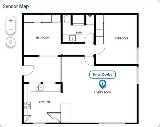
Section titled “Examples”Apartment floor plan with a temperature sensor
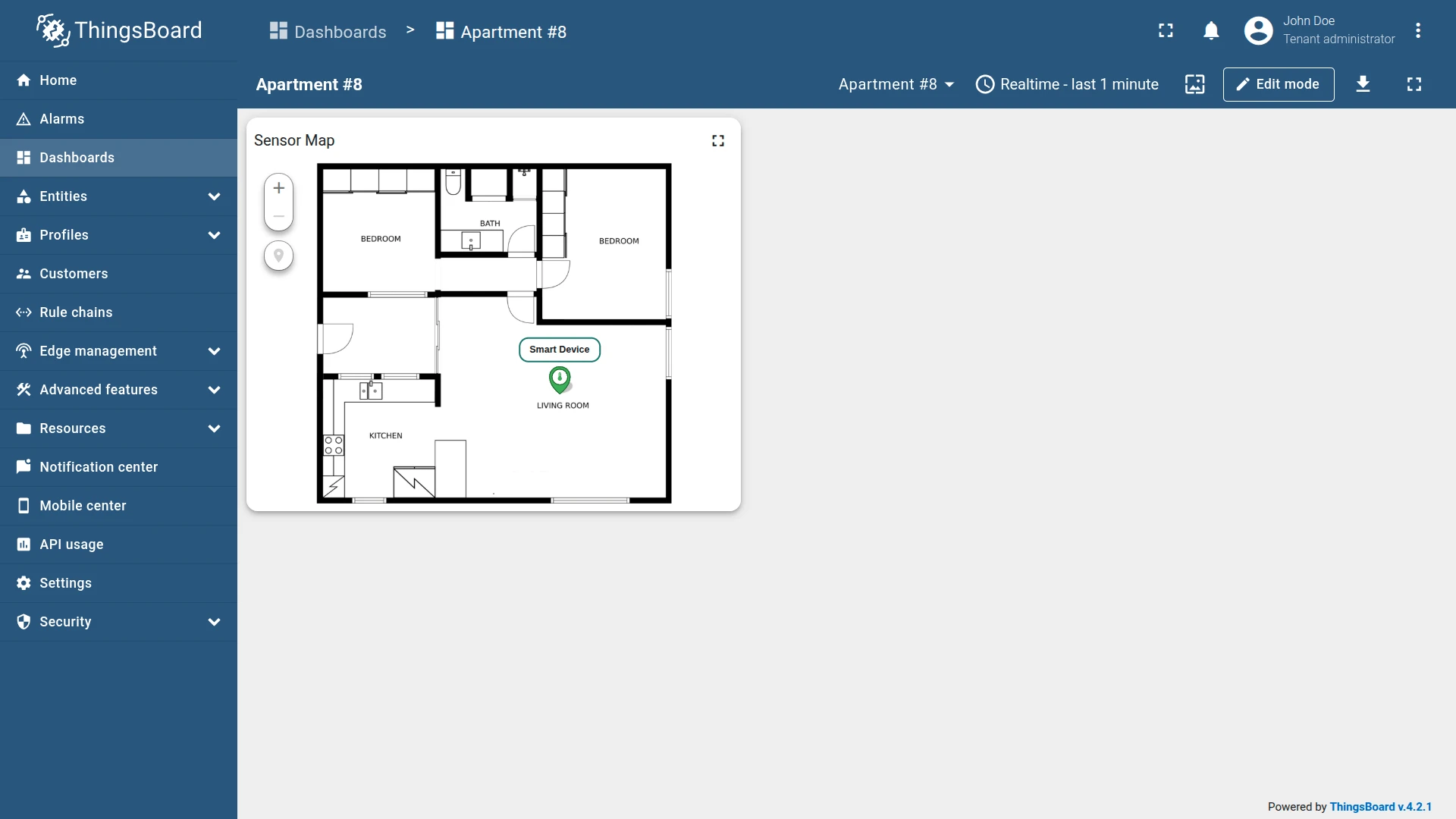
Section titled “Apartment floor plan with a temperature sensor”Goal: Display an apartment floor plan on the Image Map, place a temperature sensor marker on it, and show the current temperature in real time with color-coded status.
Download the example widget
You can download a preconfigured Image Map widget for this example and reuse it in your own dashboards.
After importing, update the target entity to match your environment.
Prerequisites
- Download the apartment plan image and upload it to the ThingsBoard Image Gallery.
- Create a device named Smart Device that sends a
temperaturetelemetry key to ThingsBoard.
Step 1: Add the widget
Open the dashboard in edit mode and add an Image Map widget.
Step 2: Configure the widget
Map type
- Image source: Image
- Image file: Select the apartment plan image from the gallery.
Overlays
Overlays ⇾ Markers and click Add marker. Configure:
- Source: Device — Smart Device
- X position key:
xPos - Y position key:
yPos - Additional data keys:
temperature
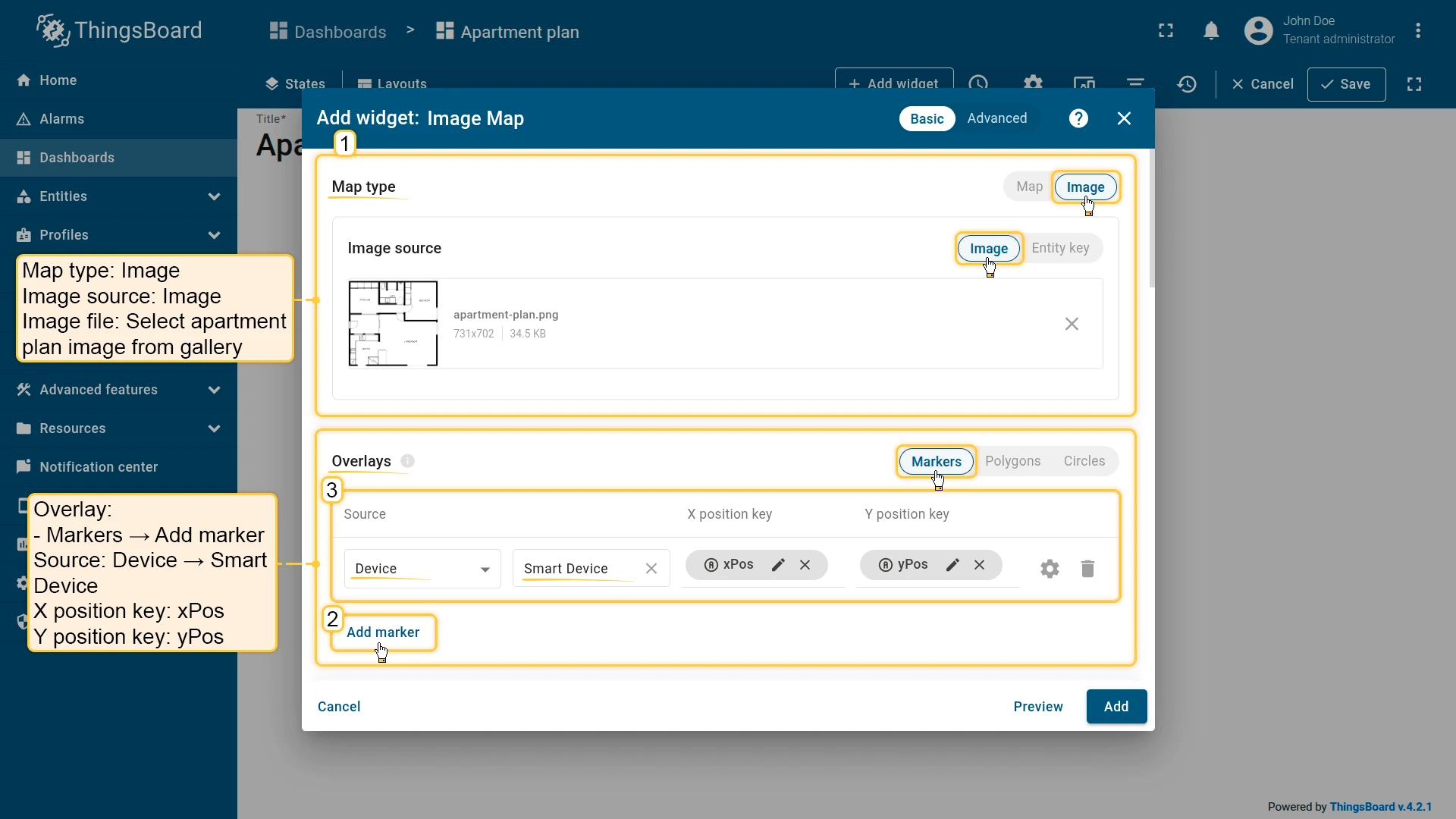
Configure marker appearance:
- Marker: Icon — Thermostat, size 36
- Color settings: Range
- Color range source key:
temperature - Color range: Blue (below 20) → Green (20–25) → Red (above 25)
- Color range source key:
- Label pattern:
<div style='position: relative; white-space: nowrap; text-align: center; font-size: 14px; top: 2px;'><span style='margin-left: -500%;'></span><div style='border: 2px solid #00695c; border-radius: 10px; color: #000; background-color: #fff; padding-left: 12px; padding-right: 12px; padding-top: 4px; padding-bottom: 4px;'>${entityLabel}</div></div>- Tooltip pattern:
<b>${entityName}</b><br/><br/><b>Temperature:</b> ${temperature} °CConfigure edit tools:
- Instruments: Add, Move, Remove
- Scope: Server
Map controls
Disable Scroll and Double click zoom.
Appearance
Set the title: Sensor Map
Card appearance
Set Card border radius: 12px.
Click Add to insert the widget into the dashboard. Resize and reposition as needed, then save the dashboard.
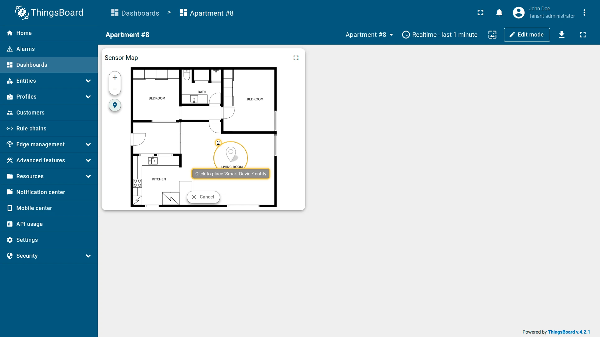
Step 3: Place the marker on the map
- In the left panel of the Image Map widget, click Place marker.
- Click on any area of the floor plan image to place the marker at that position.
- The marker for Smart Device appears at the selected location.
You can drag the marker to adjust its position, or click it and select Remove marker to delete it.

Result
The Image Map widget displays the apartment floor plan with a thermostat marker positioned in the living room. The marker changes color based on the current temperature — blue when cool, green when normal, red when warm. Hovering over the marker opens a tooltip with the precise reading.
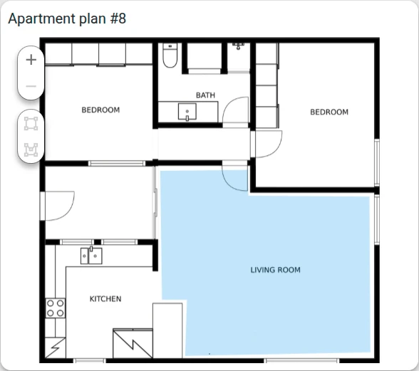
Robot vacuum working area polygon
Section titled “Robot vacuum working area polygon”Goal: Draw a polygon on the apartment floor plan that represents the robot vacuum’s cleaning zone, linked to a device attribute.
Download the example widget
You can download a preconfigured Image Map widget for this example and reuse it in your own dashboards.
After importing, update the target entity to match your environment.
Prerequisites
- Download the apartment plan image and upload it to the ThingsBoard Image Gallery.
- Create a device named Robot Vacuum.
Step 1: Add the widget
Open the dashboard in edit mode and add an Image Map widget.
Step 2: Configure the widget
Map type
- Image source: Image
- Image file: Select the apartment plan image from the gallery.
Overlays
Overlays ⇾ Polygons and click Add polygon. Configure:
- Source: Device — Robot Vacuum
- Polygon key:
perimeter
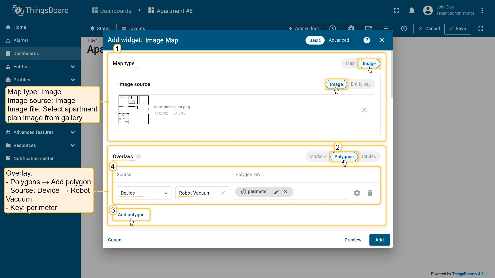
Configure polygon appearance:
- Fill: Color —
#3388FF33 - Stroke: 0px
- Tooltip pattern:
<b>Robot vacuum working area</b> - Tooltip trigger: Show on hover
Configure edit tools:
- Instruments: Add, Remove
- Scope: Server
Map controls
Disable Scroll and Double click zoom.
Appearance
Set the title: Apartment plan #8
Card appearance
Set Card border radius: 12px.
Click Add to insert the widget into the dashboard. Resize and reposition as needed, then save the dashboard.
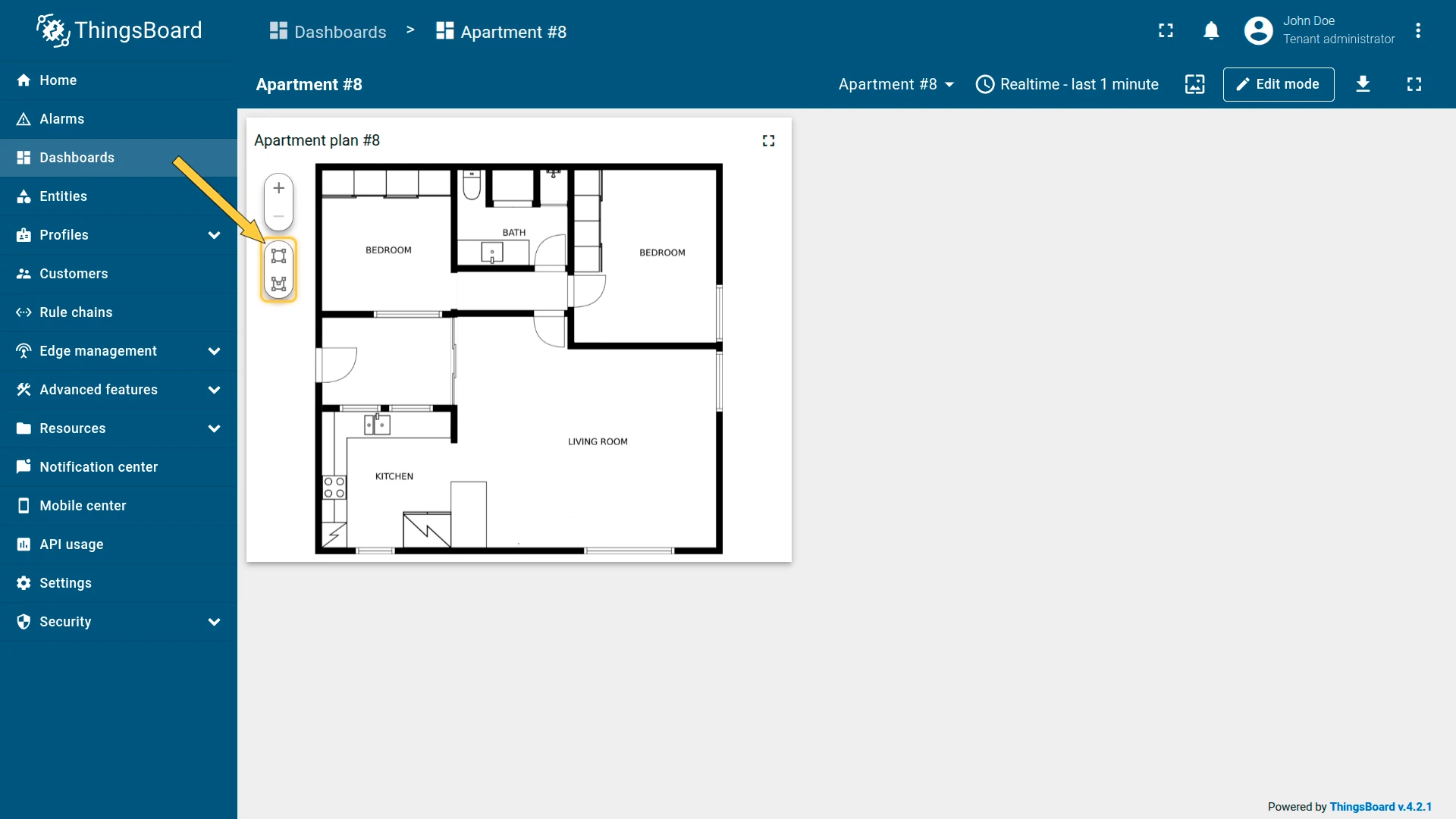
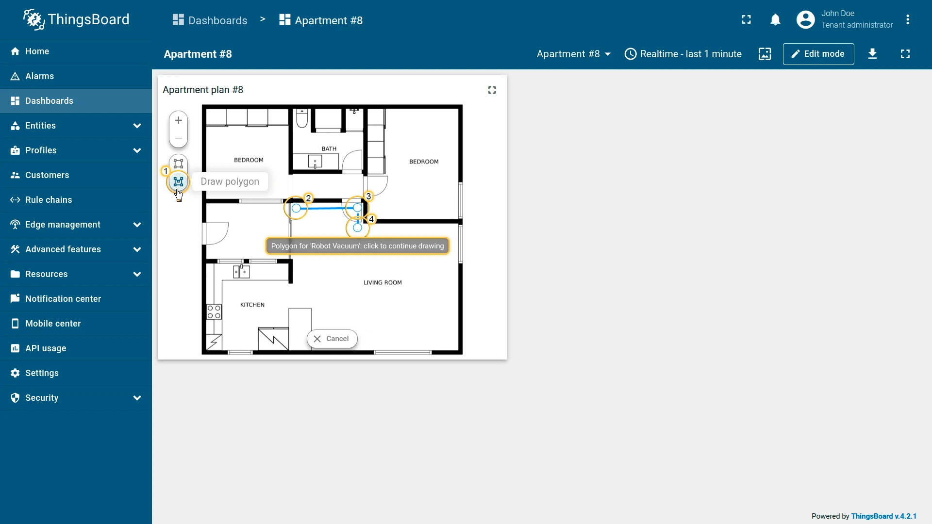
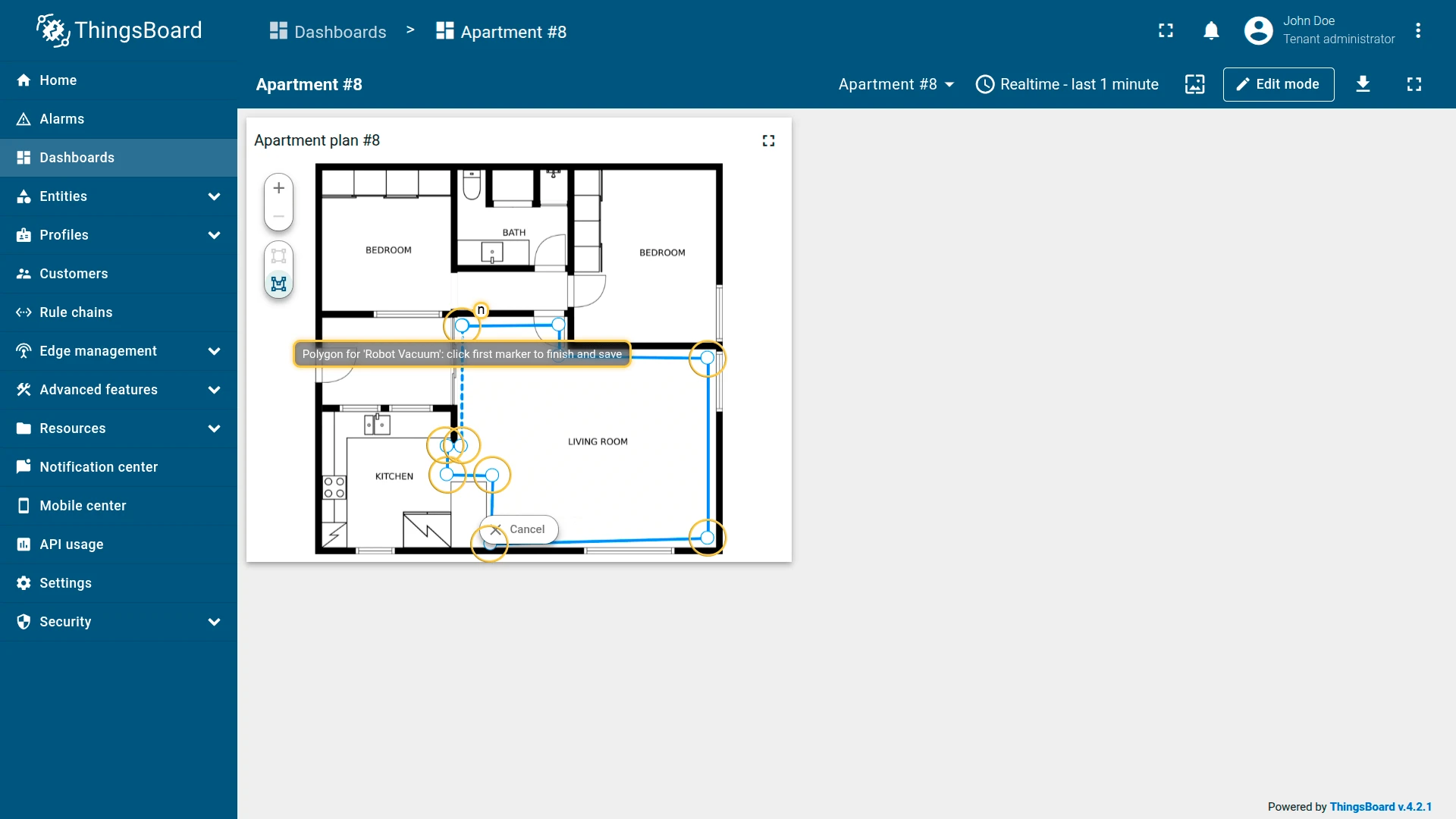
Step 3: Draw the polygon on the map
- In the left panel of the Image Map widget, click Draw rectangle or Draw polygon.
- Click on the floor plan to place the first point of the polygon.
- Continue clicking to add additional points along the boundary.
- Click the first point again to close the shape and save it.
The polygon appears on the Image Map, representing the defined cleaning area. You can reshape it later using the Edit tool or reposition it with the Move tool.
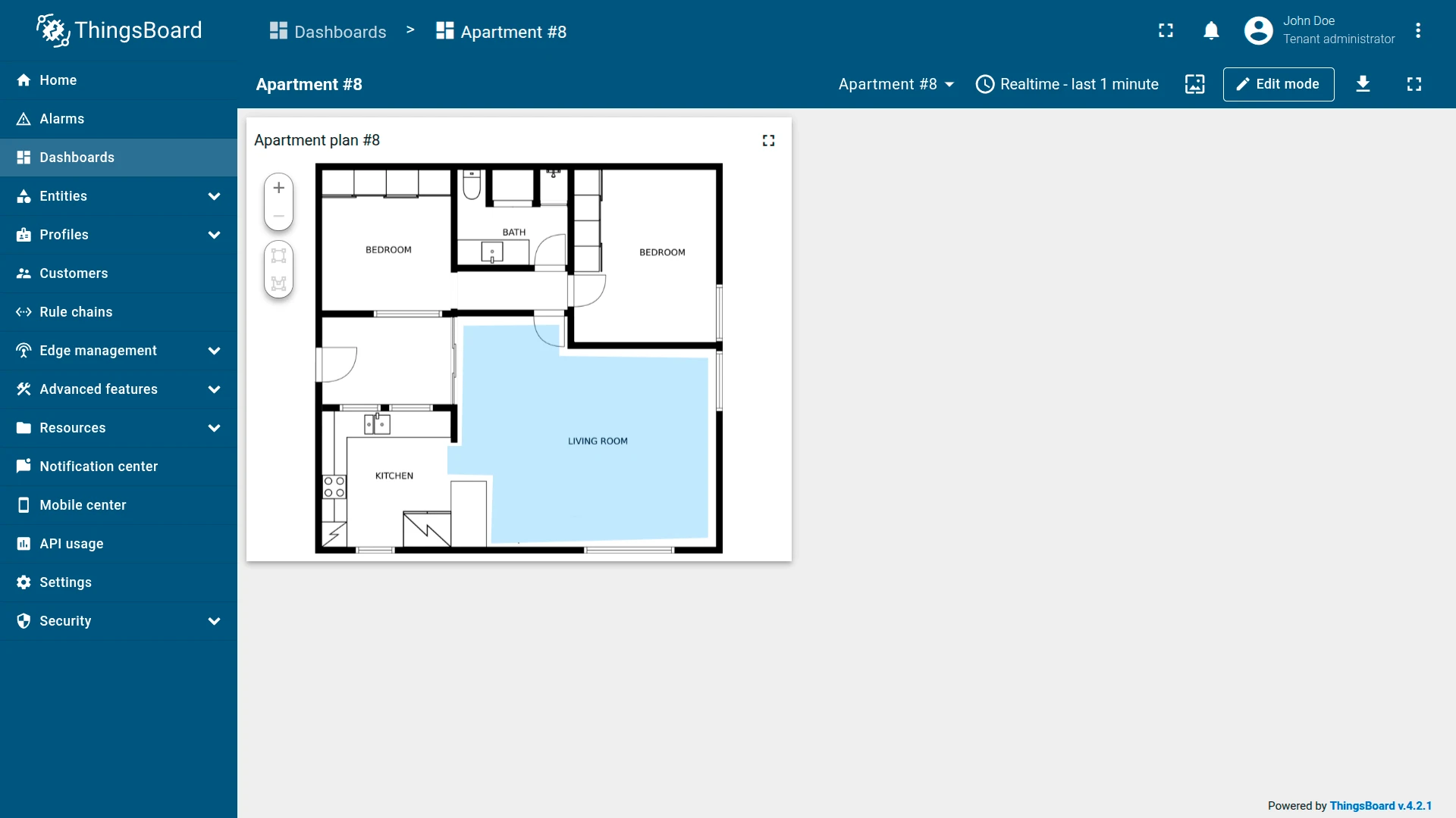
Result
The Image Map widget displays the apartment floor plan with a semi-transparent blue polygon outlining the robot vacuum’s operating area. Hovering over the polygon shows a tooltip.
Wi-Fi coverage zone
Section titled “Wi-Fi coverage zone”Goal: Visualize the Wi-Fi router’s signal coverage area as a circle on the apartment floor plan.
Download the example widget
You can download a preconfigured Image Map widget for this example and reuse it in your own dashboards.
After importing, update the target entity to match your environment.
Prerequisites
- Download the apartment plan image and upload it to the ThingsBoard Image Gallery.
- Create a device named Wi-Fi Router.
Step 1: Add the widget
Open the dashboard in edit mode and add an Image Map widget.
Step 2: Configure the widget
Map type
- Image source: Image
- Image file: Select the apartment plan image from the gallery.
Overlays
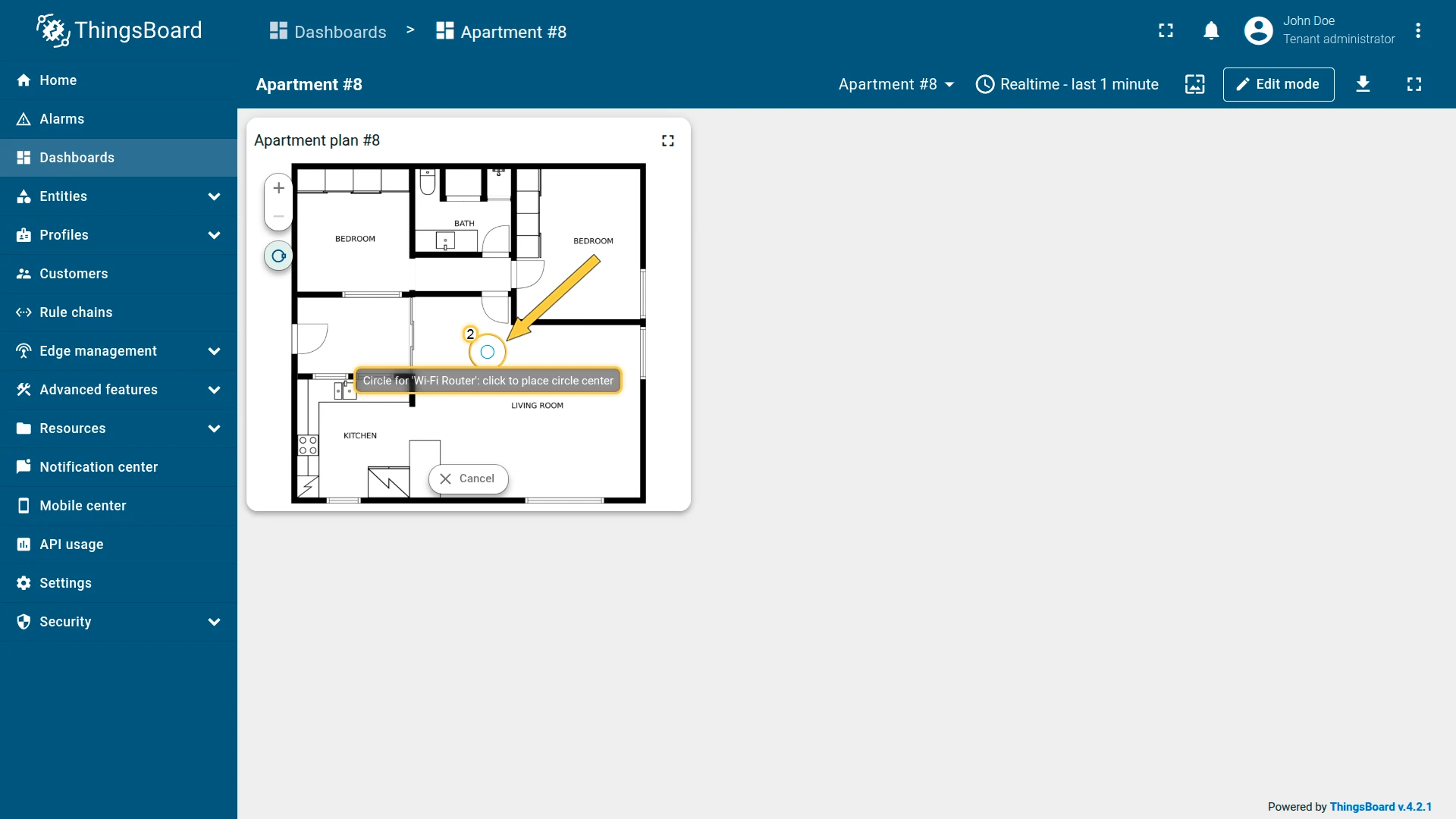
Overlays ⇾ Circles and click Add circle. Configure:
- Source: Device — Wi-Fi Router
- Circle key:
perimeter

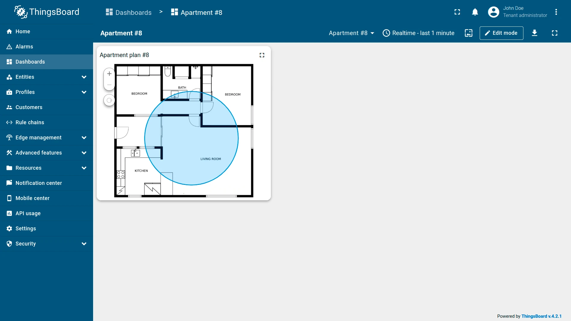
Configure circle appearance:
- Fill: Color —
#3388FF33 - Stroke: 2px —
#048AD3 - Tooltip pattern:
<b>${entityName}</b> - Tooltip trigger: Show on hover
Configure edit tools:
- Instruments: Add, Remove
- Scope: Server
Map controls
Disable Scroll and Double click zoom.
Appearance
Set the title: Apartment plan #8
Card appearance
Set Card border radius: 12px.
Click Add to insert the widget into the dashboard. Resize and reposition as needed, then save the dashboard.
Step 3: Draw the circle on the map
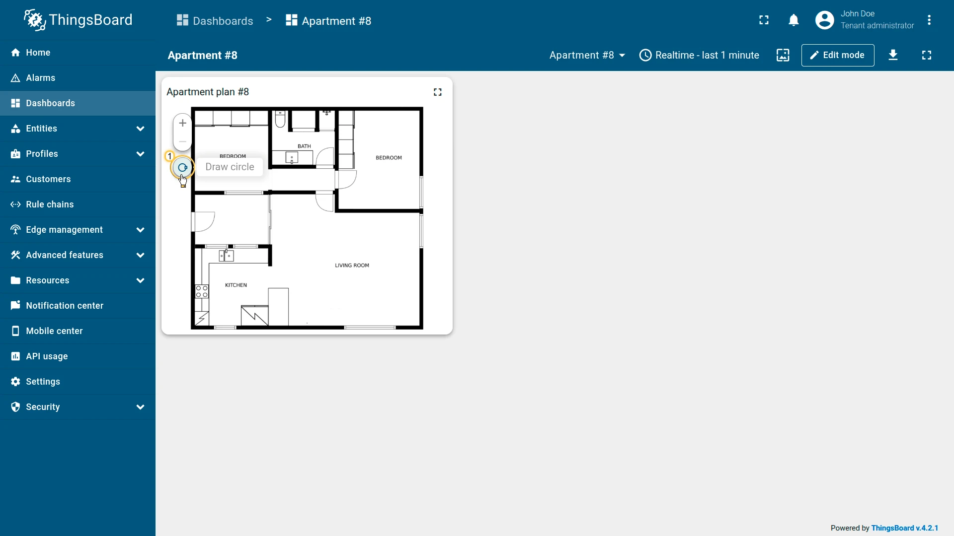
- In the left panel of the Image Map widget, click Draw circle.
- Click on the floor plan to place the center of the circle at the router’s location.
- Move the mouse to set the desired radius, then click again to create and save the circle.
You can adjust the circle’s size or position later using the Edit circle tool.

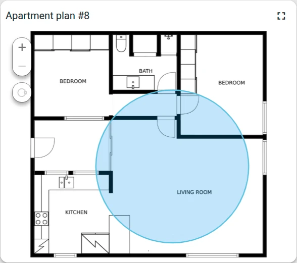
Result
The Image Map widget displays the apartment floor plan with a blue circular overlay showing the Wi-Fi router’s approximate signal range. Hovering over the circle shows a tooltip with the router name.
Troubleshooting
Section titled “Troubleshooting”Marker not visible after saving:
- Confirm that the entity has the x and y position keys populated as attributes. If the keys are empty, the marker has no position and is not rendered.
- Check that the key names in the widget configuration match exactly the attribute key names on the entity.
- Use the Place marker tool on the widget’s left panel to position the marker interactively — this writes the
xPosandyPosattributes to the entity automatically.
Polygon or circle not displayed:
- Verify the attribute key exists on the entity and that the value format is correct.
- For polygons:
[[x1,y1],[x2,y2],...]with values between 0 and 1. - For circles:
[x, y, radius]with x and y between 0 and 1. - Use the Draw polygon or Draw circle tool on the widget to create the shape interactively and have the attribute written automatically.
Background image not loading:
- If using Image source: Image, confirm the image was uploaded to the ThingsBoard Image Gallery.
- If using Image source: Entity key, confirm the entity has the attribute key populated with a valid image URL.
Edit tools not appearing on the widget:
- Enable the corresponding instruments (Add, Move, Remove, Edit) in the overlay’s Edit marker / Edit polygon / Edit circle section.
Was this helpful?