Command Button
The Command button widget places a one-click device control on any dashboard. Press it to immediately send an RPC command, set a device attribute, or log a telemetry value — the button has no persistent ON/OFF state and always returns to its idle appearance after the action completes. Use it for explicit, one-shot device actions: reboot a controller, trigger a preset, send a test signal, or acknowledge an event.
Key Capabilities
Section titled “Key Capabilities”- One-click, fire-and-forget action for any device or entity.
- Three action types on click: Execute RPC, Set attribute, and Add time series.
- Optional disabled state based on attributes, telemetry, RPC response, alarms, or dashboard state.
- Visual feedback for Hover, Pressed, Activated (post-action flash), and Disabled interaction states.
- Configurable label, icon, layout, and color palette.
Adding the Widget
Section titled “Adding the Widget”- Open the dashboard in edit mode. Click Add widget in the top toolbar, or click the Add new widget icon in the center of an empty dashboard.
- In the widget bundle selection dialog, find and click Buttons.
- Select the Command button widget.
- Configure the datasource, behavior, and appearance, then click Add.
Configuration
Section titled “Configuration”All settings in this section use Basic mode — a quick-start configuration covering the essentials. For finer widget controls like card style, card buttons, title, and tooltip, switch to the Advanced tab.
Datasource
Section titled “Datasource”Select the datasource for the widget:
- Device — a specific device; the widget sends actions to this device on click and reads its data for the disabled condition.
- Entity alias — a set of entities matched by an entity alias; use this when the target device is selected dynamically at runtime.
Behavior
Section titled “Behavior”The Behavior section defines what fires when the button is clicked and when the button becomes disabled. Disabled state is optional.
On Click
Section titled “On Click”Defines the action executed when the user presses the button. Select one action type from the list below.
-
Execute RPC
Sends an RPC command to the device.
Parameter Description Method The RPC method name, like reboot,restartProcess, ortriggerRelay.Parameters Constant — a fixed value like true,"START", or{"action": "run"}; Function — a JS function that returns the payload; None — no parameters sent.RPC request timeout (ms) How long to wait for a device response before timing out. RPC request persistent When enabled, the RPC command is stored and retried until the device comes online. -
Set attribute
Updates a device attribute when the button is pressed.
Parameter Description Attribute scope Server or Shared. Attribute key The attribute to update, like commandorstate.Value Constant — a fixed value like "triggered"ortrue; Function — a JS function that returns the value. -
Add time series
Writes a time-series record when the button is pressed, useful for logging actions.
Parameter Description Time series key The telemetry key to write to, like commandLogorlastAction.Value Constant — a fixed value; Function — a JS function that returns the value.
Disabled State
Section titled “Disabled State”The Disabled state makes the button non-interactive when a configured condition is met. In this state the button turns gray and clicks are ignored. This section is optional — skip it if the button should always be clickable.
-
Do nothing
Set the disabled state manually. No live data needed.
Parameter Description Value On — button is always disabled; Off — button is always enabled. -
Execute RPC
Disable the button based on a device RPC response.
Parameter Description Method The RPC method to call, like getAvailability.Condition (None) Disabled when the RPC result equals the value you specify. Condition (Function) Disabled when your f(data)function returnstrue. -
Get attribute
Disable the button based on a device attribute, like an
activeflag orlockedstatus.Parameter Description Attribute scope Where the attribute is stored: Any, Client, Server, or Shared. Attribute key The attribute name to read, like activeorenabled.Condition (None) Disabled when the attribute equals the value you specify (String, Integer, Double, Boolean, or JSON). Condition (Function) Disabled when your f(data)function returnstrue. -
Get time series
Disable the button based on the latest telemetry value.
Parameter Description Time series key The telemetry key to monitor, like availabilityorstatus.Condition (None) Disabled when the telemetry value equals the value you specify. Condition (Function) Disabled when your f(data)function returnstrue. -
Get alarm status
Disable the button while a specific alarm is active, like blocking control during a critical fault.
Parameter Description Alarm severity Critical, Major, Minor, Warning, or Indeterminate. Alarm types Any alarm, or a specific alarm type. -
Get dashboard state id
Disable the button based on the currently open dashboard state.
Parameter Description Condition (None) Disabled when the current state name matches the text you enter. Condition (Function) Disabled when your f(data)function returnstrue. -
Get dashboard state object
Disable the button using the full dashboard state context; use this when you need to evaluate multiple state parameters at once.
Parameter Description Condition (Function only) Write a f(data)function that returnstrueto disable the button.
Appearance
Section titled “Appearance”Controls the widget header and title area.
| Setting | Description |
|---|---|
| Auto scale | Automatically adjusts font size and element proportions when the widget is resized. |
| Title | Text displayed in the widget header. Supports entity variables: $\{entityName\}, $\{entityLabel\}. |
| Card icon | Material Design icon shown alongside the title. Configurable size (px). |
Button Appearance
Section titled “Button Appearance”Controls the button’s visual style.
| Setting | Description |
|---|---|
| Layout | Button visual style: Outlined (bordered), Filled (solid fill), Underlined (underline only), or Basic (plain text). |
| Label | Text displayed on the button, like Restart, Reboot device, or Trigger relay. Supports entity variables: $\{entityName\}, $\{entityLabel\}. |
| Icon | Material Design icon shown on the button. Configurable size (px). |
| Border radius | Roundness of button corners (px). |
| Color palette | Main: button fill or text color; Background: surrounding area color. |
| Custom styles | Per-interaction style overrides: Enabled (default), Hovered, Pressed, Activated (momentary style shown immediately after a successful action), Disabled. Each supports Main, Background, and Shadow settings. |
Card Appearance
Section titled “Card Appearance”| Setting | Description |
|---|---|
| Background | Solid color or image used as the card background. |
| Show card buttons | Toggle visibility of the Fullscreen button in the card header. |
| Card border radius | Roundness of card corners. |
| Card padding | Spacing between card content and its border. |
Actions
Section titled “Actions”The Command button widget supports the Widget header button action — adds a button to the widget header that triggers a configured action when clicked.
Example
Section titled “Example”Ventilation Restart Button
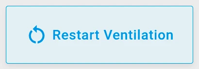
Section titled “Ventilation Restart Button”Scenario: A smart ventilation system has a device called Ventilation Relay that accepts RPC commands from ThingsBoard. Add a Restart Ventilation button to the dashboard that sends an RPC command to restart the ventilation process. The button disables automatically when the device reports it is not ready to receive commands.
Prerequisites:
- Create a device named Ventilation Relay in ThingsBoard.
- Ensure the device handles the RPC method
restartVentilationwith a Boolean parameter (true). - Add a shared attribute: Key —
active, Data type — Boolean, Value —true.
Step 1. Add the widget. Open your dashboard in edit mode, click Add widget, select the Buttons bundle, then choose Command button.
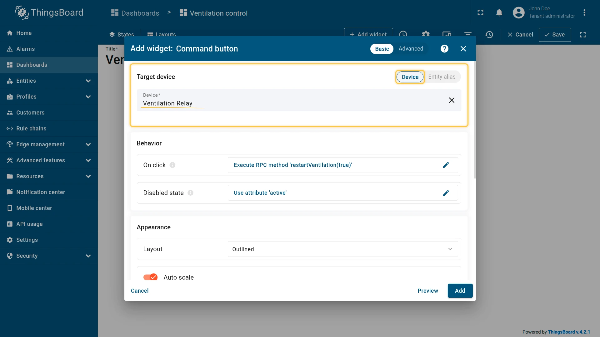
Step 2. Configure the datasource. Set Target device to Ventilation Relay.
Step 3. Configure behavior.
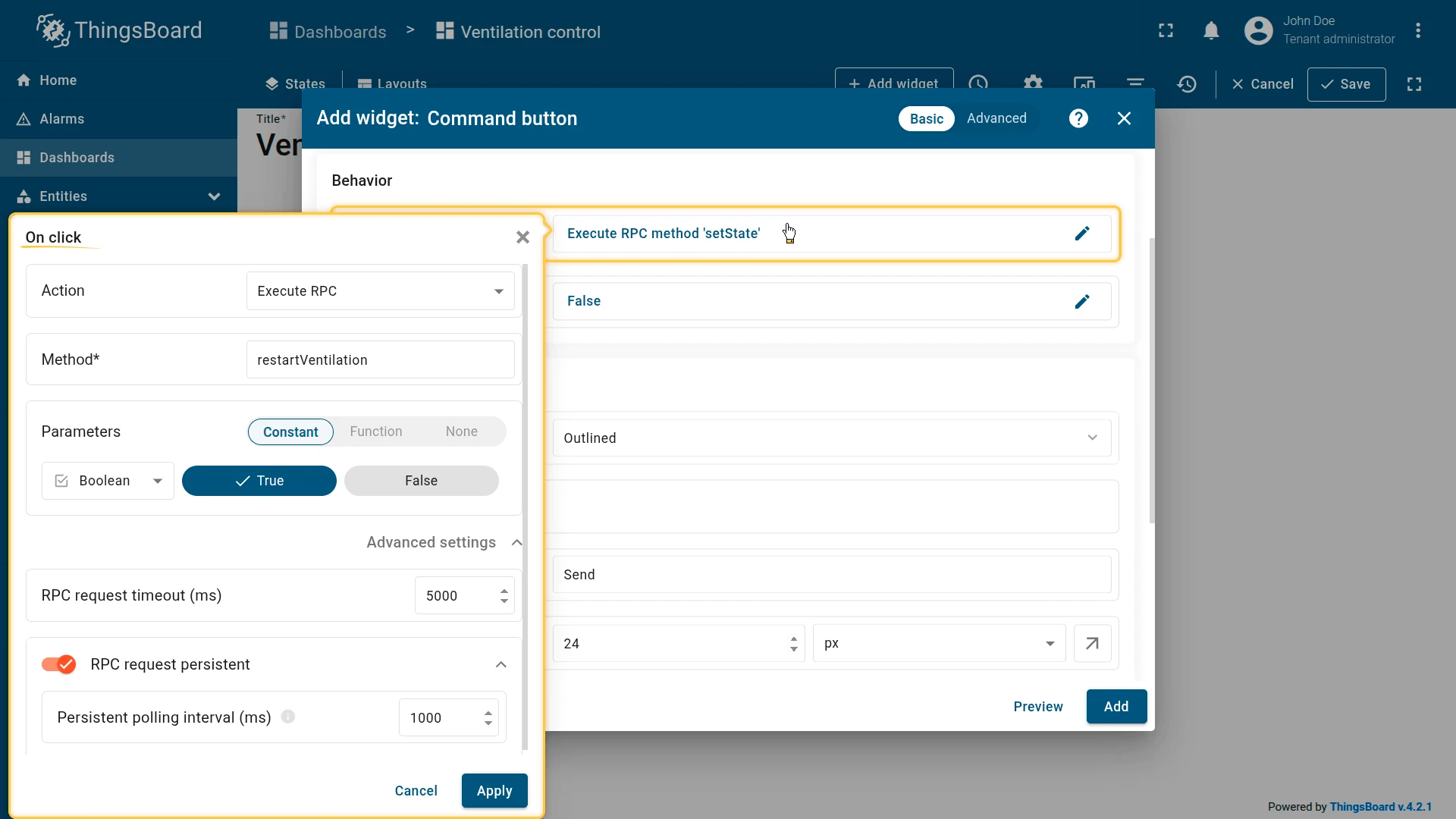
On click: Execute RPC — Method: restartVentilation, Parameters: Constant — true (Boolean), RPC request timeout: 5000 ms, RPC request persistent: enabled.
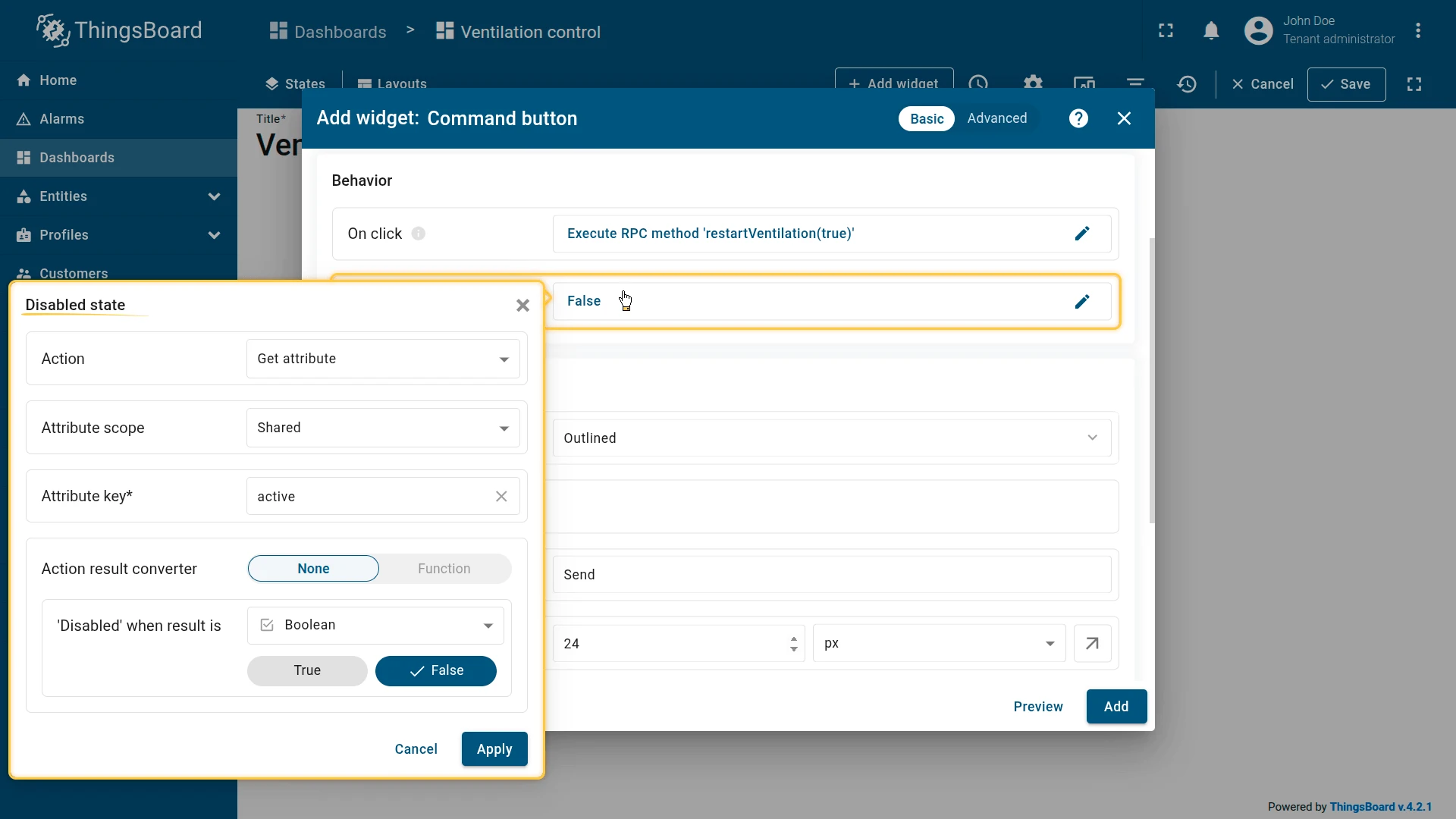
Disabled state: Get attribute — Scope: Shared, Key: active, Condition: None — Disabled when result is false (Boolean).
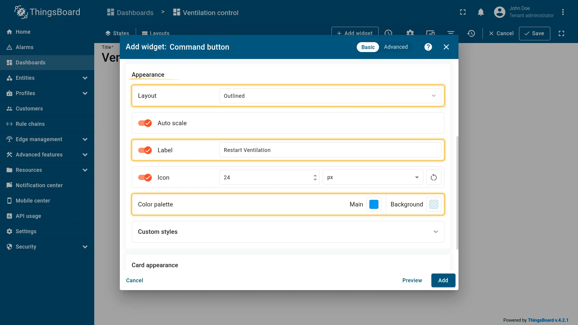
Step 4. Configure button appearance. Layout — Outlined, Label — Restart Ventilation, Icon — restart_alt, Color palette Main — #2196F3, Background — #D0EBFF70.
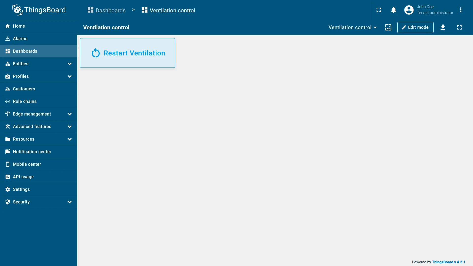
Step 5. Save. Click Add, resize and reposition as needed, then click Save on the dashboard toolbar.
Result: When active = true, the button is blue and clickable. Pressing it sends {"method": "restartVentilation", "params": true} to the device. If the device is offline, the command is queued (persistent RPC) and delivered once it reconnects. When active = false, the button turns gray and clicks are ignored.
Troubleshooting
Section titled “Troubleshooting”Button Click Has No Effect
| Cause | Solution |
|---|---|
| Device offline, RPC not persistent | Enable RPC request persistent in On click settings to queue the command until the device reconnects. |
| Wrong RPC method name | Verify the method name matches exactly what the device firmware expects. Method names are case-sensitive. |
| Wrong attribute key or scope | For Set attribute actions, confirm the key and scope (Server or Shared) match the device’s attribute. |
| Wrong value type | Ensure the constant value type (String, Boolean, Integer) matches what the device or attribute expects. |
Button Is Always Disabled
| Cause | Solution |
|---|---|
| Attribute key not found | Open Devices → Attributes and confirm the key exists with a value. |
| Wrong attribute scope | Match the scope to the actual attribute type (Client / Server / Shared). |
| Condition value inverted | Check that the Condition value matches the value that should disable the button. If the attribute is false when the button should be disabled, set the condition value to false. |
Function converter always returns true |
Review the Function converter; check for a missing return statement or incorrect comparison. |
Was this helpful?