Dashboard Reports
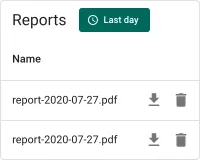
The Dashboard reports widget displays a filterable table of generated PDF reports from ThingsBoard’s file storage, pre-scoped to report-type files produced by the Reporting feature. Use it on reporting dashboards or customer portals where users need self-service access to their generated reports — without seeing unrelated files or navigating to the file storage administration page.
Adding the Widget
Section titled “Adding the Widget”- Open the dashboard in edit mode. Click Add widget in the top toolbar, or click the Add new widget icon in the center of an empty dashboard.
- In the widget bundle selection dialog, find and click Files.
- Select the Dashboard reports widget.
- Configure the appearance and click Add.
Configuration
Section titled “Configuration”The Dashboard reports widget reads directly from the file storage service and requires no datasource. All configuration lives in four tabs: Appearance, Widget card, Actions, and Layout.
Appearance
Section titled “Appearance”Controls the table header, visible columns, pagination, and the blob entity type filter.
Table Title
Section titled “Table Title”| Setting | Description |
|---|---|
| Blob entities table title | Text shown above the file list inside the widget (default: Dashboard reports) |
Display Columns
Section titled “Display Columns”Toggle individual columns on or off in the list view. The Name column is always visible.
| Toggle | Description |
|---|---|
| Display created time column | Shows the timestamp when the report file was stored (enabled by default) |
| Display type column | Shows the blob entity type; all entries will show report in the default configuration (enabled by default) |
| Display customer column | Shows the customer the report belongs to (enabled by default) |
Pagination
Section titled “Pagination”Toggle Display pagination to enable paged navigation when the report list grows long.
When enabled:
| Setting | Description |
|---|---|
| Step increment | Number of rows added per step when the user changes the page size (default: 10) |
| Number of steps | How many page-size options appear in the selector (default: 3) |
| Default page size | Initial number of rows per page (default: 10) |
Sort and Filter Options
Section titled “Sort and Filter Options”| Setting | Description |
|---|---|
| Default sort order | The field used to sort the list on first load (default: name) |
| “No data to display” alternative message | A custom message shown inside the widget when no reports match the current time range |
| Force default blob entity type | Filters the file list to the specified blob entity type (default: report). Change this only if you intentionally want to display a different file type; clearing it shows all stored files regardless of type |
Widget Card
Section titled “Widget Card”Standard card settings shared across all ThingsBoard widgets.
Card Title
Section titled “Card Title”| Setting | Description |
|---|---|
| Display widget title | Toggle to show or hide the widget title bar |
| Title | Widget title text (default: Dashboard reports) |
| Title Tooltip | Optional tooltip shown on title hover |
| Display title icon | Toggle to show an icon next to the title; configure the icon and its size |
| Advanced title style | JSON object for fine-grained title CSS (font size, weight, padding, etc.) |
Card Style
Section titled “Card Style”| Setting | Description |
|---|---|
| Text color | Default text color across the card |
| Background color | Card background fill |
| Padding | Inner spacing between card edge and content (default: 4px) |
| Margin | Outer spacing around the card |
| Border radius | Corner rounding in pixels |
| Drop shadow | Card elevation shadow (enabled by default) |
| Advanced widget style | JSON object for custom CSS applied to the widget container |
| Widget CSS | Raw CSS injected into the widget scope for full visual customization |
Card Buttons
Section titled “Card Buttons”| Setting | Description |
|---|---|
| Enable fullscreen | Adds a fullscreen toggle button in the widget header |
Actions
Section titled “Actions”The Dashboard reports widget supports the Widget header button action — a custom button placed in the widget header that triggers a configured action when clicked.
Layout
Section titled “Layout”| Setting | Description |
|---|---|
| Resizable | Allow the widget to be resized on the dashboard grid (enabled by default) |
| Preserve aspect ratio | Maintain the width-to-height ratio when resizing |
| Hide widget in mobile mode | Hides the widget when the dashboard is displayed in mobile layout |
| Hide widget in desktop mode | Hides the widget when the dashboard is displayed in desktop layout |
| Order | Position in the mobile layout stacking order |
| Height | Fixed height in rows for mobile layout |
Troubleshooting
Section titled “Troubleshooting”Widget Shows No Reports
| Cause | Solution |
|---|---|
| The current time range filter excludes all stored reports | Expand the time range using the filter button in the widget header, or switch to All time. |
| No reports have been generated yet | Reports are created when the Reporting feature runs successfully. Verify that at least one scheduled report has been generated. |
| Force default blob entity type was changed or cleared | Restore the value to report in the Appearance tab. |
| The current user has no permission to view file storage | Verify the user’s role and customer permissions in Roles. |
Download Button Does Nothing
| Cause | Solution |
|---|---|
| Browser pop-up blocker is preventing the download | Allow pop-ups from the ThingsBoard domain in the browser settings, then try again. |
Reports from Other File Types Appear in the List
| Cause | Solution |
|---|---|
| Force default blob entity type was cleared | Set Force default blob entity type back to report in the Appearance tab. |
Was this helpful?