Attributes Card
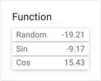
The Attributes card widget displays one or more attributes or the latest telemetry values from an entity as a compact key–value list, with each data key on its own row. Use it on device detail pages or monitoring dashboards to surface multiple live readings at a glance — without dedicating a separate widget to each value.
Key Capabilities
Section titled “Key Capabilities”- Show multiple attributes or telemetry keys from a single entity as a compact key–value list.
- Add multiple datasources — each renders as a separate labeled section inside the same widget.
- Per-datasource label and filter to narrow the displayed dataset.
- Global unit and decimal precision settings, overridable per data key.
- Data export (CSV/XLSX) and fullscreen controls in the widget header.
Adding the Widget
Section titled “Adding the Widget”- Open the dashboard in edit mode. Click Add widget in the top toolbar, or click the Add new widget icon in the center of an empty dashboard.
- In the widget bundle selection dialog, find and click Cards.
- Select the Attributes card widget.
- Configure the datasources and appearance, then click Add.
Configuration
Section titled “Configuration”Datasources
Section titled “Datasources”The widget supports multiple datasources, each added via Add datasource. Five datasource types are available:
| Type | Required fields | Description |
|---|---|---|
| Entity | Entity alias, Data keys | Reads attributes or telemetry from entities matched by an entity alias |
| Device | Device, Data keys | Reads from a specific device selected by name |
| Function | Data keys | Generates synthetic values using built-in functions (Sin, Cos, Random) — useful for testing layouts without live data |
| Entities count | Entity alias, Data keys | Returns the count of entities matched by the alias |
| Alarms count | Data keys | Returns the count of active (or filtered) alarms |
Each datasource also accepts an optional Label shown as the section header in the widget and an optional Filter to narrow which entities or alarms are included.
Limits
Section titled “Limits”| Setting | Description |
|---|---|
| Maximum entities per datasource | Upper bound on how many entities are loaded from each datasource (default: 1024) |
Appearance
Section titled “Appearance”Data Settings
Section titled “Data Settings”| Setting | Description |
|---|---|
| Units by default | Unit string appended to all displayed values unless overridden by individual data key configuration |
| Decimals by default | Default number of decimal places for numeric values; applies widget-wide unless overridden per data key |
| “No data to display” alternative message | Custom text shown inside the widget when no data is available |
Widget Card
Section titled “Widget Card”Standard card settings shared across all ThingsBoard widgets.
Card Title
Section titled “Card Title”| Setting | Description |
|---|---|
| Display widget title | Toggle to show or hide the widget title bar (enabled by default) |
| Title | Widget title text (default: Attributes card) |
| Title Tooltip | Optional tooltip shown on title hover |
| Display title icon | Toggle to show an icon next to the title; configure the icon and its size |
| Advanced title style | JSON object for fine-grained title CSS (font size, weight, padding, etc.) |
Card Style
Section titled “Card Style”| Setting | Description |
|---|---|
| Text color | Default text color across the card |
| Background color | Card background fill |
| Padding | Inner spacing between card edge and content (default: 8px) |
| Margin | Outer spacing around the card |
| Border radius | Corner rounding in pixels |
| Drop shadow | Card elevation shadow (enabled by default) |
| Advanced widget style | JSON object for custom CSS applied to the widget container |
| Widget CSS | Raw CSS injected into the widget scope for full visual customization |
Card Buttons
Section titled “Card Buttons”| Setting | Description |
|---|---|
| Enable fullscreen | Adds a fullscreen toggle button in the widget header (enabled by default) |
| Enable data export | Adds a data export button to the widget header, allowing the current dataset to be downloaded as CSV or XLSX (enabled by default) |
Actions
Section titled “Actions”The Attributes card supports the Widget header button action — a custom button placed in the widget header that triggers a configured action when clicked.
Layout
Section titled “Layout”| Setting | Description |
|---|---|
| Resizable | Allow the widget to be resized on the dashboard grid (enabled by default) |
| Preserve aspect ratio | Maintain the width-to-height ratio when resizing |
| Hide widget in mobile mode | Hides the widget when the dashboard is displayed in mobile layout |
| Hide widget in desktop mode | Hides the widget when the dashboard is displayed in desktop layout |
| Order | Position in the mobile layout stacking order |
| Height | Fixed height in rows for mobile layout |
Was this helpful?