Map
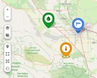
The Map widget displays the real-time location of entities on a geographic tile map. Use it to track vehicles, sensors, assets, or any entity that reports latitude and longitude — showing current positions, coverage zones, and geographic boundaries all on one interactive map.
Key capabilities
Section titled “Key capabilities”Map is one of four map widgets in ThingsBoard, each serving a distinct purpose:
| Widget | Primary use |
|---|---|
| Map | Displays current entity locations in real time on a geographic tile map. |
| Image Map | Uses a custom background image. Best for floor plans, parking lots, and indoor layouts. |
| Trip Map | Animated route replay with full timeline controls. Best for step-by-step movement analysis. |
| Route Map | Renders the full historical path as a static route line. Best for reviewing complete trips at a glance. |
What sets Map apart:
- Reads latitude and longitude from entity attributes or telemetry and places markers in real time.
- Supports multiple map providers and switchable layers — OpenStreet, Google, HERE, Tencent, or custom.
- Supports Markers, Polygons, Circles, and Polylines overlays simultaneously on the same map.
- Includes interactive editing tools — place, move, and remove markers, polygons, and circles directly on the widget.
Add the widget
Section titled “Add the widget”- Open the dashboard and switch to edit mode.
- Click Add widget at the top, or the Add new widget icon in the center of the screen.
- Open the Maps widget bundle.
- Select Map.
- Configure the widget settings, then click Add.
Map type
Section titled “Map type”Configure one or more tile layers for the map background:
- Label: Display name shown in the layer switcher on the widget.
- Provider: OpenStreet, Google, HERE, Tencent, or Custom (enter a tile server URL).
- Layer: Tile style — Mapnik, HOT, WorldStreetMap, WorldTopoMap, WorldImagery, Roadmap, etc. Available options depend on the provider.
- Reference layer: A transparent overlay with labeled map elements (streets, borders). Configure via the layer gear icon menu.
Click Add layer to configure additional switchable layers. Users switch between layers using the layer icon button directly on the widget.
Overlays
Section titled “Overlays”Overlays are the visual elements rendered on the map. Each overlay type binds to its own data source and is configured independently.
Markers represent individual entities — vehicles, sensors, assets — displayed as icons at their geographic coordinates.
Add a marker: Click Add marker, select a data source, define coordinate keys, and click Save.
Datasource
Select the entity providing position data: Function, Device, or Entity (entity alias). Apply a filter to narrow the selection.
Keys
- Latitude key: Attribute or telemetry key containing latitude (default:
latitude). - Longitude key: Attribute or telemetry key containing longitude (default:
longitude). - Additional data keys: Extra keys (like
temperature,status,active) used in labels, tooltips, or color functions.
Appearance — Marker
Three display modes:
- Shape: Select a built-in shape; set size (px) and color. Use a color function (JavaScript) to change the marker color dynamically based on telemetry values.
- Icon: Select a built-in icon; set size and color. Use color range rules to map value ranges to specific colors.
- Image: Provide an image URL, or use a marker image function that returns
{ url, size, offset }.
Marker offset — fine-tune the anchor point position (Horizontal, Vertical; 0–1 range).
Rotate marker — rotates the marker icon to reflect the direction of movement. Set an Offset angle (degrees) to adjust the base orientation.
Appearance — Label
Text shown above the marker:
- Pattern (default): Use template variables like
${entityName},${entityLabel}, or any data key. - Function: Return an HTML string based on data values.
Appearance — Tooltip
Popup shown on marker interaction:
- Pattern / Function: Define content as a template or a JavaScript function.
- Tooltip trigger: Show on click or show on hover.
- Auto-close tooltips: Close when clicking elsewhere on the map.
- Tooltip offset: Horizontal and Vertical position adjustment.
- Tag actions: Add named action links inside the tooltip using
<link-act name='action-name'>Label</link-act>. Clicking the link triggers the configured widget action.
Behavior
On click — action triggered when the marker is clicked. Available types: Do nothing, Navigate to new dashboard state, Update current dashboard state, Navigate to other dashboard, Custom action, Custom action (HTML template), Mobile action, Open URL.
Groups
Assign a group name. Groups appear in the Groups panel on the widget, where entire groups can be shown or hidden at once.
Edit marker
Enable interactive placement and editing tools directly on the widget:
- Instruments: Enable Add, Move, and/or Remove tools.
- Scope of the attribute to persist location: Server or Shared — controls where the coordinates are saved when a marker is placed or moved.
- Enable snapping to other vertices for precision drawing: Snaps the marker to nearby polygon vertices or circle centers.
Use map markers clustering
Groups nearby markers into a single cluster icon at lower zoom levels. The cluster icon displays the count of items inside. Improves readability for large numbers of markers.
Polygons define geographic areas — geofences, service zones, restricted regions, or any area that needs to be highlighted or linked to entity data.
Add a polygon: Click Add polygon, select a data source, define the polygon key, and click Save.
Datasource
Function, Device, or Entity alias. Apply a filter if needed.
Keys
- Polygon key: Attribute key holding the coordinate array (default:
perimeter). - Additional data keys: Extra keys for labels, tooltips, or functions.
Coordinate format:
[[lat1,lng1],[lat2,lng2],...,[latN,lngN]]Example:
[[53.37545,-6.31259],[53.37554,-6.31256],[53.37537,-6.31128],[53.37547,-6.31124]]Appearance — Fill
How the polygon interior is rendered:
- Color: Solid fill color (static or data-driven).
- Stripe: Diagonal hatching pattern — useful for indicating zones or restricted areas.
- Image: Custom image fill.
Appearance — Stroke
Border line. Set thickness (px) and color.
Appearance — Label
Text shown at the polygon center. Pattern or Function.
Appearance — Tooltip
Popup on click or hover. Pattern or Function. Configure trigger, auto-close, and tag actions.
Behavior
On click action. Same action types as Markers.
Groups
Assign a group name for visibility toggling.
Edit polygon
Interactive drawing and editing tools:
- Instruments: Enable Add, Edit (reshape vertices), Move, Rotate, Cut, and/or Remove tools.
- Scope: Server or Shared attribute scope for saving coordinates.
- Enable snapping to other vertices for precision drawing.
Circles define round geographic areas — coverage zones, detection ranges, or geofence perimeters defined by a center coordinate and radius.
Add a circle: Click Add circle, select a data source, define the circle key, and click Save.
Datasource
Function, Device, or Entity alias. Apply a filter if needed.
Keys
- Circle key: Attribute key holding the circle geometry (default:
perimeter). - Additional data keys: Extra keys for labels, tooltips, or functions.
Coordinate format:
{"latitude": value, "longitude": value, "radius": value}Example:
{"latitude": 53.4791, "longitude": -6.5172, "radius": 137.74}Appearance — Fill
Color, Stripe, or Image — same options as Polygons.
Appearance — Stroke
Border line thickness and color.
Appearance — Label
Text shown at the circle center. Pattern or Function.
Appearance — Tooltip
Popup on click or hover. Pattern or Function. Configure trigger, auto-close, and tag actions.
Behavior
On click action. Same action types as Markers.
Groups
Assign a group name for visibility toggling.
Edit circle
Interactive drawing and editing tools:
- Instruments: Enable Add, Edit (resize radius), Move, and/or Remove tools.
- Scope: Server or Shared attribute scope.
- Enable snapping to other vertices for precision drawing.
Polylines display static route paths stored as attribute coordinate arrays — for example, a fixed bus route with stops, a subway line, a pipeline, or a service corridor. Unlike Markers (which show points), Polylines render a connected line across the map.
Add a polyline: Click Add polyline, select a data source, define the polyline key, and click Save.
Datasource
Function, Device, or Entity alias. Apply a filter if needed.
Keys
- Polyline key: Attribute key holding the coordinate array (default:
perimeter). - Additional data keys: Extra keys for labels or tooltips.
Coordinate format:
[[lat1,lng1],[lat2,lng2],...,[latN,lngN]]Appearance — Stroke
Line thickness (px) and color.
Appearance — Label
Text shown along the polyline. Pattern or Function.
Appearance — Tooltip
Popup on click or hover. Pattern or Function. Configure:
- Tooltip trigger: On click or on hover.
- Auto-close tooltips.
- Tag actions: Named action links inside the tooltip.
Behavior
On click action. Types: Do nothing, Navigate to new dashboard state, Update current dashboard state, Navigate to other dashboard, Custom action, Custom action (HTML template), Mobile action, Open URL.
Groups
Assign a group name for visibility toggling.
Edit polyline
Interactive editing tools:
- Instruments: Enable Add, Edit, Move, and/or Remove tools.
- Scope: Server or Shared attribute scope for saving coordinates.
- Enable snapping to other vertices for precision drawing.
Additional datasources
Section titled “Additional datasources”Additional datasources provide telemetry or attributes from entities not directly displayed on the map. Use them in overlay functions for conditional logic — color-changing markers, enriched tooltips, or computed display values based on data from related devices.
- Source: Entity type — Function, Device, or Entity alias.
- Data keys: Telemetry or attribute keys to read from the entity.
Click Add datasource to configure more.
Map controls
Section titled “Map controls”Configure the interactive controls available on the widget.
Position — placement of the controls panel: Top-left, Top-right, Bottom-left, or Bottom-right.
Zoom actions — enable zoom via:
- Scroll: Mouse wheel zoom.
- Double click: Zoom in on double-click.
- Control buttons: Show + / − zoom buttons on the map.
Scale — display a distance scale bar: Metric (km / m) or Imperial (mi / ft).
Map action buttons
Section titled “Map action buttons”Add custom buttons overlaid on the map. Each button triggers a predefined action when clicked.
Each button has a Label, Icon, Color, and Action.
Available action types: Do nothing, Navigate to new dashboard state, Update current dashboard state, Navigate to other dashboard, Custom action, Custom action (HTML template), Mobile action, Open URL, Place map item.
The Place map item action lets users click a point on the map to create a new entity at that location — coordinates are saved automatically as entity attributes.
Click Add button to configure more buttons.
For action configuration details, see Widget actions.
Common map settings
Section titled “Common map settings”- Fit map bounds to cover all markers: Auto-adjusts zoom and position on load to fit all visible map items. Enabled by default.
- Default map center position: Initial map center coordinates (latitude, longitude) used when auto-fit is disabled.
- Default map zoom level: Initial zoom level. Higher values zoom in closer (like 7 for country level, 15 for street level).
- Limit of entities to load: Maximum entities loaded simultaneously. Prevents performance issues with large datasets (default: 16384).
Appearance
Section titled “Appearance”- Title: Widget header label. Disabled by default. Use
${entityName}or${entityLabel}as pattern variables, or enter a static string. - Card icon: Icon displayed next to the title in the header. Set size (px), alignment, and color.
Card appearance
Section titled “Card appearance”- Background: Card background color.
- Show card buttons: Toggle Data export and Fullscreen buttons in the widget header.
- Card border radius: Corner rounding in px (default: 0px).
- Card padding: Inner spacing between content and card edge in px (default: 8px).
Actions
Section titled “Actions”Add Widget header button actions — icon buttons in the widget header that trigger a configured action when clicked.
See Widget actions for available action types and configuration.
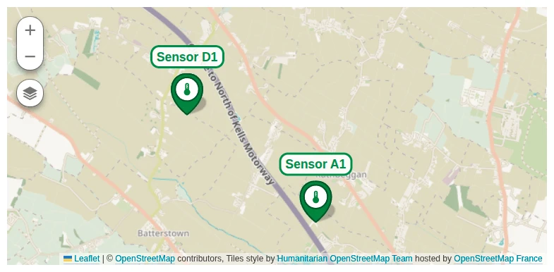
Example: Sensor tracking dashboard
Section titled “Example: Sensor tracking dashboard”Goal: Display two temperature and humidity sensors as markers on a map. Each marker shows live telemetry in a tooltip and links to a dedicated sensor detail state.
Download the example
You can download the complete dashboard for this example and import it into your own instance.
Prerequisites
-
Download and import the base dashboard into your instance. It contains two states: a main state (where the Map widget will be added) and a
sensor_detailsstate already configured to display telemetry for the selected sensor. -
Create two devices named Sensor A1 and Sensor D1 that send
temperatureandhumiditytelemetry to ThingsBoard. -
Set the following server-side attributes on each device:
Sensor A1:
active:truelatitude:53.4711462520356longitude:-6.507791078415879
Sensor D1:
active:truelatitude:53.4836805758458longitude:-6.532912864923978
Alternatively, download the CSV file and use bulk provisioning to import both devices with the required attributes.
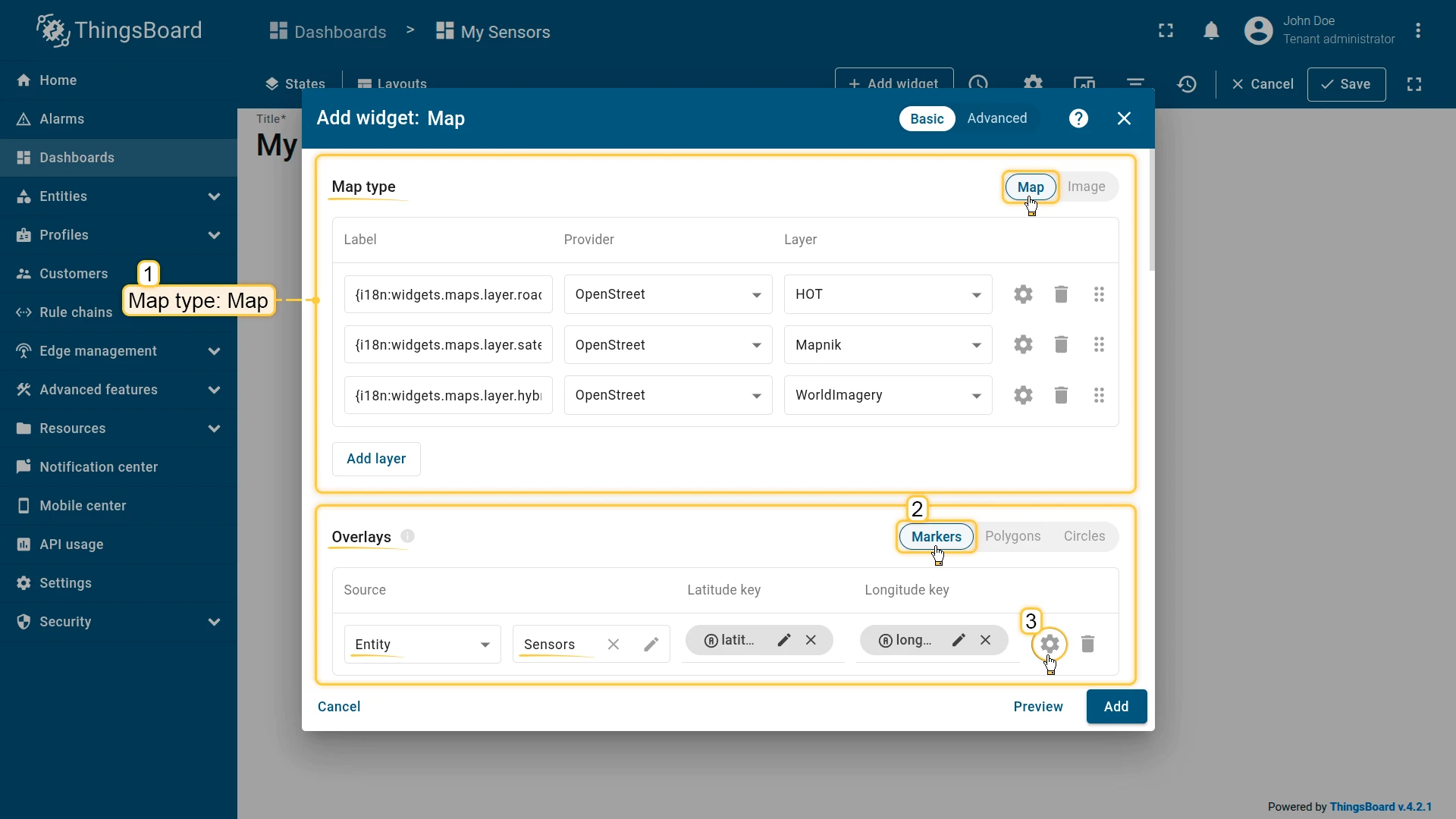
Step 1: Add the widget
Open the dashboard in edit mode and add a Map widget.
Step 2: Configure the widget
Map type
Select Map and configure three layers:
| Label | Provider | Layer |
|---|---|---|
| Roadmap | OpenStreet | HOT |
| Satellite | OpenStreet | Mapnik |
| Hybrid | OpenStreet | WorldImagery |
Overlays
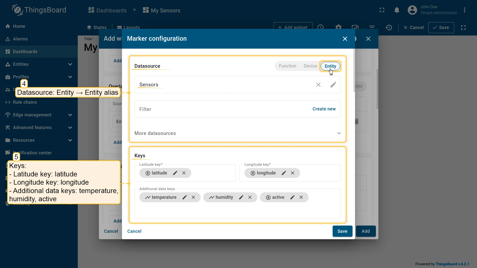
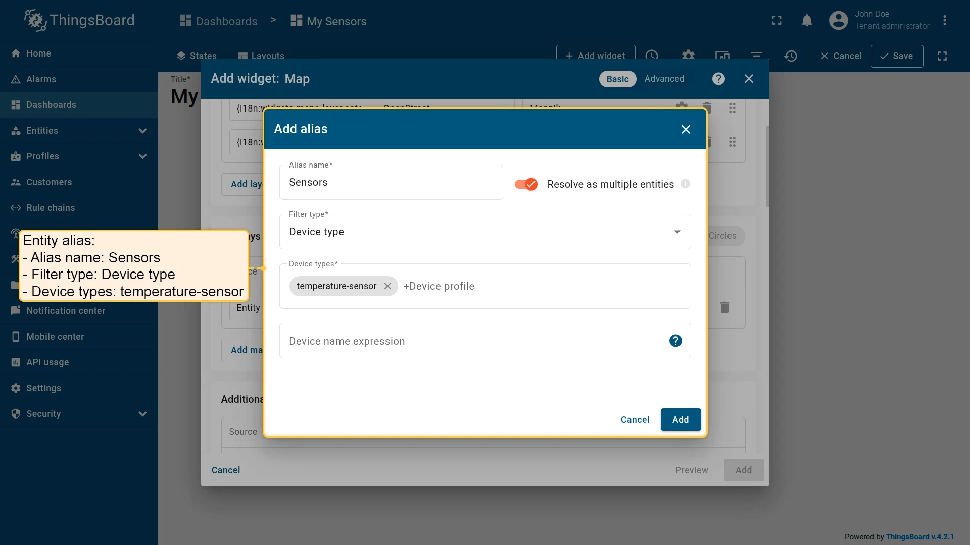
Go to Overlays ⇾ Markers and click Add marker. Configure the datasource and keys:
- Datasource: Entity alias — create a new alias named
Sensors- Filter type: Device type
- Device types:
temperature-sensor
- Latitude key:
latitude - Longitude key:
longitude - Additional data keys:
temperature,humidity,active
Configure marker appearance:
- Marker: Icon — Thermostat, size 48
- Color function:
if (data.active !== "true") { return 'rgb(255, 0, 0)';} else { return 'rgb(39, 134, 34)';}- Label function:
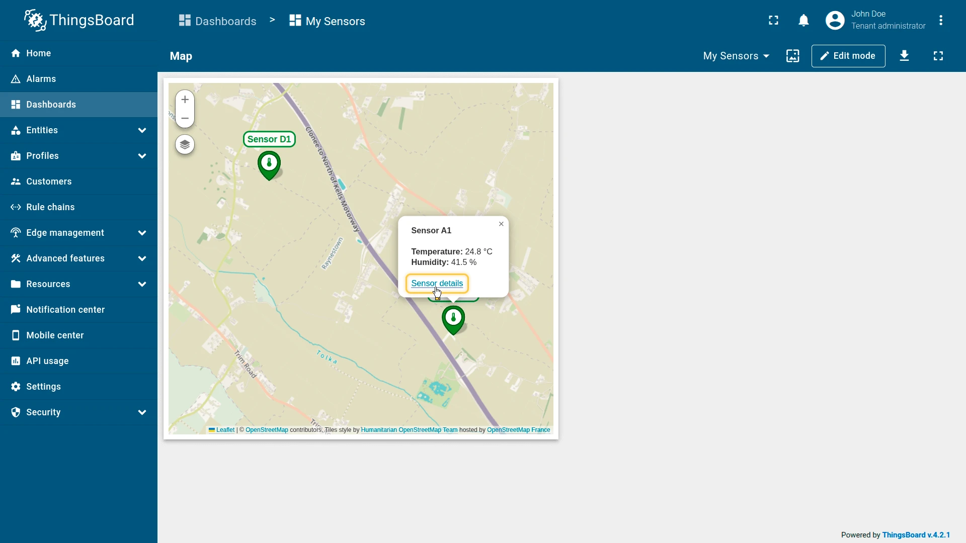
var color;if (data.active !== "true") { color = 'rgb(255, 0, 0)';} else { color = 'rgb(39, 134, 34)';}return '<span style="border: solid ' + color + '; border-radius: 10px; color: ' + color + '; background-color: #fff; padding: 3px 5px; font-size: 14px; position: relative; bottom: 6px;">' + '${entityLabel}' +'</span>';- Tooltip function:
const unit = { from: '°C', METRIC: '°C', IMPERIAL: '°F', HYBRID: '°C' };var usrUnit = ctx.unitService.getTargetUnitSymbol(unit);var unitValue = ctx.unitService.convertUnitValue(data.temperature, unit).toFixed(1);return `<b>${data.entityName}</b><br/><br/><b>Temperature:</b> ${unitValue} ${usrUnit}<br/><b>Humidity:</b> ${data.humidity} %<br/><br/><link-act name="navigate_to_details">Sensor details</link-act><br/>`;- Tag action:
- Name:
navigate_to_details - Action: Navigate to new dashboard state
- Target dashboard state:
sensor_details
- Name:
Appearance
Disable the Title display.
Card appearance
Disable the Fullscreen card button.
Click Add to insert the widget into the dashboard. Resize and reposition as needed, then save the dashboard.
Step 3: Interact with markers
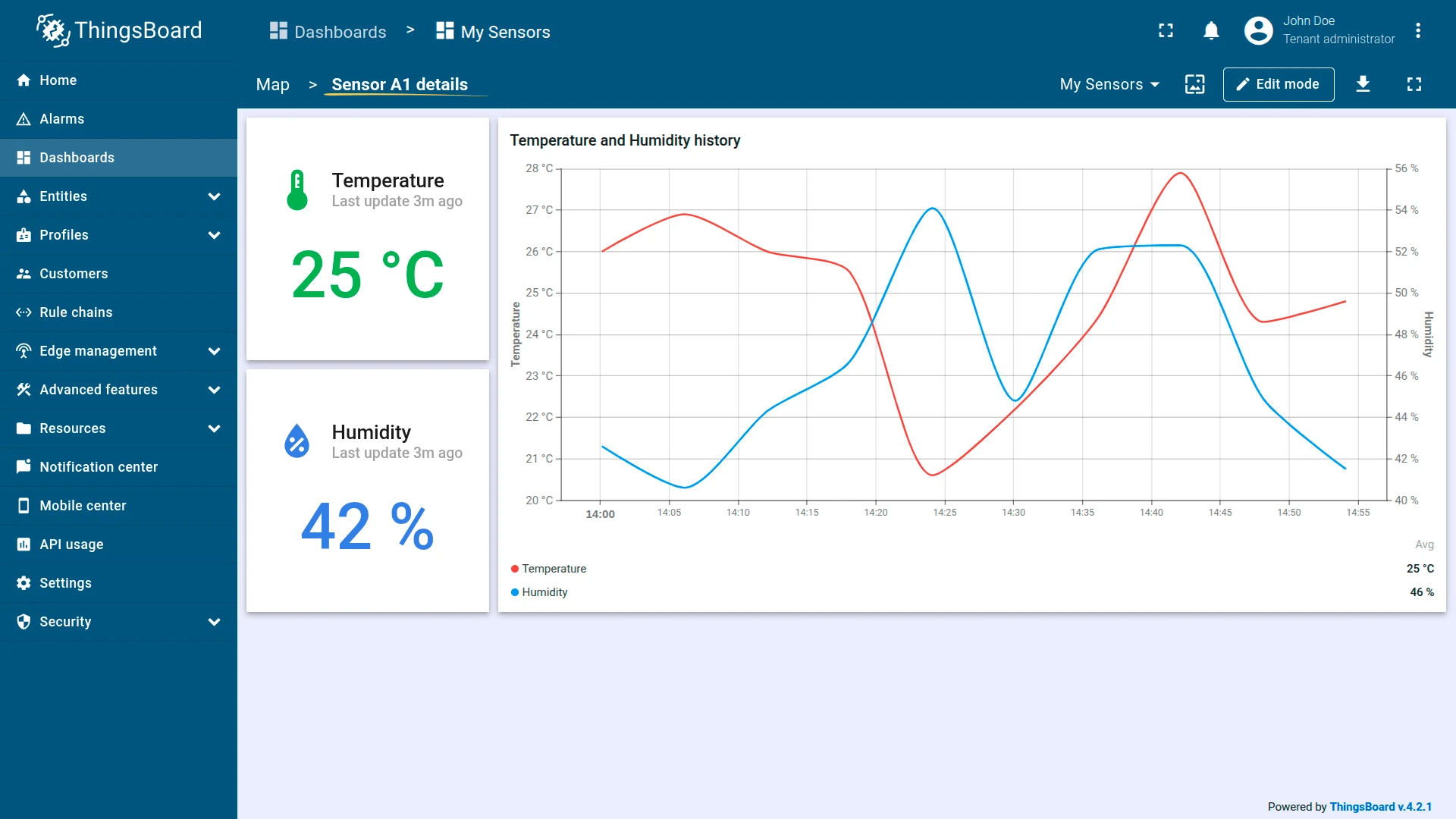
Click any marker to view the sensor’s temperature and humidity in the tooltip. Click Sensor details to navigate to the detail state, which shows current and historical readings for the past hour.
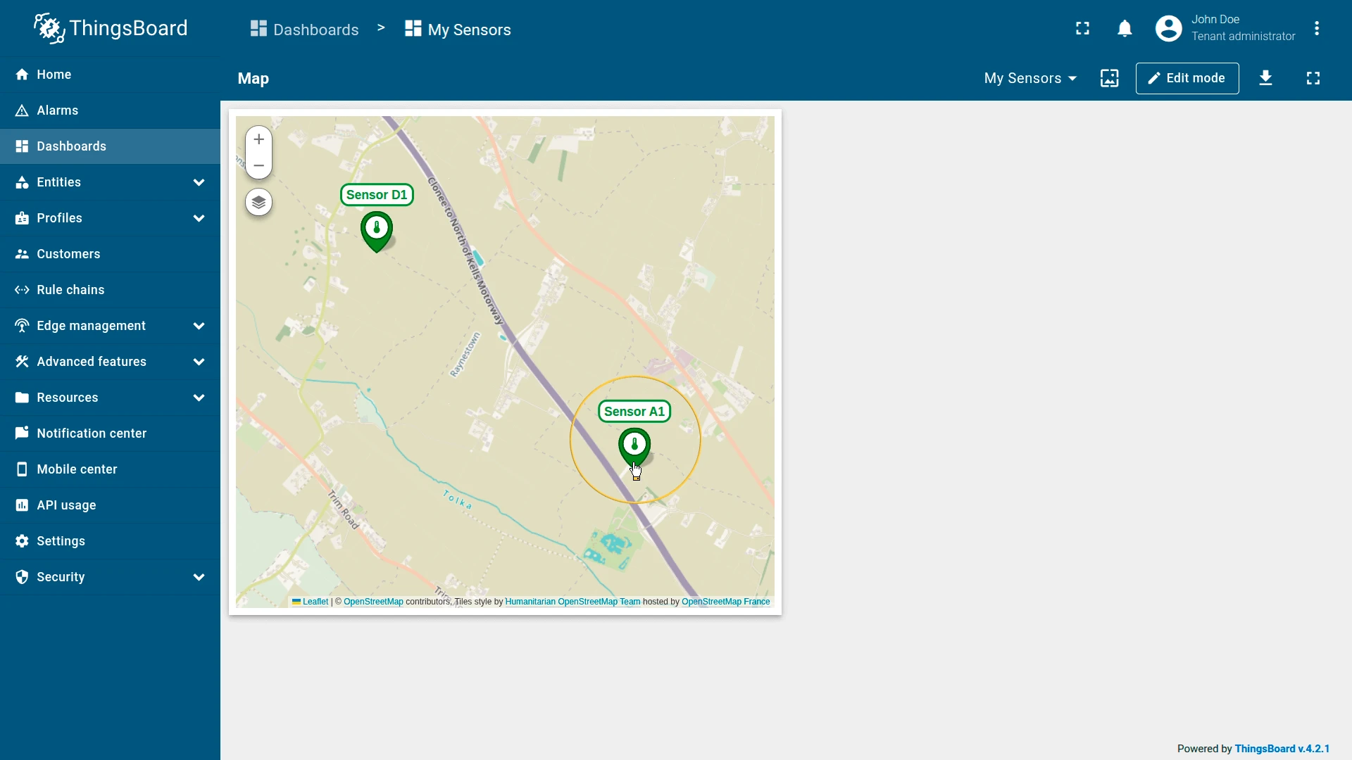
Result
The Map widget shows both sensors as thermostat icons on the map — green when active, red when inactive. Clicking a marker reveals live telemetry and a link to the sensor’s historical data view.
Troubleshooting
Section titled “Troubleshooting”Markers not visible:
- Confirm the entity has
latitudeandlongitudeattributes or telemetry populated. - Check that the coordinate key names in the widget configuration match the entity’s actual key names exactly.
- Verify the values are valid decimal coordinates, not strings or null.
Polygon or circle not displayed:
- Confirm the attribute key exists on the entity and the value format is correct.
- For polygons:
[[lat1,lng1],[lat2,lng2],...]. - For circles:
{"latitude":value,"longitude":value,"radius":value}.
Polyline not shown:
- Confirm the entity has the polyline attribute with the correct key name.
- Verify the attribute value follows the expected format:
[[lat1,lng1],[lat2,lng2],...].
Map loads blank:
- For Google Maps, HERE, or Tencent — verify the API credentials are configured in ThingsBoard system settings.
- For OpenStreetMap, no credentials are required.
Markers cluster even at high zoom:
- Check whether Use map markers clustering is enabled on the marker overlay. Disable it if individual markers are needed at all zoom levels.
Was this helpful?