Two-Segment Button
The Two-segment button widget places a two-option selector on any dashboard where only one choice can be active at a time. Each segment triggers its own dashboard action on click — navigate to a state, open a different dashboard, run custom JavaScript, or redirect to a URL — and the active segment is driven by live device data or the current dashboard state. Use it to build compact mode switches or view toggles: Temperature/Humidity, Map/List, Day/Night, or any pair of mutually exclusive options.
Key capabilities
Section titled “Key capabilities”- Two mutually exclusive segments (First and Second) — selecting one deselects the other.
- Reads the current selection from a device attribute, telemetry value, alarm status, or dashboard state.
- Each segment triggers independent dashboard actions on click: navigate to state, update state, open another dashboard, custom action, mobile action, or URL.
- Independent label, icon, and color styling for each segment and for Selected/Unselected color states.
- Two layout shapes: Squared and Rounded, each with custom per-segment colors.
- Can be disabled entirely based on device data, alarms, or dashboard state.
Adding the widget
Section titled “Adding the widget”- Open the dashboard in edit mode. Click Add widget in the top toolbar, or click the Add new widget icon in the center of an empty dashboard.
- In the widget bundle selection dialog, find and click Buttons.
- Select the Two-segment button widget.
- Configure the datasource, behavior, and appearance, then click Add.
Configuration
Section titled “Configuration”All settings in this section use Basic mode — a quick-start configuration covering the essentials. For finer widget controls like card style, card buttons, title, and tooltip, switch to the Advanced tab.
Datasource
Section titled “Datasource”Select the datasource for the widget:
- Device — a specific device; the widget reads attribute and telemetry data from this device to determine the selected segment and the disabled state.
- Entity alias — a set of entities matched by an entity alias; use this when the target device is selected dynamically at runtime.
Behavior
Section titled “Behavior”The Behavior section defines which segment appears selected on load, what each segment does when clicked, and when the widget disables. Disabled state is optional.
Select button
Section titled “Select button”Determines which segment (First or Second) appears highlighted when the dashboard loads. Select one action type from the list below.
-
Do nothing
The selected segment is set manually. No live data needed.
Parameter Description Value First — the first segment is highlighted on load; Second — the second segment is highlighted on load. -
Get attribute
Reads a device attribute to determine the selected segment.
Parameter Description Attribute scope Where the attribute is stored: Any, Client, Server, or Shared. Attribute key The attribute name to read, like modeorview.‘First button’ when result is (None) First segment selected when the attribute equals the value you specify. ‘First button’ when result is (Function) First segment selected when your f(data)function returnstrue. -
Get time series
Reads the latest telemetry value to determine the selected segment.
Parameter Description Time series key The telemetry key to read, like stateormode.‘First button’ when result is (None) First segment selected when the telemetry value equals the value you specify. ‘First button’ when result is (Function) First segment selected when your f(data)function returnstrue. -
Get alarm status
Sets the First segment as selected when a matching alarm is active on the entity.
Parameter Description Alarm severity Critical, Major, Minor, Warning, or Indeterminate. Alarm types Any alarm, or a specific alarm type. -
Get dashboard state id
Sets the selected segment based on the currently open dashboard state name; use this for navigation bars where the active state should be visually highlighted.
Parameter Description ’First button’ when result is (None) First segment selected when the current state name matches the text you enter. ‘First button’ when result is (Function) First segment selected when your f(data)function returnstrue. -
Get dashboard state object
Sets the selected segment using the full dashboard state context; use this when multiple state parameters need to be evaluated together.
Parameter Description ’First button’ when result is (Function only) Write a f(data)function that returnstrueto select the First segment.
First button click
Section titled “First button click”Defines the action executed when the user clicks the first segment. Select one action type from the list below.
-
Do nothing
The segment is clickable but performs no action. Use while testing styles or as a placeholder.
-
Navigate to new dashboard state
Switches to a different view within the same dashboard, like opening a map view or a detail screen.
Parameter Description Target dashboard state The state to open (required). Set entity from widget Passes the current entity to the target state. State entity parameter name The key the entity is passed under. Dashboard state display option Normal (same view), In separate dialog (popup), or In popover (inline overlay). -
Update current dashboard state
Updates the context of the current view without navigating away, like switching the selected entity.
Parameter Description Target dashboard state The state to switch to (optional). Set entity from widget Passes the current entity to the updated state. State entity parameter name The key the entity is passed under. -
Navigate to other dashboard
Opens a completely different dashboard.
Parameter Description Target dashboard The dashboard to open (required). Target dashboard state The specific view to open within that dashboard. Open in a new browser tab Opens the dashboard without leaving the current page. Set entity from widget Passes the current entity to the other dashboard. -
Custom action
Runs custom JavaScript on click. The function receives:
$event,widgetContext,entityId,entityName,additionalParams,entityLabel. -
Custom action (with HTML template)
Same as Custom action, but also renders a custom HTML panel or dialog when the segment is clicked.
Parameter Description Resources External scripts and styles. CSS Styling. HTML Layout. JS Logic. -
Mobile action
Triggers a native device feature inside a ThingsBoard mobile app, like the camera or QR scanner.
Parameter Description Mobile action type Take picture from gallery, Take photo, Open map directions, Open map location, Scan QR Code, Make phone call, Get phone location, Take screenshot, or Device provision. -
Open URL
Opens a website or external link when the segment is clicked.
Parameter Description URL The address to open (required). Open in a new browser tab Keeps the current dashboard open while opening the link.
Second button click
Section titled “Second button click”Defines the action executed when the user clicks the second segment. All action types and parameters are identical to First button click above.
Disabled state
Section titled “Disabled state”The Disabled state makes the entire widget non-interactive when a configured condition is met. Both segments turn gray and all clicks are ignored. This section is optional — skip it if the widget should always be clickable.
-
Do nothing
Set the disabled state manually. No live data needed.
Parameter Description Value True — widget is always disabled; False — widget is always enabled. -
Get attribute
Disable the widget based on a device attribute.
Parameter Description Attribute scope Any, Client, Server, or Shared. Attribute key The attribute name to read, like enabledorlocked.Condition (None) Disabled when the attribute equals the value you specify. Condition (Function) Disabled when your f(data)function returnstrue. -
Get time series
Disable the widget based on the latest telemetry value.
Parameter Description Time series key The telemetry key to monitor. Condition (None) Disabled when the telemetry value equals the value you specify. Condition (Function) Disabled when your f(data)function returnstrue. -
Get alarm status
Disable the widget while a specific alarm is active.
Parameter Description Alarm severity Critical, Major, Minor, Warning, or Indeterminate. Alarm types Any alarm, or a specific alarm type. -
Get dashboard state id
Disable the widget based on the currently open dashboard state.
Parameter Description Condition (None) Disabled when the current state name matches the text you enter. Condition (Function) Disabled when your f(data)function returnstrue. -
Get dashboard state object
Disable the widget using the full dashboard state context.
Parameter Description Condition (Function only) Write a f(data)function that returnstrueto disable the widget.
Appearance
Section titled “Appearance”Controls the overall widget shape and card styling.
| Setting | Description |
|---|---|
| Layout | Shape of the button segments: Squared (sharp corners) or Rounded (pill-shaped corners). |
| Auto scale | Automatically adjusts font size and element proportions when the widget is resized. |
| Card border | Width (px) and color of the card border. |
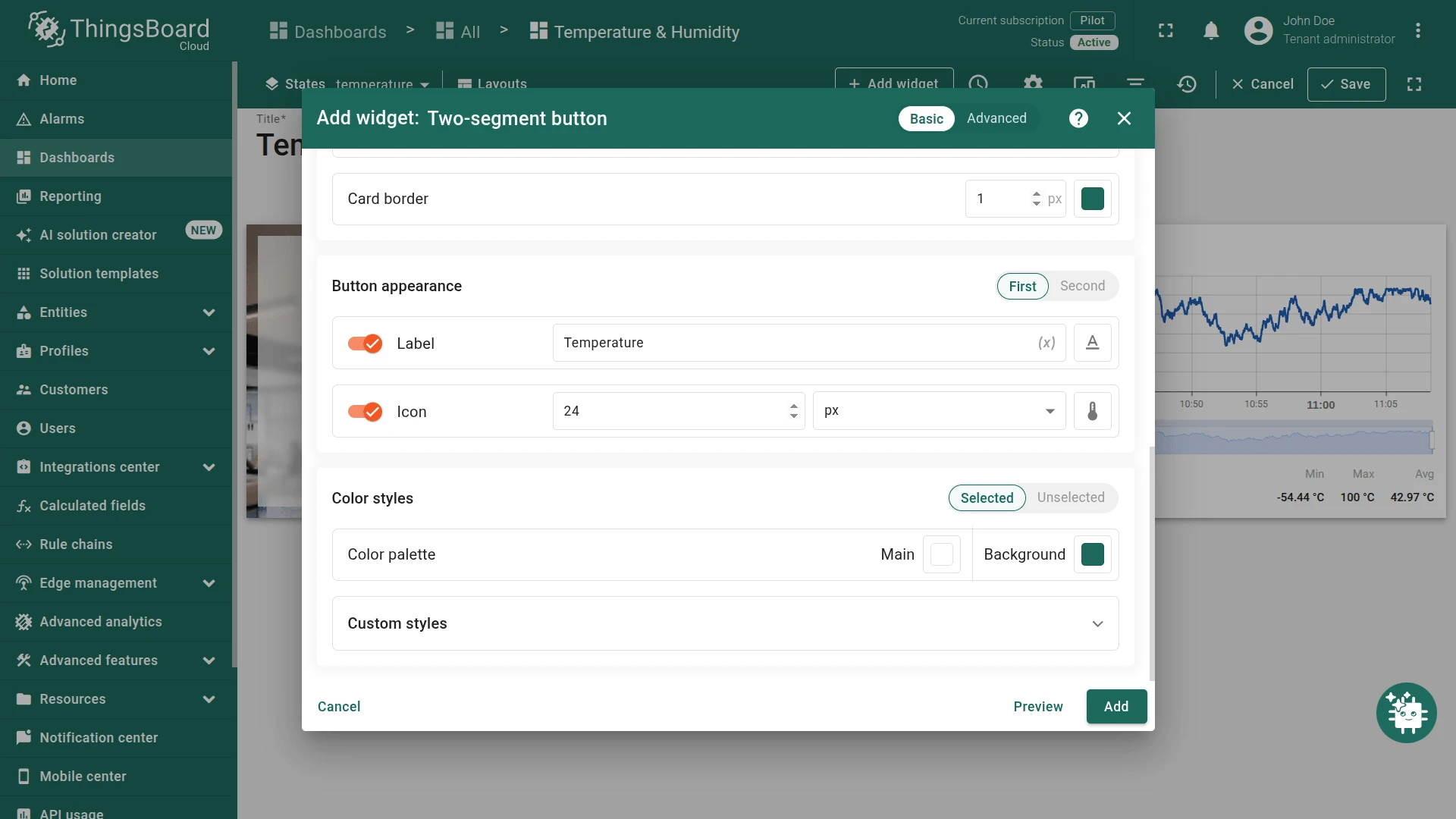
Button appearance
Section titled “Button appearance”Controls the visual style of each segment independently. The section has two tabs: First and Second.
| Setting | Description |
|---|---|
| Label | Text displayed on the segment. Supports entity variables: $\{entityName\}, $\{entityLabel\}. |
| Icon | Material Design icon shown on the segment. Configurable size (px). |
| Color styles | Two sub-tabs: Selected (segment is the active one) and Unselected (segment is inactive). Configure each independently. |
| Color palette | Main: segment fill or text color; Background: surrounding area color. Configured per Selected/Unselected state. |
| Custom styles | Per-interaction overrides for Enabled, Hovered, and Disabled states. Each supports Main, Background, and Shadow settings. |
Example
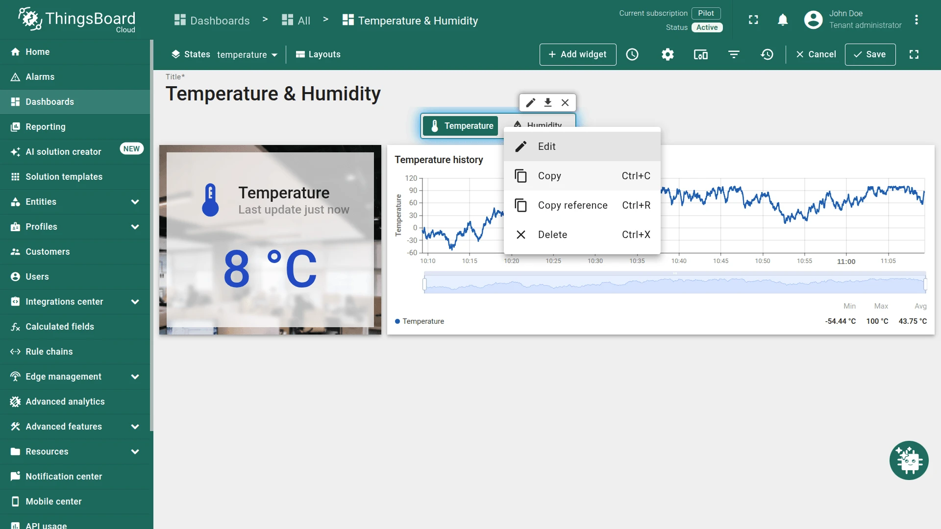
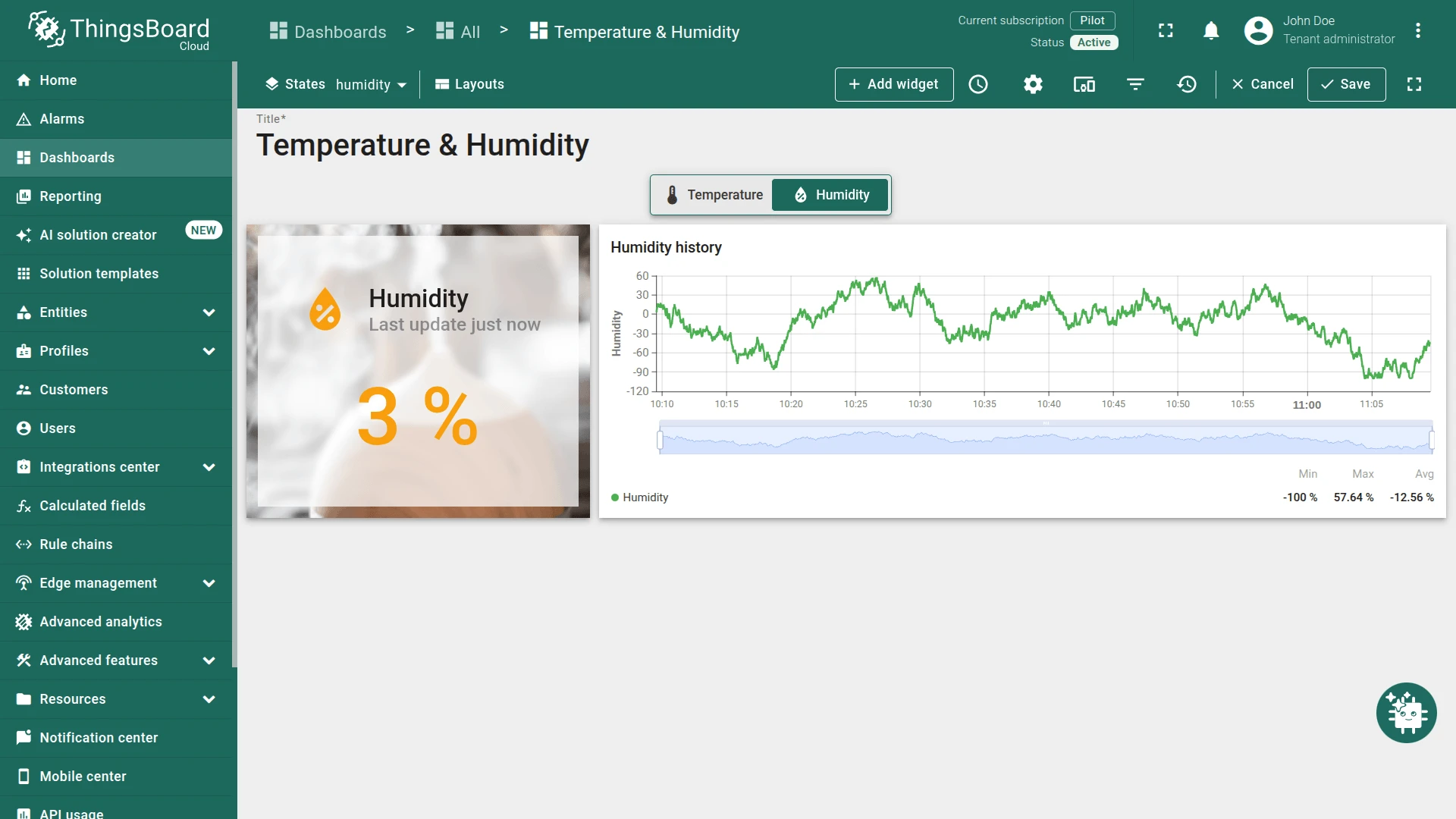
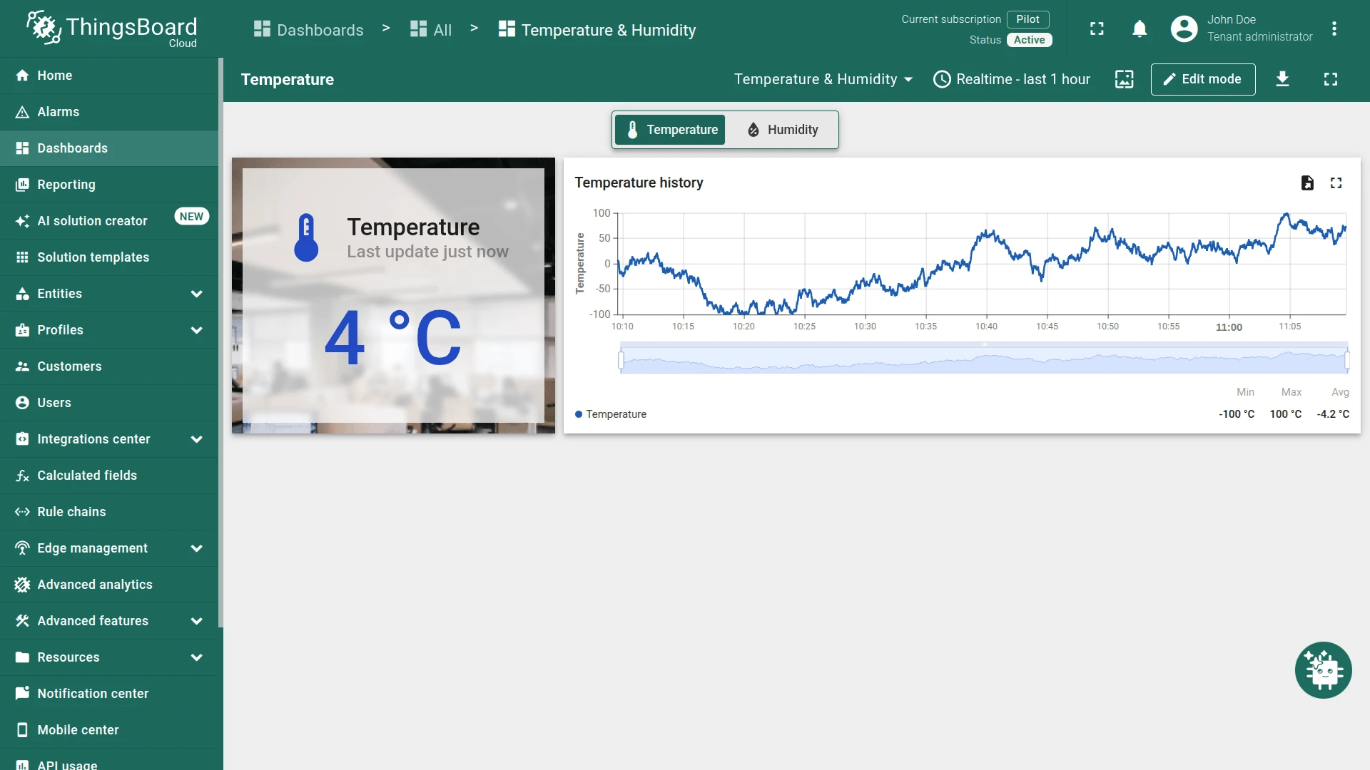
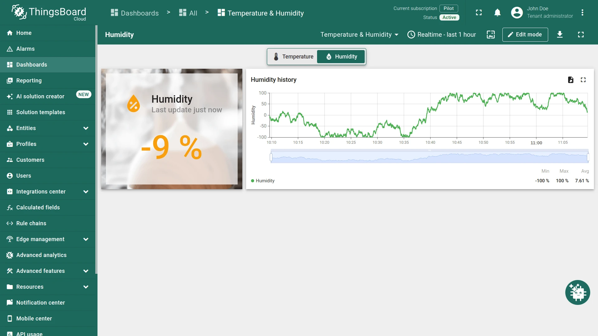
Section titled “Example”Temperature and humidity dashboard switcher
Section titled “Temperature and humidity dashboard switcher”Scenario: A Temperature & Humidity dashboard has two states: Temperature (root) and Humidity. Each state shows a current value card and a historical data chart with randomly generated data. A Two-segment button at the top lets users switch between the states and automatically highlights the active one.
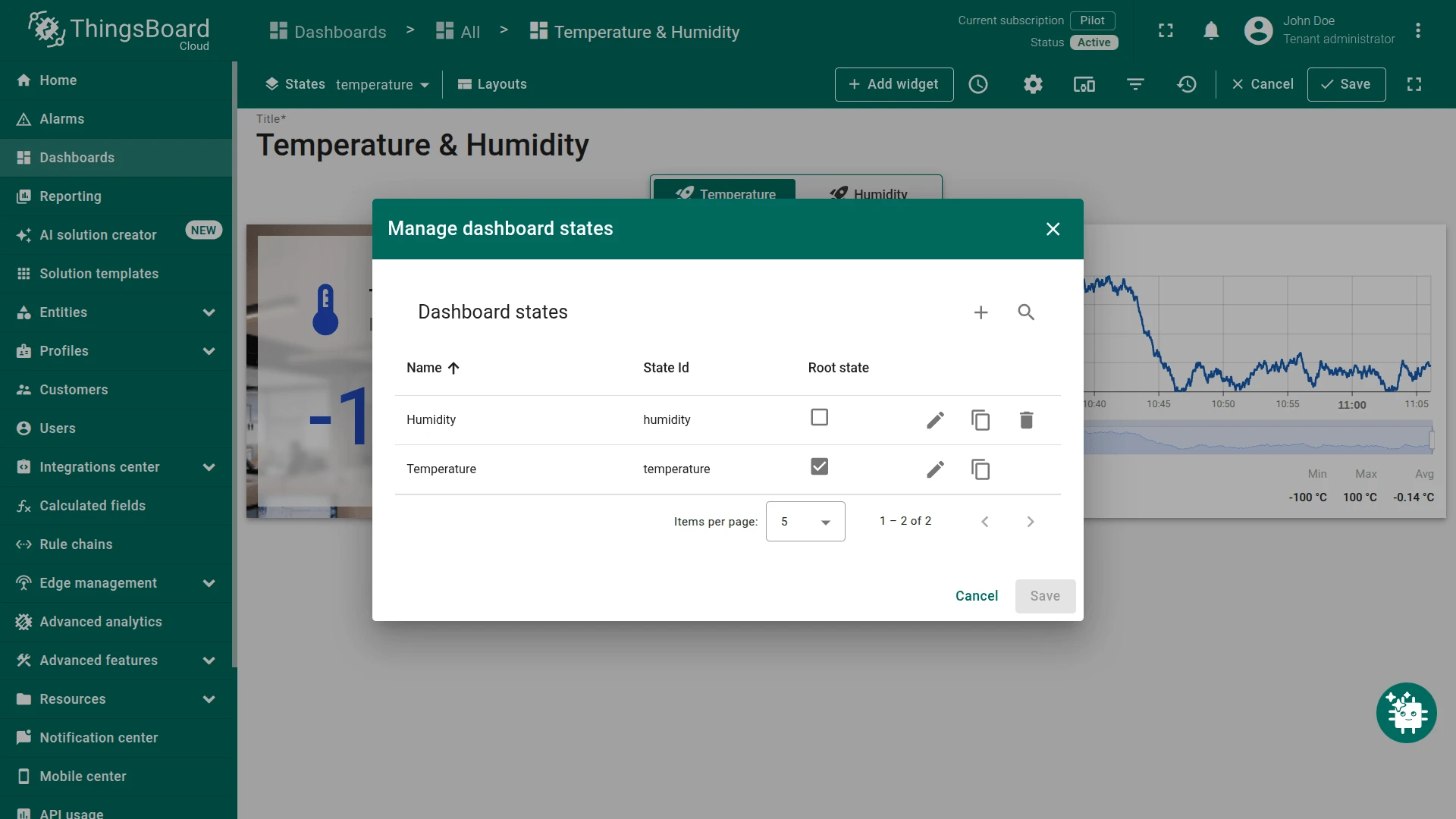
Step 1. Create the dashboard states.
Create a dashboard named Temperature & Humidity, then open Manage dashboard states and add two states:
- Temperature — set as the root state, State id:
temperature. - Humidity — State id:
humidity.
Add a current value card and a time-series line chart to each state. Use a function datasource to generate random data for testing.
Step 2. Add the Two-segment button to the Temperature state.
Switch to the Temperature state. Click Add widget, select the Buttons bundle, and choose Two-segment button.
Leave the Datasource device empty — no device data is needed for navigation-only behavior.
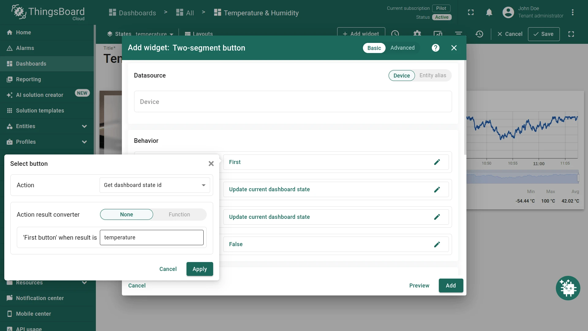
Step 3. Configure behavior.
Open Select button and set:
- Action: Get dashboard state id
- Action result converter: None
- “First button” when result is:
temperature(String)
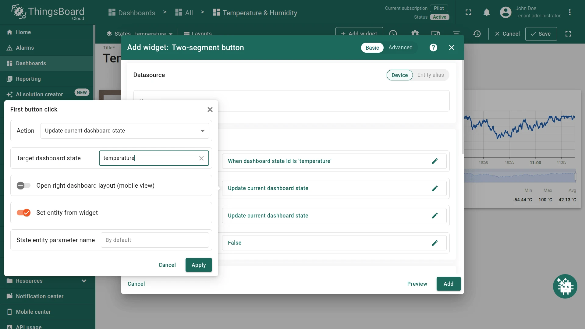
Open First button click and set:
- Action: Update current dashboard state
- Target dashboard state:
temperature
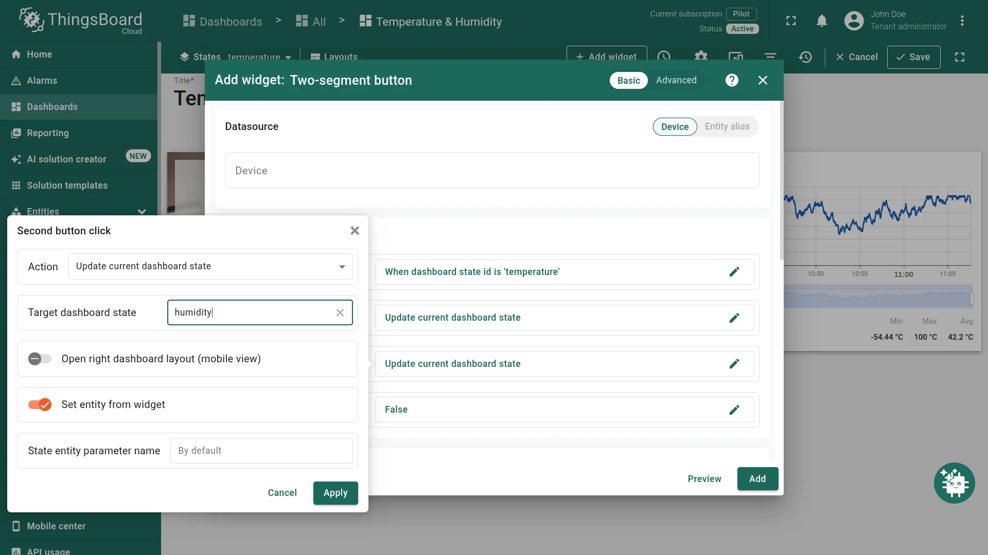
Open Second button click and set:
- Action: Update current dashboard state
- Target dashboard state:
humidity
Step 4. Configure button appearance.
In the First tab: set Label to Temperature and choose a thermometer icon.
In the Second tab: set Label to Humidity and choose a humidity drop icon.

Step 5. Save the widget.
Click Add, position the widget at the top of the Temperature state.

Step 6. Copy the widget to the Humidity state.
Right-click the widget and select Copy.
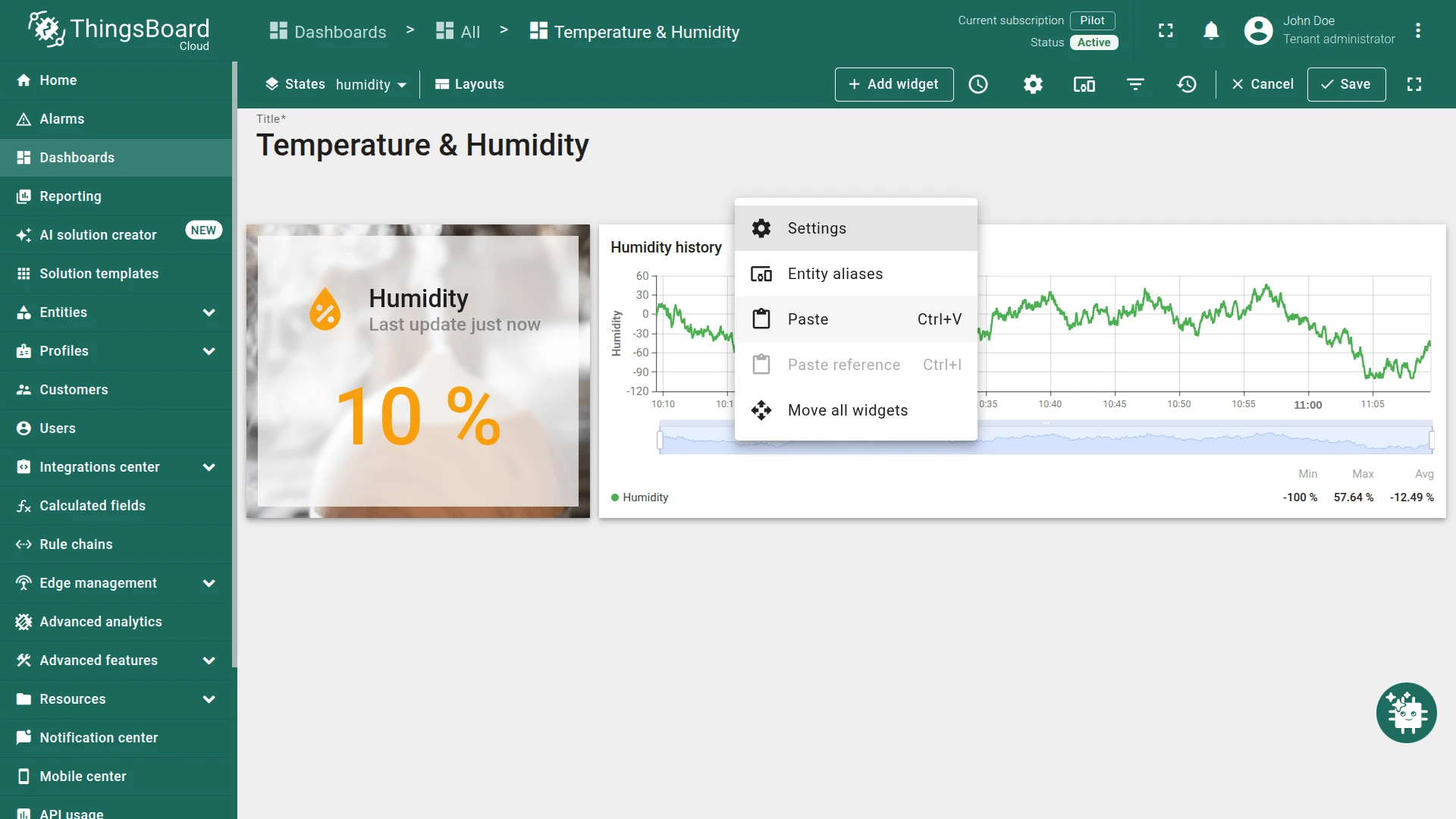
Switch to the Humidity state using the States dropdown in the top toolbar. Right-click on the dashboard canvas and select Paste.
Step 7. Save the dashboard. Click Save on the toolbar.
Result: The widget automatically highlights the active state on both views — no additional configuration is required on the Humidity state because the selection logic is driven by the current dashboard state id.
Troubleshooting
Section titled “Troubleshooting”Neither segment appears selected after load
| Cause | Solution |
|---|---|
| Select button condition does not match | Confirm the condition value matches the actual attribute, telemetry, or state id value exactly. Values are case-sensitive. |
| Attribute key not found on device | Open Devices → Attributes and confirm the key exists with a value. |
| Wrong attribute scope | Match the scope to the actual attribute type (Client / Server / Shared). |
| Function converter always returns the same value | Review the Function body; check for a missing return statement or incorrect comparison. |
Clicking a segment has no effect
| Cause | Solution |
|---|---|
| Target dashboard state does not exist | Confirm the state name in the action matches the actual state id in the dashboard. Names are case-sensitive. |
| Action type is Do nothing | Open the click action and select the correct action type. |
| Widget is in disabled state | Check the Disabled state condition — if the condition is unintentionally true, the widget is locked. |
Widget is always disabled
| Cause | Solution |
|---|---|
| Disabled state condition always resolves to true | Review the Disabled state condition value or Function body. |
| Attribute or telemetry key not found | Confirm the key exists on the target device. |
| Wrong attribute scope | Match the scope to the actual attribute type (Client / Server / Shared). |
Was this helpful?