Static Widget
Static widgets have no data subscription. They don’t connect to any device or entity — they just render content from their own settings. The platform calls self.onInit() once when the widget loads; self.onDataUpdated() is never called.
When to Use Static Widgets
Section titled “When to Use Static Widgets”Use this type for content that is independent of device data:
- Info panels, help text, or documentation cards
- Navigation menus linking to dashboard states
- Branded headers, logos, or custom banners
- Embedded HTML, iframes, or external content
- Layout utilities (spacers, dividers, section labels)
The trade-off is simplicity: no datasource to configure, no subscription to manage, fewer moving parts. When you need device data, switch to Latest Values or Time-Series.
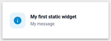
Example 1: Configurable Info Card
Section titled “Example 1: Configurable Info Card”A card with a configurable title, message, and icon — a practical extension of the Hello World widget from the overview, adding more settings fields and a cleaner layout.
-
Open Widget Library → open your bundle → click + → select Static as the type.
-
In the HTML tab, paste:
<div class="info-card"><div class="info-icon" id="info-icon-wrap"><i class="material-icons" id="info-icon-text">info</i></div><div class="info-body"><div class="info-title" id="info-title">Title</div><div class="info-message" id="info-message"></div></div></div> -
In the CSS tab, paste:
.info-card {width: 100%;height: 100%;display: flex;align-items: center;gap: 16px;padding: 16px;box-sizing: border-box;}.info-icon {width: 52px;height: 52px;border-radius: 14px;display: flex;align-items: center;justify-content: center;flex-shrink: 0;background: var(--tb-primary-50);}.info-icon i {font-size: 30px;color: var(--tb-primary-500);}.info-body {display: flex;flex-direction: column;gap: 4px;min-width: 0;}.info-title {font-size: 16px;font-weight: 600;color: #101828;}.info-message {font-size: 14px;color: #667085;line-height: 1.5;} -
In the JavaScript tab, paste:
self.onInit = function() {let s = self.ctx.settings || {};let container = self.ctx.$container[0];let iconWrap = container.querySelector('#info-icon-wrap');let iconEl = container.querySelector('#info-icon-text');let titleEl = container.querySelector('#info-title');let msgEl = container.querySelector('#info-message');iconEl.textContent = s.icon || 'info';titleEl.textContent = s.title || 'Information';msgEl.textContent = s.message || '';if (s.iconBackground) {iconWrap.style.background = s.iconBackground;}if (s.iconColor) {iconEl.style.color = s.iconColor;}};self.typeParameters = function() {return {datasourcesOptional: true,dataKeysOptional: true};};Because this is a Static widget, there’s no
onDataUpdated()— everything happens inonInit(). Settings are read directly fromself.ctx.settingsand written to the DOM usingquerySelectorandtextContent.datasourcesOptional: trueanddataKeysOptional: truetell the platform not to require a datasource when adding this widget to a dashboard. -
In the Settings form tab, click Import from JSON → select the JSON content tab → paste:
[{"id": "title","name": "Title","group": "Content","type": "text","default": "Information","required": false},{"id": "message","name": "Message","group": "Content","type": "text","default": "","required": false},{"id": "icon","name": "Icon","group": "Icon","type": "icon","default": "info","required": false},{"id": "iconBackground","name": "Icon background color","group": "Icon","type": "color","default": "","required": false},{"id": "iconColor","name": "Icon color","group": "Icon","type": "color","default": "","required": false}] -
Click Run (or
Ctrl+Enter) to preview — you should see an icon badge on the left and placeholder text on the right. Click Save → name it “Info Card”. -
Add the widget to a dashboard — no datasource required. Open widget settings → Advanced tab to set the title, message, and icon.
Example 2: Navigation Menu
Section titled “Example 2: Navigation Menu”Two navigation styles for different use cases — choose based on what should happen when a user clicks a menu item.
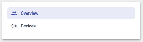
Vertical Navigation — Switch between States
Section titled “Vertical Navigation — Switch between States”A vertical icon-and-label sidebar that navigates the entire dashboard to a different state. Use this for top-level navigation between unrelated pages (e.g. Overview → Devices → Settings).
-
Open Widget Library → open your bundle → click + → select Static as the type.
-
In the HTML tab, paste:
<div class="nav-menu"><div class="nav-item"*ngFor="let item of navItems"[ngClass]="{'active': item.active}"(click)="navigate(item)"><i class="material-icons nav-icon">{{item.icon}}</i><span class="nav-label">{{item.name}}</span></div></div> -
In the CSS tab, paste:
.nav-menu {width: 100%;height: 100%;display: flex;flex-direction: column;overflow-y: auto;padding: 8px;box-sizing: border-box;gap: 2px;}.nav-item {display: flex;align-items: center;gap: 12px;padding: 10px 12px;border-radius: 8px;cursor: pointer;color: #344054;transition: background 0.15s;}.nav-item:hover {background: #f2f4f7;}.nav-item.active {background: var(--tb-primary-50);color: var(--tb-primary-500);}.nav-icon {font-size: 20px;flex-shrink: 0;}.nav-label {font-size: 14px;font-weight: 500;} -
In the JavaScript tab, paste:
self.onInit = function() {let s = self.ctx.settings || {};let items = Array.isArray(s.menuItems) ? s.menuItems : [];let currentState = self.ctx.stateController.getStateId? self.ctx.stateController.getStateId(): (self.ctx.stateController.getStateParams().state || 'default');self.ctx.$scope.navItems = items.map(function(item) {return { ...item, active: item.action === currentState };});self.ctx.$scope.navigate = function(item) {self.ctx.$scope.navItems.forEach(function(i) {i.active = (i.action === item.action);});self.ctx.stateController.openState(item.action, {}, false);self.ctx.detectChanges();};};self.typeParameters = function() {return {datasourcesOptional: true,dataKeysOptional: true};};stateController.openState(stateId, params, openRightLayout)navigates to the specified state.stateIdmust match a state ID in the dashboard’s States panel. The active item is detected by comparing each item’sactionagainst the current state ID. -
In the Settings form tab, click Import from JSON → select the JSON content tab → paste:
[{"id": "menuItems","name": "Menu items","type": "array","required": true,"arrayItemType": "fieldset","properties": [{ "id": "name", "name": "Name", "type": "text", "required": true, "fieldClass": "flex" },{ "id": "action", "name": "Action (state ID)", "type": "text", "required": true, "fieldClass": "flex" },{ "id": "icon", "name": "Icon", "type": "text", "required": true, "fieldClass": "flex" }]}]action— the target state ID, exactly as shown in the dashboard’s States panelicon— a Material Icon name (e.g.home,devices,settings)
-
Click Save → name it “Navigation Menu”.
-
Add to a dashboard. In widget settings, open the Advanced tab and configure the menu items with icon, name, and state ID. The active item highlights automatically based on the current state.
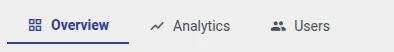
Horizontal Navigation — Switch between Sub-States
Section titled “Horizontal Navigation — Switch between Sub-States”A horizontal tab bar that stays on the same dashboard state and updates a subState URL parameter instead of navigating away. Use this for detail pages with multiple tabs (Overview, Analytics, Users) where shared widgets like a header should not be duplicated across states.
Each tab triggers a named action configured in the widget’s Actions tab, giving full flexibility over what happens on click (update state params, navigate, custom function) without changing the widget code. A Markdown/HTML Card content panel on the same state reads the subState parameter and renders the matching embedded dashboard state.
-
Open Widget Library → open your bundle → click + → select Static as the type.
-
In the HTML tab, paste:
<div class="mainContainer"><div class="navigation"><div class="item"*ngFor="let item of menu"[ngClass]="item.active ? 'active' : ''"(click)="onActionClick($event, item)"><div class="navItem"><mat-icon [ngClass]="item.active ? 'active' : ''" class="menuIcon">{{item.icon}}</mat-icon>{{item.name}}</div></div></div></div> -
In the CSS tab, paste:
.mainContainer {width: 100%;height: 100%;display: flex;justify-content: space-between;align-items: center;}.navigation {display: flex;width: 100%;height: 100%;align-items: center;overflow: auto hidden;}.navigation .item {color: #495057;cursor: pointer;font-weight: 400;padding: 5px 20px;font-size: 14px;min-width: 100px;}.menuIcon {font-size: 16px;display: flex;align-items: center;}.navigation .item.active {color: var(--tb-primary-500) !important;font-weight: bold;border-bottom: 2px solid var(--tb-primary-500);}.navigation .menuIcon.active {color: var(--tb-primary-500) !important;}.navItem {display: flex;align-items: center;justify-content: center;}@media only screen and (max-width: 500px) {.menuIcon {display: none;}.navigation .item {text-align: center;padding: 5px;}} -
In the JavaScript tab, paste:
let menu = [{ name: 'Overview', action: 'overview', active: false },{ name: 'Usage', action: 'usage', active: false },{ name: 'Trims', action: 'trims', active: false }];self.onInit = function() {var $injector = self.ctx.$scope.$injector;var utils = $injector.get(self.ctx.servicesMap.get('utils'));let settings = utils.deepClone(self.ctx.settings) || {};self.ctx.$scope.menu = menu;let menuFromSettings = settings.menuItems;if (menuFromSettings && menuFromSettings.length > 0) {menuFromSettings = menuFromSettings.map(item => ({name: item.name,action: item.action,active: false,icon: item.icon}));self.ctx.$scope.menu = menuFromSettings;}if (self.ctx.$scope.ctx.stateController) {let params = self.ctx.$scope.ctx.stateController.getStateParams();if (params['subState'] && menuFromSettings.map(x => x.action).includes(params['subState'])) {makeActive(params['subState']);} else {self.ctx.$scope.menu[0].active = true;}self.ctx.detectChanges();}function makeActive(value) {self.ctx.$scope.menu.forEach(item => {item.active = item.action === value;});}self.ctx.$scope.onActionClick = function(event, item) {let params = self.ctx.$scope.ctx.stateController.getStateParams();let actionEventDescriptors = self.ctx.$scope.ctx.actionsApi.getActionDescriptors('elementClick');let actionEvent;if (actionEventDescriptors.length) {actionEventDescriptors.forEach(action => {if (action.name === item.action) {actionEvent = action;}});params.subState = item.action;makeActive(item.action);setTimeout(() => {self.ctx.$scope.ctx.actionsApi.handleWidgetAction(params,actionEvent,params['entityId'] || null,params['entityName'] || null);}, 0);}};};self.actionSources = function() {return {'elementClick': {name: 'widget-action.element-click',multiple: true}};};self.onDestroy = function() {};Key points:
self.actionSources()withmultiple: trueadds a separate configurable action slot per tab in the widget’s Actions tab.actionsApi.getActionDescriptors('elementClick')retrieves those actions; each is matched to a tab byaction.name === item.action.handleWidgetAction(params, actionEvent, entityId, entityName)fires the matched action — type is configured in the UI, not hardcoded.params.subState = item.actionupdates the param before firing so the content panel widget receives the new value.setTimeout(..., 0)defers the action by one tick to let Angular finish change detection first.- On init,
getStateParams().subStateis read to restore the active tab on page load or browser navigation.
-
In the Settings form tab, click Import from JSON → select the JSON content tab → paste:
[{"id": "menuItems","name": "Menu items","type": "array","arrayItemType": "fieldset","required": true,"properties": [{ "id": "name", "name": "Name", "type": "text", "required": true, "fieldClass": "flex" },{ "id": "action", "name": "Action name", "type": "text", "required": true, "fieldClass": "flex" },{ "id": "icon", "name": "Icon", "type": "icon", "default": "star" }]}]The
actionvalue for each tab must exactly match the Action name configured in the widget’s Actions tab. -
Click Save → name it “Navigation Menu”.
-
Add to a dashboard. Open the widget’s Actions tab and add one action per tab:
- Action source: Element click
- Action name: must match the
actionvalue from settings (e.g.overview,analytics,users) - Action type: Custom action
In the custom action function, update
subState, callupdateAliases()to trigger the content panel to re-render, then update the state params:let controller = widgetContext.$scope.ctx.stateController;let params = controller.getStateParams();params.subState = 'Overview';widgetContext.updateAliases();controller.updateState('shelterDetails', params);Repeat for each tab, changing
params.subStateto match that tab’s action value (e.g.'Analytics','Users'). TheupdateStatefirst argument must match the ID of the current container state as configured in the dashboard’s States panel.
Next Steps
Section titled “Next Steps”- Latest Values — add telemetry data to a static-style card
- Widget Patterns — advanced navigation: breadcrumbs, tab bars, role-based menus
- Widget API Reference —
stateController,typeParameters, and lifecycle reference
Was this helpful?