Long Bottom Filter
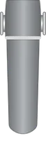
The Long bottom filter widget renders a tall vertical filter symbol with the pipe connection at the bottom. Use it to represent a larger or higher-capacity filter unit in water treatment plants, pool filtration loops, or industrial process pipelines — wherever a tall, bottom-inlet filter profile matches the physical equipment.
Key Capabilities
Section titled “Key Capabilities”- Place a visual filter element in a fluid system diagram.
- Trigger a dashboard action when the widget symbol is clicked.
Add the Widget
Section titled “Add the Widget”- Open the dashboard and switch to edit mode.
- Click Add widget at the top, or the Add new widget icon in the center of the screen.
- Open the Traditional SCADA fluid system widget bundle.
- Select the filter widget for your use case.
- Configure the widget settings, then click Add.
Target Device
Section titled “Target Device”The widget can optionally connect to a Device or an Entity alias. A device connection is only needed when the On click action requires entity context, such as navigating to a device-specific dashboard state or passing an entity to another dashboard.
SCADA Symbol
Section titled “SCADA Symbol”The SCADA symbol defines the visual shape of the widget. Each filter widget has a pre-selected symbol from the Traditional SCADA fluid system bundle. To use a different symbol, click Browse SCADA symbol from gallery and choose one from the library, or upload your own.
Behavior
Section titled “Behavior”Behavior parameters define how the widget responds to user interaction.
| Parameter | Default | Description |
|---|---|---|
| On click | Do nothing |
Action triggered when the user clicks the widget symbol. See Click action configuration. |
Click Action Configuration
Section titled “Click Action Configuration”Applies to On click. Select one action type from the list below.
-
Do nothing
The symbol is clickable but performs no action. Use while testing layouts or as a placeholder.
-
Navigate to new dashboard state
Switches to a different view within the same dashboard, like opening a filter details screen.
Parameter Description Target dashboard state The state to open (required). Open right dashboard layout (mobile view) Opens a side panel instead of replacing the view (mobile only). Set entity from widget Passes the current entity to the target state. State entity parameter name The key the entity is passed under. Dashboard state display option Normal (same view), In separate dialog (popup), or In popover (inline overlay). -
Update current dashboard state
Updates the context of the current view, like switching the selected device, without navigating away.
Parameter Description Target dashboard state The state to switch to (optional). Open right dashboard layout (mobile view) Opens a side panel on mobile. Set entity from widget Passes the current entity to the updated state. State entity parameter name The key the entity is passed under. -
Navigate to other dashboard
Opens a completely different dashboard, like jumping from a fluid system overview to a filter performance dashboard.
Parameter Description Target dashboard The dashboard to open (required). Target dashboard state The specific view to open within that dashboard. Open in a new browser tab Opens the dashboard without leaving the current page. Set entity from widget Passes the current entity to the other dashboard. State entity parameter name The key the entity is passed under. -
Custom action
Runs custom JavaScript on click to implement any behavior not covered by the built-in options. Use it to make HTTP requests, open custom dialogs, call other widget APIs, or interact with external services. The function receives:
$event,widgetContext,entityId,entityName,additionalParams,entityLabel. -
Custom action (with HTML template)
Same as Custom action, but also renders a custom HTML panel or dialog when the symbol is clicked. The function receives an additional
htmlTemplateparameter:$event,widgetContext,entityId,entityName,htmlTemplate,additionalParams,entityLabel.Parameter Description Resources External scripts and styles loaded before the action runs. CSS Styling for the HTML template. HTML Layout of the rendered dialog or panel. JS Action logic. -
Mobile action
Triggers a native device feature inside a ThingsBoard mobile app, like the camera or QR scanner.
Parameter Description Mobile action type Take picture from gallery, Take photo, Open map directions, Open map location, Scan QR Code, Make phone call, Get phone location, Take screenshot, or Device provision. -
Open URL
Opens a website or external link when clicked.
Parameter Description URL The address to open (required). Open in a new browser tab Keeps the current dashboard open while opening the link.
Card Appearance
Section titled “Card Appearance”The Card appearance section controls the widget container style.
| Setting | Default | Description |
|---|---|---|
| Background | Transparent | Card background color. |
| Show card buttons | Fullscreen | Buttons shown on the card when hovered. |
| Card border radius | 0px |
Rounding of card corners. |
| Card padding | 12px |
Inner spacing between the card edge and widget content. |
Solution Templates
Section titled “Solution Templates”These widgets are used in the following ready-made solution templates built on the Traditional SCADA fluid system bundle:
- SCADA Swimming pool — a complete swimming pool monitoring dashboard built with pipe, pump, valve, and gauge widgets from the Traditional SCADA fluid system bundle.
Was this helpful?