Progress Bar
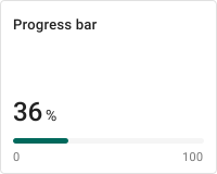
The Progress bar widget displays a numeric value as a horizontal bar that fills proportionally within a configured min/max range. Use it wherever the relative position of a reading within its bounds matters as much as the raw number — battery level, tank fill, CPU usage, completion percentage, or any bounded metric where a glance at the fill communicates status instantly.
Key Capabilities
Section titled “Key Capabilities”- Display any numeric telemetry or attribute as a filled horizontal bar against a defined range.
- Two layout options: Default (large value above the bar with range ticks) and Simplified (compact inline label and value).
- Four bar color modes: constant, gradient, value range segments, or a JavaScript color function — including threshold-based color bands without writing code.
- Configurable min/max range, unit label, decimal precision, and optional range tick markers.
- Optional icon and auto-scaling text to fit any widget size.
Adding the Widget
Section titled “Adding the Widget”- Open the dashboard in edit mode. Click Add widget in the top toolbar, or click the Add new widget icon in the center of an empty dashboard.
- In the widget bundle selection dialog, find and click Cards.
- Select the Progress bar widget.
- Configure the datasource and appearance, then click Add.
Configuration
Section titled “Configuration”All settings in this section use Basic mode — a quick-start configuration covering the essentials. For finer widget controls like title font, card style, and tooltip, switch to the Advanced tab.
Datasource
Section titled “Datasource”Select the source of the displayed value:
- Device — a specific device; the bar shows the latest telemetry or attribute value from this device.
- Entity alias — a set of entities matched by an entity alias; use this when the target device is selected dynamically at runtime.
Add exactly one data key — a telemetry key or attribute — whose latest numeric value will determine the bar fill.
Appearance
Section titled “Appearance”Controls the widget layout, label, icon, value display, and range.
| Setting | Description |
|---|---|
| Layout | Default — shows a large numeric value above the bar with range ticks below. Simplified — places the title and value on one line with a compact bar underneath. |
| Auto scale | Automatically adjusts text sizes to fit the widget area when resized. |
| Title | Label shown on the card. Supports {x} dynamic placeholders: entityName and entityLabel. Configure font and color independently. |
| Icon | Optional icon displayed on the card. Set size and color. Disabled by default. |
| Value | Displays the resolved numeric value. Configure the unit suffix (like %), decimal places, and font color. |
| Range | Defines the min and max bounds of the bar. The bar fills proportionally between these values. Default: 0–100. |
| Range ticks | Displays the min and max labels below the bar ends. Toggle on/off; configure font and color. |
Controls the fill color and background of the progress bar.
| Setting | Description |
|---|---|
| Bar color | Fill color of the bar. Supports four modes — see below. |
| Bar background | Background color of the unfilled portion of the bar track. |
Bar Color Modes
Section titled “Bar Color Modes”| Mode | Description |
|---|---|
| Constant | Single fixed color for the entire bar fill. |
| Gradient | Color transitions smoothly from one end of the range to the other. Configure start and end values and color stops. |
| Range | Assigns a specific color to each defined value segment (From / To). Add multiple segments to create threshold-based color bands — for example, green for 0–60, yellow for 60–80, red for 80–100. |
| Function | A JavaScript function f(value) that returns a CSS color string. Use for custom or non-linear coloring logic. |
Card Appearance
Section titled “Card Appearance”| Setting | Description |
|---|---|
| Background | Solid color or image background for the card. |
| Show card buttons | Toggle Data export and Fullscreen buttons in the widget header. |
| Card border radius | Corner rounding in pixels. |
| Card padding | Spacing between card content and its border. |
Actions
Section titled “Actions”The Progress bar supports the Widget header button action — a button placed in the widget header that triggers a configured action when clicked.
Example
Section titled “Example”Battery Level Indicator with Threshold Colors
Section titled “Battery Level Indicator with Threshold Colors”Goal: Display the battery level from a device named Smart Device as a progress bar. The bar turns red when critically low, yellow when moderate, and green when healthy.
Prerequisites: A device named Smart Device that sends batteryLevel (0–100) as a telemetry key.
Step 1. Add the widget. Open your dashboard in edit mode, click Add widget, select Cards, then choose Progress bar.
Step 2. Configure the datasource. Set Datasource type to Device, select Smart Device, and add batteryLevel as the data key.
Step 3. Configure appearance. Set Title to Battery. Set Value units to % and decimals to 0. Leave Range at min 0 / max 100.
Step 4. Configure bar color. Open Bar color → select Range mode. Add three segments:
| From | To | Color |
|---|---|---|
| 0 | 20 | Red (#F44336) |
| 20 | 60 | Yellow (#FFC107) |
| 60 | 100 | Green (#4CAF50) |
Step 5. Save. Click Add, resize and reposition as needed, then click Save on the dashboard toolbar.
Result: The battery level bar fills proportionally and changes color based on the current charge — red when critically low, yellow when moderate, green when healthy. The card updates automatically as new telemetry arrives.
Troubleshooting
Section titled “Troubleshooting”Bar Is Empty or Shows No Fill
| Cause | Solution |
|---|---|
| No data received | Open Devices → Latest telemetry and verify the device is sending the configured data key. Key names are case-sensitive. |
| Value outside the configured range | If the value is below min or above max, the bar may render empty or fully filled. Adjust the Range settings to match your data. |
| Entity alias resolves to no entities | Open Entity aliases in the dashboard and verify the alias returns results. |
Bar Color Does Not Change with Value
| Cause | Solution |
|---|---|
| Bar color set to Constant | Switch Bar color to Gradient, Range, or Function mode to enable value-dependent coloring. |
| Range segments do not cover all values | In Range mode, ensure segments together span the full min–max range with no gaps. |
Title Shows Entity Name Instead of Custom Text
| Cause | Solution |
|---|---|
| Dynamic placeholder in use | The Title field supports {x} placeholders (entityName, entityLabel). Replace with your desired static text if dynamic substitution is not needed. |
Was this helpful?