Actions
Widget actions allow users to trigger predefined operations from a widget through interactions such as clicking a button, a row, or the widget title.
Actions are configured per widget and triggered by specific interactions called action sources. Available sources depend on the widget type, while action types are the same for all widgets.
Actions can be used to navigate between dashboards, interact with devices, update entity data, or execute custom logic.
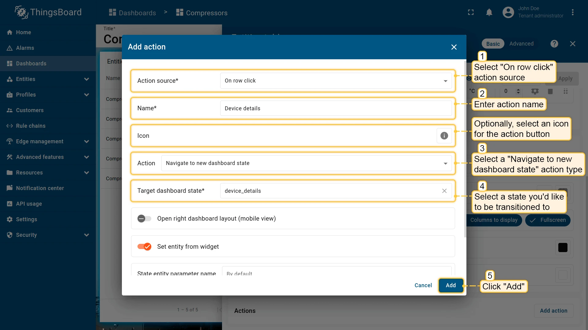
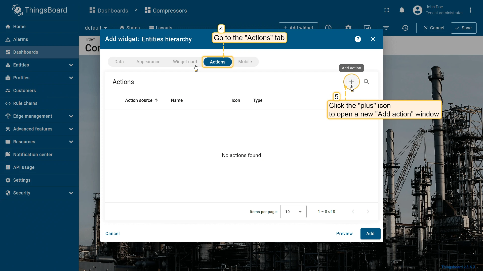
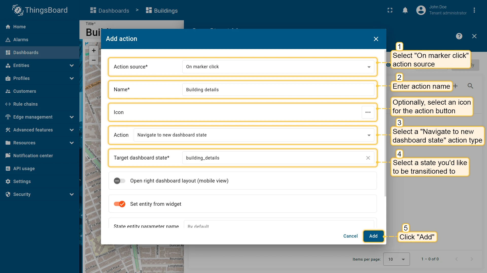
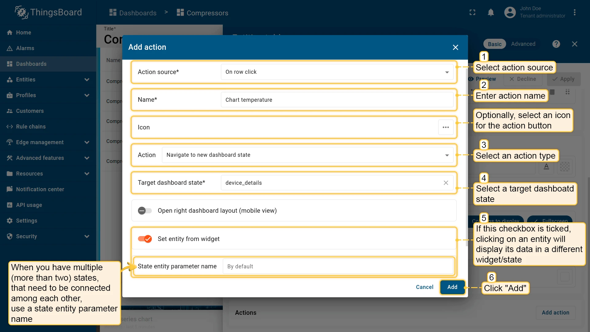
Add action
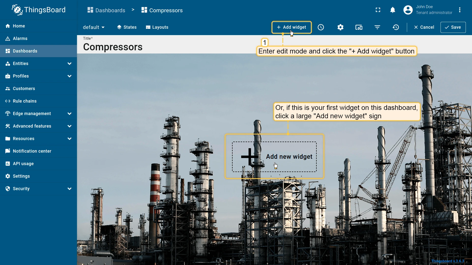
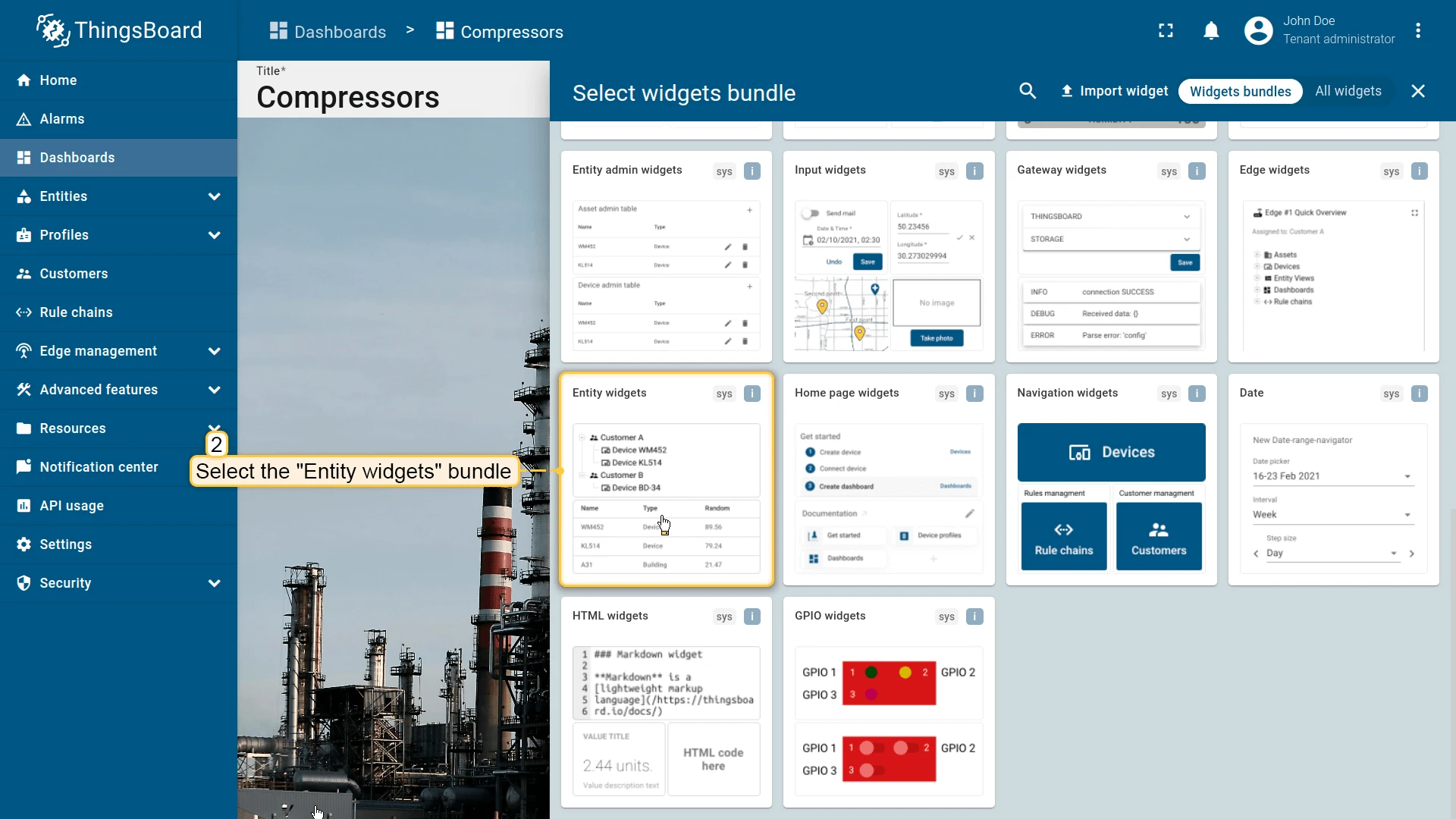
Section titled “Add action”ThingsBoard widgets have two edit modes, and the steps for adding an action differ slightly between them:
- Basic — a simplified settings panel that opens when you click the pencil icon on the widget. Actions are in a dedicated Actions section within the panel, managed through a modal list.
- Advanced — a full-screen tabbed editor opened from the basic panel. Actions have their own Actions tab with a flat list and a + button — no intermediate modal.
Both modes use the same Add action dialog to configure source, name, icon, and type.
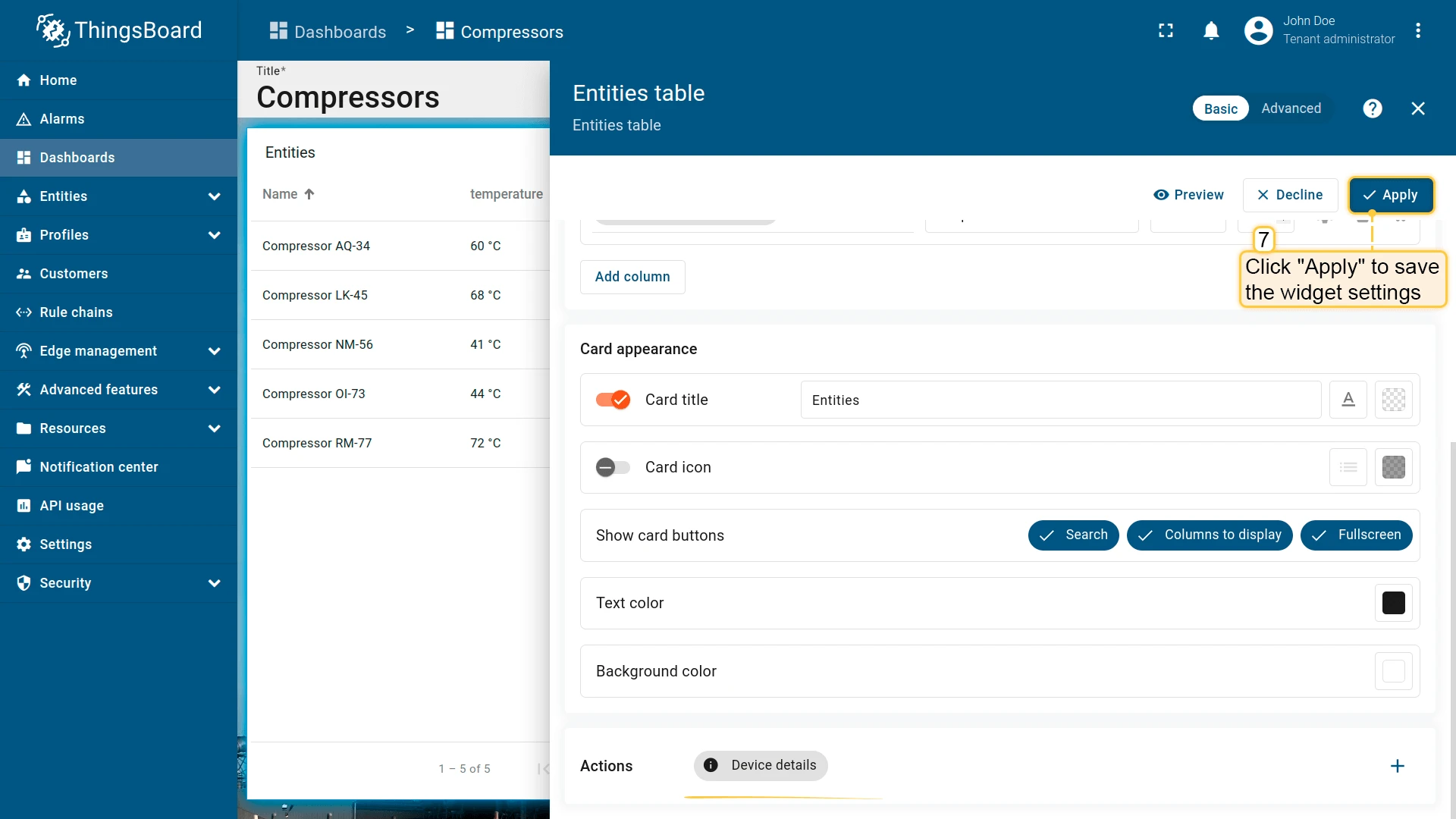
Basic widget configuration
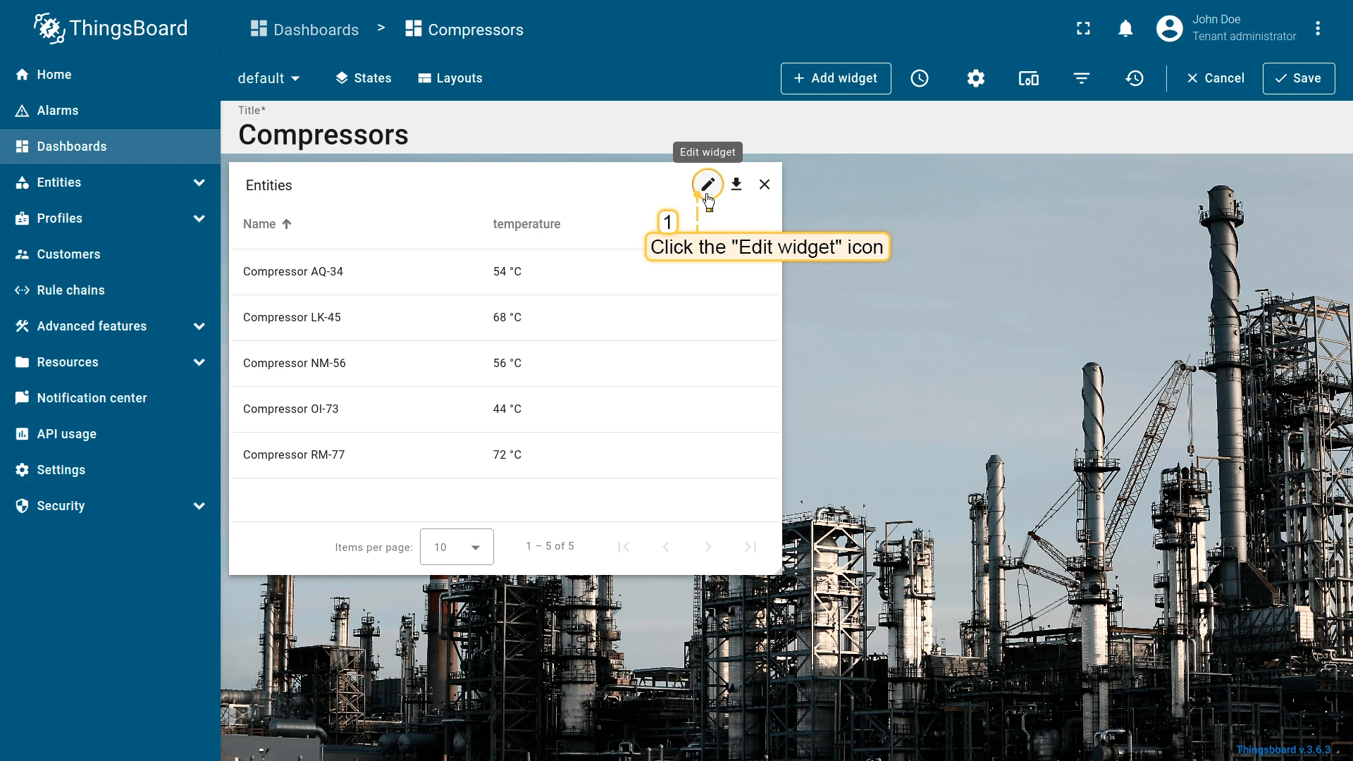
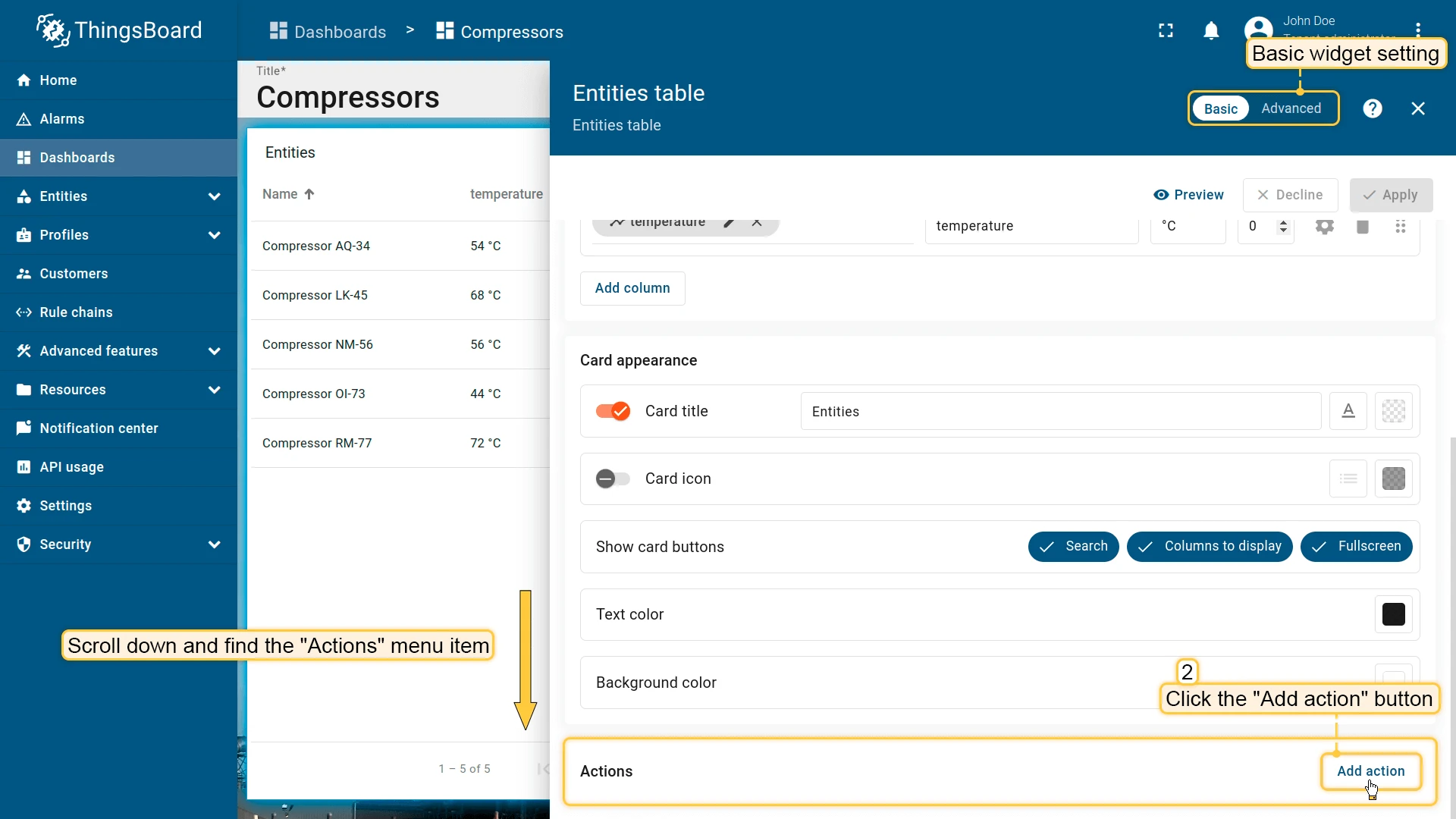
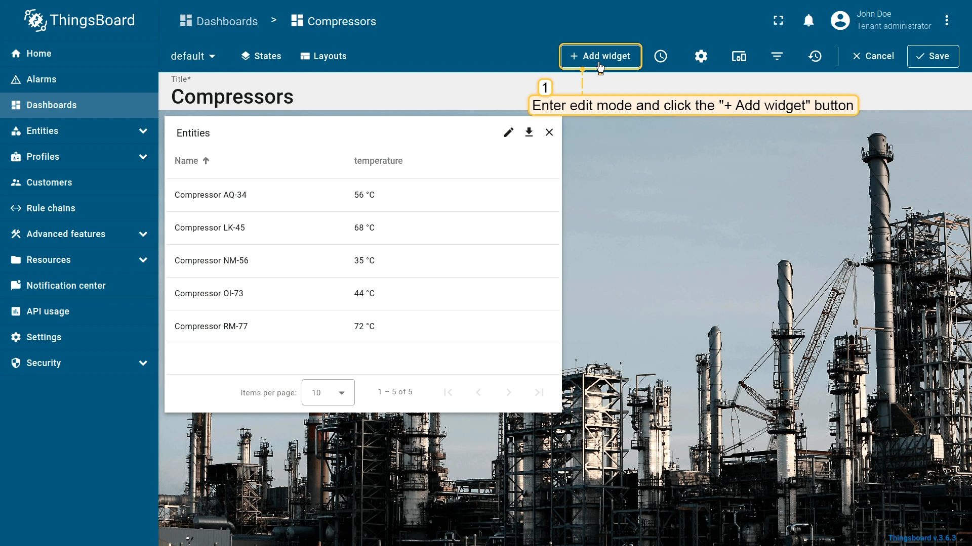
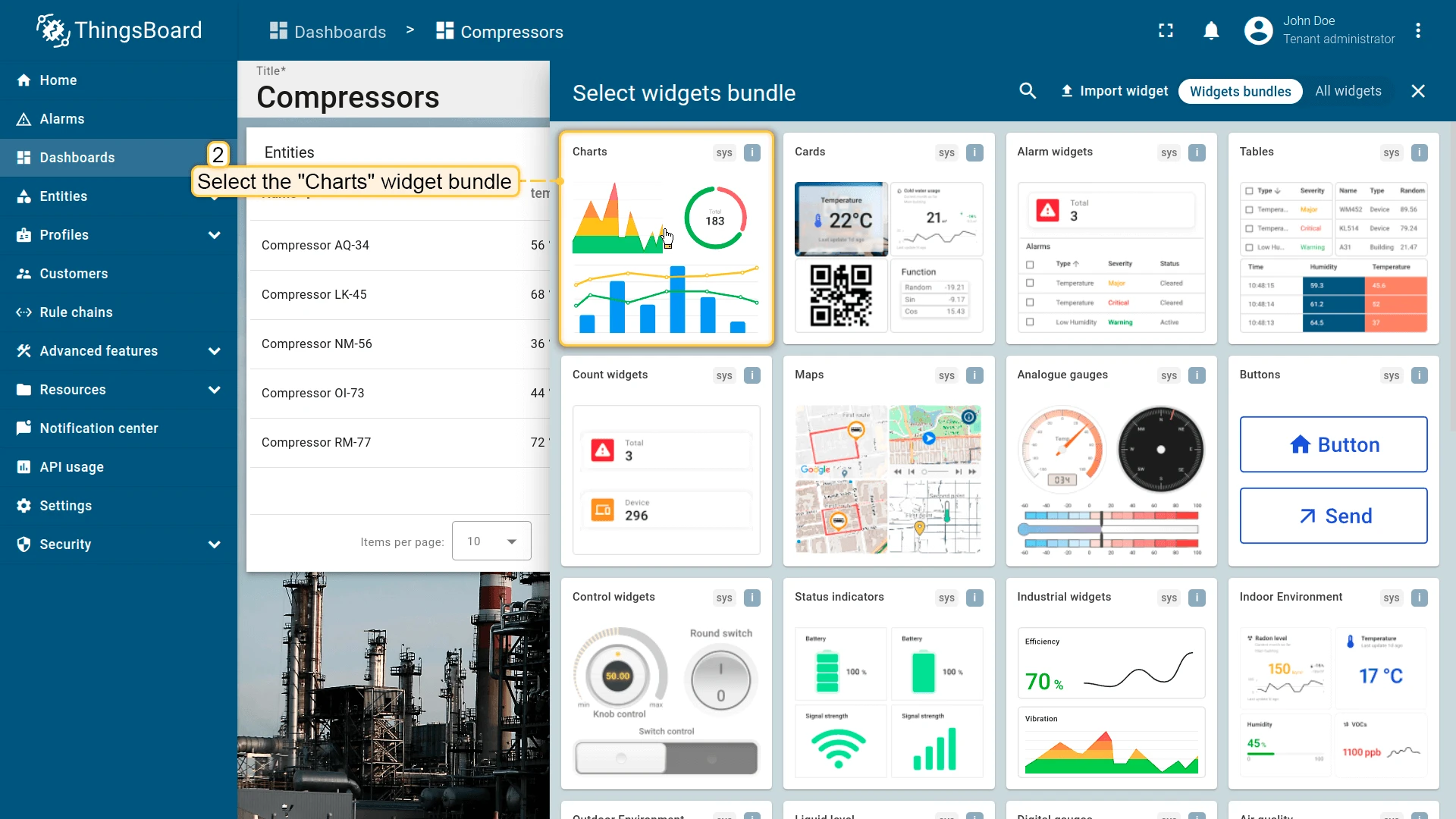
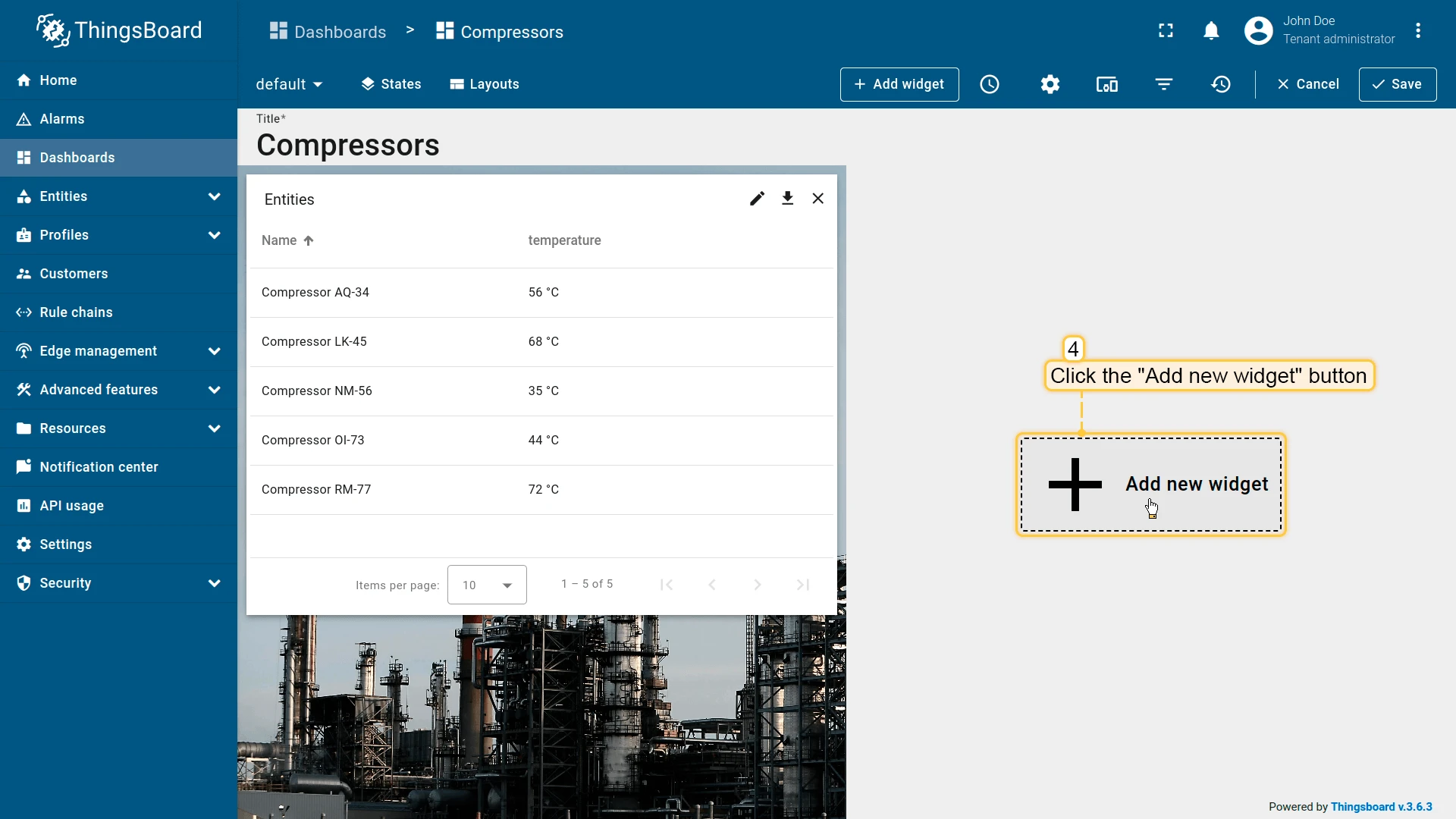
- Click the pencil icon on the widget to open its settings panel.
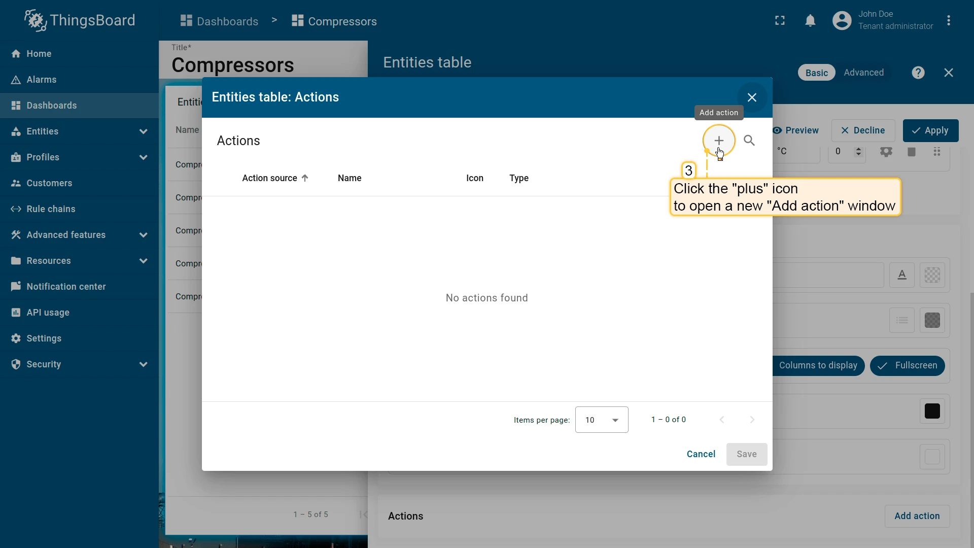
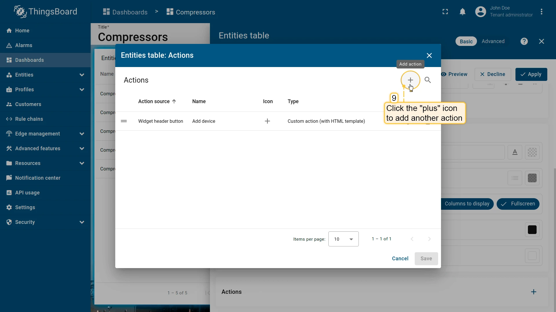
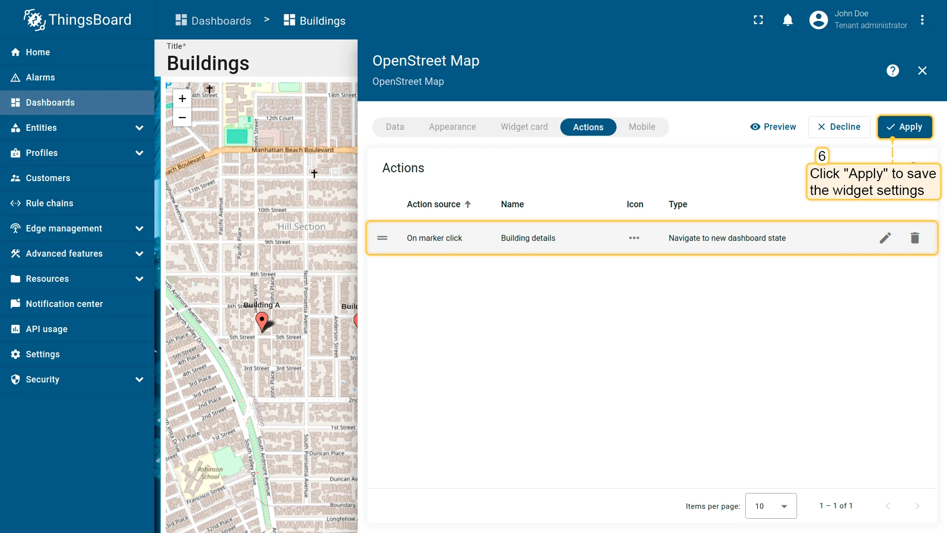
- Scroll to the Actions section and click Add action to open the Actions list. After the first action is saved, the button is replaced by a + icon.
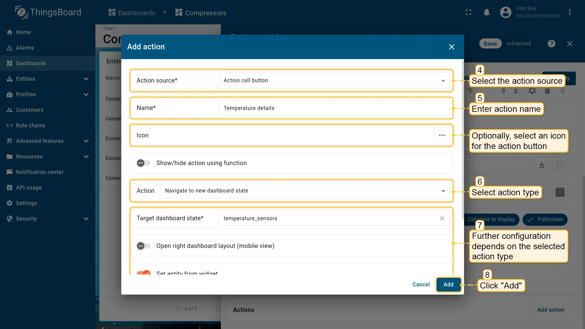
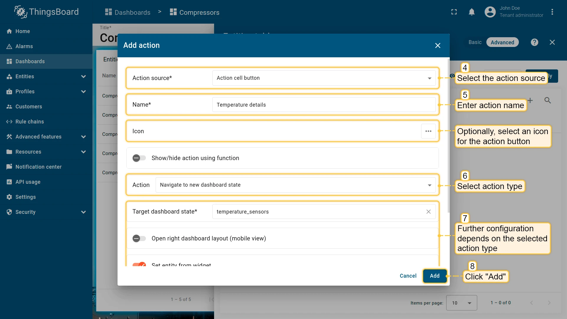
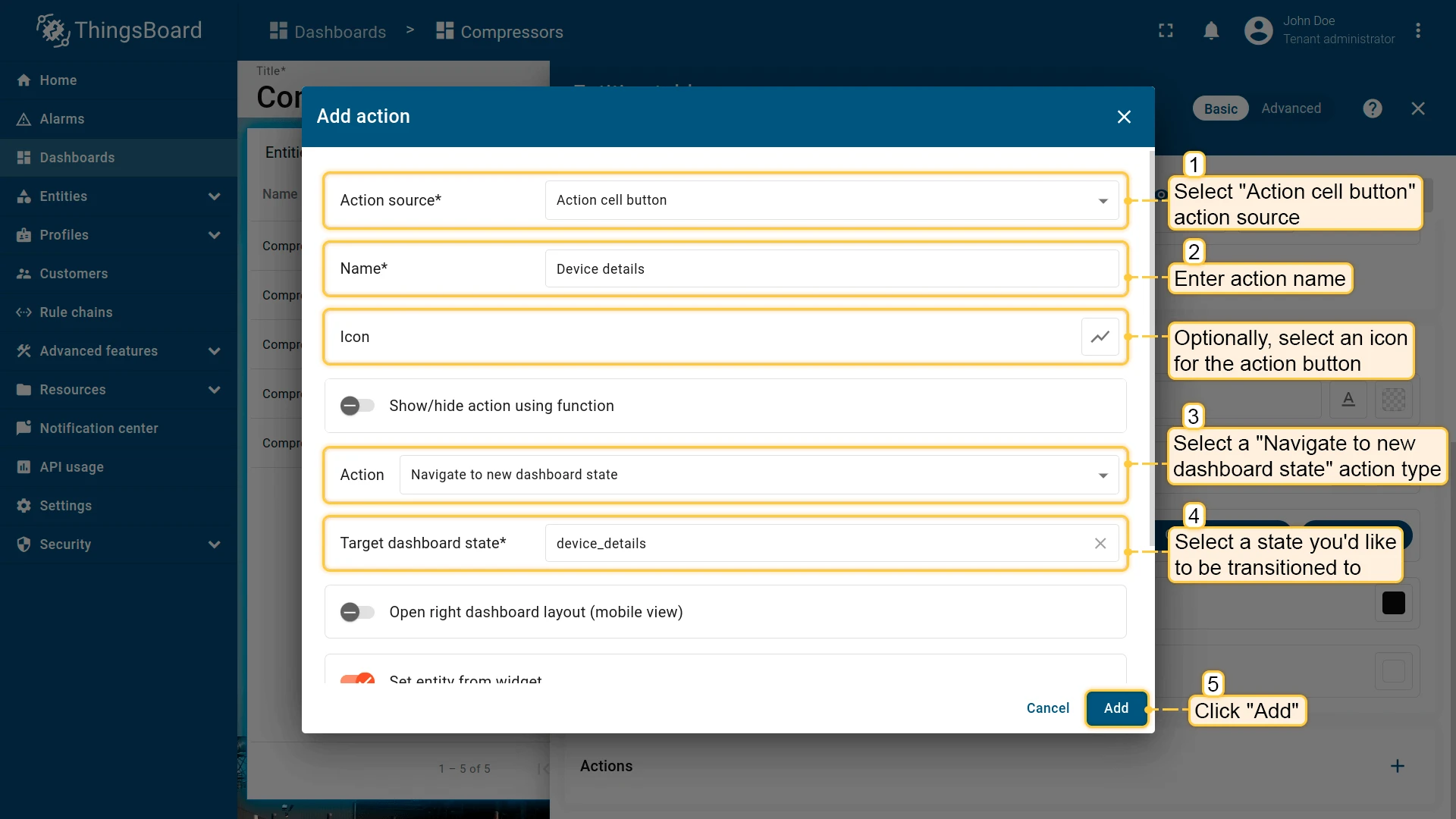
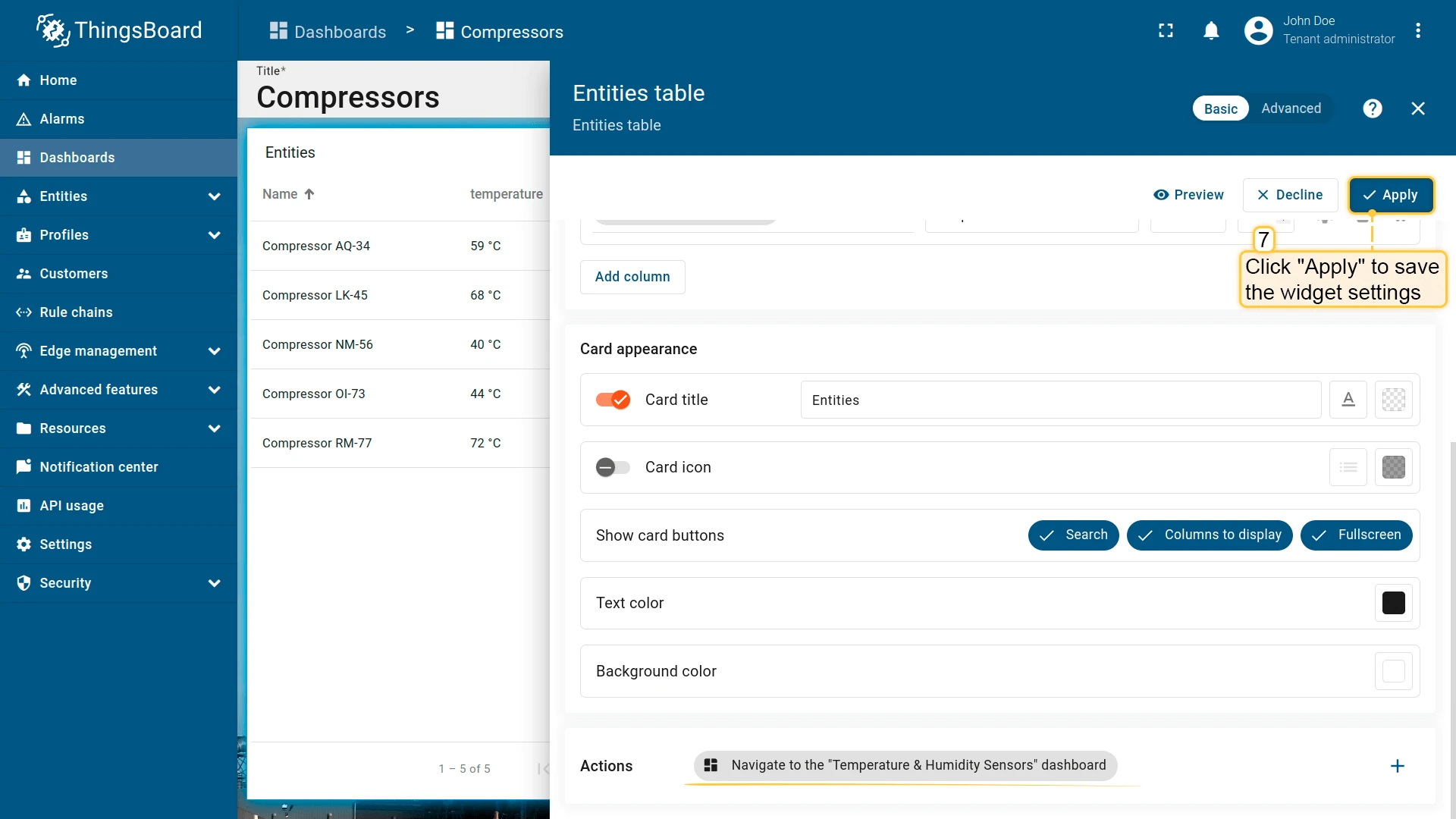
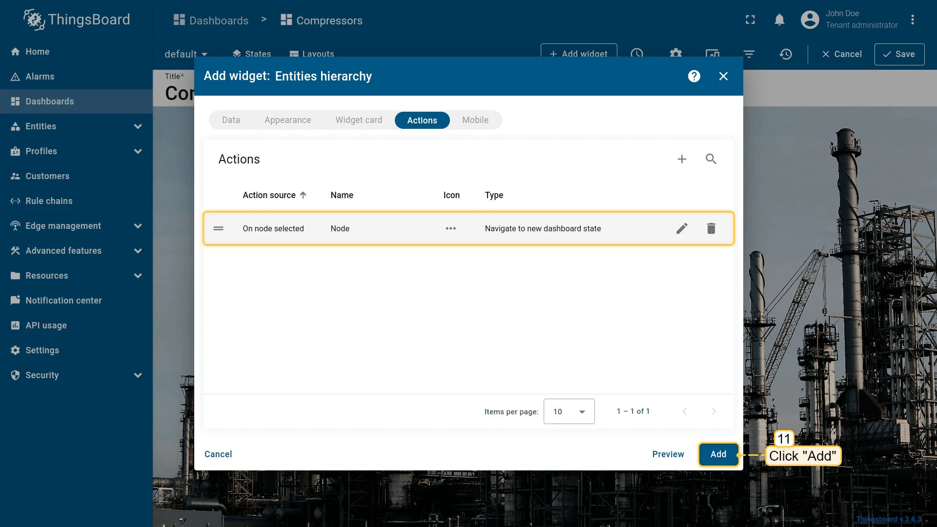
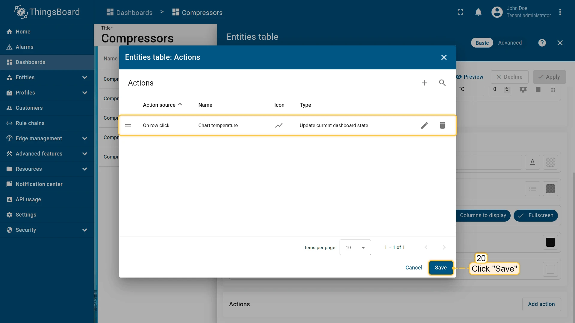
- Click + in the top-right corner of the Actions list to open the Add action dialog. Set the action source, name, icon, and type, then click Add.
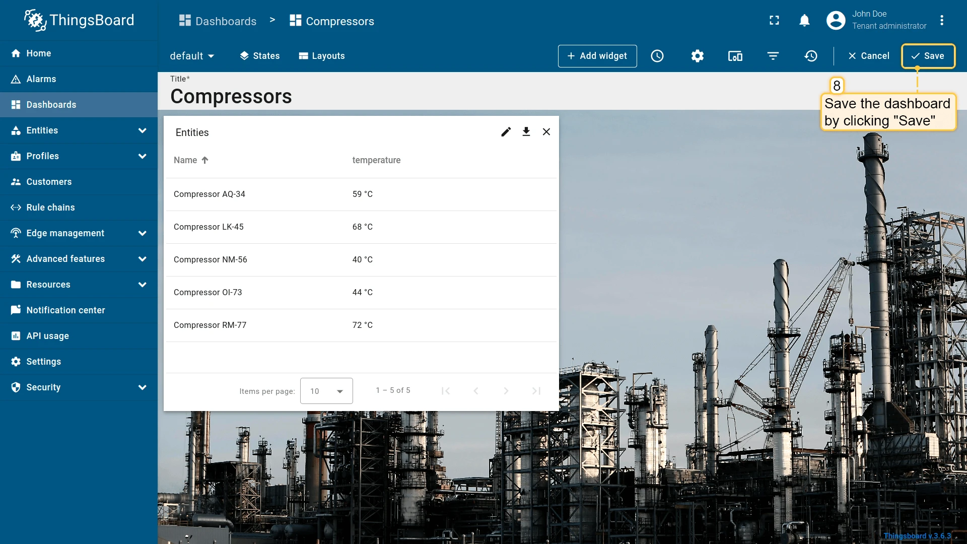
- Review the action in the list and click Save to close the list.
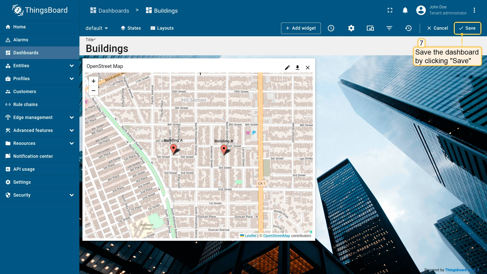
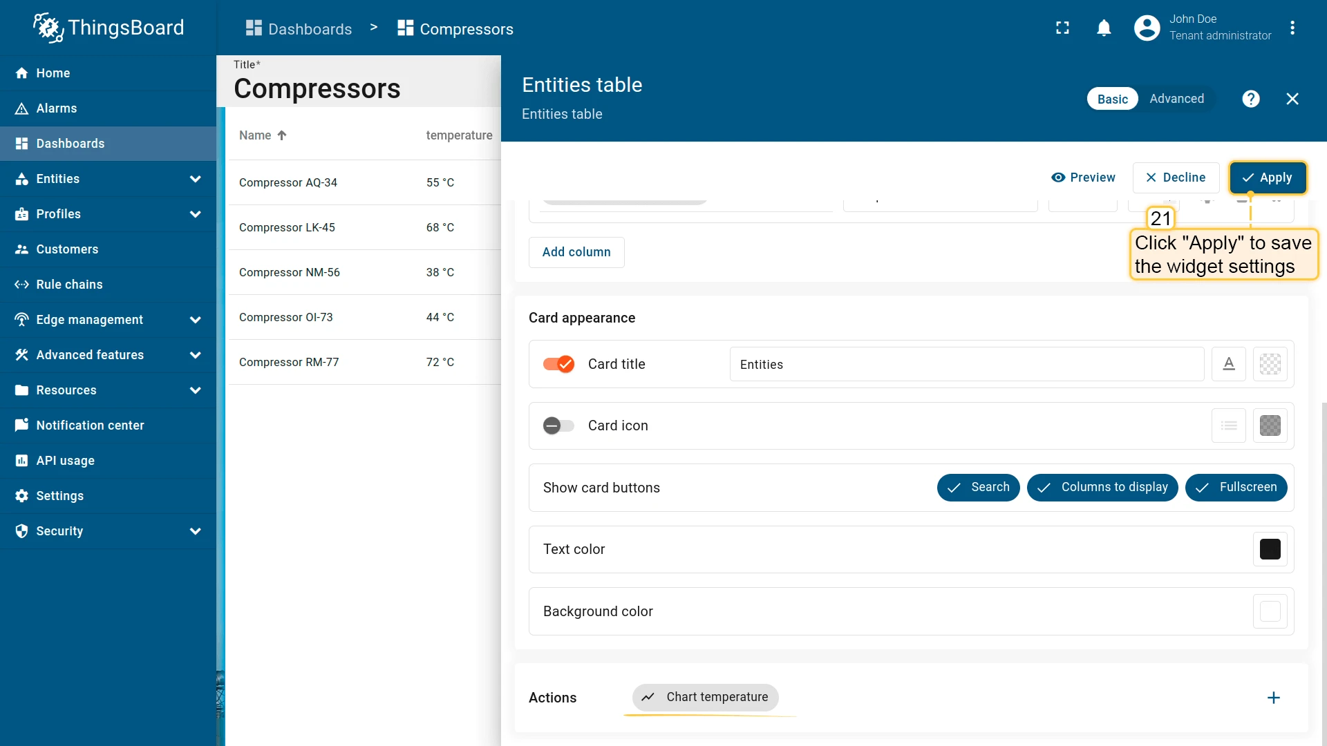
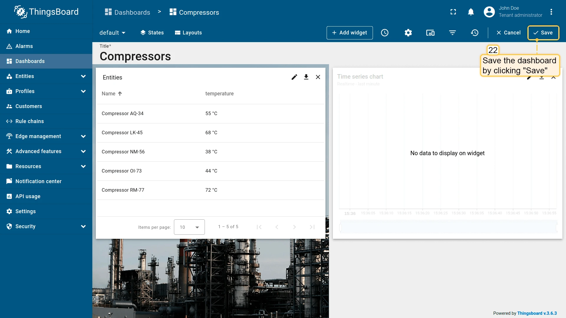
- Click Apply to save the widget settings, then click Save in the dashboard toolbar.


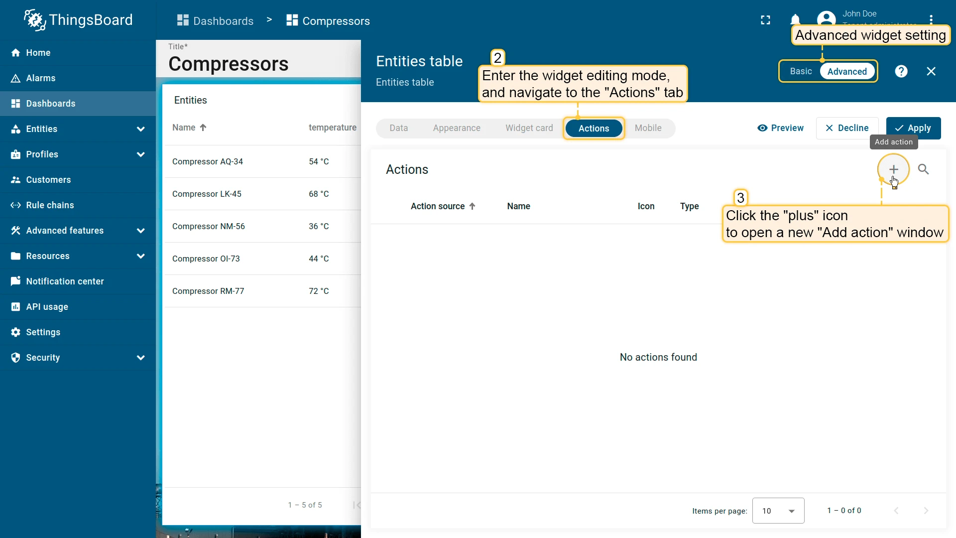
Advanced widget configuration
- Click the pencil icon on the widget to open its settings panel, then switch to advanced mode to open the full widget editor.
- Navigate to the Actions tab and click + to open the Add action dialog.
- Set the action source, name, icon, and type, then click Add.
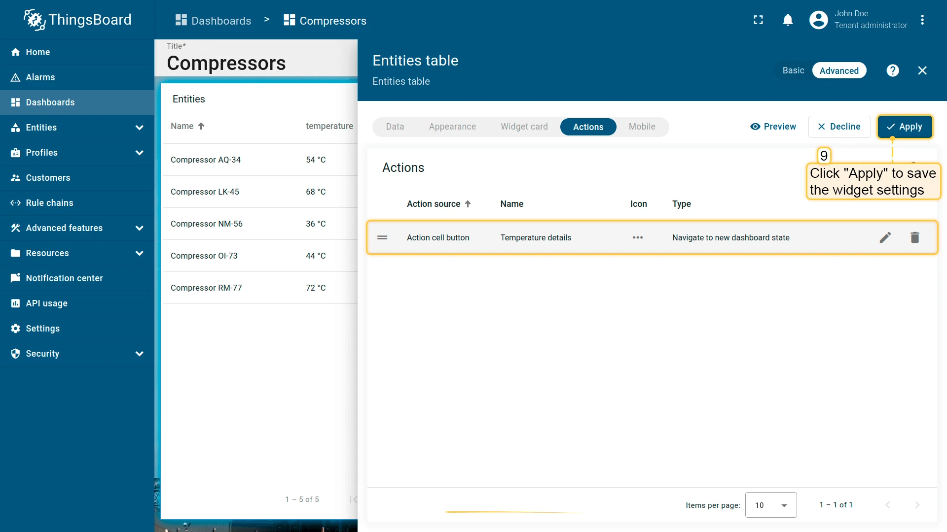
- The action appears in the Actions tab — click Apply to save the widget settings, then click Save in the dashboard toolbar.

Action types
Section titled “Action types”| Action type | Description |
|---|---|
| Navigate to new dashboard state | Navigates to a specified state within the current dashboard. |
| Update current dashboard state | Updates the entity context of the current dashboard without navigation. |
| Navigate to other dashboard | Navigates to a different dashboard, optionally to a specific state within it. |
| Custom action | Executes a custom JavaScript function (e.g. deleting a device or asset). |
| Custom action (with HTML template) | Executes a custom JavaScript function rendered inside an HTML template (e.g. a create/edit dialog). |
| Mobile action | Triggers mobile device functions: camera, QR code scan, location, phone call. |
| Open URL | Opens any URL, optionally in a new browser tab. |
| Place map item | Creates a new entity and places it directly on the map. Available for map widgets only. |
Navigate to new dashboard state
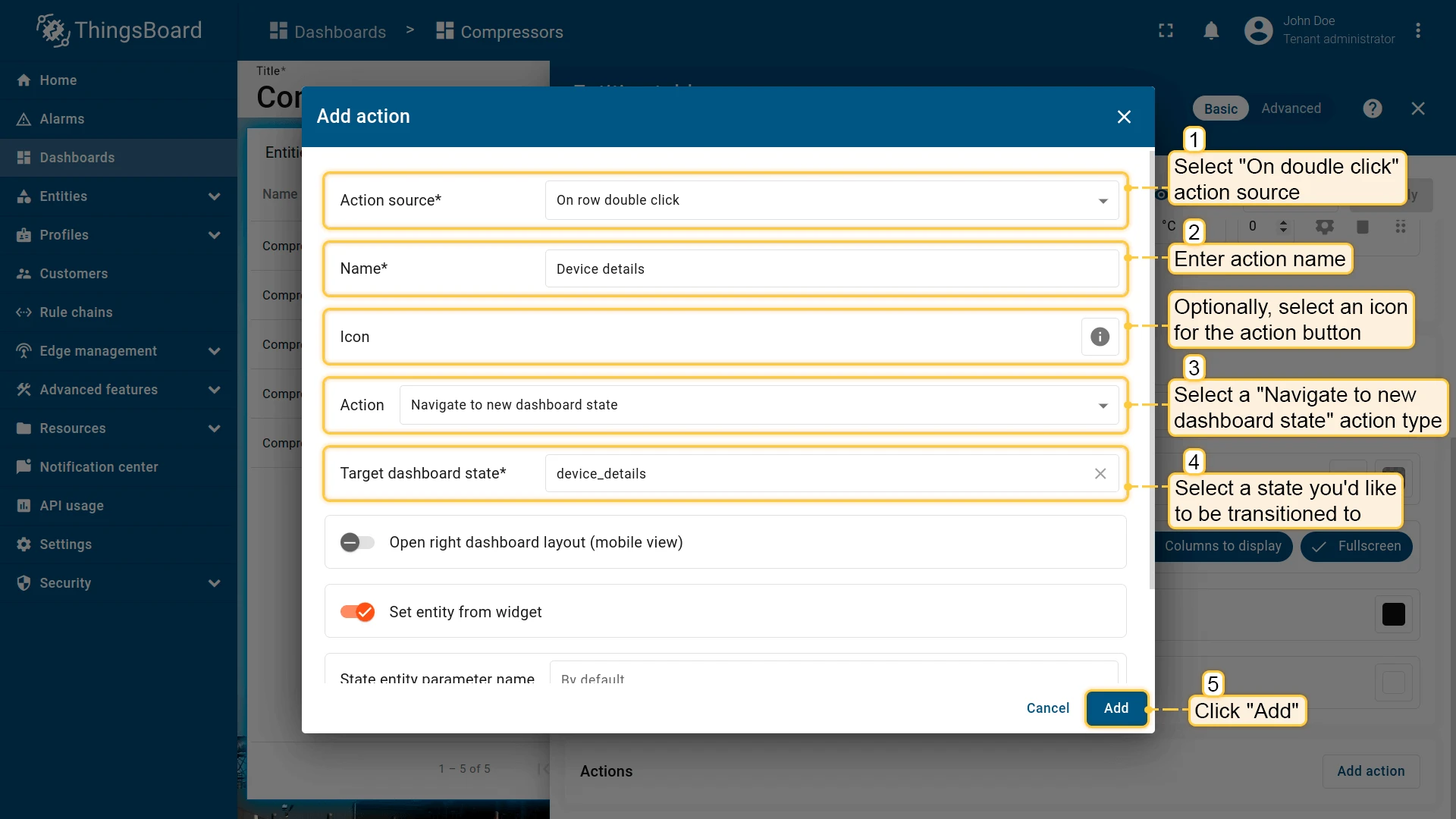
Section titled “Navigate to new dashboard state”Navigates to a dashboard state you select. By default the state replaces the current view, but you can instead open it in an overlay dialog or a popover anchored to the trigger element.
- Open the widget in edit mode, go to the Actions tab, and click +.
- Select an action source (e.g., Action cell button).
- Enter an action name and choose an icon.
- Select Navigate to new dashboard state as the action type, then choose the target state.
- Click Add, then Save and Apply to save the widget settings.
- Click Save in the dashboard toolbar to save the dashboard.


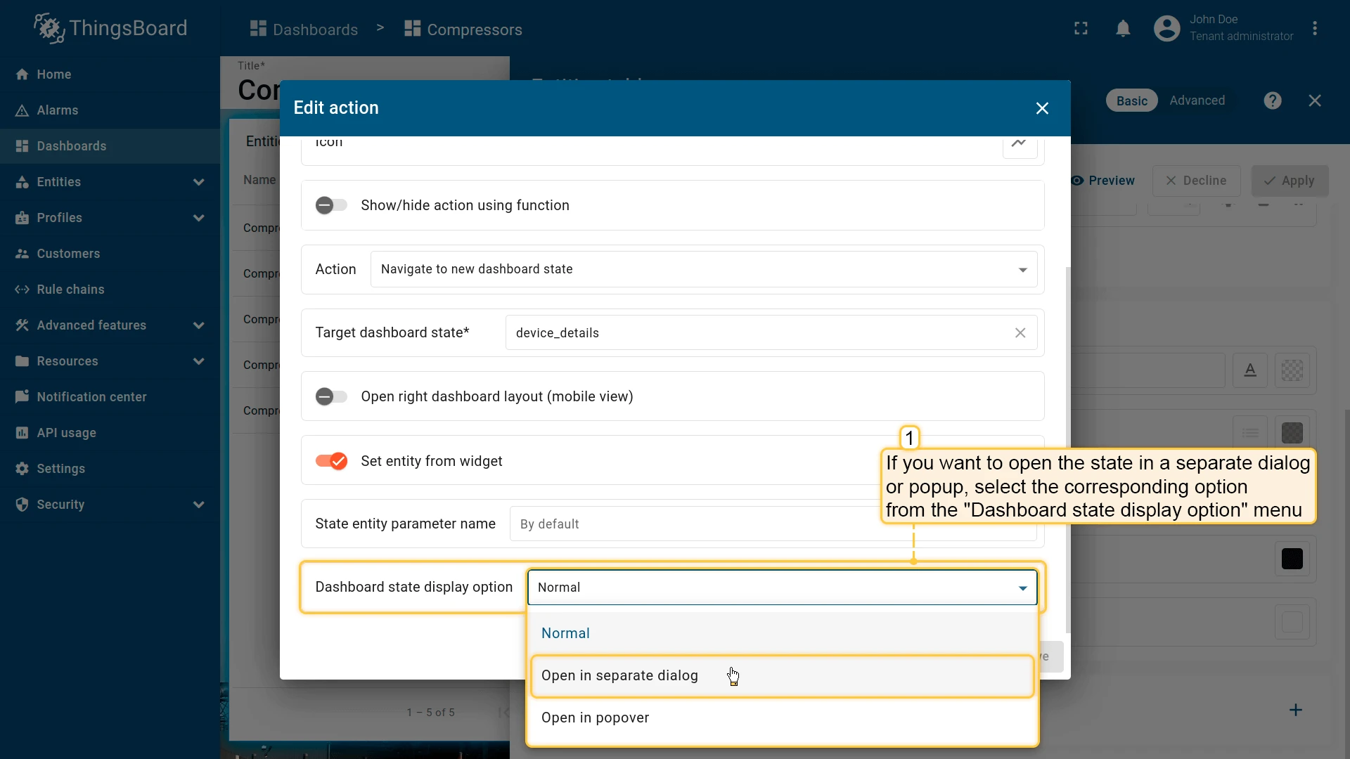
Open in a separate dialog or popover
Instead of replacing the current view, you can open the target state as an overlay. Use the Dashboard state display option field in the action settings to choose one of three modes:
- Normal — navigates to the state, replacing the current view (default).
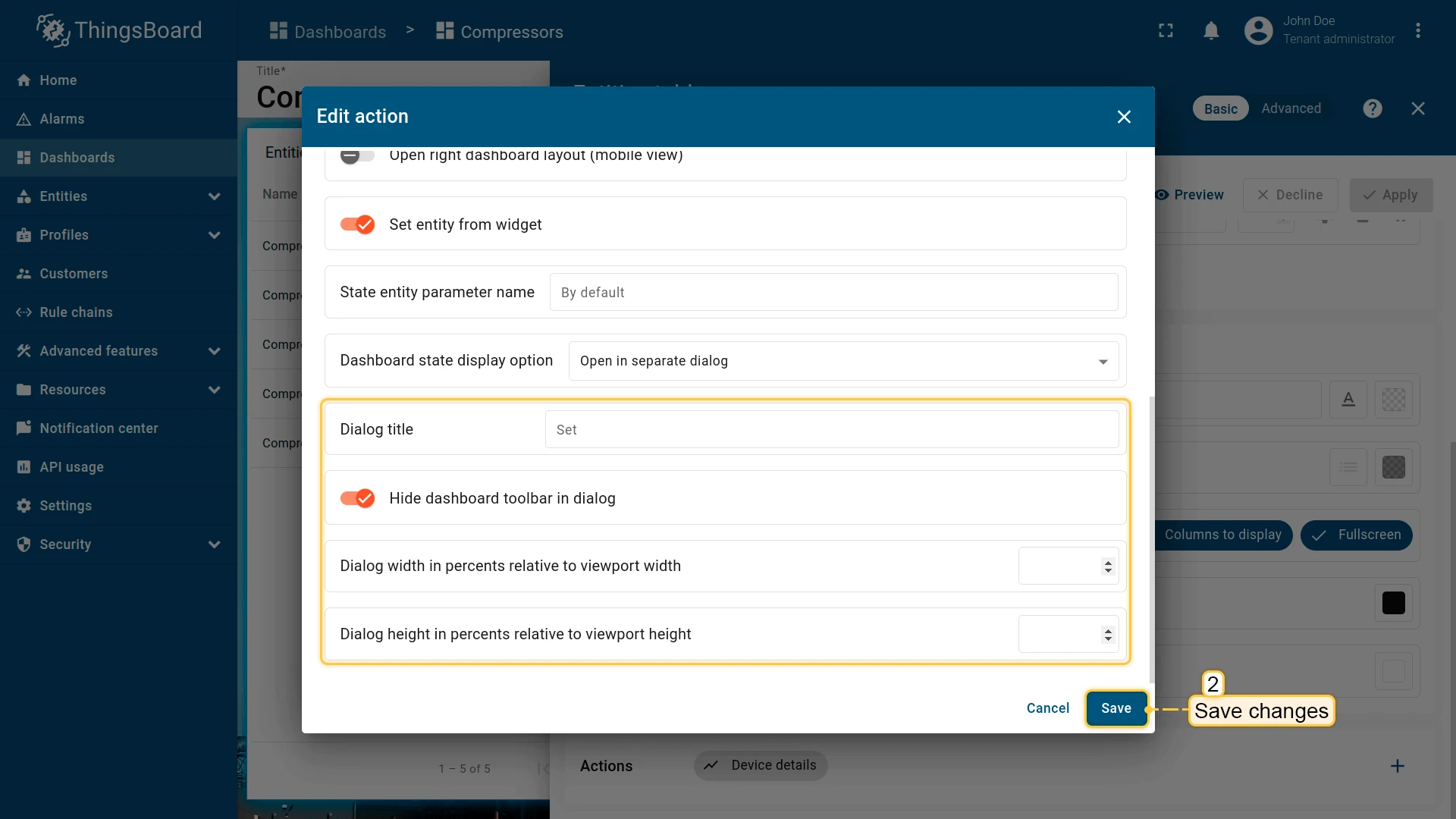
- Open in separate dialog — opens the state in a modal dialog overlay. You can configure the title, toolbar visibility, and dialog dimensions.
- Open in popover — opens the state in a popup anchored near the trigger element. You can set placement, width, and height.
- In the action settings, open the Dashboard state display option dropdown and select Open in separate dialog.
- Optionally uncheck Hide dashboard toolbar in dialog to show the time window, export, and fullscreen controls inside the dialog.
- Optionally set the dialog width and height (as percentages of the viewport).
- Save all changes.

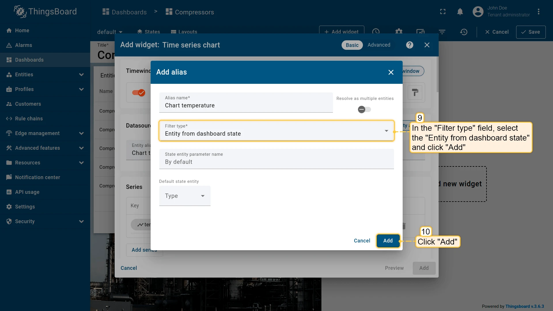
Update current dashboard state
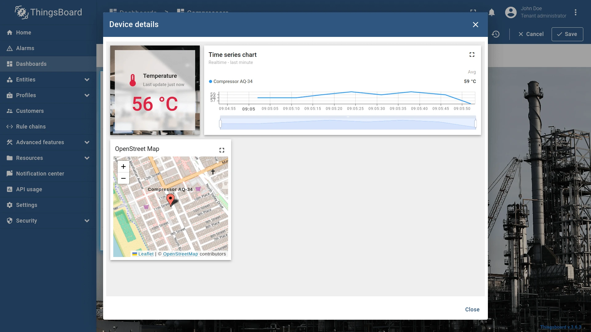
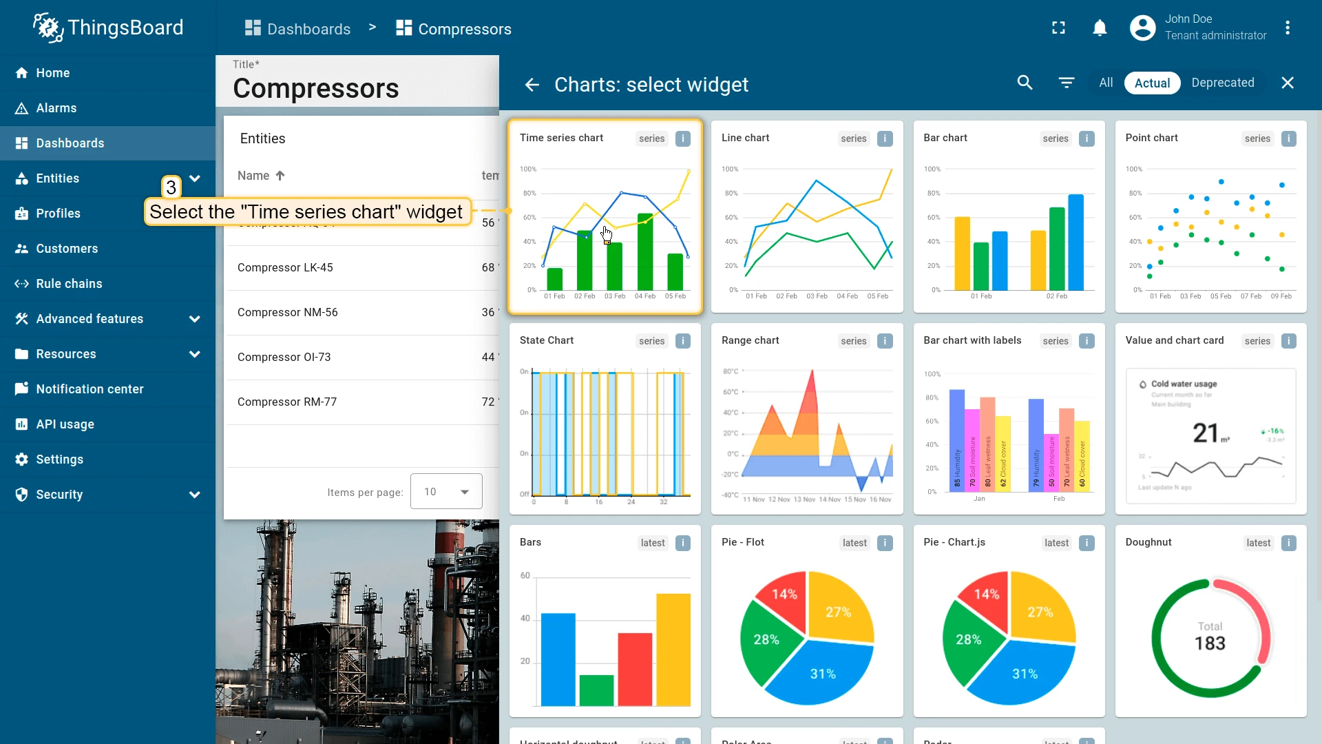
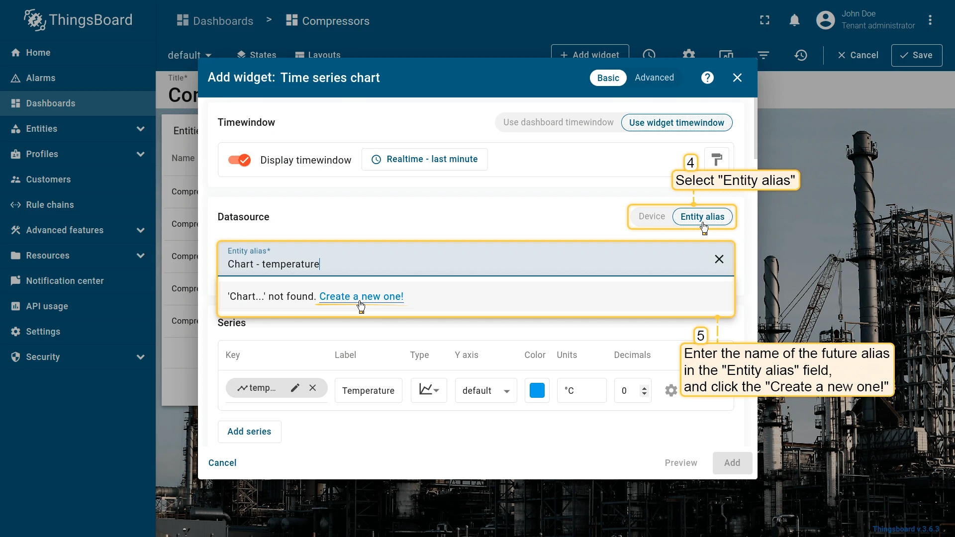
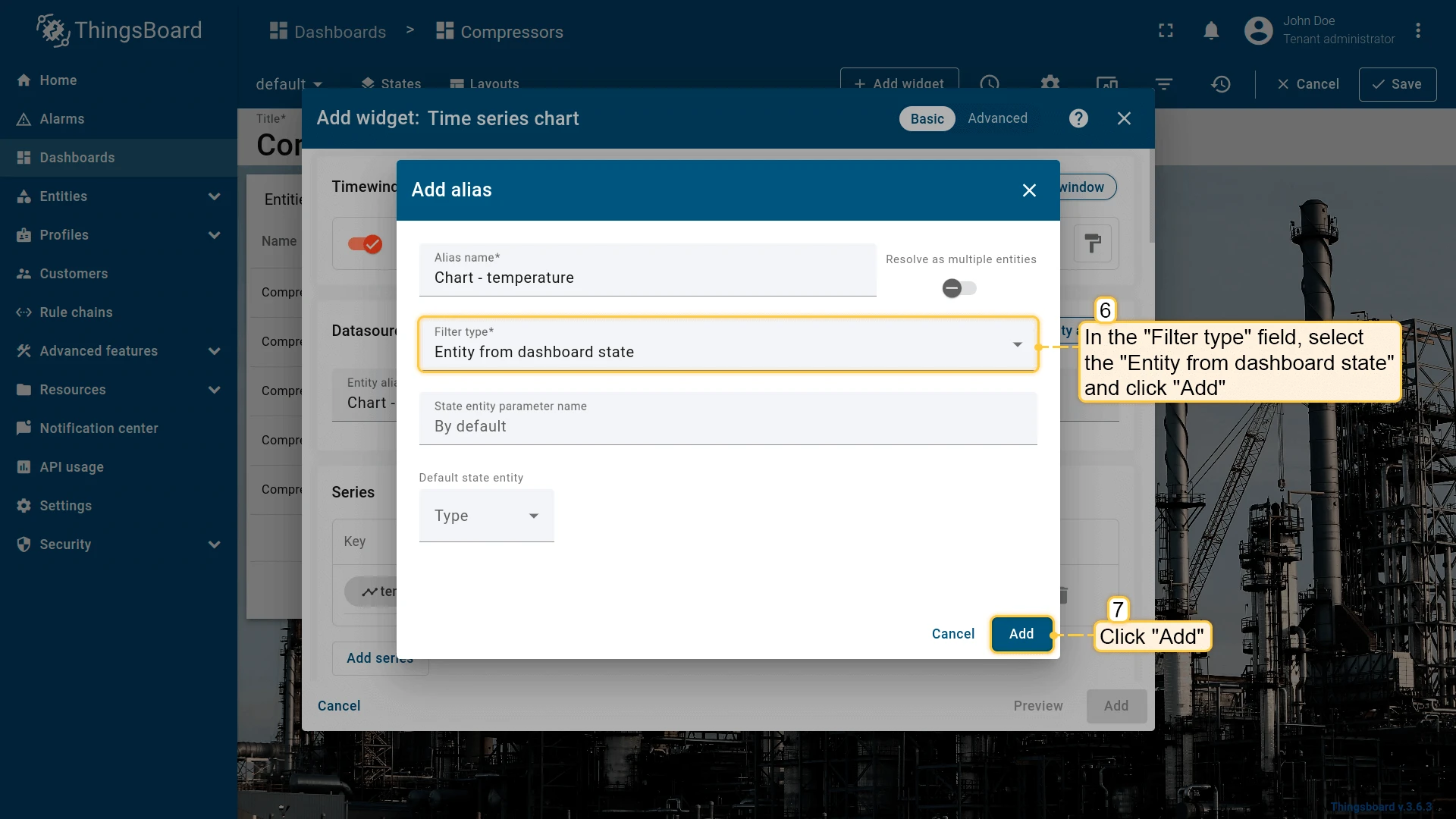
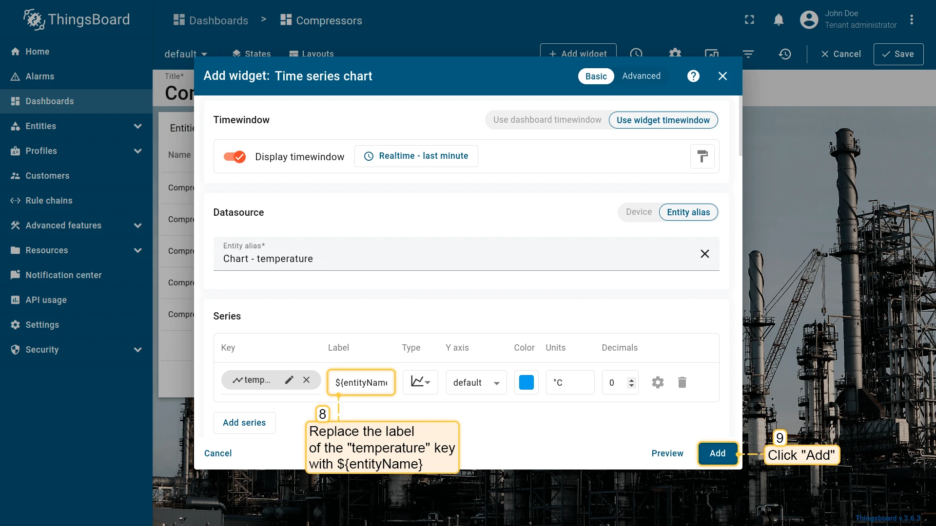
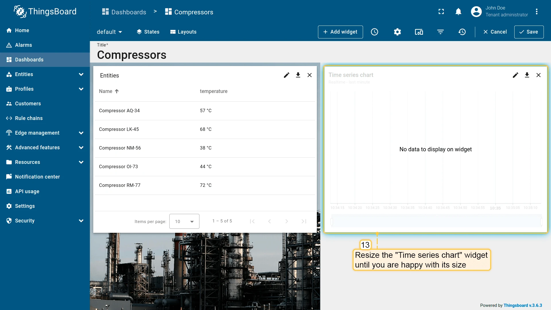
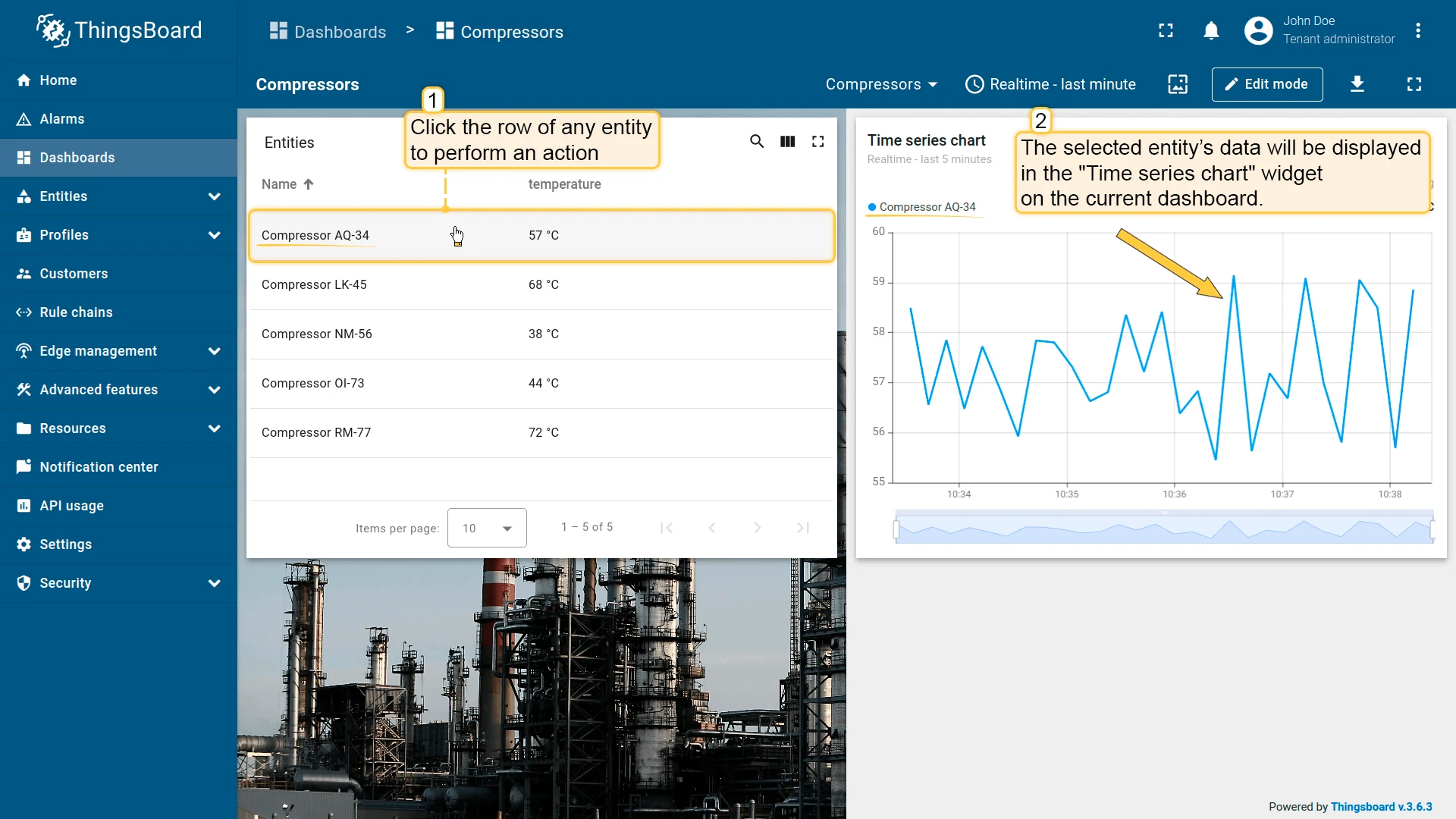
Section titled “Update current dashboard state”Updates the entity context of the current dashboard state without navigating away. Commonly used to show details for a selected entity in a companion chart or map widget on the same dashboard.
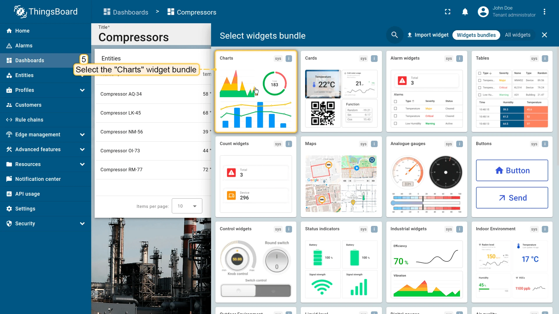
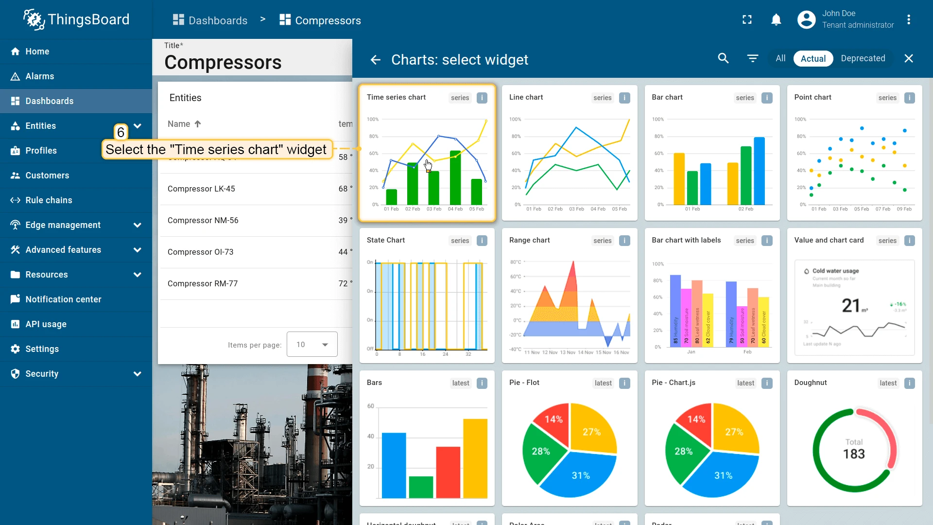
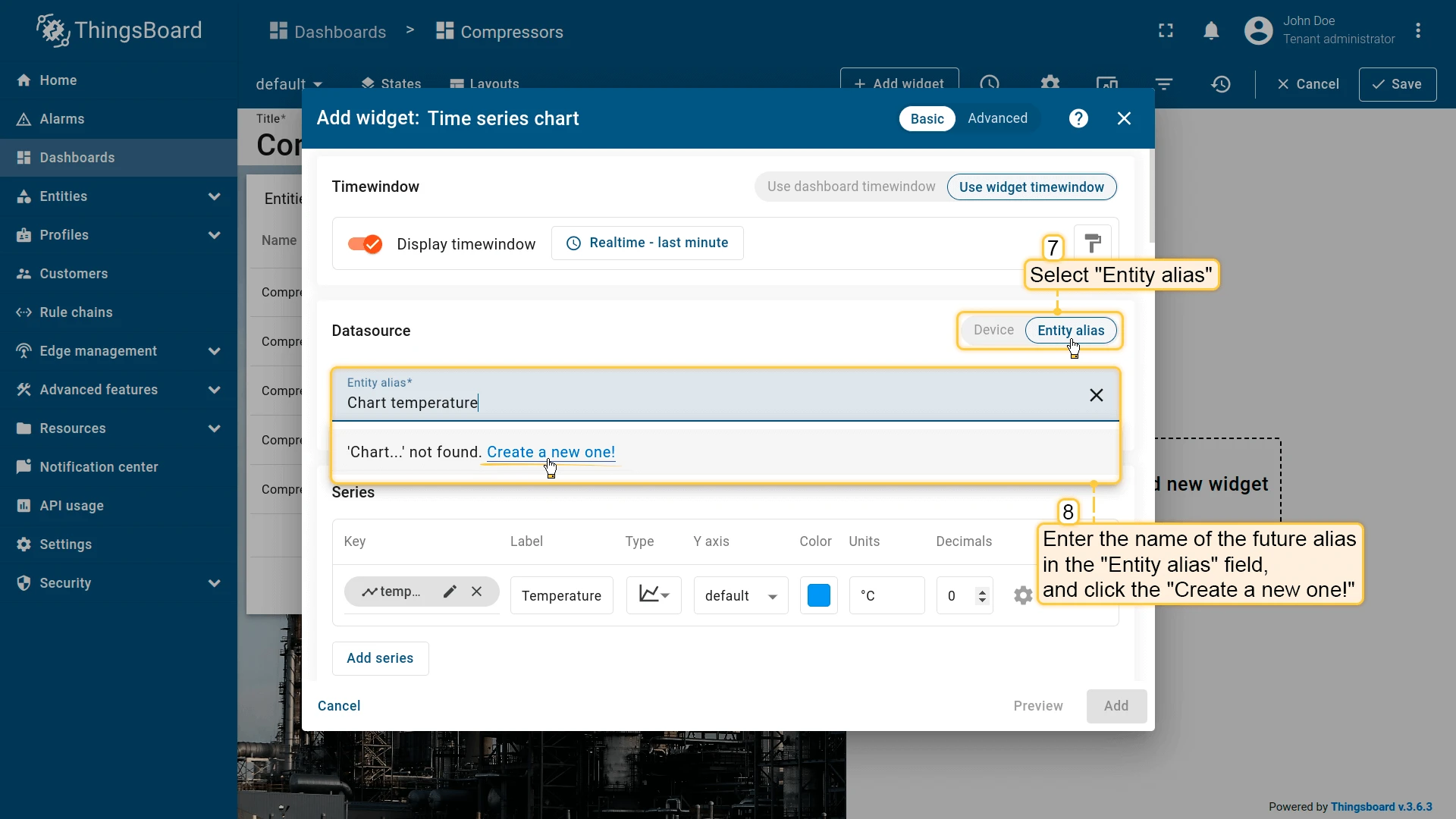
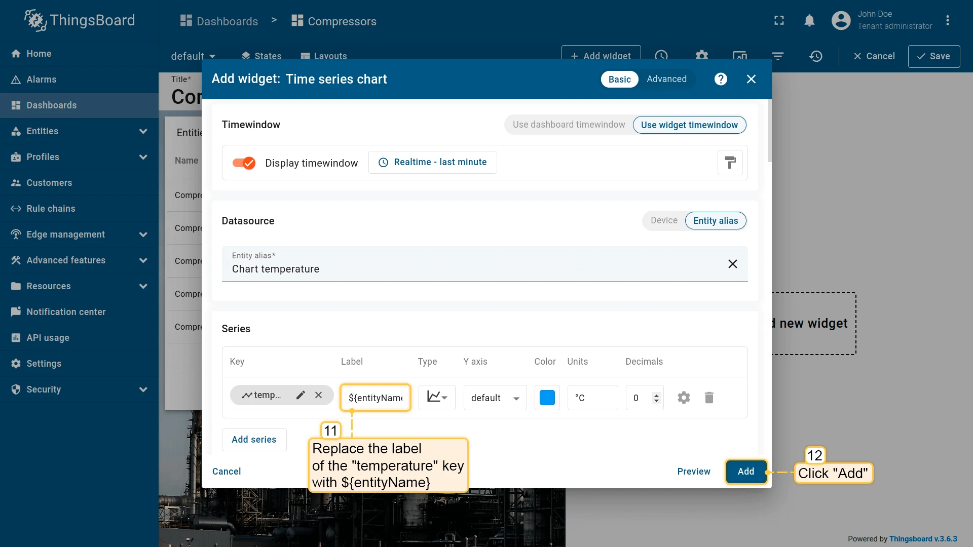
For this example, add a Timeseries Line Chart widget and configure its datasource to use the “Entity from dashboard state” alias, so the chart reflects whichever entity is currently selected:
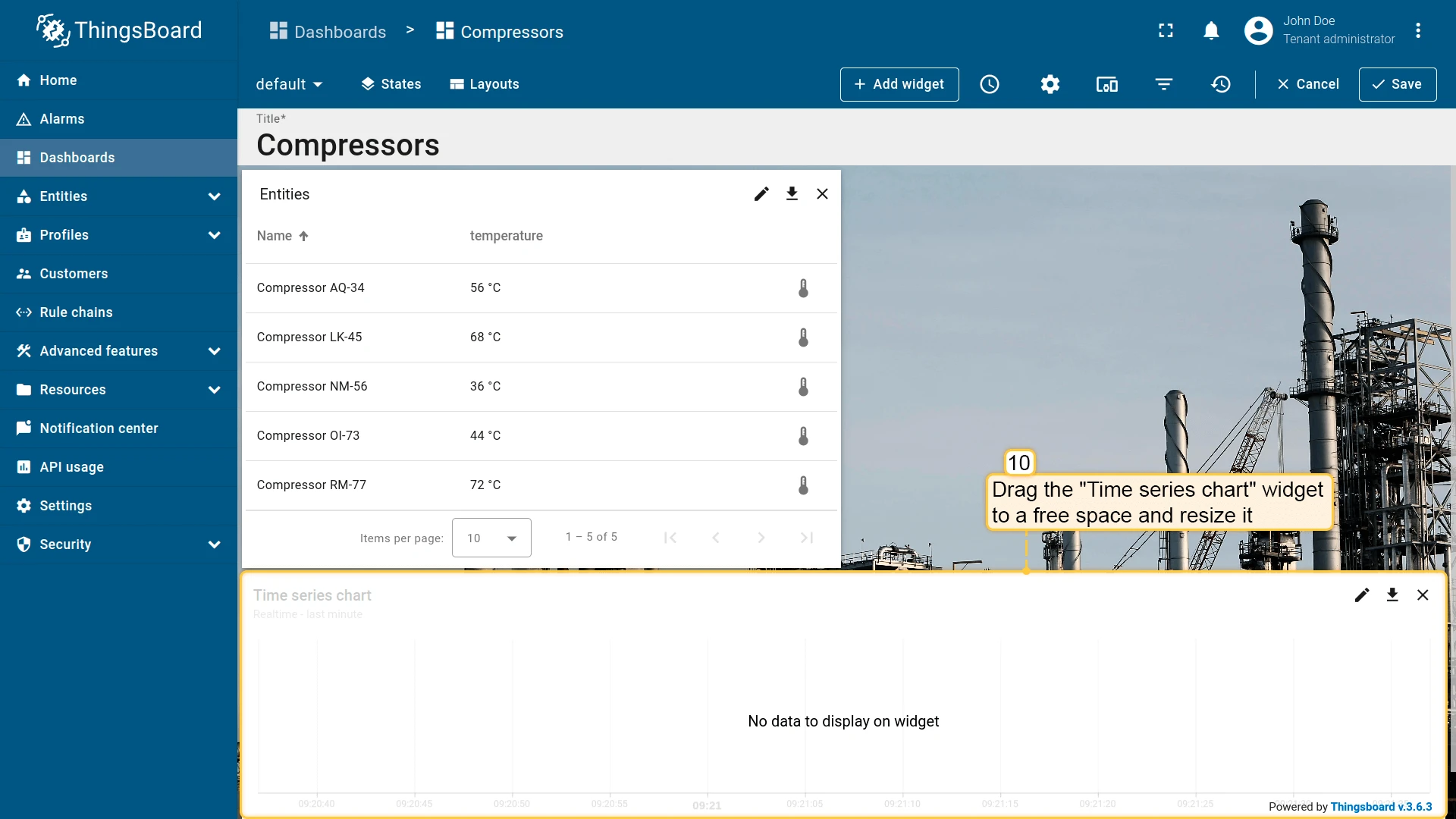
Now add an Update current dashboard state action to the Entities table widget:
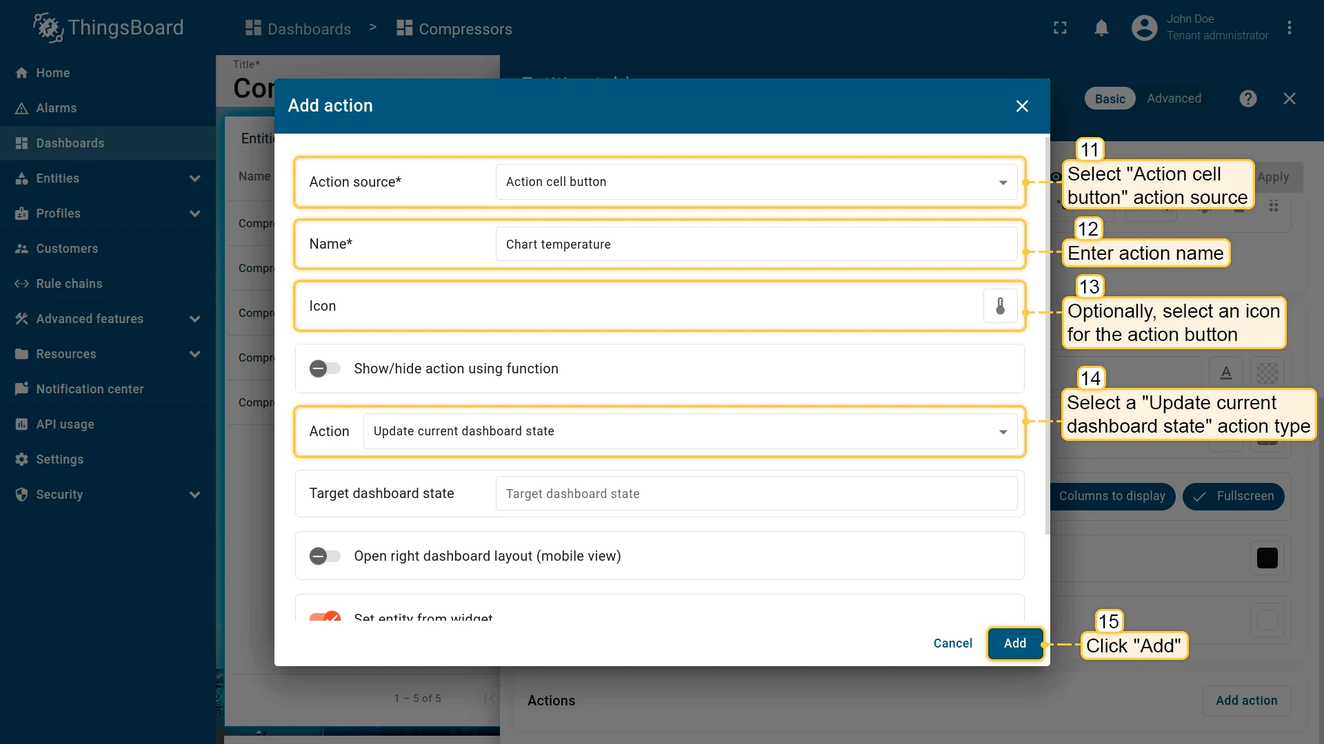
- Open the widget in edit mode, go to the Actions tab, and click +.
- Select Action cell button as the action source, enter a name (e.g. Chart temperature), and choose an icon.
- Select Update current dashboard state as the action type.
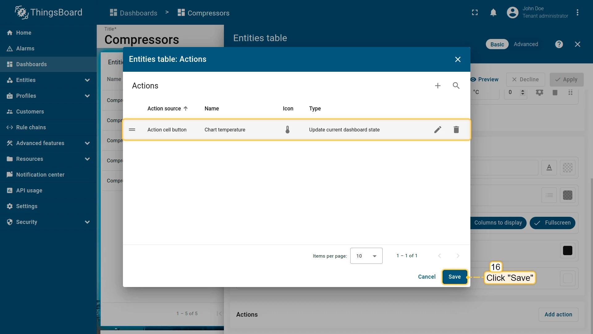
- Click Add, then Save and Apply to save the widget settings.
- Click Save in the dashboard toolbar.
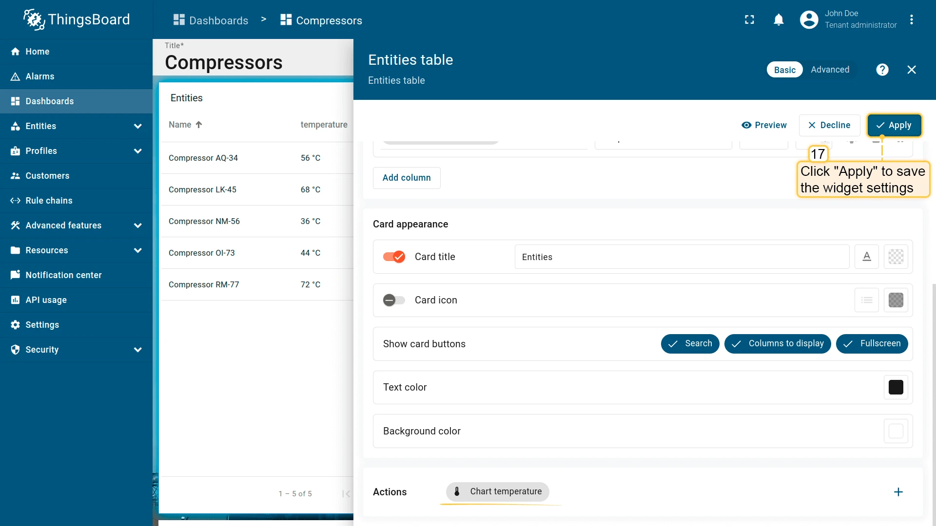
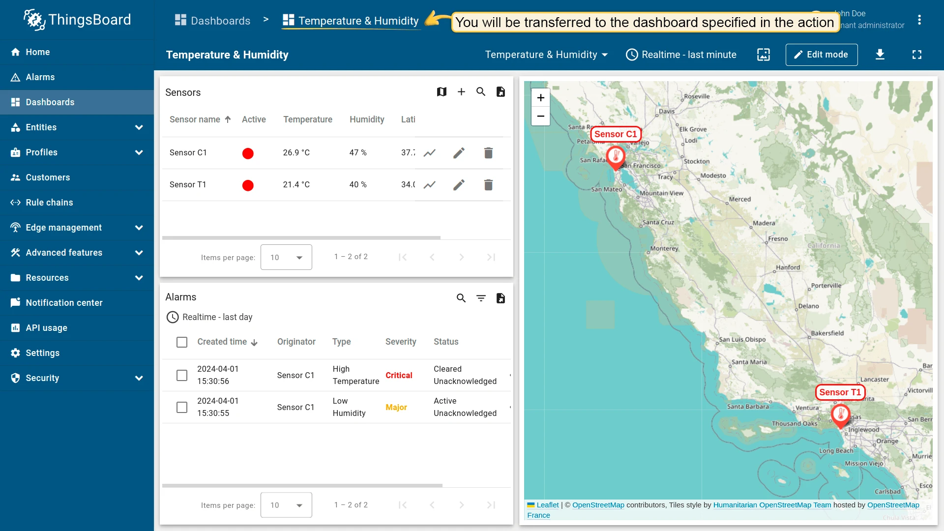
Clicking the action icon next to any entity updates the Timeseries Line Chart to show that entity’s data.
Navigate to other dashboard
Section titled “Navigate to other dashboard”Navigates to a previously created dashboard, optionally to a specific state within it.
- Open the widget in edit mode, go to the Actions tab, and click +.
- Select the action source (e.g. Widget header button), enter a name, and choose an icon.
- Select Navigate to other dashboard as the action type, then choose the target dashboard. You can also select a specific state within that dashboard.
- Click Add, then Save and Apply to save the widget settings.
- Click Save in the dashboard toolbar.


Custom action
Section titled “Custom action”Executes a custom JavaScript function when triggered. Useful for operations like deleting a device or asset directly from a table widget. Example — device deletion:
- Open the widget in edit mode, go to the Actions tab, and click +.
- Select Action cell button as the action source, enter a name (e.g. Delete device), and choose an icon.
- Select Custom action as the action type. A JavaScript function editor appears.
- Paste your custom function (example below), then click Add, Save, Apply, and Save the dashboard.
Example function for device deletion:
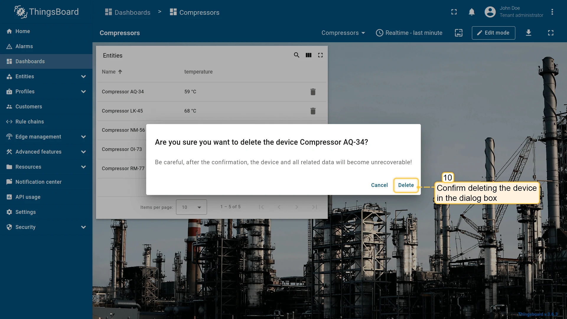
let $injector = widgetContext.$scope.$injector;let dialogs = $injector.get(widgetContext.servicesMap.get('dialogs'));let deviceService = $injector.get(widgetContext.servicesMap.get('deviceService'));
openDeleteDeviceDialog();
function openDeleteDeviceDialog() { let title = "Are you sure you want to delete the device " + entityName + "?"; let content = "Be careful, after the confirmation, the device and all related data will become unrecoverable!"; dialogs.confirm(title, content, 'Cancel', 'Delete').subscribe( function(result) { if (result) { deleteDevice(); } } );}
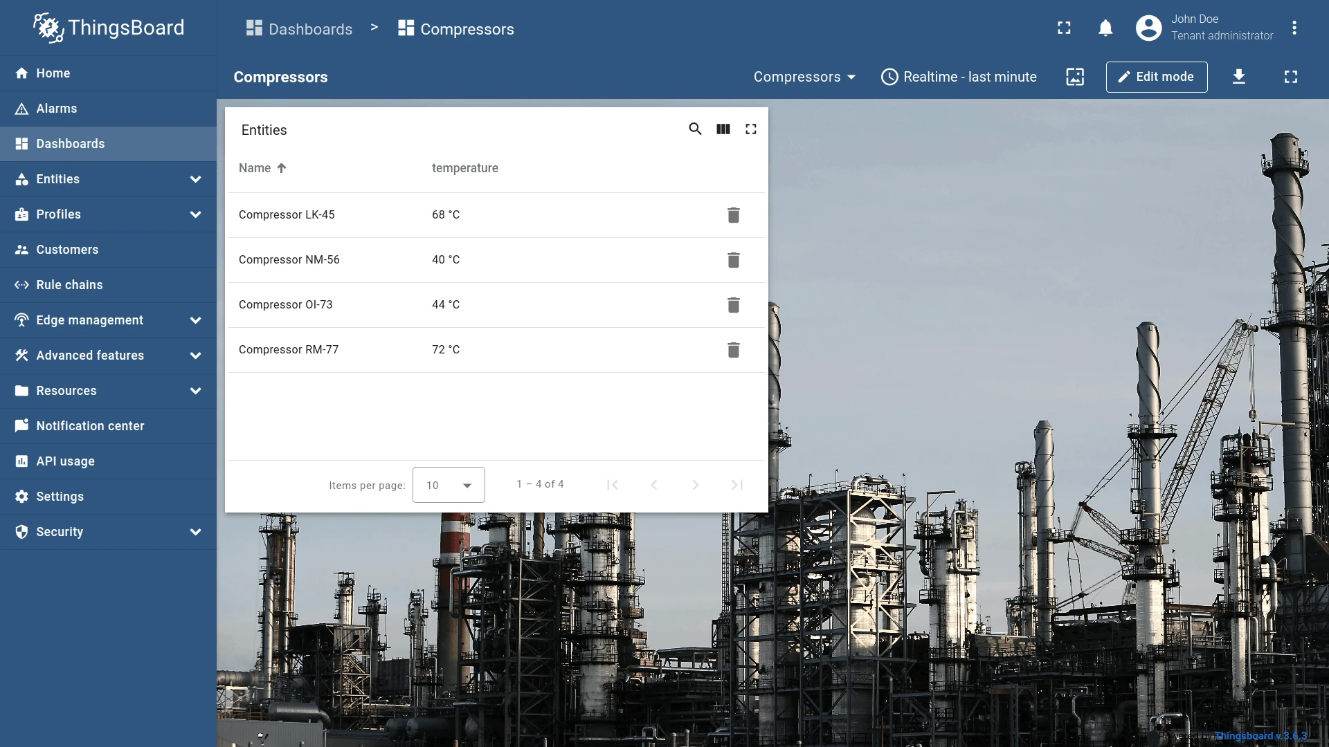
function deleteDevice() { deviceService.deleteDevice(entityId.id).subscribe( function() { widgetContext.updateAliases(); } );}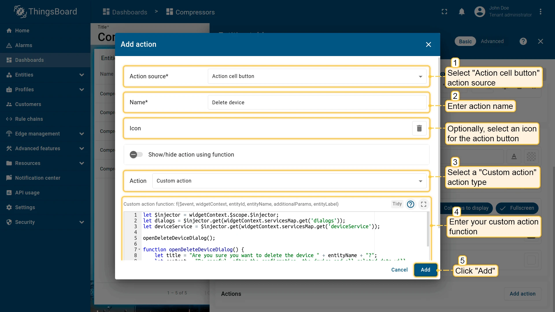


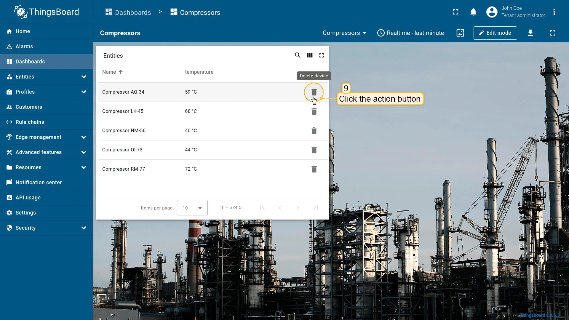
Clicking the trash icon next to an entity opens a confirmation dialog.
Custom action (with HTML template)
Section titled “Custom action (with HTML template)”Like Custom action, but the JavaScript function is rendered inside an HTML template — useful for building create/edit dialogs for entities. Four tabs are available:
- Resources — external JavaScript/CSS resources;
- CSS — custom styles;
- HTML — dialog markup;
- JavaScript — action logic.
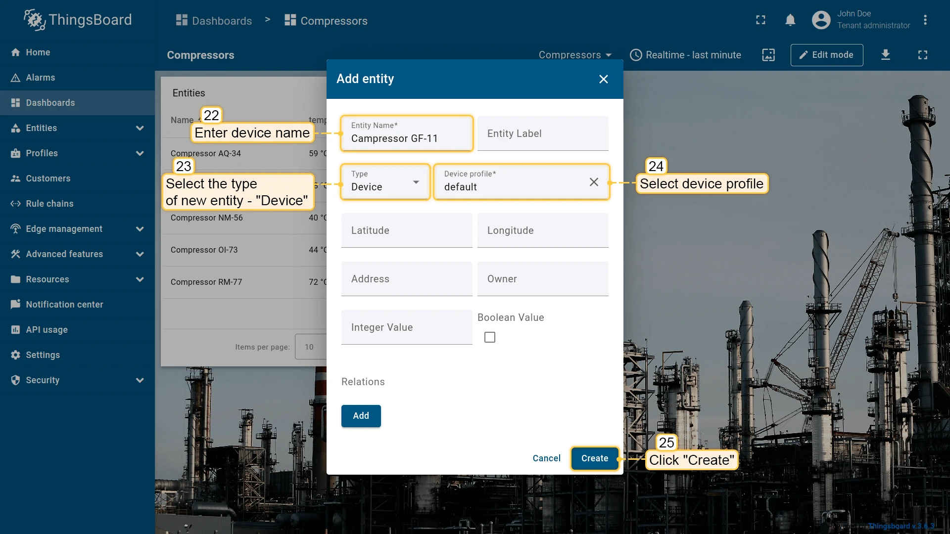
This example adds two action buttons: one in the widget header to create entities, and one per row to edit them. Starting with the add action:
- Open the widget in edit mode, go to the Actions tab, and click +.
- Select Widget header button as the action source, enter a name (e.g. Add device), and choose an icon.
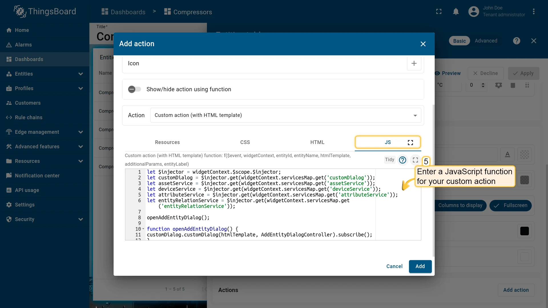
- Select Custom action (with HTML template) as the action type.
- In the JavaScript tab, paste the function for adding a new entity (example below).
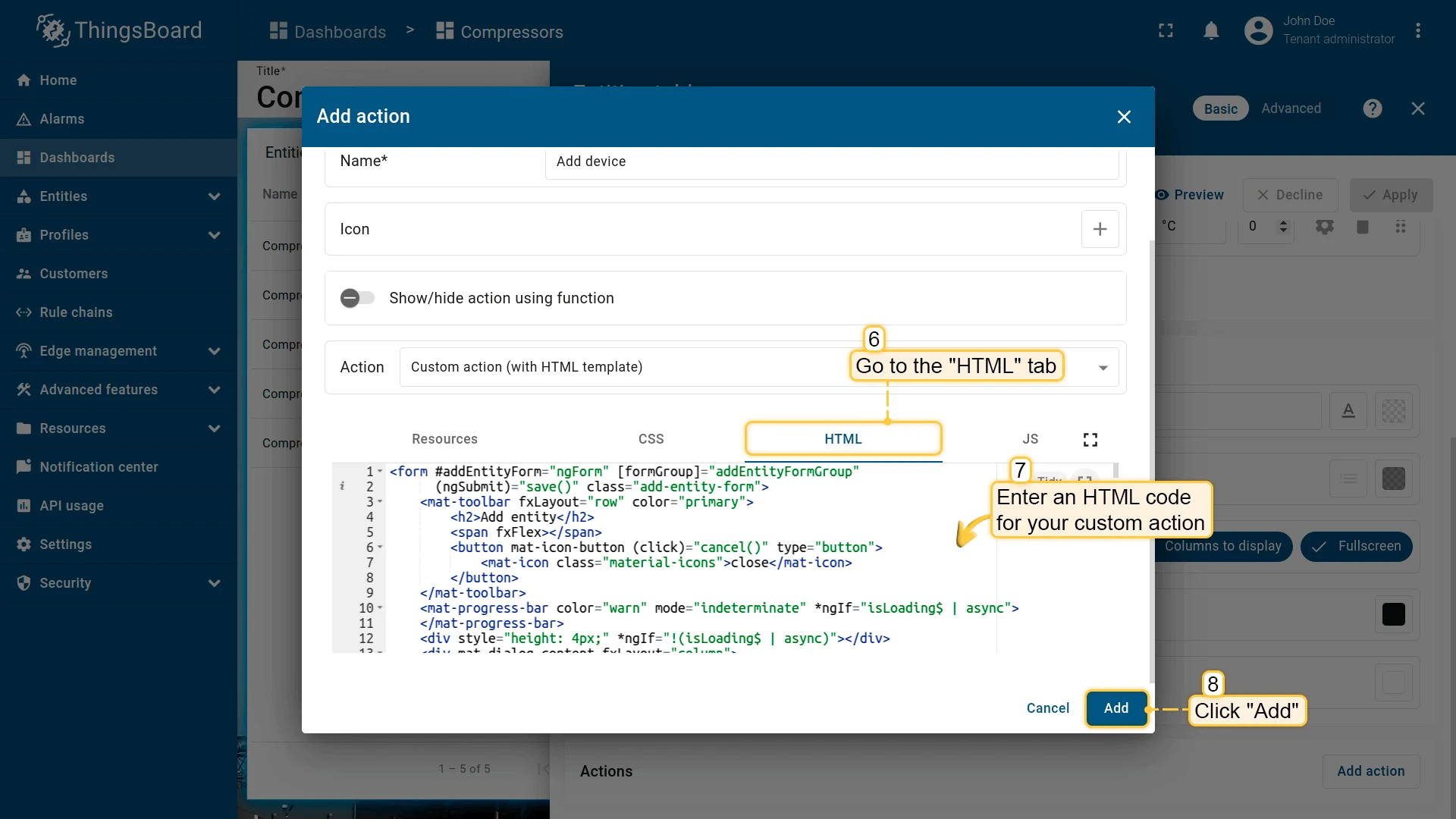
- In the HTML tab, paste the dialog markup (example below).
- Click Add, then Save and Apply to save the widget settings.
JavaScript function for adding a device or asset:
let $injector = widgetContext.$scope.$injector;let customDialog = $injector.get(widgetContext.servicesMap.get('customDialog'));let assetService = $injector.get(widgetContext.servicesMap.get('assetService'));let deviceService = $injector.get(widgetContext.servicesMap.get('deviceService'));let attributeService = $injector.get(widgetContext.servicesMap.get('attributeService'));let entityRelationService = $injector.get(widgetContext.servicesMap.get('entityRelationService'));
openAddEntityDialog();
function openAddEntityDialog() {customDialog.customDialog(htmlTemplate, AddEntityDialogController).subscribe();}
function AddEntityDialogController(instance) {let vm = instance;
    vm.allowedEntityTypes = ['ASSET', 'DEVICE'];    vm.entitySearchDirection = {        from: "FROM",        to: "TO"    }
    vm.addEntityFormGroup = vm.fb.group({     entityName: ['', [vm.validators.required]],     entityType: ['DEVICE'],     entityLabel: [null],     type: ['', [vm.validators.required]],     attributes: vm.fb.group({         latitude: [null],         longitude: [null],         address: [null],         owner: [null],         number: [null, [vm.validators.pattern(/^-?[0-9]+$/)]],         booleanValue: [null]     }),     relations: vm.fb.array([])    });
    vm.cancel = function() {        vm.dialogRef.close(null);    };
    vm.relations = function() {        return vm.addEntityFormGroup.get('relations');    };
    vm.addRelation = function() {        vm.relations().push(vm.fb.group({         relatedEntity: [null, [vm.validators.required]],         relationType: [null, [vm.validators.required]],         direction: [null, [vm.validators.required]]        }));    };
    vm.removeRelation = function(index) {        vm.relations().removeAt(index);        vm.relations().markAsDirty();    };
    vm.save = function() {        vm.addEntityFormGroup.markAsPristine();        saveEntityObservable().subscribe(            function (entity) {                widgetContext.rxjs.forkJoin([                    saveAttributes(entity.id),                    saveRelations(entity.id)                ]).subscribe(                    function () {                        widgetContext.updateAliases();                        vm.dialogRef.close(null);                    }                );            }        );    };
    function saveEntityObservable() {        const formValues = vm.addEntityFormGroup.value;        let entity = {            name: formValues.entityName,            type: formValues.type,            label: formValues.entityLabel        };        if (formValues.entityType == 'ASSET') {            return assetService.saveAsset(entity);        } else if (formValues.entityType == 'DEVICE') {            return deviceService.saveDevice(entity);        }    }
    function saveAttributes(entityId) {        let attributes = vm.addEntityFormGroup.get('attributes').value;        let attributesArray = [];        for (let key in attributes) {            if(attributes[key] !== null) {                attributesArray.push({key: key, value: attributes[key]});            }        }        if (attributesArray.length > 0) {            return attributeService.saveEntityAttributes(entityId, "SERVER_SCOPE", attributesArray);        }        return widgetContext.rxjs.of([]);    }
    function saveRelations(entityId) {        let relations = vm.addEntityFormGroup.get('relations').value;        let tasks = [];        for(let i=0; i < relations.length; i++) {            let relation = {                type: relations[i].relationType,                typeGroup: 'COMMON'            };            if (relations[i].direction == 'FROM') {                relation.to = relations[i].relatedEntity;                relation.from = entityId;            } else {                relation.to = entityId;                relation.from = relations[i].relatedEntity;            }            tasks.push(entityRelationService.saveRelation(relation));        }        if (tasks.length > 0) {            return widgetContext.rxjs.forkJoin(tasks);        }        return widgetContext.rxjs.of([]);    }}
Switch to the HTML tab and enter the HTML template for the dialog:
HTML template for the add-entity dialog:
<form #addEntityForm="ngForm" [formGroup]="addEntityFormGroup" (ngSubmit)="save()" class="add-entity-form"> <mat-toolbar fxLayout="row" color="primary"> <h2>Add entity</h2> <span fxFlex></span> <button mat-icon-button (click)="cancel()" type="button"> <mat-icon class="material-icons">close</mat-icon> </button> </mat-toolbar> <mat-progress-bar color="warn" mode="indeterminate" *ngIf="isLoading$ | async"> </mat-progress-bar> <div style="height: 4px;" *ngIf="!(isLoading$ | async)"></div> <div mat-dialog-content fxLayout="column"> <div fxLayout="row" fxLayoutGap="8px" fxLayout.xs="column" fxLayoutGap.xs="0"> <mat-form-field fxFlex class="mat-block"> <mat-label>Entity Name</mat-label> <input matInput formControlName="entityName" required> <mat-error *ngIf="addEntityFormGroup.get('entityName').hasError('required')"> Entity name is required. </mat-error> </mat-form-field> <mat-form-field fxFlex class="mat-block"> <mat-label>Entity Label</mat-label> <input matInput formControlName="entityLabel" > </mat-form-field> </div> <div fxLayout="row" fxLayoutGap="8px" fxLayout.xs="column" fxLayoutGap.xs="0"> <tb-entity-type-select class="mat-block" formControlName="entityType" [showLabel]="true" [allowedEntityTypes]="allowedEntityTypes" ></tb-entity-type-select> <tb-entity-subtype-autocomplete fxFlex *ngIf="addEntityFormGroup.get('entityType').value == 'ASSET'" class="mat-block" formControlName="type" [required]="true" [entityType]="'ASSET'" ></tb-entity-subtype-autocomplete> <tb-entity-subtype-autocomplete fxFlex *ngIf="addEntityFormGroup.get('entityType').value != 'ASSET'" class="mat-block" formControlName="type" [required]="true" [entityType]="'DEVICE'" ></tb-entity-subtype-autocomplete> </div> <div formGroupName="attributes" fxLayout="column"> <div fxLayout="row" fxLayoutGap="8px" fxLayout.xs="column" fxLayoutGap.xs="0"> <mat-form-field fxFlex class="mat-block"> <mat-label>Latitude</mat-label> <input type="number" step="any" matInput formControlName="latitude"> </mat-form-field> <mat-form-field fxFlex class="mat-block"> <mat-label>Longitude</mat-label> <input type="number" step="any" matInput formControlName="longitude"> </mat-form-field> </div> <div fxLayout="row" fxLayoutGap="8px" fxLayout.xs="column" fxLayoutGap.xs="0"> <mat-form-field fxFlex class="mat-block"> <mat-label>Address</mat-label> <input matInput formControlName="address"> </mat-form-field> <mat-form-field fxFlex class="mat-block"> <mat-label>Owner</mat-label> <input matInput formControlName="owner"> </mat-form-field> </div> <div fxLayout="row" fxLayoutGap="8px" fxLayout.xs="column" fxLayoutGap.xs="0"> <mat-form-field fxFlex class="mat-block"> <mat-label>Integer Value</mat-label> <input type="number" step="1" matInput formControlName="number"> <mat-error *ngIf="addEntityFormGroup.get('attributes.number').hasError('pattern')"> Invalid integer value. </mat-error> </mat-form-field> <div class="boolean-value-input" fxLayout="column" fxLayoutAlign="center start" fxFlex> <label class="checkbox-label">Boolean Value</label> <mat-checkbox formControlName="booleanValue" style="margin-bottom: 40px;"> {{ (addEntityFormGroup.get('attributes.booleanValue').value ? "value.true" : "value.false") | translate }} </mat-checkbox> </div> </div> </div> <div class="relations-list"> <div class="mat-body-1" style="padding-bottom: 10px; color: rgba(0,0,0,0.57);">Relations</div> <div class="body" [fxShow]="relations().length"> <div class="row" fxLayout="row" fxLayoutAlign="start center" formArrayName="relations" *ngFor="let relation of relations().controls; let i = index;"> <div [formGroupName]="i" class="mat-elevation-z2" fxFlex fxLayout="row" style="padding: 5px 0 5px 5px;"> <div fxFlex fxLayout="column"> <div fxLayout="row" fxLayoutGap="8px" fxLayout.xs="column" fxLayoutGap.xs="0"> <mat-form-field class="mat-block" style="min-width: 100px;"> <mat-label>Direction</mat-label> <mat-select formControlName="direction" name="direction"> <mat-option *ngFor="let direction of entitySearchDirection | keyvalue" [value]="direction.value"> {{ ("relation.search-direction." + direction.value) | translate}} </mat-option> </mat-select> <mat-error *ngIf="relation.get('direction').hasError('required')"> Relation direction is required. </mat-error> </mat-form-field> <tb-relation-type-autocomplete fxFlex class="mat-block" formControlName="relationType" [required]="true"> </tb-relation-type-autocomplete> </div> <div fxLayout="row" fxLayout.xs="column"> <tb-entity-select fxFlex class="mat-block" [required]="true" formControlName="relatedEntity"> </tb-entity-select> </div> </div> <div fxLayout="column" fxLayoutAlign="center center"> <button mat-icon-button color="primary" aria-label="Remove" type="button" (click)="removeRelation(i)" matTooltip="Remove relation" matTooltipPosition="above"> <mat-icon>close</mat-icon> </button> </div> </div> </div> </div> <div> <button mat-raised-button color="primary" type="button" (click)="addRelation()" matTooltip="Add Relation" matTooltipPosition="above"> Add </button> </div> </div> </div> <div mat-dialog-actions fxLayout="row" fxLayoutAlign="end center"> <button mat-button color="primary" type="button" [disabled]="(isLoading$ | async)" (click)="cancel()" cdkFocusInitial> Cancel </button> <button mat-button mat-raised-button color="primary" type="submit" [disabled]="(isLoading$ | async) || addEntityForm.invalid || !addEntityForm.dirty"> Create </button> </div></form>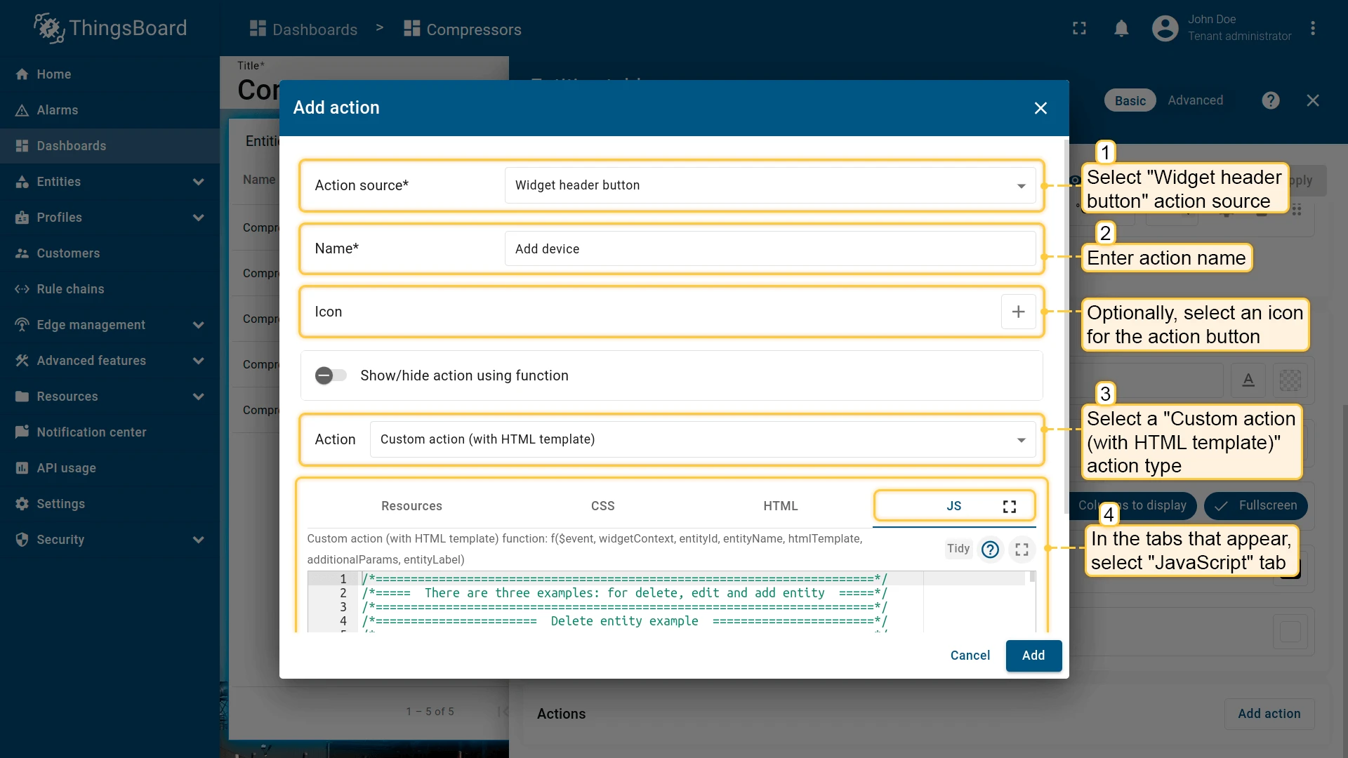
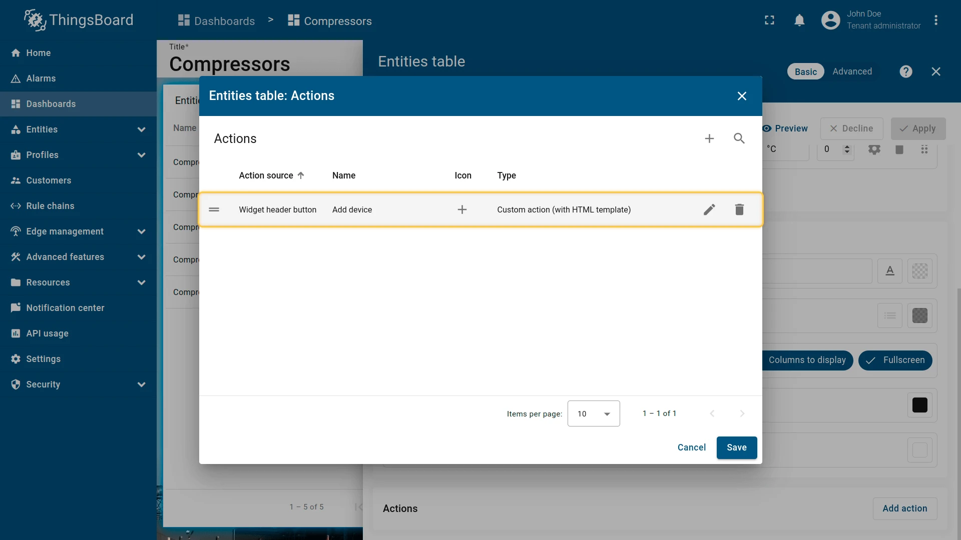
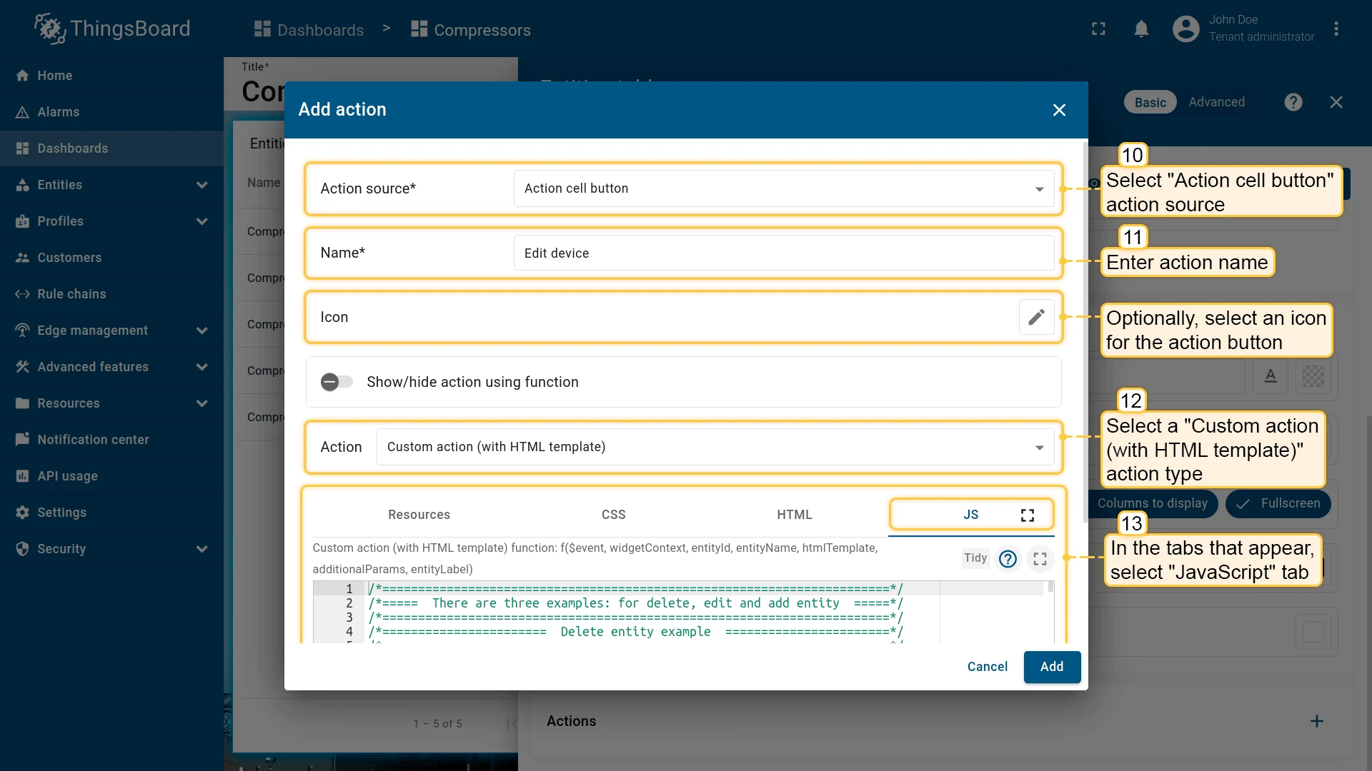
Now add a second action — a per-row Edit button. Open a new Add action dialog (click + in the Actions list), select Action cell button as the source, enter a name (e.g. Edit device), select Custom action (with HTML template), and follow the same steps: paste the JavaScript function and the HTML template below.
JavaScript function for editing a device or asset:
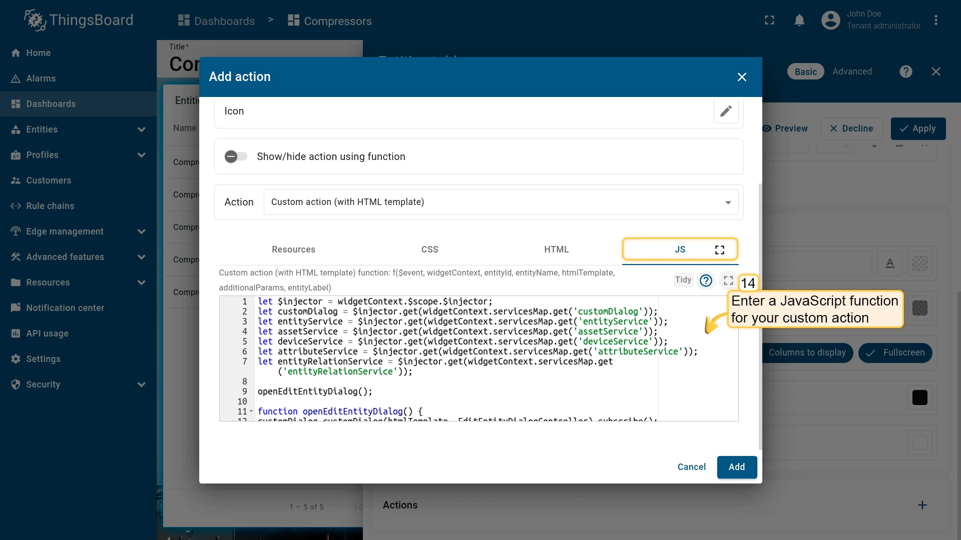
let $injector = widgetContext.$scope.$injector;let customDialog = $injector.get(widgetContext.servicesMap.get('customDialog'));let entityService = $injector.get(widgetContext.servicesMap.get('entityService'));let assetService = $injector.get(widgetContext.servicesMap.get('assetService'));let deviceService = $injector.get(widgetContext.servicesMap.get('deviceService'));let attributeService = $injector.get(widgetContext.servicesMap.get('attributeService'));let entityRelationService = $injector.get(widgetContext.servicesMap.get('entityRelationService'));
openEditEntityDialog();
function openEditEntityDialog() {customDialog.customDialog(htmlTemplate, EditEntityDialogController).subscribe();}
function EditEntityDialogController(instance) {let vm = instance;
vm.entityName = entityName; vm.entityType = entityId.entityType; vm.entitySearchDirection = { from: "FROM", to: "TO" }; vm.attributes = {}; vm.oldRelationsData = []; vm.relationsToDelete = []; vm.entity = {};
vm.editEntityFormGroup = vm.fb.group({ entityName: ['', [vm.validators.required]], entityType: [null], entityLabel: [null], type: ['', [vm.validators.required]], attributes: vm.fb.group({ latitude: [null], longitude: [null], address: [null], owner: [null], number: [null, [vm.validators.pattern(/^-?[0-9]+$/)]], booleanValue: [false] }), oldRelations: vm.fb.array([]), relations: vm.fb.array([]) });
getEntityInfo();
vm.cancel = function() { vm.dialogRef.close(null); };
vm.relations = function() { return vm.editEntityFormGroup.get('relations'); };
vm.oldRelations = function() { return vm.editEntityFormGroup.get('oldRelations'); };
vm.addRelation = function() { vm.relations().push(vm.fb.group({ relatedEntity: [null, [vm.validators.required]], relationType: [null, [vm.validators.required]], direction: [null, [vm.validators.required]] })); };
function addOldRelation() { vm.oldRelations().push(vm.fb.group({ relatedEntity: [{value: null, disabled: true}, [vm.validators.required]], relationType: [{value: null, disabled: true}, [vm.validators.required]], direction: [{value: null, disabled: true}, [vm.validators.required]] })); }
vm.removeRelation = function(index) { vm.relations().removeAt(index); vm.relations().markAsDirty(); };
vm.removeOldRelation = function(index) { vm.oldRelations().removeAt(index); vm.relationsToDelete.push(vm.oldRelationsData[index]); vm.oldRelations().markAsDirty(); };
vm.save = function() { vm.editEntityFormGroup.markAsPristine(); widgetContext.rxjs.forkJoin([ saveAttributes(entityId), saveRelations(entityId), saveEntity() ]).subscribe( function () { widgetContext.updateAliases(); vm.dialogRef.close(null); } ); };
function getEntityAttributes(attributes) { for (var i = 0; i < attributes.length; i++) { vm.attributes[attributes[i].key] = attributes[i].value; } }
function getEntityRelations(relations) { let relationsFrom = relations[0]; let relationsTo = relations[1]; for (let i=0; i < relationsFrom.length; i++) { let relation = { direction: 'FROM', relationType: relationsFrom[i].type, relatedEntity: relationsFrom[i].to }; vm.oldRelationsData.push(relation); addOldRelation(); } for (let i=0; i < relationsTo.length; i++) { let relation = { direction: 'TO', relationType: relationsTo[i].type, relatedEntity: relationsTo[i].from }; vm.oldRelationsData.push(relation); addOldRelation(); } }
function getEntityInfo() { widgetContext.rxjs.forkJoin([ entityRelationService.findInfoByFrom(entityId), entityRelationService.findInfoByTo(entityId), attributeService.getEntityAttributes(entityId, 'SERVER_SCOPE'), entityService.getEntity(entityId.entityType, entityId.id) ]).subscribe( function (data) { getEntityRelations(data.slice(0,2)); getEntityAttributes(data[2]); vm.entity = data[3]; vm.editEntityFormGroup.patchValue({ entityName: vm.entity.name, entityType: vm.entityType, entityLabel: vm.entity.label, type: vm.entity.type, attributes: vm.attributes, oldRelations: vm.oldRelationsData }, {emitEvent: false}); } ); }
function saveEntity() { const formValues = vm.editEntityFormGroup.value; if (vm.entity.label !== formValues.entityLabel){ vm.entity.label = formValues.entityLabel; if (formValues.entityType == 'ASSET') { return assetService.saveAsset(vm.entity); } else if (formValues.entityType == 'DEVICE') { return deviceService.saveDevice(vm.entity); } } return widgetContext.rxjs.of([]); }
function saveAttributes(entityId) { let attributes = vm.editEntityFormGroup.get('attributes').value; let attributesArray = []; for (let key in attributes) { if (attributes[key] !== vm.attributes[key]) { attributesArray.push({key: key, value: attributes[key]}); } } if (attributesArray.length > 0) { return attributeService.saveEntityAttributes(entityId, "SERVER_SCOPE", attributesArray); } return widgetContext.rxjs.of([]); }
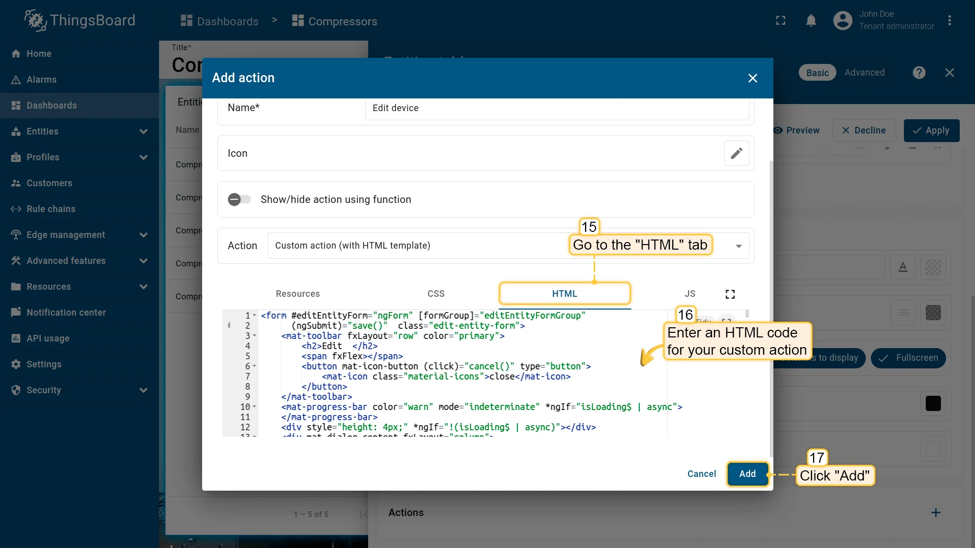
function saveRelations(entityId) { let relations = vm.editEntityFormGroup.get('relations').value; let tasks = []; for(let i=0; i < relations.length; i++) { let relation = { type: relations[i].relationType, typeGroup: 'COMMON' }; if (relations[i].direction == 'FROM') { relation.to = relations[i].relatedEntity; relation.from = entityId; } else { relation.to = entityId; relation.from = relations[i].relatedEntity; } tasks.push(entityRelationService.saveRelation(relation)); } for (let i=0; i < vm.relationsToDelete.length; i++) { let relation = { type: vm.relationsToDelete[i].relationType }; if (vm.relationsToDelete[i].direction == 'FROM') { relation.to = vm.relationsToDelete[i].relatedEntity; relation.from = entityId; } else { relation.to = entityId; relation.from = vm.relationsToDelete[i].relatedEntity; } tasks.push(entityRelationService.deleteRelation(relation.from, relation.type, relation.to)); } if (tasks.length > 0) { return widgetContext.rxjs.forkJoin(tasks); } return widgetContext.rxjs.of([]); }}Switch to the HTML tab and enter the HTML template for the edit dialog:
HTML template for the edit-entity dialog:
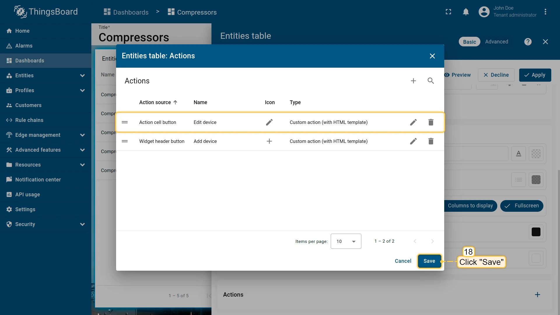
<form #editEntityForm="ngForm" [formGroup]="editEntityFormGroup" (ngSubmit)="save()" class="edit-entity-form"> <mat-toolbar fxLayout="row" color="primary"> <h2>Edit {{entityType.toLowerCase()}} {{entityName}}</h2> <span fxFlex></span> <button mat-icon-button (click)="cancel()" type="button"> <mat-icon class="material-icons">close</mat-icon> </button> </mat-toolbar> <mat-progress-bar color="warn" mode="indeterminate" *ngIf="isLoading$ | async"> </mat-progress-bar> <div style="height: 4px;" *ngIf="!(isLoading$ | async)"></div> <div mat-dialog-content fxLayout="column"> <div fxLayout="row" fxLayoutGap="8px" fxLayout.xs="column" fxLayoutGap.xs="0"> <mat-form-field fxFlex class="mat-block"> <mat-label>Entity Name</mat-label> <input matInput formControlName="entityName" required readonly=""> </mat-form-field> <mat-form-field fxFlex class="mat-block"> <mat-label>Entity Label</mat-label> <input matInput formControlName="entityLabel"> </mat-form-field> </div> <div fxLayout="row" fxLayoutGap="8px" fxLayout.xs="column" fxLayoutGap.xs="0"> <mat-form-field fxFlex class="mat-block"> <mat-label>Entity Type</mat-label> <input matInput formControlName="entityType" readonly> </mat-form-field> <mat-form-field fxFlex class="mat-block"> <mat-label>Type</mat-label> <input matInput formControlName="type" readonly> </mat-form-field> </div> <div formGroupName="attributes" fxLayout="column"> <div fxLayout="row" fxLayoutGap="8px" fxLayout.xs="column" fxLayoutGap.xs="0"> <mat-form-field fxFlex class="mat-block"> <mat-label>Latitude</mat-label> <input type="number" step="any" matInput formControlName="latitude"> </mat-form-field> <mat-form-field fxFlex class="mat-block"> <mat-label>Longitude</mat-label> <input type="number" step="any" matInput formControlName="longitude"> </mat-form-field> </div> <div fxLayout="row" fxLayoutGap="8px" fxLayout.xs="column" fxLayoutGap.xs="0"> <mat-form-field fxFlex class="mat-block"> <mat-label>Address</mat-label> <input matInput formControlName="address"> </mat-form-field> <mat-form-field fxFlex class="mat-block"> <mat-label>Owner</mat-label> <input matInput formControlName="owner"> </mat-form-field> </div> <div fxLayout="row" fxLayoutGap="8px" fxLayout.xs="column" fxLayoutGap.xs="0"> <mat-form-field fxFlex class="mat-block"> <mat-label>Integer Value</mat-label> <input type="number" step="1" matInput formControlName="number"> <mat-error *ngIf="editEntityFormGroup.get('attributes.number').hasError('pattern')"> Invalid integer value. </mat-error> </mat-form-field> <div class="boolean-value-input" fxLayout="column" fxLayoutAlign="center start" fxFlex> <label class="checkbox-label">Boolean Value</label> <mat-checkbox formControlName="booleanValue" style="margin-bottom: 40px;"> {{ (editEntityFormGroup.get('attributes.booleanValue').value ? "value.true" : "value.false") | translate }} </mat-checkbox> </div> </div> </div> <div class="relations-list old-relations"> <div class="mat-body-1" style="padding-bottom: 10px; color: rgba(0,0,0,0.57);">Relations</div> <div class="body" [fxShow]="oldRelations().length"> <div class="row" fxLayout="row" fxLayoutAlign="start center" formArrayName="oldRelations" *ngFor="let relation of oldRelations().controls; let i = index;"> <div [formGroupName]="i" class="mat-elevation-z2" fxFlex fxLayout="row" style="padding: 5px 0 5px 5px;"> <div fxFlex fxLayout="column"> <div fxLayout="row" fxLayoutGap="8px" fxLayout.xs="column" fxLayoutGap.xs="0"> <mat-form-field class="mat-block" style="min-width: 100px;"> <mat-label>Direction</mat-label> <mat-select formControlName="direction" name="direction"> <mat-option *ngFor="let direction of entitySearchDirection | keyvalue" [value]="direction.value"> {{ ("relation.search-direction." + direction.value) | translate}} </mat-option> </mat-select> <mat-error *ngIf="relation.get('direction').hasError('required')"> Relation direction is required. </mat-error> </mat-form-field> <tb-relation-type-autocomplete fxFlex class="mat-block" formControlName="relationType" required="true"> </tb-relation-type-autocomplete> </div> <div fxLayout="row" fxLayout.xs="column"> <tb-entity-select fxFlex class="mat-block" required="true" formControlName="relatedEntity"> </tb-entity-select> </div> </div> <div fxLayout="column" fxLayoutAlign="center center"> <button mat-icon-button color="primary" aria-label="Remove" type="button" (click)="removeOldRelation(i)" matTooltip="Remove relation" matTooltipPosition="above"> <mat-icon>close</mat-icon> </button> </div> </div> </div> </div> </div> <div class="relations-list"> <div class="mat-body-1" style="padding-bottom: 10px; color: rgba(0,0,0,0.57);">New Relations</div> <div class="body" [fxShow]="relations().length"> <div class="row" fxLayout="row" fxLayoutAlign="start center" formArrayName="relations" *ngFor="let relation of relations().controls; let i = index;"> <div [formGroupName]="i" class="mat-elevation-z2" fxFlex fxLayout="row" style="padding: 5px 0 5px 5px;"> <div fxFlex fxLayout="column"> <div fxLayout="row" fxLayoutGap="8px" fxLayout.xs="column" fxLayoutGap.xs="0"> <mat-form-field class="mat-block" style="min-width: 100px;"> <mat-label>Direction</mat-label> <mat-select formControlName="direction" name="direction"> <mat-option *ngFor="let direction of entitySearchDirection | keyvalue" [value]="direction.value"> {{ ("relation.search-direction." + direction.value) | translate}} </mat-option> </mat-select> <mat-error *ngIf="relation.get('direction').hasError('required')"> Relation direction is required. </mat-error> </mat-form-field> <tb-relation-type-autocomplete fxFlex class="mat-block" formControlName="relationType" [required]="true"> </tb-relation-type-autocomplete> </div> <div fxLayout="row" fxLayout.xs="column"> <tb-entity-select fxFlex class="mat-block" [required]="true" formControlName="relatedEntity"> </tb-entity-select> </div> </div> <div fxLayout="column" fxLayoutAlign="center center"> <button mat-icon-button color="primary" aria-label="Remove" type="button" (click)="removeRelation(i)" matTooltip="Remove relation" matTooltipPosition="above"> <mat-icon>close</mat-icon> </button> </div> </div> </div> </div> <div> <button mat-raised-button color="primary" type="button" (click)="addRelation()" matTooltip="Add Relation" matTooltipPosition="above"> Add </button> </div> </div> </div> <div mat-dialog-actions fxLayout="row" fxLayoutAlign="end center"> <button mat-button color="primary" type="button" [disabled]="(isLoading$ | async)" (click)="cancel()" cdkFocusInitial> Cancel </button> <button mat-button mat-raised-button color="primary" type="submit" [disabled]="(isLoading$ | async) || editEntityForm.invalid || !editEntityForm.dirty"> Save </button> </div></form>Click Add, then Save and Apply to save the widget settings, and click Save in the dashboard toolbar.
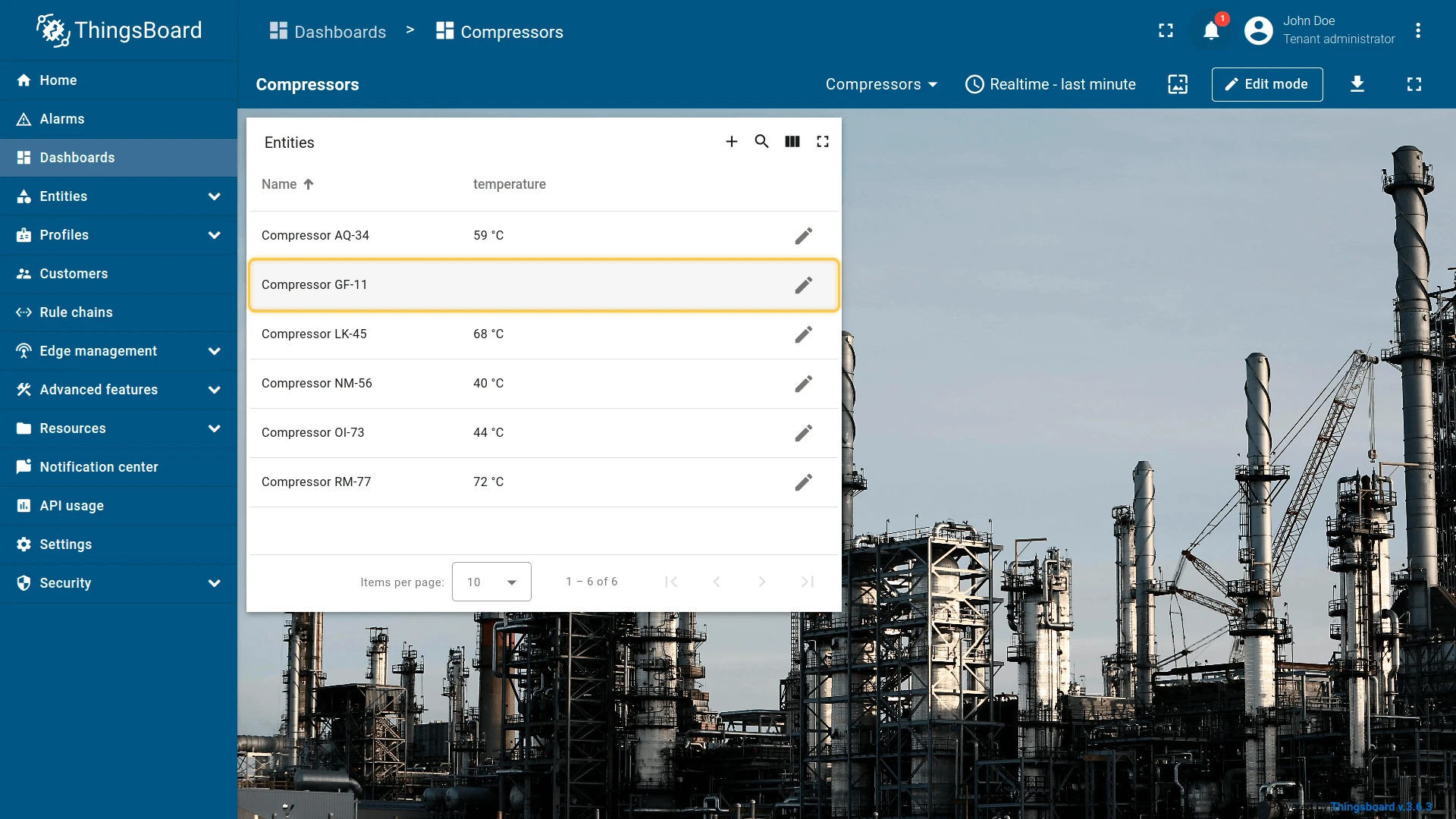
Click the Add device button in the widget header to open the create dialog. Select entity type “Device”, fill in the required fields, and click Create.


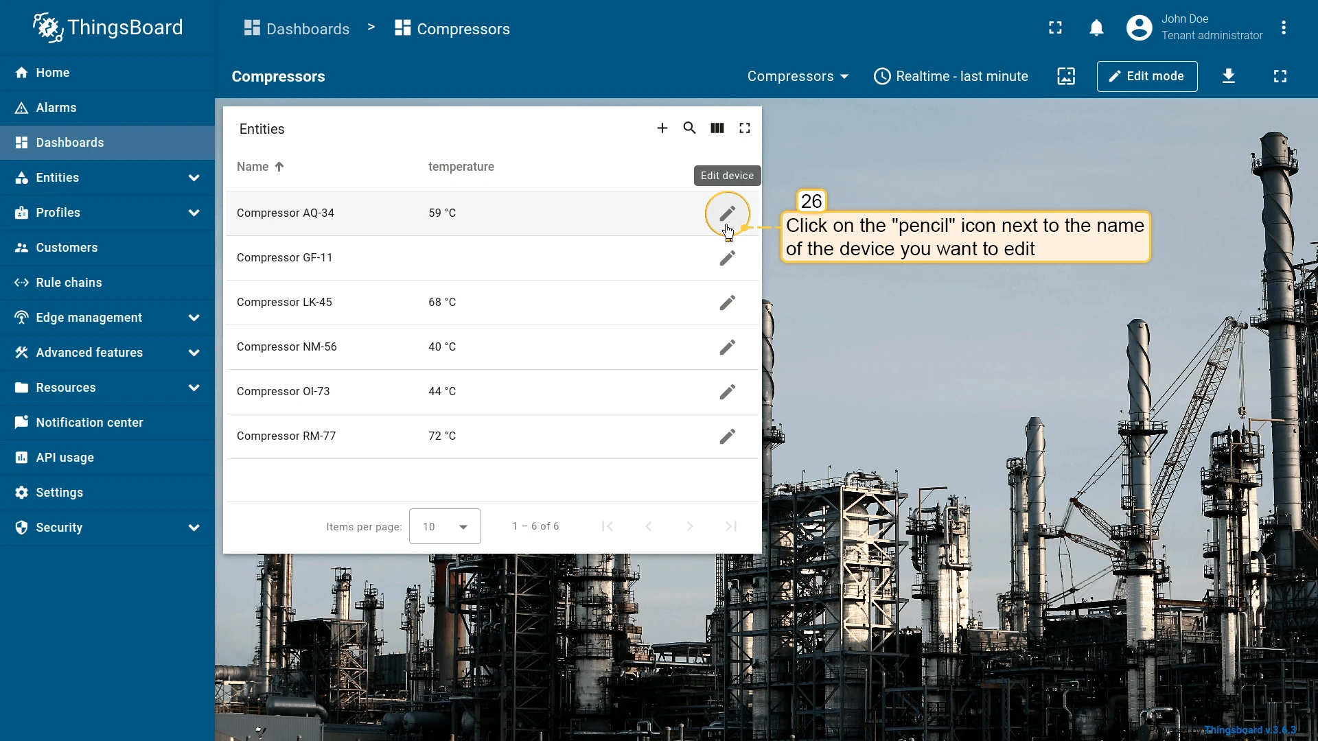
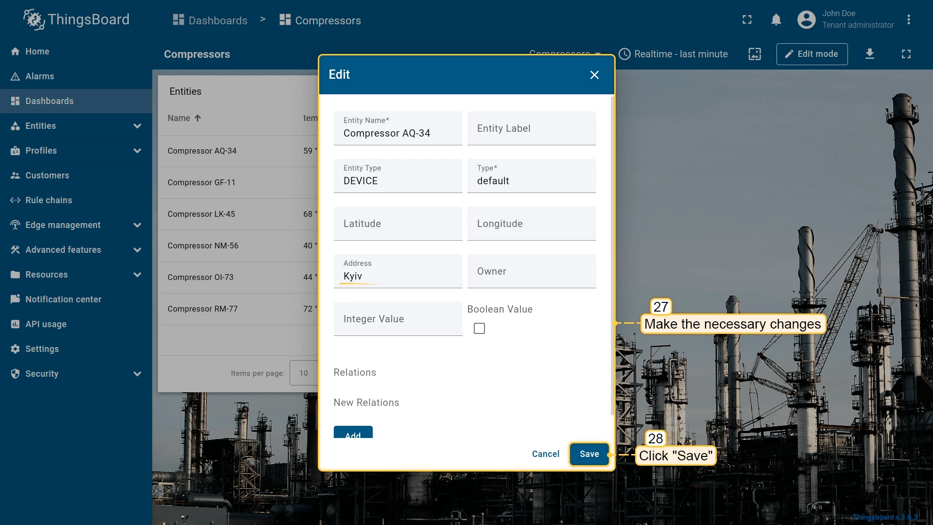
Click the pencil icon next to any entity to open the edit dialog. Make the necessary changes and click Save.
Mobile action
Section titled “Mobile action”Triggers a native mobile capability on the user’s device when the action button is tapped in the ThingsBoard mobile app. Available mobile action types:
- Scan QR code — opens the camera to scan a QR code and processes the result in a custom JavaScript function.
- Take photo — opens the camera to capture a photo, which is then handled by a custom function (e.g. uploaded as an attribute).
- Get location — fetches the device’s current GPS coordinates and passes them to a custom function.
- Make phone call — dials a phone number provided by a custom function or taken from an entity attribute.
- Open URL — opens a URL in the mobile app’s in-app browser.
Mobile actions are only active inside the ThingsBoard mobile app — on the web dashboard they are not triggered. See mobile actions for the full configuration guide.
Open URL
Section titled “Open URL”Opens any URL resource — a web page, document, image, or an internal ThingsBoard page. Can optionally open in a new browser tab. The URL field supports template variables such as ${entityName} and ${entityId} to build dynamic links based on the entity context.
- Open the widget in edit mode, go to the Actions tab, and click +.
- Select the action source (e.g. Widget header button), enter a name, and choose an icon.
- Select Open URL as the action type. Enter the target URL. Optionally enable Open in a new browser tab.
- Click Add, then Save and Apply to save the widget settings.
- Click Save in the dashboard toolbar.
Place map item
Section titled “Place map item”| Only for Map widgets |
The Place map item action adds a button to the map widget that lets users create a new entity and immediately position it on the map. After clicking the button, the user clicks a location on the map — a “Create entity” dialog opens, and once confirmed, the entity is saved to ThingsBoard and a new item appears at the chosen coordinates.
Four item types are supported:
| Item type | Description |
|---|---|
| Marker | A point marker placed at the clicked location. |
| Circle | A circle centered on the clicked point, with a configurable radius. |
| Polygon | A polygon drawn by clicking multiple vertices, closed on the final click. |
| Polyline | A line path drawn by clicking multiple points. |
The action is pre-filled with a default JavaScript function that opens a standard create dialog. You can replace it with a custom function — using the same JS + HTML template approach as Custom action (with HTML template) — to control which fields appear in the dialog.
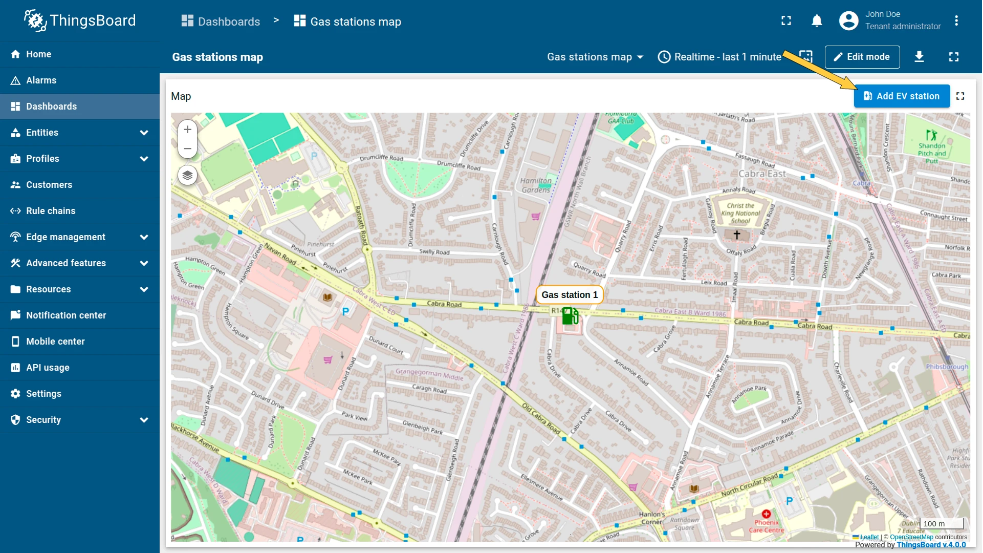
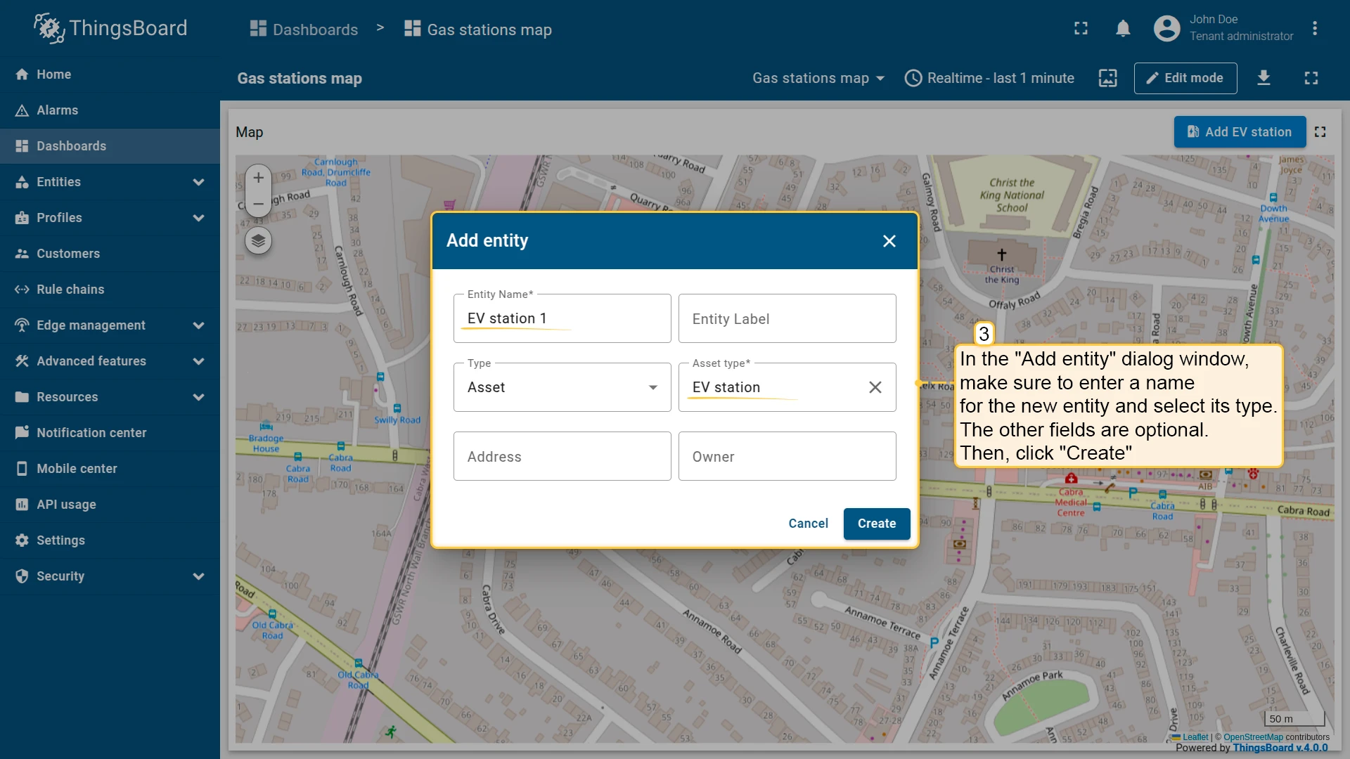
Example: add an “Add EV station” button that places new charging station assets directly on the map.
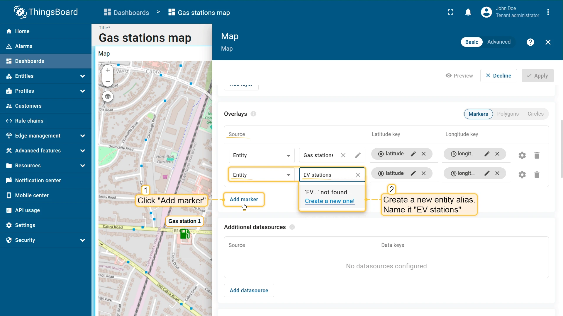
Configure the datasource
For newly created entities to appear on the map immediately, the widget’s datasource alias must resolve to the entity type you will be creating. Configure this before adding the action:
- In the widget settings, open the Overlays section and select the Marker tab.
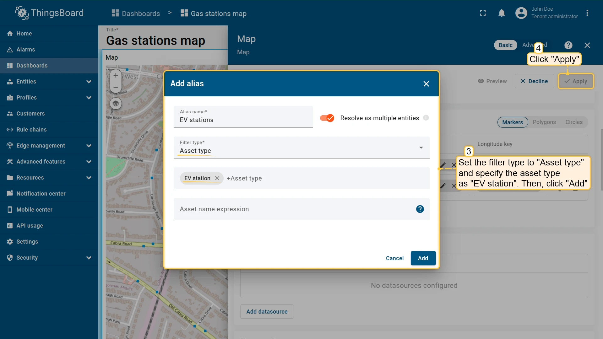
- Create a new entity alias — name it “EV stations”, set the filter type to Asset type, and specify the type as “EV station”.
- Click Apply.
Configure the action
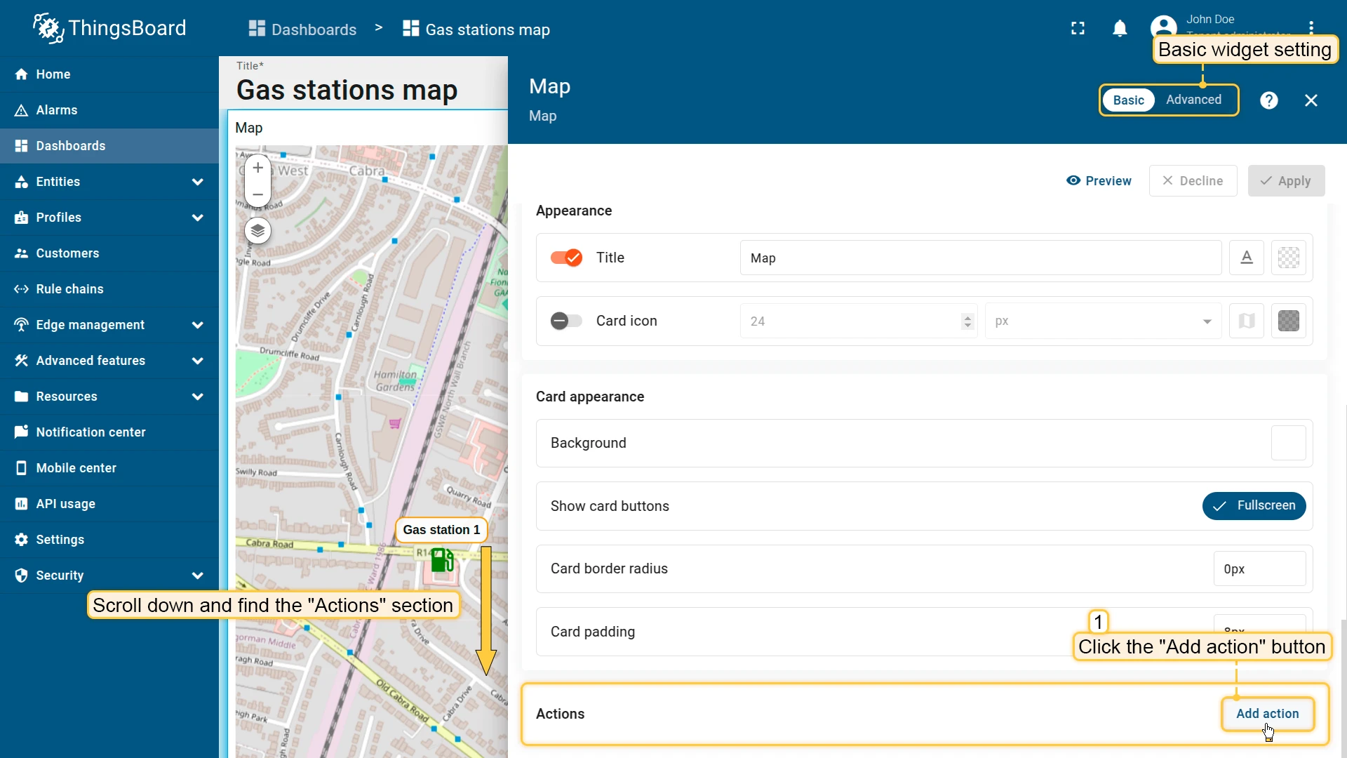
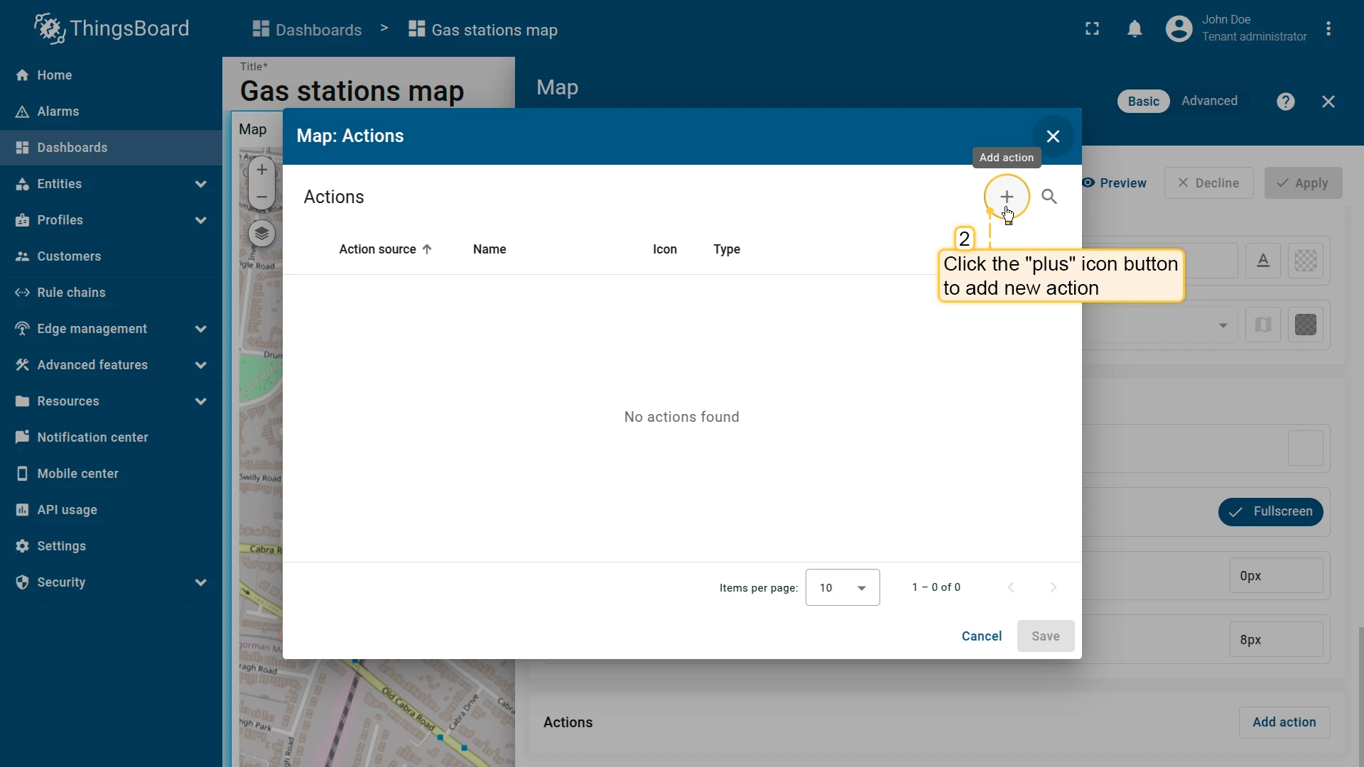
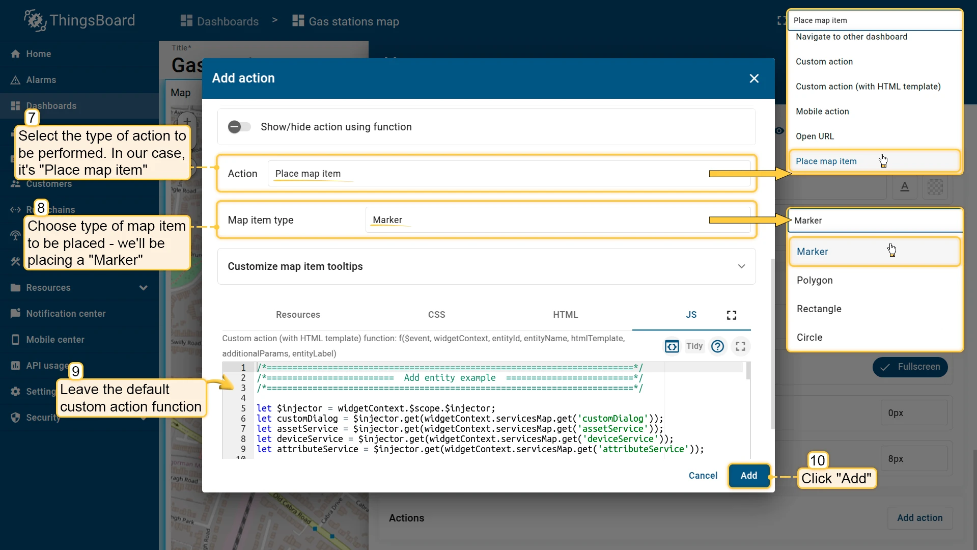
- Open the widget in edit mode, scroll to the Actions section, and click Add action, then click +.
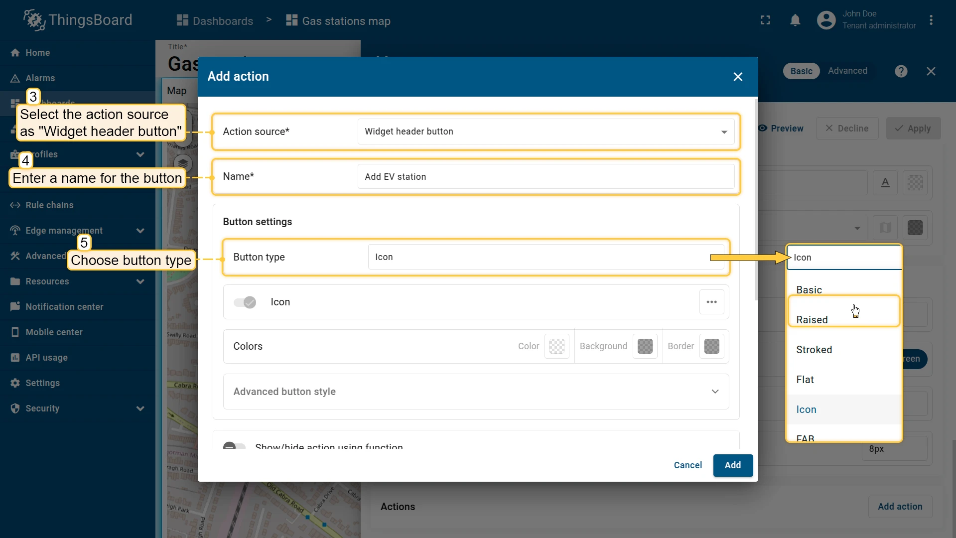
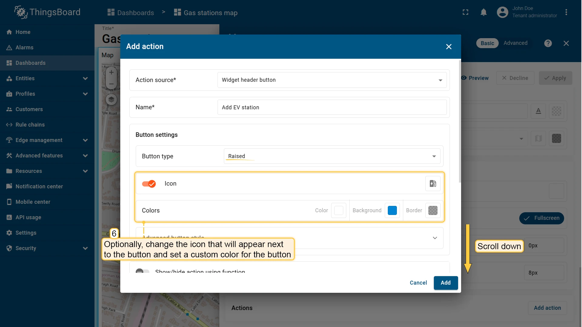
- Select Widget header button as the action source. Enter a name (e.g. Add EV station), then configure the button appearance — type, icon, and optional background color.
- From the Action dropdown, select Place map item and choose the item type — in this example, Marker.
- The JavaScript function field is pre-filled with the default create dialog — leave it unchanged or replace it with a custom function.
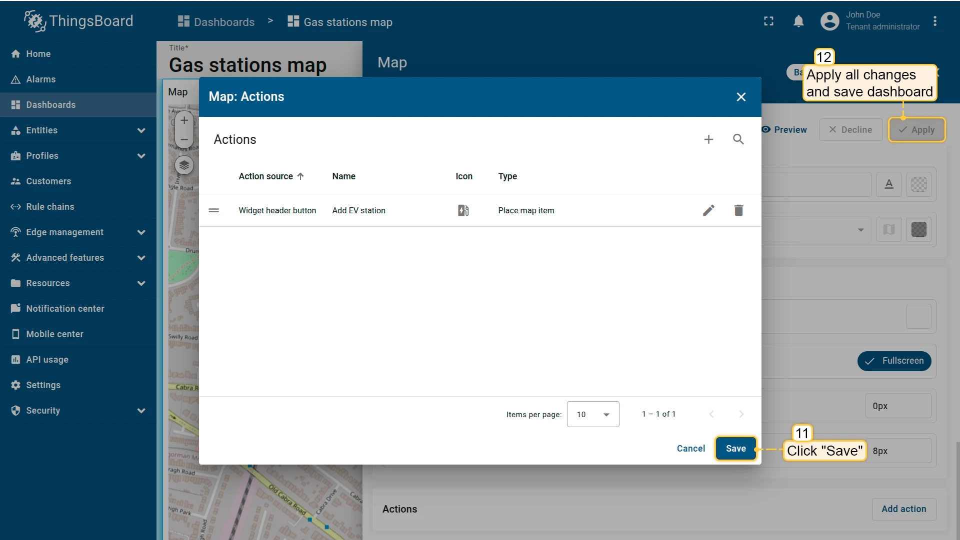
- Click Add, then Save, Apply, and Save the dashboard.
Place an item
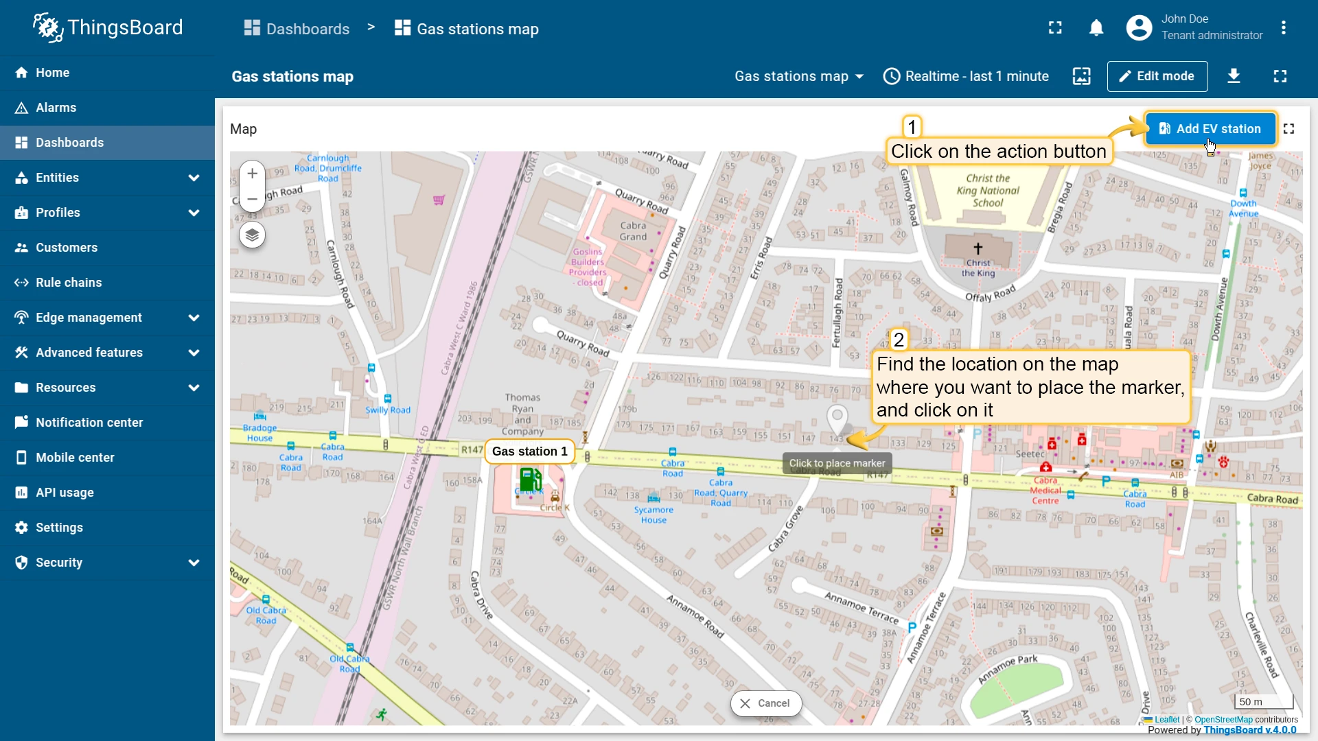
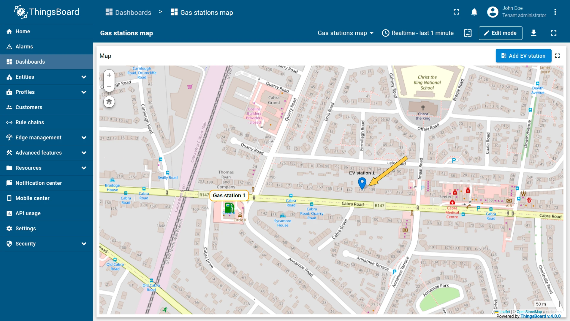
Click Add EV station in the widget header to activate placement mode, then click the desired location on the map. An “Add entity” dialog opens — enter a name, select the entity and asset type, and click Create. The new marker appears on the map immediately.
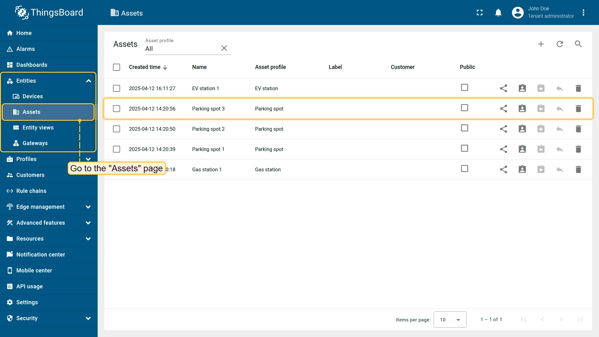
Navigate to Assets to confirm the new asset was saved.
Action sources
Section titled “Action sources”An action source defines what the user does to trigger an action — clicking a button, clicking a row, double-clicking, selecting a map marker, and so on. Available sources depend on the widget type. The examples below use the Entities table widget with the Navigate to new dashboard state action type.
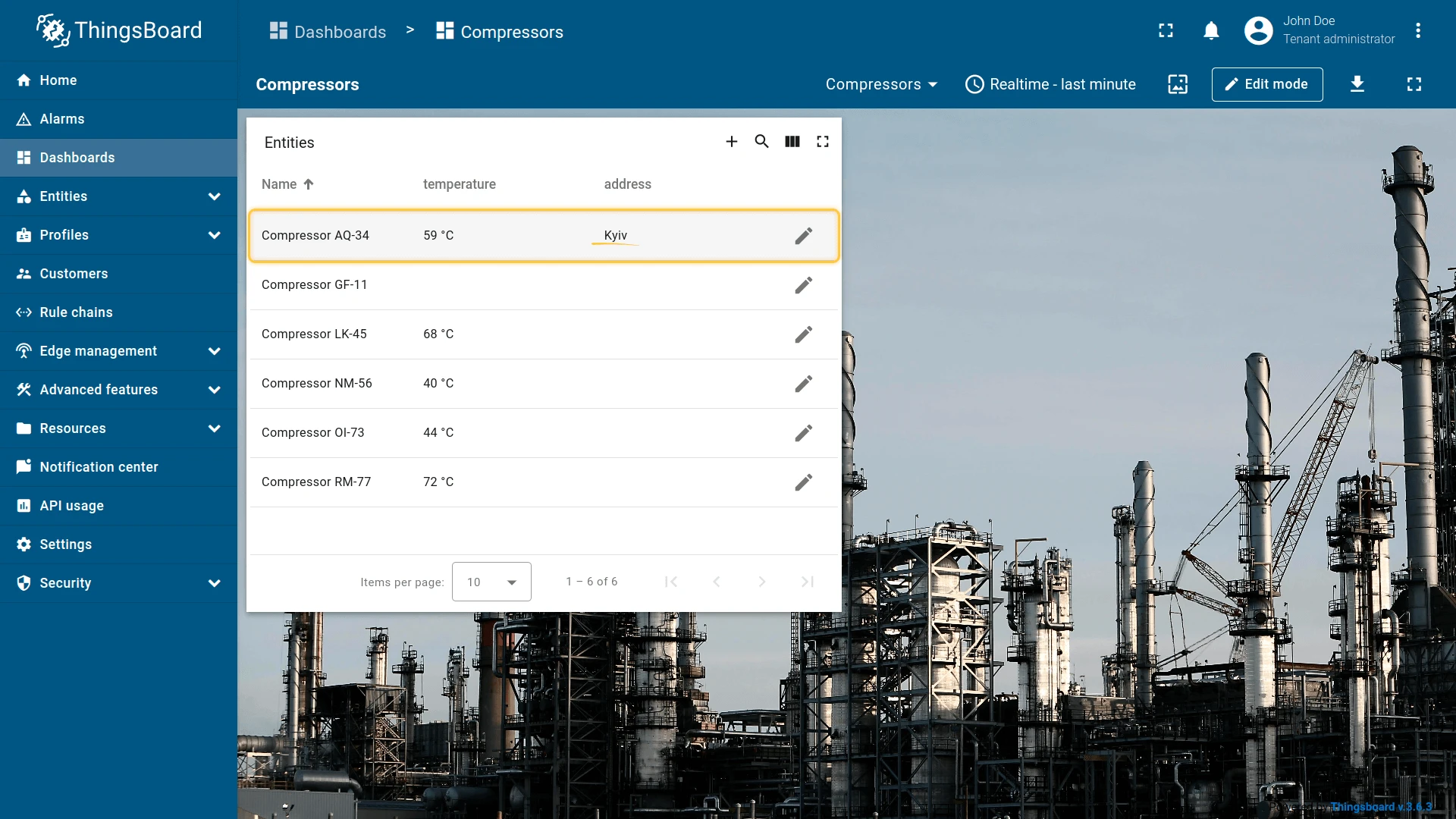
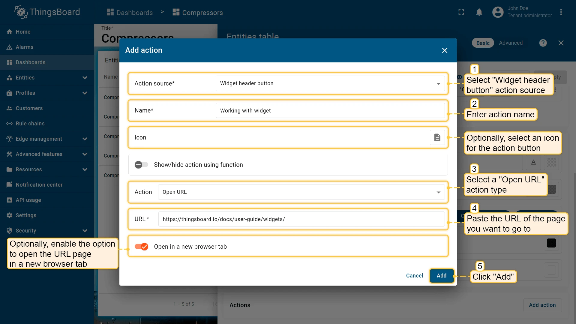
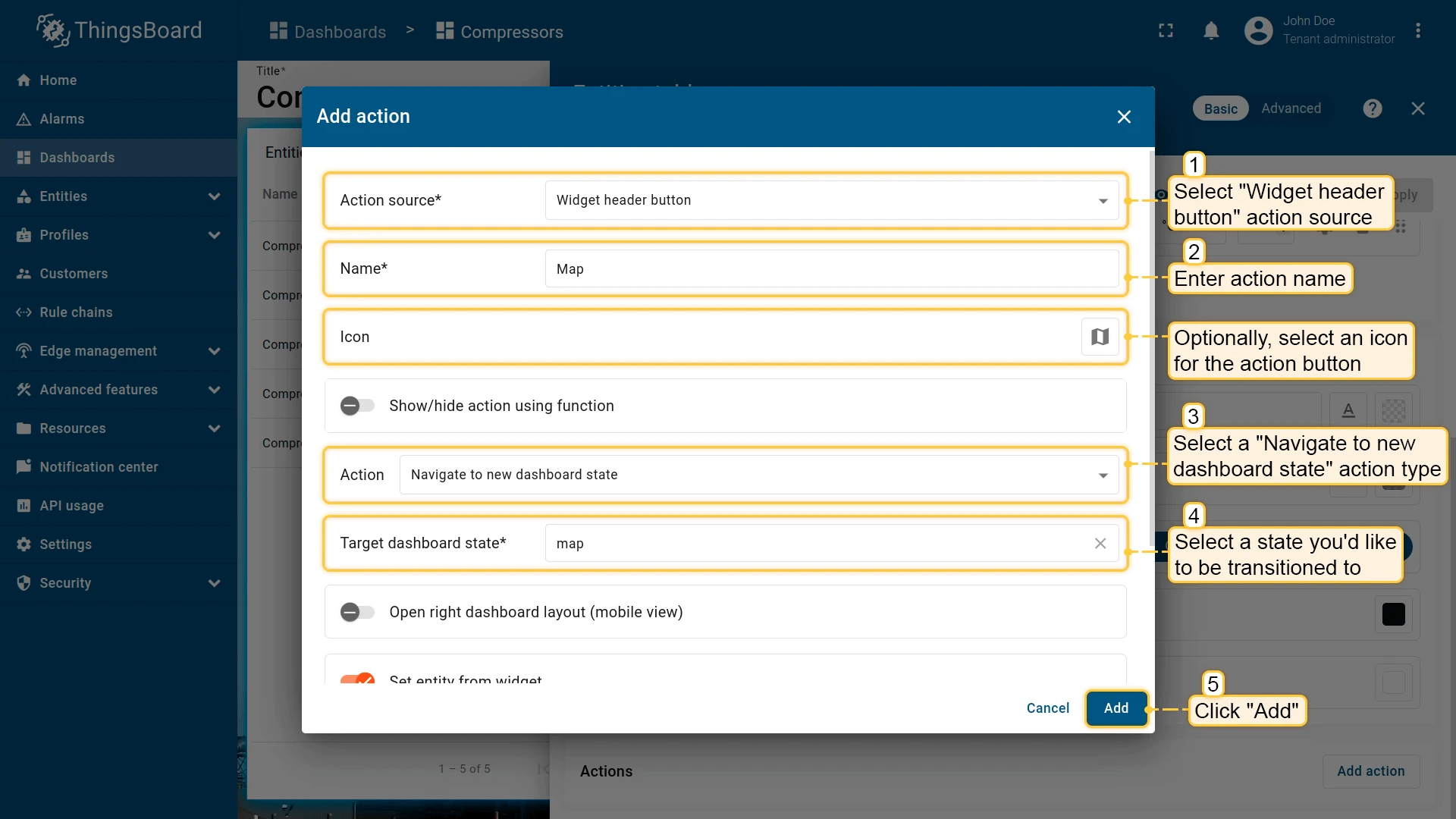
Widget header button
Section titled “Widget header button”Adds an action button to the widget header — applies to the whole widget, not to individual entities. Available in all widget types and is the most commonly used action source.
- Open the widget in edit mode, go to the Actions tab, and click +.
- Select Widget header button as the action source.
- Enter an action name and choose an icon for the button.
- Select Navigate to new dashboard state as the action type, then choose the target state.
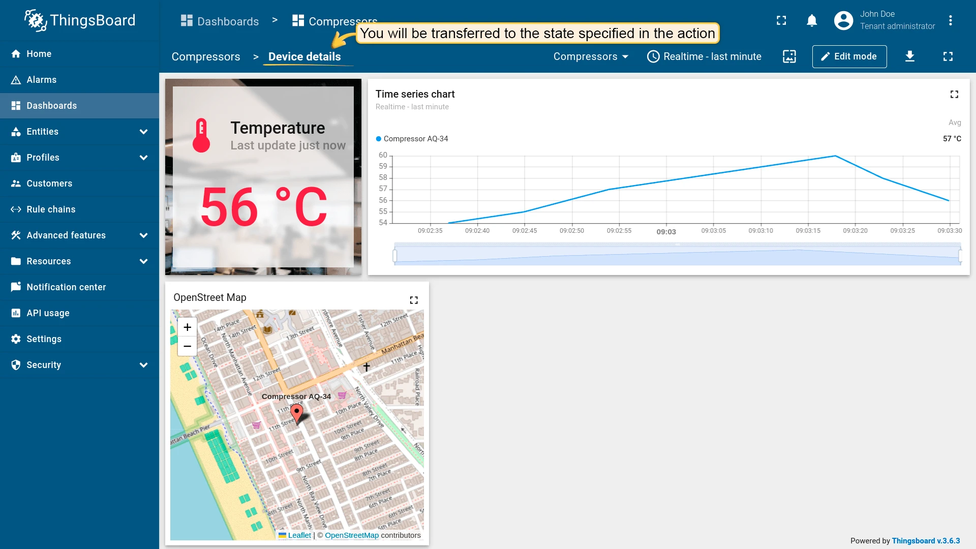
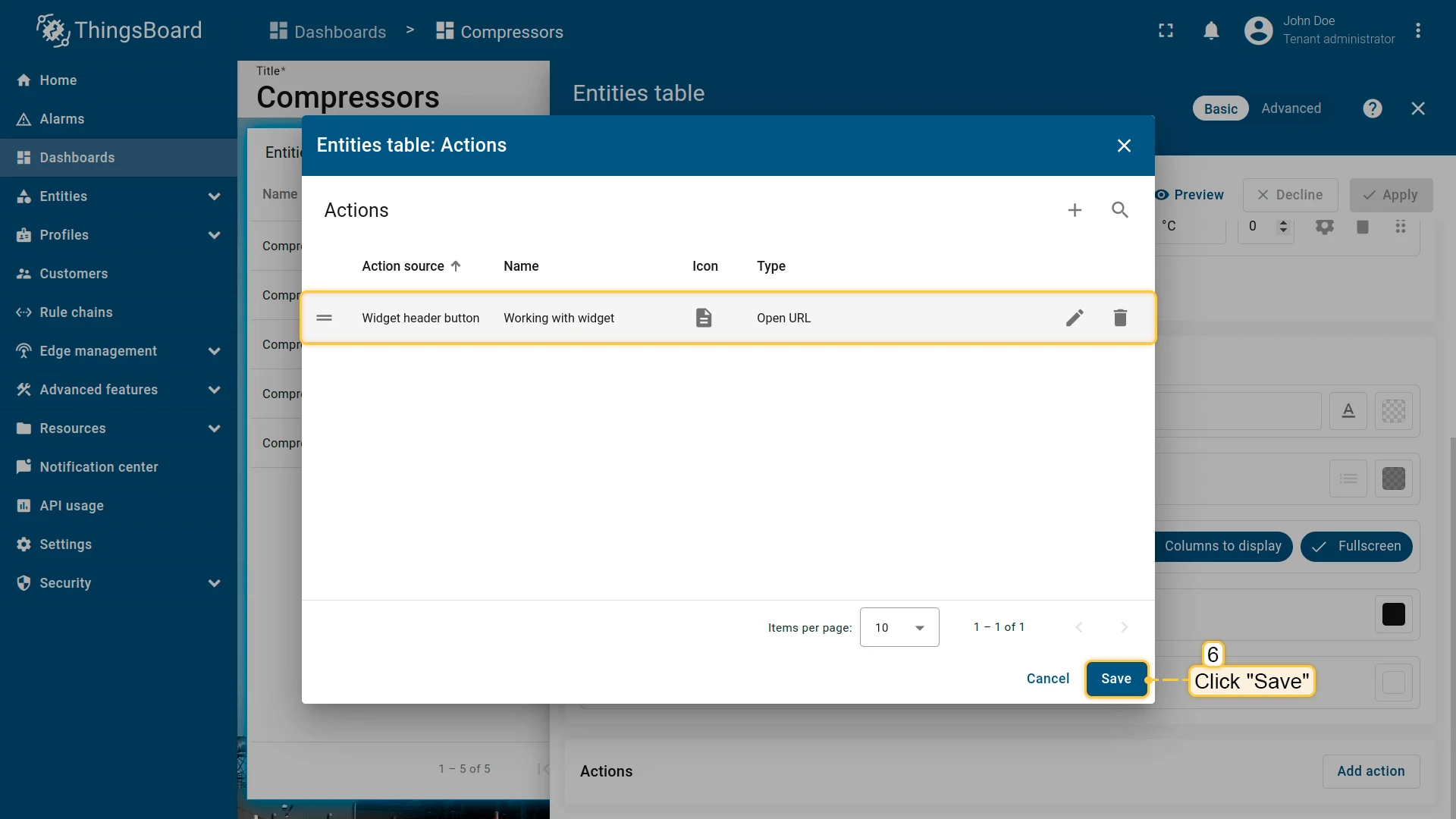
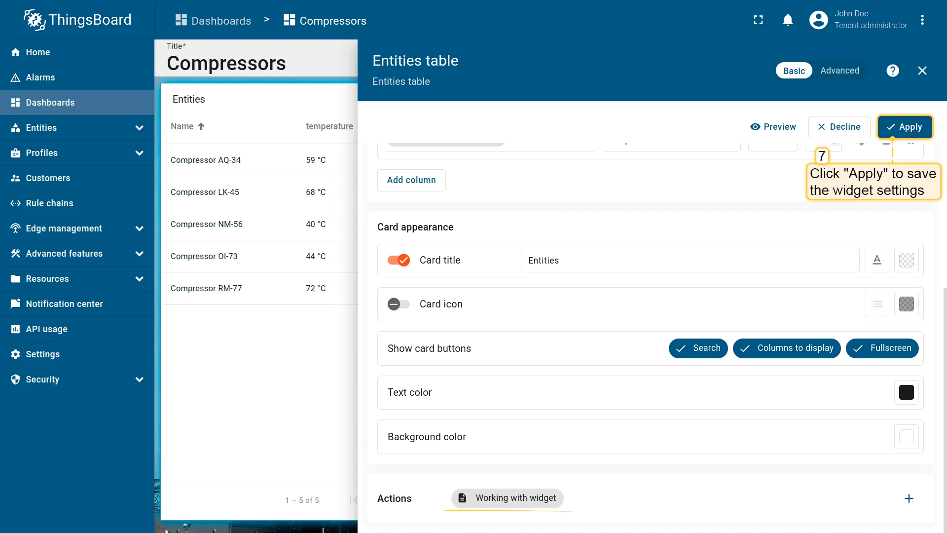
- Click Add, then Save and Apply to save the widget settings.
- Click Save in the dashboard toolbar to save the dashboard.


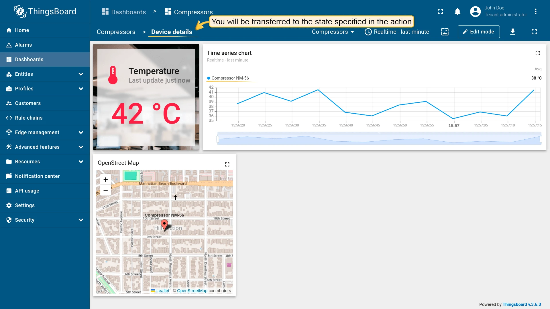
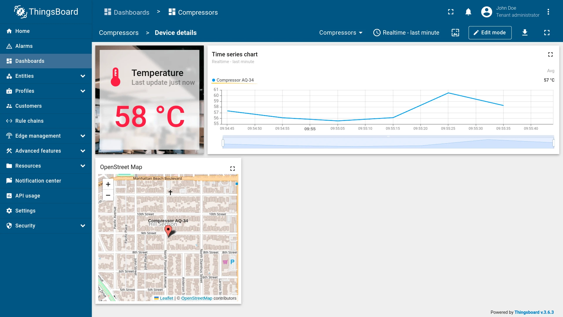
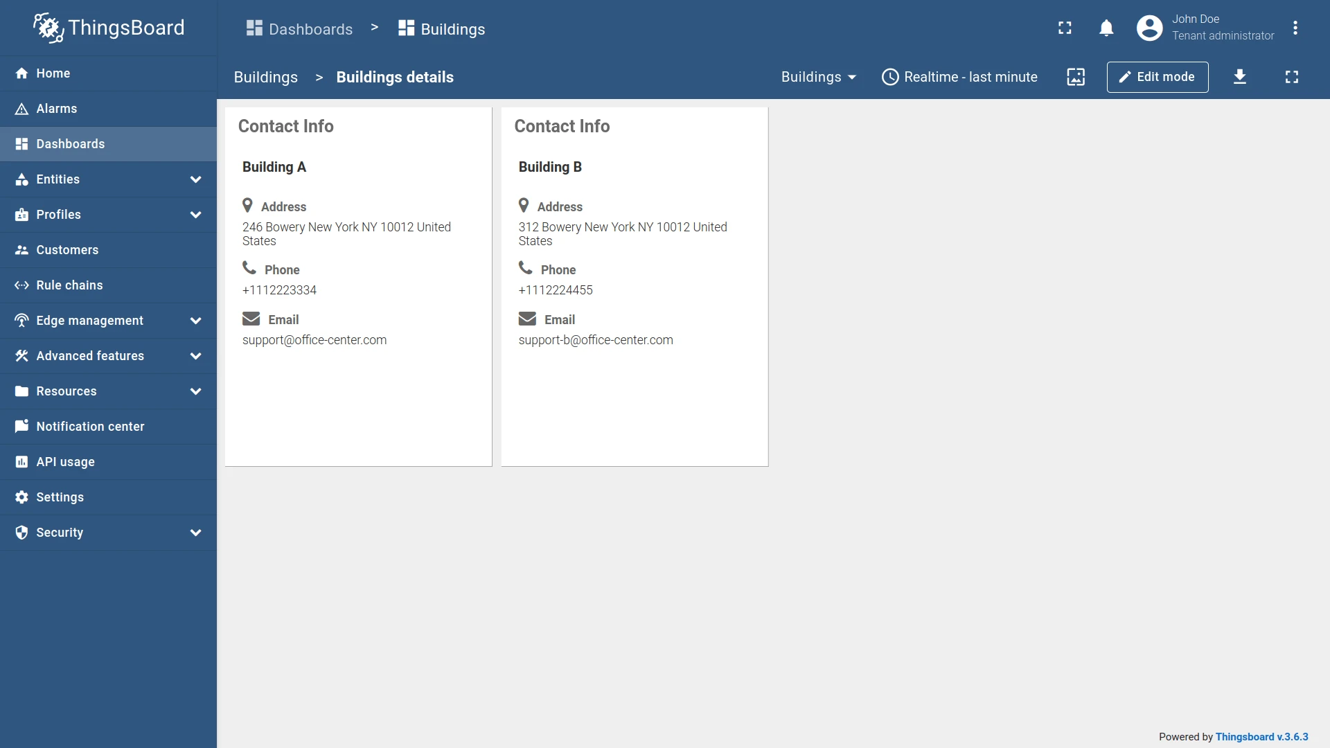
Result

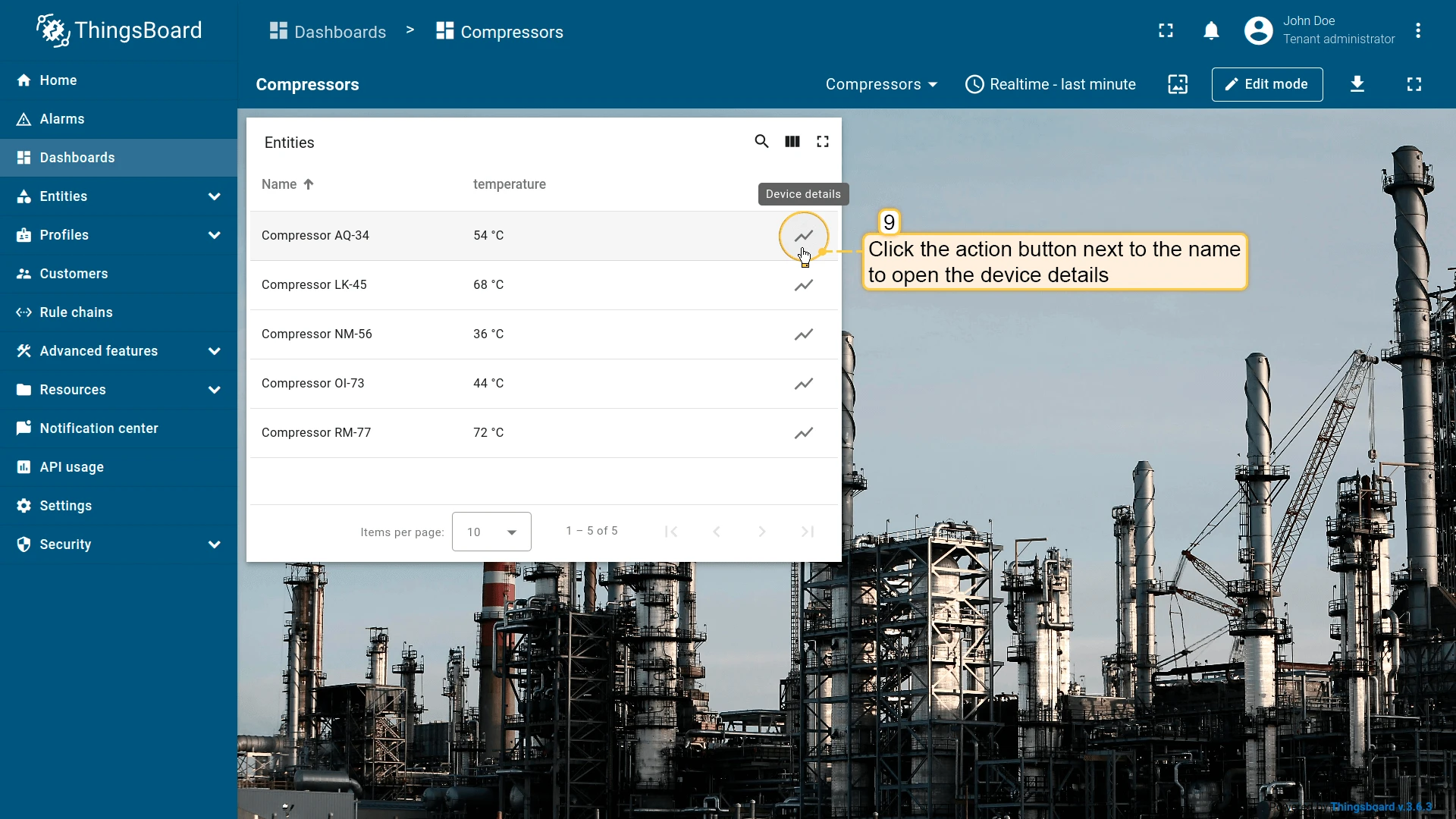
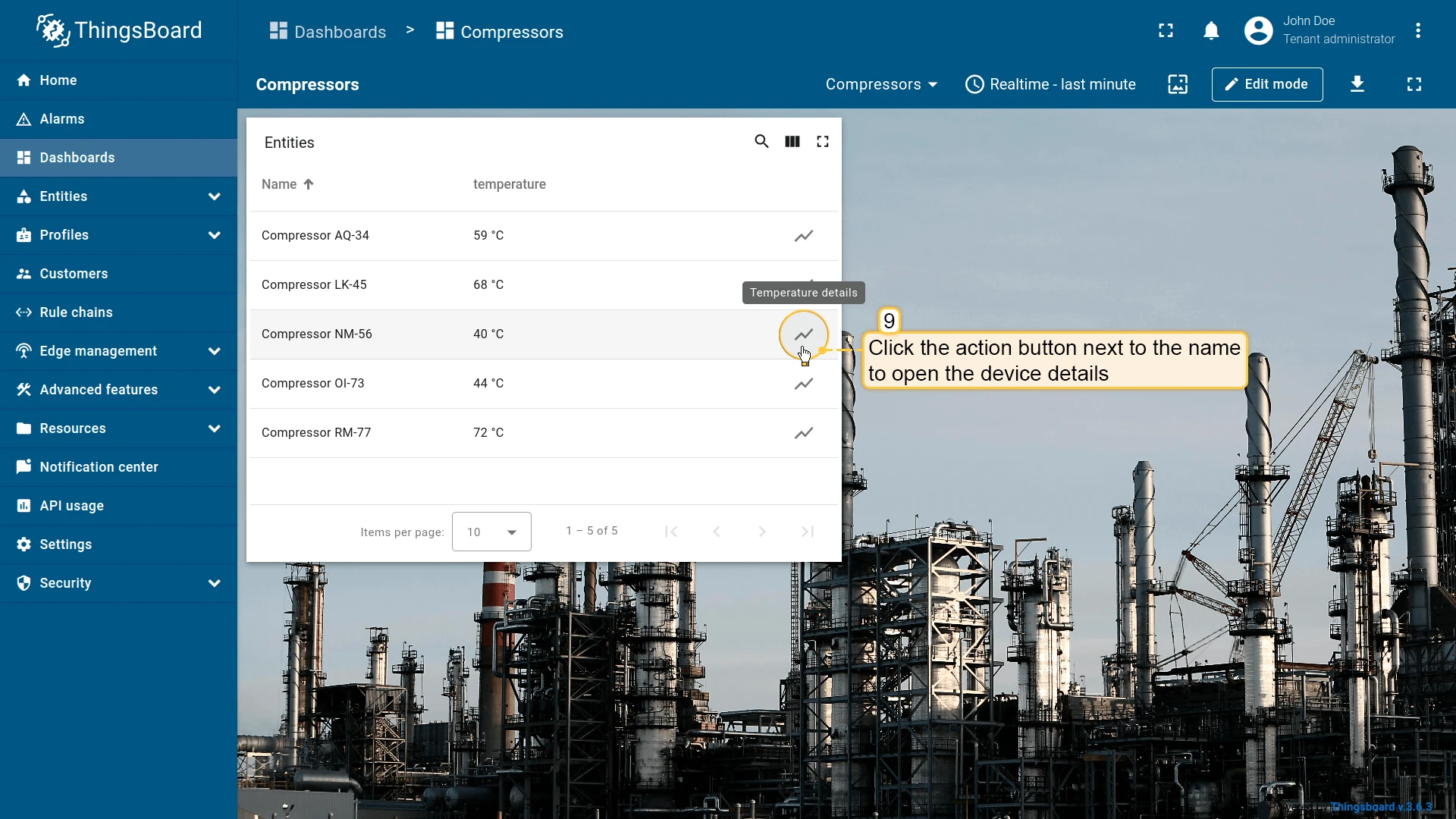
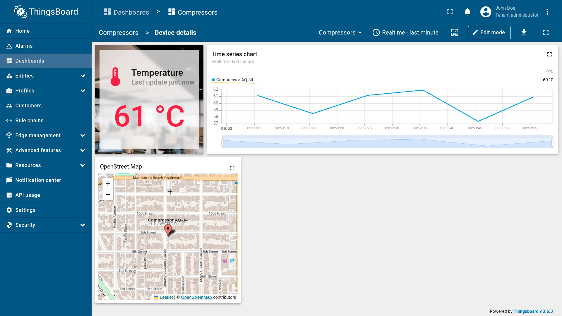
Action cell button
Section titled “Action cell button”Adds an icon button to each entity row. Clicking it executes the configured action for that specific entity — useful for navigating to details, editing, or deleting individual items.
- Open the widget in edit mode, go to the Actions tab, and click +.
- Select Action cell button as the action source.
- Enter an action name and choose an icon for the button.
- Select Navigate to new dashboard state as the action type, then choose the target state.
- Click Add, then Save and Apply to save the widget settings.
- Click Save in the dashboard toolbar to save the dashboard.


Result
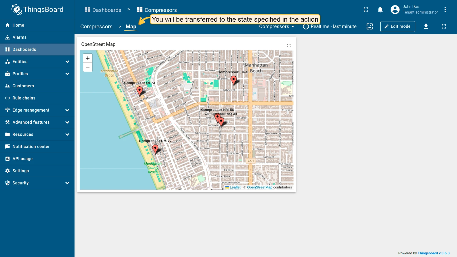
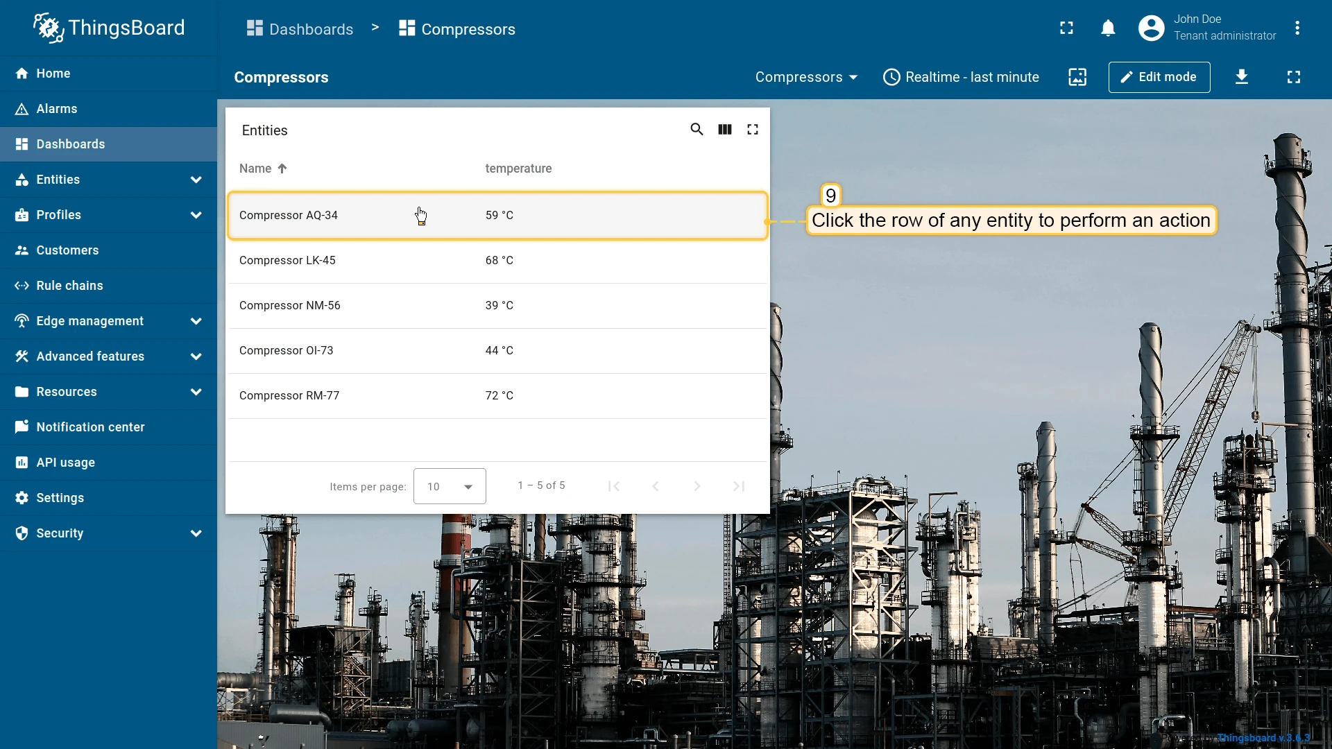
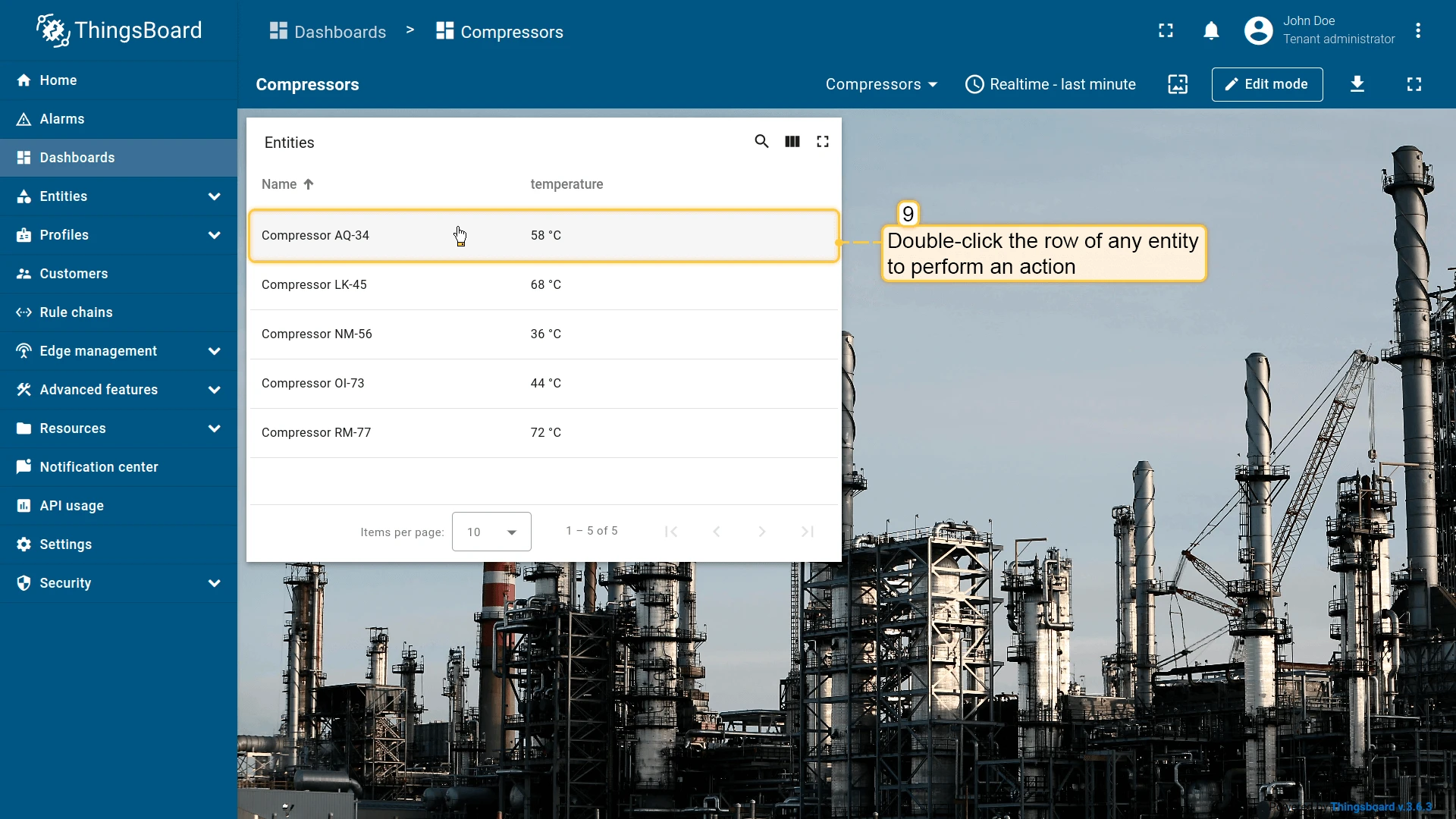
On row click
Section titled “On row click”Triggers when the user clicks anywhere on an entity row — the entire row is the clickable target, with no dedicated button shown. Can be combined with On row double click on the same widget to handle single and double clicks with different actions.
- Open the widget in edit mode, go to the Actions tab, and click +.
- Select On row click as the action source.
- Enter an action name. Optionally, choose an icon.
- Select Navigate to new dashboard state as the action type, then choose the target state.
- Click Add, then Save and Apply to save the widget settings.
- Click Save in the dashboard toolbar to save the dashboard.


Result
On row double click
Section titled “On row double click”Triggers when the user double-clicks an entity row. Can be combined with On row click on the same widget to handle single and double clicks with different actions.
- Open the widget in edit mode, go to the Actions tab, and click +.
- Select On row double click as the action source.
- Enter an action name. Optionally, choose an icon.
- Select Navigate to new dashboard state as the action type, then choose the target state.
- Click Add, then Save and Apply to save the widget settings.
- Click Save in the dashboard toolbar to save the dashboard.


Result
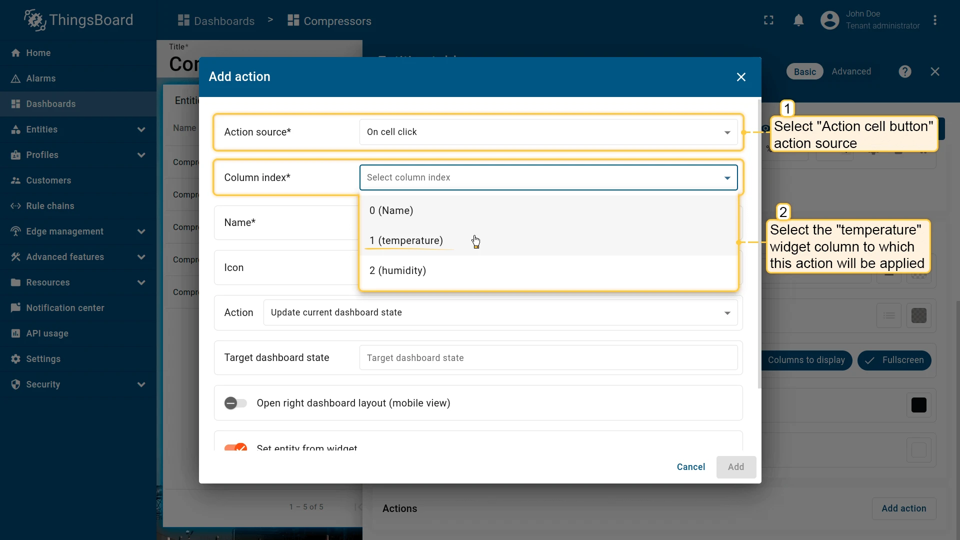
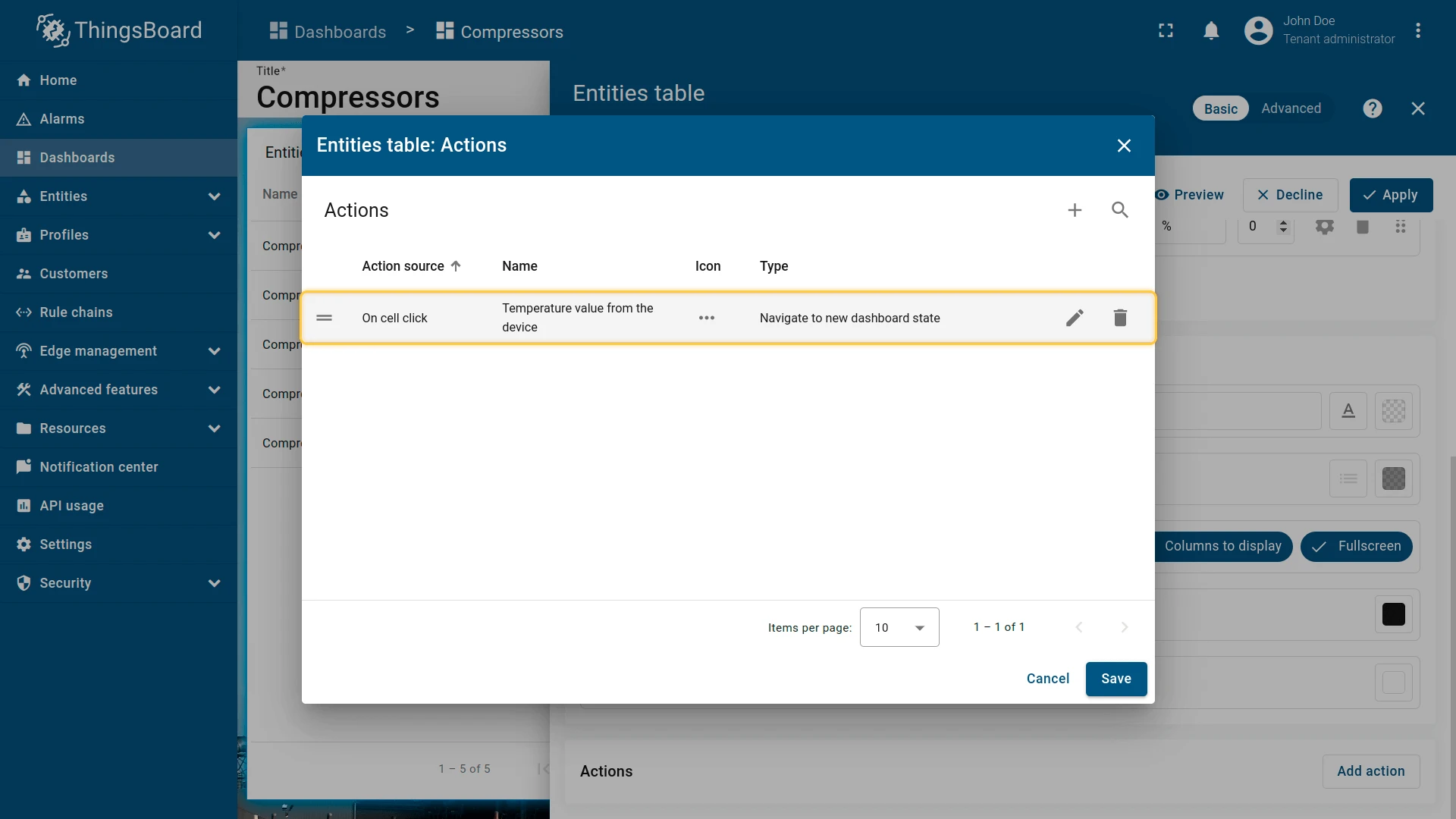
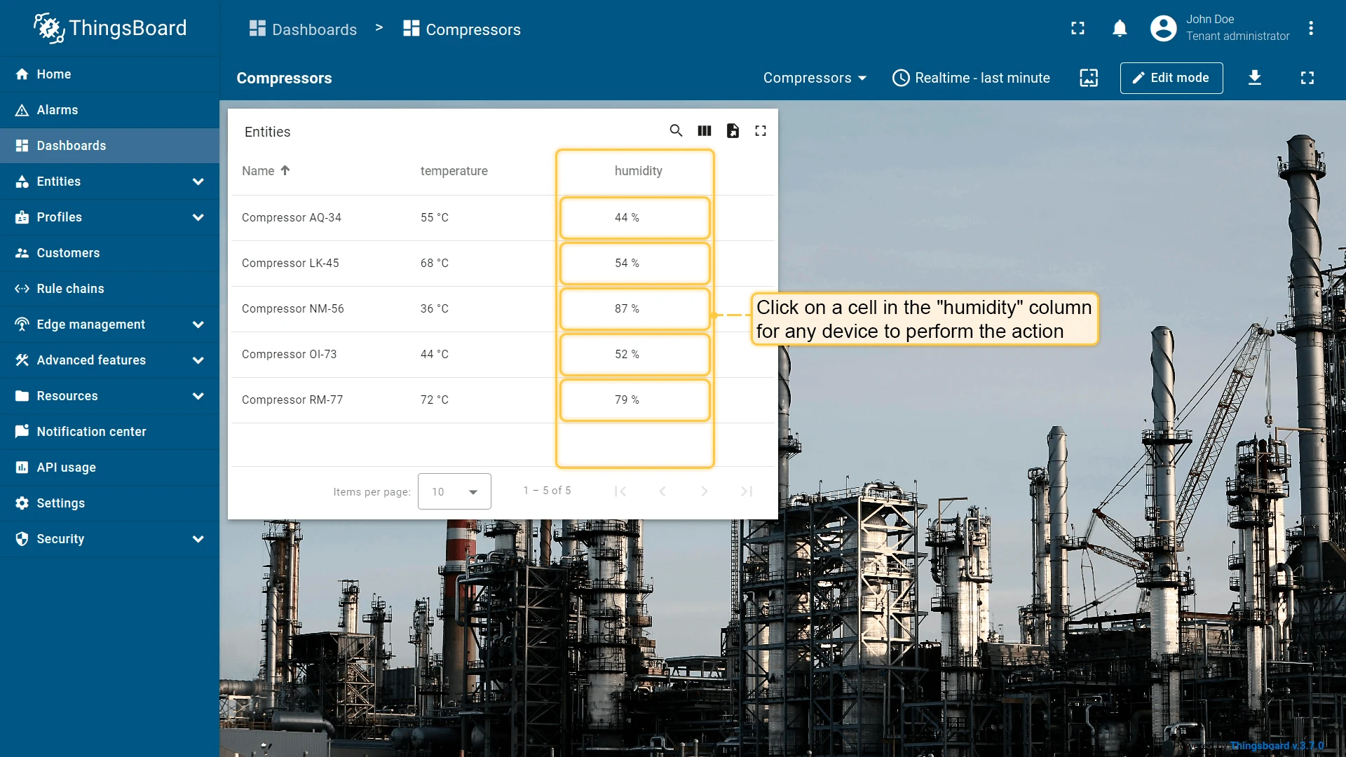
On cell click
Section titled “On cell click”| Only for Entities table, Alarms table, Device admin table, and Asset admin table widgets |
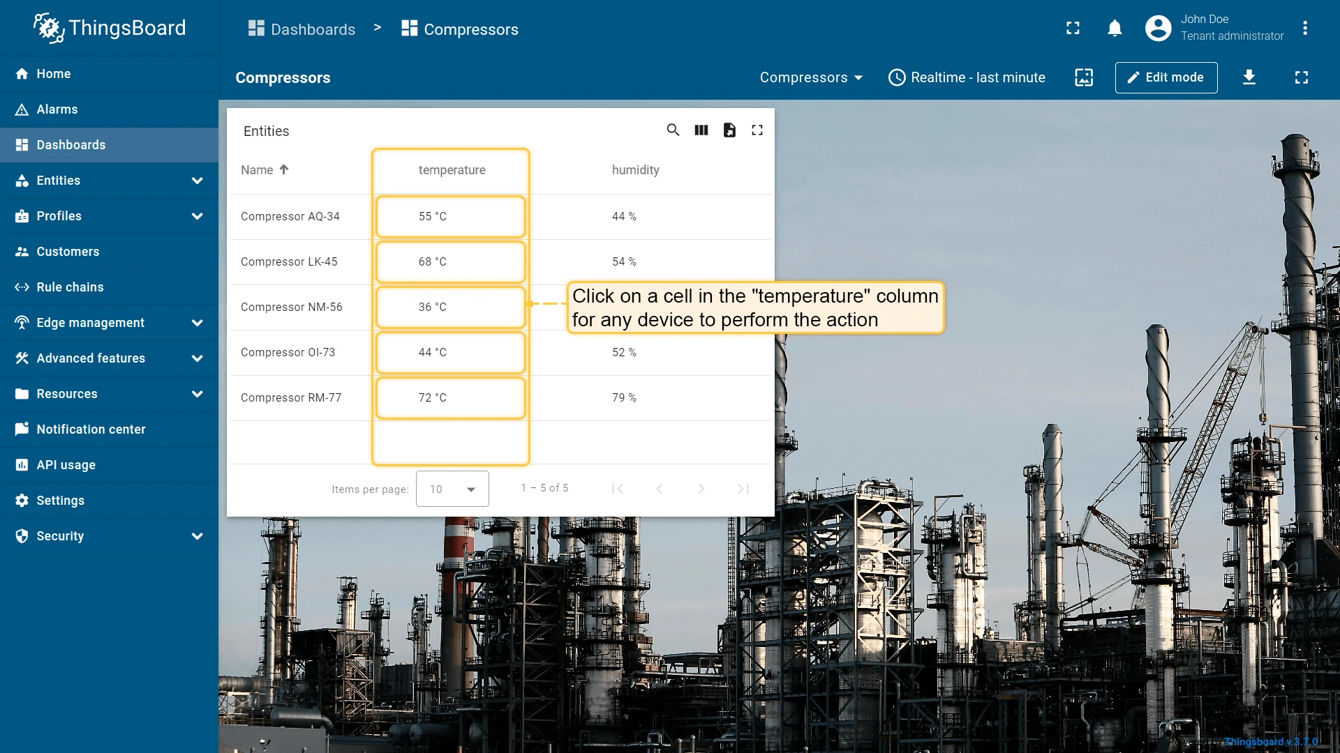
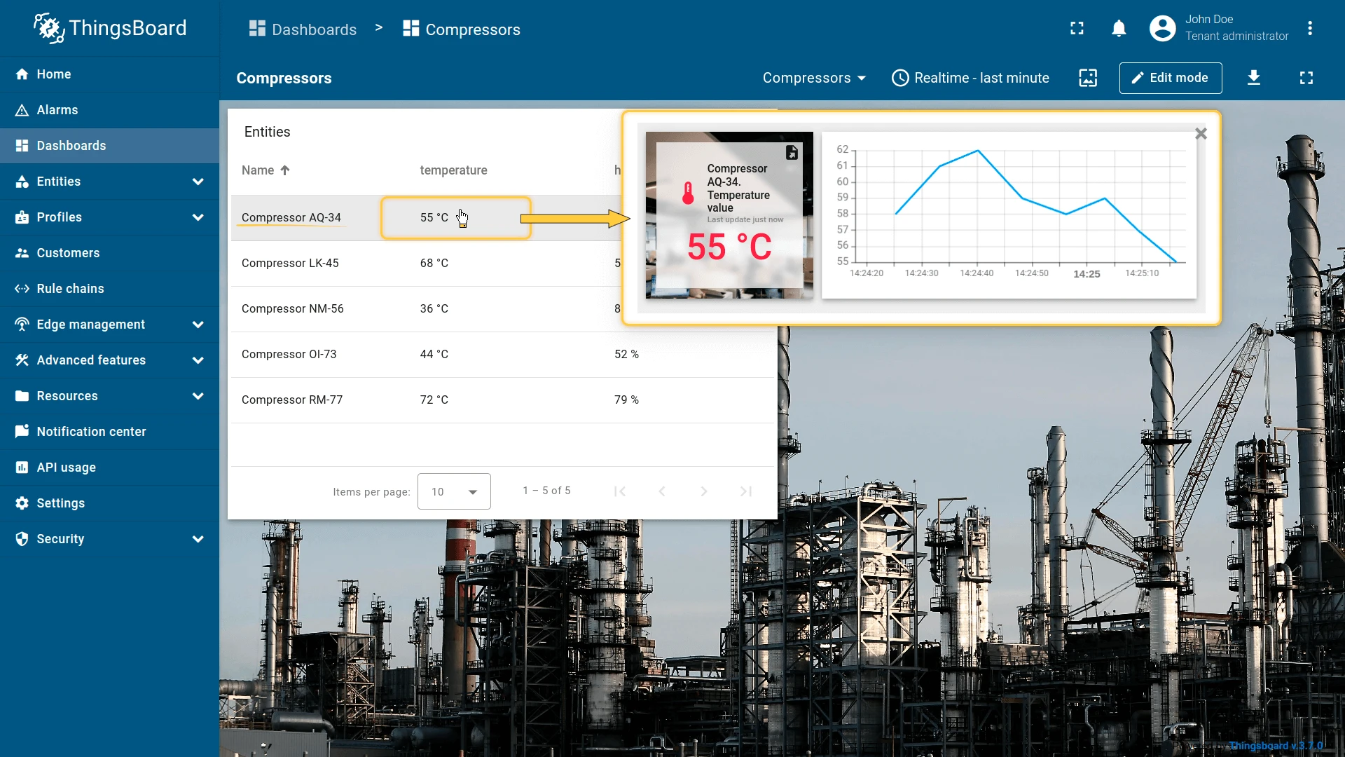
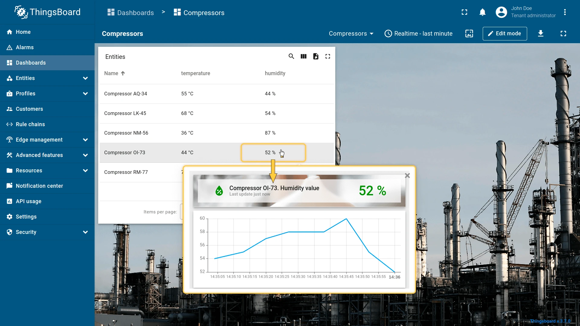
Triggers when a specific table cell is clicked. Each column can have its own independent action, configured by column index. Unlike On row click, this lets you assign different behaviors to different columns — for example, clicking the temperature cell opens a temperature popover, while clicking the humidity cell opens a humidity popover.
Configure the temperature column action:
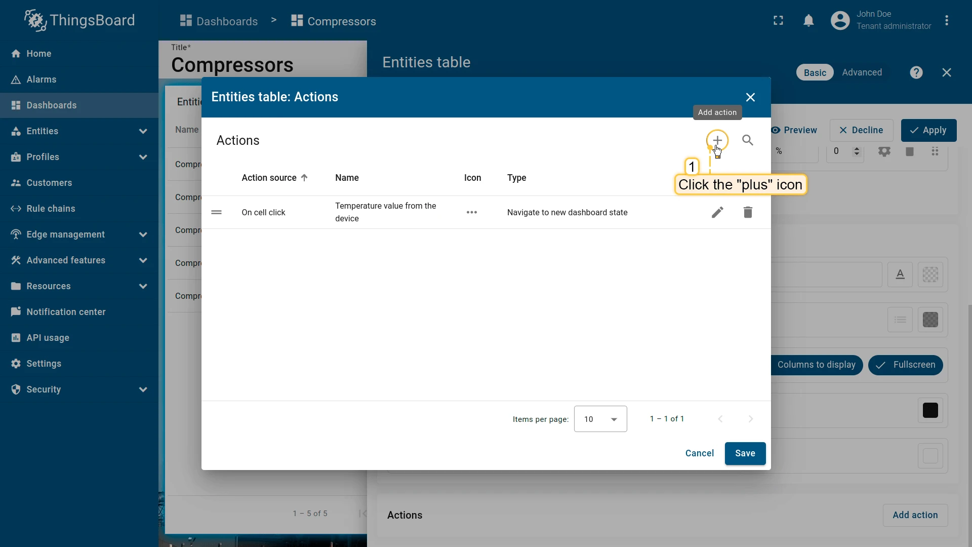
- Open the widget in edit mode, go to the Actions tab, and click +.
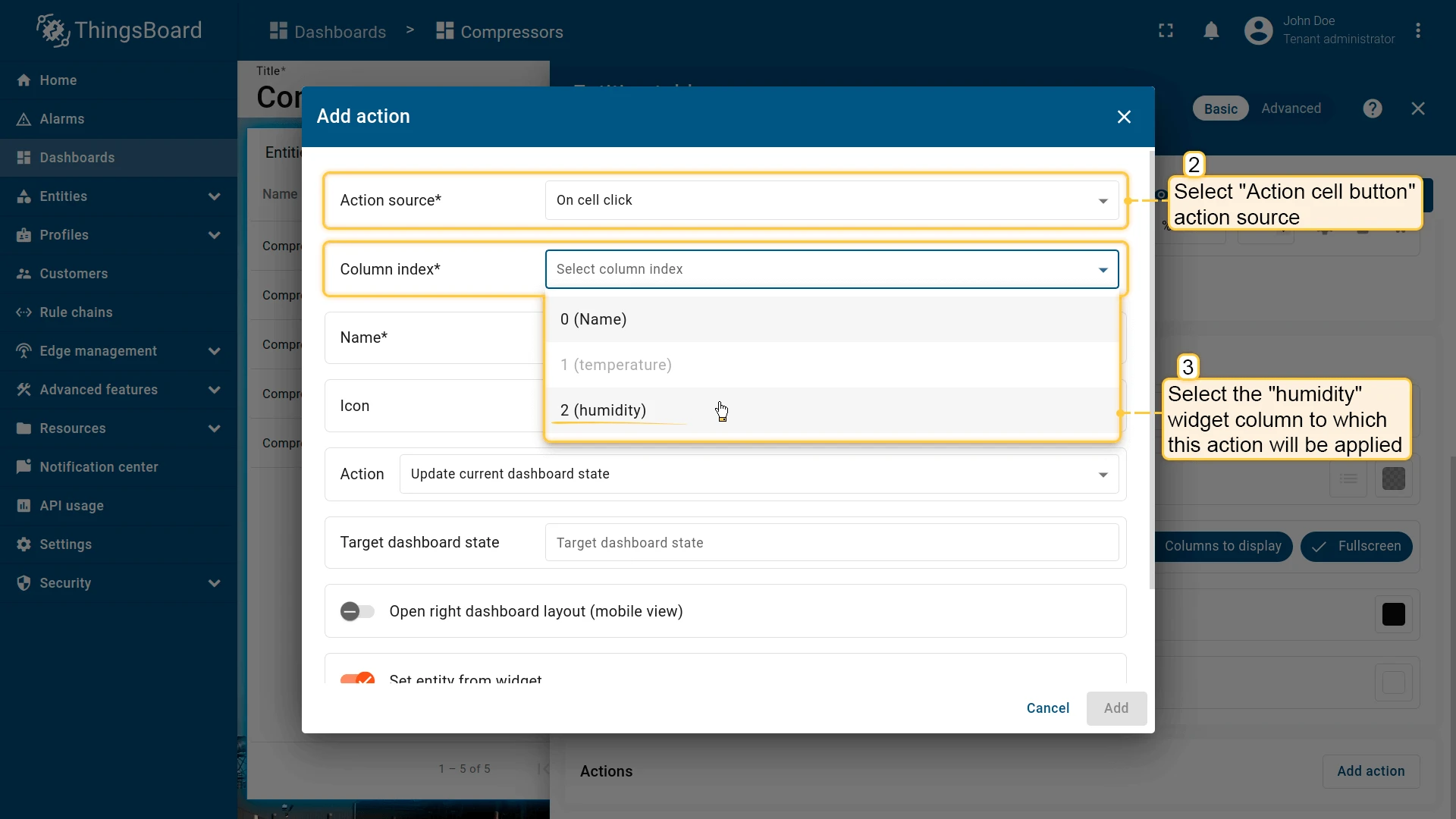
- Select On cell click as the action source.
- From the Column index dropdown, select the temperature column.
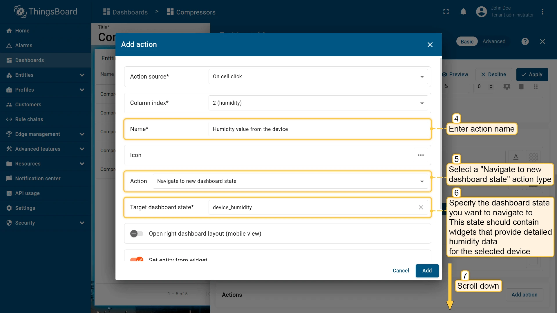
- Enter an action name, select Navigate to new dashboard state, and choose the target state.
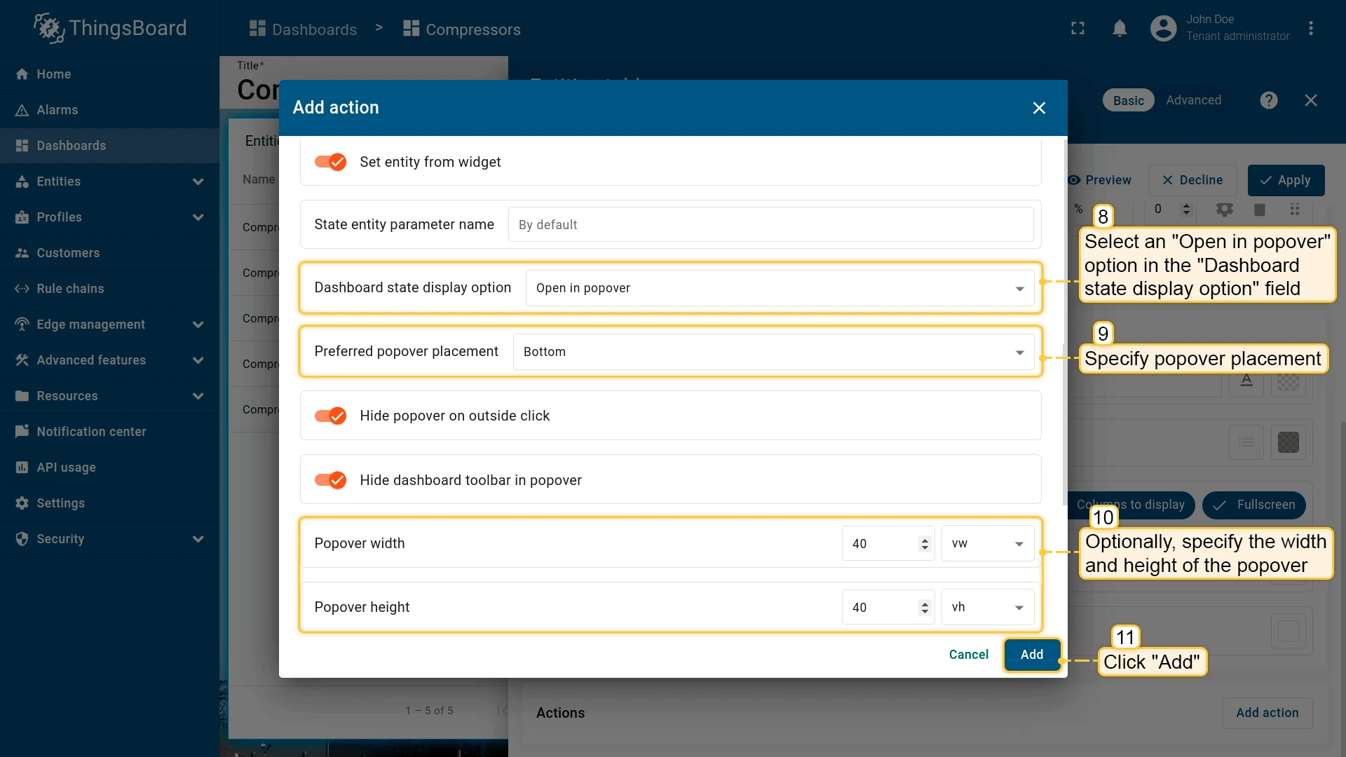
- In Dashboard state display options, select Open in popover, set placement to Right, and specify width/height.
- Click Add.

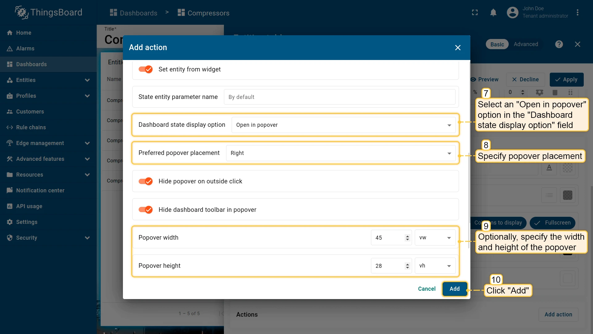
Configure the humidity column action:
- Click + to add another action.
- Select On cell click as the action source.
- From the Column index dropdown, select the humidity column.
- Enter an action name, select Navigate to new dashboard state, and choose the target state.
- In Dashboard state display options, select Open in popover, set placement to Bottom, and specify width/height.
- Click Add, then Save and Apply to save the widget settings.
- Click Save in the dashboard toolbar to save the dashboard.
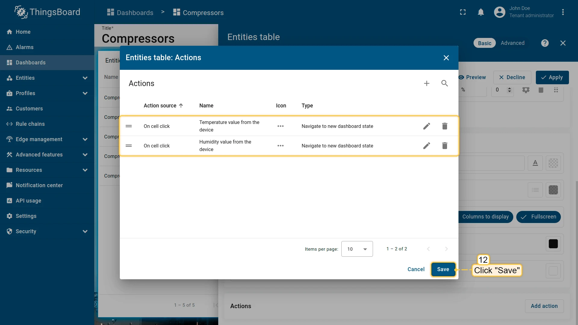


Both actions are now configured. Clicking a temperature or humidity cell opens the corresponding details popover for the selected device.
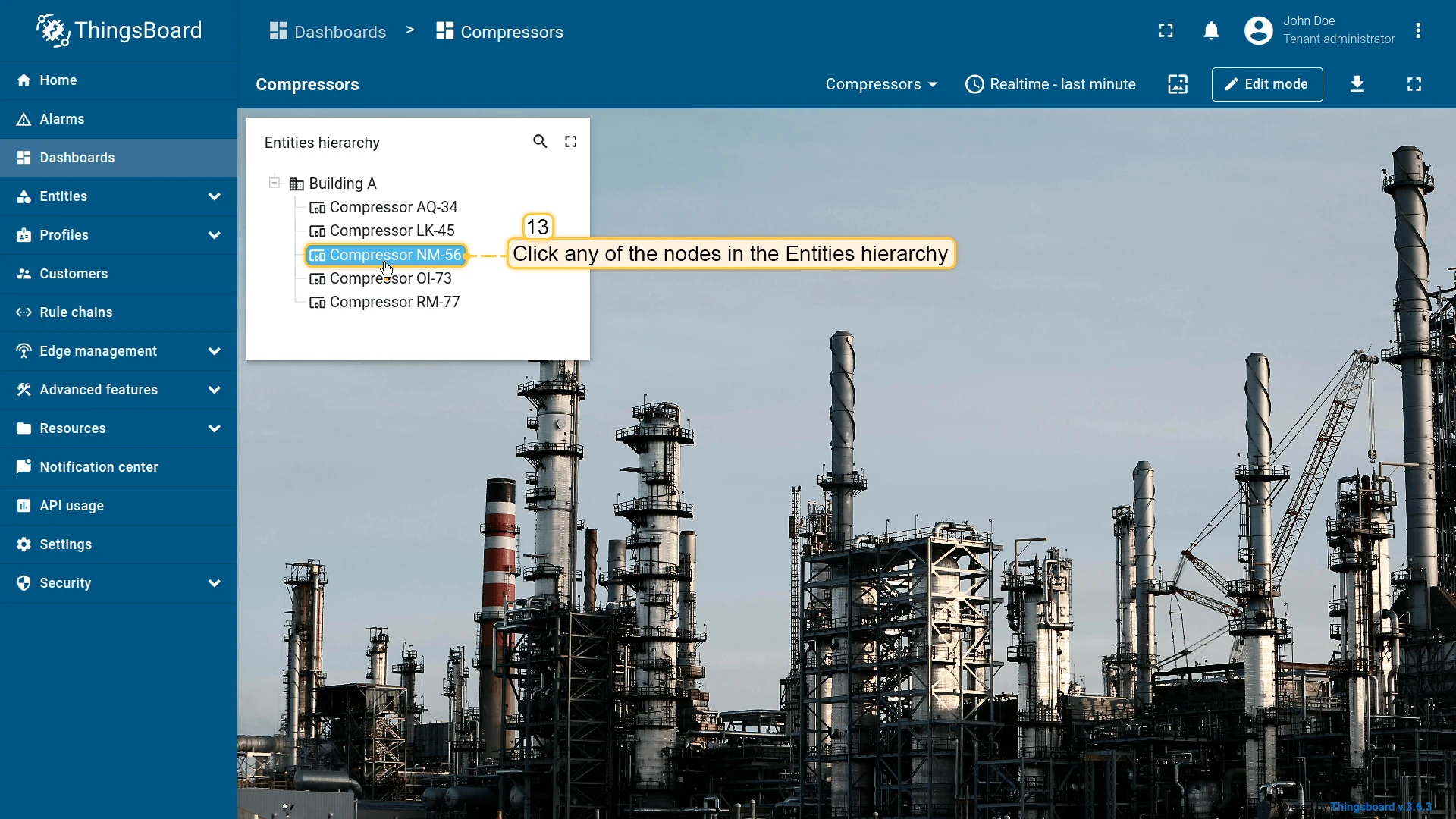
On node selected
Section titled “On node selected”| Only for Entities Hierarchy widget |
Triggers when the user selects a node in the Entities Hierarchy widget, which displays entities and their relations as a tree. Clicking any node executes the configured action for that entity.
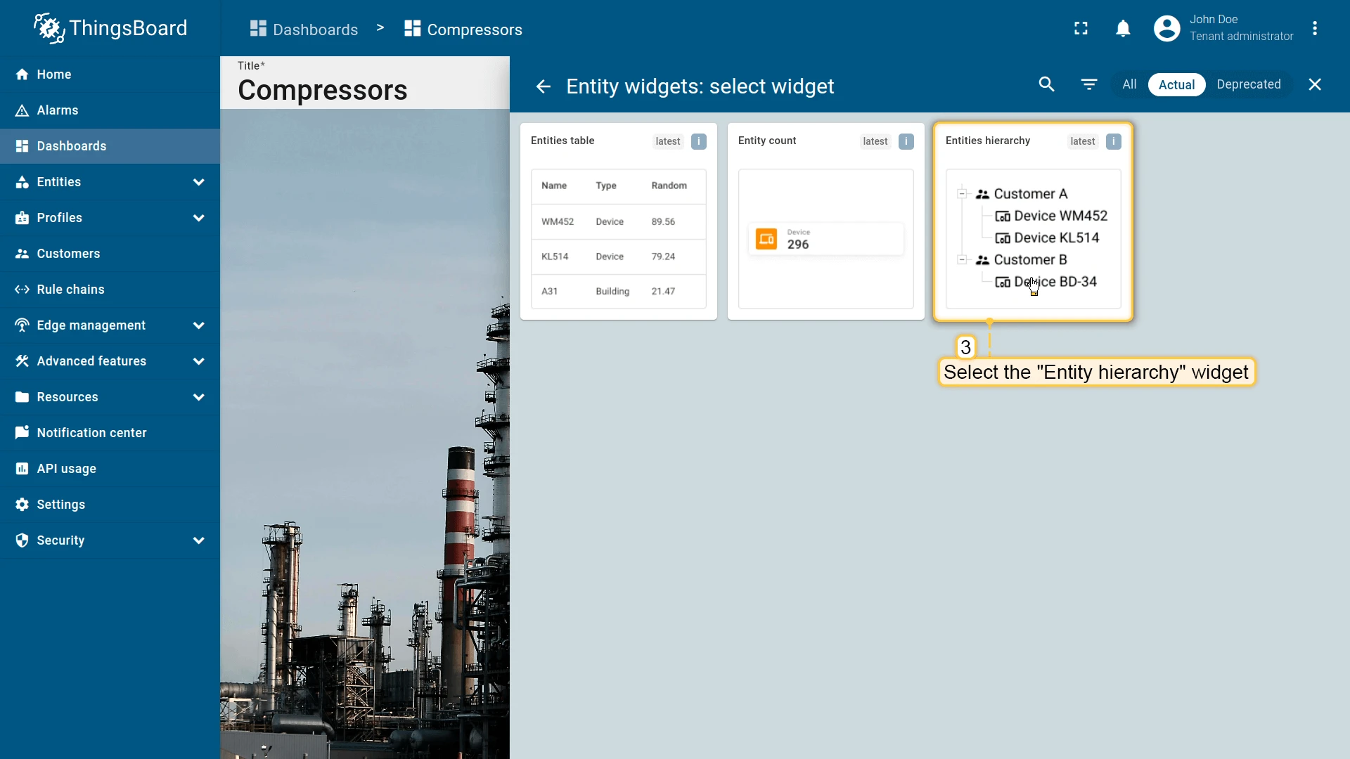
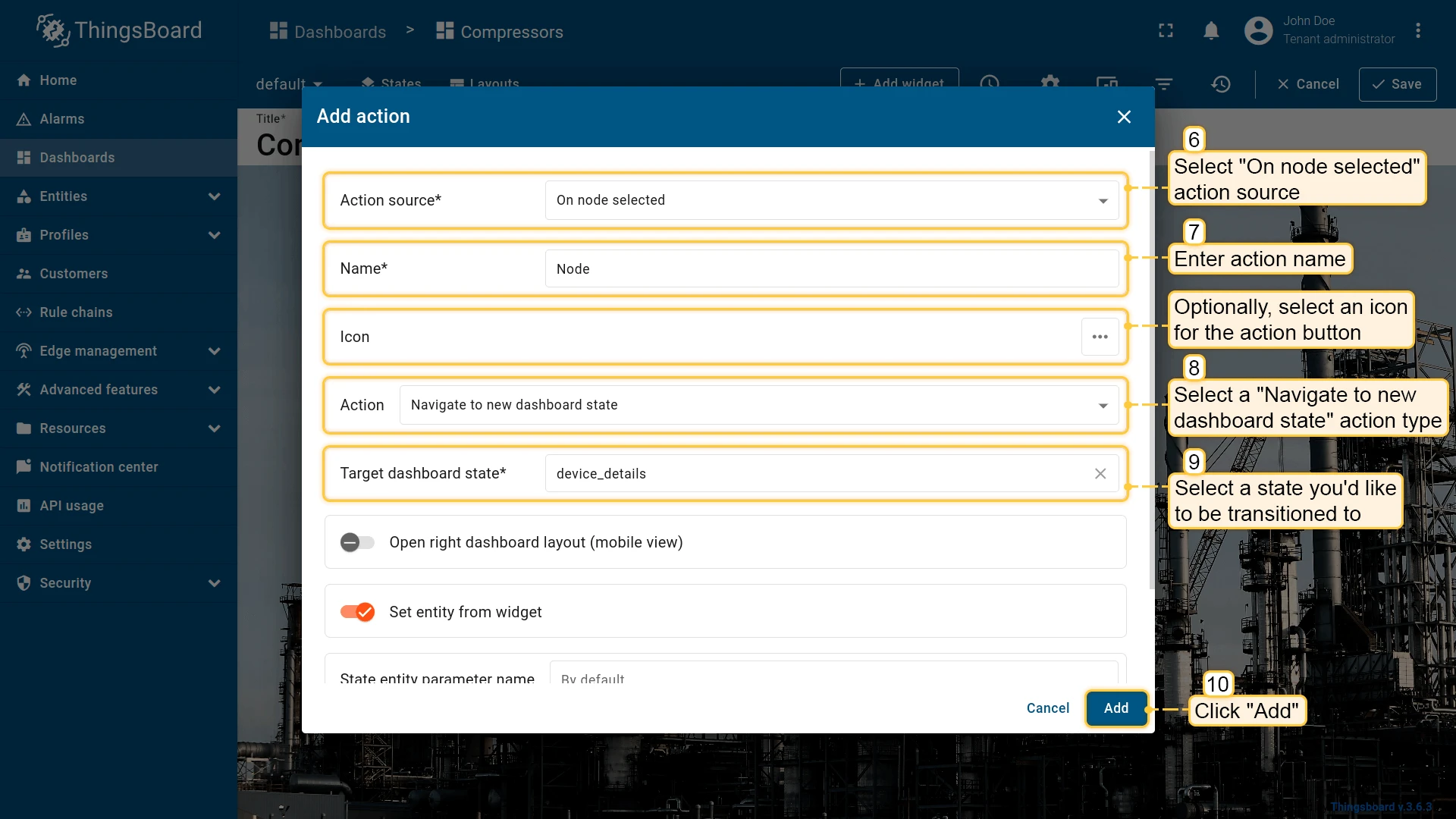
Click any node in the Entities hierarchy to trigger the action. In this example, clicking a node navigates to a state showing that node’s details.
On HTML element click
Section titled “On HTML element click”| Only for HTML widgets |
On HTML element click triggers an action when the user clicks a marked element in the widget’s HTML template.
How it works
When configuring On HTML element click, the id attribute is the link between the HTML code of the widget and the action defined in the widget’s Actions tab.
You can assign the id to any HTML element (e.g., <div>, <span>, <p>, <h1>, <button>). Typically, the id is applied to a container element (like <p> or <div>), so the entire block becomes clickable.
<p id="details" class="blue-box"> Current temperature: <span>22.5 °C</span></p>Tips
- Works only with HTML widgets; for tables, charts, and others use their specific action sources (On row click, On cell click, On node selected, etc.).
- The
idattribute must match the action Name exactly (case-sensitive). - For more advanced scenarios (dialogs, forms), use Custom action with HTML template / widgetContext.dialogs / widgetContext.customDialog in widgets that support it.
Configuration step by step
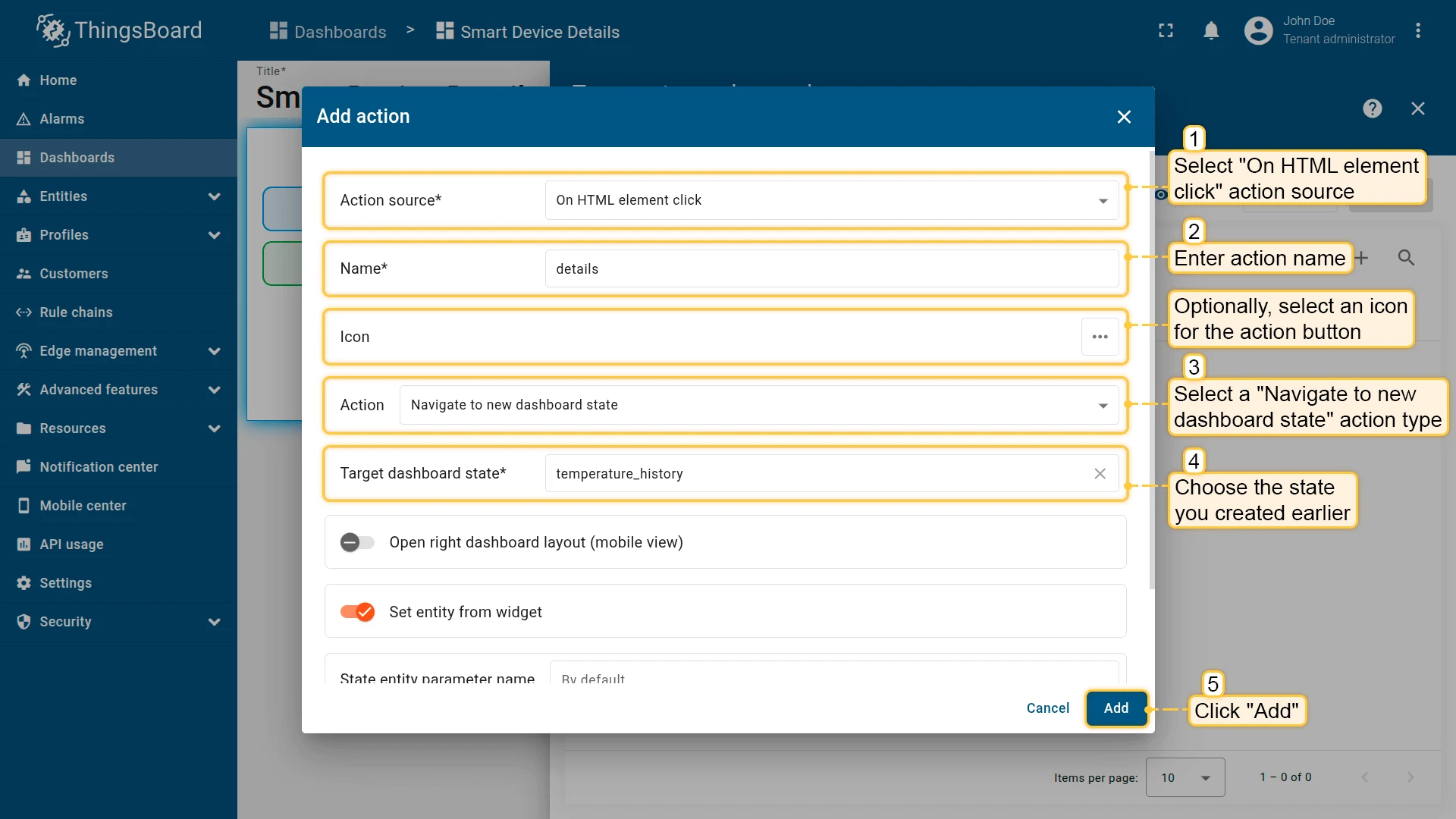
- Open the widget in edit mode, go to the Actions tab, and click +.
- Select On HTML element click as the action source.
- Enter a Name — it will also serve as the
idof the target HTML element. - Choose the action type (e.g., Navigate to new dashboard state) and specify the target state.
- Click Add.
- Go to the Appearance tab, open the HTML section, and add an
idattribute to the target element that exactly matches the action name. - Click Apply to save the widget settings, then Save in the dashboard toolbar.
After saving, ThingsBoard listens for clicks on any element whose id matches the action name. When triggered, the configured action is executed.
Example: Markdown/HTML Card widget — click the blue area
Preparation:
- Add a Markdown/HTML Card widget to your dashboard using the HTML and CSS provided below.
- Create a new dashboard state with device temperature details.
Alternative: You can download a pre-configured dashboard with the Markdown/HTML Card widget and the details state already set up, then import it into your ThingsBoard instance.
Add the Markdown/HTML Card
Markdown/HTML pattern:
const entity = data[0];const color = entity.temperature > 25 ? "red" : entity.temperature > 20 ? 'green' : 'blue'const entityName = `### Temperature value card\n - Current entity: <span >${entity.entityName}</span>\n `const temp = `- Current temperature: <span style="color:${color};">${entity.temperature.toFixed(1)} °C</span>\n `return entityName + temp;Markdown/HTML CSS:
.office-card {  box-sizing: border-box;  padding: 16px;  margin: 6px 0;  text-align: center;  font-family: system-ui, -apple-system, Segoe UI, Roboto, Arial, "Noto Sans";}
.office-card h3 {  margin: 0 0 12px;  font-size: 24px;}
.blue-box {  background: #2196F31A;  border: 2px solid #2196F3;  border-radius: 10px;  padding: 10px;  margin: 8px 0;  font-weight: 700;}
.green-box {  background: #4CAF501A;  border: 2px solid #4CAF50;  border-radius: 10px;  padding: 10px;  margin: 6px 0;  font-weight: 700;}
.temp-value,.hum-value {  font-weight: 700;  font-variant-numeric: tabular-nums;}
Add the action
- Open the widget in edit mode, go to the Actions tab, and click +.
- Select On HTML element click as the action source.
- Enter details as the action name.
- Select Navigate to new dashboard state as the action type.
- In Target dashboard state, select the state you created earlier.
- Click Add.
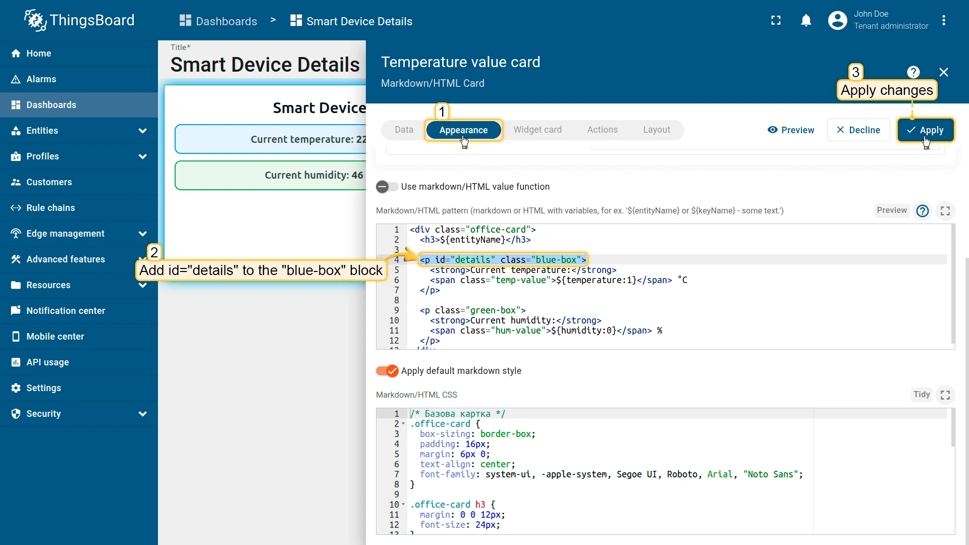
Add id to the HTML
-
Go to the Appearance tab and open the HTML section.
-
Add
id="details"to the<p class="blue-box">element. Replace it with:<p id="details" class="blue-box">This makes the entire blue-box block clickable and tied to the details action.
-
Apply changes (Apply) and save the dashboard.
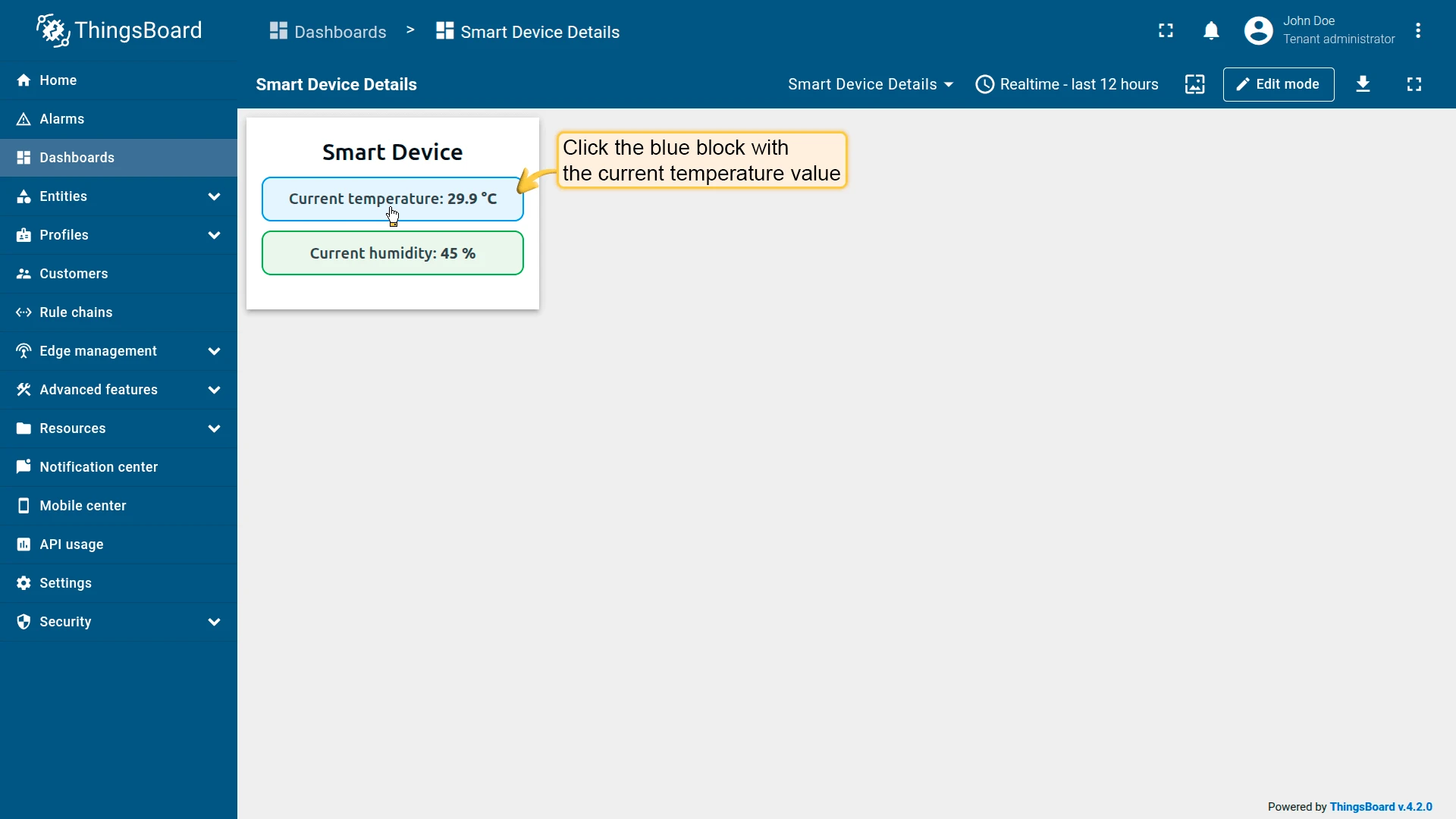
Result
Clicking the blue block with the current temperature will execute the configured action and navigate to your target state.
Map widget action sources
Section titled “Map widget action sources”Map widgets expose additional action sources tied to their interactive elements — markers, circles, polygons, polylines, and tooltip links. The examples below assume you already have a Map widget and a target dashboard state set up.

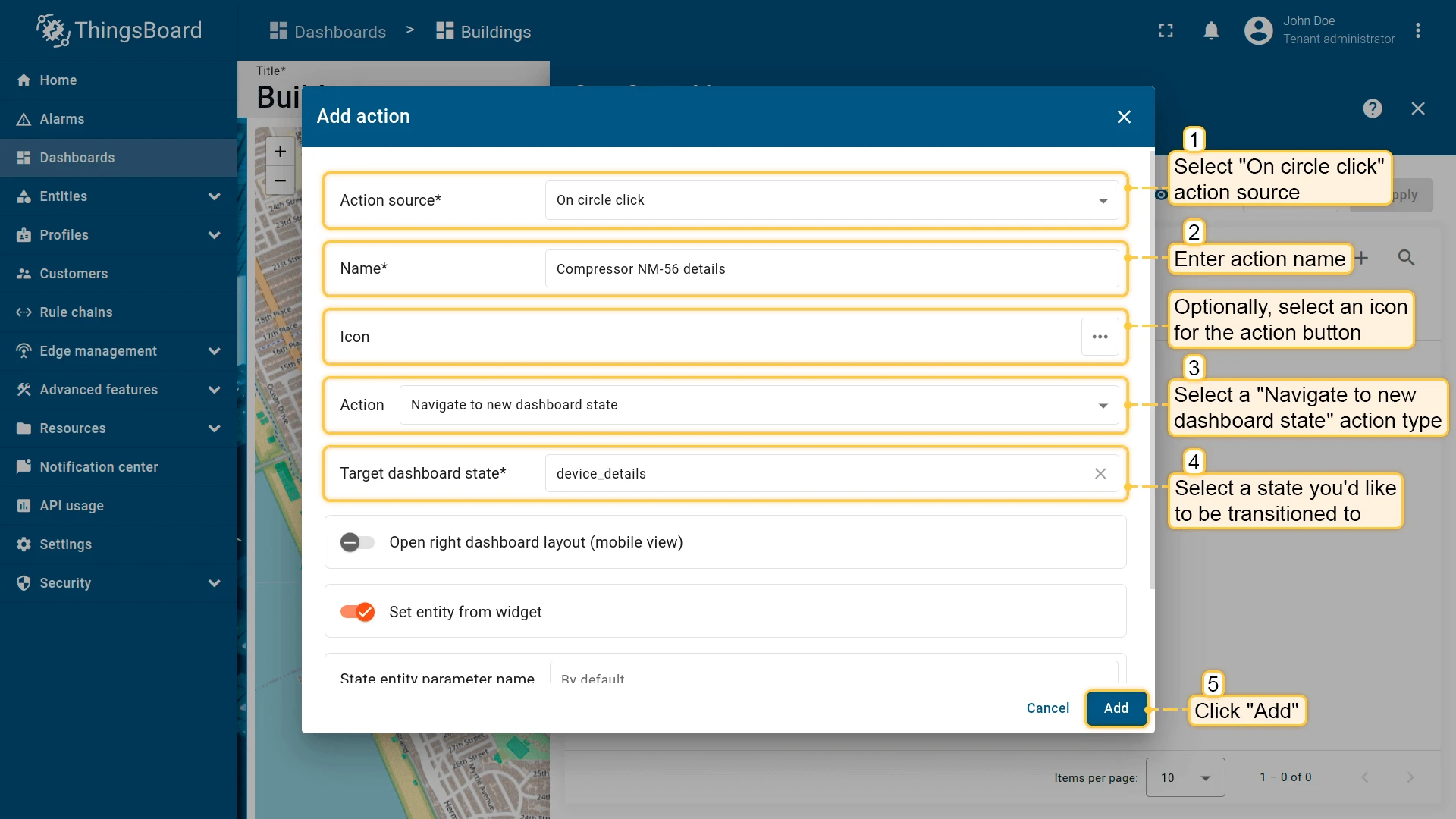
On circle click
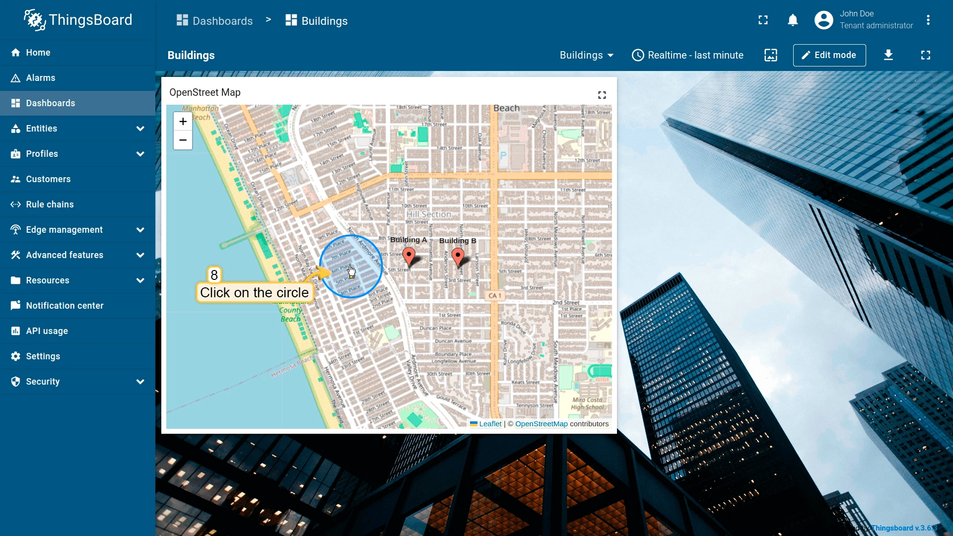
Section titled “On circle click”Triggers when the user clicks a circle geo-zone on the map. A circle is defined by a JSON attribute on the entity: {"latitude": ..., "longitude": ..., "radius": ...} (radius in meters). The clicked entity is automatically passed as context to the target state. See Map widget configuration for setup details.
- Open the widget in edit mode, go to the Actions tab, and click +.
- Select On circle click as the action source.
- Enter an action name. Optionally, choose an icon.
- Select Navigate to new dashboard state as the action type, then choose the target state.
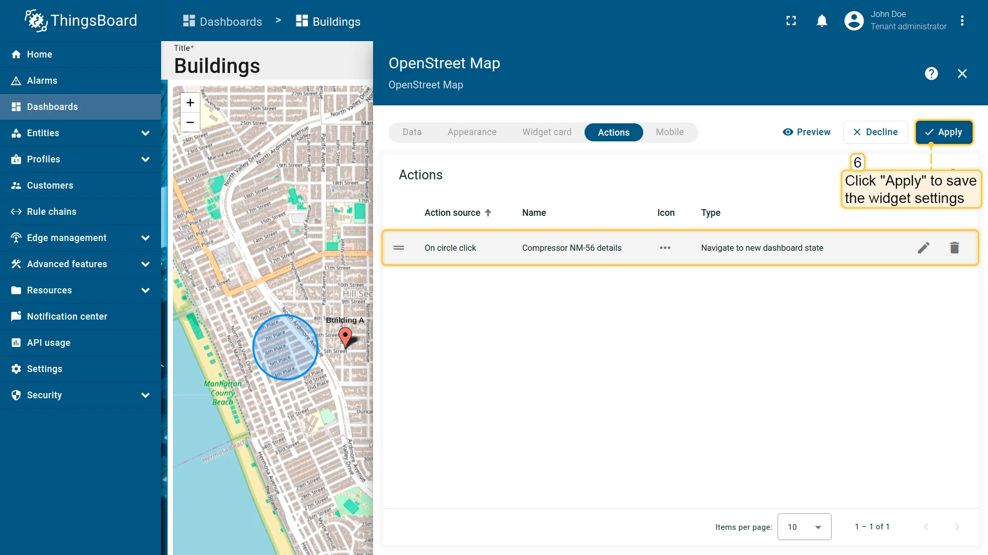
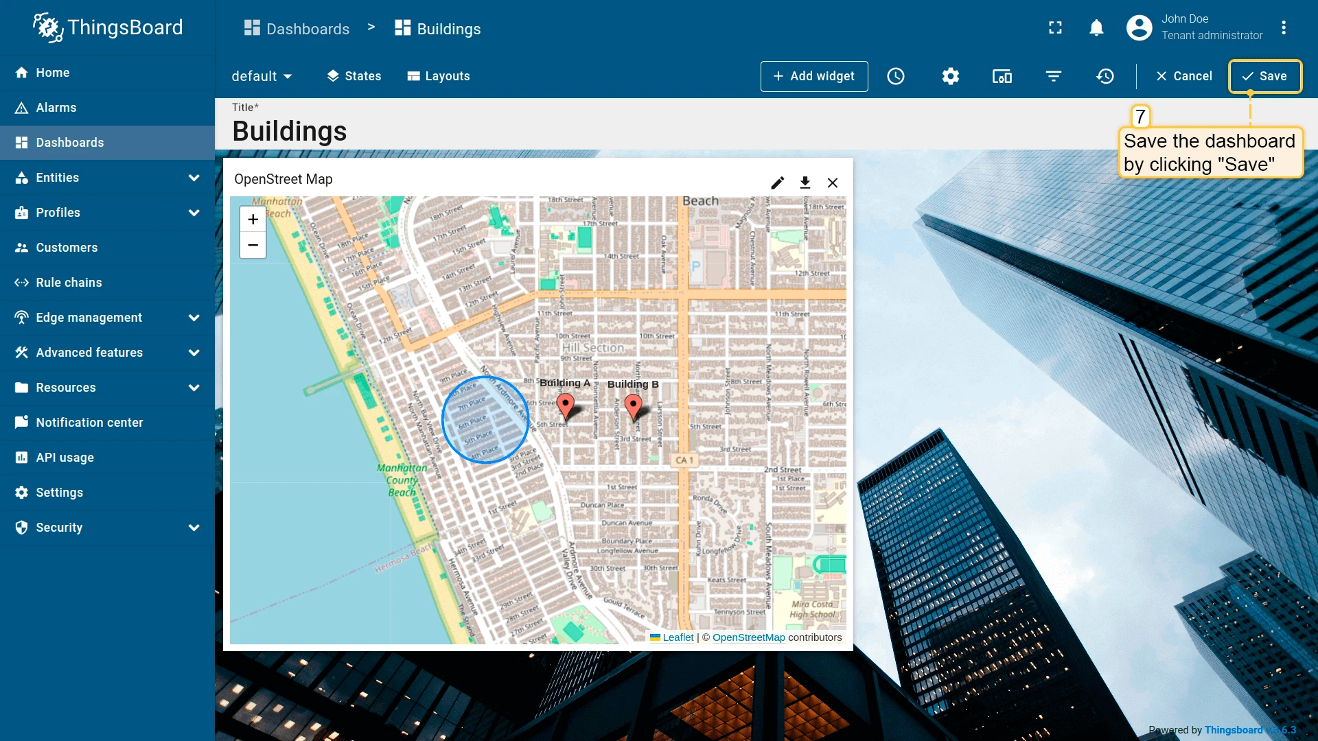
- Click Add, then Apply to save the widget settings.
- Click Save in the dashboard toolbar to save the dashboard.
On marker click
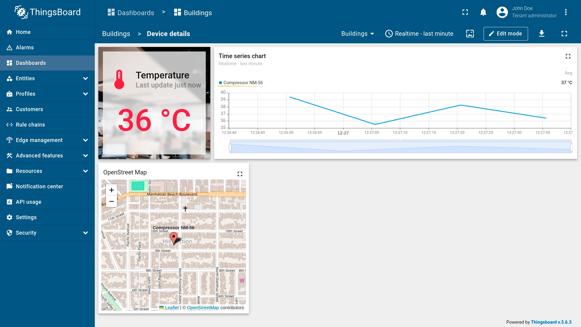
Section titled “On marker click”Triggers when the user clicks an entity marker on the map. Markers appear automatically for every entity that has latitude and longitude coordinate attributes. The clicked entity is automatically passed as context to the target state.
- Open the widget in edit mode, go to the Actions tab, and click +.
- Select On marker click as the action source.
- Enter an action name. Optionally, choose an icon.
- Select Navigate to new dashboard state as the action type, then choose the target state.
- Click Add, then Apply to save the widget settings.
- Click Save in the dashboard toolbar to save the dashboard.
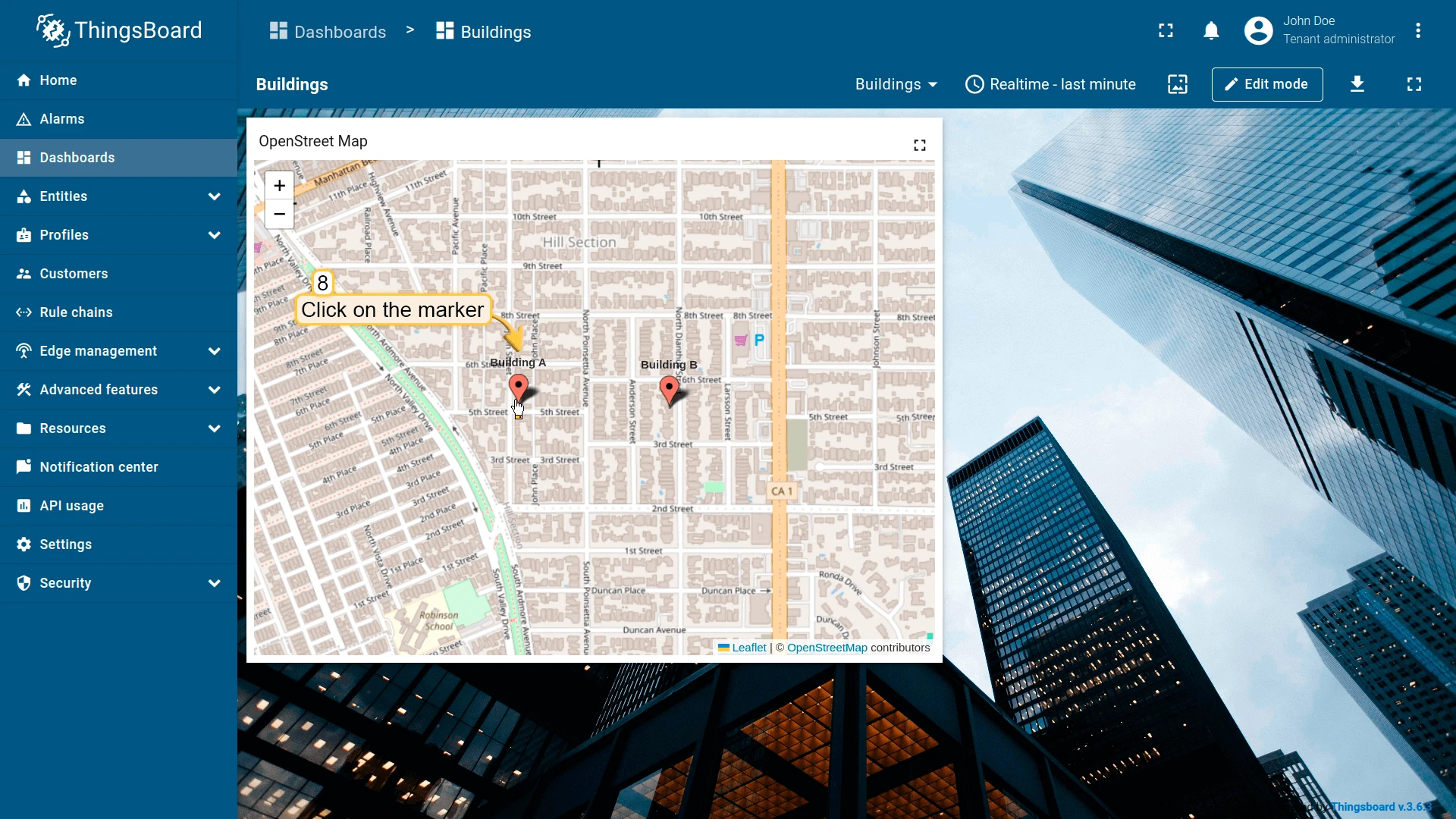
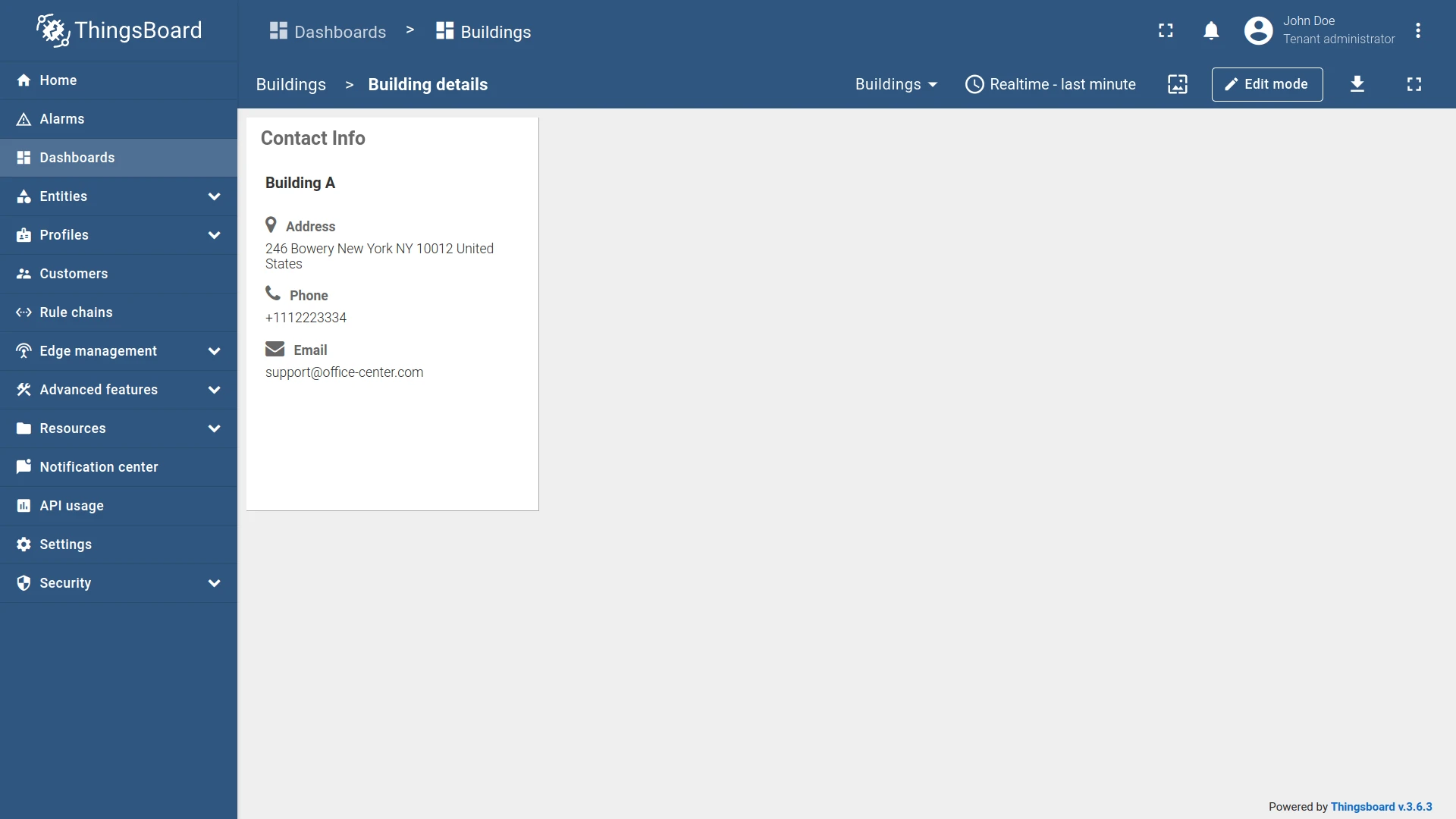
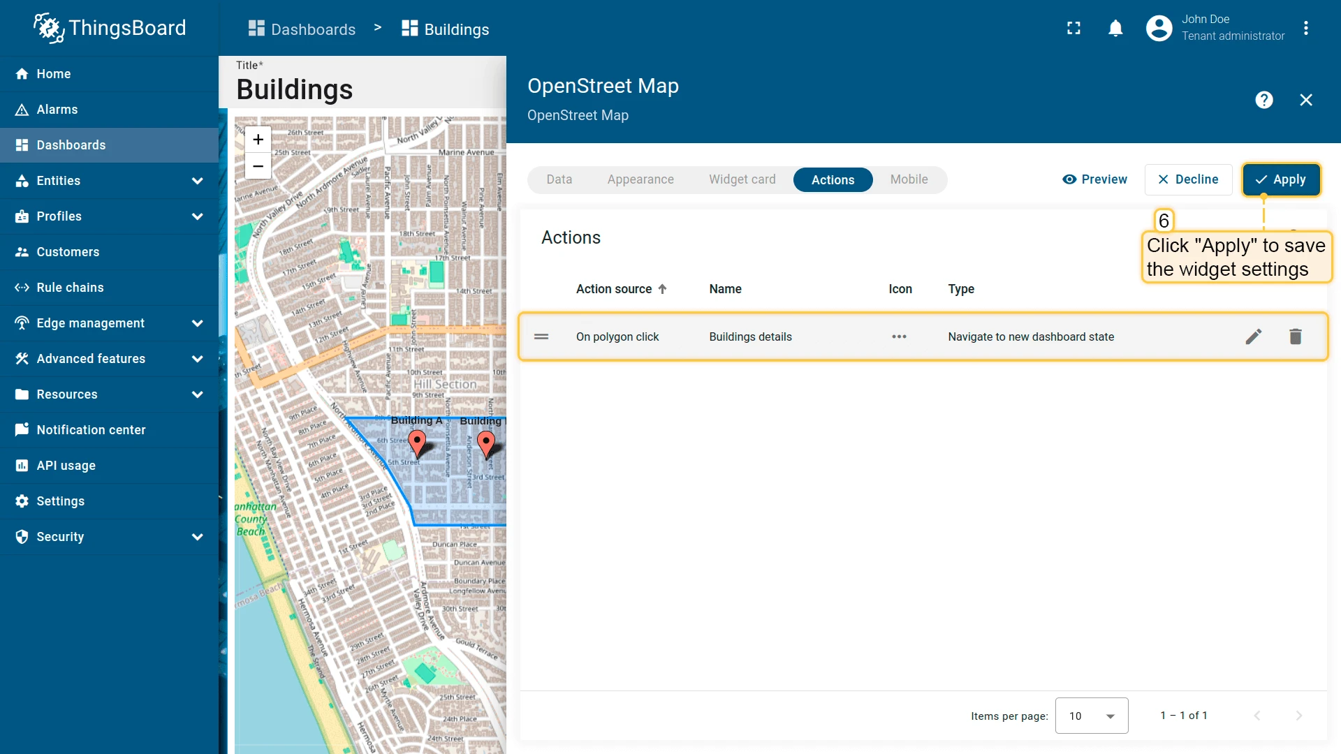
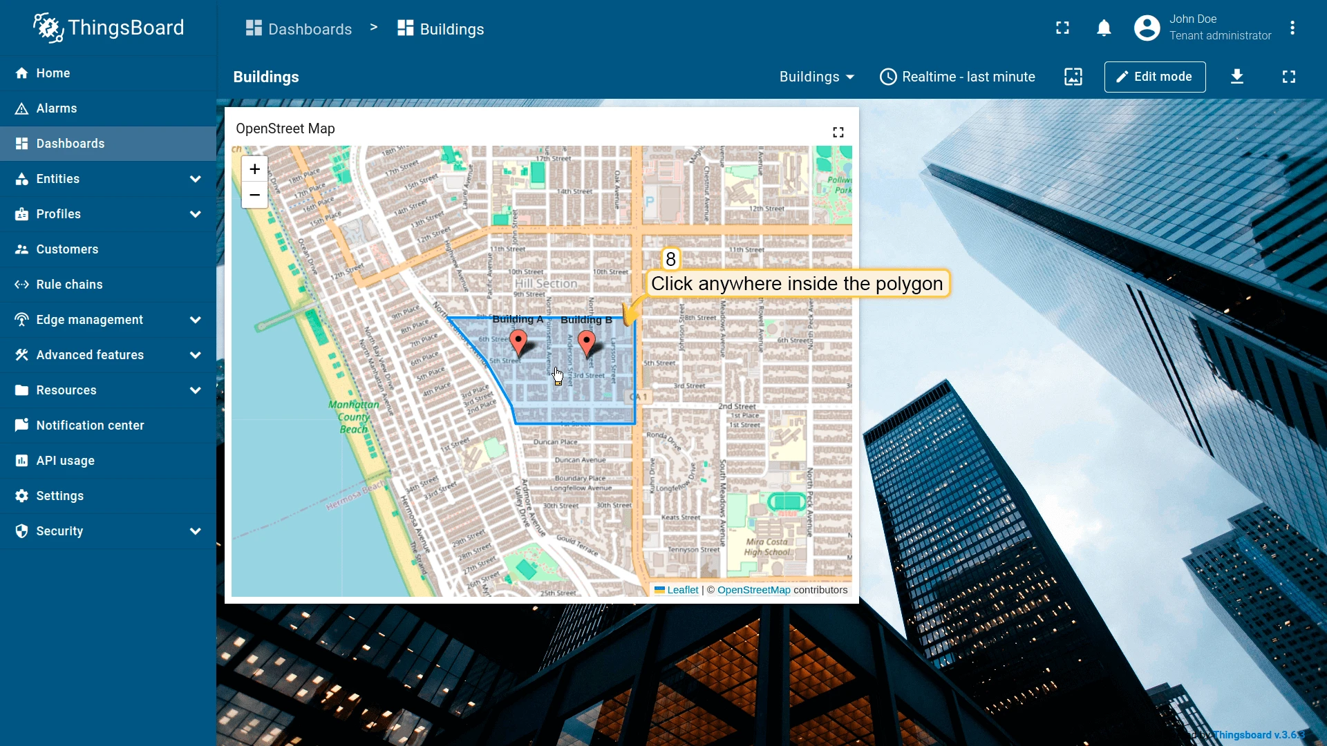
On polygon click
Section titled “On polygon click”Triggers when the user clicks anywhere inside a polygon geo-zone on the map. A polygon is defined by a JSON array of coordinate pairs [[lat, lng], [lat, lng], ...] stored in an entity attribute and can represent buildings, districts, or any bounded area. The clicked entity is automatically passed as context to the target state. See Map widget configuration for setup details.
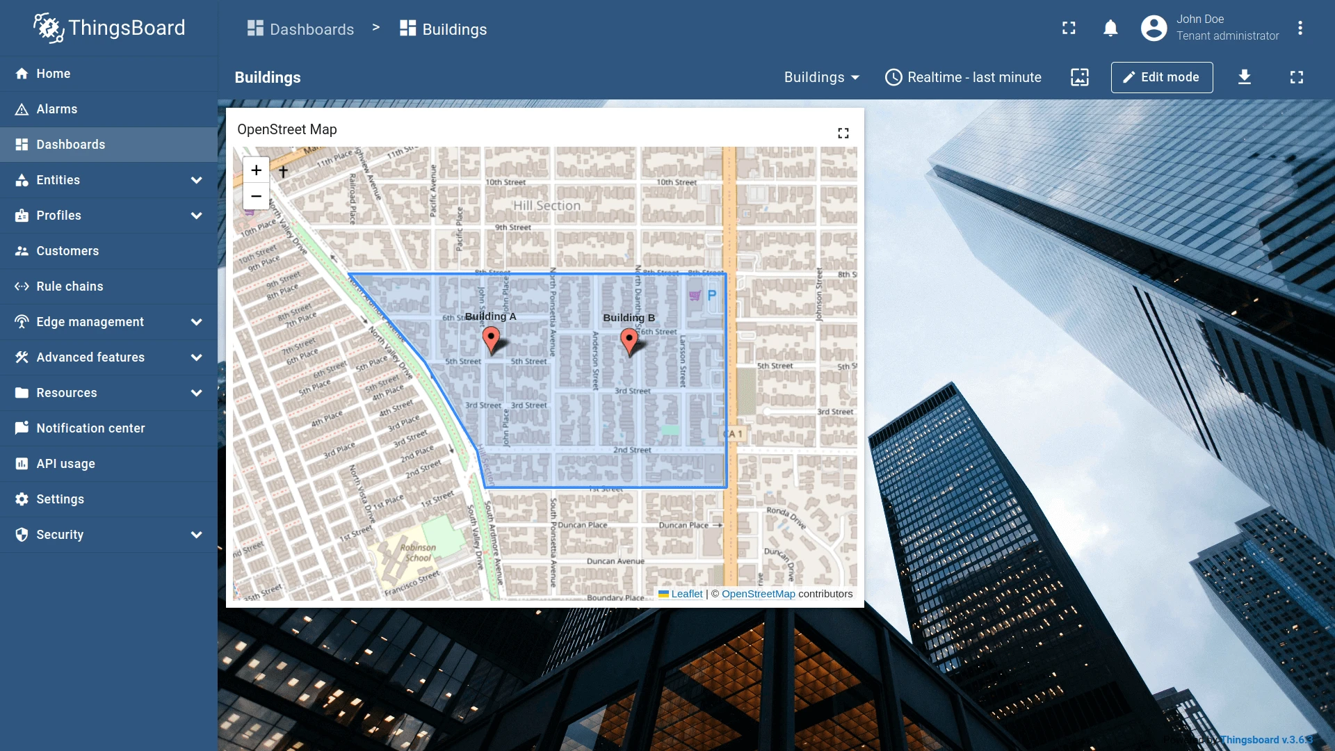
- Open the widget in edit mode, go to the Actions tab, and click +.
- Select On polygon click as the action source.
- Enter an action name. Optionally, choose an icon.
- Select Navigate to new dashboard state as the action type, then choose the target state.
- Click Add, then Apply to save the widget settings.
- Click Save in the dashboard toolbar to save the dashboard.


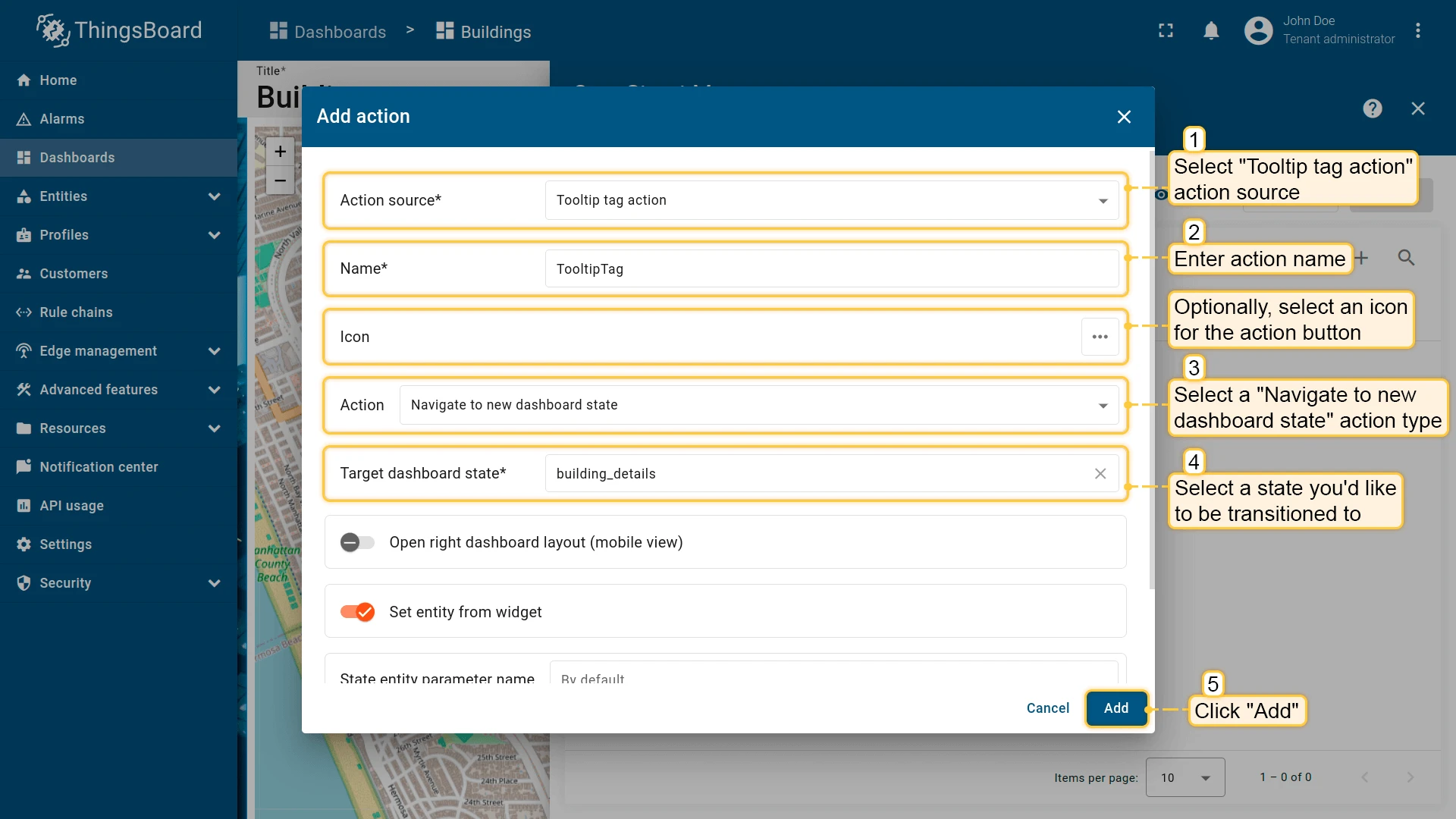
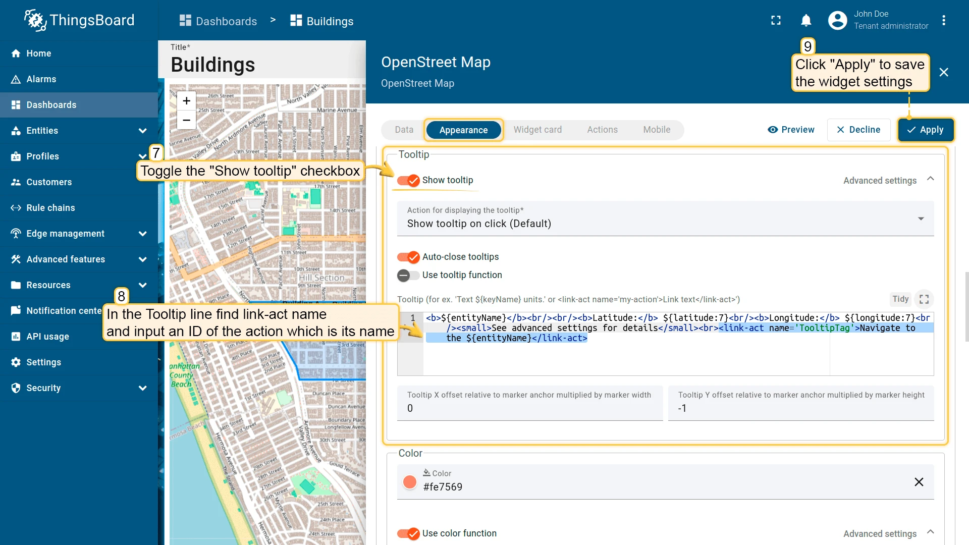
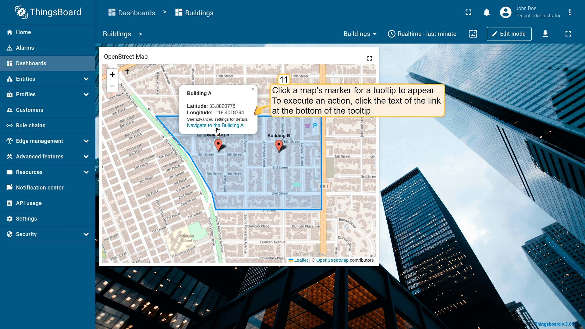
Tooltip tag action
Section titled “Tooltip tag action”Displays a tooltip when a marker is clicked. The tooltip can contain one or more clickable links, each tied to a named action via the <link-act> tag — this lets you offer multiple actions from a single marker. The name attribute must exactly match the action name (case-sensitive). For dynamic per-entity tooltip content, use tooltip function mode in the map widget’s advanced settings.
-
Open the widget in edit mode, go to the Actions tab, and click +.
-
Select Tooltip tag action as the action source.
-
Enter an action name — this exact name (case-sensitive) will be used in the
<link-act>tag. Optionally, choose an icon. -
Select Navigate to new dashboard state as the action type, then choose the target state.
-
Click Add.
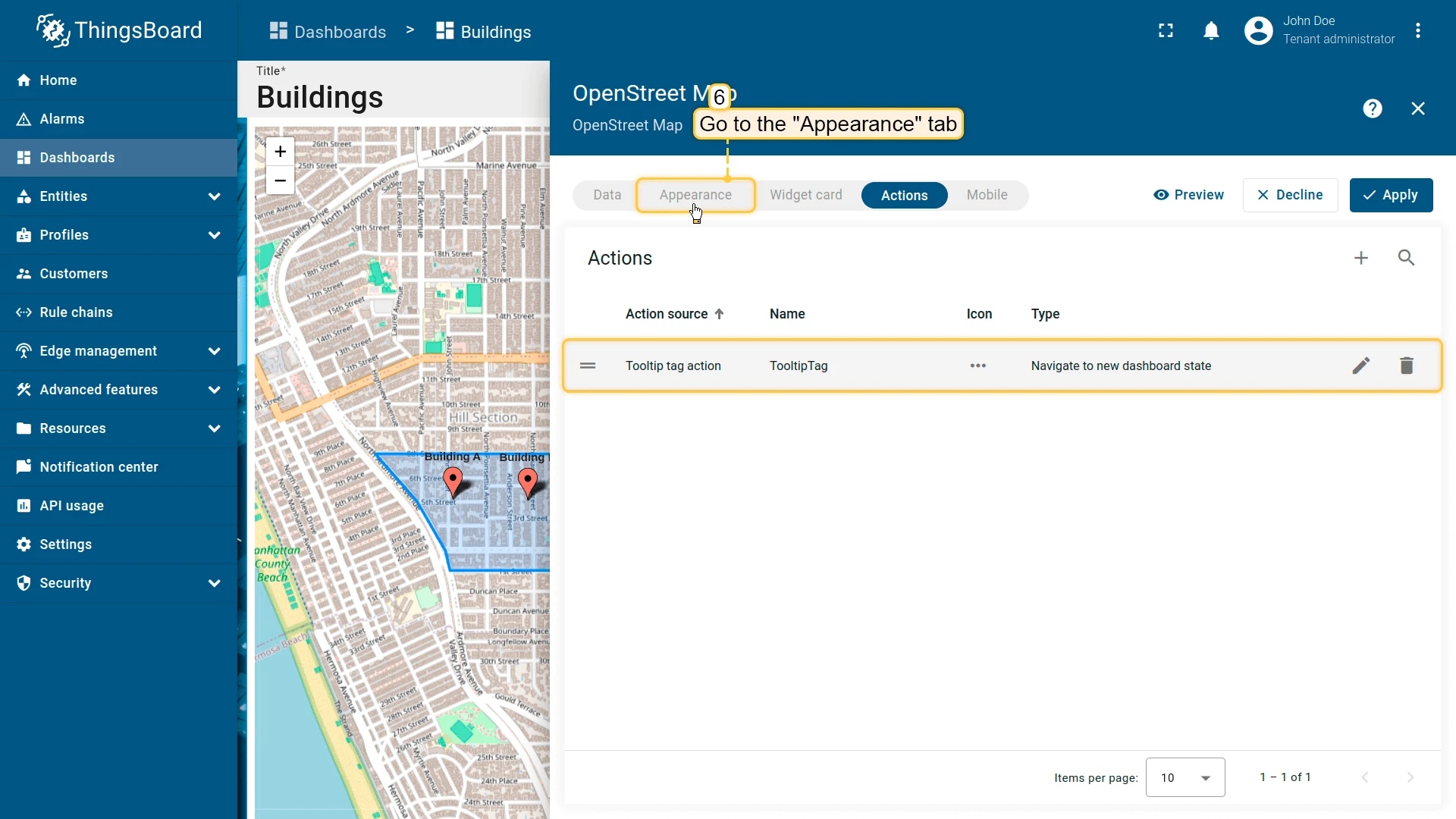
-
Go to the Appearance tab, enable Show tooltip, and add a
<link-act>tag referencing the action name:<link-act name='TooltipTag'>Navigate to the ${entityName}</link-act>where
TooltipTagis the action name and the element text is the link label shown in the tooltip. -
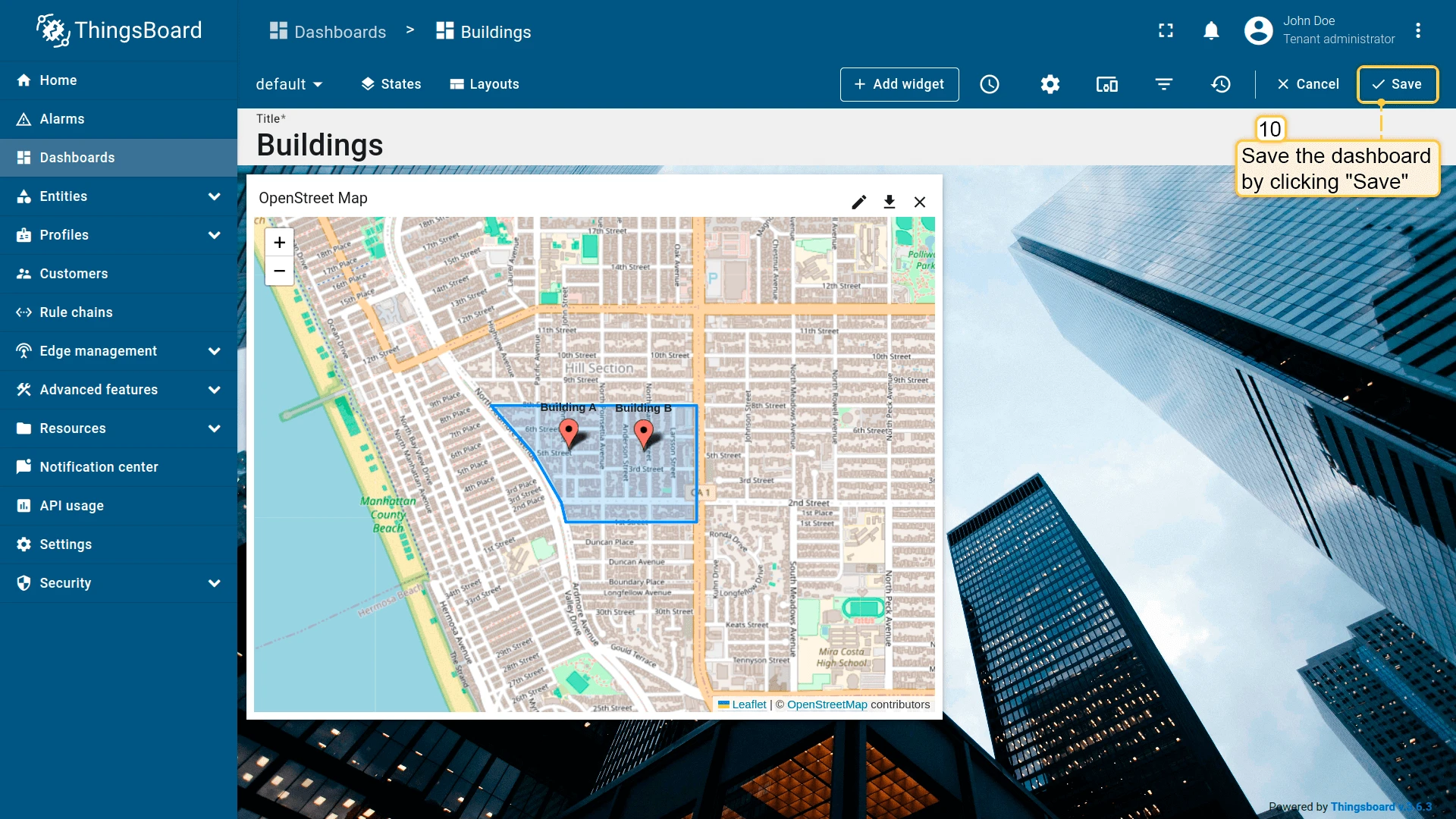
Click Apply to save the widget settings.
-
Click Save in the dashboard toolbar to save the dashboard.

Action options
Section titled “Action options”Open right dashboard layout (mobile view)
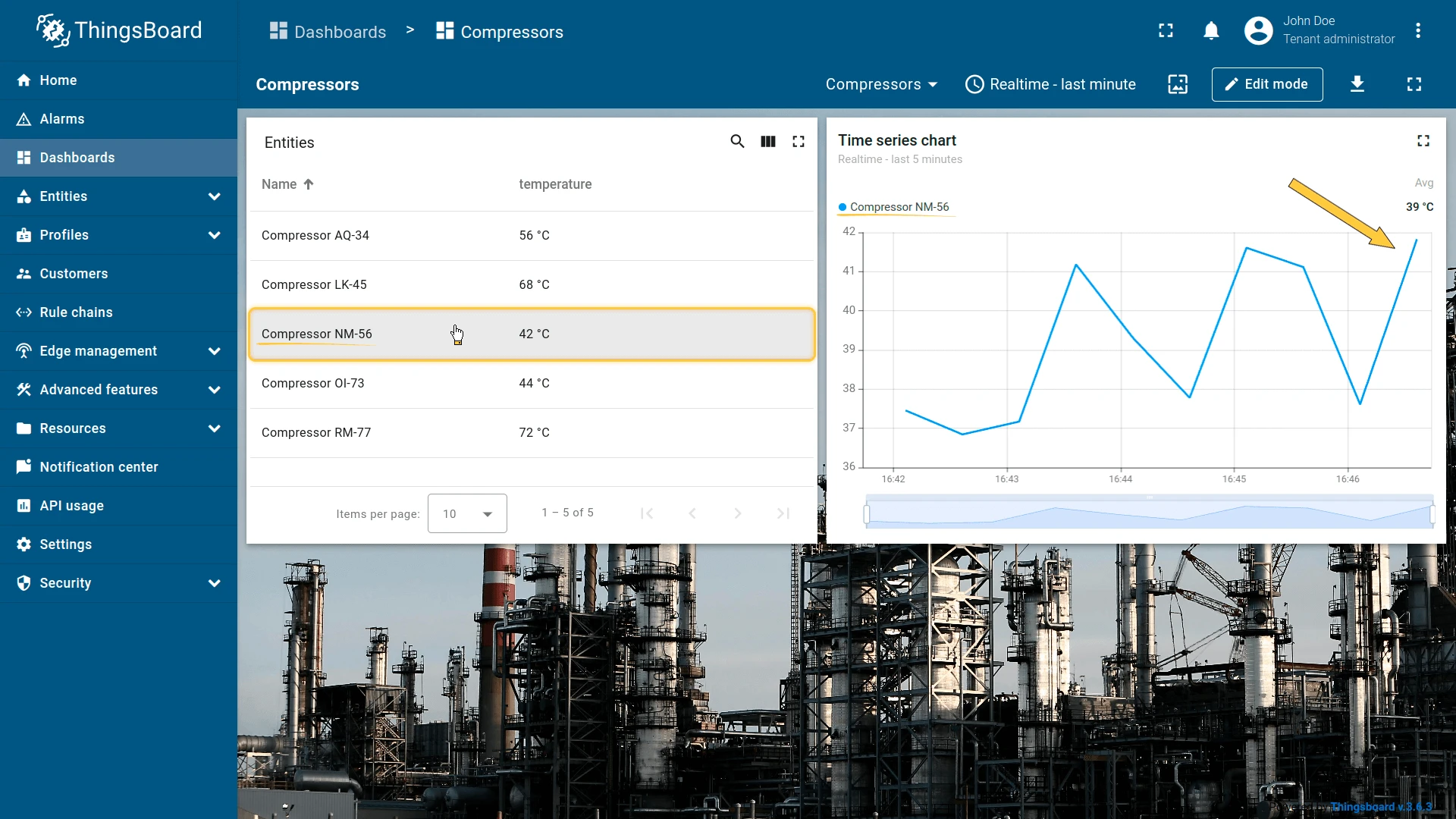
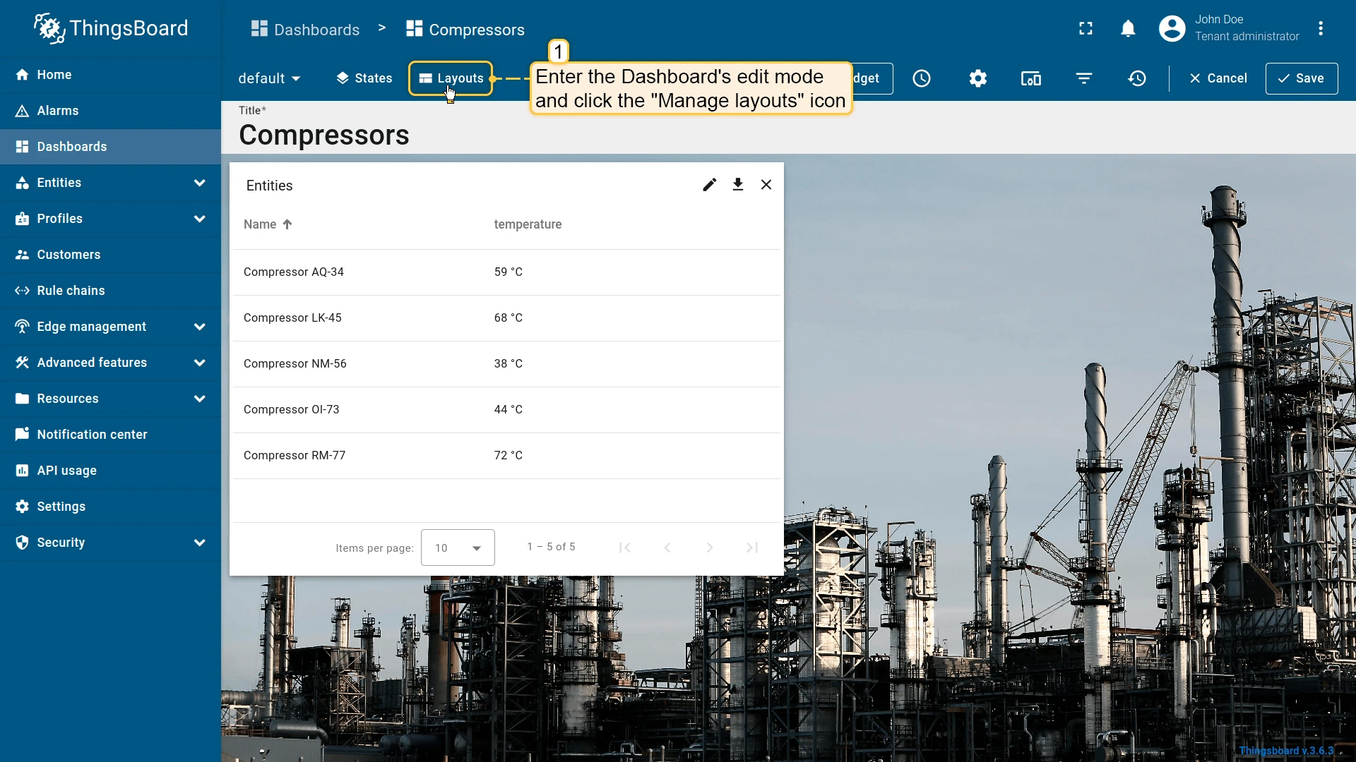
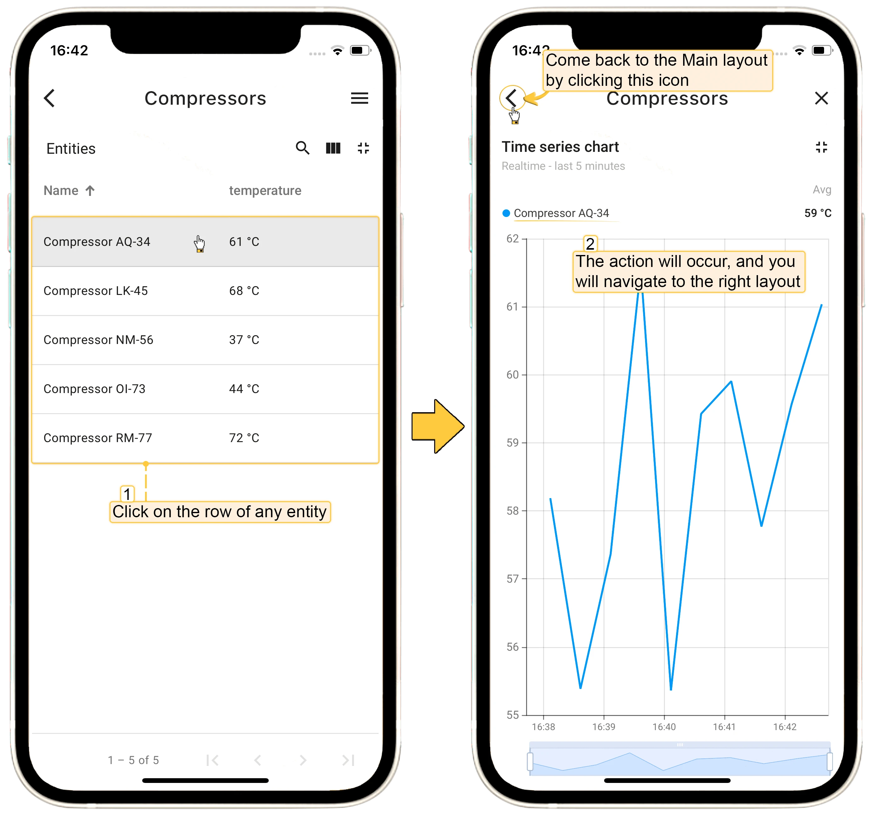
Section titled “Open right dashboard layout (mobile view)”Often you need to show updated information from one widget in another on the same dashboard. For example, consider an Entities table widget with a Time series chart beside it — when you click a row, the chart should update to show that entity’s data. On desktop, placing the widgets side by side and using the Update current dashboard state action works well. On mobile, however, the ThingsBoard Mobile Application stacks widgets vertically, so the chart ends up below the table and requires scrolling.
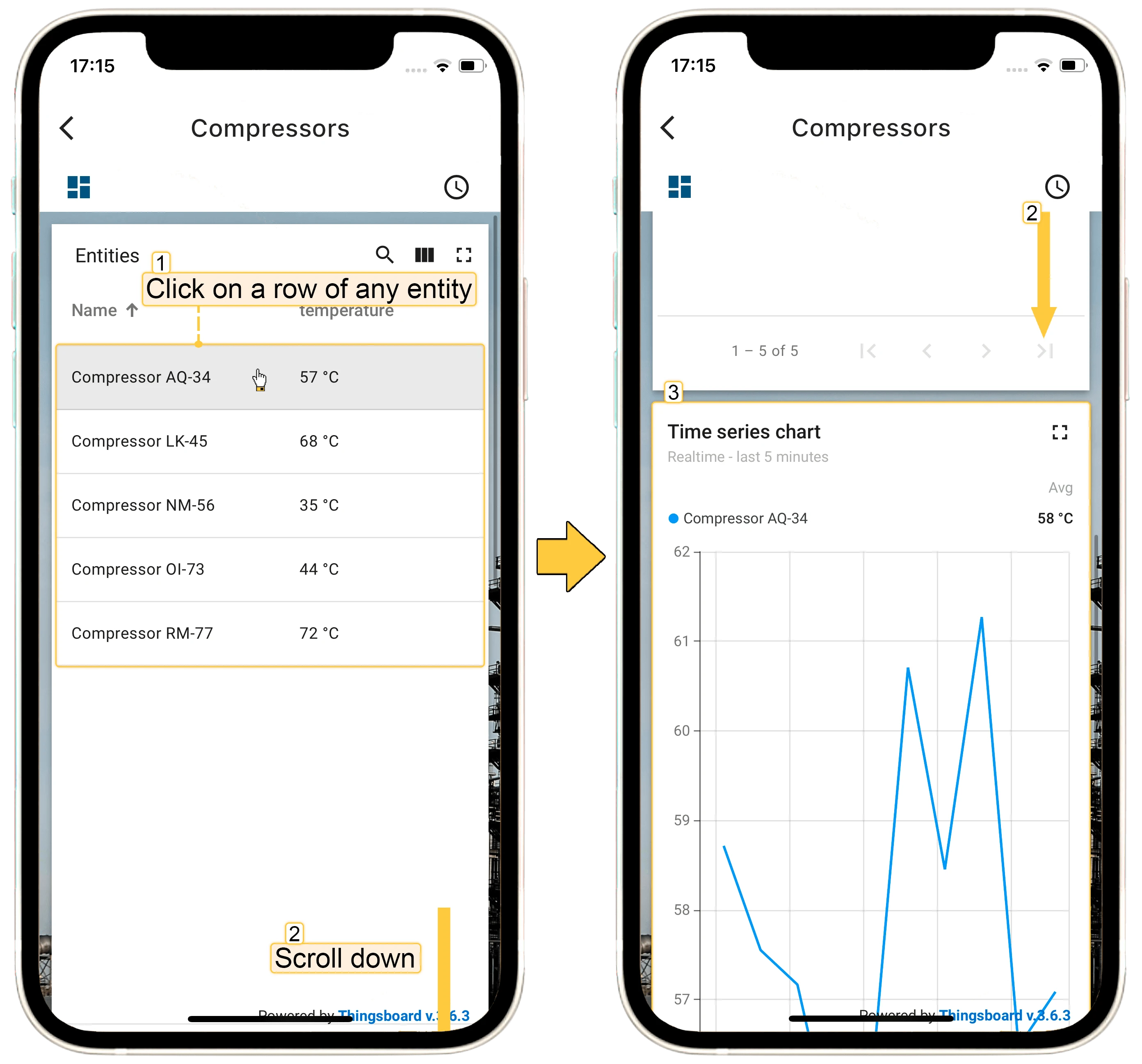
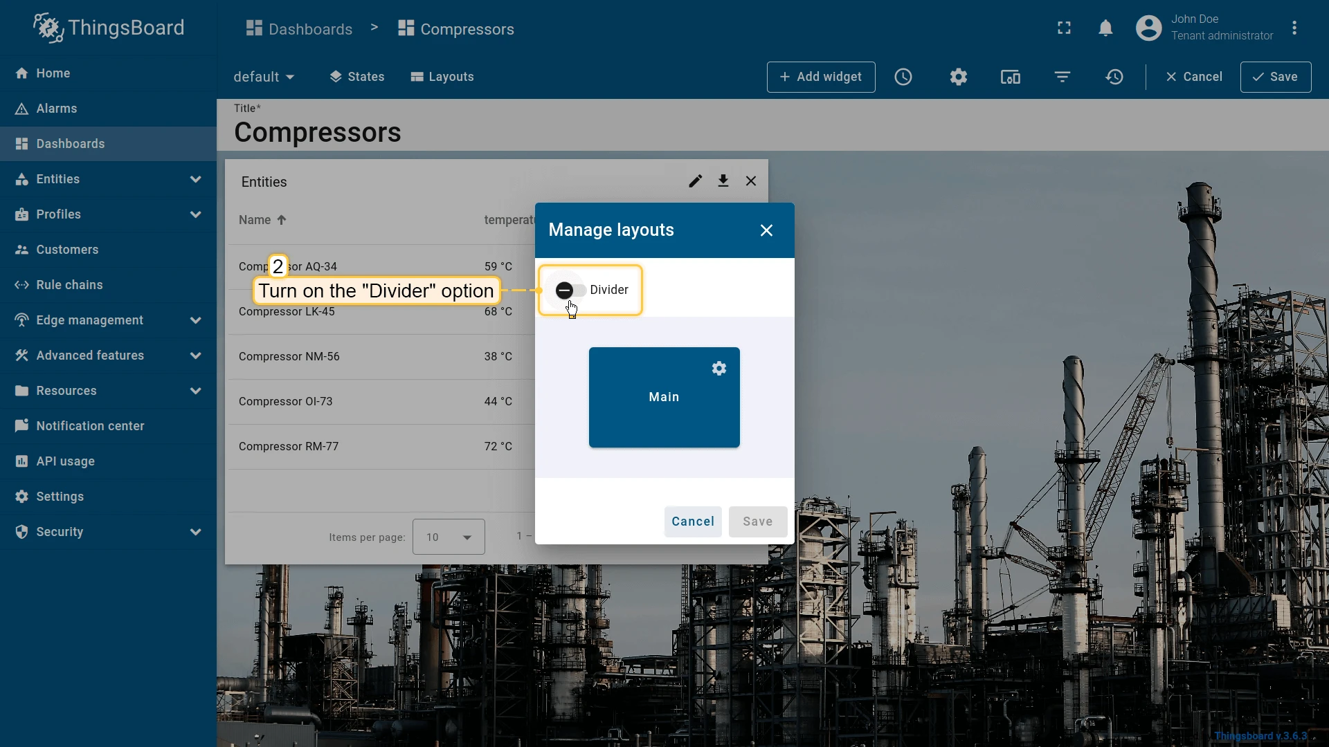
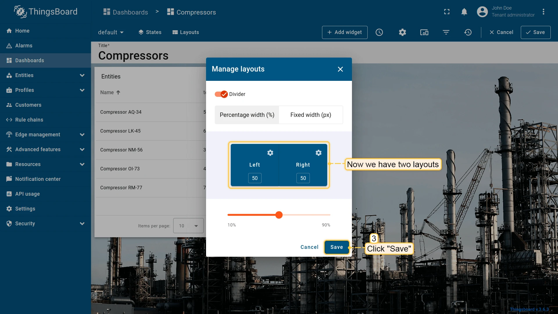
The Layouts feature solves this. Configure a Divider layout as follows:
Add the Time series chart widget to the right layout:
Configure the “Time series chart” widget to display data for the entity selected in the “Entities table”:
Now add an “Update current dashboard state” action to the “Entities table” widget:
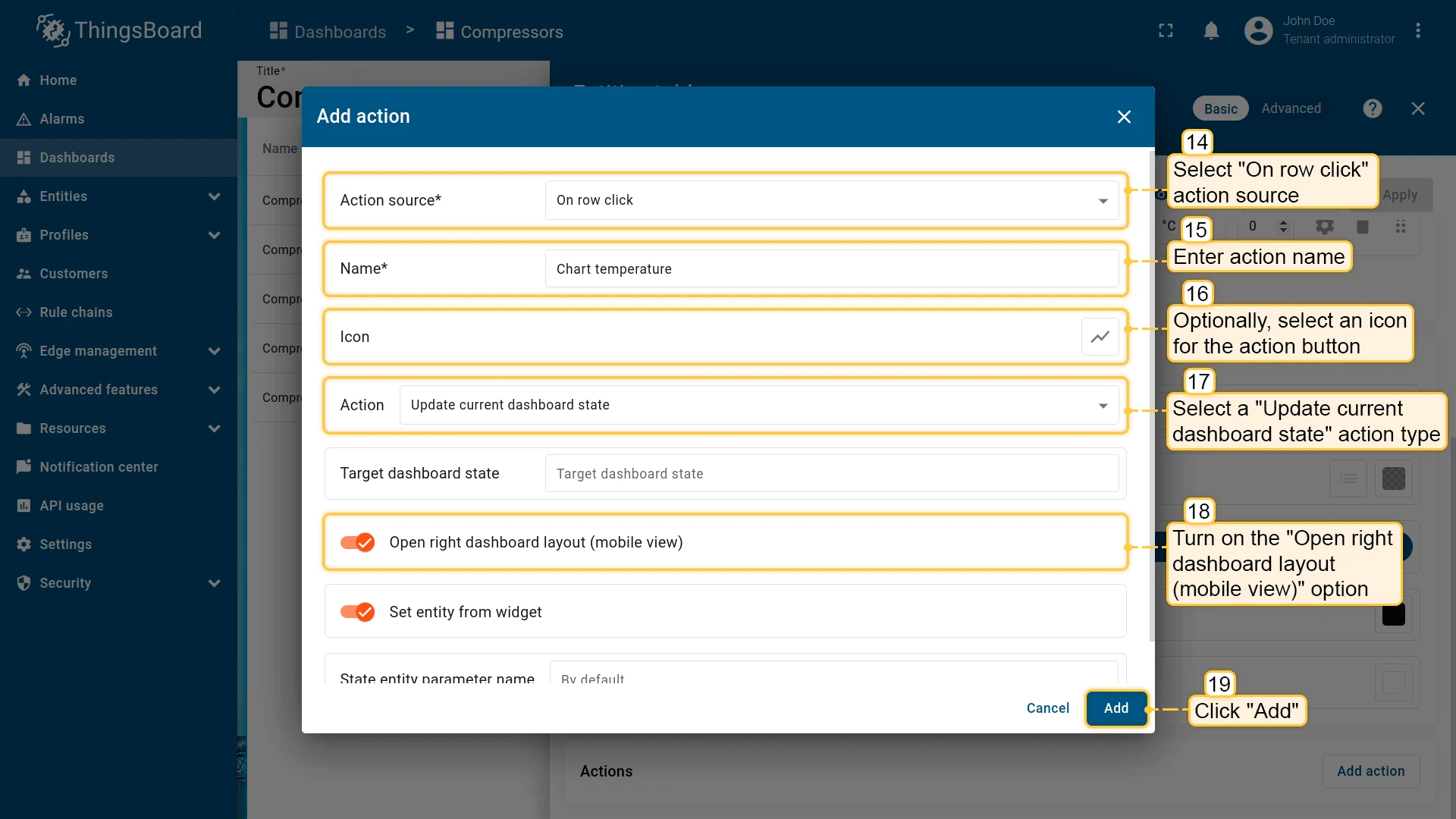
- Open the “Entities table” widget in edit mode and navigate to the “Actions” tab.
- Select “On row click” as the action source and enter an action name.
- Select “Update current dashboard state” as the action type.
- Enable “Open right dashboard layout (mobile view)”.
- Click “Add”, then “Save”.
Apply the widget settings, save the dashboard, then test the action. On mobile, clicking an entity row navigates directly to the “Time series chart” in the right layout:
Set entity from widget
Section titled “Set entity from widget”The Set entity from widget checkbox passes the selected entity into the target dashboard state. This allows the target state to use it via the Entity from dashboard state alias. For example, clicking a row in an Entities table can push that device into the state so detail widgets on the next state display its data.
Sometimes you need more than one entity in the state. For example, to navigate from a customer list to that customer’s devices and then to a specific device, you can use three states: “Main”, “Customer Devices”, and “Device Details”. Assign separate state entity parameters for each — for example, currentCustomer and currentDevice — on the “Device Details” state.
Was this helpful?